I draw and design, purely as a hobby. And it can be tricky to know when enough is enough. I've ruined several good sketches because of my tendency to over-"design", adding too much details that just ends up ruining my works. That's part of the reason why I like what I feel are creative and elegantly "clean" promotional posters.
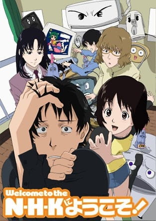
And I often run into a problem with anime posters. In that they squash together characters randomly, resized some, added in some fluffs in Photoshop and called it a day.
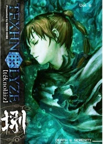
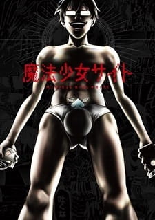
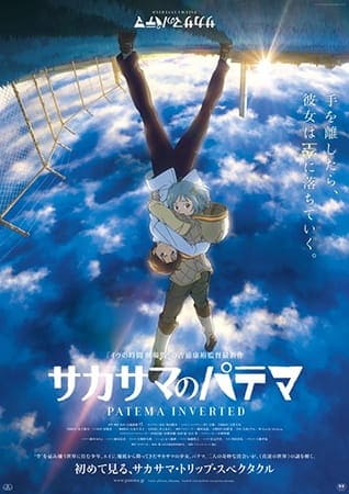
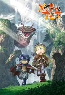
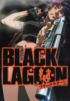
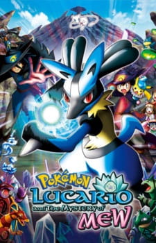
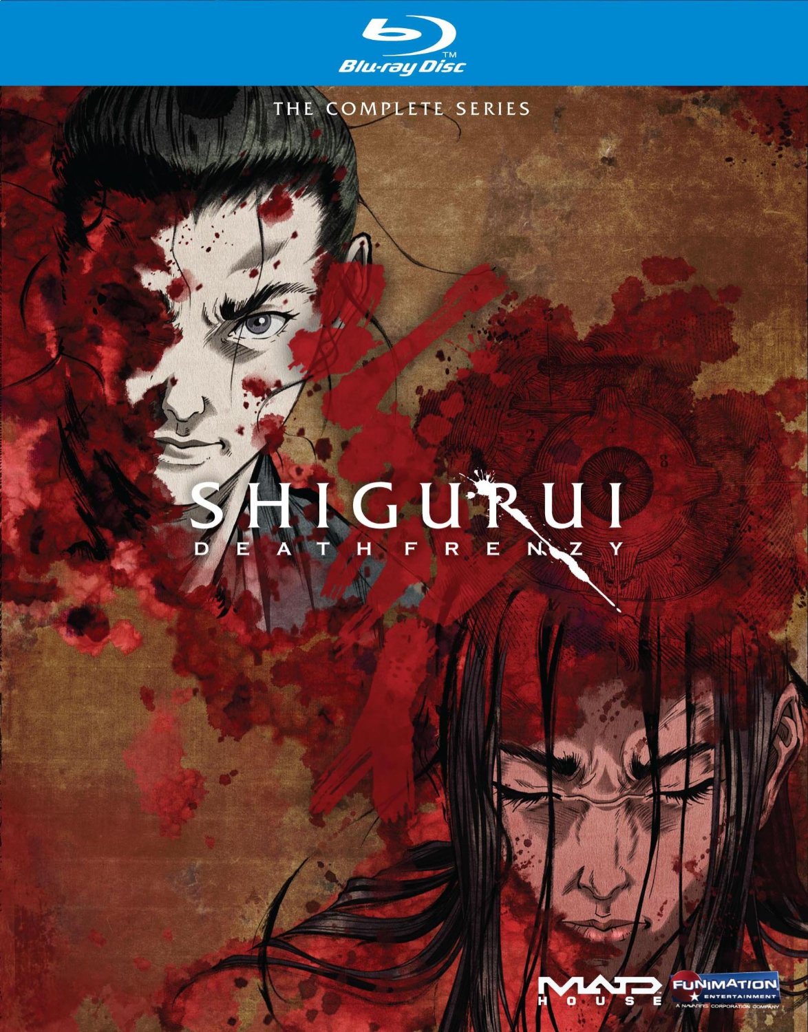
A lot of my favorite anime are guilty of this, especially this one friggin' poster:
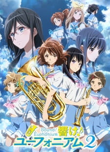
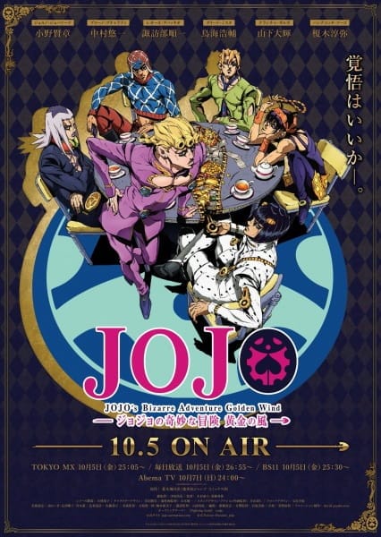
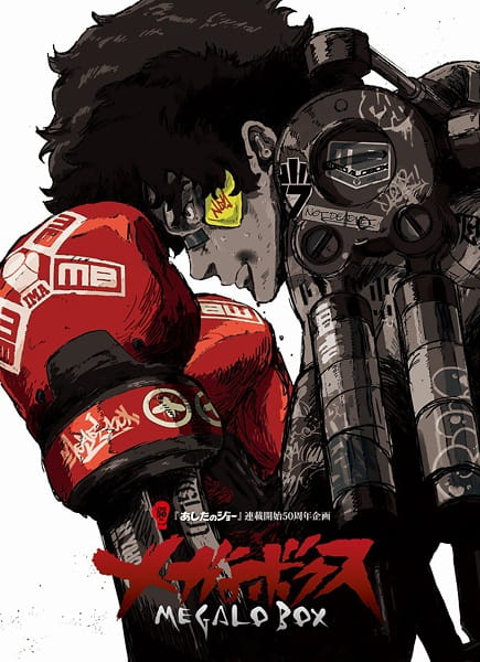
Or you know, the classic over-"designed":

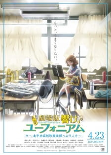
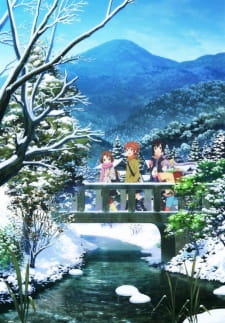
I mean, if it was just the concert band's setup for the concert (the one in the lower half), it'd be great. But then the large heads, and, uh, the clearly out of place pic of Hazuki praying... why? I find that lot of the show's promotional posters emphasizes the cute girls over the concert band idea that I can't really fault people's initial impression that it's just a bland "m'fing-tea-and-cakes" moe show.
I think poster design is an interesting topic to discuss because while it won't really easily dissuade you, except in extreme cases, a great poster design can captivate you into watching an anime you might not have given a second thought otherwise. Especially since promotional posters are meant to sell the main idea or concept of the series/movies.
So let's talk about that. Have you ever been captivated by great poster designs that it sold the show to you? Which posters? And what about them?
I'll start.
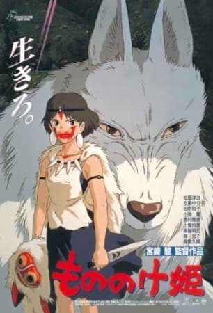
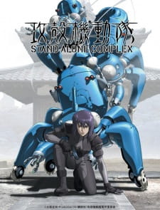
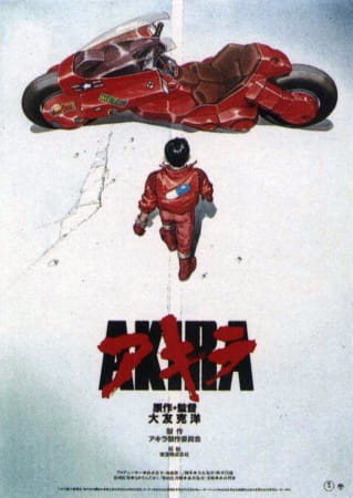
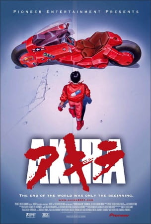
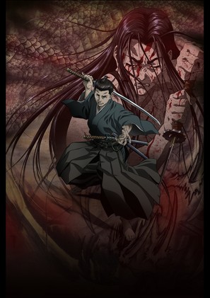
Exhibit A: I rarely praise Ghost in the Shell 1995 but damn, these posters should be and probably are iconic in their own rights. A picture worth a thousand words, I say. This is one of the most effective posters I've seen in anime. It gives you a general idea of what to expect and it's pretty damn gorgeous to boot, the left one especially. I know I said some things about overly-detailed but here there's no gaudiness to it and/or a grating mismatch of colors.
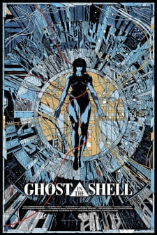 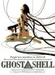
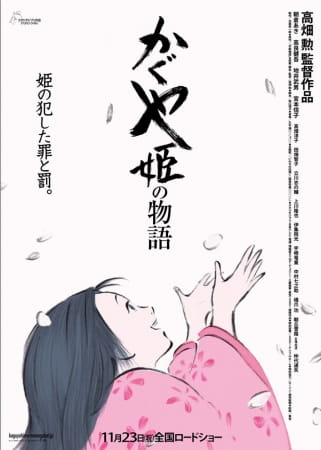
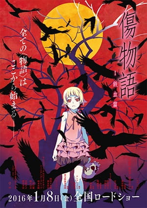
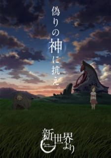
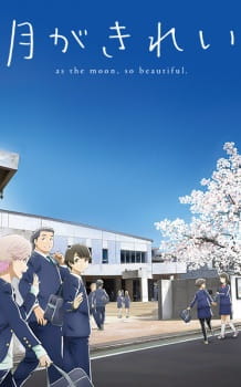
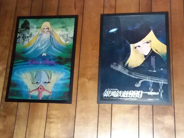
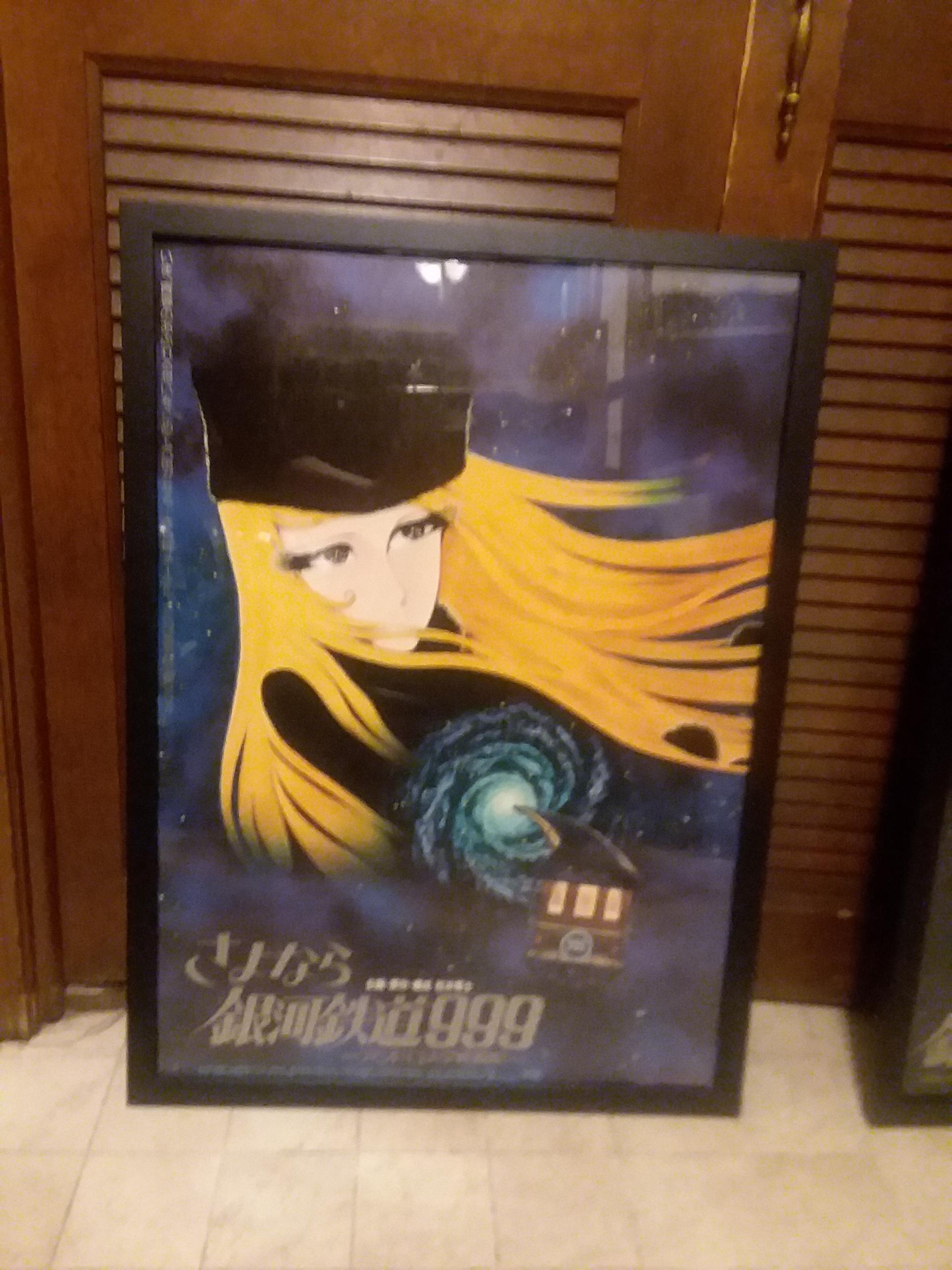
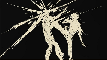
Exhibit B: Captivating imagery/motifs. They make you wonder "Why birds? Why those birds in particular?" I find that it hooks me.
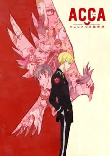 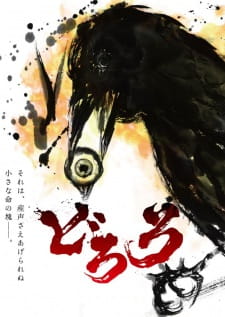
Exhibit C: Gorgeous posters that avoids being lurid and retains a sense of elegance while still selling the core idea of the work. Take Sound! Euphonium's for example: the focus on cute girl(s) is toned down and the intruments are given more, well, focus. We see Kumiko's hard at practice, which is a large large part of the series.
And if nothing else, these posters are really pretty to look at and effort seemed present on planning how and what to show with as little strokes as possible.
  |


 whats a signature