Vaixell said:"When I first see the new design I thought it was shit, but now I think it's pretty nice."
Good for you! But the more I look at that horrible accident called "modern design" the more I hate it. I hated it in the first place and I will never "get used to it". When people say they're getting used to something, it means that they don't like it but try to live with it. But why excactly do I hate the update? Well..
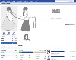
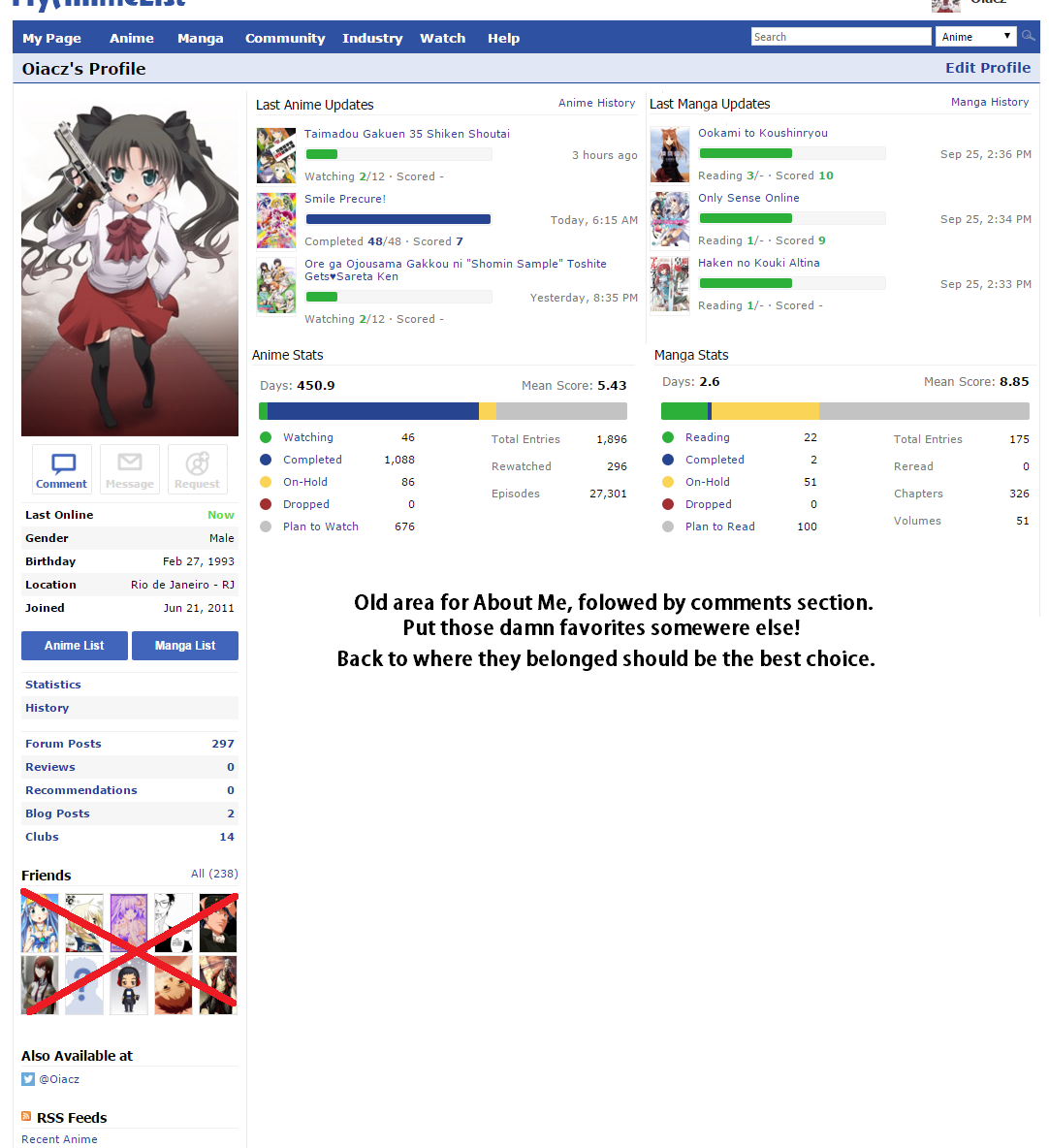
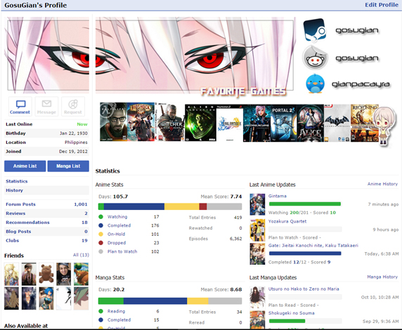
- For "small" resolutions the design is more than just contraproductive. I can't see shit. I don't even see the buttons for my lists!
http://i.imgur.com/kJUUvxw.png
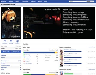
- The "About me". Why is that thing above my stats? What does it have to do with them? Move them before the comments.
-- Yeah, you can make cool banners! And really, that's a cool idea but here we go again with small resolutions!
http://i.imgur.com/95FGBQV.png As you can see, you can see nothing. Great.
- The links to my lists. Why are they where they are now? Why is there where they were a link to edit my profily now? I don't need this. I want quick access to my lists, that's what this site is about! Lists!
- Those ugly colors for that ratio bar. I don't have a problem with this bar in general, but I cannot stand these colors. They don't fit. If they change to soft shades of blue, I'll actually like the new stats.
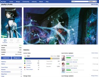
- Last Updates. I like the idea of a progress bar. But it looks like shit. I saw a pretty neat idea on making the bars look better. It was like this:
http://i.imgur.com/yxjhe1z.png
- The pixelated graphics. Whoever mades this, I wanna punch you in the throat.
No, this is not a browser bug! It looked fine before the update! Now, after that, it's shit. Yeah, Firefox' fault, and I am the king of fucking China! Some high as fuck idiot thought it would be a good idea to change the way graphics are being scaled down for no apparent reason. Most say "Change for the sake of change", and yeah, that's it. It's dumb.
- I don't read manga. The non-existent stats steal space. This is not okay. (But yeah, that was already a problem before the new design.)
- The favorites. Good, we can have ten for everything now. Good, the additional ones are hidden! Great idea!.. Stop doing drugs, it's dumb. I want my favorites on the left side, not in the middle of everything, that's clusterfuck. Also, I don't have manga favs, and no people favs, so they steal space again. Looks really nice!
- Friends. I quote hundrets of users now: "This is not fucking facebook." Move that under the clubs or something like that.
- RSS feeds. I don't know a single person who uses that shit. And I don't think anyone wants user feeds. They are useless.
Fix your shit.