Forum Settings
Forums
New
May 23, 6:36 PM
#1
Lead Admin
Faerie Queen

Offline
Aug 2007
6276
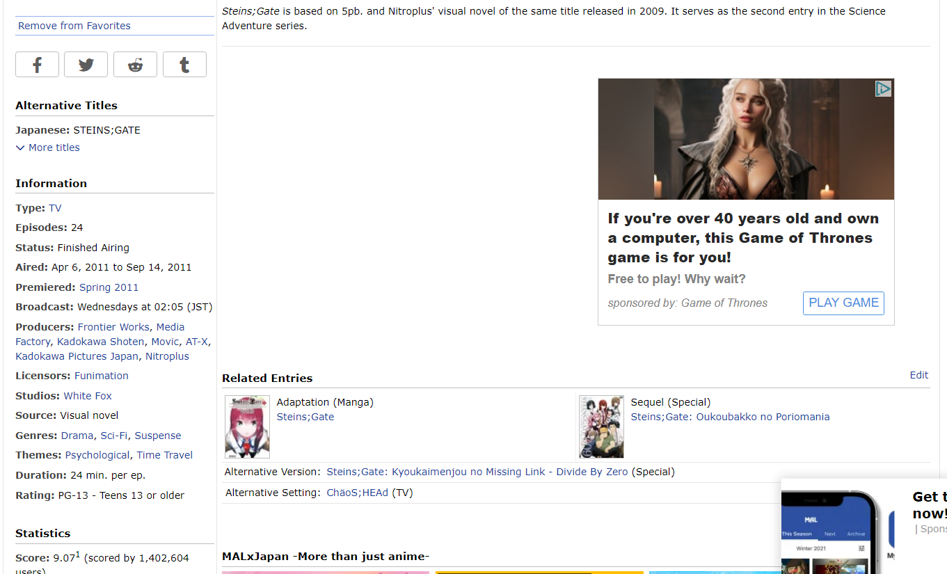
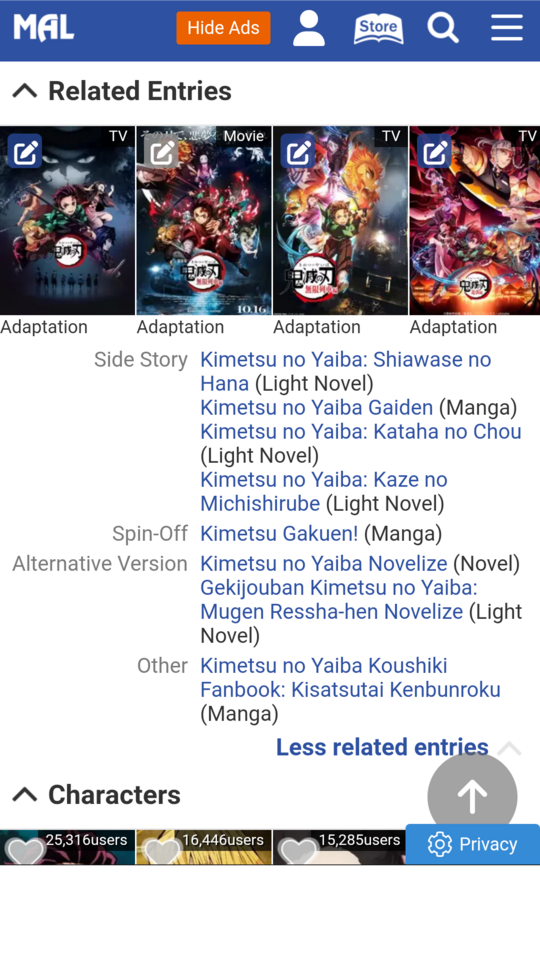
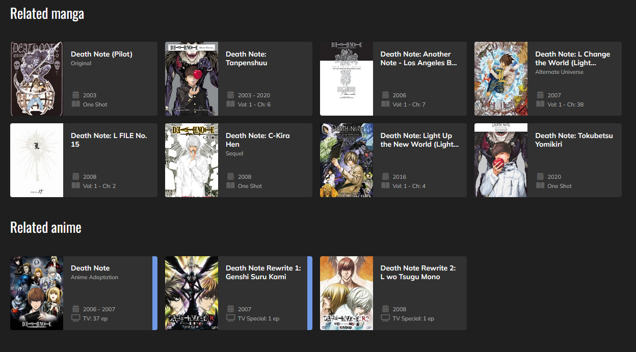
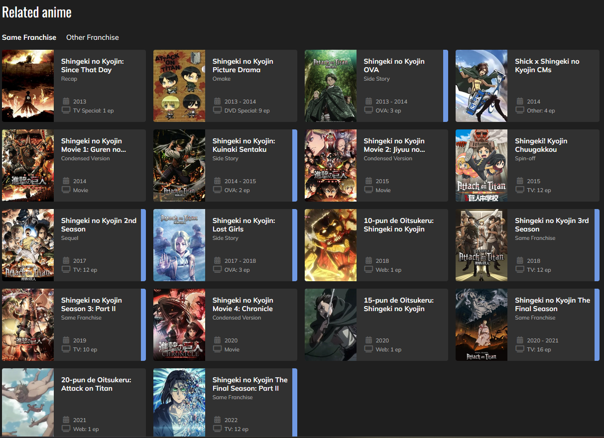
We've released a small change to Anime/Manga database pages today to make frequently-clicked related entries more visible by including a thumbnail for each prequel, sequel, and adaptation. Along with this modification, the type of the related entry is now included. All other relations will be listed on one line each as well, for readability. Since this will make the Related Entries section longer on the page (particularly for huge franchises like One Piece), more than four relations will be collapsed under a More/Less accordion like OP/ED themes.


For now, Manga <-> Novel relations will be still be listed under Alternative Version (without a thumbnail). In the future, we'll be making it possible for these relations to also appear rightfully as Adaptations, and will migrate the existing data.

We also recognize that although many anime are adapted from light novels, the manga versions or "comicalizations" of these titles are often still more widely read. Thus, we plan to make it easier to move between Anime <-> Manga entries of Light Novel sources in the future, as well.

It's a small update, but we hope this will make it easier for new and existing members to move between related entries in our database. Please let us know of any issues you may encounter.
Pages (3) [1] 2 3 »
May 23, 7:06 PM
#2

Offline
Nov 2021
156
good change
May 23, 7:09 PM
#3
a lil bean ✨

Offline
Feb 2011
17722
I can finally say this is a somewhat welcome update!

We can finally properly read the many related entries without trying to figure out where it starts/ends lol

Question tho, when you say " frequently-clicked related entries ", based on what? By tracking what was the previous page before visiting an entry? Or do you mean just what is assumed to be what people check the most (prequel/sequel) without any real regards to the side stories and such?

Another question, is there any hope now to finally get our status per series here? Similar to how we get the little tags (cw, cmpl, ptw, hold) on the seasonal page, VAs pages, and so on.

And finally, why did the episode videos get pushed so far down? They are now below the OP/ED section....
SheyCroixMay 23, 7:13 PM

HiScoreLoScoreAuction

Turn-InsAWCc

ᓚᘏᗢ

May 23, 7:14 PM
#4

Offline
Dec 2019
3395
Reply to SheyCroix
I can finally say this is a somewhat welcome update!

We can finally properly read the many related entries without trying to figure out where it starts/ends lol

Question tho, when you say " frequently-clicked related entries ", based on what? By tracking what was the previous page before visiting an entry? Or do you mean just what is assumed to be what people check the most (prequel/sequel) without any real regards to the side stories and such?

Another question, is there any hope now to finally get our status per series here? Similar to how we get the little tags (cw, cmpl, ptw, hold) on the seasonal page, VAs pages, and so on.

And finally, why did the episode videos get pushed so far down? They are now below the OP/ED section....
@SheyCroix

Kind of, but seems like the whole purpose and the main point was to add a larger ad section in the middle of the screen

May 23, 7:20 PM
#5
a lil bean ✨

Offline
Feb 2011
17722
Reply to hacker09
@SheyCroix

Kind of, but seems like the whole purpose and the main point was to add a larger ad section in the middle of the screen

@hacker09 Oh what the... yuck.

HiScoreLoScoreAuction

Turn-InsAWCc

ᓚᘏᗢ

May 23, 7:32 PM
#6
Lead Admin
Faerie Queen

Offline
Aug 2007
6276
Reply to hacker09
@SheyCroix

Kind of, but seems like the whole purpose and the main point was to add a larger ad section in the middle of the screen

@hacker09 The ad spots were not changed. They've been there for 5+ years now, if not more.
May 23, 7:34 PM
#7

Offline
Dec 2019
3395
Reply to Kineta
@hacker09 The ad spots were not changed. They've been there for 5+ years now, if not more.
@Kineta

Oh, then I'm clearly wrong. Sorry!

My Ublock Origin showed a big white space only today...
It could be a bug then? I'm sot sure
May 23, 7:39 PM
#8
Offline
Jan 2019
2
I'm NGL I don't like this change, is it possible to make it a setting to keep it as the old version. As a lot of things are missing in some of the anime listings, for example on fate/stay night 2006 it used to show all of these https://imgur.com/a/WYZcyWr

But now it only shows this
https://imgur.com/a/E7oF7f7

And as well as the fact that some, including me would prefer the older style, as it is more compact with less imagery. Thanks
Revs_May 23, 7:44 PM
May 23, 7:59 PM
#9

Offline
Oct 2019
467
like this change but there should be an optional decision to be able to revert to the old setting
Signature removed. Please follow the signature rules, as defined in the Site & Forum Guidelines.
May 23, 8:05 PM
Offline
Mar 2024
2
this change is nice for some people, but not adding a way to revert back is a huge mistake since me along with so many people prefer more compact designs, especially since this change removed the entire "related anime" section on my end.

and when i say it's gone, i mean likes it's completely gone on my end, like the section is completely nowhere to be seen on any anime or manga page i go on.
Onii-ChanFantasyMay 23, 8:10 PM
May 23, 8:33 PM

Offline
Jan 2021
162
I noticed that some scores suddenly went down (to the exact score of few months ago) in all Sorcerous Stabber Orphen anime after this update, wtf
May 23, 8:51 PM

Offline
Feb 2016
11116
Reply to fudish123
I noticed that some scores suddenly went down (to the exact score of few months ago) in all Sorcerous Stabber Orphen anime after this update, wtf
@fudish123
I started a thread last week to ask why so many anime scores have been going up. And now they've all gone back down!
https://myanimelist.net/forum/?topicid=2159991
その目だれの目?
May 23, 8:58 PM

Offline
Mar 2008
48029
That seems like that could be useful. I only have a miild concern of cover images of follow up seasons being potential spoilers in some cases though the images show up when doing a search anyway and they are small enough you cant get much off of it so it's not that big an issue.
May 23, 10:00 PM

Offline
Sep 2021
64
hell yeah, this is a useful change
Goodnight, Punpun 
May 23, 11:32 PM
Ceasefire NOW

Offline
Aug 2009
3710
Thanks for the update. It’s nice that the adaptations are visually separated and organized better; I remember I was kind of having a hard time with that during the Easter event…

I also like that each related anime entry has its own row instead of being grouped together into a confusing clump.
May 24, 2:24 AM

Offline
Jun 2019
6353
Good change.
May 24, 3:04 AM

Offline
Jun 2020
2405
Enjoying this change a lot on the mobile website
May 24, 3:13 AM

Offline
Jun 2011
569
Unnecessary change. Please include an option to revert back to old format.
May 24, 3:30 AM
Offline
Apr 2019
2
Can you provide a reference to the complaint for visibility? Is it possible to add an option to revert the change?

- It made readability way harder for me. Previously, I had to check the first column of words to see what I want (e.g. sequels) and check that row only, now I become dizzy checking the padded grid to see which are the sequels. It's pretty dysfunctional. For example, if I want to check the sequel for https://myanimelist.net/anime/9656/Kimi_ni_Todoke_2nd_Season I have to check every entry my eye goes to first entry then travels a significant distance to the right, then bottom left then right. This is tiring compared to the previous compact mode where I need to check the term sequel and look right immediatly.

- When I checkout an anime, I rapidly click on all entries, and the added unneeded tiny thumbnails just makes it a slower process

- I don't want to always look for an extra button to check if related anime exists or not.
clumsy_gamer_19May 24, 5:33 AM
May 24, 3:38 AM

Offline
Nov 2017
1694
This is great, so much more clear now!

Hopefully this can also be added one day =>
https://myanimelist.net/forum/?topicid=1817297

plz @ me
May 24, 4:54 AM

Offline
Jan 2021
162
Reply to Lucifrost
@fudish123
I started a thread last week to ask why so many anime scores have been going up. And now they've all gone back down!
https://myanimelist.net/forum/?topicid=2159991
@Lucifrost Yeah, I noticed that scores were rising up but it wasn't that much either. It was under 0.2 points anyway.
May 24, 4:57 AM

Offline
Oct 2017
9
Now please update the search bar, it's so dysfunctional it isn't even funny
May 24, 5:46 AM

Offline
Sep 2008
3972

Looks great! 😍
Nice change ❤
May 24, 6:32 AM

Offline
Apr 2022
27
love it!
May 24, 6:42 AM
Offline
Jan 2020
11
This was really good, I liked it
May 24, 7:35 AM

Offline
Apr 2017
140
Honestly, I really like the idea, but I think the execution is lacking. My main gripe with this change is the fact that it only seems to affect prequel/sequel relations as well as adaptations. With this it feels really inconsistent even though it isn't, because some shows don't have either of these relations and as such still have the same "Related Entries" section as always, while others look completely different now. The fact, that some relations are hidden now is also annoying, because up until now it was always visible and now I have to do an additional click for something that should always be visible. Because if it would look the same on all relations I think this change would be really great, I like what it does visually. I guess for now I'll have to get a script that unhides the hidden entries...

Also, since some other users mentioned it, I'm glad to see something was done against the score botting. While I'm admittedly sad to see my favorite shows go down in score again, it's still a lot better to have actual scores than those artificially inflated ones. We wanna keep it fair here.
May 24, 9:47 AM
Wisewolf

Offline
Dec 2021
22
Personally I hate this change, In terms in readability I feel like you're changing something that doesn't need changing.

Please add an option in the setting to revert this change.
May 24, 9:51 AM

Offline
Nov 2020
280
I checked out a few of the more massive franchises and it seems to be much more comprehensible than the old system. Nice <3
May 24, 10:25 AM
Offline
Feb 2010
54
The thumbnails are too small to be useful, but the biggest problem is this typical scenario

If there is a related adaptation, prequel ends up on the right while sequel ends up on the left, which is unintuitive. I suggest Prequel and Sequel be separated on line 1 - prequel on the left. And adaptation can go below that or even somewhere else.

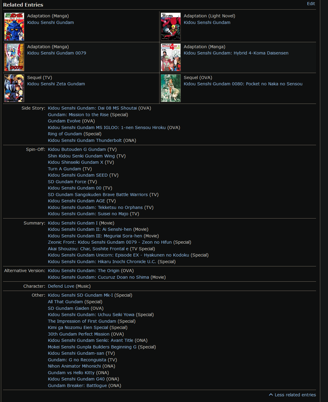
For big sections it's a lot better since there are no thumbnails, but there is still a problem with sorting, where you can see the titles aren't sorted alphabetically or by type (series, ova etc), but by some hidden factor that isn't stated or obvious as can be seen here:


May 24, 10:44 AM
Offline
Aug 2020
473
Very good quality of life changing
May 24, 10:59 AM
Offline
Aug 2022
4
Please add an option to revert to the old way of displaying the relations. I personally dont want an extra click and the thumbnail clutter.
May 24, 11:38 AM

Offline
Apr 2019
8
This is an extremely annoying change, please give us an option to revert it in settings.
May 24, 11:44 AM

Offline
Feb 2021
7226
Thanks for the changes, it becomes more convenient to use!
May 24, 12:09 PM

Offline
Jan 2016
108
wow I wished there was this a few months ago when I took my time to complete my list with ovas and special.
I just think the thumbnails are unnecessary, just the type would be perfect
RyushindaiMay 24, 12:13 PM
May 24, 12:13 PM

Offline
Jan 2009
94695
this is a nice update
May 24, 1:49 PM

Offline
Jan 2013
65
Not a fan of the score update, it made the less watched anime score artificially goes down.
I'm pretty sure it's because it became a weighted score and it makes me really sad because now less watched anime (older anime) have pretty bad score.
Check Otoko Ippiki Gaki Daishou as an exemple (it's supposed to be ~7.88 from the score average but now it's 6.43, if I was just checking the page I would never even give it a try as of now)
If my portion of anime seen ever gets lower than 10% of the database, consider me dead.
May 24, 4:54 PM
Fantasy lover

Offline
Aug 2017
1258
Great update! I also like that the episode videos are not so high up anymore, but it would be great, if we could get the option to remove them. It is really annoying to have spoilers of a show that clearly visible. At LEAST make it so that the first episodes are shown and not the last since that makes spoilers much more likely.

Same thing goes for the Videos tab. Please put the trailers on top an the Crunchyroll episodes at the bottom.
May 24, 4:59 PM
Fantasy lover

Offline
Aug 2017
1258
Reply to Aggnog
The thumbnails are too small to be useful, but the biggest problem is this typical scenario

If there is a related adaptation, prequel ends up on the right while sequel ends up on the left, which is unintuitive. I suggest Prequel and Sequel be separated on line 1 - prequel on the left. And adaptation can go below that or even somewhere else.

For big sections it's a lot better since there are no thumbnails, but there is still a problem with sorting, where you can see the titles aren't sorted alphabetically or by type (series, ova etc), but by some hidden factor that isn't stated or obvious as can be seen here:


@Aggnog The sorting is very obvious and not hidden at all... The thing that aired first is at the top and the newest at the bottom. I don't think it should be different
May 24, 5:44 PM

Offline
Aug 2017
486
Can you please add an option to revert to the old way of displaying the relations ?
Some of us really liked the old format more.
May 24, 6:16 PM

Offline
Sep 2009
3
I liked the previous listing more but if this is permanent can the title/url of the related content and the relation description be swapped? It's more intuitive for the title of something to be above the description of it.
May 24, 6:35 PM
Offline
Feb 2010
54
Reply to Keiken
@Aggnog The sorting is very obvious and not hidden at all... The thing that aired first is at the top and the newest at the bottom. I don't think it should be different
@Keiken Sorted by date but the date isn't listed, literally the definition of hidden. There is no use case ever where this is a useful sorting method here, in fact it is ridiculous when media types are mixed. The current system forces you to open every single link in a new tab to actually get any useful information.
May 24, 8:30 PM

Offline
Feb 2016
11116
Reply to flammeur
Not a fan of the score update, it made the less watched anime score artificially goes down.
I'm pretty sure it's because it became a weighted score and it makes me really sad because now less watched anime (older anime) have pretty bad score.
Check Otoko Ippiki Gaki Daishou as an exemple (it's supposed to be ~7.88 from the score average but now it's 6.43, if I was just checking the page I would never even give it a try as of now)
@flammeur
The low scores are the original scores. They increased regularly over the past couple of months and have been returned to normal. It's possible bots were involved. I wish the admins would put out an official statement, because it's basically gaslighting if they pretend that nothing happened.
https://myanimelist.net/stacks/44765
LucifrostMay 24, 8:52 PM
その目だれの目?
May 24, 9:08 PM

Offline
Aug 2019
32
i think we should able to hide related entries with one click just as on the mobile website. What we to do when the series has too many side stories, movies and sequels? I just pretend not to see the new feature, i think it's more beneficial for the newbies.

May 24, 9:38 PM
Offline
Jul 2015
253
Reply to MysticalMagic
This is an extremely annoying change, please give us an option to revert it in settings.
@MysticalMagic

How the hell is it annoying?? it's not a gigantic mess anymore.

This is one of the best changes on this site ever.
May 24, 10:46 PM

Offline
Jun 2021
3420
I often check the Related Entries section. So it's nice, it's up now just after the synopsis. With or without a thumbnail, good change to move it up there.
May 24, 11:23 PM
Offline
Jan 2017
37
We finally have LN and Mangas indicated properly on the anime page, although I still don't like the "alternative version" crap on manga/ln pages for the same series. It's a manga adaptation of a light novel, not an alternative version. An alternative version would be let's say a reboot or a retelling from another perspective, not an adaptation. I like the images though, it looks nice on the page.

Also it would be cool if there was a LN List on one's userpage and the "chapters" counter disappeared from LN entries as it's completely useless (who thought that was a good idea? LNs don't have a global chapter count listed anywhere. They start like "Vol. 5, ch. 1", who knows how many chapters have there been in preceding volumes?). But hell will sooner freeze over than those common sense things get implemented.
May 24, 11:32 PM
Offline
Aug 2016
37
Reply to YoshiYogurt
@MysticalMagic

How the hell is it annoying?? it's not a gigantic mess anymore.

This is one of the best changes on this site ever.
@YoshiYogurt
There are three things that are annoying about the change.

  1. The inconsistent design style,
  2. the bad readability of the "important" relations,
  3. and the fact that you have to fold out to see all relations.


1. This makes the whole thing look weird and disorienting because of how different the style is, as if the two parts aren't actually the same section - but they are. The "big" style is instead consistent with the unrelated character and creator sections, that are separated by the rest of the relations and then a row of MxJ ads from their design "sibling".
2. The "important" relations are not in a list but a two-column design, making them harder to parse as you have to check the type for each one and then see what the entry is, while not offering any real value in the small preview images provided. It's the same issue as with everything that's not a straight list.
3. This means a lot of extra clicks, and because it hides some of the most important relations because they're not deemed important by default (e.g. Macross: Do You Remember Love is the most important relation to Macross, and it's in the dropdown, while decades-later novelizations that nobody has read are featured in the big section.), it'll lead to confusion, especially among newer users. Not everyone will always go out of their way to check all relations, especially when they're now more hidden.

Now I agree that the previous design was not great, just being a big run-on of titles in each category, and I think that the new one-per-row compact style with proper release order is much more readable and intuitive, while adding new information (show type). It's just unfortunate that it's ruined by the "important" relations section that dominates the section now while not at all fitting into it. If it was all the more compact style, this would be a universally positive change, but as it is, it's self-sabotaged.

So I'd recommend just changing the whole thing to the new compact style, leaving it expanded (at least up to a bigger size, maybe 10-20 entries - 4 isn't a lot, and in the compact style 8-10 titles will fit into the space of 4 big ones, depending on relation type, and it'd still be considerably smaller than some of the large relation lists in the old style). Those changes would make it way more useable, and the only real cost is no images that nobody needed anyway.
DarkoniusMay 24, 11:44 PM
May 25, 12:18 AM

Offline
Jul 2009
5279
This is a bad change..

Can we have an option to change it back?
May 25, 12:24 AM

Offline
Oct 2010
20880
I would have liked something like this, why complicate the format?


CatalanoMay 25, 12:29 AM
May 25, 4:05 AM

Offline
Apr 2019
8
Reply to YoshiYogurt
@MysticalMagic

How the hell is it annoying?? it's not a gigantic mess anymore.

This is one of the best changes on this site ever.
@YoshiYogurt It is because now I need to click to expand pretty much every time just to see sequels/related content when it was fully visible before.
Pages (3) [1] 2 3 »

More topics from this board

» [Challenge] You Should Read This Manga 2024 ( 1 2 3 4 5 )

Kineta - Feb 23

248 by nanajp »»
Jul 20, 2:48 AM

» Forum Conversation View: Now available ( 1 2 3 4 )

Kineta - Aug 29, 2023

180 by Thyriad-oPPailov »»
Jul 19, 6:04 PM

» Favorites Boosting Accounts: Ranking Recalculations ( 1 2 3 4 5 ... Last Page )

Kineta - May 6, 2021

409 by clane34 »»
Jul 18, 4:24 AM

» Clubs Have a Brand-New Look—In-App!

Kineta - May 15, 2022

46 by YourFriendHolly »»
Jul 9, 9:47 AM

» English Titles Added to Desktop; Moving Towards a Romanized/English Toggle ( 1 2 3 )

Kineta - Feb 12, 2020

124 by maverickwhites »»
Jul 7, 11:07 PM
It’s time to ditch the text file.
Keep track of your anime easily by creating your own list.
Sign Up Login