Forum SettingsEpisode Information
Forums
Konosuba: God's Blessing on This Wonderful World! (light novel)
Available on Manga Store
New
Pages (7) « First ... « 2 3 [4] 5 6 » ... Last »
Jan 15, 2017 1:38 PM

Offline
Aug 2015
2468
SeasonADay said:
felipeliborio said:


Well... now I'm depressed! I love this anime but the art does not fit its quality... It would be so much more pleasant to watch with this level of quality...


The job of an anime ADAPTION is to ADAPT the SOURCE MATERIAL as much as posible and as PRFECTLY AS POSSIBLE. studio deen failed. Anyone dare to argue with me? Before someone starts getting salty, yes studio deen did the script correctly, but an adaption is more then just words, it is the original creators (the storyteller AND THE ORIGINAL ARTIST'S DESIGNS, NOT WARPED DESIGNS THAT DO NOT FIT THE FIRST ONES).
Actually The job of an anime ADAPTION is to SELL the SOURCE MATERIAL as much as possible.
Jan 15, 2017 1:53 PM
Offline
Apr 2011
239
SeasonADay said:
felipeliborio said:


Well... now I'm depressed! I love this anime but the art does not fit its quality... It would be so much more pleasant to watch with this level of quality...


The job of an anime ADAPTION is to ADAPT the SOURCE MATERIAL as much as posible and as PRFECTLY AS POSSIBLE. studio deen failed. Anyone dare to argue with me? Before someone starts getting salty, yes studio deen did the script correctly, but an adaption is more then just words, it is the original creators (the storyteller AND THE ORIGINAL ARTIST'S DESIGNS, NOT WARPED DESIGNS THAT DO NOT FIT THE FIRST ONES).


It's called an adaptation, not an adaption.
.
Jan 15, 2017 2:08 PM

Offline
Apr 2015
4824
SeasonADay said:
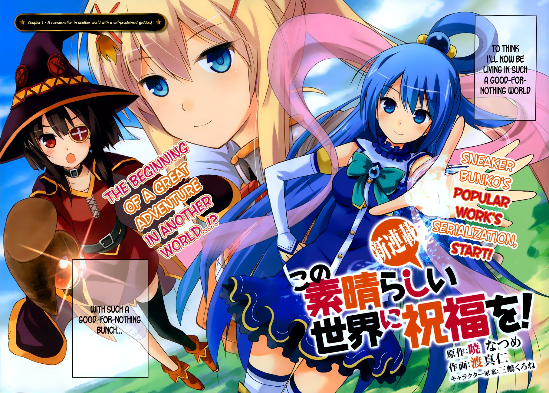
Stop commenting with the intelligence of someone with the brain of a a rat. The source material is this. Anime needs to be the equivalent of the source material mostly. Just shut up and accept that studio DEEN sucks.
[img]http://vignette3.wikia.nocookie.net/konosuba/images/5/5f/KonoSuba_Vol1-7_Colored.png/revision/latest?cb=20160707113937[/ig]
If you want the source material, just look at that instead. Save us from your needless hacking, when what you want already exists In another medium.
Jan 15, 2017 2:24 PM

Offline
Apr 2014
6858
SeasonADay said:
Stop commenting with the intelligence of someone with the brain of a a rat. The source material is this. Anime needs to be the equivalent of the source material mostly. Just shut up and accept that studio DEEN sucks.
[img]http://vignette3.wikia.nocookie.net/konosuba/images/5/5f/KonoSuba_Vol1-7_Colored.png/revision/latest?cb=20160707113937[img]

How about you shut up and stick to your LN then?
Jan 15, 2017 3:22 PM

Offline
Feb 2010
197
FononZero said:
SeasonADay said:


The job of an anime ADAPTION is to ADAPT the SOURCE MATERIAL as much as posible and as PRFECTLY AS POSSIBLE. studio deen failed. Anyone dare to argue with me? Before someone starts getting salty, yes studio deen did the script correctly, but an adaption is more then just words, it is the original creators (the storyteller AND THE ORIGINAL ARTIST'S DESIGNS, NOT WARPED DESIGNS THAT DO NOT FIT THE FIRST ONES).


It's called an adaptation, not an adaption.


It's called an adaptation, not a replica. Anyway, you can't replicate perfectly something from LN to anime.

SeasonADay's post becomes more funny when I check his MAL and notice he likes the anime adaptation of Paprika and Clannad.
lighthalzen-kunJan 15, 2017 3:27 PM


“Read as little as possible of critical or aesthetic works. They are either products of a close-minded spirit, petrified and devoid of meaning in their lifeless hardening, or clever verbal games [...]. Works of art are of an infinite solitude; nothing is worse than criticism for approaching them. Only love can grasp them, keep them, be just toward them. Always give precedence to your own feeling against these analyses, these reviews, these introductions. [...] You must let every impression, every seed of feeling, ripen within you, in the dark, in the inexpressible, in the unconscious, those regions closed to understanding. Wait with humility and patience for the hour of the birth of a new clarity. Art demands of its faithful followers as much as of its creators.”
— RAINER-MARIA Rilke, Letters to a Young Poet (letter dated April 23, 1903).
Jan 15, 2017 3:56 PM
Offline
Apr 2011
239
lighthalzen-kun said:
FononZero said:


It's called an adaptation, not an adaption.


It's called an adaptation, not a replica. Anyway, you can't replicate perfectly something from LN to anime.

SeasonADay's post becomes more funny when I check his MAL and notice he likes the anime adaptation of Paprika and Clannad.
If you actually intentionally wrote what I think you did, you are amazing!! :) if not, yes, I still agree with you regardless.
.
Jan 15, 2017 4:24 PM

Offline
Apr 2016
75
yes the art is a bit sloppy this season but somehow it looks funnier :D which makes it better for a comedy anime
Jan 15, 2017 4:39 PM

Offline
Aug 2016
3762
looks the same for me. it just people paying more attention this time
:v
Jan 15, 2017 5:42 PM
Offline
Jan 2014
13
I am extremely disappointed. This season's art style looks so garbage that I can barely watch it. And it COMPLETELY doesn't fit the anime in any shape or form. -_-
Jan 15, 2017 5:53 PM

Offline
Aug 2014
66
SeasonADay said:
DarklordVor said:


Um.. not really? Just two of my recent memory of DEEN anime other than KonoSuba has a very good design and art.


So it's pretty much derpy by choice and that is by Kikuta, the chief animation director. And Sakamoto is also a funny comedy anime, so KonoSuba being derpy is definitely intentional, but I don't know why they chose this way.

Are these the only two examples you can give?


Aren't you the one that keep using the one example from the court scene? while several counter arguments has been presented with not only a still frame but an entire scene?

You are rather stubborn when it comes to this subject, yes they did butch a scene, and their inbetweens aren't always amazing. However this is true for the vast majority of anime, especially on the shows that shoot out 2 seasons with a year in between. - The animations aren't bad enough to condemn a season over one episode.

You also seem to keep refereeing to the art of the light norvel, which isn't really comparable to that of an anime, as the time used for the pictures in a light novel is far greater than that of an anime, they need to redesign the characters so that the animation team can keep up with the deadlines. This is often times done in cooperation with the original artist or writer, so you can be pretty sure they have approved of the character design that they now stay true to.
This is true for the majority of anime that we seen the last decade.
Jan 15, 2017 8:17 PM
fanservice<3

Offline
Mar 2012
12549
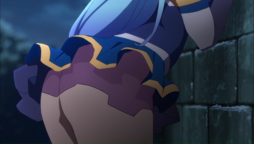
i still got a boner when they showed Aqua's ass, so idgaf
Jan 15, 2017 9:46 PM

Offline
Aug 2015
2058
As much as I liked the 1st season and its OVA, I still can't believe DEEN can get away with this shit and milk the shit out of its franchise because of "muh intentional ass quality animations for comedy sake" mentality of its fans SMH
MizunashiJan 15, 2017 9:50 PM
Jan 15, 2017 10:00 PM
Offline
Nov 2010
635
Pretty dissapointed so far. I suppose in the end it's supposed to be comedy but the change seems different enough from the first season that I don't really like it. Gonna keep watching though- hopefully it'll get better.
Jan 15, 2017 10:04 PM

Offline
Jul 2014
2849
Season 1 had tons of episodes with ok art, episode 4,6, 8 and 10 are fine examples, by far the only bad episode when it comes to art in season 1 was ep 9, and that doesnt even compare to how horrible season 2's ep1 is.

You'd literally pause for seconds after looking at the original LN art and compare it to the anime version, I mean they look beautiful as hell in the LN but looks horrible as fuck in the anime, hell even the manga counterpart made them look cute at least and the comedy still worked.

-StrayJan 15, 2017 10:20 PM
Jan 15, 2017 10:36 PM

Offline
Feb 2010
197
Yeah the manga has plenty of chibi and SD representations, it works well, very reminding of manga like Azumanga Daioh. That's why the deformations in the anime, intentional or not (there are both), don't bother much.


“Read as little as possible of critical or aesthetic works. They are either products of a close-minded spirit, petrified and devoid of meaning in their lifeless hardening, or clever verbal games [...]. Works of art are of an infinite solitude; nothing is worse than criticism for approaching them. Only love can grasp them, keep them, be just toward them. Always give precedence to your own feeling against these analyses, these reviews, these introductions. [...] You must let every impression, every seed of feeling, ripen within you, in the dark, in the inexpressible, in the unconscious, those regions closed to understanding. Wait with humility and patience for the hour of the birth of a new clarity. Art demands of its faithful followers as much as of its creators.”
— RAINER-MARIA Rilke, Letters to a Young Poet (letter dated April 23, 1903).
Jan 16, 2017 2:07 AM
Offline
Sep 2015
15
Simple 99% graphic budget went to Megumin's Explosion Spells ;)
Jan 16, 2017 2:54 AM

Offline
Sep 2016
764
well guys pay them;0
Jan 16, 2017 5:13 AM
Offline
Feb 2009
879
SigOpram said:
That's because the password was wrong. *cough*

Plus there's also some benefit...

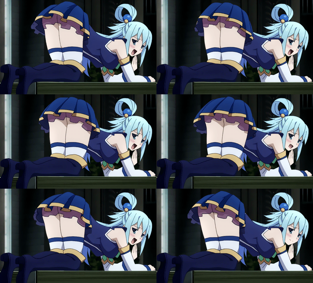
wtf was that skirt all about? Failed fanservice or just fail?
Jan 16, 2017 7:40 AM

Offline
Mar 2015
7953
SeasonADay said:
DarklordVor said:


Um.. not really? Just two of my recent memory of DEEN anime other than KonoSuba has a very good design and art.


So it's pretty much derpy by choice and that is by Kikuta, the chief animation director. And Sakamoto is also a funny comedy anime, so KonoSuba being derpy is definitely intentional, but I don't know why they chose this way.

It is rushed. Get it through your head.


There's a difference between ignorant and stupid, but you're both. Rakugo season 2 has the same time of production as KonoSuba 2. They're worked by a different team of DEEN studio. Yet, Rakugo season 2 is as normal as it can get. HOWEVER, Kikuta, the Chief Animation Director, chose this art style. As he DELIBERATELY admit that this art style of animation makes the animation flows really well.

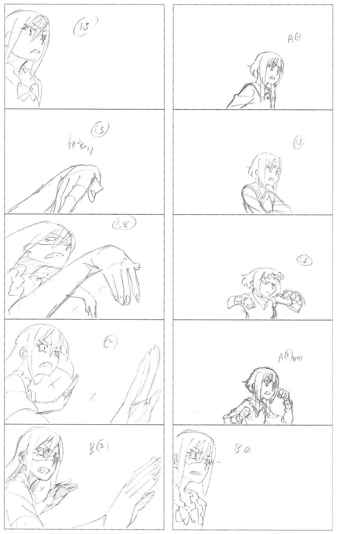
I mean seriously, I even gave you HIS sketch of episode 9 scene. Where it deliberately shows the derpiness face. It's his taste of art. It's like saying "modern art is the best thing ever" and you disagree with it. People have their own opinion of what art is.


Jan 16, 2017 7:46 AM

Offline
Mar 2015
7953
-Stray said:
Season 1 had tons of episodes with ok art, episode 4,6, 8 and 10 are fine examples, by far the only bad episode when it comes to art in season 1 was ep 9, and that doesnt even compare to how horrible season 2's ep1 is.

You'd literally pause for seconds after looking at the original LN art and compare it to the anime version, I mean they look beautiful as hell in the LN but looks horrible as fuck in the anime, hell even the manga counterpart made them look cute at least and the comedy still worked.


It's because Kikuta did not do episode 2,4,6,8,10. Chief Animation Director: Momoka Komatsu directed those episodes and you're right, he gives us the best of KonoSuba than Kikuta ever did with 1,3,5,7,9 + OVA.

Episode 2 by Momoka:


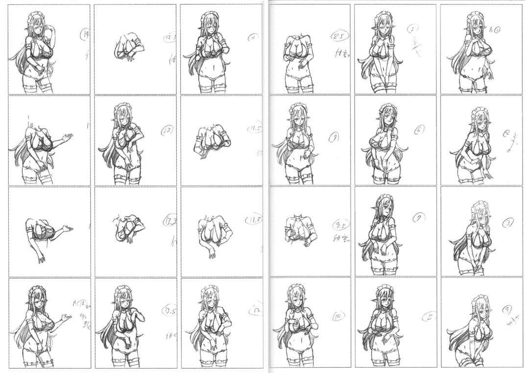
Kikuta ruined episode 9 especially because he prefers "something that flows better" and his love for saggy tits. Seriously, someone needs to fire this guy and let Momoka control the whole anime.

Season 2 episode 1 was also directed by Kikuta, so you can see how much derpiness and shitty animation can be found in this episode. I just hope Momoka is back for next episode.

Jan 16, 2017 8:19 AM

Offline
Sep 2016
4552
DarklordVor said:
-Stray said:
Season 1 had tons of episodes with ok art, episode 4,6, 8 and 10 are fine examples, by far the only bad episode when it comes to art in season 1 was ep 9, and that doesnt even compare to how horrible season 2's ep1 is.

You'd literally pause for seconds after looking at the original LN art and compare it to the anime version, I mean they look beautiful as hell in the LN but looks horrible as fuck in the anime, hell even the manga counterpart made them look cute at least and the comedy still worked.


It's because Kikuta did not do episode 2,4,6,8,10. Chief Animation Director: Momoka Komatsu directed those episodes and you're right, he gives us the best of KonoSuba than Kikuta ever did with 1,3,5,7,9 + OVA.

Episode 2 by Momoka:


Kikuta ruined episode 9 especially because he prefers "something that flows better" and his love for saggy tits. Seriously, someone needs to fire this guy and let Momoka control the whole anime.

Season 2 episode 1 was also directed by Kikuta, so you can see how much derpiness and shitty animation can be found in this episode. I just hope Momoka is back for next episode.
yea i just realize every girl here have saggy tits rofl
CrossAnge

Hey guys check my profile for current airing season anime recommendation (guaranteed best taste)
Jan 16, 2017 10:32 AM

Offline
Jul 2014
2849
DarklordVor said:
-Stray said:
Season 1 had tons of episodes with ok art, episode 4,6, 8 and 10 are fine examples, by far the only bad episode when it comes to art in season 1 was ep 9, and that doesnt even compare to how horrible season 2's ep1 is.

You'd literally pause for seconds after looking at the original LN art and compare it to the anime version, I mean they look beautiful as hell in the LN but looks horrible as fuck in the anime, hell even the manga counterpart made them look cute at least and the comedy still worked.


It's because Kikuta did not do episode 2,4,6,8,10. Chief Animation Director: Momoka Komatsu directed those episodes and you're right, he gives us the best of KonoSuba than Kikuta ever did with 1,3,5,7,9 + OVA.

Episode 2 by Momoka:


Kikuta ruined episode 9 especially because he prefers "something that flows better" and his love for saggy tits. Seriously, someone needs to fire this guy and let Momoka control the whole anime.

Season 2 episode 1 was also directed by Kikuta, so you can see how much derpiness and shitty animation can be found in this episode. I just hope Momoka is back for next episode.


Oh so thats why there was such a huge gap in art with those episodes, he's the one that does them saggy tits.... agree'd, Momoka should handle the whole ep2 and beyond, KonoSuba would look much better with him doing it.
Jan 16, 2017 11:50 AM

Offline
Mar 2015
7953
GangsterCat said:
yea i just realize every girl here have saggy tits rofl

-Stray said:

Oh so thats why there was such a huge gap in art with those episodes, he's the one that does them saggy tits.... agree'd, Momoka should handle the whole ep2 and beyond, KonoSuba would look much better with him doing it.


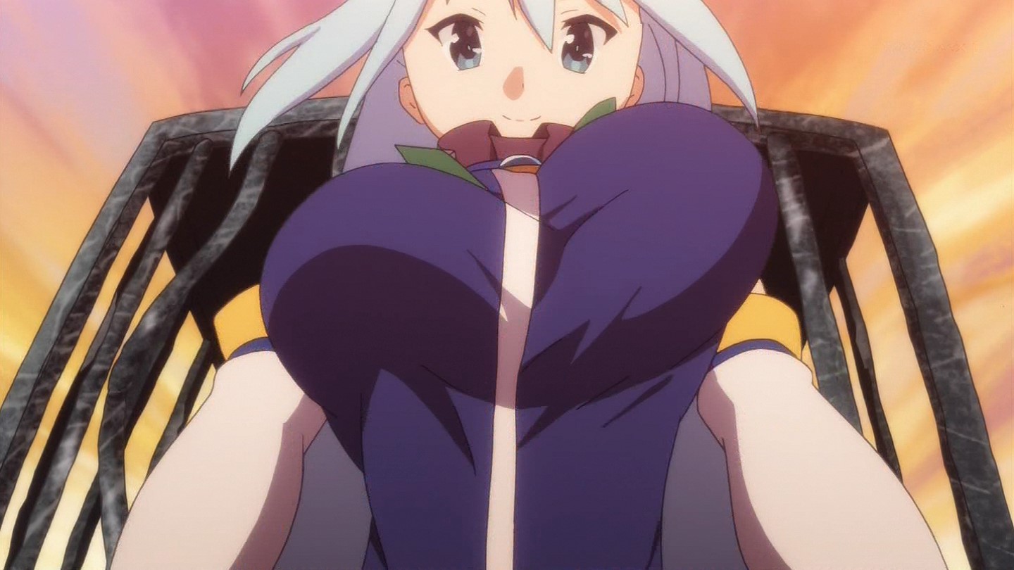
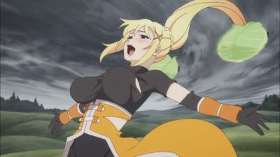
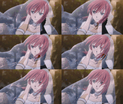
Yup, because not only this Kikuta guy change the Character Design made by Mishima Kurone on LN to Anime, but he also direct them. So we get things like this on episode 5:


Darkness on episode 3:


And a whole bunch of movements on episode 9:


I'm just glad that most of the part that Momoka directed (episode 2, 4, 6, 8, 10) are funny, good and beautiful (Megumin introduction, Megumin attacking Verdia's castle, Attack on Verdia, the ghost mansion, and the final battle with Destroyer)

Edit: And there was even a point where this happened,

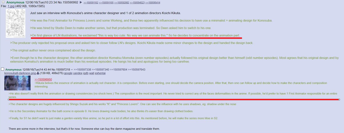
Animestyle interview with Kikuta said:
Even though he is the character designer, the other animation director Komatsu Momoka (even number episodes) actually followed his original design better than himself (odd number episodes). Most agrees that his original design and by extension Komatsu's animation is much better than his eventual episodes. He hangs his hat and apologizes for being too carefree.


Just shows how much Momoka Komatsu is way better than Kikuta on his own work.
DarklordVorJan 16, 2017 1:13 PM

Jan 16, 2017 1:22 PM

Offline
Feb 2010
197
and that because of dumb complaints of you SAO-design-loving people that he made the first ep of season 2 much weirder (trying to do moe)


“Read as little as possible of critical or aesthetic works. They are either products of a close-minded spirit, petrified and devoid of meaning in their lifeless hardening, or clever verbal games [...]. Works of art are of an infinite solitude; nothing is worse than criticism for approaching them. Only love can grasp them, keep them, be just toward them. Always give precedence to your own feeling against these analyses, these reviews, these introductions. [...] You must let every impression, every seed of feeling, ripen within you, in the dark, in the inexpressible, in the unconscious, those regions closed to understanding. Wait with humility and patience for the hour of the birth of a new clarity. Art demands of its faithful followers as much as of its creators.”
— RAINER-MARIA Rilke, Letters to a Young Poet (letter dated April 23, 1903).
Jan 16, 2017 11:40 PM

Offline
Oct 2016
1065
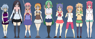
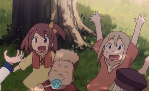
LOL. Done by studio DEEN as well.


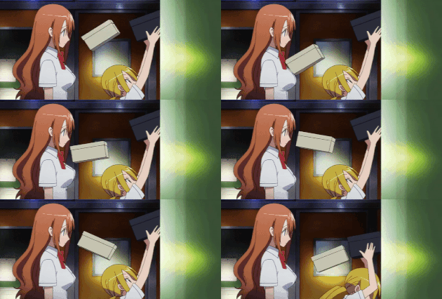
but you see this is acceptable because the art was that way to begin with. (my personal favorite of the pictures i saved)

So Rika is a squid and Mion is Crayon shin-chan's mother
Yuki_NonakaJan 16, 2017 11:43 PM
Jan 17, 2017 12:01 AM

Offline
Nov 2014
5402
I have to agree S1 looked much better. I don't know if S2's art is "bad", I just don't like it that much. If S1 looked like that too I probably wouldn't mind it now.
Jan 17, 2017 12:13 AM

Offline
Nov 2016
179
The art is bad and the comedy is less than season 1, let's see what happen on eps 2.
Nice to meet you.......
はじめまして。。。。。。。。。
Jan 17, 2017 11:11 PM
Offline
Apr 2015
12
Yeah, I don't really find the art as appealing as others. However, I do enjoy the art when it's used at some comedic moments
Jan 18, 2017 12:59 AM
Offline
Apr 2016
1
the art work is sloppy in season 2. not in a comedic way, just low budget. worse than that: there is absolutely no subtlety, its the worst kind of slapstick. its taken a witty show and destroyed it. didnt laugh, even once.
the art is only one of a dozen problems. i think the voice director was told to dum down the show, like everything else in it, as the main character even sounds different.
its like that last k project series: i couldn't even watch that
Jan 18, 2017 1:23 AM

Offline
Aug 2015
1837
RajDarge said:
the art work is sloppy in season 2. not in a comedic way, just low budget. worse than that: there is absolutely no subtlety, its the worst kind of slapstick. its taken a witty show and destroyed it. didnt laugh, even once.
the art is only one of a dozen problems. i think the voice director was told to dum down the show, like everything else in it, as the main character even sounds different.
its like that last k project series: i couldn't even watch that


Honestly, in season 1 we had a lot of animation errors. Before starting the S2, I watched a few episodes of the S1 and frankly it was average.


Jan 18, 2017 3:10 AM

Offline
May 2010
321
SeasonADay said:
LOL. Done by studio DEEN as well.


but you see this is acceptable because the art was that way to begin with. (my personal favorite of the pictures i saved)

So Rika is a squid and Mion is Crayon shin-chan's mother


If anything I believe Higurashi got an upgrade with each season too, but yeah the art was like this from the start and the art works well with the bright happy scenes and the dark stabby-stabby scenes. Man, I miss Higurashi...

On topic, I definitely noticed the shift in art quality but I'm sure I'll get used to it soon enough... maybe.... Hopefully. Just hoping the magic and explosions don't take a huge dip in this season because I love watching magic animation. But hey, I still enjoyed the episode so there's that. I'm not sure I've ever stopped watching a show because of bad animation if the story and characters are interesting enough.
If you're going to put up a show of torture...I'm sorry, but I'd rather leave the stage. – Furude Rika, Higurashi no Naku Koro ni
Jan 18, 2017 6:58 AM

Offline
Jul 2014
4197
OP did you watch the horrible 360p rip?
Jan 18, 2017 10:54 AM

Offline
Oct 2014
6
Before vs after Christmas
Jan 18, 2017 11:49 AM

Offline
Dec 2016
50
Ithirul said:
Before vs after Christmas


wow... it's really that painful... what a shame, this show deserved even better quality if not the same than s1 at the very least.

Jan 18, 2017 2:05 PM

Offline
Sep 2011
546
Never seen a topic as retarded as this one...
Seriously, are people really saying the art and animation is horrible and trying to make a point by showing a frame of season 2 that is not as well drawn than other frame of season 1? Are people really comparing frames of an animated series to their manga or light novel counterpart? Do you people even know what animation is? Why are we comparing Konosuba's animation to Nichijou's animation? Those are compeltly diferent shows, what works in one doesn't work in the other, not all comedy is the same...
Inferno Cop's animation is better than Berserk 2016's, not because it had better prodution value, but because it's made in a way it works. What is "worse on purpose" like many said, is not because is actually worse, it's because the producers actually realized that making rougher art would be way more effective in this show, than a more detailed art, and they were right. In all of this, what's so hard to understand?
Jan 18, 2017 3:19 PM
#1 Hitagi Lover

Offline
Apr 2014
3011
Lmao this thread. I honestly don't even know where to start. smh @ OP

The art is fine, it doesn't matter if you like it or not. Adaptations don't have to be accurate with the character designs to the very tiniest detail.
Jan 18, 2017 3:22 PM

Offline
Feb 2010
197
https://twitter.com/Ara3Wkm/status/806042832490237952 interview with kikuta

i never had a problem with his episodes from season 1 personally, though i can understand it bothers some people but the problem comes from them


that must be why he failed a lot of faces in the episode, hoping he'll forget this idea


“Read as little as possible of critical or aesthetic works. They are either products of a close-minded spirit, petrified and devoid of meaning in their lifeless hardening, or clever verbal games [...]. Works of art are of an infinite solitude; nothing is worse than criticism for approaching them. Only love can grasp them, keep them, be just toward them. Always give precedence to your own feeling against these analyses, these reviews, these introductions. [...] You must let every impression, every seed of feeling, ripen within you, in the dark, in the inexpressible, in the unconscious, those regions closed to understanding. Wait with humility and patience for the hour of the birth of a new clarity. Art demands of its faithful followers as much as of its creators.”
— RAINER-MARIA Rilke, Letters to a Young Poet (letter dated April 23, 1903).
Jan 18, 2017 4:16 PM

Offline
Apr 2013
7288
Veldin461 said:
What is "worse on purpose" like many said, is not because is actually worse, it's because the producers actually realized that making rougher art would be way more effective in this show, than a more detailed art, and they were right. In all of this, what's so hard to understand?


Veldin461 said:
Never seen a topic as retarded as this one...


You've seen one now.


This is the type of ridiculous bullshit that I was talking about.

Fucking lmao.
Jan 18, 2017 4:24 PM

Offline
May 2009
9167
Wow, second episode aired and as expected looked like previous season.

Let's not continue this retarded thread.
Jan 18, 2017 6:41 PM

Offline
May 2015
254
bastek66 said:
Wow, second episode aired and as expected looked like previous season.

Let's not continue this retarded thread.


I think someone above mentioned something about KonoSuba having 2 different animation director and with this episode, it's now proven that it's not budget, but different of art styles between the two directors.

So I guess we're expecting a bad quality one on the next episode and a good quality one on the episode after that. I'm also expecting when the third episode hits, someone will complain about the quality again and we'll go back having to discuss this thread again.
Jan 18, 2017 7:18 PM

Offline
Dec 2007
6641
DarkingDawning said:
bastek66 said:
Wow, second episode aired and as expected looked like previous season.

Let's not continue this retarded thread.


I think someone above mentioned something about KonoSuba having 2 different animation director and with this episode, it's now proven that it's not budget, but different of art styles between the two directors.

So I guess we're expecting a bad quality one on the next episode and a good quality one on the episode after that. I'm also expecting when the third episode hits, someone will complain about the quality again and we'll go back having to discuss this thread again.

It's almost as if there actually was an issue with the way episode 1 looked to some people.


From what people said here I thought It was just my imagination and that the Umineko anime actually looked fine too /s


RajDarge said:
the art work is sloppy in season 2. not in a comedic way, just low budget.

And no one who comes in here actually looks at the thread, they just read the title and assume it's about the 'comedy' style.

I don't blame some people for not noticing the low budget art, but when they just dismiss it as nothing it reeks of fanboyism. I LOVED S1 but I also have some reasonable expectations. (Just like how I didn't pass DEEN on UBW Movie while some others did)
KetuekigamiJan 18, 2017 7:36 PM
Signature removed. Please follow the signature rules, as defined in the Site & Forum Guidelines.
Jan 19, 2017 4:43 AM

Offline
Apr 2014
6858
>low budget art

What the hell is that supposed to mean? How does more budget improve the detail on the art if the character designer is intentional not focusing on making the characters look perfectly on-model every frame but in movements?


Those deformed faces aren't because of "lol DEEN QUALITY xD" but because the character designer doesn't think focusing on drawing consistencies is important. Heck based on these interviews, it's perfectly clear he understands the appeal of the show than most here.

Z4KJan 19, 2017 4:53 AM
Jan 19, 2017 5:46 AM
Offline
Jul 2018
564089
I haven't seen the 2nd episode yet due to personal real life stuff going on but... are we going with the debate again with the art of the 2nd season? I thought the art worked well with the comedy for the 2nd season because it looked pretty stupid but it worked in itself as stupid.

Also, let's go and make this point out:

To anyone that says "MUH ANIMU ADAPTATION HAS TO BE LIKE THE SAME ARTSTYLE AS THIS" note that while I can see that argument going, it depends on what the people want to take the art direction, all decisions are made for a reason. KonoSuba's staff is probably doing this because it fits more with the comedy genre, and that's understandable enough.

Also budget is not even a fucking issue either. And I know, inb4 also "it doesn't make it better, it makes it worse if its done on purpose." Though again, I think the decision makes sense at least imo.
Jan 19, 2017 10:11 AM

Offline
Jun 2009
36
Pretty happy with the quality of episode 2. I didn't have this low-budget feeling like in episode 1. Hoping for the best!
Jan 19, 2017 10:35 AM

Offline
Apr 2016
1656
First season was way better. I'm very disappointed :( i was waiting for the new season and now this s**t quality :(( i dropped my score to 6/10....

Jan 19, 2017 3:08 PM

Offline
Sep 2011
546
hoopla123 said:
Veldin461 said:
What is "worse on purpose" like many said, is not because is actually worse, it's because the producers actually realized that making rougher art would be way more effective in this show, than a more detailed art, and they were right. In all of this, what's so hard to understand?


Veldin461 said:
Never seen a topic as retarded as this one...


You've seen one now.


This is the type of ridiculous bullshit that I was talking about.

Fucking lmao.


And you were talking about... sorry, but I don't have the patience to read every single comment on a topic like this. Not worth it
Also your phrasing... didn't even understand if you were agreeing or disagreeing with me
Jan 19, 2017 4:35 PM

Offline
May 2015
254
Ketuekigami said:

It's almost as if there actually was an issue with the way episode 1 looked to some people.


From what people said here I thought It was just my imagination and that the Umineko anime actually looked fine too /s


I know there are people defending it, which was delusional, but I also hate it when people hated it saying "season 1 art is better than season 2" when it's exactly the same shit. @DarklordVor already said it plenty of times in this thread that it's Kikuta's animation preference. Meanwhile episode 2 was not directed by Kikuta and therefore it has way better animation than episode 1.


Jan 19, 2017 5:57 PM

Offline
Jan 2011
1292
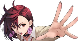
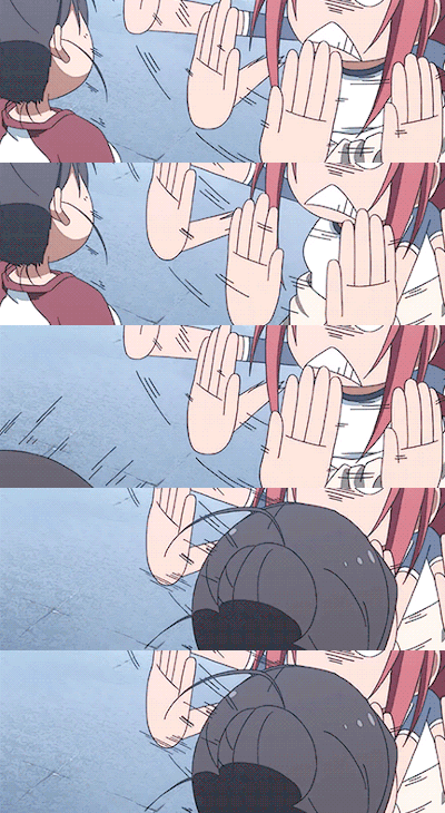
Z4k said:
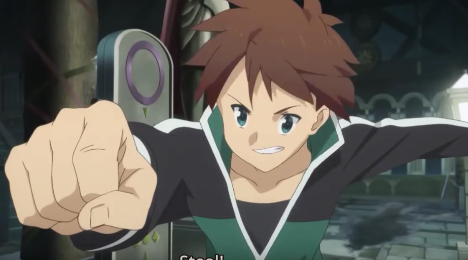
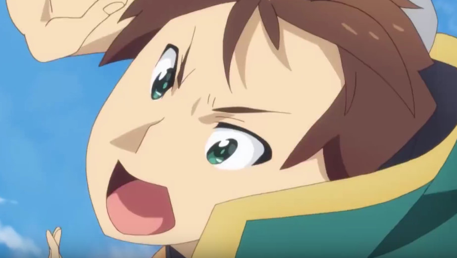
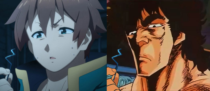
LN art is pretty generic and not as funny as the anime's artstyle. Not sure why anyone would want a it because that would mean we wouldn't have funny expressions or scenes like these


It wouldn't be really possible with the LN's artstyle.


I find that typical LN's animation to feel quite sterile. While Konasuba's quality isn't the best I will say as I've said with last years season it feels rather fluid. The Gainaxing seems a tad more natural than other high quality works for some reason.
Jan 20, 2017 3:32 AM

Offline
Mar 2015
7953
Net-Raid said:
@DarkingDawning
I agree.
Those are fine, it's just the overall quality I guess:

Now, I'm not an artist so it's probably just me but maybe someone who knows how to draw can actually give his/her opinion.
I like the art here too:

Feels more consistent.


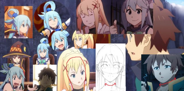
Well that's the problem. As I have pointed out, it's Kikuta's art style that is actually inconsistent. You can see how he's doing it overly exaggerated "funny faces." On an interview, he even admit that he can't really adapt his own Character Design, but Momoka, the other Chief Animation Director, was able to adapt it better (which is why the even episodes had so much better qualities). I think Kikuta make those weird faces because he can't replicate his own work and therefore make an excuse of drawing so many derpy faces as "funny"

The two Aqua gif that you posted were from episode 8 (where Aqua felt guilty) and episode 4 (Aqua talking about Kazuma fapping). Both episodes WERE NOT directed by Kikuta, hence the GOOD QUALITY because they were directed by Momoka. You just added more statement that the Even episodes that were directed by Momoka has better quality than the Odd episodes that were directed by Kikuta.

The same goes for Ebara (replaces Momoka for this season), who directed the animation for S2E2. He was able to take Kikuta's Character Design and make it good like what we had on that episode. So you should expect the 3rd and every Odd numbered episodes to have that derpiness and inconsistencies if they were directed by Kikuta.

Jan 20, 2017 4:21 AM

Offline
Mar 2015
7953
Net-Raid said:
These are from odd numbered episodes(S1) and they look mostly fine:
Ep.1
Ep.3
Ep.5
Ep.7


Not mostly though. Compare all those odd numbered episodes against even numbered episodes.

Let's compare episode 1 and 2.

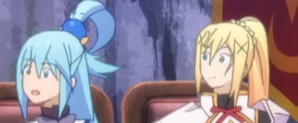
In episode 1, this picture of Aqua is a little bit more elongated.


While episode 2 has Aqua's face with a normal shaped face.


Not just that, but you can see how episode 1's saggy boobs is more prominent than episode 2's. That's because Kikuta love saggy boobs. Which is also the reason why Yunyun has way over the top boobs on OVA and a normal one on S2E2.

Net-Raid said:
I never said it wasn't. I agreed and just added that the overall quality seems to drop this season compared to first season.


And you used the S2E01 that was directed by Kikuta to make your conclusion. You can't just say the overall quality of season 2 is worst than season 1's when it's not finished airing. If it's like that, then I could argue that episode 9 has the worst looking art in KonoSuba with season 2 included. Therefore season 1 has worse animation than season 2. That's how you conclude the overall quality of season 2 by using just one Kikuta episode. The second episode has better quality than episode 1, almost to Momoka's standard on the previous season.

Pages (7) « First ... « 2 3 [4] 5 6 » ... Last »

More topics from this board

Poll: » Kono Subarashii Sekai ni Shukufuku wo! 2 Episode 4 Discussion ( 1 2 3 4 5 ... Last Page )

Stark700 - Feb 1, 2017

256 by Baskarite »»
Oct 21, 10:14 PM

Poll: » Kono Subarashii Sekai ni Shukufuku wo! 2 Episode 10 Discussion ( 1 2 3 4 5 ... Last Page )

Stark700 - Mar 15, 2017

344 by k-angel »»
Sep 16, 11:06 PM

Poll: » Kono Subarashii Sekai ni Shukufuku wo! 2 Episode 2 Discussion ( 1 2 3 4 5 ... Last Page )

Stark700 - Jan 18, 2017

300 by k-angel »»
Sep 5, 11:28 PM

Poll: » Kono Subarashii Sekai ni Shukufuku wo! 2 Episode 3 Discussion ( 1 2 3 4 5 )

Stark700 - Jan 25, 2017

214 by nemma92 »»
Aug 16, 8:40 AM

Poll: » Kono Subarashii Sekai ni Shukufuku wo! 2 Episode 6 Discussion ( 1 2 3 4 5 )

Stark700 - Feb 15, 2017

225 by AniDisFan »»
Jul 23, 7:15 AM

Preview MangaManga Store

It’s time to ditch the text file.
Keep track of your anime easily by creating your own list.
Sign Up Login