New
Oct 17, 2015 6:57 AM
#1701

| ok but...you still won't have notifications when people talk to you on forums? |
 |
Oct 17, 2015 6:57 AM
#1702

| I don't like it, but I don't really think it's worth the drama around it either. I'd be miffed if the update completely changed the content of the page, but it's all still there, just in the wrong places, and uglier. This is all fixable with a userscript. |
Oct 17, 2015 7:00 AM
#1703

| The main problem here is what others have mentioned: the 'About Me' section. Now that it's hidden behind a tiny arrow no-one will click, it has no value... yet it's at the top of the page? Why are anime/manga favourites at the bottom when the now worthless About Me bit is at the top? That makes no sense whatsoever. It's good that users can add up to 10 favourites now. But who the hell cares now favourites aren't visible and buggy-blurry? When they were to the left, they were tidy and in plain sight. Adding MALGraph functionality is cool... but, again: with the inferior layout, it was better for users just to add the stats manually to their About Me section. Given MAL is still meant to be listing site, if not favourites, stats should be at the top of pages. You still haven't bothered to add sorting options to reviews, which has killed the reviewing community with 0-vote uninterest, and now you've made another mess. Sorry but I'm done with this site the moment list tags are 'fixed' / lists are 'fixed'. PS: My list view e-penis stats are no longer public?... PUK KYUUUU! |
AironicallyHumanOct 17, 2015 7:03 AM
Oct 17, 2015 7:00 AM
#1704
| the new design is cool, looks more cleaner now |
Oct 17, 2015 7:12 AM
#1705

| lt look really dirty :( I prefer the old version. I like that you add the number of episode that you see also to the profile but i very didn't like that the "about me" is above the other things. you can combine the good thing of both of them, it will be the best thing. |
 |
Oct 17, 2015 7:12 AM
#1706

| This is really bad. I can't even look at any profile pages anymore because I instantly want to close the tab. Thanks god I have direct links to animelist and mangalist but that isn't really a long term solution. I'm in really tight spot because I don't like the layouts of anime planet or hummingbird either. The reason why I prefered MAL was because how simple everything looked while providing a lot of information. Now everything is cluttered and info was removed. Maybe I should create an excel file or something? Because I sure don't want to use the site in the state it is right now. |
Oct 17, 2015 7:20 AM
#1707

| Nce to see some aspects of it changed, but what i dont like is that the favourites column was changed, i dont like its new location, overall it looks OK but feels mashed up somehow. I would like if they could have more options for the edition of the anime/manga list. |
 |
Oct 17, 2015 7:22 AM
#1708
Oyukimaru said: I would rather use notepad.go to ANN |
Oct 17, 2015 7:25 AM
#1709

| I must say I'm mostly bothered with the following: - About Me section being right there, in your face. It's too big and too unimportant for a site that's dealing with anime and manga lists. - the resize effect on all images in one's profile (currently watching/reading, favorites of all kind etc.) is bad. Why couldn't it have been resized like in the new Friends section (which I rather like now, looks simple and clean and lack of nicknames next to the pictures adds to it) - the number of different colors on anime and manga statistics does not quite appeal to me, but I find that to be more of my personal preference than something "really, globally wrong". I preferred the different shades of blue (or any color, at that). Also, I don't quite get the Last Anime/Manga Updates bars; I'm 2 episodes away from finishing Sailor Moon R so I get that the bar's close to the finish, but H2 manga is currently at it's 9th chapter (out of 338) and the bar's halfway full? o_O Same issue with the coloring in that part, since you've used the same colors as in the statistics bars. Anyway, I believe that it's not as terrible as some users may have pointed out without trying to be constructive about it and I rather like some comments that make fairly good points about the whole design. With a few tweaks, I think I might get used to it and rather enjoy it. But for now, these points bug me and I'd prefer the old layout to it than this one staying as it is now. |
 |
Oct 17, 2015 7:32 AM
#1710

ArbiterofWhim said: Just woke up hoping it was all a horrible nightmare. I guess not :/ iirc RedUbs and/or Tsiox were working on a Stylish userscript to rearrange the profile so that favorites and list view counts were back on the left, and statistics were above about me. Did they release a final script to make it look like RedUbs' pic, or are they still working on it? there is also Cpt_Mathix making scripts to rearrange parts of the profile, you can find a list here or directly to his script page: https://greasyfork.org/en/users/16080-cptmathix |
 Fixes to make the Profile more bearable after "the Modern★Profile★Update★★Rip★Profile★" |
Oct 17, 2015 7:42 AM
#1711
| People keep complaining abou how terrible the new design is. Just like people on Tumblr, who complain when there is an update but after three days they all love it. Every one just has to get used to it. After some time I think people will see this as a great change to the website. |
Oct 17, 2015 7:51 AM
#1712
Runikus said: Progeusz said: This is really bad. I can't even look at any profile pages anymore because I instantly want to close the tab. Thanks god I have direct links to animelist and mangalist but that isn't really a long term solution. I'm in really tight spot because I don't like the layouts of anime planet or hummingbird either. The reason why I prefered MAL was because how simple everything looked while providing a lot of information. Now everything is cluttered and info was removed. Maybe I should create an excel file or something? Because I sure don't want to use the site in the state it is right now. I was trying to find alternative to MAL yesterday, but don't find any. Other sites about anime worse then new MAL. MAL has the best list but other sites have way better databases in regards to anime and manga. |
Oct 17, 2015 8:06 AM
#1713

| Btw, I STILL get logged out from time to time. Anyone else? submarina said: People keep complaining abou how terrible the new design is. Just like people on Tumblr, who complain when there is an update but after three days they all love it. Every one just has to get used to it. After some time I think people will see this as a great change to the website. Fuck no. It's awful. |
Oct 17, 2015 8:08 AM
#1714

Lucumo said: Gotta love how a lot of the people who are fine with the new layout/design just joined recently. I'm also assuming it has something to do with whether they are tablet/mobile users or desktop users. Shit looks really bad on a desktop with a decent size monitor, it looks like I'm viewing a site made in 2002 that hasn't been updated to fit modern monitor resolutions. |
Oct 17, 2015 8:13 AM
#1715

Oct 17, 2015 8:24 AM
#1716

| It'll take a bit of getting used to but I like it a lot!! :) I miss having the 'Edit' button beside the names of Last Anime/Manga series though, it was convenient. |
  |
Oct 17, 2015 8:28 AM
#1717
| Honestly speaking, I 'hate' the new update. I don't see what was wrong with the old one. Sure, updates are welcome but this doesn't even feel like an update. -- "About Me" section. Yes, most of the users (including me) customize the about me section with layouts, bbcode, etc, etc. But that wasn't a reason to make it at top and moreover, add a tiny stupid arrow so that we could see the whole layout. I don't think most of the big picture layout works anymore. Thankfully, bbcode still works when we click the stupid arrow. Very disappointed. -- Favorite Characters, Anime etc. I actually like it that the number of favorites is increased to 10, thank you. But, placing it UNDER about me was a pretty stupid move honestly. I think most of the users (assuming) like to browse profile, check ppl's favs, stats etc. It would've been better if it was left side like it was. It was better .. now we have to scroll down and click the stupid arrow (again). It's tiring (not that I'm lazy ok i am a little but still, scrolling down for something this simple is meh) -- Statistics. I like what you've done with this, actually. It looks way better and a little colorful and neat. But then again, I don't like that that it's placed UNDER about me. It feels like About Me section is the first priority now. Please tell me, is this MYANIMELIST or Facebook? I think our animanga stats should be the first priority lol. |
Oct 17, 2015 8:29 AM
#1718

| Hmm the last online section feels like its in a different time zone than mine lol |
Oct 17, 2015 8:34 AM
#1719
Xinil said:
The thing is, MAL users have been asking for this change for as long as I can remember. Couldn't help but remember: Rachel said: We meet, you flirted and then bamn nine years later you had me. Too little, too late? First off all, there's not much difference between 5 and 10 favorites, unless you're new to anime/manga or ThatAnimeSnob's long lost sibling. At the present time, even AniDB allows its users to add up to 50 favorites in each category. Not to mention Anime-Planet, where you can add as many favorite characters and people as you want and also create custom lists for anime, manga (and characters) that can be more informative than regular favorite lists. Second, 8oomer said: 1) Expand arrows These are very annoying. I feel I did not receive 5 additional favorite titles; rather I lost 5 favorite characters instead. Visibly we now only have 5 favorites of everything. Also this: kukimunstir said: Except for characters, I don't have my favorites filled up to ten so there're gaping holes right in the middle of my profile. How hideous. For the time being, cleared all favorites. AllenVonStein said: After reading replies i can tell that there's a lot of users who didn't like the new style like 70% So maybe they gonna change the style if they listen to users who are part of this community Well, back in 2010, there were a lot of people who didn't like the new layout either. |
Oct 17, 2015 8:35 AM
#1720

| Today was the first day I had time to watch some anime and therefore actually used the profile. Goddamn it, give us the "edit" button in the "recent updates" panel back. I always update my shows from there, why would you remove even such a convenient feature in the first place? >_> |
Oct 17, 2015 8:38 AM
#1721

| It looks fancy and is easy to navigate, so that pretty much means I'm a-ok with the new design. It's simple enough that I understood what was moved where and what was changed for ~5 minutes of playing around, and I wholeheartedly welcome the new limit of favorites. Nice job, overall. Gotta love the 38 pages of people going frantic about a simple change, though. Just another notch in the imaginary belt of the MAL elitists, who are soon going to be like ''Hurr, I remember the time when this site had PROPER profiles. God, everything was so much better back then, this place is so trash now. /angst''. |
~||Sky of the Night Light||~  |
Oct 17, 2015 8:38 AM
#1722

| Excuse me, but I'm not getting any profile views. This is off limits. I should get 1 at least everyday. You need to correct this, it's very confusing. |
Oct 17, 2015 8:38 AM
#1723

Zeando said: ArbiterofWhim said: Just woke up hoping it was all a horrible nightmare. I guess not :/ iirc RedUbs and/or Tsiox were working on a Stylish userscript to rearrange the profile so that favorites and list view counts were back on the left, and statistics were above about me. Did they release a final script to make it look like RedUbs' pic, or are they still working on it? there is also Cpt_Mathix making scripts to rearrange parts of the profile, you can find a list here or directly to his script page: https://greasyfork.org/en/users/16080-cptmathix Thanks m8. Now with the combination of Tsiox's Stylish Theme, RedUb's Stylish script to remove the Statistics and Favorites headers, and 3 of Cpt_Mathix's userscripts, I finally have a profile that I can look at without wanting to commit seppuku. Have we figured out a way to restore the listview e-penis stats, or are we still e-masculated? |
 |
Oct 17, 2015 8:46 AM
#1724

| Is there going to be an update similar to this for clubs, too? |
 |
Oct 17, 2015 8:50 AM
#1725

| Making only five favourites visible ruins the point of having 10 in the first place. I'm going to keep mine to five then. |
Oct 17, 2015 8:50 AM
#1726

| I just deleted all my information in my biography/about me, and the design is surprisingly a lot less terrible than it was before. Loving the ten favorites thing, too. I guess I could get used to the new layout. |
Oct 17, 2015 8:51 AM
#1727

| Should've kept the stats at the top and the faves on the left then no one would be complaining about the change. most of the complaints seem to be around the re-arranging of the profile. I'm sure most people wanna see this feedback log that has been spoken of. The problem with this site is that there should've been a forum post with a preview of the new profile and we should've been able to vote on it and offer constructive criticism before the changes took effect. But this is the new MAL where majority of the users get ignored and the minority gets what they want. So typical that it almost feels like politics. Tell us what you want and we'll give you what we want instead EDIT: found the so-called feedback log and it doesn't look a redesigned profile was requested. |
Kuma-KumaOct 17, 2015 9:41 AM
 |
Oct 17, 2015 8:51 AM
#1728

ReFord said: New design looks absolutely ugly and dull.  Why the administration doesn't give us opportunity to choose between the old and new variants for our own profiles? It would be more logical and more tolerant for regular and long-time users! Eventually, this measure could really increase users' loyalty to the service. But now I'm thinking about looking for the alternative web-site or skipping profile's screen and going directly to my anime list in order to be blind to this ugliness. Old design was really accurate, stylish and pretty to look at it. I'm sure that not only me but a lot of other people enjoyed and loved it sincerely. So this change is a kick us in the teeth. Please, let us choose by ourselves and add the option of changing profile's design to the old one. P.S. I'm sorry for my bad English. Yea, I think I'm gonna find a new site too. I've used MAL for years, but this so-called update that I never asked for has completely ruined MAL for me. |
   |
Oct 17, 2015 8:52 AM
#1729
| Is there a way to skin the profile, like you do for your list. |
Oct 17, 2015 8:55 AM
#1730

Lucumo said: Gotta love how a lot of the people who are fine with the new layout/design just joined recently. I've been here for almost eight years and am perfectly fine with the changes. Yes, there are issues, but it's high time MAL upgraded from the 2003 look. It's not as though functionality was radically destroyed or anything, unless the anime list counter and 'random anime' thing were of great importance to you. You'll live without those. The main problem I have is that it completely killed any traffic that the blog section would get. I have to link it in my description now, and even then I don't think most people are going to care enough to click. |
 |
Oct 17, 2015 8:57 AM
#1731

Agafin said: Making only five favourites visible ruins the point of having 10 in the first place. I'm going to keep mine to five then. I'm still remember when Xinil said "adding more slots reduce the meaning of favorite" anyway I'm fine with this, at least I could see which of my friends who online at the same time as mine without looking at "friends" tab. |
| I'm too weird to live but much too rare to die. |
Oct 17, 2015 8:57 AM
#1732

| Please change it back. This is so ugly. |
Oct 17, 2015 9:04 AM
#1733
| Like the new design |

Oct 17, 2015 9:47 AM
#1735
Veronin said: Yes, there are issues, but it's high time MAL upgraded from the 2003 look. What is that saying about fixing what wasn't broken? What, are you saying a site that was outdated in 2003 remained successful for12-years regardless? Look, the new design is not terrible overall, but it is made terrible by the new 'EVERYTHING IN THE MIDDLE' increased size clusterfuck, paired with the emphasis on 'About Me' and close to invisible drop-down arrows. The only way this situation can be salvaged is by removing About Me to a side-link on the left (like blogs) and extending favourites visible to a non-blurry, non-dropdown 10/10 visible at all times. Stats + favourites are far more important. |
Oct 17, 2015 9:55 AM
#1736

Veronin said: People should stop eating cooked food and living in houses, they are soooo outdated.Yes, there are issues, but it's high time MAL upgraded from the 2003 look. Is is do damn hard to understand that change in itself has absolutely no value? You either improve or leave things alone. You don't fuck something up just to make it different. |
Ii tenki desu ne... |
Oct 17, 2015 9:57 AM
#1737

| Nothing but babies on this site. Things change. Either deal with it or offer constructive feedback to help improve it. Back in the late 90's and early 00's, sites used to take up the entire screen. Over the years the designs changed and now most, if not all sites are centered. I didn't like it at first due to having less space and having to scroll down more, but I got used to it and now it's standard. I've already posted my suggestions a few pages back, but the big one is that the About Me should be below Statistics and Favorites, with comments on the bottom like in the old design. I'd also like to see a Global Score above or below your Mean Score. Anyone else that complains and demands to change it back without offering constructive feedback? See ya. |
 |
Oct 17, 2015 9:58 AM
#1738

REKT said: How do I uninstall MAL? 1-Start by deleting ur anime/manga/Mal "friends list" 2-Stop posting |
 |
Oct 17, 2015 9:59 AM
#1739
Veronin said: Lucumo said: Gotta love how a lot of the people who are fine with the new layout/design just joined recently. I've been here for almost eight years and am perfectly fine with the changes. Yes, there are issues, but it's high time MAL upgraded from the 2003 look. It's not as though functionality was radically destroyed or anything, unless the anime list counter and 'random anime' thing were of great importance to you. You'll live without those. The main problem I have is that it completely killed any traffic that the blog section would get. I have to link it in my description now, and even then I don't think most people are going to care enough to click. Why should it change visually? Websites have to change HTML quite regularly in order to keep up with browsers and the ever-changing standard HTML / CSS practices, but rarely do they have to overhaul the aesthetic design of the pages. As a web developer, I can guarantee you that MAL is nowhere near the state that it was in 2003. It has changed many times since then. You just haven't seen it. The visual change was for 2 reasons: make it "more pleasant" for mobilefags at the expense of all desktop users, and change simply for the sake of change. tl;dr there was no good reason for this change, and people who believe there is simply don't have a clue what they are talking about. |
ex_necrossOct 17, 2015 10:04 AM
Oct 17, 2015 10:01 AM
#1741
| I think there's a problem with the colors on the stats bar... I have 21 dropped and 0 plan to watch, but there is no red, just some light grey at the end... Also I think the completion bars under last updates are kinda a waste of space since anything that currently airing/publishing (at least for me, currently airing stuff is probably 95% of what I update and they typically don't get their final episode counts added until the last few weeks) automatically sits at 50%. It would be nice if we could at least toggle that off... I'm also in the camp we should be able to choose to have the old profile, at least until some of the other concerns discussed in this thread are addressed... |
Oct 17, 2015 10:02 AM
#1742

| In my 8 years on this side, I've seen a lot of changes, but... the new profile design needs some time to get used to. |
Oct 17, 2015 10:03 AM
#1743

| Everything is awesome and u should make design for messages.. |
Oct 17, 2015 10:04 AM
#1744

ex_necross said: Huh I have my suspensions of this being for mobile reasons since it looks like a mobile page lol. But I'm not sure that was their intentions. So I guess we all expected more features and a small design change..not a complete new Mock-up.As a web developer, I can guarantee you that MAL is nowhere near the state that it was in 2003. It has changed many times since then. You just haven't seen it. The visual change was for 2 reasons: make it "more pleasant" for mobilefags at the expense of all desktop users, and change simply for the sake of change. |
 Behold of my awesomeness~ controversial and/or sensitive topics likely devolve into the same repetitive, derogatory, abusive, and harassing comments can no longer be posted. But my feels. |
Oct 17, 2015 10:12 AM
#1745
Rasco said: ex_necross said: Huh I have my suspensions of this being for mobile reasons since it looks like a mobile page lol. But I'm not sure that was their intentions. So I guess we all expected more features and a small design change..not a complete new Mock-up.As a web developer, I can guarantee you that MAL is nowhere near the state that it was in 2003. It has changed many times since then. You just haven't seen it. The visual change was for 2 reasons: make it "more pleasant" for mobilefags at the expense of all desktop users, and change simply for the sake of change. It may not have been their main goal, but mobile-friendly design is something every web designer takes into account, more often than not at the expense of everyone else. Kids glued to their phones have been the undoing of many great pages I used to frequent. I haven't actually seen MAL on a mobile device before, so I'm not sure how much of these new change translates over to their mobile version. Either way, it looks really bad on a big monitor. Really feels like I'm viewing a page from the early 2000's that was never updated. |
Oct 17, 2015 10:17 AM
#1746

Rarity said: The layout somehow manages to waste space and be cluttered at the same time. BakastreetBoys said: Cool_DuDE said: Ty Airi.Nico- said: Airi said: Aside from rage, actual gripes with the new piece of shit:
All that needs to be said. God bless you, man. alpha_shadow said: nx6 said: I do want my old stats bars back and the pageview stats. this and a lot of other things, put the favorites where they used to be, remove the gray extension arrow, move the about section where it used to be or allow us to place the modules where we want, remove the dumb rainbow color scheme, remove the useless friends section, give us the option to use the old layout... |
-miraiiOct 17, 2015 11:33 AM
 "In the past few months since we met, I've shared many memories with Nagato. Though I've also shared memories with Haruhi, Asahina-san and Koizumi, I found that I've experienced more events with Nagato in particular. In fact, every situation seems to involve her. I might as well mention this, she's probably the only person to cause the bell within me to shake the most vigorously..." ~ Kyon, TMOSH "In the past few months since we met, I've shared many memories with Nagato. Though I've also shared memories with Haruhi, Asahina-san and Koizumi, I found that I've experienced more events with Nagato in particular. In fact, every situation seems to involve her. I might as well mention this, she's probably the only person to cause the bell within me to shake the most vigorously..." ~ Kyon, TMOSH |
Oct 17, 2015 10:18 AM
#1747
ex_necross said: Looks fine on my 27" 1440p monitor and looks nothing like the early 2000's. If it did, statistics and favorites would be on the right side on its own column, causing the page to take up the entire screen which is how designs in that era were.Either way, it looks really bad on a big monitor. Really feels like I'm viewing a page from the early 2000's that was never updated. |
|

Oct 17, 2015 10:24 AM
#1749
| Please on behalf of everyone who is displeased with the new design, please allow the option to have your MAL profile to be the old design as well as the new design. |
Oct 17, 2015 10:25 AM
#1750
Yvese said: ex_necross said: Looks fine on my 27" 1440p monitor and looks nothing like the early 2000's. If it did, statistics and favorites would be on the right side on its own column, causing the page to take up the entire screen which is how designs in that era were.Either way, it looks really bad on a big monitor. Really feels like I'm viewing a page from the early 2000's that was never updated. This is too much dead space. On the forums it is fine, but on the profile pages it is just ugly. I checked to see if ads were meant to be there, but nope. 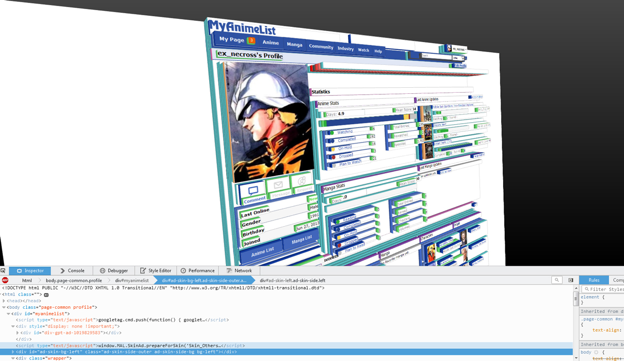 |
More topics from this board
» MAL Game "Fantasy Anime League" Opens for Fall 2024 ( 1 2 3 )Kineta - Sep 12 |
118 |
by simio_curioso
»»
2 hours ago |
|
» Summer Stack Challenges 🎾 ( 1 2 3 4 5 ... Last Page )Kineta - Jul 30 |
322 |
by luinthoron
»»
Yesterday, 3:55 PM |
|
» MAL Game "Fantasy Anime League" Opens for Spring 2024 ( 1 2 3 4 )Kineta - Mar 17 |
156 |
by badabass
»»
Sep 17, 5:59 PM |
|
» Join MAL's Moderator Team!Kineta - Sep 12 |
0 |
by Kineta
»»
Sep 12, 7:26 PM |
|
» Related Anime/Manga Section Changes ( 1 2 3 )Kineta - May 23 |
124 |
by Chronowarp
»»
Sep 10, 5:20 AM |