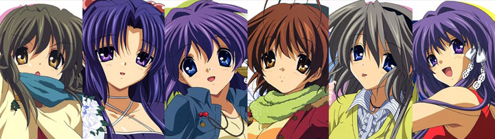
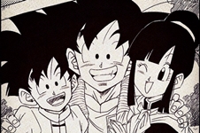
it took me so long to get used to code geass' design, the characters were so elongated with very sharp features and huge eyes, it wasn't something i was used to.
Not a fan of the character designs of Higashi no Eden/3-gatsu no Lion. Also don't like Kyoto Animation's generic artstyle they seem to use in most of their anime.
Boku no Hero Academia easily has the worst character designs of any shonen. At first I thought it was One Piece, but after watching it the goofy cartoon looks fit perfectly with the show. My Hero on the other hand is gross. Almost everyone looks atrocious.
ShinAn said: tbh, I'm not watch one piece anime because of the animation.
of course they couldnt keep movie level every episode, but the tension is lost from the manga
other than that maybe clamp, except code geass
Animation and character designs are two different things though
I know it's going to be a unpopular opinion but I don't like Jojo Part 5 characters designs. Really most male characters look gay. I even mistook a character for girl. I also didn’t like the actual show as much as its predecessors
I'm loving a place further than the universe right now but I'm just not that big of a fan of the character designs, especially the extra-glossy-like hair..
Granted they have their unique style compared to the cookie cutter generic look of many anime, especially coming from A-1 or KyoAni, but doesn't change the fact that it's generally considered to be on the ugly side
Basically tnything made from KyoAni, Shaft and specifically Madoka.
Also 90% of cute girls doing cute things, or any anime with lolis as the main characters.
ShinAn said: tbh, I'm not watch one piece anime because of the animation.
of course they couldnt keep movie level every episode, but the tension is lost from the manga
other than that maybe clamp, except code geass
Animation and character designs are two different things though
probably something more generic looking like sao. I personally like unique designs like kaiji or clamp. I really hate watching an anime that looks the same as every other anime.
One Piece makes me feel unease, the characters seem to be something like a shoujo, but drawn in Chernobyl.
I don't know, sometimes I want to throw up when I see Luffy's face
Higurashi Gou. The white shading looks terrible and the color hurts my eyes every time I look at it. The character design alone is an easy -2 to the final score no matter how the story turns out.
Out of all anime I've seen including everything I drop, I could count on one hand how many anime made me complain about the color. It's just that bad.
sao. the characters look so damn bland it hurts. I never watched the show because of it. I don't even care about it's bad rep, it just looks extremely boring.
Characters with realistic colors/outfits, but normal anime facial features. Character designs following that model tend to be quite forgettable for me. They basically have realistic elements in their color palate with none of the diversity in facial features that would typically go along with more realistic character designs. For example, a show like Anne actually has characters with a variety of head shapes(i.e Marilla has a circular jaw, Diana has a noticeably fatter and circular face when compared to Anne, and Jane Andrews is a midpoint between having the shape of Diana as in very oval with less fat at the top), different nose types(i.e Matthew has a wider nose, Diana's aunt has a crooked nose, Josie's nose is more circular than the other girls in her class, and Mrs. Bluett has a hooked nose), or signs of aging(i.e the winkles present on both Matthew and Marilla). This variety can help the artists portray different personality traits using those facial features. For instance, if you want a character that's more stern-looking, you are able to use thinner and squared face types to showcase that as squares are found in stuff like bricks, so the shape looks stronger and this seeps through into the character design.
This is in itself an advantage the show uses to give the facial features of the cast more of a variety than say DR and it works well for that show as unlike other anime, you actually hang around with the different age groups quite a bit(not as just minor characters, as Matthew and Marillia are consistently there in almost all the episodes). The whole cast isn't just teenagers, so different facial features are more present in it partially due to that. And Laughing Salesman New is even better than Anne in that regard as it's more experimental with facial features. I say this because Anne's younger characters like her friend group are a little too similar to each other in terms of looks which isn't a problem Salesman has at all.
That said, DR does have its own edge because of being more unrealistic in style. You can do crazy stuff with the hair or the outfits to exaggerate the character's personality. If they want to have an egotistical character who has grand delusions about being this super unique(as in how she perceives herself), high-class persona, they can show all that with her design. It fits within that universe for Luneburg to have this fancy gothic lolita dress with huge purple, twin drill hair to go back to the hemidere archetype in a way it wouldn't work out well in Anne's universe. There's a certain freedom that comes with the unrealistic character designs, that the lack of facial difference between the characters starts to not matter all that much to me. As the dress like the silhouette with laces is more formal which matches how she sees herself as above other people, and purple can symbolize royalty as it used to be a rare and expensive dye to have with twin drill tails being something that would be very high maintenance to wear every day which also goes along with her perception of herself as a noble of sorts. Meanwhile, the gothic bit is more in line with how she views herself as a darker character(
she wanted to have a 100 demon servants as her wish that led her to kill Hifumi
).
So with all that said, going half-way with the character design, isn't a good option imo. You lack the advantages of both and only gain the disadvantages. You don't have the freedom of going crazy and doing whatever you want with the colors, hairstyle, and outfits, while you also not gaining the diversity of facial features that comes with a more realistic style.
As much as I love K-On, the character designs of that show kind of suck. They all have the same face, their hairstyles and colors are forgettable as they feel as though they can be easily found elsewhere, and the outfit they are stuck in is a boring school uniform with minor adjustments.
Another example would be Special A, which is basically the same deal, but even worse as the standard design is odd-looking with overly long arms and legs and pretty much no adjustments to the school uniform.
-One Piece
Looks worse than a 5 year-old kid drawing. Even a kid from that age could make a better manga (and anime)...
-JoJo's Bizarre Adventure
It tries to have a tough, maybe manly-like design, but it looks like a deformed, semi-Hulk type of design that looks so ridiculous and "bizarre", rather than being masculine or having some "cool action series" kind-of approach...
-Ghost in the Shell (first film), Innocence and Arise
I never understood (nor liked) that movie (but I liked more SAC series). The second one looked so terrible for me, so I didn't even give it a chance to saw it. In both cases (plus Arise series), the characters' design were so bad that were so discouraging enough to ignore them. Until today, SAC has the best character design from all the GITS universe.
(Also, ScarJo was excellent as Motoko in the live-action movie, but the goddamn writers really sucked it up so bad!)
-Yamato Nadeshiko Shichihenge
Seriously, I tried to like this series, but the design were so lame, sometimes even creepy (and not in a fun way) that nearly before the end of the series, I decided to drop it since it felt more than a obligation to see how this thing ended more than a true interest I could ever have...
-Kill la Kill
I really didn't like the anime at all. The design is supposedly meant to enhance the "energy" and the "dynamism" through the anime, but it end looking so unappealing, but still, highlighting the feminine bodies as eyecandies to "try" to keep the audience watching...
-Naruto
More than a complain about the design overall, I'd like to complain about all the ninja outfits throughout the series. They're all look like tracking suits and seem so boring, lame and distasteful, (plus counting the "rubber" sandals every character have, except for Jiraiya... before anyone of you can rub it into my face)
To keep it short; all the characters don't look like ninjas. Looks like anything else, rather than ninjas...
-Also, most of the CLAMP's style are really exaggerating with the characters' design. Despite that I love Cardcaptor Sakura, sometimes, characters have an irreal, elongated design that looks more like sticks. Sorry, but I had to take it out...
Ciezul said: Maybe jojo. Everyone is lit Gorilla, even they have female gorilla too.
man i dont think because even gucci partnershiped with them because of jojos unique design. But i agree part 1 to 3 had some questionable designs but after that it was all great
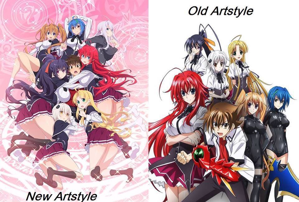
Mici_Angels said: I don't like it when characters are 'shiny' and/or have too much colors that just don't fit. Hetalia's character design change suffered from that, DGray Man Hollow similarly.They just look cheap to me. The new Sailor Moon also feels off.
I hate the character designs of angels in Shingeki no Bahamut even tho the anime is one of my favourites. They all look like hoes to me.
I'm also not keen on some over exaggerated designs, like too big anime eyes or hair. Things like that kept me away from some popular anime like BNHA and One Piece.
Mention said: My answer is xxxHolic.
To be fair, I like the anime. But its character design is my least favorite thing that the anime offers. Everyone is tall and thin like a stick.
What about you?
Do you also not like other CLAMP anime or just xxxholic?
maiawatchesanime said: it took me so long to get used to code geass' design, the characters were so elongated with very sharp features and huge eyes, it wasn't something i was used to.
maiawatchesanime said: it took me so long to get used to code geass' design, the characters were so elongated with very sharp features and huge eyes, it wasn't something i was used to.
Have you not seen any other CLAMP anime?
hey :) no i haven't actually, are all their designs similar? i suppose now that i am familiar with their style after seeing code geass, i won't find other shows as hard to get used to