New
Sep 7, 2020 10:13 PM
#1

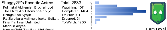
This is a custom layout for modern template lists. If you don't know how to install the codes, click here to view the Beginner's Tutorial. If there are problems: install the latest version, or check the Repair Thread for patches and updates (found here). All premade modern layouts can be found in the gallery by clicking here, and more ways to customize your list can be found here. 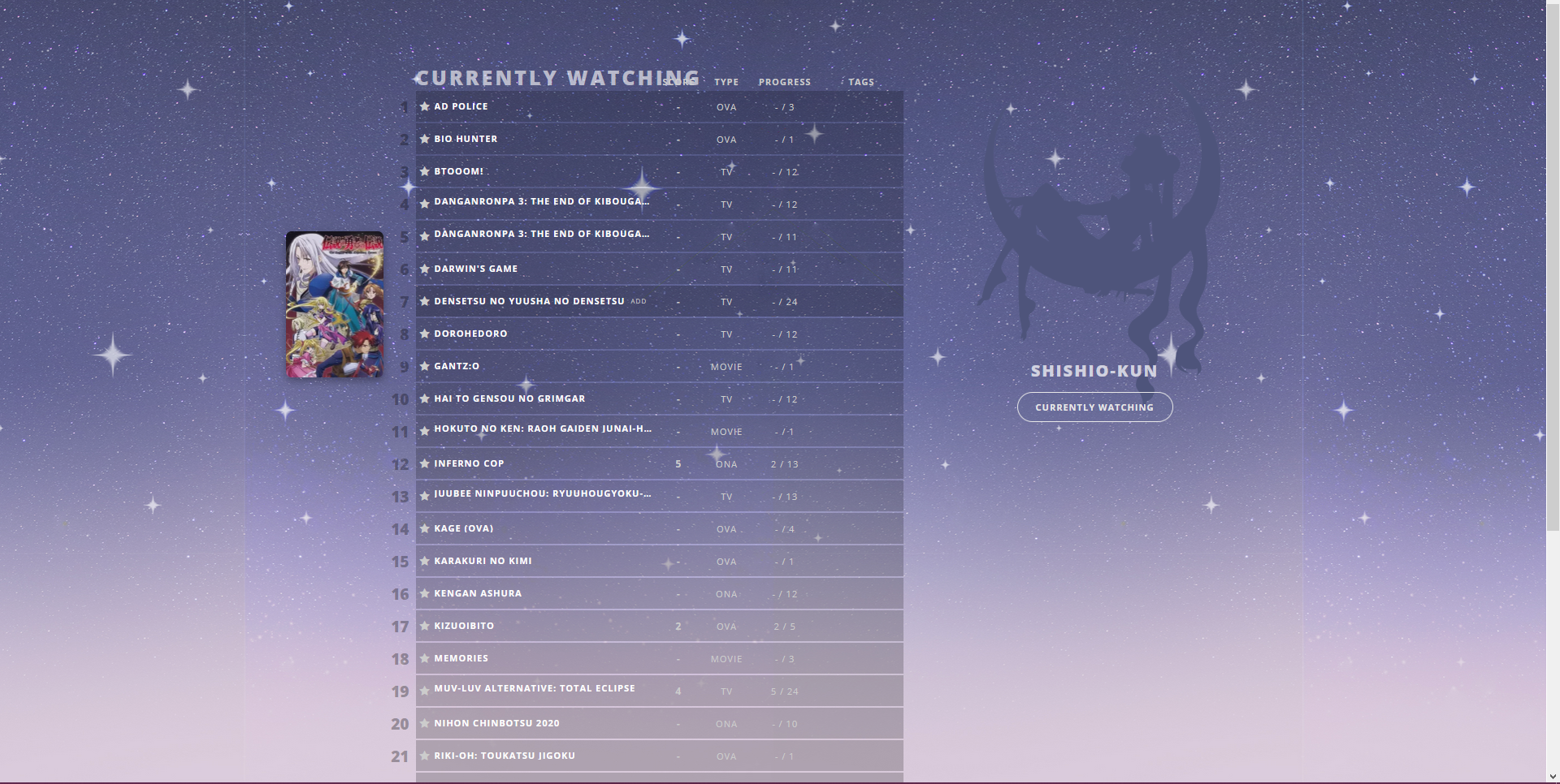 Very easy to customize with the notes in the code! :D Latest Source Codes For anime lists: https://pastebin.com/raw/SwDNvLjD For manga lists: https://pastebin.com/raw/gVDG08FE For anime and manga list sharing the same code: https://pastebin.com/raw/HsLAFS7h When you are finished installing the layout, you can speed up the layout load time by going to line 5 and replacing the usernames SpaceCowboy and Dateyutaka with your own username. Save, and you should still have preview pics but loading much faster. Backup Source code
/*        List design by 5cm         Inspiration from SolitarySetsuna */
/*     Render by ElysionsGarden       Background by Adrian Pelletier  */
@import "https://fonts.googleapis.com/css?family=Open+Sans:400,700,800";
@import "https://malscraper.azurewebsites.net/covers/auto/presets/datatitlebefore";


/*     BACKGROUND
Change the direct image link in parenthesis to change the image.*/
body {
  background: #dfd1e0 repeat-x center/contain fixed
    url(https://image.myanimelist.net/ui/fkLITaJTefafxFKPGRzngtEQrJsgH6ZcWACcraNYdFaj6awlwd5NVw4l1RHz4T-_)!important;
  font: 11px Open Sans; color: #ccc; letter-spacing: 1px; text-transform: uppercase;}


/*     SAILOR MOON
Change the direct image link in parenthesis to change the image.*/
.header:before {
  content: url(https://image.myanimelist.net/ui/fkLITaJTefafxFKPGRzngugMyEX13ps3hq4aKHOIBB5ZXXYjF4jsNJpR0LzOs4Yn);
  display: block; text-align: right;}


/*     LIST COLOR
Generate RGBA colors with this tool
http://www.menucool.com/rgba-color-picker*/
.list-item, .list-table > tbody:nth-of-type(2n+1) {
  background: rgba(0,0,0,.2);}


/*     PREVIEW PIC SETTINGS
Adjust the left and margin top to change the position of the preview pic. Width and height control the size.*/
.data.image ~ .data.title .link:before {
  content: ''; position: absolute; display: block; left: -80px; margin-top: -80px;
  width: 120px; height: 180px; background-size: cover; background-position: center;
  border-radius: 7px; box-shadow: 0px 4px 10px rgba(0,0,0,.4); opacity: 0; z-index: -1;
  transition: all .5s ease-in-out;}


.header .header-title, .header .header-menu, .header .header-info, #header-menu-button,
i.fa, [data-owner=""] .list-menu-float, .icon-menu:not(.profile), .cover-block, #cover-image-container,
.status-menu-container .status-menu .status-button::after, .status-menu-container .search-container,
.list-unit .list-status-title .stats, .list-table .list-table-header .header-title.image,
.list-table .list-table-data .data.image, .icon-watch.ml4, .more,
.list-table .list-table-data .tags .edit {
  display: none;}
.header {
  position: fixed; width: 300px; height: 480px; left: calc(50% + 250px); top: 100px; z-index: 1;}

.header .header-menu.other {
  display: block; top: unset; bottom: 98px; left: -10px;}
.header .header-menu .btn-menu {
  font-size: 0; text-align: center;}
.header a.username {
  background: center/150px url(https://image.myanimelist.net/ui/uDqA5Hj63XC4_7-Zz2-uStdYe5Qg1UiBTLljp3L1u-Q);
  font: 800 20px Open Sans; color: rgba(255,255,255,.7); letter-spacing: 2px; padding: 5px 0;}
.list-menu-float {
  top: 450px; left: calc(50% + 250px); width: 300px; border: 0; z-index: 1;}
.icon-menu.profile {
  background: url(none)!important; display: inline-block; width: auto; height: auto;}
.icon-menu.profile:after {content: attr(href);
  background: center/120px url(https://image.myanimelist.net/ui/uDqA5Hj63XC4_7-Zz2-uStdYe5Qg1UiBTLljp3L1u-Q);
  font: 800 20px Open Sans; color: rgba(255,255,255,.7); letter-spacing: 2px; padding: 5px;
  display: inline-block; white-space: nowrap; text-indent: -443px; overflow: hidden;}
.icon-menu.profile:hover:after, .header a:hover,
.list-table .list-table-data a:not(.edit-disabled):hover,
.status-menu-container .status-menu .status-button:not(.on):hover {
  color: white; text-decoration: none;}
.list-container {
  width: 1000px; top: 100px; background: none!important; border: 0;}
#status-menu {
  position: fixed; width: auto; height: 0; top: 495px; left: calc(50% + 300px); border: 0}
#status-menu .status-menu {
  display: flex; flex-flow: column; align-items: center;}
.status-menu-container .status-menu .status-button {
  order: 2; width: 170px; background: rgba(255,255,255,.2); padding: 2px 0;
  font: bold 11px Open Sans; color: rgba(67,72,104,.7); transition: all .2s ease-in-out;}
.status-menu-container .status-menu .status-button.on {order: 1;
  background: rgba(92,99,145,.2); color: #e8e8e8!important;
  padding: 10px; border-radius: 20px; border: 1px solid #e8e8e8;}
.status-menu-container .status-menu .status-button:not(.on) {
  margin-top: -16px; opacity: 0;}
.status-menu-container .status-menu:hover .status-button:not(.on),
.list-block, .status-menu-container.fixed + div.list-block {
  margin: 0; opacity: 1;}
.list-unit {
  width: 600px; margin-left: 60px;}
.list-unit .list-status-title {
  background: none; width: 600px; position: absolute; top: -12px;}
.list-unit .list-status-title .text {
  font: 800 25px Open Sans; color: rgba(255,255,255,.6); letter-spacing: 3px; text-align: left;}
.list-table {
  border: 0; border-collapse: separate; border-spacing: 0 2px;}
.list-table > tbody:nth-of-type(2n+1):first-child, .list-table .list-table-header .header-title {
  background: none; border: 0; height: 18px;}

.list-table .list-table-header .header-title.title {
  visibility: hidden;}
.list-table .list-table-header .header-title .link.sort, .list-table .list-table-data .data a,
.list-table .list-table-data a.edit-disabled {
  color: #ccc!important;}
.list-table .list-table-data .data {
  height: 30px; border: 0;}
.list-table .list-table-data:hover {
  background: rgba(0,0,0,.1);}
.list-table .list-table-data .data.status {
  background: none!important; font: 13px FontAwesome; padding: 0 5px;}
.data.status.watching:before {
  content: 'f005';}
.data.status.completed:before {
  content: 'f058';}
.data.status.onhold:before {
  content: 'f06a'}
.data.status.dropped:before {
  content: 'f05e'}
.data.status.plantowatch:before {
  content: 'f017';}

.list-table-data:hover .data.title .link:before {
  opacity: .8;}
.list-table .list-table-header .header-title.number {
  position: absolute; visibility: hidden;}
.list-table .list-table-data .data.number {
  position: absolute; left: 12px; margin-top: 3px; font: 800 19px Open Sans; letter-spacing: 0;
  color: rgba(0,0,0,.3); text-align: right; width: 40px; z-index: -2;}
.data.number ~ .data.title .link:before {
  left: -100px;}
.list-table .list-table-data .data.title {
  padding-left: 0;}
.list-table .list-table-data .data.title .link {
  font-size: 1em; line-height: 1em; color: white!important; display: inline-block;
  max-width: 270px; white-space: nowrap; overflow: hidden; text-overflow: ellipsis;}
.content-status {
  background: rgba(0,0,0,.2); padding: 1px 0 2px 4px;
  border-radius: 10px; position: relative; top: -1px;}
.list-table .list-table-data .data.title .add-edit-more {
  float: none; display: inline; font-size: 0; line-height: 0; opacity: 0;
  position: relative; top: -2px; left: 3px;}
.list-table-data:hover .data.title .add-edit-more {
  opacity: 1;}
.add, .edit, .data.tags {
  font-size: 8px; line-height: 1em;}
#footer-block {
  background: none; position: relative; top: 90px;}
#copyright {
  font: 8px Open Sans; color: rgba(0,0,0,.6)}
|
Shishio-kunJun 26, 2023 2:43 PM
Reply Disabled for Non-Club Members
Aug 23, 2021 5:45 AM
#2

hi!! i hope this is okay and i'm not being stupid. i really love this layout but it keeps doing this when i install it 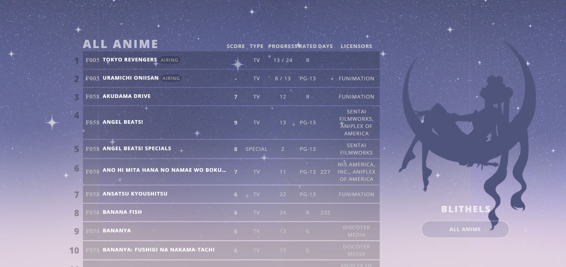 adds the F005 etc. and the lines are in the back are also misplaced is there a fix for this?? thank u :) |
Aug 23, 2021 9:59 AM
#3
blithels said: hi!! i hope this is okay and i'm not being stupid. i really love this layout but it keeps doing this when i install it adds the F005 etc. and the lines are in the back are also misplaced is there a fix for this?? thank u :) New source codes should be fixed now |
Jan 7, 2022 10:56 AM
#4

| Thanks a lot for this great list! I tweaked it a bit here and there, and I'm very happy with the result! https://myanimelist.net/animelist/lifeiscrazy 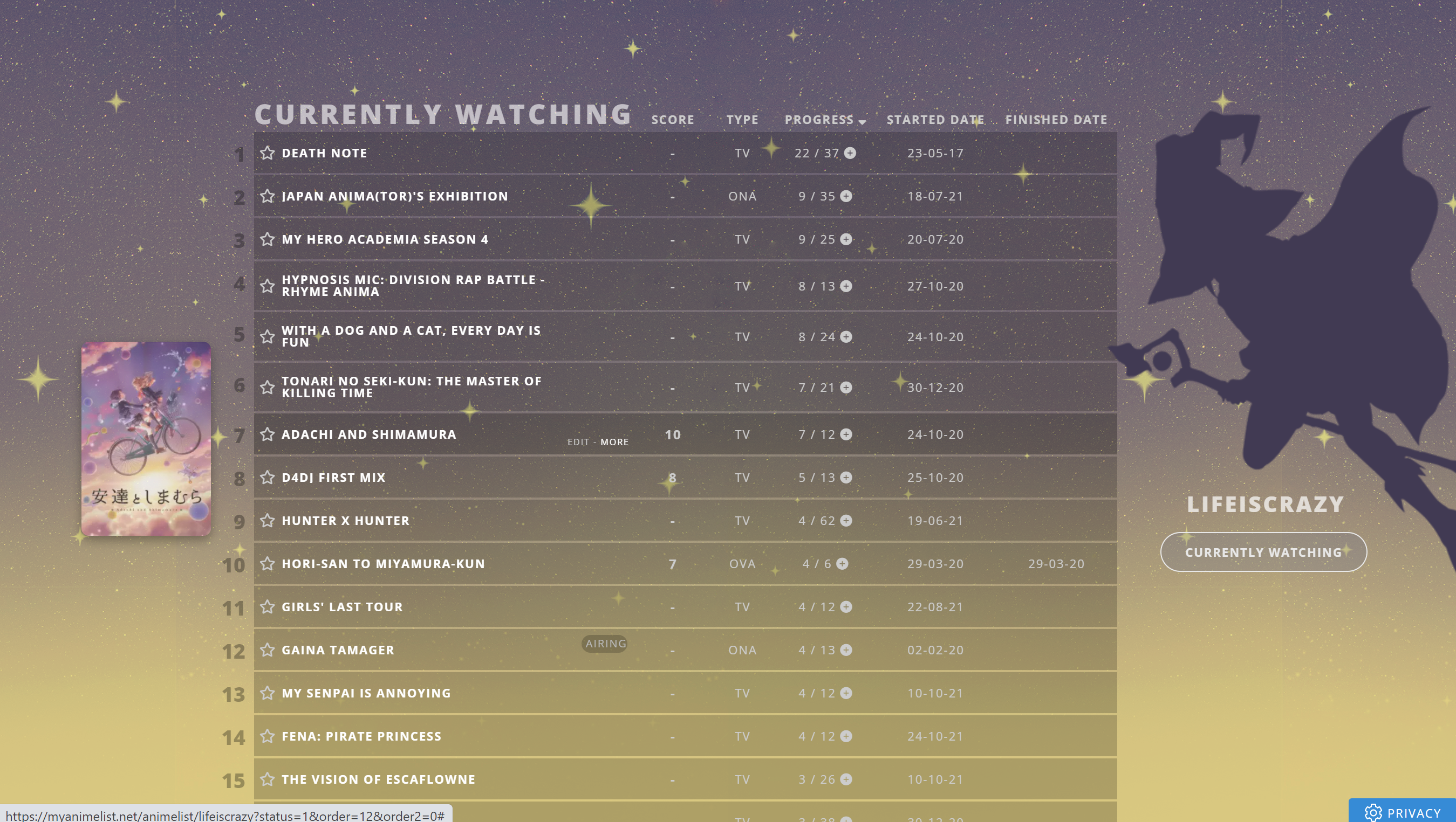 |
lifeiscrazyJan 7, 2022 1:07 PM
 |
Jan 7, 2022 12:55 PM
#5
lifeiscrazy said: Thanks a lot for this great list! I tweaked it a bit here and there, and I'm very happy with the result! https://myanimelist.net/animelist/lifeiscrazy It is really nice, screencapped! Maybe we could have different color variations in the future in the OP |
Jan 7, 2022 1:05 PM
#6
Shishio-kun said: lifeiscrazy said: Thanks a lot for this great list! I tweaked it a bit here and there, and I'm very happy with the result! https://myanimelist.net/animelist/lifeiscrazy It is really nice, screencapped! Maybe we could have different color variations in the future in the OP Thanks, good idea!! :) I like changing up the layouts slightly! Maybe I should try my hand at making one from scratch... sometime :D |
|
Apr 27, 2022 9:34 AM
#7
| Hey, is there a way to change the color of all anime, completed, plan to watch... when it rolls down, not when you hover over it? I really can't find it in the code the original dark blue, purplish color isn't the best for the background I'd like to use. |
 |
Apr 27, 2022 11:41 AM
#8

Tamagami_ said: Hey, is there a way to change the color of all anime, completed, plan to watch... when it rolls down, not when you hover over it? I really can't find it in the code the original dark blue, purplish color isn't the best for the background I'd like to use. https://htmlcolorcodes.com .status-menu-container .status-menu .status-button {
color: rgba(150,150,150,.7) !important;
} |
   My Userscripts - Themes - Userstyles - Extensions (Chrome/Firefox) [API CSS] MAL-Scraper-API Cover/CSS Generator |
Sep 5, 2022 2:44 PM
#9
| Hey, i wanted to use this as a base for my list and i run into 2 problems. and im sure its ez to fix but im just not as good with css. https://imgur.com/a/gtc1EEG here my problem. One image is taken from my preview (looks the same when i open it normally) the other one is in a private browser window without login. 1. the font is different 2. the position of my username is different/back to the default one. I just used the top pixel comment to adjust it as you can see in the 1st screenshot. also tried the position: fixed but that did nothing. also is there a way to add an option to sort by name/title? you can click on score, type and progress to sort by that but not go back to name. and lastly, i use dark reader to make mal into darkmode but that also gets rid of the background in the anime/manga lists. is there a fix for that? thx :D edit: i just noticed that in the private window the hover to show the cover images also does not work. |
AvngrSep 6, 2022 5:06 AM
Sep 6, 2022 7:19 PM
#10

Avngr said: i wanted to use this as a base for my list and i run into 2 problems. and im sure its ez to fix but im just not as good with css. 1. the font is different To fix the font, you'll need to change the formatting of the font import. Find this text near the top of the CSS:  Add a backslash after the "@" so that it looks like this: @\import "https://fonts.googleapis.com/css?family=Open+Sans:400,700,800"; Avngr said: edit: i just noticed that in the private window the hover to show the cover images also does not work. This is mainly another import formatting issue, but not solely. The best solution here is to replace this line:  With these two lines. This should allow all users to see the cover images. @\import "https://malscraper.azurewebsites.net/covers/all/anime/presets/datatitlebefore"; @\import "https://malscraper.azurewebsites.net/covers/all/manga/presets/datatitlebefore"; If you don't use the mangalist, you can skip the second line if you want. You can tell which is for which list because one line says "anime" and the other says "manga". Avngr said: 2. the position of my username is different/back to the default one. I just used the top pixel comment to adjust it as you can see in the 1st screenshot. also tried the position: fixed but that did nothing. The name positioning is because, by necessity, the logged-out username display is controlled by a different HMTL element than the logged-in username. To fix it, you'll have to reposition this other element: .header a.username {
position: relative;
top: 200px;
left: 30px;
}Avngr said: also is there a way to add an option to sort by name/title? you can click on score, type and progress to sort by that but not go back to name. Since it exists on the default list, yes, we can add it back. It just requires a bit of tweaking to other styles so that there is room for it to display. .list-table-header .header-title {
padding-top: 16px;
}
.list-table .list-table-header .header-title.title {
visibility: visible;
padding-left: 0;
}Avngr said: and lastly, i use dark reader to make mal into darkmode but that also gets rid of the background in the anime/manga lists. is there a fix for that? Can't comment on this as I don't use it, but unless it has a toggle for specific websites or webpages, probably not. The people I've talked to in the past who use that extension ended up disabling it. |
Sep 6, 2022 7:26 PM
#11
lifeiscrazy said: Thanks a lot for this great list! I tweaked it a bit here and there, and I'm very happy with the result! https://myanimelist.net/animelist/lifeiscrazy I really like what you did here, great colours! And I see you've updated the design to support some of the new features too. Do you mind if I use some of your CSS to update the theme for other people? I won't take your specific colours or image. |
Sep 7, 2022 5:39 AM
#12
| Thx Valerio Lyndon for the response. The image preview still does not work but thats really not a big problem. The other fixes worked! ty :) |
Sep 7, 2022 8:00 AM
#13
| @Valerio_Lyndon I did want to make an easy-to-recolor version of this before, and have some premade colors, like we did with the basic designs* and the Classic Square layouts which were all heavily used https://myanimelist.net/forum/?topicid=1501171 https://myanimelist.net/forum/?topicid=1198609 And I also wanted to have a PSD silhouette anyone could put into Photopea and replace with their own pics to make them own image for the layout Anyways it'd be awesome to have recoloring in your version of this! * Also the basic designs were used a lot, or at least had a lot of hits, its just no one talked about them since there were virtually no problems with them (and people didn't say thanks in club very much ":D) |
Sep 9, 2022 1:09 PM
#14
Valerio_Lyndon said: lifeiscrazy said: Thanks a lot for this great list! I tweaked it a bit here and there, and I'm very happy with the result! https://myanimelist.net/animelist/lifeiscrazy I really like what you did here, great colours! And I see you've updated the design to support some of the new features too. Do you mind if I use some of your CSS to update the theme for other people? I won't take your specific colours or image. Hey! Yeah, sure you can :) At first I thought about just hiding the icons.. but in the end I actually didn't mind them but wanted to change them up haha. I tried to do all my changes in separate codes so I could have the original list code if it ever got updates or something. But I think I changed/removed some of the original code too because it messed stuff up XD |
|
Sep 11, 2022 12:34 AM
#15
lifeiscrazy said: Valerio_Lyndon said: Do you mind if I use some of your CSS to update the theme for other people? I won't take your specific colours or image. Hey! Yeah, sure you can :) At first I thought about just hiding the icons.. but in the end I actually didn't mind them but wanted to change them up haha. I tried to do all my changes in separate codes so I could have the original list code if it ever got updates or something. But I think I changed/removed some of the original code too because it messed stuff up XD Thanks! I added in some of your codes with some tweaks to the version I'm maintaining. Keeping the codes separate makes a lot of sense, but yes it can be a bit much at times over-riding so much other stuff lol. |
Sep 11, 2022 12:35 AM
#16
Shishio-kun said: I did want to make an easy-to-recolor version of this before, and have some premade colors, like we did with the basic designs* and the Classic Square layouts which were all heavily used https://myanimelist.net/forum/?topicid=1501171 https://myanimelist.net/forum/?topicid=1198609 And I also wanted to have a PSD silhouette anyone could put into Photopea and replace with their own pics to make them own image for the layout Anyways it'd be awesome to have recoloring in your version of this! * Also the basic designs were used a lot, or at least had a lot of hits, its just no one talked about them since there were virtually no problems with them (and people didn't say thanks in club very much ":D) A PSD is a great idea! I would do it myself, but the tutorial part is harder to do. I should have a recolour section ready soon as well. It'll be in mod form as to keep the original code intact. |
Valerio_LyndonSep 11, 2022 1:59 AM
Sep 11, 2022 3:16 PM
#17
Here's all the codes for easy recolouring:/* Restyle Theme */
/* BACKGROUND */
body {
background-color: #dfd1e0 !important;
}
/* REGULAR TEXT */
body,
.list-table .list-table-header .header-title .sort-icon,
.list-table .list-table-header .header-title .link.sort,
.list-table .list-table-data .data a,
.list-table .list-table-data a.edit-disabled,
.list-table .list-table-data .data.title .notes .text,
[class^="icon-watch"] .malicon,
.mal-modal .mal-modal-dialog .mal-modal-content a:hover,
.mal-modal .mal-modal-dialog .mal-modal-content .mal-modal-header
{
color: #ccc !important;
}
/* BRIGHT TEXT */
.icon-menu.profile:hover::after,
.header a:hover,
.status-menu-container .status-menu .status-button:not(.on):hover,
.list-table .list-table-data a:not(.edit-disabled):hover,
.list-table .list-table-data .data.title .link,
#recaptcha-terms a:hover,
.mal-modal .mal-modal-dialog .mal-modal-content a,
.mal-modal .mal-modal-dialog .mal-modal-content button.btn-close
{
color: #fff !important;
}
/* USERNAME TEXT */
.header a.username,
.icon-menu.profile:after {
color: rgba(255,255,255,.7);
}
/* NUMBER TEXT */
.list-table .list-table-data .data.number {
color: rgba(0,0,0,.3);
}
/* FOOTER TEXT */
#copyright,
#recaptcha-terms,
#recaptcha-terms a {
color: rgba(0,0,0,.6);
}
/* CATEGORY MENU DROPDOWN */
.status-menu-container .status-menu .status-button {
background: rgba(255,255,255,.2);
color: rgba(67,72,104,.7);
}
/* CATEGORY MENU SELECTED */
.status-menu-container .status-menu .status-button.on {
background: rgba(92,99,145,.2);
color: #e8e8e8 !important;
border-color: #e8e8e8;
}
/* LIST ROW BACKGROUND */
.list-item,
.list-table > tbody:nth-of-type(2n+1) {
background: rgba(0,0,0,.2);
}
/* ON HOVER */
/* Applied -on top- of the other background. */
.list-table .list-table-data:hover {
background: rgba(0,0,0,.1);
}
/* AIRING STATUS */
.content-status {
background: rgba(0,0,0,.2);
}
/* IMAGE SHADOW */
.list-table .list-table-data .data.image .link {
box-shadow: 0px 4px 10px rgba(0,0,0,.4);
}
/* STREAMING POPUP BACKGROUND */
.mal-modal .mal-modal-dialog .mal-modal-content {
background-color: #8783b366 !important
}You can also find it on the Theme Customiser, along with updated code that doesn't require a cover generator and supports all the new MAL features.  |
Valerio_LyndonJul 24, 2023 4:30 PM
Jan 7, 2023 5:45 PM
#18
| Hi, i just installed your amazing template and ran into a little problem i was hoping you could help me with. The currently watching option is overlaping with score and type, and i am not sure how to fix it. There is also missing the score and if i may have another request for the button where you choose all anime, currently watching etc. to be moved left and up next to the top of the list? thank you. |
Feb 8, 2023 7:29 AM
#19
| Thanks for this cool and clean layout! Just replaced the picture on the right part. Here's my list: https://myanimelist.net/animelist/SkyIsDVRK |
Feb 21, 2023 1:31 PM
#20
SkyIsDVRK said: Thanks for this cool and clean layout! Just replaced the picture on the right part. Here's my list: https://myanimelist.net/animelist/SkyIsDVRK Nice, glad you like it!! :D |
Feb 21, 2023 1:32 PM
#21
xnavix said: Hi, i just installed your amazing template and ran into a little problem i was hoping you could help me with. The currently watching option is overlaping with score and type, and i am not sure how to fix it. There is also missing the score and if i may have another request for the button where you choose all anime, currently watching etc. to be moved left and up next to the top of the list? thank you. I think the reason is it's not made for all those columns, so you'd have to cut some out or we'd have to edit it to support more |
Mar 29, 2023 6:12 AM
#22

| Hello, I installed this theme. Thank you. <3 |
| Forum set + pfp by my aibou Rin. <3 |
Jun 16, 2023 6:56 PM
#23

| Thanks a bunch for this list! I modified it, and I'm very happy with how the result came out! https://myanimelist.net/animelist/gabitzxa |
 |
Jun 17, 2023 3:31 PM
#24
Gabitzxa said: Great choice of images and colours!Thanks a bunch for this list! I modified it, and I'm very happy with how the result came out! https://myanimelist.net/animelist/gabitzxa |
Jun 17, 2023 3:46 PM
#25
Gabitzxa said: Thanks a bunch for this list! I modified it, and I'm very happy with how the result came out! https://myanimelist.net/animelist/gabitzxa Very cool!! 😃 |
Jun 17, 2023 4:57 PM
#26
Shishio-kun said: Appriciate it! i coudn't do it without your base "template"Gabitzxa said: Thanks a bunch for this list! I modified it, and I'm very happy with how the result came out! https://myanimelist.net/animelist/gabitzxa Very cool!! 😃 Valerio_Lyndon said: I mean hanako kun is pretty cool so ya, it will only be a matter of time until i will decide to change my theme agianGabitzxa said: Great choice of images and colours!Thanks a bunch for this list! I modified it, and I'm very happy with how the result came out! https://myanimelist.net/animelist/gabitzxa |
|
Jun 26, 2023 9:09 AM
#27
| I've been using this list for years and have just updated it today to the newer source code. https://myanimelist.net/animelist/P1kus3ru There is just one thing that is a bit troublesome is the time it takes to load after you try to sort or switch the status. I guess it's because the whole list has to be refetched which takes a bit. I don't mind it that much but my friend told me he finds it annoying that it takes slower to filter than other lists. There isn't anything to fix this right? |
Jun 26, 2023 2:18 PM
#28
P1kus3ru said: I've been using this list for years and have just updated it today to the newer source code. https://myanimelist.net/animelist/P1kus3ru There is just one thing that is a bit troublesome is the time it takes to load after you try to sort or switch the status. I guess it's because the whole list has to be refetched which takes a bit. I don't mind it that much but my friend told me he finds it annoying that it takes slower to filter than other lists. There isn't anything to fix this right? It's the MALscraper import for big preview pics slowing it down. See the repair sticky (it has a green heart), part B, there's way to replace the MALscraper import with a more personalized one using your username that will be much faster. There's a couple other tips on speeding on layouts in part H, but the main thing is replacing the malscraper with one using your username |
Jun 26, 2023 2:44 PM
#29
| Opening post was also updated with new source codes that should be easy to edit if you want to speed them up |
Mar 9, 2024 9:29 PM
#30
| I really like the layout and have replaced the MALscraper import with my personalized one (replaced username) but the preview pictures aren't showing. Is there something else I might be missing? https://myanimelist.net/animelist/Shiba4 |
Mar 10, 2024 8:54 PM
#31
Reply to Shiba4
I really like the layout and have replaced the MALscraper import with my personalized one (replaced username) but the preview pictures aren't showing. Is there something else I might be missing? https://myanimelist.net/animelist/Shiba4
@Shiba4 For some reason, despite the cover images not requiring the "Image" column to be ticked, the CSS is written to block cover images until the "Image" column is enabled. To fix this, find this code near line 33...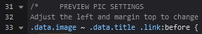 And delete the ".data.image ~ " text from the start of that line. Once done, it should look like this: 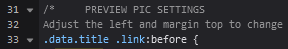 That should allow the images to display. Save your changes and check your list. The other solution would probably be to enable images in your list settings, which is a good debugging step for cover images on any list layout. It just isn't required for this one, provided you follow the steps above. |
Mar 10, 2024 10:21 PM
#32
Reply to Valerio_Lyndon
@Shiba4 For some reason, despite the cover images not requiring the "Image" column to be ticked, the CSS is written to block cover images until the "Image" column is enabled. To fix this, find this code near line 33...
And delete the ".data.image ~ " text from the start of that line. Once done, it should look like this:
That should allow the images to display. Save your changes and check your list.
The other solution would probably be to enable images in your list settings, which is a good debugging step for cover images on any list layout. It just isn't required for this one, provided you follow the steps above.
| @Valerio_Lyndon Thank you, it worked! Love the layout! |
Mar 28, 2024 6:17 AM
#33

| I really like the design and minimalism of this but I was wondering is there a way I can move my username and the dropdown box for selecting currently watching, completed, etc. to the other side at the top? Picture for reference of where im talking about https://i.imgur.com/d1ZZik5.png I tried my best to go though and edit things I thought might change it but im not good at all this coding and couldn't find a way. Also when you select currently watching it gets overlapped by the score and progress https://i.imgur.com/aUYGQBS.png Any help would be much appreciated :) |
Mar 31, 2024 11:13 PM
#34
Reply to Tommy-Pickles
I really like the design and minimalism of this but I was wondering is there a way I can move my username and the dropdown box for selecting currently watching, completed, etc. to the other side at the top? Picture for reference of where im talking about https://i.imgur.com/d1ZZik5.png I tried my best to go though and edit things I thought might change it but im not good at all this coding and couldn't find a way. Also when you select currently watching it gets overlapped by the score and progress https://i.imgur.com/aUYGQBS.png Any help would be much appreciated :)
The easiest way to move it would be to override the "top" and "left" properties on each relevant element. Here's some code that can be put at the bottom that does that. I used some custom variables (the "--" prepended properties) to avoid repeating our new positions 3 times, which also means it's easier for you to tweak. :root {
--custom-offset-x: -200px;
--custom-offset-y: -360px;
}
.header {
left: calc(50% - 240px + var(--custom-offset-x));
top: calc(100px + var(--custom-offset-y));
transform: translateX(-100%);
}
#status-menu {
left: calc(50% - 300px + var(--custom-offset-x));
top: calc(495px + var(--custom-offset-y));
transform: translateX(-100%);
}
.list-menu-float {
left: calc(50% - 240px + var(--custom-offset-x));
top: calc(450px + var(--custom-offset-y));
transform: translateX(-100%);
}Keep in mind this will not display correct at very small screen widths (it will go off screen), but for most people it will be fine. There are better ways to do this, but they're more complex so I figured we should go with the quickest way for now. We can definitely look at other options if you want though. The text overlap has a couple of different fixes you can apply, depending on which way you prefer. One option is to move the list down a bit, which is fool-proof but loses some of the original charm. .list-table {
padding-top: 20px;
} The other option is to change the text to be shorter, which would be my preferred solution. I've done that by setting the font-size of the regular text to 0 and then adding new text with the ::before selector. :is(.watching,.reading) .list-status-title .text {
font-size: 0;
}
.list-status-title .text::before {
font-size: 25px;
cursor: text;
}
.watching .list-status-title .text::before {
content: "Watching";
}
.reading .list-status-title .text::before {
content: "Reading";
} I love the Frieren theming! Great use of that image. |
Mar 31, 2024 11:45 PM
#35
Reply to Valerio_Lyndon
The easiest way to move it would be to override the "top" and "left" properties on each relevant element. Here's some code that can be put at the bottom that does that. I used some custom variables (the "--" prepended properties) to avoid repeating our new positions 3 times, which also means it's easier for you to tweak.
Keep in mind this will not display correct at very small screen widths (it will go off screen), but for most people it will be fine. There are better ways to do this, but they're more complex so I figured we should go with the quickest way for now. We can definitely look at other options if you want though.
The text overlap has a couple of different fixes you can apply, depending on which way you prefer. One option is to move the list down a bit, which is fool-proof but loses some of the original charm.
The other option is to change the text to be shorter, which would be my preferred solution. I've done that by setting the font-size of the regular text to 0 and then adding new text with the ::before selector.
I love the Frieren theming! Great use of that image.
:root {
  --custom-offset-x: -200px;
  --custom-offset-y: -360px;
}
.header {
	left: calc(50% - 240px + var(--custom-offset-x));
	top: calc(100px + var(--custom-offset-y));
	transform: translateX(-100%);
}
#status-menu {
	left: calc(50% - 300px + var(--custom-offset-x));
	top: calc(495px + var(--custom-offset-y));
	transform: translateX(-100%);
}
.list-menu-float {
	left: calc(50% - 240px + var(--custom-offset-x));
	top: calc(450px + var(--custom-offset-y));
	transform: translateX(-100%);
}
Keep in mind this will not display correct at very small screen widths (it will go off screen), but for most people it will be fine. There are better ways to do this, but they're more complex so I figured we should go with the quickest way for now. We can definitely look at other options if you want though.
The text overlap has a couple of different fixes you can apply, depending on which way you prefer. One option is to move the list down a bit, which is fool-proof but loses some of the original charm.
.list-table {
	padding-top: 20px;
}
The other option is to change the text to be shorter, which would be my preferred solution. I've done that by setting the font-size of the regular text to 0 and then adding new text with the ::before selector.
:is(.watching,.reading) .list-status-title .text {
	font-size: 0;
}
.list-status-title .text::before {
	font-size: 25px;
	cursor: text;
}
.watching .list-status-title .text::before {
	content: "Watching";
}
.reading .list-status-title .text::before {
	content: "Reading";
}
I love the Frieren theming! Great use of that image.
| @Valerio_Lyndon This is exactly what I was looking for!! Thank you so much for your awesome skills and knowledge. Valerio_Lyndon said: I love the Frieren theming! Great use of that image. Again thank you! The second I saw the image I knew what had to be done and this template fit perfectly. Your theme customizer is so easy to work with and done so well I cant thank you enough for how much fun it is to customize the themes you have on there. I have like 6 different saved themes all done through that website. Thank you again I cant wait to see more of what you make <(´⌯ ̫ ⌯`)> |
Tommy-PicklesMar 31, 2024 11:49 PM
Reply Disabled for Non-Club Members
More topics from this board
» ❓ Ask for help here + See Frequently Asked Questions ( 1 2 3 4 5 ... Last Page )Shishio-kun - Apr 15, 2010 |
7910 |
by Shishio-kun
»»
Apr 27, 11:31 AM |
|
Sticky: » [ USERSTYLES & DARK THEMES ] All MyAnimeList themesShishio-kun - Jan 28, 2023 |
33 |
by Shishio-kun
»»
Apr 27, 10:34 AM |
|
» [WINDOWS] ⭐️ How to install custom icons and cursors + 300 icons/cursors!Shishio-kun - Jan 2, 2024 |
35 |
by Shishio-kun
»»
Apr 21, 8:52 AM |
|
» [CSS - Modern] ⭐️ Brink by V.L -- Cover-style theme! ( 1 2 3 4 5 ... Last Page )Valerio_Lyndon - Mar 16, 2019 |
448 |
by YumiTasty
»»
Apr 18, 4:25 PM |
|
Sticky: » [ LIST TUTORIALS ] All CSS guides and extensions for listsShishio-kun - Feb 20, 2023 |
26 |
by Shishio-kun
»»
Apr 15, 11:42 AM |