New
Jun 11, 2014 5:13 PM
#1
This is a custom layout for classic template lists. If you don't know how to install the codes, use the Beginner's Tutorial: click here. If there are problems: install the latest version, or check the Repair Sticky for patches and updates (found here). All premade classic layouts can be found in the gallery by clicking here. These are re-edits I made of our #1 most popular CSS Square layout. My version focuses on making certain parts more easily changeable through codes in your CSS edit box rather than with the imports (so if the Dropbox version crashes you can use these). You should be able to easily change the background pics, icons and colors easily with the notes in the code which I organized and outlined. There are also some tweaked versions too. Get the codes by clicking the links under the pics. Don't import these codes, they're made to be put in the CSS edit box. Recommended Settings Tags is optional, however. 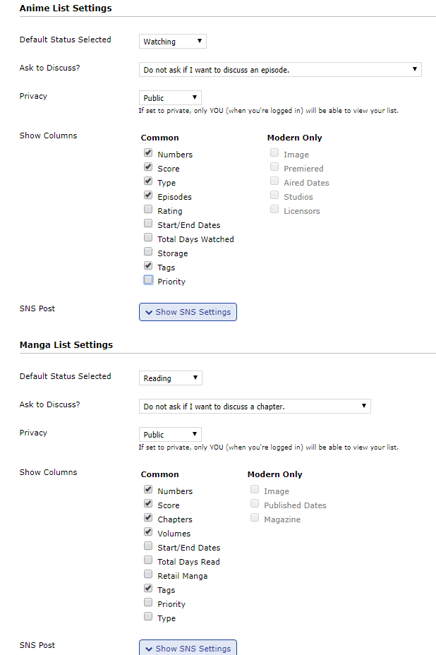 Original versions (rehosted) This is one made to look like the original Square layouts and you can customize the banner, icons, and backgrounds- plus alter many of the colors and fonts with the codes in the CSS!  Links to codes for these layouts Lelouch theme (black) Ocean theme (blue) Light theme (white) Fire theme (red) Nature theme (green) Single custom banner and background This are variations of the themes above but with abstract backgrounds behind the list and custom banners from various games.  Links to codes for these layouts Guilty Gear (black) Touhou (blue) Chun-li (white) Umineko (red) Warcraft (green) Multiple custom banners and background This is another version with unique Hatsune Miku backgrounds on each banner depending of each category page.  Transparent menus w/wide list, long covers and no banner This is a version with no banners so you can see the whole background, plus it has glowing buttons, several characters, a wide list and long covers to show off your anime/manga to their maximum potential. I've made two versions of the code, one with headers (as in the example below) and one without headers, as shown here. The one without headers is useful if you plan to only show one anime category at a time.  Links to codes for this layout Holographic Square layout (with headers) Holographic Square layout (with no headers) Changing colors of the text There are already notes in the code to change the color of text, but you can add these to the bottom to change text colors easily (click the spoiler). Important: When adding codes to the CSS edit box, make sure you delete any "Read more:" lines that get added in (circled here), or else codes after it won't work. Change color of list text and link colors all at once You can change the color of all the text thats red in the pic below at once. Add this code below the pic to the bottom of your CSS. Change "red" to the color you want for the text. It only affects the color of text in red in the example pic. It won't affect the search box text color, header color, the color of links on hover, or the copyright colors. To change those colors and other individual parts of the layout, see after.  /* MAIN TEXT AND LINK COLORS */ .table_header a, .status_selected a, .status_not_selected a, .td1:first-of-type, .td2:first-of-type, .td1, .td2, .td1 a, .td2 a, .animetitle, .category_totals, #grand_totals{ color: red; } Color of the header Add this code to the bottom to control the color of the text circled. Change "white" to the color you want.  /* HEADER TEXT COLOR */ .header_cw, .header_completed, .header_onhold, .header_dropped, .header_ptw{ color: white; } Color of links and tags text on hover Add this code to the bottom to control the color of the text circled. Change "white" to the color you want.  /* LINK TEXT AND TAGS TEXT ON HOVER */ a:hover, #mal_cs_listinfo a:hover, #mal_cs_links a:hover, #mal_cs_otherlinks a:hover { color: white !Important; } Search bar text color Add this code to the bottom to control the color of the text circled. Change "white" to the color you want.  /* TOPBAR SEARCHBOX COLOR */ #searchBox{ color: white !important; } Topbar buttons Add this code to the bottom to control the color of the text circled. Change "silver" to the color you want.  /* TOPBAR BUTTON TEXT COLOR */ .table_header a{ color: silver; } Category buttons Add this code to the bottom to control the color of the text circled. Change "silver" to the color you want.  /* SELECTED CATEGORY LINK TEXT COLOR*/ .status_selected a{ color: silver; } /* UNSELECTED CATEGORY LINK TEXT COLOR */ .status_not_selected a { color: silver; } Anime info colors Add this code to the bottom to control the color of the text circled. Change "silver" to the color you want.  /* ANIME INFO BUBBLE COLOR */ .td1:first-of-type, .td2:first-of-type, .td1, .td2, .td1 a, .td2 a { color: silver; } Animetitles  /* ANIMETITLE COLOR */ .animetitle{ color: silver; } Totals sections Add this code to the bottom to control the color of the text circled. Change "silver" to the color you want. First code is for the category totals second is for the grand totals in the text.  /* CATEGORY TOTALS COLOR, GRAND TOTALS COLOR */ .category_totals{ color: silver ; } #grand_totals { color: silver ; } Copyright section Add this code to the bottom to control the color of the text circled. Change "silver" to the color you want.  /* COPYRIGHT COLOR */ #copyright { color: silver ; } Add-ons Longer covers, glowing buttons, wider list, remove the headers, and more. Important: When adding codes to the CSS edit box, make sure you delete any "Read more:" lines that get added in (circled here), or else codes after it won't work. For longer covers  You can easily make your covers look longer like in the after pic above. Simply copy the codes from this link and paste them at the bottom of your CSS. http://tny.cz/01cf662a For wider list/more covers per line  Look in the code, and increase the list width. The wider it is, the more covers you'll see on it. You can extend the width to 100%. Afterwards you might want to adjust the code under it if part of your list looks misaligned. You'll find it under: /* LIST WIDTH (NUMBER OF COVERS PER ROW) If it doesn't work, try to add to the bottom of your CSS edit box (don't import), and if it still doesn't you can report it here in this topic. http://tny.cz/eba77ba6 Remove the headers  Simply add to your code: .header_cw, .header_completed, .header_onhold, .header_dropped, .header_ptw { margin-top: -120px; visibility: hidden; } .header_cw:before, .header_completed:before, .header_onhold:before, .header_dropped:before, .header_ptw:before, .header_cw:after, .header_completed:after, .header_onhold:after, .header_dropped:after, .header_ptw:after { visibility: visible !important; } Make category buttons glow for what category you're on  This is a useful feature to combine with the one where you remove the header, in order to better tell what category you're on. Its already installed automatically in the Vocaloid and Hologram versions. You can replace #fff with a color you want for your selected category buttons! .status_selected { background-color: ; box-shadow: 0px 0px 5px #fff; } Bring back overflow to icons  The original 2012 Square layout had this feature (seen in the example pic above) for when you hover an icon where your name is too long, but I removed the function from all my versions above, however, you can readd it with the code below: #mal_cs_listinfo a, #mal_cs_links a, #mal_cs_otherlinks a { overflow-x: auto !important; } How to make custom changes/fixes fast! Change wallpaper, icons, banners, button colors, fix covers, and setting covers for manga lists. How to change the images for wallpaper, icons or banner with your own You'll change the images for these parts through the codes near the top of your CSS edit box. I've put them all near the top on purpose to make it easy to find. They are clearly outlined for you and say things like "BANNER (TOP IMAGE)". If you never learned how to change out an image before, see this tutorial: http://myanimelist.net/forum/?topicid=415315 How to change the color of buttons and other parts? You'll find many color codes in the second half of the CSS. You can change background color and text for nearly every part of the layout I could think of. Just skim through the descriptions to find where to change the part you want. Updating your missing covers if some (or all!) don't show up Use this topic: http://myanimelist.net/forum/?topicid=443333 Set longer anime title (title, not the cover!) and tag spaces Find the codes under MAX HEIGHT OF ANIME TITLES and use those. |
Shishio-kunNov 1, 2018 7:43 PM
 |
Jul 14, 2014 4:32 AM
#2
| I've finally finished editing and testing these. If you see issues with the position or width of stuff let me know with your resolution pls. Also if you make a customized version be sure to post it here! |
|
Jul 14, 2014 10:10 AM
#3
| Thank you very much. I have a few questions. Some of them weren't answered by the author of the original Square layout. 1. How can I add the Long Covers addon from the original to the new code? 2. I like to write my thoughts in the Tags box. Is there a way to increase the Tag box's size? 3. Some long titles like "Jojo's Bizarre Adenture: Stardust Crusaders". Is there anything that can be done to adjust title length? |
Jul 15, 2014 1:13 AM
#4
Vladislav_Paizis said: Thank you very much. I have a few questions. Some of them weren't answered by the author of the original Square layout. 1. How can I add the Long Covers addon from the original to the new code? 2. I like to write my thoughts in the Tags box. Is there a way to increase the Tag box's size? 3. Some long titles like "Jojo's Bizarre Adenture: Stardust Crusaders". Is there anything that can be done to adjust title length? I've added a section to the first post on how to make the covers longer with that add-on (For longer covers). I've added a couple codes to the bottom of the CSS sources to control the second and third thing. So you may want to recopy the source code. You just want to add 30-100px to those parts until they get to where you want them on your layout. |
|
Jul 20, 2014 9:57 PM
#5

| thank you so much for this its amazeing! can you help me remove the banner from the top? also is there a way to have multiple backgrounds that switch out each time somone visits my list or chooses one of the images at random? |
| El Psy Congroo-Rintarou Okabe |
Jul 20, 2014 11:28 PM
#6
fufoojoe said: thank you so much for this its amazeing! can you help me remove the banner from the top? also is there a way to have multiple backgrounds that switch out each time somone visits my list or chooses one of the images at random? For the first layout you can remove the banner with #inlineContent { display: none !important;} and for the second you'd use .status_selected:nth-of-type(6) a:before, .header_cw:before, .header_completed:before, .header_onhold:before, .header_dropped:before, .header_ptw:before{ display: none;} For random background images I've made a topic about that already, check the "customize your list" tutorials linked from the front page |
|
Aug 5, 2014 9:12 AM
#7
Sep 3, 2014 2:12 AM
#8
| Hello. I'm using the Guilty Gear layout and I want some advice on how to fix the banner (top image). It used to show Sol Badguy's face, but now it is fixed on his neck and chest. It's the same for both anime and manga lists. http://myanimelist.net/animelist/Vladislav_Paizis |
Vladislav_PaizisSep 3, 2014 3:01 AM
Sep 3, 2014 8:47 AM
#9
Vladislav_Paizis said: Hello. I'm using the Guilty Gear layout and I want some advice on how to fix the banner (top image). It used to show Sol Badguy's face, but now it is fixed on his neck and chest. It's the same for both anime and manga lists. http://myanimelist.net/animelist/Vladislav_Paizis Try adding background-position: 60% 13%; background-size: cover; under inline content |
|
Sep 23, 2014 8:42 AM
#10
| I've re-added the Vocaloid layout with multiple banner backgrounds for each page, an "uncrashable" version like the others |
|
Sep 23, 2014 9:55 AM
#11
Shishio-kun said: I've re-added the Vocaloid layout with multiple banner backgrounds for each page, an "uncrashable" version like the others What about for this version of square layout? http://myanimelist.net/forum/?topicid=459189 |
 |
Sep 23, 2014 11:03 AM
#12
Symqn said: Shishio-kun said: I've re-added the Vocaloid layout with multiple banner backgrounds for each page, an "uncrashable" version like the others What about for this version of square layout? http://myanimelist.net/forum/?topicid=459189 ? The first one in top post is the same as that version, just edited so it can be posted on MAL without dropboxes (which crash the layout if the dropbox goes down). Its the same codes as the original dark theme with Lelouch banner. That original you've linked to is down for now |
|
Sep 23, 2014 2:58 PM
#13
| what are the settings for the ocean themed version instead of dark for the Single custom banner and background layout. stupid question but im a stupid afterall lol XD |
~I am just one sadist who supports friends~  |
Sep 24, 2014 11:41 AM
#14
| I can't seem to get the Anime Info Text Color to stop overwriting the Title Color any Ideas? /* ANIME INFO TEXT COLOR */ .td1:first-of-type, .td2:first-of-type, .td1, .td2, .td1 a, .td2 a { color:red ; } /* ANIMETITLE COLOR */ .animetitle{ color:gold ; } |
Sep 24, 2014 12:23 PM
#15
eImpulse said: I can't seem to get the Anime Info Text Color to stop overwriting the Title Color any Ideas? /* ANIME INFO TEXT COLOR */ .td1:first-of-type, .td2:first-of-type, .td1, .td2, .td1 a, .td2 a { color:red ; } /* ANIMETITLE COLOR */ .animetitle{ color:gold ; } Add !important before the semicolon under animetitle. So like: /* ANIMETITLE COLOR */ .animetitle{ color:gold !important; } |
|
Sep 24, 2014 12:31 PM
#16
The_Pyromaani said: what are the settings for the ocean themed version instead of dark for the Single custom banner and background layout. stupid question but im a stupid afterall lol XD You have to manually adjust the colors to look like the ocean theme |
|
Sep 24, 2014 8:51 PM
#17
| Thank you, Im just a novice glad to have the help of an expert. |
Sep 26, 2014 6:25 AM
#18
| Can anyone please elucidate this If you look behind the covers, you'll see a faint table between the covers and main background. This is the background. You can adjust the width of it with the codes under LIST WIDTH. This will also change the number of animes you have on each row. Increase= more per row. How do we change the number of anime per row? |
 |
Sep 26, 2014 11:36 AM
#19
OppaiTaisho said: Can anyone please elucidate this If you look behind the covers, you'll see a faint table between the covers and main background. This is the background. You can adjust the width of it with the codes under LIST WIDTH. This will also change the number of animes you have on each row. Increase= more per row. How do we change the number of anime per row? Ok looks like this trick got lost in the recent revision of this layout. But I provided a CSS you can add to the bottom (see first post) that should give wider rows, not sure how it looks exactly on wider/shorter screens tho. |
|
Oct 5, 2014 8:04 PM
#20

| Since the dropbox for updating missing covers is not in a working state, would that mean to update them, I would have to manually update my covers one at a time? |
 |
Oct 5, 2014 8:19 PM
#21
WordsofSyrup said: Since the dropbox for updating missing covers is not in a working state, would that mean to update them, I would have to manually update my covers one at a time? In the topic, use the thing about generating your own covers. Use Blink or Genku to make your own covers and they'll be perfect. |
|
Oct 5, 2014 9:14 PM
#22
| Regarding the googledrive import link, how would I go about setting that up, so that I can add more covers, accordingly? |
| |
Oct 5, 2014 9:46 PM
#23
WordsofSyrup said: Regarding the googledrive import link, how would I go about setting that up, so that I can add more covers, accordingly? You don't need to use Google drive imports, its a huge pain- the tutorial for Blink or Genku shows you how to use Dropbox: http://myanimelist.net/forum/?topicid=1174347 Your Dropbox will work fine and its much easier |
|
Oct 6, 2014 7:03 PM
#24
| If I'm using the resolution of 1920 x 1080 what would I do to align the Currently Watching and other buttons with the background shadow? Thanks! =) |
Oct 7, 2014 4:25 AM
#25
| I've updated the Guilty Gear layout with non-dropbox links, but I'm having trouble with Anime Title Length and Tag Box Height settings. I wrote different height sizes even up to 800px, but nothing changed. |
Oct 7, 2014 11:25 AM
#26
smashdex5 said: If I'm using the resolution of 1920 x 1080 what would I do to align the Currently Watching and other buttons with the background shadow? Thanks! =) I see something else was lost in the transition from imports to CSS edit box. I think this will be easy to fix, but I have to re-release the Vocaloid layout later today and confirm it looks right in other resolutions (so please come back later). A simple solution for u if you don't wanna wait might be to go to /* Media query for devices above 1680px */ @media all and (min-device-width:1681px) { #inlineContent:before { left: 8%; width: 885px; } } /* Media query for devices above 1920px */ @media all and (min-device-width:1921px) { #inlineContent:before { left: 7%; width: 873px; } } and add !important before each semi-colon (four in all). Make sure there's a space before each "!important". |
|
Oct 7, 2014 11:30 AM
#27
Vladislav_Paizis said: I've updated the Guilty Gear layout with non-dropbox links, but I'm having trouble with Anime Title Length and Tag Box Height settings. I wrote different height sizes even up to 800px, but nothing changed. They need !important (with a space in the front) before the semi-colon in this code. I overlooked this when I moved them from dropbox to CSS edit boxes, so I will have to update that as well. It won't make much difference in animetitles tho I think, but def in tag boxes like on your Angel Beats! review |
|
Oct 8, 2014 5:52 PM
#28
| The off center "Top buttons" and "cw, completed etc" buttons are killing me, I've spent 3 hours trying to figure out which line of code does what, but I've just managed to break the code a 100 times :( I run on 1920x1080 and the "!Important" fix didnt align the things. So what I want is to have it all centered and maybe remove the gray bars behind the buttons :) helps plx? |
Oct 8, 2014 6:52 PM
#29
I3orje said: The off center "Top buttons" and "cw, completed etc" buttons are killing me, I've spent 3 hours trying to figure out which line of code does what, but I've just managed to break the code a 100 times :( I run on 1920x1080 and the "!Important" fix didnt align the things. So what I want is to have it all centered and maybe remove the gray bars behind the buttons :) helps plx? When you did the important fix, it seems you changed left to 0% for some reason, this is why it aligned the grey bar all the way to the left. It needs to be like 7% I think. I've updated the Vocaloid version you're using, so reinstall the code.. http://tny.cz/a107baee ..and see it it aligns it. I don't have a 1920 px screen so I can't test it. If its not aligned, you can help by leaving it in your code and taking a screenshot and post it here so I can see how much it needs to be adjusted. edit: if you want them perfectly centered, not just aligned with the grey tab, its very complicated afaik with the Vocaloid version. You need to go to .status_not_selected:nth-of-type(1), .status_selected:nth-of-type(1) and start editing the left codes so that the buttons move to the position you want. That will do it for the current button, then you do that for all the following buttons. After that, you need to go to the 1920px media screen codes near the bottom and adjust the grey bar with that code. Would suggest using Firebug source edit. |
Shishio-kunOct 8, 2014 7:04 PM
|
Oct 8, 2014 7:52 PM
#30
| @smashdex, Vladislav_Paizis: I've updated the layouts so both your problems should be fixed. You have to reinstall them to see if it worked. The codes to edit the Anime Title Length and Tag Box Height settings have higher priority and seem to work now. |
|
Oct 9, 2014 12:03 AM
#31
| This: http://imgur.com/ZKb7eDG is what your unedited vocaloid layout (http://tny.cz/a107baee) looks like at 1920x1080. I applaud your efforts as I really love the square layout but this: http://imgur.com/7acWdIX is something closer to my personal ideal: 1) A single background image. A banner is unecessary as well as all that unused space. If someone wants a banner so bad they can photoshop it on top of their custom background. At the very least the whole banner section should be optional. (The white at the top would be filled with backgroud, that's just there from my quick photoshop job.) 2) You don't really need a category selection AND a category title. The selected category can just be bold/more saturated. Those are my only really big pet peeves, aside from everything being centered. You could easily fit a 6th row at 1920x1080 by default. The category list not meeting the bottom of the banner occurs on my second monitor as well (1440x900). |
Oct 9, 2014 9:57 AM
#32
Egonor said: This: http://imgur.com/ZKb7eDG is what your unedited vocaloid layout (http://tny.cz/a107baee) looks like at 1920x1080. I applaud your efforts as I really love the square layout but this: http://imgur.com/7acWdIX is something closer to my personal ideal: 1) A single background image. A banner is unecessary as well as all that unused space. If someone wants a banner so bad they can photoshop it on top of their custom background. At the very least the whole banner section should be optional. (The white at the top would be filled with backgroud, that's just there from my quick photoshop job.) 2) You don't really need a category selection AND a category title. The selected category can just be bold/more saturated. Those are my only really big pet peeves, aside from everything being centered. You could easily fit a 6th row at 1920x1080 by default. The category list not meeting the bottom of the banner occurs on my second monitor as well (1440x900). Thanks for the screenshot, its good to know its looking aligned on those wide screens, and I'll try to fix the banner later for "long" screens sometime later. On the first thing, I can look into making a banner removing add-on, can't guarantee it tho. On the second thing, it might not be hard to make an add-on for this. Most of the customization is to match the original Square layout as much as possible with little changes and without having to import it. But I am pretty sure to remove the category title. .header_cw, .header_completed, .header_onhold, .header_dropped, .header_ptw { display: none !important; } at bottom. |
|
Oct 9, 2014 8:42 PM
#34
| I love the new holographic square layout! Nice work! |
smashdex5Oct 9, 2014 8:59 PM
Oct 9, 2014 11:52 PM
#35
smashdex5 said: I love the new holographic square layout! Nice work! Thanks, its pretty much finished. I've been making adjustments to all these layouts so it'll be easier to use while the most popular Square layout is down. |
|
Oct 18, 2014 4:52 PM
#36
| Updated the hell out of these, now much easier to customize, and added new versions- you need to install the new versions to take full advantage of new features. |
|
Oct 20, 2014 4:17 AM
#37
| Categories (CW, Completed, OnHold, Dropped, PTW) of my Anime list to much in right, so how to fix it? |
SViperOct 20, 2014 4:35 AM
[size=0] |
Oct 20, 2014 9:00 AM
#38
SViper said: Categories (CW, Completed, OnHold, Dropped, PTW) of my Anime list to much in right, so how to fix it? Scroll down deep in your code to .status_not_selected:nth-of-type(1), .status_selected:nth-of-type(1) There should be a left: code after that. This is for your CW button. You have to adjust the number amount after it and it moves that button where you want. The following 5 codes with left: after that are for the other 5 buttons. |
|
Oct 20, 2014 9:30 AM
#39
Shishio-kun said: SViper said: Categories (CW, Completed, OnHold, Dropped, PTW) of my Anime list to much in right, so how to fix it? Scroll down deep in your code to .status_not_selected:nth-of-type(1), .status_selected:nth-of-type(1) There should be a left: code after that. This is for your CW button. You have to adjust the number amount after it and it moves that button where you want. The following 5 codes with left: after that are for the other 5 buttons. What ever, I couldn't do that for All Anime |
| [size=0] |
Oct 20, 2014 9:53 AM
#40
SViper said: I couldn't do that for All Anime All anime button is .status_selected:nth-of-type(6) a:after right after those. It appears twice so you need to do it for the second appearance. |
|
Oct 20, 2014 10:08 AM
#41
| Edited the source code of the Vocaloid layout so its easier to change the buttons position- its now under /* POSITION OF CATEGORY BUTTONS |
|
Oct 21, 2014 6:14 AM
#42
| Could you later on update Manga covers as well? |
| [size=0] |
Oct 21, 2014 8:19 PM
#43
SViper said: Could you later on update Manga covers as well? Eh, probably not anytime soon. The generator I used to update the anime covers got a sorta warning from MAL, and there are twice the manga covers as anime I think. So I don't want it to get flagged. |
|
Oct 22, 2014 12:14 AM
#44
Oct 22, 2014 10:44 PM
#45
| I can not get this picture to go behind everything as the pic I see behind the Anime On the list http://imgur.com/hipDvD9 http://myanimelist.net/animelist/YukiUzumaki&status=1&order=0 any suggestions?? |
 |
Oct 22, 2014 11:42 PM
#46
FauxAzn said: How do I remove/hide the Numbers and Type fields, and replace the Episodes field with Tags? try to go here and check/uncheck them http://myanimelist.net/editprofile.php?go=listpreferences YukiUzumaki said: I can not get this picture to go behind everything as the pic I see behind the Anime On the list http://imgur.com/hipDvD9 http://myanimelist.net/animelist/YukiUzumaki&status=1&order=0 any suggestions?? Needs .jpg or .png at the end when you put it in the parenthesis, like: http://i.imgur.com/hipDvD9.jpg |
Shishio-kunOct 22, 2014 11:45 PM
|
Oct 23, 2014 5:02 PM
#47
| I am having problems left and right when I make the background work the banner does not work but when I get the banner to work the background does not its wierd the background works only on The all anime page. but the banner does not work on that one but works on the rest help?? /* BANNERS */ .header_cw:before { background-image: url(http://i.imgur.com/hipDvD9 ) background-attachment: scroll !important; background-position: center 30%; background-repeat: no-repeat; background-size: cover; } .header_completed:before { background-image: url("http://i.imgur.com/el6PlIa.jpg"); background-attachment: scroll !important; background-position: center 30%; background-repeat: no-repeat; background-size: cover; } .header_onhold:before { background-image: url(http://i.imgur.com/DWMmfr0.jpg); background-attachment: scroll !important; background-position: center 30%; background-repeat: no-repeat; background-size: cover; } .header_dropped:before { background-image: url(http://i.imgur.com/Sa98uiw.jpg); background-attachment: scroll !important; background-position: center 20%; background-repeat: no-repeat; background-size: cover; } .header_ptw:before { background-image: url("http://i.imgur.com/QQ7KzDG.jpg"); background-position: right 1%; background-attachment: scroll !important; background-repeat: no-repeat; background-size: cover; } .status_selected:nth-of-type(6) a:before { background-image: url("http://i.imgur.com/o6tSHgM.jpg"); background-attachment: scroll !important; background-position: center 23%; background-repeat: no-repeat; background-size: cover; } /* MAIN BACKGROUND (BEHIND EVERYTHING) */ body{ background-image: url(http://i.imgur.com/hipDvD9.jpg); background-size: cover; background-attachment: fixed; } /* EXTRA BACKGROUND IN FRONT OF BANNER (OPTIONAL) */ #inlineContent { background-image: url(); } /* EXTRA BACKGROUND BEHIND LIST (OPTIONAL)*/ #list_surround{ background-image: url(); } IDK what I am doing wrong any suggestions becouse I tried to change it again and its not working at all now the background is also the banner at the same time hmmm... any suggestion (and sorry I a newb at This stuff so please be Patience. here is the pic I want as the banner http://imgur.com/R8Zc6eq and here is what I want as the background http://imgur.com/hipDvD9 I want to change background but I want it to know what I am doing before I switch it. Sorry if I am confusing or I take up ur time that could be spent doing something else. |
| |
Oct 23, 2014 5:27 PM
#48
| You're repeating the mistake I told you not to do in my previous post. In the third and forth line of your CSS you posted, you have: background-image: url(http://i.imgur.com/hipDvD9 ) but it needs a .jpg or .png at the end like I said earlier. And you only replace the url in parenthesis, you don't take out the semicolon or move the parenthesis to the next line. It should look like: background-image: url(http://i.imgur.com/hipDvD9.png); and thats all. And that link should actually be the http://imgur.com/R8Zc6eq one since its going to be the banner. You haven't put this code under any of the banners. You need to put that in the parenthesis for any of the 6 banners you want to change. For both things your code should look like: /* BANNERS */ .header_cw:before { background-image: url(http://imgur.com/R8Zc6eq.jpg); background-attachment: scroll !important; background-position: center 30%; background-repeat: no-repeat; background-size: cover; } .header_completed:before { background-image: url("http://i.imgur.com/el6PlIa.jpg"); background-attachment: scroll !important; background-position: center 30%; background-repeat: no-repeat; background-size: cover; } .header_onhold:before { background-image: url(http://i.imgur.com/DWMmfr0.jpg); background-attachment: scroll !important; background-position: center 30%; background-repeat: no-repeat; background-size: cover; } .header_dropped:before { background-image: url(http://i.imgur.com/Sa98uiw.jpg); background-attachment: scroll !important; background-position: center 20%; background-repeat: no-repeat; background-size: cover; } .header_ptw:before { background-image: url("http://i.imgur.com/QQ7KzDG.jpg"); background-position: right 1%; background-attachment: scroll !important; background-repeat: no-repeat; background-size: cover; } .status_selected:nth-of-type(6) a:before { background-image: url("http://i.imgur.com/o6tSHgM.jpg"); background-attachment: scroll !important; background-position: center 23%; background-repeat: no-repeat; background-size: cover; } /* MAIN BACKGROUND (BEHIND EVERYTHING) */ body{ background-image: url(http://i.imgur.com/hipDvD9.jpg); background-size: cover; background-attachment: fixed; } /* EXTRA BACKGROUND IN FRONT OF BANNER (OPTIONAL) */ #inlineContent { background-image: url(); } /* EXTRA BACKGROUND BEHIND LIST (OPTIONAL)*/ #list_surround{ background-image: url(); } Try to look for the mistakes I've pointed out to you before asking further questions- you might be able to solve it on your own that way. Also you're using the 6-banner version. So that only changes the banner for the Currently Watching page. You have to change the url in parenthesis under .status_selected:nth-of-type(6) a:before { to change the banner on the All Anime page. If you only want the same banner for all categories don't use the Vocaloid version- use one of the single banner and background versions and change the images in that (Guilty Gear, Umineko, etc). |
Shishio-kunOct 23, 2014 5:30 PM
|
Oct 23, 2014 5:52 PM
#49
Shishio-kun said: You're repeating the mistake I told you not to do in my previous post. In the third and forth line of your CSS you posted, you have: background-image: url(http://i.imgur.com/hipDvD9 ) but it needs a .jpg or .png at the end like I said earlier. And you only replace the url in parenthesis, you don't take out the semicolon or move the parenthesis to the next line. It should look like: background-image: url(http://i.imgur.com/hipDvD9.png); and thats all. And that link should actually be the http://imgur.com/R8Zc6eq one since its going to be the banner. You haven't put this code under any of the banners. You need to put that in the parenthesis for any of the 6 banners you want to change. For both things your code should look like: /* BANNERS */ .header_cw:before { background-image: url(http://imgur.com/R8Zc6eq.jpg); background-attachment: scroll !important; background-position: center 30%; background-repeat: no-repeat; background-size: cover; } .header_completed:before { background-image: url("http://i.imgur.com/el6PlIa.jpg"); background-attachment: scroll !important; background-position: center 30%; background-repeat: no-repeat; background-size: cover; } .header_onhold:before { background-image: url(http://i.imgur.com/DWMmfr0.jpg); background-attachment: scroll !important; background-position: center 30%; background-repeat: no-repeat; background-size: cover; } .header_dropped:before { background-image: url(http://i.imgur.com/Sa98uiw.jpg); background-attachment: scroll !important; background-position: center 20%; background-repeat: no-repeat; background-size: cover; } .header_ptw:before { background-image: url("http://i.imgur.com/QQ7KzDG.jpg"); background-position: right 1%; background-attachment: scroll !important; background-repeat: no-repeat; background-size: cover; } .status_selected:nth-of-type(6) a:before { background-image: url("http://i.imgur.com/o6tSHgM.jpg"); background-attachment: scroll !important; background-position: center 23%; background-repeat: no-repeat; background-size: cover; } /* MAIN BACKGROUND (BEHIND EVERYTHING) */ body{ background-image: url(http://i.imgur.com/hipDvD9.jpg); background-size: cover; background-attachment: fixed; } /* EXTRA BACKGROUND IN FRONT OF BANNER (OPTIONAL) */ #inlineContent { background-image: url(); } /* EXTRA BACKGROUND BEHIND LIST (OPTIONAL)*/ #list_surround{ background-image: url(); } Try to look for the mistakes I've pointed out to you before asking further questions- you might be able to solve it on your own that way. Also you're using the 6-banner version. So that only changes the banner for the Currently Watching page. You have to change the url in parenthesis under .status_selected:nth-of-type(6) a:before { to change the banner on the All Anime page. If you only want the same banner for all categories don't use the Vocaloid version- use one of the single banner and background versions and change the images in that (Guilty Gear, Umineko, etc). Thanks for the help it means A lot I just got one more question Um Is there a way to make the background Thing transparent so I can see the back ground some better??http://myanimelist.net/animelist/YukiUzumaki&status=7&order=0 and THANKS A LOT. I am looking as I type this |
| |
Oct 23, 2014 6:09 PM
#50
| Yes, find COLOR OF LIST and change the background color to this: /* COLOR OF LIST*/ #list_surround{ background-color: rgba(1, 149, 195, .4);} You can make it more or less translucent by changing the number ".4" to ".1" or ".7", etc. |
|
More topics from this board
Sticky: » [ LIST LAYOUTS ] All premade CSS layouts for listsShishio-kun - Feb 20, 2023 |
33 |
by Naitik7897
»»
Yesterday, 9:39 AM |
|
Sticky: » 💚 [REPAIR STICKY] Repair/speed up layouts + Request layout fixes ( 1 2 )Shishio-kun - Nov 17, 2023 |
54 |
by Shishio-kun
»»
Dec 22, 2025 2:46 PM |
|
» [CSS- MODERN] ⭐ Minimal Dashboard layout by 5cm ~ Compact and convenient! ( 1 2 3 )Shishio-kun - Sep 4, 2020 |
133 |
by Shishio-kun
»»
Dec 2, 2025 10:24 AM |
|
» ⭐Ready to be amazed? View the Bunkasai graphic and list design contest (VOTE YOUR FAVES!)Shishio-kun - Nov 22, 2025 |
3 |
by Shishio-kun
»»
Nov 28, 2025 9:02 PM |
|
Sticky: » [ BBCODE ] All 2023 BBcodes, Guides, and Templates ( 1 2 )Shishio-kun - Feb 16, 2023 |
65 |
by F124N
»»
Nov 11, 2025 1:31 AM |