Forum Settings
Forums
New
Pages (50) « First ... « 4 5 [6] 7 8 » ... Last »
Oct 15, 2015 9:48 PM

Offline
Nov 2007
1381
I will say the on the recent anime/manga updates, I do like the bar graphs in relevance of how far you are into that specific series.
Oct 15, 2015 9:49 PM

Offline
Dec 2013
12
I prefer the old layout.
Oct 15, 2015 9:49 PM

Offline
Apr 2014
13384
Cool_DuDE said:
"Manga list" and "Anime List" views are gone??

Can only see them in "My panel"


HOW CAN I BRAG FROM NOW ON????

Everyone has to be equal. Communism is the way to go.
Oct 15, 2015 9:49 PM
Offline
Nov 2014
26585
I hated how the characters image in your favs are pixelated to hell.

And anime list/manga list views is gone...

RIP
Oct 15, 2015 9:49 PM
Offline
Aug 2012
470
This just came out of nowhere. At least, How about leaving it optional to choose the layout you want, to go back to the previous layout at your own choice. "If it ain't broke, don't fix it." Not feeling the new layout design. Like for one, the pictures in the updates & favorite section seen blurry and not clear.

This is kind of reminding me of Deviantart layout changes.
K-AnimeOct 16, 2015 9:08 PM
Oct 15, 2015 9:50 PM
Offline
Dec 2012
2
Looks fine to me, and I like that the bar graphs for the anime/manga statistics are the correct proportions now. It'd be nice if the sections were modules that can be moved.
Oct 15, 2015 9:52 PM

Offline
Sep 2014
7338
looks pretty damn nice but it's a shame you have to open the favourites or about me if its longer :O
Oct 15, 2015 9:52 PM

Offline
Nov 2014
9843
Protaku94 said:
Cool_DuDE said:
HOW CAN I BRAG FROM NOW ON????

Everyone has to be equal. Communism is the way to go.
Feel like home land.

Oct 15, 2015 9:52 PM

Offline
Oct 2008
4667
at first I thought it was ugly, like the new last.fm design or something.
But after spending only a few minutes with it, it's quite good. layout needs some work though, it's too floaty (LIKE the new last.fm). too much white space. the sections need to be more defined
Oct 15, 2015 9:52 PM

Offline
Jul 2015
83
It's blindingly colorful. Too damn colorful in fact. I like the bland simple profile better, and having the bio at the top is the worst. If you have pictures, videos, etc..., then you have to scroll half a mile down the page. Luckily I never spent much time adding videos and pics to my profile and I never get comments. *I'm glad this change was accepted by the community before being incorporated.


*Please note the sarcasm there.
"Ohhh how humans fall to love so easily. Tis a truth unrequited that we, being so weak, pity the weak, and detest the weaker."

-My Brain

Oct 15, 2015 9:53 PM

Offline
Dec 2013
12825
If it ain't broke don't fix it >.>
Honestly compared to the old layout of the profiles. It looks derpy. I can't even fit all my favorites on the page. That is very inefficient. So clearly I'm not a fan of this layout.
Oct 15, 2015 9:53 PM

Offline
Oct 2007
1962
the statistics section is going to have to be redesigned, im sorry but that part is just ugly.
Also, for someone who doesnt read much manga id rather not have manga last list udates showing that are over 2 years old. Can there be a way to turn them off.
Signature removed. Please follow the signature rules, as defined in the Site & Forum Guidelines.
Oct 15, 2015 9:54 PM

Offline
Feb 2008
1668
mayukachan said:


nice consistency

Haha wow.
Oct 15, 2015 9:54 PM

Offline
May 2015
4788
I was in a forum went to my profile and Bang! New design, I'm digging it!
Oct 15, 2015 9:54 PM

Offline
Jul 2015
4953
ScottR said:
. If you have pictures, videos, etc..., then you have to scroll half a mile down the page. Luckily I never spent much time adding videos and pics to my profile and I never get comments. *I'm glad this change was accepted by the community before being incorporated.


.


KEK
Oct 15, 2015 9:54 PM

Offline
Oct 2015
145
I really like the new layout, very nice and clean. Yeah it will get time used to it, but it would be worth
Oct 15, 2015 9:54 PM
Offline
Jul 2018
561910
I'm almost never one to complain about redesigns. In fact, I've done it twice or three times in my life up to this point. Here are my criticisms.

1: Two too many colors. A site that represents a distinct and specific aesthetic can work with more busy color pallets that fit that specific theme. Anime is a medium, however; which makes it a lot more broad than that. Furthermore, even though MAL is obviously an otaku-fueled website, the idea here is that the enthusiasm comes from the users themselves; not from the site. My point? MAL is a site where a very subdued, very non-confrontational color pallet is in order. Just blue worked fine for me. It looked a little early 2000's, but it looked just fine. Perhaps just make a few better font choices, and it'd be up to speed with Youtube and the like.

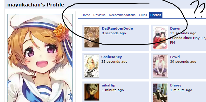
2: The profile bio is on the top. I feel a site *about* lists shouldn't make the lists a second priority. I feel that this change will subconsciously direct new users to treat the site a little more as a blog, and a little less as a personalized database. I do like blogs, but there are plenty already, whereas this is the only really great anime database.

I know there's Hummingbird. But see, I went back there again to remind myself what it looked like, and...

1 (again): I really need to emphasize this. I enjoy going to tumblr when I'm looking for an *audiovisual* experience. I want fan art; I want crazy expressiveness; ext. I go to Hummingbird, and immediately get confronted with a giant anime background, like I'd get when logging into tumblr. I don't personally want a database/list website to be like that, however. Youtube doesn't shove a bunch of stuff into your face to get you hype; they let the videos do that by themselves. Wikipedia is about *information*, so it's natural that almost every page is packed full of text. The images are mostly tucked away on the right.

Think about Bing. It's got giant, big-old images plastered everywhere; but it's still not as pleasurable as the plain-white-nothingness you get from searching with Google. Graphic design textbooks might possibly tell you that bigger and more complex is always better--and we've sort of been accustomed to assuming that such a thing MUST always be an improvement--but in many instances, I would disagree.

Obviously, MAL has never looked anything like Tumblr, or Hummingbird, but this update has made it looks just a little bit closer to that.

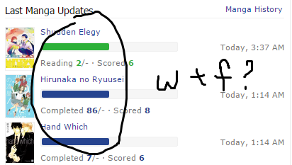
3: DROP = RED = STRESS
I like to try things out more than I like to finish them. It's alright that many (or most) others have the inverse philosophy, but as you can see, I have a somewhat high drop ratio. I don't have the longest attention span (or the highest quantity of free time), so I don't want to commit myself to finishing something if I'm not invested enough.
In other words, just because I dropped a show doesn't mean I HATE it and can't stand it; it could just mean that I lost interest for the time being.
What I'm getting at is, the RED makes it feel like DROP equals BAD. I know that's not the intention, but that's how it subconsciously comes out--just a little bit. It makes me feel like I'm flexing for the people viewing my page, like "AHA I'm so badddd look at all the shows I dropped! You caught me red handed!"

An anime Youtuber I know often gets asked why he drops so many shows as it is, and so now he's going to get that question even more because MAL is drawing attention to it.

4: "Mean score"
Who the heck cares about the mean score? Maybe for a fun little stat, sure, but why is it such a prominent number to put on there? Again, think about how this will ever-so-slightly condition peoples' mentality towards everything.

5: All the information on the side. This mostly ties into #2. All the stuff on the side is about how the person interacts with MyAnimeList.net, and *not* about how that person interacts with anime itself. Which again, there's plenty of great otaku bouncy-houses on the net to marinate yourself in and hang out with others; but there's only *one* anime database this complete, and this clean.

These problems will certainly not be things everyone--or most people--will care about. Though, I'd like to know: what are the GOOD things about this redesign? What are some positive elements to counteract the negative ones I perceive? That's really the reason this kind of bothers me; it just feels pointless and accomplishing of nothing. 0 steps forward, 2 steps back.
Oct 15, 2015 9:55 PM

Offline
Mar 2012
1255
K-Anime said:
"If it ain't broke, don't fix it."

Sorry, here at MAL we follow the standard of "If it ain't broke, break it."
Oct 15, 2015 9:56 PM
Nobody

Offline
Jul 2013
12165
Cool_DuDE said:
"Manga list" and "Anime List" views are gone??

Can only see them in "My panel"


HOW CAN I BRAG FROM NOW ON????

I don't think it's worth bragging over how they held f5 on their list for a couple of hours
Oct 15, 2015 9:57 PM

Offline
Jan 2013
6305
JOAOAA said:
Cool_DuDE said:
"Manga list" and "Anime List" views are gone??

Can only see them in "My panel"


HOW CAN I BRAG FROM NOW ON????

I don't think it's worth bragging over how they held f5 on their list for a couple of hours
You can't increase the counter that way. It's something like 1 entry per 24 hours on a unique IP.
Oct 15, 2015 9:58 PM

Offline
Apr 2012
319
I'm not fond of the new design. The way the favorites are laid out now is definitely worse than in the original layout, which was more space efficient and neat. I also dislike how the biography section is at the top. The first thing I would like to see when I come to a profile page, including my own, is the more "essential" information regarding anime watched and such. This makes me not want to have a bio section at the top at all.
Oct 15, 2015 9:58 PM
Nobody

Offline
Jul 2013
12165
Syrup- said:
You can't increase the counter that way. It's something like 1 entry per 24 hours on a unique IP.

oh they fixed it?

what a shame
Oct 15, 2015 9:59 PM

Offline
Oct 2010
370
Holy shit I hate it.

pls give us the option to change back if we want.
Oct 15, 2015 9:59 PM

Offline
Apr 2012
213
Zadion said:
Favorites expanded to 10

10/10 best MAL update of all time

and this should be the ONLY change rly.
To err is human. To purr is feline (c)
Oct 15, 2015 9:59 PM

Offline
Jul 2015
4953
Syrup- said:


HOW CAN I BRAG FROM NOW ON????

I don't think it's worth bragging over how they held f5 on their list for a couple of hours[/quote]You can't increase the counter that way. It's something like 1 entry per 24 hours on a unique IP.[/quote]
Oct 15, 2015 10:00 PM
Offline
Jul 2015
12
Total garbage
>tfw 7 pages of posts with cute girls avatars telling your update was shit
Oct 15, 2015 10:00 PM

Offline
Jul 2015
4953
konakona495 said:
Total garbage
>tfw 7 pages of posts with cute girls avatars telling your update was shit


LOL
Oct 15, 2015 10:01 PM

Offline
Nov 2011
640
I'd like more if they put the favorites in horizontal, change the place of 'about me' and remove the friends.
CharOct 15, 2015 10:07 PM
Oct 15, 2015 10:01 PM

Offline
Nov 2014
9843
konakona495 said:
Total garbage
>tfw 7 pages of posts with cute girls avatars telling your update was shit
There are some brutal dudes as well.

Oct 15, 2015 10:01 PM

Offline
Oct 2013
4469
Literally every person I've ever shown this site too thought the design is shit. Reworking the profile is the first step to making it actually look decent. Sorry dudes, but "early 2000s" is very bad.

The only thing that needs changed is moving the favorites to the top--MAYBE. It'd be cool if you could choose where you wanted things on your profile located, like on RateYourMusic.


Discord: the.path.to.pathos
RateYourMusic
last.fm
Oct 15, 2015 10:01 PM

Offline
Apr 2014
13384
ataraxial said:
K-Anime said:
"If it ain't broke, don't fix it."

Sorry, here at MAL we follow the standard of "If it ain't broke, break it."

MAL knows best after all.
Oct 15, 2015 10:01 PM

Offline
Nov 2008
2524
Red_Keys said:
Wow, this thread proves the stereotype that anime fans are tantrum throwing nerds who care way too much about stupid and inconsequential shit.

It looks fine. Features added are ones I specifically remember users requesting.
Well said, young man. Well said.
Oct 15, 2015 10:02 PM

Offline
Feb 2009
560
Thanks Xinil for ruining the profile page. Everything now takes two times more space than before, seems like your designer took the shit modern design 101 course. Congratulations!

The new arrange for the sidebar (where your avatar is) looks nice, though. Pushing everything from there to the center does not. Too much space, too much information. Learn a thing or two from anilist, hummingbird and Anime-Planet.

I guess the only reason I'm still coming back to MAL is the clubs. Back to anilist.co, then, my club is mostly on Discord nowadays.
Oct 15, 2015 10:02 PM

Offline
Dec 2009
66
I really like it. It's colorful
Oct 15, 2015 10:02 PM
Offline
Jan 2015
1202
I like the new stats but I really liked it better when I had my favorites on the left side of my screen...
Oct 15, 2015 10:02 PM
Offline
Mar 2014
23
Wow it's awesome!
Oct 15, 2015 10:02 PM

Offline
Jan 2013
11951
Minus all the bright blue, I don't mind it at all. It hurts my eyes, and all my profile shit is still there, just need to hit the down arrow. Anyways the suffering I'm seeing others having over it makes the price even out.

Goood goood. I feel your anger...your sorrow..
Oct 15, 2015 10:03 PM
Offline
Mar 2014
9
Zadion said:
Literally every person I've ever shown this site too thought the design is shit. Reworking the profile is the first step to making it actually look decent. Sorry dudes, but "early 2000s" is very bad.

The only thing that needs changed is moving the favorites to the top--MAYBE. It'd be cool if you could choose where you wanted things on your profile located, like on RateYourMusic.


why is your totally not made up anecdotal evidence more important than all the people's opinions that actually use the site?
Oct 15, 2015 10:03 PM
Nobody

Offline
Jul 2013
12165
I just tested and went up 100 views holding f5 for about 10 secs so I dunno what you're talking about
Oct 15, 2015 10:04 PM

Offline
Jun 2011
420
konakona495 said:
Total garbage
>tfw 7 pages of posts with cute girls avatars telling your update was shit


THIS.
Oct 15, 2015 10:04 PM

Offline
Mar 2014
4596
Not gonna lie, it does look appealing... but no more shared anime statistics? And I'm not a fan of having to click an arrow to see the rest of everyone's fav characters & people.

The simplistic old one is way better tbh.
Oct 15, 2015 10:05 PM

Offline
Jul 2015
4953
JOAOAA said:
I just tested and went up 100 views holding f5 for about 10 secs so I dunno what you're talking about


Really?

Send a screenshot *earlier* and *later*
Oct 15, 2015 10:05 PM

Offline
Jul 2015
83
Cool_DuDE said:
Davoo said:
it just feels pointless and accomplishing of nothing. 0 steps forward, 2 steps back.


That's wrong. It's more like turn to the left and take three steps foward then turn to the right and take a half step.
"Ohhh how humans fall to love so easily. Tis a truth unrequited that we, being so weak, pity the weak, and detest the weaker."

-My Brain

Oct 15, 2015 10:06 PM

Offline
Oct 2011
2507
It's okay. I miss the top tab though. They need to re-add that.

They need to remove:
Friends:
Stats (like forum posts, clubs, etc.)

These are useless.. this is animu list not some facebook crap. Need to add those back on the top tab.

Anime and Manga statistic section needs to be a roll over (click on anime to switch to anime stats and click on manga to switch to manga stats)

The favourites look really out of section... should be back on the side bar than randomly in the middle of the about me and the comment section...
it can even be put in another tab on the top

All in all imo, the distribution is too cluttered. There is more things going on in the right side than the left side (you have to scroll ALL THE WAY DOWN just to get to the comment section, the favourite section is ruining it)
Oct 15, 2015 10:06 PM

Offline
Jul 2012
48259
Oct 15, 2015 10:06 PM

Offline
May 2014
3707
I'd probs be okay-ish with this new layout if it weren't for the fact that you took the list views & comment counts off. I really liked looking at those & they're what made MAL fun for me.

Oct 15, 2015 10:07 PM

Offline
Nov 2013
12686
Since it was deleted. I really don't like the favorites in middle, that section was better on the left side. And the numbers, really. Not as insulting as the other ones which still remain here.

Oct 15, 2015 10:07 PM

Offline
Oct 2014
24
i want the old version back please!
If i don't have to do it, i won't
if i do have to do it,I'll make it quick
Oct 15, 2015 10:07 PM

Offline
Jun 2013
98
It's not that bad... I actually like it
Oct 15, 2015 10:07 PM
Site Admin
Offline
Aug 2012
8451
mayukachan said:


wat

Yeah I really don't think that's necessary, the bars are redundant info, and it's worse when an anime or manga has unknown number of episodes or chapters...it's just half way...why
Pages (50) « First ... « 4 5 [6] 7 8 » ... Last »

More topics from this board

» Summer Stack Challenges 🧪 ( 1 2 3 4 5 )

tingy - Jul 29

212 by Proxinecro »»
4 hours ago

» TOUGEN ANKI 🩸 Profile Badge Event ( 1 2 )

Kineta - Aug 20

81 by wasifali758595 »»
5 hours ago

» [Update May 8] MyAnimeList Acquired by Gaudiy Inc. ( 1 2 3 4 5 ... Last Page )

Kineta - May 7

353 by W3TFT »»
Sep 11, 7:07 PM

» Dark theme now available on Desktop! 🎉 ( 1 2 3 4 5 ... Last Page )

Kineta - Apr 11, 2023

623 by RED-clover12 »»
Sep 4, 5:43 PM

» [Challenge] You Should Read This Manga 2025 ( 1 2 3 4 5 )

Kineta - Mar 30

216 by domonkun »»
Sep 3, 11:31 PM
It’s time to ditch the text file.
Keep track of your anime easily by creating your own list.
Sign Up Login