Konosuba: God's Blessing on This Wonderful World! (light novel)
Available on Manga Store
New
Jan 20, 2017 4:41 AM
#201
Net-Raid said: DarklordVor said: And you used the S2E01 that was directed by Kikuta. You can't just say the overall quality of season 2 is worst than season 1's when it's not finished airing. If it's like that, then I could argue that episode 9 has the worst looking art in KonoSuba with season 2 included. Therefore season 1 has worse animation than season 2. That's how you conclude the overall quality of season 2 by using just one Kikuta episode. Lol, dude, that's not what I meant. Of course by "this season" I meant what is shown so far, that's why I said "seems", obviously I wouldn't know if the whole season are gonna be like that. I don't have a superpower, I can't see the future. And as for your comparison, honestly it doesn't look that different to me. For me it looks consistent enough(at least it's consistent throughout the episode). If you compare the screenshots I posted before, the faces are different enough, look at Aqua's faces, sometimes her eyes are slanted sometimes it's round. Ah I see, I guess we have some miscommunication. It's hard when English is not your first language lol >.> Hmm really? I actually could see a little difference on S1E1 compared to S1E2. I feel like it's almost like this, but only a little better.  But yeah, it feels like Kikuta is not even trying anymore and gave up on KonoSuba by just making everything derpy. At least we know that Ebara will bring us good quality episodes on the even episodes. |
Jan 20, 2017 4:58 AM
#202
| Oh jeez so it isn't just me. I started watching and I kept on thinking something was wrong, I had to go back and rewatch a bit of s1... My gosh did the art decline some characters just move their mouths. I understand that this might allow for more, interesting(?) faces but cmon it's so bad. Is this a studio Deen thing? Or it's a one time event? |
Jan 21, 2017 10:53 AM
#203
| I think it's important to realize that the animation in Konosuba is bad on purpose. Season one looks just as bad. I know people are posting these highly detailed gifs from season one, but I find it funny that they're only showing ones from the first episode of season one and the introductions of main characters. Of course season one will have better animation because it's a way to draw viewers in. Most people will not continue to watch after the first episode of a first season if the animation looks extremely wonky. But once you have already established a fanbase from the first season, I don't think that the first episode of season two should match the quality of a series introduction. Nobody who hasn't seen season one isn't just gonna jump into season two. This isn't an episodic show from America where you can just start watching a random episode and get drawn in, that's not how Japanese animation is set up. Anyways, back to my main point. I don't think the animation being bad is detrimental to the show in anyway. If anything, it helps the show get across it's main idea. The show is a parody of the tropes found in shonen "stuck in a video game world" shows. One thing I noticed about those is that the animation is pretty good, at least from what I have seen. So Konosuba having goofy and bad animation on purpose really fits the bill. It's also worth mentioning that all characters have flaws and are pretty awful people, if you really think about it. Having animation like what we have seen so far in season two fits so well. The weird faces are a plus. I've been having so much fun taking screenshots so far this season and sharing them with my friends. Silly cartoon screencaps have a pretty big audience if you think about, there's whole tumblrs dedicated to finding silly faces, smears, and inbetweens. One show that has a lot of great pausable moments is The Ren and Stimpy Show. I personally think of Konosuba as a Japanese Ren and Stimpy. John K. wanted to never draw the same face on one character more than once, and man did episode one of season two do just that. The faces are awkward, disformed, and derpy, but it's all for fun. It's supposed to be a silly comedy show. I just find it funny how if something like this came out in the west, it would probably be defended for being stylistic. Most of the shows on Adult Swim look bad, but that's all part of the campy and DIY feel. If Konosuba's animation is better than cult classic cartoons that air at midnight, I don't see why we should complain. To quote Mystery Science Theater 3000, "Just repeat to yourself it's just a show, I should really just relax." |
Jan 21, 2017 11:03 AM
#204
Jan 21, 2017 11:13 AM
#205
SeasonADay said: Looks generic as fuck.Barrli said: I loved the first session! But i have never watched a anime with that poor Artwork! I hate it!!! I really like that Anime, but i think, i can´t watch a couple more of that. My eyes feel so painfull now :/ Read the light novels. The artwork looks like this.  The anime looks much funnier. The wacky animation also helps a lot. DEEN did your cherished light novel justice, get over it. |
| Proud founder of The Official Anti-Ging Freecss Fan Club Join now! Kellhus said: GuusWayne said: there is a limit to the suspension of disbelief And it's the fan that did it. Not the smoking porn reading rubik cube genius rape ape with a magic boat. |
Jan 21, 2017 12:53 PM
#206
Sapewloth said: SeasonADay said: Looks generic as fuck.Barrli said: I loved the first session! But i have never watched a anime with that poor Artwork! I hate it!!! I really like that Anime, but i think, i can´t watch a couple more of that. My eyes feel so painfull now :/ Read the light novels. The artwork looks like this. [img]https://s27.postimg.org/dwm5ghpgj/kono.jpg[img] The anime looks much funnier. The wacky animation also helps a lot. DEEN did your cherished light novel justice, get over it. Preach! 15 character |
Jan 21, 2017 3:39 PM
#207
DarkingDawning said: Ketuekigami said: It's almost as if there actually was an issue with the way episode 1 looked to some people. 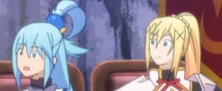 From what people said here I thought It was just my imagination and that the Umineko anime actually looked fine too /s  I know there are people defending it, which was delusional, but I also hate it when people hated it saying "season 1 art is better than season 2" when it's exactly the same shit. @DarklordVor already said it plenty of times in this thread that it's Kikuta's animation preference. Meanwhile episode 2 was not directed by Kikuta and therefore it has way better animation than episode 1.  I honestly wouldn't say its exactly the same shit. It's not uncommon to have strange art when in motion (animation), but its less common to have strange art at a still scene. For example that picture I linked is on screen for literally 5 seconds without motion, while most of the other examples take place less than a second because they are in motion (thus harder to notice). And that, I feel is much worse. S1 had some of that too of course, but ep1 in comparison looked like they just gave 0 shits. (I am talking about art, not animation) I don't know how much of an influence the director has on the general art quality. Like I said, Umineko had a lot of good industry people working on it but the animation and art looked like garbage. Ep2 was an improvement in both so maybe director has some influence in that, but it makes me concerned for the art in the future though. |
KetuekigamiJan 21, 2017 4:01 PM
| Signature removed. Please follow the signature rules, as defined in the Site & Forum Guidelines. |
Jan 22, 2017 7:31 AM
#209
| It's not just the art that was better, i feel like the new season has bad pacing, feels disjointed compared to before. I want to give it a chance, but usually if the first episode is this bad it means it's not going to be pretty for the rest. It wasn't terrible but I just loved season 1 of this show, needed to meet my expectations and such. |
 |
Jan 22, 2017 3:19 PM
#210
Portis said: It's not just the art that was better, i feel like the new season has bad pacing, feels disjointed compared to before. I want to give it a chance, but usually if the first episode is this bad it means it's not going to be pretty for the rest. It wasn't terrible but I just loved season 1 of this show, needed to meet my expectations and such. Hmm? Bad pacing how? They're adapting 1 chapter per episode making a 5 episodes per LN adaptation, that's slower and truthful than most adapted LN shows that adapted 2-3 episodes per LN. Season 1's pacing was even slower because vol. 1 chapter 1 was divided into episode 3's prologue. Which is why they skipped 3 important chapters in season 1 like Wiz's introduction. The animation is only bad, when it's the odd episodes directed by Kikuta. We've proven that when Chief Animation Director Ebara took control on episode 2 and Kikuta has no control over it. |
Jan 22, 2017 11:30 PM
#211
| @DarklordVor just watch the episode, that's how. they're just my impressions, don't have to agree with them. I see what you're saying, though I'd like to point out that having consistent chapter adaptations has nothing to do with how well paced something is. |
 |
Jan 24, 2017 6:01 AM
#212
| This season did come out in just under a year so it didn't have time to sit aroud and be nitpicked at least the story is interesting and likable and the animation flows and its not completely terrible. I've enjoyed it so far. |
Jan 27, 2017 2:18 PM
#213
Jan 30, 2017 9:08 PM
#214
| The animation is improving compare to episode 1. Maybe someone got fired and replaced with a better animation director? |
 |
Feb 1, 2017 9:10 AM
#215
Feb 1, 2017 9:49 AM
#216
taffers said: I think it's important to realize that the animation in Konosuba is bad on purpose. Season one looks just as bad. I know people are posting these highly detailed gifs from season one, but I find it funny that they're only showing ones from the first episode of season one and the introductions of main characters. Of course season one will have better animation because it's a way to draw viewers in. Most people will not continue to watch after the first episode of a first season if the animation looks extremely wonky. But once you have already established a fanbase from the first season, I don't think that the first episode of season two should match the quality of a series introduction. Nobody who hasn't seen season one isn't just gonna jump into season two. This isn't an episodic show from America where you can just start watching a random episode and get drawn in, that's not how Japanese animation is set up. Anyways, back to my main point. I don't think the animation being bad is detrimental to the show in anyway. If anything, it helps the show get across it's main idea. The show is a parody of the tropes found in shonen "stuck in a video game world" shows. One thing I noticed about those is that the animation is pretty good, at least from what I have seen. So Konosuba having goofy and bad animation on purpose really fits the bill. It's also worth mentioning that all characters have flaws and are pretty awful people, if you really think about it. Having animation like what we have seen so far in season two fits so well. The weird faces are a plus. I've been having so much fun taking screenshots so far this season and sharing them with my friends. Silly cartoon screencaps have a pretty big audience if you think about, there's whole tumblrs dedicated to finding silly faces, smears, and inbetweens. One show that has a lot of great pausable moments is The Ren and Stimpy Show. I personally think of Konosuba as a Japanese Ren and Stimpy. John K. wanted to never draw the same face on one character more than once, and man did episode one of season two do just that. The faces are awkward, disformed, and derpy, but it's all for fun. It's supposed to be a silly comedy show. I just find it funny how if something like this came out in the west, it would probably be defended for being stylistic. Most of the shows on Adult Swim look bad, but that's all part of the campy and DIY feel. If Konosuba's animation is better than cult classic cartoons that air at midnight, I don't see why we should complain. To quote Mystery Science Theater 3000, "Just repeat to yourself it's just a show, I should really just relax." If no one's gonna acknowledge this post than I suppose I will. Thank you taffers, this is exactly the point I've been making to people for weeks now. (Was actually planning to make a post about it but seeing as you seem to have summed it all up perfectly I guess there is no point.) However, I would like to point out one thing people have seemed to miss, the character designs in Konosuba are absolutely gorgeous. From Megumin to Wiz every character has the kind of design that just draws you in. Anyway, again I'd like to thank you taffers. I completely agree with your points. |
| If you love Kono Subarashii Sekai Ni Shukufuku Wo! (God's Blessing Blessing on this Wonderful World!) Then come join The Kono Suba Fan Club to enjoy a community of people that share your love. It's a small club as of now but we hope to grow much larger as this amazing show goes on! |
Feb 1, 2017 10:01 AM
#217
DarklordVor said: Let me grab popcorn before someone complaining to DEEN instead of Kikuta about the drop of quality in today's episode grab popcorn As expected from a Kikuta episode eh? FULL OF QUALITY and saggy boobs. 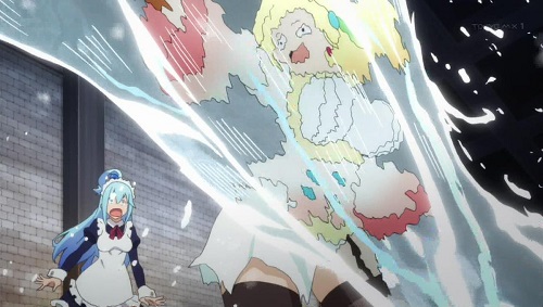 your picture is sooooo QUALITY it makes my head hurt how can one man draw so bad? |
 “Read as little as possible of critical or aesthetic works. They are either products of a close-minded spirit, petrified and devoid of meaning in their lifeless hardening, or clever verbal games [...]. Works of art are of an infinite solitude; nothing is worse than criticism for approaching them. Only love can grasp them, keep them, be just toward them. Always give precedence to your own feeling against these analyses, these reviews, these introductions. [...] You must let every impression, every seed of feeling, ripen within you, in the dark, in the inexpressible, in the unconscious, those regions closed to understanding. Wait with humility and patience for the hour of the birth of a new clarity. Art demands of its faithful followers as much as of its creators.” — RAINER-MARIA Rilke, Letters to a Young Poet (letter dated April 23, 1903). |
Feb 1, 2017 3:04 PM
#218
| I really enjoyed the quality of episode 3. Episode 4 was not great, but still better than episode 1. I am pretty impressed by the inventivity of the people who praise the lack of quality! From my point of view Konosuba is like a burger, something you enjoy not because it's high end cooking, but because it's fun and feels good. But sometimes (mostly episode 1) the art/animation was bad enough to break my immersion. It felt like I found a piece of rotten meat inside my burger. |
Feb 1, 2017 5:31 PM
#219
Feb 1, 2017 5:57 PM
#220
| The art is virtually the same thing IF NOT shittier looking than season 1. The shittier and more QUALITY it looks, the better the show is. |
Feb 1, 2017 7:59 PM
#221
JesusGTChrist said: taffers said: I think it's important to realize that the animation in Konosuba is bad on purpose. Season one looks just as bad. I know people are posting these highly detailed gifs from season one, but I find it funny that they're only showing ones from the first episode of season one and the introductions of main characters. Of course season one will have better animation because it's a way to draw viewers in. Most people will not continue to watch after the first episode of a first season if the animation looks extremely wonky. But once you have already established a fanbase from the first season, I don't think that the first episode of season two should match the quality of a series introduction. Nobody who hasn't seen season one isn't just gonna jump into season two. This isn't an episodic show from America where you can just start watching a random episode and get drawn in, that's not how Japanese animation is set up. Anyways, back to my main point. I don't think the animation being bad is detrimental to the show in anyway. If anything, it helps the show get across it's main idea. The show is a parody of the tropes found in shonen "stuck in a video game world" shows. One thing I noticed about those is that the animation is pretty good, at least from what I have seen. So Konosuba having goofy and bad animation on purpose really fits the bill. It's also worth mentioning that all characters have flaws and are pretty awful people, if you really think about it. Having animation like what we have seen so far in season two fits so well. The weird faces are a plus. I've been having so much fun taking screenshots so far this season and sharing them with my friends. Silly cartoon screencaps have a pretty big audience if you think about, there's whole tumblrs dedicated to finding silly faces, smears, and inbetweens. One show that has a lot of great pausable moments is The Ren and Stimpy Show. I personally think of Konosuba as a Japanese Ren and Stimpy. John K. wanted to never draw the same face on one character more than once, and man did episode one of season two do just that. The faces are awkward, disformed, and derpy, but it's all for fun. It's supposed to be a silly comedy show. I just find it funny how if something like this came out in the west, it would probably be defended for being stylistic. Most of the shows on Adult Swim look bad, but that's all part of the campy and DIY feel. If Konosuba's animation is better than cult classic cartoons that air at midnight, I don't see why we should complain. To quote Mystery Science Theater 3000, "Just repeat to yourself it's just a show, I should really just relax." If no one's gonna acknowledge this post than I suppose I will. Thank you taffers, this is exactly the point I've been making to people for weeks now. (Was actually planning to make a post about it but seeing as you seem to have summed it all up perfectly I guess there is no point.) However, I would like to point out one thing people have seemed to miss, the character designs in Konosuba are absolutely gorgeous. From Megumin to Wiz every character has the kind of design that just draws you in. Anyway, again I'd like to thank you taffers. I completely agree with your points. Thanks! And great point. I do really love the character designs for this whole series. Even the background characters have a certain level of charm put into them. I love how I am starting to recognize and differentiate the background characters at the bar and adventurer's guild! |
Feb 1, 2017 10:18 PM
#222
Kittens-kun said: I like how you people take screenshots and try and act like the entire episode looks like that even when moving at normal speed. If you have to slow it down, to look frame by frame, to find these "lol deen quality xD" moments, then the art really isn't as bad as you say it is. I thought that most person had the problem with Darkness' unusually big boobs? I mean ugh, that was so hideous. This episode was so hideous. Did she grew 5 cups larger over the last 3 episodes? How DEEN fucked KonoSuba 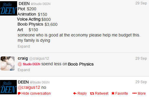 DEEN keeps on ruining KonoSuba everyday. If I want content, then I'll read the LN. But I watch anime to also appreciate the art, so that was hideous. |
Feb 1, 2017 10:28 PM
#223
DarkingDawning said: Kittens-kun said: I like how you people take screenshots and try and act like the entire episode looks like that even when moving at normal speed. If you have to slow it down, to look frame by frame, to find these "lol deen quality xD" moments, then the art really isn't as bad as you say it is. I thought that most person had the problem with Darkness' unusually big boobs? I mean ugh, that was so hideous. This episode was so hideous. Did she grew 5 cups larger over the last 3 episodes? How DEEN fucked KonoSuba DEEN keeps on ruining KonoSuba everyday. If I want content, then I'll read the LN. But I watch anime to also appreciate the art, so that was hideous. rolled my eyes Come on. NOT DEEN's fuck up. There were almost no boob physics whatsoever made by non-Kikuta directors. See Yunyun's boobs on episode 2 being way smaller than the OVA made by Kikuta. 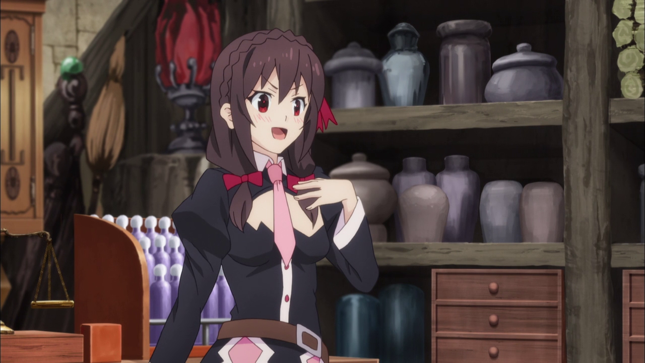 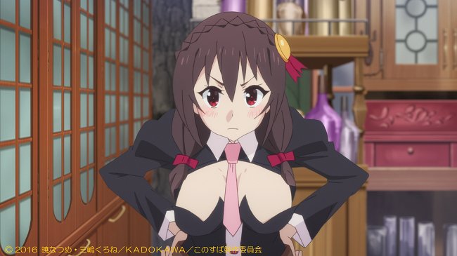 So that picture statement was very wrong. Because the art is only inconsistent when Kikuta direct the anime. Meanwhile Ebara and Tanaka did okay-great on episode 2 & 3, along with Momoka on episode 2, 4, 6, 8, 10 last season. |
Feb 1, 2017 10:36 PM
#224
DarklordVor said: rolled my eyes Come on. NOT DEEN's fuck up. There were almost no boob physics whatsoever made by non-Kikuta directors. See Yunyun's boobs on episode 2 being way smaller than the OVA made by Kikuta. [img]http://i.imgur.com/6hjeJad.png[/img [img]https://pbs.twimg.com/media/Ce2SEvYUIAA7dRW.jpg[/img So that picture statement was very wrong. Because the art is only inconsistent when Kikuta direct the anime. Meanwhile Ebara and Tanaka did okay-great on episode 2 & 3, along with Momoka on episode 2, 4, 6, 8, 10 last season. I'm pretty sure it's not only this Kikuta's guy episode. Remember Wiz on episode 2? 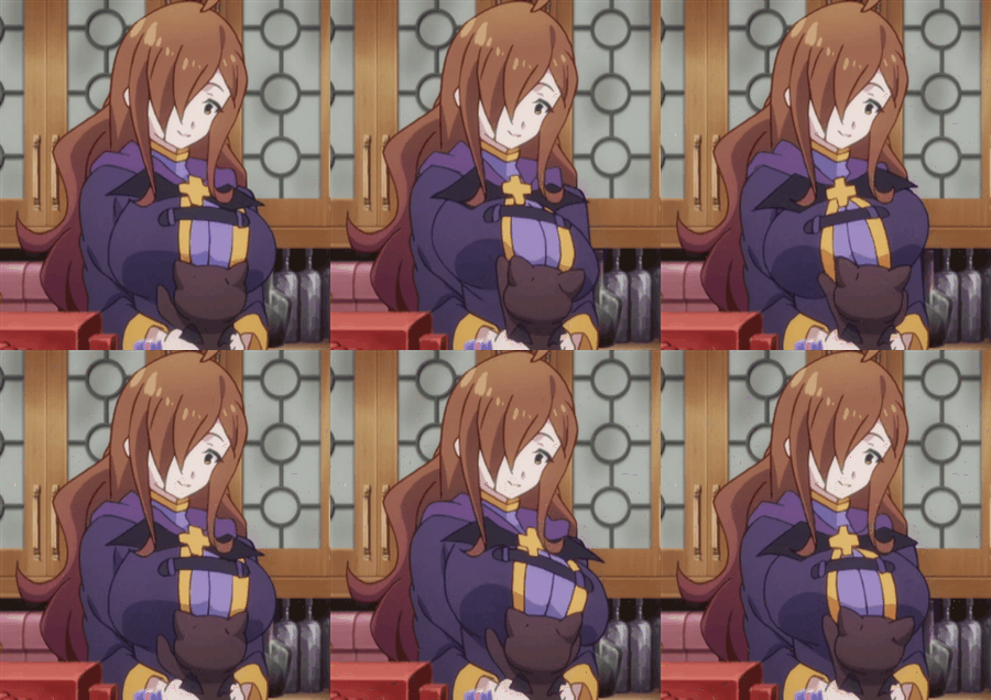 Pretty sure DEEN have many boob physics in this episode. So DEEN is also to blame. But if we're talking about the face and art then we'll probably would've talk about Kikuta. So since I was talking about the boobs, I'm blaming DEEN and now Kikuta too. |
Feb 1, 2017 10:43 PM
#225
DarkingDawning said: DarklordVor said: rolled my eyes Come on. NOT DEEN's fuck up. There were almost no boob physics whatsoever made by non-Kikuta directors. See Yunyun's boobs on episode 2 being way smaller than the OVA made by Kikuta. [img]http://i.imgur.com/6hjeJad.png[/img [img]https://pbs.twimg.com/media/Ce2SEvYUIAA7dRW.jpg[/img So that picture statement was very wrong. Because the art is only inconsistent when Kikuta direct the anime. Meanwhile Ebara and Tanaka did okay-great on episode 2 & 3, along with Momoka on episode 2, 4, 6, 8, 10 last season. I'm pretty sure it's not only this Kikuta's guy episode. Remember Wiz on episode 2? Pretty sure DEEN have many boob physics in this episode. So DEEN is also to blame. But if we're talking about the face and art then we'll probably would've talk about Kikuta. So since I was talking about the boobs, I'm blaming DEEN and now Kikuta too. Uh... I'M PRETTY SURE that this is not boob physics we're talking about. And you even said it yourself that you're more bothered with Darkness' unusually big boobs? I mean ugh, that was so hideous. Boob physics means that the boobs are jiggling almost every time the character moves, which is true on every Kikuta episodes. Since saggy boobs means there are more chance of jiggling boobs. Meanwhile Wiz's boobs were not "jiggling", but being played with Chomusuke. It's not boobs physics because this did not happened naturally like how Darkness' boobs keep on jiggling in this episode when she's talking. |
Feb 2, 2017 12:35 AM
#226
DarklordVor said: DarkingDawning said: Kittens-kun said: I like how you people take screenshots and try and act like the entire episode looks like that even when moving at normal speed. If you have to slow it down, to look frame by frame, to find these "lol deen quality xD" moments, then the art really isn't as bad as you say it is. I thought that most person had the problem with Darkness' unusually big boobs? I mean ugh, that was so hideous. This episode was so hideous. Did she grew 5 cups larger over the last 3 episodes? How DEEN fucked KonoSuba DEEN keeps on ruining KonoSuba everyday. If I want content, then I'll read the LN. But I watch anime to also appreciate the art, so that was hideous. rolled my eyes Come on. NOT DEEN's fuck up. There were almost no boob physics whatsoever made by non-Kikuta directors. See Yunyun's boobs on episode 2 being way smaller than the OVA made by Kikuta.   So that picture statement was very wrong. Because the art is only inconsistent when Kikuta direct the anime. Meanwhile Ebara and Tanaka did okay-great on episode 2 & 3, along with Momoka on episode 2, 4, 6, 8, 10 last season. the small boobs yunyun is much better if you ask me. |
 |
Feb 2, 2017 3:20 AM
#227
| I mean, yea konosuba never had great animation and art since the start of season 1, but what if this was intentional? just to make it even more funnier? yeah, studio deen could also be low on budget for this series, but there WERE times when the animations were top notch. like the creepy hand movement kazuma did (yea....it's kinda weird that i'm using that as evidence...but meh) and the EXPLOSION moments. i don't know about y'all but the shitty art and animation actually makes this funnier to me. Somehow when i imagine this having actual good art similar to the LN and having kyoani or ufotable-tier of animation, it won't be as funny as it is now. just my opinion though. |
Feb 2, 2017 3:27 AM
#228
| Regardless of the intent, off-model expressiveness = shit animation because it's not good-looking ART. It's not artistic, it's lazy. It's not creative, it's just bad animating. No thanks, give me my Madhouse panning stills instead please #konosuba2 #pingpong2014 #narutospain |
Feb 2, 2017 3:33 AM
#229
| it's shit, bad and lazy. look at latest episode that's horrendous. shame that the content is really good |
Cross  Ange AngeHey guys check my profile for current airing season anime recommendation (guaranteed best taste) |
Feb 2, 2017 3:36 AM
#230
| My guess is that they just were lazy and greedy so they gave KonoSuba season 1 bad art and animation. They probably didn't even expect it to become that popular in the first place. So they really have no reason to change that now since it's successful even with minimal effort in art and animation. |
Feb 2, 2017 3:36 AM
#231
| Iirc one of the staff members came out and said that it was intentional for comedic effect a while back, which considering how good Rakugo looks in comparison is probably true As for whether that's a good excuse though... that's debatable. The reaction faces are genuinely hilarious this way, but other than that there are too many needlessly derpy shots I think. Would probably be better if they had normal art for the most part and then just go off-track with the reaction faces alone |
Feb 2, 2017 4:23 AM
#232
Ckan said: Regardless of the intent, off-model expressiveness = shit animation because it's not good-looking ART. It's not artistic, it's lazy. It's not creative, it's just bad animating. No thanks, give me my Madhouse panning stills instead please #konosuba2 #pingpong2014 #narutospain Damn you're good. |
Feb 2, 2017 4:36 AM
#233
Gator said: capitalism is great!!!! working as intended!!! lowest possible cost to get highest possible profit! let's use the budget to make megaman game for BD content! more profit!My guess is that they just were lazy and greedy so they gave KonoSuba season 1 bad art and animation. They probably didn't even expect it to become that popular in the first place. So they really have no reason to change that now since it's successful even with minimal effort in art and animation. |
Cross  Ange AngeHey guys check my profile for current airing season anime recommendation (guaranteed best taste) |
Feb 2, 2017 5:11 AM
#234
GangsterCat said: it's shit, bad and lazy. look at latest episode that's horrendous. shame that the content is really good This is exactly how I feel. The whole time I'm watching even the opening I'm thinking it looks awful but by the end of the episode I feel that I had a good laugh. The 'bad art for comedic effect' just does nothing for me. I would highly recommend watching season 1 to people but I just can't see myself ever recommending this season without bringing up how bad it looks. |
Feb 2, 2017 5:48 AM
#235
| Season 1 definitely had better animation. I believe its intentional but it's still funny |
Feb 2, 2017 5:51 AM
#236
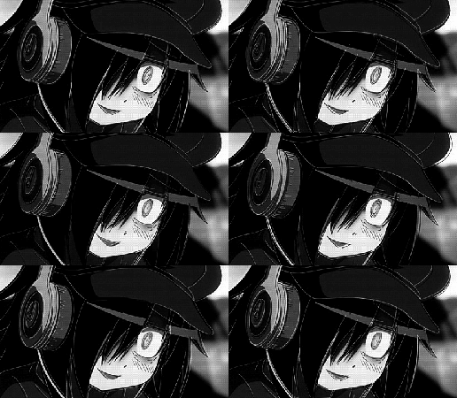
| Pretty sure they rushed out season 2 as a cash grab and that's why the animation sucks so hard. |
 |
Feb 2, 2017 5:52 AM
#237
| It looks like shit. I don't give a shit. If you have a really dramatic or emotional scene or a grand action scene i'd ask for it to look good, but from a comedy i just ask it to be funny. Shitty art is a bit funny, or at the very least it doesn't make things less funny. The first seasons of Milky Holmes also looked like shit, and it was still a great show because it was funny. You know... i might even go so far as to say this is the most appropriate art style you can adopt. This is a zany comedy, right? You're not taking anything seriously. You just laugh at the absurdity of it. So the animation followed suit and went equally as absurd as the rest of the show. The art of film making, ladies and gentlemen. |
Feb 2, 2017 5:52 AM
#238
| This show's rating just reflects how bad hype can be sometimes. Comedy is forced, animation is horrendous (i know its on purpose, but that doesn't add anything to the humor unless you're 10yo) and the characters aren't being natural this time. It seems like they are following the memes and not caring much about real content. Its sad actually, since i liked the first season. But this is just bad. |
Feb 2, 2017 6:14 AM
#239
| It was on purpose m8, the budget for the series dropped due to unknown circumstances. Well at least Aqua still has no pantsu so all is good and doing well. |
Feb 2, 2017 6:41 AM
#240
| What will they achieve if they make that on purpose? They just dragging the show down. |
 |
Feb 2, 2017 6:42 AM
#241
SeijiroUshio said: What will they achieve if they make that on purpose? They just dragging the show down. They have to spend less time animating and drawing which means they save money. |
Feb 2, 2017 6:54 AM
#242
Feb 2, 2017 9:25 AM
#243
| Well, it's not great, but it doesn't seem to affect the ratings much. If anything, it kinda fits with the comedy and the characters. |
Feb 2, 2017 9:55 AM
#244
| It's totally on purpose. Yes it's a little bad at times, but that just adds to the charm of the show. I can back this up because the studio (Studio Deen) that produces Konosuba is the same studio that produced the Higurashi series. |
Tonster911Feb 2, 2017 10:01 AM
Feb 2, 2017 1:32 PM
#245
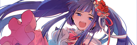
| It's DEEN being DEEN.DEEN has never been a great studio to begin with both content and especially quality wise.Their most notable works are Shouwa Genroku Rakugo Shinjuu and haven't seen but Rurouni Kenshin I guess. Konosuba II is just plain bad in terms of quality it's ugly , derpy etc. |
 |
Feb 2, 2017 6:02 PM
#246
Kittens-kun said: I like how you people take screenshots and try and act like the entire episode looks like that even when moving at normal speed. If you have to slow it down, to look frame by frame, to find these "lol deen quality xD" moments, then the art really isn't as bad as you say it is. You are right in some respects. Sometimes it is normal for anime in general to have somewhat off 'in between animations'. And because they often last less than a second they are hard to notice. But if you dont see other issue's you are just not paying attention. in Konosuba2 those scenes that are supposed to be just 'in between animation' take up a lot more time and therefore are FAR more noticeable. I don't wanna go through this episode right now, but I can show you scenes from ep1 that lasted up to 7 seconds and looked like complete shit. |
KetuekigamiFeb 2, 2017 6:09 PM
| Signature removed. Please follow the signature rules, as defined in the Site & Forum Guidelines. |
Feb 2, 2017 6:07 PM
#247
| It is 100% bad on purpose, but not in any conceivable good way. Ep1 looked AWFUL by all standards, it gave me Umineko flashbacks. Then episodes 2 and 3 were very good, but now 4 was pretty bad. I thought I was watching Konosuba and not HSotD? It is bad on purpose because they purposefully cut corners at times, or because Kikuta is obsessed with saggy tits. It does not add any charm, it is just bad quality. I have no idea how some people here set the bar so low that bad quality is "endearing". |
KetuekigamiFeb 2, 2017 6:24 PM
| Signature removed. Please follow the signature rules, as defined in the Site & Forum Guidelines. |
Feb 2, 2017 6:22 PM
#248
| Ugh... I hate it when people don't understand that this was CLEARLY intentional. This is why I made a big fat insult to Kikuta every time he becomes the chief animation director of the episodes so people won't blame DEEN directly. You see, here's the breakdown of the problem. Kikuta SUCKS. KIKUTA FUCKING SUCKS. That's who you want to blame, not DEEN. It's not a problem of out of budget, because episode 2 and 3 are arguably 100% better than episode 1 and 4 directed by Kikuta. Yes people, I have my own opinion of saying Kikuta sucks just like how I would say the Kardashian sucks no matter how much people like OP trying to defend them. Kikuta's artistic choice is shit. Here's the breakdown of his characteristics: - Bigger boobs than the character's design. - Bouncy boobs - Saggy boobs - Weird-looking faces - Derpy faces - Squash and stretch animation It's so off-putting every time he works on KonoSuba. He worked with episode 1, 3, 5, 7, 9, OVA of last season with season 2 episode 1 and 4. Then look how shit he is: Saggy boobs on Aqua, derpy face on Darkness.  Kikuta's VERY INTENTIONAL episode 9's sketch using squash and stretch animation: 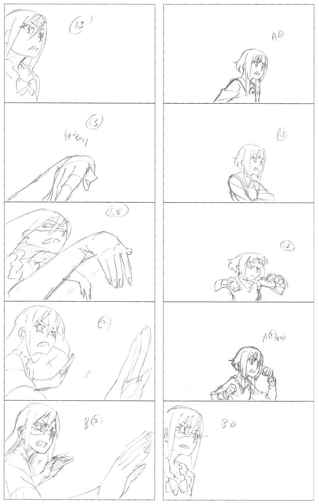 Oversized boobs and fucking huge boobs with sags on them can be found in episodes like yesterday with Darkness. Here's a comparison of Yunyun on episode 2 made by Ebara to Yunyun in OVA made by Kikuta:   Saggy boobs of episode 3, 5, season 2 episode 4: 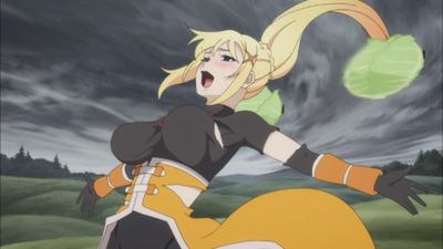 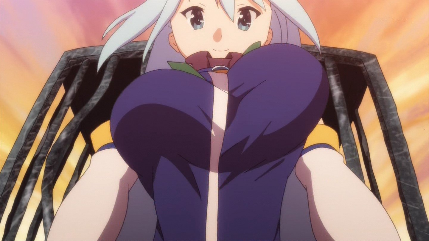 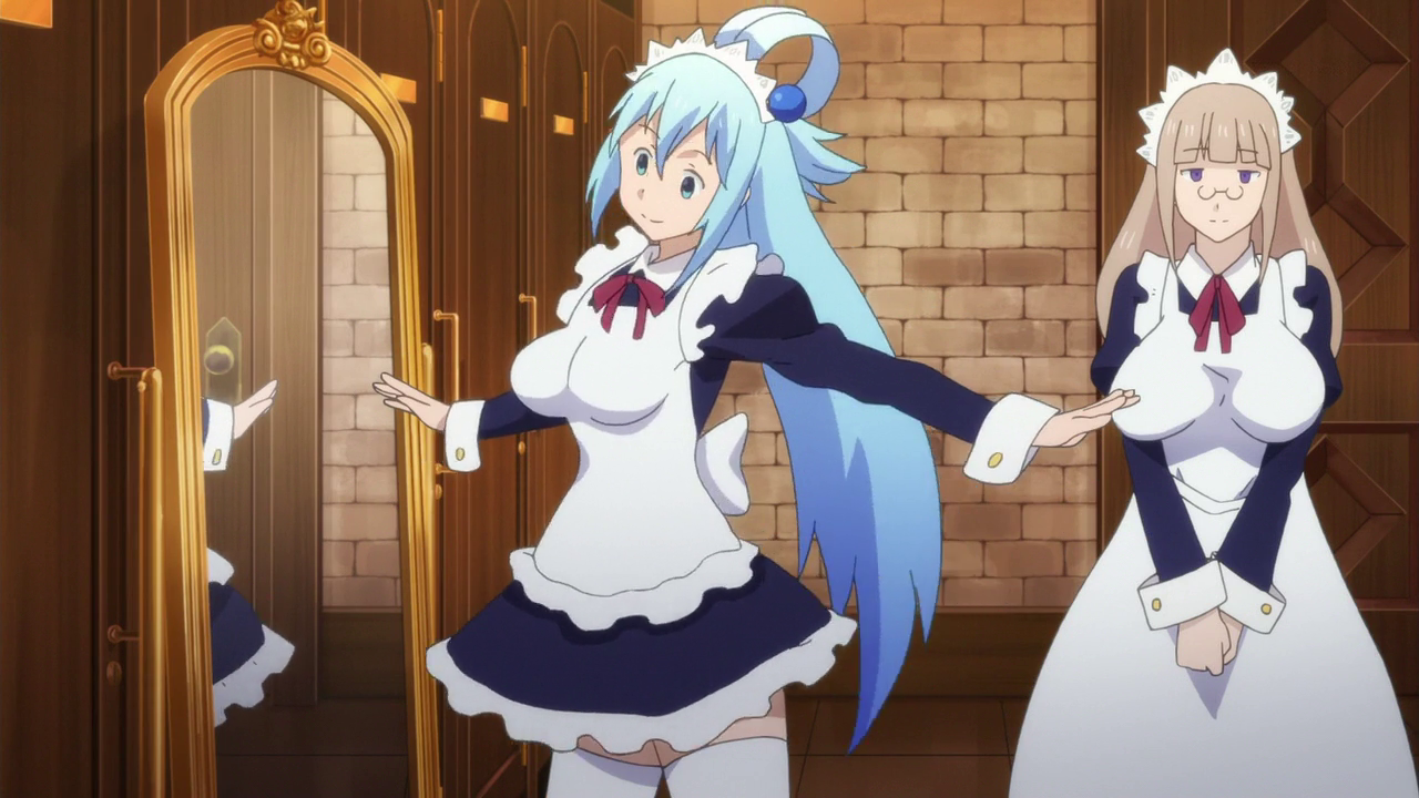 Humongous boobs. Darkness boobs become 2-3x bigger than her original: 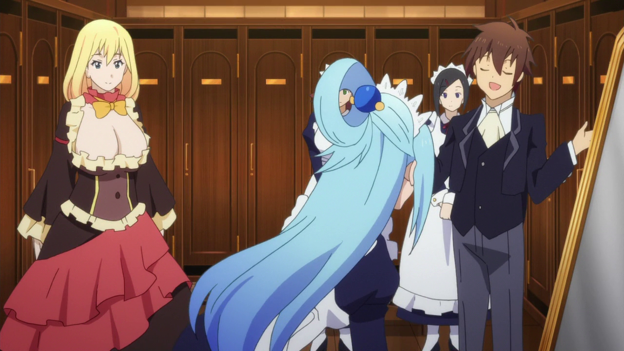 DERPY FACES CAN ONLY FOUND IN KIKUTA'S EPISODES. You won't find them in episode 2 or 3 of season 2 because Kikuta is nowhere near those. Meanwhile episodes made by Kikuta have them, prominently on episode 1 of season 2. TL;DR: BLAME FUCKING KIKUTA. Don't drag DEEN's name along with Ebara and Tanaka who made KonoSuba actually good in the last 2 episodes. The only time it were top notch was episodes not made by Kikuta. Aqua's god blow was beautifully animated in the last episode, not made by Kikuta.  Meanwhile Kikuta at his best: 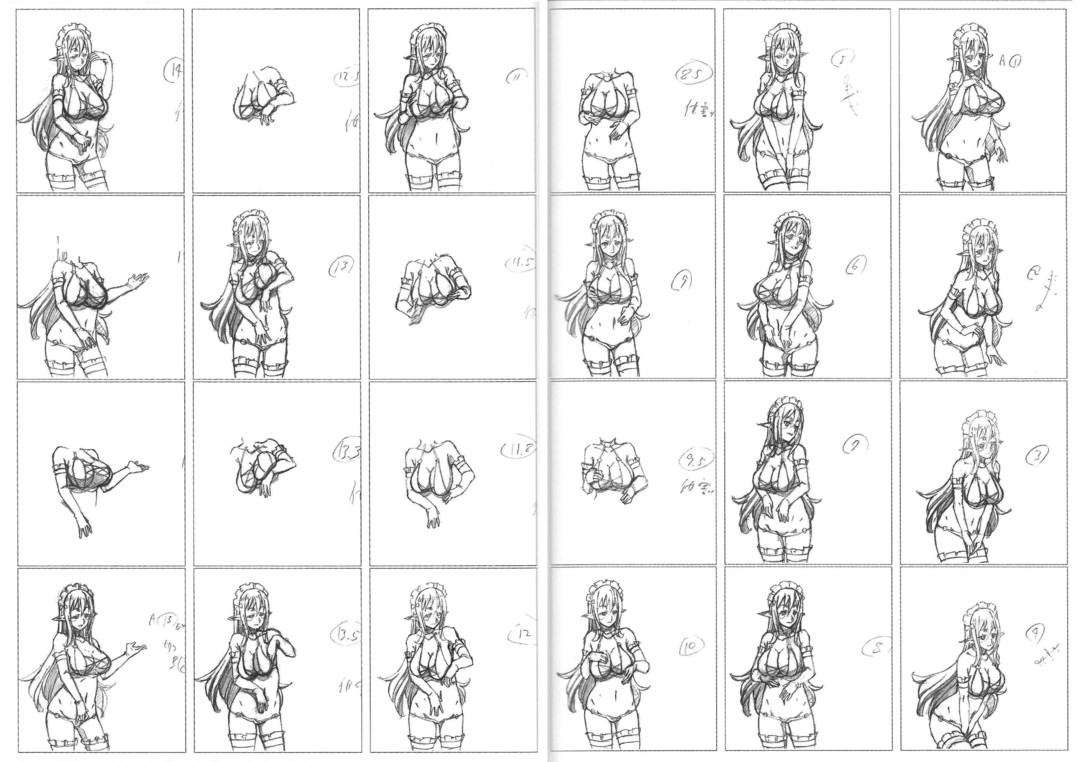 And KonoSuba never had good quality animations on season 1? Then you should compare Momoka's (chief animation director of ep 2, 4, 6, 8, 10) episode to Kikuta's on last season:  The part that irks me the most is that Kikuta made unproportional big boobs and sag them on every episodes he's on. What are we? Highschool of the Dead fanservice anime? |
DarklordVorFeb 2, 2017 6:42 PM
Feb 2, 2017 8:28 PM
#249
| @DarklordVor Wow. Great researched! 10/10. That's why the graphics reminds me of Jiggle boobs from HotD, I freaking hate them! I liked everything about KonoSuba except the graphics. (I didn't thought that it change largely by the chief animation directors/animators.) PLEASE STOP JIGGLING/SAGGY BOOBS!!! |
Feb 2, 2017 8:39 PM
#250
Insanity_42 said: @DarklordVor Wow. Great researched! 10/10. That's why the graphics reminds me of Jiggle boobs from HotD, I freaking hate them! I liked everything about KonoSuba except the graphics. (I didn't thought that it change largely by the chief animation directors/animators.) PLEASE STOP JIGGLING/SAGGY BOOBS!!! It clearly changed a lot by the chief animation directors. You can see how much he worked on the boobs in episode 9. Remember that over the top animation with the succubus massaging her own breasts for a long time? Ugh. KonoSuba was not even supposed to be all fanservicy like Highschool DxD.  Meanwhile Yunyun on episode 2 has smaller boobs and even Aqua has normal boobs on episode 3. Both not helmed by Kikuta. Here I tried to find almost the same angle to show how differ the boobs are: Tanaka's episode 3 Aqua: 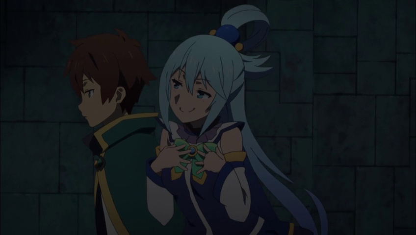 Kikuta's episode 4 Aqua: 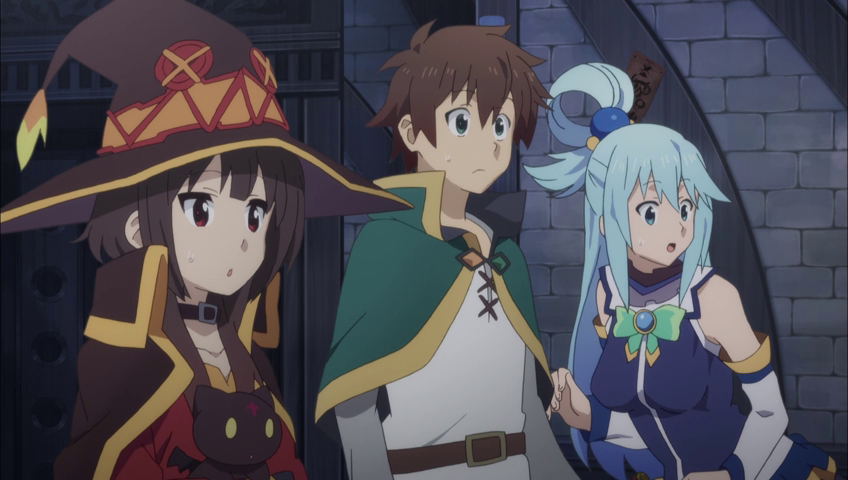 |
More topics from this board
Poll: » Kono Subarashii Sekai ni Shukufuku wo! 2 Episode 4 Discussion ( 1 2 3 4 5 ... Last Page )Stark700 - Feb 1, 2017 |
256 |
by Baskarite
»»
Oct 21, 10:14 PM |
|
Poll: » Kono Subarashii Sekai ni Shukufuku wo! 2 Episode 10 Discussion ( 1 2 3 4 5 ... Last Page )Stark700 - Mar 15, 2017 |
344 |
by k-angel
»»
Sep 16, 11:06 PM |
|
Poll: » Kono Subarashii Sekai ni Shukufuku wo! 2 Episode 2 Discussion ( 1 2 3 4 5 ... Last Page )Stark700 - Jan 18, 2017 |
300 |
by k-angel
»»
Sep 5, 11:28 PM |
|
Poll: » Kono Subarashii Sekai ni Shukufuku wo! 2 Episode 3 Discussion ( 1 2 3 4 5 )Stark700 - Jan 25, 2017 |
214 |
by nemma92
»»
Aug 16, 8:40 AM |
|
Poll: » Kono Subarashii Sekai ni Shukufuku wo! 2 Episode 6 Discussion ( 1 2 3 4 5 )Stark700 - Feb 15, 2017 |
225 |
by AniDisFan
»»
Jul 23, 7:15 AM |

