Forum Settings
Forums
New
Jan 8, 2022 6:44 PM
#1
Lead Admin
Faerie Queen

Offline
Aug 2007
6263


The "Seasonal Tile View" display on Desktop has been modified to:
  • Support the addition of new information + filters (coming soon)
  • Match the top bar to the app
    • grouping status/release information together
    • adding the episode duration to anime titles
    • making room for an episode countdown on Seasonal pages (in the future)
  • Include alternate language titles (based on the language chosen in your list settings)
  • Improve display of My List status information
These changes affect the Seasonal page and Anime/Manga Search pages for specific genres, themes, producers, etc.

Our goal was to modify the old design as little as possible, while making space for the new information that will come soon. Creating a more unified UX between app and desktop was a side bonus.

Please look forward to some more significant changes which will be rolling out in upcoming weeks~
Jan 8, 2022 7:04 PM
#2

Offline
Jan 2009
92527
>making room for an episode countdown on Seasonal pages (in the future)

i hope that is soon, since AniList have this for years already

but nice that MAL have more frequent updates this days

Jan 8, 2022 7:40 PM
#3
Offline
Feb 2015
568
Awesome! I barely use desktop but this is a nice addition
Jan 9, 2022 12:43 AM
#4
Offline
Apr 2016
17
I like. It's nice.

What would be good is to be able to filter the animes already seen in the search.
Jan 9, 2022 1:19 AM
#5
孔真・コウマコト

Offline
Jun 2017
7617
Oh, I was wondering why I saw this layout earlier today but I completely forgot about it the next second xD.

It’s a nice change, I suppose. I miss the previous style a little bit this feels cleaner so I’ll take it.
#Anime4Life be my Life Motto! #PrayForKyoAni


Jan 9, 2022 2:37 AM
#6
a lil bean ✨

Offline
Feb 2011
17577
I guess I will have to indeed wait for the rest of the changes. Right now I'm not really a fan of not having the studio/source on the top bar as it was. It made searching/spotting them much easier and helped tons.

I do like the new change of having the episode count and more visible the status. Also that it now shows the duration per episode or total duration. Oh and having the airing status change there was nice to see too.

Thanks for the continued improvement to the site, we are really behind on a lot of things =/

HiScoreLoScoreAuction

Turn-InsAWCc

ᓚᘏᗢ

Jan 9, 2022 2:42 AM
#7

Offline
Aug 2021
448
While I think this is a step in the right direction, I still feel that the studio needs to be highlighted at the top bar instead of being buried under the synopsis. The way we have to click a down chevron icon to view more of the synopsis felt kind of weird as well, as it's already placed in a scrollbox, but I think that's understandable considering the info placed under it. It's still a good change, can't wait to see all the upcoming features MAL has to offer!
Jan 9, 2022 3:39 AM
#8

Offline
Mar 2017
2196
Any possibility for allowing us to choose primary language for main heading for shows?
Jan 9, 2022 4:52 AM
#9
Offline
Feb 2010
44
I am well aware of modern web design and the narrow web page paradigm, but with the grid layout on the seasonal list etc, there is simply not enough space.

The webpage takes up less than half of the space on a 16:9 screen, and it's not like mobile was the consideration as it has it's own design.

I strongly suggest making the page a bit wider, this will remove the need for scrolling on almost every synopsis, allow for a bit larger images and overall be easier to read. I will say that apart from that the padding is way too big between the grids as well as around the anime title. With these changes you can achieve bigger images (with 320x220 you can barely make out faces in some posters, as well as fit descriptions without scrolling, it's a win-win for everyone.
Jan 9, 2022 5:06 AM

Offline
Apr 2018
395
Good changes. I think it would be better to switch between the score and members places, as the score will be in the middle.
Jan 9, 2022 7:05 AM
Ero Ojisan

Offline
Jun 2019
4907
I noticed this change when I was searching for anime today and its a nice feature.
Jan 9, 2022 7:08 AM

Offline
Feb 2020
1575
Oh yes! Episode countdowns! Will be of a great help to me instead of looking to AniList all the time
Jan 9, 2022 9:35 AM

Offline
Feb 2008
548
Will there be update where if a seasonal anime finishes airing, we get a notification for that? We get a notification for when the seasonal anime is about to air. It would also be great to see a notification for when the seasonal anime finishes airing too. Thank you.
In sterquiliniis invenitur.
Jan 9, 2022 10:55 AM

Offline
Nov 2008
998
With Studio, Source, Themes and Demographic highlighted in bold text and crammed together into description section, it feels cluttered. Add to that the fact that these rows are not aligned vertically between anime info boxes that are next to each other (see screenshot below) and it gets somewhat hard to read. I agree with the comments above that this information belongs in the top bar. It's consistent and easier to find that way.


Also, as odd as it may sound, the shortened member number (i.e. 123K) is harder to process for me than full (i.e. 217,546). It's not like there wasn't enough space to keep displaying it that way. Did this also carry over from mobile app design, where smaller screen size is taken into account?
GenoardJan 9, 2022 10:59 AM
AnimeThemes.moe <- the largest collection of anime Openings & Endings on the Web
AnimeMusicQuiz.com <- guess an anime from your list by it's Opening/Ending music browser game
Jan 9, 2022 1:29 PM

Offline
Apr 2017
132
I've already reported a bug on this, but I'll use this chance to give it some more attention: The page showing shows that will air later shows some really strange results and at this point I'm pretty certain it's related to this change. It's nothing fatal but should nevertheless be fixed.
Jan 9, 2022 2:58 PM

Offline
Jul 2019
15327
I was a fan of the whole number than the shortened one lmao. Just like to have more info yknow. But this looks like a mad update. Quite useful for sure.
Jan 9, 2022 3:41 PM

Offline
Jan 2021
432
Please improve the mobile version of MAL....
Roxy

Jan 9, 2022 4:50 PM

Offline
Jan 2021
2203
The only thing I don't like about this is the user count. Like, why though? I like to see the exact number and not just rounded up numbers. But I gotta say, this is pretty clean and nice


I hope no one I know irl sees my secret account~

Anyways, do I look cute in this outfit?~

Jan 9, 2022 5:16 PM
Can't wait for the addition of an episode countdown! But I agree with what some other users have said. I already found it a chore to scroll down to see the themes and demographics but now we have to do it for source and studio too?? This layout only works on the entires with shorts synopsis because you can see all the info at once. It should either be changed so you don't have to scroll down to see it on every entry or add another bar at the top expanding the box sizes to fit the info on top like it used to be. The genre section could be split between genres and themes then another line could be added for studio, source and demographic (if the entry has one). Also the 'add to list' and 'completed' buttons are a little to similar in color. Changing one would make it easier to distinguish them apart.
LittleKitty24Jan 9, 2022 5:26 PM
Jan 9, 2022 6:15 PM
I like water

Offline
Feb 2020
2930
I like these changes! I'll be waiting for episodes countdowns
Jan 9, 2022 7:40 PM

Offline
Mar 2008
46922
Not too bad. Will the episode countdown when it comes around also be able to optionally be set in settings to give you notifications for each episode like you currently can get when a show begins to air?
Jan 10, 2022 2:00 AM

Offline
Feb 2020
5797
Hiding studio/theme/source under the arrow, is a a very bad update. I really loved to sort and search out in seasonal page based on source material. Now I have to click at each and every arrow to find out what source anime was from. It made things tedious...now I might as wil open a new page instead of clicking on that arrow.

Edit- it actually worse. Its not hiding, its just some sort of alignment problem. Synopsis is the the one which is hidden. Studio/theme/source is actually going down the box thats its half why hidden by default. That is a weird faulty design. I hope the arrow alignment is corrected eventually
AdampkJan 10, 2022 2:42 AM
Click for a anime mashup!
BIO
Still not gone bandwagon u, keep crying. Here u are welcome to CRINGE at my EXISTENCE


Jan 10, 2022 5:39 AM

Offline
Jul 2021
5460
Episode countdowns would be really nice, looking forward to it.

The end of an era. Thank you Wit, Mappa and Isayama.
Feeling half happy, half sad.
  

Kawaii waifus
and precious
  best girls <3333


Jan 10, 2022 5:53 AM

Offline
Oct 2021
1247
Oh yes! Can't wait for the episode countdowns like Anichart.net
Jan 10, 2022 7:18 AM

Offline
Oct 2010
20636
it's mess, what happened with clear and clean designs
Jan 10, 2022 7:41 AM
Offline
Mar 2019
36
where did air times go?
Jan 10, 2022 10:21 AM
Anime Emperor

Offline
Jan 2019
338
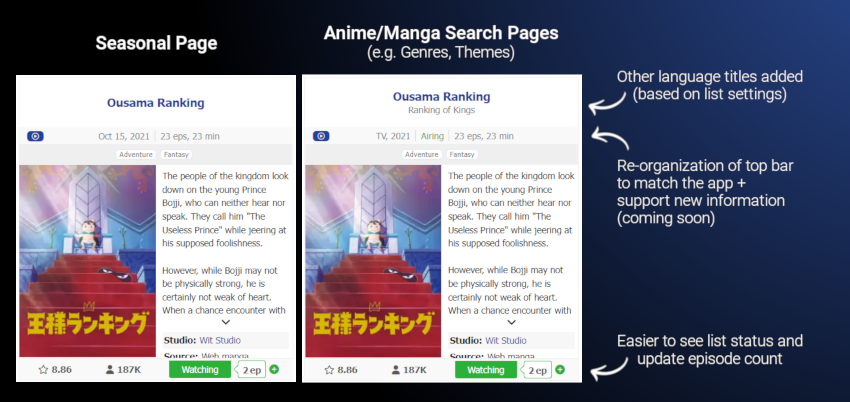
Let me start by saying I have been using desktop version way more than the mobile app. I have always loved using the seasonal section and I actually spend a lot of my time on MAL on it, not only for the current season but for previous seasons, too. I've been a fan of almost every change introduced in the last 5 years and could never say anything but praise for all your hard work so far. But honestly, this one is a huge, disastrous downgrade in my opinion. I feel that is has been made with the presumption that people mostly look only at the current season and not previous seasons which has led to some horrible decisions which made the seasonal page way worse. The things that I've found worse so far are:

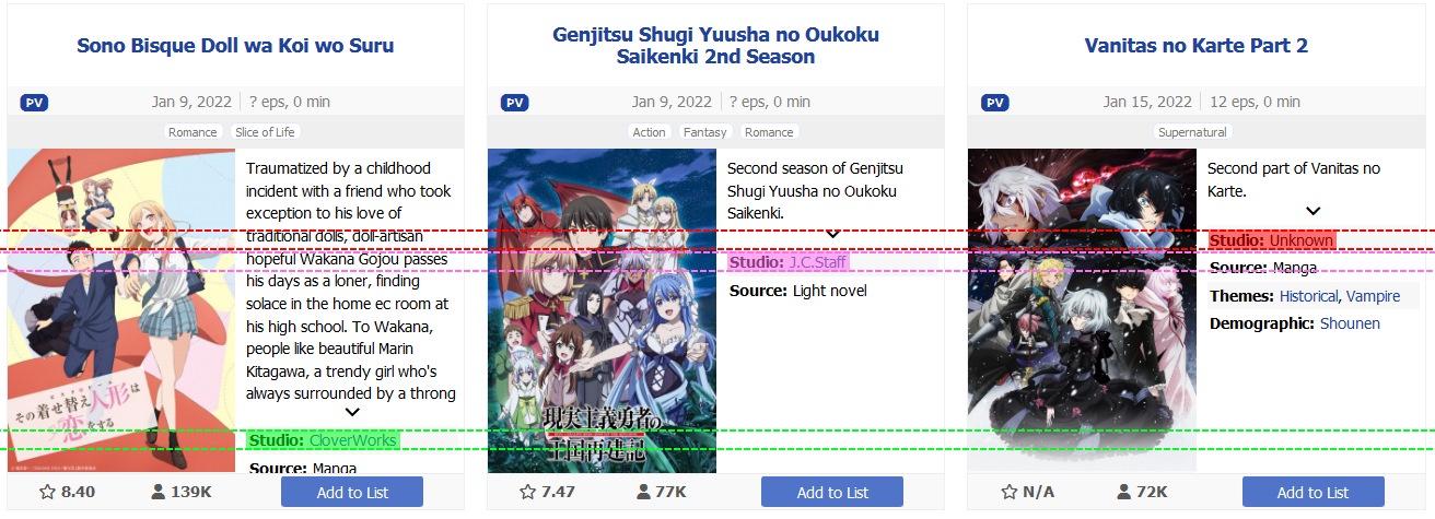
1) Studio name shoved below description. Studio name is probably one of the most important things about an anime because, well... it tells us who created it. Few things could be more vital than this and now they are in an ugly and hardly noticeable spot.

2) Average duration of episodes moved way above. Okay, seriously? We are talking about seasonal anime. In 99% of the cases, it's something between 22 and 24 minutes. Who would want to know if an anime is 1 minute longer or shorter?! What information does that bring us? Absolutely nothing. Awful move, to say the least.

3) Air date moved way above without mentioning the hour. Another hideous change. Ok, I might have not detested this change if it was at least serving its purpose of giving me an information when will an anime I anticipate start. But it's not even doing that - because of timezones, Jan 10 might be Jan 10 or Jan 9 for me. So not only did you completely ignore all people who look at previous seasons and don't care which date exactly did an anime start airing in Summer 1992, you demolished the chance to give the full information and gave only the sole date, which on its own does more to mislead people than give them to correct time when they'd expect the anime to air. So, to summarize it - you introduce a change which could have been useful only for one page out of the entirety of above 400 anime seasons in history (and number would only rise), only for around of 4 months (at the very end and beginning of each quarter), but actually would might often prove to be misleading.

4) Number of members rounded in a weird way. Ye, it might be not that significant whether the members of an anime are 867K or 868K, for example. But for the rounding of millions, this change is makes us lose visibility of tens of thousands. 1.7M might be 1,650,000 but it might also be 1,749,999. Furthermore, it looks simply weird and way worse than it used be. And you had enough to space for those few more digits so you don't actually win anything with it. If you want to give us information - give us the full one.

5) "Add" button uses almost the same color as "completed". This one is a very niche change for people like me who want to be able to recognize in just a glance the status of their seasonal anime for the given season, without reading its name. Before these changes, it was easily visible - grey for not added and blue for completed. Ye, well, not anymore. Now "Completed" and "Add to List" are colored almost the same and I have to stop for a split-second and take a look to see whether I completed the anime. Which completely destroys the idea of being able to tell which anime I have or haven't watched without reading the names cause I take the time to look at the status, I'd rather just read the name.

6) Promotional video button made larger and more visible. This also might be something that affects only me and a small portion of people - but there are some who don't really care about promotional videos. Great, you've added the option for enthusiasts to do so - why make it larger now? Furthermore, the blue color adds up to the blue of "Completed"/"Add to List" buttons and becomes too dominating and tough on the eyes.

Of course, it hasn't been all bad. To end with something positive, I'd say that I really dig the way you added our rating next to the status of the anime. Now that's a great change. But for all the rest, they really hinder the way I use the site and I'd definitely start using it way less if at least some of them aren't resolved in the near future. It just kills my fun when looking at seasonal anime's page.
Lionel13927Jan 10, 2022 10:25 AM
Jan 10, 2022 1:28 PM

Offline
Oct 2018
59
I dislike the update. Here's why:

1. Add to list thing now takes way too much place and has the same color as completed - blue. Previously it was easier to see how many animes from KyoAni I completed for example. And there wasn't that big blue tile add to list which is bugging me a bit. Now it isn't really easier to see list status. And simple white "add" is better than big blue "add to list".

2. Titles take too much time now. (I use only japanese titles) Apparently "for the new information that will come soon".

3. (The most important one) It is harder to find studio which made the show and source material. Instead we have episode length feature which is good for finding short-episode anime but most anime have about 24 min so it is less important.

4. Shortened numbers
Lionel13927 said:

4) Number of members rounded in a weird way. Ye, it might be not that significant whether the members of an anime are 867K or 868K, for example. But for the rounding of millions, this change is makes us lose visibility of tens of thousands. 1.7M might be 1,650,000 but it might also be 1,749,999. Furthermore, it looks simply weird and way worse than it used be. And you had enough to space for those few more digits so you don't actually win anything with it. If you want to give us information - give us the full one.
Agree. (Btw good post.)

5. It looks messy. (It is little bit hurting my eyes maybe they will adapt with time)
Why episode length and total episode information is seperated by comma not line like with air date. (ok maybe this one is not that bad.)
MiscanthusJan 14, 2022 11:52 AM
Jan 11, 2022 1:54 AM

Offline
Nov 2013
204
This is a terrible update, it's way too messy. I'm not gonna go into details cause people like Miscanthus and more have said it better than I ever could.

But I will add that the removal or the air time (As in the time of day that it airs) is a serious loss, now it's gonna take an extra click or specifcally serching for a show just to re-check what time it airs each day instead of easily scrolling down seasonal and seeing it, along with everything else that day right next to it when organised by air date. Makes it so easy to know at what point in what day I'll be able to get the episodes, not I need to check each one individually on their page and that'll take so much longer.
LOL, your opinion is wrong!
Jan 11, 2022 6:11 AM

Offline
Oct 2014
3645
mobile design still looks primitive. I need to switch everytime when using mal from mobile. We need a permanent switch.
Jan 11, 2022 6:20 AM

Offline
Oct 2018
1808
The layout looks garbage than before. Just... Get back the old layout pls thanks.


“Once you've been loved once and have loved once, you cannot forget it.”
― Natsume Takashi
Jan 12, 2022 1:24 AM
Offline
Sep 2021
2
.............,.,.,.,.,.
Aowkwok
Jan 13, 2022 11:27 PM

Offline
Aug 2013
5337
Please add an option to show original Japanese title (kanji) instead of English localized one.
Dub = fake crap. Always.
Jan 16, 2022 8:33 PM

Offline
Jul 2017
13348
Nice small change...

...but in all honesty, it only makes the small details look more cluttered than it was before. Have an idea of how anime lists like LiveChart, Anlist or other anime-recording sites are done, then implement here instead, thanks.
Jan 17, 2022 6:22 PM

Offline
Feb 2021
80
Already saw that its good to see that the app is being update for good causes
Between dreams and reality is the vault of your soul. No one could see the “Dream World” without this path.
芸淑 芸


Jan 19, 2022 12:23 AM
Offline
May 2021
92
Junelovesanime said:
Awesome! I barely use desktop but this is a nice addition
right
Jan 25, 2022 8:14 AM

Offline
Aug 2020
40
yo, add to list and completed are too similar in color its hard to see, change it please
Feb 3, 2022 11:20 PM
平沢唯

Offline
Dec 2016
2197
I'm glad that development has finally started back up in full. Loving the new changes the last months, although it does make my job as a list designer harder haha. Keep it up! :)
Jul 3, 2023 5:45 AM

Offline
Mar 2012
183
Is this a automatic as a  Status?

Anime-Planet.com - anime | manga | watch anime online
Sep 8, 2023 1:13 PM
Offline
Oct 2018
3
Less cluttered and info is easier to ingest.....just not as pretty ui wise

More topics from this board

» [Challenge] You Should Read This Manga 2024 ( 1 2 3 4 5 )

Kineta - Feb 23

211 by niladribarua »»
6 hours ago

» Moderators Wanted! Accepting applications for all positions

Kineta - Yesterday

0 by Kineta »»
Yesterday, 6:46 PM

» Try MAL's New Mobile Site! ( 1 2 3 4 5 ... Last Page )

Xinil - Feb 15, 2015

423 by RED-clover12 »»
Apr 24, 10:19 AM

» Planned 5hr Maintenance, Thursday April 25 @ 1am-6am PT

Kineta - Apr 22

0 by Kineta »»
Apr 22, 8:10 PM

» New Site Update: Peak Anime 🗻 ( 1 2 3 4 5 )

Kineta - Mar 31

213 by Lancelot73 »»
Apr 21, 4:28 AM
It’s time to ditch the text file.
Keep track of your anime easily by creating your own list.
Sign Up Login