New
Apr 19, 2018 1:00 AM
#1

This is a custom layout for modern template lists. If you don't know how to install the codes, click here to view the Beginner's Tutorial. If there are problems: install the latest version, or check the Repair Thread for patches and updates (found here). All premade modern layouts can be found in the gallery by clicking here, and more ways to customize your list can be found here. 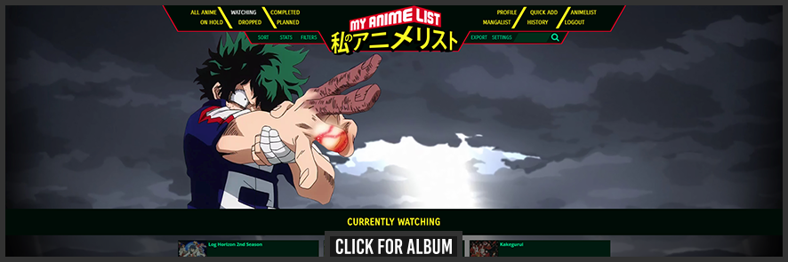 Introduction  This theme was made for the 2017 list design competition here in Shishio's club, so it was interesting being on a time crunch for once. I was quite into watching airing anime, especially My Hero Academia, so you may be able to see where some of the design decisions come from. :) I went all out on the top bar, packing just about everything up there; It was an interesting challenge from a technical point of view! Not everything turned out exactly how I wanted, but I had a lot of fun creating this. I hope someone has fun using it! Theme Specifications & Highlights:
  If you have any feedback, I welcome replies. I don't respond to everything but I do read and appreciate it. Changelog • My Other List Designs • Source Code |
Valerio_LyndonJan 7, 10:21 PM
Reply Disabled for Non-Club Members
Aug 20, 2018 8:55 PM
#2

| Edited the code in the OP so that it can be seen by other users and ppl who are logged out. Hope that's ok! Have to do it to cut down on the problems ppl are having |
Oct 3, 2018 1:06 AM
#3
| @Almirage Sorry for the late response, I won't bore you with the excuses. Anyhow, I've finally pushed an update to the theme for mangalist support. This is what it looks like.  And here's the options for the mangalist:  Hope it's close to what you were hoping for.~ |
Oct 4, 2018 4:03 AM
#4

Thank you, the fixes enabled me to go and personalize it as I intended before. I've mostly done the edits I wanted to, but I've come across something I can't figure out on my own. This black thing here, I wasn't able to find its color code due to it being a gradient using image editing software. I want to change its color to match the rest of my color scheme but I don't know where to change the value. |
AlmirageOct 5, 2018 8:33 PM
Oct 6, 2018 1:16 PM
#5
Almirage said: You really went all out, wow! Didn't expect anyone to ever put up with this theme's CSS long enough to modify it haha. Looking good!Thank you, the fixes enabled me to go and personalize it as I intended before. I've mostly done the edits I wanted to, but I've come across something I can't figure out on my own. This black thing here, I wasn't able to find its color code due to it being a gradient using image editing software. I want to change its color to match the rest of my color scheme but I don't know where to change the value. As to the colour value, you can find it in the code under ".data.studio:after". It's normally set to the same colour as the list entries secondary background, so with your colour scheme we could change it to this... .data.studio:after {
/* ...other values here... */
background: linear-gradient(to right, rgba(226,226,226,0), rgba(226,226,226,1) 80%);
} Also looks like the tag boxes left side is still the default colour, which would be found under the border-left property of ".data.tags:before". Here's it set to the same colour as the rest. Also looks like the tag boxes left side is still the default colour, which would be found under the border-left property of ".data.tags:before". Here's it set to the same colour as the rest..data.tags:before {
/* ...other values here... */
border-left: 2px solid #fafafa;
}I will get to the rest of your post in the help thread later today, assuming they're still causing you trouble. |
Oct 6, 2018 6:17 PM
#6
Valerio_Lyndon said: You really went all out, wow! Didn't expect anyone to ever put up with this theme's CSS long enough to modify it haha. Looking good! MAL broke my former CSS sometime ago with the shutdown business, so I figured if I was going to go get a new style I should go get the best one I could for a fresh look, especially one that could take advantage of the various graphical resources I got my hands on since then. I really appreciate that you made this list style, and even configured it for the mangalist on request, since I can't actually work with CSS personally having never learned how to code. Couldn't let myself half-ass it with something so nice to work with, haha. |
Oct 6, 2018 10:14 PM
#7
Almirage said: Ah, sucks that your old one got broken. I'm glad you like the design, much appreciate the support.~Valerio_Lyndon said: You really went all out, wow! Didn't expect anyone to ever put up with this theme's CSS long enough to modify it haha. Looking good! MAL broke my former CSS sometime ago with the shutdown business, so I figured if I was going to go get a new style I should go get the best one I could for a fresh look, especially one that could take advantage of the various graphical resources I got my hands on since then. I really appreciate that you made this list style, and even configured it for the mangalist on request, since I can't actually work with CSS personally having never learned how to code. Couldn't let myself half-ass it with something so nice to work with, haha. |
Feb 26, 2019 2:03 AM
#8

| @Valerio_Lyndon i hope its not too late but i have a very simple question, in your layout of boku no hero academia if i were to change all the text color of the names of anime from green to red what code do i have to change, if only can you pinpoint that, im having trouble locating it. |


Feb 26, 2019 2:17 AM
#9
Van-Balthazar said: Hm, I believe this code should work, just append it to the bottom of your CSS and then change the colour to anything. :) If you were looking for the code in the original theme it would be ".list-table .list-table-data .data a" which changes every link on list entries, not just the title.@Valerio_Lyndon i hope its not too late but i have a very simple question, in your layout of boku no hero academia if i were to change all the text color of the names of anime from green to red what code do i have to change, if only can you pinpoint that, im having trouble locating it. /*Title Colour*/
.list-table .list-table-data .title a {
color: #ea2c2c !important;
}
/*Title Colour On Hover*/
.list-table .list-table-data .title a:hover {
color: #fff600 !important;
} |
Feb 26, 2019 11:22 PM
#10
| @Valerio_Lyndon Hm, I believe this code should work, just append it to the bottom of your CSS and then change the colour to anything. :) If you were looking for the code in the original theme it would be ".list-table .list-table-data .data a" which changes every link on list entries, not just the title. /*Title Colour*/
.list-table .list-table-data .title a {
color: #ea2c2c !important;
}
/*Title Colour On Hover*/
.list-table .list-table-data .title a:hover {
color: #fff600 !important;
}amm, i got throught that problem, and things went super smooth, thanks alot for that, but im stuck at another place now, the images of midoriya, bakugo etc you placed in your layout, when i try to replace them with my images they blur, despite the fact that they are of high quality they lower down as soon as they set into the list. no matter what sizes and positions i choose, any suggestions what i might be missing here sorry for the trouble !! |
SatsugaiDeAtsuFeb 26, 2019 11:36 PM
Feb 27, 2019 3:10 AM
#11
| @Valerio_Lyndon I found a way on my own, and have completed my list edit. Thank you, Because of you i was finally able to make my own fairy tail list layout, Thanks a ton,,, |
Feb 27, 2019 8:25 PM
#12
Van-Balthazar said: Good to hear, and I'm glad the design came in handy! :3@Valerio_Lyndon I found a way on my own, and have completed my list edit. Thank you, Because of you i was finally able to make my own fairy tail list layout, Thanks a ton,,, |
Apr 3, 2019 2:20 PM
#13
jonlo987 said: Hi, I am editing a bit of the modern css of Boku no Hero (https://myanimelist.net/forum/?topicid=1723118) and I would like to change only the viewing part of the anime list for this image (https://image.myanimelist.net/ui/OK6W_koKDTOqqqLDbIoPAnUL24OeT2udBExV1JsNk_s) taken from the second post of the forum https://myanimelist.net/forum/?topicid=1544259&show=50. I have tried to adapt the anime list with different css of this style, but I can not modify only the list display, I always break the initial menu. Could someone pass me please the css that makes possible the list of animes as shown in the picture? And if it is possible, in whitch part of Boku no Hero's css have to add it? Thanks in advance. Moving your post over here to the topic for it I don't follow what you're trying to do exactly- do you want more anime per row? |
Apr 3, 2019 3:20 PM
#14
Shishio-kun said: jonlo987 said: Hi, I am editing a bit of the modern css of Boku no Hero (https://myanimelist.net/forum/?topicid=1723118) and I would like to change only the viewing part of the anime list for this image (https://image.myanimelist.net/ui/OK6W_koKDTOqqqLDbIoPAnUL24OeT2udBExV1JsNk_s) taken from the second post of the forum https://myanimelist.net/forum/?topicid=1544259&show=50. I have tried to adapt the anime list with different css of this style, but I can not modify only the list display, I always break the initial menu. Could someone pass me please the css that makes possible the list of animes as shown in the picture? And if it is possible, in whitch part of Boku no Hero's css have to add it? Thanks in advance. Moving your post over here to the topic for it I don't follow what you're trying to do exactly- do you want more anime per row? Hi, I want to maintain the structure of Boku no Hero modern css but that the visualization of the anime list be like covers, but I can not edit it correctly. So you can get an idea of what I want, look at this image https://i.imgur.com/WbHvdha.png. I'm not editing it well, since the images are blurry and some strange characters appear, this would be the main thing. Then if there was some way to add "Start/End Dates" on the images, it would be perfect, but this would be something additional if there were possibility. Thanks |
Apr 3, 2019 6:43 PM
#15
jonlo987 said: Shishio-kun said: jonlo987 said: Hi, I am editing a bit of the modern css of Boku no Hero (https://myanimelist.net/forum/?topicid=1723118) and I would like to change only the viewing part of the anime list for this image (https://image.myanimelist.net/ui/OK6W_koKDTOqqqLDbIoPAnUL24OeT2udBExV1JsNk_s) taken from the second post of the forum https://myanimelist.net/forum/?topicid=1544259&show=50. I have tried to adapt the anime list with different css of this style, but I can not modify only the list display, I always break the initial menu. Could someone pass me please the css that makes possible the list of animes as shown in the picture? And if it is possible, in whitch part of Boku no Hero's css have to add it? Thanks in advance. Moving your post over here to the topic for it I don't follow what you're trying to do exactly- do you want more anime per row? Hi, I want to maintain the structure of Boku no Hero modern css but that the visualization of the anime list be like covers, but I can not edit it correctly. So you can get an idea of what I want, look at this image https://i.imgur.com/WbHvdha.png. I'm not editing it well, since the images are blurry and some strange characters appear, this would be the main thing. Then if there was some way to add "Start/End Dates" on the images, it would be perfect, but this would be something additional if there were possibility. Thanks OK, you want something like this code below for big preview pics  You can edit anything further with Inspect Element (see this topic) or just ask https://myanimelist.net/forum/?topicid=1329419 @\import "https://valeriolyndon.github.io/MAL-Public-List-Designs/Tilt%20Theme/Theme%20-%20Compressed.css"; @\import "https://malscraper.azurewebsites.net/covers/auto/presets/dataimagelinkbefore"; /* COVER AREA The area taken up by covers. */ .list-block { /* variables used in calc (explicit names) */ --height-img: 250px !important; --width-img: 178px !important; } /* HD COVER SIZE The size of covers seen. */ .data.image a:before{ background-size: cover !important; height: 250px !important; width: 178px !important; background-position: center center !important; } /* LOW RES COVER SIZE You only see this if the import for high res covers goes down. */ a img{ background-size: cover !important; height: 250px !important; width: 178px !important; } /* OTHER CODES*/ .data.image .image{ display: inherit !important; background-repeat: no-repeat !important; } a img{ display: block !important; border: none !important; background-repeat: no-repeat !important; } .data.image a:before{ display: block; content: ""; position: absolute; background-repeat: no-repeat !important; } .list-table-data { width: 340px; height: 250px; } .add-edit-more { width: 180px; height: 250px;} .data.title .link.sort { left: 110px; } |
Apr 3, 2019 7:02 PM
#16
jonlo987 said: Shishio-kun said: jonlo987 said: Hi, I am editing a bit of the modern css of Boku no Hero (https://myanimelist.net/forum/?topicid=1723118) and I would like to change only the viewing part of the anime list for this image (https://image.myanimelist.net/ui/OK6W_koKDTOqqqLDbIoPAnUL24OeT2udBExV1JsNk_s) taken from the second post of the forum https://myanimelist.net/forum/?topicid=1544259&show=50. I have tried to adapt the anime list with different css of this style, but I can not modify only the list display, I always break the initial menu. Could someone pass me please the css that makes possible the list of animes as shown in the picture? And if it is possible, in whitch part of Boku no Hero's css have to add it? Thanks in advance. Moving your post over here to the topic for it I don't follow what you're trying to do exactly- do you want more anime per row? Hi, I want to maintain the structure of Boku no Hero modern css but that the visualization of the anime list be like covers, but I can not edit it correctly. So you can get an idea of what I want, look at this image https://i.imgur.com/WbHvdha.png. I'm not editing it well, since the images are blurry and some strange characters appear, this would be the main thing. Then if there was some way to add "Start/End Dates" on the images, it would be perfect, but this would be something additional if there were possibility. Thanks This will add back the data started and finished parts, but you have to move them where you want them. They also need a color set since its black by default and hard to see. .data.started, .data.finished{ color: white !important; position: relative !important; font-size: 10px !important; top: 0px; left: 0px; } .data.finished{ top: 0px; left: 20px; } |
Apr 4, 2019 10:32 AM
#17
Shishio-kun said: jonlo987 said: Shishio-kun said: jonlo987 said: Hi, I am editing a bit of the modern css of Boku no Hero (https://myanimelist.net/forum/?topicid=1723118) and I would like to change only the viewing part of the anime list for this image (https://image.myanimelist.net/ui/OK6W_koKDTOqqqLDbIoPAnUL24OeT2udBExV1JsNk_s) taken from the second post of the forum https://myanimelist.net/forum/?topicid=1544259&show=50. I have tried to adapt the anime list with different css of this style, but I can not modify only the list display, I always break the initial menu. Could someone pass me please the css that makes possible the list of animes as shown in the picture? And if it is possible, in whitch part of Boku no Hero's css have to add it? Thanks in advance. Moving your post over here to the topic for it I don't follow what you're trying to do exactly- do you want more anime per row? Hi, I want to maintain the structure of Boku no Hero modern css but that the visualization of the anime list be like covers, but I can not edit it correctly. So you can get an idea of what I want, look at this image https://i.imgur.com/WbHvdha.png. I'm not editing it well, since the images are blurry and some strange characters appear, this would be the main thing. Then if there was some way to add "Start/End Dates" on the images, it would be perfect, but this would be something additional if there were possibility. Thanks This will add back the data started and finished parts, but you have to move them where you want them. They also need a color set since its black by default and hard to see. .data.started, .data.finished{ color: white !important; position: relative !important; font-size: 10px !important; top: 0px; left: 0px; } .data.finished{ top: 0px; left: 20px; } Thanks, I'll try |
Apr 11, 2019 1:33 PM
#18
jonlo987 said: Shishio-kun said: jonlo987 said: Shishio-kun said: jonlo987 said: Hi, I am editing a bit of the modern css of Boku no Hero (https://myanimelist.net/forum/?topicid=1723118) and I would like to change only the viewing part of the anime list for this image (https://image.myanimelist.net/ui/OK6W_koKDTOqqqLDbIoPAnUL24OeT2udBExV1JsNk_s) taken from the second post of the forum https://myanimelist.net/forum/?topicid=1544259&show=50. I have tried to adapt the anime list with different css of this style, but I can not modify only the list display, I always break the initial menu. Could someone pass me please the css that makes possible the list of animes as shown in the picture? And if it is possible, in whitch part of Boku no Hero's css have to add it? Thanks in advance. Moving your post over here to the topic for it I don't follow what you're trying to do exactly- do you want more anime per row? Hi, I want to maintain the structure of Boku no Hero modern css but that the visualization of the anime list be like covers, but I can not edit it correctly. So you can get an idea of what I want, look at this image https://i.imgur.com/WbHvdha.png. I'm not editing it well, since the images are blurry and some strange characters appear, this would be the main thing. Then if there was some way to add "Start/End Dates" on the images, it would be perfect, but this would be something additional if there were possibility. Thanks This will add back the data started and finished parts, but you have to move them where you want them. They also need a color set since its black by default and hard to see. .data.started, .data.finished{ color: white !important; position: relative !important; font-size: 10px !important; top: 0px; left: 0px; } .data.finished{ top: 0px; left: 20px; } Thanks, I'll try Hello again, I have managed to advance a lot, but two things have come up: 1- I can not see correctly the icons that appear in the progress of each anime on the top left. 2- How can I change the heart icon on top left? I have seen in the CSS that there is a section where a square appears (content: "" in line 914, 926,...), I suppose it will be a character that is not able to read it. What do I have to add here to change the icon? a link to an image? I attached image of how am I: https://i.imgur.com/BSixmxo.png I also attach link to CSS: https://github.com/jonlo987/anime/blob/master/Boku%20no%20Heroe%20css Thank you very much again |
Apr 11, 2019 4:14 PM
#19
@jonlo987 You can fix the progress by going to line 59 and finding this code....data.chapter:before,.data.progress:before,.data.season:before,.data.tags:before,.header-info:after,.header-info:before,.header:after,.header:before,.list-table>tbody:first-of-type:after,.status-menu-container:after,.status-menu-container:before{.header-info:after,.header-info:before,.header:after,.header:before,.list-table>tbody:first-of-type:after,.status-menu-container:after,.status-menu-container:before{The heart icon is controlled by a ':before' element with a text-based heart icon, which would probably be the box you're describing. Not sure why it shows up as a box for you. It also seems to have been converted to question marks in the code you provided for some reason. You could try putting an image there, and it would work. But it's a lot easier to work with images using the background-image property rather than the content property. If you're looking to use a custom image, I'd advise going to line 1109 and changing this code... .list-container .list-unit .list-table .list-item .list-table-data .data.score::before {
display: inline-block;
font: normal normal normal 28px / 1 FontAwesome;
-webkit-font-smoothing: antialiased;
-moz-osx-font-smoothing: grayscale;
text-rendering: auto;
position: absolute;
color: #df2020;
content: "?";
z-index: -1;
right: 0;
top: 0;
text-shadow: rgba(0, 0, 0, 0.5) 1px 1px 2px;
}.list-container .list-unit .list-table .list-item .list-table-data .data.score::before {
content: "";
position: absolute;
top: 0;
right: 0;
z-index: -1;
display: block;
width: 28px;
height: 28px;
background: url(IMAGEHERE) center / contain no-repeat;
}The difference between the two codes is that the first is using a text-based icon and has a lot of lines in relation to that: color, font-smoothing, text-shadow, etc. Specifically, it's using FontAwesome, which is a font meant for displaying icons. To switch to an image-based format, I removed all the properties relating to text and added in the relevant image properties: width, height, background. |
Valerio_LyndonApr 11, 2019 4:20 PM
Apr 11, 2019 4:15 PM
#20
| @Shishio-kun Never got around to saying it, but thank you very much for answering this the other week. ^^ |
Apr 11, 2019 8:58 PM
#21
Valerio_Lyndon said: @Shishio-kun Never got around to saying it, but thank you very much for answering this the other week. ^^ No problem; you answered way more other stuff recently than me so thanks to you too :D |
Apr 12, 2019 3:13 PM
#22
Valerio_Lyndon said: @jonlo987 You can fix the progress by going to line 59 and finding this code... .data.chapter:before,.data.progress:before,.data.season:before,.data.tags:before,.header-info:after,.header-info:before,.header:after,.header:before,.list-table>tbody:first-of-type:after,.status-menu-container:after,.status-menu-container:before{.header-info:after,.header-info:before,.header:after,.header:before,.list-table>tbody:first-of-type:after,.status-menu-container:after,.status-menu-container:before{The heart icon is controlled by a ':before' element with a text-based heart icon, which would probably be the box you're describing. Not sure why it shows up as a box for you. It also seems to have been converted to question marks in the code you provided for some reason. You could try putting an image there, and it would work. But it's a lot easier to work with images using the background-image property rather than the content property. If you're looking to use a custom image, I'd advise going to line 1109 and changing this code... .list-container .list-unit .list-table .list-item .list-table-data .data.score::before {
display: inline-block;
font: normal normal normal 28px / 1 FontAwesome;
-webkit-font-smoothing: antialiased;
-moz-osx-font-smoothing: grayscale;
text-rendering: auto;
position: absolute;
color: #df2020;
content: "?";
z-index: -1;
right: 0;
top: 0;
text-shadow: rgba(0, 0, 0, 0.5) 1px 1px 2px;
}.list-container .list-unit .list-table .list-item .list-table-data .data.score::before {
content: "";
position: absolute;
top: 0;
right: 0;
z-index: -1;
display: block;
width: 28px;
height: 28px;
background: url(IMAGEHERE) center / contain no-repeat;
}The difference between the two codes is that the first is using a text-based icon and has a lot of lines in relation to that: color, font-smoothing, text-shadow, etc. Specifically, it's using FontAwesome, which is a font meant for displaying icons. To switch to an image-based format, I removed all the properties relating to text and added in the relevant image properties: width, height, background. That's perfect, thank you very much Valerio_Lyndon |
Jun 2, 2021 6:18 PM
#23
| Moving your post over here, you should look thru the previous posts to see if any of them already answer any of your questions Dull_Doll said: So I would like to make 2 separate background Visit MyAnimeList  #1 in red is the background I want to change. #2 in yellow is to indicate that the back ground from #1 and the anime pictures are blend with some kind of dark shader. and I want to remove that. #3 I want to keep it like this. My current background size is 500x500 I'm still working on my 2rd background. I intend to make it 500x500 repeated. I'd be really gratefull if someone could help me with this since I d'ont have any knowlegde about css. edit: this is the premade css I used ( https://myanimelist.net/forum/?topicid=1723118 ) |
Jun 6, 2021 12:35 AM
#24
Dull_Doll said: So I would like to make 2 separate background Visit MyAnimeList #1 in red is the background I want to change. #2 in yellow is to indicate that the back ground from #1 and the anime pictures are blend with some kind of dark shader. and I want to remove that. #3 I want to keep it like this. My current background size is 500x500 I'm still working on my 2rd background. I intend to make it 500x500 repeated. I'd be really gratefull if someone could help me with this since I d'ont have any knowlegde about css. For the anime picture darkening, you can actually find that option near the top of the CSS as seen here: 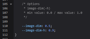 You can change the "0.5" to "0" to remove the primary darkening. If you want, you can also lower the "0.9" to reduce or remove the darkening on hover as well. 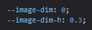 The darkening behind the list items is controlled by the "--list-bg" colour variable, also found near the top of the code. 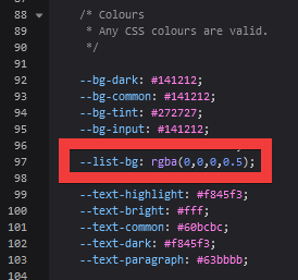 You can change this to rgba(0,0,0,0) or "transparent" to remove it.  If you want to add a background behind the list items, that will require some new code. Add to the bottom of the CSS.  /* List background */
.list-block {
background: url(https://i.imgur.com/DCJTMdz.jpg) repeat center top / 500px auto scroll;
}Hope that helps. |
Jun 8, 2021 12:47 PM
#25

| @Valerio_Lyndon Thank you so much! Wait here, I'm coming to hug you. ε=ε=ε=(~  ̄▽ ̄)~ ε=ε=ε=┏(゜ロ゜;)┛ |
Jun 27, 2021 5:10 PM
#26
Since it doesn't look good behind the thumbnail, I want to add this behind it  So that it looks like this  If you know how to add a bar for the top and the bottom that would be great.  |
Jun 30, 2021 6:41 PM
#27
Dull_Doll said: Since it doesn't look good behind the thumbnail, I want to add this behind it https://i.imgur.com/G3kq423.jpg/UrPn8da.jpg/To/Picture.jpg So that it looks like this https://i.imgur.com/cYYPzcT.jpg/UrPn8da.jpg/To/Picture.jpg If you know how to add a bar for the top and the bottom that would be great. https://i.imgur.com/4VmQof4.jpg/UrPn8da.jpg/To/Picture.jpg This should be possible with some simple CSS as opposed to another background image. Here's an example: .list-table {
background: #141213;
border: 2px solid white !important;
box-sizing: content-box;
}If you wanted to add some extra padding (space between the items and the border) or some margin (space between the border and the rest of the page, like the top bar) you can add those with the "padding" or "margin" values. Example of alternate code: .list-table {
background: #141213;
border: 2px solid white !important;
box-sizing: content-box;
padding: 5px;
margin-top: 20px;
} |
Jul 1, 2021 2:50 PM
#28
| @Valerio_Lyndon thx again, my savior |
Jul 1, 2021 3:33 PM
#29
Hail VL! 🙏🙏🙏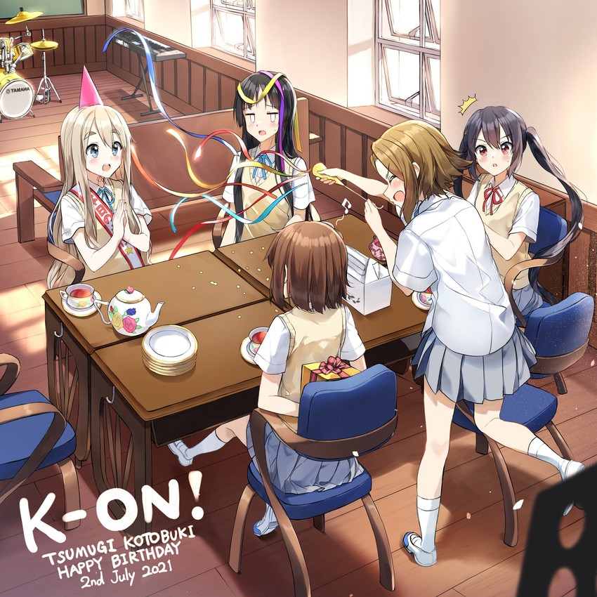 |
Jul 9, 2021 11:20 AM
#30

| @Valerio_Lyndon Hi, I would like to know if it is possible to do this (the same as in your profile):  I've noticed that yours gets this badge whenever it's a 10, but I'd like to bookmark it. It would be perfect if it could be clickable, like the tags or similar. (I think this part is already impossible. I don't know.) In my profile with your code. Here's the full code: https://pastebin.com/raw/GQVw5ePm |
Tone_ZRJul 9, 2021 11:25 AM
Jul 11, 2021 10:37 PM
#31
Tone_ZR said: @Valerio_Lyndon Hi, I would like to know if it is possible to do this (the same as in your profile): https://i.imgur.com/a4pGwyk.png I've noticed that yours gets this badge whenever it's a 10, but I'd like to bookmark it. It would be perfect if it could be clickable, like the tags or similar. (I think this part is already impossible. I don't know.) In my profile with your code. Here's the full code: https://pastebin.com/raw/GQVw5ePm So you want some form of score-based decoration? Or did you want it based on tags? You'd be right to assume that the score banner won't be clickable. We might be able to make a tag version that is clickable, but it would have to be manually added for each entry. And of course anything we add will have to be designed a bit differently, since this theme has a very different layout/appearance. |
Jul 12, 2021 8:24 AM
#32
Valerio_Lyndon said: I want based on tags. Make my 'Favorite' tag this badge whenever used.Tone_ZR said: @Valerio_Lyndon Hi, I would like to know if it is possible to do this (the same as in your profile): https://i.imgur.com/a4pGwyk.png I've noticed that yours gets this badge whenever it's a 10, but I'd like to bookmark it. It would be perfect if it could be clickable, like the tags or similar. (I think this part is already impossible. I don't know.) In my profile with your code. Here's the full code: https://pastebin.com/raw/GQVw5ePm So you want some form of score-based decoration? Or did you want it based on tags? You'd be right to assume that the score banner won't be clickable. We might be able to make a tag version that is clickable, but it would have to be manually added for each entry. And of course anything we add will have to be designed a bit differently, since this theme has a very different layout/appearance. Example: "I liked this movie., FV". When writing the 'FV', the emblem would appear next to the cover, or below the name. Like that:  And I thought it might be clickable, simply because this layout is clickable on the tags and I haven't changed that. Edit1: I made this example running on PS. 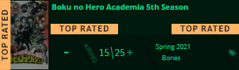 |
Tone_ZRJul 12, 2021 8:49 AM
Jul 13, 2021 1:11 PM
#33
Tone_ZR said: Valerio_Lyndon said: I want based on tags. Make my 'Favorite' tag this badge whenever used.Tone_ZR said: @Valerio_Lyndon Hi, I would like to know if it is possible to do this (the same as in your profile): https://i.imgur.com/a4pGwyk.png I've noticed that yours gets this badge whenever it's a 10, but I'd like to bookmark it. It would be perfect if it could be clickable, like the tags or similar. (I think this part is already impossible. I don't know.) In my profile with your code. Here's the full code: https://pastebin.com/raw/GQVw5ePm So you want some form of score-based decoration? Or did you want it based on tags? You'd be right to assume that the score banner won't be clickable. We might be able to make a tag version that is clickable, but it would have to be manually added for each entry. And of course anything we add will have to be designed a bit differently, since this theme has a very different layout/appearance. Example: "I liked this movie., FV". When writing the 'FV', the emblem would appear next to the cover, or below the name. Like that: And I thought it might be clickable, simply because this layout is clickable on the tags and I haven't changed that. Edit1: I made this example running on PS. Thanks for the image examples! You could give this a go and see how it goes. It will expand the tags on hover unfortunately, as that's simply how CSS works. If you want to change what it says or modify it says, you can find the "TOP RATED" in quotes and change that to say something else such as "FAVOURITE". 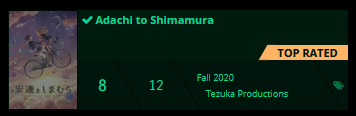 /* Modify how tags work to allow overflow */
.data.tags div {
width: 185px;
margin-left: 185px;
overflow: visible;
transition:
letter-spacing 200ms cubic-bezier(0.32,0.05,0.48,1),
margin-left 50ms linear 150ms;
}
.data.tags:hover div {
margin-left: 0;
transition:
letter-spacing 200ms cubic-bezier(0.32,0.05,0.48,1),
margin-left 50ms linear 0ms;
}
/* Add new styling for FV tag */
.tags a[href*="=FV"] {
position: absolute;
bottom: 50px;
right: 0;
width: 80px;
height: 15px;
background: #feb566;
text-align: center;
font-size: 0;
letter-spacing: 0;
}
.tags a[href*="=FV"]::before {
content: "";
position: absolute;
top: 0;
left: -5px;
z-index: -1;
width: 10px;
height: 15px;
background: #feb566;
transform: skew(-30deg);
}
.tags a[href*="=FV"]::after {
content: "TOP RATED";
font-size: 11px;
font-weight: bold;
color: #00150c;
transition: color 0.075s cubic-bezier(0.32, 0.05, 0.48, 1);
}
.tags a[href*="=FV"]:hover::after {
color: #FFF;
} |
Jul 13, 2021 1:52 PM
#34
Thanks for the image examples! You could give this a go and see how it goes. It will expand the tags on hover unfortunately, as that's simply how CSS works. If you want to change what it says or modify it says, you can find the "TOP RATED" in quotes and change that to say something else such as "FAVOURITE". Thank yooou sooo muuuuuch! I love it!/* Modify how tags work to allow overflow */
.data.tags div {
width: 185px;
margin-left: 185px;
overflow: visible;
transition:
letter-spacing 200ms cubic-bezier(0.32,0.05,0.48,1),
margin-left 50ms linear 150ms;
}
.data.tags:hover div {
margin-left: 0;
transition:
letter-spacing 200ms cubic-bezier(0.32,0.05,0.48,1),
margin-left 50ms linear 0ms;
}
/* Add new styling for FV tag */
.tags a[href*="=FV"] {
position: absolute;
bottom: 50px;
right: 0;
width: 80px;
height: 15px;
background: #feb566;
text-align: center;
font-size: 0;
letter-spacing: 0;
}
.tags a[href*="=FV"]::before {
content: "";
position: absolute;
top: 0;
left: -5px;
z-index: -1;
width: 10px;
height: 15px;
background: #feb566;
transform: skew(-30deg);
}
.tags a[href*="=FV"]::after {
content: "TOP RATED";
font-size: 11px;
font-weight: bold;
color: #00150c;
transition: color 0.075s cubic-bezier(0.32, 0.05, 0.48, 1);
}
.tags a[href*="=FV"]:hover::after {
color: #FFF;
}Edit1: I was trying to change some code settings to have another tag on the left side. The 'QA' tag, but I couldn't. Example: 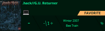 I changed the background color and size, but I can't get it to the left. The code looked like this: /* Add new styling for FV tag */
.tags a[href*="=FV"] {
position: absolute;
bottom: 50px;
right: 0;
width: 80px;
height: 16px;
background: #001a0e;
text-align: center;
font-size: 0;
letter-spacing: 0;
}
.tags a[href*="=FV"]::before {
content: "";
position: absolute;
top: 0;
left: -5px;
z-index: -1;
width: 10px;
height: 15px;
background: #001a0e;
transform: skew(-30deg);
}
.tags a[href*="=FV"]::after {
content: "💻";
font-size: 20px;
font-weight: bold;
color: #00150c;
transition: color 0.075s cubic-bezier(0.32, 0.05, 0.48, 1);
}
.tags a[href*="=FV"]:hover::after {
color: #FFF;
}
Edit2: I remembered something. This request would not change everything, but switch sides of the emblem. Like that: 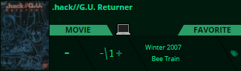 This is my last request. Sorry for giving you so much trouble. |
Tone_ZRJul 14, 2021 9:45 AM
May 19, 2022 11:09 AM
#35
Tone_ZR said: Edit2: I remembered something. This request would not change everything, but switch sides of the emblem. Like that: This is my last request. Sorry for giving you so much trouble. I know its been a year but are you still lookin for help with this? It seems you want to switch two parts- what exactly? |
Reply Disabled for Non-Club Members
More topics from this board
» ❓ Ask for help here + See Frequently Asked Questions ( 1 2 3 4 5 ... Last Page )Shishio-kun - Apr 15, 2010 |
7812 |
by mtsRhea
»»
Apr 21, 5:25 AM |
|
» [CSS- MODERN] ⭐ Minimal Dashboard layout by 5cm ~ Compact and convenient! ( 1 2 3 )Shishio-kun - Sep 4, 2020 |
121 |
by Pokitaru
»»
Apr 21, 3:25 AM |
|
» [CSS-MODERN] Change list text/font colors on any list layoutShishio-kun - May 4, 2021 |
3 |
by hideso
»»
Apr 20, 4:33 PM |
|
» [CSS] [VIDEO GUIDE] ⭐️ How to change fonts on a list layoutShishio-kun - Jul 15, 2019 |
17 |
by hideso
»»
Apr 20, 4:03 PM |
|
» [CSS][Modern] ☀️ Endless Summer Layout by Cateinya ( 1 2 3 4 5 ... Last Page )Cateinya - Aug 18, 2016 |
309 |
by hideso
»»
Apr 20, 3:56 PM |