New
Apr 28, 2018 9:15 AM
#1401

| Have been away from MAL for quite some time and the first thing I did when I came back was spending about a week on a layout. Took some getting used to writing css for the modern style And that's what I came up with:  I reused the images and some code for the menu I already had from a classic KanColle style I posted on the request thread a few years ago and modified it to work with the modern style. Code can be found in my blog |
 |
May 2, 2018 11:45 AM
#1402

Valerio_Lyndon said: MurakumoJP said: Oh damn, that is sexy. I love it. Everything looks sleek and works together and has so much detail and care put into it, really fantastic job.My new style of CSS, although the basis I took the design of one site. This CSS goes for modern design. Forgive me for my bad English.  I agree! I love the red icons. Very clean and attractive. |
May 2, 2018 11:46 AM
#1403
Redlord307 said: Have been away from MAL for quite some time and the first thing I did when I came back was spending about a week on a layout. Took some getting used to writing css for the modern style And that's what I came up with: I reused the images and some code for the menu I already had from a classic KanColle style I posted on the request thread a few years ago and modified it to work with the modern style. Code can be found in my blog Very creative and cool layout! You did a great job with the modern CSS! |
Sep 19, 2018 7:44 PM
#1404

| Okay. Now that Im satisfied. I will share. My anime list: https://myanimelist.net/animelist/Arillion My profile: https://myanimelist.net/profile/Arillion My profile design had about 4 different drafts before I settled on the one I had now. I just have to redo my manga list design then Im finshed redesigning my profile, manga and anime lists. |
Sep 21, 2018 12:24 AM
#1405

My first attempt at stitching profile from images. I really wanted to incorporate changing picture too. I think it turned out pretty ok, but I'm not using it anymore.         (it's also in "old profiles" spoiler in my profile) |
Nov 24, 2018 2:40 PM
#1406

First time tried to create something. :D 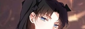      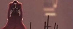  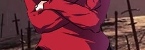        |
Nov 24, 2018 3:31 PM
#1407
I love it and I love that character! |
Nov 24, 2018 3:36 PM
#1408
Ty for kind words and good turtorials xD Who doesn't love Rin :3 |
Nov 27, 2018 12:11 PM
#1409
Progress in 2 days xD 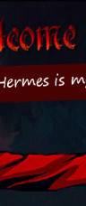                                                  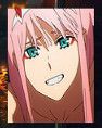 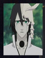    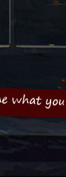 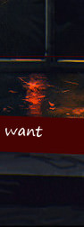 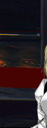 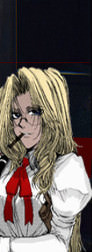 |
Nov 27, 2018 12:34 PM
#1410
Ah much better, and you got good at splitting it up cool. A lot of ppl have trouble with that! Very easy to read and click and cool pics. Thanks for sharing! In the future you might want to look into making wallpapers or my Photoshop series I have as well (see my sig for link), since you can add borders and glows and all! :D |
Nov 27, 2018 1:01 PM
#1411
Shishio-kun said: Ah much better, and you got good at splitting it up cool. A lot of ppl have trouble with that! Very easy to read and click and cool pics. Thanks for sharing! In the future you might want to look into making wallpapers or my Photoshop series I have as well (see my sig for link), since you can add borders and glows and all! :D Yeah, ty. I'll start to do something in photoshop when I get new pc, now even gimp is lagging :D Definetly will check your series. :) Cuz I got interested in this stuff(Btw I'm surprised I'm interested, nothing usually coughts my attention). |
Nov 28, 2018 11:19 AM
#1412
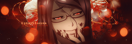
3rd work. Just trying to improve. Made stupid mistake in violet evergarden filmstrip... 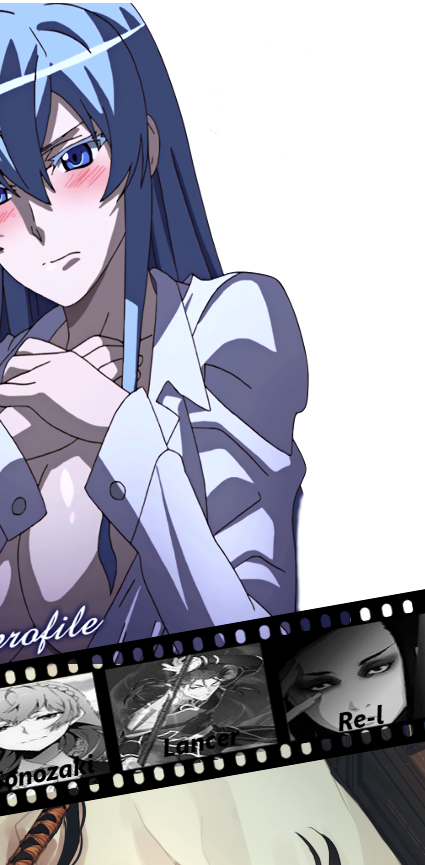 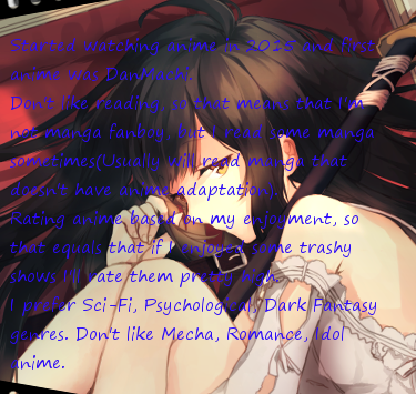 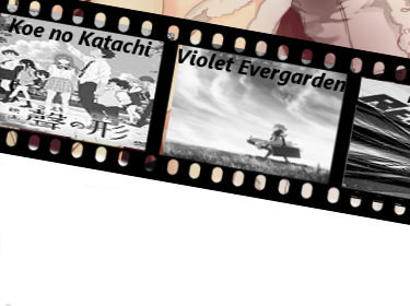 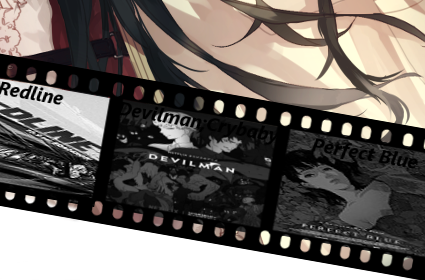 |
UselessSakuraNov 28, 2018 11:23 AM
Nov 29, 2018 5:35 PM
#1413
UselessSakura said: 3rd work. Just trying to improve. Made stupid mistake in violet evergarden filmstrip... Nice cool idea! 😍Esdeath😍 Did you ever see our Esdeath club menu? D: (first pic) https://imgur.com/a/2Sy0A btw there's lots of good tools to look into for graphic stuff too :D https://myanimelist.net/forum/?topicid=1309867 |
Dec 2, 2018 4:07 AM
#1414
I hope I can post profile pics/forum set here(If no I'm srry). Want to know some mistakes. Tried to create profile pic/forum set for Mal on photoshop.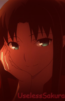  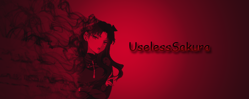 |
Dec 15, 2018 11:42 PM
#1415
UselessSakura said: I hope I can post profile pics/forum set here(If no I'm srry). Want to know some mistakes. Tried to create profile pic/forum set for Mal on photoshop. Oh cool you got started with Photoshop :D Not really any mistakes here, just keep trying different filters and glows and experimenting |
Dec 24, 2018 4:08 AM
#1416

@Shishio-kun Hi! I'm allowed to post stuff like Christmas cards in here to show off my latest design, right? :D Just a little experiment.. |

Dec 24, 2018 5:16 AM
#1417
LunyRem said: This is cute! :D Spreading the festive cheer@Shishio-kun Hi! I'm allowed to post stuff like Christmas cards in here to show off my latest design, right? :D Just a little experiment.. |
Dec 24, 2018 5:18 AM
#1418
Valerio_Lyndon said: LunyRem said: This is cute! :D Spreading the festive cheer@Shishio-kun Hi! I'm allowed to post stuff like Christmas cards in here to show off my latest design, right? :D Just a little experiment.. Thank you! :D |
Dec 28, 2018 2:50 AM
#1419

inspired by Steam Artwork Showcases, I made a banner that combines my avatar so it looks like a solid rectangle.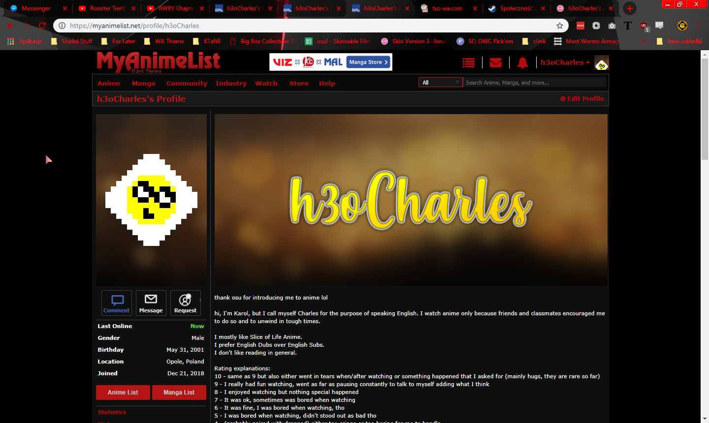 to recreate the template: 1. make a 1042x350 canvas 2. make a new layer that's 255x350 <-- avatar 3. make another layer that's 17x350 <-- spacer 4. move the spacer to the right of avatar 5. template is ready |
 |
Dec 28, 2018 1:31 PM
#1420
h3oCharles said: inspired by Steam Artwork Showcases, I made a banner that combines my avatar so it looks like a solid rectangle. to recreate the template: 1. make a 1042x350 canvas 2. make a new layer that's 255x350 <-- avatar 3. make another layer that's 17x350 <-- spacer 4. move the spacer to the right of avatar 5. template is ready That's pretty cool and thanks for the tips! |
Jan 12, 2019 2:03 AM
#1421
| I've made another banner and revamped my page, not sure about using a character as my avatar because it looks like I'm plastering her everywhere. EDIT1: oh, and do you plan on making an exclusive set of member cards for reaching 10k members? At the time of writing this, there are currently 10406 members! |
h3oCharlesJan 12, 2019 2:07 AM
|
Jan 12, 2019 2:42 AM
#1422
h3oCharles said: I've made another banner and revamped my page, not sure about using a character as my avatar because it looks like I'm plastering her everywhere. EDIT1: oh, and do you plan on making an exclusive set of member cards for reaching 10k members? At the time of writing this, there are currently 10406 members! I love it! Man it looks really amazing with the dark design around it! Haven't thought about a 10k card D: I'm glad you brought it up, maybe someone in the future would be interested in doing a temporary edition for it. btw I prefer Eng dubs too 😎 |
Jan 12, 2019 3:57 AM
#1423

Jan 12, 2019 7:14 AM
#1424
Shishio-kun said: I wish I could, but my mentality probably won't allow it :DHaven't thought about a 10k card D: I'm glad you brought it up, maybe someone in the future would be interested in doing a temporary edition for it. |
|
Jan 12, 2019 11:58 AM
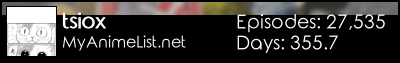
#1425
Tsiox said: Oh no, I'm already working on one too we can't have competition! :o Nah, I'm sure you'll make something fantastic if you do, and it'll be a lot different from what I'm making. I look forwards to seeing what you come up with and getting depressed I didn't think of it first. ;)That dark design reminded me that I maybe should share mine that I made some years ago, been using it whole time but now I'm planning to make a new one that will be more modern dark theme from scratch (ya can also look at my other themes if interested) LINK  |
Jan 12, 2019 12:09 PM
#1426
Valerio_Lyndon said: Tsiox said: Oh no, I'm already working on one too we can't have competition! :o Nah, I'm sure you'll make something fantastic if you do, and it'll be a lot different from what I'm making. I look forwards to seeing what you come up with and getting depressed I didn't think of it first. ;)That dark design reminded me that I maybe should share mine that I made some years ago, been using it whole time but now I'm planning to make a new one that will be more modern dark theme from scratch (ya can also look at my other themes if interested) LINK lmao, I think it's good to take inspiration from each others works, most important for me is that I like it cuz the layout is mainly meant for me but I share it cuz it can always be other people that likes it. |
   |
Jan 12, 2019 5:14 PM
#1427
Tsiox said: That dark design reminded me that I maybe should share mine that I made some years ago, been using it whole time but now I'm planning to make a new one that will be more modern dark theme from scratch (ya can also look at my other themes if interested) LINK Gorgeous dark theme, better looking than the others I saw on Userstyles a few months ago by far |
Jan 13, 2019 8:57 AM
#1428
Shishio-kun said: Tsiox said: That dark design reminded me that I maybe should share mine that I made some years ago, been using it whole time but now I'm planning to make a new one that will be more modern dark theme from scratch (ya can also look at my other themes if interested) LINK Gorgeous dark theme, better looking than the others I saw on Userstyles a few months ago by far Thank you! |
|
Jan 14, 2019 12:31 PM
#1429
| I can't really decide what I should stay with, so I made another banner xD background is messed up because it scrolls with the viewer Profile Anime/Manga List Does anyone have suggestions on what could I possibly replace the two renders in the About Me section with? |
|
Jan 14, 2019 6:15 PM
#1430
h3oCharles said: I can't really decide what I should stay with, so I made another banner xD background is messed up because it scrolls with the viewer Profile Anime/Manga List Does anyone have suggestions on what could I possibly replace the two renders in the About Me section with? Blue, pink, or green renders, like Natsumi from Date a Live 😍 |
Jan 14, 2019 11:51 PM
#1431
Shishio-kun said: Blue, pink, or green renders, like Natsumi from Date a Live 😍 Well, I could do that, but my color palette is that blonde yellow and light red and I'd like to keep that. I was thinking of putting some artwork around some frames that look like old photos. |
|
Jan 15, 2019 11:20 AM
#1432
| ok, how's this? also double post :/ |
|
Jan 15, 2019 1:50 PM
#1433

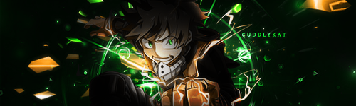
I really like that, it's sorta simple, but effective. The Color scheme with the images in the photo's fit well with the top banner and such. I don't know if you're doing this for just your own sake mainly for for ppl who see you profile, but in regular MAL it looks a bit, bland, as the photos are white and the bc is white, unlike your image where the bc is black with white photos. So it doesn't quite get the same effect. (Another note, link's on regular MAL is not red/pink like yours, but blue, so you loose that effect too with regular MAL) Something that you can try to alter/add as well, is a drop shadow the the photos, of a dark red/brown-ish color, as it adds more color, would look nice on both dark and light, as if it were a black shadow it would really look to good on your dark mode and I think it could look cool. I dont know if you chose the images yourself, but an idea could be to change the images in the photos with more fall related images, as it will keep a concictency. Lastly, the link's on you page and text in general you can play around and change the color of tme to make them fit more the over all look. Another thing you could try if you're able, is to go with the fall theme which is sorta going on is to create fall leaves and add there, instead of photos, and these leaves could also have images of characters in them. That could also be cool and a fancy effect. It would also bring a bit more color and not make it look so blad on regular MAL. But this works very well as is. These are just idea and my thoughts and I hope this is helpful to you in some way. (EDITED/UPDATED) |
CuddlyKatJan 16, 2019 12:41 AM
Jan 16, 2019 10:24 AM
#1434
CuddlyKat said: Now THAT is the kind of feedback I was looking for!I really like that, it's sorta simple, but effective. The Color scheme with the images in the photo's fit well with the top banner and such. I don't know if you're doing this for just your own sake mainly or for ppl who see your profile, but in regular MAL it looks a bit... bland, as the photos are white and the bg is white, unlike your image where the bc is black with white photos. So it doesn't quite get the same effect. (Another note, links on regular MAL is not red/pink like yours, but blue, so you lose that effect too with regular MAL) Something that you can try to alter/add as well, is a drop shadow the photos, of a dark red/brownish color, as it adds more color, would look nice on both dark and light, as if it was a black shadow it would really look too good on your dark mode and I think it could look cool. I don't know if you chose the images yourself, but an idea could be to change the images in the photos with more fall-related images, as it will keep a consistency. Lastly, the link's on your page and text, in general, you can play around and change the color of them to make them fit more the overall look. Another thing you could try if you're able, is to go with the fall theme which is sorta going on is to create fall leaves and add there, instead of photos, and these leaves could also have images of characters in them. That could also be cool and a fancy effect. It would also bring a bit more color and not make it look so bad on regular MAL. But this works very well as is. These are just idea and my thoughts and I hope this is helpful to you in some way. (EDITED/UPDATED) I thought of placing a character on a couple of leaves but then I don't have any full body renders of Kagamine Rin. I might be able to get away with placing some leaves around the borders of the photos, but it might look like a mess once I'll do that |
|
Jan 16, 2019 1:13 PM
#1435
h3oCharles said: CuddlyKat said: Now THAT is the kind of feedback I was looking for!I really like that, it's sorta simple, but effective. The Color scheme with the images in the photo's fit well with the top banner and such. I don't know if you're doing this for just your own sake mainly or for ppl who see your profile, but in regular MAL it looks a bit... bland, as the photos are white and the bg is white, unlike your image where the bc is black with white photos. So it doesn't quite get the same effect. (Another note, links on regular MAL is not red/pink like yours, but blue, so you lose that effect too with regular MAL) Something that you can try to alter/add as well, is a drop shadow the photos, of a dark red/brownish color, as it adds more color, would look nice on both dark and light, as if it was a black shadow it would really look too good on your dark mode and I think it could look cool. I don't know if you chose the images yourself, but an idea could be to change the images in the photos with more fall-related images, as it will keep a consistency. Lastly, the link's on your page and text, in general, you can play around and change the color of them to make them fit more the overall look. Another thing you could try if you're able, is to go with the fall theme which is sorta going on is to create fall leaves and add there, instead of photos, and these leaves could also have images of characters in them. That could also be cool and a fancy effect. It would also bring a bit more color and not make it look so bad on regular MAL. But this works very well as is. These are just idea and my thoughts and I hope this is helpful to you in some way. (EDITED/UPDATED) I thought of placing a character on a couple of leaves but then I don't have any full body renders of Kagamine Rin. I might be able to get away with placing some leaves around the borders of the photos, but it might look like a mess once I'll do that Hmm.. Placing some leaves around the border of the photos could work quite well, if you dont go overboard, but maybe not go around them, but just place a few around in the "zone" of the photos would look good I think. But it's mostly trail and error there to see what looks the best. I would advise to try and use a very subtle drop shadow to indictae that the leaves are on top of the photos in the 3d space. Maybe even have some behind? Again, I also think that haveing a small drop shadow in a very dark red/bown on the photo's them self would add some style and effect. Idea's to try :) Lastly, I am glad you liked my feedback, I'd love to try to assist more. Also, shameless promotion. In the donation thread, I have recently posted a few graphics for use of practice, learning and inspiration. (The PSD file), so take a look and see if you find anything interesting, LINK |
CuddlyKatJan 16, 2019 1:17 PM
Jan 19, 2019 12:25 PM
#1436
Jan 21, 2019 1:44 AM
#1437
h3oCharles said: ok, did some changes based on your feedback! I also had to change the theme due to technical issues, this shade of blue is annoying me >_> Hai, sorry for no reply, was doing stuff in the weekend. Let's see. Ahh, yes, I really like the direction this is going in. But a few things you can think on. ---------------------------------------------------------------------------------------------------------------------- 1. Add a drop shadow on the leafs too, to make it look more consistent. Since they are intertwining, both the leafs and photo's should have drop shadow to keep the depth effect, as like it is now it's half the effect, and it looks sorta weird. Experiment with the amount of drop show depending on what is on the bottom and what is on the top. As the top one should have more drop shadow then the bottom. And if you want to go really technical, you can try to to cut up the images for variations on the drop shadow to create an even better effect.  ---------------------------------------------------------------------------------------------------------------------- 2. Have all of the drop shadow go in the same direction, right now, it looks a bit weird as there is not an overall light source, which makes it look a bit haphazardly. This will also increase the overall flow of it. Have a global light source. ---------------------------------------------------------------------------------------------------------------------- 3. Change the drop shadow to a red-ish (Ex.), as yellow, don't look too good on white bacground in normal MAL, but on your back theme it looks, good, but a red will look good on both I think, and it will and "symmetry" with the red links. You could even try with a gradient drop shadow that goes from red to yellow. Experiment! ---------------------------------------------------------------------------------------------------------------------- 4. The use of realistic leafs are cool, but often they are hard to make it work with anime graphics, consider using fall leaf clip art, like these. I think those would look and fit better. + you can use a hue/saturation adjustment layer to alter the color and such of the leafs to make them fit better.  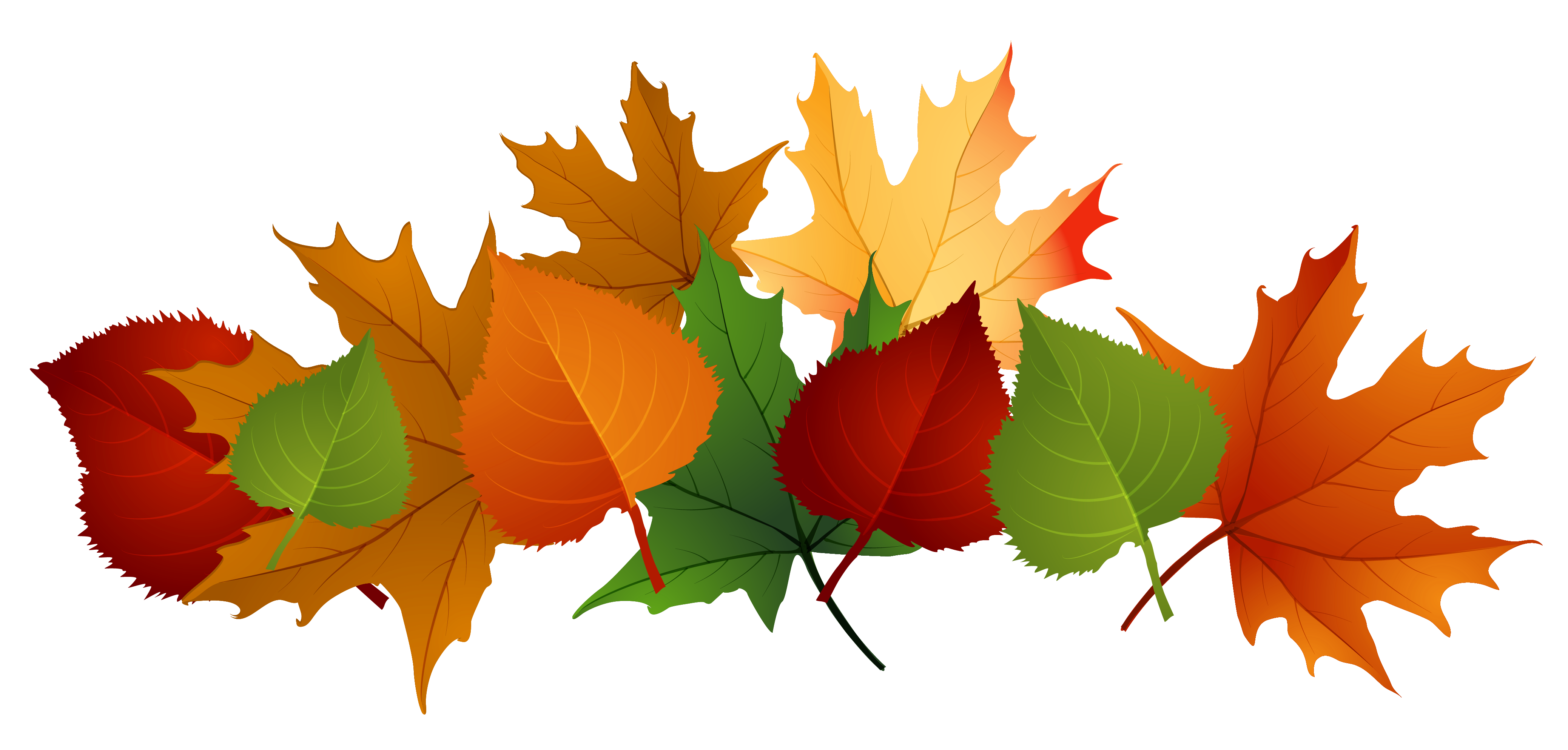 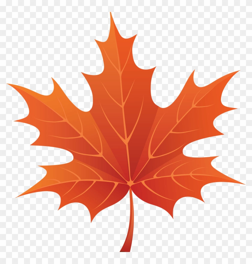 ---------------------------------------------------------------------------------------------------------------------- 5. Something I notice after wards now, that maybe the headers, in each of the quotes should be of a red color as well, but a brighter one then what is used on the link. (And maybe add a capital letter on the; "Thank Osu for...." It's almost pissing me off xD As everything else is capital.) ---------------------------------------------------------------------------------------------------------------------- 6. Just a tip for something else. I can see on you website page the background is lapsing over and over, I don't know if it's self made or what so, but if you want to "fix" it, you could try to install Stylish and use one, or some of Shishio-kun's CSS styles. Custom background & characters Custom background & color Custom Characters on the sides A video that does through this that Shishio-kun has made. Link I think I use the Custom background and Custom characters on the side together, as there was more settings there to change and fit it to my screen, as I use a TV as monitor xD. + some other stuff. |
CuddlyKatJan 21, 2019 2:54 AM
Jan 21, 2019 10:11 AM
#1438
CuddlyKat said: Happens. I was taking my time making changes, too. I have to say, in my entire lifetime, I have never seen such useful feedback directed to me. Thanks.Hai, sorry for no reply, was doing stuff at the weekend. Let's see. Ahh, yes, I really like the direction this is going in. But a few things you can think on. 1. I did add a drop shadow for leaves, it's a bit tucked away than photos and it's also colored black, which is probably why it's not that visible. I'll experiment with that. 2. How does one make a light source in GIMP xd? Noted. 3. if you mean drop shadow on photos, I have a brown to yellow gradient. Leaves are just black. If you mean to make leaves' drop shadow to a red to yellow gradient, then I might try that later 4. Noted. 5. Color the bold headers of each box in red? ok. Notice how I only colored the links red... well, except for Discord, just so it won't look out of place. 6. The background is fine, it scrolls with the viewer. I used an extension to capture the whole page and I do use the custom background style with Stylus. It's just the way it gets captured is inaccurate. Again, thanks for the overly detailed (but actually helpful and useful) feedback |
|
Jan 21, 2019 11:32 AM
#1439
h3oCharles said: CuddlyKat said: Happens. I was taking my time making changes, too. I have to say, in my entire lifetime, I have never seen such useful feedback directed to me. Thanks.Hai, sorry for no reply, was doing stuff at the weekend. Let's see. Ahh, yes, I really like the direction this is going in. But a few things you can think on. 1. I did add a drop shadow for leaves, it's a bit tucked away than photos and it's also colored black, which is probably why it's not that visible. I'll experiment with that. 2. How does one make a light source in GIMP xd? Noted. 3. if you mean drop shadow on photos, I have a brown to yellow gradient. Leaves are just black. If you mean to make leaves' drop shadow to a red to yellow gradient, then I might try that later 4. Noted. 5. Color the bold headers of each box in red? ok. Notice how I only colored the links red... well, except for Discord, just so it won't look out of place. 6. The background is fine, it scrolls with the viewer. I used an extension to capture the whole page and I do use the custom background style with Stylus. It's just the way it gets captured is inaccurate. Again, thanks for the overly detailed (but actually helpful and useful) feedback I am glad that my feedback is helpful. I joined this club properly just before Christmas to help Shishio-kun with stuff, and now I've started to become more of a part and decided since I am donation graphics, I should go and try to help ppl who wants feedback to the best of my ability. 1. Oh, when I look on it again I can see it. I was writing this at work, and didn't properly pay attention to it. But yea I can see some, of it, in some places, but it's also a little hard too see in some other places. Maybe try too use the same color on all of the drop shadows. Also, the other thing that I see now that throws me off is that the drop shadow is of various sizes, that does not correspond with it's depth in the image. 2. Ah... GIMP, for some reason I thought you were using Photoshop. Eehe, my bad. Then A fair amount of what I have said doesn't quite make sense... Sorry xD And well, you cant. But try to make all of the shaodws to go in the same direction so it looks the there is a global light source. 3. I mean for both the photo's and the leafs, as a yellow is not so visible on a white background (which MAL is), and you use a pure red or a gradient, experiment with that. 4. I saw that the image was bit incorrect, so here is just a link too google images for simplicity sake (if you didn't seach on it) LINK 5. Mhm. I can see the discord is red as well, tho it's a different red then the others, so it looks sorta out of place. And for th header color, I am not certain if it should be brither or darker, just try and experiment with it. Heck, it might even be cool to use a gradient. Like this. Preferences I used this website for it, tho it is apparently unsecured, there might be other/better websites for this. This can be experimented with. LINK 6. oh.. Oh, i see.. xD What sceen capture are you using? I don't now if you checked out my donation files, maybe because is said it was PSD files. but there is also gimp files there you can have a look at to maybe get some inspiration from. Also, here is just a card I made with the fall theme. It was my first project in Photoshop.  Last. I got confused now with all the text. Just, um, do what you want, and get back and I'll have another look. Again, I am happy that you appreciate my feed back, and please don't feel pressured to do anything you don't like, just because I said it/mentioned it, as I hope I haven't come across like so, but more so that I am giving you an option to attempt. NOTE: I wrote this a bit ina hurry, due to time constraints. Sorry. |
CuddlyKatJan 21, 2019 11:37 AM

Feb 10, 2019 9:27 AM
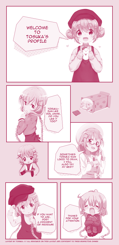
#1441
Kat likes it very much! It's so cute and adorable~ Good job! Nya~ |
Feb 10, 2019 2:09 PM
#1442
CUTE! I did little comic style profiles too so it's nice to see someone else with one D: |
Feb 11, 2019 11:12 PM
#1443
Shishio-kun said: CUTE! I did little comic style profiles too so it's nice to see someone else with one D: thanks :3 |
Feb 17, 2019 10:29 PM
#1444

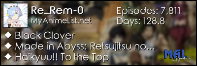
| I did my "About Me" profile recently just for the fun of it. You can check it out on my profile if you just like. A simple beginners one but I did it on my own. MY PROFILE |
 |
Feb 19, 2019 7:47 AM
#1445

Re_Rem-0 said: I did my "About Me" profile recently just for the fun of it. You can check it out on my profile if you just like. A simple beginners one but I did it on my own. MY PROFILE Good attempt! I think the GIF looks really out of place though since it eats a sizable part of your layout. You might wanna stick a second render there instead. |
 |
Feb 19, 2019 10:22 AM
#1446
Skittles said: Re_Rem-0 said: I did my "About Me" profile recently just for the fun of it. You can check it out on my profile if you just like. A simple beginners one but I did it on my own. MY PROFILE Good attempt! I think the GIF looks really out of place though since it eats a sizable part of your layout. You might wanna stick a second render there instead. Like should I have a the entire background in space? |
|
Feb 19, 2019 2:35 PM
#1447
Re_Rem-0 said: Skittles said: Re_Rem-0 said: I did my "About Me" profile recently just for the fun of it. You can check it out on my profile if you just like. A simple beginners one but I did it on my own. MY PROFILE Good attempt! I think the GIF looks really out of place though since it eats a sizable part of your layout. You might wanna stick a second render there instead. Like should I have a the entire background in space? Yeah chipping off the corner of the background like that seems irregular. |
|
Feb 19, 2019 3:20 PM
#1448
Skittles said: Re_Rem-0 said: Skittles said: Re_Rem-0 said: I did my "About Me" profile recently just for the fun of it. You can check it out on my profile if you just like. A simple beginners one but I did it on my own. MY PROFILE Good attempt! I think the GIF looks really out of place though since it eats a sizable part of your layout. You might wanna stick a second render there instead. Like should I have a the entire background in space? Yeah chipping off the corner of the background like that seems irregular. Okay, thanks for the help! EDIT: Fixed! Now that you've mentioned it. It does look way better. |
Re_Rem-0Feb 19, 2019 3:32 PM
|
Mar 1, 2019 7:40 AM
#1449

| Made a new profile layout. This time I tried dividing it in two parts rather than have MAL cut it. I worked four days on it because I started without anything in mind. PART ONE PART TWO:               |
 |
Mar 1, 2019 8:34 AM
#1450
Narushisto said: Made a new profile layout. This time I tried dividing it in two parts rather than have MAL cut it. I worked four days on it because I started without anything in mind. PART ONE PART TWO: I really like it, it's very artistic and unique in a way with all the textures, images and text which have been used. A very nice layout indeed. |
More topics from this board
» theme helpthreat - Jul 5 |
5 |
by Zaryf
»»
Aug 21, 5:46 AM |
|
» [CSS - Modern] 🍰 Clarity by V.L ( 1 2 3 4 5 ... Last Page )Valerio_Lyndon - Apr 19, 2018 |
1261 |
by KiranaStarr
»»
Aug 16, 5:48 PM |
|
» [CSS] ⭐️ Customize your List Cursor + Cursor FixesShishio-kun - Mar 8, 2021 |
30 |
by Shishio-kun
»»
Jul 28, 3:17 AM |
|
» How To Have Different Banner/Cover image & Background Image For Manga & Anime ListsYasminaRegina - Jul 25 |
2 |
by YasminaRegina
»»
Jul 26, 1:02 AM |
|
Sticky: » 💚 [REPAIR STICKY] Repair/speed up layouts + Request layout fixes ( 1 2 )Shishio-kun - Nov 17, 2023 |
52 |
by LucaBalsa
»»
Jul 6, 2:02 PM |