Private Entry
April 28th, 2018
[CSS][MODERN] KanColle Layout
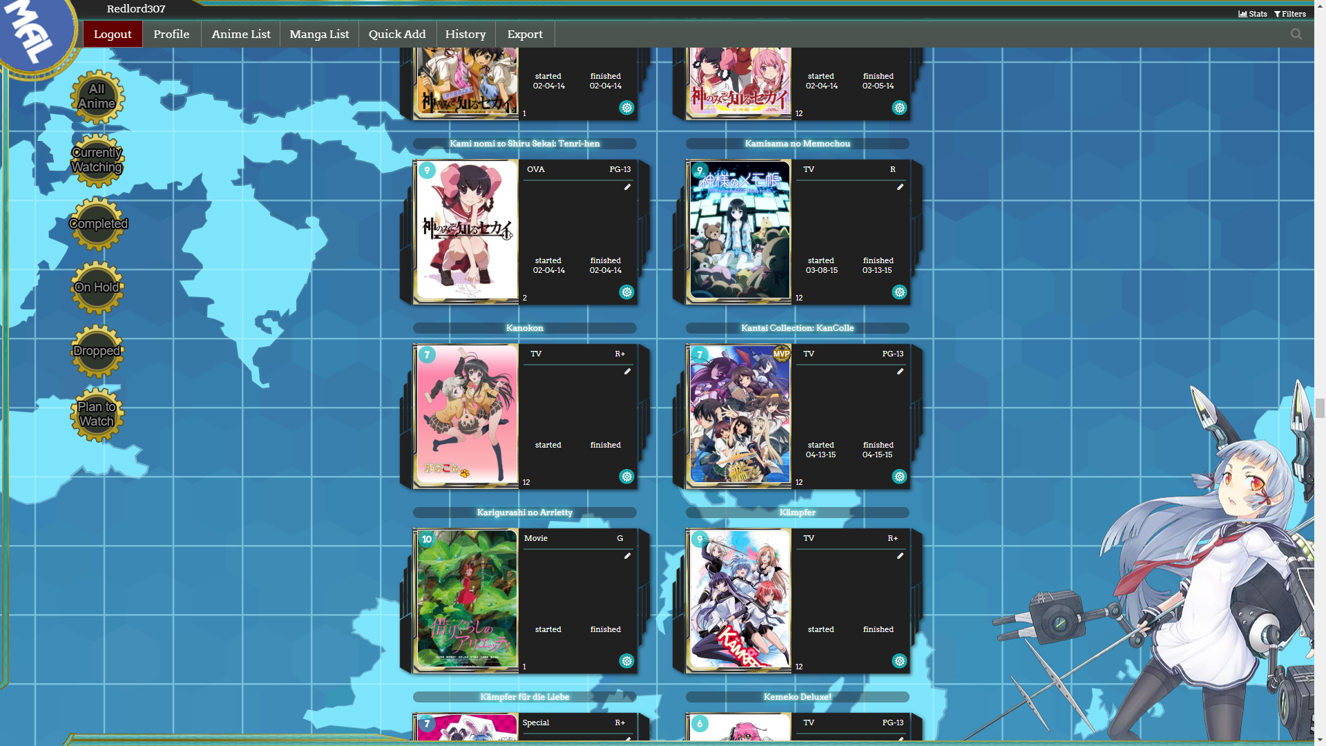
Anime Relations: Kantai Collection: KanColle
[quote]
This is a tutorial for a custom CSS layout. If you don't know how to install it, see the Beginner's tutorial.
This layout can be used for both anime & manga list.[/center]
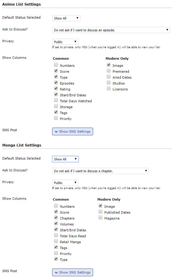
List Settings:
The following image shows all fields supported by the layout.
(You can tick less and the layout should still work, but any other columns will likely break it)
Installation:
1. Finish the List Settings
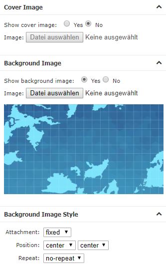
2. upload the background from here to your background:
Don't forget to dissable the Cover Image
3. Copy the code
[code]
@import url(https://fonts.googleapis.com/css?family=Arvo);
@\import "https://malscraper.azurewebsites.net/covers/auto/presets/dataimagelinkbefore";
:root {
/*Username Configuration*/
--username: "Username";
/*Fleet Girl Configuration*/
--fleetGirlImage: url(https://dl.dropboxusercontent.com/s/9kutd7ph88n7o37/015_3.png);
--fleetGirlWidth: 590px;
--fleetGirlHeight: 742px;
--fleetGirlOffsetRight: -30px;
--fleetGirlOffsetBottom: -139px;
/*Favorite Icon Configuration*/
--favoriteIcon: url(https://dl.dropboxusercontent.com/s/tmnwppf3i5g8ejy/mvp.png);
--favoriteIconWidth: 30px;
--favoriteIconHeight: 30px;
--favoriteIconTop: -26px;
--favoriteIconLeft: -36px;
}
body {
font-family: 'Arvo' !important;
background-size: cover;
}
@-webkit-keyframes rotating {
from {
-ms-transform: rotate(0deg);
-moz-transform: rotate(0deg);
-webkit-transform: rotate(0deg);
-o-transform: rotate(0deg);
transform: rotate(0deg);
}
to {
-ms-transform: rotate(360deg);
-moz-transform: rotate(360deg);
-webkit-transform: rotate(360deg);
-o-transform: rotate(360deg);
transform: rotate(360deg);
}
}
@keyframes rotating {
from {
-ms-transform: rotate(0deg);
-moz-transform: rotate(0deg);
-webkit-transform: rotate(0deg);
-o-transform: rotate(0deg);
transform: rotate(0deg);
}
to {
-ms-transform: rotate(360deg);
-moz-transform: rotate(360deg);
-webkit-transform: rotate(360deg);
-o-transform: rotate(360deg);
transform: rotate(360deg);
}
}
@-webkit-keyframes fade {
0% {
opacity: .5;
}
50% {
opacity: 1;
}
100% {
opacity: .5;
}
}
@keyframes fade {
0% {
opacity: .5;
}
50% {
opacity: 1;
}
100% {
opacity: .5;
}
}
body:after {
pointer-events: none;
top: 0;
left: 0;
content: " ";
position: fixed;
width: 100%;
height: 100%;
box-sizing: border-box;
z-index: 10;
border-style: solid;
border-width: 0px 3px 99px 109px;
-moz-border-image: url(https://dl.dropboxusercontent.com/s/pzrqy4iyip7g2nl/body_border.png) 0 3 99 109 stretch;
-webkit-border-image: url(https://dl.dropboxusercontent.com/s/pzrqy4iyip7g2nl/body_border.png) 0 3 99 109 stretch;
-o-border-image: url(https://dl.dropboxusercontent.com/s/pzrqy4iyip7g2nl/body_border.png) 0 3 99 109 stretch;
border-image: url(https://dl.dropboxusercontent.com/s/pzrqy4iyip7g2nl/body_border.png) 0 3 99 109 stretch;
}
.header {
position: fixed !important;
top: 0px;
left: 0px;
border: none !important;
z-index: 15 !important;
padding: 0 !important;
margin: 0 !important;
height: 118px;
width: 100%;
background: url(https://dl.dropboxusercontent.com/s/s8lj5aoymoq3g76/TopBar.png), url(https://dl.dropboxusercontent.com/s/3uuc1tm2fi40arq/Toprepeat.png)!important;
background-repeat: no-repeat, repeat-x !important;
background-color: transparent !important;
}
.header .header-info {
margin-left: 338px;
left: 0px;
top: 5px !important;
top: 7px !important;
position: fixed !important;
display: block;
font-size: 1.0em;
text-align: right;
}
#header-menu-button .fa {
display: none !important;
}
#header-menu-dropdown {
display: none !important;
}
.header .header-title {
position: fixed;
top: -22px;
left: -18px;
width: 125px !important;
height: 125px !important;
border: none;
font-size: 0px !important;
background-image: url(https://dl.dropboxusercontent.com/s/srpgim2tds38kbe/MAL_orb.png) !important;
background-size: cover;
-webkit-animation: rotating 20s linear infinite;
-moz-animation: rotating 20s linear infinite;
-ms-animation: rotating 20s linear infinite;
-o-animation: rotating 20s linear infinite;
animation: rotating 20s linear infinite;
-webkit-animation: linear infinite;
-webkit-animation-name: rotating, fade;
-webkit-animation-duration: 20s, 2s;
-moz-animation: linear infinite;
-moz-animation-name: rotating, fade;
-moz-animation-duration: 20s, 2s;
-ms-animation: linear infinite;
-ms-animation-name: rotating, fade;
-ms-animation-duration: 20s, 2s;
-o-animation: linear infinite;
-o-animation-name: rotating, fade;
-o-animation-duration: 20s, 2s;
animation: linear infinite;
animation-name: rotating, fade;
animation-duration: 20s, 2s;
}
.status-menu-container.fixed+div.list-block {
margin-top: 0px;
}
/*Fleet Girl floating animation*/
@keyframes floating {
0% {
transform: translate3d(0, 0, 0);
}
50% {
transform: translate3d(0, 10px, 0);
}
100% {
transform: translate3d(0, 0, 0);
}
}
@-webkit-keyframes floating {
0% {
-webkit-transform: translate3d(0, 0, 0);
}
50% {
-webkit-transform: translate3d(0, 10px, 0);
}
100% {
-webkit-transform: translate3d(0, 0, 0);
}
}
/*Fleet Girl*/
body:before {
background-image: var(--fleetGirlImage);
width: var(--fleetGirlWidth);
height: var(--fleetGirlHeight);
right: var(--fleetGirlOffsetRight);
bottom: var(--fleetGirlOffsetBottom);
z-index: 10;
content: "";
position: fixed;
pointer-events: none;
animation-name: floating;
-webkit-animation-name: floating;
animation-duration: 10s;
-webkit-animation-duration: 10s;
animation-iteration-count: infinite;
-webkit-animation-iteration-count: infinite;
}
.list-table {
width: 791px;
margin: 0 auto;
border-collapse: collapse;
border: none;
}
.list-table>tbody:nth-of-type(2n+1) {
background-color: transparent;
}
.list-table>tbody {
display: table;
float: left;
position: relative;
margin: 40px 0 0 17px;
width: 378px;
height: 227px;
background-image: url(https://dl.dropboxusercontent.com/s/mj9q15rp6tnh01w/info.png);
background-size: contain;
}
.list-table .list-table-data .data {
position: absolute;
display: block;
left: 120px;
width: 120px;
text-align: left;
border: none;
color: white;
}
.list-table .list-table-data .data.image {
left: 0;
}
.list-table .list-table-data .data.image a {
display: inline-block;
}
/*fallback default MAL covers*/
.list-table .list-table-data .data.image .image {
width: 143px;
height: 197px;
margin-left: 31px;
margin-top: 4px;
border-top-right-radius: 11px;
border-bottom-left-radius: 11px;
}
/*malcat-gen Covers*/
.data.image a:before {
content: ' ';
width: 143px;
height: 197px;
left: 32px;
top: 9px;
border-top-right-radius: 11px;
border-bottom-left-radius: 11px;
position: absolute;
background-size: cover;
display: block;
}
.list-table .list-table-data .data.status {
width: 153px;
height: 203px;
top: 5px;
left: 25px;
background-image: url(https://dl.dropboxusercontent.com/s/r83c6wwwwditi2y/Rarity_colors.jpg);
background-size: 400% 200%;
}
/*Different Card Color depending on status*/
.list-table .list-table-data .data.status.completed {
background-image: url(https://dl.dropboxusercontent.com/s/r83c6wwwwditi2y/Rarity_colors.jpg);
background-position-x: 0px;
background-position-y: 211px;
}
.list-table .list-table-data .data.status.watching, .list-table .list-table-data .data.status.reading {
background-image: url(https://dl.dropboxusercontent.com/s/r83c6wwwwditi2y/Rarity_colors.jpg);
background-position-x: 306px;
background-position-y: 0px;
}
.list-table .list-table-data .data.status.onhold {
background-image: url(https://dl.dropboxusercontent.com/s/r83c6wwwwditi2y/Rarity_colors.jpg);
background-position-x: 459pxpx;
background-position-y: 0px;
}
.list-table .list-table-data .data.status.plantowatch, .list-table .list-table-data .data.status.plantoread {
background-image: url(https://dl.dropboxusercontent.com/s/r83c6wwwwditi2y/Rarity_colors.jpg);
background-position-x: 0px;
background-position-y: 0px;
}
.list-table .list-table-data .data.status.dropped {
background-image: url(https://dl.dropboxusercontent.com/s/r83c6wwwwditi2y/Rarity_colors.jpg);
background-position-x: 153px;
background-position-y: 0px;
}
.list-table .list-table-data .data.score {
background-color: #0ebec2a8;
text-align: center;
top: 9px;
left: 33px;
width: 25px;
height: 20px;
padding: 5px 0 0 0;
border-radius: 15px;
}
.list-table .list-table-data .data.rated {
left: 300px;
top: 8px;
width: 50px !important;
text-align: center;
}
.list-table tbody .list-table-data .data.tags {
left: 185px;
top: 31px;
width: 159px !important;
height: 97px;
}
.list-table .list-table-data .tags .edit:hover {
color: transparent!important;
}
.list-table .list-table-data .tags .edit:hover:after {
color: #0ebec2;
}
.list-table .list-table-data .tags .edit {
display: block;
width: 10px;
text-align: right;
color: transparent;
font-size: 0px;
margin-left: 145px;
}
.list-table .list-table-data .tags .edit:after {
content: '\f040';
font-family: FontAwesome;
width: 100%;
text-align: center;
color: white;
font-size: 10px;
}
.list-table .list-table-data .data.tags>div {
border-bottom: 1px solid #3b5f5d;
border-top: 1px solid #3b5f5d;
}
.list-table .list-table-data .data.started {
top: 154px;
left: 199px;
width: 82px !important;
}
td.data.started:before {
content: "started";
position: absolute;
top: -10px;
left: 3px;
}
.list-table .list-table-data .data.finished {
top: 154px;
left: 281px;
width: 82px !important;
}
td.data.finished:before {
content: "finished";
position: absolute;
top: -10px;
left: 1px;
}
.list-table .list-table-data .data.type {
left: 178px;
top: 8px;
text-align: center;
width: 50px !important;
}
.list-table .list-table-data .data.progress div:before {
content: '';
}
/*Anime-List Episode Progress*/
.list-table .list-table-data .data.progress {
top: 194px;
left: 184px;
width: 163px;
}
/*Manga-List Chapter & Volume Progress*/
.list-table .list-table-data .data.chapter {
top: 194px;
left: 184px;
width: 163px;
}
.list-table .list-table-data .data.volume {
top: 179px;
left: 184px;
width: 163px;
}
.list-table .list-table-data .data.title {
top: -25px;
left: 25px;
width: 324px;
background-color: rgba(30, 32, 37, 0.4117647058823529);
border-radius: 20px;
padding: 0;
text-align: center;
word-wrap: break-word;
}
.icon-watch {
display: none !important;
}
.list-table .list-table-data .data.title .add-edit-more {
visibility: hidden;
position: absolute;
top: 212px;
right: 22px;
margin: 0;
font-size: 0.9em;
float: none;
z-index: 5;
}
.add, .edit, .more {
visibility: visible;
position: absolute;
}
.add, .edit {
left: 0;
}
.more {
display: none;
}
.list-table .more-info {
position: absolute;
display: none;
left: -8px;
top: 27px;
width: 260px;
height: 302px;
border: none;
z-index: 1;
}
.list-table tbody:first-of-type {
display: none;
}
.list-container {
background-color: transparent !important;
border: none !important;
margin-top: 100px;
}
.list-table .list-table-data .data.title .rewatching, .list-table .list-table-data .data.title .rereading, .list-table .list-table-data .data.title .content-status {
color: #BABABA;
font-size: 0.9em;
left: 204px;
top: 36px;
width: 71px;
text-align: center;
position: absolute;
}
.list-table a {
color: white;
}
.add a, .edit a {
height: 23px;
width: 23px;
display: block;
background-image: url(https://dl.dropboxusercontent.com/s/vyb69objo62c4tl/edit.png);
color: transparent !important;
}
.list-table .list-table-data a:not(.edit-disabled):hover {
color: #0ebec2 !important;
text-decoration: none !important;
}
.list-table .list-table-data .add a:hover, .list-table .list-table-data .edit a:hover {
background: url(https://dl.dropboxusercontent.com/s/vyb69objo62c4tl/edit.png) 0 23px;
color: transparent !important;
}
.list-table .list-table-data .data.title .link {
font-weight: normal !important;
}
td.data.title>a {
text-shadow: 0 0 5px rgba(255, 255, 255, 1), 0 0 10px rgba(255, 255, 255, 1), 0 0 15px #00ffff, 0 0 20px #00ffff;
}
/*float menu*/
.status-menu-container {
position: fixed !important;
border: none !important;
background-color: transparent !important;
z-index: 25;
height: 0px;
}
.status-menu-container .search-container {
position: fixed;
right: 18px;
z-index: 25;
top: 26px;
}
.header .header-menu .btn-menu {
display: block;
position: fixed;
text-align: right;
font-size: 16px;
left: 310px;
top: 8px;
}
.list-menu-float {
top: 0px;
width: 0px !important;
height: 0px !important;
left: 0px;
border: none !important;
z-index: 20;
}
.list-menu-float a {
font-family: 'Exo', 'Trebuchet MS' !important;
font-size: 14px !important;
transition: background-color 0.2s;
-moz-transition: background-color 0.2s;
-webkit-transition: background-color 0.2s;
-o-transition: background-color 0.2s;
transition: text-shadow 0.2s;
-moz-transition: text-shadow 0.2s;
-webkit-transition: text-shadow 0.2s;
-o-transition: text-shadow 0.2s;
background-color: transparent;
text-decoration: none !important;
}
.list-menu-float a:hover {
text-shadow: 0 0 5px rgba(255, 255, 255, 1), 0 0 10px rgba(255, 255, 255, 1), 0 0 15px #00ffff, 0 0 20px #00ffff;
}
.list-menu-float .icon-menu {
display: inline-block !important;
background-color: transparent !important;
position: fixed !important;
width: 85px !important;
height: 38px !important;
line-height: 39px;
font-family: 'Arvo' !important;
}
.list-menu-float .icon-menu .text {
position: relative !important;
opacity: 1 !important;
width: 85px !important;
top: 0px;
left: 0px;
font-family: 'Arvo';
font-size: 16px;
}
.icon-menu svg {
display: none;
}
.list-menu-float .profile {
width: 85px !important;
height: 38px !important;
top: 30px;
left: 206px;
border-right: 1px solid gray;
background: none !important;
}
.list-menu-float .profile:after {
visibility: visible;
content: "Profile";
position: relative !important;
opacity: 1 !important;
font-family: 'Arvo';
font-size: 16px;
color: white !important;
}
.btn-menu {
visibility: hidden;
}
.btn-menu:after {
content: var(--username);
pointer-events: none;
color: white;
visibility: visible;
font-size: 15px;
top: 4px;
left: 113px;
font-family: 'Arvo';
width: 168px;
height: 28px;
text-align: center;
position: fixed;
vertical-align: middle;
}
.list-menu-float .setting {
visibility: hidden;
}
.list-menu-float .logout {
display: block !important;
text-align: center !important;
height: 38px !important;
border-right: 1px solid gray;
border-left: 1px solid gray;
border-bottom: 1px solid gray;
background-color: rgba(100, 0, 0, 1) !important;
background-repeat: no-repeat !important;
background-position: center !important;
position: fixed;
line-height: 39px;
top: 30px;
left: 120px;
width: 85px !important;
font-size: 15px !important;
color: white;
}
.list-menu-float .logout:hover {
background-color: rgba(150, 0, 0, 1) !important;
text-shadow: 0px 0px 5px #00ff00
}
.list-menu-float .icon-menu.anime-list {
top: 30px;
left: 293px;
width: 112px !important;
border-right: 1px solid gray;
}
.list-menu-float .icon-menu.anime-list .text {
width: 113px !important;
}
.list-menu-float .icon-menu.manga-list {
top: 30px;
left: 406px;
width: 113px !important;
border-right: 1px solid gray;
}
.list-menu-float .icon-menu.manga-list .text {
width: 113px !important;
}
.list-menu-float .icon-menu.quick-add {
top: 30px;
left: 519px;
width: 113px !important;
border-right: 1px solid gray;
}
.list-menu-float .icon-menu.quick-add .text {
width: 113px !important;
}
.list-menu-float .icon-menu.history {
top: 30px;
left: 632px;
border-right: 1px solid gray;
}
.list-menu-float .icon-menu.export {
top: 30px;
left: 718px;
border-right: 1px solid gray;
}
.list-unit .list-status-title {
position: relative;
display: table;
background-color: rgba(30, 32, 37, 0.4117647058823529);
width: 80%;
height: 38px;
border-radius: 25px;
margin-left: auto;
margin-right: auto;
}
.list-unit .list-status-title .stats {
position: fixed;
height: 38px;
line-height: 38px;
right: 4px;
top: 1px;
z-index: 21;
}
.list-unit .list-stats {
background-color: transparent;
width: 600px;
height: 30px;
line-height: 30px;
color: white;
text-align: center;
position: fixed;
top: 4px;
right: 123px;
z-index: 22;
}
/*category menu*/
.status-menu-container .status-menu {
display: block !important;
top: 100px !important;
left: 100px !important;
position: fixed !important
}
.status-menu-container .status-menu .status-button {
position: relative;
/* Internet Explorer 10 */
display: -ms-flexbox;
-ms-flex-pack: center;
-ms-flex-align: center;
/* Firefox */
display: -moz-box;
-moz-box-pack: center;
-moz-box-align: center;
/* Safari, Opera, and Chrome */
display: -webkit-box;
-webkit-box-pack: center;
-webkit-box-align: center;
/* W3C */
display: box;
box-pack: center;
box-align: center;
margin-bottom: 12px;
padding: 0px !important;
width: 77px;
height: 56px;
width: 80px;
height: 80px;
background-repeat: no-repeat;
z-index: 5;
text-shadow: rgb(0, 0, 0) 2px 0px 0px, rgb(0, 0, 0) 1.75517px 0.958851px 0px, rgb(0, 0, 0) 1.0806px 1.68294px 0px, rgb(0, 0, 0) 0.141474px 1.99499px 0px, rgb(0, 0, 0) -0.832294px 1.81859px 0px, rgb(0, 0, 0) -1.60229px 1.19694px 0px, rgb(0, 0, 0) -1.97998px 0.28224px 0px, rgb(0, 0, 0) -1.87291px -0.701566px 0px, rgb(0, 0, 0) -1.30729px -1.5136px 0px, rgb(0, 0, 0) -0.421592px -1.95506px 0px, rgb(0, 0, 0) 0.567324px -1.91785px 0px, rgb(0, 0, 0) 1.41734px -1.41108px 0px, rgb(0, 0, 0) 1.92034px -0.558831px 0px;
}
.status-menu-container .status-menu .status-button:hover:after {
background: url(https://dl.dropboxusercontent.com/s/4wzbc2ag5bjre5m/category.png) 0 80px;
}
.status-menu-container .status-menu .status-button:after {
background: url(https://dl.dropboxusercontent.com/s/4wzbc2ag5bjre5m/category.png) 0 0;
-webkit-transition: background-image 0.2s ease-in-out !important;
transition: background-image 0.2s ease-in-out !important;
width: 80px;
height: 80px;
background-color: transparent !important;
opacity: 1 !important;
z-index: -1
}
.status-menu-container .status-menu .status-button::before {
position: absolute !important;
display: inline-block;
content: "";
width: 80px !important;
height: 80px !important;
background-repeat: no-repeat;
margin-left: -39px;
margin-top: -44px;
top: 45px;
left: 40px;
background-image: url(https://dl.dropboxusercontent.com/s/3paw6hy0e0jq3io/cogwheel2.png);
opacity: 1 !important;
background-color: transparent !important;
z-index: -1;
}
.status-menu-container .status-menu .status-button:hover:before, .status-button.on:before {
-webkit-animation: rotating 6s linear infinite;
-moz-animation: rotating 6s linear infinite;
-ms-animation: rotating 6s linear infinite;
-o-animation: rotating 6s linear infinite;
animation: rotating 6s linear infinite;
}
/*Footer */
#footer-block {
padding: 15px 0;
background-color: rgba(30, 32, 37, 0.4117647058823529);
color: white;
width: 44%;
margin-left: auto;
margin-right: auto;
position: relative;
font-family: Avenir, "lucida grande", tahoma, verdana, arial, sans-serif;
border-radius: 20px;
}
#copyright:after {
content: " \A Custom CSS by Redlord307. Google 'Shishio's Custom Lists' for more designs and info.";
white-space: pre;
}
/* favorite */
a[href$="&tag=*&preview=3"], a[href$="&tag=*"] {
position: absolute;
left: 0;
width: 150px;
height: 0;
font-size: 15px;
top: 0;
visibility: hidden;
}
a[href$="&tag=*&preview=3"]:after, a[href$="&tag=*"]:after {
content: ' ';
width: var(--favoriteIconWidth);
height: var(--favoriteIconHeight);
display: inline-block;
position: absolute;
top: var(--favoriteIconTop);
left: var(--favoriteIconLeft);
background-image: var(--favoriteIcon);
visibility: visible;
}
/*Filter window fix*/
#advanced-options {
position: fixed !important;
}
if you want to host this style yourself, you can find everything needed here
Customization:
At the top of the there is a :root block containing some variabels for changing the displayed Username, Fleetgirl Image and Favorite icon
:root {
/*Username Configuration*/
--username: "Redlord307";
/*Fleet Girl Configuration*/
--fleetGirlImage: url(https://dl.dropboxusercontent.com/s/9g21od92nvihaj9/8.png);
--fleetGirlWidth: 590px;
--fleetGirlHeight: 742px;
--fleetGirlOffsetRight: -30px;
--fleetGirlOffsetBottom: -139px;
/*Favorite Icon Configuration*/
--favoriteIcon: url(https://dl.dropboxusercontent.com/s/tmnwppf3i5g8ejy/mvp.png);
--favoriteIconWidth: 30px;
--favoriteIconHeight: 30px;
--favoriteIconTop: -26px;
--favoriteIconLeft: -36px;
}
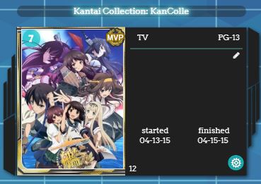
This layout supports marking animes/mangas as favorites by adding a * tag
Edit the tags either directly by clicking on the pencil icon or use the edit menu by clicking on the edit button.
If there are no other tags just type in a * otherwise add ,* at the end.
If done correctly it should get the MVP icon and look like this:
This is a tutorial for a custom CSS layout. If you don't know how to install it, see the Beginner's tutorial.
This layout can be used for both anime & manga list.[/center]
List Settings:
The following image shows all fields supported by the layout.
(You can tick less and the layout should still work, but any other columns will likely break it)
Installation:
1. Finish the List Settings
2. upload the background from here to your background:
Don't forget to dissable the Cover Image
3. Copy the code
[code]
@import url(https://fonts.googleapis.com/css?family=Arvo);
@\import "https://malscraper.azurewebsites.net/covers/auto/presets/dataimagelinkbefore";
:root {
/*Username Configuration*/
--username: "Username";
/*Fleet Girl Configuration*/
--fleetGirlImage: url(https://dl.dropboxusercontent.com/s/9kutd7ph88n7o37/015_3.png);
--fleetGirlWidth: 590px;
--fleetGirlHeight: 742px;
--fleetGirlOffsetRight: -30px;
--fleetGirlOffsetBottom: -139px;
/*Favorite Icon Configuration*/
--favoriteIcon: url(https://dl.dropboxusercontent.com/s/tmnwppf3i5g8ejy/mvp.png);
--favoriteIconWidth: 30px;
--favoriteIconHeight: 30px;
--favoriteIconTop: -26px;
--favoriteIconLeft: -36px;
}
body {
font-family: 'Arvo' !important;
background-size: cover;
}
@-webkit-keyframes rotating {
from {
-ms-transform: rotate(0deg);
-moz-transform: rotate(0deg);
-webkit-transform: rotate(0deg);
-o-transform: rotate(0deg);
transform: rotate(0deg);
}
to {
-ms-transform: rotate(360deg);
-moz-transform: rotate(360deg);
-webkit-transform: rotate(360deg);
-o-transform: rotate(360deg);
transform: rotate(360deg);
}
}
@keyframes rotating {
from {
-ms-transform: rotate(0deg);
-moz-transform: rotate(0deg);
-webkit-transform: rotate(0deg);
-o-transform: rotate(0deg);
transform: rotate(0deg);
}
to {
-ms-transform: rotate(360deg);
-moz-transform: rotate(360deg);
-webkit-transform: rotate(360deg);
-o-transform: rotate(360deg);
transform: rotate(360deg);
}
}
@-webkit-keyframes fade {
0% {
opacity: .5;
}
50% {
opacity: 1;
}
100% {
opacity: .5;
}
}
@keyframes fade {
0% {
opacity: .5;
}
50% {
opacity: 1;
}
100% {
opacity: .5;
}
}
body:after {
pointer-events: none;
top: 0;
left: 0;
content: " ";
position: fixed;
width: 100%;
height: 100%;
box-sizing: border-box;
z-index: 10;
border-style: solid;
border-width: 0px 3px 99px 109px;
-moz-border-image: url(https://dl.dropboxusercontent.com/s/pzrqy4iyip7g2nl/body_border.png) 0 3 99 109 stretch;
-webkit-border-image: url(https://dl.dropboxusercontent.com/s/pzrqy4iyip7g2nl/body_border.png) 0 3 99 109 stretch;
-o-border-image: url(https://dl.dropboxusercontent.com/s/pzrqy4iyip7g2nl/body_border.png) 0 3 99 109 stretch;
border-image: url(https://dl.dropboxusercontent.com/s/pzrqy4iyip7g2nl/body_border.png) 0 3 99 109 stretch;
}
.header {
position: fixed !important;
top: 0px;
left: 0px;
border: none !important;
z-index: 15 !important;
padding: 0 !important;
margin: 0 !important;
height: 118px;
width: 100%;
background: url(https://dl.dropboxusercontent.com/s/s8lj5aoymoq3g76/TopBar.png), url(https://dl.dropboxusercontent.com/s/3uuc1tm2fi40arq/Toprepeat.png)!important;
background-repeat: no-repeat, repeat-x !important;
background-color: transparent !important;
}
.header .header-info {
margin-left: 338px;
left: 0px;
top: 5px !important;
top: 7px !important;
position: fixed !important;
display: block;
font-size: 1.0em;
text-align: right;
}
#header-menu-button .fa {
display: none !important;
}
#header-menu-dropdown {
display: none !important;
}
.header .header-title {
position: fixed;
top: -22px;
left: -18px;
width: 125px !important;
height: 125px !important;
border: none;
font-size: 0px !important;
background-image: url(https://dl.dropboxusercontent.com/s/srpgim2tds38kbe/MAL_orb.png) !important;
background-size: cover;
-webkit-animation: rotating 20s linear infinite;
-moz-animation: rotating 20s linear infinite;
-ms-animation: rotating 20s linear infinite;
-o-animation: rotating 20s linear infinite;
animation: rotating 20s linear infinite;
-webkit-animation: linear infinite;
-webkit-animation-name: rotating, fade;
-webkit-animation-duration: 20s, 2s;
-moz-animation: linear infinite;
-moz-animation-name: rotating, fade;
-moz-animation-duration: 20s, 2s;
-ms-animation: linear infinite;
-ms-animation-name: rotating, fade;
-ms-animation-duration: 20s, 2s;
-o-animation: linear infinite;
-o-animation-name: rotating, fade;
-o-animation-duration: 20s, 2s;
animation: linear infinite;
animation-name: rotating, fade;
animation-duration: 20s, 2s;
}
.status-menu-container.fixed+div.list-block {
margin-top: 0px;
}
/*Fleet Girl floating animation*/
@keyframes floating {
0% {
transform: translate3d(0, 0, 0);
}
50% {
transform: translate3d(0, 10px, 0);
}
100% {
transform: translate3d(0, 0, 0);
}
}
@-webkit-keyframes floating {
0% {
-webkit-transform: translate3d(0, 0, 0);
}
50% {
-webkit-transform: translate3d(0, 10px, 0);
}
100% {
-webkit-transform: translate3d(0, 0, 0);
}
}
/*Fleet Girl*/
body:before {
background-image: var(--fleetGirlImage);
width: var(--fleetGirlWidth);
height: var(--fleetGirlHeight);
right: var(--fleetGirlOffsetRight);
bottom: var(--fleetGirlOffsetBottom);
z-index: 10;
content: "";
position: fixed;
pointer-events: none;
animation-name: floating;
-webkit-animation-name: floating;
animation-duration: 10s;
-webkit-animation-duration: 10s;
animation-iteration-count: infinite;
-webkit-animation-iteration-count: infinite;
}
.list-table {
width: 791px;
margin: 0 auto;
border-collapse: collapse;
border: none;
}
.list-table>tbody:nth-of-type(2n+1) {
background-color: transparent;
}
.list-table>tbody {
display: table;
float: left;
position: relative;
margin: 40px 0 0 17px;
width: 378px;
height: 227px;
background-image: url(https://dl.dropboxusercontent.com/s/mj9q15rp6tnh01w/info.png);
background-size: contain;
}
.list-table .list-table-data .data {
position: absolute;
display: block;
left: 120px;
width: 120px;
text-align: left;
border: none;
color: white;
}
.list-table .list-table-data .data.image {
left: 0;
}
.list-table .list-table-data .data.image a {
display: inline-block;
}
/*fallback default MAL covers*/
.list-table .list-table-data .data.image .image {
width: 143px;
height: 197px;
margin-left: 31px;
margin-top: 4px;
border-top-right-radius: 11px;
border-bottom-left-radius: 11px;
}
/*malcat-gen Covers*/
.data.image a:before {
content: ' ';
width: 143px;
height: 197px;
left: 32px;
top: 9px;
border-top-right-radius: 11px;
border-bottom-left-radius: 11px;
position: absolute;
background-size: cover;
display: block;
}
.list-table .list-table-data .data.status {
width: 153px;
height: 203px;
top: 5px;
left: 25px;
background-image: url(https://dl.dropboxusercontent.com/s/r83c6wwwwditi2y/Rarity_colors.jpg);
background-size: 400% 200%;
}
/*Different Card Color depending on status*/
.list-table .list-table-data .data.status.completed {
background-image: url(https://dl.dropboxusercontent.com/s/r83c6wwwwditi2y/Rarity_colors.jpg);
background-position-x: 0px;
background-position-y: 211px;
}
.list-table .list-table-data .data.status.watching, .list-table .list-table-data .data.status.reading {
background-image: url(https://dl.dropboxusercontent.com/s/r83c6wwwwditi2y/Rarity_colors.jpg);
background-position-x: 306px;
background-position-y: 0px;
}
.list-table .list-table-data .data.status.onhold {
background-image: url(https://dl.dropboxusercontent.com/s/r83c6wwwwditi2y/Rarity_colors.jpg);
background-position-x: 459pxpx;
background-position-y: 0px;
}
.list-table .list-table-data .data.status.plantowatch, .list-table .list-table-data .data.status.plantoread {
background-image: url(https://dl.dropboxusercontent.com/s/r83c6wwwwditi2y/Rarity_colors.jpg);
background-position-x: 0px;
background-position-y: 0px;
}
.list-table .list-table-data .data.status.dropped {
background-image: url(https://dl.dropboxusercontent.com/s/r83c6wwwwditi2y/Rarity_colors.jpg);
background-position-x: 153px;
background-position-y: 0px;
}
.list-table .list-table-data .data.score {
background-color: #0ebec2a8;
text-align: center;
top: 9px;
left: 33px;
width: 25px;
height: 20px;
padding: 5px 0 0 0;
border-radius: 15px;
}
.list-table .list-table-data .data.rated {
left: 300px;
top: 8px;
width: 50px !important;
text-align: center;
}
.list-table tbody .list-table-data .data.tags {
left: 185px;
top: 31px;
width: 159px !important;
height: 97px;
}
.list-table .list-table-data .tags .edit:hover {
color: transparent!important;
}
.list-table .list-table-data .tags .edit:hover:after {
color: #0ebec2;
}
.list-table .list-table-data .tags .edit {
display: block;
width: 10px;
text-align: right;
color: transparent;
font-size: 0px;
margin-left: 145px;
}
.list-table .list-table-data .tags .edit:after {
content: '\f040';
font-family: FontAwesome;
width: 100%;
text-align: center;
color: white;
font-size: 10px;
}
.list-table .list-table-data .data.tags>div {
border-bottom: 1px solid #3b5f5d;
border-top: 1px solid #3b5f5d;
}
.list-table .list-table-data .data.started {
top: 154px;
left: 199px;
width: 82px !important;
}
td.data.started:before {
content: "started";
position: absolute;
top: -10px;
left: 3px;
}
.list-table .list-table-data .data.finished {
top: 154px;
left: 281px;
width: 82px !important;
}
td.data.finished:before {
content: "finished";
position: absolute;
top: -10px;
left: 1px;
}
.list-table .list-table-data .data.type {
left: 178px;
top: 8px;
text-align: center;
width: 50px !important;
}
.list-table .list-table-data .data.progress div:before {
content: '';
}
/*Anime-List Episode Progress*/
.list-table .list-table-data .data.progress {
top: 194px;
left: 184px;
width: 163px;
}
/*Manga-List Chapter & Volume Progress*/
.list-table .list-table-data .data.chapter {
top: 194px;
left: 184px;
width: 163px;
}
.list-table .list-table-data .data.volume {
top: 179px;
left: 184px;
width: 163px;
}
.list-table .list-table-data .data.title {
top: -25px;
left: 25px;
width: 324px;
background-color: rgba(30, 32, 37, 0.4117647058823529);
border-radius: 20px;
padding: 0;
text-align: center;
word-wrap: break-word;
}
.icon-watch {
display: none !important;
}
.list-table .list-table-data .data.title .add-edit-more {
visibility: hidden;
position: absolute;
top: 212px;
right: 22px;
margin: 0;
font-size: 0.9em;
float: none;
z-index: 5;
}
.add, .edit, .more {
visibility: visible;
position: absolute;
}
.add, .edit {
left: 0;
}
.more {
display: none;
}
.list-table .more-info {
position: absolute;
display: none;
left: -8px;
top: 27px;
width: 260px;
height: 302px;
border: none;
z-index: 1;
}
.list-table tbody:first-of-type {
display: none;
}
.list-container {
background-color: transparent !important;
border: none !important;
margin-top: 100px;
}
.list-table .list-table-data .data.title .rewatching, .list-table .list-table-data .data.title .rereading, .list-table .list-table-data .data.title .content-status {
color: #BABABA;
font-size: 0.9em;
left: 204px;
top: 36px;
width: 71px;
text-align: center;
position: absolute;
}
.list-table a {
color: white;
}
.add a, .edit a {
height: 23px;
width: 23px;
display: block;
background-image: url(https://dl.dropboxusercontent.com/s/vyb69objo62c4tl/edit.png);
color: transparent !important;
}
.list-table .list-table-data a:not(.edit-disabled):hover {
color: #0ebec2 !important;
text-decoration: none !important;
}
.list-table .list-table-data .add a:hover, .list-table .list-table-data .edit a:hover {
background: url(https://dl.dropboxusercontent.com/s/vyb69objo62c4tl/edit.png) 0 23px;
color: transparent !important;
}
.list-table .list-table-data .data.title .link {
font-weight: normal !important;
}
td.data.title>a {
text-shadow: 0 0 5px rgba(255, 255, 255, 1), 0 0 10px rgba(255, 255, 255, 1), 0 0 15px #00ffff, 0 0 20px #00ffff;
}
/*float menu*/
.status-menu-container {
position: fixed !important;
border: none !important;
background-color: transparent !important;
z-index: 25;
height: 0px;
}
.status-menu-container .search-container {
position: fixed;
right: 18px;
z-index: 25;
top: 26px;
}
.header .header-menu .btn-menu {
display: block;
position: fixed;
text-align: right;
font-size: 16px;
left: 310px;
top: 8px;
}
.list-menu-float {
top: 0px;
width: 0px !important;
height: 0px !important;
left: 0px;
border: none !important;
z-index: 20;
}
.list-menu-float a {
font-family: 'Exo', 'Trebuchet MS' !important;
font-size: 14px !important;
transition: background-color 0.2s;
-moz-transition: background-color 0.2s;
-webkit-transition: background-color 0.2s;
-o-transition: background-color 0.2s;
transition: text-shadow 0.2s;
-moz-transition: text-shadow 0.2s;
-webkit-transition: text-shadow 0.2s;
-o-transition: text-shadow 0.2s;
background-color: transparent;
text-decoration: none !important;
}
.list-menu-float a:hover {
text-shadow: 0 0 5px rgba(255, 255, 255, 1), 0 0 10px rgba(255, 255, 255, 1), 0 0 15px #00ffff, 0 0 20px #00ffff;
}
.list-menu-float .icon-menu {
display: inline-block !important;
background-color: transparent !important;
position: fixed !important;
width: 85px !important;
height: 38px !important;
line-height: 39px;
font-family: 'Arvo' !important;
}
.list-menu-float .icon-menu .text {
position: relative !important;
opacity: 1 !important;
width: 85px !important;
top: 0px;
left: 0px;
font-family: 'Arvo';
font-size: 16px;
}
.icon-menu svg {
display: none;
}
.list-menu-float .profile {
width: 85px !important;
height: 38px !important;
top: 30px;
left: 206px;
border-right: 1px solid gray;
background: none !important;
}
.list-menu-float .profile:after {
visibility: visible;
content: "Profile";
position: relative !important;
opacity: 1 !important;
font-family: 'Arvo';
font-size: 16px;
color: white !important;
}
.btn-menu {
visibility: hidden;
}
.btn-menu:after {
content: var(--username);
pointer-events: none;
color: white;
visibility: visible;
font-size: 15px;
top: 4px;
left: 113px;
font-family: 'Arvo';
width: 168px;
height: 28px;
text-align: center;
position: fixed;
vertical-align: middle;
}
.list-menu-float .setting {
visibility: hidden;
}
.list-menu-float .logout {
display: block !important;
text-align: center !important;
height: 38px !important;
border-right: 1px solid gray;
border-left: 1px solid gray;
border-bottom: 1px solid gray;
background-color: rgba(100, 0, 0, 1) !important;
background-repeat: no-repeat !important;
background-position: center !important;
position: fixed;
line-height: 39px;
top: 30px;
left: 120px;
width: 85px !important;
font-size: 15px !important;
color: white;
}
.list-menu-float .logout:hover {
background-color: rgba(150, 0, 0, 1) !important;
text-shadow: 0px 0px 5px #00ff00
}
.list-menu-float .icon-menu.anime-list {
top: 30px;
left: 293px;
width: 112px !important;
border-right: 1px solid gray;
}
.list-menu-float .icon-menu.anime-list .text {
width: 113px !important;
}
.list-menu-float .icon-menu.manga-list {
top: 30px;
left: 406px;
width: 113px !important;
border-right: 1px solid gray;
}
.list-menu-float .icon-menu.manga-list .text {
width: 113px !important;
}
.list-menu-float .icon-menu.quick-add {
top: 30px;
left: 519px;
width: 113px !important;
border-right: 1px solid gray;
}
.list-menu-float .icon-menu.quick-add .text {
width: 113px !important;
}
.list-menu-float .icon-menu.history {
top: 30px;
left: 632px;
border-right: 1px solid gray;
}
.list-menu-float .icon-menu.export {
top: 30px;
left: 718px;
border-right: 1px solid gray;
}
.list-unit .list-status-title {
position: relative;
display: table;
background-color: rgba(30, 32, 37, 0.4117647058823529);
width: 80%;
height: 38px;
border-radius: 25px;
margin-left: auto;
margin-right: auto;
}
.list-unit .list-status-title .stats {
position: fixed;
height: 38px;
line-height: 38px;
right: 4px;
top: 1px;
z-index: 21;
}
.list-unit .list-stats {
background-color: transparent;
width: 600px;
height: 30px;
line-height: 30px;
color: white;
text-align: center;
position: fixed;
top: 4px;
right: 123px;
z-index: 22;
}
/*category menu*/
.status-menu-container .status-menu {
display: block !important;
top: 100px !important;
left: 100px !important;
position: fixed !important
}
.status-menu-container .status-menu .status-button {
position: relative;
/* Internet Explorer 10 */
display: -ms-flexbox;
-ms-flex-pack: center;
-ms-flex-align: center;
/* Firefox */
display: -moz-box;
-moz-box-pack: center;
-moz-box-align: center;
/* Safari, Opera, and Chrome */
display: -webkit-box;
-webkit-box-pack: center;
-webkit-box-align: center;
/* W3C */
display: box;
box-pack: center;
box-align: center;
margin-bottom: 12px;
padding: 0px !important;
width: 77px;
height: 56px;
width: 80px;
height: 80px;
background-repeat: no-repeat;
z-index: 5;
text-shadow: rgb(0, 0, 0) 2px 0px 0px, rgb(0, 0, 0) 1.75517px 0.958851px 0px, rgb(0, 0, 0) 1.0806px 1.68294px 0px, rgb(0, 0, 0) 0.141474px 1.99499px 0px, rgb(0, 0, 0) -0.832294px 1.81859px 0px, rgb(0, 0, 0) -1.60229px 1.19694px 0px, rgb(0, 0, 0) -1.97998px 0.28224px 0px, rgb(0, 0, 0) -1.87291px -0.701566px 0px, rgb(0, 0, 0) -1.30729px -1.5136px 0px, rgb(0, 0, 0) -0.421592px -1.95506px 0px, rgb(0, 0, 0) 0.567324px -1.91785px 0px, rgb(0, 0, 0) 1.41734px -1.41108px 0px, rgb(0, 0, 0) 1.92034px -0.558831px 0px;
}
.status-menu-container .status-menu .status-button:hover:after {
background: url(https://dl.dropboxusercontent.com/s/4wzbc2ag5bjre5m/category.png) 0 80px;
}
.status-menu-container .status-menu .status-button:after {
background: url(https://dl.dropboxusercontent.com/s/4wzbc2ag5bjre5m/category.png) 0 0;
-webkit-transition: background-image 0.2s ease-in-out !important;
transition: background-image 0.2s ease-in-out !important;
width: 80px;
height: 80px;
background-color: transparent !important;
opacity: 1 !important;
z-index: -1
}
.status-menu-container .status-menu .status-button::before {
position: absolute !important;
display: inline-block;
content: "";
width: 80px !important;
height: 80px !important;
background-repeat: no-repeat;
margin-left: -39px;
margin-top: -44px;
top: 45px;
left: 40px;
background-image: url(https://dl.dropboxusercontent.com/s/3paw6hy0e0jq3io/cogwheel2.png);
opacity: 1 !important;
background-color: transparent !important;
z-index: -1;
}
.status-menu-container .status-menu .status-button:hover:before, .status-button.on:before {
-webkit-animation: rotating 6s linear infinite;
-moz-animation: rotating 6s linear infinite;
-ms-animation: rotating 6s linear infinite;
-o-animation: rotating 6s linear infinite;
animation: rotating 6s linear infinite;
}
/*Footer */
#footer-block {
padding: 15px 0;
background-color: rgba(30, 32, 37, 0.4117647058823529);
color: white;
width: 44%;
margin-left: auto;
margin-right: auto;
position: relative;
font-family: Avenir, "lucida grande", tahoma, verdana, arial, sans-serif;
border-radius: 20px;
}
#copyright:after {
content: " \A Custom CSS by Redlord307. Google 'Shishio's Custom Lists' for more designs and info.";
white-space: pre;
}
/* favorite */
a[href$="&tag=*&preview=3"], a[href$="&tag=*"] {
position: absolute;
left: 0;
width: 150px;
height: 0;
font-size: 15px;
top: 0;
visibility: hidden;
}
a[href$="&tag=*&preview=3"]:after, a[href$="&tag=*"]:after {
content: ' ';
width: var(--favoriteIconWidth);
height: var(--favoriteIconHeight);
display: inline-block;
position: absolute;
top: var(--favoriteIconTop);
left: var(--favoriteIconLeft);
background-image: var(--favoriteIcon);
visibility: visible;
}
/*Filter window fix*/
#advanced-options {
position: fixed !important;
}
if you want to host this style yourself, you can find everything needed here
Customization:
At the top of the there is a :root block containing some variabels for changing the displayed Username, Fleetgirl Image and Favorite icon
:root {
/*Username Configuration*/
--username: "Redlord307";
/*Fleet Girl Configuration*/
--fleetGirlImage: url(https://dl.dropboxusercontent.com/s/9g21od92nvihaj9/8.png);
--fleetGirlWidth: 590px;
--fleetGirlHeight: 742px;
--fleetGirlOffsetRight: -30px;
--fleetGirlOffsetBottom: -139px;
/*Favorite Icon Configuration*/
--favoriteIcon: url(https://dl.dropboxusercontent.com/s/tmnwppf3i5g8ejy/mvp.png);
--favoriteIconWidth: 30px;
--favoriteIconHeight: 30px;
--favoriteIconTop: -26px;
--favoriteIconLeft: -36px;
}
This layout supports marking animes/mangas as favorites by adding a * tag
Edit the tags either directly by clicking on the pencil icon or use the edit menu by clicking on the edit button.
If there are no other tags just type in a * otherwise add ,* at the end.
If done correctly it should get the MVP icon and look like this:
Posted by Redlord307 | Apr 28, 2018 6:15 AM | 0 comments