New
Mar 1, 2019 11:56 AM
#1451

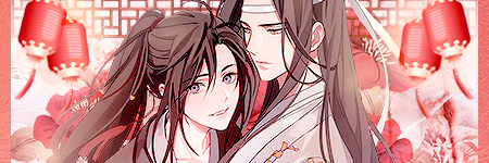
CuddlyKat said: Narushisto said: Made a new profile layout. This time I tried dividing it in two parts rather than have MAL cut it. I worked four days on it because I started without anything in mind. PART ONE PART TWO:               I really like it, it's very artistic and unique in a way with all the textures, images and text which have been used. A very nice layout indeed. Thank you! |
 |
Mar 1, 2019 5:16 PM
#1452

Narushisto said: Made a new profile layout. This time I tried dividing it in two parts rather than have MAL cut it. I worked four days on it because I started without anything in mind. PART ONE PART TWO: SO COOL! I love the mangaish separation with the gold borders! Thanks for sharing :D full screen view 😍  |
Apr 4, 2019 11:49 AM
#1453

| hello, I haven't really been active in this club but if anyone's interested, I'd appreciate any feedback on my latest profile layout! it's pretty big so i just posted it on imgur lol https://imgur.com/0FinlfS |
 |
Apr 4, 2019 7:32 PM
#1454
aryandil said: hello, I haven't really been active in this club but if anyone's interested, I'd appreciate any feedback on my latest profile layout! it's pretty big so i just posted it on imgur lol https://imgur.com/0FinlfS Looks cool! I like the well organized style. Thanks for showing :D |
Apr 4, 2019 8:12 PM
#1455

aryandil said: hello, I haven't really been active in this club but if anyone's interested, I'd appreciate any feedback on my latest profile layout! it's pretty big so i just posted it on imgur lol https://imgur.com/0FinlfS Really love this one! Simple, clean, and a nice color scheme. |
 |
Apr 4, 2019 9:54 PM
#1456
| @Skittles whoa I love your sig and profile too! Real good use of red and dark colors :D super pleasing to the eye (like a bag of Skittles) |
Apr 4, 2019 11:41 PM
#1457
Shishio-kun said: @Skittles whoa I love your sig and profile too! Real good use of red and dark colors :D super pleasing to the eye (like a bag of Skittles) Thanks! For the layout, I used several techniques I've learned from watching your tutorial videos (especially splicing). |
|
Apr 5, 2019 12:05 AM
#1458
Skittles said: Shishio-kun said: @Skittles whoa I love your sig and profile too! Real good use of red and dark colors :D super pleasing to the eye (like a bag of Skittles) Thanks! For the layout, I used several techniques I've learned from watching your tutorial videos (especially splicing). WOW! Thanks for telling me, I'm honored :D |
Apr 8, 2019 6:50 PM
#1459
Shishio-kun said: aryandil said: hello, I haven't really been active in this club but if anyone's interested, I'd appreciate any feedback on my latest profile layout! it's pretty big so i just posted it on imgur lol https://imgur.com/0FinlfS Looks cool! I like the well organized style. Thanks for showing :D thanks for the feedback! i definitely wanted it to be more organized so i'm glad it looks like that goal was accomplished. |
|
Apr 8, 2019 6:51 PM
#1460
Skittles said: aryandil said: hello, I haven't really been active in this club but if anyone's interested, I'd appreciate any feedback on my latest profile layout! it's pretty big so i just posted it on imgur lol https://imgur.com/0FinlfS Really love this one! Simple, clean, and a nice color scheme. thank you! glad to hear it wasn't cluttered at all. |
|
Apr 11, 2019 11:12 AM
#1461

Narushisto said: you made me smile, thx for using my gimmickMade a new profile layout. This time I tried dividing it in two parts rather than have MAL cut it. I worked four days on it because I started without anything in mind. PART ONE PART TWO: |
h3oCharlesApr 11, 2019 12:02 PM
 |
Apr 11, 2019 12:26 PM
#1462
h3oCharles said: Narushisto said: you made me smile, thx for using my gimmickMade a new profile layout. This time I tried dividing it in two parts rather than have MAL cut it. I worked four days on it because I started without anything in mind. PART ONE PART TWO: Cool, you continue the image from your profile pic in the layout too, looks nice! Ever since MAL changed to wider layouts back in 2015 I never made a layout that doesn't continue the profile pic, and always wondered why don't more people do it, it looks good with practically anything. |
|
Apr 14, 2019 6:25 PM
#1463

| I just redid my Anime list design, my profile, and my favorite male and female characters blogs, and my favorite anime blog and my shipped characters blog. And it only took me like two weeks or so. XD Anime list: https://myanimelist.net/animelist/Arillion Profile: https://myanimelist.net/profile/Arillion I'm not going to link each blog as they are my profile so you can check them out. |
Apr 15, 2019 2:29 AM
#1464
Arillion said: I just redid my Anime list design, my profile, and my favorite male and female characters blogs, and my favorite anime blog and my shipped characters blog. And it only took me like two weeks or so. XD Anime list: https://myanimelist.net/animelist/Arillion Profile: https://myanimelist.net/profile/Arillion I'm not going to link each blog as they are my profile so you can check them out. You've come a long way; all really cute :D Are you using GIMP or Photoshop on it? |
Apr 15, 2019 2:02 PM
#1465
Thank you. :) I use both GIMP and Photoshop. I mostly use Photoshop though and I only use GIMP when I'm slicing the image up to put the links or to make an image transparent. And I use a web site called ipiccy to make the collages I use on my blogs. I remember when I used to be horrible at this. XD I remember showing someone, not on here but like I was talking to them to their face and showing them, a layout I did a while ago and I told them that I used a premade code and just tweaked it to my liking and they were like 'that's not coding. You're using a premade'. I told them, tweaking a premade code can be just as hard especially if you don't know what you're doing. One semicolon out of line, it can mess up your entire layout. That person was very pessimistic but it didn't bring me down. :) |
ArillionApr 15, 2019 4:32 PM
May 3, 2019 12:29 PM
#1466
| So I made my own theme for my anime list of the Grid Style 5 layout! It's Slayers themed, with different backgrounds/renders/banners for each category. I only changed the images, but it took a lot of time because of the jokes on the on hold & dropped buttons(and overall choosing and editing stuff), making renders (all except on hold and left dropped are mine), and overall making it look good choosing the color scheme and backgrounds. |
|
May 3, 2019 1:27 PM
#1467
Narushisto said: So I made my own theme for my anime list of the Grid Style 5 layout! It's Slayers themed, with different backgrounds/renders/banners for each category. I only changed the images, but it took a lot of time because of the jokes on the on hold & dropped buttons(and overall choosing and editing stuff), making renders (all except on hold and left dropped are mine), and overall making it look good choosing the color scheme and backgrounds. 😍😍😍 It's amazing! You customized every page D: the kinda thing I hoped people would do when I was working on Grid Styles :D This page looks best to me so I screenshotted it for permanent saving :D  |
May 4, 2019 3:31 AM
#1468
| @Shishio-kun Yes, it would be nice to see more people customize these, the grid Styles are perfect for it! At least I'm working on a few more styles for them! |
|
May 4, 2019 4:14 AM
#1469
Narushisto said: So I made my own theme for my anime list of the Grid Style 5 layout! It's Slayers themed, with different backgrounds/renders/banners for each category. I only changed the images, but it took a lot of time because of the jokes on the on hold & dropped buttons(and overall choosing and editing stuff), making renders (all except on hold and left dropped are mine), and overall making it look good choosing the color scheme and backgrounds. This is honestly the best-looking grid style list I've seen on this site. I've always been more of a classic style person, but your layout is really something else. Good job! |
SkittlesMay 4, 2019 4:18 AM
|
Jun 11, 2019 3:00 PM
#1471
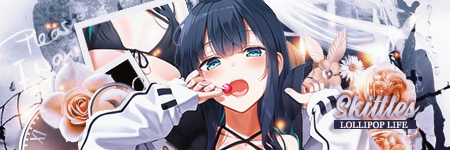
I haven't made a lot of dark stuff and used GIFs often, so I tried creating a new layout using these two criterias. Since I've recently reached a total of 1000 hours playtime for the Dark Souls trilogy, I decide to make a layout based on the franchise.           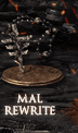 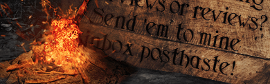 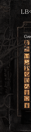     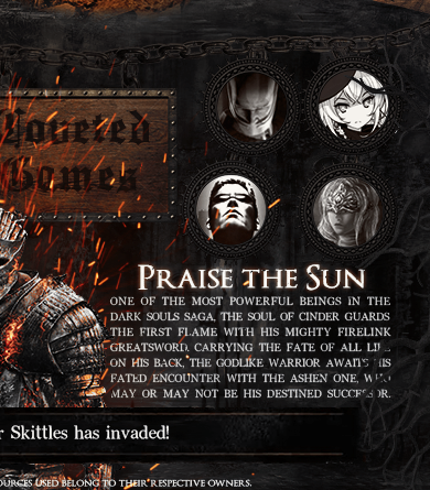 |
|
Jun 11, 2019 3:21 PM
#1472
| @Skittles I'm really loving this layout :D The animation is excellent, and the design is executed really well overall as well. I also appreciate that you haven't sacrificed readability even with all the style. |

Jun 11, 2019 8:55 PM
#1474
Valerio_Lyndon said: @Skittles I'm really loving this layout :D The animation is excellent, and the design is executed really well overall as well. I also appreciate that you haven't sacrificed readability even with all the style. Thanks! I'm actually really picky about readability, which is why size 10 font is my bare minimum. I know some people only add small text in their layouts for aesthetic purposes, but I always want others to know me better from reading my profile. Thanks, Shishio! :D It's actually nominated for the MAL Profile Contest this month. I just want to try win first place for once; I've come close many times but never there yet XD |
|
Jun 23, 2019 4:19 AM
#1475

been working on Re:Zero theme designed by Hahaido for awhile by merging it with large covers from ShelterStyleV3 list designed by Takana no Hana plus tags by akarin https://greasyfork.org/en/scripts/7125-myanimelist-mal-tags-updater and synopsis by burntjello http://burntjello.webs.com/m/MyAnimeListTools/ |
ShaggyZEJun 23, 2019 5:36 PM
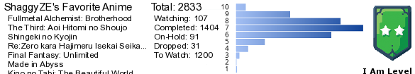   My Userscripts - Themes - Userstyles - Extensions (Chrome/Firefox) [API CSS] MAL-Scraper-API Cover/CSS Generator |
Jun 26, 2019 4:01 PM
#1476
ShaggyZE said: been working on Re:Zero theme designed by Hahaido for awhile by merging it with large covers from ShelterStyleV3 list designed by Takana no Hana plus tags by akarin https://greasyfork.org/en/scripts/7125-myanimelist-mal-tags-updater and synopsis by burntjello http://burntjello.webs.com/m/MyAnimeListTools/ Wow looks awesome!!!! Cool animation and hover effects 😍 |
Jul 4, 2019 5:03 AM
#1477
| In the end I didn't like dividing the profile layout in two becuase the second part becomes lazy, so I made a new version of my profile layout with different content without dividing it. Full view here without clickable buttons and animations. |
NarushistoJul 9, 2019 3:44 AM
|
Jul 21, 2019 5:35 AM
#1478

Jul 21, 2019 6:11 AM
#1479
jicks said: Your list looks amazing, so pleasing to the eye, love the studio logos and favorite marks! Very original idea to cover the images with gradients, looks awesome, nice color scheme and the pictures are fitting! I have to let you know though, if you look at the list in firefox, the anime titles appear higher than they should for some reason, it looks like this. In Chrome it looks perfect though! Also, I would recommend using white, transparent or a color from the theme for the copyright section background at the bottom too, imo it would look better!Had a free weekend so decided to re-do my anime list; List here Added some logos for my favourite production studios, and Roselia emblems for my favourite anime. 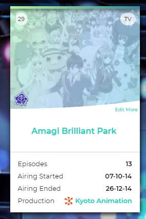 |
NarushistoJul 21, 2019 6:18 AM
|
Jul 21, 2019 6:44 AM
#1480
Narushisto said: jicks said: Your list looks amazing, so pleasing to the eye, love the studio logos and favorite marks! Very original idea to cover the images with gradients, looks awesome, nice color scheme and the pictures are fitting! I have to let you know though, if you look at the list in firefox, the anime titles appear higher than they should for some reason, it looks like this. In Chrome it looks perfect though! Also, I would recommend using white, transparent or a color from the theme for the copyright section background at the bottom too, imo it would look better!Had a free weekend so decided to re-do my anime list; List here Added some logos for my favourite production studios, and Roselia emblems for my favourite anime. Ah, forgot to run a browser check haha; just fixed that up. I completely missed the footer! Took your advice and changed it up to match the color theme! |
 |
Jul 21, 2019 6:55 AM
#1481
jicks said: Looks awesome! And the footer looks perfect now too!Narushisto said: jicks said: Had a free weekend so decided to re-do my anime list; List here Added some logos for my favourite production studios, and Roselia emblems for my favourite anime. Ah, forgot to run a browser check haha; just fixed that up. I completely missed the footer! Took your advice and changed it up to match the color theme! |
|
Jul 21, 2019 1:55 PM
#1482
jicks said: This looks fantastic! Clean, modern, and stylish, I love it.Had a free weekend so decided to re-do my anime list; List here Added some logos for my favourite production studios, and Roselia emblems for my favourite anime. |
Jul 21, 2019 3:39 PM
#1483
jicks said: Had a free weekend so decided to re-do my anime list; List here Added some logos for my favourite production studios, and Roselia emblems for my favourite anime. Really nice and cool! :D maybe you want to enter your list in our contest, it could qualify for best table design? https://myanimelist.net/forum/?topicid=1789096 |
Jul 21, 2019 9:27 PM
#1484
jicks said: Had a free weekend so decided to re-do my anime list; List here Added some logos for my favourite production studios, and Roselia emblems for my favourite anime. Looks nice! +1 for the BanG Dream! theme lol |
|
Jul 22, 2019 9:52 PM
#1485
| hi again! was a bit more experimental with this layout but hopefully it doesn't look too bad. (already noticed some minor issues such as a couple of elements need to be properly centered and at least two pngs are sharpened to the point of being pixelated re: header lucy)  |
|
Jul 22, 2019 10:58 PM
#1486
aryandil said: hi again! was a bit more experimental with this layout but hopefully it doesn't look too bad. (already noticed some minor issues such as a couple of elements need to be properly centered and at least two pngs are sharpened to the point of being pixelated re: header lucy) This is really good! I love it; yeah just replace the pixelated Lucy renders and it will be perfect. You can run your renders through Waifu2x (a free site) if you want to upscale the quality. |
Shishio-kunJul 22, 2019 11:04 PM
Jul 23, 2019 9:36 AM
#1487
Shishio-kun said: This is really good! I love it; yeah just replace the pixelated Lucy renders and it will be perfect. You can run your renders through Waifu2x (a free site) if you want to upscale the quality. this site is literally my lifesaver; thank you so much! i've been wanting a tool like this for a while. i can finally upscale some old renders. |
|
Jul 23, 2019 2:41 PM
#1488

Skittles said: I haven't made a lot of dark stuff and used GIFs often, so I tried creating a new layout using these two criterias. Since I've recently reached a total of 1000 hours playtime for the Dark Souls trilogy, I decide to make a layout based on the franchise. Yoyo, could u tell me how u combined gif with the image or u just added fire effects separately? |
 |
Jul 23, 2019 2:56 PM
#1489
aryandil said: Shishio-kun said: This is really good! I love it; yeah just replace the pixelated Lucy renders and it will be perfect. You can run your renders through Waifu2x (a free site) if you want to upscale the quality. this site is literally my lifesaver; thank you so much! i've been wanting a tool like this for a while. i can finally upscale some old renders. yeah super useful for upscaling old wallpapers and renders |
Jul 23, 2019 3:06 PM
#1490
| @aryandil That's actually a neat-looking layout! The blue-pink contrast works so well! Love the whole composition, too :D Uhm if you don't mind me asking, may I know the fonts you used? (Main title, headers, text) @Raideroz The entire top part of my layout is actually a GIF. It's seperate from the main body (lower part), and I combined them together using BBcodes when I uploaded it on MAL. After I"m done creating the composition of my layout, I spliced it and worked on the top part on a seperate file. To make the fires, I used the Timeline feature on Photoshop. |
|
Jul 23, 2019 3:17 PM
#1491
| @Skittles Thank u very much. I wanted to use animated image of some character for my profile layout, but I just started working on this and it will probably take some time for me to learn, so I decided to make something similar to yours. :P This will help. |
|
Jul 23, 2019 4:51 PM
#1492
Skittles said: @aryandil That's actually a neat-looking layout! The blue-pink contrast works so well! Love the whole composition, too :D Uhm if you don't mind me asking, may I know the fonts you used? (Main title, headers, text) Thank you!! ^-^ For fonts, I used Sugar Plums Italic for the top header, TW Cen MT for the subheaders (ie. About, Profile, etc.), and Circular Std for the body itself. |
|
Jul 25, 2019 6:34 PM
#1493
| @Raideroz for animated characters, do you mean something like in my second profile layout (the red-themed one with the girl here)? If so, just make the layout normally, but draw a white empty box on where the characters are supposed to be. Make the animated GIFs in separate files using the Timeline feature. Splice the layout, and then when uploading it to MAL, organize all the pieces normally, but replace the white boxes with the animated character pictures. Sorry it all sounds so messy when explained through text format xD @aryandil thank you, appreciate it^^ Also for fixing pixelated images, I suggest converting them to a Smart Object if you're using Photoshop. Right-click the layer, then choose 'Convert to Smart Object.' I find that doing so will lessen the quality loss when rescaling stuff. |
|
Jul 26, 2019 3:07 AM
#1494
| @Skittles https://www.deviantart.com/yamoimatr/art/Steam-Artwork-Animated-Jibril-771631690 I meant something like this. |
|
Jul 26, 2019 4:27 AM
#1495
Skittles said: @aryandil thank you, appreciate it^^ Also for fixing pixelated images, I suggest converting them to a Smart Object if you're using Photoshop. Right-click the layer, then choose 'Convert to Smart Object.' I find that doing so will lessen the quality loss when rescaling stuff. you're welcome! i actually already convert everything to smart objects, just i tend to use smart sharpen and my normal sharpen settings make animus very oversharpened despite reducing the smart filter blending options afterwards :PP |
|
Aug 12, 2019 11:23 PM
#1496
So I've finally decided to create my own list design. Unfortunately, my only knowledge of coding is from watching Shishio's really helpful videos and Youtube tutorials for one full day. As a result, the final outcome is plagued with numerous bugs and glitches, confirmed by a friend who tested it for me.
With that said, I still feel like sharing it since it's my first design. Would probably try fixing it later, but if they continue to persist I might just scrap it. CSS is just too overwhelming for me T_T You can see my list here.  Lastly, I'd like to credit Hahaido for the snow animation and TheHolyPotato for the layout base. |
|
Aug 15, 2019 1:54 AM
#1497
Skittles said: So I've finally decided to create my own list design. Unfortunately, my only knowledge of coding is from watching Shishio's really helpful videos and Youtube tutorials for one full day. As a result, the final outcome is plagued with numerous bugs and glitches, confirmed by a friend who tested it for me.
With that said, I still feel like sharing it since it's my first design. Would probably try fixing it later, but if they continue to persist I might just scrap it. CSS is just too overwhelming for me T_T You can see my list here. Lastly, I'd like to credit Hahaido for the snow animation and TheHolyPotato for the layout base. Yay you've started your layout journey 😎 and wow that's cool! I think your layout is really pretty, great choice of snow and those images 😍 I tried to make a GIF of it to capture it forever, but my CPU is too weak to record all the frames of the snow ":D Maybe I can try Gyazo or another ap  |
Shishio-kunAug 15, 2019 2:04 AM
Aug 15, 2019 2:07 AM
#1498
Shishio-kun said: Yay you've started your layout journey 😎 and wow that's cool! I think your layout is really pretty, great choice of snow and those images 😍 Thanks :D I managed to figure out how to fix the vanishing sidebars by trial-and-error. Turns out the background image links need to start with https://i.imgur instead of simply https://imgur. Not sure why that resolved the error, but it just did. As for the top menu, I eventually decided to adapt a standard version from a premade layout. Gave up trying to make the animated one more workable lol. EDIT: I actually tried to make a GIF preview also for my original post, but the framerate was unbearable. Apparently displaying the list really did a number on my friend's laptop. Must be the snow effect. I'll probably tinker with the animated top menu buttons again to see if I can make them work better. Really want them to return. |
SkittlesAug 15, 2019 2:16 AM
|
Aug 15, 2019 2:00 PM
#1499
Skittles said: Shishio-kun said: Yay you've started your layout journey 😎 and wow that's cool! I think your layout is really pretty, great choice of snow and those images 😍 Thanks :D I managed to figure out how to fix the vanishing sidebars by trial-and-error. Turns out the background image links need to start with https://i.imgur instead of simply https://imgur. Not sure why that resolved the error, but it just did. As for the top menu, I eventually decided to adapt a standard version from a premade layout. Gave up trying to make the animated one more workable lol. EDIT: I actually tried to make a GIF preview also for my original post, but the framerate was unbearable. Apparently displaying the list really did a number on my friend's laptop. Must be the snow effect. I'll probably tinker with the animated top menu buttons again to see if I can make them work better. Really want them to return. Complicated layouts lagging computers used to be a real big problem, thankfully it's become less of an issue these last few years. |
Sep 7, 2019 5:36 PM
#1500


More topics from this board
» theme helpthreat - Jul 5 |
5 |
by Zaryf
»»
Aug 21, 5:46 AM |
|
» [CSS - Modern] 🍰 Clarity by V.L ( 1 2 3 4 5 ... Last Page )Valerio_Lyndon - Apr 19, 2018 |
1261 |
by KiranaStarr
»»
Aug 16, 5:48 PM |
|
» [CSS] ⭐️ Customize your List Cursor + Cursor FixesShishio-kun - Mar 8, 2021 |
30 |
by Shishio-kun
»»
Jul 28, 3:17 AM |
|
» How To Have Different Banner/Cover image & Background Image For Manga & Anime ListsYasminaRegina - Jul 25 |
2 |
by YasminaRegina
»»
Jul 26, 1:02 AM |
|
Sticky: » 💚 [REPAIR STICKY] Repair/speed up layouts + Request layout fixes ( 1 2 )Shishio-kun - Nov 17, 2023 |
52 |
by LucaBalsa
»»
Jul 6, 2:02 PM |