New
Apr 8, 2014 3:09 PM
#151

xAngelPerz said: RafaelDeJongh said: There seems to be something wrong with the mal_cs_otherlinks, it worked fine yesterday. Anyone knows what's up? I thought that was my mistake when I was editing something, I'm glad that I'm not the only one. I hope they give us an answer. It seems to be more an overall MAL problem as the episode discussion overlay is broken as well (html/php wise as the div doesn't hold any data at all) But yea let's see if someone knows an actual answer on this problem. |
 |
Apr 8, 2014 10:46 PM
#152

RafaelDeJongh said: xAngelPerz said: RafaelDeJongh said: There seems to be something wrong with the mal_cs_otherlinks, it worked fine yesterday. Anyone knows what's up? I thought that was my mistake when I was editing something, I'm glad that I'm not the only one. I hope they give us an answer. It seems to be more an overall MAL problem as the episode discussion overlay is broken as well (html/php wise as the div doesn't hold any data at all) But yea let's see if someone knows an actual answer on this problem. Another problem that I just see, is that when you click the Update Entry isn't align, and sometimes is on the half of your list, not in the place you clicked it, here's an example. Clicked on 49 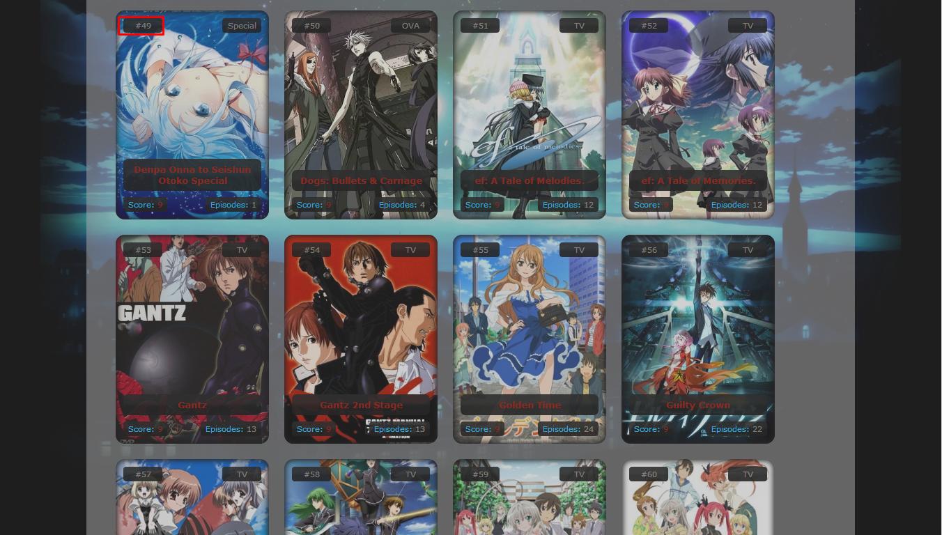 Appears on 65 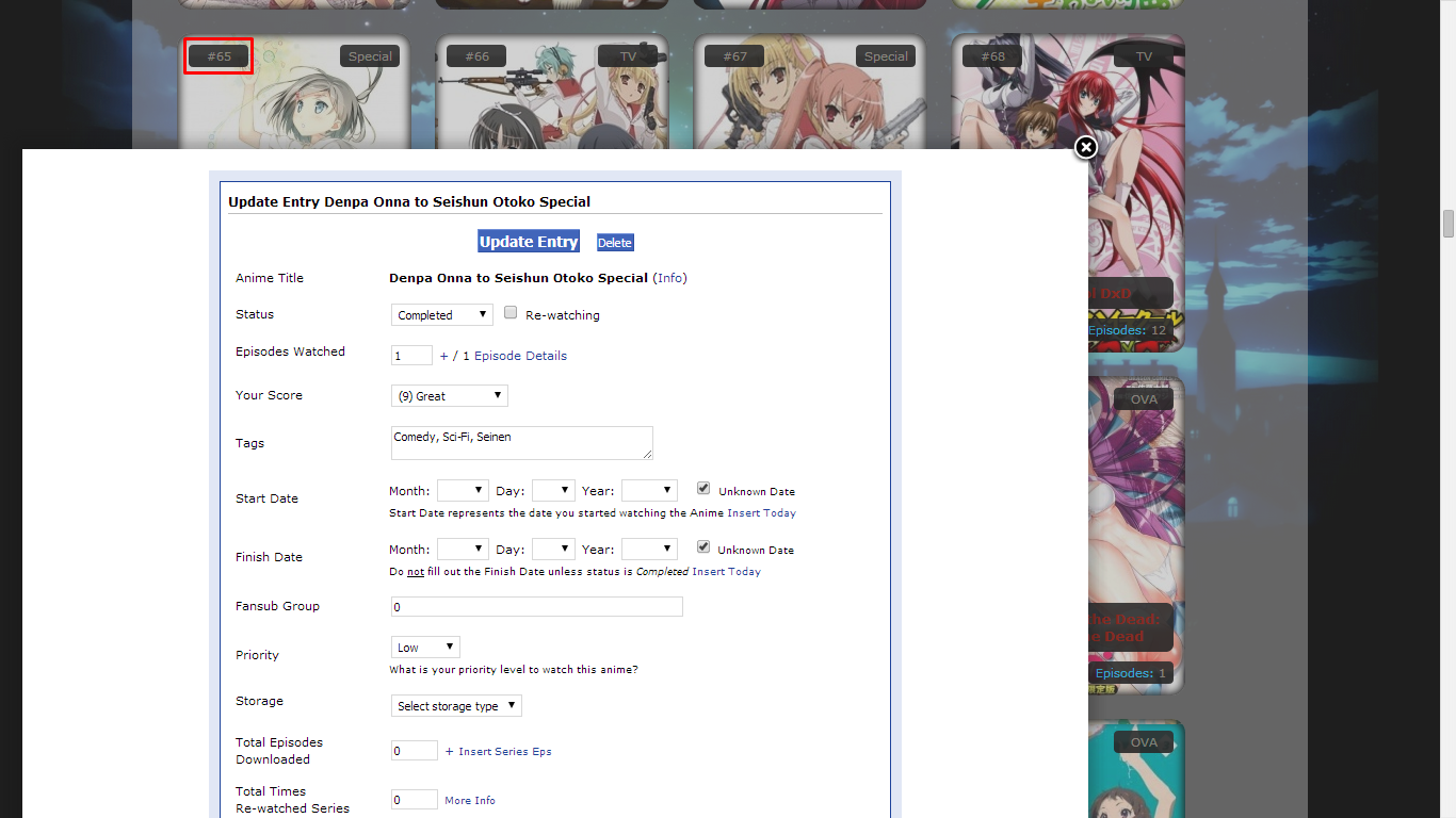 |
   |
Apr 9, 2014 7:04 AM
#153

xAngelPerz said: Ye I'm having a similar problem too.RafaelDeJongh said: xAngelPerz said: RafaelDeJongh said: There seems to be something wrong with the mal_cs_otherlinks, it worked fine yesterday. Anyone knows what's up? I thought that was my mistake when I was editing something, I'm glad that I'm not the only one. I hope they give us an answer. It seems to be more an overall MAL problem as the episode discussion overlay is broken as well (html/php wise as the div doesn't hold any data at all) But yea let's see if someone knows an actual answer on this problem. Another problem that I just see, is that when you click the Update Entry isn't align, and sometimes is on the half of your list, not in the place you clicked it, here's an example. Clicked on 49 Appears on 65 |
Apr 9, 2014 7:25 AM
#154

| For ppl having the problem with the white overlay box that pops up when you click an entry, add this to the bottom of your CSS: #fancybox-inner { height: 100% !important; width: 100% !important; left: 0 !important; } #fancybox-wrap { height: 90% !important; position: fixed !important; width: 80% !important; left: 0 !important; right: 0 !important; top: 0 !Important; margin: auto !important; } MAL seems to have changed the default coding for this part, so this fixes it back similarly to how it was before. Take it away in the future if its off again, that would mean MAL fixed it back probably. As for the MALCSotherlinks thing I don't know what it is, probably a similar thing to the overlay box but I want to wait a bit to see if it goes back to where it was before applying a mass fix; ppl are welcome to provide temporary coding solutions in the meantime |
Apr 9, 2014 3:24 PM
#155

| I fixed the mal_cs_otherlinks issue, it's because they changed the links from absolute path to relative paths. Why would they do that I don't know ... |
Apr 9, 2014 3:44 PM
#156
u531355 said: I fixed the mal_cs_otherlinks issue, it's because they changed the links from absolute path to relative paths. Why would they do that I don't know ... Do you perhaps have a better fix for the overlay than the one posted above? |
RafaelDeJonghApr 9, 2014 4:34 PM
|
Apr 9, 2014 5:21 PM
#157
| Fix for mal_cs_otherlinks is in both style.css and bar.css Every line looking like #mal_cs_otherlinks div a[href="http://myanimelist.net/forum/"] now looks like#mal_cs_otherlinks div a[href*="/forum/"] I changed a lot of things to fix the fancybox. The idea is that before, body had a 77% width and was centered. Now it is 100% and it fixes the fancybox. But then I had to give a width of 77% and center both mal_control_strip and list_surround for it to look the same. This involves a lot of changes in every files, sorry for the inconvenience. Here is a list of those changes : In the css on MAL: Change point 6 from body {max-width: 1452px;} to #mal\_control\_strip, #list_surround {max-width: 1452px;} In style.css: Before: #mal_control_strip { position: absolute; top: 0px; left: auto !important; width: 686px !important; height: 120px; background-image: none !important; border-radius: 0px 0px 13px 13px; } body { margin: auto !important; width: 77%; min-width: 726px; font-size: 11px; font-family: Verdana, Arial, Helvetica, sans-serif; } #list_surround { margin: 526px 0px 64px -31px; padding: 11px 31px 42px 31px; width: 100%; border-radius: 42px; } After: body { font-size: 11px; font-family: Verdana, Arial, Helvetica, sans-serif; } #mal_control_strip { width: 77% !important; height: 120px; margin: auto !important; background: none !important; } #mal_control_strip tbody { position: absolute; top: 0px; width: 686px; height: 120px; border-radius: 0px 0px 13px 13px; } #list_surround { width: 77%; min-width: 726px; margin: 406px auto 64px; padding: 11px 31px 42px 31px; border-radius: 42px; } In theme.css: Change mal_control_strip to mal_control_strip tbody and you can remove !important on the background-color The Asuka Addon and the Bar On Right Addon are also different, redownload the files from first post All these changes were a bit useless in fact. The following code should be an universal fancybox fix: #fancybox-wrap { I'll keep the other changes because it's still better code.position: fixed !important; top: 0px !important; bottom: 0px; left: 0px !important; right: 0px !important; max-height: 90%; margin: auto !important; } #fancybox-inner { bottom: 10px; height: auto !important; } |
u531355May 1, 2014 7:59 AM
Apr 9, 2014 6:32 PM
#158
| Hmm I'll wait for the better fix as I've edited he parts mentioned above and that didn't really fixed the fancy box. |
|
Apr 10, 2014 2:33 AM
#159
u531355 said: I fixed the mal_cs_otherlinks issue, it's because they changed the links from absolute path to relative paths. Why would they do that I don't know ... u531355 said: I changed a lot of things to fix the fancybox. The idea is that before, body had a 77% width and was centered. Now it is 100% and it fixes the fancybox. Whoa whoa whoa, how do you find this out? I'd like to know all the changes they've made to the site. |
Apr 10, 2014 5:50 AM
#160
| For the mal_cs_otherlinks it was easy to find why the css selectors didn't match anything anymore. The 77% thing is specific to the Square Layout. But I found in this js in the code: http://cdn.myanimelist.net/js/jquery.fancybox.pack.v1.js that the body's size is used to calculate the size of the fancybox. So I wanted to give it back the default look. It's still messed up vertically, but that's not specific to the Square Layout. It's bugged even without any css for your list. Thanks MAL. Edit: fixed. See post on previous page. |
u531355Apr 10, 2014 7:05 AM
Apr 10, 2014 3:01 PM
#162
| Still having an issue with the #fancybox-outer where the discussion box after updating an episode is way to tall: http://sleekupload.com/uploads/5/table_7.png http://sleekupload.com/uploads/5/outerbox.png Anyway to fix this? Current code: /*FancyBox*/ #fancybox-outer { background-color: rgb(52, 52, 52) !important; box-shadow: 1px 2px 6px rgba(0,0,0, 0.5); -moz-box-shadow: 1px 2px 6px rgba(0,0,0, 0.5); -webkit-box-shadow: 1px 2px 6px rgba(0,0,0, 0.5); border: 1px solid #666; -webkit-border-radius: 10px; -moz-border-radius: 10px; border-radius: 10px; height: 100% !important; min-height: 10% !important; } /*FancyBox Inner Table*/ #fancybox-inner { bottom: 10px; width: 98% !important; height: auto !important; } #fancybox-frame{ background-color: #fff; -webkit-border-radius: 10px; -moz-border-radius: 10px; border-radius: 10px; -moz-box-shadow: 0 0 3px #5e5e5e, inset 0 0 6px #000; -webkit-box-shadow: 0 0 3px #5e5e5e, inset 0 0 6px #000; box-shadow: 0 0 3px #5e5e5e, inset 0 0 6px #000; } #fancybox-wrap { position: fixed !important; top: 5% !important; bottom: 5%; left: 0px !important; right: 0px !important; width: 94% !important; max-width: 1024px; height: auto !important; margin: auto !important; } |
|
Apr 11, 2014 7:13 AM
#163
| You can try his version: http://myanimelist.net/forum/?topicid=1140579&show=20#msg29946507 |
Apr 11, 2014 8:50 AM
#164
#fancybox-wrap { this works fineposition: fixed !important; top: 0px !important; bottom: 0px; left: 0px !important; right: 0px !important; max-height: 90%; margin: auto !important; } #fancybox-inner { bottom: 10px; height: auto !important; } |
Apr 11, 2014 9:13 AM
#165
| Yep that does the trick! Thanks! |
|
Apr 12, 2014 4:54 AM
#166

| Hi people, I looking for someone to made Pokemonish: Top-bar Icons, Header Picture and Cover. I will be very thankful. |
[size=0] |
Apr 17, 2014 11:22 PM
#167

Hello, I'm currently having an issue with part of this CSS. Specifically the (Profile, log out, Add to List, Export etc) icons at the top.  Is there any fix for this? It just suddenly happened a week or two ago. |
Aka-himeApr 17, 2014 11:32 PM
Apr 18, 2014 12:40 AM
#168
u531355 said: Fix for mal_cs_otherlinks is in both style.css and bar.css Every line looking like #mal_cs_otherlinks div a[href="http://myanimelist.net/forum/"] now looks like#mal_cs_otherlinks div a[href*="/forum/"] |
Apr 27, 2014 5:29 AM
#170

| thanks for sharing! |
May 18, 2014 10:41 PM
#171

| So someone wanted me to help them with some stuff for their list. I ended up with /* Square Layout */ /* 1) Generated covers */ @import url(http://dl.dropbox.com/u/49469857/MAL/premade/anime.css); /* 2) Base layout */ @import url(http://dl.dropbox.com/u/49469857/MAL/premade/square/style.css); /* 3) Top-bar icons */ @import url(http://dl.dropbox.com/u/49469857/MAL/premade/square/bars/japan/bar.css); /* 4) Layout theme */ @import url(https://dl.dropboxusercontent.com/u/33318285/tieria/tieria.css); /* 5) Addons - Add as many as you want */ @import url(http://dl.dropbox.com/u/49469857/MAL/premade/square/addons/longcovers/addon.css); @import url(http://dl.dropbox.com/u/49469857/MAL/premade/square/addons/baronright/addon.css); /* 6) Options */ /* Determines the number of covers on each row, it should be a multiple of 242px */ #mal_control_strip, #list_surround {max-width: 1452px;} /* Header picture */ #inlineContent {background-image: url(https://dl.dropboxusercontent.com/u/33318285/tieria/rsz_mahou_sensou_takeshi_x_mui_by_akw_art_design-d7bpnuo.jpg);} /* Default picture when no cover is found */ .hide {background-image: url();} /* Links color */ a {color: rgb(255, 0, 0);} /*Background Image*/ body { background-image: url(https://dl.dropboxusercontent.com/u/33318285/tieria/black-vintage-backgrounds.jpg); background-attachment: fixed; } but they don't want the top bar/stuff in that area there and instead want to switch to use something from here http://myanimelist.net/forum/?topicid=449097 mainly the first one. So what do I do to switch to that one and get rid of the top bar background and the other "anime title, score, type" and what not? Not very good at this kind of stuff so just a change this to this would be nice haha. Thanks again for such a nice layout. |
 |

Jun 14, 2014 8:34 PM
#173

| I need help with the banner. I uploaded my own custom banner to dropbox but when I paste it into my CSS it doesn't show up in my list. https://www.dropbox.com/s/8bji3ela8llzlei/Hitman.jpg |
Jun 14, 2014 8:42 PM
#174
Aichiro said: I need help with the banner. I uploaded my own custom banner to dropbox but when I paste it into my CSS it doesn't show up in my list. Try putting this link for the image in your CSS instead of that one: http://i.imgur.com/gX1UurS.jpg |
 |
Jun 14, 2014 8:52 PM
#175
Tyrant10 said: Aichiro said: I need help with the banner. I uploaded my own custom banner to dropbox but when I paste it into my CSS it doesn't show up in my list. Try putting this link for the image in your CSS instead of that one: http://i.imgur.com/gX1UurS.jpg Thanks for your help! but I just figured it out. I went to dropbox and clicked show original used that link and it worked. https://dl-web.dropbox.com/get/hitman.jpg?_subject_uid=308624043&w=AABQJaAk3gw9-Fu_5jPV9nEi5YqpZEvuOQVpEmxAzg-yqw Lol it's a long link. but when I tried it your way or uploading it to any other image hosting website it made it into some kind of repeating image like this guy.  |
Jun 17, 2014 2:00 AM
#176
| Hello. I'm a n00b in this group and I apologise if my questions were already asked. I love this layout, but would like to make a couple of changes: 1. The list does not fully show the titles for Anime with long names like "Jojo's Bizarre Adventure: Stardust Crusaders" or "Mangaka-san to Assistant-san to The Animation". The last words get cut off awkwardly. Is there a way to correct this? 2. I like to write my impressions and comments in the Tags section that appears when you hover mouse over the cover, but the Tag box is very tiny. Is there a way to expand it? My list - http://myanimelist.net/animelist/Vladislav_Paizis Current Code: /* Square Layout u531355 - 2012 */ /* 1) Generated covers */ @import url(http://dl.dropbox.com/u/49469857/MAL/premade/anime.css); /* 2) Base layout */ @import url(http://dl.dropbox.com/u/49469857/MAL/premade/square/style.css); /* 3) Top-bar icons */ @import url(http://dl.dropbox.com/u/49469857/MAL/premade/square/bars/japan/bar.css); /* 4) Layout theme */ @import url(http://dl.dropbox.com/u/49469857/MAL/premade/square/themes/dark/theme.css); /* 5) Addons - Add as many as you want */ @import url(http://dl.dropbox.com/u/49469857/MAL/premade/square/addons/longcovers/addon.css); /* 6) Options */ /* Determines the number of covers on each row, it should be a multiple of 242px */ body {max-width: 1694px;} /* Header picture */ #inlineContent {background-image: url(http://dl.dropbox.com/u/49469857/MAL/premade/square/headers/seasons.jpg);} /* Default picture when no cover is found */ .hide {background-image: url();} /* Links color */ a {color: rgb(39, 255, 195);} /* More infos on http://myanimelist.net/forum/?topicid=459189 */ |
Jul 13, 2014 12:21 PM
#177
Vladislav_Paizis said: 1. The list does not fully show the titles for Anime with long names like "Jojo's Bizarre Adventure: Stardust Crusaders" or "Mangaka-san to Assistant-san to The Animation". The last words get cut off awkwardly. Is there a way to correct this? 2. I like to write my impressions and comments in the Tags section that appears when you hover mouse over the cover, but the Tag box is very tiny. Is there a way to expand it? Under point #6 Options, add the following 2 blocks of code. .animetitle { max-height: none !important; } .td1[width="125"], .td2[width="125"] { height: 70px !important; } You can change the number 70 to fit your needs. |
Jul 17, 2014 3:10 PM
#178
| Thanks a lot for this layout ^_^My only concern is that I can't change the order according to the priority that I want to watch them :/ (obviously I'm talking about the plan to watch list)Is there some way that I can order them according to priority like the regular list? |
Jul 17, 2014 5:00 PM
#179
Blazeflack said: Vladislav_Paizis said: 1. The list does not fully show the titles for Anime with long names like "Jojo's Bizarre Adventure: Stardust Crusaders" or "Mangaka-san to Assistant-san to The Animation". The last words get cut off awkwardly. Is there a way to correct this? 2. I like to write my impressions and comments in the Tags section that appears when you hover mouse over the cover, but the Tag box is very tiny. Is there a way to expand it? Under point #6 Options, add the following 2 blocks of code. .animetitle { max-height: none !important; } .td1[width="125"], .td2[width="125"] { height: 70px !important; } You can change the number 70 to fit your needs. Thank you, but I'm using a different version of the Square Layout right now. |
Jul 23, 2014 8:01 AM
#180
pikrodafni said: Thanks a lot for this layout ^_^My only concern is that I can't change the order according to the priority that I want to watch them :/ (obviously I'm talking about the plan to watch list)Is there some way that I can order them according to priority like the regular list? You can add the following CSS, which will do the following: 1. Increase width of the table header (otherwise "Anime Title" will be shown on 2 lines) 2. Display the "Priority" button on the right side of "Progress" 3. Decrease the search box width to allow for the increased table header width 4. Reposition the search box .header_cw + table, .header_completed + table, .header_onhold + table, .header_dropped + table, .header_ptw + table { width: 536px; } .table_header:nth-of-type(6) { display: inline !important; } #searchBox { width: 125px !important; } #mal_cs_powered { left: 536px; } |
removed-userJul 23, 2014 8:11 AM
Jul 23, 2014 11:35 AM
#181
| I've been tweaking this layout for my personal taste, and thought I would show you guys how it ended up and also share the code of my tweaks. I use the Japan top bar, dark theme and the long covers addon. How it looks: http://i.imgur.com/J5HSQNL.png List of changes I made:
CSS code (make sure you change the cover generator code): /*
Square Layout
u531355 - 2012
Anime Style
*/
/* 1) Generated covers
More info on Fellow Writer: http://myanimelist.net/forum/?topicid=1163417
*/
@import url(http://mal-fellow-writer.appspot.com/anime/Blazeflack/?covers=http://dl.dropbox.com/u/49469857/MAL/premade/formats/covers/more);
/* 2) Base layout */
@import url(http://dl.dropbox.com/u/49469857/MAL/premade/square/style.css);
/* 3) Top-bar icons */
@import url(http://dl.dropbox.com/u/49469857/MAL/premade/square/bars/japan/bar.css);
/* 4) Layout theme */
@import url(http://dl.dropbox.com/u/49469857/MAL/premade/square/themes/dark/theme.css);
/* 5) Addons - Add as many as you want */
@import url(http://dl.dropbox.com/u/49469857/MAL/premade/square/addons/longcovers/addon.css);
@import url(https://dl.dropboxusercontent.com/u/176854663/MAL/Square%20Layout/tweaks.css);
@import url(https://dl.dropboxusercontent.com/u/176854663/MAL/Square%20Layout/nostatus.css);
/* 6) Options */
/* Determines the number of covers on each row, it should be a multiple of 242px */
#mal_control_strip, #list_surround {max-width: 968px;}
/* Header picture */
#inlineContent {background-image: url();}
/* Default picture when no cover is found */
.hide {background-image: url();}
/* Links color */
a {color: rgb(0, 179, 255);}
/* More info on Square Layout on http://myanimelist.net/forum/?topicid=459189 */My tweaks are in the tweaks.css file and the code inside it is documented: /* Layout Tweaks */
/* Fix horizontal scroll on menu buttons START */
#mal_cs_listinfo div a, #mal_cs_links div a, #mal_cs_otherlinks div a {
line-height: 16px;
overflow-x: visible;
overflow-y: visible;
white-space: normal;
word-wrap: break-word;
}
/* Fix horizontal scroll on menu buttons END */
/* Make room for "Priority" sorting button START */
.header_cw + table, .header_completed + table, .header_onhold + table,
.header_dropped + table, .header_ptw + table {
width: 536px;
}
.table_header:nth-of-type(6) {
display: inline;
}
#searchBox {
width: 125px !important;
}
#mal_cs_powered {
left: 536px;
}
/* Make room for "Priority" sorting button END */
/* Center status header (watching/completed etc.) START */
.header_title {
padding-left: 0px;
}
/* Center status header (watching/completed etc.) END */
/* Resize info boxes on covers START */
.td1:first-of-type, .td2:first-of-type {
width: 37px;
}
.td1 a[title="Anime Information"] + small, .td2 a[title="Anime Information"] + small {
position: relative;
margin-left: auto;
margin-right: auto;
left: auto;
width: 76px;
}
.td1:nth-of-type(4)[width="50"], .td2:nth-of-type(4)[width="50"] {
width: 37px;
}
/* Resize info boxes on covers END */
/* Allow long title names without being cut off START */
.animetitle {
max-height: none;
}
/* Allow long title names without being cut off END */
/* Create a "Priority" info box on covers START */
.td1:nth-of-type(6)[width="80"]:before, .td2:nth-of-type(6)[width="80"]:before {
content: "Prioritya";
white-space: pre;
}
.td1:nth-of-type(6)[width="80"], .td2:nth-of-type(6)[width="80"] {
top: 40px;
left: 11px;
width: 37px;
text-align: center;
display: block;
}
/* Create a "Priority" info box on covers END */
/* Reposition category menu (watching, complated etc.) START */
#list_surround > table:first-of-type {
position: static;
top: 462px;
margin-left: auto;
margin-right: auto;
}
/* Reposition category menu (watching, complated etc.) END */
/* Fix position of topbar sorting buttons by decreasing right margin when using "Bar on Right" addon START*/
.header_cw + table, .header_completed + table, .header_onhold + table,
.header_dropped + table, .header_ptw + table {
margin-right: 150px;
}
/* Fix position of topbar sorting buttons by decreasing right margin when using "Bar on Right" addon END*/
/* Theme Tweaks */
/* Set a global fixed background START */
body {
background-image: url(https://dl.dropboxusercontent.com/u/176854663/MAL/Square%20Layout/background2.jpg);
background-size: cover;
background-attachment: fixed;
}
/* Set a global fixed background END */
/* Make header background transparent START */
#inlineContent {
background-color: rgba(26, 26, 26, 0);
border-bottom-color: rgba(1,1,1,0);
}
/* Make header background transparent END */
/* Make category menu background transparent START */
#list_surround > table:first-of-type {
background-color: rgba(0,0,0,0);
}
/* Make category menu background transparent END */
/* Make background behind covers semi-transparent START */
#list_surround, input[type=text] {
background-color: rgba(1,1,1,.4);
}
/* Make background behind covers semi-transparent END */
/* Make background behind menu bar semi-transparent START */
#mal_control_strip tbody {
background-color: rgba(1,1,1,.4);
}
/* Make background behind menu bar semi-transparent END */
/* Change background color of currently selected category START */
.status_selected {
background-color: rgb(33, 33, 33);
}
/* Change background color of currently selected category END */Optional: if you want to keep status headers then remove the following line: @import url(https://dl.dropboxusercontent.com/u/176854663/MAL/Square%20Layout/nostatus.css); Changelog:
|
removed-userAug 4, 2014 11:40 AM
Jul 23, 2014 12:10 PM
#182
| Oh thats very nice dude. I better tell you before your comment is buried under the member card vote topics lol. I'll try to add it in with these others later! http://myanimelist.net/forum/?topicid=1226163&show=0#post1 |
Jul 23, 2014 3:05 PM
#183
Shishio-kun said: Oh thats very nice dude. I better tell you before your comment is buried under the member card vote topics lol. I'll try to add it in with these others later! http://myanimelist.net/forum/?topicid=1226163&show=0#post1 Cool, didn't know that thread existed until now. Thanks for pointing me to it :) |
Jul 23, 2014 10:55 PM
#184
| Yea your tweaks look awesome! If I add that on to what I have now it would fit perfectly. |
Jul 24, 2014 5:58 AM
#185
Aichiro said: Yea your tweaks look awesome! If I add that on to what I have now it would fit perfectly. Thanks :). There was a small placement issue when using "Bar on Right" and I noticed you use that in your list. I have fixed the issue now though so you should be good to go :) |
Jul 24, 2014 7:19 AM
#186
| Lol thanks man!! I was trying to fix it for like an hour last night thinking my font sizes where the problem. Edit: Wait Nvm my problem is different for everthing else is perfect it's just I can't figure out what's causing this: http://i.imgur.com/83bxhpW.png It's probably something on my end. |
AichiroJul 24, 2014 7:28 AM
Jul 24, 2014 8:50 AM
#187
Aichiro said: Lol thanks man!! I was trying to fix it for like an hour last night thinking my font sizes where the problem. Edit: Wait Nvm my problem is different for everthing else is perfect it's just I can't figure out what's causing this: http://i.imgur.com/83bxhpW.png It's probably something on my end. It seems to be caused by an edit you made in theme.css You added font-family: 'Aladin',cursive; font-size: 15px; font-weight: normal; to #mal_cs_listinfo div a, #mal_cs_links div a, #mal_cs_otherlinks div a,
.table_headerLink, .status_not_selected,
.header_cw, .header_completed, .header_onhold,
.header_dropped, .header_ptw,
.category_totals, #grand_totals, #copyright {You never noticed the issue yourself because the text was being kept in the center, so it didn't show. But looking at your manga list the issue is clear for visitors:  I'm looking into a fix for you. I also noticed your bar is now positioned to the far left in your anime list, causing some issues with your sorting buttons, but that must be from you playing around with the code I guess? Edit: To fix the text issue you should move your custom code font-family: 'Aladin',cursive; font-size: 15px; font-weight: normal; Before: #mal_cs_listinfo div a, #mal_cs_links div a, #mal_cs_otherlinks div a,
.table_headerLink, .status_not_selected,
.header_cw, .header_completed, .header_onhold,
.header_dropped, .header_ptw,
.category_totals, #grand_totals, #copyright {
background-color: rgb(26, 26, 26);
background-image: -moz-linear-gradient(center top , rgb(26, 26, 26) 40%, rgb(13, 13, 13) 60%);
font-family: 'Aladin',cursive;
font-size: 15px;
font-weight: normal;
}
#mal_cs_listinfo div a:hover, #mal_cs_links div a:hover, #mal_cs_otherlinks div a:hover,
.table_headerLink:hover, .status_not_selected:hover {
background-image: -moz-linear-gradient(center bottom , rgb(26, 26, 26) 40%, rgb(13, 13, 13) 60%);
}After: #mal_cs_listinfo div a, #mal_cs_links div a, #mal_cs_otherlinks div a,
.table_headerLink, .status_not_selected,
.header_cw, .header_completed, .header_onhold,
.header_dropped, .header_ptw,
.category_totals, #grand_totals, #copyright {
background-color: rgb(26, 26, 26);
background-image: -moz-linear-gradient(center top , rgb(26, 26, 26) 40%, rgb(13, 13, 13) 60%);
}
#mal_cs_listinfo div a:hover, #mal_cs_links div a:hover, #mal_cs_otherlinks div a:hover,
.table_headerLink:hover, .status_not_selected:hover {
background-image: -moz-linear-gradient(center bottom , rgb(26, 26, 26) 40%, rgb(13, 13, 13) 60%);
font-family: 'Aladin',cursive;
font-size: 15px;
font-weight: normal;
} |
removed-userJul 24, 2014 9:12 AM
Jul 24, 2014 9:27 AM
#189
| Happy to help, glad you liked my changes. I noticed you don't have the "Priority" sorting button visible, but it looks like you have made your own edit to enable the "Rated" sorting instead? Edit: Nvm, the reason you have the "Rated" sorting button instead of "Priority" is because you have enabled the "Rating" column instead of "Priority" in your list settings. |
removed-userJul 24, 2014 9:37 AM
Jul 25, 2014 6:19 AM
#190
| I Seem To Have A Problem With This Layout. :| Same Goes For All The Other Layouts Here's The Images ---> 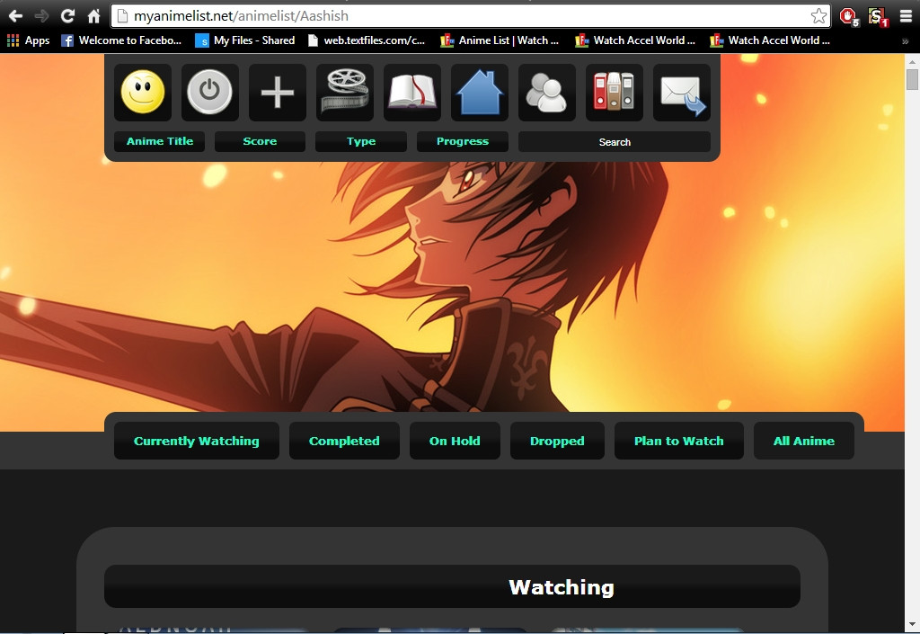 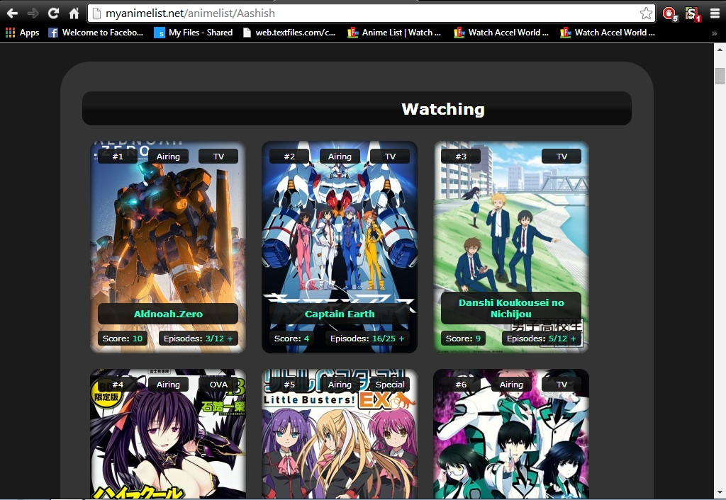 Anyone Know The Problem? :/ |
Jul 25, 2014 7:25 AM
#191
| You haven't told us what the problem is. What you think is a problem may not be thought of as a problem for us. Describe your issue in detail, that way people will be able to help you. |
Jul 25, 2014 9:41 AM
#192
| I Installed 2-3 Different Layouts But They Don't Appear Properly As Shown In The Pics That Were Made By The Person. Look At The Above Pics. There Should Be 5 Columns In The Layout But I Only See 3. The Header Is Not In The Middle, Lelouch's Photo Is Bigger Than It Should Appear. In Another Layout I Couldn't See The Buttons That Were To Direct Me To Watching, Completed...... After I Zoomed Out I Could See The Buttons. In Another Layout The Anime Lists Came Behind The Buttons. Even After I Resized The Anime List It Didn't Have Borders In The End = Half Complete. In Another Layout It Fit Perfectly Except For The Buttons. The Buttons Came Above The Top Bar. If You Want I Can Add Images And Show You The Problem :| |
Jul 25, 2014 10:35 AM
#193
| Read the first post in this thread and take special note to step 6. It explains how you get different amount of pictures per row. To make the status header text be centered, add the following css: .header_title {
padding-left: 0px;
}I don't know what you mean by "Lelouch's Photo Is Bigger Than It Should Appear." |
Jul 25, 2014 10:47 AM
#194
| Thanks For The Helping The Head Problem :D Shouldn't Lelouch's Pic Look Like This? ---> https://dl.dropboxusercontent.com/u/49469857/MAL/premade/square/addons/baronright/preview.jpg Instead Of Looking Like This? http://i.imgur.com/sxOGt7s.jpg |
Jul 25, 2014 12:36 PM
#195
| I'm still not sure what you're talking about. Do you mean the top bar being positioned further to the right? If so then you should read the first post again, it covers that too. If you mean it is zoomed in, then that is something you did in your browser. Reset the zoom back to default to make it look like it should. |
Jul 25, 2014 8:32 PM
#196
This Is How It Looks When I Zoom Out To 50% --->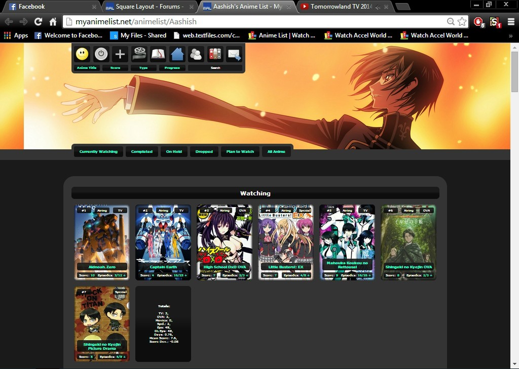 This Is How It Look When Zoom Is In Default ---> |
Jul 26, 2014 6:32 AM
#197
| Well your list looks fine on my end, so it has to be something you did in your own browser. This is getting off topic though, you don't really need help with the Square Layout but rather need help resetting your zoom level in your browser. I suggest you google around for a solution related to your choice of browser. |
removed-userJul 26, 2014 8:26 AM
Jul 26, 2014 7:35 AM
#198
| k Will Do :D |
Jul 26, 2014 10:49 AM
#199
| It could also be that your screen resolution is low. |

More topics from this board
Sticky: » [ USERSTYLES & DARK THEMES ] All MyAnimeList themesShishio-kun - Jan 28, 2023 |
17 |
by is_peque
»»
24 minutes ago |
|
» ❓ Ask for help here + See Frequently Asked Questions ( 1 2 3 4 5 ... Last Page )Shishio-kun - Apr 15, 2010 |
7863 |
by ShaggyZE
»»
34 minutes ago |
|
» [CSS - Modern] 🍰 Clarity by V.L ( 1 2 3 4 5 ... Last Page )Valerio_Lyndon - Apr 19, 2018 |
1222 |
by laBelphe
»»
Sep 20, 3:16 PM |
|
» [CLASSIC CSS] ⭐️Space Layout by nblur/U531355 ✨RESTORED AND UPSCALED✨Shishio-kun - Nov 17, 2023 |
7 |
by Recon911
»»
Sep 20, 4:43 AM |
|
» ✳️[NEWSLETTER] Any Broken Layouts? + Restored Designs so far + Frozen GIF Fix ( 1 2 )Shishio-kun - Nov 15, 2023 |
58 |
by AholePony
»»
Sep 19, 10:47 AM |