Forum Settings
Forums
New
Nov 9, 2018 5:04 AM
#1

Offline
Mar 2017
2852
Different anime programs use varying degrees of color saturation, and sometimes it's overdone to the point of being a flaw.

"No Game No Life" is one show where I thought overused highly saturated, overly brilliant colors. It could be argued that it's because most of the story is in a virtual world. Compare to "Sword Art Online" where the color saturation in the virtual world is turned up just a notch or two but doesn't stand out as overly brilliant like in NGNL.

"Steins;Gate" I thought erred in the other direction. The overall color palette has a kind of washed-out sepia-toned look to it. Maybe it's part of how they're trying to set the mood for the story, but I've seen other psycho thrillers that used brighter colors and it didn't detract from the story in the least.

What do you all think? Do you think the color saturation in the above two examples was appropriate, or not? Other examples?
A møøse once bit my sister...
Nov 9, 2018 5:12 AM
#2
Offline
Apr 2017
41
I really love colour saturation. I think it should only be used in fantasy worlds, but wherever it is used, I love it. The majority of anime take place in fantasy worlds anyway. One of the many reasons I love K Project is because of the way it looks like it's had a colour saturation painterly filter slapped over the whole thing. Can't get enough of it, and mod all my games to look the same way.
Nov 9, 2018 5:17 AM
#3

Offline
Feb 2018
1337
The saturation of colors is beautiful !, There are animes in that they exaggerate a bit with saturation, taking away realism from colors. But without doubt for me it makes the anime more entertaining, I do not know why but it adds a touch of life that makes you focus more.
Nov 9, 2018 5:24 AM
#4
IHaveTrashTaste

Offline
Aug 2013
214
I don't mind the saturation. It didn't bother me, it didn't distract me.One anime which I like and use a lot of saturation is Flip Flappers, and there the saturation is needed for the virtual world.
Nov 9, 2018 5:26 AM
#5

Offline
Oct 2018
85
The other anime that stand out in colour saturation would be Monogatari Series,Re-Zero, Your lie in April ..may be.
Nov 9, 2018 5:38 AM
#6
Offline
Oct 2014
1
I think I generally prefer a more saturated palette, aesthetically, but there are cases where muted colors are part of the ambience. I think a the color brightness and red hue in NGNL would be an absurd stylistic choice in a show like Texhnolyze or Lain.

Now that you mention this though, OP, I was comparing my library to some of crunchyroll titles and they have severely muted the blue overtones in Fate/Zero. I don't know if this is simply an encode issue, or if it was because it's a trend of people not liking a lot of color saturation. I still think it's the former but here's the comparison


http://screenshotcomparison.com/comparison/123962
Nov 9, 2018 5:39 AM
#7
長鳥真 / ナガトリマコト

Offline
Jun 2017
8208
I really love when shows try to overly implement the colour saturation or any other form of intricate animation detail, it’s just that I’m drawn to such shows rather. I feel like there’s some sort of life thrown in and that just makes the whole experience a lot more enjoyable and memorable.

Visually appealing Art/Animation and amazing Sound Department has always been a thing that has helped enhance my impression of a certain show. Steins;Gate created a perfect atmosphere using a low level of colour saturation so that’s a different case, but shows such as SanGatsu no Lion, Shingeki no Kyojin(Attack on Titan), Koe no Katachi(the Silent Voice), No Game No Life, Re;Zero, Shigatsu Kimi no Uso(Your Lie in April), Hai to Gensou no Grimgar(Grimgar of Fantasy and Ashes), Koi wa Ameagari no You ni(After the Rain), Kotonoha ni wa(Garden of Words) and Guilty Crown really take the animation scale to the next level and I’m thoroughly satisfied in this regard!

Even a movie like Uchiage Hanabi has had a lasting impression of me because of Studio Shaft’s incredible visuals despite it’s nearly horrendous Storyline and Characters!
#Anime4Life be my Life Motto! #PrayForKyoAni


Nov 9, 2018 5:49 AM
#8

Offline
Oct 2010
11839
Color saturation is key in visual language and using it appropriately for the mood of the show helps a lot to the kind of feeling it is trying to convey. Like many other elements, there are no set rules and it can be driven wrong, but it will usually be a matter of case by case and individual bad choices.
Nov 9, 2018 6:02 AM
#9

Offline
Jul 2014
126
I think taste and preferences in colors are extremely subjective. Trying to find even a minimalist wallpaper that you and a friend with a very different aesthetic finds attractive is surprisingly hard in my experience.

That said, this rings true to me:

jal90 said:
Color saturation is key in visual language [...]


and occasionally this is done poorly, or misses some opportunities.

The use of colors and color saturation in Hyouka's ending makes me happy. I think NGNL's color scheme makes a lot of sense for the setting (a bright reimagining of a darker world by a playful god). I think Steins;Gate's color scheme makes sense as a fitting aesthetic.
Nov 9, 2018 6:15 AM

Offline
Jan 2016
816
To me the examples you mentioned are cases where I like it because they do something unusual. I loved NGNL's use of color because it both was how Sora and Shiro saw the world, this was their fantasy and it gave their originally dull world color, plus when Sora disappeared, Shiro's world got washed out and faded, the colors worked in line with the characters. And because it didn't go for a standard color style, it stood out and I still remember it to this day as opposed to the hundreds of generic color choices that other isekai have used.

As for Steins;Gate, the fact that with that color choice, just one frame can convey the tone of the show is to me a perfect reason why it's appropriate. It helps to create and reinforce the mood of the series, which makes it easier for the dialogue and characters to tell their story.

To me, I feel your statement is backwards. It's not that these shows went too far, it's that most other shows don't use color effectively. These are definitely more on the extreme end, but they're memorable and elevate the stories they're a part of. No, not every series needs to do this, but I can't imagine what those shows would be like without their color pallets how they are. Probably a lot less interesting.
You have shit taste, and then I have taste so shit it makes your taste look good
Nov 9, 2018 6:24 AM

Offline
Nov 2014
3220
I typically love shows with high color saturation. Tsuritama and Punch Line immediately come to mind. Personally felt like NGNL was supposed to be oversaturated as part of the point. It exemplifies the overwhelming optimistic viewpoint of Sora and Shiro. That said, I think it's a valid criticism of the show. It does step pretty deep into sensory overload at times.

On the opposite side of the spectrum, shows with muted colors can be really impactful as well. Kino's Journey (2003) is a shining example, as it gives this parable-esque feeling that helps frame the story without words. I actually hate the use of color in S;G and often cite it as one of the reasons I dropped the show so hard. The use of white and muted colors just seems so obvious. Visually when I look at an episode all I can see are the creators jerking of about how artistic and meaningful they are. Like they're in the studio shouting: "We're better than all those other trashy shows! We're making a masterpiece!!!1!" I know I'm alone on this one, but right from the get-go S;G scans as pretentious without the creative chops to back such a front.
Nov 9, 2018 6:43 AM

Offline
Mar 2015
47096
man, hai to gensou no grimgar is somewhat overhated because studio and game concept, but man, those visual is fucking beautiful...
"If taking responsibility for a mistake that cannot be undone means death, it's not that hard to die. At least, not as hard as to live on."
Nov 9, 2018 3:38 PM

Offline
Mar 2017
2852
Some interesting discussion on this. Many of the animes mentioned I haven't seen but some I have. I agree that the muted colors in Kino's Journey worked well, and my criticism of S;G may have been overstated - I still say they could have done with a little more color saturation but it was within range. I still stand by my assessment of NGNL as being too saturated. In other cases the saturation is noticeable but isn't so distracting or in-your-face - examples of this are Your Lie in April and in Makoto Shinkai films.

Changes in saturation can be an interesting effect. They could, for instance, set off flashbacks. Or imagine you're watching a psycho-thriller with some paranormal themes, and we see the MC in a setting with normal or somewhat high saturation. Then the saturation drops over a period of ten or fifteen seconds, the colors gradually losing their brilliance, and the MC's expression goes from happy to that's interesting to WTF? to oh, shit!
A møøse once bit my sister...
Nov 9, 2018 5:20 PM
Offline
Feb 2017
6006
mwalimu said:
Different anime programs use varying degrees of color saturation, and sometimes it's overdone to the point of being a flaw.

"No Game No Life" is one show where I thought overused highly saturated, overly brilliant colors. It could be argued that it's because most of the story is in a virtual world. Compare to "Sword Art Online" where the color saturation in the virtual world is turned up just a notch or two but doesn't stand out as overly brilliant like in NGNL.

"Steins;Gate" I thought erred in the other direction. The overall color palette has a kind of washed-out sepia-toned look to it. Maybe it's part of how they're trying to set the mood for the story, but I've seen other psycho thrillers that used brighter colors and it didn't detract from the story in the least.

What do you all think? Do you think the color saturation in the above two examples was appropriate, or not? Other examples?


If it's done right, definitely. NGNL is suppose to be an upbeat, happy, gaming show. The vibrant red colors add to it extremely well. If NGNL were to have the saturation removed, it would remove a big part of why I like it.
Nov 9, 2018 5:33 PM

Offline
Oct 2010
11839
abhutrash said:
On the opposite side of the spectrum, shows with muted colors can be really impactful as well. Kino's Journey (2003) is a shining example, as it gives this parable-esque feeling that helps frame the story without words.

You know what, I have mixed feelings about Kino's journey. There is some sense of familiarity from its very subdued color palette. And I like that. But there's also some sort of disconnect from the beauty of its world. Kino's journey's is supposed to be a world of contrasts, but everything looks so similar. To a point this choice works, to a point it doesn't feel accurate to the overall message. I always kind of thought that a more contrasted and/or brighter color palette could make this show even better if applied correctly. Then again, that's what they went for in the 2017 series, and it got worse; it didn't capture the wonders of making everything more distinct to the eyes, and it missed the subdued familiarity of the original.
Nov 9, 2018 6:47 PM

Offline
Dec 2012
10014
It really only bothered me a few times, such as Kaidohmaru and OreShura, where bright whiteish colors were used way too often and it was actually painful to watch, like starring at the sun.
"The name's Gambit. Remember it."
-Gambit "X-Men '97"

Nov 9, 2018 7:11 PM

Offline
Nov 2014
3220
jal90 said:
abhutrash said:
On the opposite side of the spectrum, shows with muted colors can be really impactful as well. Kino's Journey (2003) is a shining example, as it gives this parable-esque feeling that helps frame the story without words.

You know what, I have mixed feelings about Kino's journey. There is some sense of familiarity from its very subdued color palette. And I like that. But there's also some sort of disconnect from the beauty of its world. Kino's journey's is supposed to be a world of contrasts, but everything looks so similar. To a point this choice works, to a point it doesn't feel accurate to the overall message. I always kind of thought that a more contrasted and/or brighter color palette could make this show even better if applied correctly. Then again, that's what they went for in the 2017 series, and it got worse; it didn't capture the wonders of making everything more distinct to the eyes, and it missed the subdued familiarity of the original.
I feel the point you are making, but may I pose this: Perhaps the world is not actually one of contrasts. Yes, each "Land" that Kino visits is steeped in it's own drastically unique traditions and background, but at the center of every story is one thing: humanity. What drives every narrative in Kino's Journey (2003) is human nature and the flaws it entails. To me, the similarity of the art style throughout the show serves two purposes. First (as I mentioned in my original post), it establishes that parable feel. Second, it creates a intertwined, concrete world. While it is easy to admire the series as individual, unrelated narratives, when you step back and put together all of the experiences under a singular world context, you're left with what can best be described by the tagline:
The world is not beautiful, therefore it is.

I can get more in-depth by talking next about the purpose behind Kino traveling and the insecurities of Kino as a character, but that's a bit out of the scope of what we are talking about. The point is, the similarity of the art throughout is a conscious choice that enhances the overall message. Maybe the show could've been more experimental in color contrasts (don't get me wrong, I could see it working), but as Kino's Journey (2017) showed us, it's a hard line to walk.

Really want to add more to this to better illustrate my point, but I'm drunk and having a very hard time translating my feelings into text. Hopefully this makes a bit of sense...
CureEtudeNov 9, 2018 7:20 PM
Nov 9, 2018 7:31 PM

Offline
Nov 2011
9206
It can be used effectively or ineffectively. In Steins;Gate’s case I think it works very well for setting the mood of the series.

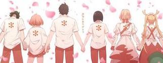
The pastels of One Week Friends are another example of color palette capturing the essence of its series, and the way everything seems to fade into nothingness is particularly relevant to the type of story it is as well.
Nov 9, 2018 7:43 PM

Offline
Jan 2016
523
I personally loved that.
I mean you can take the anime just the way the saturation told you.
NGNL supposed to be colorful, and with the saturation, it is.
S;G supposed to be dark, and with the saturation, it is.
I mean, how do you feel when you saw a normal-daily life at S;G's saturation? It's pretty uncomfortable, right? atleast yea, for me.
Nov 9, 2018 8:16 PM

Offline
May 2018
161
*laughs in jojo*
sometimes they used it for aesthetic purpose only
Nov 10, 2018 3:40 AM
Offline
Jul 2018
561862
No Game No Life's color saturation is amazing,idk what you are talking about op
Nov 10, 2018 7:05 AM
Offline
Jul 2018
561862
So all creators should use your 'right' amount if saturation?
We should let them know creators do what they want
Nov 10, 2018 7:56 AM

Offline
Mar 2017
2852
Creators should do what they think works best, but that doesn't mean fans can't have opinions about it. As the discussion here illustrates, different fans have different opinions about what worked well and what works best.
A møøse once bit my sister...
Nov 10, 2018 8:10 AM
Offline
Apr 2017
872
Tonkotsu ramen whatever (can't be arsed to look up the exact name) was the only show I simply couldn't watch, it made my eyes bleed as it was oversaturated to the point that even Asian instagram posts seemed normal-looking when compared to it. I watch anime either on my phone (oled screen) or on my laptop (97% srgb coverage and calibrated for editing) and some shows are far too oversaturated. Obviously, if you watch them on some washed-out lcd or god forbid, a tn panel (like I was less than 6 months ago), then there is no such thing as oversaturation (there is, but the "don't-go-beyond-this-limit" bar is far higher).

It's not like anime are the only ones culpable of this, the grand tour is utter shite from that point of view (*also* from that point of view), the grass looks like someone just passed by and used a huge green highlighter on it, it's atrocious.

I've never watched no game no life so I wouldn't really know about it, but in Steins;Gate I didn't mind the more muted colour palette. In the VN it made a good contrast with the eyes of the characters and when there *is* colour (two colours, specifically) it hits far more than it would have if it had been an oversaturated crapshow all along.
"The problem with defining even an aspect of your personality by something that you like, is that criticism of that product appears to you to be criticism of you personally. I find it to be a very harmful attitude, [...] you can't rationally discuss a product because you've started to define yourself by its very existence."

John Bain

More topics from this board

» Do you like "so bad it's good" content?

RobertBobert - 2 hours ago

15 by ForgotEyeWasHere »»
16 seconds ago

» Are people just projecting their own insecurities onto anime girls?

Dragevard - 18 minutes ago

1 by Zarutaku »»
7 minutes ago

» 🎃 Halloween Special: Crown of Eternal Night 🌙 ( 1 2 )

nirererin - 12 hours ago

75 by thewiru »»
7 minutes ago

» Which anime do you wish had a dub and why?

Rally- - 4 hours ago

12 by MinakoBestGirl »»
11 minutes ago

» Is killing taken lightly in anime?

thewiru - Yesterday

18 by rohan121 »»
13 minutes ago
It’s time to ditch the text file.
Keep track of your anime easily by creating your own list.
Sign Up Login