New
Oct 17, 2015 10:25 AM
#1751

| Woo hoo! My profile picture finally updated. I made a few more adjustments.  The only thing that kind of irks me is the gap between my About Me text and Statistics. Is there any way to reduce that? |

Oct 17, 2015 10:32 AM
#1752

| Statistics part looks good & a lot better than before BUT IT SHOULD BE ON TOP AS IT WAS BEFORE. failed on that part. |
 |
Oct 17, 2015 10:33 AM
#1753

aikaflip said: Woo hoo! My profile picture finally updated. I made a few more adjustments. The only thing that kind of irks me is the gap between my About Me text and Statistics. Is there any way to reduce that? Yes. Here.  |
Oct 17, 2015 10:35 AM
#1754
ex_necross said: aikaflip said: Woo hoo! My profile picture finally updated. I made a few more adjustments. The only thing that kind of irks me is the gap between my About Me text and Statistics. Is there any way to reduce that? Yes. Here. Woah. You're good. How would I apply that to my profile? I'm new to this, but I'm not new to coding. If you point me in the right direction, I could probably figure out the rest. |
Oct 17, 2015 10:37 AM
#1755

| I'm not against change but I do want my old stats bars back and the pageview stats. |
Oct 17, 2015 10:42 AM
#1756
ex_necross said: Yvese said: ex_necross said: Either way, it looks really bad on a big monitor. Really feels like I'm viewing a page from the early 2000's that was never updated. This is too much dead space. On the forums it is fine, but on the profile pages it is just ugly. I checked to see if ads were meant to be there, but nope. 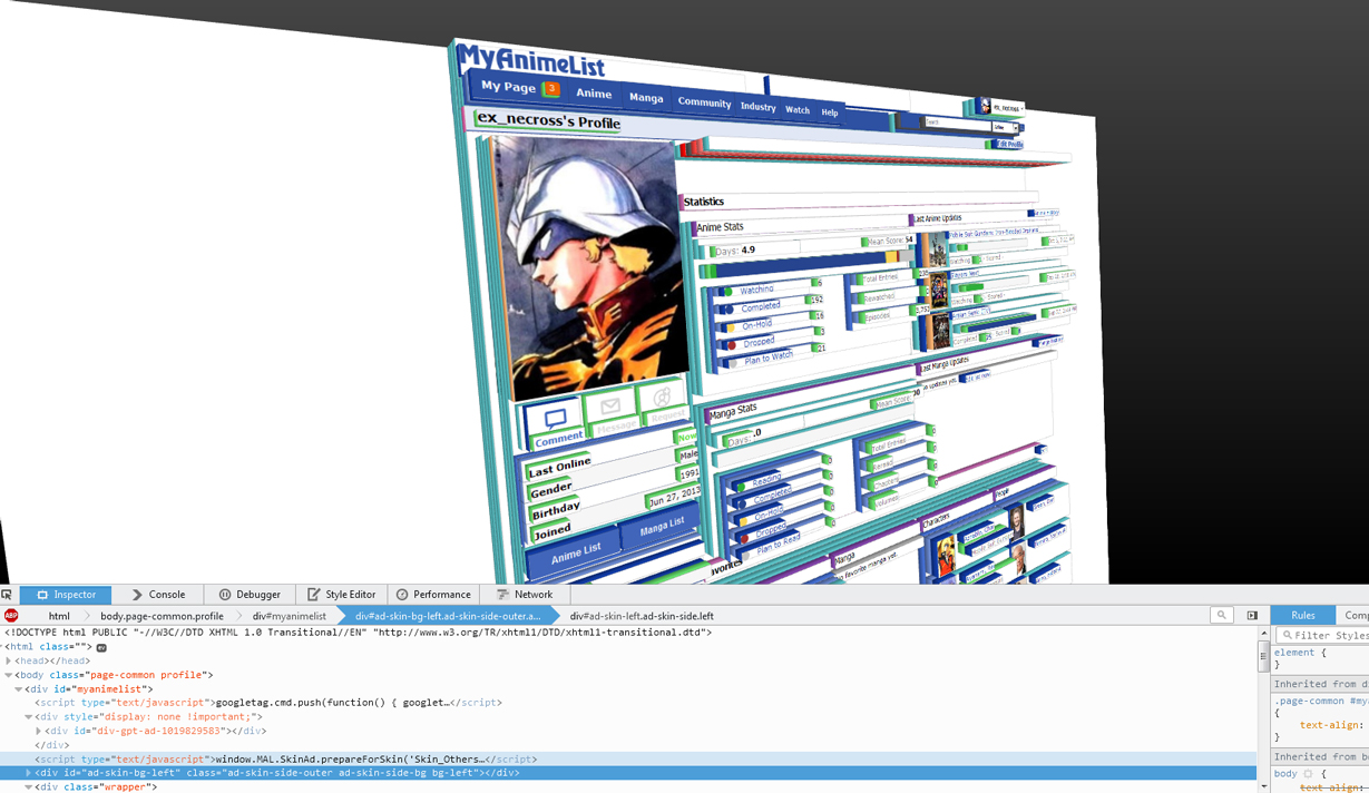 Didn't you know that 40-50% of a website being dead space is "modern" these days? |
Oct 17, 2015 10:45 AM
#1757

I'm having some issues with profile picture blurriness, I'm not sure this is the right forum to ask about this, but I will anyway.  This is my profile picture, and it's a bit blurry. It's not terribly blurry but compared to the actual picture image if you drag my profile picture into a seperate tab, 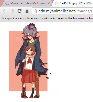 |
 |
Oct 17, 2015 10:46 AM
#1758
aikaflip said: ex_necross said: aikaflip said: Woo hoo! My profile picture finally updated. I made a few more adjustments. The only thing that kind of irks me is the gap between my About Me text and Statistics. Is there any way to reduce that? Yes. Here. Woah. You're good. How would I apply that to my profile? I'm new to this, but I'm not new to coding. If you point me in the right direction, I could probably figure out the rest. Unfortunately that's not gonna help you much if you don't know CSS, I was only pointing to the rule for why the space exists. If you wanna permanently remove it, you're gonna have to get a page style for it. I heard people are already working on custom styles to try to sort out this new mess. Sorry, I'm not that great at teaching these things lol. Lucumo said: Didn't you know that 40-50% of a website being dead space is "modern" these days? Yeah, but there wasn't really anything outdated about the previous look. Was perfectly modern for a page that is dedicated to anime lists. |
ex_necrossOct 17, 2015 10:51 AM
Oct 17, 2015 10:53 AM
#1759

ArbiterofWhim said: Zeando said: ArbiterofWhim said: Just woke up hoping it was all a horrible nightmare. I guess not :/ iirc RedUbs and/or Tsiox were working on a Stylish userscript to rearrange the profile so that favorites and list view counts were back on the left, and statistics were above about me. Did they release a final script to make it look like RedUbs' pic, or are they still working on it? there is also Cpt_Mathix making scripts to rearrange parts of the profile, you can find a list here or directly to his script page: https://greasyfork.org/en/users/16080-cptmathix Thanks m8. Now with the combination of Tsiox's Stylish Theme, RedUb's Stylish script to remove the Statistics and Favorites headers, and 3 of Cpt_Mathix's userscripts, I finally have a profile that I can look at without wanting to commit seppuku. Have we figured out a way to restore the listview e-penis stats, or are we still e-masculated? no idea, of the scripts i've seen there was nothing about that |
 Fixes to make the Profile more bearable after "the Modern★Profile★Update★★Rip★Profile★" |
Oct 17, 2015 10:56 AM
#1760

nx6 said: I do want my old stats bars back and the pageview stats. this and a lot of other things, put the favorites where they used to be, remove the gray extension arrow, move the about section where it used to be or allow us to place the modules where we want, remove the dumb rainbow color scheme, remove the useless friends section, give us the option to use the old layout... |
| :3 |
Oct 17, 2015 11:00 AM
#1761
ex_necross said: Lucumo said: Didn't you know that 40-50% of a website being dead space is "modern" these days? Yeah, but there wasn't really anything outdated about the previous look. Was perfectly modern for a page that is dedicated to anime lists. I was being sarcastic since filling the page completely with useful information and good design is how it should be, in my opinion. A lot of websites manage to do that. And yep, the previous look wasn't outdated at all. |
Oct 17, 2015 11:00 AM
#1762

nx6 said: Yes I liked my List views visible to the public. Since it shows curiousness.I'm not against change but I do want my old stats bars back and the pageview stats. |
 Behold of my awesomeness~ controversial and/or sensitive topics likely devolve into the same repetitive, derogatory, abusive, and harassing comments can no longer be posted. But my feels. |
Oct 17, 2015 11:05 AM
#1763
ex_necross said: aikaflip said: ex_necross said: aikaflip said: Woo hoo! My profile picture finally updated. I made a few more adjustments. The only thing that kind of irks me is the gap between my About Me text and Statistics. Is there any way to reduce that? Yes. Here. Woah. You're good. How would I apply that to my profile? I'm new to this, but I'm not new to coding. If you point me in the right direction, I could probably figure out the rest. Unfortunately that's not gonna help you much if you don't know CSS, I was only pointing to the rule for why the space exists. If you wanna permanently remove it, you're gonna have to get a page style for it. I heard people are already working on custom styles to try to sort out this new mess. Sorry, I'm not that great at teaching these things lol. Lol, it's fine. Thanks anyway. |
Oct 17, 2015 11:08 AM
#1764
aikaflip said: ex_necross said: aikaflip said: ex_necross said: aikaflip said: Woo hoo! My profile picture finally updated. I made a few more adjustments. The only thing that kind of irks me is the gap between my About Me text and Statistics. Is there any way to reduce that? Yes. Here. Woah. You're good. How would I apply that to my profile? I'm new to this, but I'm not new to coding. If you point me in the right direction, I could probably figure out the rest. Unfortunately that's not gonna help you much if you don't know CSS, I was only pointing to the rule for why the space exists. If you wanna permanently remove it, you're gonna have to get a page style for it. I heard people are already working on custom styles to try to sort out this new mess. Sorry, I'm not that great at teaching these things lol. Lol, it's fine. Thanks anyway. I should note that user scripts are surprisingly simple to make and the change in question is a simple one. You could learn CSS in a week or less if you wanted to, it really comes in handy whenever you want to make personalized changes to a site. Kinda gives you a new perspective of the web. |
Oct 17, 2015 11:08 AM
#1765

Yvese said: You being the prime example. Not capable of reason, only namecalling everyone who doesn't share your mindset.Nothing but babies on this site. |
Oct 17, 2015 11:11 AM
#1766

Progeusz said: Yvese said: You being the prime example. Not capable of reason, only namecalling everyone who doesn't share your mindset.Nothing but babies on this site. I hope Yvese has some burn heal, he's gonna need it. |
Oct 17, 2015 11:14 AM
#1767

| I think it's cute aside from my enlarged profile picture lol. Thanks MAL! |
| You may have a fresh start any moment you choose, for this thing that we call "failure" is not the falling down, but the staying down |
Oct 17, 2015 11:24 AM
#1768
alpha_shadow said: nx6 said: I do want my old stats bars back and the pageview stats. this and a lot of other things, put the favorites where they used to be, remove the gray extension arrow, move the about section where it used to be or allow us to place the modules where we want, remove the dumb rainbow color scheme, remove the useless friends section, give us the option to use the old layout... it would be good if the staff did that, but in the while they aren't doing that, there are some ways to get some of the old profile back, or at least make it look a tiny bit better, using scripts, style editors, and adblocks i've made a list of scripts and edits some users made, if you want to try: http://myanimelist.net/forum/?topicid=1439200&show=100#msg42672597 (if you already saw that thread, i agree the staff should still be pushed to improve and fix things more) there is not a favorites solution for now, just removing them |
Fixes to make the Profile more bearable after "the Modern★Profile★Update★★Rip★Profile★" |
Oct 17, 2015 11:30 AM
#1769
| I wonder if this thread will get 6, 666 posts. |
Oct 17, 2015 11:36 AM
#1770

Progeusz said: Did I hurt your feelings? Anyone that cries and demands that MAL change it back because the new design sucks, are in fact babies. If they can't post [b]constructive feedback[/b] on why it sucks, then they should either suck it up or leave. Making stupid one liners and complaining is a huge problem on this site and is why I barely frequent the forums anymore. Good to see nothing has changed.Yvese said: You being the prime example. Not capable of reason, only namecalling everyone who doesn't share your mindset.Nothing but babies on this site. I've already made two posts on here with my feedback on the new design. If everyone did that we wouldn't have 39 pages that admins have to sift through just to get legit feedback. CondemneDio said: Didn't take long for said one liner. Only took one post.Progeusz said: Yvese said: Nothing but babies on this site. I hope Yvese has some burn heal, he's gonna need it. Stay classy MAL. |
 |
Oct 17, 2015 11:40 AM
#1771
Yvese said: Didn't take long for said one liner. Only took one post. Stay classy MAL. Mm-hmm. Prepare to receive immature posts, if you put ones out yourself. |
Oct 17, 2015 11:44 AM
#1772

Yvese said: Progeusz said: Did I hurt your feelings? Anyone that cries and demands that MAL change it back because the new design sucks, are in fact babies. If they can't post [b]constructive feedback[/b] on why it sucks, then they should either suck it up or leave.Yvese said: Nothing but babies on this site. Wow , you must've read at least, like, 5 comments or something. This topic is CHOCK FULL with CONSTRUCTIVE feedback about what is bad and how it could be changed. Alas, it's all pointless because it's gonna stay the way it is now. So you don't need to worry about any admins, because no one is going to sift through anything, let alone address or even change stuff. |
Oct 17, 2015 11:47 AM
#1773
Yvese said: This basically what you're saying.waaah, you aren;t allowed to dislike something I like Now, get out with your blatant lies because there was a multitude of arguments posted in this thread. You're also showing extreme bias and unfairness here. >If they can't post constructive feedback on why it sucks, then they should either suck it up or leave. What the hell? Only people who dislike the changes have to provide arguments? They aren't allowed to simply voice their discontent? But those who like it get a free pass? Because what, precisely? There's no difference between "it sucks" and "it looks good". Both are equally valid. They aren't saying much but they do express the opinion of said person. However you're telling people who have been here for long years to leave the site just because they didn't want to write an essay? You're an insane hypocrite and propagator of censorship. I and countless other people made multiple post each about what is bad about the new update. Very few people were capable of providing arguments why they like it. And even if they do provide the arguments, they are unable to reply when someone counters those. |
Oct 17, 2015 11:47 AM
#1774
CondemneDio said: So my post is immature because of calling people babies, yet the rest of it is largely irrelevant? Like the part where I said Yvese said: Didn't take long for said one liner. Only took one post. Stay classy MAL. Mm-hmm. Prepare to receive immature posts, if you put ones out yourself. Things change. Either deal with it or offer constructive feedback to help improve it. I suppose I should bring myself down to your level and join the one-liner circlejerk so we can keep pushing this thread past 39 pages of garbage. |
|
Oct 17, 2015 11:50 AM
#1775
| I dislike how the About Me, is cut off. People have to click the arrow to expand. It is sort of annoying. I think the favorites/statistics should be at the top. |
Oct 17, 2015 11:52 AM
#1776
Yvese said: CondemneDio said: So my post is immature because of calling people babies, yet the rest of it is largely irrelevant? Like the part where I said Yvese said: Didn't take long for said one liner. Only took one post. Stay classy MAL. Mm-hmm. Prepare to receive immature posts, if you put ones out yourself. Things change. Either deal with it or offer constructive feedback to help improve it. I suppose I should bring myself down to your level and join the one-liner circlejerk so we can keep pushing this thread past 39 pages of garbage. You may make a good point, but when you say things like a dick, people aren't going to listen to you. |
Oct 17, 2015 11:52 AM
#1777
Yvese said: Yes. When you start your post with completely unfounded namecalling, you shouldn't expect to be treated seriously. You deserve being treated the same as you treat others. You should feel happy that people replied to you seriously because you don't deserve anything more than namecalling you yourself started. You can't bring yourself down to others' level because you put yourself way below everyone else with your very first line.CondemneDio said: So my post is immature because of calling people babies, yet the rest of it is largely irrelevant? Like the part where I said Yvese said: Didn't take long for said one liner. Only took one post. Stay classy MAL. Mm-hmm. Prepare to receive immature posts, if you put ones out yourself. Things change. Either deal with it or offer constructive feedback to help improve it. I suppose I should bring myself down to your level and join the one-liner circlejerk so we can keep pushing this thread past 39 pages of garbage. |


Oct 17, 2015 12:12 PM
#1780

Progeusz said: Yvese said: You being the prime example. Not capable of reason, only namecalling everyone who doesn't share your mindset.Nothing but babies on this site. For a second I thought my dinner was burning, but then I realized it was just this post. |
 |
Oct 17, 2015 12:19 PM
#1781

| Just... no. Please make it go away. +1 to being able to choose. This is just ugly. Or at least make it not THAT huge... |
Oct 17, 2015 12:20 PM
#1782

I like how the old tabs are still present when you're not on the Home tab btw: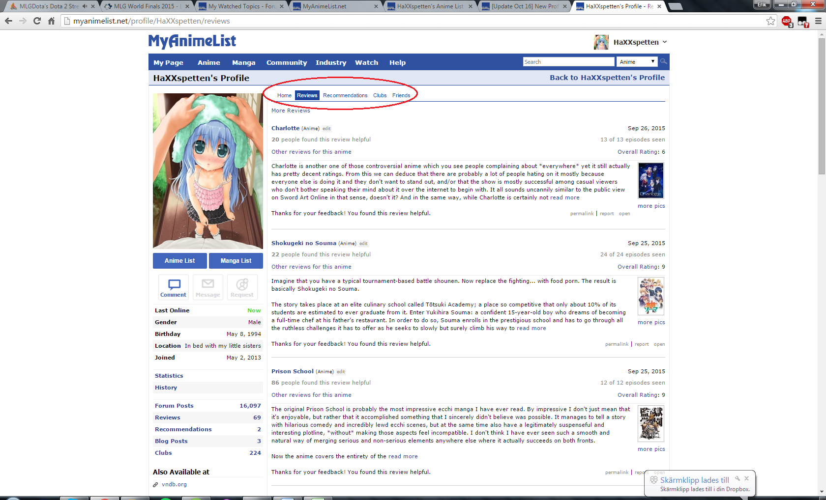 |
  |
Oct 17, 2015 12:21 PM
#1783

| After the change, my compatibility with all my friends have lowered by like 10%, kind of disheartening. Whats up with that? Is is some kind of bug? |
 |
Oct 17, 2015 12:25 PM
#1784
Progeusz said: I forgot that being politically correct has been the standard for awhile now. Thanks Obama.Yvese said: Yes. When you start your post with completely unfounded namecalling, you shouldn't expect to be treated seriously. You deserve being treated the same as you treat others. You should feel happy that people replied to you seriously because you don't deserve anything more than namecalling you yourself started. You can't bring yourself down to others' level because you put yourself way below everyone else with your very first line.CondemneDio said: Yvese said: Didn't take long for said one liner. Only took one post. Stay classy MAL. Mm-hmm. Prepare to receive immature posts, if you put ones out yourself. Things change. Either deal with it or offer constructive feedback to help improve it. I suppose I should bring myself down to your level and join the one-liner circlejerk so we can keep pushing this thread past 39 pages of garbage. I'll try to not hurt people's feelings by calling them a completely inappropriate derogatory term. Calling people babies.. the nerve! |
|
Oct 17, 2015 12:26 PM
#1785
Yvese said: Thanks Obama. Dank meme brah I r8 it 8/8 |
Oct 17, 2015 12:27 PM
#1786
CondemneDio said: Just joining the circlejerk. Can't go around calling people babies lest you want to face the wrath of the namecalling police.Yvese said: Thanks Obama. Dank meme brah I r8 it 8/8 Thanks Obama. |
|
Oct 17, 2015 12:28 PM
#1787
Yvese said: CondemneDio said: Just joining the circlejerk. Can't go around calling people babies lest you want to face the wrath of the namecalling police.Yvese said: Thanks Obama. Dank meme brah I r8 it 8/8 Thanks Obama. Dank meme brah I r8 it 8/8 |
Oct 17, 2015 12:29 PM
#1788
Yvese said: Really, there's very little difference between calling someone a baby and calling that person a fucking moron. Latter would just get you deleted fast but the underlying message is still the same.I'll try to not hurt people's feelings by calling them a completely inappropriate derogatory term. Calling people babies.. the nerve! The important part is, you're using ad hominem, trying to belittle others because you're unable to win in normal discussion. And it's showing as you can only comment on attitude of others instead of contents of their posts, the points of their messages. |
Oct 17, 2015 12:32 PM
#1789
galimx said: Nothing will change :( Yeah, they're not listening. Next thing you know, the lists will be fucked over too. |
Oct 17, 2015 12:32 PM
#1790
galimx said: Yeah, this hurts :( MAL staff never have the guts to admit their decision was wrong. When they do something, it's bound to stay.Nothing will change :( |
Oct 17, 2015 12:43 PM
#1791

| The more I use it, the more I like it. Looks actually quite pretty, modern, and pleases the eye. There is more info available right away, without the need for malgraph or checking the list (such as meanscore or scores for last updates). About me being on top is something I disliked at first, but it was just me being used to the old layout, now there are some nice possibilites like combining about me with profile picture, without any real disadvantage. The drop down arrow for bigger 'about me's is also a HUGE plus, too many users just went way overboard with their profiles being so big you have scroll it forever, it's nice that it discourages people from making something so long that only brought annoyance, because no one ever cares for that much useless info. Keep it short and classy. The only thing I dislike is that only half of the faovurites show, there is no point in letting us have more if they are hidden. I hope it's gonna be changed. |
 |
Oct 17, 2015 12:44 PM
#1792

| With Crave this shit wouldn't have happened. How ironic, right? |
Oct 17, 2015 12:54 PM
#1793

What I would do:
What I would not do, despite the outrage:
|
Oct 17, 2015 1:01 PM
#1794
Progeusz said: galimx said: Yeah, this hurts :( MAL staff never have the guts to admit their decision was wrong. When they do something, it's bound to stay.Nothing will change :( There's 2 main reasons why they will not revert the change. The biggest one is their defense mechanism, a bit of mental gymnastics so to speak. They have convinced themselves beforehand that this will be met with lots of negative reception, and that it will blow over after a bit. As long as they tell themselves to expect a heavy negative reception, they can't be wrong. After all, they were right. This is a common psychological practice, they have set themselves up a situation where they cannot lose. The second reason is the sunken cost fallacy. Everyone is probably aware of what this is, but just incase: https://en.wikipedia.org/wiki/Sunk_costs |
Oct 17, 2015 1:03 PM
#1795
| I'm still surprised, what were they thinking. Do i need to write a bunch of stuff about myself? just move it under statistic please or at-least give an option to choose. Not to mention that fold. It look really bad. messed up my whole profile setting. WOW. edit button is gone as well. Way to go MAL... |
Han-yuuOct 17, 2015 1:09 PM
|
Oct 17, 2015 1:10 PM
#1796

| This is awesome! Really love the new profiles, they look really nice. Cool update! ^_^ Imaishi said: The only thing I dislike is that only half of the faovurites show, there is no point in letting us have more if they are hidden. I hope it's gonna be changed. I actually tend to like the idea of only showing half of the favorites at first. it gives more importance to those first five, while still allowing users to add more favorites if they have a lot. Plus, having all ten visible at once would be kind of large on the page... having half of them hidden keeps the size of that box manageable. |
vigorousjammerOct 17, 2015 1:16 PM
::End of Transmission:: What have I been watching? Click here and find out on my viewing blog, "Vigorous Viewing" |
Oct 17, 2015 1:16 PM
#1797
ex_necross said: aikaflip said: ex_necross said: aikaflip said: ex_necross said: aikaflip said: Woo hoo! My profile picture finally updated. I made a few more adjustments. The only thing that kind of irks me is the gap between my About Me text and Statistics. Is there any way to reduce that? Yes. Here. Woah. You're good. How would I apply that to my profile? I'm new to this, but I'm not new to coding. If you point me in the right direction, I could probably figure out the rest. Unfortunately that's not gonna help you much if you don't know CSS, I was only pointing to the rule for why the space exists. If you wanna permanently remove it, you're gonna have to get a page style for it. I heard people are already working on custom styles to try to sort out this new mess. Sorry, I'm not that great at teaching these things lol. Lol, it's fine. Thanks anyway. I should note that user scripts are surprisingly simple to make and the change in question is a simple one. You could learn CSS in a week or less if you wanted to, it really comes in handy whenever you want to make personalized changes to a site. Kinda gives you a new perspective of the web. Yeah, I should finally take the time to learn CSS. It's been on my to-do for awhile. In the meantime, I'm just going to move my About Me to a blog, and link the blog to the body picture. I'm completely satisfied with how my profile looks now. |
Oct 17, 2015 1:17 PM
#1798

| I don't mind the new profile change. Kinda nice to see an site to update its design every so often. |
"Lelouch, do you know why snow is white? Snow is white, because it's forgotten what color it's supposed to be."  |
Oct 17, 2015 1:18 PM
#1799

| New design looks messy for me (have to get used to it, because it's just a matter of habit). But anyway, thank you!:) |
 |
Oct 17, 2015 1:27 PM
#1800

| :c |
 |
More topics from this board
» Related Anime/Manga Section ChangesKineta - Yesterday |
39 |
by Green929392
»»
5 minutes ago |
|
» [Challenge] You Should Read This Manga 2024 ( 1 2 3 4 5 )Kineta - Feb 23 |
236 |
by Wael5656
»»
Yesterday, 9:40 AM |
|
» List Title Toggle: Main Title, English, and more ( 1 2 3 )Kineta - Nov 10, 2021 |
109 |
by RED-clover12
»»
May 17, 5:06 PM |
|
» Try MAL's New Mobile Site! ( 1 2 3 4 5 ... Last Page )Xinil - Feb 15, 2015 |
424 |
by nothing_ness
»»
May 5, 8:51 PM |
|
» Moderators Wanted! Accepting applications for all positionsKineta - Apr 26 |
0 |
by Kineta
»»
Apr 26, 6:46 PM |