New
Oct 16, 2015 12:27 AM
#51
ghoullovesharem said: Ya, the button is cute, I just really want to poof with the arrows.Mkim said: I have only one question at this moment  its still better than to scroll infintely and get crashed 800th post |
| gone bai bai |
Oct 16, 2015 12:30 AM
#52

alpha_shadow said: 1. Gove us the option to use the old layout because the new one is terrible. ^ |
 "One must die and one must live. No victory, no defeat. The survivor will carry on the fight. It is our destiny... The one who survives will inherit the title of Boss. And the one who inherits the title of Boss will face an existence of endless battle." |
Oct 16, 2015 1:04 AM
#53

Kittenpotpie said: revert everything except 10 favorites limit +1 The new design is terrible. And why "About" is now on top? |
Oct 16, 2015 1:07 AM
#54
| And one more thing. What happened with friends "compatibility"? |
Oct 16, 2015 1:07 AM
#55
| I kinda dig the new design. I wish the favourites would be displayed at all times though, without having to click the arrow below it. Seems kind of unneccassary to me. |

Oct 16, 2015 1:15 AM
#57

Akagi-kun said: Negative affinity. So you can track edgelords easier.That this zero mean? |
 |
Oct 16, 2015 1:22 AM
#58
| I think if you move the "About" box to where it was before, make deletion the thumbnails of friends from the ribbon (it is absolutely not necessary and not informative), slightly modify the display of favorites, the situation with design changes will be a bit better. |
Oct 16, 2015 1:25 AM
#59

| Imo the Anime stats and updates should be read vertically, like this excuse the shoddy paint job.  And the About Me should be on the bottom, or we should have the flexibility to choose where to put it. We also can't see other peoples anime list views? How am I suppose to know how famous they are now??! |
Oct 16, 2015 1:26 AM
#60

| Since this is suppose to be constructive, I'll give my opinion on what I like and what I think could be changed. I'll start with the positives. I like how the 'watching, on hold, and plan to watch, ect is now color coded. I also like the green line that shows how far you are into a series. Like many others have already said, I would move the 'about me' section away from the top and somewhere to the side. And having the comment button under the profile pic is kinda redundant since there's already one in the comments section. Anyway just my two cents. :D |
| MAL: A community that thinks every anime is bad, but rates everything a 7/10. |
Oct 16, 2015 1:28 AM
#61
| I've asked around and talked to a lot of people (especially my closer friends that I trust) and I think the biggest problems are 1) the placement of the About Me section is irregular/obstructive. 2) the statistics and favourites now take up one whole screen (1000px on mine) making navigation a bit of a chore 3) no option to turn features off or switch to the old layout This problem could have been prevented by giving users a chance to beta test the site layout by opting in to try out the new layout. I know a lot of people who aren't usually irrational and hasty people thinking about leaving because of this change. While I don't understand their impatience, I understand their motivation. |
|
Oct 16, 2015 1:43 AM
#62

| What I really don't like is the 'About Me' section placement.. This is the least what I can say. FloatsBoats said: Imo the Anime stats and updates should be read vertically, like this excuse the shoddy paint job. Agreed. |
 |
Oct 16, 2015 1:48 AM
#63

| i think a other thing is to change the corresponding color for examples blue=watching green=completed |
 |
Oct 16, 2015 2:00 AM
#64

| I'm so disappointed. I will never accept it. |
 |
Oct 16, 2015 2:06 AM
#65
SnugglyWhuggly said: the new layout ain't even that bad, but it definitely needs improving and fixing. Agreed. |
Oct 16, 2015 2:11 AM
#66

| I wrote a simple userscript that switches the About me and Statistics in your profile: https://greasyfork.org/nl/scripts/13108-myanimelist-mal-profile-switch Hope you like it! |
| My Userscripts: • Show anime/manga info inside your animelist/mangalist • Other Scripts |
Oct 16, 2015 2:11 AM
#67

I'm not fan of the new design (updates bars should be slimer or removed, etc) but I could live with it if a little thing was added:
|
EratiKOct 16, 2015 10:36 AM
 |
Oct 16, 2015 2:34 AM
#68

| I don't think I personally agree with this new profile layout. I won't hate the site for implementing this to be permanent, but I think the system should be ran a little bit better before actually putting these changes into action. The site gave no notice aside from the forum post - that wasn't even a day old to give notice to a big change that many people visit on MAL, the profiles. I feel as if someone from the staff should give a notice a month - or even a week - before hand to let people get the idea that change is a possibility soon. A possible solution to solve this idea of not even knowing what it'll look like and get a ton of mixed feelings from the sudden change would be to post a screenshot or a preview of what the change will look like. An example of it would be the way other sites and games handle changes. They publish what the new item or layout will look out through screenshots and post it to see what the mass will think of it. Although my only complaint isn't only the entire abrupt change without any notice, I think people are taking the idea of 'list views' or anything of that sort a little too lightly. A lot of the people that I've met on this site love to see the idea of a 'list count' to see their track on the site and see how much they've grown from day 1 of creating their profile. In a similar fashion, the old layout of "AIM" and "MSN" being in the spot that was in the old layout gave room for the profile to make itself an individual rather than actual other methods of contacting said person's profile. |
YuusaOct 16, 2015 2:37 AM
 |
Oct 16, 2015 2:43 AM
#69

Cpt_Mathix said: god bless youI wrote a simple userscript that switches the About me and Statistics in your profile: https://greasyfork.org/nl/scripts/13108-myanimelist-mal-profile-switch Hope you like it! ghoullovesharem said: i think a other thing is to change the corresponding color for examples blue=watching green=completed i think we should have an option to choose our colours ourselves. |

Oct 16, 2015 2:48 AM
#70
Cpt_Mathix said: Very nice. This should tide people over until they respond to the criticisms the forums have given. (they'll respond, right guys? Guys?)I wrote a simple userscript that switches the About me and Statistics in your profile: https://greasyfork.org/nl/scripts/13108-myanimelist-mal-profile-switch Hope you like it! I can't figure out how to get the About me underneath the Favourites by myself though |
|
Oct 16, 2015 3:01 AM
#71

Cpt_Mathix said: I wrote a simple userscript that switches the About me and Statistics in your profile: https://greasyfork.org/nl/scripts/13108-myanimelist-mal-profile-switch Hope you like it! Awesome, thanks! |
 |
Oct 16, 2015 3:02 AM
#72
Syrup- said: Cpt_Mathix said: Very nice. This should tide people over until they respond to the criticisms the forums have given. (they'll respond, right guys? Guys?)I wrote a simple userscript that switches the About me and Statistics in your profile: https://greasyfork.org/nl/scripts/13108-myanimelist-mal-profile-switch Hope you like it! I can't figure out how to get the About me underneath the Favourites by myself though here you go: https://greasyfork.org/nl/scripts/13110-myanimelist-mal-profile-switch-2 |
| My Userscripts: • Show anime/manga info inside your animelist/mangalist • Other Scripts |
Oct 16, 2015 3:05 AM
#73
| Is the picture size on profile page a new feature? Or am I just not paying attention to this? |
Oct 16, 2015 3:09 AM
#74

Akagi-kun said: And one more thing. What happened with friends "compatibility"? yeah was wondering about this too? did u get ur answer ? |
 |
Oct 16, 2015 3:10 AM
#75
Akagi-kun said: It's not a bug, it's a feature! you're not paying attention: I outlined the issue in the second part of the OPIs the picture size on profile page a new feature? Or am I just not paying attention to this? Cpt_Mathix said: thank you~!here you go: https://greasyfork.org/nl/scripts/13110-myanimelist-mal-profile-switch-2 |
|
Oct 16, 2015 3:25 AM
#76
Syrup- said: Akagi-kun said: It's not a bug, it's a feature! you're not paying attention: I outlined the issue in the second part of the OPIs the picture size on profile page a new feature? Or am I just not paying attention to this? Cpt_Mathix said: thank you~!here you go: https://greasyfork.org/nl/scripts/13110-myanimelist-mal-profile-switch-2 Are u the only one who will see the change or others uses too. ? |
|
Oct 16, 2015 3:27 AM
#77
AllenVonStein said: Syrup- said: Akagi-kun said: Is the picture size on profile page a new feature? Or am I just not paying attention to this? Cpt_Mathix said: here you go: https://greasyfork.org/nl/scripts/13110-myanimelist-mal-profile-switch-2 Are u the only one who will see the change or others uses too. ? Only users who downloaded the script can see the changes. |
| My Userscripts: • Show anime/manga info inside your animelist/mangalist • Other Scripts |
Oct 16, 2015 3:28 AM
#78
AllenVonStein said: You are the only one if you install this.Are u the only one who will see the change or others uses too. ? |
Oct 16, 2015 3:31 AM
#79

BigBoss said: alpha_shadow said: 1. Gove us the option to use the old layout because the new one is terrible. ^ |
 |
Oct 16, 2015 3:37 AM
#80
Cpt_Mathix said: Only users who downloaded the script can see the changes. mayukachan said: You are the only one if you install this. ok i see .pff |
|
Oct 16, 2015 3:54 AM
#81

| It was suggested and heavily supported that you would be able to update your progress on your recently watched/read things straight from the profile page with a "+" button. This was never implemented which is beyond me, probably the best suggestion that was in that thread, simple too |
 |
Oct 16, 2015 4:06 AM
#82

| the page has become so much longer stats and favorites panels are too big, making the comment section being too far down 1) it could help if Favorites were back on the side, or if there still were profile pages, instead of having everything into the same page 2) Anime and Manga Stats don't need to be on 2 separate lines, having them side by side like before was a smart way to don't take too much space FloatsBoats said: support thisImo the Anime stats and updates should be read vertically, like this excuse the shoddy paint job. also allow to edit Profile Panels order, or bring the stats back on the top, Stats are the most important thing of MAL, people can have their fancy blogs somewhere else 3) Affinity to You and Stats should stay close to each other, no sense having them splitted |
ZeandoOct 16, 2015 5:25 AM
 Fixes to make the Profile more bearable after "the Modern★Profile★Update★★Rip★Profile★" |
Oct 16, 2015 4:07 AM
#83
Zeando said: welcome to 2k15 web designthe page has become so much longer aka shit. |
Oct 16, 2015 4:11 AM
#84
Zeando said: making the comment section being too far down But we have a hyperjump button now ) |
Oct 16, 2015 4:16 AM
#85
Zeando said: Akagi-kun said: Zeando said: making the comment section being too far down But we have a hyperjump button now ) where the hell is it?  This icon, right under the profile picture. From the second post on this page ) |
Akagi-kunOct 16, 2015 4:57 AM
Oct 16, 2015 4:22 AM
#86
| @mayukachan on the first impact, yeah @Akagi-kun yeah yeah it's clear now still annoyed at the long page, can hardly see the anime manga stats in a single screen D: anyway this is about reporting annoying things about the new layout, no need to reply to each report or this will become a 1000+ posts discussion like the update thread = useless thread |
ZeandoOct 16, 2015 4:26 AM
Fixes to make the Profile more bearable after "the Modern★Profile★Update★★Rip★Profile★" |
Oct 16, 2015 4:32 AM
#87
| This low resolution of preview images makes me cry. This  and this   One more issue. MALGraph after refreshing statistics, lost informations about picture profile and list views... List views:0 0 anime, 0 manga And now we cannot see an information about number of anime and manga lists views on the profile page. Now, on http://myanimelist.net panel.php only ( |
Akagi-kunOct 16, 2015 4:49 AM
Oct 16, 2015 6:39 AM
#88

| Would rather the research count was episodes rather than anime. |
     Short of the day: Monotonous Purgatory(MAL) ✰Public Domain Club | One Piece Club✰ |
Oct 16, 2015 7:10 AM
#89
FloatsBoats said: We also can't see other peoples anime list views? How am I suppose to know how famous they are now??! That's my biggest complain |
Oct 16, 2015 8:14 AM
#90

| That the Anime Stats and Last Updates are horizontally instead of vertically was addressed in the update thread. BUT I'd like to have the Anime/Manga stats side by side nontheless IF I use the limited privacy option that MAL provides and hide the last updates. Currently I do have Last Anime Updates and Last Manga Updates in there but if you expand it by clicking the small history link above those sections you won't see anything since I have turned them off. This little detail seems contradictory to the privacy option and indicates a high possibility that MAL will not do anything to improve the well known pigeon-holes in privacy in the near future. And I have to disagree wholeheartedly that About Me should be put below statistics (by default). The profile is your personal playground and it makes sense to put the section where you have the most freedom with at the top. Statistics are more off-putting as they require you to think more than some text (it's a usability thing you may not agree with because you're simply not used to it). Having said that I'd like the links under "Also Available at" (why is it "Available at" and not "available at" or "Available At"?) above the Anime List / Manga List buttons. It's weird having them so far down in your sidebar, it's like the links don't exist but MAL has always been nitpicky about how links to other sides are embedded. For now it's probably better putting websites in your About Me. Overall I like it, though but it's always the same in every community. As soon as a severe layout update is introduced that improves a lot while not being perfect at first, everyone is bitching loudly, see last.fm, or trakt.tv. Besides that these two majorly fucked up core functions for weeks or months and you should be happy MAL manages not to fuck up so majorly. It's funny to observe the same reaction every time. :D If this is the direction anime pages will move towards to, I am looking forward to it. Edit: In case your about me is too long or have more favs in your lists, those "gradients" should give a visible feedback if you mouse hover, like darkening in color. So that you know what you are clicking on, opaque white over a white background isn't really helping here and easy to overlook entirely. |
nantukoOct 16, 2015 8:28 AM
 |
Oct 16, 2015 8:24 AM
#91

| Good things: The 3 basic buttons of messag/comment/addfriend are useful, look better and we didn't need anything else here. In fact, the whole left side looks good. Forum Posts, Clubs, Reviews all should be next to each other. I also like that friends are more visible now. It's easier to see it. The colorful stats look easier on the eye It's great that the comment box is above the comments. The bad: The stats look weird standing in the middle of the profile. Maybe it's something I'll get used to, but right now I get this urge to grab it and put it higher. As for the favorites, I suggest displaying them in a row rather than a column. The middle is wider, not narrower. Columns look okay on the side, but in the wide middle it looks like extra space. It will also be prettier to see a row of larger images of my favorite characters |
| WEAPONS - My blog, for reviews of music, anime, books, and other things |
Oct 16, 2015 10:06 AM
#92

| Xinil asked for feedback on that thread. Many of us provided it. They gave zero fucks. What makes you guys think they'll give more than negative fucks to this thread? Just deal with it, that's the way this site works; like reviews, which are pretty much obliterated by now. |

Oct 16, 2015 10:29 AM
#93
| A NEW THREAD GOT MADE TO CONTINUE THE DEVELOPMENT OF SCRIPTS AND THEMES FOR THE PROFILE reply there plz while we deal with it.. Moving and Removing panels by scripts to use scripts it's required to install a browser add-on to run scripts stats can be placed back on top with this script: https://greasyfork.org/en/scripts/13110-myanimelist-mal-profile-switch-2 (thx Cpt_Mathix) https://greasyfork.org/en/scripts/13129-myanimelist-mal-profile-switch-3 ^^^ this one moves the list buttons under the profile picture https://greasyfork.org/en/scripts/13131-myanimelist-mal-profile-switch-4 ^^^ this removes instead the friends section Changing the colors and sizes of the progress bars, using Stylish Stylesheet to make the bars slimmer and with more soft colors, using the Broser add-on Stylish (Firefox version , Chrome version) like in this example: 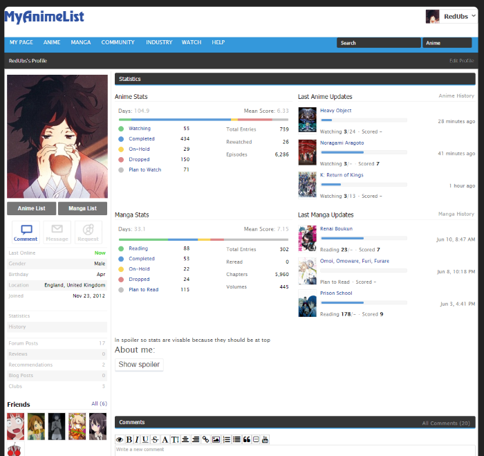 /*
Softens the colour of the progress bars on MAL profiles as well as making them thinner!
Compatible with other Stylish MAL Stylesheets!
Colours by Tsiox @ http://myanimelist.net/profile/Tsiox
Thinning out and put together by RedUbs @ http://myanimelist.net/profile/RedUbs
*/
/*
soft blue #5c9ad8
MAL blue #2e51a2 //#c3c3c3
*/
@-moz-document regexp(".*myanimelist.net/(?!animelist|mangalist).*") {
/*Thinning Out MAL default: 10px, Softer Bars Style defaut: 5px*/
.profile .statistics-updates .data .graph {
height:5px;
}
.profile .statistics-updates .data .graph .graph-inner{
height:5px;
}
.profile .user-statistics .stats-graph {
height: 5px;
}
/* Colours stats bars*/
.profile .user-statistics .stats-graph .graph.watching,
.profile .user-statistics .stats-graph .graph.reading {
background-color: #77cc85;
}
.profile .user-statistics .stats-graph .graph.completed {
background-color: #5c9ad8;
}
.profile .user-statistics .stats-graph .graph.on-hold {
background-color: #f9d457;
}
.profile .user-statistics .stats-graph .graph.dropped {
background-color: #dd8687;
}
.profile .user-statistics .stats-graph .graph.plantowatch,
.profile .user-statistics .stats-graph .graph.plantoread{
background-color: #c3c3c3;
}
/* Colours stats dots*/
.profile .user-statistics .stats-status .circle.watching::after,
.profile .user-statistics .stats-status .circle.reading::after {
background-color: #77cc85;
}
.profile .user-statistics .stats-status .circle.completed::after {
background-color: #5c9ad8;
}
.profile .user-statistics .stats-status .circle.on-hold::after {
background-color: #f9d457;
}
.profile .user-statistics .stats-status .circle.dropped::after {
background-color: #dd8687;
}
.profile .user-statistics .stats-status .circle.plantowatch::after,
.profile .user-statistics .stats-status .circle.plantoread::after {
background-color: #c3c3c3;
}
/* Colours last updated bars*/
.profile .statistics-updates .data .graph .graph-inner.watching,
.profile .statistics-updates .data .graph .graph-inner.reading {
background-color: #77cc85;
}
.profile .statistics-updates .data .graph .graph-inner.completed {
background-color: #5c9ad8;
}
.profile .statistics-updates .data .graph .graph-inner.on-hold {
background-color: #f9d457;
}
.profile .statistics-updates .data .graph .graph-inner.dropped {
background-color: #dd8687;
}
/* Colours last updated text*/
.profile .statistics-updates .data .text.watching,
.profile .statistics-updates .data .text.reading {
color: #232323;
}
.profile .statistics-updates .data .text.dropped {
color: #232323;
}
.profile .statistics-updates .data .text.completed {
color: #232323;
}
.profile .user-favorites .favorites-list .list .image {
border: #bcbcbc 1px solid;
}
}downloadable also for a short time from here: https://userstyles.org/styles/119813/softer-profile-bars Removing the Favorites section https://userstyles.org/styles/119787/remove-favourites-section-from-profiles Removing panels using adblocks parts like the oversized favorites and the friend panels can also be removed with an adblock Elements on the right area: (where there is the about me) AdBlockPlus filters for the Favorites are: myanimelist.net##.container-right .user-favorites-outer.js-truncate-outer (^^^ this one is the favorite panel) myanimelist.net##.container-right > H2.mb12 (^^^ this one is the favorite header) (changed it cause the previous one did disable part of the stats too) filter to remove the Statistics header: myanimelist.net##.container-right > .user-statistics.mb24 > H2:first-child Elements on the left area: (under the profile picture) filter to remove the Statistics quick link: myanimelist.net##.user-profile > .user-status.border-top > .icon-statistics.link filter to remove the History link: myanimelist.net##.user-profile > .user-status.border-top > .icon-history.link filters for the Friends panel: myanimelist.net##.user-friends.pt4.pb12 myanimelist.net##.user-profile > H4 (^^^ this one needs a little more of work cause it also disables the header of "Also Available at", better to use the script above instead) filters to remove the RSS Feeds myanimelist.net##.user-profile > .icon-rss myanimelist.net##.user-profile > .user-profile-sns:last-child filter for the Big blue footer space at the end of every page with social media links myanimelist.net###footer-block (blocking elements with AdBP "may" require a different suscribing list) Also thanks to all the people who made suggestions, requests and helped to improve the current tools. |
ZeandoOct 18, 2015 8:23 AM
Fixes to make the Profile more bearable after "the Modern★Profile★Update★★Rip★Profile★" |
Oct 16, 2015 11:05 AM
#94

| My feedback. I do not like it. At least (for me) place the statistic on top, the the profile info down. Just change the place between the two. Thats my opinion, Thank you. And have a great Anime Marathon. |
Oct 16, 2015 11:38 AM
#95

| Other than that the "About Me" section is on top, I do like the new UI, however I'd prefer to have said section in the bottom, and insted show the animes that I'm watching at top along with the favourites and stuff. Because as it is now, you usually just runs in to a big wall of text, whenever you visit another's profile, but you don't get any impression of what said person is currently watching, or his/her preferences. |
 |
Oct 16, 2015 12:32 PM
#96
xbobx said: They're more likely to give fucks about this thread than the one flooded with people crying "change it back or I'll poop my diaper". I already know the dev team on this site is notorious for not listening, and they gave us concrete evidence of this by doing whatever the fuck they wanted after asking us what we though about profiles.Xinil asked for feedback on that thread. Many of us provided it. They gave zero fucks. What makes you guys think they'll give more than negative fucks to this thread? Just deal with it, that's the way this site works; like reviews, which are pretty much obliterated by now. Someone should make a checklist of all the things they implemented in that thread. I doubt there was very many things that made it through. mayukachan said: this site doesn't represent that ideal very well. The appeal of modern design is to bring functionality with a clean aesthetic. This is functional to the point of disgusting, and even though it may look organized, there's too much on the screen.Zeando said: welcome to 2k15 web designthe page has become so much longer aka shit. |
|
Oct 16, 2015 1:28 PM
#97
Zeando said: stats can be placed back on top with this script: https://greasyfork.org/en/scripts/13110-myanimelist-mal-profile-switch-2 (dunno who did this script but thank you) Glad you like it :) |
| My Userscripts: • Show anime/manga info inside your animelist/mangalist • Other Scripts |
Oct 16, 2015 1:58 PM
#98

| So is anyone able to tell me how to use these script things? Would be much appreciated. |
Oct 16, 2015 2:00 PM
#99

| Can we get an edit link on the Last Anime Updates/Last Manga Updates entries? It's rather inconvenient if one wants to change an entry / add an episode or chapter - going through either the entries page or ones list. |
 |
Oct 16, 2015 2:13 PM
#100
Digital_Fuzion said: So is anyone able to tell me how to use these script things? Would be much appreciated. You have to download a userscript manager first: https://greasyfork.org/en/help/installing-user-scripts. If you did this you can browse greasyfork and install scripts with the green install button |
| My Userscripts: • Show anime/manga info inside your animelist/mangalist • Other Scripts |
More topics from this board
» How about flagging if an account's scores dont count in and is it permanent?SinDrake - Nov 23 |
1 |
by Darkonius
»»
Nov 23, 10:09 PM |
|
» Allow us to filter out chinese snimation.brokencounter - Feb 18, 2024 |
20 |
by Y-MELLY
»»
Nov 23, 1:53 PM |
|
» Daily change in members updateKsirou - Nov 21 |
1 |
by _cjessop19_
»»
Nov 22, 1:42 AM |
|
» [Feature Request] More options for stats in signatureHughMungis - Nov 18 |
1 |
by hacker09
»»
Nov 20, 8:47 AM |
|
» Prevent obscure Donghua from polluting the top rankingsZarutaku - Jun 3, 2024 |
20 |
by Runasius
»»
Nov 18, 7:22 AM |