New
Aug 18, 2015 8:43 PM
#3001

| Moved from feedback topic. Most of this post this guy already knows what he wants and isn't actually looking for feedback, hes mainly looking for fixes Kirito_Kurosaki said: I was wondering if i could get some feedback and help with my list. Not too long ago i started getting into customizing my list (like 2 weeks ago) and after a few trial and errors, and ultimately failures, i decided to use a premade list as a template and further customize it in little bits. For my theme i tried doing a SAO theme with the multi wallpaper function that came with the premade list. Im still far from done and want help regarding the "Score" part of my list of which i will put pictures in. I just started so it looks very similar to the original, if anyone has any input i'd be more than glad to hear it, it's what i came here for. 1st wallpaper (All) As you can see my "Score" section is black but i want it to be the same as the rest of the list, i'd also like to see if someone could help me with the missing covers but that's not really urgent 2nd-6th wallpapers (Planning, dropped, etc) Planning http://i.imgur.com/rkqTEUe.png Dropped http://i.imgur.com/prMjDRl.png On hold http://i.imgur.com/zwCCRNA.png Completed http://i.imgur.com/WQmW19P.png Watching http://i.imgur.com/sjj2Ysf.png Also here's my Css @import "https://dl.dropbox.com/s/0rb5a1wq0b8ev5w/LastChapterAnimeListCSS.css"; @import "http://dl.dropbox.com/u/78340470/CSSforFoxgirls.css"; @import url(http://dl.dropboxusercontent.com/u/78192465/MyAnimeList/Lineage/TopMenu.css); @import url(http://dl.dropboxusercontent.com/u/78192465/MyAnimeList/Lineage/CategoryMenu.css); @import url(http://dl.dropboxusercontent.com/u/78340470/anime.css); @font-face { font-family: 'SAO'; src: url(http://dl.dropboxusercontent.com/u/78192465/MyAnimeList/Fonts/SAO.woff) format('woff'); } @font-face { font-family: 'Philosopher'; src: url(http://dl.dropboxusercontent.com/u/78192465/MyAnimeList/Fonts/Philosopher.woff) format('woff'); } /* HOW TO USE Use and COMPLETE this simple tutorial if you never installed CSS, it only takes a few minutes: http://myanimelist.net/forum/?topicid=200320 When you're done with the tutorial and can see the starter layout on your list, copy and paste this entire page of codes (including this part and the codes above and below) to your CSS edit box (the box titled Edit Advanced CSS File) replacing any other codes in the box. Save with the blue button at the bottom. It will put this premade layout on your list instead of the starter one from the tutorial! If the layout looks weird on your list after installing, you can try to alter your settings here. Common solutions are to set Default Status Settings to Watching or All Anime, check or uncheck tags (make sure you save afterwards): http://myanimelist.net/editprofile.php?go=listpreferences If your list still has problems you can ask us about it here, or other questions: http://myanimelist.net/forum/?topicid=200323 And you'll find further ways to customize your list here: http://myanimelist.net/forum/?topicid=419405 */ td[class^='td']:nth-of-type(2) { width: 454px !important; } .table_header[width="125"], span[id*="tagLinks"], div[id*="tagChangeRow"] { display: none !important; } td[class^='td'][width="125"] { width: 0; } .hide { background-position: center; background-repeat: no-repeat; background-size: auto; } .borderRBL { border-style: solid; border-color: #FFFFFF; border-width: 2px 0 !important; } .borderRBL small { visibility: visible !important; } a { text-decoration: none; } body { font-family: 'Philosopher'; font-size: 13px; color: #7f7e7e; letter-spacing: .5px; background-color: transparent; } /* LIST SETTINGS */ #list_surround { position: relative; left: 100%; margin-left: -1200px; top: -220px; width: 580px; padding-top: 200px; } .table_header span { display: none; } .table_header:nth-child(2) { text-align: left; } .td1, .td2 { padding: 6px 0 3px; line-height: 13px; vertical-align: top; transition: background-color .4s ease; -webkit-transition: background-color .4s ease; } .animetitle, .animetitle + small { display:-cell; } .animetitle span { display: inline-block; } .animetitle + small:before { content: ' '; white-space: pre-wrap; } .animetitle + small { visibility: visible !important; color: #f2a603; font-size: 11px; text-transform: lowercase; letter-spacing: .5px; } #list_surround small { visibility: hidden; } #list_surround small a:last-of-type:before { position: absolute; display: inline-block !important; content: '...'; margin-left: -8px; font-family: Arial; line-height: 7px; font-size: 18px; font-weight: bold; letter-spacing: .5px; color: #7f7e7e; } #list_surround small a:first-of-type { position: relative; left: 44px; padding: 10px; font-size: 0; background-image: url(http://dl.dropboxusercontent.com/u/78192465/MyAnimeList/Lineage/Images/small.png); background-repeat: no-repeat; background-position: 0 -1px; } #list_surround small a[href*="edit"] { background-position: 0 -22px; } #list_surround tr:hover small a:first-of-type, #list_surround tr:hover small a:last-of-type:before { visibility: visible; } td[class^='td']:nth-child(2) { text-align: left; } td[class^='td'][width="45"] { background-image: url(http://i.imgur.com/sudqPq5.jpg); background-repeat: no-repeat; background-position: 11px 2px; } /* LIST COLOR */ .table_header, .td1, .td2 { text-align: center; background-color: rgba(255, 255, 255, .60); } tr:hover td[class^='td']:not(.borderRBL) { background-color: rgba(255, 255 , 255, 1); } /* LIST FONT COLOR */ a { color: #666565; } .table_headerLink { line-height: 24px; font-size: 12px; color: #f2a603 !important; font-weight: normal; text-transform: uppercase; } .table_headerLink strong { font-weight: normal !important; } td[class^='td'][width="45"], td[class^='td'][width="45"] a { color: #FFFFFF; } /* BORDER COLORS */ td[class^='td']:first-child { border-left: 2px solid #FFFFFF !important; box-shadow: -1px 0 0 #7f7e7e; } td[class^='td']:last-child { border-right: 2px solid #FFFFFF !important; box-shadow: 1px 0 0 #7f7e7e; } .table_header { border-style: solid; border-color: #FFFFFF; border-width: 2px 0; background-color: rgb(255, 255, 255); box-shadow: 0 1px 0 #000000, 0 -1px 0 #7f7e7e; } .table_header:first-child { border-left: 2px solid white !important; box-shadow: 0 -1px 0 #7f7e7e, 0 1px 0 #000000, -1px 0 0 #7f7e7e; } .table_header:nth-child(5) { border-right: 2px solid white !important; box-shadow: 0 -1px 0 #7f7e7e, 1px 0 0 #7f7e7e, 0 1px 0 #000000; border-radius: 0 16px 0 0; } /* HEADERS */ .header_title { pointer-events: none; display: inline-block; height: 100px; } /* Headers pics*/ .header_cw span, .header_completed span, .header_onhold span, .header_dropped span, .header_ptw span { position: absolute; display: inline-block; width: 660px; height: 131px; font-size: 0; background-image: url(http://dl.dropboxusercontent.com/u/78192465/MyAnimeList/Lineage/Images/headers_bg.png); background-repeat: no-repeat; z-index: 1; } .header_cw span { background-position: center 0; } .header_completed span { background-position: center -131px; } .header_onhold span { background-position: center -262px; } .header_dropped span { background-position: center -393px; } .header_ptw span { background-position: center -524px; } /* CURRENTLY WATCHING RENDER(removed) AND BACKGROUND */ .status_selected:first-child { background-image: url(none), url(http://i.imgur.com/6XMWB4O.png); background-position: -400px 15px; } /* COMPLETED RENDER AND BACKGROUND */ .status_selected:nth-child(2) { background-image: url(http://i.imgur.com/HfxhRr8.png), url(http://i.imgur.com/X1JmLRU.jpg); background-position: 600px, -160px; } /* ON-HOLD RENDER (removed) AND BACKGROUND */ .status_selected:nth-child(3) { background-image: url(none), url(http://i.imgur.com/BtnkPON.png); background-position: left bottom, left top; } /* DROPPED RENDER(removed) AND BACKGROUND */ .status_selected:nth-child(4) { background-image: url(none), url(http://i.imgur.com/0VJqaNI.png); background-position: left bottom, center center; } /* PLANNED RENDER(removed) AND BACKGROUND */ .status_selected:nth-child(5) { background-image: url(none), url(http://i.imgur.com/OYPR7G8.png); background-position: left bottom, right center; } /* ALL RENDER AND BACKGROUND */ .status_selected:last-child { background-image: url(none), url(http://i.imgur.com/sudqPq5.jpg); background-position: left center; } .category_totals { padding: 3px 3px 9px 3px; text-align: center; font-size: 11px; color: #FFFFFF; border: 2px solid #FFFFFF; background-color: rgb(242, 166, .5); box-shadow: 1px 0 0 #7f7e7e, 0 1px 0 #7f7e7e, -1px 0 0 #7f7e7e; border-radius: 0 0 16px 16px; } #grand_totals:before { diplay: inline-block; content: '< '; } #grand_totals:after { diplay: inline-block; content: ' >'; } #grand_totals { position: absolute; display: block; margin-top: -28px; width: calc(100% - 24px); padding: 0 10px 10px; text-align: center; font-size: 11px; color: #FFFFFF; border-color: #FFFFFF; border-style: solid; border-width: 0 2px; background-color: rgb(242, 166, .5); box-shadow: 1px 0 0 #7f7e7e, 0 1px 0 #7f7e7e, -1px 0 0 #7f7e7e; border-radius: 0 0 12px 12px; } #copyright:before { diplay: block; content: "Design by SylakentH_"; font-size: 12px; } #copyright:after { diplay: block; content: "Edited by LastChapter."; font-size: 12px; } #copyright { position: relative; display: block; margin-top: -10px !important; padding: 2px 0 4px; font-size: 12px; color: #FFFFFF; border: solid 4px #da6358; background-color: rgb(160, 55, 60); border-radius: 16px; } #copyright a { padding-right: 2px; font-size: 14px; color: #FFFFFF; text-shadow: 1px 1px #f11c26; } /* Put your text here */ #:before { position: fixed; display: block; content: "Whether here or in the real world, you can cry when it hurts. There's no rule that you can't show feelings just because it's a game.-Kirito (Sword Art Online)"; right: 0; top: 0; padding-right: 4px; font-family: 'SAO'; line-height: 24px; color: #FFFFFF; font-size: 18px; letter-spacing: 1px; text-shadow: 1px 1px #000000; } @-moz-document url-prefix() { #list_surround small a:last-of-type:before { line-height: 6px; } .td1, .td2 { line-height: 14px; padding: 4px 0; } } /*Covers*/ :hover + .hide { position: fixed !important; display: block !important; left: 730px; top: 120px; width: 193px; height: 316px; background-repeat: no-repeat !important; background-size: 193px 312px !important; } :hover + .hide:after { position: fixed; display: block; content: ''; left: 730px; top: 120px; width: 193px; height: 316px; background-image: url('https://dl.dropboxusercontent.com/u/113316285/hxh/all.png'); background-size: 193px 316px; } .hide:before { background: none repeat scroll 0 0 transparent; border-radius: 15px 15px 15px 15px; color: white; content: ""; padding-bottom: 5px; position: absolute; text-align: center; top: 10px; width: 262px; } } Just to clairify i didn't create this list in anyway, i have simply changed the wallpapers and changed little bits so far, im planning to change a good bit of things later on but i came here first to get some input on where to keep going and some help You have a black background image on the score for some reason. Remove it and you can see score again td[class^='td'][width="45"] { background-image: url(http://i.imgur.com/sudqPq5.jpg); } ^ find and remove that Missing covers is covered in CSS tutorials, if you don't know where use Google -> search MyanimeList + customize your list, or All CSS tutorials, etc |
Shishio-kunAug 18, 2015 9:20 PM
Aug 19, 2015 5:06 PM
#3002

| Hi, I just wonder, how can I make the review section looks like this? http://puu.sh/jHxCd.png I mean, it expands with longer reviews instead of a constant height limit. |
Aug 20, 2015 2:19 AM
#3003
Takana_no_Hana said: Hi, I just wonder, how can I make the review section looks like this? http://puu.sh/jHxCd.png I mean, it expands with longer reviews instead of a constant height limit. add this code .td1:nth-of-type(6), .td2:nth-of-type(6) { width: 0 !important; height: auto; padding: 0; display: block; direction: rtl; } .td1:nth-of-type(6) > span, .td2:nth-of-type(6) > span { position: initial !important; width: 520px !important; direction: ltr; } .td1:nth-of-type(2), .td2:nth-of-type(2) { width: 62%; } |
 |
Aug 20, 2015 5:07 AM
#3004

| Hi im not sure if this has been answered elsewhere but this thread is quite long. im trying to write display: table-cell; but after i update my list it turns to display: -cell; is their a way to stop this? |
Aug 20, 2015 2:21 PM
#3005
D_Cuy said: Takana_no_Hana said: Hi, I just wonder, how can I make the review section looks like this? http://puu.sh/jHxCd.png I mean, it expands with longer reviews instead of a constant height limit. add this code .td1:nth-of-type(6), .td2:nth-of-type(6) { width: 0 !important; height: auto; padding: 0; display: block; direction: rtl; } .td1:nth-of-type(6) > span, .td2:nth-of-type(6) > span { position: initial !important; width: 520px !important; direction: ltr; } .td1:nth-of-type(2), .td2:nth-of-type(2) { width: 62%; } Thanks, but the code didn't work. http://puu.sh/jIzqJ.jpg It just moved the tags into right, and when I tried to write something long it also eats words instead of expanding. |
Aug 20, 2015 2:27 PM
#3006

shardshunt1 said: Hi im not sure if this has been answered elsewhere but this thread is quite long. im trying to write display: table-cell; but after i update my list it turns to display: -cell; is their a way to stop this? If you write "table" in the Advanced CSS code box it will be striped (some weird MAL rule to not apply CSS to tables or something), that's why I always import the code from dropbox and make all the changes directly in my PC, it updates automatically and no worries form anything being striped. There is way to get table in that, but I don't remember in this moment. |
Aug 21, 2015 3:47 AM
#3007
Takana_no_Hana said: D_Cuy said: Takana_no_Hana said: Hi, I just wonder, how can I make the review section looks like this? http://puu.sh/jHxCd.png I mean, it expands with longer reviews instead of a constant height limit. add this code .td1:nth-of-type(6), .td2:nth-of-type(6) { width: 0 !important; height: auto; padding: 0; display: block; direction: rtl; } .td1:nth-of-type(6) > span, .td2:nth-of-type(6) > span { position: initial !important; width: 520px !important; direction: ltr; } .td1:nth-of-type(2), .td2:nth-of-type(2) { width: 62%; } Thanks, but the code didn't work. http://puu.sh/jIzqJ.jpg It just moved the tags into right, and when I tried to write something long it also eats words instead of expanding. I don't know why XD it should work fine in google chrome and Firefox before  after 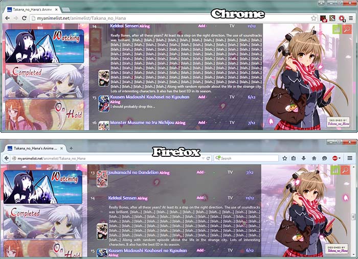 |
|
Aug 21, 2015 5:10 AM
#3008
D_Cuy said: Takana_no_Hana said: D_Cuy said: Takana_no_Hana said: Hi, I just wonder, how can I make the review section looks like this? http://puu.sh/jHxCd.png I mean, it expands with longer reviews instead of a constant height limit. add this code .td1:nth-of-type(6), .td2:nth-of-type(6) { width: 0 !important; height: auto; padding: 0; display: block; direction: rtl; } .td1:nth-of-type(6) > span, .td2:nth-of-type(6) > span { position: initial !important; width: 520px !important; direction: ltr; } .td1:nth-of-type(2), .td2:nth-of-type(2) { width: 62%; } Thanks, but the code didn't work. http://puu.sh/jIzqJ.jpg It just moved the tags into right, and when I tried to write something long it also eats words instead of expanding. I don't know why XD it should work fine in google chrome and Firefox before after Oh :(, I think I will add it again and try to fix it up. Anw thanks for your codes xD |
Aug 21, 2015 1:46 PM
#3009
| Hi i am new to this whole coding thing. I have basically copy-pasted a bunch of stuff from Shishio's beginner tutorial. I have gotten it satisfactory except for that i am using pictures for list headers instead of text and for some reason my " Currently Watching " picture does not show up. Here is the code: @import url(http://fonts.googleapis.com/css?family=Courgette); @import url(https://googledrive.com/host/0BxjwQr0BBXs-aDYxM2JlaFM2bnM); /* Got a question or want to learn more? Try this link: http://myanimelist.net/forum/?topicid=419405&show=0#post1 */ /* BACKGROUND IMAGE This is the main background image for the whole page. Change the image link to the background you want! If you're not seeing a background, make sure you are copied the entire CSS code or added any new background image codes correctly. Also your image link may be broken, try uploading a new background then! */ body { background-image: url(http://i59.tinypic.com/jkiu06.jpg); background-attachment: fixed; } /* HEADER COLOR AND FONT These codes control the main headers' fonts and colors. Every header is above each part of your list (they say things like Currently Watching, Completed, Dropped, etc). if you don't want a solid color there, go to the line that starts with background-color and replace it the color type (blue for example) with the word "transparent" (no quotations). */ .header_title { background-color:transparent; color:transparent; font-family:english111 vivace bt; font-size:48px; } /* SUB-HEADERS BACKGROUND COLOR COLOR Below each main header is the sub-header which says Score, Episodes, Tags, etc. */ .table_header { background-color:#FF45FF; } /* ANIME/MANGA TITLE FONTS This is the type and color of the anime/manga titles on your list, like Bleach, Vampire Knight, etc. */ .animetitle, .animetitle:visited { color:white; font-family:courgette; font-size:20px; } /* LIST FONTS This is the type and color for more of the numbers, links, and words on the list itself! */ .td1, .td2, a, a:visited, .category_totals, .table_header, #grand_totals, #copyright { color:white; font-family:courgette; } /* LIST WIDTH Use this to increase the width of your list! */ #list_surround { width:640px; } /* REPOSITION MAIN BACKGROUND Change the position your background starts on your screen from with the two properties after "background-position" below. You replace 'center' and '43%' with two other properties, they can be any of the following: left, top, bottom, right, or center. So if you want your background to start from the center of the screen, use "center center" after background-position in the code below, replacing "center 43%". If you want it to start from the top and left, use "top left" If you want it to start from the top and center, use "top center". If you want it to start from the right and top, use "right top" If you want it to start from the right and bottom, use "right bottom" and so forth... Additionally, you can change "left" to a % to determine how far left or right the background starts from. For example "30% top" will start the background from the top but 30% of the pic's width from the left of the layout. You can also change top to a % to change the amount you want to start it from the top or bottom. */ body{ background-position: center 43%;} /*OTHER CODES Important codes for the layout's setup. Don't mess with these unless you know exactly what you're doing. If you want to customize more on the page, use the link at the top of this CSS, or ask in my club! */ body { font-weight: light; background-repeat: no-repeat; background-color: black; } #list_surround { margin:auto; background-image:url(); } a { text-decoration:none; } a:visited { text-decoration:none; } a:hover, a:visited:hover { color:#FF00FF; text-decoration:underline; } .category_totals, .td1, .td2, #grand_totals, #copyright { background: rgba(239, 122, 250, 0.5); border-width:0; padding:2px; } .category_totals:HOVER, .td1:HOVER, .td2:HOVER, #grand_totals:HOVER, #copyright:HOVER {background-color:#FF8FFF; border-width:0; padding:2px; } #copyright:after { content: " Custom CSS by Shishio-kun. Google 'Shishio's Custom Lists' for more designs or info."; } .thickbox { color:cyan; font-family:fantasy; font-size:12px; } .header_title { height:52px; padding:2px; } .table_header { border-width:0; font-weight:bold; padding:2px; } .category_totals { height:30px; } #copyright, #grand_totals { text-align: center; margin:0 auto; } body { background-size: cover; } #list_surround { position: absolute !important; right: 1px !important;} #mal_control_strip { display: none !important;} } /* Anime List only CURRENTLY WATCHING HEADER This is the header above currently watching/reading. Increase the amount after "height:" if your image doesn't fit the header. Lower the margin-bottom below zero if you wish the header move it behind the list. If in Google Chrome your header has little to no height and doesn't increase when you try to change it, then replace "height:" with "padding-top:". */ .header_cw { background-image:url(http://i59.tinypic.com/nf1att.jpg); height: 200px; margin-bottom: 0px; background-color: transparent; background-repeat: no-repeat; color:; font-family:; font-size:; } /* COMPLETED HEADER This is the header above your anime/manga that's completed. Increase the amount after "height:" if your image doesn't fit the header. Lower the margin-bottom below zero if you wish the header move it behind the list. If in Google Chrome your header has little to no height and doesn't increase when you try to change it, then replace "height:" with "padding-top:". */ .header_completed { background-image:url(http://i62.tinypic.com/fbi51t.jpg); height: 285px; margin-bottom: 0px; background-color: transparent; background-repeat: no-repeat; color:; font-family:; font-size:; } /* ON-HOLD HEADER This is the header above your animes/mangas on-hold. Increase the amount after "height:" if your image doesn't fit the header. Lower the margin-bottom below zero if you wish the header move it behind the list. If in Google Chrome your header has little to no height and doesn't increase when you try to change it, then replace "height:" with "padding-top:". */ .header_onhold { background-image:url(http://i57.tinypic.com/2j4668y.jpg); height: 285px; margin-bottom: 0px; background-color: transparent; background-repeat: no-repeat; color:; font-family:; font-size:; } /* DROPPED HEADER This is the header above your dropped animes/mangas. Increase the amount after "height:" if your image doesn't fit the header. Lower the margin-bottom below zero if you wish the header move it behind the list. If in Google Chrome your header has little to no height and doesn't increase when you try to change it, then replace "height:" with "padding-top:". */ .header_dropped { background-image:url(http://i60.tinypic.com/23w2yci.jpg); height: 285px; margin-bottom: 0px; background-color: transparent; background-repeat: no-repeat; color:; font-family:; font-size:; } /* PLAN TO WATCH HEADER This is the header above the anime/manga you plan to see or read on your list. Increase the amount after "height:" if your image doesn't fit the header. Lower the margin-bottom below zero if you wish the header move it behind the list. If in Google Chrome your header has little to no height and doesn't increase when you try to change it, then replace "height:" with "padding-top:". */ .header_ptw { background-image:url(http://i62.tinypic.com/hvun0h.jpg); height: 260px; margin-bottom: 0px; background-color: transparent; background-repeat: no-repeat; color:; font-family:; font-size:; } /* REMOVE HEADER COLOR You need this code to remove the default background colors from the header and override any related codes. You're supposed to use your own images or the default ones for the header, so this color is set to transparent so it won't get in the way. If you want the color back for some reason, remove this section. */ .header_title { background-color: transparent !important; } /* OTHER CODES Stuff I had to add after site changes. You need this otherwise the headers won't be visible. */ tbody {background-color: transparent; background-image: none;} /* REMOVE HEADER TEXT These codes remove the original text like "Completed" and "Currently Watching" from each category on the list. Some people will want the text gone so they can have their own custom logos. But if you want the text back, you have to remove this whole section. It shouldn't affect the images in any way. */ .header_title { color: gray !important; color: transparent !important; font-size: 1px !important; font-size: 0px !important; font-size: 0 !important; font-size: 0pt !important; } /* CODES (REPLACEMENT FOR "CSS FOR FOXGIRLS" IMPORT) Used to remove the more button (which no longer works after using the code above to show covers). Also helps with settings for the tag hover option if you use that. */ #list_surround table:nth-of-type(n+4):hover td:nth-of-type(3), #list_surround table:nth-of-type(n+4):hover td:nth-of-type(4), #list_surround table:nth-of-type(n+4):hover td:nth-of-type(5), #list_surround table:nth-of-type(n+4):hover td:nth-of-type(6), #list_surround table:nth-of-type(n+4):hover td:nth-of-type(7), #list_surround table:nth-of-type(n+4):hover td:nth-of-type(8) { display: table-cell; } #list_surround small a:last-of-type { display: none !important; } .animetitle + small { visibility: visible !important; } #list_surround a[href*="http://myanimelist.net/panel.php?go=edit"], #list_surround a[href*="http://myanimelist.net/editlist.php?type="], #list_surround a[href*="http://myanimelist.net/panel.php?go=add"] { visibility: visible !important; margin-right: 10px } .td1:nth-of-type(6) small, .td2:nth-of-type(6) small, .td1:nth-of-type(5) small, .td2:nth-of-type(5) small, .td1:nth-of-type(4) small, .td2:nth-of-type(4) small { visibility: visible !important; } .td1:nth-of-type(6) small:hover, .td2:nth-of-type(6) small:hover, .td1:nth-of-type(5) small:hover, .td2:nth-of-type(5) small:hover, .td1:nth-of-type(4) small:hover, .td2:nth-of-type(4) small:hover{ text-decoration: underline; } /* COVER AREA The surrounding area containing each cover pic which appears when you point to a row (requires #more CSS to see a DVD or manga cover). Move the cover's location around with left and top. Remove only the border-radius: 25px 25px 25px 25px; lines to take the rounded corners away. Increase height and width to make the pics bigger. Delete border-style: solid; to remove the border. For changing the original background color see the bottom of the original post: http://myanimelist.net/forum/?topicid=563993 */ .hide { background-size: cover; left: 420px; top: 160px; height: 350px; width: 226px; padding-bottom: 0px; border-style: solid; border-color: #FF00FF; border-top: 1px solid #FF00FF;; border-left: 1px solid #FF00FF; border-right: 1px solid #FF00FF; border-bottom: 1px solid #FF00FF; border-radius: 25px 25px 25px 25px; background-color: rgba(200, 5, 200, 0.75); background-position: center 50% !important; background-repeat: no-repeat !Important; display: block !important; position: fixed; visibility: hidden; opacity: 0; } /* PREVIEW MSG ABOVE COVERS Remove content: "preview"; to remove the PREVIEW text. Change the text in quotations after content to what you want it to say above your cover pic. Top and width controls the position of the text. */ .hide:before { color: white; background: transparent; content: ; padding-bottom: 5px; position: absolute; text-align: center; width: 225px; top: -25px; border-radius: 25px 25px 0 0; } /* OTHER SETTINGS */ :hover + .hide { visibility: visible; opacity: 1; } border-radius: 25px 25px 25px 25px; border-style: solid !important; border-width: 1px; border-color: white; } /* LIST BACKGROUND COLOR AND OPACITY Go to this page for instructions on customizing this part, under: Changing the list background color + opacity of the list background http://myanimelist.net/forum/?topicid=440525 */ .category_totals, .td1, .td2, #grand_totals, #copyright { background: rgba(0, 150, 185, 0.5) !important; } /* LINK COLOR */ a { -moz-transition: all 0.25s ease-in-out 0s; -webkit-transition: all 0.25s ease-in-out 0s; -o-transition: all 0.25s ease-in-out 0s; transition: all 0.25s ease-in-out 0s; color: #EEEEEE; text-decoration: none; text-shadow: none; } a:hover { color: #3F1786; text-shadow: 0 1px rgba(239, 122, 250, 0.6); } /* CATEGORY LINKS */ .status_not_selected, .status_selected { border: 0 none !important; height: auto !important; padding: 0 8px; text-align: center !important; width: 16.667% !important; } .status_not_selected a, .status_selected a { background-color: rgba(239, 122, 250, 0.6); border-color: rgba(48, 44, 64, 0.5); border-radius: 2px 2px 2px 2px; border-style: solid; border-width: 1px; color: #FFFFFF; display: block !important; font-weight: bold; padding: 8px; text-shadow: 0 1px rgba(239, 122, 250, 0.6); } .status_selected a { background-color: rgba(239, 122, 250, 0.6); border-color: rgba(164, 16, 32, 0.5); } .status_not_selected a:hover { background-color: #403C5A; border-color: #201C3A; box-shadow: 0 1px 1px rgba(239, 122, 250, 0.6); text-shadow: 0 1px rgba(239, 122, 250, 0.6); } .status_selected a:hover { background-color: #B42030; border-color: rgba(239, 122, 250, 0.6); box-shadow: 0 1px 1px rgba(239, 122, 250, 0.6); text-shadow: 0 1px rgba(239, 122, 250, 0.6); } |
Aug 21, 2015 4:58 PM
#3010
| @WhaleBacon You have some extra } and some extra ; in a few lines, I have corrected the code so it should be OK. @import url(http://fonts.googleapis.com/css?family=Courgette); @import url(https://googledrive.com/host/0BxjwQr0BBXs-aDYxM2JlaFM2bnM); /* Got a question or want to learn more? Try this link: http://myanimelist.net/forum/?topicid=419405&show=0#post1 */ /* BACKGROUND IMAGE This is the main background image for the whole page. Change the image link to the background you want! If you're not seeing a background, make sure you are copied the entire CSS code or added any new background image codes correctly. Also your image link may be broken, try uploading a new background then! */ body { background-image: url(http://i59.tinypic.com/jkiu06.jpg); background-attachment: fixed; } /* HEADER COLOR AND FONT These codes control the main headers' fonts and colors. Every header is above each part of your list (they say things like Currently Watching, Completed, Dropped, etc). if you don't want a solid color there, go to the line that starts with background-color and replace it the color type (blue for example) with the word "transparent" (no quotations). */ .header_title { background-color:transparent; color:transparent; font-family:english111 vivace bt; font-size:48px; } /* SUB-HEADERS BACKGROUND COLOR COLOR Below each main header is the sub-header which says Score, Episodes, Tags, etc. */ .table_header { background-color:#FF45FF; } /* ANIME/MANGA TITLE FONTS This is the type and color of the anime/manga titles on your list, like Bleach, Vampire Knight, etc. */ .animetitle, .animetitle:visited { color:white; font-family:courgette; font-size:20px; } /* LIST FONTS This is the type and color for more of the numbers, links, and words on the list itself! */ .td1, .td2, a, a:visited, .category_totals, .table_header, #grand_totals, #copyright { color:white; font-family:courgette; } /* LIST WIDTH Use this to increase the width of your list! */ #list_surround { width:640px; } /* REPOSITION MAIN BACKGROUND Change the position your background starts on your screen from with the two properties after "background-position" below. You replace 'center' and '43%' with two other properties, they can be any of the following: left, top, bottom, right, or center. So if you want your background to start from the center of the screen, use "center center" after background-position in the code below, replacing "center 43%". If you want it to start from the top and left, use "top left" If you want it to start from the top and center, use "top center". If you want it to start from the right and top, use "right top" If you want it to start from the right and bottom, use "right bottom" and so forth... Additionally, you can change "left" to a % to determine how far left or right the background starts from. For example "30% top" will start the background from the top but 30% of the pic's width from the left of the layout. You can also change top to a % to change the amount you want to start it from the top or bottom. */ body{ background-position: center 43%; } /*OTHER CODES Important codes for the layout's setup. Don't mess with these unless you know exactly what you're doing. If you want to customize more on the page, use the link at the top of this CSS, or ask in my club! */ body { font-weight: light; background-repeat: no-repeat; background-color: black; } #list_surround { margin:auto; background-image:url(); } a { text-decoration:none; } a:visited { text-decoration:none; } a:hover, a:visited:hover { color:#FF00FF; text-decoration:underline; } .category_totals, .td1, .td2, #grand_totals, #copyright { background: rgba(239, 122, 250, 0.5); border-width:0; padding:2px; } .category_totals:HOVER, .td1:HOVER, .td2:HOVER, #grand_totals:HOVER, #copyright:HOVER { background-color:#FF8FFF; border-width:0; padding:2px; } #copyright:after { content: " Custom CSS by Shishio-kun. Google 'Shishio's Custom Lists' for more designs or info."; } .thickbox { color:cyan; font-family:fantasy; font-size:12px; } .header_title { height:52px; padding:2px; } .table_header { border-width:0; font-weight:bold; padding:2px; } .category_totals { height:30px; } #copyright, #grand_totals { text-align: center; margin:0 auto; } body { background-size: cover; } #list_surround { position: absolute !important; right: 1px !important; } #mal_control_strip { display: none !important; } /* Anime List only CURRENTLY WATCHING HEADER This is the header above currently watching/reading. Increase the amount after "height:" if your image doesn't fit the header. Lower the margin-bottom below zero if you wish the header move it behind the list. If in Google Chrome your header has little to no height and doesn't increase when you try to change it, then replace "height:" with "padding-top:". */ .header_cw { background-image: url(http://i59.tinypic.com/nf1att.jpg); height: 200px; margin-bottom: 0px; background-color: transparent; background-repeat: no-repeat; } /* COMPLETED HEADER This is the header above your anime/manga that's completed. Increase the amount after "height:" if your image doesn't fit the header. Lower the margin-bottom below zero if you wish the header move it behind the list. If in Google Chrome your header has little to no height and doesn't increase when you try to change it, then replace "height:" with "padding-top:". */ .header_completed { background-image:url(http://i62.tinypic.com/fbi51t.jpg); height: 285px; margin-bottom: 0px; background-color: transparent; background-repeat: no-repeat; color:; font-family:; font-size:; } /* ON-HOLD HEADER This is the header above your animes/mangas on-hold. Increase the amount after "height:" if your image doesn't fit the header. Lower the margin-bottom below zero if you wish the header move it behind the list. If in Google Chrome your header has little to no height and doesn't increase when you try to change it, then replace "height:" with "padding-top:". */ .header_onhold { background-image:url(http://i57.tinypic.com/2j4668y.jpg); height: 285px; margin-bottom: 0px; background-color: transparent; background-repeat: no-repeat; color:; font-family:; font-size:; } /* DROPPED HEADER This is the header above your dropped animes/mangas. Increase the amount after "height:" if your image doesn't fit the header. Lower the margin-bottom below zero if you wish the header move it behind the list. If in Google Chrome your header has little to no height and doesn't increase when you try to change it, then replace "height:" with "padding-top:". */ .header_dropped { background-image:url(http://i60.tinypic.com/23w2yci.jpg); height: 285px; margin-bottom: 0px; background-color: transparent; background-repeat: no-repeat; color:; font-family:; font-size:; } /* PLAN TO WATCH HEADER This is the header above the anime/manga you plan to see or read on your list. Increase the amount after "height:" if your image doesn't fit the header. Lower the margin-bottom below zero if you wish the header move it behind the list. If in Google Chrome your header has little to no height and doesn't increase when you try to change it, then replace "height:" with "padding-top:". */ .header_ptw { background-image:url(http://i62.tinypic.com/hvun0h.jpg); height: 260px; margin-bottom: 0px; background-color: transparent; background-repeat: no-repeat; color:; font-family:; font-size:; } /* REMOVE HEADER COLOR You need this code to remove the default background colors from the header and override any related codes. You're supposed to use your own images or the default ones for the header, so this color is set to transparent so it won't get in the way. If you want the color back for some reason, remove this section. */ .header_title { background-color: transparent !important; } /* OTHER CODES Stuff I had to add after site changes. You need this otherwise the headers won't be visible. */ tbody { background-color: transparent; background-image: none; } /* REMOVE HEADER TEXT These codes remove the original text like "Completed" and "Currently Watching" fro; each category on the list. Some people will want the text gone so they can have their own custom logos. But if you want the text back, you have to remove this whole section. It shouldn't affect the images in any way. */ .header_title { color: gray !important; color: transparent !important; font-size: 1px !important; font-size: 0px !important; font-size: 0 !important; font-size: 0pt !important; } /* CODES (REPLACEMENT FOR "CSS FOR FOXGIRLS" IMPORT) Used to remove the more button (which no longer works after using the code above to show covers). Also helps with settings for the tag hover option if you use that. */ #list_surround table:nth-of-type(n+4):hover td:nth-of-type(3), #list_surround table:nth-of-type(n+4):hover td:nth-of-type(4), #list_surround table:nth-of-type(n+4):hover td:nth-of-type(5), #list_surround table:nth-of-type(n+4):hover td:nth-of-type(6), #list_surround table:nth-of-type(n+4):hover td:nth-of-type(7), #list_surround table:nth-of-type(n+4):hover td:nth-of-type(8) { display: table-cell; } #list_surround small a:last-of-type { display: none !important; } .animetitle + small { visibility: visible !important; } #list_surround a[href*="http://myanimelist.net/panel.php?go=edit"], #list_surround a[href*="http://myanimelist.net/editlist.php?type="], #list_surround a[href*="http://myanimelist.net/panel.php?go=add"] { visibility: visible !important; margin-right: 10px } .td1:nth-of-type(6) small, .td2:nth-of-type(6) small, .td1:nth-of-type(5) small, .td2:nth-of-type(5) small, .td1:nth-of-type(4) small, .td2:nth-of-type(4) small { visibility: visible !important; } .td1:nth-of-type(6) small:hover, .td2:nth-of-type(6) small:hover, .td1:nth-of-type(5) small:hover, .td2:nth-of-type(5) small:hover, .td1:nth-of-type(4) small:hover, .td2:nth-of-type(4) small:hover{ text-decoration: underline; } /* COVER AREA The surrounding area containing each cover pic which appears when you point to a row (requires #more CSS to see a DVD or manga cover). Move the cover's location around with left and top. Remove only the border-radius: 25px 25px 25px 25px; lines to take the rounded corners away. Increase height and width to make the pics bigger. Delete border-style: solid; to remove the border. For changing the original background color see the bottom of the original post: http://myanimelist.net/forum/?topicid=563993 */ .hide { background-size: cover; left: 420px; top: 160px; height: 350px; width: 226px; padding-bottom: 0px; border-style: solid; border-color: #FF00FF; border-top: 1px solid #FF00FF; border-left: 1px solid #FF00FF; border-right: 1px solid #FF00FF; border-bottom: 1px solid #FF00FF; border-radius: 25px 25px 25px 25px; background-color: rgba(200, 5, 200, 0.75); background-position: center 50% !important; background-repeat: no-repeat !Important; display: block !important; position: fixed; visibility: hidden; opacity: 0; } /* PREVIEW MSG ABOVE COVERS Remove content: "preview"; to remove the PREVIEW text. Change the text in quotations after content to what you want it to say above your cover pic. Top and width controls the position of the text. */ .hide:before { color: white; background: transparent; content: ""; padding-bottom: 5px; position: absolute; text-align: center; width: 225px; top: -25px; border-radius: 25px 25px 0 0; } /* OTHER SETTINGS */ :hover + .hide { visibility: visible; opacity: 1; border-radius: 25px 25px 25px 25px; border-style: solid !important; border-width: 1px; border-color: white; } /* LIST BACKGROUND COLOR AND OPACITY Go to this page for instructions on customizing this part, under: Changing the list background color + opacity of the list background http://myanimelist.net/forum/?topicid=440525 */ .category_totals, .td1, .td2, #grand_totals, #copyright { background: rgba(0, 150, 185, 0.5) !important; } /* LINK COLOR */ a { -moz-transition: all 0.25s ease-in-out 0s; -webkit-transition: all 0.25s ease-in-out 0s; -o-transition: all 0.25s ease-in-out 0s; transition: all 0.25s ease-in-out 0s; color: #EEEEEE; text-decoration: none; text-shadow: none; } a:hover { color: #3F1786; text-shadow: 0 1px rgba(239, 122, 250, 0.6); } /* CATEGORY LINKS */ .status_not_selected, .status_selected { border: 0 none !important; height: auto !important; padding: 0 8px; text-align: center !important; width: 16.667% !important; } .status_not_selected a, .status_selected a { background-color: rgba(239, 122, 250, 0.6); border-color: rgba(48, 44, 64, 0.5); border-radius: 2px 2px 2px 2px; border-style: solid; border-width: 1px; color: #FFFFFF; display: block !important; font-weight: bold; padding: 8px; text-shadow: 0 1px rgba(239, 122, 250, 0.6); } .status_selected a { background-color: rgba(239, 122, 250, 0.6); border-color: rgba(164, 16, 32, 0.5); } .status_not_selected a:hover { background-color: #403C5A; border-color: #201C3A; box-shadow: 0 1px 1px rgba(239, 122, 250, 0.6); text-shadow: 0 1px rgba(239, 122, 250, 0.6); } .status_selected a:hover { background-color: #B42030; border-color: rgba(239, 122, 250, 0.6); box-shadow: 0 1px 1px rgba(239, 122, 250, 0.6); text-shadow: 0 1px rgba(239, 122, 250, 0.6); } |
Aug 21, 2015 7:02 PM
#3011
| @al_exs Thanks for all the help! this fixed many of my problems with putting in new code. |
Aug 26, 2015 12:13 PM
#3012

| Hi there, I've got one problem with my list. I'd like to enlarge the image of the DVD cover on my anime list. I tried everything, but it wasn't going right. Could you help me and tell me where in the code is an error, or, how to do it? |
Aug 26, 2015 3:33 PM
#3013

line 745 .hide { background-color: rgba(0, 0, 0, 0.9); background-position: 50% 50% !important; background-repeat: no-repeat !important; border-color: black; border-style: solid; border-width: 1px; display: block !important; height: 200px; /*Change this */ right: 30px; position: fixed; bottom: 30px; width: 140px; /* And this */ background-size: 143px !important; visibility: hidden; opacity: 0; } It should work ! |
Aug 27, 2015 3:44 AM
#3014
| and you also need to chang "background-size: 143px !important;" id recommend .hide {
background-color: rgba(0, 0, 0, 0.9);
background-position: 50% 50% !important;
background-repeat: no-repeat !important;
border-color: black;
border-style: solid;
border-width: 1px;
display: block !important;
height: 321px;
right: 30px;
position: fixed;
bottom: 30px;
width: 225px;
background-size: cover !important;
visibility: hidden;
opacity: 0;
} |
Aug 27, 2015 8:41 AM
#3015
Aug 29, 2015 10:37 PM
#3016
| So I've been fiddling with the codes and stuff to re-arrange the look of my anime list and the tutorial did a fine job at taking me through it. My list feels a bit more unique now. I have a problem with it though that I can't find a solution for. If you go on my anime list, you can see that my vertical borders don't exactly line up the way they should. This is happening for all borders apart for the "rated" border. I don't have the knowledge to know how to fix this. Solution anyone? It's really bothering me. |
FieryFightAug 29, 2015 10:51 PM
| Signature removed. Please follow the signature rules, as defined in the Site & Forum Guidelines. |
Aug 29, 2015 11:09 PM
#3017
HighKing77 said: So I've been fiddling with the codes and stuff to re-arrange the look of my anime list and the tutorial did a fine job at taking me through it. My list feels a bit more unique now. I have a problem with it though that I can't find a solution for. If you go on my anime list, you can see that my vertical borders don't exactly line up the way they should. This is happening for all borders apart for the "rated" border. I don't have the knowledge to know how to fix this. Solution anyone? It's really bothering me. Yeah I had that problem when I was using Chrome. If you try to view your list with another browser, for example Firefox, all stuff should be neat and organized. I think you're the only one seeing it like that. other people who view your list will find it fine. I went to your list using, Chrome, Firefox, and Microsoft Edge and there's no problems with it |
Aug 29, 2015 11:11 PM
#3018
| Can some one help me with this. Every time I put the animation code in MAL CSS editor and update it, the animation name goes away http://imgur.com/R55iJax |
Aug 29, 2015 11:19 PM
#3019
| What is the name of the animation?? because the MAL CSS editor strip the word table and some others, so you have to use different name. |
Aug 29, 2015 11:23 PM
#3020
al_exs said: What is the name of the animation?? because the MAL CSS editor strip the word table and some others, so you have to use different name. LOL the animation name is table |
Aug 29, 2015 11:31 PM
#3021
| It's working now! thank you |
Anzumatsuri_Aug 29, 2015 11:39 PM
Aug 30, 2015 2:30 AM
#3022
HighKing77 said: So I've been fiddling with the codes and stuff to re-arrange the look of my anime list and the tutorial did a fine job at taking me through it. My list feels a bit more unique now. I have a problem with it though that I can't find a solution for. If you go on my anime list, you can see that my vertical borders don't exactly line up the way they should. This is happening for all borders apart for the "rated" border. I don't have the knowledge to know how to fix this. Solution anyone? It's really bothering me. Its important we're seeing the same thing so I don't give you a wrong solution. Do you notice the problem only when you move the cursor over the list- or are they misaligned all the time even when you're not pointing to the list? I only see the former problem. |
Aug 30, 2015 5:29 AM
#3023
Shishio-kun said: HighKing77 said: So I've been fiddling with the codes and stuff to re-arrange the look of my anime list and the tutorial did a fine job at taking me through it. My list feels a bit more unique now. I have a problem with it though that I can't find a solution for. If you go on my anime list, you can see that my vertical borders don't exactly line up the way they should. This is happening for all borders apart for the "rated" border. I don't have the knowledge to know how to fix this. Solution anyone? It's really bothering me. Its important we're seeing the same thing so I don't give you a wrong solution. Do you notice the problem only when you move the cursor over the list- or are they misaligned all the time even when you're not pointing to the list? I only see the former problem. It's misaligned all the time. So it's a bit easier for you to see what I mean, I took a screenshot and circled examples of where it's misaligned. See what I mean?  |
FieryFightAug 30, 2015 5:45 AM
| Signature removed. Please follow the signature rules, as defined in the Site & Forum Guidelines. |
Aug 30, 2015 5:50 AM
#3024
HighKing77 said: Shishio-kun said: HighKing77 said: So I've been fiddling with the codes and stuff to re-arrange the look of my anime list and the tutorial did a fine job at taking me through it. My list feels a bit more unique now. I have a problem with it though that I can't find a solution for. If you go on my anime list, you can see that my vertical borders don't exactly line up the way they should. This is happening for all borders apart for the "rated" border. I don't have the knowledge to know how to fix this. Solution anyone? It's really bothering me. Its important we're seeing the same thing so I don't give you a wrong solution. Do you notice the problem only when you move the cursor over the list- or are they misaligned all the time even when you're not pointing to the list? I only see the former problem. It's misaligned all the time. So it's a bit easier for you to see what I mean, I took a screenshot and circled examples of where it's misaligned. See what I mean? Is that the same CSS you have now on your anime list? Cuz your current list layout has red header text when I look at it, but in the screenshot its blue and underlined. |
Aug 30, 2015 6:00 AM
#3025
Shishio-kun said: HighKing77 said: Shishio-kun said: HighKing77 said: So I've been fiddling with the codes and stuff to re-arrange the look of my anime list and the tutorial did a fine job at taking me through it. My list feels a bit more unique now. I have a problem with it though that I can't find a solution for. If you go on my anime list, you can see that my vertical borders don't exactly line up the way they should. This is happening for all borders apart for the "rated" border. I don't have the knowledge to know how to fix this. Solution anyone? It's really bothering me. Its important we're seeing the same thing so I don't give you a wrong solution. Do you notice the problem only when you move the cursor over the list- or are they misaligned all the time even when you're not pointing to the list? I only see the former problem. It's misaligned all the time. So it's a bit easier for you to see what I mean, I took a screenshot and circled examples of where it's misaligned. See what I mean? Is that the same CSS you have now on your anime list? Cuz your current list layout has red header text when I look at it, but in the screenshot its blue and underlined. Yeah, the header text is red but sometimes my computer makes words show up like that for some reason. I think it was by some virus or something. You can also see it happened to "special" on the middle of the screen. It has nothing to do with the CSS code. Would sending you my CSS code help you find out why the vertical borders are unaligned? |
| Signature removed. Please follow the signature rules, as defined in the Site & Forum Guidelines. |
Aug 30, 2015 6:32 AM
#3026
HighKing77 said: Yeah, the header text is red but sometimes my computer makes words show up like that for some reason. I think it was by some virus or something. You can also see it happened to "special" on the middle of the screen. It has nothing to do with the CSS code. Would sending you my CSS code help you find out why the vertical borders are unaligned? No, no need to send cuz I already ripped your CSS from your list and added to my own list. But I don't see the same errors tho as you, in Chrome or FF. I wonder if the errors are because your computer is reading code differently. Because the errors circled happen are so close to stuff the rest of us don't see (tho they're also close to "Special" which is bigger than the other text). I think you might have an unwanted add on or program installed that is turning certain parts into links -the blue underlined parts. Unfortunately, I can only make guesses at what you can try to do. I would say, first try adjusting the overall width of the list to see if that fixes anything. If that doesn't work you can play with the width of these codes as a start: td.table_header:nth-child(2){ width: 770px; } Use it to increase the width of the table header thats misaligned. It might have to a bit less or more width (like 5 px at a time), idk, just try to mess with it and see if it fixes things at all. You can do the same with this code- this controls width of column 4 so you can try to expand it so that fits the "Special" text. td:nth-child(4) { width: 100px !important; } I would try those things out one at a time making small adjustments. You may also want to look thru your add ons and programs and remove anything you don't recognize, thats also not from Microsoft or from the "birthdate" of the computer. I would also recommend installing Avast and Malwarebytes and clearing your com, then removing or disabling Avast when it clears everything cuz it can lag out online gaming, streaming, etc. It might solve everything |
Aug 30, 2015 7:38 AM
#3027
Shishio-kun said: HighKing77 said: Yeah, the header text is red but sometimes my computer makes words show up like that for some reason. I think it was by some virus or something. You can also see it happened to "special" on the middle of the screen. It has nothing to do with the CSS code. Would sending you my CSS code help you find out why the vertical borders are unaligned? No, no need to send cuz I already ripped your CSS from your list and added to my own list. But I don't see the same errors tho as you, in Chrome or FF. I wonder if the errors are because your computer is reading code differently. Because the errors circled happen are so close to stuff the rest of us don't see (tho they're also close to "Special" which is bigger than the other text). I think you might have an unwanted add on or program installed that is turning certain parts into links -the blue underlined parts. Unfortunately, I can only make guesses at what you can try to do. I would say, first try adjusting the overall width of the list to see if that fixes anything. If that doesn't work you can play with the width of these codes as a start: td.table_header:nth-child(2){ width: 770px; } Use it to increase the width of the table header thats misaligned. It might have to a bit less or more width (like 5 px at a time), idk, just try to mess with it and see if it fixes things at all. You can do the same with this code- this controls width of column 4 so you can try to expand it so that fits the "Special" text. td:nth-child(4) { width: 100px !important; } I would try those things out one at a time making small adjustments. You may also want to look thru your add ons and programs and remove anything you don't recognize, thats also not from Microsoft or from the "birthdate" of the computer. I would also recommend installing Avast and Malwarebytes and clearing your com, then removing or disabling Avast when it clears everything cuz it can lag out online gaming, streaming, etc. It might solve everything I couldn't fix it, but an antivirus managed to get rid of the blue underlined words I sometimes see, so that's good. If other people can't see the errors, then I'll just live with it. Bet this wouldn't happen if I weren't using a Mac... they're weird sometimes. Thanks for the help! |
| Signature removed. Please follow the signature rules, as defined in the Site & Forum Guidelines. |
Aug 30, 2015 8:17 AM
#3028
HighKing77 said: Shishio-kun said: HighKing77 said: Yeah, the header text is red but sometimes my computer makes words show up like that for some reason. I think it was by some virus or something. You can also see it happened to "special" on the middle of the screen. It has nothing to do with the CSS code. Would sending you my CSS code help you find out why the vertical borders are unaligned? No, no need to send cuz I already ripped your CSS from your list and added to my own list. But I don't see the same errors tho as you, in Chrome or FF. I wonder if the errors are because your computer is reading code differently. Because the errors circled happen are so close to stuff the rest of us don't see (tho they're also close to "Special" which is bigger than the other text). I think you might have an unwanted add on or program installed that is turning certain parts into links -the blue underlined parts. Unfortunately, I can only make guesses at what you can try to do. I would say, first try adjusting the overall width of the list to see if that fixes anything. If that doesn't work you can play with the width of these codes as a start: td.table_header:nth-child(2){ width: 770px; } Use it to increase the width of the table header thats misaligned. It might have to a bit less or more width (like 5 px at a time), idk, just try to mess with it and see if it fixes things at all. You can do the same with this code- this controls width of column 4 so you can try to expand it so that fits the "Special" text. td:nth-child(4) { width: 100px !important; } I would try those things out one at a time making small adjustments. You may also want to look thru your add ons and programs and remove anything you don't recognize, thats also not from Microsoft or from the "birthdate" of the computer. I would also recommend installing Avast and Malwarebytes and clearing your com, then removing or disabling Avast when it clears everything cuz it can lag out online gaming, streaming, etc. It might solve everything I couldn't fix it, but an antivirus managed to get rid of the blue underlined words I sometimes see, so that's good. If other people can't see the errors, then I'll just live with it. Bet this wouldn't happen if I weren't using a Mac... they're weird sometimes. Thanks for the help! Sure; you might want to try another layout style like a Square layout- it might not be effected by the same coding problems |
Aug 30, 2015 1:18 PM
#3029
| HighKing77, everything is fine when I'm viewing it. http://imgur.com/DQENAgX |
Aug 30, 2015 1:23 PM
#3030
| Is there anyway to reduce the background width of category totals and copyright? http://imgur.com/JrwzQCk I can reduce it if I reduce the list surround width, but that will ruin the width of my list |
Aug 31, 2015 10:01 AM
#3031

| Hello, I am relatively new here and I have been checking out alot of guides. I don't know much about HTML and CSS but I manage through trial and error. So I was trying to change the position of the covers and edit tags on my page. Then I encountered something like this: .td1[width="125"] > span, .td2[width="125"] > span { left: calc(55% + 10px); } You can probably see it already, ">" doesnt work in bbcode right? So I have been wondering about how you should alter it, so that you can put it in your code. Can't seem to figure it out tho. Anybody that can help me out? |
 |
Aug 31, 2015 10:20 AM
#3032
milkishealthy said: Hello, I am relatively new here and I have been checking out alot of guides. I don't know much about HTML and CSS but I manage through trial and error. So I was trying to change the position of the covers and edit tags on my page. Then I encountered something like this: .td1[width="125"] > span, .td2[width="125"] > span { left: calc(55% + 10px); } You can probably see it already, ">" doesnt work in bbcode right? So I have been wondering about how you should alter it, so that you can put it in your code. Can't seem to figure it out tho. Anybody that can help me out? You can import it (there's a topic on that) to bypass the restrictions, or just try to use the code with the symbols. Like this .td1[width="125"] span, .td2[width="125"] span { left: calc(55% + 10px); } might even work btw you mentioned BBcode but I think you meant CSS code, not BBcode. They are very different for future reference- the custom coding the list uses (CSS) is different form the profile's custom code (BBcode). |
Aug 31, 2015 10:22 AM
#3033
SamPolus22 said: Is there anyway to reduce the background width of category totals and copyright? http://imgur.com/JrwzQCk I can reduce it if I reduce the list surround width, but that will ruin the width of my list They have their own codes. Try to reduce their width. I think its #copyright, .category_totals, and .grand_totals |
Aug 31, 2015 11:30 AM
#3034
Shishio-kun said: btw you mentioned BBcode but I think you meant CSS code, not BBcode. They are very different for future reference- the custom coding the list uses (CSS) is different form the profile's custom code (BBcode). Woops you're right, my bad. It seems to work already with how you adjusted it. It always looks so simple after you get the answer. Oh well. I'll still look into that topic about importing it anyways. Thanks a bunch. |
|
Aug 31, 2015 10:34 PM
#3035

Hey! So I'm looking at these AMAZING profiles and there are some that I just don't see how to actually do it... for example, Sacred's (sorry for using you as an example, hope you don't mind), her profile looks like this 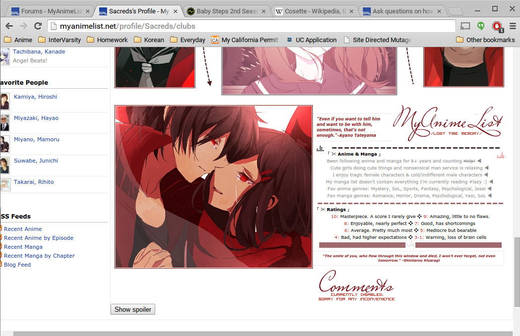 |
 |
Sep 1, 2015 5:20 AM
#3036
| Rather simple question, how can I position the list on the right and not have it centered? I've tried logically assuming which part of the CSS positions the list and not the background, but I couldn't find anything useful. Thanks in advance. List code: /* // Self-explanatory */ BODY { background-image: url(http://i.imgur.com/j4i51W6.jpg); background-attachment: fixed; background-repeat: no-repeat; background-position: center center; background-size: cover; color: #ffffff; font-size: 10.00px; font-family: Trebuchet MS; #text-transform: lowercase; background-color: #f8f1ec; } .status_selected, .header_title, .category_totals, .td1, #grand_totals, #copyright, .status_not_selected, .table_header, .td2 { opacity: 0.40 } #mal_control_strip { position: fixed !important; } #mal_control_strip{ z-index:10 !important; } #mal_cs_listinfo a:hover { text-shadow: none; } #mal_cs_listinfo a:hover strong { text-shadow: none; } #mal_cs_links a:hover { text-shadow: none; } #mal_cs_otherlinks a:hover { text-shadow: none; } #mal_cs_otherlinks strong a:hover { text-shadow: none; } #mal_cs_powered a:hover { text-shadow: none; } .animetitle + small { color: #000000; font-size: 10.00px; letter-spacing:1px; padding-left: 2px; #text-transform: lowercase; text-decoration: none; } #list_surround { margin: 0 auto; width: 670px; padding-top:60px; position: center; } a { color: #ffffff; text-decoration: none; } a:visited { color: #ffffff; text-decoration: none; } a:hover { color: #d0ff35; text-decoration: none; text-shadow: 1px 1px 0px #373b5a; } .td1 { color: #ffffff; border-width: 0px 1px 1px 0px; border-style: none; padding: 4px; background-color: #000000; } .td2 { color: #ffffff; border-width: 0px 1px 1px 0px; border-style: none; padding: 4px; background-color: #000000; } .table_header { color: #ffffff; border-style: none; background-color: #000000; padding: 4px; } .table_headerLink { color: ; } .table_headerLink:Visited { color: ; } .table_headerLink:Hover { color: #d0ff35; text-shadow: none; } .form { border-width: 1px 1px 1px 1px; border-color: #000000; border-style: none; color: #ffffff; padding: 4px; font-size: 10.00px; font-family: Verdana, Arial; } .status_selected { font-size: 9.5px; color: #000000; border-color: ; padding: 4px; text-decoration: line-through; letter-spacing: 1px; } .status_selected a:hover { text-shadow: none; color: #d0ff35; } .status_selected a { color: #000000; } .status_not_selected { font-size: 9.5px; color: #000000; border-color: ; padding: 4px; letter-spacing: 1px; } .status_not_selected a:hover { color: #d0ff35; text-shadow: 1px 1px 0px #000000; } .status_not_selected a { color: #000000; } .header_cw { } .header_completed { } .header_onhold { } .header_dropped { } .header_ptw { } .header_title { font-size: 18px; text-align: center; color: #ffffff; padding-bottom: 3px; border-radius: 25px 25px 0px 0px; border-color: #000000; border-style: solid; background-color: #000000; } .category_totals { color: #000000; text-align: center; background-color: #000000; border-radius: 0px 0px 25px 25px; padding-bottom: 5px; padding-top: 5px; } #grand_totals { display: none; } .header_al { font-weight: bold; font-size: 16px; } .header_al_links { } .animetitle { font-weight: bold; } /* copyright contains the "Producted by Garrett Gyssler" text DO NOT REMOVE OR HIDE THIS DIV IF FOUND TO BE REMOVED, YOUR LIST WILL BE REMOVED TOO */ #copyright { color: #000000; text-align: center; margin: 0 auto; width: 670px; letter-spacing: 1px; padding-top: 3px; font-size: 9.5px; border-radius: 25px 25px 25px 25px; } #copyright a { color: #000000; { #copyright a:hover { color: #000000; text-shadow: none; { |
Sep 1, 2015 1:50 PM
#3037

| @Subpyro: http://myanimelist.net/forum/?topicid=393437 @TheExplorer: Just enter the bbcode for the image and the text on the same line, in the order you want them in. You can also use this tutorial if you want to see exactly what that person did. |
Doomcat55Sep 1, 2015 2:10 PM
 |
Sep 1, 2015 3:44 PM
#3038
Subpyro said: Rather simple question, how can I position the list on the right and not have it centered? I've tried logically assuming which part of the CSS positions the list and not the background, but I couldn't find anything useful. Thanks in advance. List code: /* // Self-explanatory */ BODY { background-image: url(http://i.imgur.com/j4i51W6.jpg); background-attachment: fixed; background-repeat: no-repeat; background-position: center center; background-size: cover; color: #ffffff; font-size: 10.00px; font-family: Trebuchet MS; #text-transform: lowercase; background-color: #f8f1ec; } .status_selected, .header_title, .category_totals, .td1, #grand_totals, #copyright, .status_not_selected, .table_header, .td2 { opacity: 0.40 } #mal_control_strip { position: fixed !important; } #mal_control_strip{ z-index:10 !important; } #mal_cs_listinfo a:hover { text-shadow: none; } #mal_cs_listinfo a:hover strong { text-shadow: none; } #mal_cs_links a:hover { text-shadow: none; } #mal_cs_otherlinks a:hover { text-shadow: none; } #mal_cs_otherlinks strong a:hover { text-shadow: none; } #mal_cs_powered a:hover { text-shadow: none; } .animetitle + small { color: #000000; font-size: 10.00px; letter-spacing:1px; padding-left: 2px; #text-transform: lowercase; text-decoration: none; } #list_surround { margin: 0 auto; width: 670px; padding-top:60px; position: center; } a { color: #ffffff; text-decoration: none; } a:visited { color: #ffffff; text-decoration: none; } a:hover { color: #d0ff35; text-decoration: none; text-shadow: 1px 1px 0px #373b5a; } .td1 { color: #ffffff; border-width: 0px 1px 1px 0px; border-style: none; padding: 4px; background-color: #000000; } .td2 { color: #ffffff; border-width: 0px 1px 1px 0px; border-style: none; padding: 4px; background-color: #000000; } .table_header { color: #ffffff; border-style: none; background-color: #000000; padding: 4px; } .table_headerLink { color: ; } .table_headerLink:Visited { color: ; } .table_headerLink:Hover { color: #d0ff35; text-shadow: none; } .form { border-width: 1px 1px 1px 1px; border-color: #000000; border-style: none; color: #ffffff; padding: 4px; font-size: 10.00px; font-family: Verdana, Arial; } .status_selected { font-size: 9.5px; color: #000000; border-color: ; padding: 4px; text-decoration: line-through; letter-spacing: 1px; } .status_selected a:hover { text-shadow: none; color: #d0ff35; } .status_selected a { color: #000000; } .status_not_selected { font-size: 9.5px; color: #000000; border-color: ; padding: 4px; letter-spacing: 1px; } .status_not_selected a:hover { color: #d0ff35; text-shadow: 1px 1px 0px #000000; } .status_not_selected a { color: #000000; } .header_cw { } .header_completed { } .header_onhold { } .header_dropped { } .header_ptw { } .header_title { font-size: 18px; text-align: center; color: #ffffff; padding-bottom: 3px; border-radius: 25px 25px 0px 0px; border-color: #000000; border-style: solid; background-color: #000000; } .category_totals { color: #000000; text-align: center; background-color: #000000; border-radius: 0px 0px 25px 25px; padding-bottom: 5px; padding-top: 5px; } #grand_totals { display: none; } .header_al { font-weight: bold; font-size: 16px; } .header_al_links { } .animetitle { font-weight: bold; } /* copyright contains the "Producted by Garrett Gyssler" text DO NOT REMOVE OR HIDE THIS DIV IF FOUND TO BE REMOVED, YOUR LIST WILL BE REMOVED TOO */ #copyright { color: #000000; text-align: center; margin: 0 auto; width: 670px; letter-spacing: 1px; padding-top: 3px; font-size: 9.5px; border-radius: 25px 25px 25px 25px; } #copyright a { color: #000000; { #copyright a:hover { color: #000000; text-shadow: none; { Hi there. Change your #list_surround code to this #list_surround { position: absolute !important; width: 670px; padding-top:60px; right: 0px; } you can change the "right" amount. Increasing it makes the list farther from right by that amount |
Sep 1, 2015 9:47 PM
#3039
| How to make a button that selects all of these together so when I hover over that button, the items all show up http://imgur.com/ub25z5N My code for the top bar: #mal_control_strip { background: url(none) !important; } #mal_cs_listinfo,#mal_cs_links, #mal-cs-pic { border-right: 0 none !important; } #mal_cs_listinfo { position: relative; left: 1690px; top: 10px; } #mal_cs_listinfo a strong { background-image: url(http://i58.tinypic.com/2eqexco.jpg); background-repeat: no-repeat; background-size: 205px; background-position: -5px 0px; padding: 60px; border: solid white 1px; border-radius: 50%; color: transparent !important; font-size: 14px; transition: all .5s 0s ease; } #mal_cs_listinfo a strong:hover { color: #FF0090 !important; } #mal_cs_powered #search { position: relative; right: 400px; } #mal_cs_powered a { position: relative; right:400px; } #mal_cs_links { display: table !important; position: relative; height: 0px !important; top: 200px; left: 1508px; background-color: transparent !important; } #mal_cs_links a.List_LightBox { background-color: white !important; color: #FF0090 !important; display: table-cell !important; position: relative; width: 200px; border: inset #FF0090 2px; font-size: 14px; text-align: center; } #mal_cs_links > div:nth-child(1) > a:nth-child(2) { background-color: white !important; color: #FF0090 !important; display: table-cell !important; position: relative; width: 200px; border: inset #FF0090 2px; font-size: 14px; text-align: center; bottom: 12px; } #mal_cs_links a[href="/animelist/SamPolus22"] { background-color: white !important; color: #FF0090 !important; display: table-cell !important; position: relative; width: 200px; border: inset #FF0090 2px; font-size: 14px; text-align: center; bottom: 7px; } #mal_cs_links a[href="/mangalist/SamPolus22"] { background-color: white !important; color: #FF0090 !important; display: table-cell !important; position: relative; width: 200px; border: inset #FF0090 2px; font-size: 14px; text-align: center; bottom: 17px; } |
Sep 1, 2015 10:27 PM
#3040
Doomcat55 said: @Subpyro: http://myanimelist.net/forum/?topicid=393437 @TheExplorer: Just enter the bbcode for the image and the text on the same line, in the order you want them in. You can also use this tutorial if you want to see exactly what that person did. It still doesn't work. It just ends up like this  :( (Borrowed her code for a bit) I always try to put the words on the same line, but it only does it for one line, and at the very bottom too.... |
|
Sep 2, 2015 4:25 AM
#3041
TheExplorer said: It still doesn't work. It just ends up like this :( (Borrowed her code for a bit) I always try to put the words on the same line, but it only does it for one line, and at the very bottom too....  Its the img align tag. Quote my post to copy the BBcodes for it. Its img align code. Quote my post to copy the BBcodes for it. Its the img align tag. Quote my post to copy the BBcodes for it. Its img align code. Quote my post to copy the BBcodes for it. |
Sep 2, 2015 4:51 AM
#3042
SamPolus22 said: How to make a button that selects all of these together so when I hover over that button, the items all show up http://imgur.com/ub25z5N My code for the top bar: #mal_control_strip { background: url(none) !important; } #mal_cs_listinfo,#mal_cs_links, #mal-cs-pic { border-right: 0 none !important; } #mal_cs_listinfo { position: relative; left: 1690px; top: 10px; } #mal_cs_listinfo a strong { background-image: url(http://i58.tinypic.com/2eqexco.jpg); background-repeat: no-repeat; background-size: 205px; background-position: -5px 0px; padding: 60px; border: solid white 1px; border-radius: 50%; color: transparent !important; font-size: 14px; transition: all .5s 0s ease; } #mal_cs_listinfo a strong:hover { color: #FF0090 !important; } #mal_cs_powered #search { position: relative; right: 400px; } #mal_cs_powered a { position: relative; right:400px; } #mal_cs_links { display: table !important; position: relative; height: 0px !important; top: 200px; left: 1508px; background-color: transparent !important; } #mal_cs_links a.List_LightBox { background-color: white !important; color: #FF0090 !important; display: table-cell !important; position: relative; width: 200px; border: inset #FF0090 2px; font-size: 14px; text-align: center; } #mal_cs_links > div:nth-child(1) > a:nth-child(2) { background-color: white !important; color: #FF0090 !important; display: table-cell !important; position: relative; width: 200px; border: inset #FF0090 2px; font-size: 14px; text-align: center; bottom: 12px; } #mal_cs_links a[href="/animelist/SamPolus22"] { background-color: white !important; color: #FF0090 !important; display: table-cell !important; position: relative; width: 200px; border: inset #FF0090 2px; font-size: 14px; text-align: center; bottom: 7px; } #mal_cs_links a[href="/mangalist/SamPolus22"] { background-color: white !important; color: #FF0090 !important; display: table-cell !important; position: relative; width: 200px; border: inset #FF0090 2px; font-size: 14px; text-align: center; bottom: 17px; } It would be easiest just to rip that function and customize it from there, some top bar mods have it already |
Sep 2, 2015 9:50 AM
#3043
Shishio-kun said: SamPolus22 said: How to make a button that selects all of these together so when I hover over that button, the items all show up http://imgur.com/ub25z5N My code for the top bar: #mal_control_strip { background: url(none) !important; } #mal_cs_listinfo,#mal_cs_links, #mal-cs-pic { border-right: 0 none !important; } #mal_cs_listinfo { position: relative; left: 1690px; top: 10px; } #mal_cs_listinfo a strong { background-image: url(http://i58.tinypic.com/2eqexco.jpg); background-repeat: no-repeat; background-size: 205px; background-position: -5px 0px; padding: 60px; border: solid white 1px; border-radius: 50%; color: transparent !important; font-size: 14px; transition: all .5s 0s ease; } #mal_cs_listinfo a strong:hover { color: #FF0090 !important; } #mal_cs_powered #search { position: relative; right: 400px; } #mal_cs_powered a { position: relative; right:400px; } #mal_cs_links { display: table !important; position: relative; height: 0px !important; top: 200px; left: 1508px; background-color: transparent !important; } #mal_cs_links a.List_LightBox { background-color: white !important; color: #FF0090 !important; display: table-cell !important; position: relative; width: 200px; border: inset #FF0090 2px; font-size: 14px; text-align: center; } #mal_cs_links > div:nth-child(1) > a:nth-child(2) { background-color: white !important; color: #FF0090 !important; display: table-cell !important; position: relative; width: 200px; border: inset #FF0090 2px; font-size: 14px; text-align: center; bottom: 12px; } #mal_cs_links a[href="/animelist/SamPolus22"] { background-color: white !important; color: #FF0090 !important; display: table-cell !important; position: relative; width: 200px; border: inset #FF0090 2px; font-size: 14px; text-align: center; bottom: 7px; } #mal_cs_links a[href="/mangalist/SamPolus22"] { background-color: white !important; color: #FF0090 !important; display: table-cell !important; position: relative; width: 200px; border: inset #FF0090 2px; font-size: 14px; text-align: center; bottom: 17px; } It would be easiest just to rip that function and customize it from there, some top bar mods have it already Yeah, It's the last method that I want to use but I have no choice |
Sep 2, 2015 1:12 PM
#3044
| I'm trying to shrink a couple renders for use as category buttons in a layout I'm working on, but the results always come out sharply pixelated. I've tried a couple fixes that I found on Google, but none of them changed anything. Any help? (I'm using Gimp 2.8.14). |
|
Sep 2, 2015 1:32 PM
#3045
| Is there a difference between #mal_cs_links and #mal(backslash)_cs(backslash)_links ? MAL doesn't allow slashes and backslashes |
Anzumatsuri_Sep 2, 2015 1:35 PM
Sep 3, 2015 1:11 PM
#3046
I'm using the layout for displaying renders for my manga list, but I have a problem. When I search for a title that has adaptations in more than one category, the renders for both categories overlap like this: 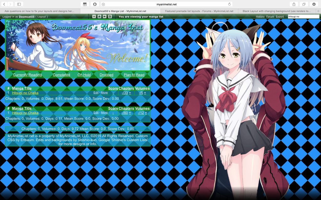 It also appears to be messing up the background - I had set the checkered background to change with the categories, but none of them should have a blue and black pattern. Help, please? |
Doomcat55Sep 3, 2015 1:15 PM
|
Sep 3, 2015 3:11 PM
#3047
SamPolus22 said: Is there a difference between #mal_cs_links and #mal(backslash)_cs(backslash)_links ? MAL doesn't allow slashes and backslashes Backslashes allow blacklisted codes thru the CSS edit box. MAL sees the backslash and removes it, then lets the code thru which it normally wouldn't. There's an advanced CSS topic on all hacked selectors If you import the CSS, they aren't needed, and imported backslashed codes will not work since the backslash isn't removed like when its used in the CSS edit box Doomcat55 said: I'm trying to shrink a couple renders for use as category buttons in a layout I'm working on, but the results always come out sharply pixelated. I've tried a couple fixes that I found on Google, but none of them changed anything. Any help? (I'm using Gimp 2.8.14). Make sure they scale down width and height at the same rate- or try another photo editor- or ask in the graphic request topic for someone to shrink them for you Doomcat55 said: I'm using the layout for displaying renders for my manga list, but I have a problem. When I search for a title that has adaptations in more than one category, the renders for both categories overlap like this: It also appears to be messing up the background - I had set the checkered background to change with the categories, but none of them should have a blue and black pattern. Help, please? a solution would be to give each render an additional checkered background right behind it. So this way when the images overlap there will only be one render shown at the time even if multiple backgrounds are present on screen at once. it could turn out complicated tho. You'd have to add multiple backgrounds with the topic on that. Then you'd have to make sure that extra background doesn't overlap over the list. if you try to do this on your own and can't get it, you can keep asking and sooner or later someone we should just be able to do this for you (may be harder to get help till next week) |
Sep 3, 2015 8:51 PM
#3048
| I want to move the MAL listinfo element to the right so it goes out of the page and stay hidden to make a transition, but every time I move it to the right the page width expands. I can't do anything with the top bar because of this. It happens to every element in the top bar http://imgur.com/NsZyCR9 |
Sep 4, 2015 5:11 AM
#3049
SamPolus22 said: I want to move the MAL listinfo element to the right so it goes out of the page and stay hidden to make a transition, but every time I move it to the right the page width expands. I can't do anything with the top bar because of this. It happens to every element in the top bar http://imgur.com/NsZyCR9 try this : body { overflow-x: hidden; } or this : #mal_cs_listinfo { position: fixed; } |
|
Sep 4, 2015 6:30 AM
#3050

| Hey there, I just managed to finish my list design, and it seemed to be good. However I just got feedback that the pop-up screen is in the way of the text itself. I tried different things and this is what I ended up with; My normal screen: https://gyazo.com/337334dcf11046729c822a3618c97993 Minimised screen: https://gyazo.com/5228e21e2ce5e3590dcf49c44470608d It seems that the pop up screen is stuck to that location, not keeping in mind how big someone's screen is. How can I adjust this so that the pop up adjusts itself to screen size? Thanks in advance, |
More topics from this board
» theme helpthreat - Jul 5 |
5 |
by Zaryf
»»
Aug 21, 5:46 AM |
|
» [CSS - Modern] 🍰 Clarity by V.L ( 1 2 3 4 5 ... Last Page )Valerio_Lyndon - Apr 19, 2018 |
1261 |
by KiranaStarr
»»
Aug 16, 5:48 PM |
|
» [CSS] ⭐️ Customize your List Cursor + Cursor FixesShishio-kun - Mar 8, 2021 |
30 |
by Shishio-kun
»»
Jul 28, 3:17 AM |
|
» How To Have Different Banner/Cover image & Background Image For Manga & Anime ListsYasminaRegina - Jul 25 |
2 |
by YasminaRegina
»»
Jul 26, 1:02 AM |
|
Sticky: » 💚 [REPAIR STICKY] Repair/speed up layouts + Request layout fixes ( 1 2 )Shishio-kun - Nov 17, 2023 |
52 |
by LucaBalsa
»»
Jul 6, 2:02 PM |