New
Feb 22, 2017 9:28 PM
#1

This is a custom layout for modern template lists. If you don't know how to install the codes, click here to view the Beginner's Tutorial. If there are problems: install the latest version, or check the Repair Thread for patches and updates (found here). All premade modern layouts can be found in the gallery by clicking here, and more ways to customize your list can be found here. This is a layout originally made by @Ruri and donated in our club. I've made a few adjustments to make it easier for newbies to recolor and to resize the layout's covers. Update: A new dark version is now available based on Suitangi's color changes and Valerio Lyndon's help. This one isn't as easy to customize as the white one, so use the white one if you want to make extensive color changes!   Installation Source Code for light version: @\import "//fonts.googleapis.com/css?family=Montserrat:400, 700"; @\import "https://malscraper.azurewebsites.net/covers/auto/presets/dataimagelink"; /* SIZE OF HIGH RES COVERS*/ .list-item, .list-item .list-table-data, .data.image, .list-table .list-table-data .data.image a, .list-item .data.title, .list-table .list-table-data .data.title .add-edit-more .edit a, .list-table .list-table-data .data.title .add-edit-more .add a, .data.tags textarea {width: 150px !important; height: 215px !important;} /* SIZE OF LOW RES COVERS Found behind the normal high resolution covers. You should only see these if your cover import goes down.*/ a img{ width: 150px !important; height: 215px !important; } /* PLACEMENT OF THE TYPE TEXT Where you'll see OVA, Movie, TV, etc when you point to a cover.*/ .list-item .data.type { margin-top: -30px !important; margin-left: 49px !important; } /* COLOR OF BACKGROUND */ .list-container, #status-menu, .list-unit, .list-unit .list-status-title { background-color: #F5F8FA !important; } /* COLOR OF SIDEBAR */ .list-menu-float .icon-menu, .header { background-color: #1F2631 !important; } /* COLOR OF LIST SORTING OPTIONS */ .list-table .list-table-header .header-title{ background-color: #FFFFFF !important; } /* FONT SIZE */ body {font-size: 13px !important;} .more, .link.sort + a, .header-menu .icon, .fancy-bg, .list-unit .list-status-title .text, .status-menu-container .status-menu .status-button:after {display: none;} a, .header a:hover, .header .header-menu .list-menu .icon-menu:hover, .list-item, .data.progress:hover .fa, .data.chapter:hover .fa, .data.volume:hover .fa, .list-table .list-table-data, .list-table .list-table-header .header-title .link.sort:hover, .list-menu-float .icon-menu .text, .list-unit .list-status-title .stats a, .list-table .list-table-data a:not(.edit-disabled):hover, .list-table .list-table-data a.edit-disabled, .list-table .list-table-header .header-title .sort-icon, .fa-search:before {color: #00a8ff;} html {overflow-x: hidden;} td {font-size: .96em;} body {font-size: .73em;} :focus {outline: none;} a {transition: opacity .15s ease-in-out;} a, i.fa.fa-plus-circle {transition: color .15s ease-in-out;} html, .list-container {background: #f8f8f8;} input {font-size: 1em !important; color: #fff;} *:not(.status) {border: none !important;} *:not(.fa) {font-family: 'Montserrat', FontAwesome, sans-serif !important; text-decoration: none !important; line-height: normal;} i.fa.fa-plus-circle, .data.tags {color: transparent;} .text, .link, .status-button.on {font-weight: normal !important;} @media header-leftbar {} .header {position: fixed; z-index: 600 !important; width: 100%; height: 100%;} .header a, .header .header-menu {color: #323232; left: 80px; height: 60px;} .header .header-menu .list-menu .icon-menu {color: #323232;} .header, .header .header-title, .list-menu-float, .list-menu-float .icon-menu, .list-menu-float .icon-menu.profile:after, .list-menu-float .icon-menu:hover .text {width: 60px;} @media header-mal-logo {} .header .header-title {position: fixed; font-size: 0; text-indent: 0; top: initial; bottom: 0; left: 0 !important; height: 60px; border-top: 30px solid #181f29; background-size: cover;} @media header-leftbar-menu {} .list-menu-float {top: 0; z-index: 700 !important;} .list-menu-float .icon-menu, .list-menu-float .icon-menu.profile:after {height: 60px;} .list-menu-float .icon-menu svg.icon {fill: #fff; height: 16px; padding-left: 10%; padding-top: 15%;} .list-menu-float .icon-menu:hover svg.icon {fill: #013a61; top: 6px;} .list-menu-float .icon-menu .text {font-size: .74em; top: 35px; text-transform: lowercase; left: 0; color: #181f29;} .list-menu-float .icon-menu, .header {background: #1f2631;} .list-menu-float .icon-menu {transition: none;} .list-menu-float .icon-menu:not(.profile):hover {width: initial;} .list-menu-float .icon-menu:hover, .link-style-setting, .link-list-setting {background-color: #00a8ff !important;} .list-menu-float .link-list-setting, .list-menu-float .icon-menu.setting:hover .text .link-style-setting {border: none; color: #fff;} @media header-sort-by {} .list-table-header {float: right; margin-left: 100%; margin-right: 3px;} .header-title.status, .header-title.image, .header-title.tags {display: none !important;} .list-table .list-table-header .header-title {width: auto !important; background: #f8f8f8; padding: 0 10px !important; font-weight: normal;} .list-table .list-table-header .header-title .link.sort {color: #777;} @media topbar {} .list-block {margin-left: 60px;} .list-unit .list-status-title {width: 80%; display: block; z-index: 500; height: 0; background-color: transparent; font-size: 1.2em} .list-unit .list-stats {width: 40%; color: #1f2631; background: none; z-index: 510; padding: 5px} #status-menu, .list-unit .list-status-title, .list-unit .list-stats {position: absolute; top: 80px; left: 0; right: 0; margin: 0 auto; padding-left: 60px;} .status-menu, .status-menu .on, .search-container, .list-status-title, .list-block .list-stats {margin-top: 20px !important} .status-menu-container {background: none; z-index: 110} @media topbar-status {} .status-menu-container .status-menu {display: inline-block; border-spacing: 0; padding-top: 38px} .status-menu-container .status-menu .status-button {display: none; width: 150px; text-align: left; font-size: 1.2em; padding: 8px 10px; color: #777} .status-menu-container .status-menu .status-button.on {display: block !important; position: absolute; top: 0; padding: 10px; color: #00a8ff} .status-menu:hover {background-color: #1f2631;} .status-menu-container .status-menu:hover .status-button.on {color: #f8f8f8;} .status-menu-container .status-menu:hover .status-button {display: block; background: #1f2631} .status-menu-container .status-menu .status-button:hover {color: #6ebcf4 !important; background: #181f29 !important} @media topbar-search {} .status-menu-container .search-container {top: 0; right: 145px} .status-menu-container .search-container #search-box {background: none; margin-top: 0; border-bottom: none !important; padding-left: 15px} #search-box input {background: 0; color: #1f2631} .status-menu-container .search-container #search-box.open {border-bottom: 1px solid #cecece !important} .fa-search:before {position: absolute; left: 0; top: 13px; font-size: .7em;} @media topbar-fixed {} .status-menu-container.fixed, .fixed + div.list-block .list-status-title, .fixed + div.list-block .list-unit .list-stats {position: fixed !important; top: 0 !important;} .fixed {height: 60px; background: #f8f8f8;} .status-menu-container.fixed + div.list-block {margin-top: 16px} .header .header-menu .list-menu {top: 100px; padding: 5px 0; background-color: #f8f8f8; right: initial; border: 0; box-shadow: none; -webkit-box-shadow: none; -moz-box-shadow: none;} .header .header-menu .list-menu .icon-menu {width: 50px; height: 42px; text-align: left;} .header .header-menu .list-menu .icon-menu .text {left: 0; top: 6px} .header .header-menu .list-menu .icon-menu:hover {background: none} @media covers {} /* credit to LukeLC */ .list-table tbody:first-child {margin: 115px 0 0 0; display: block;} .list-container {width: 100%; position: absolute;} .list-table {display: table-row;} .data.status, .data.image ~ td {position: absolute;} .list-table .list-table-data .data.image a {border-radius: 3px; background-size: cover; background-repeat: no-repeat; background-position: center center !important;} .list-item {margin: 10px; position: relative; float: left; z-index: 1;} .list-item .data {opacity: 0;} .list-item .list-table-data {border-radius: 3px; position: absolute;} .list-table .list-table-data .data {padding: 0; border-bottom: none;} .list-item .data.image {z-index: 0; position: absolute;} .list-item .data.image img {height: 100%; width: 100%;} .list-item:hover .data, .list-item .data.image, .list-item .data.title, .list-item:hover .data.title *, .list-item .data.score, .list-item .data.progress, .list-item .data.chapter, a[href*="%C2%9"] {opacity: 1;} @media entrytitle {} .data.title > a {position: absolute; z-index: 5; color: #fff; bottom: 31px; margin-right: 10px; text-shadow: 0 0 3px #000} .list-item .data.title {box-sizing: border-box; border-radius: 3px; padding: 10px 10px 31px !important;} .list-table .list-table-data .data.title .link {font-size: 1.04em;} @media entrytitle-add-edit-more {} .add-edit-more {color: transparent;} .list-table .list-table-data .data.title .add-edit-more .edit a, .list-table .list-table-data .data.title .add-edit-more .add a {position: absolute; top: 0; left: 0; cursor: default; color: transparent;} @media entryscore {} .list-item .data.score {right: 10px;} .score select.edit-transition {margin-right: -20px;} .data.score, .data.progress, .data.chapter, .data.volume, a[href*="%C2%9"] {z-index: 30; bottom: 0; padding: 10px !important; transition: opacity .15s ease-in-out;} .data.progress, .data.chapter, .data.volume {left: 10px; word-spacing: -2px;} .data.volume {margin-left: 50px;} .data.progress input.edit-transition, .data.chapter input.edit-transition, .data.volume input.edit-transition {width: 10px !important; background: none;} @media entrytype-status {} .list-item .data.type {padding: 12px 15px !important; color: white; font-size: 1em; text-shadow: 0 0 3px #000; transition: opacity .15s ease-in-out; margin-top: 178px; margin-left: 49px; } .data.title .rewatching, .data.title .rereading, .data.title .content-status {display: block; font: .9em; text-shadow: 0 0 3px #000; margin-left: 5px; margin-top: 20px; color: #fff !important; opacity: 0; transition: opacity .15s ease-in-out;} @media huge-status-tag-block {} .list-item:hover .data.tags:before {opacity: 1;} .data.status {height: 15px !important; top: 28px !important; background: none !important;} .data.status, .data.tags:before {margin-left: -4px; width: 12px !important; padding: 5px 0 !important; z-index: 10;} .data.status:hover:after, .data.tags:hover:before {width: 15px; padding: 5px 5px 5px 4px !important; font-size: 1.1em; top: 0; color: #fff; cursor: default;} .data.tags:before, .data.status:hover:after, .data.tags:hover:before {position: absolute; left: 0; height: 15px !important;} .data.tags {opacity: 1; height: 100%; text-align: right !important; text-transform: capitalize; width: 0;} .data.tags * {z-index: 25; transition: opacity .15s ease-in-out;} .data.tags:hover * {width: 150px; opacity: 1 !important;} .data.tags:before {content: ''; border-left: 4px solid #00a8ff; opacity: 0; margin-top: 3px;} .data.tags:hover:before {content: 'f02b0a0'; letter-spacing: -1px; background: #00a8ff; width: 15px !important;} @media entrytags-textarea {} .data.tags textarea {position: absolute; font-family: monospace!important; z-index: 200;} .edit-transition.edit-leave {display: none;} @media entrytags-editbutton {} .tags .edit {position: absolute; top: 3px; width: 14px !important; height: 25px; font-size: 0 !important;} .tags .edit:hover {width: 24px !important;} @media entrytags-padding {} div[class*="tags-"] span:first-child:before {content: ''; display: block; margin-top: 3px;} div[class*="tags-"] span:last-child {margin-right: 4px;} div[class*="tags-"] {overflow: hidden; transition: opacity .2s .1s; border-radius: 3px;} [href*="&tag="]:not([href$="&tag=*"]):not([href*="%C2%9"]) {opacity: 0; font-size: .9em; line-height: 1.56em; color: #fff; border-radius: 3px; margin-right: 3px; white-space: nowrap; text-shadow: 0 0 3px #000; display: inline;} @media entrytags-favorites {} a[href$="&tag=*"] {position: absolute; left: 0; width: 150px; height: 0; font-size: 15px; top: 0; color: transparent !important;} a[href$="&tag=*"]:after {content: 'f004'; color: #ff2c55 !important; margin: 165px -3px; padding: 3px 6px; font-size: 0.87em; display: inline-block; border-right: 3px solid; background: #2e3847; pointer-events: all;} @media entrytags-mangaka {} a[href*="%C2%9"] {position: absolute; left: 0; text-align: left; white-space: nowrap; padding: 0 !important; margin: 10px;} @media entrytags-anime-comments {} .anime [href*="&tag="] {white-space: normal !important; text-transform: none; pointer-events: none;} .anime div[class*="tags-"] span:first-child:before {width: 25px; height: 25px; float: left;} @media entrystatus-colors-and-tab-icons {} .status.reading, .status.watching {border-left: 4px solid #f7464a} .status.plantoread, .status.plantowatch {border-left: 4px solid #97bbcd} .status.completed {border-left: 4px solid #46bfbd} .status.onhold {border-left: 4px solid #fdb45c} .status.dropped {border-left: 4px solid #dcdcdc} .status.reading:after, .status.watching:after {background: #f7464a} .status.plantoread:after, .status.plantowatch:after {background: #97bbcd} .status.completed:after {background: #46bfbd} .status.onhold:after {background: #fdb45c} .status.dropped:after {background: #dcdcdc} .status.reading:hover:after {content: 'f02e';} .status.watching:hover:after {content: 'f008';} .status.plantowatch:hover:after, .status.plantoread:hover:after {content: 'f073';} .status.completed:hover:after {content: 'f00c';} .status.onhold:hover:after {content: 'f04c';} .status.dropped:hover:after {content: 'f00d';} @media mediaquery {} @media (min-width:1901px) {#status-menu, .list-unit, .list-unit .list-status-title { width: 1530px !important;}} @media (max-width:1900px) {#status-menu, .list-unit, .list-unit .list-status-title { width: 1360px !important;}} @media (max-width:1700px) {#status-menu, .list-unit, .list-unit .list-status-title { width: 1190px !important;}} @media (max-width:1500px) {#status-menu, .list-unit, .list-unit .list-status-title { width: 1020px !important;}} @media (max-width:1300px) {#status-menu, .list-unit, .list-unit .list-status-title { width: 850px !important;}} @media (max-width:1100px) {#status-menu, .list-unit, .list-unit .list-status-title { width: 680px !important;}} @media (max-width:900px) {#status-menu, .list-unit, .list-unit .list-status-title { width: 510px !important;}} @media (max-width:700px) {#status-menu, .list-unit, .list-unit .list-status-title { width: 340px !important;} .header .header-menu .btn-menu { display: none;}} @media personal {} .data.volume, .data.chapter, span a[href*="%CB%93"], span a[href*="%CB%91"], span a[href*="%E2%80%A7"] {display: none !important;} a img{ position: absolute; display: block !important; z-index: -10 !important; width: 150px; height: 215px; } .data.tags { opacity: 1; height: 28px; text-align: right !important; text-transform: capitalize; width: 150px; } .data.status { height: 15px !important; padding-right: 28px !important; } .list-table .list-table-data .data.title .add-edit-more .edit a:hover, .list-table .list-table-data .data.title .add-edit-more .add a:hover{ box-shadow: 0px 0px 1px 1px rgba(0,0,0,0.75); } .data.status {opacity: 1 !important; top: 28px !important;} .header .header-title{ display: none; } .data.status { opacity: 1 !important; top: 28px !important;} .list-item .data.title {background: linear-gradient(to top, rgba(0, 0, 0, .8) 0%, rgba(0, 0, 0, .00784314) 60%);} div[class*="tags-"]{ background: linear-gradient(to bottom, rgba(0, 0, 0, .8) 0%, rgba(0, 0, 0, 0.54) 50%, rgba(0, 0, 0, 0) 100%);} .status-menu-container .status-menu .status-button { display: none; width: 155px; text-align: left; font-size: 1.2em; padding: 8px 10px; color: #777; } .status-menu-container .search-container #search-button { margin-right: 10px;} #copyright{ position: absolute; font-size: 10px; z-index: 100; right: 0%; } Source Code for dark version: @\import "//fonts.googleapis.com/css?family=Montserrat:400, 700"; @\import "https://malscraper.azurewebsites.net/covers/auto/presets/dataimagelink"; /* SIZE OF HIGH RES COVERS*/ .list-item, .list-item .list-table-data, .data.image, .list-table .list-table-data .data.image a, .list-item .data.title, .list-table .list-table-data .data.title .add-edit-more .edit a, .list-table .list-table-data .data.title .add-edit-more .add a, .data.tags textarea {width: 150px !important; height: 215px !important;} /* SIZE OF LOW RES COVERS Found behind the normal high resolution covers. You should only see these if your cover import goes down.*/ a img{ width: 150px !important; height: 215px !important; } /* PLACEMENT OF THE TYPE TEXT Where you'll see OVA, Movie, TV, etc when you point to a cover.*/ .list-item .data.type { margin-top: -30px !important; margin-left: 49px !important; } /* FONT SIZE */ body {font-size: 13px !important;} .more, .link.sort + a, .header-menu .icon, .fancy-bg, .list-unit .list-status-title .text, .status-menu-container .status-menu .status-button:after {display: none;} a, .header a:hover, .header .header-menu .list-menu .icon-menu:hover, .list-item, .data.progress:hover .fa, .data.chapter:hover .fa, .data.volume:hover .fa, .list-table .list-table-data, .list-table .list-table-header .header-title .link.sort:hover, .list-menu-float .icon-menu .text, .list-unit .list-status-title .stats a, .list-table .list-table-data a:not(.edit-disabled):hover, .list-table .list-table-data a.edit-disabled, .list-table .list-table-header .header-title .sort-icon, .fa-search:before {color: #00a8ff;} html {overflow-x: hidden;} td {font-size: .96em;} body {font-size: .73em;} :focus {outline: none;} a {transition: opacity .15s ease-in-out;} a, i.fa.fa-plus-circle {transition: color .15s ease-in-out;} html, .list-container {background: #f8f8f8;} input {font-size: 1em !important; color: #fff;} *:not(.status) {border: none !important;} *:not(.fa) {font-family: 'Montserrat', FontAwesome, sans-serif !important; text-decoration: none !important; line-height: normal;} i.fa.fa-plus-circle, .data.tags {color: transparent;} .text, .link, .status-button.on {font-weight: normal !important;} @media header-leftbar {} .header {position: fixed; z-index: 600 !important; width: 100%; height: 100%;} .header a, .header .header-menu {color: #323232; left: 80px; height: 60px;} .header .header-menu .list-menu .icon-menu {color: #323232;} .header, .header .header-title, .list-menu-float, .list-menu-float .icon-menu, .list-menu-float .icon-menu.profile:after, .list-menu-float .icon-menu:hover .text {width: 60px;} @media header-mal-logo {} .header .header-title {position: fixed; font-size: 0; text-indent: 0; top: initial; bottom: 0; left: 0 !important; height: 60px; border-top: 30px solid #181f29; background-size: cover;} @media header-leftbar-menu {} .list-menu-float {top: 0; z-index: 700 !important;} .list-menu-float .icon-menu, .list-menu-float .icon-menu.profile:after {height: 60px;} .list-menu-float .icon-menu svg.icon {fill: #fff; height: 16px; padding-left: 10%; padding-top: 15%;} .list-menu-float .icon-menu:hover svg.icon {fill: #013a61; top: 6px;} .list-menu-float .icon-menu .text {font-size: .74em; top: 35px; text-transform: lowercase; left: 0; color: #181f29;} .list-menu-float .icon-menu, .header {background: #1f2631;} .list-menu-float .icon-menu {transition: none;} .list-menu-float .icon-menu:not(.profile):hover {width: initial;} .list-menu-float .icon-menu:hover, .link-style-setting, .link-list-setting {background-color: #00a8ff !important;} .list-menu-float .link-list-setting, .list-menu-float .icon-menu.setting:hover .text .link-style-setting {border: none; color: #fff;} @media header-sort-by {} .list-table-header {float: right; margin-left: 100%; margin-right: 3px;} .header-title.status, .header-title.image, .header-title.tags {display: none !important;} .list-table .list-table-header .header-title {width: auto !important; background: #f8f8f8; padding: 0 10px !important; font-weight: normal;} .list-table .list-table-header .header-title .link.sort {color: #777;} @media topbar {} .list-block {margin-left: 60px;} .list-unit .list-status-title {width: 80%; display: block; z-index: 500; height: 0; background-color: transparent; font-size: 1.2em} .list-unit .list-stats {width: 40%; color: #1f2631; background: none; z-index: 510; padding: 5px} #status-menu, .list-unit .list-status-title, .list-unit .list-stats {position: absolute; top: 80px; left: 0; right: 0; margin: 0 auto; padding-left: 60px;} .status-menu, .status-menu .on, .search-container, .list-status-title, .list-block .list-stats {margin-top: 20px !important} .status-menu-container {background: none; z-index: 110} @media topbar-status {} .status-menu-container .status-menu {display: inline-block; border-spacing: 0; padding-top: 38px} .status-menu-container .status-menu .status-button {display: none; width: 150px; text-align: left; font-size: 1.2em; padding: 8px 10px; color: #777} .status-menu-container .status-menu .status-button.on {display: block !important; position: absolute; top: 0; padding: 10px; color: #00a8ff} .status-menu:hover {background-color: #1f2631;} .status-menu-container .status-menu:hover .status-button.on {color: #f8f8f8;} .status-menu-container .status-menu:hover .status-button {display: block; background: #1f2631} .status-menu-container .status-menu .status-button:hover {color: #6ebcf4 !important; background: #181f29 !important} @media topbar-search {} .status-menu-container .search-container {top: 0; right: 145px} .status-menu-container .search-container #search-box {background: none; margin-top: 0; border-bottom: none !important; padding-left: 15px} #search-box input {background: 0; color: #1f2631} .status-menu-container .search-container #search-box.open {border-bottom: 1px solid #cecece !important} .fa-search:before {position: absolute; left: 0; top: 13px; font-size: .7em;} @media topbar-fixed {} .status-menu-container.fixed, .fixed + div.list-block .list-status-title, .fixed + div.list-block .list-unit .list-stats {position: fixed !important; top: 0 !important;} .fixed {height: 60px; background: #f8f8f8;} .status-menu-container.fixed + div.list-block {margin-top: 16px} .header .header-menu .list-menu {top: 100px; padding: 5px 0; background-color: #f8f8f8; right: initial; border: 0; box-shadow: none; -webkit-box-shadow: none; -moz-box-shadow: none;} .header .header-menu .list-menu .icon-menu {width: 50px; height: 42px; text-align: left;} .header .header-menu .list-menu .icon-menu .text {left: 0; top: 6px} .header .header-menu .list-menu .icon-menu:hover {background: none} @media covers {} /* credit to LukeLC */ .list-table tbody:first-child {margin: 115px 0 0 0; display: block;} .list-container {width: 100%; position: absolute;} .list-table {display: table-row;} .data.status, .data.image ~ td {position: absolute;} .list-table .list-table-data .data.image a {border-radius: 3px; background-size: cover; background-repeat: no-repeat; background-position: center center !important;} .list-item {margin: 10px; position: relative; float: left; z-index: 1;} .list-item .data {opacity: 0;} .list-item .list-table-data {border-radius: 3px; position: absolute;} .list-table .list-table-data .data {padding: 0; border-bottom: none;} .list-item .data.image {z-index: 0; position: absolute;} .list-item .data.image img {height: 100%; width: 100%;} .list-item:hover .data, .list-item .data.image, .list-item .data.title, .list-item:hover .data.title *, .list-item .data.score, .list-item .data.progress, .list-item .data.chapter, a[href*="%C2%9"] {opacity: 1;} @media entrytitle {} .data.title > a {position: absolute; z-index: 5; color: #fff; bottom: 31px; margin-right: 10px; text-shadow: 0 0 3px #000} .list-item .data.title {box-sizing: border-box; border-radius: 3px; padding: 10px 10px 31px !important;} .list-table .list-table-data .data.title .link {font-size: 1.04em;} @media entrytitle-add-edit-more {} .add-edit-more {color: transparent;} .list-table .list-table-data .data.title .add-edit-more .edit a, .list-table .list-table-data .data.title .add-edit-more .add a {position: absolute; top: 0; left: 0; cursor: default; color: transparent;} @media entryscore {} .list-item .data.score {right: 10px;} .score select.edit-transition {margin-right: -20px;} .data.score, .data.progress, .data.chapter, .data.volume, a[href*="%C2%9"] {z-index: 30; bottom: 0; padding: 10px !important; transition: opacity .15s ease-in-out;} .data.progress, .data.chapter, .data.volume {left: 10px; word-spacing: -2px;} .data.volume {margin-left: 50px;} .data.progress input.edit-transition, .data.chapter input.edit-transition, .data.volume input.edit-transition {width: 10px !important; background: none;} @media entrytype-status {} .list-item .data.type {padding: 12px 15px !important; color: white; font-size: 1em; text-shadow: 0 0 3px #000; transition: opacity .15s ease-in-out; margin-top: 178px; margin-left: 49px; } .data.title .rewatching, .data.title .rereading, .data.title .content-status {display: block; font: .9em; text-shadow: 0 0 3px #000; margin-left: 5px; margin-top: 20px; color: #fff !important; opacity: 0; transition: opacity .15s ease-in-out;} @media huge-status-tag-block {} .list-item:hover .data.tags:before {opacity: 1;} .data.status {height: 15px !important; top: 28px !important; background: none !important;} .data.status, .data.tags:before {margin-left: -4px; width: 12px !important; padding: 5px 0 !important; z-index: 10;} .data.status:hover:after, .data.tags:hover:before {width: 15px; padding: 5px 5px 5px 4px !important; font-size: 1.1em; top: 0; color: #fff; cursor: default;} .data.tags:before, .data.status:hover:after, .data.tags:hover:before {position: absolute; left: 0; height: 15px !important;} .data.tags {opacity: 1; height: 100%; text-align: right !important; text-transform: capitalize; width: 0;} .data.tags * {z-index: 25; transition: opacity .15s ease-in-out;} .data.tags:hover * {width: 150px; opacity: 1 !important;} .data.tags:before {content: ''; border-left: 4px solid #00a8ff; opacity: 0; margin-top: 3px;} .data.tags:hover:before {content: 'f02b0a0'; letter-spacing: -1px; background: #00a8ff; width: 15px !important;} @media entrytags-textarea {} .data.tags textarea {position: absolute; font-family: monospace!important; z-index: 200;} .edit-transition.edit-leave {display: none;} @media entrytags-editbutton {} .tags .edit {position: absolute; top: 3px; width: 14px !important; height: 25px; font-size: 0 !important;} .tags .edit:hover {width: 24px !important;} @media entrytags-padding {} div[class*="tags-"] span:first-child:before {content: ''; display: block; margin-top: 3px;} div[class*="tags-"] span:last-child {margin-right: 4px;} div[class*="tags-"] {overflow: hidden; transition: opacity .2s .1s; border-radius: 3px;} [href*="&tag="]:not([href$="&tag=*"]):not([href*="%C2%9"]) {opacity: 0; font-size: .9em; line-height: 1.56em; color: #fff; border-radius: 3px; margin-right: 3px; white-space: nowrap; text-shadow: 0 0 3px #000; display: inline;} @media entrytags-favorites {} a[href$="&tag=*"] {position: absolute; left: 0; width: 150px; height: 0; font-size: 15px; top: 0; color: transparent !important;} a[href$="&tag=*"]:after {content: 'f004'; color: #ff2c55 !important; margin: 165px -3px; padding: 3px 6px; font-size: 0.87em; display: inline-block; border-right: 3px solid; background: #2e3847; pointer-events: all;} @media entrytags-mangaka {} a[href*="%C2%9"] {position: absolute; left: 0; text-align: left; white-space: nowrap; padding: 0 !important; margin: 10px;} @media entrytags-anime-comments {} .anime [href*="&tag="] {white-space: normal !important; text-transform: none; pointer-events: none;} .anime div[class*="tags-"] span:first-child:before {width: 25px; height: 25px; float: left;} @media entrystatus-colors-and-tab-icons {} .status.reading, .status.watching {border-left: 4px solid #f7464a} .status.plantoread, .status.plantowatch {border-left: 4px solid #97bbcd} .status.completed {border-left: 4px solid #46bfbd} .status.onhold {border-left: 4px solid #fdb45c} .status.dropped {border-left: 4px solid #dcdcdc} .status.reading:after, .status.watching:after {background: #f7464a} .status.plantoread:after, .status.plantowatch:after {background: #97bbcd} .status.completed:after {background: #46bfbd} .status.onhold:after {background: #fdb45c} .status.dropped:after {background: #dcdcdc} .status.reading:hover:after {content: 'f02e';} .status.watching:hover:after {content: 'f008';} .status.plantowatch:hover:after, .status.plantoread:hover:after {content: 'f073';} .status.completed:hover:after {content: 'f00c';} .status.onhold:hover:after {content: 'f04c';} .status.dropped:hover:after {content: 'f00d';} @media mediaquery {} @media (min-width:1901px) {#status-menu, .list-unit, .list-unit .list-status-title { width: 1530px !important;}} @media (max-width:1900px) {#status-menu, .list-unit, .list-unit .list-status-title { width: 1360px !important;}} @media (max-width:1700px) {#status-menu, .list-unit, .list-unit .list-status-title { width: 1190px !important;}} @media (max-width:1500px) {#status-menu, .list-unit, .list-unit .list-status-title { width: 1020px !important;}} @media (max-width:1300px) {#status-menu, .list-unit, .list-unit .list-status-title { width: 850px !important;}} @media (max-width:1100px) {#status-menu, .list-unit, .list-unit .list-status-title { width: 680px !important;}} @media (max-width:900px) {#status-menu, .list-unit, .list-unit .list-status-title { width: 510px !important;}} @media (max-width:700px) {#status-menu, .list-unit, .list-unit .list-status-title { width: 340px !important;} .header .header-menu .btn-menu { display: none;}} @media personal {} .data.volume, .data.chapter, span a[href*="%CB%93"], span a[href*="%CB%91"], span a[href*="%E2%80%A7"] {display: none !important;} a img{ position: absolute; display: block !important; z-index: -10 !important; width: 150px; height: 215px; } .data.tags { opacity: 1; height: 28px; text-align: right !important; text-transform: capitalize; width: 150px; } .data.status { height: 15px !important; padding-right: 28px !important; } .list-table .list-table-data .data.title .add-edit-more .edit a:hover, .list-table .list-table-data .data.title .add-edit-more .add a:hover{ box-shadow: 0px 0px 1px 1px rgba(0,0,0,0.75); } .data.status {opacity: 1 !important; top: 28px !important;} .header .header-title{ display: none; } .data.status { opacity: 1 !important; top: 28px !important;} .list-item .data.title {background: linear-gradient(to top, rgba(0, 0, 0, .8) 0%, rgba(0, 0, 0, .00784314) 60%);} div[class*="tags-"]{ background: linear-gradient(to bottom, rgba(0, 0, 0, .8) 0%, rgba(0, 0, 0, 0.54) 50%, rgba(0, 0, 0, 0) 100%);} .status-menu-container .status-menu .status-button { display: none; width: 155px; text-align: left; font-size: 1.2em; padding: 8px 10px; color: #777; } a, .header a:hover, .header .header-menu .list-menu .icon-menu:hover, .list-item, .data.progress:hover .fa, .data.chapter:hover .fa, .data.volume:hover .fa, .list-table .list-table-data, .list-table .list-table-header .header-title .link.sort:hover, .list-menu-float .icon-menu .text, .list-unit .list-status-title .stats a, .list-table .list-table-data a:not(.edit-disabled):hover, .list-table .list-table-data a.edit-disabled, .list-table .list-table-header .header-title .sort-icon, .fa-search:before {color: #f7f7f7;} a {transition: opacity .15s ease-in-out;} a, i.fa.fa-plus-circle {transition: color .15s ease-in-out;} html, .list-container {background: #1b1e23;} input {font-size: 1em !important; color: #777;} a {transition: opacity .15s ease-in-out;} a, i.fa.fa-plus-circle {transition: color .15s ease-in-out;} html, .list-container {background: #1b1e23;} input {font-size: 1em !important; color: #777;} i.fa.fa-plus-circle, .data.tags {color: transparent;} .text, .link, .status-button.on {font-weight: normal !important;} .header a, .header .header-menu {color: #dddddd;} .header .header-menu .list-menu .icon-menu {color: #dddddd;} .list-menu-float .icon-menu .text {color: #181f29;} .list-menu-float .icon-menu, .header {background: #1f2631;} .list-menu-float .icon-menu:hover, .link-style-setting, .link-list-setting {background-color: #8fa9ba !important;} .list-menu-float .link-list-setting, .list-menu-float .icon-menu.setting:hover .text .link-style-setting {border: none; color: #fff;} .header-title.title, .header-title.score, .header-title.type, .header-title.progress {color: #dddddd; } .fixed { background: #1b1e23;} .list-table .list-table-header .header-title {width: auto !important; background: #1b1e23; padding: 0 10px !important; font-weight: normal;} .list-table .list-table-header .header-title .link.sort {color: #dddddd;} .status-menu-container .search-container #search-button { margin-right: 10px;} #copyright{ position: absolute; font-size: 10px; z-index: 100; right: 0%; } If you don't know how to install a layout: use the simple beginner's tutorial to learn how to install the source code for any modern layout: http://myanimelist.net/forum/?topicid=1499052 For the best look set your list according to these settings: 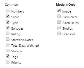 You make these changes on this page: https://myanimelist.net/editprofile.php?go=listpreferences Customization Notes in the top of the code can help with making some simple changes. You can also add .list-item .data.title {background: none;} div[class*="tags-"]{ background: none;} to the bottom of your CSS to remove the shadowy overlay over the preview pics, however this makes the text inside covers hard to read. Fixes and remixes! If you have any particular fixes or improvements I can add to the code, be sure to post them so I can add them to the bottom (fixes and patches) or top (additional customizations). Also if you make a new theme with this be sure to let us see or even share it so others can use it! |
Shishio-kunMar 25, 2023 8:59 AM
Aug 20, 2017 6:45 PM
#2

| I made some rudimentary edits for my own list because I prefer a darker version; but thought I'd share :) Screenshot  IMPORTANT: Make sure you change USERNAME (in red in the code below) to your MAL username, AND also that you have these settings on your list: You make these changes on this page: https://myanimelist.net/editprofile.php?go=listpreferences Code @import '//fonts.googleapis.com/css?family=Montserrat:400, 700'; @import '//mal-image.appspot.com/all/USERNAME/?code=.data.image%20a%5Bhref%5E%3D%22%2F%5BTYPE%5D%2F%5BID%5D%2F%22%5D%20%7B%20background%3A%20url(%5BURL%5D)%3B%20%7D%0A.data.image%20a%5Bhref%5E%3D%22%2F%5BTYPE%5D%2F%5BID%5D%2F%22%5D%20img%20%7B%20display%3A%20none%3B%20%7D'; .more, .link.sort + a, .header-menu .icon, .fancy-bg, .list-unit .list-status-title .text, .status-menu-container .status-menu .status-button:after {display: none;} i.fa.fa-bar-chart, i.fa.fa-filter {size: 0px;} a, .header a:hover, .header .header-menu .list-menu .icon-menu:hover, .list-item, .data.progress:hover .fa, .data.chapter:hover .fa, .data.volume:hover .fa, .list-table .list-table-data, .list-table .list-table-header .header-title .link.sort:hover, .list-menu-float .icon-menu .text, .list-unit .list-status-title .stats a, .list-table .list-table-data a:not(.edit-disabled):hover, .list-table .list-table-data a.edit-disabled, .list-table .list-table-header .header-title .sort-icon, .fa-search:before {color: #f7f7f7;} html {overflow-x: hidden;} td {font-size: .96em;} body {font-size: .73em;} :focus {outline: none;} a {transition: opacity .15s ease-in-out;} a, i.fa.fa-plus-circle {transition: color .15s ease-in-out;} html, .list-container {background: #1b1e23;} input {font-size: 1em !important; color: #777;} *:not(.status) {border: none !important;} *:not(.fa) {font-family: 'Montserrat', FontAwesome, sans-serif !important; text-decoration: none !important; line-height: normal;} i.fa.fa-plus-circle, .data.tags {color: transparent;} .text, .link, .status-button.on {font-weight: normal !important;} @media header-leftbar {} .header {position: fixed; z-index: 600 !important; width: 100%; height: 100%;} .header a, .header .header-menu {color: #dddddd; left: 80px; height: 60px;} .header .header-menu .list-menu .icon-menu {color: #dddddd;} .header, .header .header-title, .list-menu-float, .list-menu-float .icon-menu, .list-menu-float .icon-menu.profile:after, .list-menu-float .icon-menu:hover .text {width: 60px;} @media header-mal-logo {} .header .header-title {position: fixed; font-size: 0; text-indent: 0; top: initial; bottom: 0; left: 0 !important; height: 60px; border-top: 30px solid #181f29; background: url('//i.imgur.com/9snm60K.png'); background-size: cover;} @media header-leftbar-menu {} .list-menu-float {top: 0; z-index: 700 !important;} .list-menu-float .icon-menu, .list-menu-float .icon-menu.profile:after {height: 60px;} .list-menu-float .icon-menu svg.icon {fill: #fff; height: 16px; padding-left: 10%; padding-top: 15%;} .list-menu-float .icon-menu:hover svg.icon {fill: #013a61; top: 6px;} .list-menu-float .icon-menu .text {font-size: .74em; top: 35px; text-transform: lowercase; left: 0; color: #181f29;} .list-menu-float .icon-menu, .header {background: #1f2631;} .list-menu-float .icon-menu {transition: none;} .list-menu-float .icon-menu:not(.profile):hover {width: initial;} .list-menu-float .icon-menu:hover, .link-style-setting, .link-list-setting {background-color: #8fa9ba !important;} .list-menu-float .link-list-setting, .list-menu-float .icon-menu.setting:hover .text .link-style-setting {border: none; color: #fff;} @media header-sort-by {} .list-table-header {float: right; margin-left: 100%; margin-right: 3px; } .header-title.status, .header-title.image, .header-title.tags {display: none !important;} .header-title.title, .header-title.score, .header-title.type, .header-title.progress {color: #dddddd } .list-table .list-table-header .header-title {width: auto !important; background: #1b1e23; padding: 0 10px !important; font-weight: normal;} .list-table .list-table-header .header-title .link.sort {color: #dddddd;} @media topbar {} .list-block {margin-left: 60px;} .list-unit .list-status-title {width: 80%; display: block; z-index: 500; height: 0; background-color: transparent; font-size: 1.2em} .list-unit .list-stats {width: 40%; color: #dddddd; background: none; z-index: 510; padding: 5px} #status-menu, .list-unit .list-status-title, .list-unit .list-stats {position: absolute; top: 80px; left: 0; right: 0; margin: 0 auto; padding-left: 60px;} .status-menu, .status-menu .on, .search-container, .list-status-title, .list-block .list-stats {margin-top: 20px !important} .status-menu-container {background: none; z-index: 110} @media topbar-status {} .status-menu-container .status-menu {display: inline-block; border-spacing: 0; padding-top: 38px} .status-menu-container .status-menu .status-button {display: none; width: 150px; text-align: left; font-size: 1.3em; padding: 8px 10px; color: #a7a7a7} .status-menu-container .status-menu .status-button.on {display: block !important; position: absolute; top: 0; padding: 10px; color: #fefefe} .status-menu:hover {background-color: #1f2631;} .status-menu-container .status-menu:hover .status-button.on {color: #a7a7a7;} .status-menu-container .status-menu:hover .status-button {display: block; background: #1f2631} .status-menu-container .status-menu .status-button:hover {color: #f7f7f7 !important; background: #181f29 !important} @media topbar-search {} .status-menu-container .search-container {top: 0; right: 145px} .status-menu-container .search-container #search-box {background: none; margin-top: 0; border-bottom: none !important; padding-left: 15px} #search-box input {background: 0; color: #dddddd} .status-menu-container .search-container #search-box.open {border-bottom: 1px solid #cecece !important} .fa-search:before {position: absolute; left: 0; top: 13px; font-size: .7em;} @media topbar-fixed {} .status-menu-container.fixed, .fixed + div.list-block .list-status-title, .fixed + div.list-block .list-unit .list-stats {position: fixed !important; top: 0 !important;} .fixed {height: 60px; background: #1b1e23;} .status-menu-container.fixed + div.list-block {margin-top: 16px} .header .header-menu .list-menu {top: 100px; padding: 5px 0; background-color: #1b1e23; right: initial; border: 0; box-shadow: none; -webkit-box-shadow: none; -moz-box-shadow: none;} .header .header-menu .list-menu .icon-menu {width: 50px; height: 42px; text-align: left;} .header .header-menu .list-menu .icon-menu .text {left: 0; top: 6px} .header .header-menu .list-menu .icon-menu:hover {background: none} @media covers {} /* credit to LukeLC */ .list-table tbody:first-child {margin: 115px 0 0 0; display: block;} .list-container {width: 100%; position: absolute;} .list-table {display: table-row;} .data.status, .data.image ~ td {position: absolute; } .list-table .list-table-data .data.image a {border-radius: 5px; background-size: cover; background-repeat: no-repeat; background-position: center center !important; } .list-item {margin: 10px; position: relative; float: left; z-index: 1; background: #1b1e23; } .list-item .data {opacity: 0;} .list-item .list-table-data {border-radius: 3px; position: absolute;} .list-table .list-table-data .data {padding: 0; border-bottom: none;} .list-item .data.image {z-index: 0; position: absolute; border-radius: 5px;} .list-item .data.image img {height: 100%; width: 100%; border-radius: 5px;} .list-item, .list-item .list-table-data, .data.image, .list-table .list-table-data .data.image a, .list-item .data.title, .list-table .list-table-data .data.title .add-edit-more .edit a, .list-table .list-table-data .data.title .add-edit-more .add a, .data.tags textarea {width: 150px !important; height: 215px !important; border-radius: 6px;} .list-item:hover .data, .list-item .data.image, .list-item .data.chapter, a[href*="%C2%9"] {opacity: 1; } @media entrytitle {} .data.title > a {position: absolute; z-index: 5; color: #fff; bottom: 31px; margin-right: 10px; text-shadow: 0 0 3px #000} .list-item .data.title {box-sizing: border-box; background: linear-gradient(to top, rgba(0, 0, 0, .8) 0%, rgba(0, 0, 0, .00784314) 60%); border-radius: 5px; padding: 10px 10px 31px !important;} .list-table .list-table-data .data.title .link {font-size: 1.04em;} @media entrytitle-add-edit-more {} .add-edit-more {color: transparent;} .list-table .list-table-data .data.title .add-edit-more .edit a, .list-table .list-table-data .data.title .add-edit-more .add a {position: absolute; top: 0; left: 0; cursor: default; color: transparent;} @media entryscore {} .list-item .data.score {right: 10px;} .score select.edit-transition {margin-right: -20px;} .data.score, .data.progress, .data.chapter, .data.volume, a[href*="%C2%9"] {z-index: 30; bottom: 0; padding: 10px !important; transition: opacity .15s ease-in-out;} .data.progress, .data.chapter, .data.volume {left: 10px; word-spacing: -2px;} .data.volume {margin-left: 50px;} .data.progress input.edit-transition, .data.chapter input.edit-transition, .data.volume input.edit-transition {width: 10px !important; background: none;} @media entrytype-status {} .list-item .data.type {padding: 12px 15px !important; color: #fff; font-size: 1em; text-shadow: 0 0 3px #000; transition: opacity .15s ease-in-out;} .data.title .rewatching, .data.title .rereading, .data.title .content-status {display: block; font: .9em; text-shadow: 0 0 3px #000; margin-left: 5px; margin-top: 20px; color: #fff !important; opacity: 0; transition: opacity .15s ease-in-out;} @media huge-status-tag-block {} .list-item:hover .data.tags:before {opacity: 1;} .data.status {height: 15px !important; top: 28px !important; background: none !important;} .data.status, .data.tags:before {margin-left: -4px; width: 12px !important; padding: 5px 0 !important; z-index: 10;} .data.status:hover:after, .data.tags:hover:before {width: 15px; padding: 5px 5px 5px 4px !important; font-size: 1.1em; top: 0; color: #fff; cursor: default;} .data.tags:before, .data.status:hover:after, .data.tags:hover:before {position: absolute; left: 0; height: 15px !important;} .data.tags {opacity: 1; height: 100%; text-align: right !important; text-transform: capitalize; width: 0;} .data.tags * {z-index: 25; transition: opacity .15s ease-in-out;} .data.tags:hover * {width: 150px; opacity: 1 !important;} .data.tags:before {content: ''; border-left: 4px solid #00a8ff; opacity: 0; margin-top: 3px;} .data.tags:hover:before {content: 'f02b0a0'; letter-spacing: -1px; background: #00a8ff; width: 15px !important;} @media entrytags-textarea {} .data.tags textarea {position: absolute; font-family: monospace!important; z-index: 200;} .edit-transition.edit-leave {display: none;} @media entrytags-editbutton {} .tags .edit {position: absolute; top: 3px; width: 14px !important; height: 25px; font-size: 0 !important;} .tags .edit:hover {width: 24px !important;} @media entrytags-padding {} div[class*="tags-"] span:first-child:before {content: ''; display: block; margin-top: 3px;} div[class*="tags-"] span:last-child {margin-right: 4px;} div[class*="tags-"] {overflow: hidden; transition: opacity .2s .1s; background: linear-gradient(to bottom, rgba(0, 0, 0, .8) 0%, rgba(0, 0, 0, 0.54) 50%, rgba(0, 0, 0, 0) 100%); border-radius: 3px;} [href*="&tag="]:not([href$="&tag=*"]):not([href*="%C2%9"]) {opacity: 0; font-size: .9em; line-height: 1.56em; color: #fff; border-radius: 3px; margin-right: 3px; white-space: nowrap; text-shadow: 0 0 3px #000; display: inline;} @media entrytags-favorites {} a[href$="&tag=*"] {position: absolute; left: 0; width: 150px; height: 0; font-size: 15px; top: 0; color: transparent !important;} a[href$="&tag=*"]:after {content: 'f004'; color: #ff2c55 !important; margin: 165px -3px; padding: 3px 6px; font-size: 0.87em; display: inline-block; border-right: 3px solid; background: #2e3847; pointer-events: all;} @media entrytags-mangaka {} a[href*="%C2%9"] {position: absolute; left: 0; text-align: left; white-space: nowrap; padding: 0 !important; margin: 10px;} @media entrytags-anime-comments {} .anime [href*="&tag="] {white-space: normal !important; text-transform: none; pointer-events: none;} .anime div[class*="tags-"] span:first-child:before {width: 25px; height: 25px; float: left;} @media entrystatus-colors-and-tab-icons {} .status.reading, .status.watching {border-left: 4px solid #f7464a} .status.plantoread, .status.plantowatch {border-left: 4px solid #97bbcd} .status.completed {border-left: 4px solid #46bfbd} .status.onhold {border-left: 4px solid #fdb45c} .status.dropped {border-left: 4px solid #dcdcdc} .status.reading:after, .status.watching:after {background: #f7464a} .status.plantoread:after, .status.plantowatch:after {background: #97bbcd} .status.completed:after {background: #46bfbd} .status.onhold:after {background: #fdb45c} .status.dropped:after {background: #dcdcdc} .status.reading:hover:after {content: 'f02e';} .status.watching:hover:after {content: 'f008';} .status.plantowatch:hover:after, .status.plantoread:hover:after {content: 'f073';} .status.completed:hover:after {content: 'f00c';} .status.onhold:hover:after {content: 'f04c';} .status.dropped:hover:after {content: 'f00d';} @media fancybox {} #advanced-options .btn-apply, #advanced-options .btn-clear {background-color: #6EBCF4} #advanced-options select, #advanced-options input[type=text] {border: 0; border-bottom: 1px solid #eee !important; color: #6EBCF4;} #advanced-options {background-color: #fff; padding: 35px 0; box-shadow: none; color: #121923;} #advanced-options, #fancybox-wrap {position: fixed; top: 80px !important;} #advanced-options .advanced-options-header {text-transform: uppercase; color: #00a8ff} #advanced-options .advanced-options-header .description {font-size: .65em; color: #1f2631; text-transform: none;} #advanced-options .sort-widget input[type=radio]:checked + label, #advanced-options .btn-apply:hover, #advanced-options .btn-clear:hover {background-color: #121923; color: #6EBCF4} #advanced-options .filter-widget.aired-season, #advanced-options .filter-widget.published-date {border-bottom: 1px solid #ccc !important; margin-bottom: 40px; } #fancybox-close {top: 20px !important; right: 40px !important; color: #777; background: none !important;} #fancybox-close:before {content: 'Close'; color: #777; font-size: 1.2em; margin: 10px;} page-common ownlist_anime_update @media mediaquery {} @media (min-width:1901px) {#status-menu, .list-unit, .list-unit .list-status-title { width: 1530px !important;}} @media (max-width:1900px) {#status-menu, .list-unit, .list-unit .list-status-title { width: 1360px !important;}} @media (max-width:1700px) {#status-menu, .list-unit, .list-unit .list-status-title { width: 1190px !important;}} @media (max-width:1500px) {#status-menu, .list-unit, .list-unit .list-status-title { width: 1020px !important;}} @media (max-width:1300px) {#status-menu, .list-unit, .list-unit .list-status-title { width: 850px !important;}} @media (max-width:1100px) {#status-menu, .list-unit, .list-unit .list-status-title { width: 680px !important;}} @media (max-width:900px) {#status-menu, .list-unit, .list-unit .list-status-title { width: 510px !important;}} @media (max-width:700px) {#status-menu, .list-unit, .list-unit .list-status-title { width: 340px !important;} .header .header-menu .btn-menu { display: none;}} @media personal {} .data.volume, .data.chapter, span a[href*="%CB%93"], span a[href*="%CB%91"], span a[href*="%E2%80%A7"] {display: none !important;} |
Shishio-kunDec 21, 2017 12:41 PM
 |
Aug 21, 2017 12:05 PM
#3
| Awesome! Thanks for sharing! |
Shishio-kunDec 21, 2017 12:42 PM
Jan 8, 2018 7:17 AM
#4

| Very nice layout! But i find a little problem with the sort bar. When i change the page, for exemple, from All anime to Currently watching, it moves from the right to the left. Also it is dfficult to reach the item because the type text (tv, movie etc) overlays the bar. The drop down menu for select the page have a little bug too. Lastly, i'd like to change the background with an image, but in the customization section, even if i add an image, it doesn't show up. Am i doing it wrong or it is impossible to add a background image? |
Jan 8, 2018 12:46 PM
#5
MatteoDanelon said: Very nice layout! But i find a little problem with the sort bar. When i change the page, for exemple, from All anime to Currently watching, it moves from the right to the left. Also it is dfficult to reach the item because the type text (tv, movie etc) overlays the bar. The drop down menu for select the page have a little bug too. Lastly, i'd like to change the background with an image, but in the customization section, even if i add an image, it doesn't show up. Am i doing it wrong or it is impossible to add a background image? On the first and second thing What browser and device are you using? I don't see the same errors on your list from PC/Chrome On the third thing it's probably not possible to upload a background to this layout and see it without making some changes. So you have to add the background manually under /* COLOR OF BACKGROUND */ .list-container, #status-menu, .list-unit, .list-unit .list-status-title { with CSS. Do you know how to add a background this way? Like with uploading images and writing background codes etc |
Jan 8, 2018 1:48 PM
#6
Shishio-kun said: On the first and second thing What browser and device are you using? I don't see the same errors on your list from PC/Chrome On the third thing it's probably not possible to upload a background to this layout and see it without making some changes. So you have to add the background manually under /* COLOR OF BACKGROUND */ .list-container, #status-menu, .list-unit, .list-unit .list-status-title { with CSS. Do you know how to add a background this way? Like with uploading images and writing background codes etc I'm using Chrome (version 63.0.3239.132) on a laptop with a 720p monitor running Windows 10 For the CSS code, i learned it little bit on highschool, so i think i can deal with it, if there aren't difficult codes |
Jan 8, 2018 2:00 PM
#7
MatteoDanelon said: Shishio-kun said: On the first and second thing What browser and device are you using? I don't see the same errors on your list from PC/Chrome On the third thing it's probably not possible to upload a background to this layout and see it without making some changes. So you have to add the background manually under /* COLOR OF BACKGROUND */ .list-container, #status-menu, .list-unit, .list-unit .list-status-title { with CSS. Do you know how to add a background this way? Like with uploading images and writing background codes etc I'm using Chrome (version 63.0.3239.132) on a laptop with a 720p monitor running Windows 10 For the CSS code, i learned it little bit on highschool, so i think i can deal with it, if there aren't difficult codes Wow so you're seeing the errors right now on your list? Hmm I don't know why you're getting these errors then. All I can suggest for now is to update Chrome and reinstall the layout, or try a new one. I'll update you here if I can think of anything. Well to change the background: you have to upload the new background you want to Imgur or similar site (not Photobucket). It should give you a Direct Link among others for that background. Then in your CSS, under /* COLOR OF BACKGROUND */ .list-container, #status-menu, .list-unit, .list-unit .list-status-title { paste this new set of lines under there background-image: url() !important; background-attachment: fixed; background-size: cover; And in the parenthesis, paste the Direct Link you got from imgur. Save and the background should change. |
Jan 8, 2018 2:37 PM
#8
Shishio-kun said: Wow so you're seeing the errors right now on your list? Hmm I don't know why you're getting these errors then. All I can suggest for now is to update Chrome and reinstall the layout, or try a new one. I'll update you here if I can think of anything. Well to change the background: you have to upload the new background you want to Imgur or similar site (not Photobucket). It should give you a Direct Link among others for that background. Then in your CSS, under /* COLOR OF BACKGROUND */ .list-container, #status-menu, .list-unit, .list-unit .list-status-title { paste this new set of lines under there background-image: url() !important; background-attachment: fixed; background-size: cover; And in the parenthesis, paste the Direct Link you got from imgur. Save and the background should change. Chrome is updated and i've reinstalled the layout, but it still doesn't work. The background image code doesn't work too, i see the same color as in your original code, even if i erase the background-color line I'm beginning to think that this layout isn't made for me D: It's a shame because is one of the best, imho |
Jan 8, 2018 2:44 PM
#9
Danezzzz said: Shishio-kun said: Wow so you're seeing the errors right now on your list? Hmm I don't know why you're getting these errors then. All I can suggest for now is to update Chrome and reinstall the layout, or try a new one. I'll update you here if I can think of anything. Well to change the background: you have to upload the new background you want to Imgur or similar site (not Photobucket). It should give you a Direct Link among others for that background. Then in your CSS, under /* COLOR OF BACKGROUND */ .list-container, #status-menu, .list-unit, .list-unit .list-status-title { paste this new set of lines under there background-image: url() !important; background-attachment: fixed; background-size: cover; And in the parenthesis, paste the Direct Link you got from imgur. Save and the background should change. Chrome is updated and i've reinstalled the layout, but it still doesn't work. The background image code doesn't work too, i see the same color as in your original code, even if i erase the background-color line I'm beginning to think that this layout isn't made for me D: It's a shame because is one of the best, imho Maybe something in your browser extensions or PC is blocking the CSS from loading properly. As for the background it wasn't the direct link it needed. It should look like this /* COLOR OF BACKGROUND */ .list-container, #status-menu, .list-unit, .list-unit .list-status-title { background-image: url(https://i.imgur.com/4Vog0Jo.jpg) !important; background-attachment: fixed; background-size: cover; } Not this /* COLOR OF BACKGROUND */ .list-container, #status-menu, .list-unit, .list-unit .list-status-title { background-image: url(https://imgur.com/a/hoeCl) !important; background-attachment: fixed; background-size: cover; } Direct link is copied from here after uploading a pic  |
Shishio-kunJan 8, 2018 2:48 PM
Jan 8, 2018 3:05 PM
#10
Shishio-kun said: Danezzzz said: Shishio-kun said: Wow so you're seeing the errors right now on your list? Hmm I don't know why you're getting these errors then. All I can suggest for now is to update Chrome and reinstall the layout, or try a new one. I'll update you here if I can think of anything. Well to change the background: you have to upload the new background you want to Imgur or similar site (not Photobucket). It should give you a Direct Link among others for that background. Then in your CSS, under /* COLOR OF BACKGROUND */ .list-container, #status-menu, .list-unit, .list-unit .list-status-title { paste this new set of lines under there background-image: url() !important; background-attachment: fixed; background-size: cover; And in the parenthesis, paste the Direct Link you got from imgur. Save and the background should change. Chrome is updated and i've reinstalled the layout, but it still doesn't work. The background image code doesn't work too, i see the same color as in your original code, even if i erase the background-color line I'm beginning to think that this layout isn't made for me D: It's a shame because is one of the best, imho Maybe something in your browser extensions or PC is blocking the CSS from loading properly. As for the background it wasn't the direct link it needed. It should look like this /* COLOR OF BACKGROUND */ .list-container, #status-menu, .list-unit, .list-unit .list-status-title { background-image: url(https://i.imgur.com/4Vog0Jo.jpg) !important; background-attachment: fixed; background-size: cover; } Not this /* COLOR OF BACKGROUND */ .list-container, #status-menu, .list-unit, .list-unit .list-status-title { background-image: url(https://imgur.com/a/hoeCl) !important; background-attachment: fixed; background-size: cover; } Direct link is copied from here after uploading a pic Oh right, i picked the wrong link, my bad Anyway it doesn't fit, it's fixed under the middle of the screen, where there are the anime's posters, and scrolls and repeat on the border ahaha i guess i'll take the default background I don't have many extension on Chrome, and i don't think that the few ones that i have can block CSS from loading. Same as programs on the PC |
Jan 8, 2018 4:00 PM
#11
Danezzzz said: Shishio-kun said: Danezzzz said: Shishio-kun said: Wow so you're seeing the errors right now on your list? Hmm I don't know why you're getting these errors then. All I can suggest for now is to update Chrome and reinstall the layout, or try a new one. I'll update you here if I can think of anything. Well to change the background: you have to upload the new background you want to Imgur or similar site (not Photobucket). It should give you a Direct Link among others for that background. Then in your CSS, under /* COLOR OF BACKGROUND */ .list-container, #status-menu, .list-unit, .list-unit .list-status-title { paste this new set of lines under there background-image: url() !important; background-attachment: fixed; background-size: cover; And in the parenthesis, paste the Direct Link you got from imgur. Save and the background should change. Chrome is updated and i've reinstalled the layout, but it still doesn't work. The background image code doesn't work too, i see the same color as in your original code, even if i erase the background-color line I'm beginning to think that this layout isn't made for me D: It's a shame because is one of the best, imho Maybe something in your browser extensions or PC is blocking the CSS from loading properly. As for the background it wasn't the direct link it needed. It should look like this /* COLOR OF BACKGROUND */ .list-container, #status-menu, .list-unit, .list-unit .list-status-title { background-image: url(https://i.imgur.com/4Vog0Jo.jpg) !important; background-attachment: fixed; background-size: cover; } Not this /* COLOR OF BACKGROUND */ .list-container, #status-menu, .list-unit, .list-unit .list-status-title { background-image: url(https://imgur.com/a/hoeCl) !important; background-attachment: fixed; background-size: cover; } Direct link is copied from here after uploading a pic Oh right, i picked the wrong link, my bad Anyway it doesn't fit, it's fixed under the middle of the screen, where there are the anime's posters, and scrolls and repeat on the border ahaha i guess i'll take the default background I don't have many extension on Chrome, and i don't think that the few ones that i have can block CSS from loading. Same as programs on the PC Weird, well if you see the problem in other browsers it's probably something to do with your PC. I have the same layout on my list atm. I wonder if you see the same problem there: https://myanimelist.net/animelist/Shishio-kun But whether or not you do, I'm not really sure how that would help narrow down the solution. |
Jan 10, 2018 6:19 AM
#12
Shishio-kun said: Danezzzz said: Shishio-kun said: Danezzzz said: Shishio-kun said: Wow so you're seeing the errors right now on your list? Hmm I don't know why you're getting these errors then. All I can suggest for now is to update Chrome and reinstall the layout, or try a new one. I'll update you here if I can think of anything. Well to change the background: you have to upload the new background you want to Imgur or similar site (not Photobucket). It should give you a Direct Link among others for that background. Then in your CSS, under /* COLOR OF BACKGROUND */ .list-container, #status-menu, .list-unit, .list-unit .list-status-title { paste this new set of lines under there background-image: url() !important; background-attachment: fixed; background-size: cover; And in the parenthesis, paste the Direct Link you got from imgur. Save and the background should change. Chrome is updated and i've reinstalled the layout, but it still doesn't work. The background image code doesn't work too, i see the same color as in your original code, even if i erase the background-color line I'm beginning to think that this layout isn't made for me D: It's a shame because is one of the best, imho Maybe something in your browser extensions or PC is blocking the CSS from loading properly. As for the background it wasn't the direct link it needed. It should look like this /* COLOR OF BACKGROUND */ .list-container, #status-menu, .list-unit, .list-unit .list-status-title { background-image: url(https://i.imgur.com/4Vog0Jo.jpg) !important; background-attachment: fixed; background-size: cover; } Not this /* COLOR OF BACKGROUND */ .list-container, #status-menu, .list-unit, .list-unit .list-status-title { background-image: url(https://imgur.com/a/hoeCl) !important; background-attachment: fixed; background-size: cover; } Direct link is copied from here after uploading a pic Oh right, i picked the wrong link, my bad Anyway it doesn't fit, it's fixed under the middle of the screen, where there are the anime's posters, and scrolls and repeat on the border ahaha i guess i'll take the default background I don't have many extension on Chrome, and i don't think that the few ones that i have can block CSS from loading. Same as programs on the PC Weird, well if you see the problem in other browsers it's probably something to do with your PC. I have the same layout on my list atm. I wonder if you see the same problem there: https://myanimelist.net/animelist/Shishio-kun But whether or not you do, I'm not really sure how that would help narrow down the solution. Yup, same problem with Firefox, and with seeing your list too, so it's my laptop's problem. I really don't know what's wrong with it ahah Just to be sure, if you check my list, there's no problem? https://myanimelist.net/animelist/Danezzzz |
Jan 10, 2018 2:34 PM
#13
Danezzzz said: Shishio-kun said: Danezzzz said: Shishio-kun said: Danezzzz said: Shishio-kun said: Wow so you're seeing the errors right now on your list? Hmm I don't know why you're getting these errors then. All I can suggest for now is to update Chrome and reinstall the layout, or try a new one. I'll update you here if I can think of anything. Well to change the background: you have to upload the new background you want to Imgur or similar site (not Photobucket). It should give you a Direct Link among others for that background. Then in your CSS, under /* COLOR OF BACKGROUND */ .list-container, #status-menu, .list-unit, .list-unit .list-status-title { paste this new set of lines under there background-image: url() !important; background-attachment: fixed; background-size: cover; And in the parenthesis, paste the Direct Link you got from imgur. Save and the background should change. Chrome is updated and i've reinstalled the layout, but it still doesn't work. The background image code doesn't work too, i see the same color as in your original code, even if i erase the background-color line I'm beginning to think that this layout isn't made for me D: It's a shame because is one of the best, imho Maybe something in your browser extensions or PC is blocking the CSS from loading properly. As for the background it wasn't the direct link it needed. It should look like this /* COLOR OF BACKGROUND */ .list-container, #status-menu, .list-unit, .list-unit .list-status-title { background-image: url(https://i.imgur.com/4Vog0Jo.jpg) !important; background-attachment: fixed; background-size: cover; } Not this /* COLOR OF BACKGROUND */ .list-container, #status-menu, .list-unit, .list-unit .list-status-title { background-image: url(https://imgur.com/a/hoeCl) !important; background-attachment: fixed; background-size: cover; } Direct link is copied from here after uploading a pic Oh right, i picked the wrong link, my bad Anyway it doesn't fit, it's fixed under the middle of the screen, where there are the anime's posters, and scrolls and repeat on the border ahaha i guess i'll take the default background I don't have many extension on Chrome, and i don't think that the few ones that i have can block CSS from loading. Same as programs on the PC Weird, well if you see the problem in other browsers it's probably something to do with your PC. I have the same layout on my list atm. I wonder if you see the same problem there: https://myanimelist.net/animelist/Shishio-kun But whether or not you do, I'm not really sure how that would help narrow down the solution. Yup, same problem with Firefox, and with seeing your list too, so it's my laptop's problem. I really don't know what's wrong with it ahah Just to be sure, if you check my list, there's no problem? https://myanimelist.net/animelist/Danezzzz Yes it's totally normal to me when I saw it earlier but its default now. The glitch has gotta to be in your browser or PC imo. That makes it difficult to fix unfortunately. It's also possible you have an later version of the browser than me that breaks the layout. Hmm maybe you should try the classic layouts. It is possible the glitch you're having doesn't affect a classic one. https://myanimelist.net/forum/?topicid=318587 |
Jan 11, 2018 3:07 AM
#14
Shishio-kun said: Danezzzz said: Shishio-kun said: Danezzzz said: Shishio-kun said: Danezzzz said: Shishio-kun said: Wow so you're seeing the errors right now on your list? Hmm I don't know why you're getting these errors then. All I can suggest for now is to update Chrome and reinstall the layout, or try a new one. I'll update you here if I can think of anything. Well to change the background: you have to upload the new background you want to Imgur or similar site (not Photobucket). It should give you a Direct Link among others for that background. Then in your CSS, under /* COLOR OF BACKGROUND */ .list-container, #status-menu, .list-unit, .list-unit .list-status-title { paste this new set of lines under there background-image: url() !important; background-attachment: fixed; background-size: cover; And in the parenthesis, paste the Direct Link you got from imgur. Save and the background should change. Chrome is updated and i've reinstalled the layout, but it still doesn't work. The background image code doesn't work too, i see the same color as in your original code, even if i erase the background-color line I'm beginning to think that this layout isn't made for me D: It's a shame because is one of the best, imho Maybe something in your browser extensions or PC is blocking the CSS from loading properly. As for the background it wasn't the direct link it needed. It should look like this /* COLOR OF BACKGROUND */ .list-container, #status-menu, .list-unit, .list-unit .list-status-title { background-image: url(https://i.imgur.com/4Vog0Jo.jpg) !important; background-attachment: fixed; background-size: cover; } Not this /* COLOR OF BACKGROUND */ .list-container, #status-menu, .list-unit, .list-unit .list-status-title { background-image: url(https://imgur.com/a/hoeCl) !important; background-attachment: fixed; background-size: cover; } Direct link is copied from here after uploading a pic Oh right, i picked the wrong link, my bad Anyway it doesn't fit, it's fixed under the middle of the screen, where there are the anime's posters, and scrolls and repeat on the border ahaha i guess i'll take the default background I don't have many extension on Chrome, and i don't think that the few ones that i have can block CSS from loading. Same as programs on the PC Weird, well if you see the problem in other browsers it's probably something to do with your PC. I have the same layout on my list atm. I wonder if you see the same problem there: https://myanimelist.net/animelist/Shishio-kun But whether or not you do, I'm not really sure how that would help narrow down the solution. Yup, same problem with Firefox, and with seeing your list too, so it's my laptop's problem. I really don't know what's wrong with it ahah Just to be sure, if you check my list, there's no problem? https://myanimelist.net/animelist/Danezzzz Yes it's totally normal to me when I saw it earlier but its default now. The glitch has gotta to be in your browser or PC imo. That makes it difficult to fix unfortunately. It's also possible you have an later version of the browser than me that breaks the layout. Hmm maybe you should try the classic layouts. It is possible the glitch you're having doesn't affect a classic one. https://myanimelist.net/forum/?topicid=318587 It seems that with the classic layout i do not have problems. I really don't understand what's wrong with my PC or browser ahah Anyway thank you so much for the help |
Apr 4, 2018 5:40 AM
#15
Awesome layout, but I do have one problem. In regards to these pop-out bars next to the covers. What are they meant to be, and are they meant to look like this?  |
Apr 7, 2018 1:12 PM
#16
TF2sideswipe said: Awesome layout, but I do have one problem. In regards to these pop-out bars next to the covers. What are they meant to be, and are they meant to look like this? I think I figured it out. The blue may be for your tags. But he/she added "F0" as the default text content there, probably so the user was supposed to change it to "Tags:" or "Review:" instead. If you have tags, then you get those tags after "Review:" for example. Now the red I'm pretty sure was meant to be the type of anime category completion-wise. These were change to default gibberish like 2b0a0, but I changed them to the proper category names. Again, I think it was something the creator intended the user to change on their own. In the CSS below, I changed the text to that, so it looks more proper on your list, and I also removed the blue part, since it doesn't seem relevant to your list as you don't use tags. You can just add the codes to the bottom of your CSS. What do you think @valerio_lyndon? I think I got the creator's intentions down .data.tags{ opacity: 0 !important; } .data.tags:hover:before {content: ''Tags:"; letter-spacing: -1px; background: transparent; width: 100px !important;} .data.status:hover:after, .data.tags:hover:before {width: 100px; padding: 5px 5px 5px 4px !important; font-size: 1.1em; top: 0; color: #fff; cursor: default;} .status.reading:hover:after {content: 'reading';} .status.watching:hover:after {content: 'watching';} .status.plantowatch:hover:after, .status.plantoread:hover:after {content: 'planned';} .status.completed:hover:after {content: 'completed';} .status.onhold:hover:after {content: 'on hold';} .status.dropped:hover:after {content: 'dropped';} |
Apr 7, 2018 3:45 PM
#17
Shishio-kun said: Thanks for the @, wouldn't have seen this otherwise. I'm 100% sure those are meant to be FontAwesome icons. I would say it was a glitch with FontAwesome not loading but it actually looks more like someone modified the code by accident and removed the backslashes before the text. I'll have to take a look at the code more to know exactly what the issues are. TF2sideswipe said: Awesome layout, but I do have one problem. In regards to these pop-out bars next to the covers. What are they meant to be, and are they meant to look like this? I think I figured it out. The blue may be for your tags. But he/she added "F0" as the default text content there, probably so the user was supposed to change it to "Tags:" or "Review:" instead. If you have tags, then you get those tags after "Review:" for example. Now the red I'm pretty sure was meant to be the type of anime category completion-wise. These were change to default gibberish like 2b0a0, but I changed them to the proper category names. Again, I think it was something the creator intended the user to change on their own. In the CSS below, I changed the text to that, so it looks more proper on your list, and I also removed the blue part, since it doesn't seem relevant to your list as you don't use tags. You can just add the codes to the bottom of your CSS. What do you think @valerio_lyndon? I think I got the creator's intentions down .data.tags{ opacity: 0 !important; } .data.tags:hover:before {content: ''Tags:"; letter-spacing: -1px; background: transparent; width: 100px !important;} .data.status:hover:after, .data.tags:hover:before {width: 100px; padding: 5px 5px 5px 4px !important; font-size: 1.1em; top: 0; color: #fff; cursor: default;} .status.reading:hover:after {content: 'reading';} .status.watching:hover:after {content: 'watching';} .status.plantowatch:hover:after, .status.plantoread:hover:after {content: 'planned';} .status.completed:hover:after {content: 'completed';} .status.onhold:hover:after {content: 'on hold';} .status.dropped:hover:after {content: 'dropped';} But what I do know is the blue is tags, so f02b is the tag icon  , f008 is on the watching status and is a movie icon, not really sure why it's a movie icon , f008 is on the watching status and is a movie icon, not really sure why it's a movie icon  but it does make some sense. There are a few others such as completed status being f00c which is a checkmark and so on. but it does make some sense. There are a few others such as completed status being f00c which is a checkmark and so on.I'm not sure why the codes are all messed up or why the font family is not set to FontAwesome, maybe a missed @import or incorrectly pasted code?... Not sure. I will have time in around 3-5 hours where I can start looking into this properly. But until then, to fix it we'd have to first apply FontAwesome to the elements (MyAnimeList uses FontAwesome by default so no need for a font import first). .data.status:after { font-family: FontAwesome; }Then modify the code to add a \ before each bit of text or figure out which icon is meant to be there using the list in the cases like tags where it has too many characters for some unknown reason and fix the content bits. .data.status.watching:hover:after { content: "\f008" }Those code bits are untested examples but I am pretty sure that basic concept should fix it. EDIT: Here we go, this seems to get the icons in place. Looks like setting the font wasn't need after all, seems Ruri thought of that already with some fallback font stuff I haven't seen before. .data.status.watching:hover:after,
.data.status.reading:hover:after { content: "\f008" }
.data.status.completed:hover:after { content: "\f00c" }
.data.status.onhold:hover:after { content: "\f04c" }
.data.status.dropped:hover:after { content: "\f00d" }
.data.status.plantowatch:hover:after,
.data.status.plantoread:hover:after { content: "\f073" }
.data.tags:hover:before { content: "\f02b" } |
Valerio_LyndonApr 7, 2018 8:25 PM
Apr 7, 2018 9:33 PM
#18
| @Valerio_Lyndon Oh ok thanks, I never would have known this. My instincts told me to consult you! Thanks to your help I was able to really update the topic! @TF2sideswipe If you want to fix the issue try the changes in Valerio's post, if that doesn't work tho post back and btw I got a new dark version available in the OP which fixes that issue |
Apr 7, 2018 10:56 PM
#19
| Wow incredible work @Shishio-kun and @Valerio_Lyndon, you guys are awesome. Quick response and with a great fix. Keep it up guys. |
Apr 24, 2018 5:23 AM
#20
| Amazing. The Best poster-style theme imo. Just one problem. It's a bit strange though, so please excuse my long clumsy explanation. First, I noticed that the shadow overlay doesn't extend to the bottom corners of the posters, so there are bright dots in the corners of of them. That bothered me ever since I noticed it. Then, when I came here to tell you about that, I looked a little closer and noticed what I believe to be the reason for the un-shadowed corners. The theme seems to be (inconsistently) trying to round the corners of the posters. It seems to do this artificially by making the corners white, which the user normally wouldn't notice because it's the same as the color of the background of the original light theme. Unfortunately, this seems to only be being done to the bottom corners and not the top(it seems that maybe the tops of the posters used to be shadowed as well, maybe?), and even then it's doing it only on some corners for some reason. On top of the bright corners being very noticeable in the dark theme, it is also noticeable in the light theme when hovering the mouse over a poster, because this puts an un-rounded black border around said poster. It is also always noticeable that corners are randomly rounded here and there. It's even present in the screenshots of the OP. For a specific example of all this, look at the bottom right corner of the My Hero Academia Season 3 poster. It's easier to see if you zoom in. I loved the theme at first, and I still want to, but idk if my self-diagnosed not-really-ocd can cope XD |
BogglegongsApr 24, 2018 2:02 PM
Apr 25, 2018 9:59 PM
#21
Bogglegongs said: Amazing. The Best poster-style theme imo. Just one problem. It's a bit strange though, so please excuse my long clumsy explanation. First, I noticed that the shadow overlay doesn't extend to the bottom corners of the posters, so there are bright dots in the corners of of them. That bothered me ever since I noticed it. Then, when I came here to tell you about that, I looked a little closer and noticed what I believe to be the reason for the un-shadowed corners. The theme seems to be (inconsistently) trying to round the corners of the posters. It seems to do this artificially by making the corners white, which the user normally wouldn't notice because it's the same as the color of the background of the original light theme. Unfortunately, this seems to only be being done to the bottom corners and not the top(it seems that maybe the tops of the posters used to be shadowed as well, maybe?), and even then it's doing it only on some corners for some reason. On top of the bright corners being very noticeable in the dark theme, it is also noticeable in the light theme when hovering the mouse over a poster, because this puts an un-rounded black border around said poster. It is also always noticeable that corners are randomly rounded here and there. It's even present in the screenshots of the OP. For a specific example of all this, look at the bottom right corner of the My Hero Academia Season 3 poster. It's easier to see if you zoom in. I loved the theme at first, and I still want to, but idk if my self-diagnosed not-really-ocd can cope XD Oh, I see what you mean. Strange. I fixed the hover outline issue, but the bright points around the edges seems to be mostly caused by a rendering issue. No idea how to fix it, I swear I've done the same thing this list is doing before but not had issues... anyhow, that's not important. What I did instead is fix everything as best I can and then added a slight shadow to the outer edges of each item to try and cover up the lightness. Here's the light theme code and here's the dark theme code. Or alternatively here is the patch version of the fix (a small amount of code that can be copy-pasted to the bottom of the code). /* EDGE SMOOTHING AMOUNT */
.list-item, .list-item .list-table-data, .data.image, .list-table .list-table-data .data.image a, .list-item .data.title, .list-table .list-table-data .data.title .add-edit-more .edit a, .list-table .list-table-data .data.title .add-edit-more .add a, div[class*="tags-"], .data.tags textarea {
border-radius: 3px !important;
}
/* Various Fixes */
a img {
border-radius: 4px;
}
.list-item {
background: none !important;
}
/* Edge Darkening to cover up weird rendering */
.data.image a {
box-shadow: inset 0 0 2px 0.5px rgba(0, 0, 0, 0.5);
}This probably won't be enough to sate you as it is still kind of an issue but I figured I'd post anyway. I wish I knew of a way to fix this but it seems to be an issue in the browser itself (I'm running Chrome). |
Apr 26, 2018 1:53 PM
#22
Valerio_Lyndon said: Oh, I see what you mean. Strange. I fixed the hover outline issue, but the bright points around the edges seems to be mostly caused by a rendering issue. No idea how to fix it, I swear I've done the same thing this list is doing before but not had issues... anyhow, that's not important. What I did instead is fix everything as best I can and then added a slight shadow to the outer edges of each item to try and cover up the lightness. Here's the light theme code and here's the dark theme code. Or alternatively here is the patch version of the fix (a small amount of code that can be copy-pasted to the bottom of the code). /* EDGE SMOOTHING AMOUNT */
.list-item, .list-item .list-table-data, .data.image, .list-table .list-table-data .data.image a, .list-item .data.title, .list-table .list-table-data .data.title .add-edit-more .edit a, .list-table .list-table-data .data.title .add-edit-more .add a, div[class*="tags-"], .data.tags textarea {
border-radius: 3px !important;
}
/* Various Fixes */
a img {
border-radius: 4px;
}
.list-item {
background: none !important;
}
/* Edge Darkening to cover up weird rendering */
.data.image a {
box-shadow: inset 0 0 2px 0.5px rgba(0, 0, 0, 0.5);
}This probably won't be enough to sate you as it is still kind of an issue but I figured I'd post anyway. I wish I knew of a way to fix this but it seems to be an issue in the browser itself (I'm running Chrome). That's a big improvement. It doesn't catch my eye anymore; I have to explicitly look for it to see the issue now. The corners almost look like they just have a bit of a shine now, as if it's intentional. Even though I like sharp corners, I know many prefer the rounded look and this is better than the glitchy corners anyway. (I'm using Firefox btw.) I think I'll get over the mild issue now. Thanks a lot for the update. All your themes are great too, I might try out that one you're using. |
BogglegongsApr 26, 2018 2:00 PM
Apr 26, 2018 9:15 PM
#23
Bogglegongs said: Glad to hear it's better now, and thanks for the compliment. :)Valerio_Lyndon said: Oh, I see what you mean. Strange. I fixed the hover outline issue, but the bright points around the edges seems to be mostly caused by a rendering issue. No idea how to fix it, I swear I've done the same thing this list is doing before but not had issues... anyhow, that's not important. What I did instead is fix everything as best I can and then added a slight shadow to the outer edges of each item to try and cover up the lightness. Here's the light theme code and here's the dark theme code. Or alternatively here is the patch version of the fix (a small amount of code that can be copy-pasted to the bottom of the code). /* EDGE SMOOTHING AMOUNT */
.list-item, .list-item .list-table-data, .data.image, .list-table .list-table-data .data.image a, .list-item .data.title, .list-table .list-table-data .data.title .add-edit-more .edit a, .list-table .list-table-data .data.title .add-edit-more .add a, div[class*="tags-"], .data.tags textarea {
border-radius: 3px !important;
}
/* Various Fixes */
a img {
border-radius: 4px;
}
.list-item {
background: none !important;
}
/* Edge Darkening to cover up weird rendering */
.data.image a {
box-shadow: inset 0 0 2px 0.5px rgba(0, 0, 0, 0.5);
}This probably won't be enough to sate you as it is still kind of an issue but I figured I'd post anyway. I wish I knew of a way to fix this but it seems to be an issue in the browser itself (I'm running Chrome). That's a big improvement. It doesn't catch my eye anymore; I have to explicitly look for it to see the issue now. The corners almost look like they just have a bit of a shine now, as if it's intentional. Even though I like sharp corners, I know many prefer the rounded look and this is better than the glitchy corners anyway. (I'm using Firefox btw.) I think I'll get over the mild issue now. Thanks a lot for the update. All your themes are great too, I might try out that one you're using. |
Aug 20, 2018 9:34 PM
#24
| New versions in the OP with working HD pics again which will also be visible to other users and logged out users |
Sep 11, 2018 5:23 AM
#25

| What part of the code do I need to edit to make the colors of each section be the MyAnimeList default? i.e Dark Blue for Watched and Green for Watching etc I noticed in posts above where there was a problem with the color codes showing up instead of the icons but yeah it was all alittle complicated. I've tried finding the colors I watch to change in the code but honestly I'm a complete novice at stuff like this. I guess it's possible since there are icons for these sections that simply changing the color isn't possible without changing the icons? I'd like to try and do this myself so any guidance would be appreciated. |
BlaizeVSep 11, 2018 5:27 AM
Sep 11, 2018 1:13 PM
#26
BlaizeV said: What part of the code do I need to edit to make the colors of each section be the MyAnimeList default? i.e Dark Blue for Watched and Green for Watching etc I noticed in posts above where there was a problem with the color codes showing up instead of the icons but yeah it was all alittle complicated. I've tried finding the colors I watch to change in the code but honestly I'm a complete novice at stuff like this. I guess it's possible since there are icons for these sections that simply changing the color isn't possible without changing the icons? I'd like to try and do this myself so any guidance would be appreciated. I see what you mean; I didn't know (or I forgot) this changed the colors of the category type. Hmm. I should probably change it to what MAL has later I think you would add this, then change the color words to what you want, then save. Notice that under status watching, I got it green. And under completed (watched) I got it blue. You need to change the red colors to what you want. btw if the colors don't match, we can give more specific colors just let us know. Let us know how this works too. @media entrystatus-colors-and-tab-icons {} .status.reading, .status.watching {border-left: 4px solid green} .status.plantoread, .status.plantowatch {border-left: 4px solid red} .status.completed {border-left: 4px solid blue} .status.onhold {border-left: 4px solid red} .status.dropped {border-left: 4px solid red} |
Sep 26, 2018 2:51 PM
#27
| Hi! Idk if this thread is still alive or not, but I found a bug that I don't know how to fix. I added a background that does not scroll in the end of the CSS code: /* COLOR OF BACKGROUND */ .list-container, #status-menu, .list-unit, .list-unit .list-status-title { background-image: url(https://i.imgur.com/a53qHMo.jpg) !important; background-attachment: fixed; background-size: cover; background-repeat: no-repeat; } But if I go to a page with no added anime, or few added animes (ex: the "Currently watching" page) the background is cut off after the last anime is listed, and the original grey background takes place again ( https://i.imgur.com/pHIV69h.jpg) I also wonder how to Remove the blue tag icon which appears if i put my mouse over the left top corner of an anime cover, and could I move up the other icon which is below it to the top? (the icon that indicated if the series is completed, currently watching, etc.) I would also know if anyone knows what code I would use to replace the plain text that show score/episodes/name etc. I would like it to look like this theme: https://myanimelist.net/forum/?topicid=1712734 Thanks! |
Sep 26, 2018 9:45 PM
#28
Grante15 said: Add this to the bottom of your list CSS:Hi! Idk if this thread is still alive or not, but I found a bug that I don't know how to fix. I added a background that does not scroll in the end of the CSS code: /* COLOR OF BACKGROUND */ .list-container, #status-menu, .list-unit, .list-unit .list-status-title { background-image: url(https://i.imgur.com/a53qHMo.jpg) !important; background-attachment: fixed; background-size: cover; background-repeat: no-repeat; } But if I go to a page with no added anime, or few added animes (ex: the "Currently watching" page) the background is cut off after the last anime is listed, and the original grey background takes place again ( https://i.imgur.com/pHIV69h.jpg) I also wonder how to Remove the blue tag icon which appears if i put my mouse over the left top corner of an anime cover, and could I move up the other icon which is below it to the top? (the icon that indicated if the series is completed, currently watching, etc.) I would also know if anyone knows what code I would use to replace the plain text that show score/episodes/name etc. I would like it to look like this theme: https://myanimelist.net/forum/?topicid=1712734 Thanks! .list-container { min-height: 100%; }
.data.tags:before { content: none !important; }
.data.status { top: 3px !important; }As to replacing the text, there is no clear-cut way of going about it. We'd have to directly modify the theme to move things around like that. Not super hard but it does require a clear goal in mind, so with that said, I'm curious what exactly you're thinking of. Do you want the exact layout, with progress top left, score top right, etcetera, or something more specific? And would you want to directly rip the style and icons from that other theme or stay with the style of this AniList design? |
Sep 27, 2018 3:53 PM
#29
Valerio_Lyndon said: Grante15 said: Add this to the bottom of your list CSS:Hi! Idk if this thread is still alive or not, but I found a bug that I don't know how to fix. I added a background that does not scroll in the end of the CSS code: /* COLOR OF BACKGROUND */ .list-container, #status-menu, .list-unit, .list-unit .list-status-title { background-image: url(https://i.imgur.com/a53qHMo.jpg) !important; background-attachment: fixed; background-size: cover; background-repeat: no-repeat; } But if I go to a page with no added anime, or few added animes (ex: the "Currently watching" page) the background is cut off after the last anime is listed, and the original grey background takes place again ( https://i.imgur.com/pHIV69h.jpg) I also wonder how to Remove the blue tag icon which appears if i put my mouse over the left top corner of an anime cover, and could I move up the other icon which is below it to the top? (the icon that indicated if the series is completed, currently watching, etc.) I would also know if anyone knows what code I would use to replace the plain text that show score/episodes/name etc. I would like it to look like this theme: https://myanimelist.net/forum/?topicid=1712734 Thanks! .list-container { min-height: 100%; }
.data.tags:before { content: none !important; }
.data.status { top: 3px !important; }As to replacing the text, there is no clear-cut way of going about it. We'd have to directly modify the theme to move things around like that. Not super hard but it does require a clear goal in mind, so with that said, I'm curious what exactly you're thinking of. Do you want the exact layout, with progress top left, score top right, etcetera, or something more specific? And would you want to directly rip the style and icons from that other theme or stay with the style of this AniList design? Ah, thanks man! I did not really expect such a fast response ^^ Yeah that code did fixed the icon, and removing the tag from list settings removed the function! :) So I might not have thought this through very much, I'm interested in all the functions; Episodes, score, name, release, type of series, season and rating (all marked yellow: https://i.imgur.com/ttS3XsC.png ) The screenshot pictures on the right are from this theme, with only name, episodes and rating marked in orange. I think the other theme uses more shading on the bottom (feels like I can read it more easily?) and since the top icons have clear colors its super easy to look at. That is why I'm interested in copying that code^^ But i mean if you could turn the heart (or change the icon to something more appropriate?) black with a white number, and maybe the same with the green episode thingy but in grey? I think that would look kind of cool and maybe fit better with the style of the theme. It could also be the same color as the original background/side border (speaking of that, what is the color-code for the background?). :) I'm not really that experienced in CSS coding or color coordination, so I'm totally up for suggestions! |
Sep 27, 2018 4:40 PM
#30
| I kind of got into this, so I managed to change out the background color of the sidebar and the filtering menu: https://i.imgur.com/cIWWWpE.jpg But now i wonder a couple of things; 1. (Green) How to I change the color of this quick settings tab? 2. (Orange) How do I change the color of this text? (Can I place it at the bottom of the page?) 3. (Blue) If i hover over the search bottom, the drop-down menu opens up? 4. (Blue) How do I change the background color of this drop down menu? 5. (Blue) Can I change the color of the individual texts in the drop down menu when I'm about to click them? (They are all the same light blue color atm) 6. (Yellow) Can i change the background opacity of this menu? I kind of ask 1000 questions, but this was quite fun and I got 0 experience with this kind of work, I've only taken a course in android java programming like 5 years ago ^^ |
Sep 28, 2018 11:40 PM
#31
Grante15 said: So you're sort of thinking it would look like this, yeah? [Image] I mean, the layout, ignoring that it's a rough edit lol. Just want to make sure before I dive into it. My only problem with the previous linked image is that the bottom line of info would often be conflicting in widths, which might be hard to compensate for. Might have to do something more like this: [Image]So I might not have thought this through very much, I'm interested in all the functions; Episodes, score, name, release, type of series, season and rating (all marked yellow: https://i.imgur.com/ttS3XsC.png ) Since I'll be modifying large swathes of the code, I plan to take a copy of your CSS, modify it, then post it here again once I'm done so you can easily replace your current one with the new stuff. Grante15 said: The original background colour is #1b1e23(speaking of that, what is the color-code for the background?). :)  Unfortunately I can't get to things properly tonight, as I've got to sleep. But should be back sometime tomorrow after I've finished up real life duties so I can edit the theme and answer your questions. :) |
Sep 29, 2018 10:28 AM
#32
Valerio_Lyndon said: Grante15 said: So you're sort of thinking it would look like this, yeah? [Image] I mean, the layout, ignoring that it's a rough edit lol. Just want to make sure before I dive into it. My only problem with the previous linked image is that the bottom line of info would often be conflicting in widths, which might be hard to compensate for. Might have to do something more like this: [Image]So I might not have thought this through very much, I'm interested in all the functions; Episodes, score, name, release, type of series, season and rating (all marked yellow: https://i.imgur.com/ttS3XsC.png ) Since I'll be modifying large swathes of the code, I plan to take a copy of your CSS, modify it, then post it here again once I'm done so you can easily replace your current one with the new stuff. Grante15 said: The original background colour is #1b1e23(speaking of that, what is the color-code for the background?). :) Unfortunately I can't get to things properly tonight, as I've got to sleep. But should be back sometime tomorrow after I've finished up real life duties so I can edit the theme and answer your questions. :) Wow, yeah that would look awesome! :D But I think having the episodes/score boxes with the same gap, the same distance from the edges (also from the top->down), in a similar fashion as the other text would look the best! The second image did look neater than the first one imo :) https://paste.ofcode.org/ENeJPtWQUTtZ3fNFNSX3e4 Here is the code that I'm currently using/have modified so far! There is no hurry, I mean i just kind of got into this on a whim ^^ I'm thankful for the all the help! |
Sep 29, 2018 7:50 PM
#33
| I am back! Grante15 said: I think having the episodes/score boxes with the same gap, the same distance from the edges (also from the top->down), in a similar fashion as the other text would look the best! The second image did look neater than the first one imo :) Here's the redone code. As I wasn't 100% sure which you wanted, here's a couple different options. First link is the first image, second link is the second image.[Opt1] [Opt2] It's not too hard to fine-tune these as far as you want. :)   And this is the manga list (didn't screencap both options).  Here's the [anime] options and [manga] options I used (volumes on mangalist are optional, probably look better without in fact). If you're ever curious about differences between things, I find a comparison website helpful.
Grante15 said: Asking questions is the best way to learn. :3I kind of ask 1000 questions, but this was quite fun and I got 0 experience with this kind of work, I've only taken a course in android java programming like 5 years ago ^^ Grante15 said: The shading appears to be about the same to me, but it can be tweaked if you wanted to (selector is ".list-item .data.title"). And if you want to play with the score/progress backgrounds just look up ".data.progress" or ".data.score" in the CSS and you should find the correct areas. Or you can add some code to the bottom of the CSS. For instance,I think the other theme uses more shading on the bottom (feels like I can read it more easily?) and since the top icons have clear colors its super easy to look at. That is why I'm interested in copying that code^^ .data.progress, .data.chapter, .data.volume { background: #232; }
.data.score { background: #322; }Grante15 said: I checked and turns out the heart is an icon, so it's even easier to change than I thought. So if you wanted the heart instead of the plain background you could first set the score box background to transparent, then add in the icon. Something like the code below. And the "color" property would control the colour of the heart.But i mean if you could turn the heart (or change the icon to something more appropriate?) black with a white number, and maybe the same with the green episode thingy but in grey? I think that would look kind of cool and maybe fit better with the style of the theme. It could also be the same color as the original background/side border  .data.score {
min-width: 18px;
background: none;
}
.data.score:before {
content: "\f004";
position: absolute;
right: 0;
top: 4px;
display: block;
width: 100%;
color: #272727;
font: normal 28px/1 FontAwesome;
text-align: center;
text-shadow: rgba(0, 0, 0, 0.5) 1px 1px 2px;
z-index: -1;
}Grante15 said: That's good! :DI kind of got into this, so I managed to change out the background color of the sidebar and the filtering menu: https://i.imgur.com/cIWWWpE.jpg But now i wonder a couple of things; You can find this selector used in the code: ".list-menu-float .icon-menu:hover, .link-style-setting, .link-list-setting". Or put the code below at the bottom of your CSS and tweak it there. .list-menu-float .icon-menu:hover, .link-style-setting, .link-list-setting
{background-color: #8fa9ba;}.link-style-setting, .link-list-setting
{background-color: #8fa9ba;}Grante15 said: Due to how this list design is made, I'm not sure how to go about doing that. If I was to remake a good deal of the list CSS I could do it, but that is a lot of work for such a small design swap haha.[IMG]2. (Orange) How do I change the color of this text? (Can I place it at the bottom of the page?) Unfortunately, that's not really fixable. The search button/bar is a child of the same parent menu that houses the drop-down menu. So due to how the hovering feature works, when you hover over one it activates the other. I wish I had a solution for you here, but it's something only modifying the HTML could do (which I wish we could do mind you!). Find this selector in the CSS: ".status-menu:hover" Or use this at the bottom of the code: .status-menu:hover {background-color: #1f2631;}Grante15 said: Yep! Here's some sample code. You can change the colours from here.[IMG]5. (Blue) Can I change the color of the individual texts in the drop down menu when I'm about to click them? (They are all the same light blue color atm) .status-menu-container .status-menu .status-button.all_anime:hover { color: purple !important; }
.status-menu-container .status-menu .status-button.watching:hover,
.status-menu-container .status-menu .status-button.reading:hover { color: orange !important; }
.status-menu-container .status-menu .status-button.completed:hover { color: blue !important; }
.status-menu-container .status-menu .status-button.onhold:hover { color: yellow !important; }
.status-menu-container .status-menu .status-button.dropped:hover { color: red !important; }
.status-menu-container .status-menu .status-button.plantowatch:hover,
.status-menu-container .status-menu .status-button.plantoread:hover { color: grey !important; }Yep. You can either find this selector in the CSS: ".list-table .list-table-header .header-title" And then fiddle with the background property there, or you can add this code to the bottom of your list and change it here. .list-table .list-table-header .header-title { background: rgba(40, 40, 40, .5); } --------- For finding other things yourself, there's a lot of stuff than can be found through finding the class name through inspect element, then trying to find that text in the current CSS. Sometimes this will fail, but as a general rule it's pretty helpful. [Example] --------- And I don't know if you would be interested in doing so, but if you want to centre the list items titles (like the other theme has) you could find ".list-item .data.title" and add "text-align: center;". .list-item .data.title { text-align: center; } --------- I tried not to over-explain too many things to keep the post somewhat less of a behemoth than I normally tend to create, so let me know if anything is really confusing! |
Sep 30, 2018 3:33 PM
#34
| Wow! Thanks a lot! This was super informative, and quite easy to follow! :D The only two remaining things that I wonder about is the menu (point 6. previously), the menu does this if there is not enough anime added: (https://imgur.com/n1CpFQt) It jumps to the left side of the page when it should be to the right. But I was thinking that one possibly could use coordinates or something to fix it in one position? I also can't get the ".list-item .data.title { text-align: center; }" to work, and i don't understand why? I check all the places in the code there i can find ".list-item .data.title" and I add "text-align: center;" within the {}, and I also add it last in the code to overwrite any other possible code that would counteract this, but it does not work? (https://pastebin.com/raw/9z99nVZA) Am I just stupid or is there something that I'm missing? Other than that, I'm super satisfied with this result! (I understand that HTML stuff that you can't really change is quite hard to do anything about ^^) I think it looks really good now! :D Again, 100x thanks to you sir! |
Oct 2, 2018 11:15 PM
#35
Grante15 said: Hmm, strange. A lot of odd code added up to that one happening, huh. I fixed it by making the list's width consistent with everything else.Wow! Thanks a lot! This was super informative, and quite easy to follow! :D The only two remaining things that I wonder about is the menu (point 6. previously), the menu does this if there is not enough anime added: (https://imgur.com/n1CpFQt) It jumps to the left side of the page when it should be to the right. But I was thinking that one possibly could use coordinates or something to fix it in one position? I also can't get the ".list-item .data.title { text-align: center; }" to work, and i don't understand why? I check all the places in the code there i can find ".list-item .data.title" and I add "text-align: center;" within the {}, and I also add it last in the code to overwrite any other possible code that would counteract this, but it does not work? (https://pastebin.com/raw/9z99nVZA) Am I just stupid or is there something that I'm missing? Other than that, I'm super satisfied with this result! (I understand that HTML stuff that you can't really change is quite hard to do anything about ^^) I think it looks really good now! :D Again, 100x thanks to you sir! The text-align problem is 100% my bad, apologies for that. The selector was wrong, it should have had an extra piece at the end. I also noticed another issue with the idea that I fixed during this pass through the code. I'm the stupid one this time. ;P I grouped it all into one piece again here: [Code]. Replace your current stuff with it. It should have all your changes you've made since the last post since I took the copy only an hour or so before posting this. Glad I could help.~ If there's any more problems feel free to bring them up if you're wondering about them. :) |
Dec 27, 2018 6:00 PM
#36
| The pictures are not in HD for me. What I'm supposed to do? |
Dec 27, 2018 6:31 PM
#37
You don't have the layout on your list so I can't tell you the exact issue. And you don't have anything added anyways on this account so see front page, there's a solution thingie there "fix broken layouts" https://myanimelist.net/clubs.php?cid=19736 but iirc you need to have your layout off private to get the HD covers nowadays (until they fix the API). Tho I think Malamute can add some covers despite that. |
Dec 28, 2018 3:23 PM
#38
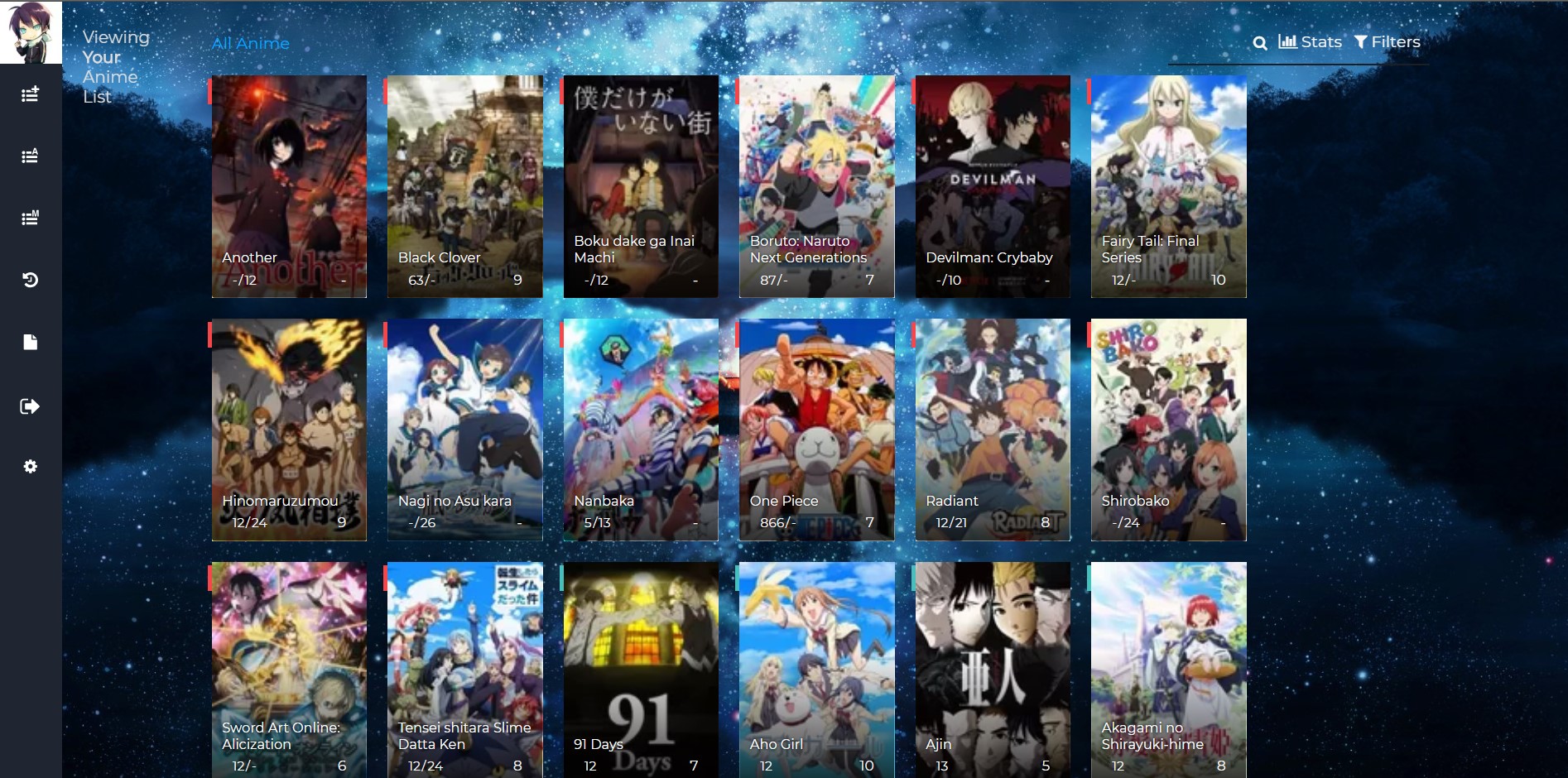 are the images supposed to be this blur? |
 |
Dec 28, 2018 3:41 PM
#39
| No, they're normally more clear. Unfortunately, the tool that generates covers requires a public list so that it can scan and generate the CSS for your list. |
Dec 28, 2018 3:43 PM
#40
Valerio_Lyndon said: No, they're normally more clear. Unfortunately, the tool that generates covers requires a public list so that it can scan and generate the CSS for your list. so all i have to do is make my list public? |
|
Dec 28, 2018 4:43 PM
#41
LittleJegster said: Valerio_Lyndon said: No, they're normally more clear. Unfortunately, the tool that generates covers requires a public list so that it can scan and generate the CSS for your list. so all i have to do is make my list public? The layout works fine for me, but I see you made your list public and it's still not working. I think you have to wait some time now after making it public now and check it tomorrow |
Dec 28, 2018 5:34 PM
#42
Shishio-kun said: LittleJegster said: Valerio_Lyndon said: No, they're normally more clear. Unfortunately, the tool that generates covers requires a public list so that it can scan and generate the CSS for your list. so all i have to do is make my list public? The layout works fine for me, but I see you made your list public and it's still not working. I think you have to wait some time now after making it public now and check it tomorrow ok will do, thanks for the fast reply :) |
|
Mar 31, 2019 11:02 PM
#43
Valerio_Lyndon said: Grante15 said: Hmm, strange. A lot of odd code added up to that one happening, huh. I fixed it by making the list's width consistent with everything else.Wow! Thanks a lot! This was super informative, and quite easy to follow! :D The only two remaining things that I wonder about is the menu (point 6. previously), the menu does this if there is not enough anime added: (https://imgur.com/n1CpFQt) It jumps to the left side of the page when it should be to the right. But I was thinking that one possibly could use coordinates or something to fix it in one position? I also can't get the ".list-item .data.title { text-align: center; }" to work, and i don't understand why? I check all the places in the code there i can find ".list-item .data.title" and I add "text-align: center;" within the {}, and I also add it last in the code to overwrite any other possible code that would counteract this, but it does not work? (https://pastebin.com/raw/9z99nVZA) Am I just stupid or is there something that I'm missing? Other than that, I'm super satisfied with this result! (I understand that HTML stuff that you can't really change is quite hard to do anything about ^^) I think it looks really good now! :D Again, 100x thanks to you sir! The text-align problem is 100% my bad, apologies for that. The selector was wrong, it should have had an extra piece at the end. I also noticed another issue with the idea that I fixed during this pass through the code. I'm the stupid one this time. ;P I grouped it all into one piece again here: [Code]. Replace your current stuff with it. It should have all your changes you've made since the last post since I took the copy only an hour or so before posting this. Glad I could help.~ If there's any more problems feel free to bring them up if you're wondering about them. :) The [Code] is no longer available. Where I can get the updated Code? Thankss!! |
VsamaralMar 31, 2019 11:20 PM
Apr 1, 2019 12:40 AM
#44
Vsamaral said: Ah, sorry about that! The code can be found as below. I can't guarantee it is exactly what was in the original link, but it's basically the same. But keep in mind this version is modified for Grante's tastes, not just fixes. :) If you were looking for something specific out of the code, I might be able to help.Valerio_Lyndon said: Grante15 said: Wow! Thanks a lot! This was super informative, and quite easy to follow! :D The only two remaining things that I wonder about is the menu (point 6. previously), the menu does this if there is not enough anime added: (https://imgur.com/n1CpFQt) It jumps to the left side of the page when it should be to the right. But I was thinking that one possibly could use coordinates or something to fix it in one position? I also can't get the ".list-item .data.title { text-align: center; }" to work, and i don't understand why? I check all the places in the code there i can find ".list-item .data.title" and I add "text-align: center;" within the {}, and I also add it last in the code to overwrite any other possible code that would counteract this, but it does not work? (https://pastebin.com/raw/9z99nVZA) Am I just stupid or is there something that I'm missing? Other than that, I'm super satisfied with this result! (I understand that HTML stuff that you can't really change is quite hard to do anything about ^^) I think it looks really good now! :D Again, 100x thanks to you sir! The text-align problem is 100% my bad, apologies for that. The selector was wrong, it should have had an extra piece at the end. I also noticed another issue with the idea that I fixed during this pass through the code. I'm the stupid one this time. ;P I grouped it all into one piece again here: [Code]. Replace your current stuff with it. It should have all your changes you've made since the last post since I took the copy only an hour or so before posting this. Glad I could help.~ If there's any more problems feel free to bring them up if you're wondering about them. :) The [Code] is no longer available. Where I can get the updated Code? Thankss!! @\import "//fonts.googleapis.com/css?family=Montserrat:400, 700";
@\import "https://malscraper.azurewebsites.net/covers/auto/presets/dataimagelink";
/* SIZE OF HIGH RES COVERS*/
.list-item, .list-item .list-table-data, .data.image, .list-table .list-table-data .data.image a, .list-item .data.title, .list-table .list-table-data .data.title .add-edit-more .edit a, .list-table .list-table-data .data.title .add-edit-more .add a, .data.tags textarea
{width: 150px !important;
height: 215px !important;}
/* SIZE OF LOW RES COVERS
Found behind the normal high resolution covers. You should only see these if your cover import goes down.*/
a img
{width: 150px !important;
height: 215px !important;}
/* PLACEMENT OF THE TYPE TEXT
Where you'll see OVA, Movie, TV, etc when you point to a cover.*/
.list-item .data.type
{left: 50%;
top: -20px;}
/* FONT SIZE */
body {font-size: 13px !important;}
.more, .link.sort + a, .header-menu .icon, .fancy-bg, .list-unit .list-status-title .text, .status-menu-container .status-menu .status-button:after
{display: none;}
a, .header a:hover, .header .header-menu .list-menu .icon-menu:hover, .list-item, .data.progress:hover .fa, .data.chapter:hover .fa, .data.volume:hover .fa, .list-table .list-table-data, .list-table .list-table-header .header-title .link.sort:hover, .list-menu-float .icon-menu .text, .list-unit .list-status-title .stats a, .list-table .list-table-data a:not(.edit-disabled):hover, .list-table .list-table-data a.edit-disabled, .list-table .list-table-header .header-title .sort-icon, .fa-search:before
{color: #282828;}
html {overflow-x: hidden;}
td {font-size: .96em;}
body {font-size: .73em;}
:focus {outline: none;}
a
{transition: opacity .15s ease-in-out;}
a, i.fa.fa-plus-circle
{transition: color .15s ease-in-out;}
html, .list-container
{background: #f8f8f8;}
input
{font-size: 1em !important;
color: #fff;}
*:not(.status)
{border: none !important;}
*:not(.fa)
{font-family: 'Montserrat', FontAwesome, sans-serif !important;
text-decoration: none !important;
line-height: normal;}
.data.tags
{color: transparent;}
.text, .link, .status-button.on
{font-weight: normal !important;}
@media header-leftbar {}
.header
{position: fixed;
z-index: 600 !important;
width: 100%;
height: 100%;}
.header a, .header .header-menu
{color: #fff;
left: 80px;
height: 60px;}
.header .header-menu .list-menu .icon-menu
{color: #fff;}
.header, .header .header-title, .list-menu-float, .list-menu-float .icon-menu, .list-menu-float .icon-menu.profile:after, .list-menu-float .icon-menu:hover .text
{width: 60px;}
@media header-mal-logo {}
.header .header-title
{position: fixed;
font-size: 0;
text-indent: 0;
top: initial;
bottom: 0;
left: 0 !important;
height: 60px;
border-top: 30px solid #282828;
background-size: cover;}
@media header-leftbar-menu {}
.list-menu-float
{top: 0;
z-index: 700 !important;}
.list-menu-float .icon-menu, .list-menu-float .icon-menu.profile:after
{height: 60px;}
.list-menu-float .icon-menu svg.icon
{fill: #fff;
height: 16px;
padding-left: 10%;
padding-top: 15%;}
.list-menu-float .icon-menu:hover svg.icon
{fill: #19F24B;
top: 6px;}
.list-menu-float .icon-menu .text
{font-size: .74em;
top: 35px;
text-transform: lowercase;
left: 0;
color: #19F24B;}
.list-menu-float .icon-menu, .header
{background: #19F24B;}
.list-menu-float .icon-menu
{transition: none;}
.list-menu-float .icon-menu:not(.profile):hover
{width: initial;}
.list-menu-float .icon-menu:hover, .link-style-setting, .link-list-setting
{background-color: #3d3d3d !important;}
.list-menu-float .link-list-setting, .list-menu-float .icon-menu.setting:hover .text .link-style-setting
{border: none;
color: #fff;}
@media header-sort-by {}
.list-table-header
{float: right;
margin-left: 100%;
margin-right: 3px;}
.header-title.status, .header-title.image, .header-title.tags, .header-title.started
{display: none !important;}
.list-table .list-table-header .header-title
{width: auto !important;
background: #FF0000;
padding: 0 10px !important;
font-weight: normal;}
.list-table .list-table-header .header-title .link.sort
{color: #19f24b;}
@media topbar {}
.list-block
{margin-left: 60px;}
.list-unit .list-status-title
{width: 80%;
display: block;
z-index: 500;
height: 0;
background-color: transparent;
font-size: 1.2em}
.list-unit .list-stats
{width: 40%;
color: #19F24B;
background-color: transparent;
z-index: 510;
padding: 5px}
#status-menu, .list-unit .list-status-title, .list-unit .list-stats
{position: absolute;
top: 80px;
left: 0;
right: 0;
margin: 0 auto;
padding-left: 60px;}
.status-menu, .status-menu .on, .search-container, .list-status-title, .list-block .list-stats
{margin-top: 20px !important}
.status-menu-container
{background: none;
z-index: 110}
@media topbar-status {}
.status-menu-container .status-menu
{display: inline-block;
border-spacing: 0;
padding-top: 38px}
.status-menu-container .status-menu .status-button
{display: none;
width: 175px;
text-align: left;
font-size: 1.2em;
padding: 8px 10px;
color: #fff}
.status-menu-container .status-menu .status-button.on
{display: block !important;
position: absolute;
top: 0;
padding: 10px;
color: #19F24B}
.status-menu:hover {background-color: #282828;}
.status-menu-container .status-menu:hover .status-button.on
{color: #282828;}
.status-menu-container .status-menu:hover .status-button
{display: block;
background: #282828}
.status-menu-container .status-menu .status-button:hover
{color: #3d3d3d !important;
background: #3d3d3d !important}
@media topbar-search {}
.status-menu-container .search-container
{top: 0;
right: 145px}
.status-menu-container .search-container #search-box
{background: none;
margin-top: 0;
border-bottom: none !important;
padding-left: 15px}
#search-box input
{background: 0;
color: #19F24B}
.status-menu-container .search-container #search-box.open
{border-bottom: 1px solid #cecece !important}
.fa-search:before
{position: absolute;
left: 0;
top: 13px;
font-size: .7em;}
@media topbar-fixed {}
.status-menu-container.fixed, .fixed + div.list-block .list-status-title, .fixed + div.list-block .list-unit .list-stats
{position: fixed !important;
top: 0 !important;}
.fixed
{height: 60px;
background: #f8f8f8;}
.status-menu-container.fixed + div.list-block
{margin-top: 16px}
.header .header-menu .list-menu
{top: 100px;
padding: 5px 0;
background-color: #f8f8f8;
right: initial;
border: 0;
box-shadow: none;
-webkit-box-shadow: none;
-moz-box-shadow: none;}
.header .header-menu .list-menu .icon-menu
{width: 50px; height: 42px; text-align: left;}
.header .header-menu .list-menu .icon-menu .text
{left: 0;
top: 6px}
.header .header-menu .list-menu .icon-menu:hover
{background: none}
@media covers {} /* credit to LukeLC */
.list-table tbody:first-child
{margin-top: 155px;
display: block;}
.list-container
{width: 100%;
position: absolute;}
.list-table
{display: block;}
.data.status, .data.image ~ td
{position: absolute;}
.list-table .list-table-data .data.image a
{border-radius: 3px;
background-size: cover;
background-repeat: no-repeat;
background-position: center center !important;}
.list-item
{margin: 10px;
position: relative;
float: left;
background: none !important;
z-index: 1;}
.list-item .data
{opacity: 0;}
.list-item .list-table-data
{position: absolute;}
.list-table .list-table-data .data
{padding: 0;
border-bottom: none;}
.list-item .data.image
{z-index: 0;
position: absolute;}
.list-item .data.image img
{height: 100%; width: 100%;}
.list-item:hover .data, .list-item .data.image, .list-item .data.title, .list-item:hover .data.title *, .list-item .data.score, .list-item .data.progress, .list-item .data.chapter, a[href*="%C2%9"]
{opacity: 1;}
@media entrytitle {}
.data.title > a
{position: absolute;
z-index: 5;
color: #fff;
bottom: 31px;
margin-right: 10px;
text-shadow: 0 0 3px #000;
text-align: center;
min-width: 130px;}
.manga .data.title > a
{bottom: 11px;}
.list-item .data.title
{box-sizing: border-box;
border-radius: 3px;
padding: 10px 10px 31px !important;}
.list-table .list-table-data .data.title .link
{font-size: 1.04em;}
@media entrytitle-add-edit-more {}
.add-edit-more
{color: transparent;}
.list-table .list-table-data .data.title .add-edit-more .edit a, .list-table .list-table-data .data.title .add-edit-more .add a
{position: absolute;
top: 0;
left: 0;
border-radius: 3px;
cursor: default;
color: transparent;}
@media entryscore {}
.score select.edit-transition
{margin-right: -20px;}
.data.score, .data.progress, .data.chapter, .data.volume, a[href*="%C2%9"]
{z-index: 30;
top: 10px;
padding: 7px !important;
border-radius: 3px;
background: rgba(0, 0, 0, 0.55);
transition: opacity .15s ease-in-out;}
.list-item .data.score
{right: 10px;
background: transparent;}
.data.progress, .data.chapter, .data.volume
{left: 10px;
word-spacing: -2px;
background: linear-gradient(135deg, rgba(0, 0, 0, 0.65), rgba(0, 0, 0, 0.35));}
.data.volume
{margin-left: 50px;}
.data.progress input.edit-transition, .data.chapter input.edit-transition, .data.volume input.edit-transition
{width: 10px !important;
background: none;}
i.fa.fa-plus-circle
{color: transparent;
font-size: 0;}
.data.progress:hover .fa
{font-size: inherit;}
@media entrytype-status {}
.list-item .data.type
{padding: 2px 15px !important;
color: white;
font-size: 1em;
text-shadow: 0 0 3px #000;
transition: opacity .15s ease-in-out;
transform: translateX(-50%);
}
.data.title .rewatching, .data.title .rereading, .data.title .content-status
{display: block;
font: .9em;
text-shadow: 0 0 3px #000;
margin-left: 5px;
margin-top: 34px;
color: #fff !important;
opacity: 0;
transition: opacity .15s ease-in-out;}
@media entryseason-rated {}
.data.season, .data.rated
{bottom: 0;
padding: 10px !important;
font-size: 10px;
opacity: 1;
z-index: 10;}
.data.rated
{right: 0;}
@media huge-status-tag-block {}
.list-item:hover .data.tags:before
{opacity: 1;}
.data.status, .data.tags:before
{margin-left: -4px;
width: 12px !important;
padding: 5px 0 !important;
z-index: 35;}
.data.status
{width: 5px !important;
height: 15px !important;
top: 28px !important;
background: none !important;
opacity: 1 !important;}
.data.status:before
{content: "";
position: absolute;
left: -8px;
top: -4px;
width: 100%;
height: 100%;
padding: 4px 0 4px 12px}
.data.status:hover:after, .data.tags:hover:before
{width: 15px;
padding: 5px 5px 5px 4px !important;
font-size: 1.1em;
top: 0;
color: #fff;
cursor: default;
pointer-events: none;}
.data.tags:before, .data.status:hover:after, .data.tags:hover:before
{position: absolute;
left: 0;
height: 15px !important;}
.data.tags
{opacity: 1;
height: 100%;
text-align: right !important;
text-transform: capitalize;
width: 0;}
.data.tags *
{z-index: 25;
transition: opacity .15s ease-in-out;}
.data.tags:hover *
{width: 150px;
opacity: 1 !important;}
.data.tags:before
{content: '';
border-left: 4px solid #00a8ff;
opacity: 0;
margin-top: 3px;}
.data.tags:hover:before
{content: 'f02b0a0';
letter-spacing: -1px;
background: #00a8ff;
width: 15px !important;}
@media entrytags-textarea {}
.data.tags textarea
{position: absolute; font-family: monospace!important;
z-index: 200;}
.edit-transition.edit-leave
{display: none;}
@media entrytags-editbutton {}
.tags .edit
{position: absolute;
top: 3px;
width: 14px !important;
height: 25px;
font-size: 0 !important;}
.tags .edit:hover
{width: 24px !important;}
@media entrytags-padding {}
div[class*="tags-"] span:first-child:before
{content: '';
display: block;
margin-top: 3px;}
div[class*="tags-"] span:last-child
{margin-right: 4px;}
div[class*="tags-"]
{overflow: hidden;
transition: opacity .2s .1s;
border-radius: 3px;}
[href*="&tag="]:not([href$="&tag=*"]):not([href*="%C2%9"])
{opacity: 0;
font-size: .9em;
line-height: 1.56em;
color: #fff;
border-radius: 3px;
margin-right: 3px;
white-space: nowrap;
text-shadow: 0 0 3px #000;
display: inline;}
@media entrytags-favorites {}
a[href$="&tag=*"]
{position: absolute;
left: 0;
width: 150px;
height: 0;
font-size: 15px;
top: 0;
color: transparent !important;}
a[href$="&tag=*"]:after
{content: 'f004';
color: #ff2c55 !important;
margin: 165px -3px;
padding: 3px 6px;
font-size: 0.87em;
display: inline-block;
border-right: 3px solid;
background: #2e3847;
pointer-events: all;}
@media entrytags-mangaka {}
a[href*="%C2%9"]
{position: absolute;
left: 0;
text-align: left;
white-space: nowrap;
padding: 0 !important;
margin: 10px;}
@media entrytags-anime-comments {}
.anime [href*="&tag="]
{white-space: normal !important;
text-transform: none;
pointer-events: none;}
.anime div[class*="tags-"] span:first-child:before
{width: 25px;
height: 25px;
float: left;}
@media entrystatus-colors-and-tab-icons {}
.status.reading, .status.watching
{border-left: 4px solid green}
.status.plantoread, .status.plantowatch
{border-left: 4px solid Purple}
.status.completed
{border-left: 4px solid blue}
.status.onhold
{border-left: 4px solid yellow}
.status.dropped
{border-left: 4px solid red}
.status.reading:after, .status.watching:after
{background: #f7464a}
.status.plantoread:after, .status.plantowatch:after
{background: #97bbcd}
.status.completed:after
{background: #46bfbd}
.status.onhold:after
{background: #fdb45c}
.status.dropped:after
{background: #dcdcdc}
.status.reading:hover:after
{content: 'f02e';}
.status.watching:hover:after
{content: 'f008';}
.status.plantowatch:hover:after, .status.plantoread:hover:after
{content: 'f073';}
.status.completed:hover:after
{content: 'f00c';}
.status.onhold:hover:after
{content: 'f04c';}
.status.dropped:hover:after
{content: 'f00d';}
@media mediaquery {}
@media (min-width:1901px)
{#status-menu, .list-unit, .list-unit .list-status-title
{ width: 1530px !important;}}
@media (max-width:1900px)
{#status-menu, .list-unit, .list-unit .list-status-title
{ width: 1360px !important;}}
@media (max-width:1700px)
{#status-menu, .list-unit, .list-unit .list-status-title
{ width: 1190px !important;}}
@media (max-width:1500px)
{#status-menu, .list-unit, .list-unit .list-status-title
{ width: 1020px !important;}}
@media (max-width:1300px)
{#status-menu, .list-unit, .list-unit .list-status-title
{ width: 850px !important;}}
@media (max-width:1100px)
{#status-menu, .list-unit, .list-unit .list-status-title
{ width: 680px !important;}}
@media (max-width:900px)
{#status-menu, .list-unit, .list-unit .list-status-title
{ width: 510px !important;}}
@media (max-width:700px)
{#status-menu, .list-unit, .list-unit .list-status-title
{ width: 340px !important;}
.header .header-menu .btn-menu
{ display: none;}}
a img{
position: absolute;
display: block !important;
z-index: -10 !important;
width: 150px;
height: 215px;
border-radius: 3px;
}
.data.tags {
opacity: 1;
height: 28px;
text-align: right !important;
text-transform: capitalize;
width: 150px;
}
.list-table .list-table-data .data.title .add-edit-more .edit a:hover,
.list-table .list-table-data .data.title .add-edit-more .add a:hover{
box-shadow: 0px 0px 1px 1px rgba(0,0,0,0.75);
}
.header .header-title{
display: none;
}
.list-item .data.title
{background: linear-gradient(to top, rgba(0, 0, 0, .8) 0%, rgba(0, 0, 0, .00784314) 60%);}
div[class*="tags-"]{
background: linear-gradient(to bottom, rgba(0, 0, 0, .8) 0%, rgba(0, 0, 0, 0.54) 50%, rgba(0, 0, 0, 0) 100%);}
a, .header a:hover, .header .header-menu .list-menu .icon-menu:hover, .list-item, .data.progress:hover .fa, .data.chapter:hover .fa, .data.volume:hover .fa, .list-table .list-table-data, .list-table .list-table-header .header-title .link.sort:hover, .list-menu-float .icon-menu .text, .list-unit .list-status-title .stats a, .list-table .list-table-data a:not(.edit-disabled):hover, .list-table .list-table-data a.edit-disabled, .list-table .list-table-header .header-title .sort-icon, .fa-search:before
{color: #f7f7f7;}
a
{transition: opacity .15s ease-in-out;}
a, i.fa.fa-plus-circle
{transition: color .15s ease-in-out;}
input
{font-size: 1em !important;
color: #777;}
a
{transition: opacity .15s ease-in-out;}
a, i.fa.fa-plus-circle
{transition: color .15s ease-in-out;}
input
{font-size: 1em !important;
color: #777;}
i.fa.fa-plus-circle, .data.tags
{color: transparent;}
.text, .link, .status-button.on
{font-weight: normal !important;}
.header a, .header .header-menu
{color: #dddddd;}
.header .header-menu .list-menu .icon-menu
{color: #dddddd;}
.list-menu-float .icon-menu .text
{color: #fff;}
.list-menu-float .icon-menu, .header
{background: #fff;}
.list-menu-float .link-list-setting, .list-menu-float .icon-menu.setting:hover .text .link-style-setting
{border: none;
color: #fff;}
html, .list-container
{background: #282828;}
.list-table .list-table-header .header-title
{width: auto !important;
background: #fff;
padding: 0 10px !important;
font-weight: normal;}
.list-table .list-table-header .header-title .link.sort
{color: #dddddd;}
.status-menu-container .search-container #search-button {
margin-right: 10px;}
#copyright{
position: absolute;
font-size: 10px;
z-index: 100;
right: 0%;
}
.data.status.watching:hover:after,
.data.status.reading:hover:after { content: "\f008" }
.data.status.completed:hover:after { content: "\f00c" }
.data.status.onhold:hover:after { content: "\f04c" }
.data.status.dropped:hover:after { content: "\f00d" }
.data.status.plantowatch:hover:after,
.data.status.plantoread:hover:after { content: "\f073" }

.data.tags:hover:before { content: "\f02b" }
.list-item .data.title
{background: linear-gradient(to top, rgba(0, 0, 0, .8) 0%, rgba(0, 0, 0, .00784314) 60%);}
div[class*="tags-"]{
background: linear-gradient(to bottom, rgba(0, 0, 0, .8) 0%, rgba(0, 0, 0, 0.54) 50%, rgba(0, 0, 0, 0) 100%);}
/* COLOR OF BACKGROUND */
.list-container, #status-menu, .list-unit, .list-unit .list-status-title {
background-image: url(https://image.myanimelist.net/ui/5LYzTBVoS196gvYvw3zjwLKH8iXBoXxOZaYYqPaK_ic) !important;
background-attachment: fixed;
background-size: cover;
background-repeat: no-repeat;
}
.list-container { min-height: 100%; }
.data.tags:before { content: none !important; }
.data.status { top: 3px !important; }
/* COLOR OF SIDEBAR */
.list-menu-float .icon-menu, .header {
background-color: #282828 !important;
}
.list-menu-float .icon-menu:hover, .link-style-setting, .link-list-setting{ background-color: #282828;}
/* drop down menu */
.status-menu:hover {background-color: #282828;}
/* heart score */
.data.score {
min-width: 18px;
background: none;
}
.data.score:before {
content: "\f004";
position: absolute;
right: 0;
top: 4px;
display: block;
width: 100%;
color: #272727;
font: normal 28px/1 FontAwesome;
text-align: center;
text-shadow: rgba(0, 0, 0, 0.5) 1px 1px 2px;
z-index: -1;
}
.status-menu:hover {background-color: #282828;}
/* dropdown menu color */
.status-menu-container .status-menu .status-button.all_anime:hover { color: #19F24B !important; }
.status-menu-container .status-menu .status-button.watching:hover,
.status-menu-container .status-menu .status-button.reading:hover { color: green !important; }
.status-menu-container .status-menu .status-button.completed:hover { color: blue !important; }
.status-menu-container .status-menu .status-button.onhold:hover { color: yellow !important; }
.status-menu-container .status-menu .status-button.dropped:hover { color: red !important; }
.status-menu-container .status-menu .status-button.plantowatch:hover,
.status-menu-container .status-menu .status-button.plantoread:hover { color: Purple !important; }
/* Right menu fade */
.list-table .list-table-header .header-title { background: rgba(40, 40, 40, .5); }
|
Apr 1, 2019 9:42 AM
#45
Valerio_Lyndon said: Vsamaral said: Ah, sorry about that! The code can be found as below. I can't guarantee it is exactly what was in the original link, but it's basically the same. But keep in mind this version is modified for Grante's tastes, not just fixes. :) If you were looking for something specific out of the code, I might be able to help.Valerio_Lyndon said: Grante15 said: Hmm, strange. A lot of odd code added up to that one happening, huh. I fixed it by making the list's width consistent with everything else.Wow! Thanks a lot! This was super informative, and quite easy to follow! :D The only two remaining things that I wonder about is the menu (point 6. previously), the menu does this if there is not enough anime added: (https://imgur.com/n1CpFQt) It jumps to the left side of the page when it should be to the right. But I was thinking that one possibly could use coordinates or something to fix it in one position? I also can't get the ".list-item .data.title { text-align: center; }" to work, and i don't understand why? I check all the places in the code there i can find ".list-item .data.title" and I add "text-align: center;" within the {}, and I also add it last in the code to overwrite any other possible code that would counteract this, but it does not work? (https://pastebin.com/raw/9z99nVZA) Am I just stupid or is there something that I'm missing? Other than that, I'm super satisfied with this result! (I understand that HTML stuff that you can't really change is quite hard to do anything about ^^) I think it looks really good now! :D Again, 100x thanks to you sir! The text-align problem is 100% my bad, apologies for that. The selector was wrong, it should have had an extra piece at the end. I also noticed another issue with the idea that I fixed during this pass through the code. I'm the stupid one this time. ;P I grouped it all into one piece again here: [Code]. Replace your current stuff with it. It should have all your changes you've made since the last post since I took the copy only an hour or so before posting this. Glad I could help.~ If there's any more problems feel free to bring them up if you're wondering about them. :) The [Code] is no longer available. Where I can get the updated Code? Thankss!! @\import "//fonts.googleapis.com/css?family=Montserrat:400, 700";
@\import "https://malscraper.azurewebsites.net/covers/auto/presets/dataimagelink";
/* SIZE OF HIGH RES COVERS*/
.list-item, .list-item .list-table-data, .data.image, .list-table .list-table-data .data.image a, .list-item .data.title, .list-table .list-table-data .data.title .add-edit-more .edit a, .list-table .list-table-data .data.title .add-edit-more .add a, .data.tags textarea
{width: 150px !important;
height: 215px !important;}
/* SIZE OF LOW RES COVERS
Found behind the normal high resolution covers. You should only see these if your cover import goes down.*/
a img
{width: 150px !important;
height: 215px !important;}
/* PLACEMENT OF THE TYPE TEXT
Where you'll see OVA, Movie, TV, etc when you point to a cover.*/
.list-item .data.type
{left: 50%;
top: -20px;}
/* FONT SIZE */
body {font-size: 13px !important;}
.more, .link.sort + a, .header-menu .icon, .fancy-bg, .list-unit .list-status-title .text, .status-menu-container .status-menu .status-button:after
{display: none;}
a, .header a:hover, .header .header-menu .list-menu .icon-menu:hover, .list-item, .data.progress:hover .fa, .data.chapter:hover .fa, .data.volume:hover .fa, .list-table .list-table-data, .list-table .list-table-header .header-title .link.sort:hover, .list-menu-float .icon-menu .text, .list-unit .list-status-title .stats a, .list-table .list-table-data a:not(.edit-disabled):hover, .list-table .list-table-data a.edit-disabled, .list-table .list-table-header .header-title .sort-icon, .fa-search:before
{color: #282828;}
html {overflow-x: hidden;}
td {font-size: .96em;}
body {font-size: .73em;}
:focus {outline: none;}
a
{transition: opacity .15s ease-in-out;}
a, i.fa.fa-plus-circle
{transition: color .15s ease-in-out;}
html, .list-container
{background: #f8f8f8;}
input
{font-size: 1em !important;
color: #fff;}
*:not(.status)
{border: none !important;}
*:not(.fa)
{font-family: 'Montserrat', FontAwesome, sans-serif !important;
text-decoration: none !important;
line-height: normal;}
.data.tags
{color: transparent;}
.text, .link, .status-button.on
{font-weight: normal !important;}
@media header-leftbar {}
.header
{position: fixed;
z-index: 600 !important;
width: 100%;
height: 100%;}
.header a, .header .header-menu
{color: #fff;
left: 80px;
height: 60px;}
.header .header-menu .list-menu .icon-menu
{color: #fff;}
.header, .header .header-title, .list-menu-float, .list-menu-float .icon-menu, .list-menu-float .icon-menu.profile:after, .list-menu-float .icon-menu:hover .text
{width: 60px;}
@media header-mal-logo {}
.header .header-title
{position: fixed;
font-size: 0;
text-indent: 0;
top: initial;
bottom: 0;
left: 0 !important;
height: 60px;
border-top: 30px solid #282828;
background-size: cover;}
@media header-leftbar-menu {}
.list-menu-float
{top: 0;
z-index: 700 !important;}
.list-menu-float .icon-menu, .list-menu-float .icon-menu.profile:after
{height: 60px;}
.list-menu-float .icon-menu svg.icon
{fill: #fff;
height: 16px;
padding-left: 10%;
padding-top: 15%;}
.list-menu-float .icon-menu:hover svg.icon
{fill: #19F24B;
top: 6px;}
.list-menu-float .icon-menu .text
{font-size: .74em;
top: 35px;
text-transform: lowercase;
left: 0;
color: #19F24B;}
.list-menu-float .icon-menu, .header
{background: #19F24B;}
.list-menu-float .icon-menu
{transition: none;}
.list-menu-float .icon-menu:not(.profile):hover
{width: initial;}
.list-menu-float .icon-menu:hover, .link-style-setting, .link-list-setting
{background-color: #3d3d3d !important;}
.list-menu-float .link-list-setting, .list-menu-float .icon-menu.setting:hover .text .link-style-setting
{border: none;
color: #fff;}
@media header-sort-by {}
.list-table-header
{float: right;
margin-left: 100%;
margin-right: 3px;}
.header-title.status, .header-title.image, .header-title.tags, .header-title.started
{display: none !important;}
.list-table .list-table-header .header-title
{width: auto !important;
background: #FF0000;
padding: 0 10px !important;
font-weight: normal;}
.list-table .list-table-header .header-title .link.sort
{color: #19f24b;}
@media topbar {}
.list-block
{margin-left: 60px;}
.list-unit .list-status-title
{width: 80%;
display: block;
z-index: 500;
height: 0;
background-color: transparent;
font-size: 1.2em}
.list-unit .list-stats
{width: 40%;
color: #19F24B;
background-color: transparent;
z-index: 510;
padding: 5px}
#status-menu, .list-unit .list-status-title, .list-unit .list-stats
{position: absolute;
top: 80px;
left: 0;
right: 0;
margin: 0 auto;
padding-left: 60px;}
.status-menu, .status-menu .on, .search-container, .list-status-title, .list-block .list-stats
{margin-top: 20px !important}
.status-menu-container
{background: none;
z-index: 110}
@media topbar-status {}
.status-menu-container .status-menu
{display: inline-block;
border-spacing: 0;
padding-top: 38px}
.status-menu-container .status-menu .status-button
{display: none;
width: 175px;
text-align: left;
font-size: 1.2em;
padding: 8px 10px;
color: #fff}
.status-menu-container .status-menu .status-button.on
{display: block !important;
position: absolute;
top: 0;
padding: 10px;
color: #19F24B}
.status-menu:hover {background-color: #282828;}
.status-menu-container .status-menu:hover .status-button.on
{color: #282828;}
.status-menu-container .status-menu:hover .status-button
{display: block;
background: #282828}
.status-menu-container .status-menu .status-button:hover
{color: #3d3d3d !important;
background: #3d3d3d !important}
@media topbar-search {}
.status-menu-container .search-container
{top: 0;
right: 145px}
.status-menu-container .search-container #search-box
{background: none;
margin-top: 0;
border-bottom: none !important;
padding-left: 15px}
#search-box input
{background: 0;
color: #19F24B}
.status-menu-container .search-container #search-box.open
{border-bottom: 1px solid #cecece !important}
.fa-search:before
{position: absolute;
left: 0;
top: 13px;
font-size: .7em;}
@media topbar-fixed {}
.status-menu-container.fixed, .fixed + div.list-block .list-status-title, .fixed + div.list-block .list-unit .list-stats
{position: fixed !important;
top: 0 !important;}
.fixed
{height: 60px;
background: #f8f8f8;}
.status-menu-container.fixed + div.list-block
{margin-top: 16px}
.header .header-menu .list-menu
{top: 100px;
padding: 5px 0;
background-color: #f8f8f8;
right: initial;
border: 0;
box-shadow: none;
-webkit-box-shadow: none;
-moz-box-shadow: none;}
.header .header-menu .list-menu .icon-menu
{width: 50px; height: 42px; text-align: left;}
.header .header-menu .list-menu .icon-menu .text
{left: 0;
top: 6px}
.header .header-menu .list-menu .icon-menu:hover
{background: none}
@media covers {} /* credit to LukeLC */
.list-table tbody:first-child
{margin-top: 155px;
display: block;}
.list-container
{width: 100%;
position: absolute;}
.list-table
{display: block;}
.data.status, .data.image ~ td
{position: absolute;}
.list-table .list-table-data .data.image a
{border-radius: 3px;
background-size: cover;
background-repeat: no-repeat;
background-position: center center !important;}
.list-item
{margin: 10px;
position: relative;
float: left;
background: none !important;
z-index: 1;}
.list-item .data
{opacity: 0;}
.list-item .list-table-data
{position: absolute;}
.list-table .list-table-data .data
{padding: 0;
border-bottom: none;}
.list-item .data.image
{z-index: 0;
position: absolute;}
.list-item .data.image img
{height: 100%; width: 100%;}
.list-item:hover .data, .list-item .data.image, .list-item .data.title, .list-item:hover .data.title *, .list-item .data.score, .list-item .data.progress, .list-item .data.chapter, a[href*="%C2%9"]
{opacity: 1;}
@media entrytitle {}
.data.title > a
{position: absolute;
z-index: 5;
color: #fff;
bottom: 31px;
margin-right: 10px;
text-shadow: 0 0 3px #000;
text-align: center;
min-width: 130px;}
.manga .data.title > a
{bottom: 11px;}
.list-item .data.title
{box-sizing: border-box;
border-radius: 3px;
padding: 10px 10px 31px !important;}
.list-table .list-table-data .data.title .link
{font-size: 1.04em;}
@media entrytitle-add-edit-more {}
.add-edit-more
{color: transparent;}
.list-table .list-table-data .data.title .add-edit-more .edit a, .list-table .list-table-data .data.title .add-edit-more .add a
{position: absolute;
top: 0;
left: 0;
border-radius: 3px;
cursor: default;
color: transparent;}
@media entryscore {}
.score select.edit-transition
{margin-right: -20px;}
.data.score, .data.progress, .data.chapter, .data.volume, a[href*="%C2%9"]
{z-index: 30;
top: 10px;
padding: 7px !important;
border-radius: 3px;
background: rgba(0, 0, 0, 0.55);
transition: opacity .15s ease-in-out;}
.list-item .data.score
{right: 10px;
background: transparent;}
.data.progress, .data.chapter, .data.volume
{left: 10px;
word-spacing: -2px;
background: linear-gradient(135deg, rgba(0, 0, 0, 0.65), rgba(0, 0, 0, 0.35));}
.data.volume
{margin-left: 50px;}
.data.progress input.edit-transition, .data.chapter input.edit-transition, .data.volume input.edit-transition
{width: 10px !important;
background: none;}
i.fa.fa-plus-circle
{color: transparent;
font-size: 0;}
.data.progress:hover .fa
{font-size: inherit;}
@media entrytype-status {}
.list-item .data.type
{padding: 2px 15px !important;
color: white;
font-size: 1em;
text-shadow: 0 0 3px #000;
transition: opacity .15s ease-in-out;
transform: translateX(-50%);
}
.data.title .rewatching, .data.title .rereading, .data.title .content-status
{display: block;
font: .9em;
text-shadow: 0 0 3px #000;
margin-left: 5px;
margin-top: 34px;
color: #fff !important;
opacity: 0;
transition: opacity .15s ease-in-out;}
@media entryseason-rated {}
.data.season, .data.rated
{bottom: 0;
padding: 10px !important;
font-size: 10px;
opacity: 1;
z-index: 10;}
.data.rated
{right: 0;}
@media huge-status-tag-block {}
.list-item:hover .data.tags:before
{opacity: 1;}
.data.status, .data.tags:before
{margin-left: -4px;
width: 12px !important;
padding: 5px 0 !important;
z-index: 35;}
.data.status
{width: 5px !important;
height: 15px !important;
top: 28px !important;
background: none !important;
opacity: 1 !important;}
.data.status:before
{content: "";
position: absolute;
left: -8px;
top: -4px;
width: 100%;
height: 100%;
padding: 4px 0 4px 12px}
.data.status:hover:after, .data.tags:hover:before
{width: 15px;
padding: 5px 5px 5px 4px !important;
font-size: 1.1em;
top: 0;
color: #fff;
cursor: default;
pointer-events: none;}
.data.tags:before, .data.status:hover:after, .data.tags:hover:before
{position: absolute;
left: 0;
height: 15px !important;}
.data.tags
{opacity: 1;
height: 100%;
text-align: right !important;
text-transform: capitalize;
width: 0;}
.data.tags *
{z-index: 25;
transition: opacity .15s ease-in-out;}
.data.tags:hover *
{width: 150px;
opacity: 1 !important;}
.data.tags:before
{content: '';
border-left: 4px solid #00a8ff;
opacity: 0;
margin-top: 3px;}
.data.tags:hover:before
{content: 'f02b0a0';
letter-spacing: -1px;
background: #00a8ff;
width: 15px !important;}
@media entrytags-textarea {}
.data.tags textarea
{position: absolute; font-family: monospace!important;
z-index: 200;}
.edit-transition.edit-leave
{display: none;}
@media entrytags-editbutton {}
.tags .edit
{position: absolute;
top: 3px;
width: 14px !important;
height: 25px;
font-size: 0 !important;}
.tags .edit:hover
{width: 24px !important;}
@media entrytags-padding {}
div[class*="tags-"] span:first-child:before
{content: '';
display: block;
margin-top: 3px;}
div[class*="tags-"] span:last-child
{margin-right: 4px;}
div[class*="tags-"]
{overflow: hidden;
transition: opacity .2s .1s;
border-radius: 3px;}
[href*="&tag="]:not([href$="&tag=*"]):not([href*="%C2%9"])
{opacity: 0;
font-size: .9em;
line-height: 1.56em;
color: #fff;
border-radius: 3px;
margin-right: 3px;
white-space: nowrap;
text-shadow: 0 0 3px #000;
display: inline;}
@media entrytags-favorites {}
a[href$="&tag=*"]
{position: absolute;
left: 0;
width: 150px;
height: 0;
font-size: 15px;
top: 0;
color: transparent !important;}
a[href$="&tag=*"]:after
{content: 'f004';
color: #ff2c55 !important;
margin: 165px -3px;
padding: 3px 6px;
font-size: 0.87em;
display: inline-block;
border-right: 3px solid;
background: #2e3847;
pointer-events: all;}
@media entrytags-mangaka {}
a[href*="%C2%9"]
{position: absolute;
left: 0;
text-align: left;
white-space: nowrap;
padding: 0 !important;
margin: 10px;}
@media entrytags-anime-comments {}
.anime [href*="&tag="]
{white-space: normal !important;
text-transform: none;
pointer-events: none;}
.anime div[class*="tags-"] span:first-child:before
{width: 25px;
height: 25px;
float: left;}
@media entrystatus-colors-and-tab-icons {}
.status.reading, .status.watching
{border-left: 4px solid green}
.status.plantoread, .status.plantowatch
{border-left: 4px solid Purple}
.status.completed
{border-left: 4px solid blue}
.status.onhold
{border-left: 4px solid yellow}
.status.dropped
{border-left: 4px solid red}
.status.reading:after, .status.watching:after
{background: #f7464a}
.status.plantoread:after, .status.plantowatch:after
{background: #97bbcd}
.status.completed:after
{background: #46bfbd}
.status.onhold:after
{background: #fdb45c}
.status.dropped:after
{background: #dcdcdc}
.status.reading:hover:after
{content: 'f02e';}
.status.watching:hover:after
{content: 'f008';}
.status.plantowatch:hover:after, .status.plantoread:hover:after
{content: 'f073';}
.status.completed:hover:after
{content: 'f00c';}
.status.onhold:hover:after
{content: 'f04c';}
.status.dropped:hover:after
{content: 'f00d';}
@media mediaquery {}
@media (min-width:1901px)
{#status-menu, .list-unit, .list-unit .list-status-title
{ width: 1530px !important;}}
@media (max-width:1900px)
{#status-menu, .list-unit, .list-unit .list-status-title
{ width: 1360px !important;}}
@media (max-width:1700px)
{#status-menu, .list-unit, .list-unit .list-status-title
{ width: 1190px !important;}}
@media (max-width:1500px)
{#status-menu, .list-unit, .list-unit .list-status-title
{ width: 1020px !important;}}
@media (max-width:1300px)
{#status-menu, .list-unit, .list-unit .list-status-title
{ width: 850px !important;}}
@media (max-width:1100px)
{#status-menu, .list-unit, .list-unit .list-status-title
{ width: 680px !important;}}
@media (max-width:900px)
{#status-menu, .list-unit, .list-unit .list-status-title
{ width: 510px !important;}}
@media (max-width:700px)
{#status-menu, .list-unit, .list-unit .list-status-title
{ width: 340px !important;}
.header .header-menu .btn-menu
{ display: none;}}
a img{
position: absolute;
display: block !important;
z-index: -10 !important;
width: 150px;
height: 215px;
border-radius: 3px;
}
.data.tags {
opacity: 1;
height: 28px;
text-align: right !important;
text-transform: capitalize;
width: 150px;
}
.list-table .list-table-data .data.title .add-edit-more .edit a:hover,
.list-table .list-table-data .data.title .add-edit-more .add a:hover{
box-shadow: 0px 0px 1px 1px rgba(0,0,0,0.75);
}
.header .header-title{
display: none;
}
.list-item .data.title
{background: linear-gradient(to top, rgba(0, 0, 0, .8) 0%, rgba(0, 0, 0, .00784314) 60%);}
div[class*="tags-"]{
background: linear-gradient(to bottom, rgba(0, 0, 0, .8) 0%, rgba(0, 0, 0, 0.54) 50%, rgba(0, 0, 0, 0) 100%);}
a, .header a:hover, .header .header-menu .list-menu .icon-menu:hover, .list-item, .data.progress:hover .fa, .data.chapter:hover .fa, .data.volume:hover .fa, .list-table .list-table-data, .list-table .list-table-header .header-title .link.sort:hover, .list-menu-float .icon-menu .text, .list-unit .list-status-title .stats a, .list-table .list-table-data a:not(.edit-disabled):hover, .list-table .list-table-data a.edit-disabled, .list-table .list-table-header .header-title .sort-icon, .fa-search:before
{color: #f7f7f7;}
a
{transition: opacity .15s ease-in-out;}
a, i.fa.fa-plus-circle
{transition: color .15s ease-in-out;}
input
{font-size: 1em !important;
color: #777;}
a
{transition: opacity .15s ease-in-out;}
a, i.fa.fa-plus-circle
{transition: color .15s ease-in-out;}
input
{font-size: 1em !important;
color: #777;}
i.fa.fa-plus-circle, .data.tags
{color: transparent;}
.text, .link, .status-button.on
{font-weight: normal !important;}
.header a, .header .header-menu
{color: #dddddd;}
.header .header-menu .list-menu .icon-menu
{color: #dddddd;}
.list-menu-float .icon-menu .text
{color: #fff;}
.list-menu-float .icon-menu, .header
{background: #fff;}
.list-menu-float .link-list-setting, .list-menu-float .icon-menu.setting:hover .text .link-style-setting
{border: none;
color: #fff;}
html, .list-container
{background: #282828;}
.list-table .list-table-header .header-title
{width: auto !important;
background: #fff;
padding: 0 10px !important;
font-weight: normal;}
.list-table .list-table-header .header-title .link.sort
{color: #dddddd;}
.status-menu-container .search-container #search-button {
margin-right: 10px;}
#copyright{
position: absolute;
font-size: 10px;
z-index: 100;
right: 0%;
}
.data.status.watching:hover:after,
.data.status.reading:hover:after { content: "\f008" }
.data.status.completed:hover:after { content: "\f00c" }
.data.status.onhold:hover:after { content: "\f04c" }
.data.status.dropped:hover:after { content: "\f00d" }
.data.status.plantowatch:hover:after,
.data.status.plantoread:hover:after { content: "\f073" }
.data.tags:hover:before { content: "\f02b" }
.list-item .data.title
{background: linear-gradient(to top, rgba(0, 0, 0, .8) 0%, rgba(0, 0, 0, .00784314) 60%);}
div[class*="tags-"]{
background: linear-gradient(to bottom, rgba(0, 0, 0, .8) 0%, rgba(0, 0, 0, 0.54) 50%, rgba(0, 0, 0, 0) 100%);}
/* COLOR OF BACKGROUND */
.list-container, #status-menu, .list-unit, .list-unit .list-status-title {
background-image: url(https://image.myanimelist.net/ui/5LYzTBVoS196gvYvw3zjwLKH8iXBoXxOZaYYqPaK_ic) !important;
background-attachment: fixed;
background-size: cover;
background-repeat: no-repeat;
}
.list-container { min-height: 100%; }
.data.tags:before { content: none !important; }
.data.status { top: 3px !important; }
/* COLOR OF SIDEBAR */
.list-menu-float .icon-menu, .header {
background-color: #282828 !important;
}
.list-menu-float .icon-menu:hover, .link-style-setting, .link-list-setting{ background-color: #282828;}
/* drop down menu */
.status-menu:hover {background-color: #282828;}
/* heart score */
.data.score {
min-width: 18px;
background: none;
}
.data.score:before {
content: "\f004";
position: absolute;
right: 0;
top: 4px;
display: block;
width: 100%;
color: #272727;
font: normal 28px/1 FontAwesome;
text-align: center;
text-shadow: rgba(0, 0, 0, 0.5) 1px 1px 2px;
z-index: -1;
}
.status-menu:hover {background-color: #282828;}
/* dropdown menu color */
.status-menu-container .status-menu .status-button.all_anime:hover { color: #19F24B !important; }
.status-menu-container .status-menu .status-button.watching:hover,
.status-menu-container .status-menu .status-button.reading:hover { color: green !important; }
.status-menu-container .status-menu .status-button.completed:hover { color: blue !important; }
.status-menu-container .status-menu .status-button.onhold:hover { color: yellow !important; }
.status-menu-container .status-menu .status-button.dropped:hover { color: red !important; }
.status-menu-container .status-menu .status-button.plantowatch:hover,
.status-menu-container .status-menu .status-button.plantoread:hover { color: Purple !important; }
/* Right menu fade */
.list-table .list-table-header .header-title { background: rgba(40, 40, 40, .5); }
First of all, thank you man! Just one more thing, I want to know if the animes can be divided into Lists like "Completed", "Watching", etc leaving everything the way it is, just sort by categories. Thanks for the quick reply. |
Apr 1, 2019 9:39 PM
#46
Vsamaral said: It's certainly possible using MalCat, although not as prettily as I'd like. Here's them vertically next to the list:First of all, thank you man! Just one more thing, I want to know if the animes can be divided into Lists like "Completed", "Watching", etc leaving everything the way it is, just sort by categories. Thanks for the quick reply.  And code: Add this to the top of your CSS: @\import "https://malcat-gen.appspot.com/headers?template=body[data-query*='\"status\":7'] .list-item:nth-child($index){clear:left}body[data-query*='\"status\":7'] .list-item:nth-child($index):before{content:'$content'}";.list-item:before {
position: absolute;
top: 15px;
left: -10px;
height: 20px;
padding-left: 10px;
font-size: 1.5em;
line-height: 20px;
transform: rotate(90deg);
transform-origin: top left;
pointer-events: none;
}I would have liked to have also given you an option with them placed horizontally across the list, but there is no way to create space between the list items that I can think of so it ends up looking very squashed [Image]. I didn't do extensive testing on this code so let me know if there's any problems. :) |
Apr 2, 2019 7:31 PM
#47
Valerio_Lyndon said: It's certainly possible using MalCat, although not as prettily as I'd like. Here's them vertically next to the list: And code: Add this to the top of your CSS: @\import "https://malcat-gen.appspot.com/headers?template=body[data-query*='\"status\":7'] .list-item:nth-child($index){clear:left}body[data-query*='\"status\":7'] .list-item:nth-child($index):before{content:'$content'}";.list-item:before {
position: absolute;
top: 15px;
left: -10px;
height: 20px;
padding-left: 10px;
font-size: 1.5em;
line-height: 20px;
transform: rotate(90deg);
transform-origin: top left;
pointer-events: none;
}I would have liked to have also given you an option with them placed horizontally across the list, but there is no way to create space between the list items that I can think of so it ends up looking very squashed [Image]. I didn't do extensive testing on this code so let me know if there's any problems. :) Hey man, thanks again, you are amazing! I add the List into the code, and I tried to merge the oldest code with the modified version, for now everything works out. @\import "//fonts.googleapis.com/css?family=Montserrat:400, 700";
@\import "https://malscraper.azurewebsites.net/covers/auto/presets/dataimagelink";
@\import "https://malcat-gen.appspot.com/headers?template=body[data-query*='\"status\":7'] .list-item:nth-child($index){clear:left}body[data-query*='\"status\":7'] .list-item:nth-child($index):before{content:'$content'}";
/* SIZE OF HIGH RES COVERS*/
.list-item, .list-item .list-table-data, .data.image, .list-table .list-table-data .data.image a, .list-item .data.title, .list-table .list-table-data .data.title .add-edit-more .edit a, .list-table .list-table-data .data.title .add-edit-more .add a, .data.tags textarea
{width: 150px !important;
height: 215px !important;}
/* SIZE OF LOW RES COVERS
Found behind the normal high resolution covers. You should only see these if your cover import goes down.*/
a img
{width: 150px !important;
height: 215px !important;}
/* PLACEMENT OF THE TYPE TEXT
Where you'll see OVA, Movie, TV, etc when you point to a cover.*/
.list-item .data.type
{left: 50%;
top: -20px;}
/* FONT SIZE */
body {font-size: 13px !important;}
.more, .link.sort + a, .header-menu .icon, .fancy-bg, .list-unit .list-status-title .text, .status-menu-container .status-menu .status-button:after
{display: none;}
a, .header a:hover, .header .header-menu .list-menu .icon-menu:hover, .list-item, .data.progress:hover .fa, .data.chapter:hover .fa, .data.volume:hover .fa, .list-table .list-table-data, .list-table .list-table-header .header-title .link.sort:hover, .list-menu-float .icon-menu .text, .list-unit .list-status-title .stats a, .list-table .list-table-data a:not(.edit-disabled):hover, .list-table .list-table-data a.edit-disabled, .list-table .list-table-header .header-title .sort-icon, .fa-search:before
{color: #00a8ff;}
html {overflow-x: hidden;}
td {font-size: .96em;}
body {font-size: .73em;}
:focus {outline: none;}
a
{transition: opacity .15s ease-in-out;}
a, i.fa.fa-plus-circle
{transition: color .15s ease-in-out;}
html, .list-container
{background: #f8f8f8;}
input
{font-size: 1em !important;
color: #fff;}
*:not(.status)
{border: none !important;}
*:not(.fa)
{font-family: 'Montserrat', FontAwesome, sans-serif !important;
text-decoration: none !important;
line-height: normal;}
.data.tags
{color: transparent;}
.text, .link, .status-button.on
{font-weight: normal !important;}
@media header-leftbar {}
.header
{position: fixed;
z-index: 600 !important;
width: 100%;
height: 100%;}
.header a, .header .header-menu
{color: #323232;
left: 80px;
height: 60px;}
.header .header-menu .list-menu .icon-menu
{color: #323232;}
.header, .header .header-title, .list-menu-float, .list-menu-float .icon-menu, .list-menu-float .icon-menu.profile:after, .list-menu-float .icon-menu:hover .text
{width: 60px;}
@media header-mal-logo {}
.header .header-title
{position: fixed;
font-size: 0;
text-indent: 0;
top: initial;
bottom: 0;
left: 0 !important;
height: 60px;
border-top: 30px solid #181f29;
background-size: cover;}
@media header-leftbar-menu {}
.list-menu-float
{top: 0;
z-index: 700 !important;}
.list-menu-float .icon-menu, .list-menu-float .icon-menu.profile:after
{height: 60px;}
.list-menu-float .icon-menu svg.icon
{fill: #fff;
height: 16px;
padding-left: 10%;
padding-top: 15%;}
.list-menu-float .icon-menu:hover svg.icon
{fill: #013a61;
top: 6px;}
.list-menu-float .icon-menu .text
{font-size: .74em;
top: 35px;
text-transform: lowercase;
left: 0;
color: #181f29;}
.list-menu-float .icon-menu, .header
{background: #1f2631;}
.list-menu-float .icon-menu
{transition: none;}
.list-menu-float .icon-menu:not(.profile):hover
{width: initial;}
.list-menu-float .icon-menu:hover, .link-style-setting, .link-list-setting
{background-color: #00a8ff !important;}
.list-menu-float .link-list-setting, .list-menu-float .icon-menu.setting:hover .text .link-style-setting
{border: none;
color: #fff;}
@media header-sort-by {}
.list-table-header
{float: right;
margin-left: 100%;
margin-right: 3px;}
.header-title.status, .header-title.image, .header-title.tags, .header-title.started
{display: none !important;}
.list-table .list-table-header .header-title
{width: auto !important;
background: #f8f8f8;
padding: 0 10px !important;
font-weight: normal;}
.list-table .list-table-header .header-title .link.sort
{color: #777;}
@media topbar {}
.list-block
{margin-left: 60px;}
.list-unit .list-status-title
{width: 80%;
display: block;
z-index: 500;
height: 0;
background-color: transparent;
font-size: 1.2em}
.list-unit .list-stats
{width: 40%;
color: #1f2631;
background-color: transparent;
z-index: 510;
padding: 5px}
#status-menu, .list-unit .list-status-title, .list-unit .list-stats
{position: absolute;
top: 80px;
left: 0;
right: 0;
margin: 0 auto;
padding-left: 60px;}
.status-menu, .status-menu .on, .search-container, .list-status-title, .list-block .list-stats
{margin-top: 20px !important}
.status-menu-container
{background: none;
z-index: 110}
@media topbar-status {}
.status-menu-container .status-menu
{display: inline-block;
border-spacing: 0;
padding-top: 38px}
.status-menu-container .status-menu .status-button
{display: none;
width: 175px;
text-align: left;
font-size: 1.2em;
padding: 8px 10px;
color: #777}
.status-menu-container .status-menu .status-button.on
{display: block !important;
position: absolute;
top: 0;
padding: 10px;
color: #00a8ff}
.status-menu:hover {background-color: #1f2631;}
.status-menu-container .status-menu:hover .status-button.on
{color: #f8f8f8;}
.status-menu-container .status-menu:hover .status-button
{display: block;
background: #1f2631}
.status-menu-container .status-menu .status-button:hover
{color: #6ebcf4 !important;
background: #181f29 !important}
@media topbar-search {}
.status-menu-container .search-container
{top: 0;
right: 145px}
.status-menu-container .search-container #search-box
{background: none;
margin-top: 0;
border-bottom: none !important;
padding-left: 15px}
#search-box input
{background: 0;
color: #1f2631}
.status-menu-container .search-container #search-box.open
{border-bottom: 1px solid #cecece !important}
.fa-search:before
{position: absolute;
left: 0;
top: 13px;
font-size: .7em;}
@media topbar-fixed {}
.status-menu-container.fixed, .fixed + div.list-block .list-status-title, .fixed + div.list-block .list-unit .list-stats
{position: fixed !important;
top: 0 !important;}
.fixed
{height: 60px;
background: #f8f8f8;}
.status-menu-container.fixed + div.list-block
{margin-top: 16px}
.header .header-menu .list-menu
{top: 100px;
padding: 5px 0;
background-color: #f8f8f8;
right: initial;
border: 0;
box-shadow: none;
-webkit-box-shadow: none;
-moz-box-shadow: none;}
.header .header-menu .list-menu .icon-menu
{width: 50px; height: 42px; text-align: left;}
.header .header-menu .list-menu .icon-menu .text
{left: 0;
top: 6px}
.header .header-menu .list-menu .icon-menu:hover
{background: none}
@media covers {} /* credit to LukeLC */
.list-table tbody:first-child
{margin-top: 155px;
display: block;}
.list-container
{width: 100%;
position: absolute;}
.list-table
{display: block;}
.data.status, .data.image ~ td
{position: absolute;}
.list-table .list-table-data .data.image a
{border-radius: 3px;
background-size: cover;
background-repeat: no-repeat;
background-position: center center !important;}
.list-item
{margin: 10px;
position: relative;
float: left;
background: none !important;
z-index: 1;}
.list-item .data
{opacity: 0;}
.list-item .list-table-data
{position: absolute;}
.list-table .list-table-data .data
{padding: 0;
border-bottom: none;}
.list-item .data.image
{z-index: 0;
position: absolute;}
.list-item .data.image img
{height: 100%; width: 100%;}
.list-item:hover .data, .list-item .data.image, .list-item .data.title, .list-item:hover .data.title *, .list-item .data.score, .list-item .data.progress, .list-item .data.chapter, a[href*="%C2%9"]
{opacity: 1;}
@media entrytitle {}
.data.title > a
{position: absolute;
z-index: 5;
color: #fff;
bottom: 31px;
margin-right: 10px;
text-shadow: 0 0 3px #000;
text-align: center;
min-width: 130px;}
.manga .data.title > a
{bottom: 11px;}
.list-item .data.title
{box-sizing: border-box;
border-radius: 3px;
padding: 10px 10px 31px !important;}
.list-table .list-table-data .data.title .link
{font-size: 1.04em;}
@media entrytitle-add-edit-more {}
.add-edit-more
{color: transparent;}
.list-table .list-table-data .data.title .add-edit-more .edit a, .list-table .list-table-data .data.title .add-edit-more .add a
{position: absolute;
top: 0;
left: 0;
border-radius: 3px;
cursor: default;
color: transparent;}
@media entryscore {}
.score select.edit-transition
{margin-right: -20px;}
.data.score, .data.progress, .data.chapter, .data.volume, a[href*="%C2%9"]
{z-index: 30;
top: 20px;
padding: 7px !important;
border-radius: 3px;
background: rgba(0, 0, 0, 0.55);
transition: opacity .15s ease-in-out;}
.list-item .data.score
{right: 10px;
background: transparent;}
.data.progress, .data.chapter, .data.volume
{left: 10px;
word-spacing: -2px;}
.data.volume
{margin-left: 50px;}
.data.progress input.edit-transition, .data.chapter input.edit-transition, .data.volume input.edit-transition
{width: 10px !important;
background: none;}
i.fa.fa-plus-circle
{color: transparent;
font-size: 0;}
.data.progress:hover .fa
{font-size: inherit;}
@media entrytype-status {}
.list-item .data.type
{padding: 2px 15px !important;
color: white;
font-size: 1em;
text-shadow: 0 0 3px #000;
transition: opacity .15s ease-in-out;
transform: translateX(-50%);
}
.data.title .rewatching, .data.title .rereading, .data.title .content-status
{display: block;
font: .9em;
text-shadow: 0 0 3px #000;
margin-left: 5px;
margin-top: 34px;
color: #fff !important;
opacity: 0;
transition: opacity .15s ease-in-out;}
@media entryseason-rated {}
.data.season, .data.rated
{bottom: 0;
padding: 10px !important;
font-size: 10px;
opacity: 1;
z-index: 10;}
.data.rated
{right: 0;}
@media huge-status-tag-block {}
.list-item:hover .data.tags:before
{opacity: 1;}
.data.status, .data.tags:before
{margin-left: -4px;
width: 12px !important;
padding: 5px 0 !important;
z-index: 35;}
.data.status
{width: 5px !important;
height: 15px !important;
top: 28px !important;
background: none !important;
opacity: 1 !important;}
.data.status:before
{content: "";
position: absolute;
left: -8px;
top: -4px;
width: 100%;
height: 100%;
padding: 4px 0 4px 12px}
.data.status:hover:after, .data.tags:hover:before
{width: 15px;
padding: 5px 5px 5px 4px !important;
font-size: 1.1em;
top: 0;
color: #fff;
cursor: default;
pointer-events: none;}
.data.tags:before, .data.status:hover:after, .data.tags:hover:before
{position: absolute;
left: 0;
height: 15px !important;}
.data.tags
{opacity: 1;
height: 100%;
text-align: right !important;
text-transform: capitalize;
width: 0;}
.data.tags *
{z-index: 25;
transition: opacity .15s ease-in-out;}
.data.tags:hover *
{width: 150px;
opacity: 1 !important;}
.data.tags:before
{content: '';
border-left: 4px solid #00a8ff;
opacity: 0;
margin-top: 3px;}
.data.tags:hover:before
{content: 'f02b0a0';
letter-spacing: -1px;
background: #00a8ff;
width: 15px !important;}
@media entrytags-textarea {}
.data.tags textarea
{position: absolute; font-family: monospace!important;
z-index: 200;}
.edit-transition.edit-leave
{display: none;}
@media entrytags-editbutton {}
.tags .edit
{position: absolute;
top: 3px;
width: 14px !important;
height: 25px;
font-size: 0 !important;}
.tags .edit:hover
{width: 24px !important;}
@media entrytags-padding {}
div[class*="tags-"] span:first-child:before
{content: '';
display: block;
margin-top: 3px;}
div[class*="tags-"] span:last-child
{margin-right: 4px;}
div[class*="tags-"]
{overflow: hidden;
transition: opacity .2s .1s;
border-radius: 3px;}
[href*="&tag="]:not([href$="&tag=*"]):not([href*="%C2%9"])
{opacity: 0;
font-size: .9em;
line-height: 1.56em;
color: #fff;
border-radius: 3px;
margin-right: 3px;
white-space: nowrap;
text-shadow: 0 0 3px #000;
display: inline;}
@media entrytags-favorites {}
a[href$="&tag=*"]
{position: absolute;
left: 0;
width: 150px;
height: 0;
font-size: 15px;
top: 0;
color: transparent !important;}
a[href$="&tag=*"]:after
{content: 'f004';
color: #ff2c55 !important;
margin: 165px -3px;
padding: 3px 6px;
font-size: 0.87em;
display: inline-block;
border-right: 3px solid;
background: #2e3847;
pointer-events: all;}
@media entrytags-mangaka {}
a[href*="%C2%9"]
{position: absolute;
left: 0;
text-align: left;
white-space: nowrap;
padding: 0 !important;
margin: 10px;}
@media entrytags-anime-comments {}
.anime [href*="&tag="]
{white-space: normal !important;
text-transform: none;
pointer-events: none;}
.anime div[class*="tags-"] span:first-child:before
{width: 25px;
height: 25px;
float: left;}
@media entrystatus-colors-and-tab-icons {}
.status.reading, .status.watching
{border-left: 4px solid #f7464a}
.status.plantoread, .status.plantowatch
{border-left: 4px solid #97bbcd}
.status.completed
{border-left: 4px solid #46bfbd}
.status.onhold
{border-left: 4px solid #fdb45c}
.status.dropped
{border-left: 4px solid #dcdcdc}
.status.reading:after, .status.watching:after
{background: #f7464a}
.status.plantoread:after, .status.plantowatch:after
{background: #97bbcd}
.status.completed:after
{background: #46bfbd}
.status.onhold:after
{background: #fdb45c}
.status.dropped:after
{background: #dcdcdc}
.status.reading:hover:after
{content: 'f02e';}
.status.watching:hover:after
{content: 'f008';}
.status.plantowatch:hover:after, .status.plantoread:hover:after
{content: 'f073';}
.status.completed:hover:after
{content: 'f00c';}
.status.onhold:hover:after
{content: 'f04c';}
.status.dropped:hover:after
{content: 'f00d';}
@media mediaquery {}
@media (min-width:1901px)
{#status-menu, .list-unit, .list-unit .list-status-title
{ width: 1530px !important;}}
@media (max-width:1900px)
{#status-menu, .list-unit, .list-unit .list-status-title
{ width: 1360px !important;}}
@media (max-width:1700px)
{#status-menu, .list-unit, .list-unit .list-status-title
{ width: 1190px !important;}}
@media (max-width:1500px)
{#status-menu, .list-unit, .list-unit .list-status-title
{ width: 1020px !important;}}
@media (max-width:1300px)
{#status-menu, .list-unit, .list-unit .list-status-title
{ width: 850px !important;}}
@media (max-width:1100px)
{#status-menu, .list-unit, .list-unit .list-status-title
{ width: 680px !important;}}
@media (max-width:900px)
{#status-menu, .list-unit, .list-unit .list-status-title
{ width: 510px !important;}}
@media (max-width:700px)
{#status-menu, .list-unit, .list-unit .list-status-title
{ width: 340px !important;}
.header .header-menu .btn-menu
{ display: none;}}
a img{
position: absolute;
display: block !important;
z-index: -10 !important;
width: 150px;
height: 215px;
border-radius: 3px;
}
.data.tags {
opacity: 1;
height: 28px;
text-align: right !important;
text-transform: capitalize;
width: 150px;
}
.list-table .list-table-data .data.title .add-edit-more .edit a:hover,
.list-table .list-table-data .data.title .add-edit-more .add a:hover{
box-shadow: 0px 0px 1px 1px rgba(0,0,0,0.75);
}
.header .header-title{
display: none;
}
.data.status {
opacity: 1 !important;
top: 50px !important;}
.list-item .data.title
{background: linear-gradient(to top, rgba(0, 0, 0, .8) 0%, rgba(0, 0, 0, .00784314) 60%);}
div[class*="tags-"]{
background: linear-gradient(to bottom, rgba(0, 0, 0, .8) 0%, rgba(0, 0, 0, 0.54) 50%, rgba(0, 0, 0, 0) 100%);}
a, .header a:hover, .header .header-menu .list-menu .icon-menu:hover, .list-item, .data.progress:hover .fa, .data.chapter:hover .fa, .data.volume:hover .fa, .list-table .list-table-data, .list-table .list-table-header .header-title .link.sort:hover, .list-menu-float .icon-menu .text, .list-unit .list-status-title .stats a, .list-table .list-table-data a:not(.edit-disabled):hover, .list-table .list-table-data a.edit-disabled, .list-table .list-table-header .header-title .sort-icon, .fa-search:before
{color: #f7f7f7;}
a
{transition: opacity .15s ease-in-out;}
a, i.fa.fa-plus-circle
{transition: color .15s ease-in-out;}
input
{font-size: 1em !important;
color: #777;}
a
{transition: opacity .15s ease-in-out;}
a, i.fa.fa-plus-circle
{transition: color .15s ease-in-out;}
input
{font-size: 1em !important;
color: #777;}
i.fa.fa-plus-circle, .data.tags
{color: transparent;}
.text, .link, .status-button.on
{font-weight: normal !important;}
.header a, .header .header-menu
{color: #dddddd;}
.header .header-menu .list-menu .icon-menu
{color: #dddddd;}
.list-menu-float .icon-menu .text
{color: #181f29;}
.list-menu-float .icon-menu, .header
{background: #1f2631;}
.list-menu-float .icon-menu:hover, .link-style-setting, .link-list-setting
{background-color: #8fa9ba !important;}
.list-menu-float .link-list-setting, .list-menu-float .icon-menu.setting:hover .text .link-style-setting
{border: none;
color: #fff;}
html, .list-container
{background: #1b1e23;}
.header-title.title, .header-title.score, .header-title.type, .header-title.progress
{color: #dddddd;
}
.fixed
{
background: #1b1e23;}
.list-table .list-table-header .header-title
{width: auto !important;
background: #1b1e23;
padding: 0 10px !important;
font-weight: normal;}
.list-table .list-table-header .header-title .link.sort
{color: #dddddd;}
.status-menu-container .search-container #search-button {
margin-right: 10px;}
#copyright{
position: absolute;
font-size: 10px;
z-index: 100;
right: 0%;
}
.data.tags{
opacity: 0 !important;
}
.data.tags:hover:before
{content: ''Tags:";
letter-spacing: -1px;
background: transparent;
width: 100px !important;}
.data.status:hover:after, .data.tags:hover:before
{width: 100px;
padding: 5px 5px 5px 4px !important;
font-size: 1.1em;
top: 0;
color: #fff;
cursor: default;}
.status.reading:hover:after
{content: 'reading';}
.status.watching:hover:after
{content: 'watching';}
.status.plantowatch:hover:after, .status.plantoread:hover:after
{content: 'planned';}
.status.completed:hover:after
{content: 'completed';}
.status.onhold:hover:after
{content: 'on hold';}
.status.dropped:hover:after
{content: 'dropped';}
/* EDGE SMOOTHING AMOUNT */
.list-item, .list-item .list-table-data, .data.image, .list-table .list-table-data .data.image a, .list-item .data.title, .list-table .list-table-data .data.title .add-edit-more .edit a, .list-table .list-table-data .data.title .add-edit-more .add a, div[class*="tags-"], .data.tags textarea {
	border-radius: 3px !important;
}

/* Various Fixes */
a img {
	border-radius: 4px;
}
.list-item {
	background: none !important;
}

/* Edge Darkening to cover up weird rendering */
.data.image a {
	box-shadow: inset 0 0 2px 0.5px rgba(0, 0, 0, 0.5);
}
.data.score {
	min-width: 18px;
	background: none;
}
.data.score:before {
	content: "\f004";
	position: absolute;
	right: 0;
	top: 4px;

	display: block;
	width: 100%;

	color: #272727;
	font: normal 28px/1 FontAwesome;
	text-align: center;
	text-shadow: rgba(0, 0, 0, 0.5) 1px 1px 2px;

	z-index: -1;
}
.list-item:before {
	position: absolute;
	top: 15px;
	left: -10px;
	height: 20px;
	padding-left: 10px;
	font-size: 1.5em;
	line-height: 20px;
	transform: rotate(90deg);
	transform-origin: top left;
	pointer-events: none;
}
I was testing the Lists, and I found something interesting. When I change the Sort in menu, the animes on the list were mixed. Here is a picture  Accel World I have already Completed, but when I sort by Anime Titles, it is on Watching List. Can you help me? kkk Thanks for everything again! There is no problem them vertically, so just relax. |
Apr 3, 2019 2:36 AM
#48
@Vsamaral Oh, you're right! Well, there's no way to separate the entries the way the classic list does it; You'll have to go category by category to view them that way. But I am pretty sure replacing the import you added to the top last post should fix the issue. Here's the new version of it that should hopefully stop them from getting divided incorrectly when sorted.@\import "https://malcat-gen.appspot.com/headers?template=body[data-query*='status":7']:not([data-query*='order"']) .list-item:nth-child($index){clear:left}body[data-query*='status":7']:not([data-query*='order"']) .list-item:nth-child($index):before{content:'$content'}"; |
Valerio_LyndonApr 3, 2019 2:44 AM
Jun 14, 2019 5:00 AM
#49
| Hi, I added a background image to my list but under Currently Watching it doesn't fill the whole background. Instead it only fills the screen behind the images. The rest of the background is white. This is the code I used - /* COLOR OF BACKGROUND */ .list-container, #status-menu, .list-unit, .list-unit .list-status-title { paste this new set of lines under there background-image: url() !important; background-attachment: fixed; background-size: cover; I'm guessing it's something to do with the "background-size: cover;" bit?  |
Jun 14, 2019 6:30 PM
#50
BlaizeV said: Normally, yes, you would be correct about the background-size being the issue. But this theme is coded a little differently, so it turns out it's actually a height issue of the element that displays the background image. Adding this to the bottom of your code should fix it:I added a background image to my list but … it doesn't fill the whole background. Instead it only fills the screen behind the images. The rest of the background is white. … I'm guessing it's something to do with the "background-size: cover;" bit? .list-container { min-height: 100%; } |
More topics from this board
Sticky: » [ SIGNATURES ~ PROFILES] All guides, generators, and templatesShishio-kun - Feb 16, 2023 |
35 |
by iluvmozu
»»
6 hours ago |
|
Sticky: » [ BBCODE ] All 2023 BBcodes, Guides, and Templates ( 1 2 )Shishio-kun - Feb 16, 2023 |
63 |
by Shishio-kun
»»
6 hours ago |
|
» ❓ Ask for help here + See Frequently Asked Questions ( 1 2 3 4 5 ... Last Page )Shishio-kun - Apr 15, 2010 |
7924 |
by Shishio-kun
»»
Sep 24, 1:50 AM |
|
» [CSS - Modern] 🍰 Clarity by V.L ( 1 2 3 4 5 ... Last Page )Valerio_Lyndon - Apr 19, 2018 |
1262 |
by Shishio-kun
»»
Sep 22, 4:35 AM |
|
» [CSS - MODERN] ⚡️ Fully-Customizable Layouts (2024 updates!) ( 1 2 3 4 5 ... Last Page )Shishio-kun - Jul 21, 2017 |
382 |
by Shishio-kun
»»
Sep 22, 4:29 AM |