New
Oct 7, 2021 8:59 PM
#201
@itsmelemongee I think I found the issue after I thought of something, disregard my last post. It seems to be something to do with the Airing section which is bugging out now for some reason. Please paste this code to your CSS at the bottom (it would be temporary), it should turn the airing sections red and make them visible at all times; when you point to them, do you see the glitch? .list-table .list-table-data .data.title .content-status, .list-table .list-table-data .data.title .rereading, .list-table .list-table-data .data.title .rewatching { background-color: red !important; opacity: 1 !important; } Your CW should look something like this, and those red sections are bugging out for me in preview and on my own list although its not exactly what you're seeing. I want to make sure the glitch you're seeing is actually due to these red parts which are normally invisible (and shouldn't be there lol, so this needs to be patched later). 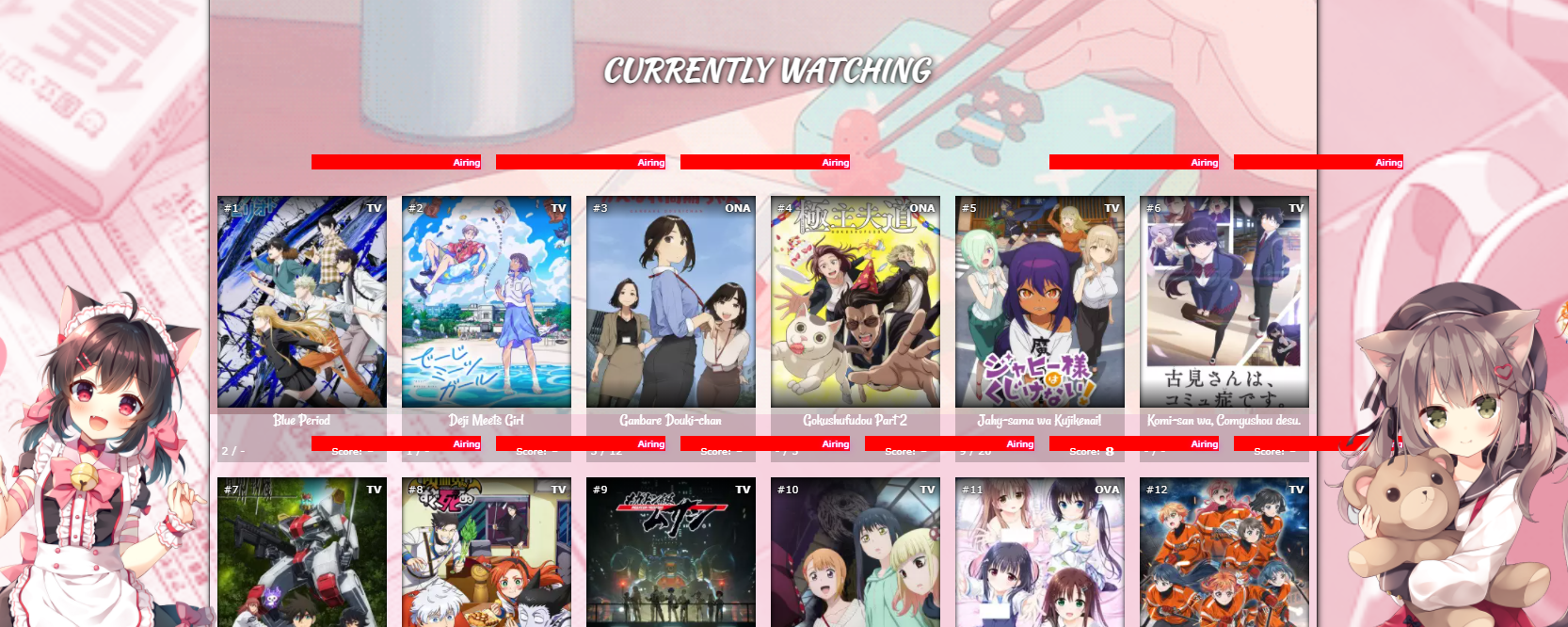 Then please delete that new code and paste this to the bottom- does it remove the glitch? If so then it's definitely these parts glitching out. (this code is also meant to be temporary) .list-table .list-table-data .data.title .content-status, .list-table .list-table-data .data.title .rereading, .list-table .list-table-data .data.title .rewatching { display: none !important } |
Oct 8, 2021 2:40 AM
#202
Shishio-kun said: @itsmelemongee I think I found the issue after I thought of something, disregard my last post. It seems to be something to do with the Airing section which is bugging out now for some reason. Please paste this code to your CSS at the bottom (it would be temporary), it should turn the airing sections red and make them visible at all times; when you point to them, do you see the glitch? .list-table .list-table-data .data.title .content-status, .list-table .list-table-data .data.title .rereading, .list-table .list-table-data .data.title .rewatching { background-color: red !important; opacity: 1 !important; } Your CW should look something like this, and those red sections are bugging out for me in preview and on my own list although its not exactly what you're seeing. I want to make sure the glitch you're seeing is actually due to these red parts which are normally invisible (and shouldn't be there lol, so this needs to be patched later).  Then please delete that new code and paste this to the bottom- does it remove the glitch? If so then it's definitely these parts glitching out. (this code is also meant to be temporary) .list-table .list-table-data .data.title .content-status, .list-table .list-table-data .data.title .rereading, .list-table .list-table-data .data.title .rewatching { display: none !important } When hovering over the red parts the glitch appeared and the areas in which the red parts are seem to line up exactly with the areas where the glitch appears. The other code actually did remove the glitch! :D So that seems to be the problem I'm not sure if i mentioned this or not, but the glitch didn't appear on every entry on the list and didn't appear at all on my completed or plan to watch lists (not that I noticed anyway), which would be explained by the error lying with the airing parts If I haven't mentioned it then I'm sorry, I didn't realize it would be important :') |
soft-bean_sasakiOct 8, 2021 2:48 AM
Oct 8, 2021 12:10 PM
#203
itsmelemongee said: Shishio-kun said: @itsmelemongee I think I found the issue after I thought of something, disregard my last post. It seems to be something to do with the Airing section which is bugging out now for some reason. Please paste this code to your CSS at the bottom (it would be temporary), it should turn the airing sections red and make them visible at all times; when you point to them, do you see the glitch? .list-table .list-table-data .data.title .content-status, .list-table .list-table-data .data.title .rereading, .list-table .list-table-data .data.title .rewatching { background-color: red !important; opacity: 1 !important; } Your CW should look something like this, and those red sections are bugging out for me in preview and on my own list although its not exactly what you're seeing. I want to make sure the glitch you're seeing is actually due to these red parts which are normally invisible (and shouldn't be there lol, so this needs to be patched later).  Then please delete that new code and paste this to the bottom- does it remove the glitch? If so then it's definitely these parts glitching out. (this code is also meant to be temporary) .list-table .list-table-data .data.title .content-status, .list-table .list-table-data .data.title .rereading, .list-table .list-table-data .data.title .rewatching { display: none !important } When hovering over the red parts the glitch appeared and the areas in which the red parts are seem to line up exactly with the areas where the glitch appears. The other code actually did remove the glitch! :D So that seems to be the problem I'm not sure if i mentioned this or not, but the glitch didn't appear on every entry on the list and didn't appear at all on my completed or plan to watch lists (not that I noticed anyway), which would be explained by the error lying with the airing parts If I haven't mentioned it then I'm sorry, I didn't realize it would be important :') OK I'll patch this sometime in the near future to fix it (when I understand it better). The change should be sent automatically to everyone's layout :D |
Oct 8, 2021 12:11 PM
#204
Shishio-kun said: itsmelemongee said: Shishio-kun said: @itsmelemongee I think I found the issue after I thought of something, disregard my last post. It seems to be something to do with the Airing section which is bugging out now for some reason. Please paste this code to your CSS at the bottom (it would be temporary), it should turn the airing sections red and make them visible at all times; when you point to them, do you see the glitch? .list-table .list-table-data .data.title .content-status, .list-table .list-table-data .data.title .rereading, .list-table .list-table-data .data.title .rewatching { background-color: red !important; opacity: 1 !important; } Your CW should look something like this, and those red sections are bugging out for me in preview and on my own list although its not exactly what you're seeing. I want to make sure the glitch you're seeing is actually due to these red parts which are normally invisible (and shouldn't be there lol, so this needs to be patched later).  Then please delete that new code and paste this to the bottom- does it remove the glitch? If so then it's definitely these parts glitching out. (this code is also meant to be temporary) .list-table .list-table-data .data.title .content-status, .list-table .list-table-data .data.title .rereading, .list-table .list-table-data .data.title .rewatching { display: none !important } When hovering over the red parts the glitch appeared and the areas in which the red parts are seem to line up exactly with the areas where the glitch appears. The other code actually did remove the glitch! :D So that seems to be the problem I'm not sure if i mentioned this or not, but the glitch didn't appear on every entry on the list and didn't appear at all on my completed or plan to watch lists (not that I noticed anyway), which would be explained by the error lying with the airing parts If I haven't mentioned it then I'm sorry, I didn't realize it would be important :') OK I'll patch this sometime in the near future to fix it (when I understand it better). The change should be sent automatically to everyone's layout :D all right, thanks so much for the help! |
Oct 9, 2021 7:16 PM
#205
| Hello! It's my first time using CSS and I need some help personalizing my list, I don't know if this is the correct forum to ask for it, but if anyone could help me I would be really glad! So, I want to lower the first row of animes in order to see the whole cover image. Is there a way to do that? See the image below:  Thanks! |
Oct 9, 2021 7:49 PM
#206
Endless_end said: Hello! It's my first time using CSS and I need some help personalizing my list, I don't know if this is the correct forum to ask for it, but if anyone could help me I would be really glad! So, I want to lower the first row of animes in order to see the whole cover image. Is there a way to do that? See the image below:  Thanks! It says how under: /*MOVE COVER PICS UP OR DOWN in the CSS code. Check your code or the opening post for any future questions |
Oct 9, 2021 8:01 PM
#207
Shishio-kun said: Endless_end said: Hello! It's my first time using CSS and I need some help personalizing my list, I don't know if this is the correct forum to ask for it, but if anyone could help me I would be really glad! So, I want to lower the first row of animes in order to see the whole cover image. Is there a way to do that? See the image below:  Thanks! It says how under: /*MOVE COVER PICS UP OR DOWN in the CSS code. Check your code or the opening post for any future questions Shishio-kun I'm really sorry. I was using an older version of the code. Just copied it again. Either way, thank you so much. I really appreciate your work!!! |
Oct 9, 2021 8:07 PM
#208
Endless_end said: Shishio-kun said: Endless_end said: Hello! It's my first time using CSS and I need some help personalizing my list, I don't know if this is the correct forum to ask for it, but if anyone could help me I would be really glad! So, I want to lower the first row of animes in order to see the whole cover image. Is there a way to do that? See the image below:  Thanks! It says how under: /*MOVE COVER PICS UP OR DOWN in the CSS code. Check your code or the opening post for any future questions Shishio-kun I'm really sorry. I was using an older version of the code. Just copied it again. Either way, thank you so much. I really appreciate your work!!! I checked your list and saw you weren't using the layout at all, so I figured you were using the new one not an old one You can still use the old code if you want, and add extensions from the opening post to it for some of the features of the new version (like moving the cover pics down). |
Oct 9, 2021 8:14 PM
#209
Shishio-kun said: Endless_end said: Shishio-kun said: Endless_end said: Hello! It's my first time using CSS and I need some help personalizing my list, I don't know if this is the correct forum to ask for it, but if anyone could help me I would be really glad! So, I want to lower the first row of animes in order to see the whole cover image. Is there a way to do that? See the image below:  Thanks! It says how under: /*MOVE COVER PICS UP OR DOWN in the CSS code. Check your code or the opening post for any future questions Shishio-kun I'm really sorry. I was using an older version of the code. Just copied it again. Either way, thank you so much. I really appreciate your work!!! I checked your list and saw you weren't using the layout at all, so I figured you were using the new one not an old one You can still use the old code if you want, and add extensions from the opening post to it for some of the features of the new version (like moving the cover pics down). Ahh that's because I'm still working on getting it done before using it. I got the first code last year I think, but never had the time to customize it, that's what happened. But thank you for the advice, I will do that!! (I accidentally saw your last comment on Valerio_Lyndon profile, I hope you get better soon!) |
Oct 10, 2021 3:01 PM
#210
Endless_end said: Shishio-kun said: Endless_end said: Shishio-kun said: Endless_end said: Hello! It's my first time using CSS and I need some help personalizing my list, I don't know if this is the correct forum to ask for it, but if anyone could help me I would be really glad! So, I want to lower the first row of animes in order to see the whole cover image. Is there a way to do that? See the image below:  Thanks! It says how under: /*MOVE COVER PICS UP OR DOWN in the CSS code. Check your code or the opening post for any future questions Shishio-kun I'm really sorry. I was using an older version of the code. Just copied it again. Either way, thank you so much. I really appreciate your work!!! I checked your list and saw you weren't using the layout at all, so I figured you were using the new one not an old one You can still use the old code if you want, and add extensions from the opening post to it for some of the features of the new version (like moving the cover pics down). Ahh that's because I'm still working on getting it done before using it. I got the first code last year I think, but never had the time to customize it, that's what happened. But thank you for the advice, I will do that!! (I accidentally saw your last comment on Valerio_Lyndon profile, I hope you get better soon!) Thanks :D |
Oct 11, 2021 3:43 PM
#211
| Hello :D I got a few questions about the clarity layout that I haven't found any answers to and couldn't figure out on my own (I'm using the dark one) 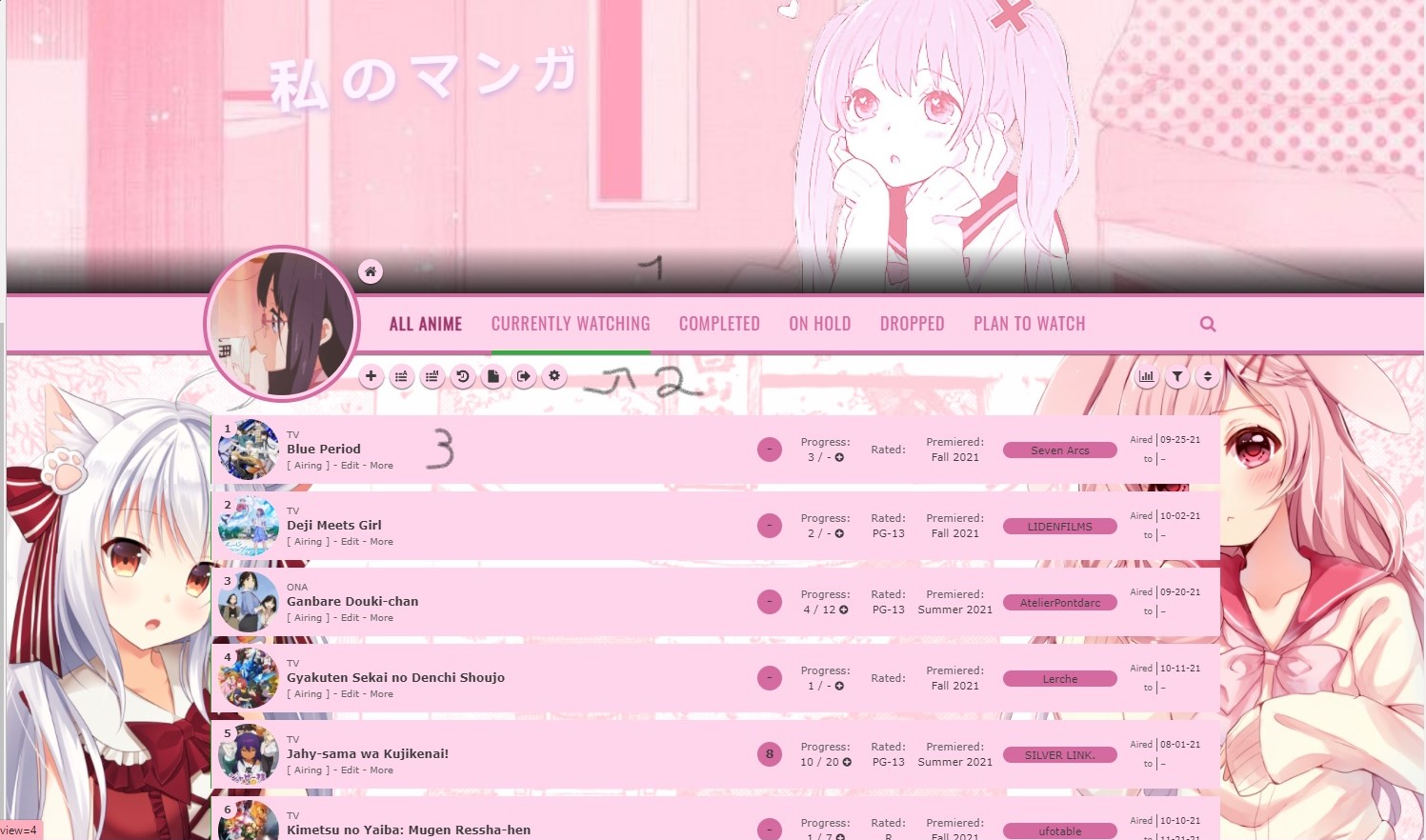 I numbered the image so my questions are hopefully easy to follow :-) Okay so 1st, is there a way to remove that shadow? I tried playing around with the list colours but nothing seemed to get rid of it so I thought I'd just ask ^^ 2nd: managed to solve this on my own :D And lastly, can I make the actual list rows (maybe also the header) a little more transparent? I couldn't find this in the code, or maybe I overlooked it, I'm not sure. I appreciate any help and I hope you're having a nice day/night/evening/afternoon or whatever time it is for you right now >u< |
soft-bean_sasakiOct 12, 2021 9:38 AM
Oct 12, 2021 11:41 AM
#212
itsmelemongee said: Hello :D I got a few questions about the clarity layout that I haven't found any answers to and couldn't figure out on my own (I'm using the dark one)  I numbered the image so my questions are hopefully easy to follow :-) Okay so 1st, is there a way to remove that shadow? I tried playing around with the list colours but nothing seemed to get rid of it so I thought I'd just ask ^^ 2nd: managed to solve this on my own :D And lastly, can I make the actual list rows (maybe also the header) a little more transparent? I couldn't find this in the code, or maybe I overlooked it, I'm not sure. I appreciate any help and I hope you're having a nice day/night/evening/afternoon or whatever time it is for you right now >u< add .cover-block:before { background: transparent; } There's a Clarity theme with the transparent rows already, can you just use that and change the colors from there? You also might be able to find what codes make them transparent in that layout and you can add them to yours, and you can put your layout and the transparent row layout in diffchecker and see the differences, one of those differences might show you what the transparent row codes are |
Oct 12, 2021 12:19 PM
#213
Shishio-kun said: itsmelemongee said: Hello :D I got a few questions about the clarity layout that I haven't found any answers to and couldn't figure out on my own (I'm using the dark one)  I numbered the image so my questions are hopefully easy to follow :-) Okay so 1st, is there a way to remove that shadow? I tried playing around with the list colours but nothing seemed to get rid of it so I thought I'd just ask ^^ 2nd: managed to solve this on my own :D And lastly, can I make the actual list rows (maybe also the header) a little more transparent? I couldn't find this in the code, or maybe I overlooked it, I'm not sure. I appreciate any help and I hope you're having a nice day/night/evening/afternoon or whatever time it is for you right now >u< add .cover-block:before { background: transparent; } There's a Clarity theme with the transparent rows already, can you just use that and change the colors from there? You also might be able to find what codes make them transparent in that layout and you can add them to yours, and you can put your layout and the transparent row layout in diffchecker and see the differences, one of those differences might show you what the transparent row codes are Thank you very much, I figured it out :) |
Nov 17, 2021 6:57 AM
#214
| On my list: Clarity (Dark, 6 Themes) for some reason the icons for returning to the home, quick add and sort by have suddenly blacked themselves out. This happened after I changed some of my settings to no longer show start date, end date, total days watched and demographic, etc so I assume that was the reason. Does anyone know any solutions? |
Nov 18, 2021 7:40 AM
#215
| @epicpunnyname The problem is related to Font Awesome and Shishio-kun is trying to find the answer now. https://myanimelist.net/forum/?topicid=1973079 |
Nov 18, 2021 11:37 AM
#216
@epicpunnyname try adding this to your layout, underneath whatever imports are in your design. It fixes the Takana layout I tested it myself, and it might fix yours but it could also matter where you put it. I don't think other users can see it only the list user for now, still looking into things so more info later via a newsletter probably with a better solution unless the MAL devs use my fix hopefully they do @font-face{ font-display:block; font-family:'FontAwesome'; src:url(/fonts/fa6/fa-regular-400.woff2) format("woff2"),url(/fonts/fa6/fa-regular-400.ttf) format("truetype")} |
Shishio-kunNov 18, 2021 11:41 AM
Nov 18, 2021 12:48 PM
#217
Shishio-kun said: It works well, everything other than the quick add button (which is still an X in square brackets) seems to have been fixed@epicpunnyname try adding this to your layout, underneath whatever imports are in your design. It fixes the Takana layout I tested it myself, and it might fix yours but it could also matter where you put it. I don't think other users can see it only the list user for now, still looking into things so more info later via a newsletter probably with a better solution unless the MAL devs use my fix hopefully they do @font-face{ font-display:block; font-family:'FontAwesome'; src:url(/fonts/fa6/fa-regular-400.woff2) format("woff2"),url(/fonts/fa6/fa-regular-400.ttf) format("truetype")} |
Nov 18, 2021 10:18 PM
#218
@epicpunnyname Yeah I installed a Clarity and saw that too You can delete the patch now since MAL actually repaired it on their end which I was not expecting, but since you're using a Clarity Valerio_Lyndon may apply some updates for the change so check later this week, but let us know if the icons still don't look right then (they should soon, if not now when you read this). Both MAL an V.L. can send updates to your list so they're changing things atm |
Dec 3, 2021 9:07 AM
#219
| Hey, I'm using one of the Wide-Banner Grid Layouts and the + button to add a new episode seems to have stopped working (doesn't do anything when I hover over it, and when I click it the edit window opens). Pretty sure it was working a week or so ago, and I haven't made any changes to my list in that time. Not sure what happened. I tried going back to the original code (although I didn't make any changes other than adding the dark theme stuff and a few text colors) and it wasn't working there either. Any ideas? |
Dec 4, 2021 1:30 AM
#220
-Shanigami- said: Hey, I'm using one of the Wide-Banner Grid Layouts and the + button to add a new episode seems to have stopped working (doesn't do anything when I hover over it, and when I click it the edit window opens). Pretty sure it was working a week or so ago, and I haven't made any changes to my list in that time. Not sure what happened. I tried going back to the original code (although I didn't make any changes other than adding the dark theme stuff and a few text colors) and it wasn't working there either. Any ideas? I'm guessing this whole layout needs to be updated and repaired with a patch, I have to get to it later this year |
Dec 4, 2021 5:28 AM
#221
Shishio-kun said: I'm guessing this whole layout needs to be updated and repaired with a patch, I have to get to it later this year Ah, I see. Well good luck with getting that fixed, I can work around the issue for now but I'll be glad when it's back to normal. |
Jan 22, 2022 7:58 PM
#222
| Hi, I am using the Clarity Dark Window 6 Themes layout and I'm having difficulty centering the banner background image. Anyone have some code I could add in so I can center my banner background? |
Jan 24, 2022 7:52 AM
#223
| Does anyone know if you are able to get the small colors next to an anime indicating if you are watching them, completed them etc a bit wider? Its kinda hard to see now and i would prefer just a few mm wider so its easier to see |
 • AMQ: StephWeeb • Discord: drsteph • Join me on AnimeMusicQuiz! |
Jan 24, 2022 8:19 AM
#224
Arkitekt said: Hi, I am using the Clarity Dark Window 6 Themes layout and I'm having difficulty centering the banner background image. Anyone have some code I could add in so I can center my banner background? So with yours, there's a few things you can do from what I see, add the code below to the bottom of your CSS and it will raise the banner image up a bit if that's what you mean by centering. You can change the 70% after background position to a different number until its set where you want. A higher percentage should raise and lower would lower it. The 0% on the left isn't going to change anything for now in this case so I don't think it needs to be adjusted. .cover-block{ background-position: 0% 70% !important; top: 0px; left: 0px; background-size: 100%; } The other numbers can affect the banner image too but I don't think you'll need to use them, the top and left amount can move it a bit with higher px amounts (like 20px) or negative px amounts (like -20px). And if you want to zoom in you can change the 100% after background size to a higher percentage. |
Jan 24, 2022 8:22 AM
#225
StephWeeb said: Does anyone know if you are able to get the small colors next to an anime indicating if you are watching them, completed them etc a bit wider? Its kinda hard to see now and i would prefer just a few mm wider so its easier to see Nice layout! :D Yeah, the codes for this are these, you copy and paste them to the bottom of your CSS /* STATUS COLORS IN FRONT OF ROW */ .list-table .list-table-data .data.status.reading, .list-table .list-table-data .data.status.watching{ width: 5px !important; } .list-table .list-table-data .data.status.completed{ width: 5px !important; } .list-table .list-table-data .data.status.onhold{ width: 5px !important; } .list-table .list-table-data .data.status.onhold{ width: 5px !important; } .list-table .list-table-data .data.status.dropped{ width: 5px !important; } .list-table .list-table-data .data.status.plantowatch,.list-table .list-table-data .data.status.plantoread{ width: 5px !important; } all the codes for a list layout can be found here but its a bit overwhelming https://myanimelist.net/forum/?topicid=1929120 |
Jan 24, 2022 8:29 AM
#226
Shishio-kun said: StephWeeb said: Does anyone know if you are able to get the small colors next to an anime indicating if you are watching them, completed them etc a bit wider? Its kinda hard to see now and i would prefer just a few mm wider so its easier to see Nice layout! :D Yeah, the codes for this are these, you copy and paste them to the bottom of your CSS /* STATUS COLORS IN FRONT OF ROW */ .list-table .list-table-data .data.status.reading, .list-table .list-table-data .data.status.watching{ width: 5px !important; } .list-table .list-table-data .data.status.completed{ width: 5px !important; } .list-table .list-table-data .data.status.onhold{ width: 5px !important; } .list-table .list-table-data .data.status.onhold{ width: 5px !important; } .list-table .list-table-data .data.status.dropped{ width: 5px !important; } .list-table .list-table-data .data.status.plantowatch,.list-table .list-table-data .data.status.plantoread{ width: 5px !important; } all the codes for a list layout can be found here but its a bit overwhelming https://myanimelist.net/forum/?topicid=1929120 Thank you so much, this is perfect. |
 • AMQ: StephWeeb • Discord: drsteph • Join me on AnimeMusicQuiz! |
Jan 24, 2022 10:41 PM
#227
Shishio-kun said: Thanks, that helped a lot. I appreciate it.Arkitekt said: Hi, I am using the Clarity Dark Window 6 Themes layout and I'm having difficulty centering the banner background image. Anyone have some code I could add in so I can center my banner background? So with yours, there's a few things you can do from what I see, add the code below to the bottom of your CSS and it will raise the banner image up a bit if that's what you mean by centering. You can change the 70% after background position to a different number until its set where you want. A higher percentage should raise and lower would lower it. The 0% on the left isn't going to change anything for now in this case so I don't think it needs to be adjusted. .cover-block{ background-position: 0% 70% !important; top: 0px; left: 0px; background-size: 100%; } The other numbers can affect the banner image too but I don't think you'll need to use them, the top and left amount can move it a bit with higher px amounts (like 20px) or negative px amounts (like -20px). And if you want to zoom in you can change the 100% after background size to a higher percentage. |
Mar 8, 2022 12:40 PM
#228
| I'm using Grid Style 1 and I was wondering if it is possible to have different category buttons pics depending on which category is being viewed at the moment. E.g. while viewing all anime on my list, category buttons would be Gintama themed, while viewing dropped category, category buttons would be Berserk themed, and so on. If it's possible, could someone help me doing so? |
Mar 9, 2022 12:40 AM
#229
AlexMasterOtakuP said: I'm using Grid Style 1 and I was wondering if it is possible to have different category buttons pics depending on which category is being viewed at the moment. E.g. while viewing all anime on my list, category buttons would be Gintama themed, while viewing dropped category, category buttons would be Berserk themed, and so on. If it's possible, could someone help me doing so? Yes this is possible, if a bit clunky to do. You can select the individual links based on which one is "active" For example: .status-button.all_anime.on + .status-button.watching selects the watching button if you are on the all page and .status-button.all_anime ~ .status-button.watching.on selects the all button if you are on the watching page. It does this by selecting each link in relation to the active one. + selects an element of the following type tht is place immediately after the first type (which means you have to stack them, e.g. a + b + c) ~ selects an element of the following typ that preceds the first type. I don't know for sure if it must be immediately preceding or not so this one might be a bit less clunky to write. That is the short version, let me know if you need any more help understanding it :3 PS yes this also means you will have to write 18 different selectors to affect all the buttons PPS you select the current pages button using .status-button.*inserrt current page*.on |
Mar 11, 2022 9:22 AM
#230
Pico-tan said: AlexMasterOtakuP said: I'm using Grid Style 1 and I was wondering if it is possible to have different category buttons pics depending on which category is being viewed at the moment. E.g. while viewing all anime on my list, category buttons would be Gintama themed, while viewing dropped category, category buttons would be Berserk themed, and so on. If it's possible, could someone help me doing so? Yes this is possible, if a bit clunky to do. You can select the individual links based on which one is "active" For example: .status-button.all_anime.on + .status-button.watching selects the watching button if you are on the all page and .status-button.all_anime ~ .status-button.watching.on selects the all button if you are on the watching page. It does this by selecting each link in relation to the active one. + selects an element of the following type tht is place immediately after the first type (which means you have to stack them, e.g. a + b + c) ~ selects an element of the following typ that preceds the first type. I don't know for sure if it must be immediately preceding or not so this one might be a bit less clunky to write. That is the short version, let me know if you need any more help understanding it :3 PS yes this also means you will have to write 18 different selectors to affect all the buttons PPS you select the current pages button using .status-button.*inserrt current page*.on Thank you, I managed to do it. |
Apr 24, 2022 12:04 AM
#231
| Is there a way to make the stats list "on" as default? Or permanent? Any way that'll make it be there without having to click. |
Apr 25, 2022 9:10 AM
#232
Calipup said: Is there a way to make the stats list "on" as default? Or permanent? Any way that'll make it be there without having to click. .list-stats { display: block !important; }.stats a:first-of-type { display: none !important; } |
ShaggyZEApr 25, 2022 9:16 AM
Apr 25, 2022 11:51 PM
#233
ShaggyZE said: Calipup said: Is there a way to make the stats list "on" as default? Or permanent? Any way that'll make it be there without having to click. .list-stats { display: block !important; }.stats a:first-of-type { display: none !important; }Thank you very much :) |
May 16, 2022 2:05 PM
#234
| Hi Uh, so I'm using the Minimal Dashboard layout by 5cm (Dark Transparent Version) and I want to know if i can make the side panel look complete like it does on the white version Dark Version (mine) 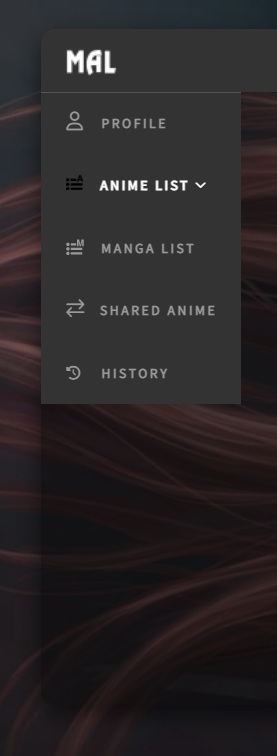 White Version (original) 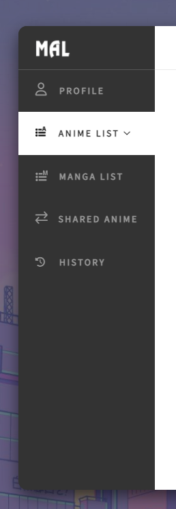 |
May 16, 2022 7:45 PM
#235
Rejuvenated said: Hi Uh, so I'm using the Minimal Dashboard layout by 5cm (Dark Transparent Version) and I want to know if i can make the side panel look complete like it does on the white version Dark Version (mine) https://i.imgur.com/UBobuyw.png White Version (original) https://i.imgur.com/af1uOpP.png Find the background property on line 34:  Change the value to this: linear-gradient(to right, #333 160px, rgba(5,5,5,.5) 160px) Here's how it should look afterwards.  |
May 16, 2022 8:57 PM
#236
Valerio_Lyndon said: Hey thanks a lot! It worked like a charm!Rejuvenated said: Hi Uh, so I'm using the Minimal Dashboard layout by 5cm (Dark Transparent Version) and I want to know if i can make the side panel look complete like it does on the white version Dark Version (mine) https://i.imgur.com/UBobuyw.png White Version (original) https://i.imgur.com/af1uOpP.png Find the background property on line 34:  Change the value to this: linear-gradient(to right, #333 160px, rgba(5,5,5,.5) 160px) Here's how it should look afterwards.  |
May 19, 2022 10:01 PM
#237
| Hiya! Me again. I've been screwing around with Valerio_Lyndon's "Clarity" layout, and I've been wondering if there's any way to make the anime cover images into rectangles like the ones on the default mal lists (preferably with rounded corners) instead of the circle ones. Thanks. |
May 19, 2022 10:48 PM
#238
Rejuvenated said: Hiya! Me again. I've been screwing around with Valerio_Lyndon's "Clarity" layout, and I've been wondering if there's any way to make the anime cover images into rectangles like the ones on the default mal lists (preferably with rounded corners) instead of the circle ones. Thanks. For corners it's a simple matter of changing the border-radius property. A lot of these simple properties can be found and altered by using Inspect Element. /* Small images */
.data.image a::after, .data.image img {
border-radius: 0px;
}
/* Large images */
.data.image a::before {
border-radius: 0px;
}If you want to change it back to a rectangle it will require changing the widths and heights of a few properties, so it takes a minute more if it's your first time. This code also changes the border-radius. Here's code with both of those changes: 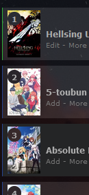 /* Small images */
.data.image,
.data.image a::after,
.data.image img {
border-radius: 0px;
width: 48px !important;
height: 68px !important;
}
/* Large images */
.data.image a::before {
border-radius: 0px;
} |
May 21, 2022 11:56 PM
#239
Valerio_Lyndon said: Hey! This really helps. Thanks a bunch!Rejuvenated said: Hiya! Me again. I've been screwing around with Valerio_Lyndon's "Clarity" layout, and I've been wondering if there's any way to make the anime cover images into rectangles like the ones on the default mal lists (preferably with rounded corners) instead of the circle ones. Thanks. For corners it's a simple matter of changing the border-radius property. A lot of these simple properties can be found and altered by using Inspect Element. /* Small images */
.data.image a::after, .data.image img {
border-radius: 0px;
}
/* Large images */
.data.image a::before {
border-radius: 0px;
}If you want to change it back to a rectangle it will require changing the widths and heights of a few properties, so it takes a minute more if it's your first time. This code also changes the border-radius. Here's code with both of those changes:  /* Small images */
.data.image,
.data.image a::after,
.data.image img {
border-radius: 0px;
width: 48px !important;
height: 68px !important;
}
/* Large images */
.data.image a::before {
border-radius: 0px;
} |
May 22, 2022 9:25 PM
#240
| for the grid style one, how do i get rid of the banner? I want the "all anime" text to be close to the buttons on the top but i don't know how to do that |
May 23, 2022 7:48 AM
#241
ParaNoClue said: for the grid style one, how do i get rid of the banner? I want the "all anime" text to be close to the buttons on the top but i don't know how to do that You're using an outdated version, the codes in the opening post are updated to fix a lot of errors, went over it here a while back https://myanimelist.net/forum/?topicid=1926193 But for this original version you have now, you can add this to the bottom to remove the banner + move the cover pics up /* ADJUST BANNER HEIGHT */ /*ALL ANIME/MANGA BANNER BACKGROUND*/ .list-unit.all_anime .list-status-title:after { height: 0px !important; } /*CURRENTLY WATCHING BANNER BACKGROUND*/ .list-unit.watching .list-status-title:after, .list-unit.reading .list-status-title:after { height: 0px !important; } /*COMPLETED BANNER BACKGROUND*/ .list-unit.completed .list-status-title:after { height: 0px !important; } /*ON-HOLD BANNER BACKGROUND*/ .list-unit.onhold .list-status-title:after { height: 0px !important; } /*DROPPED BANNER BACKGROUND*/ .list-unit.dropped .list-status-title:after { height: 0px !important; } /*PLAN TO BANNER BACKGROUND*/ .list-unit.plantowatch .list-status-title:after, .list-unit.plantoread .list-status-title:after { height: 0px !important; } /* MOVE COVER PICS UP OR DOWN Increase 0px to a higher amount like 100px to move the anime preview pics and header (Completed, etc) down. -480px brings them up to the banner buttons. */ .list-unit .list-status-title .text, .list-item{ top: -450px;} |
May 23, 2022 11:23 AM
#242
| thank you! |
May 29, 2022 12:29 AM
#243
| When I try the box shadow code (golden glow) it doesn't do anything. I tried pasting it exactly as it said but nothing happens. |
 |
May 29, 2022 11:05 AM
#244
ColCasey said: When I try the box shadow code (golden glow) it doesn't do anything. I tried pasting it exactly as it said but nothing happens. Post the code with the golden glow changes you made in a pastebin file, so I can look at it https://pastebin.com/ Or if the codes are on your anime list currently let me know and I'll look at it there Also let me know what anime you're trying to highlight and what category page its on (Current, complete, etc) |
Jan 5, 2023 5:17 PM
#245
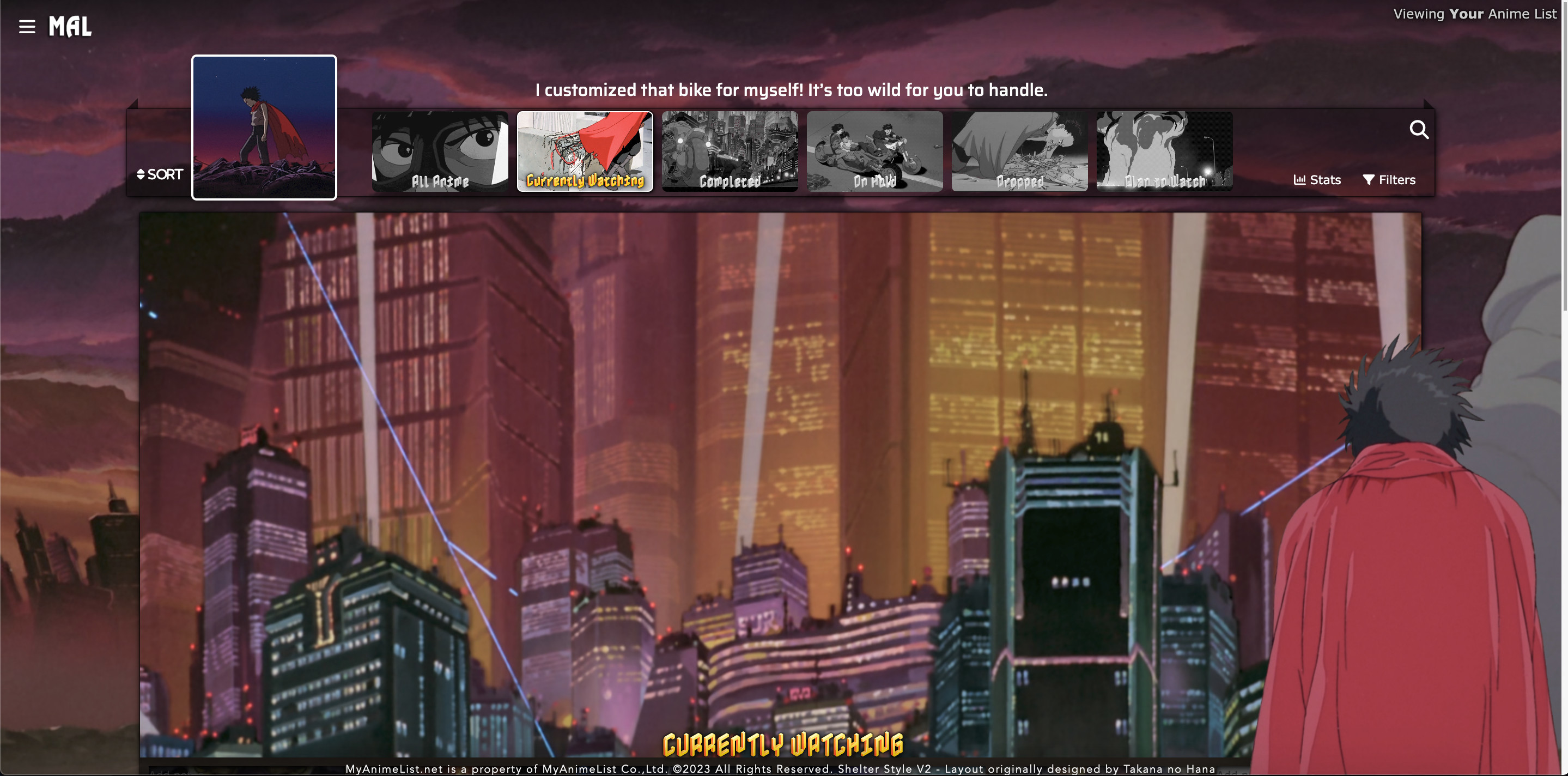 Made an Akira themed version of this skin just for fun and personal use, if anyone is interested... Copy the code here Works even when removing the grayscale code for the images coz I actually made gray thumbnails not knowing at the time that there was code for it. Know that it does work without the grayscale code, but the code also turns the text on the pictures gray so I left it in as it's nicer with gray text. The skin is basically exactly the same as the one shown in the video for customizing this skin, the only thing I changed in the end are the pictures including the cursor, the fonts and font sizes, I only have 2 imported fonts added in the above code and even left the old fonts in there, but I removed the fonts in my layout today, it doesn't need to import anything that isn't used, I guess that's cleaner. I made the bottom right png render myself because I couldn't find a suitable Akira render online, so that took a little time, but I'm very satisfied with the result. However I did upload a render that I found later on that might be interesting as replacement or even as a second one for the left side (https://images2.imgbox.com/2c/b7/Uel3VS9a_o.png), feel free to use it, you might want to resize it, I didn't change the original size as I did with the render I made. One thing I noticed in your video is that you simply put 2x gifs for each button which differs from the originally provided version in that your changed One Piece version would have continuously animating pictures even when not hovering over the pictures, I actually made grayscale picture of the first frame of the gifs, but I could have just left them in color. BTW, thanks a lot for sharing this skin and showing how to customize it, I like it a lot. |
omoeJan 6, 2023 2:53 AM
Jan 11, 2023 11:08 AM
#246
| How can I change the banner avatar on each page, I tried doing it and it didn't work |
Feb 6, 2023 10:44 PM
#247
Clarity (Dark Window, 6 Themes) My Add episode button are not workingFixed see below for solution if you have same problem |
ExonymosFeb 7, 2023 3:46 AM
 Well, well, well...look who decided to grace us with their presence! Hello, my friend. Well, well, well...look who decided to grace us with their presence! Hello, my friend. |
Feb 7, 2023 3:44 AM
#248
Exonymos said: Clarity (Dark Window, 6 Themes) My Add episode button are not working any fix for itFixed see below for solution if you have same problem Solution: If you have the similar problem with links on your list then just add this code to your CSS .data.progress, .data.chapter, .data.volume, .data.genre, .data.tags, .data.magazine, .data.season, .data.studio, .data.licensor, .data.storage, .data.demographic, .data.rated{
z-index: 5; !important
}It should work as expected now, I added all the classes which didn't worked If you have another class link not working just add the class in the code i provided |
 Well, well, well...look who decided to grace us with their presence! Hello, my friend. Well, well, well...look who decided to grace us with their presence! Hello, my friend. |
Mar 10, 2023 12:27 PM
#249
333anime said: How can I change the banner avatar on each page, I tried doing it and it didn't work Your list doesn't load for me, so I can't see if there's a fix. You'll have to let us know exactly what layout code you were using and what image links you were trying to use (links to the images on Imgur would be helpful). |
Mar 10, 2023 12:27 PM
#250
Exonymos said: Exonymos said: Clarity (Dark Window, 6 Themes) Fixed see below for solution if you have same problem Solution: If you have the similar problem with links on your list then just add this code to your CSS .data.progress, .data.chapter, .data.volume, .data.genre, .data.tags, .data.magazine, .data.season, .data.studio, .data.licensor, .data.storage, .data.demographic, .data.rated{
z-index: 5; !important
}It should work as expected now, I added all the classes which didn't worked If you have another class link not working just add the class in the code i provided Good job and thank you for updating your post! :D |
More topics from this board
» ❓ Ask for help here + See Frequently Asked Questions ( 1 2 3 4 5 ... Last Page )Shishio-kun - Apr 15, 2010 |
7812 |
by mtsRhea
»»
Apr 21, 5:25 AM |
|
» [CSS- MODERN] ⭐ Minimal Dashboard layout by 5cm ~ Compact and convenient! ( 1 2 3 )Shishio-kun - Sep 4, 2020 |
121 |
by Pokitaru
»»
Apr 21, 3:25 AM |
|
» [CSS-MODERN] Change list text/font colors on any list layoutShishio-kun - May 4, 2021 |
3 |
by hideso
»»
Apr 20, 4:33 PM |
|
» [CSS] [VIDEO GUIDE] ⭐️ How to change fonts on a list layoutShishio-kun - Jul 15, 2019 |
17 |
by hideso
»»
Apr 20, 4:03 PM |
|
» [CSS][Modern] ☀️ Endless Summer Layout by Cateinya ( 1 2 3 4 5 ... Last Page )Cateinya - Aug 18, 2016 |
309 |
by hideso
»»
Apr 20, 3:56 PM |

