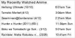
Forum Settings
Forums
New
Pages (35) « First ... « 3 4 [5] 6 7 » ... Last »
Jan 12, 2010 11:21 AM
Offline
Jun 2008
2785
Xinil, I really appreciate all the hard work you and everyone do for this site, but the new layout is extremely unfavourable to my eyes. I am not sure how navigation is at this moment, but I don't see what was wrong with the old style at all.

The profile layout is extremely wide and it honestly seems like a lot of wasted space. Now profiles look rather sparse, even ones laden with pictures and information.

I'm glad the old MAL logo is back, but that's about it.
Jan 12, 2010 11:21 AM

Offline
Dec 2008
1459
I don't like it.
Jan 12, 2010 11:21 AM

Offline
Mar 2008
468
It scares me more and more...too much space >.< space is evil and loads hard..not to say it's a hastle to navigate...T.T
Jan 12, 2010 11:22 AM

Offline
Jan 2008
52
if u just replace the logo it would be awesome!
the new bar is just great. and its made it 10 times more accessible for users and especially new user. Arigato :D
Jan 12, 2010 11:22 AM
Offline
Nov 2007
117
I think it's alright, probably get used to the navigation after awhile..

Dislike how HUGE the logo is.
Dislike the space to the right of the "Profile" button.
Like the width.
Dislike having to navigate to the forums. Maybe make it so when you click the "Community" button it brings you to the forum page.

Other than those I don't really mind the change.
Jan 12, 2010 11:22 AM

Offline
Oct 2008
502
Wow that scared me o.o
I think I need to get used to it.
Jan 12, 2010 11:22 AM
Offline
Jun 2008
1849
I for one, welcome this change. The new layout has a really nice look to it. Keep up the good work, Xinil.
Jan 12, 2010 11:22 AM

Offline
Jan 2008
219
Kira01 said:
Considering that Xinil had put lots of time into it for the past couple of weeks working on this new layout and design, I really do not want to say this but the new layout and design looks messed up. On the contrary, I don't dislike it either. Perhaps, the new layout prevents those inbox glitches from occurring since the panel is now in the top designed differently.


The design doesn't seem to reflect hard work though, which is why we're being critical.
Jan 12, 2010 11:22 AM

Offline
Jan 2009
346
I sleep... It's not true... MY EYES!!!!!
also:
LLOLL-kun said:
ВЕРНИТЕ НАВИГАЦИЮ СЛЕВА!!!

And why so big??? Is it fashionable ^^'' (I mean MYANIMELIST at the top)?
EinveraJan 12, 2010 11:27 AM

Jan 12, 2010 11:22 AM

Offline
Nov 2009
334
I thought my schools computer was loading the site wrong. lol

I don't really like it. We should have he option between choosing this and the old layout.
Jan 12, 2010 11:22 AM

Offline
Aug 2009
1657
I hate to say this but the new navigation bugs me out.

I prefer the old one because I have gotten used to it already. Plus, this new one seems to be bigger than the previous one. Everything is just big.
Jan 12, 2010 11:22 AM

Offline
May 2008
3861
I really apprechiate the work, but the old one was better. Well, maybe we'll get used to it.
Jan 12, 2010 11:23 AM

Offline
Jul 2008
3704
Hiina-tan said:
Bakayaro said:
Sadly, demanding only makes you look extremely childish.


I am a child. An angry child. Q w /Q
Let me rephrase that then.

Demanding makes you look like a snot-nosed, ungrateful, little shit. If you're going to say something, offer some form of constructive criticism. Offer some form of suggestion if you have any, but voice your opinions without actually attacking Xinil. Fact is, like it or not, the guy worked hard on this, and this website. You have to give him that.

"I'd suck you~" Berri||Desu Ne?
Jan 12, 2010 11:23 AM
Offline
Mar 2008
902
The menu on the top is annoying.
No, I don't like it.
Jan 12, 2010 11:24 AM

Offline
Mar 2009
600
I actually like it .. change is good ..


Jan 12, 2010 11:24 AM
Offline
Aug 2007
4166
Call me crazy, but shouldn't a user base be informed ahead of time before the admins go about mucking around with the layout? :|

I am too surprised by it to form a real opinion - yet.
Jan 12, 2010 11:24 AM

Offline
May 2009
416
Honestly, I dislike it. Strongly.

I apologize for being negative especially since it's been said that this took a lot of work and effort, but that won't change how I feel about it. I really hope we get at least the option to switch it back.
Jan 12, 2010 11:24 AM
Offline
Dec 2008
449
To those asking for an option to keep the old layout in addition to this new one: it would be kind of tricky in this case because some people will style their graphics (in, for example, Clubs or their About Me section) to fill this wider format, and those still using the narrow format will view it differently.

Personally I preferred more practical navigation of the older layout. I'm also against the idea of having different skins and themes, as they also impact the way graphics appear.

I'll get used to this one eventually but hopefully MAL will come up with a solution that everyone will be happy with.
Jan 12, 2010 11:24 AM

Offline
Apr 2008
8333
One problem with having an option to switch between the new layout and the old layout is that pixel widths (apparently?) are different between the two. This will obviously mean that there will be 'about me' and 'club info' section, hell even forum posts, that are only compatible with one layout and not another. This is not something that you want in a website.

lay down the law, xinil.

oh, and the ad below the menu still looks horribly out of place, no matter how long i look at it

Jan 12, 2010 11:24 AM

Offline
Dec 2008
222
I cant say i dislike the new design but I can say that I did like the menu thing that was on the left more than this menu thing on the top with the drop down menus and I liked how the login thing was right on the page to begin with instead of this new thing where you have to click on login to type in the stuff.

I use my laptop and my laptop has this finger scan thing where I just swipe my finger and it can put all the login information for me. Before I could just click on my favorites, come to the page and swipe my finger to log in and now I have to click on the login thing before swiping my finger.

Before you flame about the login thing, I know its lazy but I use it for everything and I like the way I could login before lol.
Jan 12, 2010 11:25 AM

Offline
Mar 2009
256
What a surprise lol, refreshed and a new theme appears. Personally I think it look alrighty, just need to get used to the navigation parts because Im used to look on the left side lol
Jan 12, 2010 11:25 AM

Offline
Aug 2009
938
LoveSong said:
I actually like it .. change is good ..


^ Agreed

I don't really mind the new navigation system either :)

Jan 12, 2010 11:25 AM

Offline
Jun 2009
122
The shortcuts on the left hand side were really handy, i'll miss them.
Jan 12, 2010 11:25 AM

Offline
Aug 2008
368
Drunk_Samurai said:
Tsurayu said:
Wow, is the profile width really such an issue? If you have pictures then you'll either just have to center them or redo them to accommodate a wider width. That seems like such a trivial and childish thing to complain about.

Like heaven forbid we seem some welcome changes in here if it screws up what is I'm sure a small percentage of user profiles.


Welcome changes? Quit smoking crack.


So you'd rather just see everything stagnate over the years? In that case the staff should never fixes a single issue. Other things have to change too. We can't just ask them to fix errors and then do nothing with the site itself. That screams of trying to have one's cake and eat it too.
Jan 12, 2010 11:25 AM
Offline
Sep 2009
150
eehh... i dunno if i like this. >_<; i definitely dislike the stark white...ness o.0; as for my first impression of it its *rage hate >=O* but... yeah i need to play around with it a bit more >.<;
Jan 12, 2010 11:25 AM

Offline
May 2009
939
Jan 12, 2010 11:25 AM

Offline
Jun 2009
1152
The menu navigation feels more like Myspace which i can get used to kinda.
Jan 12, 2010 11:26 AM

Offline
Apr 2008
490
Not a fan.
Jan 12, 2010 11:26 AM

Offline
May 2009
3818
I don't dislike it. It looks fine. I could get used to it.
Jan 12, 2010 11:26 AM

Offline
Oct 2007
239
I was quite surprised when I saw this change. It looks sleek, not sure how I like the navigation yet. Have to try it out more...Maybe different color templates might make things interesting?

Anyhow, nice job on trying to make the site look different. Although I was kind of happy with the old one.

Thanks.


Jan 12, 2010 11:26 AM

Offline
Jul 2008
3704
Also, Xin, when you log in, part of the new log in bubble is obscured by the Menu. Might be wise to move this down a couple of pixels.

"I'd suck you~" Berri||Desu Ne?
Jan 12, 2010 11:26 AM

Offline
Sep 2007
406
MEGATRON said:
I don't really mind the change, but mal logo at the top seems pretty giant in relation to everything else.


This.
Jan 12, 2010 11:27 AM

Offline
Oct 2008
21
There were issues to be fixed, for sure.

The site layout was not one of them.
Japanese cartoons and comics.
Jan 12, 2010 11:27 AM
Offline
Jan 2009
14
I prefer the old design. Or rather, I might just leave the site altogether. It's harder to navigate now… and I had a design I liked on stylish too… T_T wouldn't work with the new layout. Any possibility of switching back?

btw, is it because of the new layout or something? There's a glitch with my messages… says:
You have 65535 messages in your inbox. Displaying messages 1 - 20
Jan 12, 2010 11:27 AM

Offline
Feb 2008
1668
valesti said:
To those asking for an option to keep the old layout in addition to this new one: it would be kind of tricky in this case because some people will style their graphics (in, for example, Clubs or their About Me section) to fill this wider format, and those still using the narrow format will view it differently.

Personally I preferred more practical navigation of the older layout. I'm also against the idea of having different skins and themes, as they also impact the way graphics appear.

I'll get used to this one eventually but hopefully MAL will come up with a solution that everyone will be happy with.

So instead of forcing everyone to change, let's not change anything and go back to the old while other more important things can be updated.
Jan 12, 2010 11:27 AM

Offline
Sep 2008
430
RollingBox said:
34 said:
i dont like it :3
Yuuh said:
This new navigation annoys me x__x
RenaPsychoKiller said:
Hahaha. It's a joke, right?
Jan 12, 2010 11:27 AM

Offline
Jun 2009
122
The shortcuts on the left hand side were really handy, i'll miss them.
Jan 12, 2010 11:27 AM

Offline
Sep 2008
41
I like it. Really good job. Super desing and everything is clear.


Jan 12, 2010 11:27 AM

Offline
Sep 2008
918
TsubasaKnight said:
Good design, like it <3
Jan 12, 2010 11:27 AM
Offline
Apr 2008
48
Hmm, somebody didn't pay attention during the human interaction classes in web development school..

Navigation is indeed a big issue.
The drop down navigation looks slow and there is no clear seperation on the different items.

My web development toolbar is screaming at me with all kinds of error in the page (CSS and rendered XHTML)

Shame on you for using the Transitional Doctype instead of strict!!!!!!

I dunno, i would start by finding a better solution for the navigation.
After that, change the doctype to strict, and make sure it passes the CSS and XHTML W3C check. (If you dont know why.... )
Jan 12, 2010 11:27 AM

Offline
Feb 2008
5396
Bakayaro said:
Hiina-tan said:
Bakayaro said:
Sadly, demanding only makes you look extremely childish.


I am a child. An angry child. Q w /Q
Let me rephrase that then.

Demanding makes you look like a snot-nosed, ungrateful, little shit. If you're going to say something, offer some form of constructive criticism. Offer some form of suggestion if you have any, but voice your opinions without actually attacking Xinil. Fact is, like it or not, the guy worked hard on this, and this website. You have to give him that.
Just give up. The creature's obviously retarded.
Jan 12, 2010 11:27 AM

Offline
Oct 2008
3874
many ppl don't like menu on the top, so make one fixed on the left
Jan 12, 2010 11:28 AM
Offline
Aug 2007
4166
It's awkward and clunky and I miss the sidebar of quick links; it was a much easier way for me to navigate through the site. Now it reminds me of one of Livejournal's more crappier layouts. And that's not a good thing :<

Also, how is it that there's time enough to change the layout without user notice and yet not to at least address the recent obnoxious problems with server lag - especially with delayed comments, list lag and profile pictures not updating even after 3-4 days :|

I ♥ all the work you guys are doing, but prior notice would have also been nice.
Jan 12, 2010 11:28 AM
Offline
Feb 2009
217
Ah damn, this will take some time to adjust...
Jan 12, 2010 11:28 AM

Offline
Dec 2007
1471
I preferred the old style :/


-=Real, 100% Lelouch Lamperouge Zealot=-
Jan 12, 2010 11:28 AM

Offline
Mar 2009
3709
Bakayaro said:
Hiina-tan said:
Bakayaro said:
Sadly, demanding only makes you look extremely childish.


I am a child. An angry child. Q w /Q
Let me rephrase that then.

Demanding makes you look like a snot-nosed, ungrateful, little shit. If you're going to say something, offer some form of constructive criticism. Offer some form of suggestion if you have any, but voice your opinions without actually attacking Xinil. Fact is, like it or not, the guy worked hard on this, and this website. You have to give him that.


LOOOL I liked your response! ^^ I agree with you!
Jan 12, 2010 11:28 AM

Offline
Feb 2008
4350
Changes scare me.
Jan 12, 2010 11:28 AM

Offline
Oct 2007
3811
The old habits will die hard. I'll be wondering where most of the Left side went, but it's all cool.

More skins would be great and compatible with Style versions on Firefox too.

More bugs will come and go, but that's how things are.
Jan 12, 2010 11:28 AM

Offline
Aug 2008
368
Echelon said:
valesti said:
To those asking for an option to keep the old layout in addition to this new one: it would be kind of tricky in this case because some people will style their graphics (in, for example, Clubs or their About Me section) to fill this wider format, and those still using the narrow format will view it differently.

Personally I preferred more practical navigation of the older layout. I'm also against the idea of having different skins and themes, as they also impact the way graphics appear.

I'll get used to this one eventually but hopefully MAL will come up with a solution that everyone will be happy with.

So instead of forcing everyone to change, let's not change anything and go back to the old while other more important things can be updated.


Yeah, but what about the people who welcome a layout change?
Jan 12, 2010 11:29 AM

Offline
Mar 2008
414

Pages (35) « First ... « 3 4 [5] 6 7 » ... Last »

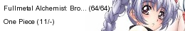
More topics from this board

» Related Anime/Manga Section Changes ( 1 2 3 )

Kineta - May 23

111 by CrazyButNot4U »»
Jun 29, 3:26 AM

» MAL Game "Fantasy Anime League" Opens for Spring 2024 ( 1 2 3 4 )

Kineta - Mar 17

152 by ponguo »»
Jun 27, 5:16 AM

» [Update May 24] Interest Stacks: New feature for custom theme lists and challenges ( 1 2 3 4 5 )

Kineta - Apr 6, 2022

206 by knktzvra »»
Jun 23, 11:11 PM

» [Challenge] You Should Read This Manga 2024 ( 1 2 3 4 5 )

Kineta - Feb 23

248 by MonEspritLibre »»
Jun 21, 11:45 PM

» English Titles Added to Desktop; Moving Towards a Romanized/English Toggle ( 1 2 3 )

Kineta - Feb 12, 2020

122 by Vaturna »»
Jun 10, 8:17 AM
It’s time to ditch the text file.
Keep track of your anime easily by creating your own list.
Sign Up Login