New
Sep 5, 2021 9:46 AM
#7151

zau said: Hey, is there any way I could add a small search icon in the corner of my list or smthg? Yeah, it was removed, but you can add a cute little search box back with this #mal_cs_powered {display: block !important; position: fixed !important; background-color: transparent !important; top: 0 !important;; right: 0 !important;} #mal_cs_powered #search{ background-color: transparent !important; } .lazyloaded{ display: none; } #mal_control_strip td{ border: none !important; } #mal_cs_powered #search #searchBox{ background: white 110px 40%/20px no-repeat url(https://image.myanimelist.net/ui/ueQLRyZL_yQZxD14iYLZC_gLr-mtem_jVqxnLpUY6LHlp_sr_ZwRrhNpbh7nV5sCeo7Sp3-sdxOAu1kTqLeHfW7i3YHTvUNvkDS5qKJPeIQyZ4XG2BGDzLdXX1QvKlrJ); } |
Sep 5, 2021 12:02 PM
#7152

Shishio-kun said: zau said: Hey, is there any way I could add a small search icon in the corner of my list or smthg? Yeah, it was removed, but you can add a cute little search box back with this #mal_cs_powered {display: block !important; position: fixed !important; background-color: transparent !important; top: 0 !important;; right: 0 !important;} #mal_cs_powered #search{ background-color: transparent !important; } .lazyloaded{ display: none; } #mal_control_strip td{ border: none !important; } #mal_cs_powered #search #searchBox{ background: white 110px 40%/20px no-repeat url(https://image.myanimelist.net/ui/ueQLRyZL_yQZxD14iYLZC_gLr-mtem_jVqxnLpUY6LHlp_sr_ZwRrhNpbh7nV5sCeo7Sp3-sdxOAu1kTqLeHfW7i3YHTvUNvkDS5qKJPeIQyZ4XG2BGDzLdXX1QvKlrJ); } Works great for my Anime list but for some reason I can't click it on my "manga" list. Is it because of the different list that I have on there? |
Sep 5, 2021 1:47 PM
#7153
zau said: Shishio-kun said: zau said: Hey, is there any way I could add a small search icon in the corner of my list or smthg? Yeah, it was removed, but you can add a cute little search box back with this #mal_cs_powered {display: block !important; position: fixed !important; background-color: transparent !important; top: 0 !important;; right: 0 !important;} #mal_cs_powered #search{ background-color: transparent !important; } .lazyloaded{ display: none; } #mal_control_strip td{ border: none !important; } #mal_cs_powered #search #searchBox{ background: white 110px 40%/20px no-repeat url(https://image.myanimelist.net/ui/ueQLRyZL_yQZxD14iYLZC_gLr-mtem_jVqxnLpUY6LHlp_sr_ZwRrhNpbh7nV5sCeo7Sp3-sdxOAu1kTqLeHfW7i3YHTvUNvkDS5qKJPeIQyZ4XG2BGDzLdXX1QvKlrJ); } Works great for my Anime list but for some reason I can't click it on my "manga" list. Is it because of the different list that I have on there? Yes they are two different layouts so the codes interact differently Add #mal_cs_powered{ top: 40px !important;;} |
Sep 5, 2021 2:13 PM
#7154
Shishio-kun said: zau said: Shishio-kun said: zau said: Hey, is there any way I could add a small search icon in the corner of my list or smthg? Yeah, it was removed, but you can add a cute little search box back with this #mal_cs_powered {display: block !important; position: fixed !important; background-color: transparent !important; top: 0 !important;; right: 0 !important;} #mal_cs_powered #search{ background-color: transparent !important; } .lazyloaded{ display: none; } #mal_control_strip td{ border: none !important; } #mal_cs_powered #search #searchBox{ background: white 110px 40%/20px no-repeat url(https://image.myanimelist.net/ui/ueQLRyZL_yQZxD14iYLZC_gLr-mtem_jVqxnLpUY6LHlp_sr_ZwRrhNpbh7nV5sCeo7Sp3-sdxOAu1kTqLeHfW7i3YHTvUNvkDS5qKJPeIQyZ4XG2BGDzLdXX1QvKlrJ); } Works great for my Anime list but for some reason I can't click it on my "manga" list. Is it because of the different list that I have on there? Yes they are two different layouts so the codes interact differently Add #mal_cs_powered{ top: 40px !important;;} Worked really well, thank you. |
Sep 5, 2021 8:18 PM
#7155

| Is there any way I can change the size of .list-table-data for only anime on plan to watch on the ALL anime page? And also add a section for Plan to watch only, like on MAL CAT /*-S-T-A-R-T--------------------*\ | Horizontal Tags R0.3-PTW-Status:6| \*------------------------------*/ .list-table-data {padding-bottom:11px} .data.plantowatch ~ .data.tags, .data.plantoread ~ .data.tags{position:absolute;left:0;top:0;display:flex !important;width:0;height:100%;padding:0!important;align-items:flex-end;} .data.plantowatch ~ .data.tags div, .data.plantoread ~ .data.tags div{max-width:980px!important;margin:0 0 4px 76px!important;font-size:0!important;white-space:nowrap!important} .data.plantowatch ~ .data.tags span, .data.plantoread ~ .data.tags span{display:inline-block!important;padding:0} .data.plantowatch ~ .data.tags span a, .data.plantoread ~ .data.tags span a {padding:1px 8px!important;margin:0 4px 0 0;white-space:nowrap} [data-query*='status":6'] .data.tags span a[href*="=Favo"]{padding:0!important} .data.plantowatch ~ .data.tags a.edit, .data.plantoread ~ .data.tags a.edit{right:-1052px!important} .data.plantowatch ~ .data.tags textarea,.data.plantoread ~ .data.tags textarea{right:-1060px!important} .data.plantowatch ~ .data.tags a:not(.edit), .data.plantoread ~ .data.tags a:not(.edit) { border-radius: 8.5px; /*color: var(--text)!important;*/ font-size: 10px!important; line-height: 15px; } I was using this before but just wanted to try something new /*-S-T-A-R-T--------------------*\
| Horizontal Tags R0.2-PTW-Status:6|
\*------------------------------*/
[data-query*='status":6']
.list-table-data{padding-bottom:11px}
[data-query*='status":6']
.data.tags{position:absolute;left:0;top:0;display:flex !important;width:0;height:100%;padding:0!important;align-items:flex-end;}
[data-query*='status":6']
.data.tags div{max-width:980px!important;margin:0 0 4px 76px!important;font-size:0!important;white-space:nowrap!important}
[data-query*='status":6']
.data.tags span{display:inline-block!important;padding:0}
[data-query*='status":6']
.data.tags span a{padding:1px 8px!important;margin:0 4px 0 0;white-space:nowrap}
[data-query*='status":6']
.data.tags span a[href*="=Favo"]{padding:0!important}
[data-query*='status":6']
.data.tags a.edit{right:-1052px!important}
[data-query*='status":6']
.data.tags textarea{right:-1060px!important}
[data-query*='status":6'].data.tags a:not(.edit) {
border-radius: 8.5px;
color: var(--text)!important;
font-size: 10px!important;
line-height: 15px;
}
/*------------------------E-N-D-*/ |
      |
Sep 5, 2021 10:28 PM
#7156

| Hey just wondering when i was watching this video of this https://youtu.be/cA0g4HkNLic about the separate layout for the manga can i use the images i used for the animelist for the manga list? |
 |
Sep 6, 2021 9:00 AM
#7157
ShadowOnyx01 said: Hey just wondering when i was watching this video of this https://youtu.be/cA0g4HkNLic about the separate layout for the manga can i use the images i used for the animelist for the manga list? You can use w/e images you want on the mangalist |
Sep 8, 2021 6:45 AM
#7158
| my anime list been pulling my hairs out as margin-bottom doesn't work on the table as a whole. i want the lines spaced, what do i do? (as i want to customize the border too i am avoiding border: px transparent solid) |
Sep 8, 2021 9:41 AM
#7159
Lightningreed said: my anime list been pulling my hairs out as margin-bottom doesn't work on the table as a whole. i want the lines spaced, what do i do? I don't understand what you want to do at all. There's too many ways to interpret your post. Can you do a visual example or more clear explanation of how the list will look when its "fixed"? Also look into editing your list with Inspect Element to do it yourself https://myanimelist.net/forum/?topicid=1499059#msg63378307 If you mean you want spacing between each anime row, then you can make list item a block then use margin bottom (is that what you were trying to add margin bottom to?) and manually space it, then reposition everything with the specific codes from here https://myanimelist.net/forum/?topicid=1929120
.list-item {
	display: block;
	margin-bottom: 20px;
}
The Kure layout does something like this and has some codes for this you should look at
.list-item {
	display: block;
	background: hsla(var(--content), 80%) !important;
	border-radius: 4px;
	margin-bottom: 30px;
	transition: background-color var(--transition-button);
	/*unused
	animation: slide-up 1.5s cubic-bezier(.16,.74,.59,1) 0s; */
}

.list-table-data,
.more-info[style*="block"] {
	position: relative;
	display: block !important;
	padding: 5px 15px 10px;
	border: none;
	align-items: center;
} .list-table-data {
	display: flex !important;
	min-height: 40px;
	padding: 0 80px 0 5px;
}

.list-table .list-table-data .data {
	display: block;
	padding: 0;
	margin-left: 10px;
	border: none;
	flex: 0 0 auto;
}
If you are trying to add margin bottom to the bottom of the entire list table as a whole to space it from the bottom stuff, then it looks like you can add margin to the loading space between the footer and list table
.list-unit .loading-space {
    margin: 32px;
}
If you mean spacing within the rows themselves increasing padding on data
.list-table .list-table-data .data {
    padding: 32px 0;
}
(as i want to customize the border too i am avoiding border: px transparent solid) Not sure what you mean by this but W3schools has all the ways you can customize a border |
Shishio-kunSep 8, 2021 10:15 AM
Sep 8, 2021 11:23 AM
#7160
Can you do a visual example or more clear explanation of how the list will look when its "fixed"? quite like this If you mean you want spacing between each anime row, then you can make list item a block then use margin bottom (is that what you were trying to add margin bottom to?) and manually space it, then reposition everything with the specific codes from here I did look into display:block, but i had no idea how to do the spacing. thought i spent a whole hour on w3s to read about display and stuff. also yeah this was the thing i was trying to do Not sure what you mean by this but W3schools has all the ways you can customize a border never mind this part, i didn't do thorough testing, that trick doesn't work very well. |
Sep 8, 2021 3:56 PM
#7161
Lightningreed said: Can you do a visual example or more clear explanation of how the list will look when its "fixed"? quite like this If you mean you want spacing between each anime row, then you can make list item a block then use margin bottom (is that what you were trying to add margin bottom to?) and manually space it, then reposition everything with the specific codes from here I did look into display:block, but i had no idea how to do the spacing. thought i spent a whole hour on w3s to read about display and stuff. also yeah this was the thing i was trying to do Not sure what you mean by this but W3schools has all the ways you can customize a border never mind this part, i didn't do thorough testing, that trick doesn't work very well.OK, then it sounds like you're all set for now :D |
Sep 9, 2021 7:18 AM
#7162
OK, then it sounds like you're all set for now :D well this didn't even last long lol, after successfully spacing the table, i tried to tweak the border: .list-item {border: 1px transparent solid} guess what? the page's framerate drops like by a half. any idea how to improve this? (edit: still has some performance drop but for whatever the heck reason it got better, tell me if you have any framerate issues at all, if not then i take it that it's my weak gpu, thanks) also i tried to change bg color based on category: .list-item .data.watching {background-color: blue !important;} doesn't work. i wonder what am i doing wrong? |
LightningreedSep 9, 2021 7:26 AM
Sep 9, 2021 9:34 AM
#7163
Lightningreed said: OK, then it sounds like you're all set for now :D well this didn't even last long lol, after successfully spacing the table, i tried to tweak the border: .list-item {border: 1px transparent solid} guess what? the page's framerate drops like by a half. any idea how to improve this? (edit: still has some performance drop but for whatever the heck reason it got better, tell me if you have any framerate issues at all, if not then i take it that it's my weak gpu, thanks) also i tried to change bg color based on category: .list-item .data.watching {background-color: blue !important;} doesn't work. i wonder what am i doing wrong? It seems perfectly fine to me- try padding or another way, maybe you can try another browser, or maybe disable/enable hardware acceleration in your browser Did you use the codes from my background per category tutorial? https://myanimelist.net/forum/?topicid=1499059#msg62570713 |
Sep 9, 2021 10:01 AM
#7164
It seems perfectly fine to me- try padding or another way, maybe you can try another browser, or maybe disable/enable hardware acceleration in your browser ah nice, i can put the blame on my gpu then Did you use the codes from my background per category tutorial? ahh it's not what i meant, i wanted to color list text based on category! from which i copied the code from this, well it doesn't work pretty well using .list-item .data.watching {background-color: blue !important;} i never tried copying the full code from "Category-coloured list text." into my own css to test it out though, so i might be missing something. also what does the tide do in that block of code |
Sep 9, 2021 10:21 AM
#7165
Lightningreed said: It seems perfectly fine to me- try padding or another way, maybe you can try another browser, or maybe disable/enable hardware acceleration in your browser ah nice, i can put the blame on my gpu then Did you use the codes from my background per category tutorial? ahh it's not what i meant, i wanted to color list text based on category! from which i copied the code from this, well it doesn't work pretty well using .list-item .data.watching {background-color: blue !important;} i never tried copying the full code from "Category-coloured list text." into my own css to test it out though, so i might be missing something. also what does the tide do in that block of code use something like this instead [data-query*='"status":7'] .list-item {background-color: blue !important;} status # is the list page (1 is current, 2 is complete, etc, 7 is all) |
Sep 9, 2021 7:23 PM
#7166
use something like this instead [data-query*='"status":7'] .list-item {background-color: blue !important;} status # is the list page (1 is current, 2 is complete, etc, 7 is all) with 7 basically any other number on the list tdlr only 7 works, the others dont |
Sep 10, 2021 9:19 AM
#7167
Lightningreed said: use something like this instead [data-query*='"status":7'] .list-item {background-color: blue !important;} status # is the list page (1 is current, 2 is complete, etc, 7 is all) with 7 basically any other number on the list tdlr only 7 works, the others dont You don't seem to have the codes on your list, so I can't repair or confirm what's wrong. Please leave the codes up if there's a problem Try this at the bottom of the CSS and leave it up, it seems to work in preview on your anime list. [data-query*='"status":7'] .list-item {background-color: blue !important;} [data-query*='"status":1'] .list-item {background-color: red !important;} [data-query*='"status":2'] .list-item {background-color: yellow !important;} [data-query*='"status":3'] .list-item {background-color: green !important;} [data-query*='"status":4'] .list-item {background-color: orange !important;} [data-query*='"status":6'] .list-item {background-color: black !important;} |
Sep 10, 2021 10:26 AM
#7168
Shishio-kun said: Lightningreed said: use something like this instead [data-query*='"status":7'] .list-item {background-color: blue !important;} status # is the list page (1 is current, 2 is complete, etc, 7 is all) with 7 basically any other number on the list tdlr only 7 works, the others dont You don't seem to have the codes on your list, so I can't repair or confirm what's wrong. Please leave the codes up if there's a problem Try this at the bottom of the CSS and leave it up, it seems to work in preview on your anime list. [data-query*='"status":7'] .list-item {background-color: blue !important;} [data-query*='"status":1'] .list-item {background-color: red !important;} [data-query*='"status":2'] .list-item {background-color: yellow !important;} [data-query*='"status":3'] .list-item {background-color: green !important;} [data-query*='"status":4'] .list-item {background-color: orange !important;} [data-query*='"status":6'] .list-item {background-color: black !important;} i added those lines into the code and removed my gradients background so that nothing interferes, but well, outlook not so good. also saved it for you for analysis, thanks! |
Sep 10, 2021 10:43 AM
#7169
Lightningreed said: Shishio-kun said: Lightningreed said: use something like this instead [data-query*='"status":7'] .list-item {background-color: blue !important;} status # is the list page (1 is current, 2 is complete, etc, 7 is all) with 7 basically any other number on the list tdlr only 7 works, the others dont You don't seem to have the codes on your list, so I can't repair or confirm what's wrong. Please leave the codes up if there's a problem Try this at the bottom of the CSS and leave it up, it seems to work in preview on your anime list. [data-query*='"status":7'] .list-item {background-color: blue !important;} [data-query*='"status":1'] .list-item {background-color: red !important;} [data-query*='"status":2'] .list-item {background-color: yellow !important;} [data-query*='"status":3'] .list-item {background-color: green !important;} [data-query*='"status":4'] .list-item {background-color: orange !important;} [data-query*='"status":6'] .list-item {background-color: black !important;} i added those lines into the code and removed my gradients background so that nothing interferes, but well, outlook not so good. also saved it for you for analysis, thanks! They are working from what I see. You're missing the code for the All page: [data-query*='"status":7'] .list-item {background-color: blue !important;} but other than that the tables on the other pages are changing color. Current list table is red, completed list table is yellow, etc. I used your CSS on my list too, and it was working fine as well. Maybe there is something wrong with your device or browser. |
Sep 11, 2021 10:25 AM
#7170

| Hi, I am having and issue with perspective transforms in a list i am creating, and i don't know what's the problem. I made the list entries into cards that flip around when clicked, in firefox everything works fine but for some reason on chrome the flip motion on the back face won't work properly, it shows the back face of the card only after the animation is finished. Here are some gifs of the problem : Firefox Chrome   I have already tried using -webkit- and -moz- on all of the transforms, add and remove transforms and other stuff, but nothing seems to work ... Anyone has any idea of what the problem is ? :/ Also here is part of the CSS with all of the transforms : /* All data cells */
.list-table tbody.list-item .list-table-data {
height: 100%;
width: 100%;
display: flex;
flex-direction: column;
position: relative;
border: 2px solid rgba(0,0,0,0.4);
border-radius: 1em;
transition: transform 0.75s ease-out 0.1s;
transform: perspective(1000px);
transform-style: preserve-3d;
backface-visibility: hidden;
}
.list-table tbody.list-item .list-table-data::before {
content: '';
width: 100%;
height: 100%;
position: absolute;
top: 0;
left: 0;
z-index: -1;
box-shadow: 0 0 20px 10px rgba(0,0,0,0.4);
}
.list-table tbody.list-item:hover {
transform: perspective(1000px) translateZ(25px);
}
.list-table tbody.list-item .list-table-data:active {
transform: perspective(1000px) rotateY(180deg);
}
tbody.list-item {
position: relative;
display: flex;
flex-direction: column;
justify-content: center;
transform-style: preserve-3d;
}
.list-table-data::after {
content: '';
width: 100%;
height: 100%;
position: absolute;
top: 0;
left: 0;
background: url("https://i.imgur.com/uVcs9PH.png");
filter: contrast(105%);
background-size: 100% 100%;
transform: rotateY(180deg);
backface-visibility: hidden;
border-radius: 1em;
box-sizing: border-box;
border: 2px solid rgba(0,0,0,0.8);
box-shadow: inset -10px -10px 5px -8px rgba(0,0,0,0.6),
inset 10px 10px 5px -8px rgba(255,255,255,0.4);
}I have also put this list style on my active anime list style if anyone wants to check the problem with the inspect tool. Thank you in advance for checking my post. |
Sep 11, 2021 11:39 AM
#7171
Rafaeleh said: Hi, I am having and issue with perspective transforms in a list i am creating, and i don't know what's the problem. I made the list entries into cards that flip around when clicked, in firefox everything works fine but for some reason on chrome the flip motion on the back face won't work properly, it shows the back face of the card only after the animation is finished. Here are some gifs of the problem : Firefox Chrome I have already tried using -webkit- and -moz- on all of the transforms, add and remove transforms and other stuff, but nothing seems to work ... Anyone has any idea of what the problem is ? :/ Also here is part of the CSS with all of the transforms : /* All data cells */
.list-table tbody.list-item .list-table-data {
height: 100%;
width: 100%;
display: flex;
flex-direction: column;
position: relative;
border: 2px solid rgba(0,0,0,0.4);
border-radius: 1em;
transition: transform 0.75s ease-out 0.1s;
transform: perspective(1000px);
transform-style: preserve-3d;
backface-visibility: hidden;
}
.list-table tbody.list-item .list-table-data::before {
content: '';
width: 100%;
height: 100%;
position: absolute;
top: 0;
left: 0;
z-index: -1;
box-shadow: 0 0 20px 10px rgba(0,0,0,0.4);
}
.list-table tbody.list-item:hover {
transform: perspective(1000px) translateZ(25px);
}
.list-table tbody.list-item .list-table-data:active {
transform: perspective(1000px) rotateY(180deg);
}
tbody.list-item {
position: relative;
display: flex;
flex-direction: column;
justify-content: center;
transform-style: preserve-3d;
}
.list-table-data::after {
content: '';
width: 100%;
height: 100%;
position: absolute;
top: 0;
left: 0;
background: url("https://i.imgur.com/uVcs9PH.png");
filter: contrast(105%);
background-size: 100% 100%;
transform: rotateY(180deg);
backface-visibility: hidden;
border-radius: 1em;
box-sizing: border-box;
border: 2px solid rgba(0,0,0,0.8);
box-shadow: inset -10px -10px 5px -8px rgba(0,0,0,0.6),
inset 10px 10px 5px -8px rgba(255,255,255,0.4);
}I have also put this list style on my active anime list style if anyone wants to check the problem with the inspect tool. Thank you in advance for checking my post. I dont see card flips at all, even in Firefox and with the codes you posted. |
Sep 11, 2021 12:31 PM
#7172
Shishio-kun said: Rafaeleh said: Hi, I am having and issue with perspective transforms in a list i am creating, and i don't know what's the problem. I made the list entries into cards that flip around when clicked, in firefox everything works fine but for some reason on chrome the flip motion on the back face won't work properly, it shows the back face of the card only after the animation is finished. Here are some gifs of the problem : Firefox Chrome I have already tried using -webkit- and -moz- on all of the transforms, add and remove transforms and other stuff, but nothing seems to work ... Anyone has any idea of what the problem is ? :/ Also here is part of the CSS with all of the transforms : /* All data cells */
.list-table tbody.list-item .list-table-data {
height: 100%;
width: 100%;
display: flex;
flex-direction: column;
position: relative;
border: 2px solid rgba(0,0,0,0.4);
border-radius: 1em;
transition: transform 0.75s ease-out 0.1s;
transform: perspective(1000px);
transform-style: preserve-3d;
backface-visibility: hidden;
}
.list-table tbody.list-item .list-table-data::before {
content: '';
width: 100%;
height: 100%;
position: absolute;
top: 0;
left: 0;
z-index: -1;
box-shadow: 0 0 20px 10px rgba(0,0,0,0.4);
}
.list-table tbody.list-item:hover {
transform: perspective(1000px) translateZ(25px);
}
.list-table tbody.list-item .list-table-data:active {
transform: perspective(1000px) rotateY(180deg);
}
tbody.list-item {
position: relative;
display: flex;
flex-direction: column;
justify-content: center;
transform-style: preserve-3d;
}
.list-table-data::after {
content: '';
width: 100%;
height: 100%;
position: absolute;
top: 0;
left: 0;
background: url("https://i.imgur.com/uVcs9PH.png");
filter: contrast(105%);
background-size: 100% 100%;
transform: rotateY(180deg);
backface-visibility: hidden;
border-radius: 1em;
box-sizing: border-box;
border: 2px solid rgba(0,0,0,0.8);
box-shadow: inset -10px -10px 5px -8px rgba(0,0,0,0.6),
inset 10px 10px 5px -8px rgba(255,255,255,0.4);
}I have also put this list style on my active anime list style if anyone wants to check the problem with the inspect tool. Thank you in advance for checking my post. I dont see card flips at all, even in Firefox and with the codes you posted. I think that's my bad I said they flip by clicking but it's by holding the mouse button over the card. They should flip if hold :/ |
Sep 11, 2021 12:45 PM
#7173
Rafaeleh said: Shishio-kun said: Rafaeleh said: Hi, I am having and issue with perspective transforms in a list i am creating, and i don't know what's the problem. I made the list entries into cards that flip around when clicked, in firefox everything works fine but for some reason on chrome the flip motion on the back face won't work properly, it shows the back face of the card only after the animation is finished. Here are some gifs of the problem : Firefox Chrome I have already tried using -webkit- and -moz- on all of the transforms, add and remove transforms and other stuff, but nothing seems to work ... Anyone has any idea of what the problem is ? :/ Also here is part of the CSS with all of the transforms : /* All data cells */
.list-table tbody.list-item .list-table-data {
height: 100%;
width: 100%;
display: flex;
flex-direction: column;
position: relative;
border: 2px solid rgba(0,0,0,0.4);
border-radius: 1em;
transition: transform 0.75s ease-out 0.1s;
transform: perspective(1000px);
transform-style: preserve-3d;
backface-visibility: hidden;
}
.list-table tbody.list-item .list-table-data::before {
content: '';
width: 100%;
height: 100%;
position: absolute;
top: 0;
left: 0;
z-index: -1;
box-shadow: 0 0 20px 10px rgba(0,0,0,0.4);
}
.list-table tbody.list-item:hover {
transform: perspective(1000px) translateZ(25px);
}
.list-table tbody.list-item .list-table-data:active {
transform: perspective(1000px) rotateY(180deg);
}
tbody.list-item {
position: relative;
display: flex;
flex-direction: column;
justify-content: center;
transform-style: preserve-3d;
}
.list-table-data::after {
content: '';
width: 100%;
height: 100%;
position: absolute;
top: 0;
left: 0;
background: url("https://i.imgur.com/uVcs9PH.png");
filter: contrast(105%);
background-size: 100% 100%;
transform: rotateY(180deg);
backface-visibility: hidden;
border-radius: 1em;
box-sizing: border-box;
border: 2px solid rgba(0,0,0,0.8);
box-shadow: inset -10px -10px 5px -8px rgba(0,0,0,0.6),
inset 10px 10px 5px -8px rgba(255,255,255,0.4);
}I have also put this list style on my active anime list style if anyone wants to check the problem with the inspect tool. Thank you in advance for checking my post. I dont see card flips at all, even in Firefox and with the codes you posted. I think that's my bad I said they flip by clicking but it's by holding the mouse button over the card. They should flip if hold :/ OK I see it now. Well I don't know why it doesn't work right in Chrome, but a few things I would try: 1. can you add the back-image to the :active element via an animation code, then have it come in just as the card turns in Chrome? (hard to explain) 2. remove all the codes except what's absolutely necessary to create the card flip effect, to see if any codes removed were interfering with the animation 3. dont use :active for the flip trick, use hover, show the back for a second, then flip back to normal. Then it will still look cool and people will get the idea |
Sep 11, 2021 12:50 PM
#7174
Shishio-kun said: Rafaeleh said: Shishio-kun said: Rafaeleh said: Hi, I am having and issue with perspective transforms in a list i am creating, and i don't know what's the problem. I made the list entries into cards that flip around when clicked, in firefox everything works fine but for some reason on chrome the flip motion on the back face won't work properly, it shows the back face of the card only after the animation is finished. Here are some gifs of the problem : Firefox Chrome I have already tried using -webkit- and -moz- on all of the transforms, add and remove transforms and other stuff, but nothing seems to work ... Anyone has any idea of what the problem is ? :/ Also here is part of the CSS with all of the transforms : /* All data cells */
.list-table tbody.list-item .list-table-data {
height: 100%;
width: 100%;
display: flex;
flex-direction: column;
position: relative;
border: 2px solid rgba(0,0,0,0.4);
border-radius: 1em;
transition: transform 0.75s ease-out 0.1s;
transform: perspective(1000px);
transform-style: preserve-3d;
backface-visibility: hidden;
}
.list-table tbody.list-item .list-table-data::before {
content: '';
width: 100%;
height: 100%;
position: absolute;
top: 0;
left: 0;
z-index: -1;
box-shadow: 0 0 20px 10px rgba(0,0,0,0.4);
}
.list-table tbody.list-item:hover {
transform: perspective(1000px) translateZ(25px);
}
.list-table tbody.list-item .list-table-data:active {
transform: perspective(1000px) rotateY(180deg);
}
tbody.list-item {
position: relative;
display: flex;
flex-direction: column;
justify-content: center;
transform-style: preserve-3d;
}
.list-table-data::after {
content: '';
width: 100%;
height: 100%;
position: absolute;
top: 0;
left: 0;
background: url("https://i.imgur.com/uVcs9PH.png");
filter: contrast(105%);
background-size: 100% 100%;
transform: rotateY(180deg);
backface-visibility: hidden;
border-radius: 1em;
box-sizing: border-box;
border: 2px solid rgba(0,0,0,0.8);
box-shadow: inset -10px -10px 5px -8px rgba(0,0,0,0.6),
inset 10px 10px 5px -8px rgba(255,255,255,0.4);
}I have also put this list style on my active anime list style if anyone wants to check the problem with the inspect tool. Thank you in advance for checking my post. I dont see card flips at all, even in Firefox and with the codes you posted. I think that's my bad I said they flip by clicking but it's by holding the mouse button over the card. They should flip if hold :/ OK I see it now. Well I don't know why it doesn't work right in Chrome, but a few things I would try: 1. can you add the back-image to the :active element via an animation code, then have it come in just as the card turns in Chrome? (hard to explain) 2. remove all the codes except what's absolutely necessary to create the card flip effect, to see if any codes removed were interfering with the animation 3. dont use :active for the flip trick, use hover, show the back for a second, then flip back to normal. Then it will still look cool and people will get the idea Ok thanks for the suggestions :D ! I will try that tomorrow and post how it went |
Sep 12, 2021 6:58 AM
#7175

| Hello, I've been trying to find a way to make a sliding sidebar similar to the one that Valerio_Lyndon has but I can't understand how it works. Could anyone explain how to do this? I'd like to make it a toggle-able thing as well if that's possible. I was also wondering (assuming I'm not stretching the abilities of CSS) if it's possible to create a list that can switch between "light" and "dark" themes when you click on a specific button within the list itself. I can't dismiss this as a possibility with my limited knowledge of CSS. Thanks! https://myanimelist.net/animelist/Leouria |
LeouriaSep 12, 2021 7:18 AM
| SIGNATURE TEXT HERE |
Sep 12, 2021 7:11 AM
#7176
Shishio-kun said: Rafaeleh said: Shishio-kun said: Rafaeleh said: Hi, I am having and issue with perspective transforms in a list i am creating, and i don't know what's the problem. I made the list entries into cards that flip around when clicked, in firefox everything works fine but for some reason on chrome the flip motion on the back face won't work properly, it shows the back face of the card only after the animation is finished. Here are some gifs of the problem : Firefox Chrome I have already tried using -webkit- and -moz- on all of the transforms, add and remove transforms and other stuff, but nothing seems to work ... Anyone has any idea of what the problem is ? :/ Also here is part of the CSS with all of the transforms : /* All data cells */
.list-table tbody.list-item .list-table-data {
height: 100%;
width: 100%;
display: flex;
flex-direction: column;
position: relative;
border: 2px solid rgba(0,0,0,0.4);
border-radius: 1em;
transition: transform 0.75s ease-out 0.1s;
transform: perspective(1000px);
transform-style: preserve-3d;
backface-visibility: hidden;
}
.list-table tbody.list-item .list-table-data::before {
content: '';
width: 100%;
height: 100%;
position: absolute;
top: 0;
left: 0;
z-index: -1;
box-shadow: 0 0 20px 10px rgba(0,0,0,0.4);
}
.list-table tbody.list-item:hover {
transform: perspective(1000px) translateZ(25px);
}
.list-table tbody.list-item .list-table-data:active {
transform: perspective(1000px) rotateY(180deg);
}
tbody.list-item {
position: relative;
display: flex;
flex-direction: column;
justify-content: center;
transform-style: preserve-3d;
}
.list-table-data::after {
content: '';
width: 100%;
height: 100%;
position: absolute;
top: 0;
left: 0;
background: url("https://i.imgur.com/uVcs9PH.png");
filter: contrast(105%);
background-size: 100% 100%;
transform: rotateY(180deg);
backface-visibility: hidden;
border-radius: 1em;
box-sizing: border-box;
border: 2px solid rgba(0,0,0,0.8);
box-shadow: inset -10px -10px 5px -8px rgba(0,0,0,0.6),
inset 10px 10px 5px -8px rgba(255,255,255,0.4);
}I have also put this list style on my active anime list style if anyone wants to check the problem with the inspect tool. Thank you in advance for checking my post. I dont see card flips at all, even in Firefox and with the codes you posted. I think that's my bad I said they flip by clicking but it's by holding the mouse button over the card. They should flip if hold :/ OK I see it now. Well I don't know why it doesn't work right in Chrome, but a few things I would try: 1. can you add the back-image to the :active element via an animation code, then have it come in just as the card turns in Chrome? (hard to explain) 2. remove all the codes except what's absolutely necessary to create the card flip effect, to see if any codes removed were interfering with the animation 3. dont use :active for the flip trick, use hover, show the back for a second, then flip back to normal. Then it will still look cool and people will get the idea I have figured out what the problem is ... So ... i have an element as the card and made the ' :after ' of that element the back of the card and attached the ' backface-visibility: hidden; ' to both. The problem is that when the main element has the back face hidden, that invisible back face overlaps with the ' :after ' element that is behind covering it and making it disappear, kind of like an invisibility cloak :) (the back face is only able to overwrite that when the animation ends). I can fix it by simply removing the ' backface-visibility ' from both elements, so the "invisibility cloak" doesn't overlap one of the faces, and apply that only to the "more/edit" element that is on the side of the card so it stays hidden when the card is flipped. Cool, now i just need to fix the front face corners so they don't appear on the back of the card, as it is currently happening. But now i realized one other problem that i am not sure how to fix ... When you click the ' more ' on the side of the card and it brings the ' more-content ' to the top of the card, how can i make it so the card doesn't flip when it is there ? --or the flip motion doesn't overlap with that element and stays on the back ? (I've tried moving the z-index but doesn't work with perspective)-- (i remembered that for this i can just translate the element for example 10000px in the Z axis, but still not sure about how to make the card not flip) Also right now the animation is jumping to the beginning on mouse over leave, instead of animating back to the initial position, but that i am not too concerned about at the moment. /* Data rows */
.list-table tbody.list-item {
width: 20em;
height: 30em;
margin-block: 2em;
margin-inline: 2em;
transition: 0.25s ease-out;
background-color: transparent;
}
/* All data cells */
.list-table tbody.list-item .list-table-data {
height: 100%;
width: 100%;
display: flex;
flex-direction: column;
position: relative;
border: 2px solid rgba(0,0,0,0.4);
border-radius: 1em;
transform: perspective(1000px);
transform-style: preserve-3d;
/* backface-visibility: hidden; */
}
.list-table tbody.list-item .list-table-data .add-edit-more {
backface-visibility: hidden;
}
.list-table tbody.list-item .list-table-data:before {
content: ''; /* --- */
width: 100%;
height: 100%;
position: absolute;
top: 0;
left: 0;
z-index: -1;
box-shadow: 0 0 20px 10px rgba(0,0,0,0.4);
}
.list-table-data:after {
content: '';
width: 100%;
height: 100%;
position: absolute;
top: 0;
left: 0;
background: url("https://i.imgur.com/uVcs9PH.png");
filter: contrast(105%);
background-size: 100% 100%;
transform: rotateY(180deg);
backface-visibility: hidden;
border-radius: 1em;
box-sizing: border-box;
border: 2px solid rgba(0,0,0,0.8);
box-shadow: inset -10px -10px 5px -8px rgba(0,0,0,0.6),
inset 10px 10px 5px -8px rgba(255,255,255,0.4);
}
tbody.list-item {
}
tbody.list-item:hover .list-table-data {
animation: flip 1.25s ease-in-out 0.25s 2 alternate;
}
.list-table tbody.list-item .list-table-data:active {
}
@keyframes flip {
0%{
transform: perspective(1000px) rotateY(0deg);
}
90%{
transform: perspective(1000px) rotateY(180deg);
}
100%{
transform: perspective(1000px) rotateY(180deg);
}
}
tbody.list-item {
position: relative;
display: flex;
flex-direction: column;
justify-content: center;
transform-style: preserve-3d;
}
tbody.list-item tr.more-info {
width: 100%;
height: 100%;
border-radius: 0.8em;
position: absolute;
left: 0.2em;
border: none;
text-align: center;
background-color: rgba(0,0,0,0.5);
backdrop-filter: blur(2px);
transform: translateZ(10000px);
} |
Sep 12, 2021 7:35 AM
#7177
Leouria said: Hello, I've been trying to find a way to make a sliding sidebar similar to the one that Valerio_Lyndon has but I can't understand how it works. Could anyone explain how to do this? I'd like to make it a toggle-able thing as well if that's possible. I was also wondering (assuming I'm not stretching the abilities of CSS) if it's possible to create a list that can switch between "light" and "dark" themes when you click on a specific button within the list itself. I can't dismiss this as a possibility with my limited knowledge of CSS. Thanks! https://myanimelist.net/animelist/Leouria I am not sure about what you mean by sliding sidebar but if you are talking about the scroll bar you can style it pretty easily by using this selector :
body::-webkit-scrollbar {
  (Your properties here ...)
}
There are other selectors for different parts of the scrollbar like : ::-webkit-scrollbar : the scrollbar. ::-webkit-scrollbar-button : the buttons on the scrollbar (arrows pointing upwards and downwards). ::-webkit-scrollbar-thumb : the draggable scrolling handle. ::-webkit-scrollbar-track : the track (progress bar) of the scrollbar. ::-webkit-scrollbar-track-piece : the track (progress bar) NOT covered by the handle. ::-webkit-scrollbar-corner : the bottom corner of the scrollbar, where both horizontal and vertical scrollbars meet. ::-webkit-resizer : the draggable resizing handle that appears at the bottom corner of some elements. You can see some documentation of this here and here. As for the light and dark themes it might be possible with a checkbox (provided that there is one we can use on the html code :/), but i am not sure as i have thought of doing that but haven't tried yet. If it is possible should be a matter of just styling different variable colors when a checkbox is checked. |
Sep 12, 2021 10:19 AM
#7178
Rafaeleh said: Shishio-kun said: Rafaeleh said: Shishio-kun said: Rafaeleh said: Hi, I am having and issue with perspective transforms in a list i am creating, and i don't know what's the problem. I made the list entries into cards that flip around when clicked, in firefox everything works fine but for some reason on chrome the flip motion on the back face won't work properly, it shows the back face of the card only after the animation is finished. Here are some gifs of the problem : Firefox Chrome I have already tried using -webkit- and -moz- on all of the transforms, add and remove transforms and other stuff, but nothing seems to work ... Anyone has any idea of what the problem is ? :/ Also here is part of the CSS with all of the transforms : /* All data cells */
.list-table tbody.list-item .list-table-data {
height: 100%;
width: 100%;
display: flex;
flex-direction: column;
position: relative;
border: 2px solid rgba(0,0,0,0.4);
border-radius: 1em;
transition: transform 0.75s ease-out 0.1s;
transform: perspective(1000px);
transform-style: preserve-3d;
backface-visibility: hidden;
}
.list-table tbody.list-item .list-table-data::before {
content: '';
width: 100%;
height: 100%;
position: absolute;
top: 0;
left: 0;
z-index: -1;
box-shadow: 0 0 20px 10px rgba(0,0,0,0.4);
}
.list-table tbody.list-item:hover {
transform: perspective(1000px) translateZ(25px);
}
.list-table tbody.list-item .list-table-data:active {
transform: perspective(1000px) rotateY(180deg);
}
tbody.list-item {
position: relative;
display: flex;
flex-direction: column;
justify-content: center;
transform-style: preserve-3d;
}
.list-table-data::after {
content: '';
width: 100%;
height: 100%;
position: absolute;
top: 0;
left: 0;
background: url("https://i.imgur.com/uVcs9PH.png");
filter: contrast(105%);
background-size: 100% 100%;
transform: rotateY(180deg);
backface-visibility: hidden;
border-radius: 1em;
box-sizing: border-box;
border: 2px solid rgba(0,0,0,0.8);
box-shadow: inset -10px -10px 5px -8px rgba(0,0,0,0.6),
inset 10px 10px 5px -8px rgba(255,255,255,0.4);
}I have also put this list style on my active anime list style if anyone wants to check the problem with the inspect tool. Thank you in advance for checking my post. I dont see card flips at all, even in Firefox and with the codes you posted. I think that's my bad I said they flip by clicking but it's by holding the mouse button over the card. They should flip if hold :/ OK I see it now. Well I don't know why it doesn't work right in Chrome, but a few things I would try: 1. can you add the back-image to the :active element via an animation code, then have it come in just as the card turns in Chrome? (hard to explain) 2. remove all the codes except what's absolutely necessary to create the card flip effect, to see if any codes removed were interfering with the animation 3. dont use :active for the flip trick, use hover, show the back for a second, then flip back to normal. Then it will still look cool and people will get the idea I have figured out what the problem is ... So ... i have an element as the card and made the ' :after ' of that element the back of the card and attached the ' backface-visibility: hidden; ' to both. The problem is that when the main element has the back face hidden, that invisible back face overlaps with the ' :after ' element that is behind covering it and making it disappear, kind of like an invisibility cloak :) (the back face is only able to overwrite that when the animation ends). I can fix it by simply removing the ' backface-visibility ' from both elements, so the "invisibility cloak" doesn't overlap one of the faces, and apply that only to the "more/edit" element that is on the side of the card so it stays hidden when the card is flipped. Cool, now i just need to fix the front face corners so they don't appear on the back of the card, as it is currently happening. But now i realized one other problem that i am not sure how to fix ... When you click the ' more ' on the side of the card and it brings the ' more-content ' to the top of the card, how can i make it so the card doesn't flip when it is there ? --or the flip motion doesn't overlap with that element and stays on the back ? (I've tried moving the z-index but doesn't work with perspective)-- (i remembered that for this i can just translate the element for example 10000px in the Z axis, but still not sure about how to make the card not flip) Also right now the animation is jumping to the beginning on mouse over leave, instead of animating back to the initial position, but that i am not too concerned about at the moment. /* Data rows */
.list-table tbody.list-item {
width: 20em;
height: 30em;
margin-block: 2em;
margin-inline: 2em;
transition: 0.25s ease-out;
background-color: transparent;
}
/* All data cells */
.list-table tbody.list-item .list-table-data {
height: 100%;
width: 100%;
display: flex;
flex-direction: column;
position: relative;
border: 2px solid rgba(0,0,0,0.4);
border-radius: 1em;
transform: perspective(1000px);
transform-style: preserve-3d;
/* backface-visibility: hidden; */
}
.list-table tbody.list-item .list-table-data .add-edit-more {
backface-visibility: hidden;
}
.list-table tbody.list-item .list-table-data:before {
content: ''; /* --- */
width: 100%;
height: 100%;
position: absolute;
top: 0;
left: 0;
z-index: -1;
box-shadow: 0 0 20px 10px rgba(0,0,0,0.4);
}
.list-table-data:after {
content: '';
width: 100%;
height: 100%;
position: absolute;
top: 0;
left: 0;
background: url("https://i.imgur.com/uVcs9PH.png");
filter: contrast(105%);
background-size: 100% 100%;
transform: rotateY(180deg);
backface-visibility: hidden;
border-radius: 1em;
box-sizing: border-box;
border: 2px solid rgba(0,0,0,0.8);
box-shadow: inset -10px -10px 5px -8px rgba(0,0,0,0.6),
inset 10px 10px 5px -8px rgba(255,255,255,0.4);
}
tbody.list-item {
}
tbody.list-item:hover .list-table-data {
animation: flip 1.25s ease-in-out 0.25s 2 alternate;
}
.list-table tbody.list-item .list-table-data:active {
}
@keyframes flip {
0%{
transform: perspective(1000px) rotateY(0deg);
}
90%{
transform: perspective(1000px) rotateY(180deg);
}
100%{
transform: perspective(1000px) rotateY(180deg);
}
}
tbody.list-item {
position: relative;
display: flex;
flex-direction: column;
justify-content: center;
transform-style: preserve-3d;
}
tbody.list-item tr.more-info {
width: 100%;
height: 100%;
border-radius: 0.8em;
position: absolute;
left: 0.2em;
border: none;
text-align: center;
background-color: rgba(0,0,0,0.5);
backdrop-filter: blur(2px);
transform: translateZ(10000px);
}It would take a lot of time to fix it how it is now, but what I would do is try this instead: use the tbody.list-item .list-table-data:hover to animate each section individually on hover, kinda like this (add these to a empty CSS to see) tbody.list-item .list-table-data:hover .image{ display: none; } tbody.list-item .list-table-data:hover .add-edit-more{ background: red; } Then I would create some separate animation for the more when its hovered .add-edit-more:hover{ background: blue !important; } |
Shishio-kunSep 12, 2021 10:35 AM
Sep 12, 2021 10:33 AM
#7179
Leouria said: Hello, I've been trying to find a way to make a sliding sidebar similar to the one that Valerio_Lyndon has but I can't understand how it works. Could anyone explain how to do this? I'd like to make it a toggle-able thing as well if that's possible. I was also wondering (assuming I'm not stretching the abilities of CSS) if it's possible to create a list that can switch between "light" and "dark" themes when you click on a specific button within the list itself. I can't dismiss this as a possibility with my limited knowledge of CSS. Thanks! https://myanimelist.net/animelist/Leouria Install the uncompressed Brink to your layout https://raw.githubusercontent.com/ValerioLyndon/MAL-Public-List-Designs/master/Brink%20Theme/Brink.css Open it in Firefox, log in, and use Inspect Element on the list with the uncompressed CSS, go to Style Editor and find the style sheet for Brink (will say it at top like in the example). https://imgur.com/xA73pWl Then start cutting out all the codes until only the sidebar is left. Then you'll have the codes for the sidebar, which you can learn from and edit how you want. You could toggle a new menu with an anime's more button. I've done this before, its very complicated, and you need links made with BBcode within the more ahead of time, that need to be styled with CSS. This tutorial has a way you can edit an individual more button, you'd have to style the links with Inspect Element https://myanimelist.net/forum/?topicid=1923093 If you aren't using Inspect Element at this point you'd have to (many videos on this) I can think of some ways to toggle a dark mode- if all your backgrounds and tables were dependent on an anime's more button, then you could toggle the more button to toggle the backgrounds/tables thus changing the lighting. That'd be extremely complicated and I'd have to do it to explain it best. You'd have to outline your fonts so they show up on either light and dark. Also, with PHP and tags, you could toggle a dark mode but I haven't done something like that in almost ten years. You'd have to find a PHP/CSS person (and a place to host the PHP file) It's also possible to change body based on the tag as in this tutorial, so if you changed MANY codes based on a tag then you could switch between light and dark mode with a tag. This is probably the easiest way https://myanimelist.net/forum/?topicid=1911634 |
Shishio-kunSep 12, 2021 10:40 AM
Sep 12, 2021 11:46 AM
#7180
Shishio-kun said: It would take a lot of time to fix it how it is now, but what I would do is try this instead: use the tbody.list-item .list-table-data:hover to animate each section individually on hover, kinda like this (add these to a empty CSS to see) tbody.list-item .list-table-data:hover .image{ display: none; } tbody.list-item .list-table-data:hover .add-edit-more{ background: red; } Then I would create some separate animation for the more when its hovered .add-edit-more:hover{ background: blue !important; } Ok, i will try doing that. Thanks a lot for the help ! :D |
Sep 15, 2021 2:54 AM
#7181

Sep 15, 2021 10:42 AM
#7182
AkeZZZ said: Hello, I'm trying to use the customized Line style layout from this thread. I've been trying to find a way to change the font, font color, and change the list's width(widen it). How and where I could change all of them at one time. For the fonts did you try these tutorials yet? https://myanimelist.net/forum/?topicid=1499059#msg63378290 |
Sep 15, 2021 11:58 AM
#7183
Shishio-kun said: AkeZZZ said: Hello, I'm trying to use the customized Line style layout from this thread. I've been trying to find a way to change the font, font color, and change the list's width(widen it). How and where I could change all of them at one time. For the fonts did you try these tutorials yet? https://myanimelist.net/forum/?topicid=1499059#msg63378290 Thank you so much Anyway, is there any way to get rid of the MAL watching icon?  the monitor one. the monitor one. |
何それ?意味分かんない  |
Sep 15, 2021 12:06 PM
#7184

| Hi, I tried to download a customized list style but every time I add it it doesn’t work. It only shows the background of that design, and the names of the anime that are in my list are all over the place. I can’t see the pictures of those either and the menu isn’t there as well. It’s just the background and some random names and ratings of the anime in my list. It is a bit hard to explain but I’ve tried everything I could and did everything it showed in the Youtube tutorials but it still doesn’t work. I used some other designs as well but the same thing happened. I am not really good with those type of things so I hope someone can help me with fixing it. |
 |
Sep 15, 2021 12:53 PM
#7185
Arddaa52 said: Hi, I tried to download a customized list style but every time I add it it doesn’t work. It only shows the background of that design, and the names of the anime that are in my list are all over the place. I can’t see the pictures of those either and the menu isn’t there as well. It’s just the background and some random names and ratings of the anime in my list. It is a bit hard to explain but I’ve tried everything I could and did everything it showed in the Youtube tutorials but it still doesn’t work. I used some other designs as well but the same thing happened. I am not really good with those type of things so I hope someone can help me with fixing it. Your list is set to Classic and you're trying to use a modern layout, Modern layouts won't work on Classic See Part A, 2 and 3 https://myanimelist.net/forum/?topicid=439897 refer to this topic when a layout is broken first Add modern layouts (layouts made in 2016 or later) to the modern theme pages as I do in the video, or add classic layouts to the classic theme pages as I do in the video https://myanimelist.net/forum/?topicid=1499059#msg45620833 |
Sep 15, 2021 12:57 PM
#7186
AkeZZZ said: Shishio-kun said: AkeZZZ said: Hello, I'm trying to use the customized Line style layout from this thread. I've been trying to find a way to change the font, font color, and change the list's width(widen it). How and where I could change all of them at one time. For the fonts did you try these tutorials yet? https://myanimelist.net/forum/?topicid=1499059#msg63378290 Thank you so much Anyway, is there any way to get rid of the MAL watching icon? the monitor one. I think its .icon-watch, .icon-watch-pv { display: none !important;} |
Sep 15, 2021 1:15 PM
#7187
Shishio-kun said: Arddaa52 said: Hi, I tried to download a customized list style but every time I add it it doesn’t work. It only shows the background of that design, and the names of the anime that are in my list are all over the place. I can’t see the pictures of those either and the menu isn’t there as well. It’s just the background and some random names and ratings of the anime in my list. It is a bit hard to explain but I’ve tried everything I could and did everything it showed in the Youtube tutorials but it still doesn’t work. I used some other designs as well but the same thing happened. I am not really good with those type of things so I hope someone can help me with fixing it. Your list is set to Classic and you're trying to use a modern layout, Modern layouts won't work on Classic See Part A, 2 and 3 https://myanimelist.net/forum/?topicid=439897 refer to this topic when a layout is broken first Add modern layouts (layouts made in 2016 or later) to the modern theme pages as I do in the video, or add classic layouts to the classic theme pages as I do in the video https://myanimelist.net/forum/?topicid=1499059#msg45620833 Thank you very much for the help. :) |
|
Sep 15, 2021 10:36 PM
#7188
Problem solved, thank you. |
何それ?意味分かんない |
Sep 22, 2021 2:03 PM
#7189
| Hey so I figured out how to put text besides my score with your help but I kind of want it hidden unless I hover over the respective title. Does that make sense? I hope it's possible, thank you in advance! |
Sep 25, 2021 2:53 PM
#7190

| Hi! Is it possible to change the color of the tiny icons/bullet points (inside the red rectangle on the image) of the lists? If yes, how can I do that? Thanks in advance :) 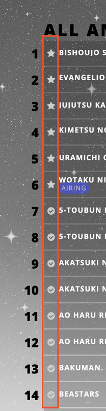 |
Sep 25, 2021 4:26 PM
#7191

espurrit0 said: Hi! Is it possible to change the color of the tiny icons/bullet points (inside the red rectangle on the image) of the lists? If yes, how can I do that? Thanks in advance :) Find the code below and add color: COLOUR; like so .list-table .list-table-data .data.status.reading, .list-table .list-table-data .data.status.watching {
background-color: #2db039;
color: #2db039;
}
.list-table .list-table-data .data.status.plantoread, .list-table .list-table-data .data.status.plantowatch {
background-color: #c3c3c3;
color: #c3c3c3;
}
.list-table .list-table-data .data.status.completed {
background-color: #26448f;
color: #26448f;
}
.list-table .list-table-data .data.status.onhold {
background-color: #f1c83e;
color: #f1c83e;
}
.list-table .list-table-data .data.status.dropped {
background-color: #a12f31;
color: #a12f31;
}also you can add this code to the top of your CSS to fix your cover images @\import "https://malscraper.azurewebsites.net/covers/anime/espurrit0/presets/datatitlebefore"; |
ShaggyZESep 25, 2021 4:42 PM
   My Userscripts - Themes - Userstyles - Extensions (Chrome/Firefox) [API CSS] MAL-Scraper-API Cover/CSS Generator |
Sep 30, 2021 2:41 PM
#7193
| Hey I would like to have the exact same anime/manga list as Is it possible? I tried getting it from her website but it isn't the exact same one. |
Shishio-kunOct 1, 2021 12:21 PM
Sep 30, 2021 3:17 PM
#7194
| please is there a way to download this view:https://anilist.co/search/anime/trending in my list?? and is there is a way to add one more "list" in "myanimelist"? |
Sep 30, 2021 3:22 PM
#7195
KIODAI said: no, you can not just download html/css from a whole other site and magically have the same CSS code that MAL uses for it's themes, it would need to be designed from scratch, or you can pick one of the premade grid style custom layouts Fully-Customized Layoutsplease is there a way to download this view:https://anilist.co/search/anime/trending in my list?? and is there is a way to add one more "list" in "myanimelist"? you can make mini lists using tags when you go to edit details of an anime or manga and enable tags in List Preferences |
ShaggyZESep 30, 2021 3:29 PM
| My Userscripts - Themes - Userstyles - Extensions (Chrome/Firefox) [API CSS] MAL-Scraper-API Cover/CSS Generator |
Oct 1, 2021 3:52 AM
#7196
zau said: Hey I would like to have the exact same anime/manga list as. Is it possible? I tried getting it from her website but it isn't the exact same one. I've tried using the "View Page Source" method to see the list but it still doesn't work, the list just becomes so scrambled. |
Shishio-kunOct 1, 2021 12:21 PM
Oct 1, 2021 8:51 AM
#7197
zau said: zau said: Hey I would like to have the exact same anime/manga list as . Is it possible? I tried getting it from her website but it isn't the exact same one. I've tried using the "View Page Source" method to see the list but it still doesn't work, the list just becomes so scrambled. You should be able to copy the layout CSS with Inspect Element, it will be on one of the style sheets in Firefox, see the video on my channel in my signature |
Shishio-kunOct 1, 2021 12:21 PM
Oct 1, 2021 9:33 AM
#7198
Shishio-kun said: zau said: zau said: Hey I would like to have the exact same anime/manga list as Is it possible? I tried getting it from her website but it isn't the exact same one. I've tried using the "View Page Source" method to see the list but it still doesn't work, the list just becomes so scrambled. You should be able to copy the layout CSS with Inspect Element, it will be on one of the style sheets in Firefox, see the video on my channel in my signature Thank you! Though, Is it possible to request a custom made layout based on that specific list? I want my list to look like that but a little bit tweaked. Unfortunately I don't have the time right now to customize it so I was gonna ask if it's possible to pay you for this request? If you're interested let's talk in PM's or just send me your discord or lmk another way we can discuss privately. Thank youu!! |
Shishio-kunOct 1, 2021 12:21 PM
Oct 1, 2021 9:39 AM
#7199
zau said: Shishio-kun said: You should be able to copy the layout CSS with Inspect Element, it will be on one of the style sheets in Firefox, see the video on my channel in my signature Thank you! Though, Is it possible to request a custom made layout based on that specific list? I want my list to look like that but a little bit tweaked. Unfortunately I don't have the time right now to customize it so I was gonna ask if it's possible to pay you for this request? If you're interested let's talk in PM's or just send me your discord or lmk another way we can discuss privately. Thank youu!! I don't open up my private info I hate doing requests since I put so much effort into tutorials, but I'd do it for $300 up front and that's all you'd have to pay in total, is that fine? |
Shishio-kunOct 1, 2021 12:21 PM
Oct 1, 2021 10:15 AM
#7200
Shishio-kun said: zau said: Shishio-kun said: zau said: zau said: Hey I would like to have the exact same anime/manga list as . Is it possible? I tried getting it from her website but it isn't the exact same one. I've tried using the "View Page Source" method to see the list but it still doesn't work, the list just becomes so scrambled. You should be able to copy the layout CSS with Inspect Element, it will be on one of the style sheets in Firefox, see the video on my channel in my signature Thank you! Though, Is it possible to request a custom made layout based on that specific list? I want my list to look like that but a little bit tweaked. Unfortunately I don't have the time right now to customize it so I was gonna ask if it's possible to pay you for this request? If you're interested let's talk in PM's or just send me your discord or lmk another way we can discuss privately. Thank youu!! I don't open up my private info I hate doing requests since I put so much effort into tutorials, but I'd do it for $300 up front and that's all you'd have to pay in total, is that fine? Ah that's a shame, that's too much for me, especially for only 3-4 changes that I wanted added to that list. |
Shishio-kunOct 1, 2021 12:21 PM
More topics from this board
Sticky: » 💚 [REPAIR STICKY] Repair/speed up a design + Request a layout fixShishio-kun - Nov 17, 2023 |
17 |
by Shishio-kun
»»
11 hours ago |
|
Sticky: » [ USERSTYLES & DARK THEMES ] All MyAnimeList themesShishio-kun - Jan 28, 2023 |
19 |
by is_peque
»»
Sep 23, 12:11 AM |
|
» [CSS - Modern] 🍰 Clarity by V.L ( 1 2 3 4 5 ... Last Page )Valerio_Lyndon - Apr 19, 2018 |
1222 |
by laBelphe
»»
Sep 20, 3:16 PM |
|
» [CLASSIC CSS] ⭐️Space Layout by nblur/U531355 ✨RESTORED AND UPSCALED✨Shishio-kun - Nov 17, 2023 |
7 |
by Recon911
»»
Sep 20, 4:43 AM |
|
Sticky: » 💎 Show off your latest design!Shishio-kun - Sep 16 |
2 |
by Shishio-kun
»»
Sep 18, 7:40 PM |