High School DxD (light novel)
Available on Manga Store
New
Apr 23, 2018 4:45 AM
#351
Riverlia said: EYeager said: Riverlia said: 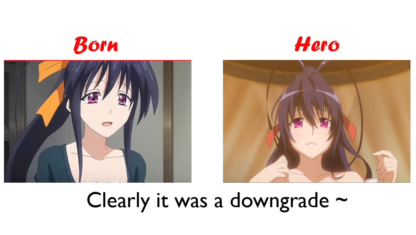 Yes, you totally can clearly see the difference and tell which art style has changed for the better Well I agree with you that new artwork is better as it provides higher quality of jiggle physics which tbh DxD is all about. But this kind of artwork make the action scenes suffer. DxD Hero's capability in term of action scene has already been proven in episode 1, with Issei vs Sairaorg. Whole body movement of the armor, clearly animated combat, fluid movement. So whether the artwork made it harder or not, the studio proved they can handle it. Though to begin with, a rounder, less angular design should make animating action scene easier, not harder. TNK on the other hand was overly relied on semi-still (almost fixed pose minimal movement) then use cut away to mimic motion (ie animate Issei cocking his hand, black screen, Issei already hit). Sometime they use close in to avoid large whole body motion, and at other time use a much less detailed armor if they couldn't get away with it. It make for good screenshots because they made the semi-still armors as shiny as possible to compensate/distract viewer, but not that great at conveying the fight in motion. Put the design drawn by the designers next to each other, it's true that old style has somewhat more details and looks more mature due to more angular shape (aesthetically better or not is subjective and case by case for each character, so no comment). However, when being animated, the one drawing the scene isn't the designer, but animation staff. A complicated design will still be simplified if they lack time and money, or if they simply just can't replicate the designer's skill. A more angular design also make it harder/more time consuming to draw multiple continuous frames for an action without something sticking out at the wrong place. Rounder = less likely for fuck up and easier to fix. That, and I guess Passione animation staff is just better than the one TNK had on DxD duty. They really mistreated one of their best cash source. I don't mean to be rude but you reminded me of this guy when I read your reply. |
Apr 23, 2018 6:17 AM
#352
EYeager said: Riverlia said: EYeager said: Riverlia said:  Yes, you totally can clearly see the difference and tell which art style has changed for the better Well I agree with you that new artwork is better as it provides higher quality of jiggle physics which tbh DxD is all about. But this kind of artwork make the action scenes suffer. DxD Hero's capability in term of action scene has already been proven in episode 1, with Issei vs Sairaorg. Whole body movement of the armor, clearly animated combat, fluid movement. So whether the artwork made it harder or not, the studio proved they can handle it. Though to begin with, a rounder, less angular design should make animating action scene easier, not harder. TNK on the other hand was overly relied on semi-still (almost fixed pose minimal movement) then use cut away to mimic motion (ie animate Issei cocking his hand, black screen, Issei already hit). Sometime they use close in to avoid large whole body motion, and at other time use a much less detailed armor if they couldn't get away with it. It make for good screenshots because they made the semi-still armors as shiny as possible to compensate/distract viewer, but not that great at conveying the fight in motion. Put the design drawn by the designers next to each other, it's true that old style has somewhat more details and looks more mature due to more angular shape (aesthetically better or not is subjective and case by case for each character, so no comment). However, when being animated, the one drawing the scene isn't the designer, but animation staff. A complicated design will still be simplified if they lack time and money, or if they simply just can't replicate the designer's skill. A more angular design also make it harder/more time consuming to draw multiple continuous frames for an action without something sticking out at the wrong place. Rounder = less likely for fuck up and easier to fix. That, and I guess Passione animation staff is just better than the one TNK had on DxD duty. They really mistreated one of their best cash source. I don't mean to be rude but you reminded me of this guy when I read your reply. Internet. You don't explain, people say your opinion is unfounded or has zero content. You explain they call you talkative. I simply opt for the later. Next time I'll just say "BS, Hero Life 1 action > TNK", if that's your style. |
RiverliaApr 23, 2018 8:03 AM
Apr 23, 2018 5:53 PM
#353
| Lets just be supportive of the Hero season hope Passionate or any other studio continues to anime more DxD season in 2019 or 2020. |
Apr 23, 2018 9:39 PM
#354
| I think in this new season the animation is like in LN and the others are very similar. I wish there will be another season |
Apr 23, 2018 9:45 PM
#355
JackDanielz said: I think in this new season the animation is like in LN and the others are very similar. I wish there will be another season I could not agree MORE Season 5 in 2019 or 2020 |
Apr 24, 2018 3:29 PM
#356
| At this very moment, after seeing the special and first 2 episodes. I don't dislike it, it's just a matter of getting used to it. Eventho in the new art the girls look to be more THICC. |
 |
Apr 24, 2018 4:15 PM
#357
| Having viewed both now I can only say that the new style just looks cheap. |
Apr 24, 2018 5:55 PM
#358
| lets continue supporting the anime I think if the colour of the characters were more dark than people would like the new art For me DxD is still awesome and hope to see a season 5 covering volumes 11 and 12 after Hero in 2019 or 2020 DxD forever |
Apr 24, 2018 5:57 PM
#359
| The new art style and the old stlyle are both good, the new style is more fluid which helps in the fighting scenes and boobs movements (which looks pretty good) the problem is that it looks less attractive and the characters look a lot puffier but in the end it doesn't matter for me cause i like it and it looks good, it just takes getting used too, by far the story is being a big improvement from what Born was but in terms of fan-service they need to step it up a bit cause High School DxD is more daring than this... |
viktheoneApr 24, 2018 6:10 PM
Apr 24, 2018 6:49 PM
#360
viktheone said: The new art style and the old stlyle are both good, the new style is more fluid which helps in the fighting scenes and boobs movements (which looks pretty good) the problem is that it looks less attractive and the characters look a lot puffier. Yeah I LIKE YOUR POINTS Lets hope season 5 is announced after Hero for 2019 or 2020 DXD FOREVER |
Apr 24, 2018 7:18 PM
#361
viktheone said: The new art style and the old stlyle are both good, the new style is more fluid which helps in the fighting scenes and boobs movements (which looks pretty good) the problem is that it looks less attractive and the characters look a lot puffier but in the end it doesn't matter for me cause i like it and it looks good, it just takes getting used too, by far the story is being a big improvement from what Born was but in terms of fan-service they need to step it up a bit cause High School DxD is more daring than this... This is exactly as pervy as it is in the novels tho so your statement makes no sense |
Apr 25, 2018 2:18 AM
#362
Darklight0303 said: viktheone said: The new art style and the old stlyle are both good, the new style is more fluid which helps in the fighting scenes and boobs movements (which looks pretty good) the problem is that it looks less attractive and the characters look a lot puffier but in the end it doesn't matter for me cause i like it and it looks good, it just takes getting used too, by far the story is being a big improvement from what Born was but in terms of fan-service they need to step it up a bit cause High School DxD is more daring than this... This is exactly as pervy as it is in the novels tho so your statement makes no sense What I meant was that for example, in previous seasons there were a lot more panty shots which gave a little bit more flavor and it was a bit more stimulating, but in terms of ecchi scenes I agree with you that they should keep it like the LN because that is surely enough. |
Apr 25, 2018 5:48 PM
#363
Riverlia said: SoraShiroBlank said: after seeing the new episodes i got to say i dislike the new art style, it makes rias head look too egg shape, and I know everyone quick to defend it by saying it closer to the art style of the vn, and in my opinion as someone who read the novels , this new art style doesnt come close to it, it may have the softer tone, but it went too overboard with it, it made me feel like im watching a moe blob comedy anime, which dxd isnt really , yes it has moment like that but it also has a darker tone to it as well, so when those darker tones comes it feel like a meh moment cause the softer tone takes away from it. idk this became a series where i would all the episodes when they come to a series where i m gonna watch probly till a whole yr or till i finish my list of anime to watch . Moe design or not (and it's very debatable if Hero design qualify as moe) doesn't affect dark or sad moment. That is up to the director execution, not the design. For example, in the Visual Novel scene, Key is known for moe as fuck design and tear jerking as hell stories. Similarly no one can look at Planetarian and say it's not cutesie, but it's undeniably a tragedy piece. There is a reason the cute kid dying is such a classic tragedy plot. But that has a sharper drawing than hero, as for kids , they are typically drawn cute/softer. And a moe fight scene is just that a moe scene while a fight scene should be like fate stay ubw style (example) so you feel that action sense, or even a art style like fate kaleid where it has it softer tone, but doesnt completely abandon that sharper tone. |
Apr 25, 2018 8:28 PM
#364
SoraShiroBlank said: Riverlia said: SoraShiroBlank said: after seeing the new episodes i got to say i dislike the new art style, it makes rias head look too egg shape, and I know everyone quick to defend it by saying it closer to the art style of the vn, and in my opinion as someone who read the novels , this new art style doesnt come close to it, it may have the softer tone, but it went too overboard with it, it made me feel like im watching a moe blob comedy anime, which dxd isnt really , yes it has moment like that but it also has a darker tone to it as well, so when those darker tones comes it feel like a meh moment cause the softer tone takes away from it. idk this became a series where i would all the episodes when they come to a series where i m gonna watch probly till a whole yr or till i finish my list of anime to watch . Moe design or not (and it's very debatable if Hero design qualify as moe) doesn't affect dark or sad moment. That is up to the director execution, not the design. For example, in the Visual Novel scene, Key is known for moe as fuck design and tear jerking as hell stories. Similarly no one can look at Planetarian and say it's not cutesie, but it's undeniably a tragedy piece. There is a reason the cute kid dying is such a classic tragedy plot. But that has a sharper drawing than hero, as for kids , they are typically drawn cute/softer. And a moe fight scene is just that a moe scene while a fight scene should be like fate stay ubw style (example) so you feel that action sense, or even a art style like fate kaleid where it has it softer tone, but doesnt completely abandon that sharper tone. None of those comparisons corelate with past seasons so your argument is completely invalid |
Apr 25, 2018 10:42 PM
#365
| I like the old art style better, however the new art style is not terrible. I have pretty much gotten use to the new art style now and it doesn't really bother me. |
Apr 25, 2018 10:43 PM
#366
SoraShiroBlank said: Riverlia said: SoraShiroBlank said: after seeing the new episodes i got to say i dislike the new art style, it makes rias head look too egg shape, and I know everyone quick to defend it by saying it closer to the art style of the vn, and in my opinion as someone who read the novels , this new art style doesnt come close to it, it may have the softer tone, but it went too overboard with it, it made me feel like im watching a moe blob comedy anime, which dxd isnt really , yes it has moment like that but it also has a darker tone to it as well, so when those darker tones comes it feel like a meh moment cause the softer tone takes away from it. idk this became a series where i would all the episodes when they come to a series where i m gonna watch probly till a whole yr or till i finish my list of anime to watch . Moe design or not (and it's very debatable if Hero design qualify as moe) doesn't affect dark or sad moment. That is up to the director execution, not the design. For example, in the Visual Novel scene, Key is known for moe as fuck design and tear jerking as hell stories. Similarly no one can look at Planetarian and say it's not cutesie, but it's undeniably a tragedy piece. There is a reason the cute kid dying is such a classic tragedy plot. But that has a sharper drawing than hero, as for kids , they are typically drawn cute/softer. And a moe fight scene is just that a moe scene while a fight scene should be like fate stay ubw style (example) so you feel that action sense, or even a art style like fate kaleid where it has it softer tone, but doesnt completely abandon that sharper tone. None of the action shown so far in DxD Hero remotely resembled moe scene. People called them cool or awesome or sexy, but no one said moe. I think you are grasping at straw here. You are speaking like there's no example for references and then make your own speculation, when we had several samples already. You call this moe? Makoto Uno worked on several action flick like Gravion and Witchblade already. DxD Hero is the first time I see people suggesting his design is too moe for action. Sample of his other action flick |
RiverliaApr 25, 2018 11:22 PM
Apr 27, 2018 12:41 AM
#367
| I guess I would simply sum up my issue with the new art style by saying that the characters are just too cute. That's fine for characters like Asia, Gasper, and Koneko but I just don't associate cute to characters like Akeno, Xenovia, and Rossweisse. The characters all just look too similar now. I ultimately don't think the art style is bad, I just can't ignore that, in my opinion, these characters were better done in prior seasons. |
Apr 27, 2018 6:48 AM
#368
| I think old one had more details and in the new one rias become younger rather than the old one |
Apr 27, 2018 6:53 AM
#369
Bbm_Davani said: I think old one had more details and in the new one rias become younger rather than the old one That's just factually wrong and Rias was ALWAYS young. It was the old style that made her way too milfy >_> |
Apr 27, 2018 7:33 AM
#370
| From old I ment the old season thanks for ur help |
Apr 27, 2018 10:11 AM
#371
| Well I came here for justification as other sites I talk about anime are not saying a word about the series. I started a thread and no one is commenting . So this is nice to see the poll indicate what I believed all along. the new art style though more in line with the LM is not favored by most people. I have to say that I gave examples on other sites between the art style and I find this new style very kiddish it is almost like US comics. Don't hate me for saying that. in defence of the studio I have to say that I liked Rail wars. There was nothing wrong with the art style. But what makes it so bad here is that it is a shock to all of us who have followed the series and the art style said basically the same since 2012. If the art style hade been like this season since day 1 well we would not be having this conversation about the art style as we would say it's the same as 2012 ect but it's not. I am glad to have a new season that is for sure and all I can hope for is that if there is a season 5 that the studio listens to fans and goes back to the old art style. Follow the story line compared to the studio that did season 3. But bring back the art style that we so love. Tia |
Apr 27, 2018 10:14 AM
#372
Tiamat26 said: Well I came here for justification as other sites I talk about anime are not saying a word about the series. I started a thread and no one is commenting . So this is nice to see the poll indicate what I believed all along. the new art style though more in line with the LM is not favored by most people. I have to say that I gave examples on other sites between the art style and I find this new style very kiddish it is almost like US comics. Don't hate me for saying that. in defence of the studio I have to say that I liked Rail wars. There was nothing wrong with the art style. But what makes it so bad here is that it is a shock to all of us who have followed the series and the art style said basically the same since 2012. If the art style hade been like this season since day 1 well we would not be having this conversation about the art style as we would say it's the same as 2012 ect but it's not. I am glad to have a new season that is for sure and all I can hope for is that if there is a season 5 that the studio listens to fans and goes back to the old art style. Follow the story line compared to the studio that did season 3. But bring back the art style that we so love. Tia The old style is never going to come back since that belongs to TNK. You are setting yourself up for disappointment. This is what Japan and the author wanted and the poll is hardly reliable when already the response is getting better and better with each episode. This poll is worthless since it was made aftter episode 0 instead of after the season ran its course. Good job pretending you have the majority tho. I am sure it feels REAL GOOD |
Apr 27, 2018 6:38 PM
#373
| [quote=Darklight0303 The old style is never going to come back since that belongs to TNK. You are setting yourself up for disappointment. This is what Japan and the author wanted and the poll is hardly reliable when already the response is getting better and better with each episode. This poll is worthless since it was made aftter episode 0 instead of after the season ran its course. Good job pretending you have the majority tho. I am sure it feels REAL GOOD[/quote] The poll was made before episode 0. I actually voted that I preferred the old, but after episode 0 aired I would have voted in favor of the new artstyle. |
Apr 27, 2018 6:43 PM
#374
TJHooker said: The poll was made before episode 0. I actually voted that I preferred the old, but after episode 0 aired I would have voted in favor of the new artstyle. That just reinforces the point I was making. A lot of these votes are premature and kneejerk reactions and to make matters worse people can't change their votes either . |
Apr 27, 2018 7:37 PM
#375
| I am really happy to see that Hero artwork is starting to be more accepted. Hope the blur-ray sales starting July 2018 go well to see season 5 in 2019 or 2020 DxD forever |
Apr 28, 2018 7:33 PM
#376
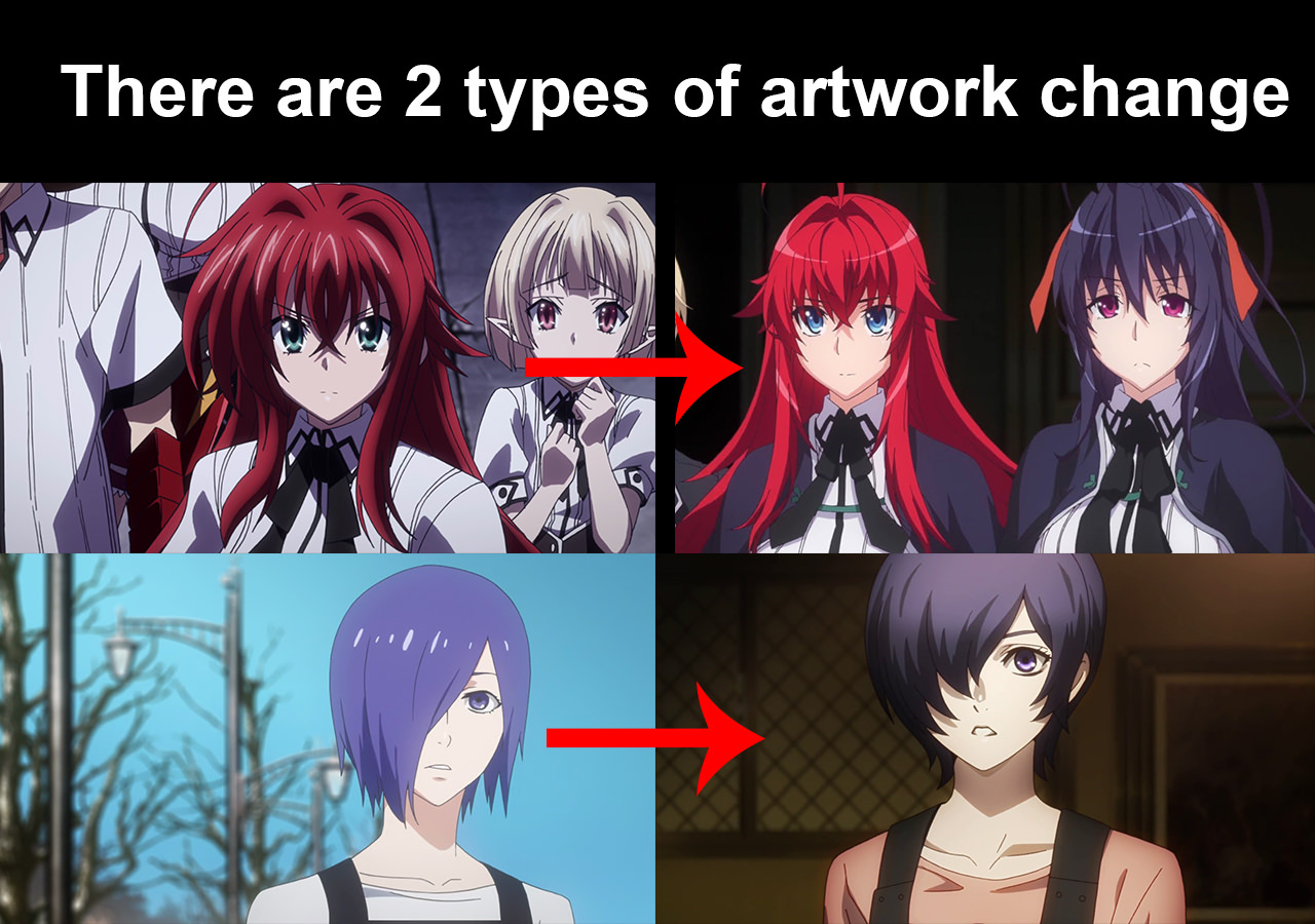
OMG this is not getting any better. The before pick Leviatan Desu  The after pic   Those are some major character changes. Granted I know we have a new studio but Holy Cow Batman. I just hope that the art gets a little bit better. I could tear this episode apart art wise. But I wont. Anyone else have thoughts on this episode? The story line looks interesting I have to give it that much thought it seems rushed to me. But then again I have not read the LN or Manga. |
Apr 28, 2018 11:56 PM
#378
| I don't mind the changes of art as long as theres new season and plot doesn't make difference and Ecchi of it is still good as previous season... But i still prefer old art :3 |
Apr 29, 2018 2:16 PM
#379
Tiamat26 said: OMG this is not getting any better. The before pick  Leviatan Desu  The after pic   Those are some major character changes. Granted I know we have a new studio but Holy Cow Batman. I just hope that the art gets a little bit better. I could tear this episode apart art wise. But I wont. Anyone else have thoughts on this episode? The story line looks interesting I have to give it that much thought it seems rushed to me. But then again I have not read the LN or Manga. I HOPE Not Only Both Of Char But For Another is So Weird Right, Better Old Art T_T |
Apr 29, 2018 2:28 PM
#380
| @Tiamat26 Your comparison pic proves why the new artstyle is better, not sure if that was the point though |
Apr 29, 2018 4:18 PM
#381
Aardwolf94 said: @Tiamat26 Your comparison pic proves why the new art style is better, not sure if that was the point though We all live to agree or disagree that the old art style was better. So the comparison pic for me was that the old art style was way better. But that is my opinion and it can diverge from others that is what makes us unique. |
Apr 29, 2018 7:14 PM
#382
Tiamat26 said: Aardwolf94 said: @Tiamat26 Your comparison pic proves why the new art style is better, not sure if that was the point though We all live to agree or disagree that the old art style was better. So the comparison pic for me was that the old art style was way better. But that is my opinion and it can diverge from others that is what makes us unique. I don't mind people prefering their own thing but all the nagging is getting annoying tbh. LN readers didn't go apeshit over the difference between LN and TNK design, because they knew it's either TNK or nothing. This time it's the same. If you really really cannot stomache the new art, drop it. They are not going back. Passione dares change Leviathan! But in fact, TNK changed it first. For example she has blue eyes in the original. Funny how people treat something TNK did wrong as unviolable canon. Side note, this is LN Leviatan. Quite different. How dare they make her different from TNK!!! 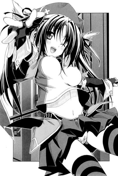 |
RiverliaApr 29, 2018 7:17 PM
Apr 29, 2018 7:34 PM
#383
| I said it before New old art DxD is still awesome and hope that the anime continues in 2019 or 2020 with season 5 DxD forever |
Apr 29, 2018 7:43 PM
#384
ToBe2050goal said: I said it before New old art DxD is still awesome and hope that the anime continues in 2019 or 2020 with season 5 DxD forever Yeah, Passione or TNK, I watch it because it's DxD, one of the few harem LN with characters I like and a good mix between ecchi shenanigan and shounen. As long as they continue to animate it decently, I'll continue to watch it. |
Apr 29, 2018 7:55 PM
#385
Riverlia said: ToBe2050goal said: I said it before New old art DxD is still awesome and hope that the anime continues in 2019 or 2020 with season 5 DxD forever Yeah, Passione or TNK, I watch it because it's DxD, one of the few harem LN with characters I like and a good mix between ecchi shenanigan and shounen. As long as they continue to animate it decently, I'll continue to watch it. Yes The combination of different genres is what makes DxD so awesome Lets hope all 25 volumes get animated or as many as possible DxD forever |
Apr 30, 2018 12:16 AM
#386
| I think the new artstyle is a big step up. It's way cleaner and feels more colourful than the old style. I'm a sucker for shiny, bright, and cute art I guess. The boobs also look 10x better as well. |
Apr 30, 2018 2:10 AM
#387
pjburton said: Renaultclio101 said: Technically I am not a fan of this new art and the old art had more character detail and it looked up to date than this season. I am not sure but heard it was a new studio that was taking over and what happened to the old studio since they were better regarding to visual. It's more in line with the LN art https://www.baka-tsuki.org/project/thumb.php?f=High_school_dxd_v9_161.jpg&width=614 that is the guy in the final few seconds of the trailer Cao Cao. Here is Rias and Asia https://www.baka-tsuki.org/project/images/e/ea/High_school_dxd_v10_291.jpg Looks closer to the new stuff than the old. I would have to disagree to an extent as although its more in line with the LN in terms of some characters, nobody can deny that the new animation screwed up characters appearances mainly Vali who now doesn't look anything close to in the LN or original series and I would say that asia and rias have the same face in born just different sizes where as in the old series they looked closer to the LN art. honestly we needed the old animation style just updated rather than this all new art style which has honestly given a cartoon-like feel to a series that does not benefit from it, in fact it takes away from the drama |
camokilerApr 30, 2018 2:14 AM
Apr 30, 2018 2:13 AM
#388
camokiler said: pjburton said: Renaultclio101 said: Technically I am not a fan of this new art and the old art had more character detail and it looked up to date than this season. I am not sure but heard it was a new studio that was taking over and what happened to the old studio since they were better regarding to visual. It's more in line with the LN art https://www.baka-tsuki.org/project/thumb.php?f=High_school_dxd_v9_161.jpg&width=614 that is the guy in the final few seconds of the trailer Cao Cao. Here is Rias and Asia https://www.baka-tsuki.org/project/images/e/ea/High_school_dxd_v10_291.jpg Looks closer to the new stuff than the old. I would have to disagree to an extent as although its more in line with the LN in terms of some characters, nobody can deny that the new animation screwed up characters appearances mainly Vali who now doesn't look anything close to in the LN or original series Wrong wrong wrong. It's actually a design from later in the novels. SO gg you played yourself |
Apr 30, 2018 2:24 AM
#389
Darklight0303 said: camokiler said: pjburton said: Renaultclio101 said: Technically I am not a fan of this new art and the old art had more character detail and it looked up to date than this season. I am not sure but heard it was a new studio that was taking over and what happened to the old studio since they were better regarding to visual. It's more in line with the LN art https://www.baka-tsuki.org/project/thumb.php?f=High_school_dxd_v9_161.jpg&width=614 that is the guy in the final few seconds of the trailer Cao Cao. Here is Rias and Asia https://www.baka-tsuki.org/project/images/e/ea/High_school_dxd_v10_291.jpg Looks closer to the new stuff than the old. I would have to disagree to an extent as although its more in line with the LN in terms of some characters, nobody can deny that the new animation screwed up characters appearances mainly Vali who now doesn't look anything close to in the LN or original series Wrong wrong wrong. It's actually a design from later in the novels. SO gg you played yourself http://www.behindthevoiceactors.com/tv-shows/High-School-DxD-HERO/ https://www.baka-tsuki.org/project/images/c/c6/High_school_DxD_Volume_22_Cover.jpg https://www.baka-tsuki.org/project/images/8/80/High_school_DxD_v21_Cover.jpg https://www.baka-tsuki.org/project/images/c/c6/High_school_DxD_v20_Cover.jpg https://www.baka-tsuki.org/project/images/4/4b/High_school_DxD_v19_Cover.jpeg face it with the exception of asia and xenovia to some extent the new animation does not even come close the LN art style especially with vali who looks barely recognisable compared to the LN art I cant take the DxD Hero vali seriously at all, he looks as intimidating as a McDonalds toy |
camokilerApr 30, 2018 2:29 AM
Apr 30, 2018 2:33 AM
#390
camokiler said: Darklight0303 said: camokiler said: pjburton said: Renaultclio101 said: Technically I am not a fan of this new art and the old art had more character detail and it looked up to date than this season. I am not sure but heard it was a new studio that was taking over and what happened to the old studio since they were better regarding to visual. It's more in line with the LN art https://www.baka-tsuki.org/project/thumb.php?f=High_school_dxd_v9_161.jpg&width=614 that is the guy in the final few seconds of the trailer Cao Cao. Here is Rias and Asia https://www.baka-tsuki.org/project/images/e/ea/High_school_dxd_v10_291.jpg Looks closer to the new stuff than the old. I would have to disagree to an extent as although its more in line with the LN in terms of some characters, nobody can deny that the new animation screwed up characters appearances mainly Vali who now doesn't look anything close to in the LN or original series Wrong wrong wrong. It's actually a design from later in the novels. SO gg you played yourself http://www.behindthevoiceactors.com/tv-shows/High-School-DxD-HERO/ https://www.baka-tsuki.org/project/images/c/c6/High_school_DxD_Volume_22_Cover.jpg https://www.baka-tsuki.org/project/images/8/80/High_school_DxD_v21_Cover.jpg https://www.baka-tsuki.org/project/images/c/c6/High_school_DxD_v20_Cover.jpg https://www.baka-tsuki.org/project/images/4/4b/High_school_DxD_v19_Cover.jpeg face it with the exception of asia and xenovia to some extent the new animation does not even come close the LN art style especially with vali who looks barely recognisable compared to the LN art I cant take the DxD Hero vali seriously at all, he looks as intimidating as a McDonalds toy camokiler said: Darklight0303 said: camokiler said: pjburton said: Renaultclio101 said: Technically I am not a fan of this new art and the old art had more character detail and it looked up to date than this season. I am not sure but heard it was a new studio that was taking over and what happened to the old studio since they were better regarding to visual. It's more in line with the LN art https://www.baka-tsuki.org/project/thumb.php?f=High_school_dxd_v9_161.jpg&width=614 that is the guy in the final few seconds of the trailer Cao Cao. Here is Rias and Asia https://www.baka-tsuki.org/project/images/e/ea/High_school_dxd_v10_291.jpg Looks closer to the new stuff than the old. I would have to disagree to an extent as although its more in line with the LN in terms of some characters, nobody can deny that the new animation screwed up characters appearances mainly Vali who now doesn't look anything close to in the LN or original series Wrong wrong wrong. It's actually a design from later in the novels. SO gg you played yourself http://www.behindthevoiceactors.com/tv-shows/High-School-DxD-HERO/ https://www.baka-tsuki.org/project/images/c/c6/High_school_DxD_Volume_22_Cover.jpg https://www.baka-tsuki.org/project/images/8/80/High_school_DxD_v21_Cover.jpg https://www.baka-tsuki.org/project/images/c/c6/High_school_DxD_v20_Cover.jpg https://www.baka-tsuki.org/project/images/4/4b/High_school_DxD_v19_Cover.jpeg face it with the exception of asia and xenovia to some extent the new animation does not even come close the LN art style especially with vali who looks barely recognisable compared to the LN art I cant take the DxD Hero vali seriously at all, he looks as intimidating as a McDonalds toy I'll give the new animation something they done kunou well she actually looks how she's supposed to look |
Apr 30, 2018 3:44 AM
#391
camokiler said: pjburton said: Renaultclio101 said: Technically I am not a fan of this new art and the old art had more character detail and it looked up to date than this season. I am not sure but heard it was a new studio that was taking over and what happened to the old studio since they were better regarding to visual. It's more in line with the LN art https://www.baka-tsuki.org/project/thumb.php?f=High_school_dxd_v9_161.jpg&width=614 that is the guy in the final few seconds of the trailer Cao Cao. Here is Rias and Asia https://www.baka-tsuki.org/project/images/e/ea/High_school_dxd_v10_291.jpg Looks closer to the new stuff than the old. I would have to disagree to an extent as although its more in line with the LN in terms of some characters, nobody can deny that the new animation screwed up characters appearances mainly Vali who now doesn't look anything close to in the LN or original series and I would say that asia and rias have the same face in born just different sizes where as in the old series they looked closer to the LN art. honestly we needed the old animation style just updated rather than this all new art style which has honestly given a cartoon-like feel to a series that does not benefit from it, in fact it takes away from the drama Said it before, saying it again. Tragic moments using cartoonish design is in fact dim a dozen by now, with plenty of successful examples. It's a matter of director ability to use the tools at his disposal, not design. The cartoonish and bright part of Tengen Toppa Guren Lagann mattered not one wit when Kamina died, ordering a gray tone for his mourning episode till Nia appeared was similarly execution based, not character design based. Also it's not like the design is as cartoonish as you claim, as it's actually comparable to most anime and the actual episode to episode scenes are not worse than TNK works (actually better so far as the low quality frames tend to be hard to notice ones when TNK had no issue drawing character of the moment badly, then call attention to it front and center). It help that DxD isn't some super depressing story full of tragedy and crapsack world, but an optimistic one that's becoming better and better with effort of the characters in it. It has sad and tragic moments, but those are sprinkled in to enhance the flavor, they are not the main flavor. While I do think some design could see improvement, it's not the doom of the series so many tries to pass it off. It's serviceable, just like LN illustration was serviceable and then later TNK design was serviceable. |
RiverliaApr 30, 2018 3:54 AM
Apr 30, 2018 1:30 PM
#392
| It's better then nothing. I'm just glad they got rid of the last 3 anime orginal episodes from season 3 .It may take a while to get if fully back on track just hope it gets the chance to. Like a few ovas doing the sona rating game and the actual loki fight from the LN |
May 2, 2018 4:57 PM
#393
| I'm already used to the new artstyle also I feel like the titty physics are looking a lot more crisp edit: also Koneko looks a lot better with the new artsyle edit 2: I fucking love this new artstyle. god bless |
LeMastaMay 2, 2018 5:10 PM
May 2, 2018 6:02 PM
#394
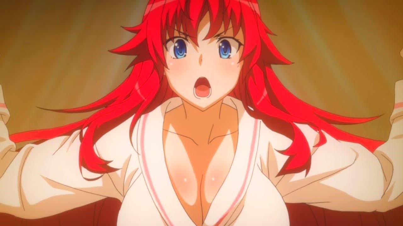
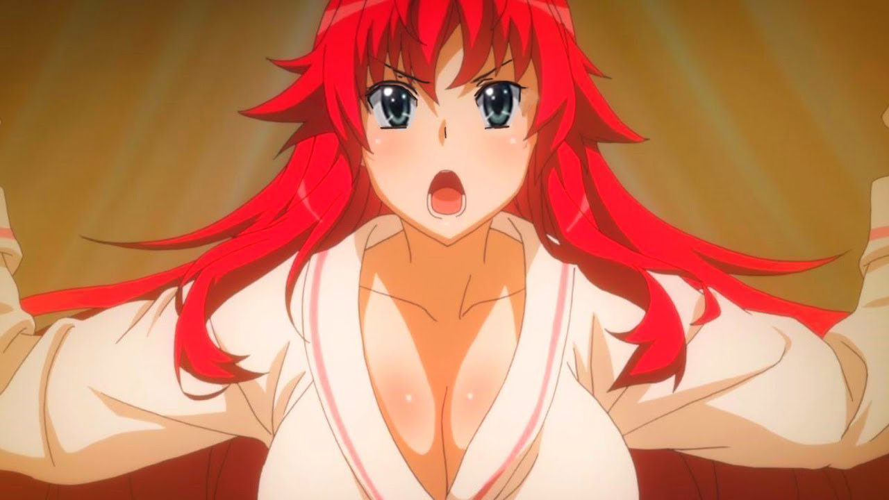
Wait bluray stuff is already out? |
May 2, 2018 6:43 PM
#395
Darklight0303 said: Wait bluray stuff is already out? No, he Photoshop TNK eyes onto Rias. Easy to tell because she was looking at Issei who was below her. There's zero reason for the eyes to look up like that. Also redrawing the eyes would require redrawing every frame with Rias, it'll waste a lot of time. Waste a lot of time and money for no real reason. |
May 2, 2018 6:53 PM
#396
Yes, first DxD bluray is going to be released on July 25th 2018 |
May 2, 2018 8:08 PM
#397
May 2, 2018 8:11 PM
#398
| After 3 episodes (technically 4 if you count the recap), I still like the old one a lot more. It just looked more realistic, and the lewd shit was animated better. Also, the characters looked less toony, and more like actual high school students. Still, I am enjoying this 4th season, even if the art style is different. |
 |
May 2, 2018 8:22 PM
#399
| I am still hoping that season 5 is announced to get volumes 11 and 12 animated in 2019 or 2020. |
May 3, 2018 12:44 AM
#400
Supersky said: I'm predicting an average of 4k-5k copies being sold. Mainly because how people are being turned away from the series due to the new art style being terrible Too bad the show is getting good feedback in Japan. So you're completely mistaken |
More topics from this board
» Season 5 Confirmed!!!Hachii13 - May 3 |
43 |
by Coolkinq
»»
Nov 18, 10:32 AM |
|
Poll: » High School DxD Hero Episode 12 Discussion ( 1 2 )tsubasalover - Aug 8, 2018 |
77 |
by Infinte_nexus
»»
Nov 15, 11:17 PM |
|
Poll: » High School DxD Hero Episode 4 Discussion ( 1 2 )Stark700 - May 8, 2018 |
99 |
by FedeMetal
»»
Sep 13, 7:51 PM |
|
Poll: » High School DxD Hero Episode 2 Discussion ( 1 2 3 )Stark700 - Apr 24, 2018 |
100 |
by FedeMetal
»»
Aug 30, 11:44 AM |
|
Poll: » High School DxD Hero Episode 3 Discussion ( 1 2 )Stark700 - May 1, 2018 |
78 |
by Andr6969
»»
Jun 7, 6:41 PM |
