New
Jan 10, 2011 11:31 AM
#21

| Hi, I need help (well, of course)! ó__ò This is my manga list: http://myanimelist.net/mangalist/Apocaly I've picked up a pre-made list (the first in the pre-made topic), and I'm slowly changing it. BUT I can't fix my banner at the top, it covers the 'Currently reading'... what I should do? Thank you very much ;) |
 Sing a song ♪♫  |
Jan 11, 2011 12:12 AM
#22

Jack_Rav said: Hey, firstly, thanks for the easy to use tutorial for altering your list design. I am a complete novice when it come to CSS, but you made it basically impossible to screw up. :) I was wondering, however, whether there was a way to either: a) Have more customisability when it comes to choosing colours. For example, for the 'Currently watching/Dropped/etc' sections, I simply typed 'brown' into the code but it more represents red. b)See a list of which colours you can use. Also, I was wondering how you could change the heights of those bars. They're slightly too tall for my liking, but I presume there's an easy way somewhere in the code to change it. :) Thanks again for the help. Here's the code in case you need to see it. /* BACKGROUND IMAGE This is the main background image for the whole page. Change the image link to the background you want! For more help see here: http://myanimelist.net/clubs.php?cid=19736 */ body { background-image: url(http://www.personal.psu.edu/users/r/w/rwa118/wallpaper/haibane_drakka1600.png); background-attachment: fixed; } /* HEADER COLOR AND FONT These codes control the main headers' fonts and colors. Every header is above each part of your list (they say things like Currently Watching, Completed, Dropped, etc). Change the color of the background by changing the color below after "background-color" (red, for example). Change the color of the fonts here by changing "color:" to another color (purple, for example). Change the font style here after "font-family:" to change these fonts to another style (Times New Roman, for example). Change the size of the fonts here by increasing or decreasing the number after "font-size:" (16px, for example). */ .header_title { background-color:brown; color:white; font-family:impact; font-size:24px; } /* SUB-HEADERS BACKGROUND COLOR COLOR Below each main header is the sub-header which says Score, Episodes, Tags, etc. You can change the color of the background by changing the color below after "background-color" (red, for example). */ .table_header { background-color:black; } /* ANIME/MANGA TITLE FONTS This is the type and color of the anime/manga titles on your list, like Bleach, Vampire Knight, etc. Change the color by "color:" to another color to change the fonts here (purple, for example). Change the font style after "font-family:" to change these fonts to another style (Times New Roman, for example). Change the size of the fonts here by increasing or decreasing the number after "font-size:" (16px, for example). */ .animetitle, .animetitle:visited { color:white; font-family:aharoni; font-size:14px; } /* LIST FONTS This is the type and color for more of the numbers, links, and words on the list itself! Change the color of the fonts here by changing "color:" to another color (purple, for example). Change the font style here after "font-family:" to change these fonts to another style (Times New Roman, for example). */ .td1, .td2, a, a:visited, .category_totals, .table_header, #grand_totals, #copyright { color:white; font-family:Lucida Grande; } /* LIST WIDTH Use this to increase the width of your list! Increase the width of your layout here, to a higher or lower amount. */ #list_surround { width:700px; } /*OTHER CODES Important codes for the layout's setup. Please don't mess with these. If you want to customize more on the page, come to my group and ask or move on to a more advanced layout. */ body { font-weight: light; background-position: top center; background-repeat: no-repeat; background-color: black; } #list_surround { margin:auto; background-image:url(); } a { text-decoration:none; } a:visited { text-decoration:none; } a:hover, a:visited:hover { color:red; text-decoration:underline; } .category_totals, .td1, .td2, #grand_totals, #copyright { background-image:url(http://i50.tinypic.com/opxow9.jpg); border-width:0; padding:2px; } .category_totals:HOVER, .td1:HOVER, .td2:HOVER, #grand_totals:HOVER, #copyright:HOVER {background-color:black; border-width:0; padding:2px; } .status_selected { background-color:black; padding:2px; color:white; text-decoration: blink; } .status_not_selected { background-color:black; padding:2px; color:white; } .status_selected a{ color:cyan; } .status_not_selected a{ color:white; } .thickbox { color:cyan; font-family:fantasy; font-size:12px; } .header_title { height:52px; padding:2px; } .table_header { border-width:0; font-weight:bold; padding:2px; } .category_totals { height:30px; } #copyright, #grand_totals { text-align: center; margin:0 auto; } #list_surround { position:absolute; left:1px;} (1) Yes, you can choose from hundreds of colors actually beyond what we can think of off the top of our heads. First off, there are the many many named colors, like turquoise or magenta, and Wikipedia actually has an essential list with examples of many possible colors: http://en.wikipedia.org/wiki/List_of_colors A lot of these strange color names won't be recognized by the CSS, or they will be spelled differently. Because of this, we use the "number" of the color, which is in the category "hex triplet" on that same list of colors. So for the "Air Force Blue"color, you'd use "#5D8AA8" instead of the word. Probably better to do that every time for colors outside the common ones. (2) Yes almost anything can be affected with the right code. I think by bars you mean the headers, to make them shorter, add this code to the bottom of your CSS, then adjust the px number to a smaller amount. .header_title { height:52px; } For your layout, 25px should reduce the size to just outside the font. |
Shishio-kunJan 11, 2011 12:15 AM
Jan 11, 2011 12:43 AM
#23
Apocaly said: Hi, I need help (well, of course)! ó__ò This is my manga list: http://myanimelist.net/mangalist/Apocaly I've picked up a pre-made list (the first in the pre-made topic), and I'm slowly changing it. BUT I can't fix my banner at the top, it covers the 'Currently reading'... what I should do? Thank you very much ;) What you should do depends on what you were planning on doing exactly, which I don't know, but to make the top image stop repeating: #list_surround .header_title { background: url(http://tinyurl.com/6zpd2gg) repeat scroll 0 0 transparent; height: 216px; left: -283px; padding: 25px; position: absolute; top: -229px; width: 869px; } Find this code (about 14 codes from the bottom) and change repeat to no-repeat. The top image won't repeat anymore. It only looks like its repeating once from what I can see. You have another image below that on the layout, but its separate from the others; its the same pic as the top header pic but with a slight edit so you might wanna change it to another one I guess. This is the code for it. #list_surround { background-image: url(http://tinyurl.com/5vv8wun); background-position: right top; background-repeat: no-repeat; padding-top: 232px; } |
Jan 11, 2011 5:50 AM
#24


Mar 1, 2011 5:00 AM
#25

| Hi, I need help with my list. How do I remove the other columns like this: http://myanimelist.net/animelist/Garrett Also, any tips on how to make my list look better? here it is: http://myanimelist.net/animelist/Nhelraios thanks :) |
Mar 21, 2011 11:59 AM
#26
Nhelraios said: Hi, I need help with my list. How do I remove the other columns like this: http://myanimelist.net/animelist/Garrett Also, any tips on how to make my list look better? here it is: http://myanimelist.net/animelist/Nhelraios thanks :) Oh I love that guys list. But what do you mean by columns? You mean like the type/progress stuff? If so try removing checks from the sections you don't want here: http://myanimelist.net/editprofile.php?go=listpreferences Making lists look better is up to the person. If you can't think of what you want to do, you can ask your friends what they'd think would be cool and you try to do it. You can also use some of the other premade codes we wrote in this group then customize those in unique ways. |
Jul 3, 2011 1:26 AM
#27

| Hi! Can anyone help me? I have problem with the banner on my list. The picture goes into the main header (watching, completed, etc.) as a background image. The other thing I would like to ask is how do you make the empty space on the top of the list completly disappear? Here is my code as of right now: body { background-image: url(http://i54.tinypic.com/24o0f46.jpg); background-attachment: fixed; } .header_title { background-image: url(http://i53.tinypic.com/sov979.jpg); color:white; text-align: center; font-family:lucida grande; font-size:24px; -moz-border-radius-topleft:20px; -moz-border-radius-topright:20px; } .table_header { background-color:; background-image:url(http://i56.tinypic.com/2dgl06o.png); } .animetitle, .animetitle:visited { color:white; font-family:comic sans ms; font-size:14px; } .td1, .td2, a, a:visited, .category_totals, .table_header, #grand_totals, #copyright { color:#3399CC; font-family:Lucida Grande; font-size:14px; } #list_surround { width:750px; } body { font-weight: light; background-position: top center; background-repeat: no-repeat; background-color: black; } #list_surround { margin:auto; background-image:url(); } a { text-decoration:none; } a:visited { text-decoration:none; } a:hover, a:visited:hover { color:#3399CC; text-decoration:none; } .category_totals, .td1, .td2, #grand_totals, #copyright { background-image:url(http://i56.tinypic.com/2dgl06o.png); border-width:0; padding:3px; } .category_totals:HOVER, .td1:HOVER, .td2:HOVER, #grand_totals:HOVER, #copyright:HOVER {background-color:; border-width:0; padding:3px; } .status_selected { background-color:black; padding:3px; color:white; } .status_not_selected { background-color:black; padding:3px; color:white; } .status_selected a{ color:#3399CC; } .status_not_selected a{ color:white; } .thickbox { color:#3399CC; font-family:fantasy; font-size:12px; } .header_title { height:32px; padding:3px; } .table_header { border-width:0; font-weight:bold; padding:3px; } .category_totals { height:20px; } #copyright, #grand_totals { text-align: center; margin:0 auto; } #list_surround { position:absolute; right:50px;} #list_surround .header_title { background-image: url(http://i56.tinypic.com/j5b90g.jpg); background-position: right top; background-repeat: no-repeat; padding-top: 232px; } .status_selected, .status_not_selected {display: none;} #mal_cs_listinfo, #mal_cs_links, #mal_cs_otherlinks, #mal_cs_powered{ display:none; Thanks! :D |
Jul 4, 2011 10:36 AM
#28
SaSgz said: Hi! Can anyone help me? I have problem with the banner on my list. The picture goes into the main header (watching, completed, etc.) as a background image. The other thing I would like to ask is how do you make the empty space on the top of the list completly disappear? I see, the banner image became the headers! Here's how you want your code to look, based on what I think you told me. I left a link to an example on your page. You can just replace the whole thing, and we can still make little adjustments after if you need em': body { background-image: url(http://i54.tinypic.com/24o0f46.jpg); background-attachment: fixed; } .header_title { background-image: url(http://i53.tinypic.com/sov979.jpg); color:white; text-align: center; font-family:lucida grande; font-size:24px; -moz-border-radius-topleft:20px; -moz-border-radius-topright:20px; } .table_header { background-color:; background-image:url(http://i56.tinypic.com/2dgl06o.png); } .animetitle, .animetitle:visited { color:white; font-family:comic sans ms; font-size:14px; } .td1, .td2, a, a:visited, .category_totals, .table_header, #grand_totals, #copyright { color:#3399CC; font-family:Lucida Grande; font-size:14px; } #list_surround { width:750px; } body { font-weight: light; background-position: top center; background-repeat: no-repeat; background-color: black; } #list_surround { margin:auto; background-image:url(); } a { text-decoration:none; } a:visited { text-decoration:none; } a:hover, a:visited:hover { color:#3399CC; text-decoration:none; } .category_totals, .td1, .td2, #grand_totals, #copyright { background-image:url(http://i56.tinypic.com/2dgl06o.png); border-width:0; padding:3px; } .category_totals:HOVER, .td1:HOVER, .td2:HOVER, #grand_totals:HOVER, #copyright:HOVER {background-color:; border-width:0; padding:3px; } .status_selected { background-color:black; padding:3px; color:white; } .status_not_selected { background-color:black; padding:3px; color:white; } .status_selected a{ color:#3399CC; } .status_not_selected a{ color:white; } .thickbox { color:#3399CC; font-family:fantasy; font-size:12px; } .header_title { height:32px; padding:3px; } .table_header { border-width:0; font-weight:bold; padding:3px; } .category_totals { height:20px; } #copyright, #grand_totals { text-align: center; margin:0 auto; } #list_surround { position:absolute; right:50px;} #list_surround{ background-image: url(http://i56.tinypic.com/j5b90g.jpg); background-position: right top; background-repeat: no-repeat; padding-top: 295px; } .status_selected, .status_not_selected {display: none;} #mal_cs_listinfo, #mal_cs_links, #mal_cs_otherlinks, #mal_cs_powered{ display:none;} |
Shishio-kunJul 4, 2011 10:39 AM
Jul 4, 2011 10:45 AM
#29
Fuko-Brian said: What Program Is Best To Use For Editing Profiles ? Like For Other People , Their Profile is Very Creative And it'll Probably Say V.03 Kinda Makes Mine Look Like Garbage xD ~Thanks [= Sorry I thought I answered, well the programs I use are Macromedia Fireworks (advanced stuff like blurring, coloring, rendering) and JASC Animation Shop (simple edits, cutting, animating), I think they're best you don't need Photoshop 99% of the time imo. A lot of people who I respect use GIMP as well. You can always just ask what programs people use on their page. I'd say for a beginner JASC animation shop is best, I did mine with that, and I learned a lot on it. Its not as easy as Paint but its not as hard as Photoshop or Fireworks, and it still does a lot! |
Jul 4, 2011 11:24 AM
#30
Shishio-kun said: SaSgz said: Hi! Can anyone help me? I have problem with the banner on my list. The picture goes into the main header (watching, completed, etc.) as a background image. The other thing I would like to ask is how do you make the empty space on the top of the list completly disappear? I see, the banner image became the headers! Here's how you want your code to look, based on what I think you told me. I left a link to an example on your page. You can just replace the whole thing, and we can still make little adjustments after if you need em': body { background-image: url(http://i54.tinypic.com/24o0f46.jpg); background-attachment: fixed; } .header_title { background-image: url(http://i53.tinypic.com/sov979.jpg); color:white; text-align: center; font-family:lucida grande; font-size:24px; -moz-border-radius-topleft:20px; -moz-border-radius-topright:20px; } .table_header { background-color:; background-image:url(http://i56.tinypic.com/2dgl06o.png); } .animetitle, .animetitle:visited { color:white; font-family:comic sans ms; font-size:14px; } .td1, .td2, a, a:visited, .category_totals, .table_header, #grand_totals, #copyright { color:#3399CC; font-family:Lucida Grande; font-size:14px; } #list_surround { width:750px; } body { font-weight: light; background-position: top center; background-repeat: no-repeat; background-color: black; } #list_surround { margin:auto; background-image:url(); } a { text-decoration:none; } a:visited { text-decoration:none; } a:hover, a:visited:hover { color:#3399CC; text-decoration:none; } .category_totals, .td1, .td2, #grand_totals, #copyright { background-image:url(http://i56.tinypic.com/2dgl06o.png); border-width:0; padding:3px; } .category_totals:HOVER, .td1:HOVER, .td2:HOVER, #grand_totals:HOVER, #copyright:HOVER {background-color:; border-width:0; padding:3px; } .status_selected { background-color:black; padding:3px; color:white; } .status_not_selected { background-color:black; padding:3px; color:white; } .status_selected a{ color:#3399CC; } .status_not_selected a{ color:white; } .thickbox { color:#3399CC; font-family:fantasy; font-size:12px; } .header_title { height:32px; padding:3px; } .table_header { border-width:0; font-weight:bold; padding:3px; } .category_totals { height:20px; } #copyright, #grand_totals { text-align: center; margin:0 auto; } #list_surround { position:absolute; right:50px;} #list_surround{ background-image: url(http://i56.tinypic.com/j5b90g.jpg); background-position: right top; background-repeat: no-repeat; padding-top: 295px; } .status_selected, .status_not_selected {display: none;} #mal_cs_listinfo, #mal_cs_links, #mal_cs_otherlinks, #mal_cs_powered{ display:none;} Yeah, that's is exactly what i am looking for!! :D Thank you so much! You are the best! |
Aug 2, 2011 10:56 AM
#31
| How do I put an image for my "Watching" and other titles like that? |
Aug 9, 2011 11:59 AM
#32

| How do I make so the wallpaper/background image fills up the entire screen? |
Aug 9, 2011 7:00 PM
#33
SilverK said: How do I put an image for my "Watching" and other titles like that? I have codes to replace the headers individually with your own custom images here: http://myanimelist.net/forum/?topicid=314657&show=0#post1 If you know how to replace background images then this should be perfect for you. Lotus97 said: How do I make so the wallpaper/background image fills up the entire screen? You just have to pick a big enough wallpaper for your anime list to fill the entire screen, which is usually the size of your computer screen. You can make a wallpaper cover the whole screen on your computer's desktop, but its not possible with CSS. The original background you chose has to be big enough to cover the entire area you see on the website. If you have a desktop thats 1400x1000 wide then use a 1056x768 wallpaper on your anime list then it won't cover your entire screen since its bigger. You need a huge wallpaper, I'd suggest Google Image (filter for large images) or Konachan for awesome big wallpapers. |
Aug 12, 2011 1:59 AM
#35

| Hi! Thanks to your easy tutorial, my list has seen great improvements. But there are other styles that I would like to try, so could you tell me: - How to move the list to the left/right side of the screen, for examble, like this: http://myanimelist.net/animelist/Nhelraios ? - How to change the shape of the border of the list, like this: http://myanimelist.net/animelist/Aki3 or like your list ? |
 |
Aug 14, 2011 1:22 PM
#36
BlauBlume said: Hi! Thanks to your easy tutorial, my list has seen great improvements. But there are other styles that I would like to try, so could you tell me: - How to move the list to the left/right side of the screen, for examble, like this: http://myanimelist.net/animelist/Nhelraios ? - How to change the shape of the border of the list, like this: http://myanimelist.net/animelist/Aki3 or like your list ? The first question was already addressed in the first post of this thread. I copied it and posted it here: * How do I move my list to the right or left side? add this code to the bottom of your CSS box to move it to the left side: #list_surround { position:absolute; left:1px;} -or- add this code to the bottom of your CSS box to move it to the right side: #list_surround { position:absolute; right:1px;} You can add to the left or right amount to move the list more from the side. So if you have it set to right: 100px; your list will be 100 px from the right side. On the second thing, we usually use custom graphics to replace the default list graphics. Right-click over parts of the list then "view background image" to see. There is a code to round and adjust borders in Firefox, example: border-radius: 131px 131px 131px 131px; but I don't know if it works in all browsers and using custom graphics is better. |
Sep 18, 2011 11:26 AM
#37

| Here my list design, I borrow the template from one of these threads. http://myanimelist.net/animelist/vansonbee The problem I've with it is the text size and the columns, I would like to extend the box size outward. Which code should I go to to make it wider? |
 |
Sep 20, 2011 11:07 AM
#38
vansonbee said: Here my list design, I borrow the template from one of these threads. http://myanimelist.net/animelist/vansonbee The problem I've with it is the text size and the columns, I would like to extend the box size outward. Which code should I go to to make it wider? It looks like the author of the template is helping you personally, so you should be set. |
Oct 14, 2011 12:17 PM
#39

| First of all, hello! And thank you for your wonderful guides for CSS editing. I had always shied away from editing my list too much until I came upon you club :D So I have some things I want to change in my layout, but I do not know how. Maybe you can help? 1 - Is there any way to make the top section where you can select your view (All anime, On-Hold, etc...) stop blinking? I would love that. Also is there any way to customize the size, color and type of the font just for this section? I want to change the font type, size, color, etc... I managed to change the color when you hover it, but not all the options changed said color... 2 - My headers came with a default size of 48. I since changed it to 32, but they moved up, and I would like them to be closer to the sub-header. Speaking about the header, I can't seem to change its font. Exactly what fonts are supported? I would like to have my header with a sort of handwriting font, if possible. 3 - Can't seem to change to color for my sub-headers... I added "font-size" to it and managed that, but the "color:brown" (example) does not work... Thanks in advance for the help ;) PS: Don't make fun of my poor choice of colors xD |
JonijonhOct 14, 2011 2:17 PM
Oct 16, 2011 6:32 PM
#40
Jonijonh said: 1 - Is there any way to make the top section where you can select your view (All anime, On-Hold, etc...) stop blinking? I would love that. Also is there any way to customize the size, color and type of the font just for this section? I want to change the font type, size, color, etc... I managed to change the color when you hover it, but not all the options changed said color... .status_not_selected a {color: ; text-decoration: none;} .status_selected a {color: ; text-decoration: none;} Add these to the bottom, insert choices of color. Jonijonh said: 2 - My headers came with a default size of 48. I since changed it to 32, but they moved up, and I would like them to be closer to the sub-header. Speaking about the header, I can't seem to change its font. Exactly what fonts are supported? I would like to have my header with a sort of handwriting font, if possible. Find this in your code: .header_title { height: 52px; padding: 2px; } Lower the height, probably to 32px. This code is located in the "Other codes", near the bottom. All fonts are supported by a browser and CSS, but the person viewing your page has to have the same font installed on their computer to see it. So if you use an obscure font, more people won't see it unless they have it installed too (rare). One thing you can try it put your fonts in a descending order of priority. Like: font-family: Font A, Font B, Font C; Font A would be an obscure font, Font B would be an popular but not default font, and C is a default font everyone has. This was you see the weird font you want (font A), most people see a cool font (font B) and everyone else sees at least font C. The computer ignores the fonts till it comes to one it knows. Jonijonh said: 3 - Can't seem to change to color for my sub-headers... I added "font-size" to it and managed that, but the "color:brown" (example) does not work... Paste this at the bottom of the CSS and change the color "red" to your choice, the top code should control the text in the sub header, and the top part controls the "#" (pound sign): .table_header a { color: red; } .table_header { color: red; } |
Oct 17, 2011 2:11 AM
#41

| Hello, I would like to know if some of the codes (specifically the individual header banners codes) can be added to the "default" CSS template? (the one given when you first open the advances CSS editor) |
  |
Oct 18, 2011 12:51 AM
#42
RulenneClarissa said:Hello, I would like to know if some of the codes (specifically the individual header banners codes) can be added to the "default" CSS template? (the one given when you first open the advances CSS editor) Should be ok. I've added that code to the bottom of the default template and the custom headers came up. Next time you're unsure of something, you can just add the codes to the bottom and see if they work or not then delete them if you don't like it. Or just copy your code to notepad, then add what you want to the site's CSS here and save, see if it works, if not you can delete the changed code and copy your old code back to the site. |
Oct 18, 2011 11:24 AM
#43
Shishio-kun said: Jonijonh said: 1 - Is there any way to make the top section where you can select your view (All anime, On-Hold, etc...) stop blinking? I would love that. Also is there any way to customize the size, color and type of the font just for this section? I want to change the font type, size, color, etc... I managed to change the color when you hover it, but not all the options changed said color... .status_not_selected a {color: ; text-decoration: none;} .status_selected a {color: ; text-decoration: none;} Add these to the bottom, insert choices of color. This only seems to work for the "Dropped" and "Plant to Watch" links at the top. Weird, has "Watching", "On-Hold", "Completed" do not obey the behaviour. I'm still having issues with the fonts types, but I'll figure it out somehow. Thanks for all the help you're giving me :) |
JonijonhOct 18, 2011 11:28 AM
Oct 18, 2011 12:47 PM
#44
Jonijonh said: This only seems to work for the "Dropped" and "Plant to Watch" links at the top. Weird, has "Watching", "On-Hold", "Completed" do not obey the behaviour. I'm still having issues with the fonts types, but I'll figure it out somehow. Thanks for all the help you're giving me :) Hmm I looked at your CSS, and you haven't pasted the codes given to the bottom of your CSS. If you leave them in, I can determine the problem. But also, I posted your anime list CSS to one of my lists with them and the colors changed plus blinking stopped so they worked... maybe you need to refresh after entering them... it might also be your browser, what do you use? As for the fonts well I see English Vivace and people without it installed will see Arial so it looks fine. If you're not seeing English Vivace then maybe you don't have it installed? |
Oct 21, 2011 6:13 AM
#45
Shishio-kun said: Hmm I looked at your CSS, and you haven't pasted the codes given to the bottom of your CSS. If you leave them in, I can determine the problem. But also, I posted your anime list CSS to one of my lists with them and the colors changed plus blinking stopped so they worked... maybe you need to refresh after entering them... it might also be your browser, what do you use? As for the fonts well I see English Vivace and people without it installed will see Arial so it looks fine. If you're not seeing English Vivace then maybe you don't have it installed? Oh yes, after I realised it didn't work, I removed that part of the code. I'll put it back so you can check it out. I use Firefox, with the latest patch. As for the fonts, the problem was not having Vivace installed. I found it and installed it, and now it shows up just fine :) Edit: The code is there again at the bottom. As per usual, when hovering over the top links, only "Plan to Watch" changes to another color (on hover). The others remain white. |
JonijonhOct 21, 2011 6:18 AM
Oct 21, 2011 5:44 PM
#46
Jonijonh said: Edit: The code is there again at the bottom. As per usual, when hovering over the top links, only "Plan to Watch" changes to another color (on hover). The others remain white. Oh ok you want the links to change color when you hover on them with your cursor, you need this code then: .status_not_selected a:hover { color: red; text-decoration: none; } .status_selected a:hover { color: blue; text-decoration: none; } Something though, I don't see the "only plan to watch changes color" thing at all on your anime list. I did see it on your manga list though, sounds like something that happens because you haven't visited the category yet, or your browser hasn't saved visiting it. After clicking all the categories on your manga list, I don't see the problem. In any case, try these codes instead they affect these links on hover. |
Oct 21, 2011 10:46 PM
#47

| This is kind of advanced I guess, but I have been trying to figure out a way to create clickable links (i.e., my list) working through a png overlay, and can't seem to get it to work. -_- working with just css can be quite frustrating! If you take a look at my anime list you can get the idea of what I'm trying to do. (I'm actually not sure if this is even possible, in which case I will have to figure out another work around) Thanks in advance! |
thetokyoterrorOct 21, 2011 11:04 PM
Oct 23, 2011 1:45 AM
#48
Saetia said: This is kind of advanced I guess, but I have been trying to figure out a way to create clickable links (i.e., my list) working through a png overlay, and can't seem to get it to work. -_- working with just css can be quite frustrating! If you take a look at my anime list you can get the idea of what I'm trying to do. (I'm actually not sure if this is even possible, in which case I will have to figure out another work around) Thanks in advance! It looks like you've covered the links with another section "inline content" that has more z-index (priority) than the list links, so it covers the links and they're untouchable. So do you want the links to poke through that so you can keep the fading effect at the top when you scroll down? If so, there's a few things you can do but it looks like you can just lower the height of the inlinecontent. I don't see a need to have it so high or even wide. Try adding to the bottom, save: #inlineContent { height: 102px;} |
Oct 24, 2011 4:18 AM
#49

| Thank you so much for these tutorials :D But I have a question :) I set everything the way I want it, but it looks different on another computer (the background picture is smaller, it doesn't go all the way from top to bottom). I guess it's up to resolution and everything, but still, the majority of lists I see here are set just right and I guess I see them in the way they were supposed to look. So I wanted to ask is there something I could do to make my list that way, so it looks right on the majority of other computers? :) ETA: Is there a way to make the picture start at the right side of the screen, without the margin? I've tried uploading it in different size, wider and what not, but usually it becomes even smaller then :/ |
Shinobi_no_reiOct 24, 2011 4:29 AM
Oct 24, 2011 8:48 PM
#50
Rei13Evangelion said: Thank you so much for these tutorials :D But I have a question :) I set everything the way I want it, but it looks different on another computer (the background picture is smaller, it doesn't go all the way from top to bottom). I guess it's up to resolution and everything, but still, the majority of lists I see here are set just right and I guess I see them in the way they were supposed to look. So I wanted to ask is there something I could do to make my list that way, so it looks right on the majority of other computers? :) ETA: Is there a way to make the picture start at the right side of the screen, without the margin? I've tried uploading it in different size, wider and what not, but usually it becomes even smaller then :/ I don't really know what you mean by "right on all computers" but you to make it start from the right side add this code to the bottom, and save: body{ background-position: right top; } It will still have a gap on the bottom when viewed on a very large screen or one with a far out resolution, because the image is too small. CSS here will not resize like with your desktop wallpaper. You need to upload a larger version- if you can't upload the size you want then use a different image host. The popular sites always resize big pics down. You can try: http://ihostimages.x10.mx/ or http://www.freeimagehosting.net/upload.php |
Shishio-kunOct 25, 2011 12:15 PM
Oct 25, 2011 10:59 AM
#51

| Hi, thanks for your tutorials, they are all good! I just wanted to ask that could you make a clear tutorial how to edit the right side menu in Mio' s style? I'd appreciate that alot. |
  |
Oct 25, 2011 2:34 PM
#52
Lumikki said: Hi, thanks for your tutorials, they are all good! I just wanted to ask that could you make a clear tutorial how to edit the right side menu in Mio' s style? I'd appreciate that alot. Maybe sometime, thanks for letting me know. |
Oct 26, 2011 8:50 AM
#53
| One very simple question again : How to remove the currently watching option from the menu? I bet it's very easy, but I cannot figure out the code. |
|
Oct 26, 2011 12:58 PM
#54
Lumikki said: One very simple question again : How to remove the currently watching option from the menu? I bet it's very easy, but I cannot figure out the code. The code I would use to remove that link is filtered out by the site, so after you save it won't take effect.. what you can do it move the link off the page- go to the bottom of your CSS and remove this from the bottom line: /* after that add these to the bottom, then save. I tested this out with your anime list code on my list and it worked, so it should be fine for you too. But its only made for the CSS that you have right now, it might not be the same on someone else's list style. .status_selected, .status_not_selected { position: absolute !important; top:-1000px !important; } .status_selected + .status_not_selected, .status_not_selected + .status_selected, .status_not_selected + .status_not_selected { position: relative !important; padding-right: 30px !important; } .status_selected + .status_not_selected + .status_not_selected, .status_not_selected + .status_selected + .status_not_selected, .status_not_selected + .status_not_selected + .status_selected, .status_not_selected + .status_not_selected + .status_not_selected { position: relative !important; } .status_selected + .status_not_selected + .status_not_selected + .status_not_selected, .status_not_selected + .status_selected + .status_not_selected + .status_not_selected, .status_not_selected + .status_not_selected + .status_selected + .status_not_selected, .status_not_selected + .status_not_selected + .status_not_selected + .status_selected, .status_not_selected + .status_not_selected + .status_not_selected + .status_not_selected { position: relative !important; } .status_selected + .status_not_selected + .status_not_selected + .status_not_selected + .status_not_selected, .status_not_selected + .status_selected + .status_not_selected + .status_not_selected + .status_not_selected, .status_not_selected + .status_not_selected + .status_selected + .status_not_selected + .status_not_selected, .status_not_selected + .status_not_selected + .status_not_selected + .status_selected + .status_not_selected, .status_not_selected + .status_not_selected + .status_not_selected + .status_not_selected + .status_selected, .status_not_selected + .status_not_selected + .status_not_selected + .status_not_selected + .status_not_selected { position: relative !important; } .status_not_selected + .status_not_selected + .status_not_selected + .status_not_selected + .status_not_selected + .status_not_selected, .status_not_selected + .status_not_selected + .status_not_selected + .status_not_selected + .status_not_selected + .status_selected, .status_not_selected + .status_not_selected + .status_not_selected + .status_not_selected + .status_selected + .status_not_selected, .status_not_selected + .status_not_selected + .status_not_selected + .status_selected + .status_not_selected + .status_not_selected, .status_not_selected + .status_not_selected + .status_selected + .status_not_selected + .status_not_selected + .status_not_selected, .status_not_selected + .status_selected + .status_not_selected + .status_not_selected + .status_not_selected + .status_not_selected, .status_selected + .status_not_selected + .status_not_selected + .status_not_selected + .status_not_selected + .status_not_selected { position: relative !important; } |
Shishio-kunOct 26, 2011 1:06 PM
Oct 26, 2011 1:11 PM
#55

| I have a question wich kind of fonts i can use is there a list or something??? |
  |
Oct 26, 2011 1:56 PM
#56

| Excuse me, I tried using the codes for different headers for watching/on hold/etc. but the headers won't show up. There must be something wrong with my original code because I edited what I found in the source of the page and left untouched what I did not find necessary to change. Can it be that there is a code blocking the appearance of the headers? Or it might be that I put the .header_al { font-weight: bold; font-size: 16px; } part in a wrong place because I did not find where it would fit. Could you please take a look at my source to see if there's something obviously wrong that I did not notice? ^.^" Thank you very much in advance! |
Oct 26, 2011 3:44 PM
#57

monalizy said: Excuse me, I tried using the codes for different headers for watching/on hold/etc. but the headers won't show up. There must be something wrong with my original code because I edited what I found in the source of the page and left untouched what I did not find necessary to change. Can it be that there is a code blocking the appearance of the headers? Or it might be that I put the .header_al { font-weight: bold; font-size: 16px; } part in a wrong place because I did not find where it would fit. Could you please take a look at my source to see if there's something obviously wrong that I did not notice? ^.^" Thank you very much in advance! The reason why the headers dont show up is because half of your CSS isnt working because of a syntax error that you made. To fix this, look for the following in your CSS: <pre>/* Which 'status' up top is selected? */ .status_selected { filter: alpha(opacity=50; -moz-opacity: 0.5; opacity: 0.5; color: #000000; border-width: 0px 0px 0px 0px; border-style: ; border-color: #000000; padding: 2px; background-color: #007d8c; } .status_not_selected { filter: alpha(opacity=50; -moz-opacity: 0.5; opacity: 0.5; color: #000000; border-width: 0px 0px 0px 0px; border-style: ; border-color: #000000; padding: 2px; background-color: #129bab; } If you look at the lines that are in red, you will notice that you forgot to close the parentheses. To fix the problem, change filter: alpha(opacity=50; to filter: alpha(opacity=50); and then your CSS will be working and your headers will show up.</pre> |
Oct 26, 2011 5:24 PM
#58
ooreneoo said: I have a question wich kind of fonts i can use is there a list or something??? You can use any font but only people who have it installed on their com will be able to see it. So if you use a weird font no one will see it unless by chance they got it. You can put multiple fonts in your codes like this separated by commas: font-family: font A, font B, font C; The first fonts on the lines are the ones people see first. If they don't have it, their computer will ignore it and go on to font B and so on. If they don't have any of the fonts, their computer will see a default font. |
Oct 27, 2011 5:53 AM
#59
Moronicidiot said: If you look at the lines that are in red, you will notice that you forgot to close the parentheses. To fix the problem, change filter: alpha(opacity=50; to filter: alpha(opacity=50); and then your CSS will be working and your headers will show up. Thank you very much! It really works now! *v* |
Nov 3, 2011 9:15 AM
#61

| i have a question, i really want to insert links for my profile page, kind of like what a lot of profiles have. I am wondering the code to insert a link for a specific picture (like the obsessions category to make a link for each anime character to go to their fan page on mal etc.) This way when you click the picture it goes to the link given. Now my obsessions category is all one image. For the code to work does each image need to be individually made for each link? Also if i make each image individually how can i keep them in the order i want them in, like beside or right below/ontop without screwing up my design. I noticed your images are all done separately but it comes together quite nicely, i cant seem to get that to work Ugg i hope this isnt confusing, i have no idea how exactly to explain my problem but i hope you understand |
| ~Lurna |
Dec 1, 2011 1:49 PM
#62
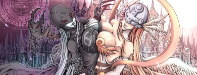
Lurna said: i have a question, i really want to insert links for my profile page, kind of like what a lot of profiles have. I am wondering the code to insert a link for a specific picture (like the obsessions category to make a link for each anime character to go to their fan page on mal etc.) This way when you click the picture it goes to the link given. Now my obsessions category is all one image. For the code to work does each image need to be individually made for each link? Also if i make each image individually how can i keep them in the order i want them in, like beside or right below/ontop without screwing up my design. I noticed your images are all done separately but it comes together quite nicely, i cant seem to get that to work Ugg i hope this isnt confusing, i have no idea how exactly to explain my problem but i hope you understand You can't add links to those images the way you have your profile graphic as one big image now. It has to be cut up into individual pieces like here:  They have to be evenly cut out (the proper term is cropped). I added the lines of color to give you an idea you need to cut them. The dimensions I added (circled parts) are suggestions for how big they should be. If you look it over carefully and add them up, you'll notice all the pics on one line have the same height as each other and add up to the same width as the top and bottom images. This is so when they get posted, they all fit together evenly like a jigsaw puzzle. Otherwise they'll be messed up and uneven. Then they got to be posted in your BBcode and replace what you got now. On the thing you asked about getting them in order: well (after you cut them all out individually) the images that are supposed to be on one line on the page need to be on one line in the code, like so: image1 is the red bordered part with Mio, image2 is the green bordered part with Meko, image3 is the blue bordered part with Makise, image4 is the purple bordered part with Mato, image5 is the turqouise bordered bottom part. I colored the text here so it would be easy to tell them apart. this is correct: [img][image1][/img] [img][image2][/img][img][image3][/img][img][image4][/img] [img][image5][/img] this is wrong: [img][image1][/img] [img][image2][/img] [img][image3][/img] [img][image4][/img] [img][image5][/img] After you split it up, then a URL link has to be attached to them in the BBcode. Like in this example: [url=http://www.myanimelist.net][img]http://myanimelist.net/ picture.jpg[/img][/url] the red part is your url tag. Whatever is in between it and the [/url] part will have a link when you click on it on the page. Add the url tag with the link you want to the images in your profile code you want that link on. I'd recommend just messing around a single image and adding a url tag to it to get the hang of it. btw bbcode is messed up alot after going back to it on this site, so you save your code often to a separate notepad. If it gets real messed up I have a thread in this club you can post in to get it fixed. Post back here too if anything isn't making sense or you're having trouble. Sorry for the late replay too, I thought you were asking someone in particular who also had a obsessions category thing but it turns out you were talking about yourself. |
Shishio-kunDec 1, 2011 2:16 PM
Jan 2, 2012 7:00 AM
#63
| How do you get your list to show Currently Watching only when you open you're animelist?? Something like this |
https://www.playfire.com/wallflower"> https://www.playfire.com/">PSN Gamercards https://www.playfire.com/">PSN Gamercards |
Jan 2, 2012 9:11 AM
#64

| Go to your profile > Edit My Profile > My List Settings > Anime List Settings > Default Status Selected or http://myanimelist.net/editprofile.php?go=listpreferences. |
 |
Jan 4, 2012 6:51 AM
#65
| Thank you very much! |
| https://www.playfire.com/wallflower">https://www.playfire.com/">PSN Gamercards |
Jan 19, 2012 7:51 PM
#66
| I'm not sure if I can ask some things yet but, for example. I tried to add some transparency on my list, in fact I'm trying to fix a lot of things and colors on it yet BUT....I would like to change the background color of my list and still keep it transparent, but not that much "invisible". I got the code here and I kinda liked it, it helped me a lot but when I try to change the color it won't be transparent anymore or I'm not even sure where to change it. If someone could help me with this I would appreciate it. (My English is not so good so it's hard for me explain, I hope you guys understand what I mean) Thank you! |
Jan 23, 2012 11:46 PM
#67
Hawkey said: I'm not sure if I can ask some things yet but, for example. I tried to add some transparency on my list, in fact I'm trying to fix a lot of things and colors on it yet BUT....I would like to change the background color of my list and still keep it transparent, but not that much "invisible". I got the code here and I kinda liked it, it helped me a lot but when I try to change the color it won't be transparent anymore or I'm not even sure where to change it. If someone could help me with this I would appreciate it. (My English is not so good so it's hard for me explain, I hope you guys understand what I mean) Thank you! Try these codes, and change the opacity number from .01 to .99 until you find the setting you like. It changes the transparency of your list background. The second set affects what you see when the cursor hangs over a spot on your list. .td1, .td2 { opacity: .9;} .td1:hover, .td2:hover { opacity: .9;} |
Jan 25, 2012 2:38 AM
#68
| Hello i got little trouble ;d When i click "More", the information in it is one big mess. How can i repair that? Link to my list: http://myanimelist.net/animelist/senami18 @Edit: Problem solved, i must add: #list_surround br { display:block; } |
senami18Jan 25, 2012 9:49 AM
Feb 1, 2012 7:20 PM
#69

| Question: How do I make the hover on background of the lists fade-in? I don't know if I explained myself ... I want it to look like this. I've looked around quite a considerable time but I can't find anything and I can't figure out the code. Would really love some help. Thank you in advance (: |
Feb 1, 2012 9:32 PM
#70

| Use something like this: tr:hover .td1, tr:hover .td2{/*code for new look*/} It changes the look of table cells in a hovered row (only in ones with titles). You can use any properties there, probably you'll use opacity and/or background-color And this is piece from my code that makes transition smooth: td{ -o-transition: background-color .2s linear; -webkit-transition: background-color .2s linear; -moz-transition: background-color .2s linear; transition: background-color .2s linear; } Obviously, here it is set for background-color only. Transition is a draft, so there are three browser-specific options and it doesn't work in IE. |
 |
More topics from this board
» [CSS- MODERN] ⭐ Minimal Dashboard layout by 5cm ~ Compact and convenient! ( 1 2 3 )Shishio-kun - Sep 4, 2020 |
121 |
by Pokitaru
»»
Apr 21, 3:25 AM |
|
» [CSS-MODERN] Change list text/font colors on any list layoutShishio-kun - May 4, 2021 |
3 |
by hideso
»»
Apr 20, 4:33 PM |
|
» [CSS] [VIDEO GUIDE] ⭐️ How to change fonts on a list layoutShishio-kun - Jul 15, 2019 |
17 |
by hideso
»»
Apr 20, 4:03 PM |
|
» [CSS][Modern] ☀️ Endless Summer Layout by Cateinya ( 1 2 3 4 5 ... Last Page )Cateinya - Aug 18, 2016 |
309 |
by hideso
»»
Apr 20, 3:56 PM |
|
» [CSS - CLASSIC] Wishes of the heart ~ XXXholic layout by HahaidoShishio-kun - Dec 27, 2015 |
9 |
by tsyndi
»»
Apr 18, 9:23 PM |