Forum Settings
Forums

Which Series´s Art do think good better and worse over time?

New
Jan 17, 2021 9:03 AM
#1

Offline
Jan 2012
700
Like the litle says, What manga serie whose art do you think got better or worse over time?
For me I think I go with this ones.

The ones that got better :
Gintama (both the action and character expression evolved to fit the serious tone that series would later get accustomed to)
HxH (At the start it suffered from having not much backgrounds and the art had a lot of mistakes here and there, but in time both of this problems got better over time)
The ones that got worse
Naruto (The expressions and emotions on the characters were a lot more lively duirng like the first 20 volymes, but after that the characters art felt more and more flat the longer it went.
Bleach (Got less detailed on backgrounds and characters expressions which had it´s moments got limited)
How I love a game
Jan 17, 2021 12:41 PM
#2

Offline
Feb 2016
10554
Please Save My Earth, the 1st and last volumes respectively.

その目だれの目?
Jan 17, 2021 4:26 PM
#3

Offline
Jun 2016
12771
Hare kon managed to do both in a way. The artist became better at drawing feet as the series progressed but relied more on photographs for backgrounds.
MEA·MENTVLA·INGENS·EST
Jan 17, 2021 5:12 PM
#4

Offline
Apr 2015
1278
The vast majority of long-running manga I've read have improved art. I can't really think of any that have gotten worse over time lol. But these are the ones that immediately come to mind, where the initial art look bad - mediocre at best (imo) and become definitively better:

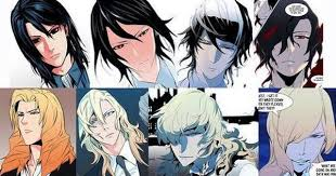
Noblesse: The biggest changes were mainly in the initial chapters, but the characters' hairstyles before looked hideous and I just didn't like the art style overall


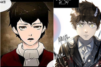
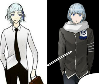
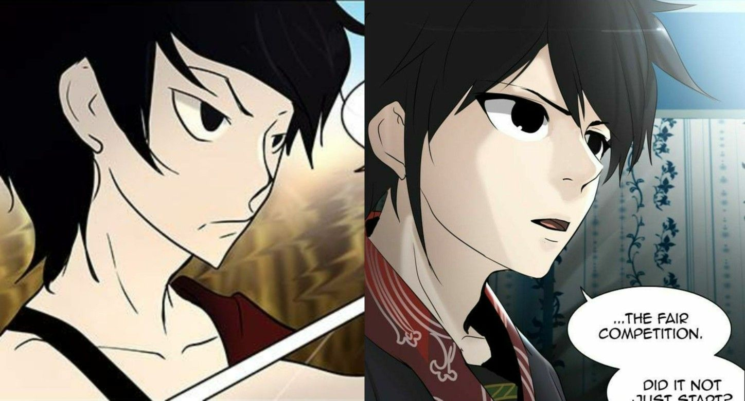
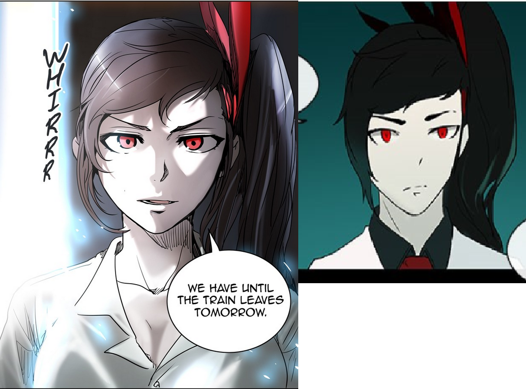
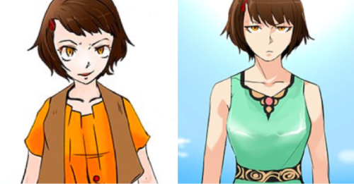
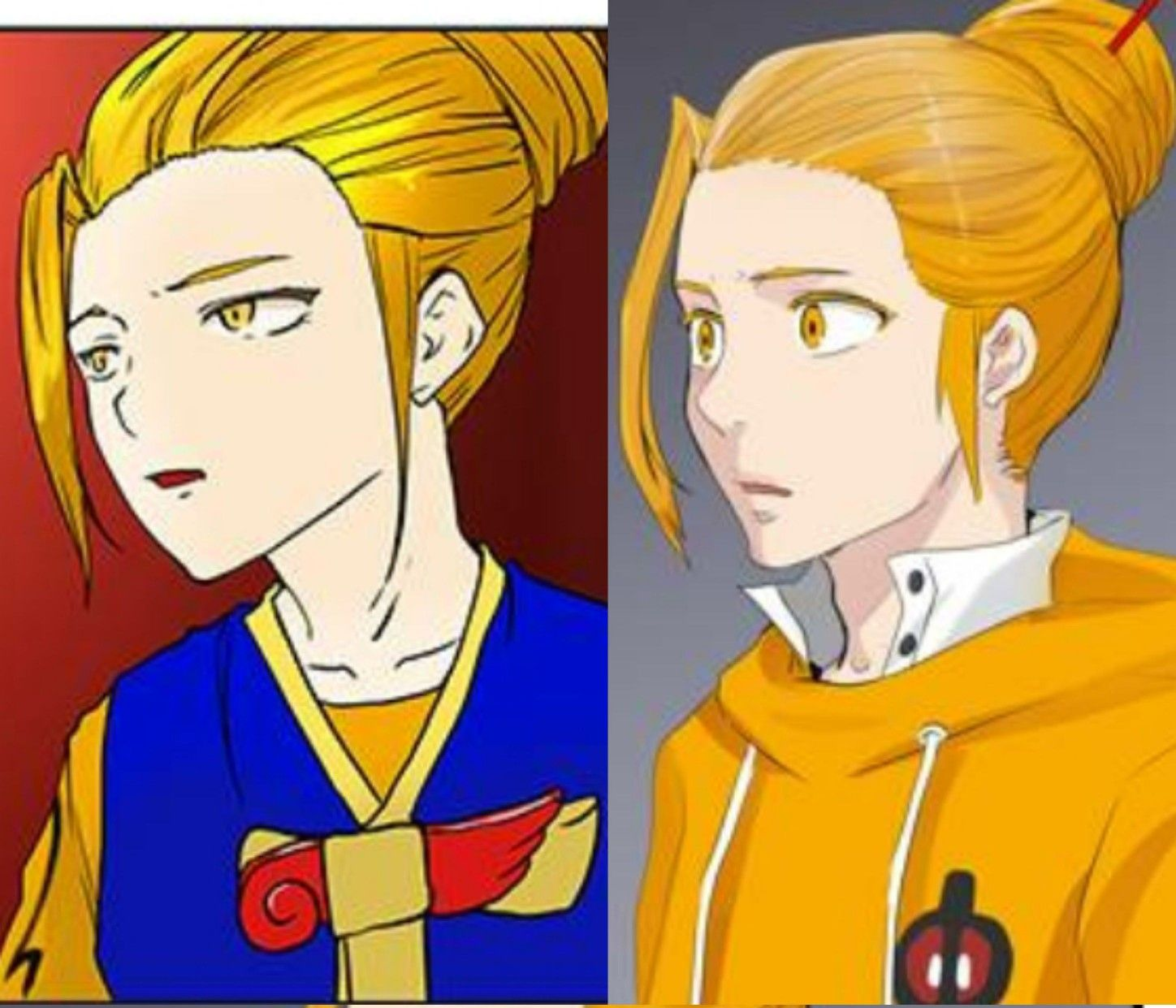
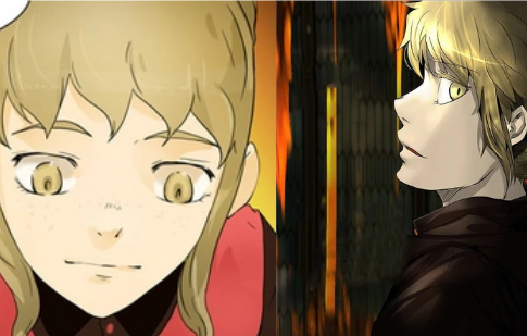
Tower of God: More shadowing, realistic body proportions, look less stiff, etc.


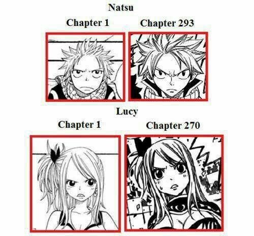
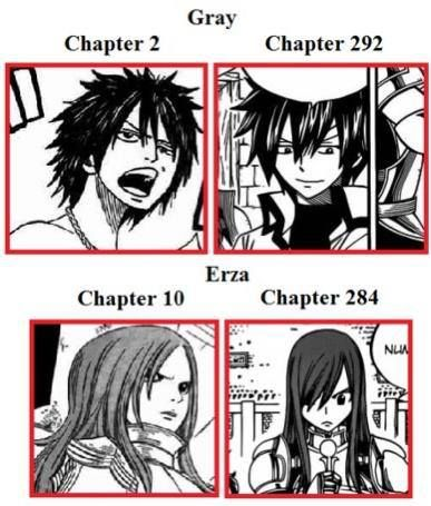
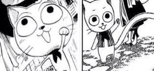
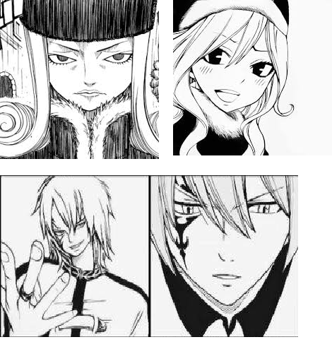
Fairy Tail: The large foreheads and exaggerated/goofy facial expressions really bothered me when I first started reading it


"As promised, all that you seek, all that we desire, is prepared up there. On top of the Tower."
Jan 20, 2021 9:28 AM
#5
Offline
Jul 2018
564533
Kengan Ashura's early style wasnt bad by any means but it becomes top tier after some time
Jan 22, 2021 5:53 PM
#6
Offline
Sep 2020
64
Kuroshitsuji. I'm not exactly a huge fan of it, but my partner really likes the manga, and from what I've seen, the art style evolution is drastic. It goes from typical bishonen (though not quite 'bug people' levels) to a very nuanced and realistic view of the characters, with the main characters being a standout. It's not surprising that enterprising -shall we say 'shota enthusiasts'?- thought it was meant to be a yaoi, because in early chapters, the protagonist, 'Ciel', looks like every uke ever made in the 2000s (thin, big eyes, twink archetype), but as time went on, he became much more believable as a malnourished (read: short af) 13-14 year old boy. Honestly, he's changed so much it's hard to believe they're the same person if you compare him between an early and a recent volume.

Sebastian, the demon butler, goes from a stereotypical bishonen from the depths of the uncanny valley, to a leanly muscular dude with actual shoulders and such, and he noticeably becomes more gaunt with each chapter as his duties take an unexpected toll on his body. Due to his restrictions as a demon, he has to express himself through facial movements and pose, and that's gotten markedly better, the more his character design has shifted towards realistic anatomy. At least, as close as one can get for a horrific eldritch abomination in a skin suit.

Essentially, the longer Black Butler goes on, the more it diverges from the typical 2000s art style and becomes a more contemporary, realistic art style befitting its dark, grounded tone of magical realism in the 1800s.
Jan 22, 2021 8:28 PM
#7
Offline
Nov 2015
353
Hunter x Hunter manga has slowly become a bunch of text with some few draws here and there ,.mangaka should really allow asssitents
Jan 23, 2021 1:36 AM
#8
Offline
Sep 2020
64
freizel said:
Hunter x Hunter manga has slowly become a bunch of text with some few draws here and there ,.mangaka should really allow asssitents


Yeah, Togashi's art has always been a bit shaky mistakey around the edges, but dude must be in his 50s by now, so it's not surprising his art would deteriorate, especially if he's been overworking his hands down the years. He probably should get someone else to do the art for him, tbh. Maybe grab the person who did the art for Starving Anonymous, because they're pretty good, even if the overall story of that one sucked?
Jan 23, 2021 9:12 PM
#9

Offline
May 2020
190
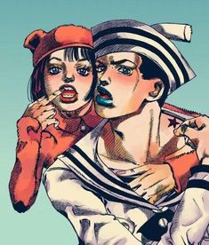
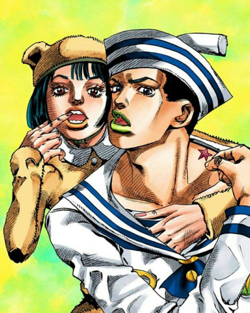
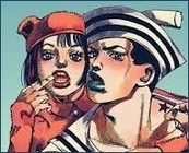
Definitely JoJo
Araki's art just gets better with each part. His art is literally GODLIKE in the currently serializing Part 8: JoJolion.
This man is a beast!
Example: My signature is from one of the volume covers! Obviously it is it cropped, also the colors are switched around a little bit. I'll put the original below


I wont include more for the sake of brevity, but I implore you to look up more images from JoJolion
GloryosityJan 23, 2021 9:35 PM
                                              
Jan 24, 2021 11:07 PM

Offline
May 2020
1898
Esmera said:
The vast majority of long-running manga I've read have improved art. I can't really think of any that have gotten worse over time lol. But these are the ones that immediately come to mind, where the initial art look bad - mediocre at best (imo) and become definitively better:

Noblesse: The biggest changes were mainly in the initial chapters, but the characters' hairstyles before looked hideous and I just didn't like the art style overall


Tower of God: More shadowing, realistic body proportions, look less stiff, etc.


Fairy Tail: The large foreheads and exaggerated/goofy facial expressions really bothered me when I first started reading it


Jesus, those ToG panels look insane. The change in art is amazing.

As for Fairy Tail, I always thought the early chapters looked a lot like the artwork from One Piece.

For me, personally, one of the best parts of reading long-running manga is the seeing how the artist's work gets better over time. I can't really recall any manga where the art got noticeably worse, or at least I never noticed it.

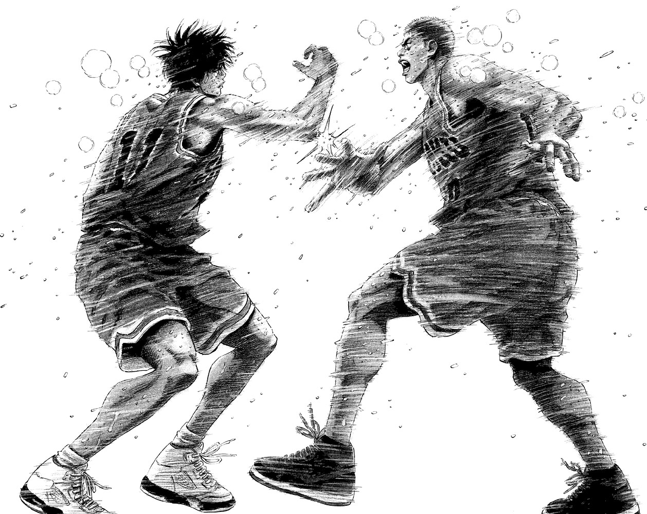
One example is Takehiko Inoue for Slam Dunk

A panel from Chapter 29


A panel from the last chapter, Chapter 276

Jan 24, 2021 11:33 PM

Offline
Aug 2020
1144
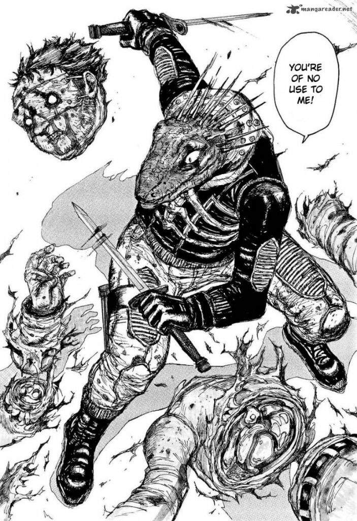
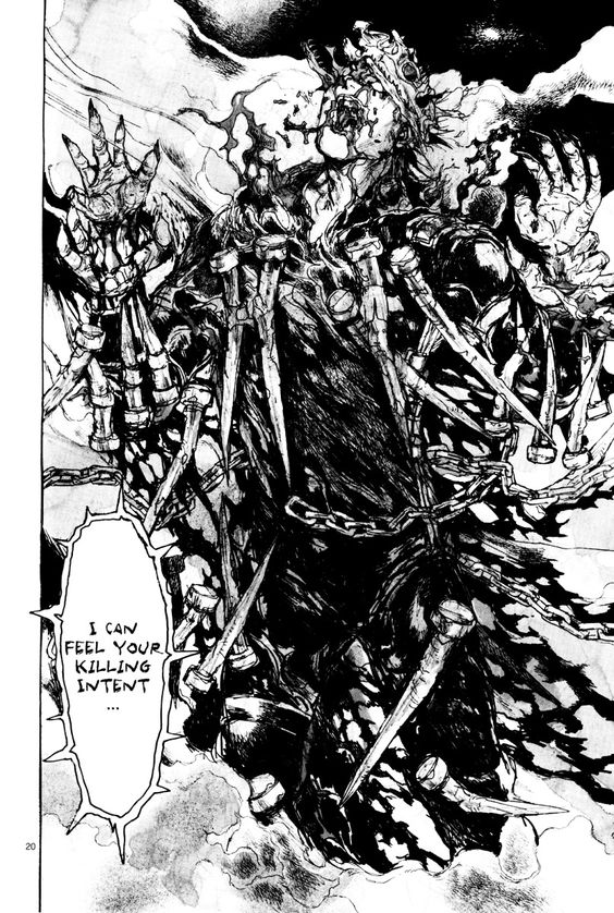
Dorohedoro

before


after
KuroGFXJan 24, 2021 11:37 PM
Jan 24, 2021 11:39 PM

Offline
Apr 2015
1278
TitanInsane said:

Jesus, those ToG panels look insane. The change in art is amazing.

As for Fairy Tail, I always thought the early chapters looked a lot like the artwork from One Piece.

For me, personally, one of the best parts of reading long-running manga is the seeing how the artist's work gets better over time. I can't really recall any manga where the art got noticeably worse, or at least I never noticed it.

One example is Takehiko Inoue for Slam Dunk

A panel from Chapter 29


A panel from the last chapter, Chapter 276


Haha I've thought of the early Fairy Tail and One Piece artwork similarity before as well, for some reason One Piece's never bothered me nearly as much though.

But WOW that Slam Dunk art improvement is amazing! I was just recently thinking of reading it, that's definitely got me motivated to start sooner than later xD


"As promised, all that you seek, all that we desire, is prepared up there. On top of the Tower."
Jan 25, 2021 3:28 AM

Offline
Aug 2014
1704
Slam Dunk's glow-up is one of the best I'll remember always.

Soul Eater always had a great sense of style, but the character designs improved a lot since the beginning. Then got a bit worse over halfway in, but still way better than they were initially, I guess.

KareKano's designs got better and more suited to the darker tone in the later parts of the manga.

Jiraishin from Takahashi Tsutomu got way better since the beginning. I know it since I peeked at the later parts and welp, from just reading his later works, since I postponed finishing due to its episodic stories being iffy as hell lol.

I'll give it to ya that Naruto was more expressive and detailed, but Bleach didn't take that much of a hit with the characters for how much better the designs got to look from it.

Nana got worse. It's like everybody took a diet and got more twiggy out of it. The faces and the expressions on close-ups took a hit and they were used in its drama like that, too. I know there's good reason for it, but it is worse imo.
Jan 25, 2021 3:06 PM

Offline
Jan 2019
2431
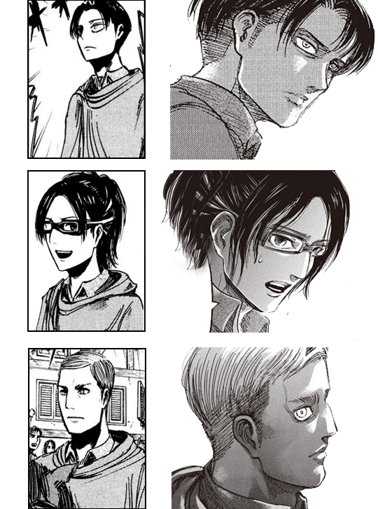
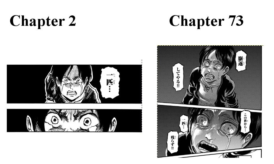
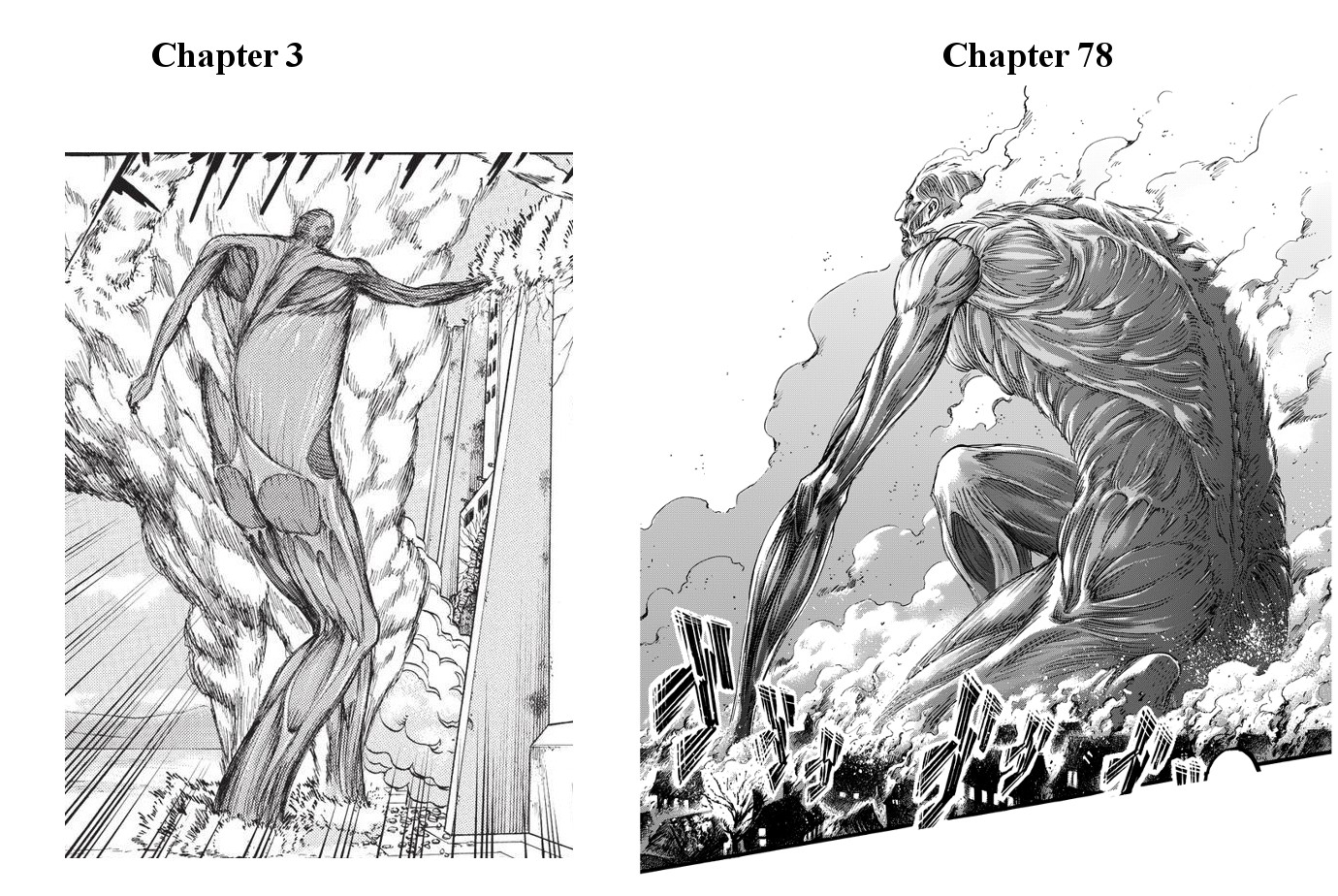
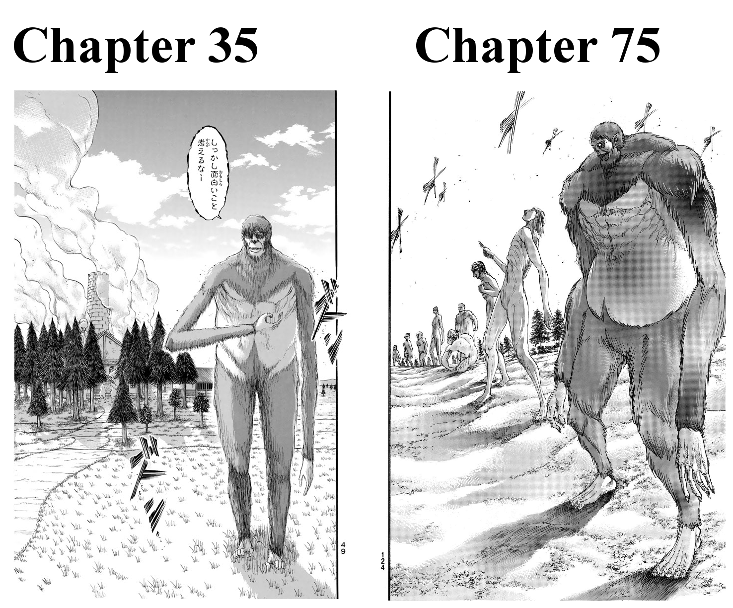
Shingeki no Kyojin, of course.


More topics from this board

» From all the ongoing (and on hiatus) manga, you can choose only one to eventually reach a conclusion. Which one would it be?

Caciulacdlac - Apr 10

11 by Rhae »»
4 hours ago

Poll: » why do some people hate manhwa/ua so much???

FruitPunchBaka - May 6

11 by bcasey25raptor »»
6 hours ago

» 2024 Manga Reading Challenge - Discussion ( 1 2 3 4 )

MRC_mod - Jan 20

159 by jaeo_k »»
Yesterday, 10:47 AM

Sticky: » 2024 Manga Reading Challenge - Sign Up ( 1 2 3 4 5 ... Last Page )

MRC_mod - Jan 18

388 by DeBritto »»
Yesterday, 7:29 AM

» 50,000 Manga Titles Translated by AI Are Set to Come Overseas

deg - May 6

5 by Lucifrost »»
Yesterday, 6:46 AM
It’s time to ditch the text file.
Keep track of your anime easily by creating your own list.
Sign Up Login