New
May 5, 2023 8:29 AM
#401
| Hi, I've been using this theme for years and it's still the best one out there imo. Just updated to 2.0 and I noticed the new More section instead of the old Notes. I don't exactly need half of the stuff in there, is it customisable? I was thinking of something like this: (and perhaps hide lines entirely when empty / values are 0) 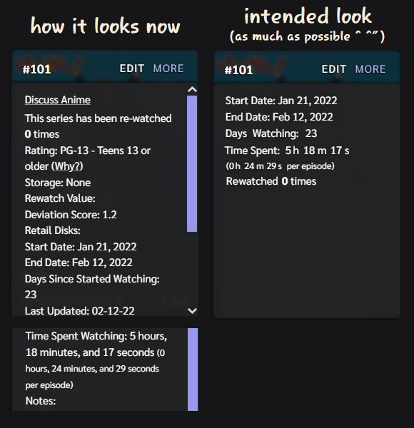 |
May 7, 2023 3:30 PM
#402
Raasquart said: Hi, I've been using this theme for years and it's still the best one out there imo. Just updated to 2.0 and I noticed the new More section instead of the old Notes. I don't exactly need half of the stuff in there, is it customisable? I was thinking of something like this: (and perhaps hide lines entirely when empty / values are 0) The old "Notes" section and the "More" section are actually one and the same, the difference is on older versions Brink hid all the extra info. MyAnimeList has since added their own "Notes" column in the list settings, thus causing the change in 2.0 for more compatibility with all lists and user preferences (those that wish for a dedicated Notes section would likely enable the "Notes" column, but this would break on older versions of Brink). That, and the code had issues on mangalists. Unfortunately, I was already pushing the limits and using some very hacky code to remove all that extra info. Due to the lack of selectors and the fact some lines are not always there, I don't believe it's possible to pick and choose individual lines. The best I can offer is to remove that section. If you enable the "Notes" column and add this mod, the "More" section will be replaced by "Notes". Or you can keep both by doing nothing to the code. /* start: Remove More Info */
.add-edit-more .more a {
font-size: 0;
visibility: hidden;
}
.add-edit-more .more a::before {
content: "NOTES";
font-size: 12px;
vertical-align: top;
}
.add-edit-more:active {
z-index: 0;
}
.add-edit-more:not(:active)::after {
right: 0;
}
.notes {
left: auto;
right: 15px;
}
.notes .text,
.notes textarea {
left: auto;
right: -15px;
}
/* end: Remove More Info */ |
Valerio_LyndonMay 7, 2023 3:43 PM
May 8, 2023 4:50 PM
#403
Valerio_Lyndon said: I see. I've actually noticed after posting that they indeed have added a separate Notes section in there, but what harm in asking~Raasquart said: Hi, I've been using this theme for years and it's still the best one out there imo. Just updated to 2.0 and I noticed the new More section instead of the old Notes. I don't exactly need half of the stuff in there, is it customisable? I was thinking of something like this: (and perhaps hide lines entirely when empty / values are 0) The old "Notes" section and the "More" section are actually one and the same, the difference is on older versions Brink hid all the extra info. MyAnimeList has since added their own "Notes" column in the list settings, thus causing the change in 2.0 for more compatibility with all lists and user preferences (those that wish for a dedicated Notes section would likely enable the "Notes" column, but this would break on older versions of Brink). That, and the code had issues on mangalists. Unfortunately, I was already pushing the limits and using some very hacky code to remove all that extra info. Due to the lack of selectors and the fact some lines are not always there, I don't believe it's possible to pick and choose individual lines. The best I can offer is to remove that section. If you enable the "Notes" column and add this mod, the "More" section will be replaced by "Notes". Or you can keep both by doing nothing to the code. /* start: Remove More Info */
.add-edit-more .more a {
font-size: 0;
visibility: hidden;
}
.add-edit-more .more a::before {
content: "NOTES";
font-size: 12px;
vertical-align: top;
}
.add-edit-more:active {
z-index: 0;
}
.add-edit-more:not(:active)::after {
right: 0;
}
.notes {
left: auto;
right: 15px;
}
.notes .text,
.notes textarea {
left: auto;
right: -15px;
}
/* end: Remove More Info */Thanks for confirming though. |
Jul 18, 2023 2:21 PM
#404

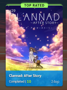
That "Top Rated" looks cool with the glow effect. It would be nice to add/mention that and other similar styles (for grid layouts) in [ LIST TUTORIALS ] All CSS guides and extensions for lists. There are plenty of other images available in this thread that can be used as examples too...  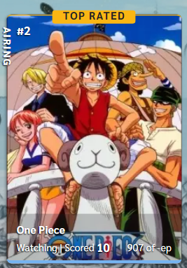   The "Top Rated" (or other text) with glow effect can be applied to other grid layouts, right? But how about on cover/preview images on hover for the default/modern list design? Just thought of that after reading this: you add currently viewing to the cover topic. I would've love to try the grid layout especially Brink, Tilt or Puni but I've so many notes with BBCode and YT embeds so I think I'll have to stick with the default. |

Jul 18, 2023 3:06 PM
#405

IridescentJaune said: That "Top Rated" looks cool with the glow effect. It would be nice to add/mention that and other similar styles (for grid layouts) in [ LIST TUTORIALS ] All CSS guides and extensions for lists. There are plenty of other images available in this thread that can be used as examples too... . I don't know what you're referring to exactly (in terms of code) but pretty much any effect can be carried over to another layout. Yeah later this year I could throw together a topic on customizing the covers this way, but I won't be doing much for this group until fall and I want to finish new tutorial videos then which were supposed to be done in spring but I had many delays with new issues. The "Top Rated" (or other text) with glow effect can be applied to other grid layouts, right? But how about on cover/preview images on hover for the default/modern list design? Just thought of that after reading this: you add currently viewing to the cover topic. I would've love to try the grid layout especially Brink, Tilt or Puni but I've so many notes with BBCode and YT embeds so I think I'll have to stick with the default idk, you have to try the codes on the layouts and see for yourself if they work. if they don't work they'd have to be adjusted https://myanimelist.net/forum/?topicid=2086767 This post, I don't follow what they mean at all. I have a really hard time understanding other user's ideas because their writing has several different interpretations in my head, so I need ppl to be much more clear with their imagined ideas. |
Jul 18, 2023 9:05 PM
#406
| You could definitely add that top rated effect to most other themes, but as Shishio says it would take some tweaking. Especially since there are a lot of hard-coded position and size values I used for those. Should be a pretty simple change for most themes though I would think. |
Jul 18, 2023 11:15 PM
#407
| Don't really mind the topic I linked. I guess want they kinda want is to have something similar to this: Anyways, I just thought if I could also add the "Top Rated" (or other text) to preview images in my list (default/modern design) like maybe on hover or if not possible just on the cover images? I tried some layouts and it looks like my notes with all those BBCodes and YT embeds are showing on Tilt and Puni normally which is great; I think my list works fine with Puni and I do like Pokémon. And it looks like Tilt and Puni are much easier to tweak compared to other grid layouts considering all my notes probably because Puni isn't exactly a grid or tile layout unlike Brink or the others. In most grid or tile layouts, the 'Notes' or 'More' sections are contained within the tiles. |
Jul 18, 2023 11:37 PM
#408
IridescentJaune said: Anyways, I just thought if I could also add the "Top Rated" (or other text) to preview images in my list (default/modern design) like maybe on hover or if not possible just on the cover images? I just checked the comments on Tilt and found these: 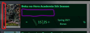 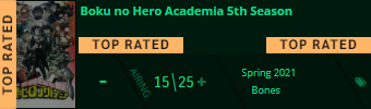 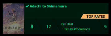  I kinda want to add that "Top Rated" (or other text) to my cover images. Those are tags, right? Would be nice if this was also on the [ LIST TUTORIALS ] All CSS guides and extensions for lists. Sorry, this no longer relates to the Brink layout... I guess I better move my inquiries to ❓ Ask for help here + See Frequently Asked Questions then. |
Jul 19, 2023 3:15 PM
#409
| @IridescentJaune ok thanks for suggestions- I've made a little topic noting this suggestion (with other stuff to do later this year) so I wont forget :D |
Dec 7, 2023 10:28 AM
#410
| I really like the "Top Rated" banner. Would it be possible to also have a "Favorites" banner that automatically gets placed on anime that's in my favorites? |
Dec 9, 2023 9:43 PM
#411
Reply to Achmetha0626
I really like the "Top Rated" banner. Would it be possible to also have a "Favorites" banner that automatically gets placed on anime that's in my favorites?
| @Achmetha0626 There's no way to do this automatically, you would have to write JavaScript for that. If you want to do this manually though then you can achieve it by using your list tags, which will also allow you to go over the 10/20 limit MAL imposes on favourites. I posted about this earlier in the thread, see: [here]. |
Jan 9, 2024 4:11 AM
#412
Reply to Valerio_Lyndon
@Achmetha0626 There's no way to do this automatically, you would have to write JavaScript for that. If you want to do this manually though then you can achieve it by using your list tags, which will also allow you to go over the 10/20 limit MAL imposes on favourites. I posted about this earlier in the thread, see: [here].
| @Valerio_Lyndon Thanks, I'm finally working on implementing it now. Is there something I can insert into the top rated banners code that will disable it if there's a specific tag on the anime? |
Jan 9, 2024 10:30 AM
#413

| Hi! (o^▽^o)ノ Thank you for providing such a beautiful theme for free! I currently have the 1.8.0 version, and wanted to update for the latest one (V2.1.1) but idk why I see the type in the left corner. I never ticked the "Number" column before but I never had a problem with it, and in preview mode, I already deleted all the mods and it didn't change anything.  Is there a way to correct this please? Here is the code that used for V2.1.1 (without all the mods I added, only the Light Theme). Also, is there any way to see the status colour at the bottom of the image on mouse hover like in the previous version? V1.8.0 V2.1.1   Thank youヽ(・∀・)ノ P.S: If you check my list, I still have the V1.8.0 since I have the display problem with V2.1.1! |
Jan 9, 2024 9:36 PM
#414
Reply to Achmetha0626
@Valerio_Lyndon Thanks, I'm finally working on implementing it now. Is there something I can insert into the top rated banners code that will disable it if there's a specific tag on the anime?
@Achmetha0626 There didn't used to be, but if we use the recent CSS addition ":has()" we should be able to do this. It should be supported by your browser by now. You can place this anywhere in the code and it should work..list-table-data:has(a[href$="=fav"]) .score-label::before,
.list-table-data:has(a[href$="=fav"]) .score-label::after {
content: none;
}If you have multiple tags you want to do this for you can add them inside of both the :has() parentheses, separated by commas. Example: .list-table-data:has( a[href$="=fav"], a[href$="=worst"] ) .score-label::before, .list-table-data:has( a[href$="=fav"], a[href$="=worst"] ) .score-label::after { content: none; } |
Jan 9, 2024 10:02 PM
#415
Reply to Meeyua
Hi! (o^▽^o)ノ
Thank you for providing such a beautiful theme for free!
I currently have the 1.8.0 version, and wanted to update for the latest one (V2.1.1) but idk why I see the type in the left corner.
I never ticked the "Number" column before but I never had a problem with it, and in preview mode, I already deleted all the mods and it didn't change anything.
Is there a way to correct this please? Here is the code that used for V2.1.1 (without all the mods I added, only the Light Theme).
Also, is there any way to see the status colour at the bottom of the image on mouse hover like in the previous version?
V1.8.0 V2.1.1
Thank youヽ(・∀・)ノ
P.S: If you check my list, I still have the V1.8.0 since I have the display problem with V2.1.1!
| @Meeyua Is there a reason you want to update? If you haven't noticed any bugs with your current CSS, you can safely stick with the old version and keep enjoying it. :) The v2.x.x is labelled as such because of the design changes, including the Type being moved to the top left when there is no Number there. To answer your questions, the easiest way to revert the look of the Type is to add extra code because otherwise there would be about 4 different places you would have to delete and add stuff. /* revert Type to v1.x.x style */
.data.type.type.type {
position: relative !important;
inset: initial !important;
padding-left: 15px !important;
font-size: 12px !important;
font-weight: 400 !important;
margin-bottom: 4px;
opacity: 0 !important;
}
.list-item:hover .data.type {
opacity: 1 !important;
}
.data.type::after {
content: "\f069";
position: absolute;
top: 0;
left: -3px;
width: 16px;
height: 15px;
color: hsla(var(--text), 83%);
text-align: center;
}Since the other items are pushed down compared to v1 you may also want to increase the height of the information section to be closer to v1. /* increase item data section height */
.list-table-data {
margin-top: 13px;
height: 186px;
}As for the status bar, it's a case of just adding back the code that was removed in v2. /* revert Status to v1.x.x style */
.data.status {
position: absolute;
left: 0;
top: 0;
z-index: 15 !important;
width: 100% !important;
height: 100%;
background: none !important;
border-bottom-width: 4px !important;
border-radius: 6px;
pointer-events: none;
} .data.status.watching,
.data.status.reading {
border-color: hsl(var(--current));
} .data.status.completed {
border-color: hsl(var(--completed));
} .data.status.onhold {
border-color: hsl(var(--paused));
} .data.status.dropped {
border-color: hsl(var(--dropped));
} .data.status.plantowatch,
.data.status.plantoread {
border-color: hsl(var(--planned));
} |
Valerio_LyndonJan 11, 2024 12:54 AM
Jan 10, 2024 2:05 AM
#416
Reply to Valerio_Lyndon
@Meeyua Is there a reason you want to update? If you haven't noticed any bugs with your current CSS, you can safely stick with the old version and keep enjoying it. :) The v2.x.x is labelled as such because of the design changes, including the Type being moved to the top left when there is no Number there.
To answer your questions, the easiest way to revert the look of the Type is to add extra code because otherwise there would be about 4 different places you would have to delete and add stuff.
Since the other items are pushed down compared to v1 you may also want to increase the height of the information section to be closer to v1.
As for the status bar, it's a case of just adding back the code that was removed in v2.
To answer your questions, the easiest way to revert the look of the Type is to add extra code because otherwise there would be about 4 different places you would have to delete and add stuff.
/* revert Type to v1.x.x style */
.data.type.type.type {
position: relative !important;
inset: initial !important;
padding-left: 15px !important;
font-size: 12px !important;
font-weight: 400 !important;
margin-bottom: 4px;
opacity: 0 !important;
}
.list-item:hover .data.type {
opacity: 1 !important;
}
.data.type::after {
content: "\f069";
position: absolute;
top: 0;
left: -3px;
width: 16px;
height: 15px;
color: hsla(var(--text), 83%);
text-align: center;
}Since the other items are pushed down compared to v1 you may also want to increase the height of the information section to be closer to v1.
/* increase item data section height */
.list-table-data {
margin-top: 13px;
height: 186px;
}As for the status bar, it's a case of just adding back the code that was removed in v2.
/* revert Status to v1.x.x style */
.data.status {
position: absolute;
left: 0;
top: 0;
z-index: 15 !important;
width: 100% !important;
height: 100%;
background: none !important;
border-bottom-width: 4px !important;
border-radius: 6px;
pointer-events: none;
} .data.status.watching,
.data.status.reading {
border-color: hsl(var(--current));
} .data.status.completed {
border-color: hsl(var(--completed));
} .data.status.onhold {
border-color: hsl(var(--paused));
} .data.status.dropped {
border-color: hsl(var(--dropped));
} .data.status.plantowatch,
.data.status.plantoread {
border-color: hsl(var(--planned));
}| @Valerio_Lyndon Thank you very much for your quick reply! (o´▽`o) Valerio_Lyndon said: Is there a reason you want to update? If you haven't noticed any bugs with your current CSS, you can safely stick with the old version and keep enjoying it. :) I don't have any bugs, but I thought I should probably update to the latest version to benefit from Brink's latest changes! I added the 3 mods to the V2.1.1 and it's still visible in the top left when there's no mouse hover.   Then I guess I should just stick with V1.8.0! But there are some minor changes I like in V2.1.1 that aren't there in V1.8.0. Can I please get the mods for the following design changes to add to my v1? - Disable the "Watch" button - "Page" get over the banner when scrolling down  - Have the star symbol and "MAL:" before the MAL Score V1.8.0 V2.1.1  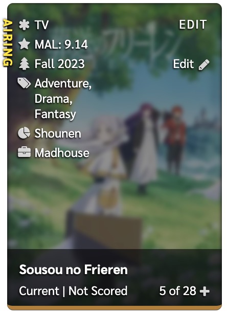 I tried to create a little bit my own code (with the little knowledge I have in CSS and from what I've found in your code) but I know it's not quite right (not enough padding below, can't put the "MAL:" before the score without affecting its colour) and I would prefer to have the correct code given by the creator themself! .data.mal_score {
order:20}
.data.mal_score::before {
content:"\f005";
color: hsla(var(--text),80%);
}
.data.mal_score:after {
content:" MAL sc.";
} Thanks a lot ヽ(・∀・)ノ |
MeeyuaJan 10, 2024 2:09 AM
Jan 10, 2024 6:12 AM
#417
Reply to Valerio_Lyndon
@Achmetha0626 There didn't used to be, but if we use the recent CSS addition ":has()" we should be able to do this. It should be supported by your browser by now. You can place this anywhere in the code and it should work.
If you have multiple tags you want to do this for you can add them inside of both the :has() parentheses, separated by commas. Example:
.list-table-data:has(a[href$="=fav"]) .score-label::before,
.list-table-data:has(a[href$="=fav"]) .score-label::after {
	content: none;
}
If you have multiple tags you want to do this for you can add them inside of both the :has() parentheses, separated by commas. Example:
.list-table-data:has( a[href$="=fav"], a[href$="=worst"] ) .score-label::before,
.list-table-data:has( a[href$="=fav"], a[href$="=worst"] ) .score-label::after {
content: none;
}
.list-table-data:has( a[href$="=fav"], a[href$="=worst"] ) .score-label::after {
content: none;
}
| @Valerio_Lyndon Thanks!! It works perfectly |
Jan 11, 2024 12:56 AM
#418
Reply to Meeyua
@Valerio_Lyndon Thank you very much for your quick reply! (o´▽`o)
I don't have any bugs, but I thought I should probably update to the latest version to benefit from Brink's latest changes!
I added the 3 mods to the V2.1.1 and it's still visible in the top left when there's no mouse hover.
Then I guess I should just stick with V1.8.0!
But there are some minor changes I like in V2.1.1 that aren't there in V1.8.0.
Can I please get the mods for the following design changes to add to my v1?
- Disable the "Watch" button
- "Page" get over the banner when scrolling down
- Have the star symbol and "MAL:" before the MAL Score
V1.8.0 V2.1.1
I tried to create a little bit my own code (with the little knowledge I have in CSS and from what I've found in your code) but I know it's not quite right (not enough padding below, can't put the "MAL:" before the score without affecting its colour) and I would prefer to have the correct code given by the creator themself!
Thanks a lot ヽ(・∀・)ノ
Valerio_Lyndon said:
Is there a reason you want to update? If you haven't noticed any bugs with your current CSS, you can safely stick with the old version and keep enjoying it. :)
Is there a reason you want to update? If you haven't noticed any bugs with your current CSS, you can safely stick with the old version and keep enjoying it. :)
I don't have any bugs, but I thought I should probably update to the latest version to benefit from Brink's latest changes!
I added the 3 mods to the V2.1.1 and it's still visible in the top left when there's no mouse hover.
Then I guess I should just stick with V1.8.0!
But there are some minor changes I like in V2.1.1 that aren't there in V1.8.0.
Can I please get the mods for the following design changes to add to my v1?
- Disable the "Watch" button
- "Page" get over the banner when scrolling down
- Have the star symbol and "MAL:" before the MAL Score
V1.8.0 V2.1.1
I tried to create a little bit my own code (with the little knowledge I have in CSS and from what I've found in your code) but I know it's not quite right (not enough padding below, can't put the "MAL:" before the score without affecting its colour) and I would prefer to have the correct code given by the creator themself!
.data.mal_score {
  order:20}

.data.mal_score::before {
  content:"\f005";
	color: hsla(var(--text),80%);
  }
.data.mal_score:after {
  content:" MAL sc.";
  }
Thanks a lot ヽ(・∀・)ノ
@Meeyua Mm, I see. I thought you might not want any of the design updates. Since you want some of the major ones, we'll carry on with v2. I looked at the Type code again and I noticed one mistake I made, but it still should have mostly worked. I edited the post with a newer version which you can also find here:/* revert Type to v1.x.x style */
.data.type.type.type {
position: relative !important;
inset: initial !important;
padding-left: 15px !important;
font-size: 12px !important;
font-weight: 400 !important;
margin-bottom: 4px;
opacity: 0 !important;
}
.list-item:hover .data.type {
opacity: 1 !important;
}
.data.type::after {
content: "\f069";
position: absolute;
top: 0;
left: -3px;
width: 16px;
height: 15px;
color: hsla(var(--text), 83%);
text-align: center;
}After you added it to your CSS, what happened? And did you add it to the very bottom? This is what it looks like to me when I test out the code on your list:  |
Jan 11, 2024 5:14 AM
#419
| @Valerio_Lyndon I changed to v2 with the codes you gave me and now everything works perfectly, thank you so much! ヽ(>∀<☆)ノ Yes I added the codes at the very bottom. I guess it was the little mistake that made the Type still visible in the top left, because other than that, everything seemed to work! Thanks again and have a nice day :) |
Sep 5, 2024 1:17 PM
#420

| @Shishio-kun and @Valerio_Lyndon Good afternoon, I need urgent help, I have damaged my beloved CSS, I tried to change the blink 1.7.0 to 2.1.3. But I did not know what I did but I need help because now I try to go back to the old one and nothing is also damaged or I'm copying wrong. /* "Brink" by Valerio Lyndon * Version 2.1.3 * * = TABLE OF CONTENTS = * ! IMPORTS * ! VARIABLES @ User @ Internal * ! PAGE-BASE @ Scrollbars @ Generic @ Containers * ! HEADER * ! USER-MENU * ! BANNER * ! STATUS-MENU @ Search * ! SORT-BUTTONS @ Filters @ Sort-By * ! LIST @ Item-Base @ Image @ Status @ Title @ Notes @ Progress/Score @ Tags @ Number @ Type @ Rated @ MAL Scores @ Popularity @ Season @ Genre/Demographic/Studio/Licensor/Magazine @ Dates @ Priority @ Storage @ More-Info @ Loading-Icon * ! OVERLAYS @ GDPR @ Streaming @ iFrames @ Rewatch-Box @ Filter-Menu * ! FOOTER * ! MEDIA-QUERIES * ! FIXES * ! MODS */ /*==============================*\ !IMPORTS \*------------------------------*/ @\import "https://fonts.googleapis.com/css2?family=Sarabun:wght@400;700&display=swap"; @\import "https://valeriolyndon.github.io/MAL-Public-List-Designs/resources/font-awesome-4.7.0/css/font-awesome-force-legacy.min.css"; /*==============================*\ !VARIABLES @User \*------------------------------*/ :root { /* USER OPTIONS * * toggleStats / Toggles list statistics (found in the footer) * valid values: visible / hidden * * toggleStreaming / Toggles anime streaming service button. * valid values: visible / hidden * * toggleTopRating(Gold/Silver/Bronze) / Toggles banners on top of highly rated items. * valid values: visible / hidden * * bgDimness / Changes dimming of background image / Higher = Dimmer. * min value: 0% / max value: 100% * * bannerVignetteOpacity / Changes opacity of banner image vignette / Higher = More Opaque. * min value: 0% / max value: 100% * * imageBrightness(Hov) / Changes lightness of cover images / Higher = Brighter. * min value: 0% / max value: 100% * * imageBlurHov / Changes blurring of cover images / Higher = More * valid values: any positive number value, ending in "px" * * imageFade / Changes fading effect on bottom of cover images / Higher = More * min value: 0 / max value: 1 * * infoBGOpacity / Changes opacity of background on list items for improved readability / Set to 0% to hide * min value: 0% / max value: 100% * * numberOpacity / Changes opacity of number text (or whichever column is in its place) / Higher = More opaque * min value: 0% / max value: 100% */ --toggleStats: hidden; --toggleStreaming: visible; --toggleTopRatingGold: visible; --toggleTopRatingSilver: visible; --toggleTopRatingBronze: hidden; --bgDimness: 50%; --bannerVignetteOpacity: 90%; --imageBrightness: 85%; --imageBrightnessHov: 50%; --imageBlurHov: 2px; --imageFade: .95; --infoBGOpacity: 0%; --numberOpacity: 80%; /* THEME COLOURS * * Colours are HSL values but without their surrounding parentheses. * To get the correct values, simply strip away the surrounding parentheses and blurb. * For instance, "hsl(244, 42%, 82%)" would simply become "244, 42%, 82%". * For help with HSL: https://www.w3schools.com/colors/colors_hsl.asp * * For help with what each colour controls, see the forum post: https://myanimelist.net/forum/?topicid=1772180 */ --bg: 240, 3%, 9%; --bgAlt: 240, 3%, 14%; --btn: 240, 3%, 16%; --btnAlt: 240, 3.5%, 21%; --btnLight: 240, 100%, 94%, 4%; --btnAccent: 240, 17%, 34%; --accent: 240, 75%, 77%; --text: 0, 0%, 100%; --textProminent: 27, 87%, 67%; --textLinkHov: 240, 50%, 80%; --current: 35, 49%, 46%; --completed: 324, 49%, 46%; --paused: 80, 91%, 23%; --dropped: 6, 44%, 46%; --planned: 56, 18%, 56%; --goldRating: 32.5, 100%, 71%; --silverRating: 0, 0%, 80%; --bronzeRating: 25, 55%, 59%; } /* ~ ~ ~ ~ ~ ~ ~ ~ ~ ~ ~ ~ ~ ~ ~*\ @Internal \*~ ~ ~ ~ ~ ~ ~ ~ ~ ~ ~ ~ ~ ~ ~ */ :root { /* INTERNALS * * More advanced variables. * Changing the font incorrectly may result in visual bugs. */ --listW: 100vw; --font: "Sarabun", "Segoe UI", "Arial", "FontAwesome 4", "FontAwesome", sans-serif; --timeText: 60ms; --timeButton: 160ms; --timeButtonLarge: 260ms; --timeItem: 120ms; --timeMenu: 350ms; --bezierFast: cubic-bezier(.38,.32,.25,1); --bezierSmooth: cubic-bezier(.45,.32,.25,1); --bezierItemBounce: cubic-bezier(.6,.48,.7,1.45); --delayMenu: 333.4ms; /* These SVGs will not display to non-list-owners. * Find the images for other users in the !FIXES section. */ --arrowUp: url(https://files.catbox.moe/uure2q.svg); --arrowRt: url(https://files.catbox.moe/lqi5fy.svg); --arrowDn: url(https://files.catbox.moe/m9ot24.svg); --arrowLt: url(https://files.catbox.moe/68o5bn.svg); } /*==============================*\ !PAGE-BASE @Scrollbars \*------------------------------*/ /* Firefox */ * { scrollbar-color: hsl(var(--accent)) hsl(var(--bgAlt)); } .list-item * { scrollbar-color: hsl(var(--accent)) transparent; } .data.tags, textarea { scrollbar-width: thin; } /* Chrome */ *::-webkit-scrollbar { width: 15px; background: hsl(var(--bgAlt)); } *::-webkit-scrollbar-button:vertical { background: center / 10px auto no-repeat transparent; } *::-webkit-scrollbar-button:vertical:start { background-image: var(--arrowUp); } *::-webkit-scrollbar-button:vertical:end { background-image: var(--arrowDn); } *::-webkit-scrollbar-button:horizontal { background: center / auto 10px no-repeat transparent; } *::-webkit-scrollbar-button:horizontal:start { background-image: var(--arrowLt); } *::-webkit-scrollbar-button:horizontal:end { background-image: var(--arrowRt); } *::-webkit-scrollbar-corner { background: hsl(var(--bgAlt)); } *::-webkit-scrollbar-thumb { background: hsl(var(--accent)) content-box; border: 0 solid transparent; border-radius: 2px; } *::-webkit-scrollbar-thumb:vertical { border-width: 0 2px; } *::-webkit-scrollbar-thumb:horizontal { border-width: 2px 0; } *::-webkit-scrollbar-thumb:hover { background-color: hsla(var(--accent), 70%); } .list-item *::-webkit-scrollbar { background: transparent; } .data.tags::-webkit-scrollbar, textarea::-webkit-scrollbar { width: 8px; } .data.tags::-webkit-scrollbar-button, textarea::-webkit-scrollbar-button { display: none; } .data.tags::-webkit-scrollbar-thumb:vertical, textarea::-webkit-scrollbar-thumb:vertical { border-width: 0 1px; } .data.tags::-webkit-scrollbar-thumb:horizontal, textarea::-webkit-scrollbar-thumb:horizontal { border-width: 1px 0; } /* ~ ~ ~ ~ ~ ~ ~ ~ ~ ~ ~ ~ ~ ~ ~*\ @Generic \*~ ~ ~ ~ ~ ~ ~ ~ ~ ~ ~ ~ ~ ~ ~ */ html { box-sizing: border-box; } *, *::before, *::after { box-sizing: inherit; } a { text-decoration: none !important; transition: color var(--timeText) var(--bezierFast); } a, .header a { color: hsl(var(--text)); } a:hover, .header a:hover { color: hsl(var(--textLinkHov)); } /* Buttons */ #header-menu-dropdown .icon-menu, .list-unit .list-status-title .stats a, .list-table > tbody:first-of-type::before, #status-menu .search-container #search-box, body #fancybox-close, #advanced-options .advanced-options-button a, div[style^="width: 300px;"] input { width: 96px; height: 32px; padding: 0; background: linear-gradient(225deg, hsla(var(--btnLight)) 20px, hsl(var(--btn)) 20px) hsl(var(--btn)) !important; border: 2px solid hsl(var(--btn)); border-radius: 3px; box-shadow: -0.5px 0.7px 2.1px hsla(0, 0%, 0%, 35%); margin: 0; color: hsl(var(--text)); font: normal 14px/26px var(--font); text-align: center; white-space: nowrap; transition: all var(--timeButton) var(--bezierFast); } #header-menu-dropdown .icon-menu:hover, .list-unit .list-status-title .stats a:hover, .list-table > tbody:first-of-type:hover::before, #status-menu .search-container #search-box:focus-within, body #fancybox-close:hover, #advanced-options .advanced-options-button a:hover, div[style^="width: 300px;"] input:hover { border-color: hsl(var(--btnAccent)); color: hsl(var(--accent)); outline: none; } /* Animations */ @keyframes fade-in { from { opacity: 0; } to { opacity: 1; } } /* ~ ~ ~ ~ ~ ~ ~ ~ ~ ~ ~ ~ ~ ~ ~*\ @Containers \*~ ~ ~ ~ ~ ~ ~ ~ ~ ~ ~ ~ ~ ~ ~ */ html { height: 100%; } body { background-image: none; } body.ownlist { position: relative; min-width: 700px; min-height: 100%; padding: 42px 0 0 !important; background-color: hsl(var(--bg)) !important; color: hsla(var(--text), 88%) !important; font: 12px var(--font); /*! background-image: url(https://i.imgur.com/NYSw623.jpg); */ } #list-container { width: 100%; background: inherit !important; border: none; } .list-block { position: relative; z-index: 2; width: 100%; background: inherit; background-size: cover; background-attachment: fixed; background-repeat: no-repeat; background-position: center; min-height: calc(100vh - (42px + 30vw)); padding-top: 62px; padding-bottom: 60px; margin: 0 auto !important; } /* Adjusts list to size correctly with banner. See BANNER for its sizing rules. */ @media (min-width: 1920px) { .list-block { min-height: calc(100vh - (42px + (1920px * 0.3))); } } .list-unit { width: 100%; } .list-table { display: flex; width: calc(var(--listW) - 16px); border: none; flex-flow: row wrap; justify-content: center; } /* Image dimming */ .list-block::before { content: ""; position: absolute; top: 0; left: 0; width: 100%; height: 100%; background: hsla(var(--bg), var(--bgDimness)); } /* Remove Tutorial/Notices */ .initialize-tutorial, #recaptcha-terms { display: none !important; } /*==============================*\ !HEADER \*------------------------------*/ .header { position: fixed; top: 0; left: 0; z-index: 1; width: 100%; height: 42px; background: hsl(var(--bgAlt)); box-shadow: 0 1.68px 3.36px hsla(0, 0%, 0%, 50%); } /* Left Area */ .header .header-title { top: 9px; left: 42px; width: 44px; height: 24px; background: url(https://files.catbox.moe/8q5kjg.svg) left 4px / auto 20px no-repeat; color: hsl(var(--text)); opacity: 0.94; transition: all var(--timeButton) var(--bezierFast); } .header .header-title:hover { opacity: 0.6; } /* Right Area */ .header .header-menu { position: static; display: flex; height: 32px; margin: 5px 12px 0 0; flex-flow: column nowrap; justify-content: center; float: right; line-height: 13px; } [data-owner=""] .header .header-menu { padding-right: 139px; } /* Viewing __ List */ .header .header-menu .btn-menu { height: 15px; align-self: flex-end; color: hsl(var(--text)); font-size: 12px; cursor: text; } [data-owner="1"] .header .header-menu .btn-menu { font-size: 14px; } .header .btn-menu #header-menu-button { font-weight: normal; pointer-events: none; } #header-menu-button i { display: none; } /* Affinity, Login/out */ .header .header-menu .header-info { height: 15px; margin: 0; color: hsla(var(--text), 75%); } .header .header-menu .header-info, .header .header-menu .header-info a { color: hsla(var(--text), 75%); font-weight: normal; } .header .header-menu .header-info a:hover { color: hsl(var(--textLinkHov)); } .header-info a[href="/login.php"], .header-info a[href="/register.php"] { font-size: 0; } .header-info a[href="/login.php"]::before { content: "Login"; font-size: 12px; } .header-info a[href="/register.php"]::before { content: "Register"; font-size: 12px; } /* Switch List Button */ #header-menu-dropdown { top: 5px; right: 12px; display: block !important; background: none; border: none; box-shadow: none; } #header-menu-dropdown .icon-menu { --btn: var(--btnAlt); width: 130px; font-size: 0; box-shadow: none; } #header-menu-dropdown .icon-menu::before { content: "\f021"; font-size: 14px; vertical-align: top; transition: inherit; } #header-menu-dropdown .icon-menu::after { display: inline-block; font-size: 14px; text-indent: 5px; transition: inherit; } #header-menu-dropdown .icon-menu.manga-list::after { content: "Swap to Manga"; } #header-menu-dropdown .icon-menu.anime-list::after { content: "Swap to Anime"; } #header-menu-dropdown .icon-menu svg, .header .header-menu .list-menu .icon-menu .text { display: none; } /*==============================*\ !USER-MENU \*------------------------------*/ .list-menu-float { position: fixed; left: -228px; top: 42px; z-index: 200; display: flex; width: 228px; height: calc(100% - 42px); background: hsl(var(--bg)); border: none; box-shadow: -1.2px 1.68px 3.36px hsla(0, 0%, 0%, 50%); border-right: 1px solid hsl(var(--bgAlt)); margin: 0 !important; flex-flow: column nowrap; font-size: 0 !important; line-height: 0; transition: all var(--timeMenu) var(--bezierSmooth) var(--delayMenu); } .list-menu-float:hover { left: 0; transition-delay: 0s; } .list-menu-float::after, .list-container::before { content: ""; position: fixed; left: 0; top: 0; width: 42px; height: 42px; box-sizing: initial; background: url(https://files.catbox.moe/0tnlh6.svg) center / auto no-repeat; color: hsl(var(--text)); font: 21px/42px "FontAwesome"; text-align: center; transition: inherit; } /* Icon for logged out users */ .list-container::before { z-index: 200; filter: brightness(0.35); cursor: not-allowed; } /* Hide for logged in users */ .list-menu-float + .list-container::before { content: none; } .list-menu-float::before { content: "USER MENU"; position: absolute; left: 0; top: -42px; width: 180px; height: 42px; padding-left: 47px; border-right: 1px solid hsl(var(--bgAlt)); background: inherit; box-sizing: initial; color: transparent; font: bold 16px/42px var(--font); text-align: left; transition: color calc(var(--timeMenu) * 0.3) ease-in-out var(--delayMenu); pointer-events: none; } .list-menu-float:hover::before { color: hsl(var(--text)); transition: color calc(var(--timeMenu) * 0.7) ease-in-out calc(var(--timeMenu) * 0.3); } #list-container::after { content: ""; position: fixed; top: 0; left: 0; z-index: 190; width: 100%; height: 100%; background: hsla(0, 0%, 0%, 0%); transition: all var(--timeMenu) var(--bezierSmooth) var(--delayMenu); pointer-events: none; } .list-menu-float:hover ~ #list-container::after { background: hsla(0, 0%, 0%, 78%); transition-delay: 0s; } .ownlist .list-menu-float .icon-menu { width: 100% !important; height: auto; background: none !important; text-align: left; transition: all var(--timeButton) var(--bezierFast); } .ownlist .list-menu-float .icon-menu svg { display: none; } .ownlist .list-menu-float .icon-menu::after, .ownlist .list-menu-float .icon-menu:not(.setting) .text, .ownlist .list-menu-float .icon-menu.setting .text .link-list-setting, .ownlist .list-menu-float .icon-menu.setting .text .link-style-setting { position: static; width: 100%; height: 40px; padding: 10px 20px 10px 16px; background: none; border: none; border-left: 4px solid transparent; overflow: visible; color: hsl(var(--text)); font: 15px/20px var(--font); text-align: left; opacity: 1; transition: inherit; } .ownlist .list-menu-float .icon-menu:hover::after, .ownlist .list-menu-float .icon-menu:not(.setting):hover .text, .ownlist .list-menu-float .icon-menu.setting .text .link-list-setting:hover, .ownlist .list-menu-float .icon-menu.setting .text .link-style-setting:hover { background: hsl(var(--bgAlt)); border-color: hsl(var(--accent)); line-height: 16px; } /* Individual Tweaks */ .ownlist .list-menu-float .icon-menu.setting .text { position: static; width: 100%; height: auto; opacity: 1; } .list-menu-float > :not(.quick-add) { order: 5; } .list-menu-float form { order: 9 !important; } .ownlist .list-menu-float .icon-menu.profile::after { content: "Profile"; display: block; } /* Dividers */ .ownlist .list-menu-float .icon-menu.quick-add, .ownlist .list-menu-float .icon-menu.export, .ownlist .list-menu-float .icon-menu.logout { margin-top: 15px; } .ownlist .list-menu-float .icon-menu.quick-add::before, .ownlist .list-menu-float .icon-menu.export::before, .ownlist .list-menu-float .icon-menu.logout::before { content: ""; position: absolute; top: -8px; left: 10px; width: calc(100% - 20px); height: 1px; background: hsla(var(--text), 12%); pointer-events: none; } /*==============================*\ !BANNER \*------------------------------*/ .cover-block { position: relative; width: 100%; } #cover-image-container { display: block; width: 100%; height: 30vw; min-height: calc(700px * 0.3); max-height: calc(1920px * 0.3); padding: 0; } #cover-image-container.hide { display: none; } #cover-image { position: fixed; left: 0; width: inherit; max-width: initial; height: inherit; object-fit: cover; } #cover-image-container::after { content: ""; position: absolute; bottom: 0; left: 0; width: 100%; height: 100%; background: radial-gradient(ellipse farthest-corner at center top, transparent 66.6667%, hsla(var(--bg), var(--bannerVignetteOpacity))); box-shadow: inset 0 -12px 8px -8px hsla(0, 0%, 0%, 50%); } .cover-block .image-container .btn-list-setting { display: none !important; } /*==============================*\ !STATUS-MENU \*------------------------------*/ /* Top Bar */ #status-menu::before { content: ""; position: absolute; top: 0; left: 0; width: 100%; height: 2px; background: linear-gradient(to right, hsla(var(--accent), 1), hsla(var(--accent), 0.55)) hsl(var(--bg)); } [data-query*='"status":1'] #status-menu::before { --accent: var(--current); } [data-query*='"status":2'] #status-menu::before { --accent: var(--completed); } [data-query*='"status":3'] #status-menu::before { --accent: var(--paused); } [data-query*='"status":4'] #status-menu::before { --accent: var(--dropped); } [data-query*='"status":6'] #status-menu::before { --accent: var(--planned); } /* Base */ #status-menu { position: sticky; z-index: 150; top: 0; width: 100%; height: 62px; padding-top: 17px; background: none; border: none; margin: 0px 0 -62px; pointer-events: none; transition: padding var(--timeMenu) var(--bezierFast); } #status-menu.fixed { padding: 5px 0; } #status-menu::after { content: ""; position: absolute; inset: 0; z-index: -1; background: linear-gradient(to bottom, hsl(var(--bg)), transparent); opacity: 0; } #status-menu.fixed::after { opacity: 1; } #status-menu .status-menu { position: static; display: flex; width: calc(var(--listW) - (396px + 0.14 * (var(--listW) - 980px))); max-width: 700px; height: 42px; margin: 0 auto; justify-content: space-around; align-items: center; pointer-events: auto; } #status-menu .status-button { display: block; height: 32px; padding: 0 9px; border-radius: 3px; flex: 0 1 auto; font: 0/30px var(--font); text-shadow: -0.6px 0.84px 1.68px #000; transform: none; } #status-menu .status-button::before { display: block; color: hsla(var(--text), 48%); font-size: 18px; transition: all var(--timeButtonLarge) var(--bezierSmooth); pointer-events: none; } #status-menu .status-button.all_anime::before { content: "ALL"; } #status-menu .status-button.watching::before, #status-menu .status-button.reading::before { content: "CURRENT"; } #status-menu .status-button.completed::before { content: "COMPLETED"; } #status-menu .status-button.onhold::before { content: "PAUSED"; } #status-menu .status-button.dropped::before { content: "DROPPED"; } #status-menu .status-button.plantowatch::before, #status-menu .status-button.plantoread::before { content: "PLANNED"; } #status-menu .status-button.on::before { color: hsl(var(--text)); font-weight: bold; } #status-menu .status-button:hover::before { color: hsl(var(--text)); transform: translateY(-2px); } #status-menu .status-button::after { content: none; } .search-container, .list-status-title, tbody:first-of-type, #status-menu::after { transition: opacity var(--timeMenu) var(--bezierFast), translate var(--timeMenu) var(--bezierFast); } #status-menu.fixed .search-container, .fixed ~ .list-block .list-status-title, .fixed ~ .list-block .list-table > tbody:first-of-type { opacity: 0; translate: 0 -32px; } /* ~ ~ ~ ~ ~ ~ ~ ~ ~ ~ ~ ~ ~ ~ ~*\ @Search \*~ ~ ~ ~ ~ ~ ~ ~ ~ ~ ~ ~ ~ ~ ~ */ #status-menu .search-container { position: absolute; top: 22px; right: calc(20px + (50% - var(--listW) * 0.5)); width: calc(169px + 0.07 * (var(--listW) - 980px)); } #status-menu .search-container #search-box { width: 100%; transition: box-shadow var(--timeMenu) var(--bezierFast), border-color var(--timeButton) var(--bezierFast); } #status-menu .search-container #search-box input { background: none; padding: 2px 6px 2px 30px; border: none; color: hsla(var(--text), 80%); line-height: 28px; } #status-menu .search-container #search-box input:focus { color: hsl(var(--text)); outline: none; } #status-menu .search-container #search-box::after { content: "\f002"; position: absolute; top: 0; left: 4px; width: 24px; color: hsla(var(--text), 83%); font-size: 16px; line-height: 30px; text-align: center; } #status-menu .search-container #search-button { display: none; } /*==============================*\ !SORT-BUTTONS @Filters \*------------------------------*/ .list-unit .list-status-title { position: absolute; top: 22px; left: calc(20px + (50% - var(--listW) * 0.5)); z-index: 30; width: 80px; height: calc(100% - 22px); background: none; } .list-unit .list-status-title .text { display: none; } .list-unit .list-status-title .stats { position: sticky; top: 43px; font-size: 0; white-space: nowrap; } .list-unit .list-status-title .stats a { display: inline-block; width: calc(80px + 0.035 * (var(--listW) - 980px)); } .list-unit .list-status-title .stats a:first-child { display: none; } /* ~ ~ ~ ~ ~ ~ ~ ~ ~ ~ ~ ~ ~ ~ ~*\ @Sort-By \*~ ~ ~ ~ ~ ~ ~ ~ ~ ~ ~ ~ ~ ~ ~ */ .list-table > tbody:first-of-type { position: absolute; top: 22px; left: calc(109px + (0.035 * (var(--listW) - 980px)) + (50% - var(--listW) * 0.5)); z-index: 35; width: calc(80px + 0.035 * (var(--listW) - 980px)); height: calc(100% - 22px); background: none !important; pointer-events: none; } .list-table > tbody:first-of-type::before { content: "\f0dc Order"; position: sticky; top: 22px; display: block; margin: 0 auto 10px auto; width: 100%; pointer-events: auto; } /* "Hitbox" */ .list-table > tbody:first-of-type:hover::after { content: ""; position: absolute; top: 0; left: -12px; z-index: -1; width: calc(100% + 24px); height: 44px; border-radius: 12px 12px 0 0 / 100% 100% 0 0; pointer-events: auto; } .list-table .list-table-header { position: relative; left: 50%; display: inline-flex; min-width: calc(100% + 24px); height: auto; background: hsl(var(--btn)); border-radius: 3px; box-shadow: -1.2px 1.68px 3.36px hsla(0, 0%, 0%, 50%); flex-flow: column nowrap; overflow: hidden; opacity: 0; transform: translateX(-50%); transition: all var(--timeButtonLarge) var(--bezierFast); } .list-table tbody:first-of-type:hover .list-table-header { opacity: 1; pointer-events: auto; } .list-table .list-table-header .header-title { display: block; width: auto !important; height: auto; padding: 0 !important; background: none; border: none; font-size: 0 !important; line-height: 0; text-align: center !important; } .list-table .list-table-header .header-title a { width: 100%; height: 32px; padding: 0 8px; border-left: 2px solid hsl(var(--btn)); border-right: 2px solid transparent; color: hsl(var(--text)) !important; font-size: 13px !important; line-height: 30px; font-weight: normal; text-indent: -1px; transition: all var(--timeButton) var(--bezierFast) !important; } .list-table .list-table-header .header-title a:hover { background: hsla(var(--btnLight)); border-left-color: hsl(var(--btnAccent)); line-height: 28px; } .list-table .list-table-header .header-title .sort-icon { margin-left: 1px; color: hsl(var(--accent)); font: 10.5px var(--font) !important; vertical-align: baseline; } .list-table .list-table-header .header-title .fa-sort-up::before { content: "ASC"; } .list-table .list-table-header .header-title .fa-sort-down::before { content: "DESC"; } .header-title.status, .header-title.number, .header-title.image, .header-title.tags, .header-title.days { display: none !important; } /*==============================*\ !LIST \*------------------------------*/ /* Empty Table Message */ .list-table[data-items="[]"]::before { --items: 3; --offset: 12.5%; display: block; width: calc(224px * var(--items)); max-width: 100%; height: 309px; background: url(https://files.catbox.moe/zl9hm9.png); background-position-x: center; padding: 48px calc((224px * var(--items) * .5) - 90px); margin: 0 auto; font-size: 18px; text-align: center; --mask: linear-gradient( to right, #0000, #000f var(--offset), #000a calc(100% - var(--offset)), #0000 ), linear-gradient( to top, #0000, #000a 30%, #000f 80% ); -webkit-mask-image: var(--mask); mask-image: var(--mask); -webkit-mask-composite: source-in; mask-composite: intersect; /* No Entries (Generic/Non-Owner) */ content: "No entries found."; } [data-owner="1"] .list-table[data-items="[]"]::before { /* No Entries (Owner) */ content: "No entries found. Why not add some?"; } [data-query*='"s":'] .list-table[data-items="[]"]::before { /* No Entries (Bad Search) */ content: "No entries found. Perhaps your search terms are too restrictive?"; } @media (min-width: 1150.5px) { .list-table[data-items="[]"]::before { --items: 5; --offset: 20%; } } @media (min-width: 1597.5px) { .list-table[data-items="[]"]::before { --items: 7; --offset: 25%; } } /* ~ ~ ~ ~ ~ ~ ~ ~ ~ ~ ~ ~ ~ ~ ~*\ @Item-Base \*~ ~ ~ ~ ~ ~ ~ ~ ~ ~ ~ ~ ~ ~ ~ */ .list-item { position: relative; z-index: 1; display: block; width: 210px; height: 300px; background: none !important; margin: calc((300px * -0.025) + 12px) calc((210px * -0.025) + 12px); flex: 0 0 auto; color: hsl(var(--text)); transform: scale(0.95); transition: all var(--timeItem) var(--bezierItemBounce); } .list-item:hover { transform: scale(1); } .list-table-data { display: flex; width: calc(50% - 6px); height: 148px; padding: 0 0 0 6px; margin: 51px 0 0 6px; overflow: hidden; overflow-y: auto; flex-flow: column nowrap; align-items: flex-end; direction: rtl; scrollbar-width: thin; transition: scrollbar-color calc(var(--timeItem) * 1.5) var(--bezierFast); } .list-table .list-table-data .data { padding: 0; border-width: 0; border-style: solid; } .data:not(.image) { direction: ltr; z-index: 5; flex: 0 0 auto; text-shadow: -0.6px 0.84px 1.68px #000; line-height: 15px; opacity: 0; transition: all var(--timeButton) var(--bezierFast), opacity calc(var(--timeItem) * 1.5) var(--bezierFast); cursor: default; } .list-item:hover .data:not(.image) { opacity: 1; } .list-table .list-table-data .data a { color: hsl(var(--text)) !important; transition-property: all; } .list-table .list-table-data .data a:not(.edit-disabled):hover { color: hsl(var(--textLinkHov)) !important; } .list-table .list-table-data a.edit-disabled { pointer-events: none; } /* data scroll */ .list-item:not(:hover) .list-table-data { scrollbar-color: transparent transparent; } .list-item:not(:hover) .list-table-data::-webkit-scrollbar-thumb { background: transparent; } .list-table-data::-webkit-scrollbar { width: 8px; } .list-table-data::-webkit-scrollbar-button { display: none; } .list-table-data::-webkit-scrollbar-thumb:vertical { border-width: 0 1px; } .list-table-data::-webkit-scrollbar-thumb:horizontal { border-width: 1px 0; } /* Dynamic Columns */ .data:not( .status, .image, .type:not(.number~.type), .number, .title, .score, .tags, .progress, .chapter, .volume ) { position: relative; max-width: 100%; min-height: 15px; padding-left: 15px !important; margin-bottom: 4px; text-align: left !important; overflow-wrap: break-word; } /* Icons */ .data:not( .status, .image, .type:not(.number~.type) .number, .title, .score, .tags, .progress, .chapter, .volume, .days )::after, .data.days::before { position: absolute; top: 0; left: -3px; width: 16px; height: 15px; color: hsla(var(--text), 83%); text-align: center; } /* ~ ~ ~ ~ ~ ~ ~ ~ ~ ~ ~ ~ ~ ~ ~*\ @Image \*~ ~ ~ ~ ~ ~ ~ ~ ~ ~ ~ ~ ~ ~ ~ */ .data.image, .data.image .link, .data.image .image, .data.image .link::before, .data.image .link::after { position: absolute; left: 0; top: 0; width: 100% !important; height: 100% !important; border: none !important; object-fit: cover; } .data.image { z-index: -1; background: hsla(var(--bg), 70%); border-radius: 6px; box-shadow: -1.2px 1.68px 3.36px hsla(0, 0%, 0%, 35%); overflow: hidden; pointer-events: none; } .data.image .link { filter: brightness(var(--imageBrightness)) opacity(var(--imageBrightness)); transition: filter var(--timeItem) var(--bezierFast) !important; } .list-item:hover .data.image .link { filter: brightness(var(--imageBrightnessHov)) opacity(var(--imageBrightnessHov)) blur(var(--imageBlurHov)); } .data.image .link::before { content: ""; background: linear-gradient(to top, hsl(var(--bg), var(--imageFade)) 5px, transparent calc(55% * var(--imageFade))); z-index: 1; } .data.image .link::after { content: ""; background: center / cover no-repeat scroll; background-image: inherit; } /* ~ ~ ~ ~ ~ ~ ~ ~ ~ ~ ~ ~ ~ ~ ~*\ @Status \*~ ~ ~ ~ ~ ~ ~ ~ ~ ~ ~ ~ ~ ~ ~ */ .data.status { display: none; } /* ~ ~ ~ ~ ~ ~ ~ ~ ~ ~ ~ ~ ~ ~ ~*\ @Title \*~ ~ ~ ~ ~ ~ ~ ~ ~ ~ ~ ~ ~ ~ ~ */ .data.title { position: absolute; bottom: -.5px; left: 0; z-index: 10; width: 100%; padding: 5px 0 27px !important; background: hsla(var(--btn), var(--infoBGOpacity)); border-radius: 0 0 6px 6px; order: 95; font-size: 0; opacity: 1; } .data.title .link { display: inline-block; max-width: 100%; max-height: 64px; padding: 5px 12px; overflow: hidden; font-size: 13px !important; line-height: 18px; } div[class^="icon-watch"] { display: inline; } .mal-icon { position: static !important; } .malicon { position: absolute; bottom: 12px; right: 7.5px; z-index: 1; width: auto; height: 15px; font-size: 0 !important; text-shadow: 0.84px 0.6px 1.68px #000; transform: rotate(90deg); transform-origin: right bottom; /*Toggle*/ visibility: var(--toggleStreaming); } .malicon::after { content: "\f144 WATCH"; color: hsla(var(--text), 80%); font-size: 12px; font-style: normal; line-height: 1; letter-spacing: 1.5px; white-space: nowrap; transition: color var(--timeText) var(--bezierFasft); } .malicon:hover::after { color: hsl(var(--textLinkHov)); } .content-status, .rewatching, .rereading { position: absolute; bottom: 270px; left: 7.5px; height: 15px; color: hsl(var(--textProminent)) !important; font-size: 12px !important; font-weight: bold; line-height: 1; letter-spacing: 1.5px; text-transform: uppercase; text-shadow: 0.84px 0.6px 1.68px #000; transform: rotate(90deg); transform-origin: left top; pointer-events: none; } .add-edit-more { position: absolute; bottom: 267px; right: 6px; z-index: 2; width: auto; padding: 1.5px; margin: 0 !important; font-size: 0 !important; opacity: 0; transition: inherit; } .list-item:hover .add-edit-more { opacity: 1; } .add-edit-more span { float: left; } .add-edit-more a { display: block; padding: 4.5px; font-size: 12px; text-transform: uppercase; letter-spacing: 1px; } /* ~ ~ ~ ~ ~ ~ ~ ~ ~ ~ ~ ~ ~ ~ ~*\ @Notes \*~ ~ ~ ~ ~ ~ ~ ~ ~ ~ ~ ~ ~ ~ ~ */ .notes { position: absolute; left: 66.5px; bottom: 240px; z-index: 1; width: 50px !important; height: 52.5px; padding: .5px; text-align: right; opacity: 0; transition: opacity calc(var(--timeItem) * 1.5) var(--bezierFast); pointer-events: none; } .list-item:hover .notes { opacity: 1; } .notes:hover { z-index: 3; pointer-events: auto; } /* Add hitbox for "click" effect */ .add-edit-more:not(:active)::after { content: ""; position: absolute; top: 1.5px; right: 86.5px; width: 50px; height: 24px; cursor: pointer; } .notes .text, .notes textarea { position: absolute; left: -66.5px; top: 37px; width: 210px !important; height: auto; min-height: 39px; max-height: 162px; padding: 9px 15px 12px; background: hsla(var(--bgAlt), 0.96); border-radius: 6px; box-shadow: 0 0 3.36px 1.68px hsla(0, 0%, 0%, 50%); overflow: hidden; overflow-y: auto; color: hsl(var(--text)) !important; font-size: 12px; text-shadow: none; text-align: left; opacity: 0; cursor: text; transition: inherit; } .notes:hover .text { opacity: 1; } .notes textarea { height: 162px; border: none; outline: none; opacity: 1; resize: none; } .notes .edit { display: none; } .notes .text:empty::before { content: "Add notes."; color: hsla(var(--text), 60%); } /* "Button" */ .notes::before { content: "NOTES"; display: inline-block; padding: 4px; font-size: 12px; cursor: pointer; pointer-events: auto; } .notes:hover::before { color: hsl(var(--textLinkHov)); } /* ~ ~ ~ ~ ~ ~ ~ ~ ~ ~ ~ ~ ~ ~ ~*\ @Progress/@Score \*~ ~ ~ ~ ~ ~ ~ ~ ~ ~ ~ ~ ~ ~ ~ */ .data.progress, .data.chapter, .data.volume, .data.score { position: absolute; bottom: 12px; z-index: 10; height: 15px; white-space: nowrap; cursor: default; } /* ~ ~ ~ ~ ~ ~ ~ ~ ~ ~ ~ ~ ~ ~ ~*\ Score \*~ ~ ~ ~ ~ ~ ~ ~ ~ ~ ~ ~ ~ ~ ~ */ .data.score { left: 12px; max-width: calc(66% - 12px); text-align: left !important; opacity: 1; } .data.score::before { white-space: pre; vertical-align: top; } [data-query*='"status":7'] .watching ~ .data.score::before, [data-query*='"status":7'] .reading ~ .data.score::before { content: "Current | "; } [data-query*='"status":7'] .completed ~ .data.score::before { content: "Completed | "; } [data-query*='"status":7'] .onhold ~ .data.score::before { content: "Paused | "; } [data-query*='"status":7'] .dropped ~ .data.score::before { content: "Dropped | "; } [data-query*='"status":7'] .plantowatch ~ .data.score::before, [data-query*='"status":7'] .plantoread ~ .data.score::before { content: "Planned | "; } .data.score .link { display: inline-flex; font-size: 14px !important; vertical-align: top; text-transform: capitalize; } .data.score .link::before { content: "Scored "; font-size: 12px; font-weight: normal; white-space: pre; } /* Planned */ [class*="planto"] ~ .data.score .link { display: none; } [class*="planto"] ~ .data.score::before { content: "Planned" !important; } /* Not Rated */ .data .score-na { font-size: 0; order: -1; } .data .score-na::before { content: "Not "; font-size: 12px; font-weight: normal; } /* Top Rated Banners for highly rated items. */ .data .score-8 { --rated: var(--bronzeRating); --toggle: var(--toggleTopRatingBronze); } .data .score-9 { --rated: var(--silverRating); --toggle: var(--toggleTopRatingSilver); } .data .score-10 { --rated: var(--goldRating); --toggle: var(--toggleTopRatingGold); } .data .score-8::before, .data .score-9::before, .data .score-10::before { content: ""; position: absolute; left: -12px; bottom: 282px; z-index: -1; width: 210px; height: 6px; border-top: 2px solid hsla(var(--rated), 0.8); border-radius: 6px 6px 0 0; pointer-events: none; box-shadow: 0 -4px 3px -3px hsl(var(--rated)), inset 0 6px 3px -6px hsl(var(--rated)); visibility: var(--toggle); } .data .score-8::after, .data .score-9::after, .data .score-10::after { content: "TOP RATED"; position: absolute; left: 93px; bottom: 278px; z-index: -1; min-width: 100px; height: 16px; padding: 0 10px; border-radius: 3px; background: hsla(var(--rated), 0.9); box-shadow: -4px 1px 5px -4px hsla(var(--rated), 0.9), 4px 1px 5px -4px hsla(var(--rated), 0.9), 0 3px 5px -3px hsla(var(--rated), 0.3), 0 5px 15px -6px hsl(var(--rated)); color: hsl(var(--bg)); font: bold 13px/13px var(--font); text-align: center; letter-spacing: 1px; text-shadow: none; backdrop-filter: blur(3px); transform: translateX(-50%); pointer-events: none; visibility: var(--toggle); } /* Prevent "change score box" layout flicker (a bug that is present on default list CSS) */ .data.score a:not([style="display: none;"]) + select { display: none; } /* ~ ~ ~ ~ ~ ~ ~ ~ ~ ~ ~ ~ ~ ~ ~*\ Progress \*~ ~ ~ ~ ~ ~ ~ ~ ~ ~ ~ ~ ~ ~ ~ */ .data.progress, .data.chapter, .data.volume { right: 12px; text-align: right !important; opacity: .64; } /* Remove Slash */ .progress div, .chapter div, .volume div { font-size: 0; } .progress span:first-of-type:not(:only-of-type) a::after, .chapter span:first-of-type:not(:only-of-type) a::after, .volume span:first-of-type:not(:only-of-type) a::after { content: " of "; } /* Watched # */ .data.progress a, .data.chapter a, .data.volume a { font-size: 12px; } /* Watched # - Planned */ .plantowatch ~ .data.progress span:first-of-type, .plantoread ~ .data.chapter span:first-of-type, .plantoread ~ .data.volume span:first-of-type { opacity: 0; transition: all var(--timeItem) var(--bezierFast); } .list-item:hover .plantowatch ~ .data.progress span:first-of-type, .list-item:hover .plantoread ~ .data.chapter span:first-of-type, .list-item:hover .plantoread ~ .data.volume span:first-of-type { opacity: 1; } /* Total # */ .progress span:nth-of-type(2), .chapter span:nth-of-type(2), .volume span:nth-of-type(2) { font-size: 12px; vertical-align: top; } /* Total # - Completed */ .progress span:only-of-type, .chapter span:only-of-type, .volume span:only-of-type { font-size: 14px; } .progress span:last-of-type::after { content: "ep"; } .chapter span:last-of-type::after { content: "ch"; } .volume span:last-of-type::after { content: "vol"; } span:nth-of-type(2)::after { color: hsl(var(--text)); text-shadow: inherit; transition: all var(--timeItem) var(--bezierFast); } [data-owner="1"] .list-item:hover span:nth-of-type(2)::after { color: transparent; text-shadow: none; } /* Increment Total */ .list-table .list-item .data [class^="icon-add-"] { position: absolute; top: 3px; right: 0; display: inline-block; color: hsla(var(--text), 0%) !important; font-size: 12px !important; text-shadow: none; transition: all var(--timeItem) var(--bezierFast); } .list-table .list-item:hover .data [class^="icon-add-"] { color: hsla(var(--text), 83%) !important; text-shadow: inherit; } [class^="icon-add-"] i::before { content: "\f067"; } /* Remove Unsupported Items */ .data.chapter + .data.volume { display: none !important; } /* Prevent change episode box layout flicker (caused by default list functions) */ .progress a + input, .chapter a + input, .volume a + input { display: none; } /* ~ ~ ~ ~ ~ ~ ~ ~ ~ ~ ~ ~ ~ ~ ~*\ @Tags \*~ ~ ~ ~ ~ ~ ~ ~ ~ ~ ~ ~ ~ ~ ~ */ .data.tags { position: absolute; top: 51px; right: 6px; width: calc(50% - 6px); padding: 0 6px 0 0 !important; height: 148px; overflow-x: hidden; overflow-y: auto; } .data.tags div, .data.tags a { position: relative; } .data.tags span { display: block; min-height: 15px; margin-bottom: 4px; font-size: 0; line-height: 0; text-align: right; } .data.tags a { display: inline-block; padding-right: 15px; font: 12px/15px var(--font) !important; vertical-align: top; overflow-wrap: break-word; } .list-table .list-table-data .tags .edit { width: auto; float: right; color: hsl(var(--text)) !important; } .data.tags a::after { position: absolute; top: 1px; right: 0; display: inline-block; color: hsla(var(--text), 83%); } .data.tags span a::after { content: "\f02b"; } .data.tags .edit::after { content: "\f040"; } .data.tags textarea { position: absolute; top: 0; right: 6px; display: block; width: calc(100% - 6px) !important; height: 99% !important; border-style: solid; border-radius: 3px; overflow: auto; word-break: break-all; resize: none; } /* ~ ~ ~ ~ ~ ~ ~ ~ ~ ~ ~ ~ ~ ~ ~*\ @Number / @Type \*~ ~ ~ ~ ~ ~ ~ ~ ~ ~ ~ ~ ~ ~ ~ */ /* These two columns share much code as Type takes the place of Number when o |
Sep 5, 2024 1:42 PM
#421
| @EnderVsqz626 Not really sure what the problem is you're having. You can just make the CSS from the sources in the opening post or via the theme customizer and paste it to your CSS, right? Is that what you were doing? The code you've posted is too long to post here, it looks cut off at the bottom Did you save the old code on any kind of Notepad? If you didn't save it I think it would be best to just update it to a new one even if its cumbersome for you to do. Just have to do it through a phone. |
Sep 5, 2024 1:48 PM
#422
Reply to Shishio-kun
@EnderVsqz626 Not really sure what the problem is you're having. You can just make the CSS from the sources in the opening post or via the theme customizer and paste it to your CSS, right? Is that what you were doing?
The code you've posted is too long to post here, it looks cut off at the bottom
Did you save the old code on any kind of Notepad? If you didn't save it I think it would be best to just update it to a new one even if its cumbersome for you to do. Just have to do it through a phone.
The code you've posted is too long to post here, it looks cut off at the bottom
Did you save the old code on any kind of Notepad? If you didn't save it I think it would be best to just update it to a new one even if its cumbersome for you to do. Just have to do it through a phone.
| @Shishio-kun ok you're right it stuck wrong but my custom backgrounds and banner that I put on the other one don't come out and I copied it from the link above |
Sep 5, 2024 2:35 PM
#423
Reply to EnderVsqz626
@Shishio-kun ok you're right it stuck wrong but my custom backgrounds and banner that I put on the other one don't come out
and I copied it from the link above
and I copied it from the link above
| @EnderVsqz626 I see custom banners and stuff on your list atm? Link the backgrounds you're trying to use and tell us where they go |
Sep 5, 2024 3:46 PM
#424
Reply to Shishio-kun
@EnderVsqz626 I see custom banners and stuff on your list atm? Link the backgrounds you're trying to use and tell us where they go
| @Shishio-kun What a pity for you brother, I already managed to put the banner and backgrounds (I had to start from 0 and place it again) And I apologize for asking so much, I am on mobile and it is certainly cumbersome to edit that CSS. I would like to know how to place the black stripe of the name with colors, I had this: /*------------------------------*\ |* - - Improve Readability - - *| \* - - multi colour patch - - */ .data.watching ~ .title, .data.reading ~ .title { background: hsla(275, 100%, 25%, 85%); } .data.completed ~ .title { background: hsla(207, 84%, 46%, 85%); } .data.onhold ~ .title { background: hsla(16, 98%, 51%, 85%); } .data.dropped ~ .title { background: hsla(0, 100%, 44%, 85%); } .data.plantowatch ~ .title, .data.plantoread ~ .title { background: hsla(140, 85%, 45%, 85%); } but I don't know why it doesn't work for me, it could be that it is no longer compatible with the new version |
Sep 5, 2024 5:57 PM
#425
Reply to EnderVsqz626
@Shishio-kun What a pity for you brother, I already managed to put the banner and backgrounds (I had to start from 0 and place it again)
And I apologize for asking so much, I am on mobile and it is certainly cumbersome to edit that CSS. I would like to know how to place the black stripe of the name with colors, I had this:
/*------------------------------*\
|* - - Improve  Readability - - *|
\* - -  multi colour patch  - - */

.data.watching ~ .title,
.data.reading ~ .title {
    background: hsla(275, 100%, 25%, 85%);
} .data.completed ~ .title {
    background: hsla(207, 84%, 46%, 85%);
} .data.onhold ~ .title {
    background: hsla(16, 98%, 51%, 85%);
} .data.dropped ~ .title {
    background: hsla(0, 100%, 44%, 85%);
} .data.plantowatch ~ .title,
.data.plantoread ~ .title {
    background: hsla(140, 85%, 45%, 85%);
}
but I don't know why it doesn't work for me, it could be that it is no longer compatible with the new version
| @EnderVsqz626 hehe well at least its coming along nicely, right? The version of that multi color patch in your code currently has some kinda of weird spaces in that one part of the code that, while appearing as normal spaces to the eye, somehow break the code and aren't the usual friendly spaces we know. I have never seen this once, so it might be some formatting error through the phone that just happened on accident. An idea I have to fix this would be to go tt the bottom of your code and delete your /*------------------------------*\
|* - - Improve Readability - - *|
\* - - multi colour patch - - */
.data.watching ~ .title,
.data.reading ~ .title {
background: hsla(275, 100%, 25%, 85%);
} .data.completed ~ .title {
background: hsla(207, 84%, 46%, 85%);
} .data.onhold ~ .title {
background: hsla(16, 98%, 51%, 85%);
} .data.dropped ~ .title {
background: hsla(0, 100%, 44%, 85%);
} .data.plantowatch ~ .title,
.data.plantoread ~ .title {
background: hsla(140, 85%, 45%, 85%);
}
which isn't working of course, replace it with this (I've removed all the spaces) and see how it works .data.watching~.title,.data.reading~.title{background:hsla(275,100%,25%,85%);}.data.completed~.title{background:hsla(207,84%,46%,85%);}.data.onhold~.title{background:hsla(16,98%,51%,85%);}.data.dropped~.title{background:hsla(0,100%,44%,85%);}.data.plantowatch~.title,.data.plantoread~.title{background:hsla(140,85%,45%,85%);} |
Sep 5, 2024 7:21 PM
#426
Reply to Shishio-kun
@EnderVsqz626 hehe well at least its coming along nicely, right?
The version of that multi color patch in your code currently has some kinda of weird spaces in that one part of the code that, while appearing as normal spaces to the eye, somehow break the code and aren't the usual friendly spaces we know. I have never seen this once, so it might be some formatting error through the phone that just happened on accident.
An idea I have to fix this would be to go tt the bottom of your code and delete your
which isn't working of course, replace it with this (I've removed all the spaces) and see how it works
The version of that multi color patch in your code currently has some kinda of weird spaces in that one part of the code that, while appearing as normal spaces to the eye, somehow break the code and aren't the usual friendly spaces we know. I have never seen this once, so it might be some formatting error through the phone that just happened on accident.
An idea I have to fix this would be to go tt the bottom of your code and delete your
/*------------------------------*\
|* - - Improve Readability - - *|
\* - - multi colour patch - - */
.data.watching ~ .title,
.data.reading ~ .title {
background: hsla(275, 100%, 25%, 85%);
} .data.completed ~ .title {
background: hsla(207, 84%, 46%, 85%);
} .data.onhold ~ .title {
background: hsla(16, 98%, 51%, 85%);
} .data.dropped ~ .title {
background: hsla(0, 100%, 44%, 85%);
} .data.plantowatch ~ .title,
.data.plantoread ~ .title {
background: hsla(140, 85%, 45%, 85%);
}
which isn't working of course, replace it with this (I've removed all the spaces) and see how it works
.data.watching~.title,.data.reading~.title{background:hsla(275,100%,25%,85%);}.data.completed~.title{background:hsla(207,84%,46%,85%);}.data.onhold~.title{background:hsla(16,98%,51%,85%);}.data.dropped~.title{background:hsla(0,100%,44%,85%);}.data.plantowatch~.title,.data.plantoread~.title{background:hsla(140,85%,45%,85%);}| @Shishio-kun Thank you very much for everything, I achieved what I was looking for. I just have to check if my personalized cursors are visible but that will be for another time because I don't have a PC. |
Sep 5, 2024 9:21 PM
#427
Reply to EnderVsqz626
@Shishio-kun Thank you very much for everything, I achieved what I was looking for.
I just have to check if my personalized cursors are visible but that will be for another time because I don't have a PC.
I just have to check if my personalized cursors are visible but that will be for another time because I don't have a PC.
@EnderVsqz626 I see this cursor!  |
Sep 6, 2024 2:11 PM
#428
Reply to Shishio-kun
@EnderVsqz626 I see this cursor!
@Shishio-kun Thank you my friend, with that I conclude my Blink update There should be 6 cursors (one for each category I agreed with the anime)
|
EnderVsqz626Sep 7, 2024 11:26 PM
Sep 6, 2024 2:30 PM
#429

| @Shishio-kun I hope this is the right place for assistance (If not, apologies in advance >_<) but has the Takana grid-style layout suffered some kind of issue or error? I found out earlier today that my list, using the previously mentioned layout (more specifically the third style), had some kind of error with how it loaded because I remember it working fine yesterday. I tried using the source code to see and also found that it had the same issue and I hadn't changed any settings either so just wondering if it's something wrong with the layout :P https://myanimelist.net/forum/?topicid=1640096 - The thread where I got the layout from These are images of the error, one is with the images I put in and the other is the original SC or you can open my lists, either works :)   {IMPORTANT: For sharper and brighter preview pics, change "USERNAME" to your username in the first two imports below. They start with @\import If needed, fix layout problems with this topic: https://myanimelist.net/forum/?topicid=439897 } @\import "https://malscraper.azurewebsites.net/covers/anime/BitChilly/presets/dataimagelinkbefore"; @\import "https://malscraper.azurewebsites.net/covers/manga/BitChilly/presets/dataimagelinkbefore"; /*Layout CSS was originally made by Takana_no_hana, edits by Shishio-kun and Valerio_Lyndon Grid Style 3, 2023 Update Learn how to customize the layout here: https://myanimelist.net/forum/?topicid=1640096 */ @\import "https://storage.live.com/items/4A07C1EEED420167%21170"; @\import "https://dl.dropboxusercontent.com/s/4u0rqtodxpjkti4/TakanaGridBackup.css"; @\import "https://fonts.googleapis.com/css?family=Orbitron"; @\import "https://fonts.googleapis.com/css?family=Amaranth"; @\import "https://fonts.googleapis.com/css?family=Rancho"; @\import "https://fonts.googleapis.com/css?family=Kaushan+Script|Tangerine"; /*WALLPAPERS To change background images: delete what's in the parenthesis. Upload the new background to Imgur or a similar site, then copy the direct link (or Original GIF link if it's animated) and paste it into the parenthesis. Save.*/ /*ALL ANIME/MANGA WALLPAPER*/ body[data-query*='"status":7'] { background-image: url(https://i.imgur.com/beDaSX8.jpg); } /*CURRENTLY WATCHING WALLPAPER*/ body[data-query*='"status":1'] { background-image: url(https://i.imgur.com/llc5K1m.png); } /*COMPLETED WALLPAPER*/ body[data-query*='"status":2'] { background-image: url(https://i.imgur.com/EJkwC99.png); } /*ON HOLD WALLPAPER*/ body[data-query*='"status":3'] { background-image: url(https://i.imgur.com/TZ8bsDJ.png); } /*DROPPED WALLPAPER*/ body[data-query*='"status":4'] { background-image: url(https://i.imgur.com/W6qjpMZ.gif); } /*PLANNED WALLPAPER*/ body[data-query*='"status":6'] { background-image: url(https://i.imgur.com/1fWESuI.png); } /*PREVIEW PICS/COVERS See the help at the top of this layout code if you have problems with blurry or missing preview pics. If you want to customize a preview pic, use the code below but change the number after "anime" to the anime's number. Get the number from the address bar on its page on MAL. For example if you go to Code Geass's page the number in the address bar is 1575. Change "anime" to "manga" to customize manga previews. This code customizes the Code Geass preview (anime #1575) if you change the background image link. Copy and paste the code to customize more preview pics, just change the number.*/ .data.image a[href^="/anime/1575/"]:before{background-image:url(https://i.imgur.com/QuPoz5o.jpg); } /*BANNER AVATAR Change the first "center" to "left" or "right" to move the picture position. Change "cover" to "contain" or remove it to change how the image fills the avatar.*/ .list-table .list-table-header:after { background-image: url(https://i.imgur.com/njkOxmo.gif); background-position: center center; background-size: cover !important; } /*BANNER QUOTE*/ .cover-block::before { content: "It's been a long time, Handler One." } /*BANNER BACKGROUNDS AND HEIGHT You can change the images here and adjust the height. If you can't see the whole image increase height and/or change "cover" to "contain". You may want to lower cover pics after (scroll down).*/ /*ALL ANIME/MANGA BANNER BACKGROUND*/ .list-unit.all_anime .list-status-title:after { background-image: url(https://i.imgur.com/bJpDEpw.png); background-size: cover !important; height: 500px !important; } /*CURRENTLY WATCHING BANNER BACKGROUND*/ .list-unit.watching .list-status-title:after, .list-unit.reading .list-status-title:after { background-image: url(https://i.imgur.com/v7fyGV2.jpg); background-size: cover !important; height: 500px !important; } /*COMPLETED BANNER BACKGROUND*/ .list-unit.completed .list-status-title:after { background-image: url(https://i.imgur.com/0ZneQ32.gif); background-size: cover !important; height: 500px !important; } /*ON-HOLD BANNER BACKGROUND*/ .list-unit.onhold .list-status-title:after { background-image: url(https://i.imgur.com/U3FxGxK.gif); background-size: cover !important; height: 500px !important; } /*DROPPED BANNER BACKGROUND*/ .list-unit.dropped .list-status-title:after { background-image: url(https://i.imgur.com/AEsIFwG.gif); background-size: cover !important; height: 500px !important; } /*PLAN TO BANNER BACKGROUND*/ .list-unit.plantowatch .list-status-title:after, .list-unit.plantoread .list-status-title:after { background-image: url(https://i.imgur.com/g3unXBT.gif); background-size: cover !important; height: 500px !important; } /*MOVE COVER PICS UP OR DOWN Increase 0px to a higher amount like 100px to move the anime preview pics and header (Completed, etc) down. -480px brings them up to the banner buttons. If you put [data-query*='"status":7'] at the start of the first two lines of code (with a space after), it will affect only All Anime/Manga. Example: [data-query*='"status":7'] .list-unit .list-status-title .text, [data-query*='"status":7'] .list-item Change the 7 to 1 for current, 2 for completed, 3 for hold, 4 for dropped, and 6 for planned. Copy and paste the code again if needed.*/ .list-unit .list-status-title .text, .list-item{ top: 0px; } /*BANNER BUTTON BACKGROUNDS The first image link in parenthesis is the still black and white image, the second image link is the animated image (a GIF).*/ /*ALL ANIME BANNER BUTTON*/ .status-button.all_anime { background-image:url(https://i.imgur.com/ZQ4Ygcb.gif); } .status-button.all_anime:hover,.status-button.all_anime.on { background-image:url(https://i.imgur.com/ZQ4Ygcb.gif); } /*CURRENT BANNER BUTTON*/ .status-button.watching,.status-button.reading { background-image:url(https://i.imgur.com/dmp9TNY.gif); } .status-button.watching:hover,.status-button.watching.on,.status-button.reading:hover,.status-button.reading.on { background-image:url(https://i.imgur.com/dmp9TNY.gif); } /*COMPLETED BANNER BUTTON*/ .status-button.completed { background-image:url(https://i.imgur.com/dWOCqUO.gif); } .status-button.completed:hover,.status-button.completed.on { background-image:url(https://i.imgur.com/dWOCqUO.gif); } /*ON HOLD BANNER BUTTON*/ .status-button.onhold { background-image:url(https://i.imgur.com/Uec13sx.gif); } .status-button.onhold:hover ,.status-button.onhold.on { background-image:url(https://i.imgur.com/Uec13sx.gif); } /*DROPPED BANNER BUTTON*/ .status-button.dropped { background-image:url(https://i.imgur.com/HZnCsxi.gif); } .status-button.dropped:hover,.status-button.dropped.on { background-image:url(https://i.imgur.com/HZnCsxi.gif); } /*PLANNED BANNER BUTTON*/ .status-button.plantowatch,.status-button.plantoread{ background-image:url(https://i.imgur.com/bjrQvzu.gif); } .status-button.plantowatch:hover,.status-button.plantowatch.on,.status-button.plantoread:hover,.status-button.plantoread.on { background-image:url(https://i.imgur.com/bjrQvzu.gif); } /*SIDE RENDERS (left and right) To move the renders, adjust the percentage after "left" or "right". You can use negatives. To resize the renders, adjust the percentage after "width". 0% will remove the render.*/ footer:before { left: -3%; width: 25% !important; background-size: contain !important; background-image: url(); background-position: left bottom !important; } footer:after { right: -3%; width: 0% !important; background-size: contain !important;; background-image: url(https://i.imgur.com/kOR31IF.png); background-position: right bottom !important; } /*ANIME/MANGA CONTAINER SETTINGS (TABLE COLORS) You can change the color with rbga colors. Generate RGBA colors here so you can replace the codes below: https://www.hexcolortool.com/ First set of colors= entire table. Second = banner. Third = default container behind an anime. Fourth = container when you point to it. Fifth = upper left menu. Sixth = top. You can set the last digit to zero to make it completely transparent.*/ .list-unit { background-color: rgba(0,0,0,.6) ; } .status-menu-container { background-color: rgba(0,0,0,.4) ; } .list-table .list-table-data { background-color: rgba(0,0,0,.2) !important; } .list-table .list-table-data:hover { background-color: rgba(0,0,0,.4) !important; } .list-menu-float .icon-menu{ background-color: rgba(0,0,0,.4) !important; } .header { background: linear-gradient(rgba(0,0,0,.4),transparent) !important; } /*CUSTOM CURSOR More here: https://myanimelist.net/forum/?topicid=1903808*/ body *, :not(*) { cursor: url(https://i.imgur.com/j9ZWzyT.png), auto !important; } /*FILTER MENU BACKGROUND*/ #advanced-options { background-image: url(https://i.imgur.com/3YDJPVg.png) !important; } /*MAL LOGO*/ .header .header-title{ background-image: url(https://i.imgur.com/E7zWfiY.png) !important; } /*GREYSCALE FOR CUSTOM CATEGORY BUTTONS Delete this to remove grey from custom buttons.*/ .status-button.watching,.status-button.reading,.status-button.completed,.status-button.onhold,.status-button.dropped,.status-button.plantowatch,.status-button.plantoread,.status-button.all_anime{ filter: grayscale(100%); } .status-button.all_anime:hover,.status-button.all_anime.on,.status-button.plantowatch:hover,.status-button.plantowatch.on,.status-button.plantoread:hover,.status-button.plantoread.on,.status-button.dropped:hover,.status-button.dropped.on,.status-button.onhold:hover,.status-button.onhold.on,.status-button.completed:hover,.status-button.completed.on,.status-button.watching:hover,.status-button.watching.on,.status-button.reading:hover,.status-button.reading.on{ filter: inherit; } {ADD NEW CODES UNDER HERE} |
 "You fought to the end. You survived. That's why you're here now. I think that's something you should be more proud of." - Vladilena Milizé |
Sep 6, 2024 2:36 PM
#430
Reply to KohiChilly
@Shishio-kun
I hope this is the right place for assistance (If not, apologies in advance >_<) but has the Takana grid-style layout suffered some kind of issue or error?
I found out earlier today that my list, using the previously mentioned layout (more specifically the third style), had some kind of error with how it loaded because I remember it working fine yesterday. I tried using the source code to see and also found that it had the same issue and I hadn't changed any settings either so just wondering if it's something wrong with the layout :P
https://myanimelist.net/forum/?topicid=1640096 - The thread where I got the layout from
These are images of the error, one is with the images I put in and the other is the original SC or you can open my lists, either works :)
{IMPORTANT:
For sharper and brighter preview pics, change "USERNAME" to your username in the first two imports below. They start with
@\import
If needed, fix layout problems with this topic:
https://myanimelist.net/forum/?topicid=439897
}
@\import "https://malscraper.azurewebsites.net/covers/anime/BitChilly/presets/dataimagelinkbefore";
@\import "https://malscraper.azurewebsites.net/covers/manga/BitChilly/presets/dataimagelinkbefore";
/*Layout CSS was originally made by Takana_no_hana, edits by
Shishio-kun and Valerio_Lyndon
Grid Style 3, 2023 Update
Learn how to customize the layout here:
https://myanimelist.net/forum/?topicid=1640096
*/
@\import "https://storage.live.com/items/4A07C1EEED420167%21170";
@\import "https://dl.dropboxusercontent.com/s/4u0rqtodxpjkti4/TakanaGridBackup.css";
@\import "https://fonts.googleapis.com/css?family=Orbitron";
@\import "https://fonts.googleapis.com/css?family=Amaranth";
@\import "https://fonts.googleapis.com/css?family=Rancho";
@\import "https://fonts.googleapis.com/css?family=Kaushan+Script|Tangerine";
/*WALLPAPERS
To change background images: delete what's in the parenthesis. Upload
the new background to Imgur or a similar site, then copy the direct link (or Original GIF link if it's animated) and paste it into the parenthesis. Save.*/
/*ALL ANIME/MANGA WALLPAPER*/
body[data-query*='"status":7'] {
background-image: url(https://i.imgur.com/beDaSX8.jpg);
}
/*CURRENTLY WATCHING WALLPAPER*/
body[data-query*='"status":1'] {
background-image: url(https://i.imgur.com/llc5K1m.png);
}
/*COMPLETED WALLPAPER*/
body[data-query*='"status":2'] {
background-image: url(https://i.imgur.com/EJkwC99.png);
}
/*ON HOLD WALLPAPER*/
body[data-query*='"status":3'] {
background-image: url(https://i.imgur.com/TZ8bsDJ.png);
}
/*DROPPED WALLPAPER*/
body[data-query*='"status":4'] {
background-image: url(https://i.imgur.com/W6qjpMZ.gif);
}
/*PLANNED WALLPAPER*/
body[data-query*='"status":6'] {
background-image: url(https://i.imgur.com/1fWESuI.png);
}
/*PREVIEW PICS/COVERS
See the help at the top of this layout code if you have problems
with blurry or missing preview pics.
If you want to customize a preview pic, use the code below but change the number after "anime" to the anime's number. Get the number from the address bar on its page on MAL. For example if you go to Code Geass's page the number in the address bar is 1575.
Change "anime" to "manga" to customize manga previews. This code customizes the Code Geass preview (anime #1575) if you change the background image link.
Copy and paste the code to customize more preview pics, just change the number.*/
.data.image a[href^="/anime/1575/"]:before{background-image:url(https://i.imgur.com/QuPoz5o.jpg);
}
/*BANNER AVATAR
Change the first "center" to "left" or "right" to move the picture position. Change "cover" to "contain" or remove it to change how the image fills the avatar.*/
.list-table .list-table-header:after {
background-image: url(https://i.imgur.com/njkOxmo.gif);
background-position: center center;
background-size: cover !important;
}
/*BANNER QUOTE*/
.cover-block::before {
content: "It's been a long time, Handler One."
}
/*BANNER BACKGROUNDS AND HEIGHT
You can change the images here and adjust the height. If you can't see the whole image increase height and/or change "cover" to "contain".
You may want to lower cover pics after (scroll down).*/
/*ALL ANIME/MANGA BANNER BACKGROUND*/
.list-unit.all_anime .list-status-title:after {
background-image: url(https://i.imgur.com/bJpDEpw.png);
background-size: cover !important;
height: 500px !important;
}
/*CURRENTLY WATCHING BANNER BACKGROUND*/
.list-unit.watching .list-status-title:after,
.list-unit.reading .list-status-title:after {
background-image: url(https://i.imgur.com/v7fyGV2.jpg);
background-size: cover !important;
height: 500px !important;
}
/*COMPLETED BANNER BACKGROUND*/
.list-unit.completed .list-status-title:after {
background-image: url(https://i.imgur.com/0ZneQ32.gif);
background-size: cover !important;
height: 500px !important;
}
/*ON-HOLD BANNER BACKGROUND*/
.list-unit.onhold .list-status-title:after {
background-image: url(https://i.imgur.com/U3FxGxK.gif);
background-size: cover !important;
height: 500px !important;
}
/*DROPPED BANNER BACKGROUND*/
.list-unit.dropped .list-status-title:after {
background-image: url(https://i.imgur.com/AEsIFwG.gif);
background-size: cover !important;
height: 500px !important;
}
/*PLAN TO BANNER BACKGROUND*/
.list-unit.plantowatch .list-status-title:after,
.list-unit.plantoread .list-status-title:after {
background-image: url(https://i.imgur.com/g3unXBT.gif);
background-size: cover !important;
height: 500px !important;
}
/*MOVE COVER PICS UP OR DOWN
Increase 0px to a higher amount like 100px to move the anime preview pics and header (Completed, etc) down. -480px brings them up to the banner buttons.
If you put [data-query*='"status":7'] at the start of the first two lines of code (with a space after), it will affect only All Anime/Manga. Example:
[data-query*='"status":7'] .list-unit .list-status-title .text,
[data-query*='"status":7'] .list-item
Change the 7 to 1 for current, 2 for completed, 3 for hold, 4 for dropped, and 6 for planned. Copy and paste the code again if needed.*/
.list-unit .list-status-title .text,
.list-item{
top: 0px;
}
/*BANNER BUTTON BACKGROUNDS
The first image link in parenthesis is the still black and white image, the second image link is the animated image (a GIF).*/
/*ALL ANIME BANNER BUTTON*/
.status-button.all_anime {
background-image:url(https://i.imgur.com/ZQ4Ygcb.gif);
}
.status-button.all_anime:hover,.status-button.all_anime.on {
background-image:url(https://i.imgur.com/ZQ4Ygcb.gif);
}
/*CURRENT BANNER BUTTON*/
.status-button.watching,.status-button.reading {
background-image:url(https://i.imgur.com/dmp9TNY.gif);
}
.status-button.watching:hover,.status-button.watching.on,.status-button.reading:hover,.status-button.reading.on {
background-image:url(https://i.imgur.com/dmp9TNY.gif);
}
/*COMPLETED BANNER BUTTON*/
.status-button.completed {
background-image:url(https://i.imgur.com/dWOCqUO.gif);
}
.status-button.completed:hover,.status-button.completed.on {
background-image:url(https://i.imgur.com/dWOCqUO.gif);
}
/*ON HOLD BANNER BUTTON*/
.status-button.onhold {
background-image:url(https://i.imgur.com/Uec13sx.gif);
}
.status-button.onhold:hover ,.status-button.onhold.on {
background-image:url(https://i.imgur.com/Uec13sx.gif);
}
/*DROPPED BANNER BUTTON*/
.status-button.dropped {
background-image:url(https://i.imgur.com/HZnCsxi.gif);
}
.status-button.dropped:hover,.status-button.dropped.on {
background-image:url(https://i.imgur.com/HZnCsxi.gif);
}
/*PLANNED BANNER BUTTON*/
.status-button.plantowatch,.status-button.plantoread{
background-image:url(https://i.imgur.com/bjrQvzu.gif);
}
.status-button.plantowatch:hover,.status-button.plantowatch.on,.status-button.plantoread:hover,.status-button.plantoread.on {
background-image:url(https://i.imgur.com/bjrQvzu.gif);
}
/*SIDE RENDERS (left and right)
To move the renders, adjust the percentage after "left" or "right". You can use negatives. To resize the renders, adjust the percentage after "width". 0% will remove the render.*/
footer:before {
left: -3%;
width: 25% !important;
background-size: contain !important;
background-image: url();
background-position: left bottom !important;
}
footer:after {
right: -3%;
width: 0% !important;
background-size: contain !important;;
background-image: url(https://i.imgur.com/kOR31IF.png);
background-position: right bottom !important;
}
/*ANIME/MANGA CONTAINER SETTINGS
(TABLE COLORS)
You can change the color with rbga colors. Generate RGBA colors here so you can replace the codes below:
https://www.hexcolortool.com/
First set of colors= entire table. Second = banner. Third = default container behind an anime. Fourth = container when you point to it. Fifth = upper left menu. Sixth = top. You can set the last digit to zero to make it completely transparent.*/
.list-unit {
background-color: rgba(0,0,0,.6) ;
}
.status-menu-container {
background-color: rgba(0,0,0,.4) ;
}
.list-table .list-table-data {
background-color: rgba(0,0,0,.2) !important;
}
.list-table .list-table-data:hover {
background-color: rgba(0,0,0,.4) !important;
}
.list-menu-float .icon-menu{
background-color: rgba(0,0,0,.4) !important;
}
.header {
background: linear-gradient(rgba(0,0,0,.4),transparent) !important;
}
/*CUSTOM CURSOR
More here: https://myanimelist.net/forum/?topicid=1903808*/
body *, :not(*) {
cursor: url(https://i.imgur.com/j9ZWzyT.png), auto !important;
}
/*FILTER MENU BACKGROUND*/
#advanced-options {
background-image: url(https://i.imgur.com/3YDJPVg.png) !important;
}
/*MAL LOGO*/
.header .header-title{
background-image: url(https://i.imgur.com/E7zWfiY.png) !important;
}
/*GREYSCALE FOR CUSTOM CATEGORY BUTTONS
Delete this to remove grey from custom buttons.*/
.status-button.watching,.status-button.reading,.status-button.completed,.status-button.onhold,.status-button.dropped,.status-button.plantowatch,.status-button.plantoread,.status-button.all_anime{
filter: grayscale(100%);
}
.status-button.all_anime:hover,.status-button.all_anime.on,.status-button.plantowatch:hover,.status-button.plantowatch.on,.status-button.plantoread:hover,.status-button.plantoread.on,.status-button.dropped:hover,.status-button.dropped.on,.status-button.onhold:hover,.status-button.onhold.on,.status-button.completed:hover,.status-button.completed.on,.status-button.watching:hover,.status-button.watching.on,.status-button.reading:hover,.status-button.reading.on{
filter: inherit;
}
{ADD NEW CODES UNDER HERE}
| @BitChilly It's ok to post here, but the best place would have been the place where you got the layout, the thread you linked. https://myanimelist.net/forum/?topicid=1640096 This way other users could find it and I'm more likely to check my own threads than others. I will look at the layout later and address it in that thread. |
Sep 6, 2024 2:39 PM
#431
Reply to Shishio-kun
@BitChilly
It's ok to post here, but the best place would have been the place where you got the layout, the thread you linked.
https://myanimelist.net/forum/?topicid=1640096
This way other users could find it and I'm more likely to check my own threads than others.
I will look at the layout later and address it in that thread.
| @Shishio-kun Ah alright, good to know for future instances. Thank you! |
"You fought to the end. You survived. That's why you're here now. I think that's something you should be more proud of." - Vladilena Milizé |
Sep 6, 2024 7:50 PM
#432
Reply to KohiChilly
@BitChilly A fix was sent to users like yourself who either installed the layout after 2021 or updated when prompted back then. Turns out my past self already had set up a backup plan already in the layout in case of such an event.  Do you see the update on your end, as I do? I will also mass message a recommended additional backup for grid layouts in case this backup goes down later so paste it if you get it please. |
Shishio-kunSep 6, 2024 7:53 PM
Sep 6, 2024 8:08 PM
#433
Reply to Shishio-kun
@BitChilly A fix was sent to users like yourself who either installed the layout after 2021 or updated when prompted back then. Turns out my past self already had set up a backup plan already in the layout in case of such an event.
Do you see the update on your end, as I do? I will also mass message a recommended additional backup for grid layouts in case this backup goes down later so paste it if you get it please.
Do you see the update on your end, as I do? I will also mass message a recommended additional backup for grid layouts in case this backup goes down later so paste it if you get it please.
| @Shishio-kun Yep, saw the update a little before your reply. Will do for the backup and once again, much thanks :) |
"You fought to the end. You survived. That's why you're here now. I think that's something you should be more proud of." - Vladilena Milizé |
Sep 6, 2024 8:48 PM
#434
Reply to KohiChilly
@Shishio-kun Yep, saw the update a little before your reply. Will do for the backup and once again, much thanks :)
| @BitChilly nice sig btw! |
Sep 11, 2024 10:06 PM
#435
This is a beautiful layout 😍 I have edited a "beginner" version using this banner intended to teach basic editing and also using the new Github import (to make covers easier and more reliable hopefully). https://myanimelist.net/forum/?goto=post&topicid=2077861&id=68652987 And then then it leads them to this topic when they want to do more Will try to do an upcoming video for those recommended (beginner) layouts but last time I wasn't happy with how it turned out |
Oct 12, 2024 4:04 AM
#436

| Hi! I'm sure this has been asked endlessly but I didnt find it browsing through the topic, sorry :( I love this layout but I'd like to display the type of anime (TV, OVA, ...) directly in the images and also is there a way to shorten the titles so all the title boxes are the same size? When the title is bigger the box is bigger... not sure if I'm explaining this right. Can you do this throught the customizer? I tried looking for it but didn't find it :/ Thank you! |
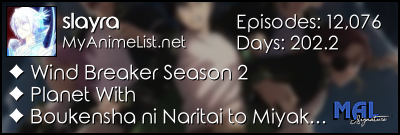 |
Oct 26, 2024 6:12 AM
#437
| Hi @Shishio-kun and @Valerio_Lyndon! First of all, thank you for this great list design. However, I'm having a problem with the tags appearing in front of the note text area. Can you help me fix it? I'm not very good in CSS coding. I tried installing the code from the theme customizer and manually, but both seem to have the same problem like this. 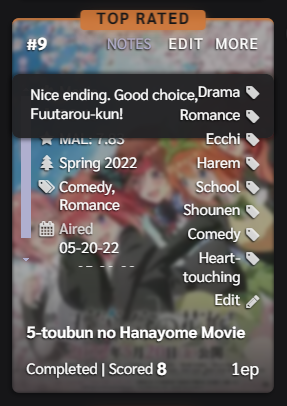 |
Dec 6, 2024 3:28 AM
#438
Reply to slayra
Hi!
I'm sure this has been asked endlessly but I didnt find it browsing through the topic, sorry :(
I love this layout but I'd like to display the type of anime (TV, OVA, ...) directly in the images and also is there a way to shorten the titles so all the title boxes are the same size? When the title is bigger the box is bigger...
not sure if I'm explaining this right.
Can you do this throught the customizer? I tried looking for it but didn't find it :/
Thank you!
| @Shishio-kun and @Valerio_Lyndon! I think the thing is truncate the text! Sorry to insist :( |
|
Dec 15, 2024 1:19 AM
#439
| There is an annoying bug with the theme. The mouse hover does not work on the left side (first column) of the screen. Hope it gets fixed. |
 |
Dec 15, 2024 10:53 AM
#440


Dec 24, 2024 11:18 PM
#441
Reply to Valerio_Lyndon
SatanHere said:
hi i want to change the back ground color to pure black ?
and ty for the amazing design
Check the user options at the top of the theme. There are colours there which you can change. To change the background, find the "--bg" line. You can then change it to black, which would be "0, 0%, 0%".hi i want to change the back ground color to pure black ?
and ty for the amazing design
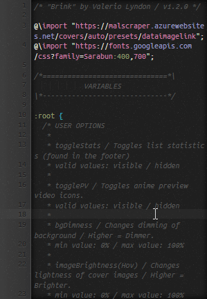
Example:
:root {
	--bg: 0, 0%, 0%;
}| @Valerio_Lyndon Hello, sorry, I have a question where you can see (I don't know what to call it) but I would like to make some changes to my list regarding: bg, bgalt, btn, etc. but I don't remember which part to modify. I remember seeing in some of your designs which part it belonged to but I forgot where it was. |
Apr 16, 7:18 PM
#442
| Hello! This style made me migrate back from Anilist, so thank you for creating it! Almost perfect (if only hi-res covers didn't take so long loading for me, haha) Is there any way to add a button that would open a Stremio app for every title? Or at least a button that would lead to a website I can specify? What MAL provides isn't even available in my country. If it's possible, how would one go about it? |
Apr 16, 9:44 PM
#443
Reply to bubbla
Hello! This style made me migrate back from Anilist, so thank you for creating it! Almost perfect (if only hi-res covers didn't take so long loading for me, haha)
Is there any way to add a button that would open a Stremio app for every title? Or at least a button that would lead to a website I can specify? What MAL provides isn't even available in my country. If it's possible, how would one go about it?
Is there any way to add a button that would open a Stremio app for every title? Or at least a button that would lead to a website I can specify? What MAL provides isn't even available in my country. If it's possible, how would one go about it?
| @bubbla The lightest way you can have high res covers load is with this, it only loads the medium quality (one grade above your current cover quality) anime covers and only the anime on your list (800 or so) not the entire database (30,000 to 100,000 depending) @\import "https://malscraper.azurewebsites.net/covers/anime/bubbla/presets/dataimagelinkafter"; it goes at the top You can manually add links with the Notes on each anime. It might be possible to manually mass edit the Notes with a single website, if you had a website in mind, and if they had the anime titles on the site in the URL it could be possible to mass add those URLs to the notes with CSS, not sure tho never done that but I think it could be possible. other options: Use a VPN for the site not available in your country? Or enter the link for the blacklisted site and put it in a online downloader and download the video from there? A online downloader like 9xbuddy or the various extensions that download videos (would need a VPN for the latter maybe). |
Apr 16, 11:03 PM
#444
Reply to Shishio-kun
@bubbla
The lightest way you can have high res covers load is with this, it only loads the medium quality (one grade above your current cover quality) anime covers and only the anime on your list (800 or so) not the entire database (30,000 to 100,000 depending)
@\import "https://malscraper.azurewebsites.net/covers/anime/bubbla/presets/dataimagelinkafter";
it goes at the top
You can manually add links with the Notes on each anime.
It might be possible to manually mass edit the Notes with a single website, if you had a website in mind, and if they had the anime titles on the site in the URL it could be possible to mass add those URLs to the notes with CSS, not sure tho never done that but I think it could be possible.
other options: Use a VPN for the site not available in your country? Or enter the link for the blacklisted site and put it in a online downloader and download the video from there? A online downloader like 9xbuddy or the various extensions that download videos (would need a VPN for the latter maybe).
@Shishio-kun @\import "https://malscraper.azurewebsites.net/covers/anime/bubbla/presets/dataimagelinkafter"; it goes at the top I installed the theme using the installer, I just checked and it has that line already. Even with my username it loads very slow :( I can access those sites with a VPN, but then there is a problem with paying, lol. Our cards aren't accepted so it's a pain, have to go though some hoops. Not sure about the notes. Like, an anime could be on one site but not on another, then you'd have to edit in 2 urls, and then what if one site no longer offers it? I think if links are in the notes, then it's more universal to somehow mass create links that open a Plex/Kodi/Stremio/etc. with a title as a query (I think it should be supported). You know, like when you open a telegram chat in the browser and it offers you to open the installed app? I have no idea how links like that are created though. Visually it's probably not hard to add a button, right? Is the problem that MAL doesn't allow JS, and scripts are done through Greasemonkey? I just like the idea of it because if we could customize where it leads, we could go to not only a streaming website, but some database, or open a youtube page with the anime title as a search query (probably?), or maybe just visit another tracker like Anilist for example. |
bubblaApr 16, 11:08 PM
Apr 17, 8:30 AM
#445
Reply to bubbla
@Shishio-kun
I installed the theme using the installer, I just checked and it has that line already. Even with my username it loads very slow :(
I can access those sites with a VPN, but then there is a problem with paying, lol. Our cards aren't accepted so it's a pain, have to go though some hoops.
Not sure about the notes. Like, an anime could be on one site but not on another, then you'd have to edit in 2 urls, and then what if one site no longer offers it? I think if links are in the notes, then it's more universal to somehow mass create links that open a Plex/Kodi/Stremio/etc. with a title as a query (I think it should be supported). You know, like when you open a telegram chat in the browser and it offers you to open the installed app? I have no idea how links like that are created though.
Visually it's probably not hard to add a button, right? Is the problem that MAL doesn't allow JS, and scripts are done through Greasemonkey? I just like the idea of it because if we could customize where it leads, we could go to not only a streaming website, but some database, or open a youtube page with the anime title as a search query (probably?), or maybe just visit another tracker like Anilist for example.
@\import "https://malscraper.azurewebsites.net/covers/anime/bubbla/presets/dataimagelinkafter"; it goes at the top
I installed the theme using the installer, I just checked and it has that line already. Even with my username it loads very slow :(
I can access those sites with a VPN, but then there is a problem with paying, lol. Our cards aren't accepted so it's a pain, have to go though some hoops.
Not sure about the notes. Like, an anime could be on one site but not on another, then you'd have to edit in 2 urls, and then what if one site no longer offers it? I think if links are in the notes, then it's more universal to somehow mass create links that open a Plex/Kodi/Stremio/etc. with a title as a query (I think it should be supported). You know, like when you open a telegram chat in the browser and it offers you to open the installed app? I have no idea how links like that are created though.
Visually it's probably not hard to add a button, right? Is the problem that MAL doesn't allow JS, and scripts are done through Greasemonkey? I just like the idea of it because if we could customize where it leads, we could go to not only a streaming website, but some database, or open a youtube page with the anime title as a search query (probably?), or maybe just visit another tracker like Anilist for example.
| @bubbla right, depends on the button and sites Sounds like you should just use torrents for anime, I used to use nyaatorrents. There's always numerous free sites to watch anime too |
Apr 17, 9:16 AM
#446
| Love the theme/design! Is there a way to add the volume number as well instead of just chapter progress? (without hovering and clicking on more/edit), that's the only thing I'm struggling with |
Apr 17, 3:28 PM
#447
Reply to YumiTasty
Love the theme/design!
Is there a way to add the volume number as well instead of just chapter progress? (without hovering and clicking on more/edit), that's the only thing I'm struggling with
Is there a way to add the volume number as well instead of just chapter progress? (without hovering and clicking on more/edit), that's the only thing I'm struggling with
| @YumiTasty These codes would put the volume on the bottom right corner :D .list-table .list-table-data .data.chapter{ top: 265px !important; } .list-table .list-table-data .data.volume{ background-color: transparent !important; top: 280px !important; left: 0px !important; display: block !important; } |
Apr 18, 10:49 AM
#448
Reply to YumiTasty
Love the theme/design!
Is there a way to add the volume number as well instead of just chapter progress? (without hovering and clicking on more/edit), that's the only thing I'm struggling with
Is there a way to add the volume number as well instead of just chapter progress? (without hovering and clicking on more/edit), that's the only thing I'm struggling with
@YumiTasty You can also add higher quality manga covers (lightweight) with simply this at the top@\import "https://malscraper.azurewebsites.net/covers/manga/YumiTasty/presets/dataimagelinkafter"; |
Apr 18, 4:25 PM
#449
Reply to Shishio-kun
@YumiTasty
These codes would put the volume on the bottom right corner :D
.list-table .list-table-data .data.chapter{
top: 265px !important;
}
.list-table .list-table-data .data.volume{
background-color: transparent !important;
top: 280px !important;
left: 0px !important;
display: block !important;
}
These codes would put the volume on the bottom right corner :D
.list-table .list-table-data .data.chapter{
top: 265px !important;
}
.list-table .list-table-data .data.volume{
background-color: transparent !important;
top: 280px !important;
left: 0px !important;
display: block !important;
}
| @Shishio-kun Thank you so much! That's exactly what I needed! |
May 20, 12:16 AM
#450
| I used the theme customizer tool to update my layout from v1.1.0 to v2.1.4 and I noticed some issues. (Sorry about the screenshots being linked. They don't seem to appear when I use the img tag.) I added the CSS modification to remove the More Info section, but I noticed the notes aren't readable. The text color is black and tags overlap it. Screenshot The Alternate Background setting controls the background for the scrollbar track and the Notes section. Previously, I had my notes as white text on black and the scrollbar was a yellow thumb on a black track. Screenshot The Text Color option sets a single color for both buttons and the MAL status links. Screenshot I have experience with CSS so I can make my own modifications, but just wanted to let you know! |
More topics from this board
» ❓ Ask for help here + See Frequently Asked Questions ( 1 2 3 4 5 ... Last Page )Shishio-kun - Apr 15, 2010 |
7918 |
by takkun_
»»
3 hours ago |
|
» [CSS - MODERN] ⚡️ Fully-Customizable Layouts (2024 updates!) ( 1 2 3 4 5 ... Last Page )Shishio-kun - Jul 21, 2017 |
381 |
by KabukiChouNights
»»
Sep 13, 10:56 AM |
|
» theme helpthreat - Jul 5 |
5 |
by Zaryf
»»
Aug 21, 5:46 AM |
|
» [CSS - Modern] 🍰 Clarity by V.L ( 1 2 3 4 5 ... Last Page )Valerio_Lyndon - Apr 19, 2018 |
1261 |
by KiranaStarr
»»
Aug 16, 5:48 PM |
|
» [CSS] ⭐️ Customize your List Cursor + Cursor FixesShishio-kun - Mar 8, 2021 |
30 |
by Shishio-kun
»»
Jul 28, 3:17 AM |