[CSS - Modern] 🛠️ Tweaks for lists -- Horizontal tags, descriptions, category-coloured text, accent colour, and more.
New
Oct 24, 2019 11:04 PM
#1
This topic is part of our CSS Tutorials and Add-ons section: https://myanimelist.net/forum/?topicid=2077862 ---Preface Welcome! This is a small collection of tweaks or changes to default lists that you may find useful. There's also a decent chance many of these will work with premade list designs, especially simpler ones. Specifically, this thread can help you if you're: • Wanting to customize your theme a little without any knowledge of CSS. • New to using CSS, and curious how to achieve any of these tweaks. ---Information -- Please read! To install any tweak, copy all the code provided into your Custom CSS box on any modern theme. Don't forget to save afterwards! If installing multiple, I recommend pasting new code to the bottom of your CSS. This prevents accidentally breaking anything by pasting into the middle of another tweak. For help with CSS colours, see my cheatsheet. These tweaks were made to be applied on top of the default modern list type. I cannot guarantee they will work with custom lists, but can't hurt to try! Just make a backup of your CSS before making any major changes (a text file on your PC will do the job). ---Tweaks Change the accent colour.  This changes every non-neutral colour on the list, meaning text, backgrounds, and everything else. Even includes the banner and background bar! For ease of customization, some things have been mildly tweaked from how the regular lists look. This customization works for all themes (Dark Blue, White Green, Etc). All options are found at the top of the provided CSS. Code: 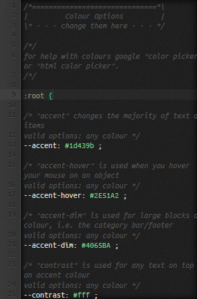 /*==============================*\
| Colour Options |
\* - - - change them here - - - */
/*/
for help with colours google "color picker" or "html color picker".
/*/
:root {
/* "accent" changes the majority of text and items
valid options: any colour */
--accent: #1d439b ;
/* "accent-hover" is used when you hover your mouse on an object
valid options: any colour */
--accent-hover: #2E51A2 ;
/* "accent-dim" is used for large blocks of colour, i.e. the category bar/footer
valid options: any colour */
--accent-dim: #4065BA ;
/* "contrast" is used for any text on top of an accent colour
valid options: any colour */
--contrast: #fff ;
/* "background-bar" toggles the bar of colour in the background.
valid options: visible / hidden */
--background-bar: visible ;
/* "cover-image" toggles the custom MAL banner. This requires the default cover image in your theme settings to be disabled!
valid options: block / none */
--cover-image: block ;
}
/*==============================*\
| Theme Internals |
\* - - - - advanced css - - - - */
body {
background-image: none;
}
body:before {
content: "";
position: fixed;
top: 0;
left: 0;
width: 100%;
height: 178px;
background: var(--accent-dim);
visibility: var(--background-bar);
}
.cover-block:before {
content: "";
display: var(--cover-image);
width: 1024px;
height: 280px;
background: var(--accent-dim) url(https://i.imgur.com/ERzN1Gs.png);
margin-top: 16px;
}
.list-unit .list-status-title,
.list-unit .list-stats {
background-color: var(--accent-dim);
}
.status-menu-container .status-menu .status-button::after,
#advanced-options .advanced-options-button a {
background-color: var(--accent);
}
.list-menu-float .icon-menu:not(.profile):hover,
.list-menu-float .icon-menu.setting:hover .text .link-list-setting,
.list-menu-float .icon-menu.setting:hover .text .link-style-setting,
#footer-block {
background-color: var(--accent);
}
#advanced-options .advanced-options-button a {
color: #fff;
opacity: 1;
} #advanced-options .advanced-options-button a:hover {
opacity: 0.8;
}
#advanced-options .sort-widget input[type=radio]:checked + label {
background: var(--accent);
border-color: var(--accent);
}
.list-menu-float .icon-menu svg.icon {
fill: var(--accent);
} .list-menu-float .icon-menu:hover svg.icon {
fill: var(--accent-hover);
}
#search-button,
.header-title .link,
.list-table .list-table-data .data a,
.more-info a {
color: var(--accent) !important;
}
#search-button:hover,
.header-title .link:hover,
.list-table .list-table-data a:not(.edit-disabled):hover,
.more-info a:hover {
color: var(--accent-hover) !important;
}
.status-menu-container .status-menu .status-button {
color: var(--accent);
} .status-menu-container .status-menu .status-button:hover,
.status-menu-container .status-menu .status-button.on {
color: var(--accent-hover);
}
.list-unit .list-status-title .text,
#copyright {
color: var(--contrast);
}
/* Fix for edit button */
.list-table .list-table-data .tags .edit {
color: #2db039 !important;
}
.list-table .list-table-data .tags .edit:hover {
color: #00ff80 !important;
}
/* Fix for certain themes changing text colour on list dropdown */
.header .header-menu .list-menu {
border-color: #444;
}
.header .header-menu .list-menu .icon-menu {
background: #222;
color: #fff;
} .header .header-menu .list-menu .icon-menu:hover {
background: #333;
}
.header .header-menu .list-menu .icon-menu svg.icon {
fill: #fff;
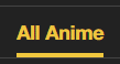
}Category-coloured header bars. 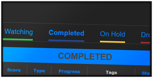 This does not change the all anime colour by default, but you can add one by changing the "YOURCOLOUR" section. /*==============================*\
| Category-Coloured Header Bars |
\* --- - --- - ---- - --- - --- */
.status-menu-container .status-menu .status-button:nth-of-type(1)::after {
/* All Anime */
background: YOURCOLOUR ;
} .status-menu-container .status-menu .status-button:nth-of-type(2)::after {
/* Watching */
background: #2db039 ;
} .status-menu-container .status-menu .status-button:nth-of-type(3)::after {
/* Completed */
background: #26448f ;
} .status-menu-container .status-menu .status-button:nth-of-type(4)::after {
/* On Hold */
background: #f1c83e ;
} .status-menu-container .status-menu .status-button:nth-of-type(5)::after {
/* Droppped */
background: #a12f31 ;
} .status-menu-container .status-menu .status-button:nth-of-type(6)::after {
/* Planned */
background: #c3c3c3 ;
}To change the text colour, you can add this extra addition! /*==============================*\
| Category-Coloured Header Text |
\* --- - --- - ---- - --- - --- */
.status-menu-container .status-menu .status-button:nth-of-type(1) {
/* All Anime */
color: YOURCOLOUR ;
} .status-menu-container .status-menu .status-button:nth-of-type(2) {
/* Watching */
color: #2db039 ;
} .status-menu-container .status-menu .status-button:nth-of-type(3) {
/* Completed */
color: #26448f ;
} .status-menu-container .status-menu .status-button:nth-of-type(4) {
/* On Hold */
color: #f1c83e ;
} .status-menu-container .status-menu .status-button:nth-of-type(5) {
/* Droppped */
color: #a12f31 ;
} .status-menu-container .status-menu .status-button:nth-of-type(6) {
/* Planned */
color: #c3c3c3 ;
} And for a bit more fun, if you want to add a rainbow animation for the all anime colour, you can use either of these codes! /*==============================*\
| Rainbow All Anime Bar |
\* --- - --- - ---- - --- - --- */
.status-menu-container .status-menu .status-button:nth-of-type(1)::after {
animation: category-rainbow-bar 10s infinite ease;
}
@keyframes category-rainbow-bar {
0%, 100% {
background: #2db039 ;
}
20% {
background: #26448f ;
}
40% {
background: #f1c83e ;
}
60% {
background: #a12f31 ;
}
80% {
background: #c3c3c3 ;
}
}/*==============================*\
| Rainbow All Anime Text |
\* --- - --- - ---- - --- - --- */
.status-menu-container .status-menu .status-button:nth-of-type(1) {
animation: category-rainbow-text 10s infinite ease;
}
@keyframes category-rainbow-text {
0%, 100% {
color: #2db039 ;
}
20% {
color: #26448f ;
}
40% {
color: #f1c83e ;
}
60% {
color: #a12f31 ;
}
80% {
color: #c3c3c3 ;
}
}Category-coloured list text. 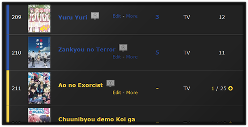 Changes list items' text to match its category. Feel free to change the colour used for each category. This tweak underlines text when hovered instead of using a colour. This code should work with most custom lists too, so feel free to give that a try if you are so inclined. Code: (choose one) This will only change the titles of anime. /*==============================*\
| Category-Coloured Titles |
\* --- - --- - ---- - --- - --- */
.data.title .link:hover {
text-decoration: underline;
}
.list-item .data.watching ~ .title .link,
.list-item .data.reading ~ .title .link {
/* Watching */
color: #2db039 !important;
}
.list-item .data.completed ~ .title .link {
/* Completed */
color: #26448f !important;
}
.list-item .data.onhold ~ .title .link {
/* On Hold */
color: #f1c83e !important;
}
.list-item .data.dropped ~ .title .link {
/* Dropped */
color: #a12f31 !important;
}
.list-item .data.plantowatch ~ .title .link,
.list-item .data.plantoread ~ .title .link {
/* Planned */
color: #c3c3c3 !important;
}This changes all the text on list items: titles, scores, tags, etcetera. /*==============================*\
| Category-Coloured List Text |
\* --- - --- - ---- - --- - --- */
.data a:not(.edit-disabled):hover {
text-decoration: underline;
}
.list-item .data.watching ~ .data a:not(.edit),
.list-item .data.reading ~ .data a:not(.edit) {
/* Watching */
color: #2db039 !important;
}
.list-item .data.completed ~ .data a:not(.edit) {
/* Completed */
color: #26448f !important;
}
.list-item .data.onhold ~ .data a:not(.edit) {
/* On Hold */
color: #f1c83e !important;
}
.list-item .data.dropped ~ .data a:not(.edit) {
/* Dropped */
color: #a12f31 !important;
}
.list-item .data.plantowatch ~ .data a:not(.edit),
.list-item .data.plantoread ~ .data a:not(.edit) {
/* Planned */
color: #c3c3c3 !important;
}Convert Tags to Mini-Reviews 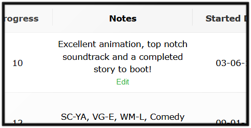 Disables default tag functionality to display descriptions and mini-reviews better. Do keep in mind tags have a character limit (255 as of writing). Code: /*==============================*\
| Convert Tags to Mini-Reviews |
\* - - - - user options - - - - */
:root {
/* tag column title
valid options: any text
do not remove the surrounding quotes */
--tag-column-title: 'Notes' ;
/* tag column width
valid options: any pixel size
default column width is 120px. numbers must have a unit value, i.e. 'px' */
--tag-column-width: 180px ;
/* tag text colour
valid options: any colour
default text colour for light lists is #000 and #ccc for dark lists */
--tag-text-colour: #ccc ;
}
/*==============================*\
| Convert Tags to Mini-Reviews |
\* - - - under the hood - - - */
.list-table .list-table-header .header-title.tags {
width: var(--tag-column-width);
font-size: 0;
}
.header-title.tags::before {
content: var(--tag-column-title);
font-size: 11px;
cursor: text;
}
.data.tags span {
overflow-wrap: anywhere;
cursor: text;
}
.list-table .list-table-data .data.tags span a {
color: var(--tag-text-colour) !important;
pointer-events: none;
}Tag Descriptions 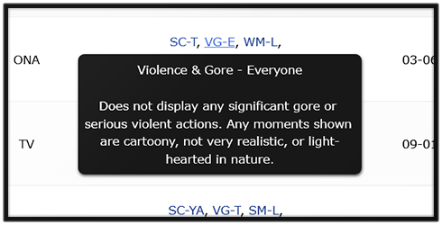 This will add a bit of text that appears by a tag when you hover over it, great for avoiding questions about what the heck all your tags are about. This tweak is a bit more involved than the others. First, you'll have to add this base code to the bottom of your CSS which styles all the descriptions. Code: /*==============================*\
| Tag Descriptions |
\* --- - --- - ---- - --- - --- */
/* Template */
.data.tags span a {
position: relative;
}
.data.tags span a::after {
position: absolute;
top: calc(100% + 5px);
left: 50%;
z-index: 2;
width: max-content;
max-width: 250px;
padding: 6px;
background: #181818;
border-radius: 6px;
box-shadow: 0 1px 3px rgba(0,0,0,0.75);
color: #fff;
white-space: pre-wrap;
opacity: 0;
transform: translateX(-50%);
transition: opacity 0.3s ease;
pointer-events: none;
} .data.tags span a:hover::after {
opacity: 1;
}
/* Descriptions */
/* add your descriptions here */Next, you can begin adding descriptions for the tags you want to have them. This will require using a template piece of code and feeding whatever tag and description we want into it. Template: .data.tags a[href*="=TAGNAME"]::after {
content: "TAGDESC"
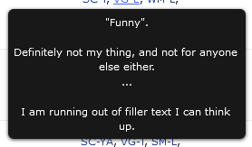
}Now we need to feed it the information. First, find the tag URL and input it where it says "TAGNAME". The easiest way to find the URL version of your tag is by hovering your mouse over your tag. In one of your screen corners (generally bottom left) it should display the URL, including the tag section, and you can copy it into the code as seen there. It will be after the "tag=" text.  Next, we need to add the description itself. You will be overriding where it says "TAGDESC" (but do not delete the quotation marks!). There are some things you must make note of while editing the description... The description cannot contain any linebreaks. This will break the code! For any linebreak you must instead use "\a ", including the space afterwards. This will add a linebreak in the final result but in your code looks more like this: content: "This is a paragraph.\a With a linebreak after it.\a\a You can stack multiple linebreaks in sequence.\a\a I always put a space after the slash-a to avoid code errors, but don't worry, it doesn't add a space once the code has been processed."; If you want to use quotations in the description you will need to "escape" them by adding a backslash in front of them. This prevents them from breaking the CSS. So instead of "this is a quote" it would be \"this is a quote\". Here is an example of a working tag description that targets the tag "Bad Comedy". It has a working URL-formatted tag, the "\a"'s that give it multiple linebreaks, and the escaped quote marks. .data.tags a[href*="=Bad%20Comedy"]::after {
content: "\"Funny\".\a \a Definitely not my thing, and not for anyone else either.\a ...\a \a I am running out of filler text I can think up."
} Troubleshooting: Tags being incorrectly selected? The basic template I gave above selects tags based on the beginning of their names. It does not select tags based on the entire name. The problem with this is if you have two tags with the same starting text. For instance, if you had a tag "Fav" and "Fav 2018" then they will likely conflict. Here's an example. .data.tags a[href*="=Fav%202018"]::after {
content: "Favourite of 2018"
}
.data.tags a[href*="=Fav"]::after {
content: "All-time Favourite"
}The first is to change the order of your code. In CSS, if two lines of equal priority are conflicting, the furthest down takes priority. So, if you have conflicts of interest, place the more generic use-case above the more specific tags. For instance, "Fav" would go above "Fav 2018" in the code, since "Fav" will have more matches and is, therefore, less specific. Here's the previous example but with the correct order: .data.tags a[href*="=Fav"]::after {
content: "All-time Favourite"
}
.data.tags a[href*="=Fav%202018"]::after {
content: "Favourite of 2018"
}The second fix is to use a more detailed selector. Here's a template for that: .data.tags a[href$="=TAGNAME"]::after,
.data.tags a[href*="=TAGNAME&"]::after {
content: "TAGDESC"
}.data.tags a[href$="=Comedy"]::after,
.data.tags a[href*="=Comedy&"]::after {
content: "Humour-focused anime."
}Add score descriptors on hover.  Add short word descriptions to your scores. Just hover over them, and it'll display the contents. There's a basic set included, but to change them you can simply change the texts inside the qoutation marks. Code: This isn't meant for long descriptions, just single words or single sentences. /*==============================*\
| Score Descriptors |
\* --- - --- - ---- - --- - --- */
.score-na::before {
content: "Haven't decided";
}
.score-1::before {
content: "Unredeemable";
}
.score-2::before {
content: "Horrid";
}
.score-3::before {
content: "Awful";
}
.score-4::before {
content: "Bad";
}
.score-5::before {
content: "Mediocre";
}
.score-6::before {
content: "Alright";
}
.score-7::before {
content: "Good";
}
.score-8::before {
content: "Great";
}
.score-9::before {
content: "Fantastic";
}
.score-10::before {
content: "Incredible";
}
/* Internals */
.score-label {
position: relative;
display: inline-block;
z-index: 0;
transition: color 0.2s ease;
}
.score-label:hover {
color: #fff !important;
}
.score-label::before {
position: absolute;
top: -4px;
left: -8px;
z-index: -1;
display: block;
padding: 4px 8px 4px calc(100% + 12px);
background: #111;
border-radius: 4px;
opacity: 0;
transition: opacity 0.2s ease;
white-space: pre;
text-align: left;
pointer-events: none;
}
.score-label:hover::before {
opacity: 1;
}Using this will cause the hover box to be a fixed width. This fixed width allows for longer descriptions that will wrap-around. Do not add line breaks to the descriptions. If you must add a line-break, use "\a " (space included). Example: "Line 1\a Line 2". This will turn into a line break in the final result. /*==============================*\
| Score Descriptors |
\* --- - --- - ---- - --- - --- */
.score-na::before {
content: "Haven't decided";
}
.score-1::before {
content: "Unredeemable";
}
.score-2::before {
content: "Horrid";
}
.score-3::before {
content: "Awful";
}
.score-4::before {
content: "Bad";
}
.score-5::before {
content: "Mediocre";
}
.score-6::before {
content: "Alright";
}
.score-7::before {
content: "Good";
}
.score-8::before {
content: "Great";
}
.score-9::before {
content: "Fantastic";
}
.score-10::before {
content: "Incredible";
}
/* Internals */
.score-label {
position: relative;
display: inline-block;
z-index: 0;
transition: color 0.2s ease;
}
.score-label:hover {
color: #fff !important;
}
.score-label::before {
position: absolute;
top: -4px;
left: -8px;
z-index: -1;
width: 400px;
display: block;
padding: 4px 8px 4px calc(100% + 12px);
background: #111;
border-radius: 4px;
opacity: 0;
transition: opacity 0.2s ease;
white-space: pre-wrap;
text-align: left;
pointer-events: none;
}
.score-label:hover::before {
opacity: 1;
}Horizontal Tags 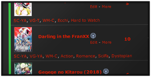 Moves tags to a horizontal row, very handy if you're running out of room on the width! Due to Safari being a bit behind, the regular bottom tags only work in Chromium browsers and Firefox. For a Safari-compatible code, use the top-aligned tags and see the spoiler below for how to bottom-align them if you so desire. /*==============================*\
| Horizontal Tags |
\* --- - --- - ---- - --- - --- */
/* remove header cell - we can't use "display: none" because it must still exist in the page flow */
.header-title.tags {
width: 0 !important;
padding: 0 !important;
font-size: 0;
}
/* make the list row an "anchor point" for the tags */
.list-table-data {
position: relative;
}
/* add a bit of spacing to each row */
.list-table .list-table-data .data {
padding-bottom: 24px;
}
/* move tags */
.list-table .list-table-data .data.tags {
position: absolute;
inset: auto 0 4px 6px;
padding: 0 8px;
border: none;
}
/* make tags horizontal */
.data.tags div {
float: left;
}
.data.tags .edit {
float: right;
width: auto !important;
}
.list-table .list-table-data .data.tags textarea {
height: 20px;
}/*==============================*\
| Horizontal Tags |
\* --- - --- - ---- - --- - --- */
/* remove header cell - we can't use "display: none" because it must still exist in the page flow */
.header-title.tags {
width: 0 !important;
padding: 0 !important;
font-size: 0;
}
/* add a bit of spacing to each row */
.list-table .list-table-data .data {
padding-top: 24px;
}
/* move tags */
.list-table .list-table-data .data.tags {
position: absolute;
left: 23px;
box-sizing: border-box;
width: calc(100% - 40px);
padding: 0 8px;
height: auto;
border: none;
}
/* make tags horizontal */
.data.tags div {
float: left;
}
.data.tags .edit {
width: auto !important;
float: right;
}
.list-table .list-table-data .data.tags textarea {
height: 20px;
}It is possible to bottom-align tags on Safari as well, but the position will be hard-coded. What this means is that any change to the height of a list row will break the positioning. If you add the top-aligned tags, you can simply move them down by adding a "margin-top" property to the ".data.tags" selector. For example: 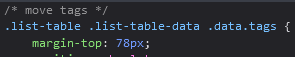 You can then change the "padding-top" property inside the ".list-table .list-table-data .data" selector to "padding-bottom" to avoid the other list information overlapping.  If you want to hide the commas, add this as well! /* Hide Commas - for use with Horizontal Tags */
.data.tags span {
margin-right: 8px;
/* hide commas by resetting font-size */
font-size: 0;
line-height: 0;
}
.data.tags a {
/* show links by setting a new font-size
change font-size here if it's too big or small */
font-size: 11px;
line-height: 20px;
} |
Valerio_LyndonOct 8, 2023 10:38 PM
Reply Disabled for Non-Club Members
Oct 25, 2019 12:37 AM
#2

| Cool topic! Thanks :D I added it to our list of Modern CSS tutorials https://myanimelist.net/forum/?topicid=1499059#msg56132876 |
Jun 28, 2020 10:25 PM
#3
| @Valerio_Lyndon Thanks for the pics and efforts, I've added more info about this topic to the main directory :D |
Jun 28, 2020 11:17 PM
#4
| Thanks, it's appreciated. :) |
Jun 12, 2021 1:32 PM
#5
| I added the color codes to change the headers too under Category-coloured header bars since I thought that's what it was for (not the little underline). |
Dec 22, 2021 2:00 AM
#6

| I was able to add colors to the header bars using this tutorial. I wanted to change the colors of the headers/texts too and found a tutorial for that in VL's Clarity layout thread. I just thought of adding the code here for those who'd want to customize that as well. Category-Colored Headers Code: /* ==================== Add Colour To Header */ .status-menu .status-button { transition: color 0.3s ease; } /* All Anime */ .status-menu .status-button:nth-of-type(1):hover, .status-menu .status-button.on:nth-of-type(1) { color: YOURCOLORHERE !important; } /* Watching */ .status-menu .status-button:nth-of-type(2):hover, .status-menu .status-button.on:nth-of-type(2) { color: #2db039 !important; } /* Completed */ .status-menu .status-button:nth-of-type(3):hover, .status-menu .status-button.on:nth-of-type(3) { color: #26448f !important; } /* On Hold */ .status-menu .status-button:nth-of-type(4):hover, .status-menu .status-button.on:nth-of-type(4) { color: #f1c83e !important; } /* Dropped */ .status-menu .status-button:nth-of-type(5):hover, .status-menu .status-button.on:nth-of-type(5) { color: #a12f31 !important; } /* Planned */ .status-menu .status-button:nth-of-type(6):hover, .status-menu .status-button.on:nth-of-type(6) { color: #c3c3c3 !important; } Original code: Valerio_Lyndon said: WhisperingAshes said: Add to the bottom of your CSS:How do i make the text i hover on (on the bar which says all anime, currently watching, etc.) be the same colour as the underline? /* ====================
Add Colour To Header */
.status-menu .status-button {
transition: color 0.3s ease;
}
/* All Anime */
.status-menu .status-button:nth-of-type(1):hover,
.status-menu .status-button.on:nth-of-type(1) {
color: var(--accent) !important;
}
/* Watching */
.status-menu .status-button:nth-of-type(2):hover,
.status-menu .status-button.on:nth-of-type(2) {
color: var(--watching) !important;
}
/* Completed */
.status-menu .status-button:nth-of-type(3):hover,
.status-menu .status-button.on:nth-of-type(3) {
color: var(--completed) !important;
}
/* On Hold */
.status-menu .status-button:nth-of-type(4):hover,
.status-menu .status-button.on:nth-of-type(4) {
color: var(--onhold) !important;
}
/* Dropped */
.status-menu .status-button:nth-of-type(5):hover,
.status-menu .status-button.on:nth-of-type(5) {
color: var(--dropped) !important;
}
/* Planned */
.status-menu .status-button:nth-of-type(6):hover,
.status-menu .status-button.on:nth-of-type(6) {
color: var(--plantowatch) !important;
}So if you combine the codes you'll get colored headers and header bars based on category. Category-Colored Headers & Header Bars  Code:
/* ====================
Add Colour To Header */

.status-menu .status-button {
transition: color 0.3s ease;
}

/* All Anime */
.status-menu .status-button:nth-of-type(1):hover,
.status-menu .status-button.on:nth-of-type(1) {
color: YOURCOLORHERE !important;
}

/* Watching */
.status-menu .status-button:nth-of-type(2):hover,
.status-menu .status-button.on:nth-of-type(2) {
color: #2db039 !important;
}

/* Completed */
.status-menu .status-button:nth-of-type(3):hover,
.status-menu .status-button.on:nth-of-type(3) {
color: #26448f !important;
}

/* On Hold */
.status-menu .status-button:nth-of-type(4):hover,
.status-menu .status-button.on:nth-of-type(4) {
color: #f1c83e !important;
}

/* Dropped */
.status-menu .status-button:nth-of-type(5):hover,
.status-menu .status-button.on:nth-of-type(5) {
color: #a12f31 !important;
}

/* Planned */
.status-menu .status-button:nth-of-type(6):hover,
.status-menu .status-button.on:nth-of-type(6) {
color: #c3c3c3 !important;
}


/*==============================*
| Category-Coloured  Header Bars |
* --- - --- - ---- - --- - --- */

.status-menu-container .status-menu .status-button:nth-of-type(1)::after {
	/* All Anime */
	background: YOURCOLOUR ;
} .status-menu-container .status-menu .status-button:nth-of-type(2)::after {
	/* Watching */
	background: #2db039 ;
} .status-menu-container .status-menu .status-button:nth-of-type(3)::after {
	/* Completed */
	background: #26448f ;
} .status-menu-container .status-menu .status-button:nth-of-type(4)::after {
	/* On Hold */
	background: #f1c83e ;
} .status-menu-container .status-menu .status-button:nth-of-type(5)::after {
	/* Droppped */
	background: #a12f31 ;
} .status-menu-container .status-menu .status-button:nth-of-type(6)::after {
	/* Planned */
	background: #c3c3c3 ;
}
Maybe tweak it a bit for a cleaner code... |
IridescentJauneDec 23, 2021 5:11 PM


Feb 27, 2022 12:40 PM
#7
| @Valerio_Lyndon Thanks for this, used the title colors in my minimalist design it looks great!!! :D |
Aug 23, 2022 3:19 PM
#8
| Using Category-coloured header bars in some reskins of the default design; I realized that the All Anime should probably use CSS animation to shift subtlety between the 5 colors |
Oct 2, 2023 9:02 PM
#9
| Updated the thread with horizontal tags, category-coloured header text, and a rainbow all-anime category header (only 1 year after Shishio mentioned it). I also removed some outdated links and updated some other information. |
Oct 3, 2023 6:15 AM
#10
Reply to Valerio_Lyndon
Updated the thread with horizontal tags, category-coloured header text, and a rainbow all-anime category header (only 1 year after Shishio mentioned it). I also removed some outdated links and updated some other information.
| @Valerio_Lyndon Oh, wow! That rainbow 'All Anime' looks rad! Keyframes are so fun! I tested it out first on my manga list but I kinda missed the pink so I had to revert... 😆 I'm now using it for my anime list, though. I actually just tried some of the other codes like the 'Category-coloured list text' as well; having everything colored according to AA, CW, C, OH, D and PTW was nice but I kinda missed the default blue for some reason so I also had to revert. 😆 I really love this thread. Most of the tweaks that I wanted and implemented in my lists can be found here. |
Oct 3, 2023 11:30 AM
#11
I was able to change the content (by following this [MODERN-CSS] Change default header text to custom text) and the background color of the "status header" with the codes/tweaks above. But what I really want is for the default header texts (All Anime, Completed, Currently Watching, On Hold, Dropped, Plan to Watch, and so on) to change color only when I hover over them. I was able to do it for the 'All Anime' page but I don't really plan on changing the default header texts.
/* Status Header Background */
.list-unit .list-status-title,
.list-unit .list-stats {
	background-color: #40E0D0 !important;
}
/* Status Header Text */
.list-unit.all_anime .list-status-title .text{
font-size: 0px !important;
}
.list-unit.all_anime .list-status-title .text:after{
  content: "ALL ANIME";
  font-size: 22px;
}
.list-unit.all_anime .list-status-title .text:hover{
  content: "ALL ANIME";
	color: #ceff00 !important;
  font-size: 22px;
}
Is there a simpler way to apply the effect to all default header texts without editing all of these codes?:
.list-unit.watching .list-status-title .text{
font-size: 0px !important;
}
.list-unit.watching .list-status-title .text:after{
  content: "WATCHING";
  font-size: 22px;
}

.list-unit.reading .list-status-title .text{
font-size: 0px !important;
}
.list-unit.reading .list-status-title .text:after{
  content: "READING";
  font-size: 22px;
}


.list-unit.completed .list-status-title .text{
font-size: 0px !important;
}
.list-unit.completed .list-status-title .text:after{
  content: "FINISHED";
  font-size: 22px;
}


.list-unit.onhold .list-status-title .text{
font-size: 0px !important;
}
.list-unit.onhold .list-status-title .text:after{
  content: "ON HOLD";
  font-size: 22px;
}


.list-unit.dropped .list-status-title .text{
font-size: 0px !important;
}
.list-unit.dropped .list-status-title .text:after{
  content: "NOT INTERESTED";
  font-size: 22px;
}


.list-unit.plantowatch .list-status-title .text{
font-size: 0px !important;
}
.list-unit.plantowatch .list-status-title .text:after{
  content: "PLANNED";
  font-size: 22px;
}

.list-unit.plantoread .list-status-title .text{
font-size: 0px !important;
}
.list-unit.plantoread .list-status-title .text:after{
  content: "PLANNED";
  font-size: 22px;
}


.list-unit.all_anime .list-status-title .text{
font-size: 0px !important;
}
.list-unit.all_anime .list-status-title .text:after{
  content: "ALL";
  font-size: 22px;
}

.list-unit.all_manga .list-status-title .text{
font-size: 0px !important;
}
.list-unit.all_manga .list-status-title .text:after{
  content: "ALL";
  font-size: 22px;
}
There'll just be too many lines of codes when I'ill just be placing the same default header texts (All Anime, Completed, Currently Watching, On Hold, Dropped, Plan to Watch) on the content: "". |
Oct 3, 2023 10:06 PM
#12
Reply to IridescentJaune
I was able to change the content (by following this [MODERN-CSS] Change default header text to custom text) and the background color of the "status header" with the codes/tweaks above. But what I really want is for the default header texts (All Anime, Completed, Currently Watching, On Hold, Dropped, Plan to Watch, and so on) to change color only when I hover over them. I was able to do it for the 'All Anime' page but I don't really plan on changing the default header texts.
Is there a simpler way to apply the effect to all default header texts without editing all of these codes?:
There'll just be too many lines of codes when I'ill just be placing the same default header texts (All Anime, Completed, Currently Watching, On Hold, Dropped, Plan to Watch) on the content: "".
/* Status Header Background */
.list-unit .list-status-title,
.list-unit .list-stats {
	background-color: #40E0D0 !important;
}
/* Status Header Text */
.list-unit.all_anime .list-status-title .text{
font-size: 0px !important;
}
.list-unit.all_anime .list-status-title .text:after{
  content: "ALL ANIME";
  font-size: 22px;
}
.list-unit.all_anime .list-status-title .text:hover{
  content: "ALL ANIME";
	color: #ceff00 !important;
  font-size: 22px;
}
Is there a simpler way to apply the effect to all default header texts without editing all of these codes?:
.list-unit.watching .list-status-title .text{
font-size: 0px !important;
}
.list-unit.watching .list-status-title .text:after{
  content: "WATCHING";
  font-size: 22px;
}

.list-unit.reading .list-status-title .text{
font-size: 0px !important;
}
.list-unit.reading .list-status-title .text:after{
  content: "READING";
  font-size: 22px;
}


.list-unit.completed .list-status-title .text{
font-size: 0px !important;
}
.list-unit.completed .list-status-title .text:after{
  content: "FINISHED";
  font-size: 22px;
}


.list-unit.onhold .list-status-title .text{
font-size: 0px !important;
}
.list-unit.onhold .list-status-title .text:after{
  content: "ON HOLD";
  font-size: 22px;
}


.list-unit.dropped .list-status-title .text{
font-size: 0px !important;
}
.list-unit.dropped .list-status-title .text:after{
  content: "NOT INTERESTED";
  font-size: 22px;
}


.list-unit.plantowatch .list-status-title .text{
font-size: 0px !important;
}
.list-unit.plantowatch .list-status-title .text:after{
  content: "PLANNED";
  font-size: 22px;
}

.list-unit.plantoread .list-status-title .text{
font-size: 0px !important;
}
.list-unit.plantoread .list-status-title .text:after{
  content: "PLANNED";
  font-size: 22px;
}


.list-unit.all_anime .list-status-title .text{
font-size: 0px !important;
}
.list-unit.all_anime .list-status-title .text:after{
  content: "ALL";
  font-size: 22px;
}

.list-unit.all_manga .list-status-title .text{
font-size: 0px !important;
}
.list-unit.all_manga .list-status-title .text:after{
  content: "ALL";
  font-size: 22px;
}
There'll just be too many lines of codes when I'ill just be placing the same default header texts (All Anime, Completed, Currently Watching, On Hold, Dropped, Plan to Watch) on the content: "".
@IridescentJaune You shouldn't need any "content" property codes at all if you aren't changing the text. The only property you need is the "color" property inside of a hover selector. For example:/* Status Header Text */
.all_anime .list-status-title .text:hover {
color: #ceff00;
}
:is(.watching,.reading) .list-status-title .text:hover {
color: #ceff00;
}
.completed .list-status-title .text:hover {
color: #ceff00;
}
.onhold .list-status-title .text:hover {
color: #ceff00;
}
.dropped .list-status-title .text:hover {
color: #ceff00;
}
:is(.plantowatch,.plantoread) .list-status-title .text:hover {
color: #ceff00;
} |
Oct 3, 2023 10:08 PM
#13
Reply to IridescentJaune
@Valerio_Lyndon Oh, wow! That rainbow 'All Anime' looks rad! Keyframes are so fun! I tested it out first on my manga list but I kinda missed the pink so I had to revert... 😆 I'm now using it for my anime list, though. I actually just tried some of the other codes like the 'Category-coloured list text' as well; having everything colored according to AA, CW, C, OH, D and PTW was nice but I kinda missed the default blue for some reason so I also had to revert. 😆
I really love this thread. Most of the tweaks that I wanted and implemented in my lists can be found here.
I really love this thread. Most of the tweaks that I wanted and implemented in my lists can be found here.
| @IridescentJaune :D |
Oct 4, 2023 7:10 AM
#14
Reply to Valerio_Lyndon
@IridescentJaune You shouldn't need any "content" property codes at all if you aren't changing the text. The only property you need is the "color" property inside of a hover selector. For example:
/* Status Header Text */
.all_anime .list-status-title .text:hover {
	color: #ceff00;
}
:is(.watching,.reading) .list-status-title .text:hover {
	color: #ceff00;
}
.completed .list-status-title .text:hover {
	color: #ceff00;
}
.onhold .list-status-title .text:hover {
	color: #ceff00;
}
.dropped .list-status-title .text:hover {
	color: #ceff00;
}
:is(.plantowatch,.plantoread) .list-status-title .text:hover {
	color: #ceff00;
}| @Valerio_Lyndon WOW! Thanks! I removed the "/* Status Header Text */" code I shared above and replaced it with yours and it works like how I wanted! I just like seeing the text color change when hovering over them. Just a bit of pizzazz, I guess. Haha. I think others could use this code to go with the "Category-Colored Headers & Header Bars" and the "Category-coloured list text" in the tutorial above. It's still like your code but I just changed the color values to the default colors.
/* Status Header Text */
.all_anime .list-status-title .text:hover {
	color: YOURCOLOUR;
}
:is(.watching,.reading) .list-status-title .text:hover {
	color: #2db039;
}
.completed .list-status-title .text:hover {
	color: #26448f ;
}
.onhold .list-status-title .text:hover {
	color: #f1c83e;
}
.dropped .list-status-title .text:hover {
	color: #a12f31;
}
:is(.plantowatch,.plantoread) .list-status-title .text:hover {
	color: #c3c3c3;
}
I think you can add this on the tutorial as well: HEX Codes: All Anime / All Manga: YOURCOLOUR 🟢Watching / Reading: #2db039 🔵Completed: #26448f 🟡On Hold: #f1c83e 🔴Dropped: #a12f31 ⚪️Plan to Watch / Plan to Read: #c3c3c3 Maybe others would like the status bar/background to change color per status page instead of the header texts (or change color along with the header texts). I was able to figure out how to do that thanks to a code from this thread: [MODERN-CSS] Change default header text to custom text. I tweaked it a bit and here's the code:
/* Status Header Background */
.list-unit.all_anime .list-status-title {
background-color: YOURCOLOUR;
}
.list-unit.reading .list-status-title {
background-color: #2db039;
}
.list-unit.completed .list-status-title {
background-color: #26448f;
}
.list-unit.onhold .list-status-title {
background-color: #f1c83e;
}
.list-unit.dropped .list-status-title {
background-color: #a12f31;
}
.list-unit.plantoread .list-status-title {
background-color: #c3c3c3;
}
I played around with :hover and here's another code if you just want the status background to change color when hovering over them.
/* Change Color of Status Header Background on Hover */
.list-unit.all_anime .list-status-title:hover {
background-color: YOURCOLOUR;
}
.list-unit.reading .list-status-title:hover {
background-color: #2db039;
}
.list-unit.completed .list-status-title:hover {
background-color: #26448f;
}
.list-unit.onhold .list-status-title:hover {
background-color: #f1c83e;
}
.list-unit.dropped .list-status-title:hover {
background-color: #a12f31;
}
.list-unit.plantoread .list-status-title:hover {
background-color: #c3c3c3;
}
P.S. Just change watching to reading and plantowatch to plantoread, and vice versa... Not sure how to implement ":is(.plantowatch,.plantoread)" in these codes. I usually don't have trouble picking colors but default colors don't go well with my manga list's theme (well to be more specific with MAL's dark pink and this shade of green!). 😆 MAL's green, yellow and gray look okay with the dark pink theme but their shade of blue and red just look way off with the dark pink. 🤢 |
IridescentJauneOct 4, 2023 7:23 AM
Nov 28, 2023 5:30 PM
#15
Nov 28, 2023 7:28 PM
#16
Reply to IridescentJaune
How to add total number of entries on All Anime, Currently Watching, Completed, On-Hold, Dropped, Plan to Watch just like in this image?
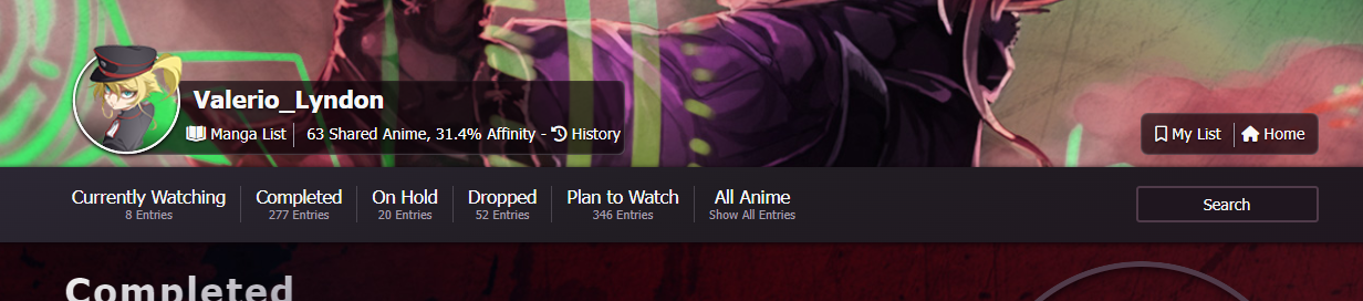
Source: 🏆 2021 List Design Winners and Gallery 🏆
Sorry if I'm asking here. I just thought it's related to this thread...
Source: 🏆 2021 List Design Winners and Gallery 🏆
Sorry if I'm asking here. I just thought it's related to this thread...
| @IridescentJaune That's one of the differences between the modern and classic lists: classic lists have the info about number of entries inside a [title] attribute on the category links. I used that to my advantage and displayed it using CSS. On modern, this information would require a third-party script to generate the CSS. The code for the classic list at its core was this: [class^="status_"] a::after {
content: attr(title);
} |
Nov 29, 2023 5:20 AM
#17
Reply to Valerio_Lyndon
@IridescentJaune That's one of the differences between the modern and classic lists: classic lists have the info about number of entries inside a [title] attribute on the category links. I used that to my advantage and displayed it using CSS. On modern, this information would require a third-party script to generate the CSS.
The code for the classic list at its core was this:
The code for the classic list at its core was this:
[class^="status_"] a::after {
	content: attr(title);
}| @Valerio_Lyndon Oh, you used Classic for that layout? Wow! I actually thought you used Modern for that. Anyways, thanks for the response. It would be cool to be able to see the total number of entries within our lists... Thinking of just adding them manually on my CSS layout but then I'll have to update them every time. Maybe you can also add a link to this tutorial [CSS - MODERN] ⭐️ Moving and customizing all individual text and sections on the layout here for the "Category Menu Codes". Related threads: [MODERN-CSS] Change default header text to custom text [CSS-MODERN] Change list text/font colors on any list layout --- Edit: I just manually added my total number of entries. I guess it'd be okay to manually update it from time to time (maybe monthly or when I do my backups). Tweaked the code from here: https://myanimelist.net/forum/?goto=post&topicid=1930157&id=63538068 |
IridescentJauneNov 29, 2023 6:56 AM
Dec 10, 2023 6:30 PM
#18
Reply to IridescentJaune
@Valerio_Lyndon Oh, you used Classic for that layout? Wow! I actually thought you used Modern for that. Anyways, thanks for the response. It would be cool to be able to see the total number of entries within our lists... Thinking of just adding them manually on my CSS layout but then I'll have to update them every time.
Maybe you can also add a link to this tutorial [CSS - MODERN] ⭐️ Moving and customizing all individual text and sections on the layout here for the "Category Menu Codes".
Related threads:
[MODERN-CSS] Change default header text to custom text
[CSS-MODERN] Change list text/font colors on any list layout
---
Edit: I just manually added my total number of entries. I guess it'd be okay to manually update it from time to time (maybe monthly or when I do my backups).
Tweaked the code from here: https://myanimelist.net/forum/?goto=post&topicid=1930157&id=63538068
| @IridescentJaune Thanks! My goal on classic is always to make people think I used modern haha. I can think of a couple of ways to add the total counts to modern, perhaps in the future. Your addition looks good! |
Dec 13, 2023 9:45 PM
#19

 for some reason unbeknownst to me, using the provided tag desc code causes misplacements of the popout: for some reason unbeknownst to me, using the provided tag desc code causes misplacements of the popout: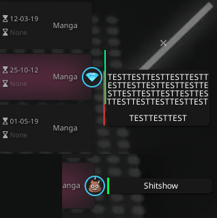 so i did some googling and found this code and used it. it works. how do i make it so the popout/tooltip is always centered to the list's entry no matter how much text are in it? /* tags description */
.data.tags span a {
position: relative;
}
.data.tags span a::after {
visibility: hidden;
width: 150px;
background-color: #181818;
box-shadow: 0 1px 3px rgba(0,0,0,0.75);
color: #fff;
white-space: pre-wrap;
text-align: center;
border-radius: 6px;
padding: 5px 0;
/* Position the tooltip */
position: absolute;
z-index: 2;
top: 28px;
left: 102%;
transition: opacity 0.3s ease;
pointer-events: none;
}
.data.tags:hover span a::after {
visibility: visible;
font-size: 12px;
}
/* Descriptions */
.data.tags a[href*="=B"]::after {
content: "TESTTESTTESTTESTTESTTESTTESTTESTTESTTESTTESTTESTTESTTESTTESTTESTTESTTESTTESTTESTTEST \a \a TESTTESTTEST"
}
.data.tags a[href*="=Where"]::after {
content: "Cant find \a anywhere online"
}
.data.tags a[href*="=Unko"]::after {
content: "Shitshow"
}
.data.tags a[href*="=Ded"]::after {
content: "Author died \a cancelled etc"
}EDIT: Thankie for Elpie |
karmashizzleDec 17, 2023 10:44 PM


Dec 17, 2023 8:45 PM
#20
Reply to karmashizzle
for some reason unbeknownst to me, using the provided tag desc code causes misplacements of the popout:so i did some googling and found this code and used it.
it works.
how do i make it so the popout/tooltip is always centered to the list's entry no matter how much text are in it?
/* tags description */

.data.tags span a {
	position: relative;
}

.data.tags span a::after {
	visibility: hidden;
	width: 150px;
	background-color: #181818;
	box-shadow: 0 1px 3px rgba(0,0,0,0.75);
	color: #fff;
	white-space: pre-wrap;
	text-align: center;
	border-radius: 6px;
	padding: 5px 0;

  /* Position the tooltip */
	position: absolute;
	z-index: 2;
	top: 28px;
	left: 102%;
	transition: opacity 0.3s ease;
	pointer-events: none;
}
.data.tags:hover span a::after {
	visibility: visible;
	font-size: 12px;
}


/* Descriptions */

.data.tags a[href*="=B"]::after {
	content: "TESTTESTTESTTESTTESTTESTTESTTESTTESTTESTTESTTESTTESTTESTTESTTESTTESTTESTTESTTESTTEST \a \a TESTTESTTEST"
}

.data.tags a[href*="=Where"]::after {
	content: "Cant find \a anywhere online"
}

.data.tags a[href*="=Unko"]::after {
	content: "Shitshow"
}

.data.tags a[href*="=Ded"]::after {
	content: "Author died \a cancelled etc"
}
EDIT: Thankie for Elpie
| @karmashizzle Without looking into the code, I assume the Clarity codes were conflicting. It's a complex theme that touches almost everything on the list. As for how to centre your current tooltips, I would recommend setting the "top" to 50% and then using a y-axis "translate" transform. This works because the "top" percentage value positions relative to the element's parent, while the "translate" percentage value positions relative to the element it's applied to. By using both we are centering compared to the parent (the tag) using "top: 50%;" and then centering the tooltip using the "transform: translateY(-50%);". .data.tags span a::after {
visibility: hidden;
width: 150px;
background-color: #181818;
box-shadow: 0 1px 3px rgba(0,0,0,0.75);
color: #fff;
white-space: pre-wrap;
text-align: center;
border-radius: 6px;
padding: 5px 0;
/* Position the tooltip */
position: absolute;
z-index: 2;
top: 50%;
transform: translateY(-50%);
left: 102%;
transition: opacity 0.3s ease;
pointer-events: none;
} |
Valerio_LyndonDec 17, 2023 8:49 PM
Reply Disabled for Non-Club Members
More topics from this board
Sticky: » [ USERSTYLES & DARK THEMES ] All MyAnimeList themesShishio-kun - Jan 28, 2023 |
14 |
by is_peque
»»
3 hours ago |
|
» ❓ Ask for help here + See Frequently Asked Questions ( 1 2 3 4 5 ... Last Page )Shishio-kun - Apr 15, 2010 |
7855 |
by 23feanor
»»
8 hours ago |
|
» [CSS - Modern] 🍰 Clarity by V.L ( 1 2 3 4 5 ... Last Page )Valerio_Lyndon - Apr 19, 2018 |
1222 |
by laBelphe
»»
Yesterday, 3:16 PM |
|
» [CLASSIC CSS] ⭐️Space Layout by nblur/U531355 ✨RESTORED AND UPSCALED✨Shishio-kun - Nov 17, 2023 |
7 |
by Recon911
»»
Yesterday, 4:43 AM |
|
» ✳️[NEWSLETTER] Any Broken Layouts? + Restored Designs so far + Frozen GIF Fix ( 1 2 )Shishio-kun - Nov 15, 2023 |
58 |
by AholePony
»»
Sep 19, 10:47 AM |