New
Oct 16, 2015 2:17 PM
#101

Digital_Fuzion said: So is anyone able to tell me how to use these script things? Would be much appreciated. if you're using mozilla you need to instal an add-on to run scripts, i'm using greasemonkey now, but there are some others once you've that add-on installed you need to go get the script and it should be done in the add-ons browser page of mozilla you should be able to disable and uninstall it once you no longer need it no idea how it works with other browsers, but guess there should be a similar add-on there too edit, ninjad' :P |
 Fixes to make the Profile more bearable after "the Modern★Profile★Update★★Rip★Profile★" |
Oct 16, 2015 2:49 PM
#102

Cpt_Mathix said: Digital_Fuzion said: So is anyone able to tell me how to use these script things? Would be much appreciated. You have to download a userscript manager first: https://greasyfork.org/en/help/installing-user-scripts. If you did this you can browse greasyfork and install scripts with the green install button Zeando said: Digital_Fuzion said: So is anyone able to tell me how to use these script things? Would be much appreciated. if you're using mozilla you need to instal an add-on to run scripts, i'm using greasemonkey now, but there are some others once you've that add-on installed you need to go get the script and it should be done in the add-ons browser page of mozilla you should be able to disable and uninstall it once you no longer need it no idea how it works with other browsers, but guess there should be a similar add-on there too edit, ninjad' :P I managed to figure it out for Chrome. Thanks for the help guys. |
Oct 16, 2015 3:38 PM
#103

| I like this design RedUbs said: A quick edit of the new MAL profile layout made via playing around with the HTML and CSS code(s). Needs improvements but the basic layout is there. Thing's I'd change (some of which are somewhat represented in the image below): - (this is an improvement for the image I made below) The statistics in the left bar need removing as some are duplicate stats + messy. I would put Animelist views in the right/main panel, somewhere under anime stats, same with manga list views under manga stats. I would want to change the position profile views, by putting it somewhere neater on the left panel. - Animelist & Mangalist buttons under profile picture (as displayed below). - About me section under the statistics section (as below but forgot to add "About Me" header to it). - I don't mind the new colourful bars scattered around the profile, but I would personally prefer lighter shades of those colours, like this:  - I'd also rather the favourites were as they were before on the left (in the position as it is in my image but make it neater, probably best as it was before the update) 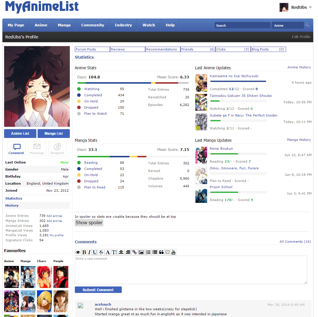 note: I'm using a stylesheet called 'Modernized' which I downloaded via 'Stylish' (a Chrome extension) |
RendTaiOct 16, 2015 5:25 PM
Oct 16, 2015 4:18 PM
#104

| Well I think we all agree that the favorites Need to be in the left, I don't mind the arrows.. but I don't want the arrows for my "about me" area.. Also I want the Anime list view count to be public again. Other than that I don't have much else to say :v |
 Behold of my awesomeness~ controversial and/or sensitive topics likely devolve into the same repetitive, derogatory, abusive, and harassing comments can no longer be posted. But my feels. |
Oct 16, 2015 4:38 PM
#105

Undim said: xbobx said: Xinil asked for feedback on that thread. Many of us provided it. They gave zero fucks. What makes you guys think they'll give more than negative fucks to this thread? Just deal with it, that's the way this site works; like reviews, which are pretty much obliterated by now. Weren't you one defending the reviews decisions? Yep, I was. Exactly one month ago I was. Defending that we should be patient for a change announced two months ago, for a issue we've been expecting fixes for more than 3 years. My patience will only go this far. Goes to prove it's really hard trying to be positive about this administration. When they finally show some progress and gets my hopes up, it goes into oblivion and instead of finishing what they started, we get these pathetic "design" changes. Syrup- said: They're more likely to give fucks about this thread than the one flooded with people crying "change it back or I'll poop my diaper". Well, if this is likely to at least have some visibility, I'll paste my stuff from the announcements thread: Something that's really bothering me though, is that "arrow" thingy on favs. I liked the old system because I was able to add everyone I like without "ranking" them. Now I'll have to choose who gets to stay on the "top 5" and who goes to the oblivion of "See more". Switching from a column orientation to a scrolling row orientation like other sites would be a more welcomed change. I'm also supporting: -The removal of the stupid "Friends" tag. Seriously, THIS ISN'T BLOODY FACEBOOK for fucks sake. Stop with the social media transformation already. -Moving "Also Available at" up. When it used to be on the center of my profile, I'd get a lot of blog clicks because of that. Now it's fucking hidden on the bottom of the sidebar. WHY?? -"About me" on the bottom -Removal of the score on "Last A/M updates" for private lists. Also what the fuck is that "negative compatibility" thing? You can have compatibility (0-100%), incompatibility (zero) but bellow zero compatibility? WTF? So you're supposed to hate each other? Someone should make a list of all these suggestions and complains. |

Oct 16, 2015 4:47 PM
#106

| View list option should placed next to anime/manga list statistics again, pushing it to the side makes it too out of the way and that spot should be reserved for personal information and statistics. |
 |
Oct 16, 2015 4:49 PM
#107

| call me a sperg but I hate how the buttons aren't directly underneath the profile picture anymore. I've been trying to get over it but my muscle memory keeps reminding me that it should be up higher. Left: Now, Right: how it should be.   |
 |
Oct 16, 2015 4:55 PM
#108
| Ah Yeah your right The list buttons are way better under the profile picture. Huh I guess there is just too much change :v |
Behold of my awesomeness~ controversial and/or sensitive topics likely devolve into the same repetitive, derogatory, abusive, and harassing comments can no longer be posted. But my feels. |
Oct 16, 2015 5:05 PM
#109
| Galimx This isn't the final update. Thats why they want our feedback.. But then again the next update might be next year... or later lol. |
Behold of my awesomeness~ controversial and/or sensitive topics likely devolve into the same repetitive, derogatory, abusive, and harassing comments can no longer be posted. But my feels. |
Oct 16, 2015 5:19 PM
#110

galimx said: They will probably never update the design anymore. They will just fix the bugs and leave it as it is. Which is sad, but whatever. Let's be honest, what galimx says is the truth, most of the time MAL don't give a shit what we think and probably never even reads these comments. |
 |
Oct 16, 2015 5:41 PM
#111
10th_man_down said: Well What we currently see as our profile is a huge pseudo suggestion from the users of MAL, which was filtered to the Devs(I'm not sure I worded that right).. So this is actually kinda our mess lol. But Now we are seeing the first update and hopefully the next one will not receive a shit storm. There is just too much back and forth when we talk about the profile, I really do think we should be able to modify it ourselves and to show features we want or keep some hidden, like our anime list views.galimx said: They will probably never update the design anymore. They will just fix the bugs and leave it as it is. Which is sad, but whatever. Let's be honest, what galimx says is the truth, most of the time MAL don't give a shit what we think and probably never even reads these comments. |
Behold of my awesomeness~ controversial and/or sensitive topics likely devolve into the same repetitive, derogatory, abusive, and harassing comments can no longer be posted. But my feels. |
Oct 17, 2015 12:12 AM
#112
| I don't know how many of you actually check the threads for updates, but I was surprised to see the OP of the News Topic updated at around noon yesterday. They seem to have looked into a number of problems outlined in this thread. http://myanimelist.net/forum/?topicid=1439180 Keep up the good work guys. We don't have to get rid of the new profile, we just need to make it work better. |
|
Oct 17, 2015 1:14 AM
#113
| ^for the favorites grid, the most annoying thing is all that space wasted only to have the titles/names visible (and also the oversized thumbnails) they could have used a popup text for the names and informations and saved up a lot of space, instead of eating up more |
Fixes to make the Profile more bearable after "the Modern★Profile★Update★★Rip★Profile★" |
Oct 17, 2015 1:29 AM
#114

| terrible idea. whoever was behind that should lose his job. and thats me trying to sound positive. everything about it is bad. Some of it is said in this thread, some of it i don't even wanna talk about it. MAL design was great because it was simple and effective. |
Oct 17, 2015 2:27 AM
#115
| I like this one as well +1 galimx said: I like the upper design as well. Much better than current. Or this: Oiacz said: Reposting my "idea" made on paint and still better 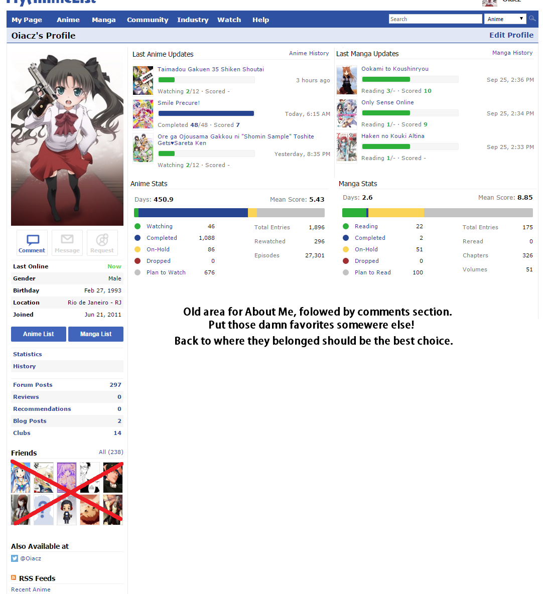 |
Oct 17, 2015 3:10 AM
#116

| As well as this... RedUbs said: Why does it say "Hibike! Euphonium" when the character is from "Maga-Tsuki" but when you click on it, it still takes you to 'Maga-Tsuki'? 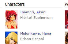 and then lower down there is a character and it doesn't even show where the character is featured... 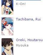 Anybody else had this problem: I saw Kamisama no Inai Nichiyoubi yesterday (probably at around 5 or 6pm) 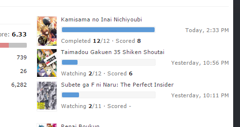 but it says Today, 2:33pm It seems the times are a little messed up for me? I guess it is something to do with timezones but I have my timezone correctly set in my profile settings. |
Oct 17, 2015 3:20 AM
#117
TsundereHeart said: It actually takes up less size than the old format. The only difference is the size of the thumbnails and their position on the profile. Everyone is just buttmad about the position being in a distracting place. I think it makes sense where it is.Syrup- said: I noticed that as well. Some things make a bit more sense after reading. On the other hand, some of the issues are addressed as "it's this way because we just wanted it this way even though it's impractical". I don't know how many of you actually check the threads for updates, but I was surprised to see the OP of the News Topic updated at around noon yesterday. They seem to have looked into a number of problems outlined in this thread. http://myanimelist.net/forum/?topicid=1439180 Keep up the good work guys. We don't have to get rid of the new profile, we just need to make it work better. Like "we wanted to keep the titles [of favorites] displayed". Well maybe consider the possibility that you can't have 40 images+names and not making the section clunky and overly large. Well, in the end MAL's decision is the one that matters in the end but I will stand by my opinion that having grids of images for favorites (like what we currently have for Friends in the left column) would be more compact, be able to actually display all 40 items neatly, and the convenience would only go down a little bit as you might have to hover over an image to find the exact name if you don't already recognize it.   |
|
Oct 17, 2015 3:33 AM
#118

Syrup- said: call me a sperg but I hate how the buttons aren't directly underneath the profile picture anymore. I've been trying to get over it but my muscle memory keeps reminding me that it should be up higher. Left: Now, Right: how it should be. I finally found what's bothering me! Fixed it: https://greasyfork.org/nl/scripts/13129-myanimelist-mal-profile-switch-3 |
| My Userscripts: • Show anime/manga info inside your animelist/mangalist • Other Scripts |
Oct 17, 2015 3:45 AM
#119

| ^ yeah that looks much better, cool :> Now we really just need the new favorites list put back in the left sidebar rather than the middle and we might be approaching something useable again. Just having 2 columns showing the covers as hotlinks but not any text might be good. Like first anime and manga side by side and then characters and people side by side below them or something. Preferably get rid of the entire Friends section while we're at it Oh and I'd really like to get rid of the Statistics and Favorites headers altogether |
HaXXspettenOct 17, 2015 3:48 AM
  |
Oct 17, 2015 4:04 AM
#120
HaXXspetten said: Oh and I'd really like to get rid of the Statistics and Favorites headers altogether If you download this Stylish stylesheet : https://userstyles.org/styles/119787/remove-favourites-section-from-profiles and edit the code, then replace it with this: Firefox: /* RedUbs - http://myanimelist.net/profile/RedUbs */ @-moz-document regexp(".*myanimelist.net/(?!animelist|mangalist).*") { h2.mb12 { display: none; } h2{ display:none; } } Chrome: |
SteveOct 17, 2015 4:11 AM
Oct 17, 2015 4:21 AM
#121
HaXXspetten said: Preferably get rid of the entire Friends section while we're at it Here you go: https://greasyfork.org/nl/scripts/13131-myanimelist-mal-profile-switch-4 |
| My Userscripts: • Show anime/manga info inside your animelist/mangalist • Other Scripts |
Oct 17, 2015 4:23 AM
#122
RedUbs said: [/quote]Not the section, just the headersHaXXspetten said: Oh and I'd really like to get rid of the Statistics and Favorites headers altogether If you download this Stylish stylesheet : https://userstyles.org/styles/119787/remove-favourites-section-from-profiles and edit the code, then replace it with this: Firefox: /* RedUbs - http://myanimelist.net/profile/RedUbs */ @-moz-document regexp(".*myanimelist.net/(?!animelist|mangalist).*") { h2.mb12 { display: none; } h2{ display:none; } } Chrome: Normally I'd just adblock those away but I can't do that here without getting rid of a bunch of other stuff in the process Like just the part within the marked areas here: http://i.imgur.com/BNk7wiD.png Cpt_Mathix said: Woo~ :>HaXXspetten said: Preferably get rid of the entire Friends section while we're at it Here you go: https://greasyfork.org/nl/scripts/13131-myanimelist-mal-profile-switch-4 |
| |
Oct 17, 2015 4:25 AM
#123
HaXXspetten said: RedUbs said: Not the section, just the headersHaXXspetten said: Oh and I'd really like to get rid of the Statistics and Favorites headers altogether If you download this Stylish stylesheet : https://userstyles.org/styles/119787/remove-favourites-section-from-profiles and edit the code, then replace it with this: Firefox: /* RedUbs - http://myanimelist.net/profile/RedUbs */ @-moz-document regexp(".*myanimelist.net/(?!animelist|mangalist).*") { h2.mb12 { display: none; } h2{ display:none; } } Chrome: Normally I'd just adblock those away but I can't do that here without getting rid of a bunch of other stuff in the process Like just the part within the marked areas here: http://i.imgur.com/BNk7wiD.png yes if you download it, and replace the code with what I specified it will remove only the headers, not the whole section |
Oct 17, 2015 4:29 AM
#124
HaXXspetten said: Not the section, just the headers Normally I'd just adblock those away but I can't do that here without getting rid of a bunch of other stuff in the process Like just the part within the marked areas here: http://i.imgur.com/BNk7wiD.png Do these adblock filters work? They work for me ! 17-10-2015 13:25:02 http://myanimelist.net/profile/* myanimelist.net###statistics > h2 ! 17-10-2015 13:25:20 http://myanimelist.net/profile/* myanimelist.net###content > .content-container > .container-right > .mb12 |
Cpt_MathixOct 17, 2015 4:36 AM
| My Userscripts: • Show anime/manga info inside your animelist/mangalist • Other Scripts |
Oct 17, 2015 4:39 AM
#125
RedUbs said: oh sorry I misread, yeah it worksHaXXspetten said: RedUbs said: HaXXspetten said: Oh and I'd really like to get rid of the Statistics and Favorites headers altogether If you download this Stylish stylesheet : https://userstyles.org/styles/119787/remove-favourites-section-from-profiles and edit the code, then replace it with this: Firefox: /* RedUbs - http://myanimelist.net/profile/RedUbs */ @-moz-document regexp(".*myanimelist.net/(?!animelist|mangalist).*") { h2.mb12 { display: none; } h2{ display:none; } } Chrome: Normally I'd just adblock those away but I can't do that here without getting rid of a bunch of other stuff in the process Like just the part within the marked areas here: http://i.imgur.com/BNk7wiD.png yes if you download it, and replace the code with what I specified it will remove only the headers, not the whole section Cpt_Mathix said: Though this works as well it seems :>HaXXspetten said: Not the section, just the headers Normally I'd just adblock those away but I can't do that here without getting rid of a bunch of other stuff in the process Like just the part within the marked areas here: http://i.imgur.com/BNk7wiD.png Do these adblock filters work? They work for me ! 17-10-2015 13:25:02 http://myanimelist.net/profile/* myanimelist.net###statistics > h2 ! 17-10-2015 13:25:20 http://myanimelist.net/profile/* myanimelist.net###content > .content-container > .container-right > .mb12 Hmm... okay with all these scripts and manual blocking it doesn't look so bad anymore. Just gotta get the Favorites section back on the left side and we're good to go I think :s |
HaXXspettenOct 17, 2015 4:43 AM
| |
Oct 17, 2015 4:58 AM
#126
Just missing a few stats but I might prefer this over how it was before: |
SteveOct 17, 2015 5:24 AM
Oct 17, 2015 6:12 AM
#127
RedUbs said: Just missing a few stats but I might prefer this over how it was before: liking the slimmer bars and the more soft colors could it be possible to swap a bit more the order and have the stats bars side to side, and the last watched/read side to side? something like this: FireHeart said: I like this one as well +1 galimx said: I like the upper design as well. Much better than current. Or this: Oiacz said: Reposting my "idea" made on paint and still better but with the stats on top (or not) |
Fixes to make the Profile more bearable after "the Modern★Profile★Update★★Rip★Profile★" |
Oct 17, 2015 6:23 AM
#128
Zeando said: RedUbs said: Just missing a few stats but I might prefer this over how it was before: liking the slimmer bars and the more soft colors could it be possible to swap a bit more the order and have the stats bars side to side, and the last watched/read side to side? something like this: FireHeart said: I like this one as well +1 galimx said: I like the upper design as well. Much better than current. Or this: Oiacz said: Reposting my "idea" made on paint and still better but with the stats on top (or not) It should be possible to change the order with javascript (which I don't know) |
Oct 17, 2015 6:46 AM
#129
RedUbs said: It should be possible to change the order with javascript (which I don't know) ok, will ask Cpt_Mathix about that would it be possible instead having a stylesheet altering only the bars and dots colors and size like in that screen before? (or the one posted before already does that? dunno, cause the preview picture doesn't show that) |
Fixes to make the Profile more bearable after "the Modern★Profile★Update★★Rip★Profile★" |
Oct 17, 2015 7:05 AM
#130
Zeando said: RedUbs said: It should be possible to change the order with javascript (which I don't know) ok, will ask Cpt_Mathix about that would it be possible instead having a stylesheet altering only the bars and dots colors and size like in that screen before? (or the one posted before already does that? dunno, cause the preview picture doesn't show that) You want a stylesheet that changes only the colours of the bars and dots, as well as making the bars thinner on the profiles like in the picture before? |
Oct 17, 2015 7:14 AM
#131
RedUbs said: Zeando said: RedUbs said: It should be possible to change the order with javascript (which I don't know) ok, will ask Cpt_Mathix about that would it be possible instead having a stylesheet altering only the bars and dots colors and size like in that screen before? (or the one posted before already does that? dunno, cause the preview picture doesn't show that) You want a stylesheet that changes only the colours of the bars and dots, as well as making the bars thinner on the profiles like in the picture before? yup, having single pieces of modifications makes it easier to select which pieces to have and which don't, like for the scripts of mathix, in this case i'm not sure to want to have the whole layout of the page change, so having only the stylesheet part of the bars could work |
Fixes to make the Profile more bearable after "the Modern★Profile★Update★★Rip★Profile★" |
Oct 17, 2015 7:17 AM
#132

| Funny how people have already given up trying to give suggestions, and started to make/use scripts to fix this bullshit. :D |
Oct 17, 2015 7:20 AM
#133
CondemneDio said: Funny how people have already given up trying to give suggestions, and started to make/use scripts to fix this bullshit. :D this tells something in the level of hope we have in having things fixed out... >_> would be happy to be wrong, but in case nothing changes we can have a backup plan.. |
Fixes to make the Profile more bearable after "the Modern★Profile★Update★★Rip★Profile★" |
Oct 17, 2015 7:42 AM
#134
Zeando said: RedUbs said: Zeando said: RedUbs said: It should be possible to change the order with javascript (which I don't know) ok, will ask Cpt_Mathix about that would it be possible instead having a stylesheet altering only the bars and dots colors and size like in that screen before? (or the one posted before already does that? dunno, cause the preview picture doesn't show that) You want a stylesheet that changes only the colours of the bars and dots, as well as making the bars thinner on the profiles like in the picture before? yup, having single pieces of modifications makes it easier to select which pieces to have and which don't, like for the scripts of mathix, in this case i'm not sure to want to have the whole layout of the page change, so having only the stylesheet part of the bars could work Stylish stylesheet that makes the colours softer for the progress bars and also makes it thinner: https://userstyles.org/styles/119813/softer-profile-bars (I might remove it soon, but you should be able to keep it if you download before then) |
Oct 17, 2015 7:46 AM
#135

| I'd like it if the favorites section is move up a bit lot. |
 |
Oct 17, 2015 7:55 AM
#136
RedUbs said: Stylish stylesheet that makes the colours softer for the progress bars and also makes it thinner: https://userstyles.org/styles/119813/softer-profile-bars (I might remove it soon, but you should be able to keep it if you download before then) thanks a lot, will test it to see if it can combine with the other scripts it's great, the script version doesn't seems to work, but with stylish it does |
ZeandoOct 17, 2015 8:01 AM
Fixes to make the Profile more bearable after "the Modern★Profile★Update★★Rip★Profile★" |
Oct 17, 2015 8:00 AM
#137
Zeando said: RedUbs said: Stylish stylesheet that makes the colours softer for the progress bars and also makes it thinner: https://userstyles.org/styles/119813/softer-profile-bars (I might remove it soon, but you should be able to keep it if you download before then) thanks a lot, will test it to see if it can combine with the other scripts yeah 4 Stylesheets and 2 userscripts and I am now content. |
Oct 17, 2015 8:10 AM
#138
Zeando said: I edited it to at least have the same colours on the update bars as the stats bar since that seemed more logical to me, but otherwise yeahRedUbs said: Stylish stylesheet that makes the colours softer for the progress bars and also makes it thinner: https://userstyles.org/styles/119813/softer-profile-bars (I might remove it soon, but you should be able to keep it if you download before then) thanks a lot, will test it to see if it can combine with the other scripts it's great, the script version doesn't seems to work, but with stylish it does |
| |
Oct 17, 2015 8:21 AM
#139
RedUbs said: In your version it's blue for watching/reading instead of green like it is in the stats graphHaXXspetten said: RedUbs said: Stylish stylesheet that makes the colours softer for the progress bars and also makes it thinner: https://userstyles.org/styles/119813/softer-profile-bars (I might remove it soon, but you should be able to keep it if you download before then) I edited it to at least have the same colours on the update bars as the stats bar since that seemed more logical to me, but otherwise yeah It should do that anyway, or it does it for me at least even after reinstalling. |
| |
Oct 17, 2015 8:23 AM
#140
HaXXspetten said: In your version it's blue for watching/reading instead of green like it is in the stats graph You sure?  Although now you mention it, I would prefer to have the watching blue and the completed green, makes more sense to me so I will change that for my personal version, thanks |
SteveOct 17, 2015 8:30 AM
Oct 17, 2015 8:30 AM
#141
| HaXXspetten means the last updated bars i think, they are all set on blue (which i don't mind, that blue for everything is fine for me :u even if i'm using #2e51a2 instead) |
Fixes to make the Profile more bearable after "the Modern★Profile★Update★★Rip★Profile★" |
Oct 17, 2015 8:32 AM
#142
Zeando said: HaXXspetten means the last updated bars i think, they are set all blue (which i don't mind, that blue for everything is fine for me :u) Ah I see, I thought I tested that but I guess not ^^" Is it like that normally on MAL or does the style sheet make them all blue? |
Oct 17, 2015 8:53 AM
#143
RedUbs said: It's only that one which was blue instead of green in yours. On-hold, Dropped and PTW/PTR were still yellow/blue/grey respectivelyZeando said: HaXXspetten means the last updated bars i think, they are set all blue (which i don't mind, that blue for everything is fine for me :u) Ah I see, I thought I tested that but I guess not ^^" Is it like that normally on MAL or does the style sheet make them all blue? Normally it's the same colours as in the stats graph for all of them (which is what I changed it to emulate) |
| |
Oct 17, 2015 8:55 AM
#144

| [*] Anime and manga stats would make more sense as pie charts. [*] Anime and manga stat colour key explanation should be combined into one to take up less space and remove redundancy. [*] More monochrome of colours should be used in stats and progress. The colour pallet is ugly. Keep it around the cooler colour range. No brownish looking colours. [*] The progress bars should be a little more subtle. [*] Last manga and anime updates would be better if they were to take up less space in width because its just empty space there. [*] Favorites lists that are left blank would be better not be displayed. |
traedOct 17, 2015 9:19 AM
| ⠀⠀⠀⠀ ⠀⠀⠀⠀⠀⠀ ⠀⠀⠀⠀ ⠀⠀⠀⠀ ⠀⠀⠀⠀⠀⠀ ⠀⠀⠀⠀⠀⠀ ⣸⠋⠀⠀⠀⡄⠀⠀⡔⠀⢀⠀⢸⠀⠀⠀⡘⡰⠁⠘⡀⠀⠀⢠⠀⠀⠀⢸⠀⠀⢸⠀⠀⠀⠀⠀⠀⠀⠀⠀ ⠀⠀⠀⠀ ⠀⠀⠀⠀⠀⠀ ⠀⠀⠀⠀⠀⠀ ⠀ ⠀⠀⠀⠀ ⠀⠀⠀⠀⠀⠀ ⠀⠀⠀⠁⠀⣀⠀⠀⡇⠀⡜⠈⠁⠀⢸⡈⢇⠀⠀⢣⠑⠢⢄⣇⠀⠀⠸⠀⠀⠀⢸⠀⠀⢸⠀⠀⠀⠀⠀⠀⠀⠀⠀ ⠀⠀⠀⠀ ⠀⠀⠀⠀⠀⠀ ⠀⠀⠀⠀⠀⠀⠀⠀⠀⠀ ⠀⠀⠀⠀ ⠀⠀⠀⠀⠀⠀ ⠀⢰⡟⡀⠀⡇⡜⠀⠀⠀⠀⠘⡇⠈⢆⢰⠁⠀⠀⠀⠘⣆⠀⠀⠀⠀⠀⠸⠀⠀⡄⠀⠀⠀⠀⠀⠀⠀⠀⠀ ⠀⠀⠀⠀ ⠀⠀⠀⠀⠀⠀ ⠀⠀⠀⠀ ⠀⠀⠀⠀⠀⠀ ⠀⠤⢄⠀⠀⠀⠀⠀⠀⠀⠀⡼⠀⣧⠀⢿⢠⣤⣤⣬⣥⠀⠁⠀⠀⠛⢀⡒⠀⠀⠀⠘⡆⡆⠀⠀⠀⡇⠀⠀⠇⠀⠀⠀⠀⠀⠀⠀⠀⠀ ⠀⠀⠀⠀ ⠀⠀⠀⠀⠀⠀ ⠀⠀ ⠀⠀⠀⠀ ⠀⠀⠀⠀⠀⠀ ⠀⢵⡀⠀⠀⠀⠀⠀⡰⠀⢠⠃⠱⣼⡀⣀⡀⠀⠀⠀⠀⠀⠀⠀⠈⠛⠳⠶⠶⠆⡸⢀⡀⣀⢰⠀⠀⢸ ⠀⠀⠀⠀⠀⠀⠀⠀⠀⠀ ⠀⠀⠀⠀ ⠀⠀⠀⠀ ⠀⠀⠀⠀⠀⠀ ⠀⠀⠀⠀⠀⠀ ⣀⣀⣀⠄⠀⠉⠁⠀⠀⢠⠃⢀⠎⠀⠀⣼⠋⠉⠀⠀⠀⠀⠀⠀⠀⠀⠀⠀⠴⠢⢄⡔⣕⡍⠣⣱⢸⠀⠀⢷⠀⠀⠀⠀⠀⠀⠀⠀⠀⠀ ⠀⠀⠀⠀ ⠀⠀⠀⠀⠀⠀ ⠀⠀⠀⠀⠀ ⠀⠀⠀⠀ ⠀⠀⠀⠀⠀⠀ ⠀⠀⠀⡰⠃⢀⠎⠀⠀⡜⡨⢢⡀⠀⠀⠀⠐⣄⠀⠀⣠⠀⠀⠀⠐⢛⠽⠗⠁⠀⠁⠊⠀⡜⠸⠀⠀⠀⠀⠀⠀⠀⠀⠀⠀ ⠀⠀⠀⠀ ⠀⠀⠀⠀⠀⠀ ⠀ ⠀⠀⠀⠀ ⠀⠀⠀⠀⠀⠀ ⠀⠀⠀⠀⠀ ⢀⠔⣁⡴⠃⠀⡠⡪⠊⣠⣾⣟⣷⡦⠤⣀⡈⠁⠉⢀⣀⡠⢔⠊⠁⠀⠀⠀⠀⢀⡤⡗⢀⠇⠀⠀⠀⠀⠀⠀⠀⠀⠀⠀ ⠀ ⠀⠀⠀⠀ ⠀⠀⠀⠀ ⠀⠀⠀⠀⠀⠀ ⠀⠀⠀⠀⠀⠀ ⠀⠀⢀⣠⠴⢑⡨⠊⡀⠤⠚⢉⣴⣾⣿⡿⣾⣿⡇⠀⠹⣻⠛⠉⠉⢀⠠⠺⠀⠀⡀⢄⣴⣾⣧⣞⠀⡜⠀⠀⠀⠀⠀⠀⠀⠀⠀⠀⠀ ⠀⠀⠀⠀ ⠀⠀⠀⠀⠀⠀ ⠀⠀⠀⠀ ⠀⠀⠀⠀⠀⠀ ⠐⠒⣉⠠⠄⡂⠅⠊⠁⠀⠀⣴⣿⣿⣿⣿⣻⣿⣿⡇⠀⠀⢠⣷⣮⡍⡠⠔⢉⡇⡠⠋⠁⠀⣿⣿⣿⣿⣄⠀⠀⠀⠀ |
Oct 17, 2015 9:33 AM
#145
RedUbs said: Stylish stylesheet that makes the colours softer for the progress bars and also makes it thinner: https://userstyles.org/styles/119813/softer-profile-bars (I might remove it soon, but you should be able to keep it if you download before then) Installed it and doesn't work for me. |
|
Oct 17, 2015 9:54 AM
#146
10th_man_down said: RedUbs said: Stylish stylesheet that makes the colours softer for the progress bars and also makes it thinner: https://userstyles.org/styles/119813/softer-profile-bars (I might remove it soon, but you should be able to keep it if you download before then) Installed it and doesn't work for me. the script version didn't work for me too, had to install the stylish add-on, and even after that initially didn't work cause the little [-S-] icon in the top was gray, which means disabled, also restarting the browser should be needed |
Fixes to make the Profile more bearable after "the Modern★Profile★Update★★Rip★Profile★" |
Oct 17, 2015 10:18 AM
#147
HaXXspetten said: RedUbs said: It's only that one which was blue instead of green in yours. On-hold, Dropped and PTW/PTR were still yellow/blue/grey respectivelyZeando said: HaXXspetten means the last updated bars i think, they are set all blue (which i don't mind, that blue for everything is fine for me :u) Ah I see, I thought I tested that but I guess not ^^" Is it like that normally on MAL or does the style sheet make them all blue? Normally it's the same colours as in the stats graph for all of them (which is what I changed it to emulate) Yay! Fixed the issue HaXXspetten bought up:  Update yours if you want the fix. (https://userstyles.org/styles/119813/softer-profile-bars) |
Oct 17, 2015 10:20 AM
#148
traed said: [*] Last manga and anime updates would be better if they were to take up less space in width because its just empty space there. agree on this one, the progression bars are strangely short making it look as if there is empty unused space there is some unused space also under the stats bars 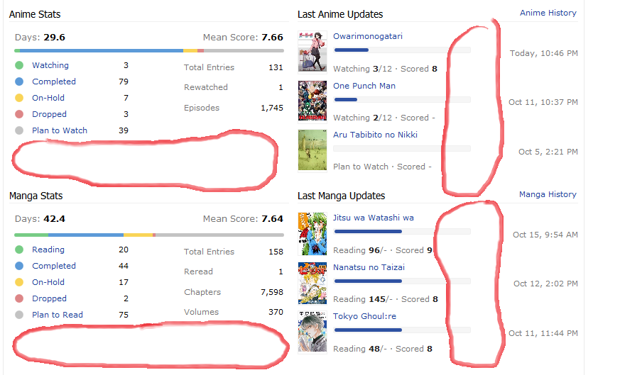 not like it's a must to fill everything, some empty space can be good, but not if that empty space is the reason for an oversized profile page think it would look better if those progression bars were longer, the dates were aligned with the titles, and if it was like the old profile that empty space under the stats would be gone too 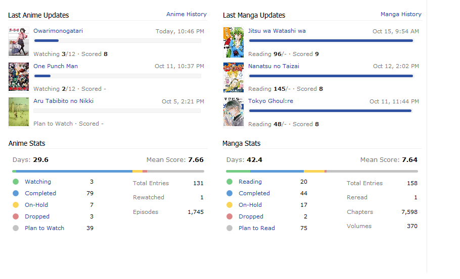 someone suggested that before, but really like that order |
ZeandoOct 17, 2015 10:30 AM
Fixes to make the Profile more bearable after "the Modern★Profile★Update★★Rip★Profile★" |
Oct 17, 2015 10:22 AM
#149
Zeando said: 10th_man_down said: RedUbs said: Stylish stylesheet that makes the colours softer for the progress bars and also makes it thinner: https://userstyles.org/styles/119813/softer-profile-bars (I might remove it soon, but you should be able to keep it if you download before then) Installed it and doesn't work for me. the script version didn't work for me too, had to install the stylish add-on, and even after that initially didn't work cause the little [-S-] icon in the top was gray, which means disabled, also restarting the browser should be needed Hopefully what Zeando said gave you some ideas for fixing your issue. If not, you can message me and hopefully we can come to a conclusion. Because this thread might have gotten slightly off topic, although we are still sharing ideas. |
Oct 17, 2015 10:26 AM
#150
Zeando said: traed said: [*] Last manga and anime updates would be better if they were to take up less space in width because its just empty space there. agree on this one, the progression bars are strangely short making it look as if there is empty unused space there is some unused space also under the stats bars not like it's a must to fill everything, some empty space can be good, but not if that empty space is the reason for an oversized profile page think it would look better if those progression bars were longer, the dates were aligned with the titles, and if it was like the old profile that empty space under the stats would be gone too Yeah I tried making a stylesheet to fix that a while ago but I don't see a way it can be done via altering the CSS. Maybe they were overly cautious of this: 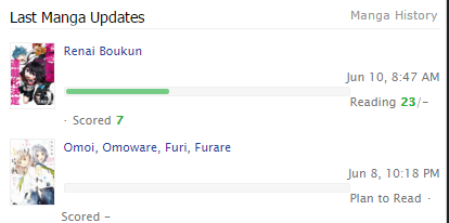 But I agree, changing the width from 190px to around 240px would be better (the image above is 270px where it broke for me). But then they could have moved the date up, in-line with the title, as you said (though I don't know if this will cause problem with anime/manga that have extremely long names. |
SteveOct 17, 2015 10:48 AM
More topics from this board
» Yearly Wrapped like MyDramaList ?ame - Yesterday |
0 |
by ame
»»
Yesterday, 9:49 PM |
|
» New Recommendation/Suggestion Featurevalvem - Jul 10, 2022 |
3 |
by valvem
»»
Yesterday, 9:14 PM |
|
» Notifications for changed / removed entries?PrOxAnto - Yesterday |
0 |
by PrOxAnto
»»
Yesterday, 4:50 AM |
|
» Would it be possible to see the users who have favorited a character from the character's page?pandaswift - Mar 15, 2024 |
8 |
by Rempresentative
»»
Sep 5, 4:32 PM |
|
» Ability to see which users favorite a characterforest5 - Jul 22, 2022 |
3 |
by Rempresentative
»»
Sep 5, 4:31 PM |