It’s finally here! Months ago (back in May) we announced that we were planning to develop a new design for our Profile section. After soliciting the community’s ideas and feedback, we took to the drawing board and created requirements and design mockups for what we thought best captured MAL’s unique character. So after many weeks of testing and numerous rounds of feedback, I’m now proud to announce and showcase the new profiles!
Please feel free to provide feedback in this thread. We’d also like to see any bugs or issues you might find mentioned here as well.
We weren’t able to incorporate every suggestion or idea into the design, but I hope we implemented the most important and popular ones. We have another round of changes planned for the future, so don't think this is it!
Head on over to your favorite user’s profile to view these new features and let us know what you think. It will be released shortly!
Update
Below you'll find a list of some of the design choices made based on feedback from users in the Community Feedback and Suggestions thread. This is not an exhaustive list, but attempts to address main concerns users may have.
About Me
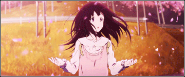
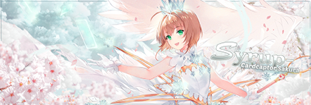
There was a common theme running through the suggestions thread that users wanted to be able to customize their profiles more. Rather than adding a top-level customization (e.g. a cover photo), the About Me was moved to the top of the page to better allow users to customize what visitors first see. This also enables interesting new ways to design your profile, such as Kryomatics' design here.
We understood that many users, however, aren't actually interested in other users' About Me sections, and are instead interested in their statistics. Thus, the "Statistics" hyperlink on the left was added to easily bypass this section. A comment button was also added for similar reasoning.
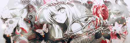
Many users complained about long About Me sections which were image heavy; thus, we added a "cut-off" arrow to hide sections longer than 1000px, as requested. The cut-off has a gradient to make it minimally obtrusive to long profile designs, such as eL_marco's design here.
Statistics
Anime statistics and last updates are horizontally placed before Manga to facilitate the addition of a "collapse" button. With the addition of such a button in the future, users who don't care about Manga and/or Anime will easily be able to collapse this section without the profile design needing to be altered.
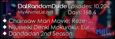
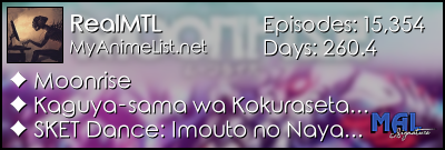
Many users in the suggestions thread said that the old profile stats bars didn't hold much meaning, and that "Days" especially did not fit in with the rest. fri, one of the creators of MALgraph, was kind enough to help us design the new chart you see for the profile statistics. Thank you, fri!
Users requested an easy way to increment episode/chapters from their profiles (like they used to have to do with the edit button). This suggestion was decided to be better integrated to the panel itself, rather than the profile, and we hope to better accommodate quick updates to currently watching/reading series there instead.
Blurry images are a bug and will be better optimized.
Re-watching series not displaying properly is a bug and will be fixed.
Manga updates showing "X/? Chapters" for completed series is a bug and will be fixed.
In the future, we'd like to see this section expanded into its own page, with many more MALgraph-like features.
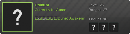
Favorites
The number of favorites were increased to 10 in each category, based on high demand from users over the years.
The section was moved to the right container due to the increase in number of favorites, the increase in thumbnail size (as requested by users in the suggestions thread), and the placement of the navigation underneath the picture.
Favorites are listed vertically, rather than horizontally, because we wanted to keep the titles/names displayed without users needing to hover the image to see the entry information. In a horizontal row, this would not work well.
An expand arrow was added because many users resisted the idea of favorites increasing in the suggestions thread and because the expanded section is quite long. The arrow was the best compromise between users that wanted more favorites and users that did not.
Blurry images are a bug and will be better optimized.
Manga-only characters not having the correct series is a bug and will be fixed.
Special characters not displaying correctly is a bug and will be fixed.
Incomplete favorites lists (e.g. only anime faves listed) will be better optimized in a future release to eliminate whitespace.
Miscellaneous Design Notes
Comment button added to easily take you to leave a comment on profiles.
Gender: Not Specified is now hidden, to enable the addition of future gender options.
Outgoing comments count was integrated in the left column with the other MAL stats at one point, but as there is no link to see all your outgoing comments (like with forum posts), it was removed. It may be added back in future revisions.
Categories with 0 entries (e.g. Reviews) may also be hidden in the future to eliminate bulk.
Anime/manga list views are located on the panel, along with profile views. They were removed from the profile so as to not clutter the left column information.
Compatibility was extended from 0 to 100%, to -100% to 100% (giving twice the resolution) and renamed.
A selection of last online friends were added back to the left column, after being removed for many years due to performance issues.
Old AIM/MSN/Yahoo fields were removed and replaced with a new external links section, incorporating little icons for known sites.
Known Bugs
Blog posts and clubs are currently counting incorrectly.
The profile picture is 224x348 px instead of 225x350.
The profile counter is reportedly no longer incrementing.
Forum posts links to an incorrect url.
Statistics links incorrectly on other profile tabs.
Other profile tabs are currently not well integrated into the profile design (e.g. still showing the old header menu); this will be addressed in subsequent phases.
Future Design Considerations
As previously stated, better integration of the other profile tabs into the new profile landing page, possibly with improved designs.
Section collapse options, to hide profile areas users do not want to see.
Seamless comment posting (without re-directs).
Better profile notifications on-site (not only through email).
Addition of MALgraph features.
More convenient way to update watching/reading series through the panel, not the profile.
Update 2
The following bugs were fixed today:
Completed manga entries weren't showing as completed on list updates.
The width on the profile picture is now 225 pixels again, and is no longer being scaled.
Bug fixed for characters in the favourites section: if the char only appeared in manga, the profile was displaying the anime with the same ID, not the manga entry.
The profile counter is increasing again (note: profile views were never visible on the old profile design).
Re-watching displays correctly in the last anime updates again.
the option to pick between the old and the new would have been nice
dont like the positioning of the last list updates needs to be back in the top corner the arrows that hide the about me section and the lower half of my favourite characters that need to be clicked to view them are also rather annoying
@Xinil is it possible to get the "About Me" section to be hidden if there's nothing in it? I don't have my About me section filled out so there's a large, unnatural, white area at the top.
Woah, pretty big change. Not sure how I feel about it. Probably spite because change isn't my thing.
But oh jolly, now my dank profile banner will be even more visible. Guess banners will be more useful for profiles now so you have incentive to click that little expand arrow.
Glad you can have ten favorites for everything now though, even though that little expand arrow seems unnecessary.
Don't really like the new anime stats. Seems kind of clunky, but stat bars like that are becoming the norm anyway.
"Every man shall reap what he has sown, from the highest lord to the lowest gutter rat. And some will lose more than the tips off their fingers, I promise you. They have made my kingdom bleed, and I do not forget that"
Oh my God, that was actually a nice change!
It looks so cute, I'll probably get used to it by tomorrow. I love the new improvements. Though I don't like my favorites being at the bottom. Please considerate that. Otherwise, thanks to the people who worked on this!
PD: I agree with giving option to switch back to those people who can't or won't get used to it.
I just noticed you can add more anime favorites now. Brb crying.