New
Oct 19, 2015 7:40 AM
#151

| oh right, the script also changes the size of the favorites headers, they were smaller than the titles before.. also, if you notice, originall there is a "Favorites" header and then "Anime" "Manga" etc, while with the script the "Favorites" header is gone, and they become "Anime Favorites" "Manga Favorites" but dunno how that may affect the moving just to be sure, try to reupdate it from here https://greasyfork.org/en/scripts/13183-myanimelist-mal-move-favorites cause both the pages you had problems with didn't have the "Also Available At" (but who knows, maybe there is also an other cause glitching it) |
ZeandoOct 19, 2015 7:52 AM
 Fixes to make the Profile more bearable after "the Modern★Profile★Update★★Rip★Profile★" |
Oct 19, 2015 8:05 AM
#152

ah, it's a browser issue. i just installed it in chrome and it works. here's what the inspect element looks like in chrome (top) & opera 12 (bottom): &  they're definitely different ._. |
Oct 19, 2015 8:49 AM
#153

Zeando said: Not sure where you wanted the last one, and it seems the 2nd one does not work? [1st is all good though thanks :)]thanks, this is getting so great :D other parts that needs to be more specific to don't mess other parts of the page .page-common .user-favorites-outer.js-truncate-outer .mb8 .page-common .user-favorites-outer.js-truncate-outer .pb12 .user-profile .user-favorites-outer.js-truncate-outer h4 Zeando said: I did this too, thanks!cool removing: .profile .user-favorites-outer, from: h4[class="mb8 mr8"], h4[class="mb8"], div[class="mb8 mr8"], div[class="mb8"], [b].profile .user-favorites-outer[/b], div[class="di-tc"]{
width: 230px !important;
}makes the style work with both and without the script to move on the side (hoping it doesn't mess something else somewhere else...) |
Oct 19, 2015 9:15 AM
#154
Steve said: Zeando said: other parts that needs to be more specific to don't mess other parts of the page .page-common .user-favorites-outer.js-truncate-outer .mb8 .page-common .user-favorites-outer.js-truncate-outer .pb12 .user-profile .user-favorites-outer.js-truncate-outer h4 Not sure where you wanted the last one, and it seems the 2nd one does not work? [1st is all good though thanks :)] they're all from the "/* More Compact Left Panel " i'm currently keeping only: .page-common .user-favorites-outer.js-truncate-outer .pb12{
padding-bottom: 4px !important;
}cause it was getting too much compressed vertically for me also noticed than on the left side there is more space usable to make the 5x2 more wide, adding spacing in between them, but it may not be usable cause when the same favorites are on the right side they may break over the right border of the page |
ZeandoOct 19, 2015 9:20 AM
Fixes to make the Profile more bearable after "the Modern★Profile★Update★★Rip★Profile★" |
Oct 19, 2015 9:19 AM
#155
Zeando said: Ok fair enough.Steve said: Zeando said: other parts that needs to be more specific to don't mess other parts of the page .page-common .user-favorites-outer.js-truncate-outer .mb8 .page-common .user-favorites-outer.js-truncate-outer .pb12 .user-profile .user-favorites-outer.js-truncate-outer h4 Not sure where you wanted the last one, and it seems the 2nd one does not work? [1st is all good though thanks :)] they're all from the "/* More Compact Left Panel " i'm currently keeping only: .page-common .user-favorites-outer.js-truncate-outer .pb12{
padding-bottom: 4px !important;
}cause it was getting too much compressed vertically for me I'm not making much progress anymore :/ can't figure out why they aren't going 5x2 Changing the height to whatever works fine, but the width doesn't even though there so much room for it! :( They are way too small (compared to the amount of room they have!) and 4x3 would not look good :( 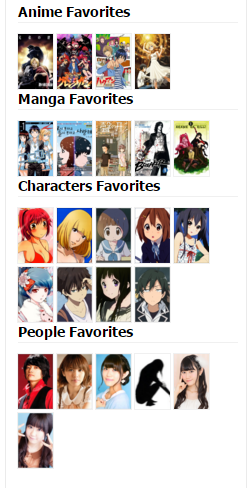 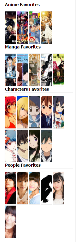 |
Oct 19, 2015 9:24 AM
#156
| if they can't become more wide, could they get centered? also check how they look when they are on the right side, cause they may overflow if they are too wide on the left |
Fixes to make the Profile more bearable after "the Modern★Profile★Update★★Rip★Profile★" |
Oct 19, 2015 9:29 AM
#157
They have so much room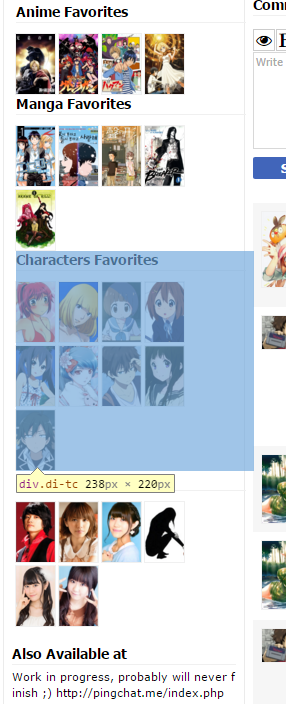 Zeando said: This is how it looks for me with float: right; also check how they look when they are on the right side, cause they may overflow if they are too wide on the left  Zeando said: Yes they could but do you really want it 4x3? If a user has 10 favourites, there would be 2 rows of 4 pictures and a final row of 2...if they can't become more wide, could they get centered? |
Oct 19, 2015 9:32 AM
#158
| wait, why a 4x3? was saying about a centered 5x2 i'm missing something here... there is definitely something strange with float:right (into .page-common .user-favorites-outer.js-truncate-outer .di-t) it's like there is an other margin there, much before the visible one |
ZeandoOct 19, 2015 9:35 AM
Fixes to make the Profile more bearable after "the Modern★Profile★Update★★Rip★Profile★" |
Oct 19, 2015 9:37 AM
#159
Zeando said: wait, why a 4x3? was saying about a centered 5x2 i'm missing something here... Zeando said: But that was to the float:right;also check how they look when they are on the right side, cause they may overflow if they are too wide on the left Zeando said: Agreedthere is definitely something strange with float:right (into .page-common .user-favorites-outer.js-truncate-outer .di-t) it's like there is an other margin there, much before the visible one |
Oct 19, 2015 9:37 AM
#160

sunnysummerday said: ah, it's a browser issue. i just installed it in chrome and it works. here's what the inspect element looks like in chrome (top) & opera 12 (bottom): & they're definitely different ._. I downloaded the latest edition of opera and it works, maybe you should update your opera browser? Or is opera 12 special? |
| My Userscripts: • Show anime/manga info inside your animelist/mangalist • Other Scripts |
Oct 19, 2015 9:39 AM
#161
Steve said: Zeando said: wait, why a 4x3? was saying about a centered 5x2 i'm missing something here... Zeando said: But that was to the float:right;also check how they look when they are on the right side, cause they may overflow if they are too wide on the left Zeando said: Agreedthere is definitely something strange with float:right (into .page-common .user-favorites-outer.js-truncate-outer .di-t) it's like there is an other margin there, much before the visible one ahhhh no xD i was meaning with the script disabled, the favorites go back under the statistics, on the right side of the profile xD .content-left .content-right Zeando said: see how it looks when on the right side of the page :D 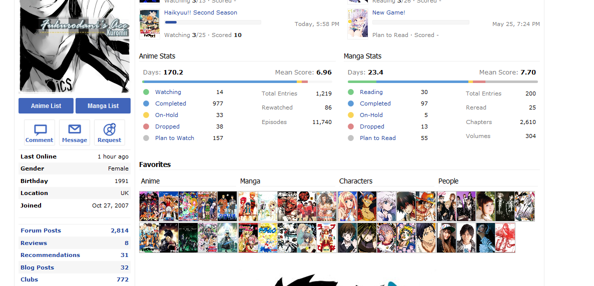 |
ZeandoOct 19, 2015 9:42 AM
Fixes to make the Profile more bearable after "the Modern★Profile★Update★★Rip★Profile★" |
Oct 19, 2015 9:46 AM
#162
Cpt_Mathix said: I downloaded the latest edition of opera and it works, maybe you should update your opera browser? Or is opera 12 special? it's the last version of opera that used the presto engine. modern opera uses webkit, which makes it the same as chrome ୧༼ಠ益ಠ༽୨ |
Oct 19, 2015 9:55 AM
#163
| @Steve about the spacing and the use of all the space have you already tried to see how the Friend block is coded? that has 5x2 and uses most of the space, so maybe the trick to make it work can be copied from there anyway, there seems to be a margin between .user-favorites-outer.js-truncate-outer and .di-td |
ZeandoOct 19, 2015 10:07 AM
Fixes to make the Profile more bearable after "the Modern★Profile★Update★★Rip★Profile★" |
Oct 19, 2015 10:28 AM
#164
Zeando said: Oooh!! I get you now!Steve said: Zeando said: wait, why a 4x3? was saying about a centered 5x2 i'm missing something here... Zeando said: also check how they look when they are on the right side, cause they may overflow if they are too wide on the left Zeando said: there is definitely something strange with float:right (into .page-common .user-favorites-outer.js-truncate-outer .di-t) it's like there is an other margin there, much before the visible one ahhhh no xD i was meaning with the script disabled, the favorites go back under the statistics, on the right side of the profile xD .content-left .content-right Zeando said: see how it looks when on the right side of the page :D Yeah it seems even when we move the favourites to the left panel, they are still bound to the size that they were on the right panel. 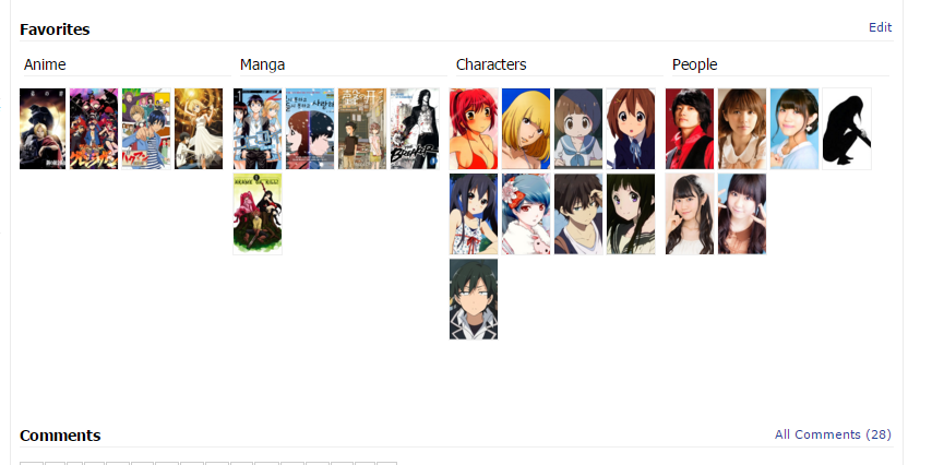 Zeando said: Yeah if we could change the favourite's class from "di-tc" to "user-friends pt4 pb12" (from favourites to friends) we should be able to finish. I have thought about it a few times and I'll try again soon to implement that.@Steve about the spacing and the use of all the space have you already tried to see how the Friend block is coded? that has 5x2 and uses most of the space, so maybe the trick to make it work can be copied from there anyway, there seems to be a margin between .user-favorites-outer.js-truncate-outer and .di-td |
Oct 19, 2015 10:30 AM
#165

Cpt_Mathix said: naisu! Zeando said: also the "Anime Favorites" headers seems too small (they should be the same size of Friends, Also Available at, RSS headers) (the headers are currently even smaller than the titles...) (or maybe it's some conflict on my part?) Here you go: https://greasyfork.org/nl/scripts/13183-myanimelist-mal-move-favorites It's much better now! works perfectly nao /o/ |
 |
Oct 19, 2015 10:32 AM
#166
Zeando said: [/spoiler] [/quote] That looks good? Seems you might have fixed it |
Oct 19, 2015 10:38 AM
#167
| ^ those favs in the spoiler-ed image above look terrible. not to sound mean! it looks like a banner ad that i'd want adblocked >:( |
Oct 19, 2015 10:40 AM
#168
i'm messing a bit with the numbers, and for now the max width i can have before it breaks from 5 to 4 is 31 for:/* Positions images and makes favourites section larger*/
.user-favorites .favorites-list .list{
margin-right: 8px;
margin-bottom: 4px;
height: 59px !important;
width: 31px !important;
display: none;
}copied the margins from the friends class :/ still not all the space is used, there is something different with the container of the favorites compared to the friends, but it looks almost decent when on the right side of the page 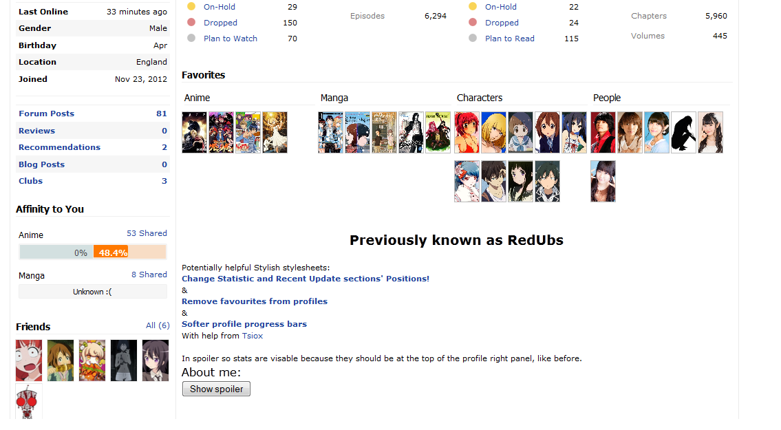 and it becomes even worse when the 10 favorites are being fully used 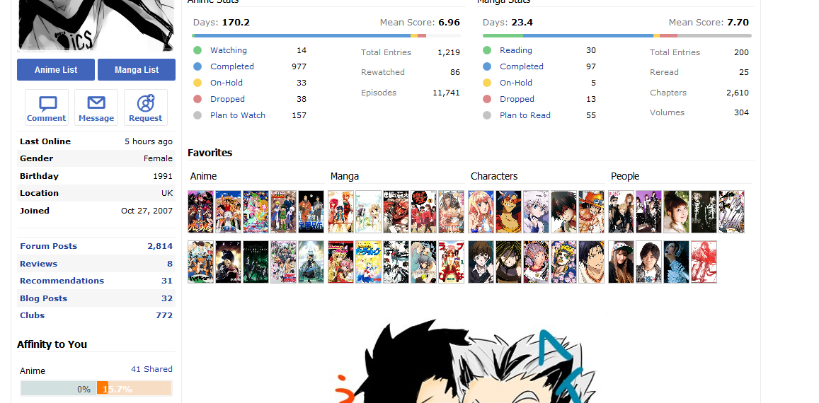 will wait anyway for your final version, Steve :) (i would focus on making them work when they are on the side, if they also can work otherwise good, but it's not a must, it'll be more hard making them look good if they stay on the right of the page) sunnysummerday said: ^ those favs in the spoiler-ed image above look terrible. not to sound mean! it looks like a banner ad that i'd want adblocked >:( they have no spacing that is the reason, they are not supposed to stay that attached to each other |
ZeandoOct 19, 2015 11:00 AM
Fixes to make the Profile more bearable after "the Modern★Profile★Update★★Rip★Profile★" |
Oct 19, 2015 10:56 AM
#169
sunnysummerday said: It won't all be in a straight line at the end, it will be in the left panel. But yes it kind of looks like some ads ^^" I still prefer it because it's so compact (but only if it's in the left panel!!).^ those favs in the spoiler-ed image above look terrible. not to sound mean! it looks like a banner ad that i'd want adblocked >:( Similar to this at the end:  |
SteveOct 19, 2015 11:24 AM
Oct 19, 2015 11:01 AM
#170
Zeando said: Can I have your code and my code to compare? i'm messing a bit with the numbers, and for now the max width i can have before it breaks from 5 to 4 is 31 for: /* Positions images and makes favourites section larger*/
.user-favorites .favorites-list .list{
margin-right: 8px;
margin-bottom: 4px;
height: 59px !important;
width: 31px !important;
display: none;
}copied the margins from the friends class :/ still not all the space is used, there is something different with the container of the favorites compared to the friends, but it looks almost decent when on the right side of the page and it become even worse when the 10 favorites are being fully used will wait anyway for your final version, Steve :) (i would focus on making them work when they are on the side, if they also can work otherwise good, but it's not a must, it'll be more hard making them look good if they stay on the right of the page) sunnysummerday said: ^ those favs in the spoiler-ed image above look terrible. not to sound mean! it looks like a banner ad that i'd want adblocked >:( they have no spacing that is the reason, they are not supposed to stay that attached to each other & Mine breaks into 3 rows at 35px wide... Here is mine if you want to compare too: /* More Compact Left Panel */
.page-common .user-favorites-outer.js-truncate-outer .mb8 {margin: 0}
.page-common .pb12{padding-bottom: 4px !important;}
/* Removes Titles & Info */
.user-favorites .favorites-list .list .data{
float: left;
padding: 0 !important;
margin: 0 !important;
display: none !important;
}
/* Positions images and makes favourites section larger*/
.favorites-list .list, .user-favorites .favorites-list .list .image{
height: 52px !important; /*[s](not 75px or 57px)[/s]*/
width: 35px !important;
margin: 1px 2px 0px 2px !important;
float: right;
background-size: cover;
}
.page-common .user-favorites-outer.js-truncate-outer .di-t{float: left;}
h4[class="mb8 mr8"], h4[class="mb8"], div[class="mb8 mr8"], div[class="mb8"], div[class="di-tc"]{width: 230px !important;} |
SteveOct 19, 2015 11:25 AM
Oct 19, 2015 11:03 AM
#171
Steve said: Can I have your code and my code to compare? Mine breaks into 3 rows at 35px wide... k /*
Softens the colour of the progress bars on MAL profiles as well as making them thinner!
Compatible with other Stylish MAL Stylesheets!
Colours by Tsiox @ http://myanimelist.net/profile/Tsiox
Thinning out and put together by RedUbs @ http://myanimelist.net/profile/RedUbs
*/
@-moz-document regexp(".*myanimelist.net/(?!animelist|mangalist).*") {
/* More Compact Left Panel
.page-common .user-favorites-outer.js-truncate-outer .mb8 {
margin: 0;
}
.page-common .user-favorites-outer.js-truncate-outer .pb12{
    padding-bottom: 4px !important;
}
/*
.user-profile .user-favorites-outer.js-truncate-outer h4 {
margin: 0 !important;
}*/
/* Removes Titles & Info */
.user-favorites .favorites-list .list .data{
float: left;
padding: 0 !important;
margin: 0 !important;
display: none !important;
}
/* Fixes Image Sizes */
.user-favorites .favorites-list .list .image{
height: 59px !important;
width: 35px !important;
margin: 1px 3px 1px 1px !important;
float: left;
}
/* Positions images and makes favourites section larger*/
.user-favorites .favorites-list .list{
margin-right: 8px;
margin-bottom: 4px;
height: 59px !important;
width: 31px !important;
display: none;
}
.page-common .user-favorites-outer.js-truncate-outer .di-t{
display: block;
float: left;
}
h4[class="mb8 mr8"], h4[class="mb8"], div[class="mb8 mr8"], div[class="mb8"], div[class="di-tc"]{
width: 230px !important;
}
li[class="list di-t mb8"]{
position: relative;
right: 5px;
}
}the max possible became 31 after i did add the margin-right: 8px; before i had 5x2 with: width: 39px (or 38, don't remember well, 38 is the width of the friend thumbs) and only used the code you posted here, which had already a 5x2 |
ZeandoOct 19, 2015 11:08 AM
Fixes to make the Profile more bearable after "the Modern★Profile★Update★★Rip★Profile★" |
Oct 19, 2015 11:07 AM
#172
Zeando said: Yeah somewhere I lost 4px...Steve said: Can I have your code and my code to compare? Mine breaks into 3 rows at 35px wide... k /*
Softens the colour of the progress bars on MAL profiles as well as making them thinner!
Compatible with other Stylish MAL Stylesheets!
Colours by Tsiox @ http://myanimelist.net/profile/Tsiox
Thinning out and put together by RedUbs @ http://myanimelist.net/profile/RedUbs
*/
@-moz-document regexp(".*myanimelist.net/(?!animelist|mangalist).*") {
/* More Compact Left Panel
.page-common .user-favorites-outer.js-truncate-outer .mb8 {
margin: 0;
}
.page-common .user-favorites-outer.js-truncate-outer .pb12{
    padding-bottom: 4px !important;
}
/*
.user-profile .user-favorites-outer.js-truncate-outer h4 {
margin: 0 !important;
}*/
/* Removes Titles & Info */
.user-favorites .favorites-list .list .data{
float: left;
padding: 0 !important;
margin: 0 !important;
display: none !important;
}
/* Fixes Image Sizes */
.user-favorites .favorites-list .list .image{
height: 59px !important;
width: 35px !important;
margin: 1px 3px 1px 1px !important;
float: left;
}
/* Positions images and makes favourites section larger*/
.user-favorites .favorites-list .list{
    margin-right: 8px;
    margin-bottom: 4px;
    height: 59px !important;
    width: 31px !important;
    display: none;
}
.page-common .user-favorites-outer.js-truncate-outer .di-t{
display: block;
float: left;
}
h4[class="mb8 mr8"], h4[class="mb8"], div[class="mb8 mr8"], div[class="mb8"], div[class="di-tc"]{
width: 230px !important;
}
li[class="list di-t mb8"]{
position: relative;
right: 5px;
}
}the max possible became 31 after i did add the margin-right: 8px; before i had 5x2 with: width: 39px and only used the code you posted here, which had already a 5x2 Oh and btw in my code the height is incorrect, was testing something and forgot to change it back from height: 75px; to height: 57px; (somewhere around 57px) If we get it working I will make the height correct again in the final version but thats good enough for now. to the correct height: 52px; Though anything between 51px and 57px works well. |
SteveOct 19, 2015 11:22 AM
Oct 19, 2015 12:04 PM
#173
Zeando said: if they can't become more wide, could they get centered? if only there was a float: center;... and because there isn't, there isn't an easy way to do this from what I can see... but if you want right-alignment that works :/ (by using float: right;) 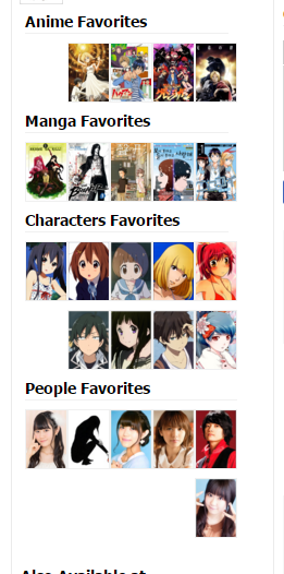 I think I'll stick with left. Why have these pictures got to be so awkward! text-align: center; works with the titles and the friends images! :( 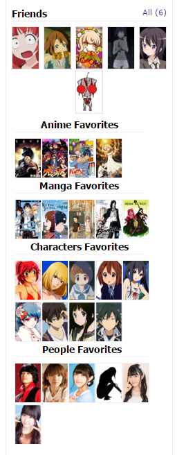 |
SteveOct 19, 2015 12:09 PM
Oct 19, 2015 12:47 PM
#174
you can't center them because mal has them coded as "table-cell", so you need to change that..user-favorites-outer.js-truncate-outer .di-t {
float: none !important;
text-align: center !important;
display: inline-block !important; }you need to left align the headers though. |
Oct 19, 2015 1:08 PM
#175
| **Update - This is discontinued and no longer functions. Sorry.** Tiles for Favourites 2 Our 3rd alternative favourites style... → See our second style "Tiles for Favourites 1" here ← → See our first style "Move favourites on left side" here ← Here is another alternative look for your favourites! (only visable by you but affects all profiles!) Should be compatible with all commonly used browsers! (make sure your browser is updated!) Larger image (shows position on left panel better) 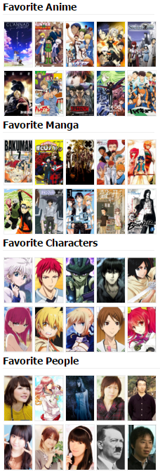 WARNING Make sure that you follow every step carefully and that both the Tampermonkey userscript and the Stylish stylesheet are enabled, otherwise this could break your profile. If your's is broken... 1. Make sure your Stylish stylesheet and Tampermonkey userscript are enabled, then refresh the page! 2. Reread the instructions and follow the steps again. 3. Either delete the stylesheet you have created and replace it with this stylesheet (which you don't necessarily need the userscript for). Or Replace your code with the following: Firefox code: @-moz-document regexp(".*myanimelist.net/profile/(?!animelist|mangalist).*") {
/* More Compact Left Panel */
.page-common .pb12{padding-bottom: 4px !important;}
.page-common .user-favorites-outer.js-truncate-outer .mb8 {margin:1px 0 1px 0;/* text-align: center;*/}
/* Removes Titles & Info */
.user-favorites .favorites-list .list .data, .page-common .content-container .container-right h2[class="mb12"]{
    padding: 0 !important;
    margin: 0 !important;
    display: none !important;
}
/* Fixes Image Sizes and stuff... */
.user-favorites .favorites-list .list .image{
    height: 65px !important;
    margin: 1px 3px 1px 1px !important;
}
.user-favorites .favorites-list .list{
    margin-bottom: 2px !important;
    width: 45px !important;
    display: none;
    float: left;
}
}/* More Compact Left Panel */
.page-common .pb12{padding-bottom: 4px !important;}
.page-common .user-favorites-outer.js-truncate-outer .mb8 {margin:1px 0 1px 0;/* text-align: center;*/}
/* Removes Titles & Info */
.user-favorites .favorites-list .list .data, .page-common .content-container .container-right h2[class="mb12"]{
padding: 0 !important;
margin: 0 !important;
display: none !important;
}
/* Fixes Image Sizes and stuff... */
.user-favorites .favorites-list .list .image{
height: 65px !important;
margin: 1px 3px 1px 1px !important;
}
.user-favorites .favorites-list .list{
margin-bottom: 2px !important;
width: 45px !important;
display: none;
float: left;
}
Installation Instructions: (for Chrome/webkit browsers and Firefox, but screenshots are taken with Chrome!) Step 1. You need to download and install Stylish which can be found from either of the following links: Firefox download: https://addons.mozilla.org/en-us/firefox/addon/stylish/ Chrome download: https://chrome.google.com/webstore/detail/stylish/fjnbnpbmkenffdnngjfgmeleoegfcffe?hl=en Step 2. Once Stylish is installed, you can then either, download the stylish stylesheet for Tiles For Favourites 2 here (recommeneded): https://userstyles.org/styles/119952/ and then skip to step 5. Or you can do it yourself manually by reading the rest of the instructions in this step and all the others. You will need to create a new Stylish stylesheet. Then put the relevant code for your browser into the "code 1" section: For Firefox: @-moz-document regexp(".*myanimelist.net/profile/(?!animelist|mangalist).*") {
/* More Compact Left Panel */
.page-common .pb12{padding-bottom: 4px !important;}
.page-common .user-favorites-outer.js-truncate-outer .mb8 {margin:1px 0 1px 0;/* text-align: center;*/}
/* Removes Titles & Info */
.user-favorites .favorites-list .list .data, .page-common .content-container .container-right h2[class="mb12"]{
    padding: 0 !important;
    margin: 0 !important;
    display: none !important;
}
/* Fixes Image Sizes and stuff... */
.user-favorites .favorites-list .list .image{
    height: 65px !important;
    margin: 1px 3px 1px 1px !important;
}
.user-favorites .favorites-list .list{
    margin-bottom: 2px !important;
    width: 45px !important;
    display: none;
    float: left;
}
.profile .user-favorites .favorites-list{
    width:225px;
}
/* Fixes Pixelated Resized Images (for favourites and recent updates) */
.profile .user-favorites .favorites-list .list .image, .profile .statistics-updates .image img {
image-rendering: initial;
}
}For Chrome (webkit browsers): /* More Compact Left Panel */
.page-common .pb12{padding-bottom: 4px !important;}
.page-common .user-favorites-outer.js-truncate-outer .mb8 {margin:1px 0 1px 0;/* text-align: center;*/}
/* Removes Titles & Info */
.user-favorites .favorites-list .list .data, .page-common .content-container .container-right h2[class="mb12"]{
padding: 0 !important;
margin: 0 !important;
display: none !important;
}
/* Fixes Image Sizes and stuff... */
.user-favorites .favorites-list .list .image{
height: 65px !important;
margin: 1px 3px 1px 1px !important;
}
.user-favorites .favorites-list .list{
margin-bottom: 2px !important;
width: 45px !important;
display: none;
float: left;
}
.profile .user-favorites .favorites-list{
width:225px;
}Step 3. (only applies to Chrome/webkit browsers!) You will then have to apply it to your desired webpage (this is included in the Firefox code so Firefox users, you don't need to do this step!) You will need to select the option "Applies to: [URLs on the domain], and in the box next to it type in "myanimelist.net" as shown in the image below. 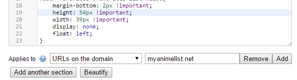 Step 4. Then name your new stylesheet to whatever you want! (example in image below) and make sure you have the "Enabled" box ticked so that the stylesheet will be enabled! 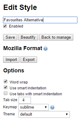 Step 5. For this step you then need to go to the following link to download and install Tampermonkey (if you use Chrome/ a webkit browser) or Greasemonkey if you use Firefox. Firefox: https://addons.mozilla.org/en-us/firefox/addon/greasemonkey/ Chrome: https://chrome.google.com/webstore/detail/tampermonkey/dhdgffkkebhmkfjojejmpbldmpobfkfo?hl=en Other browsers see here: https://greasyfork.org/en/help/installing-user-scripts Step 6. The final and simplest of steps! Now you have greasemonkey/tampermonkey downloaded and installed, you need to download this userscript for it: https://greasyfork.org/en/scripts/13183-myanimelist-mal-move-favorites Yay! Now enjoy your new favourites section! Thank you to... Cpt_Mathix Steve Zeando for creating the userscripts and stylesheet! and TsundereHeart sunnysummerday HaXXspetten shuryukan Kuromii for the ideas and help! |
SteveDec 9, 2021 4:23 AM
Oct 19, 2015 1:12 PM
#176

| thank you very very much! This made my day after the ugly shock. |

Oct 19, 2015 1:14 PM
#177
| @Steve thats fine enouth ^^ but why you didn't upload it on userstyles.org ? btw, think i've set a new record, while i was trying to remove a bit of the vertical spacing in mine, i've removed the margin-right and did end with 6 favorites on the same line xD (well they overlap, so it's sort of cheating..) 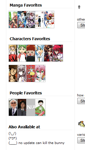 |
Fixes to make the Profile more bearable after "the Modern★Profile★Update★★Rip★Profile★" |
Oct 19, 2015 1:17 PM
#178
Zeando said: wow ;) Good job but yes thats cheating >:(btw, think i've set a new record, while i was trying to remove a bit of the vertical spacing in mine, i've removed the margin-right and did end with 6 favorites on the same line xD (well they overlap, so it's sort of cheating..) Because it requires Cpt_Mathix's script to work, so this is more suitable. But you can feel free to add your version to userstyles.org if you want! :) |
Oct 19, 2015 1:19 PM
#179
Steve said: ↑ mainly because I'm lazy and Zeando is great at updating ;pwould be nice if I could give permission for Zeando or Cpt_Mathix to edit if they wanted... Zeando, you could quote my message in a spoiler to the main thread (or if you want adda title and link (http://myanimelist.net/forum/?topicid=1440057&show=150#post175 to the main part of this thread) |
SteveOct 19, 2015 1:23 PM
Oct 19, 2015 1:22 PM
#180
Steve said: Zeando, you could add: http://myanimelist.net/forum/?topicid=1440057&show=150#post175 to the main part of this thread? that's what i was thinking of doing :) |
Fixes to make the Profile more bearable after "the Modern★Profile★Update★★Rip★Profile★" |
Oct 19, 2015 1:24 PM
#181
i think mal should've gone with something like this instead: sections would resize horizontally based on if you have 5 or more, and clicking the arrow would slide the remaining favourites in :S preferably though, we should be limited to 5 favourites per section.. or 1 >_> they're favourites after all! do you have 10 "favourite" friends? don't say yes >:( |
Oct 19, 2015 1:26 PM
#182
sunnysummerday said: I think 5 (for all categories) is best too!preferably though, we should be limited to 5 favourites per section.. or 1 >_> So we wont have half as much trouble in the first place. *edits profile to <=5 for each* Good idea |
SteveOct 19, 2015 1:34 PM
Oct 19, 2015 1:29 PM
#183
sunnysummerday said: Ahaha i kept saying that! Like was so confused why people wanted more favs, makes the term "favorite" less meaningfuli think mal should've gone with something like this instead: sections would resize horizontally based on if you have 5 or more, and clicking the arrow would slide the remaining favourites in :S preferably though, we should be limited to 5 favourites per section.. or 1 >_> they're favourites after all! do you have 10 "favourite" friends? don't say yes >:( Thanks guys for all your hardwork /o/ |
210125Oct 19, 2015 1:38 PM
|
Oct 19, 2015 1:35 PM
#184

| Now we just need to blackmail Xinil into making this the default version |
  |
Oct 19, 2015 1:58 PM
#185
Annuvin said: Not sure if anybody made a style with a bit less annoying colors yet so I'm going to post mine just in case (for use with Tampermonkey or w/e, did a quick fix on margins & width too): var style = document.createElement('style'); style.type = 'text/css'; style.innerHTML = '.graph.watching, .graph.reading, .circle.watching:after, .circle.reading:after, .graph-inner.watching, .graph-inner.reading { background-color: #B0C4E8 !important }' + '.text.watching, .text.reading { color: #B0C4E8 !important }' + '.graph.completed, .circle.completed:after, .graph-inner.completed { background-color: #7C9ACF !important }' + '.text.completed { color: #7C9ACF !important }' + '.graph.on-hold, .circle.on-hold:after, .graph-inner.on-hold { background-color: #476AA6 !important }' + '.text.on-hold { color: #476AA6 !important }' + '.graph.dropped, .circle.dropped:after, .graph-inner.dropped { background-color: #274A86 !important }' + '.text.dropped { color: #274A86 !important }' + '.page-common .di-tc { width: 50% }' + '.user-profile .user-status li .user-status-data.online { color: #4165BA }'; document.getElementsByTagName('head')[0].appendChild(style); document.getElementsByClassName('stat-score di-t w100 pt8')[0].className += ' mb8'; document.getElementsByClassName('stats-graph mt8')[0].className = 'stats-graph mt12'; Should look somewhat like this: 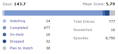 works nicely :) could you upload it on a script hosting site like https://greasyfork.org/en ? to make it easier for people to install it also, surprisingly, it doesn't conflicts with the Soft Bars style of Steve, if both are active you get slim and blue bars |
Fixes to make the Profile more bearable after "the Modern★Profile★Update★★Rip★Profile★" |
Oct 19, 2015 2:00 PM
#186
Steve said: would be nice if I could give permission for Zeando or Cpt_Mathix to edit if they wanted... Permission to edit what exactly? If you are referring to my userscript than sure go ahead. Steve said: I'm not really getting anywhere so I think I'll stick with what we have... Maybe I could try to make a userscript that gets rid of the white space? Edit: Just installed your script, I really like it :) |
| My Userscripts: • Show anime/manga info inside your animelist/mangalist • Other Scripts |
Oct 19, 2015 2:04 PM
#187
Cpt_Mathix said: I mean I want to be able to give permission to you two to edit the installation message I made (but this is not possible, only mods/admins can edit it I think) (this message I want to allow you guys to edit) Steve said: Permission to edit what exactly? If you are referring to my userscript than sure go ahead.would be nice if I could give permission for Zeando or Cpt_Mathix to edit if they wanted... Cpt_Mathix said: Cool sounds good!Steve said: Maybe I could try to make a userscript that gets rid of the white space?I'm not really getting anywhere so I think I'll stick with what we have... a userscript that makes the images larger while keeping them on the same line? or a userscript that removes the whitespace/ invisable margin (har har.) so that the stylesheet can make the images larger while keeping them in a form of (5x2)? |
Oct 19, 2015 2:14 PM
#188
Zeando said: You helped me find some identifiers and played around with the code with me which was a great help :)Credits to: Steve for the stylesheets, Cpt_Mathix for the script, Zeando for ..help? |
Oct 19, 2015 2:16 PM
#189
Steve said: Zeando said: You helped me find some identifiers and played around with the code with me which was a great help :)Credits to: Steve for the stylesheets, Cpt_Mathix for the script, Zeando for ..help? ook, changed it to "tech support" :3 |
Fixes to make the Profile more bearable after "the Modern★Profile★Update★★Rip★Profile★" |
Oct 19, 2015 2:18 PM
#190
Zeando said: [quote=Steve] Zeando said: You helped me find some identifiers and played around with the code with me which was a great help :)Credits to: Steve for the stylesheets, Cpt_Mathix for the script, Zeando for ..help? ook, changed it to "tech support" :3[/quote] Much better |
Oct 19, 2015 2:20 PM
#191

Steve said: I'm not really getting anywhere so I think I'll stick with what we have... Alternative Favourites Stlye YES! THANK YOU! Just noticed I'm currently using a literal dozen of scripts + stylish for MAL. I wonder if I'll ever be able to use this site without all these extra touches again. They should just open-source everything. It's clear that the community is doing a better job than the devs :P |

Oct 19, 2015 2:24 PM
#192
xbobx said: I would find actually making the scripts a whole lot easier too!Steve said: I'm not really getting anywhere so I think I'll stick with what we have... Alternative Favourites Stlye YES! THANK YOU! Just noticed I'm currently using a literal dozen of scripts + stylish for MAL. I wonder if I'll ever be able to use this site without all these extra touches again. They should just open-source everything. It's clear that the community is doing a better job than the devs :P |
Oct 19, 2015 2:40 PM
#193

| Thank you for including me in your credits, Steve <3 Now, I still have one little problem that I need to sort out. My favourites are currently all chilling right down at the bottom of the page: 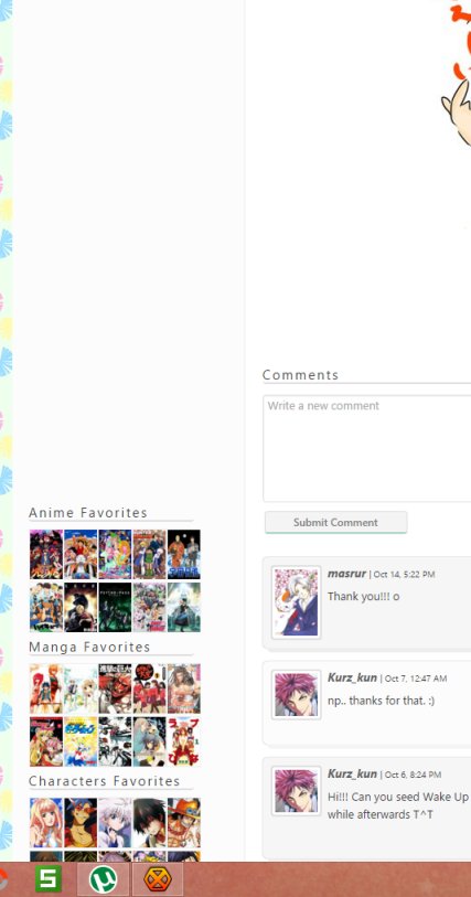 The scripts I'm running are sunny's crayon scripts and favourite alternatives in Stylish, and Move Favourites in GreaseMonkey/Tampermonkey/GreasyFork or whatever you want to refer to it as. Is this problem occurring for me because I haven't updated to sunny's latest update, or for another reason? Profiles look like this for me still, just for reference: 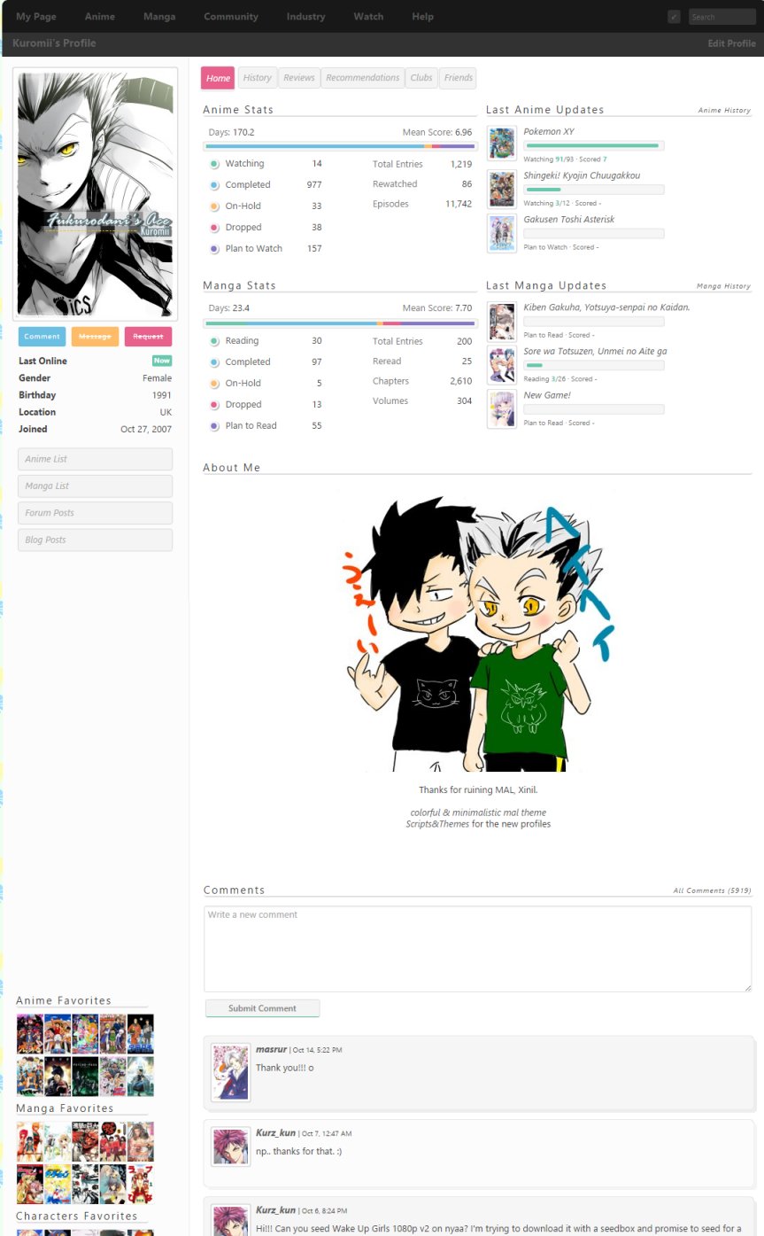 |
  |
Oct 19, 2015 2:43 PM
#194
| ^ that's because you haven't updated my theme >_> |
Oct 19, 2015 2:55 PM
#195
sunnysummerday said: ^ that's because you haven't updated my theme >_> I thought so, but I thought I'd better make sure! I've updated now and it looks so lovely <3 |
| |
Oct 19, 2015 3:12 PM
#196
| @Steve found whose fault was the invisible border .profile .user-favorites .favorites-list{
width:224px;
}:D but, little downside, it breaks the page if the script is not enabled (as expected..) would also suggest to update the firefox line in the styles like this: @-moz-document regexp(".*myanimelist.net/profile/(?!animelist|mangalist).*") { adding "profile/" so the style will be active only on the profile, where it needs to do things, and not on every page of MAL Annuvin said: Yup, done. https://greasyfork.org/en/scripts/13204-myanimelist-mal-profile-colors I haven't really checked that script but I'm guessing it's because I'm using !important on colors. Also, full color palette from the old bars if somebody's interested in modifying the colors (I''ll try to make them a bit nicer later):  thanks a lot :) |
ZeandoOct 19, 2015 4:02 PM
Fixes to make the Profile more bearable after "the Modern★Profile★Update★★Rip★Profile★" |
Oct 19, 2015 3:22 PM
#197

| Is it possible for someone to make an extension to use the old stat bars? I really hate the new one. |
Oct 19, 2015 4:18 PM
#198
| Btw just me who finds it a bit weird to have the headers say category first, favorites last? Like "Anime Favorites" and "Manga Favorites" are fair enough but "Characters Favorites" and "People Favorites" sound really strange to me If it'd be possible to change it to "Favorite Anime", "Favorite Manga", "Favorite Characters" and "Favorite People" I think it'd make more sense |
| |
Oct 19, 2015 4:30 PM
#199
| @hax that's something related to the "favorites on the side" script of Cpt_Mathix some things which may get lost since they were at the end of the previous pages @Cpt_Mathix check this empty profile http://myanimelist.net/profile/BakaProof found an other little glitch of the Align script, (it's visible in that empty profile too) the "Manga Stats" and "Last Manga Updates" are not aligned vertically it's possible to fix that too? it would appear it's the "Last Manga Updates " to be too much on the right the right end of "Last Anime Updates " is also odd, it ends past the end of "Anime Stats" guess the general width of "Updates" and "Stats" is different on the "Official", making them equal should simplify the fixing @Steve found whose fault was the invisible border .profile .user-favorites .favorites-list{
width:224px;
}:D but, little downside, it breaks the page if the script is not enabled (as expected..) would also suggest to update the firefox line in the styles like this: @-moz-document regexp(".*myanimelist.net/profile/(?!animelist|mangalist).*") { adding "profile/" so the style will be active only on the profile, where it needs to do things, and not on every page of MAL |
Fixes to make the Profile more bearable after "the Modern★Profile★Update★★Rip★Profile★" |


More topics from this board
» Share Your YouTube Channel/Videos! ( 1 2 3 4 5 ... Last Page )nin-tendo - Dec 16, 2022 |
362 |
by nin-tendo
»»
9 hours ago |
|
» Protect or punish?DollzchanAi - Apr 18 |
4 |
by DollzchanAi
»»
Today, 6:15 AM |
|
» BL reference in Tomodachi LifeKinspie13 - Yesterday |
4 |
by Kinspie13
»»
Yesterday, 9:41 PM |
|
» How to Export/Backup Your Anime List Automatically! (TamperMonkey Script)hacker09 - May 18, 2020 |
3 |
by Vapor_AU
»»
Yesterday, 8:41 PM |
|
» advice for someone returning to artCrystepsi - Apr 4 |
5 |
by haaku-san
»»
Yesterday, 4:21 PM |