New
Mar 9, 2015 11:36 PM
#2661

Takana_no_Hana said: Hi, I just want to ask that are there any way to implement this scrolling banner into my list? Here are the codes: /* ANIMATED SCROLLING BANNER Z-index is the position of the scrolling pic (in front of or behind the list). A high z-index will move the list in front of other parts. A lower index will move the scrollbar behind other parts (-1 will be behind most lists). */ #inlineContent { position: fixed!important; display: block !important; left: 0; top: 0; width: 100%; height: 100px; overflow: hidden; z-index: 8; } /* SCROLLING IMAGE Change image and animation speeds here (20s). */ #inlineContent:before { background-attachment:scroll; pointer-events: none; position: absolute!important; content: ''; width: 300%; height: 100%; background-image: url("http://i.minus.com/iRrOnoL7YWiBf.png"); -moz-animation: scroll 90s linear infinite; -webkit-animation: scroll 90s linear infinite; } @-moz-keyframes scroll { 0% { background-position: 0; } 100% { background-position: -200%; } } @-webkit-keyframes scroll { 0% { background-position: 0; } 100% { background-position: -200%; } } I figure out it has something to do with inlineContent and I've been playing with the codes for hours but no result :/ When I added that code to the list, it didn't show. Then I changed the value and sometimes it shows but the other background images or animation just got lost. You're already using inline content for the secondary background and animated sakura petals. So you could use a different selector for the scrollbar, or a different one for the second bg/petals. |
Mar 9, 2015 11:43 PM
#2662

Shishio-kun said: Takana_no_Hana said: Hi, I just want to ask that are there any way to implement this scrolling banner into my list? Here are the codes: /* ANIMATED SCROLLING BANNER Z-index is the position of the scrolling pic (in front of or behind the list). A high z-index will move the list in front of other parts. A lower index will move the scrollbar behind other parts (-1 will be behind most lists). */ #inlineContent { position: fixed!important; display: block !important; left: 0; top: 0; width: 100%; height: 100px; overflow: hidden; z-index: 8; } /* SCROLLING IMAGE Change image and animation speeds here (20s). */ #inlineContent:before { background-attachment:scroll; pointer-events: none; position: absolute!important; content: ''; width: 300%; height: 100%; background-image: url("http://i.minus.com/iRrOnoL7YWiBf.png"); -moz-animation: scroll 90s linear infinite; -webkit-animation: scroll 90s linear infinite; } @-moz-keyframes scroll { 0% { background-position: 0; } 100% { background-position: -200%; } } @-webkit-keyframes scroll { 0% { background-position: 0; } 100% { background-position: -200%; } } I figure out it has something to do with inlineContent and I've been playing with the codes for hours but no result :/ When I added that code to the list, it didn't show. Then I changed the value and sometimes it shows but the other background images or animation just got lost. You're already using inline content for the secondary background and animated sakura petals. So you could use a different selector for the scrollbar, or a different one for the second bg/petals. Hi, thanks for the answer but I'm not quite sure what are the other selector. Can you give me some hindsight? |
Mar 11, 2015 1:57 PM
#2663
| You need to replace the inline content selectors with another selector you're not using, used some in the codes below. Now you can use inline content for the scrollbar. There's already a scrollbar topic too. I think this is easier cuz inlinecontent is best for scrollbars, its picky @import url(http://storage.live.com/items/4A07C1EEED420167%21151); @import url(https://googledrive.com/host/0BxjwQr0BBXs-aDYxM2JlaFM2bnM); /* HOW TO USE (go to this link) http://dl.dropboxusercontent.com/u/78340470/howtouse.txt */ /* MAIN BACKGROUND The space background by default. */ body { background-image: url(http://i.imgur.com/bi1Y3uj.jpg); background-position:0 100%, 0 0; background-repeat:no-repeat no-repeat; background-size:cover; cursor: url(http://cur.cursors-4u.net/cursors/cur-11/cur1054.cur), progress !important; } /* SECONDARY BACKGROUND Goes behind the list but in front of the main background. Image links to a character render in the parenthesis after background. Add or remove the word "contain" (without quotations) after background-size if you want them to be fit or not fit into the entire page. */ .status_selected a:after { background: url("http://signavatar.com/38086_s.png") no-repeat scroll right bottom transparent; background-size: contain !important; content: ""; } @keyframes sparkle { 0% { background-position: 0 0, 0 0; } 100% { background-position: -485px -487px, 485px -487px; } } @-webkit-keyframes sparkle { 0% { background-position: 0 0, 0 0; } 100% { background-position: -485px -487px, 485px -487px; } } .status_selected a:before { position: fixed; display: block; content: ''; left: 50%; bottom: 0; margin-left: -40%; width: 100%; height: 100%; background-image: url(http://i.imgur.com/CRl4QNy.png), url(http://i.imgur.com/fn6Royv.png); border-radius: 50em; animation: sparkle 15s linear infinite; -webkit-animation: sparkle 15s linear infinite; } /* SIDE BUTTONS The first code controls the type of positioning of the buttons- if you change absolute to fixed, it will fix the buttons to the page. You'll have to change left: -300px; to left: 0px; after if you want them fixed. All the following codes control the background image for the buttons in this order: Current, Complete, On-hold, Dropped, Planned, and All Anime. If you don't want the All Anime button on your list, remove the X from display: Xnone; if you want the All Anime button back, add the X back or delete display:none; */ .status_selected, .status_not_selected { position:fixed; left: 10px; } .status_selected:first-of-type, .status_not_selected:first-of-type { background-image:url(http://i.imgur.com/EIe0ds2.png); background-position:0 0; top:20px; } .status_selected:nth-of-type(2), .status_not_selected:nth-of-type(2) { background-image:url(http://i.imgur.com/enIwPEb.png); background-position:100% 0; top:140px; } .status_selected:nth-of-type(3), .status_not_selected:nth-of-type(3) { background-image:url(http://i.imgur.com/l6QiiwD.png); background-position:0 0; top:260px; } .status_selected:nth-of-type(4), .status_not_selected:nth-of-type(4) { background-image:url(http://i.imgur.com/oFeoqkJ.png); background-position:100% 0; top:380px; } .status_selected:nth-of-type(5), .status_not_selected:nth-of-type(5) { background-image:url(http://i.imgur.com/BKofJla.png); background-position:0 0; top:500px; } .status_selected:last-of-type, .status_not_selected:last-of-type { background-image:url(http://i.imgur.com/g0BYNOB.png); background-position:100% 0; top:620px; display: none; } /* MAGICA LOGO AND LIST TOP SPACING Background-image is the Magica logo at page top. You can move it with background position. Padding top controls the amount of space between the list top and the top of the page. If you raise the number the list will move farther down the page. */ #list_surround { background-image: url("http://i.imgur.com/4ktjlw2.png"); background-position:; padding-top: 50px; } /* CUSTOM HEADERS */ [class^="header_"] * { height:200px; } .header_cw { background-image: url("http://i.imgur.com/5GXhEyl.png"); background-position: 100% 110px; } .header_completed { background-image: url("http://i.imgur.com/IiV7JaZ.png"); background-position: 100% 110px; } .header_onhold { background-image: url("http://i.imgur.com/fhdLlLW.png"); background-position: 100% 110px; } .header_dropped { background-image: url("http://i.imgur.com/BBEJpgi.png"); background-position: 100% 110px; } .header_ptw { background-image: url("http://i.imgur.com/APrZ8aA.png"); background-position: 100% 110px; } /* COVER PIC POSITION (hover) This is how far to the left the cover pic will zoom out when you point to the thumbnail for it. If you want it more to the right, take away from the amount below. */ .hide:hover { margin-left: -178px; } /* LIST TOP COLORS The colors for the top text (#, anime title, score, etc) and the panel itself. Google "RGBA color generator" for easy to copy color and opacity numbers customized for you to put after "background- color:". */ .table_header, .table_header a{ color: white;} .table_header { background-color: rgba(44, 103, 0, 0.5); } /* LIST BACKGROUND COLOR, ROW HEIGHT AND HOVER COLOR Adjust the opacity and color of the list itself with the first two sets of code, as well as the height of the rows. td1 is odd numbered rows, td2 is even. The third set of code is for the row color and opacity on height. */ .td1 { background-color:rgba(0, 0, 0, 0.5); height:80px; } .td2 { background-color:rgba(0, 0, 0, 0.5); height:80px; } tr:hover [class^="td"] { transition: .1s linear; background-color: rgba(180, 32, 48, 0.6); } /* LIST BOTTOM COLORS The first set controls color for the category totals, and second for the copyright section. */ .category_totals { background-color:rgba(180, 32, 48, 0.4); } #copyright { background-color:rgba(180, 32, 48, 0.6); } /* LIST FONT COLOR AND TYPE You can control the font type and colors for the list here; for the anime titles and tags see after */ .td1, .td2, .category_totals { color:white; font-family: ; } /* ANIME TITLE/AIRING You can control the font-colors for anime titles here, and the Airing text on currently airing anime. */ .animetitle { color: white; font-family: ; font-weight: bold; } .animetitle + small { color:#CC33FF !important; font-weight: bold; } /* TAGS (mini-reviews) The first code controls the size/color of the font if you put in any tags/mini-reviews. The second can control how much the width of the list the tags take up- you must put a percentage in after "width:" and before !important (for example 85% ). */ span[id*="tagLinks"] a { font-size: 12px !important; color: #FFFFFF !important; font-family: ; top: 20px !important;} span[id*="tagLinks"] { width: 87% !important; } /* TAGS EDIT BUTTON The button link "Edit" will show up under your anime title number. */ .td1:nth-of-type(6) a, .td2:nth-of-type(6) a { color: #00FFFF; font-size: 14px; left: 9px; margin-top: 20px; text-decoration: none; z-index: 1 !important; } /* OTHER CODES Ask in the original topic for this layout of in my club if you need to learn more about customizing this layout. */ .td1:nth-of-type(6) a, .td2:nth-of-type(6) a { background-color: rgba(0, 0, 0, 0) !important; position: absolute; } .table_header:nth-of-type(6) { width: 1px !important; font-size: 0 !important; } .td1:nth-of-type(6), .td2:nth-of-type(6) { font-size: 0 !important; width: 1px !important; } span[id*="tagLinks"] { background: none repeat scroll 0 0 rgba(0, 0, 0, 0) !important; color: rgba(0, 0, 0, 0); font-size: 13px !important; left: 25px !important; margin-top: 10px !important; position: absolute !important; } span[id*="tagLinks"] a { background: none repeat scroll 0 0 rgba(0, 0, 0, 0) !important; left: 49px !important; position: relative !important; text-decoration: none !important; top: 6px; } .status_selected a, .status_not_selected a, .status_selected:hover a, .status_not_selected:hover a { color:transparent; display:block; font-size:0; height:113px; width:263px; } .status_selected, .status_not_selected { -webkit-background-clip:padding-box !important; background-clip:padding-box !important; background-color:transparent; background-repeat:no-repeat no-repeat; background-size:contain; border:1px solid transparent; border-bottom-left-radius:10px; border-bottom-right-radius:10px; border-top-left-radius:10px; border-top-right-radius:10px; display:block; padding:0; width:263px; } .status_not_selected { opacity:0.7; } .status_not_selected:hover { color:transparent; opacity:1; } body { background-attachment:fixed; background-clip:border-box; background-color: black; font-family:calibri; } #list_surround { background-attachment: scroll; background-color: rgba(0, 0, 0, 0); background-repeat: no-repeat no-repeat; font-size: 100%; line-height: 1; padding-bottom: 10px; } #list_surround { left: -10px !important; margin:auto !important; position:absolute !important; right:0 !important; width: 600px; } .status_selected a:after, .status_selected a:before { display: inline-block !important; height: 100%; left: 0 !important; margin: auto !important; position: fixed !important; right: 0 !important; top: 0 !important; width: 100%; z-index: -1 !important; } .header_cw, .header_completed, .header_onhold, .header_dropped, .header_ptw { background-repeat: no-repeat; background-color: transparent; height: 260px; margin-bottom: 0; font-size: 0; margin-top: 200px; } a { color:#FFFFFF; text-decoration:none; text-shadow:none; } a:hover { color:#fff; text-decoration:underline; } .table_header:first-of-type { border-bottom-left-radius:0; border-bottom-right-radius:0; border-top-left-radius:10px; border-top-right-radius:0; } .table_header:nth-of-type(2) { padding-left:35px; text-align:left; } .table_header:last-of-type { border-bottom-left-radius:0; border-bottom-right-radius:0; border-top-left-radius:0; border-top-right-radius:10px; } .table_header, .td1, .td2, .status_selected, .status_not_selected, .category_totals { border:0 none; padding:4px; vertical-align:top; } .borderRBL { line-height:normal !important; } [cellspacing="0"] { line-height:17px; } .category_totals { border-bottom-left-radius:10px; border-bottom-right-radius:10px; border-top-left-radius:0; border-top-right-radius:0; color:white; text-align:center; } [class^="header_"] * { background-repeat:no-repeat no-repeat; font-size:0; line-height:24px; padding-bottom:4px; text-align:right; vertical-align:bottom; } .header_title { border-bottom-left-radius:4px; border-bottom-right-radius:4px; border-top-left-radius:4px; border-top-right-radius:4px; color:#FFFFFF; display:inline-block; font-style:italic; height:auto; padding:0 8px 0 0; text-shadow:rgba(0, 0, 0, 0.14902) 0 1px 1px; } #grand_totals { background-color:transparent; border:0 none; border-bottom-left-radius:10px; border-bottom-right-radius:10px; border-top-left-radius:10px; border-top-right-radius:10px; color:#FFFFFF; line-height:20px; min-height:20px; padding:8px; text-align:center; vertical-align:middle; } #copyright { border-bottom-left-radius:3px; border-bottom-right-radius:3px; border-top-left-radius:3px; border-top-right-radius:3px; color:#EEEEEE; line-height:17px; margin-top:10px; padding:8px; text-align:center; } .hide { background-color:rgba(248, 162, 200, 0.701961); background-position:50% 50%; background-repeat:no-repeat no-repeat; background-size:cover; border:1px solid #FFFFFF; border-bottom-left-radius:8px; border-bottom-right-radius:8px; border-top-left-radius:8px; border-top-right-radius:0; display:inline-block !important; height:55px; margin-left:33px; margin-top:-80px; position:absolute; width:35px; z-index: 0 !important; } .hide:hover { background-color: rgba(0, 0, 0, 0); background-repeat: no-repeat no-repeat; background-size: cover; border-radius: 20px; box-shadow: 0 0 8px 8px rgba(63, 52, 60, 0.55); padding-right: 150px; padding-top: 220px !important; position: absolute; z-index: 0 !important; } .hide:hover:after { background: transparent; content: " "; height: 75px; left: 0; position: absolute; top: 0; width: 260px; z-index: 20; } .td1:nth-of-type(2), .td2:nth-of-type(2) { padding-left:35px; text-align:left; } a, .td1, .td2, .category_totals { -webkit-transition:all 0.25s ease-in-out 0s; transition:all 0.25s ease-in-out 0s; } .animetitle { } .animetitle + small { } * { -webkit-transition:all 0.25s ease-in-out; transition:all 0.25s ease-in-out; } #list_surround small a:last-of-type { display: none !important; } .animetitle + small { visibility: visible !important; } #list_surround a[href*="http://myanimelist.net/panel.php?go=edit"], #list_surround a[href*="http://myanimelist.net/editlist.php?type="], #list_surround a[href*="http://myanimelist.net/panel.php?go=add"] { visibility: visible !important; margin-right: 10px } .td1:nth-of-type(6) small, .td2:nth-of-type(6) small, .td1:nth-of-type(5) small, .td2:nth-of-type(5) small, .td1:nth-of-type(4) small, .td2:nth-of-type(4) small { visibility: visible !important; } .td1:nth-of-type(6) small:hover, .td2:nth-of-type(6) small:hover, .td1:nth-of-type(5) small:hover, .td2:nth-of-type(5) small:hover, .td1:nth-of-type(4) small:hover, .td2:nth-of-type(4) small:hover{ text-decoration: underline; } |
Mar 11, 2015 6:50 PM
#2664
| Thank you very much for the answer, but currently the images on the right is on top of my list. I couldn't figure out how to put them under the list. I guess i will have to find other way or give up on this, anyway I really appreciate your help. |
Takana_no_HanaMar 11, 2015 7:00 PM
Mar 11, 2015 10:46 PM
#2665
Takana_no_Hana said: Thank you very much for the answer, but currently the images on the right is on top of my list. I couldn't figure out how to put them under the list. I guess i will have to find other way or give up on this, anyway I really appreciate your help. Why are you adding the animated intro now? Also the instructions for that trick said to add it these kinda changes to the bottom, always read the whole topic. It makes for less errors and is easier for us to fix your code later. The way you lower stuff from the background or foreground is with z-index (-1 is behind the list). Thats a different topic altogether anyways. The animated scrollbar is here: http://myanimelist.net/forum/?topicid=1329599 You can use copyright selector's before and after instead of "status etc etc before and after", like here. I took some time and added all that and moved all these new changes to the bottom so its easier to mess with them: @import url(http://storage.live.com/items/4A07C1EEED420167%21151); @import url(https://googledrive.com/host/0BxjwQr0BBXs-aDYxM2JlaFM2bnM); /* HOW TO USE (go to this link) http://dl.dropboxusercontent.com/u/78340470/howtouse.txt */ /* MAIN BACKGROUND The space background by default. */ body { background-image: url(http://i.imgur.com/bi1Y3uj.jpg); background-position:0 100%, 0 0; background-repeat:no-repeat no-repeat; background-size:cover; cursor: url(http://cur.cursors-4u.net/cursors/cur-11/cur1054.cur), progress !important; } /* SIDE BUTTONS The first code controls the type of positioning of the buttons- if you change absolute to fixed, it will fix the buttons to the page. You'll have to change left: -300px; to left: 0px; after if you want them fixed. All the following codes control the background image for the buttons in this order: Current, Complete, On-hold, Dropped, Planned, and All Anime. If you don't want the All Anime button on your list, remove the X from display: Xnone; if you want the All Anime button back, add the X back or delete display:none; */ .status_selected, .status_not_selected { position:fixed; left: 10px; } .status_selected:first-of-type, .status_not_selected:first-of-type { background-image:url(http://i.imgur.com/EIe0ds2.png); background-position:0 0; top:20px; } .status_selected:nth-of-type(2), .status_not_selected:nth-of-type(2) { background-image:url(http://i.imgur.com/enIwPEb.png); background-position:100% 0; top:140px; } .status_selected:nth-of-type(3), .status_not_selected:nth-of-type(3) { background-image:url(http://i.imgur.com/l6QiiwD.png); background-position:0 0; top:260px; } .status_selected:nth-of-type(4), .status_not_selected:nth-of-type(4) { background-image:url(http://i.imgur.com/oFeoqkJ.png); background-position:100% 0; top:380px; } .status_selected:nth-of-type(5), .status_not_selected:nth-of-type(5) { background-image:url(http://i.imgur.com/BKofJla.png); background-position:0 0; top:500px; } .status_selected:last-of-type, .status_not_selected:last-of-type { background-image:url(http://i.imgur.com/g0BYNOB.png); background-position:100% 0; top:620px; display: none; } /* MAGICA LOGO AND LIST TOP SPACING Background-image is the Magica logo at page top. You can move it with background position. Padding top controls the amount of space between the list top and the top of the page. If you raise the number the list will move farther down the page. */ #list_surround { background-image: url("http://i.imgur.com/4ktjlw2.png"); background-position:; padding-top: 50px; } /* CUSTOM HEADERS */ [class^="header_"] * { height:200px; } .header_cw { background-image: url("http://i.imgur.com/5GXhEyl.png"); background-position: 100% 110px; } .header_completed { background-image: url("http://i.imgur.com/IiV7JaZ.png"); background-position: 100% 110px; } .header_onhold { background-image: url("http://i.imgur.com/fhdLlLW.png"); background-position: 100% 110px; } .header_dropped { background-image: url("http://i.imgur.com/BBEJpgi.png"); background-position: 100% 110px; } .header_ptw { background-image: url("http://i.imgur.com/APrZ8aA.png"); background-position: 100% 110px; } /* COVER PIC POSITION (hover) This is how far to the left the cover pic will zoom out when you point to the thumbnail for it. If you want it more to the right, take away from the amount below. */ .hide:hover { margin-left: -178px; } /* LIST TOP COLORS The colors for the top text (#, anime title, score, etc) and the panel itself. Google "RGBA color generator" for easy to copy color and opacity numbers customized for you to put after "background- color:". */ .table_header, .table_header a{ color: white;} .table_header { background-color: rgba(44, 103, 0, 0.5); } /* LIST BACKGROUND COLOR, ROW HEIGHT AND HOVER COLOR Adjust the opacity and color of the list itself with the first two sets of code, as well as the height of the rows. td1 is odd numbered rows, td2 is even. The third set of code is for the row color and opacity on height. */ .td1 { background-color:rgba(0, 0, 0, 0.5); height:80px; } .td2 { background-color:rgba(0, 0, 0, 0.5); height:80px; } tr:hover [class^="td"] { transition: .1s linear; background-color: rgba(180, 32, 48, 0.6); } /* LIST BOTTOM COLORS The first set controls color for the category totals, and second for the copyright section. */ .category_totals { background-color:rgba(180, 32, 48, 0.4); } #copyright { background-color:rgba(180, 32, 48, 0.6); } /* LIST FONT COLOR AND TYPE You can control the font type and colors for the list here; for the anime titles and tags see after */ .td1, .td2, .category_totals { color:white; font-family: ; } /* ANIME TITLE/AIRING You can control the font-colors for anime titles here, and the Airing text on currently airing anime. */ .animetitle { color: white; font-family: ; font-weight: bold; } .animetitle + small { color:#CC33FF !important; font-weight: bold; } /* TAGS (mini-reviews) The first code controls the size/color of the font if you put in any tags/mini-reviews. The second can control how much the width of the list the tags take up- you must put a percentage in after "width:" and before !important (for example 85% ). */ span[id*="tagLinks"] a { font-size: 12px !important; color: #FFFFFF !important; font-family: ; top: 20px !important;} span[id*="tagLinks"] { width: 87% !important; } /* TAGS EDIT BUTTON The button link "Edit" will show up under your anime title number. */ .td1:nth-of-type(6) a, .td2:nth-of-type(6) a { color: #00FFFF; font-size: 14px; left: 9px; margin-top: 20px; text-decoration: none; z-index: 1 !important; } /* OTHER CODES Ask in the original topic for this layout of in my club if you need to learn more about customizing this layout. */ .td1:nth-of-type(6) a, .td2:nth-of-type(6) a { background-color: rgba(0, 0, 0, 0) !important; position: absolute; } .table_header:nth-of-type(6) { width: 1px !important; font-size: 0 !important; } .td1:nth-of-type(6), .td2:nth-of-type(6) { font-size: 0 !important; width: 1px !important; } span[id*="tagLinks"] { background: none repeat scroll 0 0 rgba(0, 0, 0, 0) !important; color: rgba(0, 0, 0, 0); font-size: 13px !important; left: 25px !important; margin-top: 10px !important; position: absolute !important; } span[id*="tagLinks"] a { background: none repeat scroll 0 0 rgba(0, 0, 0, 0) !important; left: 49px !important; position: relative !important; text-decoration: none !important; top: 6px; } .status_selected a, .status_not_selected a, .status_selected:hover a, .status_not_selected:hover a { color:transparent; display:block; font-size:0; height:113px; width:263px; } .status_selected, .status_not_selected { -webkit-background-clip:padding-box !important; background-clip:padding-box !important; background-color:transparent; background-repeat:no-repeat no-repeat; background-size:contain; border:1px solid transparent; border-bottom-left-radius:10px; border-bottom-right-radius:10px; border-top-left-radius:10px; border-top-right-radius:10px; display:block; padding:0; width:263px; } .status_not_selected { opacity:0.7; } .status_not_selected:hover { color:transparent; opacity:1; } body { background-attachment:fixed; background-clip:border-box; background-color: black; font-family:calibri; } #list_surround { background-attachment: scroll; background-color: rgba(0, 0, 0, 0); background-repeat: no-repeat no-repeat; font-size: 100%; line-height: 1; padding-bottom: 10px; } #list_surround { left: -10px !important; margin:auto !important; position:absolute !important; right:0 !important; width: 600px; } .header_cw, .header_completed, .header_onhold, .header_dropped, .header_ptw { background-repeat: no-repeat; background-color: transparent; height: 260px; margin-bottom: 0; font-size: 0; margin-top: 200px; } a { color:#FFFFFF; text-decoration:none; text-shadow:none; } a:hover { color:#fff; text-decoration:underline; } .table_header:first-of-type { border-bottom-left-radius:0; border-bottom-right-radius:0; border-top-left-radius:10px; border-top-right-radius:0; } .table_header:nth-of-type(2) { padding-left:35px; text-align:left; } .table_header:last-of-type { border-bottom-left-radius:0; border-bottom-right-radius:0; border-top-left-radius:0; border-top-right-radius:10px; } .table_header, .td1, .td2, .status_selected, .status_not_selected, .category_totals { border:0 none; padding:4px; vertical-align:top; } .borderRBL { line-height:normal !important; } [cellspacing="0"] { line-height:17px; } .category_totals { border-bottom-left-radius:10px; border-bottom-right-radius:10px; border-top-left-radius:0; border-top-right-radius:0; color:white; text-align:center; } [class^="header_"] * { background-repeat:no-repeat no-repeat; font-size:0; line-height:24px; padding-bottom:4px; text-align:right; vertical-align:bottom; } .header_title { border-bottom-left-radius:4px; border-bottom-right-radius:4px; border-top-left-radius:4px; border-top-right-radius:4px; color:#FFFFFF; display:inline-block; font-style:italic; height:auto; padding:0 8px 0 0; text-shadow:rgba(0, 0, 0, 0.14902) 0 1px 1px; } #grand_totals { background-color:transparent; border:0 none; border-bottom-left-radius:10px; border-bottom-right-radius:10px; border-top-left-radius:10px; border-top-right-radius:10px; color:#FFFFFF; line-height:20px; min-height:20px; padding:8px; text-align:center; vertical-align:middle; } #copyright { border-bottom-left-radius:3px; border-bottom-right-radius:3px; border-top-left-radius:3px; border-top-right-radius:3px; color:#EEEEEE; line-height:17px; margin-top:10px; padding:8px; text-align:center; } .hide { background-color:rgba(248, 162, 200, 0.701961); background-position:50% 50%; background-repeat:no-repeat no-repeat; background-size:cover; border:1px solid #FFFFFF; border-bottom-left-radius:8px; border-bottom-right-radius:8px; border-top-left-radius:8px; border-top-right-radius:0; display:inline-block !important; height:55px; margin-left:33px; margin-top:-80px; position:absolute; width:35px; z-index: 0 !important; } .hide:hover { background-color: rgba(0, 0, 0, 0); background-repeat: no-repeat no-repeat; background-size: cover; border-radius: 20px; box-shadow: 0 0 8px 8px rgba(63, 52, 60, 0.55); padding-right: 150px; padding-top: 220px !important; position: absolute; z-index: 0 !important; } .hide:hover:after { background: transparent; content: " "; height: 75px; left: 0; position: absolute; top: 0; width: 260px; z-index: 20; } .td1:nth-of-type(2), .td2:nth-of-type(2) { padding-left:35px; text-align:left; } a, .td1, .td2, .category_totals { -webkit-transition:all 0.25s ease-in-out 0s; transition:all 0.25s ease-in-out 0s; } .animetitle { } .animetitle + small { } * { -webkit-transition:all 0.25s ease-in-out; transition:all 0.25s ease-in-out; } #list_surround small a:last-of-type { display: none !important; } .animetitle + small { visibility: visible !important; } #list_surround a[href*="http://myanimelist.net/panel.php?go=edit"], #list_surround a[href*="http://myanimelist.net/editlist.php?type="], #list_surround a[href*="http://myanimelist.net/panel.php?go=add"] { visibility: visible !important; margin-right: 10px } .td1:nth-of-type(6) small, .td2:nth-of-type(6) small, .td1:nth-of-type(5) small, .td2:nth-of-type(5) small, .td1:nth-of-type(4) small, .td2:nth-of-type(4) small { visibility: visible !important; } .td1:nth-of-type(6) small:hover, .td2:nth-of-type(6) small:hover, .td1:nth-of-type(5) small:hover, .td2:nth-of-type(5) small:hover, .td1:nth-of-type(4) small:hover, .td2:nth-of-type(4) small:hover{ text-decoration: underline; } /* SECONDARY BACKGROUND Goes behind the list but in front of the main background. Image links to a character render in the parenthesis after background. Add or remove the word "contain" (without quotations) after background-size if you want them to be fit or not fit into the entire page. */ #copyright:before { background: url("http://signavatar.com/38086_s.png") no-repeat scroll right bottom transparent; background-size: contain !important; content: ""; } @keyframes sparkle { 0% { background-position: 0 0, 0 0; } 100% { background-position: -485px -487px, 485px -487px; } } @-webkit-keyframes sparkle { 0% { background-position: 0 0, 0 0; } 100% { background-position: -485px -487px, 485px -487px; } } #copyright:after { position: fixed; display: block; content: ''; left: 50%; bottom: 0; margin-left: -40%; width: 100%; height: 100%; background-image: url(http://i.imgur.com/CRl4QNy.png), url(http://i.imgur.com/fn6Royv.png); border-radius: 50em; animation: sparkle 15s linear infinite; -webkit-animation: sparkle 15s linear infinite; } #copyright:after, #copyright:before { display: inline-block !important; height: 100%; left: 0 !important; margin: auto !important; position: fixed !important; right: 0 !important; top: 0 !important; width: 100%; z-index: -1 !important; } /* ANIMATED SCROLLING BANNER Z-index is the position of the scrolling pic (in front of or behind the list). A high z-index will move the list in front of other parts. A lower index will move the scrollbar behind other parts (-1 will be behind most lists). If you have errors, you need to remove the #inlineContent codes from other parts of your layout before using these codes. Also read the special instructions on position in the next section below. */ #inlineContent { position: fixed; display: block !important; left: 0; top: 0; width: 100%; height: 145px; overflow: hidden; z-index: -1; } /* SCROLLING IMAGE Change image and animation speeds here (20s). For fixing errors, try to replace the '-200%' after "100% { background-position" with a negative px amount equal to the width of your banner image. Also try to replace the '300%' after the first and only "width" below with the full px width of the banner image you use. You should see the width of your banner when you create it or by clicking view image over it wherever its uploaded. */ #inlineContent:before { pointer-events: none; position: absolute; content: ''; width: 300%; height: 100%; background-image: url("http://i.imgur.com/OIagBWN.png"); -moz-animation: scroll 50s linear infinite; -webkit-animation: scroll 50s linear infinite; } @-moz-keyframes scroll { 0% { background-position: 0; } 100% { background-position: -200%; } } @-webkit-keyframes scroll { 0% { background-position: 0; } 100% { background-position: -200%; } } /* LOWER WALLPAPER Lower the body wallpaper here so that your animated banner doesn't cover up the top of it. */ body { background-position: 0 145px !important; } |
Mar 11, 2015 11:43 PM
#2666
| Hi there! I've been trying to make rounded edges to every table and I'm currently stuck at the category bar. I just cant figure out how to make it rounded. Here's the image of what I'm making: http://i.imgur.com/WQSESJ4.png I want to have rounded edges for the Category Bar, so I tried adding border-radius to the .status_selected/ .status_not_selected, but that only changes individual bars for each link and that is not what I exactly had in mind. I guess one way to resolve my problem would be to make "Currently watching" have rounded edges on the left side while "All Anime" had them on the right side, but I don't really have a clue how to do that either. Here's the code: /* BACKGROUND IMAGE This is the main background image for the whole page. Change the image link to the background you want! */ @import url(http://fonts.googleapis.com/css?family=Jacques+Francois); @import url(http://fonts.googleapis.com/css?family=Bilbo); body { background-image: url(http://i.imgur.com/eFqFe5Z.png); background-attachment: fixed; } /* HEADER COLOR AND FONT These codes control the main headers' fonts and colors. Every header is above each part of your list (they say things like Currently Watching, Completed, Dropped, etc). if you don't want a solid color there, go to the line that starts with background-color and replace it the color type (blue for example) with the word "transparent" (no quotations). */ .header_title { background-color: rgba(209, 212, 255, 0.5); color:#3CB43C; font-family:jacques francois; font-size:44px; border-radius: 25px 25px 0px 0px; } /* SUB-HEADERS BACKGROUND COLOR COLOR Below each main header is the sub-header which says Score, Episodes, Tags, etc. */ .table_header { background-color: rgba(209, 212, 255, 0.5); } /* ANIME/MANGA TITLE FONTS This is the type and color of the anime/manga titles on your list, like Bleach, Vampire Knight, etc. */ .animetitle, .animetitle:visited { color:Teal; font-family:century gothic; font-size:22px; } /* LIST FONTS This is the type and color for more of the numbers, links, and words on the list itself! */ .td1, .td2, a, a:visited, .category_totals, .table_header, #grand_totals, #copyright { color:teal; font-family:century gothic; } /* LIST WIDTH Use this to increase the width of your list! */ #list_surround { width:720px; } /* REPOSITION MAIN BACKGROUND Change the position your background starts on your screen from with the two properties after "background-position" below. You replace 'center' and '43%' with two other properties, they can be any of the following: left, top, bottom, right, or center. So if you want your background to start from the center of the screen, use "center center" after background-position in the code below, replacing "center 43%". If you want it to start from the top and left, use "top left" If you want it to start from the top and center, use "top center". If you want it to start from the right and top, use "right top" If you want it to start from the right and bottom, use "right bottom" and so forth... Additionally, you can change "left" to a % to determine how far left or right the background starts from. For example "30% top" will start the background from the top but 30% of the pic's width from the left of the layout. You can also change top to a % to change the amount you want to start it from the top or bottom. */ body{ background-position: center 43%;} /*OTHER CODES Important codes for the layout's setup. Don't mess with these unless you know exactly what you're doing. If you want to customize more on the page, use the link at the top of this CSS, or ask in my club! */ body { font-weight: light; background-repeat: repeat; background-color: rgba(209, 212, 255, 0.5) !important; } #list_surround { margin:auto; background-image:url(); } a { text-decoration:none; } a:visited { text-decoration:none; } /* Changes hover color */ a:hover, a:visited:hover { color:red; text-decoration:underline; } .category_totals, .td1, .td2, #grand_totals, #copyright { border-width:0; padding:2px; } .category_totals:HOVER, .td1:HOVER, .td2:HOVER, #grand_totals:HOVER, #copyright:HOVER {background-color:black; border-width:0; padding:2px; } #copyright:after { content: " Custom CSS by Shishio-kun. Google 'Shishio's Custom Lists' for more designs or info."; } /*Controls the category tab*/ .status_selected { background-color: rgba(209, 212, 255, 0.5) !important; padding:2px; color:A2A9FF; text-decoration: blink; } .status_not_selected { background-color: rgba(209, 212, 255, 0.5) !important; padding:2px; color:green; } .status_selected a{ color:A2A9FF; } .status_not_selected a{ color:green; } .thickbox { color:cyan; font-family:fantasy; font-size:12px; } .header_title { height:52px; padding:2px; } .table_header { border-width:0; font-weight:bold; padding:2px; } .category_totals { height:30px; } #copyright, #grand_totals { text-align: center; margin:0 auto; } body { background-size: cover; } /* LIST BACKGROUND COLOR AND OPACITY Go to this page for instructions on customizing this part, under: Changing the list background color + opacity of the list background */ .category_totals, .td1, .td2, #grand_totals, #copyright { background-color: rgba(209, 212, 255, 0.5) !important; } .category_totals{ border-radius: 0px 0px 25px 25px; } #grand_totals, #copyright{ background-color: rgba(209, 212, 255, 0.5) !important; border-radius: 25px 25px 25px 25px; } .table_header { background-color: rgba(209, 212, 255, 0.5) !important;} #list_surround { position: absolute !important; right: 25px !important;} /****************************/ /* Aqua Highlight on Hover */ /****************************/ tr:hover [class^=td] { background-color: rgba(209, 212, 255, 0.5) !important; -moz-transition: .4s ease; -webkit-transition: .4s ease; -o-transition: .4s ease; } |
Mar 13, 2015 3:34 AM
#2667

| Hey guys, Can someone tell me, // http://imgur.com/fSwfcvS // how do i make it so that the "edit" and "score" rows are vertically in line? The problem is, the type - special has too many characters / too big so it pushes the other 2 rows to the left. I'm guessing i need to adjust how many pixels the row can be wide, but i got no idea how to do it. My code /*Fonts*/ @import url("http://fonts.googleapis.com/css?family=Tangerine|Lemon|Nova+Slim"); /* BACKGROUND IMAGE */ body { background-image: url(http://dl.dropboxusercontent.com/s/3l0m6vloqt2uhul/elfenliedback.png); background-size:100%,100%,cover; background-attachment: fixed,fixed,fixed; background-position: left top, 0% 100%,0% 100%; text-shadow: 1px 0px 4px #3A6FE7; background-color: rgb(255, 255, 255); } /* HEADER COLOR AND FONT These codes control the main headers' fonts and colors. Every header is above each part of your list (they say things like Currently Watching, Completed, Dropped, etc). */ .header_title { background-color: transparent; color: #E60000; font-family: "Tangerine"; font-size:40px; border-radius: 20px 20px 0px 0px; font-weight: 700; text-align: center; text-shadow: 3px -1px 5px #0C0C0C; } /* Completed*/ .header_completed span { font-size: 0; } .header_completed span:before { content: 'Finished'; font-size: 40px; } /* SUB-HEADERS BACKGROUND COLOR COLOR Below each main header is the sub-header which says Score, Episodes, Tags, etc. */ .table_header { background-color: rgba(200, 0, 0, 0.400); } /* ANIME/MANGA TITLE FONTS */ .animetitle, .animetitle:visited { color:white; font-family: "Lemon"!important; font-size:15px; } /* LIST FONTS This is the type and color for more of the numbers, links, and words on the list itself! */ .td1, .td2, a, a:visited, .category_totals, .table_header, #grand_totals, #copyright { color:white; font-family: "Nova Slim" ; } #mal_control_strip, #mal_control_strip a { color:white; font-family: "Nova Slim" !important; text-decoration:none !important; } #mal_control_strip td, #mal_control_strip font-family: "Lemon"!important; } #mal_cs_listinfo div:first-of-type:before { color:white; font-family: "Nova Slim" !important; text-decoration:none !important; Content:'Welcome '!important; } #mal_cs_listinfo div:first-of-type:after { color:white; font-family: "Nova Slim" !important; text-decoration:none !important; Content:'-san'!important; } #list_surround { position: absolute !important; display: inline-block; left: 10px; top: 0; width: 920px !important; } /* OTHER CODES */ body { height: 100%; font-weight: light; background-repeat: no-repeat; background-color: #FFFFFF; overflow-y: scroll; } a ,a:visited { text-decoration:none; } a:hover, a:visited:hover, # a:hover, # a:visited:hover { color:rgba(251, 189, 255, 0.702); text-decoration:none; } .category_totals, .td1, .td2, #grand_totals, #copyright { } .category_totals:HOVER, .td1:HOVER, .td2:HOVER, #grand_totals:HOVER, #copyright:HOVER {background-color:rgba(12, 26, 171, 0.400); border-width:0; } .status_selected a,.status_not_selected a,.status_selected a:hover ,.status_not_selected a:hover{ } .thickbox { color:cyan; font-family:fantasy; font-size:12px; } .table_header { border-width:0; font-weight:bold; } .category_totals { border-radius: 0px 0px 20px 20px; height: 40px; text-align: center; } #grand_totals { text-align: center; margin:0 auto; border-radius: 20px; padding: 10px 20px; width: 60%; } /* AIRING */ .animetitle + small { position: relative; line-height: 1px !important; } body , body:after , a:hover { cursor:url() 1 2, auto; } /* REMOVE LINES FROM MENU BAR */ #mal_cs_pic, #mal_cs_listinfo, #mal_cs_links { border-right: 0 none !important; } #mal_cs_links a { text-shadow:none !important; } #mal_cs_links div:first-of-type a:first-of-type:hover { Background:url(https://dl.dropboxusercontent.com/s/y077khhzyk1sdxo/6168af5601c9.png)!important; background-position: 0px 0px !important; } #mal_cs_links div:first-of-type a:last-of-type:hover { Background:url(https://dl.dropboxusercontent.com/s/y077khhzyk1sdxo/6168af5601c9.png)!important; background-position: -16px 0px !important; } #mal_cs_links div:last-of-type a:first-of-type:hover { Background:url(https://dl.dropboxusercontent.com/s/y077khhzyk1sdxo/6168af5601c9.png)!important; background-position: -32px 0px !important; } #mal_cs_links div:last-of-type a:last-of-type:hover { Background:url(https://dl.dropboxusercontent.com/s/y077khhzyk1sdxo/6168af5601c9.png)!important; background-position: -48px 0px !important; } #copyright { margin-bottom:40px !important; } #grand_totals { float: left !important; display: block; margin: 20px 0; } #copyright { display: none; position: absolute; } @keyframes MyAnim { 0% { opacity: 0; } 50% { opacity: 0; } 100% { opacity: 1; } } @-webkit-keyframes MyAnim { 0% { opacity: 0; } 50% { opacity: 0; } 100% { opacity: 1; } } /* COVER AREA*/ .hide { position: fixed; left: 1000px; top: 330px; height: 50%; width: 18%; border: 1px solid white; border-radius: 25px; background-color: rgba(200, 5, 200, .75); background-size: cover; background-position: center 50% !important; background-repeat: no-repeat !Important; } :hover + .hide { display: block !important; animation: MyAnim 0.4s ease-in-out; -webkit-animation: MyAnim 0.4s ease-in-out; } /* PREVIEW MSG*/ .hide:before { background: transparent; padding-bottom: 5px; position: absolute; text-align: center; width: 225px; top: -25px; border-radius: 25px 25px 0 0; } #list_surround small { visibility: hidden; } #list_surround small a:first-of-type { visibility: visible; } #list_surround small a:last-of-type { display: none !important; } .animetitle + small { visibility: visible !important; } body { background-size: cover; } Hoping for a reply! -S |
 |
Mar 13, 2015 5:20 AM
#2668
| @AnthonyDraft You could select the whole table with links with this selector: #list_surround table[align="center"]:first-of-type { border-radius: 20px; } It has a drawback though: you have to remove background color from .status_selected and .status_not_selected and set it to this table. What you're asking for are these selectors: .status_not_selected:first-child, .status_selected:first-child { border-radius: 20px 0 0 20px; } .status_not_selected:last-child, .status_selected:last-child { border-radius: 0 20px 20px 0; } Here first-child is the letfmost row, last-child is the rightmost @Senat0r The problem is caused by the custom font you're using: it's too large. One way to fix it would be adding this to your code: td[width='50'] { width: 65px } This will expand columns in both list and in table header. |
 |
Mar 13, 2015 5:33 AM
#2669
VeriTi said: @Senat0r The problem is caused by the custom font you're using: it's too large. One way to fix it would be adding this to your code: td[width='50'] { width: 65px } This will expand columns in both list and in table header. It's aliiiiiiive~! Thanks, that worked out perfectly. Although, i have one other question, if i may, http://imgur.com/IEiu6MI Would there be a way to like, make the titles shorter in order to fit them without using double lines etc ? What i mean is , like on the picture , it should look like : " Ano Natsu de Matteru: Bokutachi wa Koukou Saigo no Natsu. . . " (or something similar) with three dots etc because it's longer than other titles. Same for the "not aired" or "currently airing" some times they make the titles too long for the list.. |
SenatorMar 13, 2015 5:55 AM
|
Mar 13, 2015 11:39 AM
#2670
VeriTi said: @AnthonyDraft You could select the whole table with links with this selector: #list_surround table[align="center"]:first-of-type { border-radius: 20px; } It has a drawback though: you have to remove background color from .status_selected and .status_not_selected and set it to this table. What you're asking for are these selectors: .status_not_selected:first-child, .status_selected:first-child { border-radius: 20px 0 0 20px; } .status_not_selected:last-child, .status_selected:last-child { border-radius: 0 20px 20px 0; } Here first-child is the letfmost row, last-child is the rightmost Thanks! That helped. Didn't know that "first-child" and "last-child" was universal selector in css. I thought I just had to change those names to the ones I need to. Took me a while to figure that out. |
Mar 13, 2015 4:33 PM
#2671

| I have a question about member card frames. Is there a tutorial on how to make custom frames without getting an image and making that a frame? And how do you make effects |
BrianMar 14, 2015 9:05 AM
Mar 15, 2015 9:05 AM
#2672
I'm trying to find this  list layout I've been at it for over an hour and am absolutely stumped the link goes to a page and I can't find it on that page or anywhere else in that discussion. Can you like post the code in a spoiler for me. Sorry to bug you but I can't find it on my own. Thanks much! list layout I've been at it for over an hour and am absolutely stumped the link goes to a page and I can't find it on that page or anywhere else in that discussion. Can you like post the code in a spoiler for me. Sorry to bug you but I can't find it on my own. Thanks much! |
| Animelist Manga List Signed - LoveLess_xxx, Casual Anime Watcher, Casual Gamer. |
Mar 16, 2015 10:43 AM
#2673
| Hi! I need some help, please. I added the tag column to a premade layout and changed its width, but I'm afraid the score and progress columns and "add-more" links got a little bit disorganized and it's killing me! :'( This image shows one of the most noticeable mismatches  I know there has to be a way to fix it, could someone help me or maybe tell me which tutorial should I look for to fix it? Thanks!! |
TatarataMar 16, 2015 12:23 PM
Mar 17, 2015 8:48 AM
#2674

| I'm using this to add ellipsis instead of doing a new line on my list(chrome seems to ignore the max-width value for some reasons): td:nth-of-type(2){ max-width:300px; white-space:nowrap; overflow:hidden; text-overflow:ellipsis; } td:last-of-type{ max-width:90px; white-space:nowrap; overflow:hidden; text-overflow:ellipsis; } td:hover{ max-width:100%; white-space: normal; text-overflow:clip; overflow:visible; max-width:none; } It works well on chrome, but on firefox it's very laggy and I can't get it to work properly. It's supposed to do something like for those who don't use chrome: http://gfycat.com/WhimsicalGiftedAfricanjacana |
SatiriquesMar 17, 2015 8:52 AM
 |
Mar 17, 2015 3:46 PM
#2675
| Ok, so i finally learned to use CSS (or at least, a little bit) and everything was going great. I got a layout/style from another forum, and even added a cover art + review hover feature. Well, everything is fine except one problem. There's an overhang under each section where it says "Score", "Type", and "Progress". And if you hover the mouse anywhere under that area, it glitches out the Cover Art/Mini Review hover feature. Here's my list to show you what i mean. http://myanimelist.net/animelist/KaynyeEast Is there any way to remove this overhang, even if it means getting rid of where it says "score", "type", and "progress"? Or, if theres a way, to move those words to the left, so they still fit over their respective categories? Any and all help is appreciated! |
Mar 19, 2015 7:08 AM
#2676

| Hey guys. I just noticed when watching my list in mobile version that it uses pictures from MAL, not covers that I learned about here (at least it's true for few examples that I checked). Is there any option to do such thing for my list in normal version? It'd be pretty nice if I didn't have to check for missing covers ever again ^^' |
Mar 19, 2015 11:42 AM
#2677
| @Terkhev I don't think so. Mobile version gives you different HTML page than the one you can style. |
|
Mar 22, 2015 9:55 AM
#2678
| Hi there. I have a small problem with my list that has been driving me mad. Most covers are of varying sizes, and don't all fit in their display areas well. Is there anyway to make them stretch to fit the area they are in? (That way they don't tile or get cut off) The code: @import "https://dl.dropboxusercontent.com/u/97405770/Layout_DVDcover/CSS/topbar.css"; @import url(https://googledrive.com/host/0BxjwQr0BBXs-aDYxM2JlaFM2bnM); @import "https://dl.dropboxusercontent.com/u/97405770/Layout_DVDcover/CSS/FixedCss.css"; /*#################################################*/ /*#############Change Banner images below##############*/ /*#################################################*/ .header_cw { background: url("http://i.imgur.com/fm2kUq3.png")!important; } .header_completed { background: url("http://i.imgur.com/fm2kUq3.png")!important; } .header_onhold { background: url("http://i.imgur.com/fm2kUq3.png")!important; } .header_dropped { background: url("http://i.imgur.com/fm2kUq3.png")!important; } .header_ptw { background: url("http://i.imgur.com/fm2kUq3.png")!important; } /*############Change background image below############*/ body { background-image: url("http://i.imgur.com/LvCOwy8.jpg"); } /*#################################################*/ /*#################################################*/ .status_selected a:hover { } #list_surround:nth-of-type(n+4) .category_totals { } #list_surround:nth-of-type(n+4) { background: none repeat scroll 0 0 rgba(0, 0, 0, 0); float: left; height: 274px !important; margin-left: -10px !important; opacity: 10; position: relative; -layout: fixed; width: 180px !important; z-index: 1 !important; } tr:hover{ opacity: 1 !important; } /* SORT */ .table_header span { display: none !important; } /* Disable Tags in the Sort Options */ .table_header[width="125"] { display: none !important; } .header_cw +, .header_completed +, .header_onhold +, .header_dropped +, .header_ptw + { position: fixed; display: block !important; left: 381px; top: 32px; width: 110px !important; } .table_header { position: absolute !important; display: inline-block; z-index: 2; } .table_header:hover .table_headerLink { visibility: visible !important; opacity: 1 !important; } .table_headerLink strong { font-weight: normal !important; } .table_headerLink, .table_header:nth-of-type(2):before { display: inline-block; width: 110px; padding: 7px 0; font-family: calibri; line-height: 17px; font-size: 11px; color: #FFFFFF; text-align: center; text-decoration: none; font-weight: normal !important; border-style: solid; border-color: #000000; border-width: 0 1px 1px 1px; background-color: rgba(0, 0, 0, .6); } .table_headerLink { font-variant: small-caps; opacity: 0; position: relative !important; text-shadow: 0 0 5px #000000; visibility: hidden; } .table_header:nth-of-type(2):before { content: "Sort List"; left: 381px; opacity: 1; position: fixed; top: 0; visibility: visible; z-index: 2; font-variant: small-caps; font-size: 12px; border-radius: 0 0 0 5px; } tr:hover .table_headerLink { visibility: visible; opacity: 1 } .table_headerLink:hover, tr:hover .table_header:nth-of-type(2):before { background-color: rgba(0, 0, 0, 1); } .table_header:nth-of-type(3) { margin-top: 32px; z-index: 2; } .table_header:nth-of-type(4) { margin-top: 64px; z-index: 2; } .table_header:nth-of-type(5) { margin-top: 96px; z-index: 2; } .table_header:nth-of-type(6) { margin-top: 128px; z-index: 2; } .table_header:nth-of-type(7) { margin-top: 128px; z-index: 2;} .table_header:nth-of-type(8) { margin-top: 160px; z-index: 2; } #list_surround >:first-of-type { position: fixed !important; left: 492px; top: 0; width: 550px; z-index: 2; } .status_selected, .status_not_selected { position: relative !important; width: 110px !important; } .status_selected a, .status_not_selected a { display: inline-block; width: 110px; padding: 7px 0; font-family: calibri; font-size: 13px; color: #FFFFFF; font-variant: small-caps; text-decoration: none; border-style: solid; border-color: #000000; border-width: 0 0 1px 1px; background-color: rgba(0, 0, 0, .6); } .status_selected:last-child, .status_not_selected:last-child { display: none !important; } .status_selected a, .status_not_selected a:hover { background-color: rgb(0, 0, 0); } .hide { background-image: url("https://dl.dropboxusercontent.com/u/97405770/Layout_DVDcover/Add.Images/coverimage.png"); border-radius: 5px; background-size: 100%; border-color: #000000; border-style: solid; border-width: 1px; display: inline-block !important; float: left; height: 265px !important; margin-bottom: 8px; margin-left: -160px; padding-left: 0; position: relative; visibility: visible !important; width: 189px; z-index: 0; box-shadow: 0 0 5px black inset; } body { background-attachment: fixed; background-clip: border-box; background-color: rgba(0, 0, 0, 0); background-repeat: no-repeat; background-size: cover !important; font-family: calibri; } a:hover { color: white !important; } #list_surround { background: none repeat scroll 0 0 rgba(0, 0, 0, 0.7); border-left-style: solid; border-right-style: solid; border-width: 1px; margin: 0 auto auto 30px; padding-top: 242px; position: absolute; width: 1016px; box-shadow: 0 0 4px black; } /*############################COLUMNS#####################*/ .td1, .td2 { background: none repeat scroll 0 0 rgba(0, 0, 0, 0); padding-right: 15px; } .td1 a, .td2 a { color: #FFFFFF; } td[class^="td"]:nth-of-type(2) {} .animetitle { color: #D3D3D3 !important; font-family: century gothic; font-variant: small-caps; left: 25px; max-width: 180px; overflow: hidden; position: absolute; text-align: center; text-decoration: none; text-overflow: ellipsis; text-shadow: 1px 1px 1px #000000, 0 0 4px #000000; top: 213px; white-space: nowrap; } td[class^="td"]:nth-of-type(3) { background: transparent; color: #FFFFE0; display: inline !important; font-family: fantasy; font-size: 22px; left: 169px !important; position: relative; text-align: center !important; text-decoration: none; text-shadow: 0 0 1px #FFD700, 0 0 2px #FFA500; top: 234px !important; width: 30px !important; padding-right: 0px ; } td[class^="td"]:nth-of-type(3) a { color: #FFFFE0 !important; font-family: century gothic; font-size: 22px; text-decoration: none; } td[class^="td"]:nth-of-type(4) { font-size: 14px; font-style: italic; font-weight: bold; left: 30px !important; position: relative; top: 239px !important; } td[class^="td"]:nth-of-type(5) { background: none repeat scroll 0 0 rgba(0, 0, 0, 0.6); border-bottom-style: none !important; border-color: #000000; border-top: 1px solid #000000; border-width: 1px; box-shadow: 0 0px 4px black inset; color: #FFFFE0; font-family: century gothic; font-size: 14px; font-style: italic; font-weight: bold; height: 18px; left: 3px; margin-left: 17px; padding-bottom: 3px; padding-left: 10px; padding-top: 34px; position: absolute; top: 211px; width: 166px; z-index: -1; border-radius: 0px 0px 3px 3px; } td[class^="td"]:nth-of-type(5) a { font-style: italic; font-weight: bold; text-decoration: none; } td[class^="td"]:nth-of-type(6) { background: none repeat scroll 0 0 rgba(0, 0, 0, 0.65); color: #FFFFE0; font-family: comic sans ms; font-size: 12px; font-style: italic; height: 171px !important; margin-left: 17px; opacity: 0; padding-left: 12px; padding-top: 40px; position: absolute; text-align: left; top: 1px !important; width: 162px; border-radius: 2px 2px 0 0; } td[class^="td"]:nth-of-type(6) a { color: #FFFFE0; font-family: comic sans ms; font-size: 12px; font-style: italic; text-decoration: none; } td[class^="td"]:nth-of-type(6) a:hover { color: #FFFFE0 !important; } td[class^="td"]:nth-of-type(1) { background: url("https://dl.dropboxusercontent.com/u/97405770/Layout_DVDcover/Add.Images/star3.png") no-repeat scroll 0 0 / 100% auto rgba(0, 0, 0, 0); content: " "; display: inline; font-size: 0; left: 168px; padding: 16px; position: relative !important; top: 248px; } td[class^="td"]:nth-of-type(7) { display: inline; position: absolute; background: transparent; font-size: 0; width: 174px; height: 5px; left: 20px; top: 0px; border-top: solid; border-width: 1px; border-color: black; border-radius: 4px 4px 0 0; border-left-style: solid; border-right-style: solid; } td[class^="td"]:nth-of-type(8) { display: none; } /*############################BANNER CELLS######################*/ .header_title { color: rgba(0, 0, 0, 0.6); font-size: 93px; font-variant: small-caps; position: relative; top: 23px; left: -30px; font-family: century gothic; } .header_cw { border-bottom: 1px solid #000000; border-color: #000000; border-width: 1px; height: 250px; padding-left: 25px; padding-top: 140px; position: absolute; top: 0 !important; width: 1015px; } .header_completed { border-bottom: 1px solid #000000; border-color: #000000; border-width: 1px; height: 250px; padding-left: 25px; padding-top: 140px; position: absolute; top: 0 !important; width: 1015px; } .header_onhold { border-bottom: 1px solid #000000; border-color: #000000; border-width: 1px; height: 250px; padding-left: 25px; padding-top: 140px; position: absolute; top: 0 !important; width: 1015px; } .header_dropped { border-bottom: 1px solid #000000; border-color: #000000; border-width: 1px; height: 250px; padding-left: 25px; padding-top: 140px; position: absolute; top: 0 !important; width: 1015px; } .header_ptw { border-bottom: 1px solid #000000; border-color: #000000; border-width: 1px; height: 250px; padding-left: 25px; padding-top: 140px; position: absolute; top: 0 !important; width: 1015px; } /*#####################EDIT################*/ #list_surround small { background: transparent; font-size: 10; left: 39px; text-decoration: none; top: 20px; visibility: hidden; } .td1 a.List_LightBox, .td2 a.List_LightBox { color: #808080; font-size: 12px !important; font-style: italic; font-variant: small-caps; left: 186px; opacity: 0.8; position: absolute; text-decoration: none; top: 1px; visibility: visible !important; width: 24px; z-index: 2; } #list_surround small a { visibility: hidden; font-size: 40px; } /*### RELATED TO SCORE ###*/ .td1[align="center"][width="45"], .td2[align="center"][width="45"] { position: absolute; } /*### TYPE ###*/ .td1[align="center"][width="50"], .td2[align="center"][width="50"] { color: #FFFFE0; font-family: century gothic; font-style: italic; font-variant: small-caps; position: absolute; text-align: left; top: 232px !important; width: 225px; z-index: 10; font-size: 13px; margin-left: 1px; } .td1[align="center"][width="50"]:before, .td2[align="center"][width="50"]:before { color: #FFFFFF; content: " Type: "; font-style: normal; font-variant: small-caps; font-weight: normal; position: relative; text-shadow: 0 0 0 !important; } /*### PROGRESS ###*/ .td1[width="70"], .td2[width="70"] { text-align: left; } .td1[width="70"] a, .td2[width="70"] a { color: lightyellow !important; font-size: 13px; font-family: century gothic; } .td1[width="70"]:before, .td2[width="70"]:before { color: #FFFFFF; content: " Progress: "; font-variant: small-caps; position: relative; font-family: century gothic; font-size: 13px; font-weight: normal; font-style: normal; } /*### COMMENT ###*/ .td1[width="125"], .td2[width="125"] { background: none repeat scroll 0 0 rgba(0, 0, 0, 0); left: 4px; position: absolute; top: 178px; width: 225px; } .td1[width="125"]:before, .td2[width="125"]:before { } /*### AIRING ###*/ .animetitle + small { background-color: rgba(0, 0, 0, 0.75) !important; background-image: url("https://dl.dropboxusercontent.com/u/97405770/Layout_DVDcover/Add.Images/airing.png") !important; background-position: -2px center !important; background-repeat: no-repeat no-repeat !important; background-size: 22px auto !important; border-color: #000000; border-radius: 5px 5px 0 0; border-style: solid; border-width: 1px; box-shadow: 0 2px 3px #808080 inset; color: #FFFFE0; font-family: century gothic; font-size: 12px !important; font-style: italic; font-variant: small-caps; left: 30px !important; letter-spacing: 0.3px; opacity: 1; padding: 0 3px 2px 22px; position: absolute; text-align: center; text-shadow: 0 0 3px #FFFFFF, -1px -1px 5px #FFFFFF; top: 192px !important; visibility: visible !important; z-index: 3; border-bottom-style: none; } /*### COPYRIGHT ###*/ #copyright:before { content: 'Design by Lirina. Topbar by Luxiamimi. '; display: block; font-size: 10px; color: lightyellow !important; text-align: right; font-style: normal; } #copyright { background: none repeat scroll 0 0 rgba(0, 0, 0, 0.5); border-color: #000000; border-left: 1px solid #000000; border-top: 1px solid #000000; border-width: 1px; color: #FFFFFF; font-family: Tahoma; font-size: 10px; left: 740px; margin: auto !important; padding: 4px; position: absolute; right: 0; text-align: right !important; top: 206px; width: 265px; z-index: 1 !important; border-radius: 5px 0 ; font-style: italic; } .category_totals { display: none; } #copyright a { color: #FFFFFF; text-decoration: none; } #copyright:before { color: #FFFFFF; } input.inputtext, textarea.textarea, textarea.inputtext { background: none repeat scroll 0 0 rgba(255, 255, 255, 0.6) !important; border-color: #000000; border-radius: 3px !important; border-style: solid; border-width: 1px; height: 125px; margin-left: 2px !important; padding: 3px 5px 5px !important; transition: box-shadow 0.2s linear 0s !important; width: 150px !important; } |
Mar 22, 2015 10:48 AM
#2679
| @jakeranson Well there are few ways: div[id^='more'] { background-size: 100% 100% } will just stretch it in both dimensions. Downside: fucks up aspect ratio, so covers with huge deviation from your "standard" size will be noticeably stretched.div[id^='more'] { background-size: cover } will stretch it maintaining aspect ratio so it always fits but covers may get blurred and some parts of cover may not be visible. |
|
Mar 23, 2015 3:46 AM
#2680

| Hi I have a problem with the animation keyframe. I'm newb and dunno how to make the "red bubbles" to move upwards. http://myanimelist.net/animelist/wenuchiha This is the code.. @-webkit-keyframes light { 0% { -webkit-transform: translateY(100%); } 100% { -webkit-transform: translateY(-100%); } } @keyframes sparkle { 0% { background-position: 0 0px, 0 0; } 100% { background-position: 485px 487px, -485px 487px; } } #inlineContent:before { animation: 15s linear 0s normal none infinite running sparkle; background-image: url("http://i60.tinypic.com/swbafs.png"), url("http://i60.tinypic.com/swbafs.png"); border-radius: 50em; bottom: 0; content: ""; display: block; height: 100%; left: 50%; margin-left: -40%; position: fixed; width: 100%; } |
| Huehuehue |
Mar 23, 2015 4:47 AM
#2681
wenuchiha said: Hi I have a problem with the animation keyframe. I'm newb and dunno how to make the "red bubbles" to move upwards. http://myanimelist.net/animelist/wenuchiha This is the code.. @-webkit-keyframes light { 0% { -webkit-transform: translateY(100%); } 100% { -webkit-transform: translateY(-100%); } } @keyframes sparkle { 0% { background-position: 0 0px, 0 0; } 100% { background-position: 485px -487px, -485px -487px; } } #inlineContent:before { animation: 15s linear 0s normal none infinite running sparkle; background-image: url("http://i60.tinypic.com/swbafs.png"), url("http://i60.tinypic.com/swbafs.png"); border-radius: 50em; bottom: 0; content: ""; display: block; height: 100%; left: 50%; margin-left: -40%; position: fixed; width: 100%; } @keyframes sparkle { 0% { background-position: 0 0px, 0 0; } 100% { background-position: 485px 487px, -485px 487px; } If you want the cherry blossom to fall down and the red bubbles to go up, you need to separate the image in two different pieces(one with the bubbles only, the other one with the cherry blossom). I can't really do that for you right now since I'm at school. If you give me those pictures, I can help you. |
SatiriquesMar 23, 2015 9:14 AM
|
Mar 23, 2015 5:17 AM
#2682
Satiriques said: wenuchiha said: Hi I have a problem with the animation keyframe. I'm newb and dunno how to make the "red bubbles" to move upwards. http://myanimelist.net/animelist/wenuchiha This is the code.. @-webkit-keyframes light { 0% { -webkit-transform: translateY(100%); } 100% { -webkit-transform: translateY(-100%); } } @keyframes sparkle { 0% { background-position: 0 0px, 0 0; } 100% { background-position: 485px 487px, -485px 487px; } } #inlineContent:before { animation: 15s linear 0s normal none infinite running sparkle; background-image: url("http://i60.tinypic.com/swbafs.png"), url("http://i60.tinypic.com/swbafs.png"); border-radius: 50em; bottom: 0; content: ""; display: block; height: 100%; left: 50%; margin-left: -40%; position: fixed; width: 100%; } @keyframes sparkle { 0% { background-position: 0 0px, 0 0; } 100% { background-position: 485px 487px, -485px 487px; } If you want the cherry blossom to fall down and the red bubbles to go up, you need to separate the image in two different pieces(one with the bubbles only, the other one with the cherry blossom). I can't really do that for you right now since I'm at school. If you give me those pictures, I can help you. I only need help to make the red bubbles goes up. Ignore The cherry blossom- image. I just wanted to test the animation, before editing the image. :) The image link is: http://i60.tinypic.com/swbafs.png Thank you ! |
| Huehuehue |
Mar 23, 2015 8:47 AM
#2683
wenuchiha said: Ignore The cherry blossom- image I can't do that if the bubbles are on the same image as the cherry blossom. I'd edit that for you real quick but I can't do it on paint since it removes the transparent background. If you don't fix your problem until I get home, I'll fix it for you(in like 2-3 hours). |
|
Mar 23, 2015 9:09 AM
#2684
| Hi Satiriques Sorry if i haven't make it clearly, but what i mean by ignore the blossom, is because I will edit the image from bloosom to red bubbles. In result: I'm gonna delete all the blossom and only have the red bubbles, in the final product. What's my problem is I want the images to "floating" upwards. :) |
| Huehuehue |
Mar 23, 2015 9:14 AM
#2685
wenuchiha said: Hi Satiriques Sorry if i haven't make it clearly, but what i mean by ignore the blossom, is because I will edit the image from bloosom to red bubbles. In result: I'm gonna delete all the blossom and only have the red bubbles, in the final product. What's my problem is I want the images to "floating" upwards. :) Oh alright, well I allready answered your question then: @keyframes sparkle { 0% { background-position: 0 0px, 0 0; } 100% { background-position: 485px -487px, -485px -487px; } To make it easy to understand, 0% is the first part of the animation and 100% is the second part. So if the animation delay is, let's say 5 seconds, your background would go from 0px to -487px in y coordinates in 5 seconds using these settings. edit: just realised I forgot to edit my main post, my bad. |
SatiriquesMar 23, 2015 9:22 AM
|
Mar 23, 2015 3:31 PM
#2686
| Okay thanks, but when I look at the code.. It's exactly the same as you have taken from my codes? Did you paste the wrong code or? And Its not working :( |
| Huehuehue |
Mar 23, 2015 3:41 PM
#2687
wenuchiha said: Okay thanks, but when I look at the code.. It's exactly the same as you have taken from my codes? Did you paste the wrong code or? And Its not working :( You didn't change it when I checked your code, are you replacing it correctly? http://gfycat.com/EntireBitterKoodoo |
|
Mar 23, 2015 3:55 PM
#2688
Satiriques said: wenuchiha said: Okay thanks, but when I look at the code.. It's exactly the same as you have taken from my codes? Did you paste the wrong code or? And Its not working :( You didn't change it when I checked your code, are you replacing it correctly? http://gfycat.com/EntireBitterKoodoo OMG! You're my hero!!! But now it only works in Firefox. How do i apply it to Chrome :)? |
| Huehuehue |
Mar 23, 2015 4:20 PM
#2689
wenuchiha said: Satiriques said: wenuchiha said: Okay thanks, but when I look at the code.. It's exactly the same as you have taken from my codes? Did you paste the wrong code or? And Its not working :( You didn't change it when I checked your code, are you replacing it correctly? http://gfycat.com/EntireBitterKoodoo OMG! You're my hero!!! But now it only works in Firefox. How do i apply it to Chrome :)? [quote] @-webkit-keyframes sparkle % { background-position: 0 0px, 0 0; } 100% { background-position: 2px -800px, -10px -300px; } and -webkit-animation: 15s linear 0s normal none infinite running sparkle; |
|
Mar 23, 2015 4:38 PM
#2690
| Still not working for chrome. Do I place them correctly? |
| Huehuehue |
Mar 23, 2015 5:13 PM
#2691
wenuchiha said: Still not working for chrome. Do I place them correctly? No, Here: @keyframes sparkle { 0% { background-position: 0 0px, 0 0; } 100% { background-position: 2px -800px, -10px -300px; } } @-webkit-keyframes sparkle { 0% { background-position: 0 0px, 0 0; } 100% { background-position: 2px -800px, -10px -300px; } } body:after { animation: 20s linear 0s normal none infinite running sparkle; -webkit-animation: 15s linear 0s normal none infinite running sparkle; background-image: url("http://i60.tinypic.com/swbafs.png"), url("http://i60.tinypic.com/swbafs.png"); border-radius: 50em; bottom: 0; content: ""; display: block; height: 100%; left: 30%; margin-left: -40%; position: fixed; width: 100%; } |
|
Mar 24, 2015 3:23 AM
#2692
| Hi, This is what my list looks like when I login(the score has blue shadow): http://puu.sh/gNAlZ.jpg This is what it looks like when I logout(the score doesnt have blue shadow style): http://puu.sh/gNAgK.jpg Is it possible to change the style from each column(score, progress, type, etc) and display for other people to see, not just yourself? |
Takana_no_HanaMar 24, 2015 5:50 AM
Mar 24, 2015 6:06 AM
#2693
| } Takana_no_Hana said: Hi, This is what my list looks like when I login(the score has blue shadow): http://puu.sh/gNAlZ.jpg This is what it looks like when I logout(the score doesnt have blue shadow style): http://puu.sh/gNAgK.jpg Is it possible to change the style from each column(score, progress, type, etc) and display for other people to see, not just yourself? Try this: .td1:nth-of-type(3), .td2:nth-of-type(3){ text-shadow: 0 0 3px #5c4ef5, 0 0 2px #5c4ef5, 0 1px 5px #5c4ef5, 0 0 1px #000000; } |
|
Mar 24, 2015 6:35 AM
#2694
Satiriques said: } Takana_no_Hana said: Hi, This is what my list looks like when I login(the score has blue shadow): http://puu.sh/gNAlZ.jpg This is what it looks like when I logout(the score doesnt have blue shadow style): http://puu.sh/gNAgK.jpg Is it possible to change the style from each column(score, progress, type, etc) and display for other people to see, not just yourself? Try this: .td1:nth-of-type(3), .td2:nth-of-type(3){ text-shadow: 0 0 3px #5c4ef5, 0 0 2px #5c4ef5, 0 1px 5px #5c4ef5, 0 0 1px #000000; } Thank you, it works like magic xD |
Mar 24, 2015 1:10 PM
#2695

| I'm having some problems with my list, so hopefully someone can help me. The first thing is about corners. I want round corners (and keep my custom headers), but I've only managed to round 3 out 4 corners using: .table_header:first-of-type { border-radius: 15px 0px 0px 0px; } .table_header:last-of-type { border-radius: 0px 15px 0px 0px; } .category_totals{ border-radius: 0px 0px 15px 15px; } With that, every corner but the upper right one gets rounded. Besides that, I wanted to know if there was a way to use the space topbar with stars (from here) without losing my custom headers. This is the full code of my list: @import "https://googledrive.com/host/0BxjwQr0BBXs-aWFrYzJjVnpoVVE"; /* Got a question or want to learn more? Try this link: http://myanimelist.net/forum/?topicid=419405&show=0#post1 */ /* BACKGROUND IMAGE This is the main background image for the whole page. Change the image link to the background you want! If you're not seeing a background, make sure you are copied the entire CSS code or added any new background image codes correctly. Also your image link may be broken, try uploading a new background then! */ body { background-image: url(http://oi57.tinypic.com/15sao0n.jpg); background-attachment: fixed; } /* HEADER COLOR AND FONT These codes control the main headers' fonts and colors. Every header is above each part of your list (they say things like Currently Watching, Completed, Dropped, etc). if you don't want a solid color there, go to the line that starts with background-color and replace it the color type (blue for example) with the word "transparent" (no quotations). */ .header_title { background-color:transparent; color:yellow; font-family:english111 vivace bt; font-size:32px; } /* SUB-HEADERS BACKGROUND COLOR COLOR Below each main header is the sub-header which says Score, Episodes, Tags, etc. */ .table_header { background-color:navy; } /* ANIME/MANGA TITLE FONTS This is the type and color of the anime/manga titles on your list, like Bleach, Vampire Knight, etc. */ .animetitle, .animetitle:visited { color:darkgoldenrod; font-family:comic Sans MS; font-size:14px; } /* LIST FONTS This is the type and color for more of the numbers, links, and words on the list itself! */ .td1, .td2, a, a:visited, .category_totals, .table_header, #grand_totals, #copyright { color:white; font-family:Lucida Grande; } /* LIST WIDTH Use this to increase the width of your list! */ #list_surround { width:950px; } /* REPOSITION MAIN BACKGROUND Change the position your background starts on your screen from with the two properties after "background-position" below. You replace 'center' and '43%' with two other properties, they can be any of the following: left, top, bottom, right, or center. So if you want your background to start from the center of the screen, use "center center" after background-position in the code below, replacing "center 43%". If you want it to start from the top and left, use "top left" If you want it to start from the top and center, use "top center". If you want it to start from the right and top, use "right top" If you want it to start from the right and bottom, use "right bottom" and so forth... Additionally, you can change "left" to a % to determine how far left or right the background starts from. For example "30% top" will start the background from the top but 30% of the pic's width from the left of the layout. You can also change top to a % to change the amount you want to start it from the top or bottom. */ body{ background-position: center 43%;} /*OTHER CODES Important codes for the layout's setup. Don't mess with these unless you know exactly what you're doing. If you want to customize more on the page, use the link at the top of this CSS, or ask in my club! */ body { font-weight: light; background-repeat: no-repeat; background-color: black; } #list_surround { margin:auto; background-image:url(); } a { text-decoration:none; } a:visited { text-decoration:none; } a:hover, a:visited:hover { color:red; text-decoration:underline; } .category_totals, .td1, .td2, #grand_totals, #copyright { background-image:url(http://img15.imageshack.us/img15/228/frame6518.png); border-width:0; padding:2px; } .category_totals:HOVER, .td1:HOVER, .td2:HOVER, #grand_totals:HOVER, #copyright:HOVER {background-color:rgba(0, 0, 0, 0.7); border-width:0; padding:2px; } #copyright:after { content: " Custom CSS by Shishio-kun. Google 'Shishio's Custom Lists' for more designs or info."; } .status_selected { background-color:black; padding:2px; color:white; text-decoration: blink; } .status_not_selected { background-color:black; padding:2px; color:white; } .status_selected a{ color:cyan; } .status_not_selected a{ color:white; } .thickbox { color:cyan; font-family:fantasy; font-size:12px; } .header_title { height:52px; padding:2px; } .table_header { border-width:0; font-weight:bold; padding:2px; } .category_totals { height:30px; } #copyright, #grand_totals { text-align: center; margin:0 auto; } #list_surround table:nth-of-type(n+4):hover td:nth-of-type(3), #list_surround table:nth-of-type(n+4):hover td:nth-of-type(4), #list_surround table:nth-of-type(n+4):hover td:nth-of-type(5), #list_surround table:nth-of-type(n+4):hover td:nth-of-type(6), #list_surround table:nth-of-type(n+4):hover td:nth-of-type(7), #list_surround table:nth-of-type(n+4):hover td:nth-of-type(8) { display: table-cell; } #list_surround small a:last-of-type { display: none !important; } .animetitle + small { visibility: visible !important; } #list_surround a[href*="http://myanimelist.net/panel.php?go=edit"], #list_surround a[href*="http://myanimelist.net/editlist.php?type="], #list_surround a[href*="http://myanimelist.net/panel.php?go=add"] { visibility: visible !important; margin-right: 10px } .td1:nth-of-type(6) small, .td2:nth-of-type(6) small, .td1:nth-of-type(5) small, .td2:nth-of-type(5) small, .td1:nth-of-type(4) small, .td2:nth-of-type(4) small { visibility: visible !important; } .td1:nth-of-type(6) small:hover, .td2:nth-of-type(6) small:hover, .td1:nth-of-type(5) small:hover, .td2:nth-of-type(5) small:hover, .td1:nth-of-type(4) small:hover, .td2:nth-of-type(4) small:hover{ text-decoration: underline; } /* COVER AREA The surrounding area containing each cover pic which appears when you point to a row (requires #more CSS). Left and top adjust the position it appears on screen. Control the height and width of the pic with height and width. Remove only the border-radius: 25px 25px 25px 25px; lines to take the rounded corners away. Increase height and width to make the pics bigger. Delete border-style: solid; to remove the border. */ .hide { background-size: cover; left: 50px; top: 160px; height: 210px; width: 136px; border-style: solid; border-color: white; border-top: 1px solid white;; border-left: 1px solid white; border-right: 1px solid white; border-bottom: 1px solid white; border-radius: 25px 25px 25px 25px; background-color: rgba(200, 5, 200, 0.75); background-position: center 50% !important; background-repeat: no-repeat !Important; display: block !important; position: fixed; visibility: hidden; opacity: 0; } /* PREVIEW MSG ABOVE COVERS Remove content: "preview"; to remove the PREVIEW text. Change the text in quotations after content to what you want it to say above your cover pic. Top and width controls the position of the text. */ .hide:before { background: transparent; color: white; content: "PREVIEW"; padding-bottom: 5px; position: absolute; text-align: center; width: 125px; top: -25px; border-radius: 25px 25px 0 0; } /* MINI REVIEW (HOVER TAG) Move the area around with the left and top codes. Adjust the surrounding area of the tags by adjusting the padding. Control the height and width of the section with the height and width codes. If your tags/mini-reviews aren't hovering correctly or you need help understanding or adjusting the background color code, see the bottom of the original tutorial: http://myanimelist.net/forum/?topicid=563993 */ td[class^='td']:nth-of-type(6) { visibility: hidden; opacity: 0; position: fixed; top: 392px; left: 30px; background-color: rgba(20, 30, 255, 0.45) !important; border-color: white; border-radius: 25px 25px 25px 25px; border-style: solid; border-width: 1px; font-size: 12px; height: 112px; width: 160px; padding: 10px 10px 0px 24px; color: white !important; z-index: 1; } /* TAG TEXT COLOR*/ tr:hover td[class^='td']:nth-of-type(6) a { color: white !important; } /* OTHER SETTINGS */ :hover + .hide , tr:hover td[class^='td']:nth-of-type(6){ visibility: visible; opacity: 1; } /* REMOVE HEADER Deletes the header Tags which isn't necessary. */ .table_header:nth-of-type(6) { display: none; } /* REMOVE TAG EDIT BUTTON Deletes the Tag's edit link which will is inaccessible with this setup, use the edit button by Animetitle to edit your tags. */ td:nth-of-type(6) small { display: none; } /* GOOGLE CHROME FIX Adjust this amount 50px at a time if your columns are uneven in Chrome. */ @media screen and (-webkit-min-device-pixel-ratio:0) { td[class^='td']:nth-of-type(2) { width: 750px !important;} } /* CUSTOM CATEGORY LINKS AREA These codes control the spaces around the 6 links to your list categories. When you customize these parts you will customize the link with it for the most part. See this page for further info on altering the background or moving the links: http://myanimelist.net/forum/?topicid=416069 */ /* CURRENTLY WATCHING/READING LINK AREA */ .status_selected, .status_not_selected { background: url(none) repeat scroll 0 0 rgba(0, 0, 0, 0.3) !important; padding-right: ; padding-top: ; padding-bottom: ; position: absolute; margin:; margin-top: 0px; left: 470px; right:; top: ; bottom: ; } /* COMPLETED LINK AREA */ .status_selected + .status_not_selected, .status_not_selected + .status_selected, .status_not_selected + .status_not_selected{ background: url(none) repeat scroll 0 0 rgba(0, 0, 0, 0.3) !important; padding-right: ; padding-top: ; padding-bottom: ; position: absolute; margin-top: 0px; margin:; left: 640px; right:; top: ; bottom: ; } /* ON HOLD LINK AREA */ .status_selected + .status_not_selected + .status_not_selected, .status_not_selected + .status_selected + .status_not_selected, .status_not_selected + .status_not_selected + .status_selected, .status_not_selected + .status_not_selected + .status_not_selected{ background: url(none) repeat scroll 0 0 rgba(0, 0, 0, 0.3) !important; padding-right: ; padding-top: ; padding-bottom: ; position: absolute; margin:; margin-top: 0px; left: 720px; right:; top: ; bottom: ; } /* DROPPED LINK AREA */ .status_selected + .status_not_selected + .status_not_selected + .status_not_selected, .status_not_selected + .status_selected + .status_not_selected + .status_not_selected, .status_not_selected + .status_not_selected + .status_selected + .status_not_selected, .status_not_selected + .status_not_selected + .status_not_selected + .status_selected, .status_not_selected + .status_not_selected + .status_not_selected + .status_not_selected{ background: url(none) repeat scroll 0 0 rgba(0, 0, 0, 0.3) !important; padding-right: ; padding-top: ; padding-bottom: ; position: absolute; margin:; margin-top: 0px; left: 800px; right:; top: ; bottom: ; } /* PLANNED LINK AREA */ .status_selected + .status_not_selected + .status_not_selected + .status_not_selected + .status_not_selected, .status_not_selected + .status_selected + .status_not_selected + .status_not_selected + .status_not_selected, .status_not_selected + .status_not_selected + .status_selected + .status_not_selected + .status_not_selected, .status_not_selected + .status_not_selected + .status_not_selected + .status_selected + .status_not_selected, .status_not_selected + .status_not_selected + .status_not_selected + .status_not_selected + .status_selected, .status_not_selected + .status_not_selected + .status_not_selected + .status_not_selected + .status_not_selected{ background: url(none) repeat scroll 0 0 rgba(0, 0, 0, 0.3) !important; padding-right: ; padding-top: ; padding-bottom: ; position: absolute; margin:; margin-top: 0px; left:880px; right:; top: ; bottom: ; } /* ALL ANIME/MANGA LINK AREA */ .status_not_selected + .status_not_selected + .status_not_selected + .status_not_selected + .status_not_selected + .status_not_selected, .status_not_selected + .status_not_selected + .status_not_selected + .status_not_selected + .status_not_selected + .status_selected, .status_not_selected + .status_not_selected + .status_not_selected + .status_not_selected + .status_selected + .status_not_selected, .status_not_selected + .status_not_selected + .status_not_selected + .status_selected + .status_not_selected + .status_not_selected, .status_not_selected + .status_not_selected + .status_selected + .status_not_selected + .status_not_selected + .status_not_selected, .status_not_selected + .status_selected + .status_not_selected + .status_not_selected + .status_not_selected + .status_not_selected, .status_selected + .status_not_selected + .status_not_selected + .status_not_selected + .status_not_selected + .status_not_selected{ background: url(none) repeat scroll 0 0 rgba(0, 0, 0, 0.3) !important; padding-right: ; padding-top: ; padding-bottom: ; position: absolute; margin:; margin-top: 0px; left:1000px; right:; top: ; bottom: ; } /* Anime List only CURRENTLY WATCHING HEADER This is the header above currently watching/reading. Increase the amount after "height:" if your image doesn't fit the header. Lower the margin-bottom below zero if you wish the header move it behind the list. If in Google Chrome your header has little to no height and doesn't increase when you try to change it, then replace "height:" with "padding-top:". */ .header_cw { background-image:url(http://images.cooltext.com/3912676.png); height: 70px; margin-bottom: 0px; background-color: transparent; background-repeat: no-repeat; color:; font-family:; font-size:; } /* COMPLETED HEADER This is the header above your anime/manga that's completed. Increase the amount after "height:" if your image doesn't fit the header. Lower the margin-bottom below zero if you wish the header move it behind the list. If in Google Chrome your header has little to no height and doesn't increase when you try to change it, then replace "height:" with "padding-top:". */ .header_completed { background-image:url(http://images.cooltext.com/3912680.png); height: 70px; margin-bottom: 0px; background-color: transparent; background-repeat: no-repeat; color:; font-family:; font-size:; } /* ON-HOLD HEADER This is the header above your animes/mangas on-hold. Increase the amount after "height:" if your image doesn't fit the header. Lower the margin-bottom below zero if you wish the header move it behind the list. If in Google Chrome your header has little to no height and doesn't increase when you try to change it, then replace "height:" with "padding-top:". */ .header_onhold { background-image:url(http://images.cooltext.com/3912693.png); height: 70px; margin-bottom: 0px; background-color: transparent; background-repeat: no-repeat; color:; font-family:; font-size:; } /* DROPPED HEADER This is the header above your dropped animes/mangas. Increase the amount after "height:" if your image doesn't fit the header. Lower the margin-bottom below zero if you wish the header move it behind the list. If in Google Chrome your header has little to no height and doesn't increase when you try to change it, then replace "height:" with "padding-top:". */ .header_dropped { background-image:url(http://images.cooltext.com/3912685.png); height: 70px; margin-bottom: 0px; background-color: transparent; background-repeat: no-repeat; color:; font-family:; font-size:; } /* PLAN TO WATCH HEADER This is the header above the anime/manga you plan to see or read on your list. Increase the amount after "height:" if your image doesn't fit the header. Lower the margin-bottom below zero if you wish the header move it behind the list. If in Google Chrome your header has little to no height and doesn't increase when you try to change it, then replace "height:" with "padding-top:". */ .header_ptw { background-image:url(http://images.cooltext.com/3912688.png); height: 70px; margin-bottom: 0px; background-color: transparent; background-repeat: no-repeat; color:; font-family:; font-size:; } /* REMOVE HEADER COLOR You need this code to remove the default background colors from the header and override any related codes. You're supposed to use your own images or the default ones for the header, so this color is set to transparent so it won't get in the way. If you want the color back for some reason, remove this section. */ .header_title { background-color: transparent !important; } /* OTHER CODES Stuff I had to add after site changes. You need this otherwise the headers won't be visible. */ tbody {background-color: transparent; background-image: none;} /* REMOVE HEADER TEXT These codes remove the original text like "Completed" and "Currently Watching" from each category on the list. Some people will want the text gone so they can have their own custom logos. But if you want the text back, you have to remove this whole section. It shouldn't affect the images in any way. */ .header_title { color: gray !important; color: transparent !important; font-size: 1px !important; font-size: 0px !important; font-size: 0 !important; font-size: 0pt !important; } /* Corners */ .table_header:first-of-type { border-radius: 15px 0px 0px 0px; } .table_header:last-of-type { border-radius: 0px 15px 0px 0px; } .category_totals{ border-radius: 0px 0px 15px 15px; } And a link to it to make access easier: http://myanimelist.net/animelist/Akai_Shuichi Thanks in advance! |
Akai_ShuichiMar 24, 2015 1:47 PM
 People need societies, but they don't necessarily need nations. - Yang Wen-li |
Mar 24, 2015 9:06 PM
#2696
| @Akai_Shuichi The problem is with this selector: .table_header:last-of-type { border-radius: 0px 15px 0px 0px; } last-of-type is your tag row, which you've removed, so this has no effect. Replace it with .table_header:nth-of-type(5) { border-radius: 0px 15px 0px 0px; } |
|
Mar 25, 2015 4:50 AM
#2697

| Hi! How do you change the colour of the words "Airing"? |
 |
Mar 25, 2015 6:37 AM
#2698
x3switlolli said: Hi! How do you change the colour of the words "Airing"? .animetitle+small{ color:magenta; } |
|
Mar 25, 2015 6:41 AM
#2699
Satiriques said: x3switlolli said: Hi! How do you change the colour of the words "Airing"? .animetitle+small{ color:magenta; } Thank you!! :) |
|
Mar 25, 2015 12:05 PM
#2700
| I want to have a random banner each time I refresh my list. I'm certain there was a tutorial about it somewhere, but I can't seem to find it... |
Mar 25, 2015 12:15 PM
#2701
| @Twin_Moons You can use my random CSS script |
|
Mar 26, 2015 7:45 AM
#2702
VeriTi said: @Akai_Shuichi The problem is with this selector: .table_header:last-of-type { border-radius: 0px 15px 0px 0px; } last-of-type is your tag row, which you've removed, so this has no effect. Replace it with .table_header:nth-of-type(5) { border-radius: 0px 15px 0px 0px; } Thanks! |
People need societies, but they don't necessarily need nations. - Yang Wen-li |
Mar 27, 2015 3:01 PM
#2703

| Hi I would like some help. I bought this: The Megami Magazine Special Edition (Highschool DxD)  And it comes with a lot of ecchi pictures. So I was trying to scan them so I could use them in my about me section and make renders out of them. The problem is that the scans looks really bad. I don't know if it's because the material it's kinda glossy or bright. But it looks bad when you zoom it. Also the colors are lighter. Here:  So would anyone give me some tips to make it look better? This is how it's supposed to be the image:  I haven't been able to find all the images I want so I want to scan them but need your help please. Also I'll share the pics once I get to scan them properly. |
 |
Mar 28, 2015 12:19 PM
#2704
| Hello, I'm too dumb so I need some help ;_; I want the same cover previewer that Rin-ichihara has. I took a look at her code but for the love of christ, I can't find it.. of course I would change a few things :) (the ones that are currently in the club all look different and one has some kind of effect when you hover over the title ;w;) |
Mar 28, 2015 12:32 PM
#2705
Angel said: Hello, I'm too dumb so I need some help ;_; I want the same cover previewer that Rin-ichihara has... (the ones that are currently in the club all look different and one has some kind of effect when you hover over the title ;w;) ? Its not a new cover preview style, its the same as in this topic but she made some color and extra changes: http://myanimelist.net/forum/?topicid=563993 Anyways I ripped the parts from her code which she adjusted from that topic: span[id*="tagRow"] { background-color: #FFFFFF !important; border: 2px solid #a1ed3d; border-radius: 0 0 10px 10px; display: block !important; line-height: 15px !important; padding: 20px 8px 8px; position: fixed; right: 970px; text-shadow: 0 0 0 #000000 !important; top: 493px; visibility: hidden; width: 199px; } tr:hover span[id*="tagRow"] { color: #7F7E7E !important; visibility: visible; } :hover + .hide { background-color: #a1ed3d; background-position: 50% 50% !important; background-repeat: no-repeat !important; background-size: auto auto !important; border-color: #FFFFFF; border-radius: 16px 16px 0 0; border-style: solid; border-width: 2px; box-shadow: 0 2px 2px #000000; display: block !important; height: 250px; padding: 39px 22px 9px 10px; position: fixed; right: 970px; top: 210px; width: 183px; } |
Shishio-kunMar 28, 2015 12:47 PM
Mar 28, 2015 12:46 PM
#2706
Shishio-kun said: Angel said: Hello, I'm too dumb so I need some help ;_; I want the same cover previewer that Rin-ichihara has. I took a look at her code but for the love of christ, I can't find it.. of course I would change a few things :) (the ones that are currently in the club all look different and one has some kind of effect when you hover over the title ;w;) ? How exactly is it different from this:  Minus the preview text, which can be taken off with the topic? wait I didn't even see that lol from where is that? MY BAD, forgive me ;_; edit: aaah, you changed your reply! thank you so much:) I figured out something now, just need to adjust it a little |
Vanessa-Mar 28, 2015 12:50 PM
Mar 28, 2015 12:50 PM
#2707
Angel said: Shishio-kun said: Angel said: Hello, I'm too dumb so I need some help ;_; I want the same cover previewer that Rin-ichihara has. I took a look at her code but for the love of christ, I can't find it.. of course I would change a few things :) (the ones that are currently in the club all look different and one has some kind of effect when you hover over the title ;w;) ? How exactly is it different from this: Minus the preview text, which can be taken off with the topic? wait I didn't even see that lol from where is that? MY BAD, forgive me ;_; It was with the other cover previews under list tutorials, which is linked via the first post which I asked to read in this topic's title. Anyways I edited my last post with the codes so you can just use those, you won't have to go thru the trouble of editing the colors like hers. |
Mar 28, 2015 1:22 PM
#2708
edup_2004 said: Hi I would like some help. I bought this: The Megami Magazine Special Edition (Highschool DxD) And it comes with a lot of ecchi pictures. So I was trying to scan them so I could use them in my about me section and make renders out of them. The problem is that the scans looks really bad. I don't know if it's because the material it's kinda glossy or bright. But it looks bad when you zoom it. Also the colors are lighter. Here: So would anyone give me some tips to make it look better? This is how it's supposed to be the image: I haven't been able to find all the images I want so I want to scan them but need your help please. Also I'll share the pics once I get to scan them properly. Whoa cool mag. Isn't lighting the problem? Maybe play around with that. If I was in your position I would try to find someone with experience scanning. Not a manga scanner, but an artsy one who cares about final quality like you, best bet imo is on Minitokyo forums: http://www.minitokyo.net/ Not sure where you'd find that on MAL, maybe Creative Corner (MAL forum). btw I think a lot of quality scans too are touched up after scanning with Photoshop later to improve the look, taking out artifacts and improving the lighting/color and such. SweetMonia's PS tutorials or Photoshop actions might be able to do that (I have no idea for sure tho). The Minitokyo ppl might know |
Mar 28, 2015 7:00 PM
#2709
| Okay, my list is near perfect now. Would anyone be kind enough to help me finish it? The alignment of certain things on my list is slightly off-place in Firefox compared to Chrome. For example, my "Sort List" drop down menu isn't aligned properly in Firefox, but it is in Chrome. The same goes for the copyright in the corner. I don't understand. The same code applies right? My Anime List: http://myanimelist.net/animelist/jakeranson My Code: .header_cw { background: url("https://googledrive.com/host/0BwZfIMCIZkftLS1tR3lES0ZnOWM") no-repeat scroll 0 0 rgba(0, 0, 0, 0); } .header_completed { background: url("https://googledrive.com/host/0BwZfIMCIZkftLS1tR3lES0ZnOWM") no-repeat scroll 0 0 rgba(0, 0, 0, 0); } .header_onhold { background: url("https://googledrive.com/host/0BwZfIMCIZkftLS1tR3lES0ZnOWM") no-repeat scroll 0 0 rgba(0, 0, 0, 0); } .header_dropped { background: url("https://googledrive.com/host/0BwZfIMCIZkftLS1tR3lES0ZnOWM") no-repeat scroll 0 0 rgba(0, 0, 0, 0); } .header_ptw { background: url("https://googledrive.com/host/0BwZfIMCIZkftLS1tR3lES0ZnOWM") no-repeat scroll 0 0 rgba(0, 0, 0, 0); } body { background-image: url("https://googledrive.com/host/0BwZfIMCIZkfteHlxX19feTRSOEE"); } .status_selected a:hover { } #list_surround table:nth-of-type(n+4) .category_totals .grand_totals{ } #list_surround table:nth-of-type(n+4) { background: none repeat scroll 0 0 rgba(0, 0, 0, 0); float: left; height: 274px !important; margin-left: -10px !important; opacity: 10; position: relative; table-layout: fixed; width: 180px !important; z-index: 1 !important; } tr:hover td { opacity: 1 !important; } .table_header span { display: none !important; } .table_header[width="125"] { display: none !important; } .header_cw + table, .header_completed + table, .header_onhold + table, .header_dropped + table, .header_ptw + table { position: relative; display: block !important; left: 350px; top: -335px; width: 110px !important; } .table_header { position: absolute !important; display: inline-block; z-index: 2; } .table_header:hover .table_headerLink { visibility: visible !important; opacity: 1 !important; } .table_headerLink strong { font-weight: normal !important; } .table_headerLink, .table_header:nth-of-type(2):before { display: inline-block; width: 110px; padding: 7px 0; font-family: century gothic; line-height: 17px; /*17px*/ font-size: 11px; color: #FFFFFF; text-align: center; text-decoration: none; font-weight: normal !important; border-style: solid; border-color: #000000; border-width: 0 1px 1px 1px; background-color: rgba(0, 0, 0, .6); } .table_headerLink { font-variant: small-caps; opacity: 0; position: relative !important; text-shadow: 0 0 5px #000000; visibility: hidden; } .table_header:nth-of-type(2):before { content: "Sort List"; left: 0px; opacity: 1; position: relative !important; visibility: visible; z-index: 2; font-variant: small-caps; font-size: 11px; } tr:hover .table_headerLink { visibility: visible; opacity: 1; } .table_headerLink:hover, tr:hover .table_header:nth-of-type(2):before { background-color: rgba(0, 0, 0, 1); } .table_header:nth-of-type(3) { margin-top: 64px; z-index: 2; } .table_header:nth-of-type(4) { margin-top: 96px; z-index: 2; } .table_header:nth-of-type(5) { margin-top: 128px; z-index: 2; } .table_header:nth-of-type(6) { margin-top: 158px; z-index: 2; } .table_header:nth-of-type(7) { margin-top: 191px; z-index: 2; } .table_header:nth-of-type(8) { margin-top: 160px; z-index: 2; } #list_surround > table:first-of-type { position: relative !important; left: 230px; top: -265px; width: 550px; z-index: 2; line-height: 17px; } .status_selected, .status_not_selected { position: relative !important; width: 110px !important; } .status_selected a, .status_not_selected a { display: inline-block; width: 110px; padding: 7px 0; font-family: century gothic; font-size: 11px; color: #FFFFFF; font-variant: small-caps; text-decoration: none; border-style: solid; border-color: #000000; border-width: 0 0 1px 1px; background-color: rgba(0, 0, 0, .6); } .status_selected:last-child, .status_not_selected:last-child { display: none !important; } .status_selected a, .status_not_selected a:hover { background-color: rgb(0, 0, 0); } .hide { background-color: #800080; background-image: url("https://googledrive.com/host/0BwZfIMCIZkftVmh5X0lYaDZQc0E"); background-size: 100% 100%; border-color: #000000; border-radius: 5px; border-style: solid; border-width: 1px; box-shadow: 0 0 5px #000000 inset; display: inline-block !important; float: left; height: 265px !important; margin-bottom: 8px; margin-left: -160px; padding-left: 0; position: relative; visibility: visible !important; width: 189px; z-index: 0; } body { background-attachment: fixed; background-clip: border-box; background-color: rgba(0, 0, 0, 0); background-repeat: no-repeat; background-size: cover !important; font-family: calibri; } a:hover { color: #FFFFFF !important; } #list_surround { background: none repeat scroll 0 0 rgba(0, 0, 0, 0.7); border-left-style: solid; border-right-style: solid; border-width: 1px; box-shadow: 0 0 4px #000000; margin: auto; padding-top: 242px; position: absolute; width: 1016px; right: 0; left: 0; } .td1, .td2 { background: none repeat scroll 0 0 rgba(0, 0, 0, 0); padding-right: 15px; } .td1 a, .td2 a { color: #FFFFFF; } td[class^="td"]:nth-of-type(2) { } .animetitle { color: #D3D3D3 !important; font-family: century gothic; font-variant: small-caps; left: 25px; max-width: 180px; overflow: hidden; position: absolute; text-align: center; text-decoration: none; text-overflow: ellipsis; text-shadow: 1px 1px 1px #000000, 0 0 4px #000000; top: 213px; white-space: nowrap; font-size: 14px; } td[class^="td"]:nth-of-type(3) { background: transparent; color: #FFFFE0; display: inline !important; font-family: century gothic; font-size: 22px; left: 169px !important; position: relative; text-align: center !important; text-decoration: none; text-shadow: 0 0 1px #FFD700, 0 0 2px #FFA500; top: 234px !important; width: 30px !important; padding-right: 0px ; } td[class^="td"]:nth-of-type(3) a { color: #FFFFE0 !important; font-family: century gothic; font-size: 22px; text-decoration: none; } td[class^="td"]:nth-of-type(4) { font-size: 14px; font-style: italic; font-weight: bold; left: 30px !important; position: relative; top: 239px !important; } td[class^="td"]:nth-of-type(5) { background: none repeat scroll 0 0 rgba(0, 0, 0, 0.6); border-bottom-style: none !important; border-color: #000000; border-top: 1px solid #000000; border-width: 1px; box-shadow: 0 0px 4px black inset; color: #FFFFE0; font-family: century gothic; font-size: 14px; font-style: italic; font-weight: bold; height: 18px; left: 3px; margin-left: 17px; padding-bottom: 3px; padding-left: 10px; padding-top: 34px; position: absolute; top: 211px; width: 166px; z-index: -1; border-radius: 0px 0px 3px 3px; } td[class^="td"]:nth-of-type(5) a { font-style: italic; font-weight: bold; text-decoration: none; } td[class^="td"]:nth-of-type(6) { background: none repeat scroll 0 0 rgba(0, 0, 0, 0.65); color: #FFFFE0; font-family: century gothic; font-size: 12px; font-style: italic; height: 171px !important; margin-left: 17px; opacity: 0; padding-left: 12px; padding-top: 40px; position: absolute; text-align: left; top: 1px !important; width: 162px; border-radius: 2px 2px 0 0; } td[class^="td"]:nth-of-type(6) a { color: #FFFFE0; font-family: century gothic; font-size: 12px; font-style: italic; text-decoration: none; } td[class^="td"]:nth-of-type(6) a:hover { color: #FFFFE0 !important; } td[class^="td"]:nth-of-type(1) { background: url("https://googledrive.com/host/0BwZfIMCIZkftaDl4eVZqUjdLUzg") no-repeat scroll 0 0 / 100% auto rgba(0, 0, 0, 0); content: " "; display: inline; font-size: 0; left: 168px; padding: 16px; position: relative !important; top: 248px; } td[class^="td"]:nth-of-type(7) { display: inline; position: absolute; background: transparent; font-size: 0; width: 174px; height: 5px; left: 20px; top: 0px; border-top: solid; border-width: 1px; border-color: black; border-radius: 4px 4px 0 0; border-left-style: solid; border-right-style: solid; } td[class^="td"]:nth-of-type(8) { display: none; } .header_title { text-shadow: -1px 0 black, 0 1px black, 1px 0 black, 0 -1px black; color: white; font-size: 93px; font-variant: small-caps; position: relative; top: 18px; left: -15px; font-family: century gothic; } .header_cw { border-bottom: 1px solid #000000; border-color: #000000; border-width: 1px; height: 250px; padding-left: 25px; padding-top: 140px; position: absolute; top: 0 !important; width: 1015px; } .header_completed { border-bottom: 1px solid #000000; border-color: #000000; border-width: 1px; height: 250px; padding-left: 25px; padding-top: 140px; position: absolute; top: 0 !important; width: 1015px; } .header_onhold { border-bottom: 1px solid #000000; border-color: #000000; border-width: 1px; height: 250px; padding-left: 25px; padding-top: 140px; position: absolute; top: 0 !important; width: 1015px; } .header_dropped { border-bottom: 1px solid #000000; border-color: #000000; border-width: 1px; height: 250px; padding-left: 25px; padding-top: 140px; position: absolute; top: 0 !important; width: 1015px; } .header_ptw { border-bottom: 1px solid #000000; border-color: #000000; border-width: 1px; height: 250px; padding-left: 25px; padding-top: 140px; position: absolute; top: 0 !important; width: 1015px; } #list_surround small { background: transparent; font-size: 10; left: 39px; text-decoration: none; top: 20px; visibility: hidden; } .td1 a.List_LightBox, .td2 a.List_LightBox { color: #808080; font-size: 12px !important; font-style: italic; font-variant: small-caps; left: 186px; opacity: 0.8; position: absolute; text-decoration: none; top: 1px; visibility: visible !important; width: 24px; z-index: 2; } #list_surround small a { visibility: hidden; font-size: 40px; } .td1[align="center"][width="45"], .td2[align="center"][width="45"] { position: absolute; } .td1[align="center"][width="50"], .td2[align="center"][width="50"] { color: #FFFFE0; font-family: century gothic; font-style: italic; font-variant: small-caps; position: absolute; text-align: left; top: 232px !important; width: 225px; z-index: 10; font-size: 13px; margin-left: 1px; } .td1[align="center"][width="50"]:before, .td2[align="center"][width="50"]:before { color: #FFFFFF; content: " Type: "; font-style: normal; font-variant: small-caps; font-weight: normal; position: relative; text-shadow: 0 0 0 !important; } .td1[width="70"], .td2[width="70"] { text-align: left; } .td1[width="70"] a, .td2[width="70"] a { color: lightyellow !important; font-size: 13px; font-family: century gothic; } .td1[width="70"]:before, .td2[width="70"]:before { color: #FFFFFF; content: " Progress: "; font-variant: small-caps; position: relative; font-family: century gothic; font-size: 13px; font-weight: normal; font-style: normal; } .td1[width="125"], .td2[width="125"] { background: none repeat scroll 0 0 rgba(0, 0, 0, 0); left: 4px; position: absolute; top: 178px; width: 225px; } .td1[width="125"]:before, .td2[width="125"]:before { } .animetitle + small { background-color: rgba(0, 0, 0, 0.75) !important; background-image: url("https://googledrive.com/host/0BwZfIMCIZkftTXVBZWFNOGJ6SDg") !important; background-position: -2px center !important; background-repeat: no-repeat no-repeat !important; background-size: 22px auto !important; border-color: #000000; border-radius: 5px 5px 0 0; border-style: solid; border-width: 1px; box-shadow: 0 2px 3px #808080 inset; color: #FFFFE0; font-family: century gothic; font-size: 12px !important; font-style: italic; font-variant: small-caps; left: 30px !important; letter-spacing: 0.3px; opacity: 1; padding: 0 3px 2px 22px; position: absolute; text-align: center; text-shadow: 0 0 3px #FFFFFF, -1px -1px 5px #FFFFFF; top: 192px !important; visibility: visible !important; z-index: 3; border-bottom-style: none; } .animetitle + small:hover { background-color: #FFFFFF !important; text-decoration: none; color: black !important; } .category_totals { padding: 0px 31px; white-space: pre-line; border-radius: 13px; color: #FFFFFF; } .category_totals:before { display: block; content: "Totals"; color: white !important; text-align: center; font-weight: bold; } .grand_totals { clear: both; position: relative; top: 31px; padding: 11px 0px; text-align: center; color: #FFFFFF; } .grand_totals { margin-bottom: 22px; border-radius: 7px; color: #FFFFFF; } #copyright:before { content: 'Thanks to Lirina, Luxiamimi, Shishio, & Sourve '; display: block; font-size: 10px; color: lightyellow !important; text-align: right; font-style: normal; } #copyright { background: none repeat scroll 0 0 rgba(0, 0, 0, 0.5); border-color: #000000; border-left: 1px solid #000000; border-top: 1px solid #000000; border-width: 1px; color: #FFFFFF; font-family: Tahoma; font-size: 10px; left: 740px; margin: auto !important; padding: 4px; position: absolute; right: 0; text-align: right !important; top: 206px; width: 265px; z-index: 1 !important; border-radius: 5px 0 ; font-style: italic; } #copyright a { color: #FFFFFF; text-decoration: none; } #copyright:before { color: #FFFFFF; } #mal_control_strip { background: rgba(0,0,0,0.35) !important; border-bottom: 1px solid #000000 !important; border-color: #000000 !important; margin: auto !important; position: absolute !important; top: 250px; width: 1016px !important; z-index: 1 !important; left: 0; right: 0; } #mal_control_strip td { margin: 0 !important; padding: 0 !important; } #mal_cs_pic, #mal_cs_listinfo, #mal_cs_links { border-right: 0 none !important; } #mal_control_strip a { font-family: 'Exo','Trebuchet MS' !important; font-size: 14px !important; transition: background-color 0.2s ease 0s; } #mal_control_strip a:hover { background-color: rgba(255, 255, 255, 0.2) !important; } #mal_cs_listinfo { margin: 0 !important; padding: 0 !important; width: 210px !important; } #mal_cs_listinfo div:first-of-type { display: inline-block !important; float: left; height: 40px !important; margin: 0 !important; padding-left: 40px !important; width: 150px !important; } #mal_cs_listinfo div:last-of-type { display: inline-block !important; height: 40px !important; margin: 0 !important; text-align: center !important; width: 20px !important; } #mal_cs_listinfo a[href*="/profile/"] { background: url("https://googledrive.com/host/0BwZfIMCIZkftUmRuOXEyQTk4TzQ") no-repeat scroll left 10% center ; border-bottom-style: none !important; display: block !important; font-family: 'Exo','Trebuchet MS' !important; font-size: 14px !important; font-variant: small-caps; height: 28px !important; overflow: hidden; padding-left: 40px; padding-right: 10px; padding-top: 12px; text-align: center !important; text-decoration: none !important; text-overflow: ellipsis; } #mal_cs_listinfo a[href*="/profile/"]:hover { } #mal_cs_listinfo a[href="/panel.php?go=logout"] { background-image: url("https://googledrive.com/host/0BwZfIMCIZkftN2NvLVEybzJWRDQ") !important; background-position: center center !important; background-repeat: no-repeat !important; border-bottom: medium none; border-left: 1px solid #000000; border-right: 1px solid #000000; display: block !important; height: 40px !important; text-align: center !important; text-indent: -9999em !important; } #mal_cs_listinfo a[href="/panel.php?go=logout"]:hover { background-color: #960000 !important; } #mal_cs_links { margin: 0 !important; padding: 0 !important; width: 120px !important; } #mal_cs_links div { display: inline-block !important; font-size: 0 !important; height: 40px !important; margin: 0 !important; width: 80px !important; } #mal_cs_links div:first-of-type { float: left; width: 40px !important; } #mal_cs_links a[href="/addtolist.php?hidenav=1"], #mal_cs_links a[href="/"], #mal_cs_links a[href*="/animelist/"], #mal_cs_links a[href*="/mangalist/"] { border-right: 1px solid #000000; display: inline-block !important; text-indent: -9999em !important; } #mal_cs_links a[href="/"] { background-attachment: scroll; background-clip: border-box; background-color: rgba(0, 0, 0, 0); background-image: url("https://googledrive.com/host/0BwZfIMCIZkftczd5TGxBNkdGN0k"); background-origin: padding-box; background-position: 0 0; background-repeat: no-repeat; height: 38px !important; left: 0; padding-bottom: 2px !important; position: absolute; width: 40px !important; } #mal_cs_links a[href="/"]:hover { background-color: rgba(255,255,255,0.4); } #mal_cs_links a[href="/addtolist.php?hidenav=1"] { background: url("https://googledrive.com/host/0BwZfIMCIZkftVWVOTEl3TGxRbWs") repeat scroll center center; height: 40px !important; width: 39px !important; } #mal_cs_links a[href*="/animelist/"] { background: url("https://googledrive.com/host/0BwZfIMCIZkfteDkxbC1SeXc5Tnc") repeat scroll center center; height: 40px !important; width: 39px !important; } #mal_cs_links a[href*="/mangalist/"] { background-attachment: scroll; background-clip: border-box; background-image: url("https://googledrive.com/host/0BwZfIMCIZkftd3BlSVFoMXFTcDg"); background-origin: padding-box; background-position: 4px center !important; background-repeat: no-repeat !important; background-size: auto auto; height: 40px !important; width: 39px !important; } #mal_cs_links a[href="/"], #mal_cs_links a[href*="/animelist/"] { float: left; } #mal_cs_otherlinks a[href="/addtolist.php?hidenav=1"] { float: right; } #mal_cs_otherlinks { float: left; margin: 0 !important; padding: 0 !important; width: 520px !important; } #mal_cs_otherlinks div:first-of-type { display: inline-block !important; float: left; font-size: 0 !important; height: 40px !important; margin: 0 !important; } #mal_cs_otherlinks div:last-of-type { display: inline-block !important; font-size: 0 !important; height: 30px !important; margin: 0 !important; width: 220px !important; } #mal_cs_otherlinks strong { border-right: 1px solid #000000; cursor: default; display: inline-block !important; font-family: 'Exo','Trebuchet MS' !important; font-size: 14px !important; font-variant: small-caps; font-weight: normal; height: 28px !important; padding: 12px 15px 0 !important; text-align: center !important; } #mal_cs_otherlinks strong a[href*="/profile/"]:hover { background-color: rgba(255,255,255,0.4); text-shadow: 0 0 5px #FFFFFF; } #mal_cs_otherlinks a[href*="/history/"], #mal_cs_otherlinks a[href="/forum/"], #mal_cs_otherlinks a[href="/panel.php?go=export"], #mal_cs_otherlinks a[href*="/sharedanime.php?"], #mal_cs_otherlinks a[href*="/sharedmanga.php?"], #mal_cs_otherlinks a[href*="/mangalist/"], #mal_cs_otherlinks a[href*="/animelist/"], #mal_cs_otherlinks a[href="/login.php"], #mal_cs_otherlinks a[href="/register.php"], #mal_cs_otherlinks a[href="/modules.php?go=faq"] { border-right: 1px solid #000000; display: inline-block !important; height: 40px !important; text-align: center !important; text-indent: -9999em !important; width: 39px !important; } #mal_cs_otherlinks a[href*="/history/"] { background-image: url("https://googledrive.com/host/0BwZfIMCIZkftYld6aXU3V1k3WEE") !important; background-position: center center !important; background-repeat: no-repeat !important; } #mal_cs_otherlinks a[href="/forum/"] { background-image: url("https://googledrive.com/host/0BwZfIMCIZkftcm9vdWJEN1RDR00") !important; background-position: center center !important; background-repeat: no-repeat !important; } #mal_cs_otherlinks a[href="/panel.php?go=export"] { background-image: url("https://googledrive.com/host/0BwZfIMCIZkftWGZDb2pydGtxck0") !important; background-position: center center !important; background-repeat: no-repeat !important; } #mal_cs_otherlinks a[href*="/sharedanime.php?"], #mal_cs_otherlinks a[href*="/sharedmanga.php?"] { background-image: url("https://googledrive.com/host/0BwZfIMCIZkftajRRcFVSXzhKSmc") !important; background-position: center center !important; background-repeat: no-repeat !important; } #mal_cs_otherlinks a[href*="/mangalist/"] { background-image: url("https://googledrive.com/host/0BwZfIMCIZkftd3BlSVFoMXFTcDg") !important; background-position: center center !important; background-repeat: no-repeat !important; } #mal_cs_otherlinks a[href*="/animelist/"] { background-image: url("https://googledrive.com/host/0BwZfIMCIZkfteDkxbC1SeXc5Tnc") !important; background-position: center center !important; background-repeat: no-repeat !important; } #mal_cs_otherlinks a[href="/login.php"] { background-image: url("https://googledrive.com/host/0BwZfIMCIZkftQnc3NUJQSUJlZkk") !important; background-position: center center !important; background-repeat: no-repeat !important; } #mal_cs_otherlinks a[href="/register.php"] { background-image: url("https://googledrive.com/host/0BwZfIMCIZkftS3R1bnZmeENjcGc") !important; background-position: center center !important; background-repeat: no-repeat !important; } #mal_cs_otherlinks a[href="/modules.php?go=faq"] { background-image: url("https://googledrive.com/host/0BwZfIMCIZkftMjVRNGdCUWZGLU0") !important; background-position: center center !important; background-repeat: no-repeat !important; } #mal_cs_otherlinks a[href*="/history/"], #mal_cs_otherlinks a[href="/forum/"], #mal_cs_otherlinks a[href*="/sharedanime.php?"], #mal_cs_otherlinks a[href*="/sharedmanga.php?"], #mal_cs_otherlinks a[href*="/mangalist/"], #mal_cs_otherlinks a[href*="/animelist/"] { float: left; } span[title="Compatibility Score"] { border-right: none; cursor: default; display: inline-block !important; float: right; font-family: 'Exo','Trebuchet MS' !important; font-size: 18px !important; height: 40px !important; text-align: center !important; width: 99px !important; margin-top: 3px; } span[title="Compatibility Score"]:before { content: "Compatibility : "; font-size: 10px !important; } #mal_cs_pic { float: left; margin: 0 !important; padding: 0 !important; width: 200px !important; } #mal_cs_pic a[href="/"] { border-right: 1px solid #000000; display: block !important; height: 40px !important; text-align: center !important; width: 200px !important; } #searchBox { background: none repeat scroll 0 0 rgba(255, 250, 215, 0.7); border-color: #000000; border-radius: 5px; border-style: solid; border-width: 1px; color: #000000 !important; font-family: century gothic !important; font-style: italic; font-variant: small-caps; margin-right: 5px; margin-top: -3px; padding-bottom: 5px; padding-left: 3px; padding-top: 5px; width: 145px !important; display: none; } #searchBox:focus { box-shadow: 0 0 5px #0983FD; } #searchListButton { display: none; } #mal_control_strip img { background: none repeat scroll 0 center rgba(0, 0, 0, 0); border: 0 none; display: none; margin: 0; padding: 0; } #mal_control_strip img { background: none repeat scroll 0 center rgba(0, 0, 0, 0); border: 0 none; display: none; margin: 0; padding: 0; } #mal_control_strip a:after { -moz-border-bottom-colors: none; -moz-border-left-colors: none; -moz-border-right-colors: none; -moz-border-top-colors: none; background-color: rgba(0, 0, 0, 0.8); border-color: #000000 !important; border-image: none; border-style: none; border-width: medium; display: block; font-variant: small-caps; height: 0; margin-left: -1px; overflow: hidden; padding: 0 10px; position: absolute; text-indent: 0; top: 40px; transition: none 0s ease 0s; } #mal_control_strip a:hover:after { -moz-border-bottom-colors: none; -moz-border-left-colors: none; -moz-border-right-colors: none; -moz-border-top-colors: none; border-color: -moz-use-text-color #808080 #808080; border-image: none; border-style: none solid solid; border-width: medium 1px 1px; height: 20px; padding: 5px 10px; transition: height 0.3s linear 0.7s, padding 0.3s linear 0.7s, border 0s linear 0.7s; } #mal_cs_listinfo a[href="/panel.php?go=logout"]:after { content: "Logout"; } #mal_cs_listinfo a[href*="/profile/"]:after { content: "My Profile"; left: 40px; } #mal_cs_links a[href="/"]:after { content: "Homepage"; } #mal_cs_links a[href="/addtolist.php?hidenav=1"]:after { content: "Add entry to my list"; } #mal_cs_links a[href*="/animelist/"]:after { content: "My Anime List"; } #mal_cs_links a[href*="/mangalist/"]:after { content: "My Manga List"; } #mal_cs_otherlinks a[href*="/history/"]:after { content: "Recent activity"; } #mal_cs_otherlinks a[href="/forum/"]:after { content: "Forums"; } #mal_cs_otherlinks a[href="/panel.php?go=export"]:after { content: "Export my list to XML"; } #mal_cs_otherlinks a[href*="/sharedanime.php?"]:after { content: "Shared Anime"; } #mal_cs_otherlinks a[href*="/sharedmanga.php?"]:after { content: "Shared Manga"; } #mal_cs_otherlinks a[href*="/mangalist/"]:after { content: "Manga List"; } #mal_cs_otherlinks a[href*="/animelist/"]:after { content: "Anime List"; } #mal_cs_otherlinks a[href="/login.php"]:after { content: "Login to my account"; } #mal_cs_otherlinks a[href="/register.php"]:after { content: "Register a new account"; } #mal_cs_otherlinks a[href="/modules.php?go=faq"]:after { content: "Any questions?"; } |
Mar 29, 2015 5:37 AM
#2710
| Ok, another problem (I did manage to fix another one myself xD). I want to add a picture to a certain anime in the tag section (only a small one), how do I do it? I did take a look at this, but it only explains how to change it for the anime titles... I don't get what's the right selector for the tag section ._. To make it (hopefully) easier to understand what I mean: 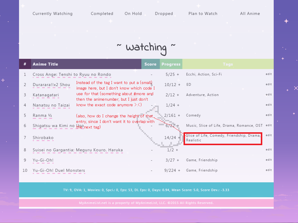 |
Vanessa-Mar 29, 2015 12:31 PM
More topics from this board
» [CSS - MODERN] ⚡️ Fully-Customizable Layouts (2024 updates!) ( 1 2 3 4 5 ... Last Page )Shishio-kun - Jul 21, 2017 |
381 |
by KabukiChouNights
»»
Sep 13, 10:56 AM |
|
» theme helpthreat - Jul 5 |
5 |
by Zaryf
»»
Aug 21, 5:46 AM |
|
» [CSS - Modern] 🍰 Clarity by V.L ( 1 2 3 4 5 ... Last Page )Valerio_Lyndon - Apr 19, 2018 |
1261 |
by KiranaStarr
»»
Aug 16, 5:48 PM |
|
» [CSS] ⭐️ Customize your List Cursor + Cursor FixesShishio-kun - Mar 8, 2021 |
30 |
by Shishio-kun
»»
Jul 28, 3:17 AM |
|
» How To Have Different Banner/Cover image & Background Image For Manga & Anime ListsYasminaRegina - Jul 25 |
2 |
by YasminaRegina
»»
Jul 26, 1:02 AM |