New
Jun 12, 2022 11:50 AM
#1101

Valerio_Lyndon said: YoshePlays said: First of all, thank you so much for dedicating this much time to the community, I can imagine how much of a hassle it would be to cater to the mass amounts of support request from people. It can be interesting! YoshePlays said: 1. It appears that the long reviews which use CSS aren't displayed anymore. 2. For series that are made by an unknown studio, it overflows into a new line. 3. Would tag descriptions like this be possible? https://i.imgur.com/CpeGxdK.png Good catches. This new version should fix those issues and add descriptions. Use it to replace what you added previously. Here's a comparison of the changes: [Comparison]. /*-S-T-A-R-T--------------------*
| Tag Tweaks for YoshePlays v4 |
https://myanimelist.net/forum/?topicid=1723114&show=600#msg61718769
*------------------------------*/
/* styling to make things look similar to horizontal tags */
.list-table-data {
padding-bottom: 11px;
}
/* add decorative score background */
.data.tags div:after {
content: "";
position: absolute;
bottom: 4px;
left: 80px;
width: 98px;
height: 17px;
background-image: linear-gradient(
to right,
#212121 0px, #212121 18px, /* 1st box */
transparent 18px, transparent 20px,
#212121 20px, #212121 38px, /* 2nd box */
transparent 38px, transparent 40px,
#212121 40px, #212121 58px, /* 3rd box */
transparent 58px, transparent 60px,
#212121 60px, #212121 78px, /* 4th box */
transparent 78px, transparent 80px,
#212121 80px, #212121 98px /* 5th box */
);
border-radius: 8.5px;
}
/* reposition score tags */
.data.tags a[href$="tag=-"],
.data.tags a[href$="tag=1"],
.data.tags a[href$="tag=2"],
.data.tags a[href$="tag=3"],
.data.tags a[href$="tag=4"],
.data.tags a[href$="tag=5"],
.data.tags a[href$="tag=6"],
.data.tags a[href$="tag=7"],
.data.tags a[href$="tag=8"],
.data.tags a[href$="tag=9"],
.data.tags a[href$="tag=10"] {
position: absolute;
bottom: 4px;
width: 18px;
padding: 1px 0;
margin: 0;
pointer-events: auto;
}
.data.tags a[href$="tag=-"]:hover,
.data.tags a[href$="tag=1"]:hover,
.data.tags a[href$="tag=2"]:hover,
.data.tags a[href$="tag=3"]:hover,
.data.tags a[href$="tag=4"]:hover,
.data.tags a[href$="tag=5"]:hover,
.data.tags a[href$="tag=6"]:hover,
.data.tags a[href$="tag=7"]:hover,
.data.tags a[href$="tag=8"]:hover,
.data.tags a[href$="tag=9"]:hover,
.data.tags a[href$="tag=10"]:hover {
cursor: default; /* resets cursor - delete this line to restore pointer cursor */
background: transparent !important; /* background on hover */
}
.data.tags span:nth-last-child(5) a[href$="tag=-"],
.data.tags span:nth-last-child(5) a[href$="tag=1"],
.data.tags span:nth-last-child(5) a[href$="tag=2"],
.data.tags span:nth-last-child(5) a[href$="tag=3"],
.data.tags span:nth-last-child(5) a[href$="tag=4"],
.data.tags span:nth-last-child(5) a[href$="tag=5"],
.data.tags span:nth-last-child(5) a[href$="tag=6"],
.data.tags span:nth-last-child(5) a[href$="tag=7"],
.data.tags span:nth-last-child(5) a[href$="tag=8"],
.data.tags span:nth-last-child(5) a[href$="tag=9"],
.data.tags span:nth-last-child(5) a[href$="tag=10"] {
left: 80px;
border-radius: 8.5px 0 0 8.5px;
color: var(--text) !important; /* box 1 colour */
}
.data.tags span:nth-last-child(4) a[href$="tag=-"],
.data.tags span:nth-last-child(4) a[href$="tag=1"],
.data.tags span:nth-last-child(4) a[href$="tag=2"],
.data.tags span:nth-last-child(4) a[href$="tag=3"],
.data.tags span:nth-last-child(4) a[href$="tag=4"],
.data.tags span:nth-last-child(4) a[href$="tag=5"],
.data.tags span:nth-last-child(4) a[href$="tag=6"],
.data.tags span:nth-last-child(4) a[href$="tag=7"],
.data.tags span:nth-last-child(4) a[href$="tag=8"],
.data.tags span:nth-last-child(4) a[href$="tag=9"],
.data.tags span:nth-last-child(4) a[href$="tag=10"] {
left: 100px;
border-radius: 0;
color: var(--text) !important; /* box 2 colour */
}
.data.tags span:nth-last-child(3) a[href$="tag=-"],
.data.tags span:nth-last-child(3) a[href$="tag=1"],
.data.tags span:nth-last-child(3) a[href$="tag=2"],
.data.tags span:nth-last-child(3) a[href$="tag=3"],
.data.tags span:nth-last-child(3) a[href$="tag=4"],
.data.tags span:nth-last-child(3) a[href$="tag=5"],
.data.tags span:nth-last-child(3) a[href$="tag=6"],
.data.tags span:nth-last-child(3) a[href$="tag=7"],
.data.tags span:nth-last-child(3) a[href$="tag=8"],
.data.tags span:nth-last-child(3) a[href$="tag=9"],
.data.tags span:nth-last-child(3) a[href$="tag=10"] {
left: 120px;
border-radius: 0;
color: var(--text) !important; /* box 3 colour */
}
.data.tags span:nth-last-child(2) a[href$="tag=-"],
.data.tags span:nth-last-child(2) a[href$="tag=1"],
.data.tags span:nth-last-child(2) a[href$="tag=2"],
.data.tags span:nth-last-child(2) a[href$="tag=3"],
.data.tags span:nth-last-child(2) a[href$="tag=4"],
.data.tags span:nth-last-child(2) a[href$="tag=5"],
.data.tags span:nth-last-child(2) a[href$="tag=6"],
.data.tags span:nth-last-child(2) a[href$="tag=7"],
.data.tags span:nth-last-child(2) a[href$="tag=8"],
.data.tags span:nth-last-child(2) a[href$="tag=9"],
.data.tags span:nth-last-child(2) a[href$="tag=10"] {
left: 140px;
border-radius: 0;
color: var(--text) !important; /* box 4 colour */
}
.data.tags span:nth-last-child(1) a[href$="tag=-"],
.data.tags span:nth-last-child(1) a[href$="tag=1"],
.data.tags span:nth-last-child(1) a[href$="tag=2"],
.data.tags span:nth-last-child(1) a[href$="tag=3"],
.data.tags span:nth-last-child(1) a[href$="tag=4"],
.data.tags span:nth-last-child(1) a[href$="tag=5"],
.data.tags span:nth-last-child(1) a[href$="tag=6"],
.data.tags span:nth-last-child(1) a[href$="tag=7"],
.data.tags span:nth-last-child(1) a[href$="tag=8"],
.data.tags span:nth-last-child(1) a[href$="tag=9"],
.data.tags span:nth-last-child(1) a[href$="tag=10"] {
left: 160px;
border-radius: 0 8.5px 8.5px 0;
color: var(--text) !important; /* box 5 colour */
}
/* add description on hover & remove pseudo comma from tags */
a[href$="tag=-"]:before,
a[href$="tag=1"]:before,
a[href$="tag=2"]:before,
a[href$="tag=3"]:before,
a[href$="tag=4"]:before,
a[href$="tag=5"]:before,
a[href$="tag=6"]:before,
a[href$="tag=7"]:before,
a[href$="tag=8"]:before,
a[href$="tag=9"]:before,
a[href$="tag=10"]:before {
content: "" !important;
position: absolute;
top: 17px;
left: calc(50% - 5px);
z-index: 5;
display: block;
border-width: 5px;
border-style: solid;
border-color: transparent transparent var(--text-dim) transparent;
opacity: 0;
transition: opacity 0.15s ease;
pointer-events: none;
}
a[href$="tag=-"]:after,
a[href$="tag=1"]:after,
a[href$="tag=2"]:after,
a[href$="tag=3"]:after,
a[href$="tag=4"]:after,
a[href$="tag=5"]:after,
a[href$="tag=6"]:after,
a[href$="tag=7"]:after,
a[href$="tag=8"]:after,
a[href$="tag=9"]:after,
a[href$="tag=10"]:after {
content: "Story"; /* box 1 description */
position: absolute;
top: 27px;
left: 50%;
z-index: 5;
display: block;
width: auto;
max-width: 340px;
height: auto;
padding: 4px 8px;
background: var(--btn-bg);
border: 1px solid var(--text-dim);
border-radius: 4px;
box-sizing: border-box;
color: var(--text);
font: 11px/15px Arial, Verdana;
text-align: left;
white-space: pre-wrap;
opacity: 0;
transition: opacity 0.15s ease;
transform: translateX(-50%);
pointer-events: none;
}
a[href$="tag=-"]:hover:before,
a[href$="tag=1"]:hover:before,
a[href$="tag=2"]:hover:before,
a[href$="tag=3"]:hover:before,
a[href$="tag=4"]:hover:before,
a[href$="tag=5"]:hover:before,
a[href$="tag=6"]:hover:before,
a[href$="tag=7"]:hover:before,
a[href$="tag=8"]:hover:before,
a[href$="tag=9"]:hover:before,
a[href$="tag=10"]:hover:before,
a[href$="tag=-"]:hover:after,
a[href$="tag=1"]:hover:after,
a[href$="tag=2"]:hover:after,
a[href$="tag=3"]:hover:after,
a[href$="tag=4"]:hover:after,
a[href$="tag=5"]:hover:after,
a[href$="tag=6"]:hover:after,
a[href$="tag=7"]:hover:after,
a[href$="tag=8"]:hover:after,
a[href$="tag=9"]:hover:after,
a[href$="tag=10"]:hover:after {
opacity: 1;
}
span:nth-last-child(4) a[href$="tag=-"]:after,
span:nth-last-child(4) a[href$="tag=1"]:after,
span:nth-last-child(4) a[href$="tag=2"]:after,
span:nth-last-child(4) a[href$="tag=3"]:after,
span:nth-last-child(4) a[href$="tag=4"]:after,
span:nth-last-child(4) a[href$="tag=5"]:after,
span:nth-last-child(4) a[href$="tag=6"]:after,
span:nth-last-child(4) a[href$="tag=7"]:after,
span:nth-last-child(4) a[href$="tag=8"]:after,
span:nth-last-child(4) a[href$="tag=9"]:after,
span:nth-last-child(4) a[href$="tag=10"]:after {
content: "Animation"; /* box 2 description */
}
span:nth-last-child(3) a[href$="tag=-"]:after,
span:nth-last-child(3) a[href$="tag=1"]:after,
span:nth-last-child(3) a[href$="tag=2"]:after,
span:nth-last-child(3) a[href$="tag=3"]:after,
span:nth-last-child(3) a[href$="tag=4"]:after,
span:nth-last-child(3) a[href$="tag=5"]:after,
span:nth-last-child(3) a[href$="tag=6"]:after,
span:nth-last-child(3) a[href$="tag=7"]:after,
span:nth-last-child(3) a[href$="tag=8"]:after,
span:nth-last-child(3) a[href$="tag=9"]:after,
span:nth-last-child(3) a[href$="tag=10"]:after {
content: "Characters"; /* box 3 description */
}
span:nth-last-child(2) a[href$="tag=-"]:after,
span:nth-last-child(2) a[href$="tag=1"]:after,
span:nth-last-child(2) a[href$="tag=2"]:after,
span:nth-last-child(2) a[href$="tag=3"]:after,
span:nth-last-child(2) a[href$="tag=4"]:after,
span:nth-last-child(2) a[href$="tag=5"]:after,
span:nth-last-child(2) a[href$="tag=6"]:after,
span:nth-last-child(2) a[href$="tag=7"]:after,
span:nth-last-child(2) a[href$="tag=8"]:after,
span:nth-last-child(2) a[href$="tag=9"]:after,
span:nth-last-child(2) a[href$="tag=10"]:after {
content: "Sound"; /* box 4 description */
}
span:nth-last-child(1) a[href$="tag=-"]:after,
span:nth-last-child(1) a[href$="tag=1"]:after,
span:nth-last-child(1) a[href$="tag=2"]:after,
span:nth-last-child(1) a[href$="tag=3"]:after,
span:nth-last-child(1) a[href$="tag=4"]:after,
span:nth-last-child(1) a[href$="tag=5"]:after,
span:nth-last-child(1) a[href$="tag=6"]:after,
span:nth-last-child(1) a[href$="tag=7"]:after,
span:nth-last-child(1) a[href$="tag=8"]:after,
span:nth-last-child(1) a[href$="tag=9"]:after,
span:nth-last-child(1) a[href$="tag=10"]:after {
content: "Enjoyment"; /* box 5 description */
}
/* reposition & restyle season & studio */
.data.season, .data.studio {
position: absolute;
bottom: 4px;
height: 15px;
background: #212121;
border-radius: 8.5px;
}
.data.season {
left: 182px;
padding: 1px 0 !important;
line-height: 15px;
}
.data.season:before {
content: none;
}
/* reposition & restyle studio */
.data.studio {
left: 278px;
width: auto;
padding: 1px 8px !important;
white-space: nowrap;
}
.data.studio span {
display: inline;
font-size: 11px !important;
}
.data.studio a {
display: inline;
background: none !important;
}
.data.studio:empty:before {
white-space: nowrap;
}
.list-table .list-table-data .studio span a:hover {
color: var(--text-h) !important;
}
/*------------------------E-N-D-*/I found this, I want to do the same thing but it also moved the Studios to the bottom row? Before : https://prnt.sc/hGZ4ubU05W1K After: https://prnt.sc/57ClqyRyUjva https://prnt.sc/enqiDDBTUqTr Does this code still work? Edit: Also found this post with code https://myanimelist.net/forum/?topicid=1723114&show=650#msg62088213 This one is preferable if it still works somehow seems easier to position it anywhere, but the same thing happens https://prnt.sc/a740vW8MpKJv https://prnt.sc/H4N6KjK0jPuf Edit 2: Atleast I fixed the studio placement now I just hade to /* */ some code oops. Edit 3: I fixed it but the only thing I cant get working is the background not being transparent before you hover (only when you hover it shows a color) https://prnt.sc/Fle94rFHSRoP Edit 4: I fixed everything and it's working now :o Never knew I was gonna learn css on mal, anyway thanks for this amazing custom list design !! |
delanodbJun 12, 2022 3:29 PM
Jun 13, 2022 11:53 PM
#1102
delanodb said: Edit 4: I fixed everything and it's working now :o Never knew I was gonna learn css on mal, anyway thanks for this amazing custom list design !! You figured everything out then? Nice! Poking around with the code yourself is a great way to learn CSS, glad you're having a successful time of it. Loving the colours of your list btw. If you need anything else just let me know. |
Jun 14, 2022 6:40 AM
#1103

delanodb said: Edit 4: I fixed everything and it's working now :o Never knew I was gonna learn css on mal, anyway thanks for this amazing custom list design !! Looks real nice now. Was checking the progress of your list in the past few days. Liking the colors as well. And yeah CSS is super fun, especially when you can make happen what you envision. @delanodb thanks ^–^ |
GodOfRoarJun 15, 2022 3:14 AM
Jun 14, 2022 2:44 PM
#1104
matolcsim said: delanodb said: Edit 4: I fixed everything and it's working now :o Never knew I was gonna learn css on mal, anyway thanks for this amazing custom list design !! Looks real nice now. Was checking the progress of your list in the past few days. Liking the colors as well. And yeah CSS is super fun, especially when you can make happen what you envision. I really like your list too ^^ |
Aug 8, 2022 9:08 PM
#1105
| hi Valerio! you've helped me a lot on your Brink theme before your Theme Customizer came out - i've been using it today to switch over to Clarity which has been extremely helpful but i did have a few questions that the customizer haven't been able to address and that i couldn't figure out myself poking around the code - 1. would it be possible to rename "on hold" to "shortlist" (this is what i use on hold for, essentially the same as Anilist's prioritized planning if you've heard of it)? this was relatively easy for me on Brink but i might be missing something on Clarity as finding and replacing all onhold's has yielded no results. 2. i'm using your updated CCS with MALFOX for category headings in "all anime" selection. however, my first entry in each category gets pushed up to the last entry in the previous category (E.G. the first anime in my "completed" section is moved to the bottom of my "watching"). is there a way to fix this? 3. is there a way to put a shadow around the score circle (similar to a box shadow but for circles) for certain scores when using the tag-based score decimal mod? not too sure if my implementation of it was the most efficient as i basically macgyver'ed the earlier comments to fit the way i wanted my list to function, so if not, that's alright. if pertinent, i only want the shadow for "10", "9.5", and "9". it's a bit hard to explain, but in Brink terms, say i set a 9.5 silver rating to the colour orange, could a 9.5 circle have an soft orange glow around it? kind of like this (but softer and thinner, of course) perpetually, not just on hover. 4. speaking of the tag-based decimal score mod, is there a way to prevent the MAL-assigned score from appearing over the tag score upon hover? i skimmed earlier comments and couldn't find a way, though i wasn't too sure if this was a limitation of CSS or not. 5. is there also a way to make it so that unless the decimal score mod detects a .5 after a comma, it won't assign the rating to the score circle? i've tried tagging stuff like "tentative 8.5" but it just messes up the formatting since it detects a .5. no worries if this isn't possible. 6. i tried using the curved list rows mod here and modified the box shadow and hover expansion mods to add the rounded edges, but i cannot for the life of me figure out how to change the edit tags button to adhere to the curve. i changed some CSS surrounding this element so it's still lingering around somewhere, but i'm too lazy to hunt it down and remove it all. you'll see it in my code, i don't know CSS at all and just tried plugging in fixes into other mods 7. can i set a unique box shadow colour depending on the score of the anime being hovered over? basically the way you've implemented gold, silver, and bronze rating on Brink but for Clarity's hover and my tag-based scoring. if not, then manually assigning it similar to the way i put in the hearts mod is also fine with me. example: madoka magica's hover box shadow would be the same colour as the "gold" rating i assign my 10's instead of the default white (as well as the same colour of the aforementioned circle shadow if that's possible) 8. i actually just noticed this today, but when i hover over a list row, the anime number loses its background and becomes transparent. is there a way to revert it to its original behaviour? sorry if i didn't explain everything as best as i could, please let me know if you need any more clarification, and if certain combinations of my requests aren't possible with others. also, please take your time, you've helped myself and a lot of people out and i don't want you to feel obliged or rushed to help me. thank you so much in advance:) here is my code in its entirety if it helps: /* Theme Customiser Settings
https://github.com/ValerioLyndon/Theme-Customiser
^TC{"options":{"background":"https://w.wallhaven.cc/full/j3/wallhaven-j3row5.jpg","avatar":"https://cdn.myanimelist.net/images/userimages/12850671.jpg?t=1659988200","character":"","banner":"https://i.redd.it/1qh9blwgoue91.png"},"mods":{"dark":{},"image-hover":{"hover":"on-row","username":"emUBC"},"review":{}},"theme":"clarity"}TC$*/
/*==============================*\
| "Clarity" by Valerio Lyndon |
| R27.3 |
\*==============================*/
@\import "https://fonts.googleapis.com/css?family=Oswald";
@\import "https://valeriolyndon.github.io/MAL-Public-List-Designs/resources/font-awesome-4.7.0/css/font-awesome-force-legacy.min.css";
@\import "https://malscraper.azurewebsites.net/covers/anime/emUBC/presets/dataimagelink";
@\import "https://malscraper.azurewebsites.net/covers/manga/emUBC/presets/dataimagelink";
:root{--name:none;--avatar:url(https://cdn.myanimelist.net/images/userimages/12850671.jpg?t=1659988200);}body{--banner:url(https://w.wallhaven.cc/full/j3/wallhaven-j3row5.jpg);}:root{}body{--character:none;}:root{--background:url(https://w.wallhaven.cc/full/rd/wallhaven-rd6yeq.jpg);--pbg:#efefef;--bg:#fff;--bg-dark:#ddd;--text:#323232;--text-h:#787878;--text-dim:#bababa;--text-dim-h:#646464;--text-dark:#111;--shadow:rgba(0,0,0,0.2);--icon:#323232;--accent:#4065ba;--banner-text:#fff;--banner-text-shadow:rgba(0,0,0,0.45);--btn-bg:#ebebeb;--btn-bg-h:#323232;--btn-head-bg-h:#1d439b;--btn-text-h:#fff;--text-head:#9b9b9b;--text-head-h:#787878;--watching:#2db039;--completed:#26448f;--onhold:#C259FF;--dropped:#a12f31;--plantowatch:#c3c3c3;--cover-bg:#323232;--edit-btn:#d9d9d9;--checkmark:#9696eb;--font-1:Arial,Verdana,"FontAwesome 4",FontAwesome,sans-serif;--font-2:Verdana,Arial,"FontAwesome 4",FontAwesome,sans-serif;--font-icon:"FontAwesome 4",FontAwesome}#advanced-options .advanced-options-button a,#fancybox-close,#search-box,#search-box input,#search-box:after,.data.chapter,.data.demographic a,.data.genre a,.data.image .link:after,.data.licensor a,.data.priority,.data.progress,.data.score a,.data.studio a,.data.tags a,.data.tags a.edit:after,.data.volume,.fixed .status-menu:after,.header .header-title:after,.icon-menu svg,.icon-menu.setting,.icon-menu.setting .text,.icon-menu.setting .text a,.icon-menu:after,.icon-menu:before,.list-table .list-table-header .header-title .link.sort,.list-table-header .header-title,.status-button:after,.status-menu-container.fixed .status-menu,.status-menu-container:not(.fixed) .status-menu,.status-menu:after{transition:all .3s ease!important}#advanced-options .advanced-options-header .description,#advanced-options .advanced-options-header .description:before,#advanced-options [class*="-widget"] input,#advanced-options [class*="-widget"] label,#advanced-options [class*="-widget"] select,#search-button i,.header-info a,.list-table-data a,.more-info .td1>div>a{transition:all .15s ease!important}.header .header-title,.header-info,.icon-menu,.icon-menu.quick-add:before,.list-menu-float .icon-menu,.list-table>tbody:first-of-type:after,.stats a{display:inline-block;height:26px!important;width:26px!important;background:var(--bg)!important;border-radius:13px;box-shadow:0 1px 2px var(--shadow);overflow:hidden;color:var(--text)!important;font:normal 0/26px var(--font-1);text-indent:0;text-align:left;white-space:nowrap;vertical-align:top;transition:all .3s ease!important}.header .header-title:hover,.icon-menu:hover,.list-menu-float .icon-menu:hover,.stats a:hover{width:100px!important;background:var(--btn-head-bg-h)!important;color:var(--btn-text-h)!important}html{position:relative;min-height:100%}body{padding-bottom:64px;background:var(--pbg) var(--background) no-repeat center/cover fixed!important}.list-container{position:static;width:100%;background:0 0!important;border:none}.list-block{width:1060px;min-height:initial;margin:64px auto 0}.status-menu-container.fixed+.list-block{margin-top:128px!important}.list-unit{width:100%!important;margin:0}.list-table{border:none!important}a,a:hover{color:var(--accent)}#recaptcha-terms,.initialize-tutorial{display:none!important}.cover-block{position:absolute;top:0;left:0;z-index:25;width:100%;min-width:1060px;height:318px;background:var(--cover-bg) var(--banner) no-repeat center center/cover scroll}.cover-block:before{content:"";position:absolute;bottom:0;left:0;display:block;width:100%;height:50px;background:linear-gradient(to top,rgba(0,0,0,.5),transparent)}#cover-image,.btn-list-setting{display:none!important}#list-container #cover-image-container{display:block!important;width:1060px;height:100%;padding:0;background:var(--character) no-repeat right center/contain;margin:0 auto}#cover-image-container:after{content:var(--name);position:absolute;top:55px;left:50%;margin-left:-475px;color:var(--banner-text);font:bold 60px/60px Oswald;text-align:left;letter-spacing:15px;text-shadow:1px 4px 7px var(--banner-text-shadow);text-transform:uppercase;white-space:pre;transform:scale(.9) perspective(350px) rotateY(8deg) rotateZ(-3deg);animation:name-slide 3s 1 .5s backwards}@keyframes name-slide{0%{top:12px;margin-left:-535px;opacity:0;letter-spacing:0;animation-timing-function:ease-out}90%{top:55px;margin-left:-475px}100%{letter-spacing:15px;opacity:1;animation-timing-function:cubic-bezier(0,0,.75,1)}}.header{z-index:36;display:flex;height:36px;margin-top:282px}.header .header-menu{position:static;display:flex;width:auto;height:26px;margin-left:6px;order:2}.btn-menu{height:0;font-size:0!important}.btn-menu #header-menu-button{display:none}.header .header-title{position:static;margin-left:155px;order:1;z-index:1}.header .header-title:before{content:"\f015";display:inline-block;width:26px;background:0 0!important;font-size:14px;font-family:var(--font-icon);text-align:center!important}.header .header-title:hover:before{color:var(--btn-text-h)!important}.header .header-title:after{content:"Home";display:inline-block;height:26px!important;width:26px!important;font:14px/26px var(--font-1);color:var(--text)}.header .header-title:hover:after{color:var(--btn-text-h)}.header .header-menu .list-menu{position:static;order:1;display:inline-block;height:26px;border:none;background:0 0;box-shadow:none}.header .icon-menu.anime-list,.header .icon-menu.manga-list{position:static;padding:0;margin-right:6px;font-size:0!important;font-weight:400!important}.header .icon-menu.anime-list .text,.header .icon-menu.manga-list .text{position:static!important;font:14px/26px var(--font-1);vertical-align:top}.header .header-menu .list-menu .icon-menu svg.icon{position:static;max-width:14px;max-height:14px;padding:6px;fill:var(--text)}.header .header-menu .list-menu .icon-menu:hover svg.icon{fill:var(--btn-text-h)}.header-info{position:static;width:auto!important;padding:0 8px;margin:0!important;font-size:12px;order:2}.header-info a{color:var(--text)!important;text-decoration:none!important}.header-info a:hover{color:var(--text-h)!important}.btn-menu a.username{position:absolute;left:0;top:-7px;display:block;width:150px;height:150px;background:0 0;border-radius:50%;font-size:0}.btn-menu span.username{display:none!important}.status-menu-container{position:relative;z-index:35!important;width:100%;min-width:1060px;height:64px;background:0 0;border:none!important}.status-menu-container.fixed{z-index:45!important}.status-menu-container:after,.status-menu-container:before{content:"";position:absolute;left:0;z-index:-1;display:block;width:100%}.status-menu-container:before{top:0;height:64px;background:var(--bg)}.status-menu-container:after{top:64px;height:2px;background:linear-gradient(to bottom,var(--shadow),transparent)}.status-menu{position:relative;display:block!important;width:1060px;padding:0 0 0 173px;margin:0 auto;box-sizing:border-box}.fixed .status-menu{padding:0 0 0 71px}.status-menu:after{content:"";position:absolute;top:-51px;left:-8px;width:150px;height:150px;background:var(--bg-dark) var(--avatar) no-repeat center top/cover;border:8px solid var(--bg);border-radius:50%;opacity:1;box-shadow:0 1px 2px var(--shadow)}.fixed .status-menu:after{top:0;width:48px;height:48px;box-shadow:none}.status-menu .status-button{display:inline-block!important;height:32px;padding:16px 0!important;margin:0 15px!important;color:var(--text-head)!important;font-size:17.6px!important;line-height:30px;white-space:nowrap;font-family:Oswald!important;text-transform:uppercase;letter-spacing:1px}.status-menu .status-button.on{color:var(--text-head-h)!important}.status-button.all_anime:after{background:var(--accent)!important}.status-button.reading:after,.status-button.watching:after{background:var(--watching)!important}.status-button.completed:after{background:var(--completed)!important}.status-button.onhold:after{background:var(--onhold)!important}.status-button.dropped:after{background:var(--dropped)!important}.status-button.plantoread:after,.status-button.plantowatch:after{background:var(--plantowatch)!important}.status-menu-container .search-container{top:19px;right:0;z-index:1}#search-box{padding-right:22px;border:2px solid transparent;border-radius:13px;margin-top:0!important}#search-box.open{width:150px!important;background:var(--btn-bg);border:2px solid var(--bg-dark)}#search-box input{background:0 0;border:none;border-radius:13px;outline:0;color:var(--text)}#search-box.open input{text-indent:7.5px;line-height:20px}.status-menu-container .search-container #search-button{position:absolute;right:0;top:0;width:26px;height:26px;border-radius:13px;margin-top:0;text-align:center}.open~#search-button{pointer-events:none}#search-button i{color:var(--text-head)!important;font-size:18px;line-height:26px}.open~#search-button i{font-size:14px;line-height:24px}#search-box:after{content:"";position:absolute;right:0;top:0;width:0;height:22px;padding-right:22px;background:linear-gradient(to right,var(--btn-bg) 2px,transparent 9.5px,transparent 142.5px,var(--btn-bg) 150px) content-box;border:2px solid transparent;border-radius:13px;pointer-events:none;opacity:0}#search-box.open:after{width:150px;opacity:1}.list-menu-float{position:relative;top:auto;display:block;width:904px;height:0;padding-left:155px;margin:0 auto;border:none;background:0 0;text-align:left;font-size:0;z-index:38}.icon-menu,.list-menu-float form{display:inline-block!important}.list-menu-float .icon-menu{top:74px;margin:0 6px 0 0}.list-menu-float .icon-menu .text{top:0!important;left:26px!important;display:inline-block;width:auto!important;height:26px;color:var(--text)!important;font-size:14px!important;opacity:1!important}.list-menu-float .icon-menu:hover .text{color:var(--btn-text-h)!important}.list-menu-float .icon-menu svg.icon{top:6px!important;left:6px!important;max-width:14px;max-height:14px;fill:var(--text)}.list-menu-float .icon-menu:hover svg.icon{fill:var(--btn-text-h)}[data-owner="1"] .list-menu-float .icon-menu.profile{position:absolute;left:0;top:-43px;display:block!important;width:150px!important;height:150px!important;background:0 0!important;border-radius:50%;font-size:0;box-shadow:none}[data-owner=""] .icon-menu.profile{background-image:none!important}[data-owner=""] .icon-menu.profile:before{content:"\f007";position:absolute;top:0;left:0;display:block;width:26px;height:26px;font-size:14px;line-height:26px;text-align:center;color:var(--text);font-family:var(--font-icon)}[data-owner=""] .icon-menu.profile:hover:before{color:var(--btn-text-h)}[data-owner=""] .icon-menu.profile:after{content:"Profile";position:absolute;top:0;left:26px;display:inline-block;height:26px;font-size:14px;color:var(--text)}[data-owner=""] .icon-menu.profile:hover:after{color:var(--btn-text-h)}.icon-menu.quick-add svg{display:none}.icon-menu.quick-add:before{content:"\f067";background:0 0!important;font-size:14px;text-align:center;font-family:var(--font-icon);box-shadow:none}.icon-menu.quick-add:hover:before{color:var(--btn-text-h)!important}.icon-menu.setting{overflow:visible}.icon-menu.setting:hover{width:26px!important}.icon-menu.setting .text{top:-2px!important;left:0!important;width:240px!important;height:26px!important;padding:2px 0;overflow:visible;font-size:0!important;opacity:1!important;pointer-events:none;z-index:-1}.icon-menu.setting:hover .text{pointer-events:auto}.icon-menu.setting .text a{position:absolute!important;top:2px!important;left:13px!important;width:0!important;height:26px!important;background:var(--btn-bg-h)!important;border:none!important;border-radius:0 13px 13px 0;overflow:hidden;color:var(--btn-text-h)!important;font:14px/26px var(--font-1)!important;text-indent:9px;text-align:center;white-space:nowrap;opacity:0!important}.icon-menu.setting:hover .text a{width:120px!important;border-radius:0 13px 13px 0;opacity:1!important}.icon-menu.setting:hover .text .link-list-setting{left:120px!important}.icon-menu.setting .text a:hover{background:var(--btn-head-bg-h)!important}.list-unit .list-status-title{width:1060px;height:64px;margin-top:-64px;background:0 0}.list-status-title .text{display:none!important}.list-status-title .stats{position:absolute;top:10px;right:32px!important;display:block;width:auto;height:26px!important;border-radius:0 0 26px 0;font-size:0;line-height:13px!important}.stats a{margin:0 0 0 6px!important;font:14px/26px var(--font-1)}.stats a i{width:26px;text-align:center}i.fa-chart-column::before{content:"\f080"}.list-stats{position:absolute;top:416px;width:1060px!important;background:0 0!important;color:var(--text)!important;font-weight:700}.list-table>tbody:first-of-type{position:relative;top:-26px;margin-top:-30px;left:1032px;display:block;width:30px;height:30px;background:0 0!important;z-index:39}.list-table>tbody:first-of-type:after{content:"\f0dc";position:absolute;top:0;right:0;margin:2px;font-size:14px;font-family:var(--font-icon);text-align:center}.list-table>tbody:first-of-type:hover:after{background:var(--btn-head-bg-h)!important;color:var(--btn-text-h)!important}.list-table-header{position:absolute;top:0;right:15px;display:block;width:auto;height:26px;padding:2px 0;font-size:0;white-space:nowrap;pointer-events:none;z-index:-1}.list-table>tbody:first-of-type:hover .list-table-header{pointer-events:auto}.list-table .list-table-header .header-title{position:relative;display:inline-block;width:auto!important;height:auto;padding:0!important;border:none;background:0 0;font-weight:400}.list-table>tbody:first-of-type:hover .header-title{opacity:1}.list-table .list-table-header .header-title .link.sort{display:block;width:13px;height:26px;background:var(--btn-bg-h);border-radius:13px 0 0 13px;margin-left:-13px;overflow:hidden;box-sizing:border-box;color:var(--btn-text-h)!important;font:11px/26px var(--font-2);text-align:center;text-indent:-9px;white-space:normal;opacity:0}.list-table tbody:first-of-type:hover .list-table-header .header-title .link.sort{width:80px;opacity:1}.list-table-header .header-title a.hover_info{display:none!important}.list-table .list-table-header .header-title .link.sort:hover{background:var(--btn-head-bg-h)}.list-table-header .header-title a .sort-icon{position:absolute;left:50%;width:10px;height:10px;margin-left:-5px;color:inherit!important;font-size:10px;line-height:10px}.sort-icon.fa-sort-up{top:2px}.sort-icon.fa-sort-down{bottom:2px}.anime tbody:first-of-type:hover .header-title.finished a,.anime tbody:first-of-type:hover .header-title.started a{padding:0 13px}.manga tbody:first-of-type:hover .header-title.finished a,.manga tbody:first-of-type:hover .header-title.started a{width:100px!important}.header-title.title a{font-size:0!important}.header-title.title a:after{content:"Title";font-size:11px}.list-table-header .header-title.tags{display:none!important}.list-item{position:relative;display:block;width:100%;background:var(--bg)!important;border:none;margin-bottom:8px}.list-table-data{position:relative;display:flex;max-width:1060px;min-height:64px;align-items:center;font-size:0}.data{display:block!important;padding:0!important;border:none!important;flex:0 0 auto;color:var(--text);font-size:11px}.list-table .list-table-data .data a{color:var(--text)!important;text-decoration:none!important}.list-table .list-table-data a:not(.edit-disabled):hover{color:var(--text-h)!important}.list-unit .loading-space{margin:14px 0 22px}.list-unit .loading-space #loading-spinner{width:20px;height:20px;margin:0 auto;color:var(--text)}.list-table[data-items="[]"]:after{content:"No entries found. Try another category?";display:block;width:900px;background:var(--bg);border-radius:16px;margin:32px auto;color:var(--text);font:16px/32px var(--font-1);text-align:center}[data-owner="1"] .list-table[data-items="[]"]:after{content:"No entries found. Why not add some?"}[data-query*='"s":'] .list-table[data-items="[]"]:after{content:"No entries found. Perhaps your search terms are too restrictive?"}.data.status{position:absolute;top:0;left:0;width:1px!important;height:100%;padding:0!important}.status.reading,.status.watching{background:var(--watching)!important}.status.completed{background:var(--completed)!important}.status.onhold{background:var(--onhold)!important}.status.dropped{background:var(--dropped)!important}.status.plantoread,.status.plantowatch{background:var(--plantowatch)!important}.data.number{position:relative;top:-22px;width:20px;height:20px;background:var(--bg);border-radius:10px;margin:0 -28px 0 8px;order:1;line-height:20px;font-weight:700;z-index:1}.list-item:nth-child(n+101) .data.number{text-indent:-7px}.list-item:nth-child(n+1001) .data.number{width:27px;margin-right:-35px}.list-item:nth-child(n+10001) .data.number{width:34px;margin-right:-42px}.data.image{width:64px;height:64px;margin:4px 0 4px 8px;order:1}.data.image a{position:relative;display:block!important;border-radius:50%;overflow:hidden}.data.image img{width:64px!important;height:64px!important;border:none!important;object-fit:cover}.data.image a:after{content:"\f14c";position:absolute;top:0;left:0;display:block;width:100%;height:100%;background:rgba(0,0,0,.5);color:#fff;font:30px/64px var(--font-icon);opacity:0}.data.image a:hover:after{opacity:1}.data.title{position:relative;width:142px;height:16px;padding:32px 0 0 8px!important;order:12;flex:1 0 auto;line-height:16px}.data.title .link.sort{position:absolute;top:16px;left:8px;display:inline-block;max-width:100%;padding-right:16px;overflow:hidden;box-sizing:border-box;line-height:16px;white-space:nowrap;text-overflow:ellipsis}.list-table .list-table-data .title .link:hover{color:var(--accent)!important}.content-status,.rereading,.rewatching{color:var(--text-dim)!important;font-size:10px!important}.content-status:before,.rereading:before,.rewatching:before{content:"["}.content-status:after,.rereading:after,.rewatching:after{content:"] - "}.add-edit-more{display:inline;float:none!important;color:var(--text-dim)}.list-table .list-table-data .title .add-edit-more a{color:var(--text-dim)!important}.list-table .list-table-data .title .add-edit-more a:hover{color:var(--text-dim-h)!important}.icon-watch,.icon-watch2{display:none!important}.data.type{position:relative;top:-16px;z-index:1;width:92px;height:16px;padding-left:8px!important;margin-right:-100px;order:11;text-align:left!important;color:var(--text-dim);line-height:16px;font-size:10px}.data.number+td:not(.image)~.type{margin-left:28px;margin-right:-128px}.data.score{position:relative;width:26px;height:26px;order:13}.data.score a{display:block;width:26px;height:26px;background:var(--btn-bg);border-radius:13px;margin:0 0 0 auto;line-height:26px}.list-table .list-table-data .score a:not(.edit-disabled):hover{background:var(--btn-bg-h);color:var(--btn-text-h)!important}.data.score select{position:absolute;top:0;right:0;display:block;width:40px;height:26px;padding:0 9px;background:var(--btn-bg-h) url(https://i.imgur.com/KF8oOyC.png) no-repeat 20px center/16px auto;border:none;border-radius:13px;box-shadow:none!important;color:var(--btn-text-h);font:bold 1.1em/26px var(--font-2);-webkit-appearance:none;-moz-appearance:none;appearance:none}@-moz-document url-prefix(){.data.score select{padding:0 16px 0 0;text-align:center}}.data.score select:focus{outline:0!important;box-shadow:0 2px 2px rgba(0,0,0,.3)}.data.chapter,.data.progress,.data.volume{width:92px;order:15}.data.chapter{margin-top:-34px}.data.volume{margin:34px 0 0 -92px}.data.chapter span,.data.progress span,.data.volume span{color:var(--text)}.data.progress:before{content:"Progress:";color:var(--text-dim)}.data.chapter:before{content:"Chapters:";color:var(--text-dim)}.data.volume:before{content:"Volumes:";color:var(--text-dim)}.data.chapter span:only-of-type:after,.data.progress span:only-of-type:after,.data.volume span:only-of-type:after{content:" \f058";position:relative;top:1px;color:var(--checkmark);font-family:var(--font-icon);font-size:13px}.data.chapter input,.data.progress input,.data.volume input{height:15px;padding:0 1px;background:var(--btn-bg);border:1px solid var(--bg-dark);outline-color:var(--accent)!important;box-sizing:border-box;color:var(--text-dark);font:11px var(--font-2)}.data.priority{width:92px;height:74px;background:var(--bg);order:14;color:var(--text);line-height:74px;z-index:1}.data.priority:before{content:"\f0a2";font-family:var(--font-icon)}.status:not(.plantowatch):not(.plantoread)~.data.priority{display:none!important}.data.chapter~.priority,.data.progress~.priority,.data.volume~.priority{position:relative;margin-right:-92px;opacity:1;pointer-events:none;z-index:1}.list-item:hover .chapter~.priority,.list-item:hover .progress~.priority,.list-item:hover .volume~.priority{opacity:0}.data.magazine,.data.rated,.data.retail,.data.season,.data.storage{margin-right:4px;order:19;flex-shrink:1}.data.rated{width:40px}.data.magazine{width:90px}.data.retail,.data.storage{width:72px}.data.season{width:92px;order:20}.data.magazine:before,.data.rated:before,.data.retail:before,.data.season:before,.data.storage:before{display:block;color:var(--text-dim)}.data.rated:before{content:"Rated:"}.data.magazine:before{content:"Magazine:"}.data.retail:before,.data.storage:before{content:"Storage:"}.data.season:before{content:"Premiered:"}.data.season:empty:after{content:"Unknown";display:block;color:var(--text-dim)}.data.demographic,.data.genre,.data.licensor,.data.studio,.data.tags{width:120px;padding:3px 0!important;margin-right:8px;order:21;flex-shrink:1}.data.licensor,.data.studio{order:22}.data.demographic span,.data.genre span,.data.licensor span,.data.studio span,.data.tags span{display:block;padding:1px 0;font-size:0!important;line-height:0}.data.demographic a,.data.genre a,.data.licensor a,.data.studio a,.data.tags a:not(.edit){display:block;padding:1px;background:var(--btn-bg);border-radius:8.5px;color:var(--text)!important;font-size:11px!important;line-height:15px}.list-table .list-table-data .demographic span a:hover,.list-table .list-table-data .genre span a:hover,.list-table .list-table-data .licensor span a:hover,.list-table .list-table-data .studio span a:hover,.list-table .list-table-data .tags span a:hover{background:var(--btn-bg-h);color:var(--btn-text-h)!important}.data.demographic:empty:before,.data.genre:empty:before,.data.licensor:empty:before,.data.magazine:empty:before,.data.studio:empty:before{display:block;padding:1px;color:var(--text-dim);font-size:10px;line-height:15px;white-space:pre}.data.genre:empty:before{content:"Unknown\a Genre"}.data.demographic:empty:before{content:"Unknown\a Demographic"}.data.studio:empty:before{content:"Unknown\a Studio"}.data.licensor:empty:before{content:"Unknown\a Licensor"}.data.magazine:empty:before{content:"Unknown\a Magazine"}.data.tags textarea{position:absolute;top:3px;right:4px;z-index:5;width:530px!important;height:calc(100% - 6px)!important;background:var(--btn-bg);border:1px solid var(--bg-dark);outline-color:var(--accent)!important;resize:none;color:var(--text)}@-moz-document url-prefix(){.data.tags textarea{width:524px!important;height:calc(100% - 14px)!important;padding:2px;box-sizing:initial!important}}.data.tags a.edit{position:absolute;top:0;right:0;width:5px!important;;border-radius:20px 20px 20px 20px;height:100%!important;background:var(--edit-btn);text-align:left!important;font-size:0!important;opacity:0;z-index:1}.list-item:hover .data.tags a.edit{opacity:.7}.list-item:hover .data.tags a.edit:hover{width:25px!important;;border-radius:20px 20px 20px 20px;opacity:1;}.data.tags a.edit:after{content:"\f040";position:absolute;top:50%;right:0;width:100%;height:20px;;border-radius:20px 20px 20px 20px;margin-top:-10px;color:var(--text);font:0/20px var(--font-icon);text-align:center;opacity:0}.data.tags a.edit:hover:after{font-size:14px;opacity:1;border-radius:20px 20px 20px 20px}.data.airing-finished,.data.airing-started,.data.days,.data.finished,.data.started{position:relative;display:flex!important;width:100px;height:14px;flex-flow:row wrap;overflow:hidden;order:25;color:var(--text);font-size:9px;line-height:14px;text-align:left!important;text-overflow:ellipsis;white-space:nowrap}.data.started{top:-20px}.data.finished{top:0;margin-left:-100px}.data.days{top:20px;margin-left:-100px}.data.airing-started{top:-10px}.data.airing-finished{top:10px;margin-left:-100px}.data.airing-finished:before,.data.airing-started:before,.data.days:before,.data.finished:before,.data.started:before{display:inline-block;width:29px;padding-right:4px;border-right:1px solid var(--text-dim);margin-right:3px;flex:0 0 auto;text-align:right;color:var(--text-dim)}.data.started:before{content:"Start"}.data.finished:before{content:"End"}.data.days:before{content:"Days"}.data.airing-started:before{content:"Aired"}.manga .data.airing-started:before{content:"Issued"}.data.airing-finished:before{content:"to"}.manga .data.airing-finished,.manga .data.airing-started{width:107px}.manga .data.airing-finished{margin-left:-107px}.manga .data.airing-finished:before,.manga .data.airing-started:before{width:36px}.data.airing-finished::after,.data.airing-started::after,.data.days::after,.data.finished::after,.data.started::after{content:"-";display:block;width:63px;flex:0 0 auto;color:var(--text-dim);font-size:14px}.more-info{border:none!important}.more-info .td1{position:relative;padding-top:23px;color:var(--text-dark)}.more-info .td1>div{margin:0}.more-info .td1>div>a{position:absolute;top:0;left:0;border-bottom:2px solid var(--accent)}.list-table .more-info .more-content a{color:var(--text-dark)!important}.list-table .more-info .more-content a:hover{color:var(--accent)!important}footer{position:absolute;bottom:0;left:0;width:100%}#footer-block{min-width:1060px;height:32px;padding:16px 0;background:var(--bg)}#footer-block:before{content:"";position:absolute;left:0;top:-2px;width:100%;min-width:1060px;height:2px;background:linear-gradient(to top,rgba(0,0,0,.1),transparent)}#copyright{padding:0;color:var(--text-head);line-height:16px}#copyright:after{content:"\aList design by Valerio Lyndon.";white-space:pre}#fancybox-overlay{background:#000!important;opacity:.2!important}#fancybox-outer [class^=fancy-]{display:none}#fancybox-outer{background:var(--bg)!important;box-shadow:0 0 32px rgba(0,0,0,.5)}#fancybox-outer #fancybox-close{top:-13px;right:-13px;width:16px;height:16px;padding:2px;background:var(--btn-bg);border:3px solid var(--btn-text-h);border-radius:13px;color:var(--text);text-align:center;box-shadow:0 1px 2px var(--shadow)}#fancybox-outer #fancybox-close:after{content:"\f00d";display:block;margin-top:-1px;font:16px/1 var(--font-icon)}#fancybox-outer #fancybox-close:hover{background:var(--text);color:var(--btn-text-h)}#advanced-options{top:64px;width:910px;padding:32px 0;background:var(--bg);border:none;box-shadow:0 0 32px rgba(0,0,0,.5);color:var(--text-dark)}#advanced-options .advanced-options-button,#advanced-options .advanced-options-header,#advanced-options [class*="-widget"]{width:100%;padding:0;border:none}#advanced-options .filter-widget:last-of-type,#advanced-options .sort-widget:last-of-type{padding-bottom:0}#advanced-options .filter,#advanced-options .sort{padding-bottom:32px}#advanced-options .advanced-options-header{font-size:0;line-height:26px;box-sizing:border-box}#advanced-options .advanced-options-header:before{display:inline-block;width:249px;height:100%;padding-bottom:7.5px;font-size:16px;line-height:26px;text-align:right}#advanced-options .filter .advanced-options-header:before{content:"Filter"}#advanced-options .sort .advanced-options-header:before{content:"Sort"}#advanced-options .advanced-options-header .description{display:inline-block;width:20px;margin:0;color:transparent;white-space:nowrap;vertical-align:top;transition:all .15s ease;pointer-events:none}#advanced-options .advanced-options-header .description:hover{color:inherit;pointer-events:auto}#advanced-options .advanced-options-header .description:before{content:"\f059";display:inline-block;width:20.5px;color:var(--icon);font:14px/26px var(--font-icon);text-align:center;pointer-events:auto}#advanced-options .advanced-options-header .description:hover:before{color:var(--text-dim)}#advanced-options [class*="-widget"]{font-size:0;line-height:1;white-space:nowrap}#advanced-options [class*="-widget"]>*{font-size:12px;vertical-align:top}#advanced-options [class*="-widget"] .widget-header{width:250.5px;height:26px;padding:11px 7.5px 11px 0;border-right:2px solid var(--text-dim);margin-right:7.5px;line-height:26px;text-align:right}#advanced-options [class*="-widget"] span{line-height:26px}#advanced-options [class*="-widget"] input,#advanced-options [class*="-widget"] label,#advanced-options [class*="-widget"] select,#advanced-options [class*="-widget"] span:not(.widget-header){height:26px;margin:11px 0;border-color:var(--text-dim)!important;border-radius:13px;box-sizing:border-box;color:var(--text-dark);font-size:12px}#advanced-options [class*="-widget"] input,#advanced-options [class*="-widget"] select{padding:0 7.5px;background:0 0;outline:0}#advanced-options [class*="-widget"] select{padding-right:16px;background:transparent url(https://i.imgur.com/hFijppc.png) no-repeat right center/16px auto}#advanced-options [class*="-widget"] input:focus,#advanced-options [class*="-widget"] option,#advanced-options [class*="-widget"] select:focus{background-color:var(--btn-bg)!important}#advanced-options :disabled,#advanced-options input:disabled+label{opacity:.5;color:var(--text)!important}#advanced-options .title input{width:387.5px!important}#advanced-options .filter-widget[class*="-status"] select{width:197.5px!important}#advanced-options .magazine select,#advanced-options .producer select{width:387.5px!important}#advanced-options .filter-widget[class*="-date"] span:nth-of-type(n+2){display:inline-block;width:40px;padding:0 3px 0 7.5px;border:1px solid var(--text-dim);border-right:none;border-radius:13px 0 0 13px;margin-right:0!important;line-height:24px;font-style:italic}#advanced-options .filter-widget[class*="-date"] span:nth-of-type(3){margin-left:7.5px!important}#advanced-options .filter-widget[class*="-date"] .day,#advanced-options .filter-widget[class*="-date"] .month,#advanced-options .filter-widget[class*="-date"] .year{border-radius:0;padding:0 16px 0 7.5px;border-left-width:0}#advanced-options .filter-widget[class*="-date"] .month,#advanced-options .filter-widget[class*="-date"] .year{border-right:none}#advanced-options .filter-widget[class*="-date"] .day{border-radius:0 13px 13px 0}#advanced-options .filter-widget[class*="-date"] .year{width:60px!important}#advanced-options .filter-widget[class*="-date"] .day,#advanced-options .filter-widget[class*="-date"] .month{width:45px!important}#advanced-options .aired-season .year{width:60px!important}#advanced-options .aired-season .season{width:130px!important;margin-left:7.5px}#advanced-options .first select,#advanced-options .second select{width:190px!important}#advanced-options .sort-widget input[type=radio]+label{width:92.25px!important;border-radius:13px;margin-left:7.5px;background:0 0!important;color:var(--text-dark);line-height:14px;transition:all .15s ease}#advanced-options .sort-widget input[type=radio]:not(:disabled)+label:hover{background:var(--btn-bg)!important}#advanced-options .sort-widget input[type=radio]:not(:disabled):checked+label{background:var(--text-dim)!important;border:1px solid var(--text-dim);color:var(--bg)!important}#advanced-options .sort-widget input[type=radio]:not(:checked)+label i{color:var(--icon)}#advanced-options #fancybox-close,#advanced-options .advanced-options-button a{width:90px;height:26px;padding:0;background:var(--btn-bg);border-radius:13px;box-shadow:0 1px 2px var(--shadow);color:var(--text-dark);line-height:26px;text-align:center}#advanced-options #fancybox-close:hover,#advanced-options .advanced-options-button a:hover{background:var(--btn-bg-h);color:var(--btn-text-h)}#advanced-options .advanced-options-button .btn-apply{margin:0 0 0 -106px}#advanced-options .advanced-options-button .btn-clear{margin:0 0 0 8px}#advanced-options #fancybox-close{left:50%;top:auto;bottom:32px;border:none;margin-left:53px}#advanced-options .btn-apply:before{content:"\f00c ";font-family:var(--font-icon)}#advanced-options .btn-clear:before{content:"\f12d ";font-family:var(--font-icon)}#advanced-options #fancybox-close:after{content:"\f00d Close";font:12px/26px var(--font-1)}#fancybox-wrap[style*="width: 320px;"]{height:120px!important}[style*="width: 320px;"] #fancybox-inner{height:calc(100% - 20px)!important}div[style^="width: 300px;"]{display:flex;height:100%!important;flex-flow:column nowrap;justify-content:center;color:var(--text);font-size:13px!important}div[style^="width: 300px;"] div{font-size:0}div[style^="width: 300px;"] input{display:block;width:240px;height:26px;background:var(--btn-bg);border:none;border-radius:13px;box-shadow:0 1px 2px var(--shadow);margin:0 auto 5px;color:var(--text);font:normal 12px/26px var(--font-1);transition:all .3s ease;cursor:pointer}div[style^="width: 300px;"] input:hover{background:var(--btn-bg-h);color:var(--btn-text-h)}.data.image a::before,.data.image img,.status-menu::after{image-rendering:-webkit-optimize-contrast}
/*-S-T-A-R-T--------------------*\
| Dark Mode R3.4 |
\*------------------------------*/
:root{--banner:url(https://i.imgur.com/WaLokPG.jpg);--character:url(https://i.imgur.com/h8HW1jf.png);--pbg:#161616;--bg:#212121;--bg-dark:#444;--text:#ababab;--text-h:#416abe;--text-dim:#777;--text-dim-h:#999;--text-dark:#ababab;--shadow:rgba(0,0,0,0.8);--icon:#959595;--accent:#416abe;--banner-text:#f6f5ff;--banner-text-shadow:#e4bef4;--btn-bg:#191919;--btn-bg-h:#ababab;--btn-head-bg-h:#416abe;--btn-text-h:#212121;--text-head:#9b9b9b;--text-head-h:#ababab;--cover-bg:#090909;--edit-btn:#323232;--checkmark:#416abe}.cover-block:before{background:linear-gradient(to top,rgba(0,0,0,.8),rgba(0,0,0,0))}.status-menu-container:after{background:linear-gradient(to bottom,rgba(0,0,0,.6),rgba(0,0,0,0))}#footer-block:before{background:linear-gradient(to top,rgba(0,0,0,.3),rgba(0,0,0,0))}.data.score select{background-image:url(https://i.imgur.com/hFijppc.png)}#fancybox-overlay{opacity:.35!important}#advanced-options,#fancybox-outer{box-shadow:0 0 32px rgba(0,0,0,.75)}#fancybox-frame{-webkit-filter:invert(87.8%) hue-rotate(197deg);filter:invert(87.8%) hue-rotate(197deg)}#advanced-options [class*="-widget"] select{background-image:url(https://i.imgur.com/KF8oOyC.png)}
/*------------------------E-N-D-*/
/*-S-T-A-R-T--------------------*\
| Hover Image R0.3 |
\*------------------------------*/
.data.image a{overflow:visible}.data.image a:before{content:"";position:absolute;top:50%;left:-166px;z-index:50;width:150px;height:0;background:var(--bg-dark) no-repeat center/cover;border-radius:8px;box-shadow:0 0 2px #000;opacity:0;pointer-events:none;transition:all .25s ease}.list-item:hover .data.image a:before{top:calc(50% - 100px);height:200px;opacity:1}.data.image a:after,.data.image img{border-radius:50%}
/*------------------------E-N-D-*/
/*-S-T-A-R-T--------------------*\
| Decimal Ratings |
\*------------------------------*/
.data.tags a[href*=".5"] {
position: absolute;
top: calc(50% - 13px);
left: 438px;
width: 26px;
height: 26px;
padding: 0 !important;
background: #212121;
border-radius: 15px;
font: bold 14px/26px Arial;
pointer-events: none;
z-index: 3; }
.data.score:hover ~ .tags a[href$=".5"] {
opacity: 0; }
/*------------------------E-N-D-*/
/*-S-T-A-R-T--------------------*\
| Review Tags R0.1 |
\*------------------------------*/
/* Raise or lower this number to change how wide the box is. Make sure not to remove the "px" at the end. */
.data.tags { width: 240px; }
.data.tags div:not(:empty){padding:2px 8px;background:var(--btn-bg);border-radius:8.5px}.data.tags span{display:inline;font-size:11px!important;cursor:text}.data.tags a:not(.edit){display:inline;padding:0;background:#191919;pointer-events:none}
/* Decimal Ratings Comma Fix 2 */
.data.tags span {
font-size: 0 !important;
}
.data.tags span + span a::before {
content: ", ";
white-space: pre-wrap;
}
.data.tags span::after {
font-size: 11px;
}
.data.tags a[href*=".5"]::before {
content: none;
}
/*------------------------E-N-D-*/
/*-S-T-A-R-T--------------------*\
| Theme Colours |
\*------------------------------*/
:root {
/* Generic Colours */
--pbg: #161616;
--bg: #212121;
--bg-dark: #444;
--text: #ffffff;
--text-h: #AAAAAA;
--text-dim: #777;
--text-dim-h: #999;
--text-dark: #ababab;
--icon: #959595;
--accent: #AAAAAA;
--banner-text: #f6f5ff;
--banner-text-shadow: #e4bef4;
/* Button Colours */
--btn-bg: #191919;
--btn-bg-h: #ababab;
--btn-head-bg-h: #FFFFFF;
--btn-text-h: #212121;
/* Header Colours */
--text-head: #F4F4F4;
--text-head-h: #F4F4F4;
/* Status Colours */
--watching: #00E585;
--completed: #0099FF;
--onhold: #C259FF;
--dropped: #D53633;
--plantowatch: #C6C633;
/* Single-Use Colours */
--cover-bg: #090909;
--edit-btn: #323232;
--checkmark: #78EF61;
}
/*------------------------E-N-D-*/
/*-S-T-A-R-T----------------------------------------*\
| Box Shadow on Hover (Rounded) |
\*-------------------------------------------------------*/
.list-table-data:hover{
box-shadow: 1px 1px 11px -1px #FFFFFF !important;
position: relative;
border-radius: 20px 20px 20px 20px;
transition:all .25s ease
}
/*------------------------E-N-D-*/
/*-S-T-A-R-T--------------------*\
| Background Tint |
\*------------------------------*/
body::before {
/* change colour here */
background: rgba(0, 0, 0, 0.8);
content: "";
z-index: -1;
position: fixed;
top: 0;
left: 0;
width: 100%;
height: 100%;
}
/*------------------------E-N-D-*/
/*-S-T-A-R-T--------------------*\
| Transparent List Rows |
\*------------------------------*/
:root {
/* Change colour here */
--row-tint: rgba(25,25,25,0.9);
}
.list-item, .data.priority, .data.number, .data.status:before, .data.status:after {
background: linear-gradient(var(--row-tint),var(--row-tint)), var(--background) no-repeat center / cover fixed transparent !important;
}
/*------------------------E-N-D-*/
/*-S-T-A-R-T--------------------*\
| CatCol Header Text R0.0 |
\*------------------------------*/
.status-menu .status-button{transition:color .3s ease}.status-menu .status-button.on:nth-of-type(1),.status-menu .status-button:nth-of-type(1):hover{color:var(--accent)!important}.status-menu .status-button.on:nth-of-type(2),.status-menu .status-button:nth-of-type(2):hover{color:var(--watching)!important}.status-menu .status-button.on:nth-of-type(3),.status-menu .status-button:nth-of-type(3):hover{color:var(--completed)!important}.status-menu .status-button.on:nth-of-type(4),.status-menu .status-button:nth-of-type(4):hover{color:var(--onhold)!important}.status-menu .status-button.on:nth-of-type(5),.status-menu .status-button:nth-of-type(5):hover{color:var(--dropped)!important}.status-menu .status-button.on:nth-of-type(6),.status-menu .status-button:nth-of-type(6):hover{color:var(--plantowatch)!important}
/*------------------------E-N-D-*/
/*-S-T-A-R-T-------------------------------------*\
| List Rows Hover Enlarge (Rounded) |
\*---------------------------------------------------*/
.list-item:hover {
--row-tint: rgba(20,20,20,0.5);
z-index: 1;
background: linear-gradient(var(--row-tint),var(--row-tint)) no-repeat center / cover fixed transparent !important;
border-radius: 20px 20px 20px 20px;
transform: scale(1.025);
transition:all .25s ease
}
/*------------------------E-N-D-*/
/*-S-T-A-R-T--------------------*\
| Category Headers (Basic) R0.3 |
\*------------------------------*/
[data-query*='"status":7']:not([data-query*=order]):not([data-query*='tag"']):not([data-query*='"s"']) .list-item:nth-child(2){margin-top:32px}[data-query*='"status":7']:not([data-query*=order]):not([data-query*='tag"']):not([data-query*='"s"']) .list-item:before{position:absolute;top:-40px;left:0;display:block;width:100%;height:32px;color:var(--text-head);font:20px/32px Oswald;text-align:center;letter-spacing:1px;text-transform:uppercase;pointer-events:none}
/*------------------------E-N-D-*/
/*MALFOX ANIME START*/
/* DO NOT remove or restyle the MALFOX START or MALFOX END markers and DO NOT place any of your own code between these two markers. Doing so can cause deletion of your code. */
.anime[data-query*='"status":7']:not([data-query*='order']):not([data-query*='tag"']):not([data-query*='"s"']) .list-item:nth-child(2){margin-top:48px;}.anime[data-query*='"status":7']:not([data-query*='order']):not([data-query*='tag"']):not([data-query*='"s"']) .list-item:nth-child(2):before{content:'Watching'}
.anime[data-query*='"status":7']:not([data-query*='order']):not([data-query*='tag"']):not([data-query*='"s"']) .list-item:nth-child(9){margin-top:48px;}.anime[data-query*='"status":7']:not([data-query*='order']):not([data-query*='tag"']):not([data-query*='"s"']) .list-item:nth-child(9):before{content:'Completed'}
.anime[data-query*='"status":7']:not([data-query*='order']):not([data-query*='tag"']):not([data-query*='"s"']) .list-item:nth-child(187){margin-top:48px;}.anime[data-query*='"status":7']:not([data-query*='order']):not([data-query*='tag"']):not([data-query*='"s"']) .list-item:nth-child(187):before{content:'On Hold'}
.anime[data-query*='"status":7']:not([data-query*='order']):not([data-query*='tag"']):not([data-query*='"s"']) .list-item:nth-child(202){margin-top:48px;}.anime[data-query*='"status":7']:not([data-query*='order']):not([data-query*='tag"']):not([data-query*='"s"']) .list-item:nth-child(202):before{content:'Dropped'}
.anime[data-query*='"status":7']:not([data-query*='order']):not([data-query*='tag"']):not([data-query*='"s"']) .list-item:nth-child(221){margin-top:48px;}.anime[data-query*='"status":7']:not([data-query*='order']):not([data-query*='tag"']):not([data-query*='"s"']) .list-item:nth-child(221):before{content:'Plan To Watch'}
/*MALFOX ANIME END*/
/*-S-T-A-R-T----------------------------*\
| Rounded Corners for List Items |
\*------------------------------------------*/
.list-item {
border-radius: 20px;
}
#list-container .data.status {
/* increase width so that the rounding effect will work */
width: 18px !important;
/* remove background and replace it with a left-border so that it visually remains the same as before despite us increasing the width */
background: none !important;
border-left: 1px solid var(--accent) !important;
/* round edges using border-radius */
border-radius: 20px 0 0 20px;
/* turn off mouse interaction to avoid any potential issues increasing the width might cause */
pointer-events: none;
}
/* add back category-specific colours */
#list-container .data.status.watching,
#list-container .data.status.reading {
border-color: var(--watching) !important;
}
#list-container .data.status.completed {
border-color: var(--completed) !important;
}
#list-container .data.status.onhold {
border-color: var(--onhold) !important;
}
#list-container .data.status.dropped {
border-color: var(--dropped) !important;
}
#list-container .data.status.plantowatch,
#list-container .data.status.plantoread {
border-color: var(--plantowatch) !important;
}
/*------------------------E-N-D-*/
/*-S-T-A-R-T--------------------------------------------*\
| HD Image on both normal and hover images |
\*-----------------------------------------------------------*/
.data.image a {
z-index: 0;
background-size: cover;
background-position: center;
}
.data.image img {
position: relative;
z-index: -1;
}
.data.image a::before {
background-image: inherit;
}
/*------------------------E-N-D-*/
/*-S-T-A-R-T--------------------------------*\
| Heart Indicators for Specific Anime |
\*----------------------------------------------*/
.link[href^="/anime/4181/"] ~ .add-edit-more .more a:before{
background-image: url(https://i.imgur.com/GEckCKy.png);
background-size: contain;
background-position: center center;
background-repeat: no-repeat;
height: 30px;
width: 30px;
content: "";
position: absolute;
margin-left: 965px;
margin-top: -23px;
pointer-events: none;
}
.link[href^="/anime/9756/"] ~ .add-edit-more .more a:before{
background-image: url(https://i.imgur.com/GEckCKy.png);
background-size: contain;
background-position: center center;
background-repeat: no-repeat;
height: 30px;
width: 30px;
content: "";
position: absolute;
margin-left: 965px;
margin-top: -23px;
pointer-events: none;
}
.link[href^="/anime/13125/"] ~ .add-edit-more .more a:before{
background-image: url(https://i.imgur.com/GEckCKy.png);
background-size: contain;
background-position: center center;
background-repeat: no-repeat;
height: 30px;
width: 30px;
content: "";
position: absolute;
margin-left: 965px;
margin-top: -23px;
pointer-events: none;
}
.link[href^="/anime/32281/"] ~ .add-edit-more .more a:before{
background-image: url(https://i.imgur.com/GEckCKy.png);
background-size: contain;
background-position: center center;
background-repeat: no-repeat;
height: 30px;
width: 30px;
content: "";
position: absolute;
margin-left: 965px;
margin-top: -23px;
pointer-events: none;
}
.link[href^="/anime/35838/"] ~ .add-edit-more .more a:before{
background-image: url(https://i.imgur.com/GEckCKy.png);
background-size: contain;
background-position: center center;
background-repeat: no-repeat;
height: 30px;
width: 30px;
content: "";
position: absolute;
margin-left: 965px;
margin-top: -23px;
pointer-events: none;
}
.link[href^="/anime/35839/"] ~ .add-edit-more .more a:before{
background-image: url(https://i.imgur.com/GEckCKy.png);
background-size: contain;
background-position: center center;
background-repeat: no-repeat;
height: 30px;
width: 30px;
content: "";
position: absolute;
margin-left: 965px;
margin-top: -23px;
pointer-events: none;
}
.link[href^="/anime/38524/"] ~ .add-edit-more .more a:before{
background-image: url(https://i.imgur.com/GEckCKy.png);
background-size: contain;
background-position: center center;
background-repeat: no-repeat;
height: 30px;
width: 30px;
content: "";
position: absolute;
margin-left: 965px;
margin-top: -23px;
pointer-events: none;
}
.link[href^="/anime/437/"] ~ .add-edit-more .more a:before{
background-image: url(https://i.imgur.com/GEckCKy.png);
background-size: contain;
background-position: center center;
background-repeat: no-repeat;
height: 30px;
width: 30px;
content: "";
position: absolute;
margin-left: 965px;
margin-top: -23px;
pointer-events: none;
}
.link[href^="/anime/5081/"] ~ .add-edit-more .more a:before{
background-image: url(https://i.imgur.com/GEckCKy.png);
background-size: contain;
background-position: center center;
background-repeat: no-repeat;
height: 30px;
width: 30px;
content: "";
position: absolute;
margin-left: 965px;
margin-top: -23px;
pointer-events: none;
}
.link[href^="/anime/7311/"] ~ .add-edit-more .more a:before{
background-image: url(https://i.imgur.com/GEckCKy.png);
background-size: contain;
background-position: center center;
background-repeat: no-repeat;
height: 30px;
width: 30px;
content: "";
position: absolute;
margin-left: 965px;
margin-top: -23px;
pointer-events: none;
}
.link[href^="/anime/11061/"] ~ .add-edit-more .more a:before{
background-image: url(https://i.imgur.com/GEckCKy.png);
background-size: contain;
background-position: center center;
background-repeat: no-repeat;
height: 30px;
width: 30px;
content: "";
position: absolute;
margin-left: 965px;
margin-top: -23px;
pointer-events: none;
}
.link[href^="/anime/11741/"] ~ .add-edit-more .more a:before{
background-image: url(https://i.imgur.com/GEckCKy.png);
background-size: contain;
background-position: center center;
background-repeat: no-repeat;
height: 30px;
width: 30px;
content: "";
position: absolute;
margin-left: 965px;
margin-top: -23px;
pointer-events: none;
}
.link[href^="/anime/12189/"] ~ .add-edit-more .more a:before{
background-image: url(https://i.imgur.com/GEckCKy.png);
background-size: contain;
background-position: center center;
background-repeat: no-repeat;
height: 30px;
width: 30px;
content: "";
position: absolute;
margin-left: 965px;
margin-top: -23px;
pointer-events: none;
}
.link[href^="/anime/16498/"] ~ .add-edit-more .more a:before{
background-image: url(https://i.imgur.com/GEckCKy.png);
background-size: contain;
background-position: center center;
background-repeat: no-repeat;
height: 30px;
width: 30px;
content: "";
position: absolute;
margin-left: 965px;
margin-top: -23px;
pointer-events: none;
}
.link[href^="/anime/17074/"] ~ .add-edit-more .more a:before{
background-image: url(https://i.imgur.com/GEckCKy.png);
background-size: contain;
background-position: center center;
background-repeat: no-repeat;
height: 30px;
width: 30px;
content: "";
position: absolute;
margin-left: 965px;
margin-top: -23px;
pointer-events: none;
}
.link[href^="/anime/23847/"] ~ .add-edit-more .more a:before{
background-image: url(https://i.imgur.com/GEckCKy.png);
background-size: contain;
background-position: center center;
background-repeat: no-repeat;
height: 30px;
width: 30px;
content: "";
position: absolute;
margin-left: 965px;
margin-top: -23px;
pointer-events: none;
}
.link[href^="/anime/25835/"] ~ .add-edit-more .more a:before{
background-image: url(https://i.imgur.com/GEckCKy.png);
background-size: contain;
background-position: center center;
background-repeat: no-repeat;
height: 30px;
width: 30px;
content: "";
position: absolute;
margin-left: 965px;
margin-top: -23px;
pointer-events: none;
}
.link[href^="/anime/35180/"] ~ .add-edit-more .more a:before{
background-image: url(https://i.imgur.com/GEckCKy.png);
background-size: contain;
background-position: center center;
background-repeat: no-repeat;
height: 30px;
width: 30px;
content: "";
position: absolute;
margin-left: 965px;
margin-top: -23px;
pointer-events: none;
}
.link[href^="/anime/35557/"] ~ .add-edit-more .more a:before{
background-image: url(https://i.imgur.com/GEckCKy.png);
background-size: contain;
background-position: center center;
background-repeat: no-repeat;
height: 30px;
width: 30px;
content: "";
position: absolute;
margin-left: 965px;
margin-top: -23px;
pointer-events: none;
}
.link[href^="/anime/37786/"] ~ .add-edit-more .more a:before{
background-image: url(https://i.imgur.com/GEckCKy.png);
background-size: contain;
background-position: center center;
background-repeat: no-repeat;
height: 30px;
width: 30px;
content: "";
position: absolute;
margin-left: 965px;
margin-top: -23px;
pointer-events: none;
}
.link[href^="/anime/40591/"] ~ .add-edit-more .more a:before{
background-image: url(https://i.imgur.com/GEckCKy.png);
background-size: contain;
background-position: center center;
background-repeat: no-repeat;
height: 30px;
width: 30px;
content: "";
position: absolute;
margin-left: 965px;
margin-top: -23px;
pointer-events: none;
}
.link[href^="/anime/43608/"] ~ .add-edit-more .more a:before{
background-image: url(https://i.imgur.com/GEckCKy.png);
background-size: contain;
background-position: center center;
background-repeat: no-repeat;
height: 30px;
width: 30px;
content: "";
position: absolute;
margin-left: 965px;
margin-top: -23px;
pointer-events: none;
}
/*------------------------E-N-D-*/ |
pseudoAug 10, 2022 11:12 PM
Aug 11, 2022 5:46 PM
#1106
| All line numbers are approximate as they will change as you change the code. You can use CTRL+F to find in the code the exact text. emUBC said: 1. would it be possible to rename "on hold" to "shortlist" (this is what i use on hold for, essentially the same as Anilist's prioritized planning if you've heard of it)? this was relatively easy for me on Brink but i might be missing something on Clarity as finding and replacing all onhold's has yielded no results. You can do that like so: /* Rename On Hold Category */
.status-button.onhold {
font-size: 0 !important;
}
.status-button.onhold::before {
font-size: 17.6px;
content: "Shortlist";
}Renaming the code didn't work because all the "onhold" texts in the code are CSS selectors referring to the pages HTML. Thus, changing these would only work if the HTML itself was different. You can see in the code above it is still referring to the "onhold" HTML, but through CSS we are replacing the text with a new "Shortlist" text. emUBC said: 6. i tried using the curved list rows mod here and modified the box shadow and hover expansion mods to add the rounded edges, but i cannot for the life of me figure out how to change the edit tags button to adhere to the curve. i changed some CSS surrounding this element so it's still lingering around somewhere, but i'm too lazy to hunt it down and remove it all. you'll see it in my code, i don't know CSS at all and just tried plugging in fixes into other mods Looks like an oversight that no one ever mentioned to me, whoops. This code should do it. /* Rounded edit button to match list items */
.tags .edit {
background: none !important;
overflow: hidden;
}
.tags .edit::before {
content: "";
position: absolute;
right: 0;
width: 25px;
height: 100%;
background: var(--edit-btn);
border-radius: 0 20px 20px 0;
transition: inherit;
pointer-events: none;
}It's unfortunately more complex than simply adding border-radius. Since border-radius can't bend shapes beyond their width or height, we have to increase the width to match. Or in this case, adding a new, wider element for the background. emUBC said: 2. i'm using your updated CCS with MALFOX for category headings in "all anime" selection. is there a way to change the colour of each category to match its respective colour instead of being white? Like this image, I take it. 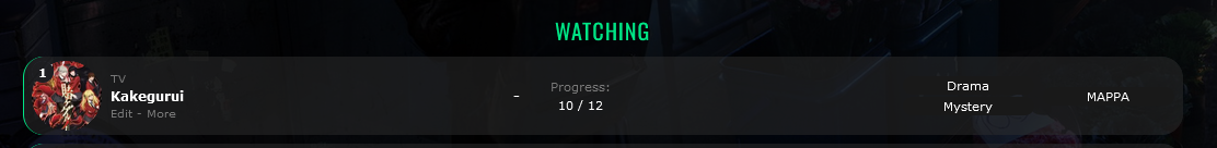 I haven't (yet?) included a way to modify the code with those extensions, so you'll have to remove your current userscript and style code in favour of some new replacement versions that allow what you're mentioning. So this section in your code, near line 180, needs to be deleted: 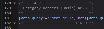 Then you can install this replacement userscript: https://dl.dropboxusercontent.com/s/u8gxbvdwei83n9e/MalFox%20Headers%20%28Custom%20Style%29.user.js And use this new styling code: /*-S-T-A-R-T--------------------*\
| Category Headers (Custom) |
\*------------------------------*/
[data-query*='"status":7']:not([data-query*=order]):not([data-query*='tag"']):not([data-query*='"s"']) .list-item:nth-child(2){margin-top:32px}
.list-item .status:before{position:absolute;top:-40px;left:0;display:block;width:1060px;height:32px;background:none !important;font:20px/32px Oswald;text-align:center;letter-spacing:1px;text-transform:uppercase;pointer-events:none}
.status.watching::before,
.status.reading::before {
color: var(--watching);
} .status.completed::before {
color: var(--completed);
} .status.onhold::before {
color: var(--onhold);
} .status.dropped::before {
color: var(--dropped);
} .status.plantowatch::before,
.status.plantoread::before {
color: var(--plantowatch);
}
/*------------------------E-N-D-*/emUBC said: 8. i actually just noticed this today, but when i hover over a list row, the anime number loses its background and becomes transparent. is there a fix for this? This is a bug regarding the row enlarging on hover. The only fix (that I know of) for this is changing how the number transparency works. You can remove the image entirely and have regular CSS transparency, which looks a bit different but solves the issue: /* Fix for enlarged rows on hover with transparent backgrounds */
.data.number { background: var(--row-tint) !important; }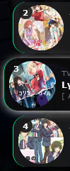 Not sure if I mentioned it in an earlier post, but using the transform to enlarge rows like that fucks with a bunch of the other CSS and is part of why I don't advertise it. Basically the background image on the number is no longer fixed to the page, but the row itself, causing it to become a lot smaller. Same happens on the Priority column, but since you don't have that enabled it isn't an issue for you. emUBC said: 3. is there a way to put a shadow around the score circle (similar to a box shadow but for circles) for certain scores when using the tag-based score decimal mod? not too sure if my implementation of it was the most efficient as i basically macgyver'ed the earlier comments to fit the way i wanted my list to function, so if not, that's alright. if pertinent, i only want the shadow for "10", "9.5", and "9". it's a bit hard to explain, but in Brink terms, say i set a 9.5 silver rating to the colour orange, could a 9.5 circle have an soft orange glow around it? kind of like this (but softer and thinner, of course) perpetually, not just on hover. Without committing to either only tags or only the score, this seems a bit headache-inducing to implement. It's not hard to add a shadow to the regular score or to the tag score. The regular score has classes we can use, while the tag score has the tag URL to use so both are possible. But the tag score is layered over top of the original score, so using a semi-transparent shadow on both the regular and tag scores mean they will be layered together. So an anime that has a "9" score with a blue shadow and a "9.5" tag score with a red shadow will end up appearing partially purple. Example Image In summary, as long as you don't mind the shadows layering over top of each other, this is doable. However, if you want the shadows to not layer then you would have to only style the regular scores or use tag scores on every item (including regular single-number scores). Anyway, here's some usable code if you want to play with it/see how it looks. This code only applies to "9" or "9.5" scores but is easily usable for other scores. Regular "9" scores: /* Styling for all scores */
.data.score .score-label {
width: 26px;
height: 26px;
border-radius: 13px;
display: block;
}
/* Styling for specific score numbers */
.data.score .score-9 {
box-shadow: 0 0 3px goldenrod;
}Tag-based "9.5" scores: .data.tags a[href$="=9.5"] {
box-shadow: 0 0 3px red;
}emUBC said: 7. can i set a unique box shadow colour depending on the score of the anime being hovered over? basically the way you've implemented gold, silver, and bronze rating on Brink but for Clarity's hover and my tag-based scoring. if not, then manually assigning it similar to the way i put in the hearts mod is also fine with me. example: madoka magica's hover box shadow would be the same colour as the "gold" rating i assign my 10's instead of the default white (as well as the same colour of the aforementioned circle shadow if that's possible) You can do this with regular scores, and can find that code below. If you don't remove the regular base shadow then it will encounter the same layering issue where the shadows will combine. This is because to make it score-coloured we lose the ability to dynamically replace the shadow of the main row, we can only add a new one. Your current box shadow code is found near line ~120.  /* SCORE-BASED ROW SHADOW */
/* Fix Change some base styling */
.data.score {
position: static;
}
.data.score select {
position: static;
float: right;
}
/* Styling for all scores */
.data.score .score-label::after {
content: "";
position: absolute;
top: 0;
left: 0;
width: 100%;
height: 100%;
border-radius: 20px;
pointer-events: none;
}
/* Styling for specific score numbers */
.list-item:hover .data.score .score-9::after {
box-shadow: 1px 1px 11px -1px goldenrod;
}As for tag scores, due to how they are positioned this would be... troublesome. You'd have to replace your current Decimal Ratings section entirely to allow the new box shadow code to work. Here's the replacement section you would have to use: /*-S-T-A-R-T--------------------*\
| Decimal Ratings |
\*------------------------------*/
.data.tags a[href*=".5"] {
font-size: 0;
}
.data.tags a[href*=".5"]::before {
position: absolute;
top: calc(50% - 13px);
left: 438px;
width: 26px;
height: 26px;
padding: 0 !important;
background: #212121;
border-radius: 15px;
font: bold 11px/26px Arial;
pointer-events: none;
z-index: 3; }
.data.score:hover ~ .tags a[href$=".5"]::before {
opacity: 0; }
.data.tags a[href$="=0.5"]::before {
content: "0.5";
}
.data.tags a[href$="=1.5"]::before {
content: "1.5";
}
.data.tags a[href$="=2.5"]::before {
content: "2.5";
}
.data.tags a[href$="=3.5"]::before {
content: "3.5";
}
.data.tags a[href$="=4.5"]::before {
content: "4.5";
}
.data.tags a[href$="=5.5"]::before {
content: "5.5";
}
.data.tags a[href$="=6.5"]::before {
content: "6.5";
}
.data.tags a[href$="=7.5"]::before {
content: "7.5";
}
.data.tags a[href$="=8.5"]::before {
content: "8.5";
}
.data.tags a[href$="=9.5"]::before {
content: "9.5";
}
/*------------------------E-N-D-*/Then, you would have to delete part of the code from the comma fix. The code should be near line 100 under "Decimal Ratings Comma Fix 2" and you can see what to delete here:  And then you could add new code for decimal-based score shadows, which as per the previous comments would conflict with the regular score shadows if you were to use both at once. /* SCORE-BASED ROW SHADOW - for tag scores */
/* Styling for all scores */
.data.tags a[href$=".5"]::after {
content: "";
position: absolute;
top: 0;
left: 0;
width: 100%;
height: 100%;
border-radius: 20px;
pointer-events: none;
}
/* Styling for specific score numbers */
.list-item:hover .data.tags a[href$="=9.5"]::after {
box-shadow: 1px 1px 11px -1px goldenrod;
}It's a bit of a mess for the decimal scores lol. emUBC said: 4. speaking of the tag-based decimal score mod, is there a way to prevent the MAL-assigned score from appearing over the tag score upon hover? i skimmed earlier comments and couldn't find a way, though i wasn't too sure if this was a limitation of CSS or not. Ah yeah, this is completely possible. The reason that was included was mostly so that the decimal score wasn't getting in the way of your view while changing score. To remove it, simply find this code within the "Decimal Ratings" mod and delete it:  emUBC said: 5. is there also a way to make it so that unless the decimal score mod detects a .5 after a comma, it won't assign the rating to the score circle? i've tried tagging stuff like "tentative 8.5" but it just messes up the formatting since it detects a .5. no worries if this isn't possible. To be honest the easiest fix for this would be to add another character at the end of the tag. For instance, "tentative 8.5." That said, you could fix this with some more detailed CSS selectors. Find the "Decimal Ratings" section in your code near line ~28. You'll need to replace the outlined text: https://i.imgur.com/ZPFRRA4.png What you are replacing it with is this, which is a more complicated CSS selector that will target both the beginning and end of each tag so it can't mis-target anything else. .data.tags a[href$="=0.5"], .data.tags a[href$="=1.5"], .data.tags a[href$="=2.5"], .data.tags a[href$="=3.5"], .data.tags a[href$="=4.5"], .data.tags a[href$="=5.5"], .data.tags a[href$="=6.5"], .data.tags a[href$="=7.5"], .data.tags a[href$="=8.5"], .data.tags a[href$="=9.5"] Here is what it should look like after the replacement. Make sure you still have the opening curly bracket: "{". 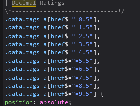 emUBC said: sorry if i didn't explain everything as best as i could, please let me know if you need any more clarification, and if certain combinations of my requests aren't possible with others. also, please take your time, you've helped myself and a lot of people out and i don't want you to feel obliged or rushed to help me. You seem to have explained it clearer than the average, so no worries there. In a similar vein, if any of my responses make no sense let me know. Some of the answers I gave are definitely "partial" answers in that you will have to copy/paste the score-specific section yourself to style more than the one score I provided in the examples, so if you need help with that I'll be around. emUBC said: you've helped me a lot on your Brink theme before your Theme Customizer came out - i've been using it today to switch over to Clarity which has been extremely helpful I'm glad to hear that! Thanks for letting me know about the customiser it can be hard to develop tools without feedback. |
Aug 11, 2022 10:21 PM
#1107
| thanks so much!! almost everything worked perfectly, there's just one thing: Valerio_Lyndon said: As for tag scores, due to how they are positioned this would be... troublesome. You'd have to replace your current Decimal Ratings section entirely to allow the new box shadow code to work. Here's the replacement section you would have to use: /*-S-T-A-R-T--------------------*
| Decimal Ratings |
*------------------------------*/
.data.tags a[href*=".5"] {
font-size: 0;
}
.data.tags a[href*=".5"]::before {
position: absolute;
top: calc(50% - 13px);
left: 438px;
width: 26px;
height: 26px;
padding: 0 !important;
background: #212121;
border-radius: 15px;
font: bold 11px/26px Arial;
pointer-events: none;
z-index: 3; }
.data.score:hover ~ .tags a[href$=".5"]::before {
opacity: 0; }
.data.tags a[href$="=0.5"]::before {
content: "0.5";
}
.data.tags a[href$="=1.5"]::before {
content: "1.5";
}
.data.tags a[href$="=2.5"]::before {
content: "2.5";
}
.data.tags a[href$="=3.5"]::before {
content: "3.5";
}
.data.tags a[href$="=4.5"]::before {
content: "4.5";
}
.data.tags a[href$="=5.5"]::before {
content: "5.5";
}
.data.tags a[href$="=6.5"]::before {
content: "6.5";
}
.data.tags a[href$="=7.5"]::before {
content: "7.5";
}
.data.tags a[href$="=8.5"]::before {
content: "8.5";
}
.data.tags a[href$="=9.5"]::before {
content: "9.5";
}
/*------------------------E-N-D-*/Then, you would have to delete part of the code from the comma fix. The code should be near line 100 under "Decimal Ratings Comma Fix 2" and you can see what to delete here: implementing this code before even touching the box shadow border results in the following:
i currently don't have it on my CSS as a result. and secondly, when viewing "all anime", "on hold" still displays instead of "shortlist" |
pseudoAug 11, 2022 11:34 PM
Aug 19, 2022 12:31 AM
#1108
emUBC said: implementing this code before even touching the box shadow border results in the following:
Hm, in my testing it looks like all the Decimal Ratings needs is an "!important" marker on the font size to remove it from the original location. I probably had a different code order while earlier testing, hence the problem. Here's the Decimal Ratings mod with that change made: /*-S-T-A-R-T--------------------*\
| Decimal Ratings |
\*------------------------------*/
.data.tags a[href*=".5"] {
font-size: 0 !important;
}
.data.tags a[href*=".5"]::before {
position: absolute;
top: calc(50% - 13px);
left: 438px;
width: 26px;
height: 26px;
padding: 0 !important;
background: #212121;
border-radius: 15px;
font: bold 11px/26px Arial;
pointer-events: none;
z-index: 3; }
.data.tags a[href$="=0.5"]::before {
content: "0.5";
}
.data.tags a[href$="=1.5"]::before {
content: "1.5";
}
.data.tags a[href$="=2.5"]::before {
content: "2.5";
}
.data.tags a[href$="=3.5"]::before {
content: "3.5";
}
.data.tags a[href$="=4.5"]::before {
content: "4.5";
}
.data.tags a[href$="=5.5"]::before {
content: "5.5";
}
.data.tags a[href$="=6.5"]::before {
content: "6.5";
}
.data.tags a[href$="=7.5"]::before {
content: "7.5";
}
.data.tags a[href$="=8.5"]::before {
content: "8.5";
}
.data.tags a[href$="=9.5"]::before {
content: "9.5";
}
/*------------------------E-N-D-*/Otherwise it all seems to work fine when I am testing. I don't see a box shadow on the tag score. If you're still having that issue though, you could try forcefully removing the shadow with an extra line of code at the bottom of your CSS: .data.tags a:not(.edit) { box-shadow: none !important; }Also, some of this CSS doesn't display in the preview correctly, so be sure to test it on your publicly-viewable list to see if anything changes there. I forgor 💀 I totally forgot that text showed up in another spot. That'll need another update to the userscript. I updated the same link as previously: https://dl.dropboxusercontent.com/s/u8gxbvdwei83n9e/MalFox%20Headers%20%28Custom%20Style%29.user.js One of these weeks I'll have to make a more easy to edit version of that userscript. Hopefully that fixes your issues, but if not I can look into it more as I have flexible time the next couple of days. |
Valerio_LyndonAug 19, 2022 12:39 AM
Aug 27, 2022 9:10 PM
#1109
Valerio_Lyndon said: emUBC said: implementing this code before even touching the box shadow border results in the following:
Hm, in my testing it looks like all the Decimal Ratings needs is an "!important" marker on the font size to remove it from the original location. I probably had a different code order while earlier testing, hence the problem. Here's the Decimal Ratings mod with that change made: /*-S-T-A-R-T--------------------*\
| Decimal Ratings |
\*------------------------------*/
.data.tags a[href*=".5"] {
font-size: 0 !important;
}
.data.tags a[href*=".5"]::before {
position: absolute;
top: calc(50% - 13px);
left: 438px;
width: 26px;
height: 26px;
padding: 0 !important;
background: #212121;
border-radius: 15px;
font: bold 11px/26px Arial;
pointer-events: none;
z-index: 3; }
.data.tags a[href$="=0.5"]::before {
content: "0.5";
}
.data.tags a[href$="=1.5"]::before {
content: "1.5";
}
.data.tags a[href$="=2.5"]::before {
content: "2.5";
}
.data.tags a[href$="=3.5"]::before {
content: "3.5";
}
.data.tags a[href$="=4.5"]::before {
content: "4.5";
}
.data.tags a[href$="=5.5"]::before {
content: "5.5";
}
.data.tags a[href$="=6.5"]::before {
content: "6.5";
}
.data.tags a[href$="=7.5"]::before {
content: "7.5";
}
.data.tags a[href$="=8.5"]::before {
content: "8.5";
}
.data.tags a[href$="=9.5"]::before {
content: "9.5";
}
/*------------------------E-N-D-*/Otherwise it all seems to work fine when I am testing. I don't see a box shadow on the tag score. If you're still having that issue though, you could try forcefully removing the shadow with an extra line of code at the bottom of your CSS: .data.tags a:not(.edit) { box-shadow: none !important; }Also, some of this CSS doesn't display in the preview correctly, so be sure to test it on your publicly-viewable list to see if anything changes there. i feel bad for making you do all this, cause i ended up preferring the cleaner look of 9's and 9.5's having the same colours lol. thank you anyways, i appreciate it a lot! maybe in the future i'll give it a whirl in the meantime i just have a few more questions, hopefully i'll be out of your hair after these Valerio_Lyndon said: I forgor 💀 I totally forgot that text showed up in another spot. That'll need another update to the userscript. I updated the same link as previously: https://dl.dropboxusercontent.com/s/u8gxbvdwei83n9e/MalFox%20Headers%20%28Custom%20Style%29.user.js One of these weeks I'll have to make a more easy to edit version of that userscript. Hopefully that fixes your issues, but if not I can look into it more as I have flexible time the next couple of days. 1. thanks for this! related to this, though, when i hover on the "shortlist" on the categories bar, the little purple underline is longer than the word.  is this an artifact of the old "on hold" titling? 2. another unrelated inquiry, is it possible for there to be a little circle with an up arrow (like this exact image here) as a perpetual element on the bottom right, so that when it's clicked, it returns to the top of the page? i'm not sure if this is possible to do with CSS so no worries if it's not. i'm aware of keyboard shortcuts like CMD+Up Arrow but i would personally like a clickable version if it's doable. 3. when both the anime title or thumbnail are clicked to view an anime (see below), is it possible to have that open in a new tab by default rather than opening in the same tab? 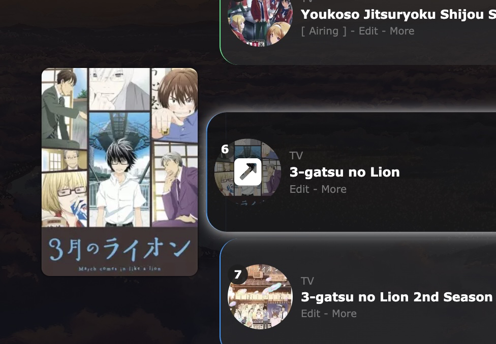 4. when hovering over the first anime under a category header, the header also transforms/enlarges with it. is there a way to separate the transforming element of the anime list entry with the header and make the header stationary? i know the code and userscript for category headers are somewhat complex so if this is too headache-inducing to implement, no worries. 5. lastly, is there a way to make [airing] and [rewatching] white (#FFFFFF), while still keeping the edit and more buttons grey? 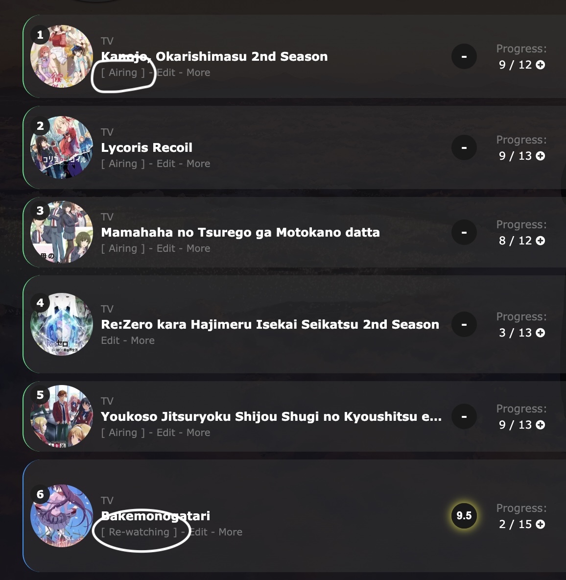 in the same vein, can the dashes between these three texts be replaced with a " | ", or is that not possible? |
pseudoAug 29, 2022 10:18 PM
Aug 30, 2022 10:55 AM
#1110

| @muuyo Moving your post over here to the Clarity topic muuyo said: Anybody have any idea how I can make the decimal scores, as listed in this guide: https://myanimelist.net/forum/?topicid=1931627 work with the Clarity theme by Valerio Lyndon? I've screwed around with the CSS and where the code appends it, but nothing's worked for me. |
Aug 30, 2022 11:21 AM
#1111

| Oh my God there's a forum topic And it has the decimal scores I was trying to get as a mod, thank you!! I'm having an issue with it though - it seems to be intercepting the "8.5" I'm adding as a tag to Beastars on my page, but it doesn't seem to be overlaying the score. (Also, is it possible for me to just clone this and replace the .5s with .1s,.2s, et cetera 8 times within the CSS?) Also, is there any central list of all custom mods that are in this forum topic? MAL forums don't support searching, and the only other place I know of a list are on the Github and the customizer. Finally, is it possible to cull the commas added at the start of a tag list? No worries if it's any trouble, just curious. |
Aug 30, 2022 1:28 PM
#1112
emUBC said: 1. thanks for this! related to this, though, when i hover on the "shortlist" on the categories bar, the little purple underline is longer than the word. is this an artifact of the old "on hold" titling? Ah yeah, an oversight on my part. The letter-spacing was still being applied to the hidden text, causing a gap. Find the previously added code, should be around line ~425-434: 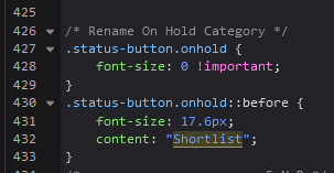 Replace it with this: /* Rename On Hold Category */
.status-button.onhold {
font-size: 0 !important;
letter-spacing: 0px !important;
}
.status-button.onhold::before {
letter-spacing: 1px;
font-size: 17.6px;
content: "Shortlist";
}emUBC said: 2. another unrelated inquiry, is it possible for there to be a little circle with an up arrow (like this exact image here) as a perpetual element on the bottom right, so that when it's clicked, it returns to the top of the page? i'm not sure if this is possible to do with CSS so no worries if it's not. i'm aware of keyboard shortcuts like CMD+Up Arrow but i would personally like a clickable version if it's doable. Adding functionality like this is not possible with CSS, you'd have to use a userscript. I didn't test it, but here's a script I found: https://greasyfork.org/en/scripts/381999-scroll-to-top-bottom-button emUBC said: 3. when both the anime title or thumbnail are clicked to view an anime (see below), is it possible to have that open in a new tab by default rather than opening in the same tab? This would be another userscript problem, since it's only possible through changes to the HTML. The script could add target="_blank". Here's a quick script for that: https://dl.dropboxusercontent.com/s/eonbl3w9b700z96/MyAnimeList%20Open%20Title%20Links%20in%20New%20Tab.user.js Obviously this would only work for you, same as all userscripts. But since it's a behavioural change not everyone would necessarily want it anyway. emUBC said: 4. lastly, when hovering over the first anime under a category header, the header also transforms/enlarges with it. is there a way to separate the transforming element of the anime list entry with the header and make the header stationary? i know the code and userscript for category headers are somewhat complex so if this is too headache-inducing to implement, no worries. This isn't a perfect fix, but you could add this CSS to sort of counter-act the list item transform. It may not look 100% perfect, but it's close to the best it will be without an entire re-work of the userscript (maybe for v2 of the script). /* Fix for List Item Transform with MalFox */
.list-item:hover .status::before {
transition: transform 0.35s ease;
transform: scale(0.9756) translateY(5%);
}emUBC said: 5. lastly, is there a way to make [airing] and [rewatching] white (#FFFFFF), while still keeping the edit and more buttons grey? https://i.imgur.com/mF5t5Th.jpg in the same vein, can the dashes between these three texts be replaced with a " | ", or is that not possible? This should do the trick. It's a bit more code than it could be since I split the first "|" from the content-status to prevent it being coloured white. The [] brackets will be coloured white no matter what we do though. /* Change add-edit-more/content-status divider symbols & change colour */
.content-status,
.rereading,
.rewatching {
color: white !important;
}
.content-status::after,
.rereading::after,
.rewatching::after {
content: "]";
}
.add-edit-more {
font-size: 0 !important;
}
.add-edit-more span {
font-size: 10px;
}
.add-edit-more span::before {
content: " | ";
white-space: pre;
}
/* hide the first divider when no content-status is present */
[class^="re"][style] + .content-status[style] + .add-edit-more span:first-child::before {
content: none;
}If you wanted to change the symbols from the pipe "|" symbol, then you can change the text inside of the double-quotes " | ". If you want to remove the first divider entirely and only have a symbol between the add & more buttons, then you could use this alternate code: /* Change add-edit-more/content-status divider symbols & change colour */
.content-status,
.rereading,
.rewatching {
color: white !important;
}
.content-status::after,
.rereading::after,
.rewatching::after {
content: "]";
}
.add-edit-more {
font-size: 0 !important;
}
.add-edit-more span {
font-size: 10px;
}
.add-edit-more span:last-child::before {
content: " | ";
white-space: pre;
} |
Valerio_LyndonAug 30, 2022 1:58 PM
Aug 30, 2022 2:29 PM
#1113
| thanks so much Valerio! pretty much everything is as close to as i want it now. i know using a bunch of different mods all together might have been a bit cumbersome for you to work around on your end (especially with the decimal ratings and score colour mods, lol) but i'm really thankful for all the effort you put in for myself and for others. |
Aug 30, 2022 5:10 PM
#1114
emUBC said: thanks so much Valerio! pretty much everything is as close to as i want it now. i know using a bunch of different mods all together might have been a bit cumbersome for you to work around on your end (especially with the decimal ratings and score colour mods, lol) but i'm really thankful for all the effort you put in for myself and for others. It can be tricky lol, but I've seen more complicated setups. If you need anything else let me know. |
Aug 30, 2022 5:28 PM
#1115
| @Valerio_Lyndon could you tell me what are some of the most complicated setups you've done or seen? |
Aug 30, 2022 8:47 PM
#1116
| @Shishio-kun Hm, I don't remember who's list was the most tricky to work with as it's been a while, but generally the more manual modifications are added the trickier it gets. For complex layouts all you need to do is check out the lists of a few frequent posters in this thread. :) There are probably more in my personal messages but I have 631 of those and can't be bothered to go back through them lmao. https://myanimelist.net/animelist/Uji_Gintoki_Bowl <- I helped out Gintoki a fair bit, but they figured out the rest. They entered this in one of the competitions a while back, really customised the list to the extreme! https://myanimelist.net/animelist/YoshePlays <- Shares a lot of mods with Gintoki, lots of information. https://myanimelist.net/animelist/Hakaminah <- Many style changes. They changed a fair bit of this themselves, and I helped out with the rest. https://myanimelist.net/animelist/Taduin <- This one I worked on a bunch. Lots of repositions, category-coloured items, and so-forth. Still using it since 2019 though! https://myanimelist.net/animelist/Powish <- Lots of customisation! I mostly just like the Hu Tao style. Scroll down to see the renders. https://myanimelist.net/animelist/jery_js <- MAL score, synopses, custom hover effects, they personalised their list a lot. https://myanimelist.net/animelist/Legends_of_anime <- The legend themselves. Lots of personal tweaks. https://myanimelist.net/animelist/Leguch <- Lots of recolours, and some features changes too. https://myanimelist.net/animelist/WhisperingAshes <- So many colours! Restyled some minor details here and there too. https://myanimelist.net/animelist/Yta_kawaii <- I don't remember if I helped them with this or not, but I know someone asked me about this before. They combined the Brink top bar with regular Clarity. Looks quite interesting! There were a couple more I think, Leospars and Sheycroix for instance, but some power users swapped over to Brink or Clarified. A couple honourable mentions here that I didn't work on. https://myanimelist.net/animelist/sunnysummerday <- Sunnysummerday's CSS is top class as always https://myanimelist.net/animelist/Cosmincreato <- took and converted Sunny's layout to dark mode https://myanimelist.net/animelist/YairPeretz <- Almost completely changed the top bar. |
Aug 31, 2022 7:35 AM
#1117
| I managed to brute force it into working, the reason the decimals weren't showing up were because they don't seem to work in the MAL editor but they work when actually looking at the page. They were also off by about 200 pixels or so, but fixed that with just measuring the difference in Paint (this might have been due to paragraph-style tags or something?). And for anyone searching, yes, you can just copy paste it ten times and regex the decimal so you can put whatever you want. Still curious about these two though. muuyo said: Also, is there any central list of all custom mods that are in this forum topic? MAL forums don't support searching, and the only other place I know of a list are on the Github and the customizer. Finally, is it possible to cull the commas added at the start of a tag list? No worries if it's any trouble, just curious. |
muuyoAug 31, 2022 7:41 AM
Aug 31, 2022 9:35 AM
#1118
Valerio_Lyndon said: If you need anything else let me know. i feel bad taking you up on this offer, but hopefully this is the last time for a while i'll be in your hair lol. a few things: 1. the [ Airing ] and [ Re-watching ] indicators on my list have a space between the square brackets and the word, as typed out. is there a way to get rid of the space so that it's just [Airing] and [Re-Watching]? (with the capital W on the Re-(W)atching if possible) the next few all have to do with the comments when you hit "More" under an anime: 2. can the "More" text turn white and have a subtle box shadow effect if it detects anything written under "Notes"? 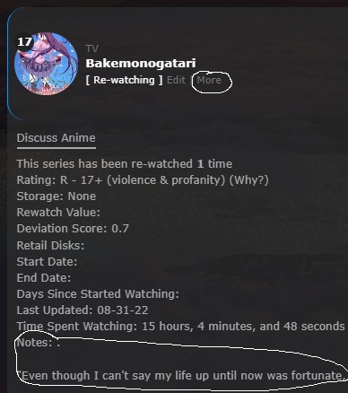 if i have to manually set this for each anime entry (such as if auto-detection isn't possible), kind of like my heart indicator mods, i'm fine with that as i don't have terribly many i'd want to do this for. 3. as per the previous image, would it be possible to hide the period that is right after the "Notes:"? i mostly do this cause i like having the comments start on a new line. i remember you did a version of this for me for Brink, and i've tried porting over the CSS, but it doesn't really work in the manner i intend it to work and i unfortunately am not knowledgeable enough to fix it on my own (i tried lol) 4. can my notes/comments themselves be white text instead of grey like the rest of the "More" panel? i'd like both the "Notes" title itself as well as the comments themselves to be white. 5. this might be difficult, but if the "More" panel is expanded (regardless of if there's comments or not), is it possible to have both the coloured status indicator on the left side, as well as the box shadow extend to adhere with the expanded panel instead of just the list item itself? i have a feeling that this is kind of hard to do lol, so if it's too much work, i can definitely live without it. |
Sep 1, 2022 12:04 AM
#1119
muuyo said: I managed to brute force it into working, the reason the decimals weren't showing up were because they don't seem to work in the MAL editor but they work when actually looking at the page. They were also off by about 200 pixels or so, but fixed that with just measuring the difference in Paint (this might have been due to paragraph-style tags or something?). Yes, there are some drawbacks to all the previous decimal score mods. The preview issue is a trade-off for better code, and the positioning is due to the janky method the decimal tags use for overriding the current score. It means that almost every change to the list columns or styling will require re-positioning the decimal scores to fix issues. I mentioned it somewhere when I first shared the code. I hope to avoid the positioning issue with an "official" decimal score mod later. muuyo said: Also, is there any central list of all custom mods that are in this forum topic? MAL forums don't support searching, and the only other place I know of a list are on the Github and the customizer. No, there isn't at the moment. Someone would have to make it. I haven't because I don't wish to advertise mods where many are flawed and/or are tailored to a users' specific set-up. I would feel on-the-hook for support at that point, so I don't do it. I instead refine and create improved versions of any mods popular enough to warrant it, and then add them to the official lists with proper installation guides. If a mod has only even been requested and used by one user then I usually never think about it again. muuyo said: Finally, is it possible to cull the commas added at the start of a tag list? No worries if it's any trouble, just curious. Not as phrased, no. Well, not unless every single entry had the same tags. However, we are able to get rid of commas at the end of the list in a round-a-bout way. First off, you will have to place your decimal and favourite tags (any tag that gets repositioned) at the very end of your tag list. Then we can use CSS to replace all the commas and remove them on the decimal tags. Here's some code for that: /* Decimal Ratings Comma Fix 3 */
.data.tags span {
font-size: 0 !important;
}
.data.tags span + span a:not([href*=".1"]):not([href*=".2"]):not([href*=".3"]):not([href*=".4"]):not([href*=".5"]):not([href*=".6"]):not([href*=".7"]):not([href*=".8"]):not([href*=".9"])::before {
content: ", ";
white-space: pre-wrap;
}
.data.tags span::after {
font-size: 11px;
} |
Valerio_LyndonSep 1, 2022 12:18 AM
Sep 1, 2022 10:30 AM
#1120
Valerio_Lyndon said: @Shishio-kun Hm, I don't remember who's list was the most tricky to work with as it's been a while, but generally the more manual modifications are added the trickier it gets. For complex layouts all you need to do is check out the lists of a few frequent posters in this thread. :) There are probably more in my personal messages but I have 631 of those and can't be bothered to go back through them lmao. https://myanimelist.net/animelist/Uji_Gintoki_Bowl <- I helped out Gintoki a fair bit, but they figured out the rest. They entered this in one of the competitions a while back, really customised the list to the extreme! https://myanimelist.net/animelist/YoshePlays <- Shares a lot of mods with Gintoki, lots of information. https://myanimelist.net/animelist/Hakaminah <- Many style changes. They changed a fair bit of this themselves, and I helped out with the rest. https://myanimelist.net/animelist/Taduin <- This one I worked on a bunch. Lots of repositions, category-coloured items, and so-forth. Still using it since 2019 though! https://myanimelist.net/animelist/Powish <- Lots of customisation! I mostly just like the Hu Tao style. Scroll down to see the renders. https://myanimelist.net/animelist/jery_js <- MAL score, synopses, custom hover effects, they personalised their list a lot. https://myanimelist.net/animelist/Legends_of_anime <- The legend themselves. Lots of personal tweaks. https://myanimelist.net/animelist/Leguch <- Lots of recolours, and some features changes too. https://myanimelist.net/animelist/WhisperingAshes <- So many colours! Restyled some minor details here and there too. https://myanimelist.net/animelist/Yta_kawaii <- I don't remember if I helped them with this or not, but I know someone asked me about this before. They combined the Brink top bar with regular Clarity. Looks quite interesting! There were a couple more I think, Leospars and Sheycroix for instance, but some power users swapped over to Brink or Clarified. A couple honourable mentions here that I didn't work on. https://myanimelist.net/animelist/sunnysummerday <- Sunnysummerday's CSS is top class as always https://myanimelist.net/animelist/Cosmincreato <- took and converted Sunny's layout to dark mode https://myanimelist.net/animelist/YairPeretz <- Almost completely changed the top bar. Wow THIS IS AMAZING! Very cool, thanks, maybe we can feature all these somehow later for permanent recognition! You know jery_js was very helpful with the list design fixing in the past, so I'm going to invite him to the development group as I think he might want to help with certain projects later? He would also make a good designer. And I was hoping we'd get some feedback ppl later too. |
Sep 1, 2022 12:59 PM
#1121
emUBC said: 1. the [ Airing ] and [ Re-watching ] indicators on my list have a space between the square brackets and the word, as typed out. is there a way to get rid of the space so that it's just [Airing] and [Re-Watching]? (with the capital W on the Re-(W)atching if possible) It isn't the most elegant solution, but you could do this with some negative margins: /* Content status bracket spacing */
.content-status::before,
.rereading::before,
.rewatching::before {
margin-right: -0.3em;
}
.content-status::after,
.rereading::after,
.rewatching::after {
margin-left: -0.3em;
}If the spacing doesn't look quite right, try incrementing the "-0.3em" values by .1 or .05 one way or another. emUBC said: 2. can the "More" text turn white and have a subtle box shadow effect if it detects anything written under "Notes"? if i have to manually set this for each anime entry (such as if auto-detection isn't possible), kind of like my heart indicator mods, i'm fine with that as i don't have terribly many i'd want to do this for. 3. as per the previous image, would it be possible to hide the period that is right after the "Notes:"? i mostly do this cause i like having the comments start on a new line. i remember you did a version of this for me for Brink, and i've tried porting over the CSS, but it doesn't really work in the manner i intend it to work and i unfortunately am not knowledgeable enough to fix it on my own (i tried lol) 4. can my notes/comments themselves be white text instead of grey like the rest of the "More" panel? i'd like both the "Notes" title itself as well as the comments themselves to be white. Sadly I don't think any of these are possible. CSS has no way to pick out text from the middle of a block without some better HTML, which doesn't exist in the More section. The way I did these tricks on Brink was to place everything before the notes onto a single line and then hide the first line, using the limited text selectors within CSS. This would be possible on Clarity, but you would of course lose all the information prior to the "Notes:" section. That said, all of these should be possible by using the recently added Notes column in the list settings. There are some caveats in that it will either be always displayed or displayed on hover, rather than within the More section. And it's still quite hard to style due to how they implemented this new column below the title by default. This new Notes section is disabled currently on Clarity, but it could be re-enabled through some more CSS. I just hadn't got around to writing a mod for it yet. emUBC said: 5. this might be difficult, but if the "More" panel is expanded (regardless of if there's comments or not), is it possible to have both the coloured status indicator on the left side, as well as the box shadow extend to adhere with the expanded panel instead of just the list item itself? i have a feeling that this is kind of hard to do lol, so if it's too much work, i can definitely live without it. Hm. This should be entirely possible by simply changing the element the various items are positioning themselves in relation to. This can be done by setting the list-table-data to static positining so that the items will position in relation to the list-item. .list-table-data {
position: static !important;
}This seems to work fine in my quick testing of it, but it maaay potentially break some positioning. For instance, I am confident this wouldn't work with horizontal tags. Give it a shot, anyhow. |
Sep 1, 2022 1:21 PM
#1122
Valerio_Lyndon said: Sadly I don't think any of these are possible. CSS has no way to pick out text from the middle of a block without some better HTML, which doesn't exist in the More section. The way I did these tricks on Brink was to place everything before the notes onto a single line and then hide the first line, using the limited text selectors within CSS. This would be possible on Clarity, but you would of course lose all the information prior to the "Notes:" section. That said, all of these should be possible by using the recently added Notes column in the list settings. There are some caveats in that it will either be always displayed or displayed on hover, rather than within the More section. And it's still quite hard to style due to how they implemented this new column below the title by default. This new Notes section is disabled currently on Clarity, but it could be re-enabled through some more CSS. I just hadn't got around to writing a mod for it yet. wow, i actually didn't know this was a thing. and yeah, it's just too clunky at the moment for Clarity, but no worries all the same. it's not something i absolutely need so i can definitely just carry on as is. Valerio_Lyndon said: Hm. This should be entirely possible by simply changing the element the various items are positioning themselves in relation to. This can be done by setting the list-table-data to static positining so that the items will position in relation to the list-item. .list-table-data {
position: static !important;
}This seems to work fine in my quick testing of it, but it maaay potentially break some positioning. For instance, I am confident this wouldn't work with horizontal tags. Give it a shot, anyhow. unfortunately as you guessed, it breaks decimal scoring positioning. after looking at the CSS a bit, since the decimal scores mod is set up to overlay based on a fixed absolute position, i'm assuming that there isn't a good element for a relative-positioned solution to anchor onto? or idk, i barely know CSS lol. anyways, if it's too cumbersome to manage to get the list-table-data statically positioned while still properly accounting for decimal scores, i wouldn't worry about trying to find a way to do it. i don't really use the "More" section all that much, and i'm assuming anyone viewing my list would use it a hundred times less, lol. |
Sep 1, 2022 3:51 PM
#1123
emUBC said: unfortunately as you guessed, it breaks decimal scoring positioning. after looking at the CSS a bit, since the decimal scores mod is set up to overlay based on a fixed absolute position, i'm assuming that there isn't a good element for a relative-positioned solution to anchor onto? or idk, i barely know CSS lol. anyways, if it's too cumbersome to manage to get the list-table-data statically positioned while still properly accounting for decimal scores, i wouldn't worry about trying to find a way to do it. i don't really use the "More" section all that much, and i'm assuming anyone viewing my list would use it a hundred times less, lol. That's an obvious one I should have checked for lol. Here's v2. It means the decimal tags should still be centered on the list row. .list-table-data {
position: static !important;
}
.tags div {
position: relative;
}Due to this change, we will need to change the "left" position for the decimal tags on line ~42. It's currently "438px". I believe changing it to "-118px" should work: 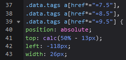 |
Sep 1, 2022 4:20 PM
#1124
| thanks so much!! that covers pretty much everything i wanted. have a good rest of your week:) |
Sep 3, 2022 6:50 PM
#1125

| @Valerio_Lyndon @Shishio-kun Sad that I didn't get an honorable mention for my manga list, but I understand, can't remember and name everyone whose ever used Clarity, also was based on Sheycroix's list and I didn't need V.L's help so just that they got mentioned is good enough, plan to submit it in next contest but doubt it will get #1 again cause I'm assuming that category will be removed if not enough people submit manga lists, I've been playing with those random PHP scripts that Shishio-kun posted awhile back to change multiple backgrounds, banners, renders so theoretically you could use an infinite amount of images that randomly get applied per refresh/category change. |
ShaggyZESep 3, 2022 7:11 PM
   My Userscripts - Themes - Userstyles - Extensions (Chrome/Firefox) [API CSS] MAL-Scraper-API Cover/CSS Generator |
Sep 3, 2022 8:33 PM
#1126
| @ShaggyZE Whoops, my bad. >_> I'll be honest everytime I saw your name I saw you helping people so I didn't even think to open the link despite knowing you had your own customised version lol. I was only opening animelists though so I wouldn't have caught it. Your mangalist is definitely one of the most heavily customised no doubt there. |
Sep 4, 2022 3:50 AM
#1127

Valerio_Lyndon said: @Shishio-kun Hm, I don't remember who's list was the most tricky to work with as it's been a while, but generally the more manual modifications are added the trickier it gets. For complex layouts all you need to do is check out the lists of a few frequent posters in this thread. :) There are probably more in my personal messages but I have 631 of those and can't be bothered to go back through them lmao. https://myanimelist.net/animelist/Uji_Gintoki_Bowl <- I helped out Gintoki a fair bit, but they figured out the rest. They entered this in one of the competitions a while back, really customised the list to the extreme! https://myanimelist.net/animelist/YoshePlays <- Shares a lot of mods with Gintoki, lots of information. https://myanimelist.net/animelist/Hakaminah <- Many style changes. They changed a fair bit of this themselves, and I helped out with the rest. https://myanimelist.net/animelist/Taduin <- This one I worked on a bunch. Lots of repositions, category-coloured items, and so-forth. Still using it since 2019 though! https://myanimelist.net/animelist/Powish <- Lots of customisation! I mostly just like the Hu Tao style. Scroll down to see the renders. https://myanimelist.net/animelist/jery_js <- MAL score, synopses, custom hover effects, they personalised their list a lot. https://myanimelist.net/animelist/Legends_of_anime <- The legend themselves. Lots of personal tweaks. https://myanimelist.net/animelist/Leguch <- Lots of recolours, and some features changes too. https://myanimelist.net/animelist/WhisperingAshes <- So many colours! Restyled some minor details here and there too. https://myanimelist.net/animelist/Yta_kawaii <- I don't remember if I helped them with this or not, but I know someone asked me about this before. They combined the Brink top bar with regular Clarity. Looks quite interesting! There were a couple more I think, Leospars and Sheycroix for instance, but some power users swapped over to Brink or Clarified. A couple honourable mentions here that I didn't work on. https://myanimelist.net/animelist/sunnysummerday <- Sunnysummerday's CSS is top class as always https://myanimelist.net/animelist/Cosmincreato <- took and converted Sunny's layout to dark mode https://myanimelist.net/animelist/YairPeretz <- Almost completely changed the top bar.  Poggies it's me |
PowishSep 4, 2022 5:16 AM
   |
Sep 4, 2022 9:04 PM
#1128
| The posted CSS addon works for removing commas, but as seen on my list, if Favorite tags are put on the end instead of at the beginning, the unicode heart symbol gets... chopped? I'm not sure how else to describe it. |
Sep 4, 2022 9:59 PM
#1129
muuyo said: The posted CSS addon works for removing commas, but as seen on my list, if Favorite tags are put on the end instead of at the beginning, the unicode heart symbol gets... chopped? I'm not sure how else to describe it. Yep, that would be my mistake of forgetting about a mod as usual lol. Here's the revised version that accounts for favourite tags: /* Decimal Ratings Comma Fix 4 */
.data.tags span {
font-size: 0 !important;
}
.data.tags span ~ span a:not([href*="=Favo"]):not([href$=".1"]):not([href$=".2"]):not([href$=".3"]):not([href$=".4"]):not([href$=".5"]):not([href$=".6"]):not([href$=".7"]):not([href$=".8"]):not([href$=".9"])::before {
content: ", ";
white-space: pre-wrap;
}
.data.tags span::after {
font-size: 11px;
} |
Nov 6, 2022 12:51 AM
#1130

| @Valerio_Lyndon I came back on this forum after a really long time. I've been busy with a lot of stuff (mainly school) so I couldn't be very active on mal, especially on forums. And I was trying to find the mal design code you gave me (that you were once working on but never finished) since my laptop had to be reset due to a virus attack... but man... while searching for it I cringed so freaking much going through my old posts. I used way too much caps, my English was bad, I was swearing way too much, and I was straight up being a bother sometimes. And I have no idea how you had to paitence to reply to me with all those factors taken into account, you'd have to have an insane level of paitence to deal with that mate. (Sorry if I wasn't supposed to post this here.) So, in the end I couldn't find the code for it, so I was hoping if you could share the code with me again if you still have it. The default UI looks way too ugly (and painful to my eyes). Hope you've been doing fine, and thanks. (ˉ﹃ˉ) |
   StoryGraph x Spotify x Instagram “Whether we die or not isn't really that big a deal." — Suzuya Juuzou |
Nov 10, 2022 2:17 AM
#1131
Legends_of_animeAnimeListMangaListMessage said: @Valerio_Lyndon I came back on this forum after a really long time. I've been busy with a lot of stuff (mainly school) so I couldn't be very active on mal, especially on forums. And I was trying to find the mal design code you gave me (that you were once working on but never finished) since my laptop had to be reset due to a virus attack... but man... while searching for it I cringed so freaking much going through my old posts. I used way too much caps, my English was bad, I was swearing way too much, and I was straight up being a bother sometimes. And I have no idea how you had to paitence to reply to me with all those factors taken into account, you'd have to have an insane level of paitence to deal with that mate. (Sorry if I wasn't supposed to post this here.) So, in the end I couldn't find the code for it, so I was hoping if you could share the code with me again if you still have it. The default UI looks way too ugly (and painful to my eyes). Hope you've been doing fine, and thanks. (ˉ﹃ˉ) Don't worry about it lol. We've all looked back and felt that way. I didn't personally stop cringing at myself until about 21, but I think that's more to do with just accepting certain cringe-worthy parts of myself rather than not being cringe anymore. Is this the code you meant: https://pastebin.com/2TNVwrXs ? I've not been using/maintaining it recently so a lot of stuff has broken with the new updates to the website. I know Shaggy had their own version, but I don't know what is fixed or broken in that version. That's found here: https://userstyles.world/style/3414/myanimelist-redesign |
Nov 10, 2022 10:57 AM
#1132
Valerio_Lyndon said: Legends_of_animeAnimeListMangaListMessage said: @Valerio_Lyndon I came back on this forum after a really long time. I've been busy with a lot of stuff (mainly school) so I couldn't be very active on mal, especially on forums. And I was trying to find the mal design code you gave me (that you were once working on but never finished) since my laptop had to be reset due to a virus attack... but man... while searching for it I cringed so freaking much going through my old posts. I used way too much caps, my English was bad, I was swearing way too much, and I was straight up being a bother sometimes. And I have no idea how you had to paitence to reply to me with all those factors taken into account, you'd have to have an insane level of paitence to deal with that mate. (Sorry if I wasn't supposed to post this here.) So, in the end I couldn't find the code for it, so I was hoping if you could share the code with me again if you still have it. The default UI looks way too ugly (and painful to my eyes). Hope you've been doing fine, and thanks. (ˉ﹃ˉ) Don't worry about it lol. We've all looked back and felt that way. I didn't personally stop cringing at myself until about 21, but I think that's more to do with just accepting certain cringe-worthy parts of myself rather than not being cringe anymore. Is this the code you meant: https://pastebin.com/2TNVwrXs ? I've not been using/maintaining it recently so a lot of stuff has broken with the new updates to the website. I know Shaggy had their own version, but I don't know what is fixed or broken in that version. That's found here: https://userstyles.world/style/3414/myanimelist-redesign Yes, this is exactly what I was talking about, thanks a lot. |
StoryGraph x Spotify x Instagram “Whether we die or not isn't really that big a deal." — Suzuya Juuzou |
Jan 27, 2023 10:01 AM
#1133
Hi, is there a way to remove this edit button  It only shows when hovering the curser over. Thanks |
Jan 29, 2023 2:27 PM
#1134

| Just installed this layout, it looks incredible. Thank you! |
Jan 30, 2023 3:33 AM
#1135
Is there a way to remove the following; Header above the menu, profile icon when scrolled to the top of the page and the home button? [font="\"Proxima Nova Regular\", \"Helvetica Neue\", Helvetica, Arial, sans-serif"] [/font] [/font] |
Jan 30, 2023 3:36 AM
#1136
killhi12 said: Sorry I dont know the answer to that but I never knew about this button untill now and this is gonna save me so much time editing tags without having to reload the page lol thx.Hi, is there a way to remove this edit button It only shows when hovering the curser over. Thanks |
Mar 20, 2023 10:44 AM
#1137
delanodb said: Is there a way to remove the following; Header above the menu, profile icon when scrolled to the top of the page and the home button? Did you still want help with this or did you solve it since? |
Mar 20, 2023 2:47 PM
#1138
Shishio-kun said: I still need it fixed :Ddelanodb said: Is there a way to remove the following; Header above the menu, profile icon when scrolled to the top of the page and the home button? Did you still want help with this or did you solve it since? |
Mar 21, 2023 11:06 AM
#1139
delanodb said: Shishio-kun said: I still need it fixed :Ddelanodb said: Is there a way to remove the following; Header above the menu, profile icon when scrolled to the top of the page and the home button? Did you still want help with this or did you solve it since? Try adding this to the bottom of the CSS edit box where you entered the code, it should move the home icon to the right of the other icons :D .header .header-title {
position: static;
margin-left: 380px !important;
margin-top: 109px !important;
} |
Mar 21, 2023 11:14 AM
#1140
| @Valerio_Lyndon I think could be an error with dark Clarity and the new notes feature? I tried this user's layout and looked at my own notes it didn't seem to work right. https://imgur.com/VAoKW9A Btw the notes codes I've used on other layouts are: .list-table .list-table-data .data.title .notes .text{
}
.list-table .list-table-data .data.title .notes .text:hover {
}
.list-table .list-table-data .data.title .notes *{
}
.list-table .list-table-data .data.title .notes .edit{
}
* is for the note editing box I think which was a pain to find so I just hammered it with an asterix, notes edit is the "edit notes" link iirc. Thankfully notes are not as much a mess as the damn tags! D: |
Mar 21, 2023 8:56 PM
#1141
Shishio-kunAnimeListMangaListMessage said: @Valerio_Lyndon I think could be an error with dark Clarity and the new notes feature? I tried this user's layout and looked at my own notes it didn't seem to work right. https://imgur.com/VAoKW9A Btw the notes codes I've used on other layouts are: .list-table .list-table-data .data.title .notes .text{
}
.list-table .list-table-data .data.title .notes .text:hover {
}
.list-table .list-table-data .data.title .notes *{
}
.list-table .list-table-data .data.title .notes .edit{
}
* is for the note editing box I think which was a pain to find so I just hammered it with an asterix, notes edit is the "edit notes" link iirc. Thankfully notes are not as much a mess as the damn tags! D: I believe this is just what happens when older versions of Clarity are used with Notes. I did make a mod to add support for notes though which you can find here: [Link] Sadly it isn't part of default functionality right now as styling the notes how the default list displays them would break too many people's lists and I didn't have any good ideas at the time since I was rushing. That said, I can think of a few ways to add the notes now I am coming at it with a fresh mind. Perhaps it's time for the next Clarity version with at least some form of Notes support. |
Valerio_LyndonMar 21, 2023 9:36 PM
Mar 22, 2023 10:33 AM
#1142
OK I understand and that's a good point. I guess in the future we could mass message everyone to update to the newest versions or use the latest mods in order to make full use of the features! Please don't ever hesitate to ask if you want to use the mass message feature for something :D |
Mar 25, 2023 8:12 AM
#1143

Valerio_Lyndon said: Uji_Gintoki_Bowl said: Before I begin this request, I wanted to thank you for all the work you do for us and our lists. It's really helpful and I can only imagine how much time it takes. Thank you! Okay, so you can probably guess from the post I quoted, but I would like something similar to Yoshe's list with the individual ratings. In fact, exactly how he has it on his list currently is how I'd like it as well (colors and all. I'll likely change the labels though). Is there a way you could do it for my list as shown in the awful drawing below (colors used are completely irrelevant)? 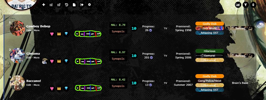 The positioning of the pins it is in line with is ' top:calc(50% + 10px); '. Also, it is very very likely that I won't be ranking all entries, so ones without tags should have a dash in all unranked categories. If there is anything that directly conflicts with making this tagging possible, please let me know. I hope this isn't too large of a request. Thank you so much again for all of your work! Try this out. This code may require further modification to work for anyone other than Gintoki. /*-S-T-A-R-T--------------------*\
| Advanced Scoring |
https://myanimelist.net/forum/?topicid=1723114&show=650#msg62080071
\*------------------------------*/
.data.tags {
/* horizontal/vertical offset from left of list */
--x-offset: 300px;
--y-offset: calc(50% + 17.5px);
}
/* add decorative score background */
.data.tags div:after {
content: "";
position: absolute;
top: var(--y-offset);
left: var(--x-offset);
width: 98px;
height: 17px;
--i: var(--bg);
background-image: linear-gradient(
to right,
#24986D 0px, #24986D 18px, /* 1st box */
transparent 18px, transparent 20px,
#E77B49 20px, #E77B49 38px, /* 2nd box */
transparent 38px, transparent 40px,
#0095A4 40px, #0095A4 58px, /* 3rd box */
transparent 58px, transparent 60px,
#03DA38 60px, #03DA38 78px, /* 4th box */
transparent 78px, transparent 80px,
#E7D772 80px, #E7D772 98px /* 5th box */
);
border-radius: 8.5px;
}
/* reposition score tags */
.data.tags a[href$="tag=-"],
.data.tags a[href$="tag=1"],
.data.tags a[href$="tag=2"],
.data.tags a[href$="tag=3"],
.data.tags a[href$="tag=4"],
.data.tags a[href$="tag=5"],
.data.tags a[href$="tag=6"],
.data.tags a[href$="tag=7"],
.data.tags a[href$="tag=8"],
.data.tags a[href$="tag=9"],
.data.tags a[href$="tag=10"] {
position: absolute;
top: var(--y-offset);
z-index: 1;
width: 18px;
padding: 1px 0;
margin: 0;
pointer-events: auto;
}
.data.tags a[href$="tag=-"]:hover,
.data.tags a[href$="tag=1"]:hover,
.data.tags a[href$="tag=2"]:hover,
.data.tags a[href$="tag=3"]:hover,
.data.tags a[href$="tag=4"]:hover,
.data.tags a[href$="tag=5"]:hover,
.data.tags a[href$="tag=6"]:hover,
.data.tags a[href$="tag=7"]:hover,
.data.tags a[href$="tag=8"]:hover,
.data.tags a[href$="tag=9"]:hover,
.data.tags a[href$="tag=10"]:hover {
cursor: default; /* resets cursor - delete this line to restore pointer cursor */
background: transparent !important; /* background on hover */
}
.data.tags span:nth-last-child(5) a[href$="tag=-"],
.data.tags span:nth-last-child(5) a[href$="tag=1"],
.data.tags span:nth-last-child(5) a[href$="tag=2"],
.data.tags span:nth-last-child(5) a[href$="tag=3"],
.data.tags span:nth-last-child(5) a[href$="tag=4"],
.data.tags span:nth-last-child(5) a[href$="tag=5"],
.data.tags span:nth-last-child(5) a[href$="tag=6"],
.data.tags span:nth-last-child(5) a[href$="tag=7"],
.data.tags span:nth-last-child(5) a[href$="tag=8"],
.data.tags span:nth-last-child(5) a[href$="tag=9"],
.data.tags span:nth-last-child(5) a[href$="tag=10"] {
left: var(--x-offset);
border-radius: 8.5px 0 0 8.5px;
color: var(--text) !important; /* box 1 colour */
}
.data.tags span:nth-last-child(4) a[href$="tag=-"],
.data.tags span:nth-last-child(4) a[href$="tag=1"],
.data.tags span:nth-last-child(4) a[href$="tag=2"],
.data.tags span:nth-last-child(4) a[href$="tag=3"],
.data.tags span:nth-last-child(4) a[href$="tag=4"],
.data.tags span:nth-last-child(4) a[href$="tag=5"],
.data.tags span:nth-last-child(4) a[href$="tag=6"],
.data.tags span:nth-last-child(4) a[href$="tag=7"],
.data.tags span:nth-last-child(4) a[href$="tag=8"],
.data.tags span:nth-last-child(4) a[href$="tag=9"],
.data.tags span:nth-last-child(4) a[href$="tag=10"] {
left: calc(var(--x-offset) + 20px);
border-radius: 0;
color: var(--text) !important; /* box 2 colour */
}
.data.tags span:nth-last-child(3) a[href$="tag=-"],
.data.tags span:nth-last-child(3) a[href$="tag=1"],
.data.tags span:nth-last-child(3) a[href$="tag=2"],
.data.tags span:nth-last-child(3) a[href$="tag=3"],
.data.tags span:nth-last-child(3) a[href$="tag=4"],
.data.tags span:nth-last-child(3) a[href$="tag=5"],
.data.tags span:nth-last-child(3) a[href$="tag=6"],
.data.tags span:nth-last-child(3) a[href$="tag=7"],
.data.tags span:nth-last-child(3) a[href$="tag=8"],
.data.tags span:nth-last-child(3) a[href$="tag=9"],
.data.tags span:nth-last-child(3) a[href$="tag=10"] {
left: calc(var(--x-offset) + 40px);
border-radius: 0;
color: var(--text) !important; /* box 3 colour */
}
.data.tags span:nth-last-child(2) a[href$="tag=-"],
.data.tags span:nth-last-child(2) a[href$="tag=1"],
.data.tags span:nth-last-child(2) a[href$="tag=2"],
.data.tags span:nth-last-child(2) a[href$="tag=3"],
.data.tags span:nth-last-child(2) a[href$="tag=4"],
.data.tags span:nth-last-child(2) a[href$="tag=5"],
.data.tags span:nth-last-child(2) a[href$="tag=6"],
.data.tags span:nth-last-child(2) a[href$="tag=7"],
.data.tags span:nth-last-child(2) a[href$="tag=8"],
.data.tags span:nth-last-child(2) a[href$="tag=9"],
.data.tags span:nth-last-child(2) a[href$="tag=10"] {
left: calc(var(--x-offset) + 60px);
border-radius: 0;
color: var(--text) !important; /* box 4 colour */
}
.data.tags span:nth-last-child(1) a[href$="tag=-"],
.data.tags span:nth-last-child(1) a[href$="tag=1"],
.data.tags span:nth-last-child(1) a[href$="tag=2"],
.data.tags span:nth-last-child(1) a[href$="tag=3"],
.data.tags span:nth-last-child(1) a[href$="tag=4"],
.data.tags span:nth-last-child(1) a[href$="tag=5"],
.data.tags span:nth-last-child(1) a[href$="tag=6"],
.data.tags span:nth-last-child(1) a[href$="tag=7"],
.data.tags span:nth-last-child(1) a[href$="tag=8"],
.data.tags span:nth-last-child(1) a[href$="tag=9"],
.data.tags span:nth-last-child(1) a[href$="tag=10"] {
left: calc(var(--x-offset) + 80px);
border-radius: 0 8.5px 8.5px 0;
color: var(--text) !important; /* box 5 colour */
}
/* add description on hover & remove pseudo comma from tags */
a[href$="tag=-"]:before,
a[href$="tag=1"]:before,
a[href$="tag=2"]:before,
a[href$="tag=3"]:before,
a[href$="tag=4"]:before,
a[href$="tag=5"]:before,
a[href$="tag=6"]:before,
a[href$="tag=7"]:before,
a[href$="tag=8"]:before,
a[href$="tag=9"]:before,
a[href$="tag=10"]:before {
content: "" !important;
position: absolute;
top: 17px;
left: calc(50% - 5px);
z-index: 5;
display: block;
border-width: 5px;
border-style: solid;
border-color: transparent transparent var(--text-dim) transparent;
opacity: 0;
transition: opacity 0.15s ease;
pointer-events: none;
}
a[href$="tag=-"]:after,
a[href$="tag=1"]:after,
a[href$="tag=2"]:after,
a[href$="tag=3"]:after,
a[href$="tag=4"]:after,
a[href$="tag=5"]:after,
a[href$="tag=6"]:after,
a[href$="tag=7"]:after,
a[href$="tag=8"]:after,
a[href$="tag=9"]:after,
a[href$="tag=10"]:after {
content: "Story"; /* box 1 description */
position: absolute;
top: 27px;
left: 50%;
z-index: 5;
display: block;
width: auto;
max-width: 340px;
height: auto;
padding: 4px 8px;
background: var(--btn-bg);
border: 1px solid var(--text-dim);
border-radius: 4px;
box-sizing: border-box;
color: var(--text);
font: 11px/15px Arial, Verdana;
text-align: left;
white-space: pre-wrap;
opacity: 0;
transition: opacity 0.15s ease;
transform: translateX(-50%);
pointer-events: none;
}
a[href$="tag=-"]:hover:before,
a[href$="tag=1"]:hover:before,
a[href$="tag=2"]:hover:before,
a[href$="tag=3"]:hover:before,
a[href$="tag=4"]:hover:before,
a[href$="tag=5"]:hover:before,
a[href$="tag=6"]:hover:before,
a[href$="tag=7"]:hover:before,
a[href$="tag=8"]:hover:before,
a[href$="tag=9"]:hover:before,
a[href$="tag=10"]:hover:before,
a[href$="tag=-"]:hover:after,
a[href$="tag=1"]:hover:after,
a[href$="tag=2"]:hover:after,
a[href$="tag=3"]:hover:after,
a[href$="tag=4"]:hover:after,
a[href$="tag=5"]:hover:after,
a[href$="tag=6"]:hover:after,
a[href$="tag=7"]:hover:after,
a[href$="tag=8"]:hover:after,
a[href$="tag=9"]:hover:after,
a[href$="tag=10"]:hover:after {
opacity: 1;
}
span:nth-last-child(4) a[href$="tag=-"]:after,
span:nth-last-child(4) a[href$="tag=1"]:after,
span:nth-last-child(4) a[href$="tag=2"]:after,
span:nth-last-child(4) a[href$="tag=3"]:after,
span:nth-last-child(4) a[href$="tag=4"]:after,
span:nth-last-child(4) a[href$="tag=5"]:after,
span:nth-last-child(4) a[href$="tag=6"]:after,
span:nth-last-child(4) a[href$="tag=7"]:after,
span:nth-last-child(4) a[href$="tag=8"]:after,
span:nth-last-child(4) a[href$="tag=9"]:after,
span:nth-last-child(4) a[href$="tag=10"]:after {
content: "Animation"; /* box 2 description */
}
span:nth-last-child(3) a[href$="tag=-"]:after,
span:nth-last-child(3) a[href$="tag=1"]:after,
span:nth-last-child(3) a[href$="tag=2"]:after,
span:nth-last-child(3) a[href$="tag=3"]:after,
span:nth-last-child(3) a[href$="tag=4"]:after,
span:nth-last-child(3) a[href$="tag=5"]:after,
span:nth-last-child(3) a[href$="tag=6"]:after,
span:nth-last-child(3) a[href$="tag=7"]:after,
span:nth-last-child(3) a[href$="tag=8"]:after,
span:nth-last-child(3) a[href$="tag=9"]:after,
span:nth-last-child(3) a[href$="tag=10"]:after {
content: "Characters"; /* box 3 description */
}
span:nth-last-child(2) a[href$="tag=-"]:after,
span:nth-last-child(2) a[href$="tag=1"]:after,
span:nth-last-child(2) a[href$="tag=2"]:after,
span:nth-last-child(2) a[href$="tag=3"]:after,
span:nth-last-child(2) a[href$="tag=4"]:after,
span:nth-last-child(2) a[href$="tag=5"]:after,
span:nth-last-child(2) a[href$="tag=6"]:after,
span:nth-last-child(2) a[href$="tag=7"]:after,
span:nth-last-child(2) a[href$="tag=8"]:after,
span:nth-last-child(2) a[href$="tag=9"]:after,
span:nth-last-child(2) a[href$="tag=10"]:after {
content: "Sound"; /* box 4 description */
}
span:nth-last-child(1) a[href$="tag=-"]:after,
span:nth-last-child(1) a[href$="tag=1"]:after,
span:nth-last-child(1) a[href$="tag=2"]:after,
span:nth-last-child(1) a[href$="tag=3"]:after,
span:nth-last-child(1) a[href$="tag=4"]:after,
span:nth-last-child(1) a[href$="tag=5"]:after,
span:nth-last-child(1) a[href$="tag=6"]:after,
span:nth-last-child(1) a[href$="tag=7"]:after,
span:nth-last-child(1) a[href$="tag=8"]:after,
span:nth-last-child(1) a[href$="tag=9"]:after,
span:nth-last-child(1) a[href$="tag=10"]:after {
content: "Enjoyment"; /* box 5 description */
}
/*------------------------E-N-D-*/I hope I didn't miss anything, but let me know if I did. There are two variables near the top labelled x-offset and y-offset to assist in changing the position easier if need be. The same notes apply to the usage of this version: Valerio_Lyndon said: This code relies on a few things. Firstly, you must place all the scores at the end of your tag section, even after decimal scores, so your tags should be ordered: review/other tags -> decimal rating -> advanced scoring. Secondly, you must have all 5 numbers for them to position correctly. If you do not have a score for one of the sections, just use a "-". Here's an example of tags that should work when placed at the end of one of your tag sections: "6,10,7,-,9". Yet another note, these tags are not searchable nor sortable. As we are just using numbers, there is no distinguishing factor to find them by. Even if we did use a prefix on the numbers, you'd still only be able to find others of the same score. So if you scored something ST:2, then you'd only be able to find other entries that were scored 2 of your ST category. Since this would be such a minor function and use up more of the tag character limit, I didn't bother with prefixes. To change box colours, you'll need to change the #212121 colour twice for each box. You can find the relevant section near the top of the provided code, under "add decorative score background". Pictured here: 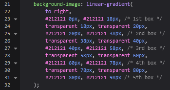 To change the text colour, find the sections further down in the code labelled "box # colour". Change "var(--text)" to any colour. 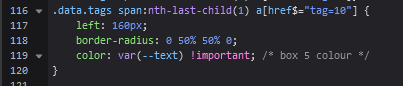 This code works perfectly fine...I've just been trying to find where in the code to make the blocks solid colors and not just it turning a color when being hovered over otherwise I feel it may be hard to see on my list. If you could direct me to the line or a code it would be very much appreciated. |
 |
Mar 25, 2023 10:27 AM
#1144

Hello, how do I get these icons in the header, as done in Clarified:  and how do I also get the icons beside the anime logos (and maybe also the outline around the anime):  Thanks in advance |
 |
Mar 25, 2023 3:11 PM
#1145
ItsAvu said: This code works perfectly fine...I've just been trying to find where in the code to make the blocks solid colors and not just it turning a color when being hovered over otherwise I feel it may be hard to see on my list. If you could direct me to the line or a code it would be very much appreciated. The base box colours are near the start of the code in the linear-gradient section. Each box is controlled by two duplicate colour codes. 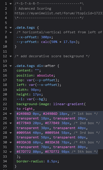 To change the first box, we could change the two "#24986D" sections to, for instance, "silver". 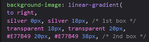 If I misunderstood and you're having an issue with tag backgrounds, that is fixable by removing the background colours. The box should look like this when you first install the code: 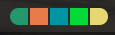 If it instead looks like this...  ... then the backgrounds are an issue. If needed, remove the backgrounds by adding this CSS the base tag styling: background: transparent !important; 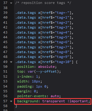 |
Mar 25, 2023 3:29 PM
#1146
Ruse125 said: Hello, how do I get these icons in the header, as done in Clarified: and how do I also get the icons beside the anime logos (and maybe also the outline around the anime): Thanks in advance Use Clarified ;3 The code for header icons, modified to best fit Clarity, is as follows: /* Clarified Category Icons */
.status-button::before {
font-family: FontAwesome;
margin-right: 3px;
}
.status-button:nth-of-type(1)::before {
content: "\f621";
}
.status-button:nth-of-type(2)::before {
content: "\f06e";
}
.status-button:nth-of-type(3)::before {
content: "\f00c";
}
.status-button:nth-of-type(4)::before {
content: "\f04c";
}
.status-button:nth-of-type(5)::before {
content: "\f00d";
}
.status-button:nth-of-type(6)::before {
content: "\f141";
}And this code will give you the status icons and image borders. /* Clarified Status Indicators */
.data.status {
position: relative;
z-index: 1;
align-self: center;
margin-left: 8px;
width: 18px !important;
height: 18px;
border-radius: 50%;
color: var(--pbg);
line-height: 18px;
font-family: FontAwesome;
pointer-events: none;
}
.data.status:is(.watching, .reading) {
background: var(--watching) !important;
} .data.status.completed {
background: var(--completed) !important;
} .data.status.onhold {
background: var(--onhold) !important;
} .data.status.dropped {
background: var(--dropped) !important;
} .data.status:is(.plantowatch, .plantoread) {
background: var(--plantowatch) !important;
}
.data.status:is(.watching, .reading)::after {
content: "\f06e ";
} .data.status.completed::after {
content: "\f00c ";
} .data.status.onhold::after {
content: "\f04c ";
} .data.status.dropped::after {
content: "\f00d ";
} .data.status:is(.plantowatch, .plantoread)::after {
content: "\f141 ";
}
.data.image {
margin-left: -9px;
}
.list-table .list-table-data .data.image a {
width: 100%;
height: 100%;
border: 2px solid var(--local-category) !important;
box-sizing: border-box;
}
.list-table .list-table-data .data.image a:hover {
box-shadow: 0 0 0 2px var(--local-category);
}
/* Category colour variables */
.status:is(.watching, .reading) ~ td {
--local-category: var(--current);
}
.status.completed ~ td {
--local-category: var(--completed);
}
.status.onhold ~ td {
--local-category: var(--onhold);
}
.status.dropped ~ td {
--local-category: var(--dropped);
}
.status:is(.plantowatch, .plantoread) ~ td {
--local-category: var(--planned);
}All new code should go at the bottom of your CSS. For future reference, you can find the CSS for such features by using Inspect Element and copy-pasting the relevant CSS. Shishio also has CSS tutorials to tweak anything that may be broken after copy-pasting. |
Valerio_LyndonMar 25, 2023 3:35 PM
Mar 25, 2023 4:40 PM
#1147
| @Valerio_Lyndon Thanks for helping them! Ruse's Clarity remix looks great too https://myanimelist.net/animelist/Ruse125 |
Mar 25, 2023 4:58 PM
#1148
Valerio_Lyndon said: Thanks for the help, and thanks for the praise @Shishio-kun, I'll try to update it more if I find something cool.Ruse125 said: Hello, how do I get these icons in the header, as done in Clarified: and how do I also get the icons beside the anime logos (and maybe also the outline around the anime): Thanks in advance Use Clarified ;3 The code for header icons, modified to best fit Clarity, is as follows: /* Clarified Category Icons */
.status-button::before {
font-family: FontAwesome;
margin-right: 3px;
}
.status-button:nth-of-type(1)::before {
content: "\f621";
}
.status-button:nth-of-type(2)::before {
content: "\f06e";
}
.status-button:nth-of-type(3)::before {
content: "\f00c";
}
.status-button:nth-of-type(4)::before {
content: "\f04c";
}
.status-button:nth-of-type(5)::before {
content: "\f00d";
}
.status-button:nth-of-type(6)::before {
content: "\f141";
}And this code will give you the status icons and image borders. /* Clarified Status Indicators */
.data.status {
position: relative;
z-index: 1;
align-self: center;
margin-left: 8px;
width: 18px !important;
height: 18px;
border-radius: 50%;
color: var(--pbg);
line-height: 18px;
font-family: FontAwesome;
pointer-events: none;
}
.data.status:is(.watching, .reading) {
background: var(--watching) !important;
} .data.status.completed {
background: var(--completed) !important;
} .data.status.onhold {
background: var(--onhold) !important;
} .data.status.dropped {
background: var(--dropped) !important;
} .data.status:is(.plantowatch, .plantoread) {
background: var(--plantowatch) !important;
}
.data.status:is(.watching, .reading)::after {
content: "\f06e ";
} .data.status.completed::after {
content: "\f00c ";
} .data.status.onhold::after {
content: "\f04c ";
} .data.status.dropped::after {
content: "\f00d ";
} .data.status:is(.plantowatch, .plantoread)::after {
content: "\f141 ";
}
.data.image {
margin-left: -9px;
}
.list-table .list-table-data .data.image a {
width: 100%;
height: 100%;
border: 2px solid var(--local-category) !important;
box-sizing: border-box;
}
.list-table .list-table-data .data.image a:hover {
box-shadow: 0 0 0 2px var(--local-category);
}
/* Category colour variables */
.status:is(.watching, .reading) ~ td {
--local-category: var(--current);
}
.status.completed ~ td {
--local-category: var(--completed);
}
.status.onhold ~ td {
--local-category: var(--onhold);
}
.status.dropped ~ td {
--local-category: var(--dropped);
}
.status:is(.plantowatch, .plantoread) ~ td {
--local-category: var(--planned);
}All new code should go at the bottom of your CSS. For future reference, you can find the CSS for such features by using Inspect Element and copy-pasting the relevant CSS. Shishio also has CSS tutorials to tweak anything that may be broken after copy-pasting. |
|
Mar 25, 2023 5:28 PM
#1149
Shishio-kun said: I'm happy they finally added a notes section however this means I'm having trouble figuring out how to restyle the code for the notes. I see below from Valerio that it may be either impossible right now or a difficult code to make. I have a vision of adding a note section using the comic speech bubble tag that you used on your older manga styled list with this code here: @Valerio_Lyndon I think could be an error with dark Clarity and the new notes feature? I tried this user's layout and looked at my own notes it didn't seem to work right. https://imgur.com/VAoKW9A Btw the notes codes I've used on other layouts are: .list-table .list-table-data .data.title .notes .text{
}
.list-table .list-table-data .data.title .notes .text:hover {
}
.list-table .list-table-data .data.title .notes *{
}
.list-table .list-table-data .data.title .notes .edit{
}
* is for the note editing box I think which was a pain to find so I just hammered it with an asterix, notes edit is the "edit notes" link iirc. Thankfully notes are not as much a mess as the damn tags! D: /* review section */ .list-table .list-table-data .data.tags { position: fixed; right: 0; left: 0; top: 50%; margin: auto; background-image: url(https://image.myanimelist.net/ui/5LYzTBVoS196gvYvw3zjwAmmNei3ftWHltBOI97xl-A); display: inline !important; line-height: 20px !important; text-align:center; pointer-events: none !important; z-index: 6; background-size: contain; padding: 120px !important; padding-top: 155px !important;; height:450px; width: 550px; background-repeat: no-repeat; background-color: transparent; background-size: contain; opacity: 0; font-size: 18px; } .list-table .list-table-data .data.tags * { animation-name: pop; animation-duration: 1s; pointer-events: none !important; color: black !important; background-color: transparent !important; font-size: 18px !important; line-height: 1.4 !important; font-family: 'Comic Sans MS', cursive !important; letter-spacing: 2px; } .list-table .list-table-data:hover .data.tags, .list-table .list-table-data:hover .data.tags span:after { opacity: 1; animation-name: pop; animation-duration: 1s; pointer-events: none !important; } @keyframes pop { 0% { height:450px; width: 550px; font-size: 0px;} 12% { height:800px; width: 800px; font-size: 0px;} 26% { height:450px; width: 550px; font-size: 0px; } 27% { height:450px; width: 550px; font-size: 18px; } 100% { height:450px; width: 550px; font-size: 18px;} } /*------------------------E-N-D-*/ |
|
Mar 26, 2023 6:44 PM
#1150
ItsAvu said: I'm happy they finally added a notes section however this means I'm having trouble figuring out how to restyle the code for the notes. I see below from Valerio that it may be either impossible right now or a difficult code to make. I have a vision of adding a note section using the comic speech bubble tag that you used on your older manga styled list with this code here: /* review section */ .list-table .list-table-data .data.tags { position: fixed; right: 0; left: 0; top: 50%; margin: auto; background-image: url(https://image.myanimelist.net/ui/5LYzTBVoS196gvYvw3zjwAmmNei3ftWHltBOI97xl-A); display: inline !important; line-height: 20px !important; text-align:center; pointer-events: none !important; z-index: 6; background-size: contain; padding: 120px !important; padding-top: 155px !important;; height:450px; width: 550px; background-repeat: no-repeat; background-color: transparent; background-size: contain; opacity: 0; font-size: 18px; } .list-table .list-table-data .data.tags * { animation-name: pop; animation-duration: 1s; pointer-events: none !important; color: black !important; background-color: transparent !important; font-size: 18px !important; line-height: 1.4 !important; font-family: 'Comic Sans MS', cursive !important; letter-spacing: 2px; } .list-table .list-table-data:hover .data.tags, .list-table .list-table-data:hover .data.tags span:after { opacity: 1; animation-name: pop; animation-duration: 1s; pointer-events: none !important; } @keyframes pop { 0% { height:450px; width: 550px; font-size: 0px;} 12% { height:800px; width: 800px; font-size: 0px;} 26% { height:450px; width: 550px; font-size: 0px; } 27% { height:450px; width: 550px; font-size: 18px; } 100% { height:450px; width: 550px; font-size: 18px;} } /*------------------------E-N-D-*/ What I was talking about with Notes earlier in this thread was about any changes I make to the default Clarity code breaking lists that users had already customised. Due to some of this theme's history I have to be careful about how I update it like that. The actual notes themselves are not any harder to style than other parts of the list, depending on what you're doing. Sorry for any confusion. In this case your changes most likely didn't work because the notes area isn't its own list column with a ".data" class like most options on the list, but is instead a child of ".data.title" and only has the ".notes" class. So if you changed the code to ".data.notes" then the CSS would be trying to target an element that doesn't exist. It also has a different structure than the tags area so whether or not you had an issue with the .data selector, some changes may still have been needed. This is where using Inspect Element to view the HTML really comes into play. Anyhow, here's a minimally modified version of the code that works with the notes. /* review section */
.notes {
position: fixed;
right: 0;
left: 0;
top: 50%;
margin: auto;
background-image: url(https://image.myanimelist.net/ui/5LYzTBVoS196gvYvw3zjwAmmNei3ftWHltBOI97xl-A);
display: block;
line-height: 20px !important;
text-align:center;
pointer-events: none !important;
z-index: 6;
background-size: contain;
padding: 120px !important;
padding-top: 155px !important;;
height:450px;
width: 550px;
background-repeat: no-repeat;
background-color: transparent;
background-size: contain;
opacity: 0;
font-size: 18px;
}
.notes .text {
pointer-events: none !important;
color: black !important;
background-color: transparent !important;
font-size: 18px !important;
line-height: 1.4 !important;
font-family: 'Comic Sans MS', cursive !important;
letter-spacing: 2px;
}
.list-table-data:hover .notes {
opacity: 1;
animation: 1s linear 0s both pop;
pointer-events: none !important;
}
.notes .edit {
display: none;
}
@keyframes pop {
0% { height:450px;
width: 550px;
font-size: 0px;}
12% { height:800px;
width: 800px;
font-size: 0px;}
26% { height:450px;
width: 550px;
font-size: 0px;
}
27% { height:450px;
width: 550px;
font-size: 18px;
}
100% { height:450px;
width: 550px;
font-size: 18px;}
}
/*------------------------E-N-D-*/Do keep in mind though that notes can be a lot longer than tags and it may end up looking really weird. 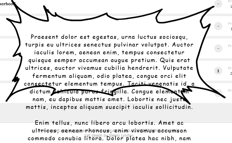  This code looks a lot different because it was easier to optimise it while I was making changes with it than keep it how it was. /* review section */
.notes {
position: fixed;
right: 0;
left: 0;
top: 50vh;
z-index: 6;
display: flex;
justify-content: center;
align-items: center;
width: 550px !important;
min-height: 176px;
padding: 120px 120px 98px;
background:
url(https://i.imgur.com/5T94jUO.png) center top / 100% 120px no-repeat,
url(https://i.imgur.com/CdZByxG.png) center 120px / 100% calc(100% - 218px) no-repeat,
url(https://i.imgur.com/3dmQZI1.png) center bottom / 100% 98px no-repeat;
margin: auto;
text-align: center;
opacity: 0;
pointer-events: none;
}
.list-table-data:hover .notes {
opacity: 1;
animation: 1s linear 0s both pop;
pointer-events: none;
}
.notes .text {
min-height: max-content;
max-height: calc(50vh - 218px);
overflow: hidden;
color: black !important;
font: 18px/1.4 'Comic Sans MS', cursive;
letter-spacing: 2px;
pointer-events: none;
}
.notes::after {
content: "";
position: absolute;
bottom: 98px;
left: 120px;
right: 120px;
height: 30px;
background: linear-gradient(to top, #fff, #fffb, #fff0);
font-size: 30px;
line-height: 30px;
}
.notes .edit {
display: none;
}
@keyframes pop {
12% {
transform: scale(1.45454545);
}
0%,26%,100% {
transform: none;
}
}
/*------------------------E-N-D-*/ |
Valerio_LyndonMar 26, 2023 6:48 PM
More topics from this board
» theme helpthreat - Jul 5 |
5 |
by Zaryf
»»
Aug 21, 5:46 AM |
|
» [CSS] ⭐️ Customize your List Cursor + Cursor FixesShishio-kun - Mar 8, 2021 |
30 |
by Shishio-kun
»»
Jul 28, 3:17 AM |
|
» How To Have Different Banner/Cover image & Background Image For Manga & Anime ListsYasminaRegina - Jul 25 |
2 |
by YasminaRegina
»»
Jul 26, 1:02 AM |
|
Sticky: » 💚 [REPAIR STICKY] Repair/speed up layouts + Request layout fixes ( 1 2 )Shishio-kun - Nov 17, 2023 |
52 |
by LucaBalsa
»»
Jul 6, 2:02 PM |
|
» [CSS/BBCODE] ⭐️ How to view anyone's CSS or BBcodes (for lists, profiles, or clubs)!Shishio-kun - Feb 6, 2012 |
37 |
by sunnysummerday
»»
Jun 11, 7:44 PM |