New
Feb 25, 2021 9:57 PM
#251

| Hi, I really like your design, but my show cover image has a weird dark halo effect around it and I'm not sure what's causing this. The original image is not like this and I even tried using other images but it's still the same. This is the original image I use for the show cover. https://ibb.co/rHXSR25 This is a screenshot of my show cover https://ibb.co/7vymVRm |
Feb 25, 2021 10:15 PM
#252
skyfaller2 said: Hi, I really like your design, but my show cover image has a weird dark halo effect around it and I'm not sure what's causing this. The original image is not like this and I even tried using other images but it's still the same. This is the original image I use for the show cover. https://ibb.co/rHXSR25 This is a screenshot of my show cover https://ibb.co/7vymVRm This is an intended design choice, but to change it you can add this to the bottom of your CSS. /*------------------------------*\
|* Remove Banner Shadow *|
\* - - - - - - - - - - - - - - -*/
#cover-image-container::after { content: none; } |
Feb 25, 2021 10:25 PM
#253
Valerio_Lyndon said: Thank you skyfaller2 said: Hi, I really like your design, but my show cover image has a weird dark halo effect around it and I'm not sure what's causing this. The original image is not like this and I even tried using other images but it's still the same. This is the original image I use for the show cover. https://ibb.co/rHXSR25 This is a screenshot of my show cover https://ibb.co/7vymVRm This is an intended design choice, but to change it you can add this to the bottom of your CSS. /*------------------------------*\
|* Remove Banner Shadow *|
\* - - - - - - - - - - - - - - -*/
#cover-image-container::after { content: none; } |
Feb 25, 2021 11:15 PM
#254
Sakku-san said: After some months I come back here to update the cover and the only thing I could say is: Thanks for doing all this work!, this style is still MY FAVORITE after many years being here in MAL. Thank you, I'm very glad it's finding some favour. :) Sakku-san said: I also took some of the ideas I read from others commenting here, like renaming Top Rated Banners, and Silver and Bronze Ratings, and I have some questions/issues: 1. The Top Rated Custom Banners is a great idea which I also want to use for the worst animes I've watch using the colors of the Bronze Ratings for scores from 1-5 but after I added the Bronze code mentioned here the bar is not centered as gold and silver are (as you can see in my watching list) AND that bar doesn't appear at all if you sort the list by score. [EDIT] Solved by deleting: :not([data-query*='order":4']) as you suggested in other post. So, is there a way I can fix both problems and use Bronze Ratings with custom banners for 1, 2, 3, 4 and 5-scored anime? That would be awesome. To remove the banner on those scored 8 and add it to those scored 1-5, replace your "Bronze Ratings" mod with this new version. /*------------------------------*\
|* Bronze Ratings *|
\* - - - - - - - - - - - - - - -*/
:root {
/* Change colour of bronze ratings here */
--bronzeRating: 38, 40%, 37%;
}
body .data .score-1::before,
body .data .score-2::before,
body .data .score-3::before,
body .data .score-4::before,
body .data .score-5::before {
content: "";
position: absolute;
left: -12px;
bottom: 282px;
z-index: -1;
width: 210px;
height: 6px;
border-top: 2px solid hsl(var(--bronzeRating));
border-radius: 6px 6px 0 0;
pointer-events: none;
/*Toggle*/
visibility: var(--toggleTopRatings);
}
body .data .score-1::after,
body .data .score-2::after,
body .data .score-3::after,
body .data .score-4::after,
body .data .score-5::after {
/* Change text here if so desired */
content: "yucky";
position: absolute;
left: 93px;
bottom: 277px;
z-index: -1;
min-width: 100px;
height: 16px;
padding: 0 8px;
border-radius: 3px;
background: hsl(var(--bronzeRating));
color: hsl(var(--bg));
font: bold 13px/13px var(--font);
text-align: center;
letter-spacing: 1px;
text-shadow: none;
transform: translateX(-50%);
pointer-events: none;
visibility: var(--toggleTopRatings);
}If you wanted to keep the rating banners for items rated 8 that could be arranged, but I assume you don't want them to be the same colour as those scored 1-5? Sakku-san said: 2. I also want to use the Score-Coloured Item Bars and rating colors in scores mentioned here but it just make all bars look white in my list and the score numbers are the same. I forgot to mention it in the previous post I think, but the score bars relied on another mod that coloured the score numbers. So you can either add that mod or use a modified version. Here's both options: /*------------------------------*\
|* Colour Score Text *|
\* - - - - - - - - - - - - - - -*/
.score-label.score-1 {
color: red;
}
.score-label.score-2 {
color: orange;
}
.score-label.score-3 {
color: goldenrod;
}
.score-label.score-4 {
color: yellow;
}
.score-label.score-5 {
color: beige;
}
.score-label.score-6 {
color: white;
}
.score-label.score-7 {
color: green;
}
.score-label.score-8 {
color: teal;
}
.score-label.score-9 {
color: lightblue;
}
.score-label.score-10 {
color: blue;
}
/*------------------------------*\
|* Score-Coloured Item Bars *|
\* - - - - - - - - - - - - - - -*/
.data.status {
display: none !important;
}
.data .score-label:not(.score-na)::before {
content: "";
position: absolute;
left: -12px;
bottom: -12px;
z-index: -1;
width: 210px;
height: 300px;
border-bottom: 4px solid currentColor;
border-radius: 6px;
color: inherit;
pointer-events: none;
}/*------------------------------*\
|* Score-Coloured Item Bars *|
\* - - - - - - - - - - - - - - -*/
.data.status {
display: none !important;
}
.data .score-label:not(.score-na)::before {
content: "";
position: absolute;
left: -12px;
bottom: -12px;
z-index: -1;
width: 210px;
height: 300px;
border-bottom: 4px solid currentColor;
border-radius: 6px;
pointer-events: none;
}
.score-label.score-1::before {
color: red;
}
.score-label.score-2::before {
color: orange;
}
.score-label.score-3::before {
color: goldenrod;
}
.score-label.score-4::before {
color: yellow;
}
.score-label.score-5::before {
color: beige;
}
.score-label.score-6::before {
color: white;
}
.score-label.score-7::before {
color: green;
}
.score-label.score-8::before {
color: teal;
}
.score-label.score-9::before {
color: lightblue;
}
.score-label.score-10::before {
color: blue;
} |
Feb 26, 2021 6:40 AM
#255

Valerio_Lyndon said: To remove the banner on those scored 8 and add it to those scored 1-5, replace your "Bronze Ratings" mod with this new version. /*------------------------------*\
|* Bronze Ratings *|
\* - - - - - - - - - - - - - - -*/
:root {
/* Change colour of bronze ratings here */
--bronzeRating: 38, 40%, 37%;
}
body .data .score-1::before,
body .data .score-2::before,
body .data .score-3::before,
body .data .score-4::before,
body .data .score-5::before {
content: "";
position: absolute;
left: -12px;
bottom: 282px;
z-index: -1;
width: 210px;
height: 6px;
border-top: 2px solid hsl(var(--bronzeRating));
border-radius: 6px 6px 0 0;
pointer-events: none;
/*Toggle*/
visibility: var(--toggleTopRatings);
}
body .data .score-1::after,
body .data .score-2::after,
body .data .score-3::after,
body .data .score-4::after,
body .data .score-5::after {
/* Change text here if so desired */
content: "yucky";
position: absolute;
left: 93px;
bottom: 277px;
z-index: -1;
min-width: 100px;
height: 16px;
padding: 0 8px;
border-radius: 3px;
background: hsl(var(--bronzeRating));
color: hsl(var(--bg));
font: bold 13px/13px var(--font);
text-align: center;
letter-spacing: 1px;
text-shadow: none;
transform: translateX(-50%);
pointer-events: none;
visibility: var(--toggleTopRatings);
}Thanks for the help! I changed bronze code to /*------------------------------*\
|* Bronze Ratings *|
\* - - - - - - - - - - - - - - -*/
:root {
/* Change colour of bronze ratings here */
--bronzeRating: 38, 40%, 37%;
}
body .data .score-1::before,
body .data .score-2::before,
body .data .score-3::before,
body .data .score-4::before {
content: "";
position: absolute;
left: -12px;
bottom: 282px;
z-index: -1;
width: 210px;
height: 6px;
border-top: 2px solid hsl(var(--bronzeRating));
border-radius: 6px 6px 0 0;
pointer-events: none;
/*Toggle*/
visibility: var(--toggleTopRatings);
}
body .data .score-4::after {
/* Change text here if so desired */
content: "POINTLESS ANIME";
position: absolute;
left: 93px;
bottom: 277px;
z-index: -1;
min-width: 100px;
height: 16px;
padding: 0 8px;
border-radius: 3px;
background: hsl(var(--bronzeRating));
color: hsl(var(--bg));
font: bold 13px/13px var(--font);
text-align: center;
letter-spacing: 1px;
text-shadow: none;
transform: translateX(-50%);
pointer-events: none;
visibility: var(--toggleTopRatings);
}
body .data .score-3::after {
/* Change text here if so desired */
content: "WASTE OF TIME";
position: absolute;
left: 93px;
bottom: 277px;
z-index: -1;
min-width: 100px;
height: 16px;
padding: 0 8px;
border-radius: 3px;
background: hsl(var(--bronzeRating));
color: hsl(var(--bg));
font: bold 13px/13px var(--font);
text-align: center;
letter-spacing: 1px;
text-shadow: none;
transform: translateX(-50%);
pointer-events: none;
visibility: var(--toggleTopRatings);
}
body .data .score-2::after {
/* Change text here if so desired */
content: "APPALLING";
position: absolute;
left: 93px;
bottom: 277px;
z-index: -1;
min-width: 100px;
height: 16px;
padding: 0 8px;
border-radius: 3px;
background: hsl(var(--bronzeRating));
color: hsl(var(--bg));
font: bold 13px/13px var(--font);
text-align: center;
letter-spacing: 1px;
text-shadow: none;
transform: translateX(-50%);
pointer-events: none;
visibility: var(--toggleTopRatings);
}
body .data .score-1::after {
/* Change text here if so desired */
content: "SCUM OF THE SCUM";
position: absolute;
left: 93px;
bottom: 277px;
z-index: -1;
min-width: 100px;
height: 16px;
padding: 0 8px;
border-radius: 3px;
background: hsl(var(--bronzeRating));
color: hsl(var(--bg));
font: bold 13px/13px var(--font);
text-align: center;
letter-spacing: 1px;
text-shadow: none;
transform: translateX(-50%);
pointer-events: none;
visibility: var(--toggleTopRatings);
}So now I have different text depending on the score given from 1-4 (I still have to choose which colors use for every score). Valerio_Lyndon said: If you wanted to keep the rating banners for items rated 8 that could be arranged, but I assume you don't want them to be the same colour as those scored 1-5? For now I want banners to show only with best (9 and 10) and worst (1-4) animes I've seen. Btw, I also tried to use the Per-Category Banner Mod with this img https://i.imgur.com/jxMl4st.png for 'Completed' but it doesn't show correctly. The same happens if I use it as normal banner without the mod. Why is that happening? I read that any size should work. |
   |
Feb 28, 2021 1:41 AM
#256
Sakku-san said: Btw, I also tried to use the Per-Category Banner Mod with this img https://i.imgur.com/jxMl4st.png for 'Completed' but it doesn't show correctly. The same happens if I use it as normal banner without the mod. Why is that happening? I read that any size should work. I assume the problem is with the image crop?  The default sizing of images is referred to in the CSS as "cover", which maintains the aspect ratio (width/height proportions) so as to not stretch the image, while fitting each side. For short but very wide image such as this, it will crop it heavily, and for text this will definitely look odd. But, for most images this makes sense. To change it, you can adjust the sizing to be either "contain" which will show the entire image, or a measurement unit such as "50%". Here's an example of that with the default image and the per-category images. All these code snippets can be added to the bottom of your CSS to apply. Show entire image without any stretching /* Adjust Banner Sizing */
#cover-image { object-fit: contain; }Show entire image and stretch /* Adjust Banner Sizing */
#cover-image { object-fit: fill; }The default banner doesn't support exact measurements, unfortunately. Show entire image without any stretching /* Adjust Banner Sizing */
#cover-image-container::before {
background-size: contain;
background-repeat: no-repeat;
}Show entire image and stretch /* Adjust Banner Sizing */
#cover-image-container::before {
background-size: 100% 100%;
background-repeat: no-repeat;
}Size using a measurement without stretch /* Adjust Banner Sizing */
#cover-image-container::before {
background-size: 60% auto;
background-repeat: no-repeat;
} |
Mar 5, 2021 7:45 PM
#257
| Really love this layout!! Just want to know how I can make the covers for the manga covers to be less dim and more defined? Idk if I make sense but want the covers to look more clear like how the covers look in the clarity layout. Also fix how the cover images look really blurry for some reason. Not too experienced with this customization so would appreciate any help :) Update: I was viewing my list on my brother's computer and noticed that my list looks fine on his computer. I'm not sure why it looks really blurry on mine though :/. When I go on your profile, the cover images look clear, but when I visit the profile of other people from this thread, some of their lists are also blurry for me. Any idea on what may be wrong? |
burnerfistahMar 7, 2021 4:44 PM
Mar 7, 2021 5:44 AM
#258
Valerio_Lyndon said: Sakku-san said: Btw, I also tried to use the Per-Category Banner Mod with this img https://i.imgur.com/jxMl4st.png for 'Completed' but it doesn't show correctly. The same happens if I use it as normal banner without the mod. Why is that happening? I read that any size should work. I assume the problem is with the image crop? The default sizing of images is referred to in the CSS as "cover", which maintains the aspect ratio (width/height proportions) so as to not stretch the image, while fitting each side. For short but very wide image such as this, it will crop it heavily, and for text this will definitely look odd. But, for most images this makes sense. To change it, you can adjust the sizing to be either "contain" which will show the entire image, or a measurement unit such as "50%". Here's an example of that with the default image and the per-category images. All these code snippets can be added to the bottom of your CSS to apply. Show entire image without any stretching /* Adjust Banner Sizing */
#cover-image { object-fit: contain; }Show entire image and stretch /* Adjust Banner Sizing */
#cover-image { object-fit: fill; }The default banner doesn't support exact measurements, unfortunately. Show entire image without any stretching /* Adjust Banner Sizing */
#cover-image-container::before {
background-size: contain;
background-repeat: no-repeat;
}Show entire image and stretch /* Adjust Banner Sizing */
#cover-image-container::before {
background-size: 100% 100%;
background-repeat: no-repeat;
}Size using a measurement without stretch /* Adjust Banner Sizing */
#cover-image-container::before {
background-size: 60% auto;
background-repeat: no-repeat;
}Thanks for all the help!! |
| |
Mar 7, 2021 6:02 PM
#259
burnerfistah said: Really love this layout!! Just want to know how I can make the covers for the manga covers to be less dim and more defined? Idk if I make sense but want the covers to look more clear like how the covers look in the clarity layout. Also fix how the cover images look really blurry for some reason. Not too experienced with this customization so would appreciate any help :) Update: I was viewing my list on my brother's computer and noticed that my list looks fine on his computer. I'm not sure why it looks really blurry on mine though :/. When I go on your profile, the cover images look clear, but when I visit the profile of other people from this thread, some of their lists are also blurry for me. Any idea on what may be wrong? Sounds like the cover generator isn't working for you. Check the debugging steps or alternate solutions from the FAQ. They likely look clear when viewing my anime list because I switched to using one of the alternate solutions a while ago. Valerio_Lyndon said:  All cover images are blurry? All cover images are blurry?Blurry images can be caused by various things. Some of which are...
To solve issues with privacy blocking functions, all we have to do is specify the info the cover generator would usually find by itself. To Install:
If you require an alternative that works with private lists, as a replacement for the primary generator, or as a solution to any other problem you're encountering, use the option in the spoiler below. Please note that the below solution is overall inferior to the main generator, so I only recommend using it if you are 100% sure you need it. Since this is a manually-mantained file, there may be the occasional image missing or not up-to-date — especially newer releases. If you do come across any problematic images, I invite you to let me know via my profile. To Install:
For further help solving any of these issues, feel free to reach out. As for them being dim, the brightness should be controlled by the theme variables near the top of the code which you seem to have found. If they seem too dim still, try raising it to 100%. |
Mar 23, 2021 8:09 AM
#260

| is there any way to make the list smaller? for example: change the number of animes in one line from 6 to 4, or just make the images smaller in generall. Thanks in advance. |
ohnewnewApr 13, 2021 11:35 AM
| Signature removed. Please follow the signature rules, as defined in the Site & Forum Guidelines. |
Mar 23, 2021 10:12 PM
#261
ohnewnew said: is there any way to make the list smaller? for example: change the number of animes in one line from 6 to 4, or just make the images smaller in generall. Thanks in advance. You can limit the number of anime in a single row with this mod (add to the bottom of your CSS). /*------------------------------*\
|* Limit Number of Columns *|
\* - - - - - - - - - - - - - - -*/
.list-table {
/* To adjust number of columns, change the first number inside the calc() function. Default (and maximum) is 8. */
max-width: calc( 5 * 224px );
}As for making the actual anime smaller, it's more difficult and can become quite complex quite fast. If we keep everything contained within the cover images, then certain text will quickly begin overlapping at smaller widths. If you just wanted the image smaller without affecting the texts that'd be possible, but may look odd. Or if we were to move text outside of the cover images or something else, then it starts getting into some deep levels of customization required and overwriting large parts of the list. Did you have a better description of what you were thinking of so that I can see about potentially helping? |
Mar 24, 2021 3:36 PM
#262

| the image background, doesn't it look a bit dark? Edit: ty for layout |
Mar 25, 2021 7:08 PM
#263
Find the "--bgDimness" variable in the theme settings (near the top of the CSS) and change its value. 0% will make the image fully bright. Higher values will dim the background further.  |
Mar 25, 2021 7:28 PM
#264
Valerio_Lyndon said: ty, i'll try it👍Find the "--bgDimness" variable in the theme settings (near the top of the CSS) and change its value. 0% will make the image fully bright. Higher values will dim the background further. |
Mar 29, 2021 6:21 PM
#265
| Hello, amazing theme I've been using it for awhile but I think the most recent update (v.1.6.0) changed something about properly adjusting the page length. I was running on (v.1.5.0) before I updated. Before, the page used to adjust to how many covers you had on the screen at once so it wouldn't allow you to scroll past the last cover you had on your screen. Now it looks like every page has a set length so that you can end up scrolling pretty far down. I only noticed this because I enabled stats to show for my page and sometimes it overlaps with the credits. It looks like it works fine when the page needs to load more covers like the completed tab, but when there's only a few (like my watching tab) then it seems to break a little bit. I checked a few other people with the same design and it looks like the same issue is there for them too. No rush to fix this it's just a minor issue I noticed. Thanks in advance! |
Mar 30, 2021 12:48 AM
#266
Prospectivee said: Hello, amazing theme I've been using it for awhile but I think the most recent update (v.1.6.0) changed something about properly adjusting the page length. I was running on (v.1.5.0) before I updated. Before, the page used to adjust to how many covers you had on the screen at once so it wouldn't allow you to scroll past the last cover you had on your screen. Now it looks like every page has a set length so that you can end up scrolling pretty far down. I only noticed this because I enabled stats to show for my page and sometimes it overlaps with the credits. It looks like it works fine when the page needs to load more covers like the completed tab, but when there's only a few (like my watching tab) then it seems to break a little bit. I checked a few other people with the same design and it looks like the same issue is there for them too. No rush to fix this it's just a minor issue I noticed. Thanks in advance! Thanks for the bug report! Looks like it was caused by a simple slip up on my part. I've released v1.6.1 which should fix this as well as a couple related issues I noticed during the fix. If you just wanted to apply a patch to fix it without updating the entire theme, feel free to see below. Add to the bottom of your CSS. /*------------------------------*\
|* Bug Fix for v1.6.0 *|
\* - - - - - - - - - - - - - - -*/
.list-block {
min-height: calc(100vh - (164px + 30vw));
}
@media (min-width: 1920px) {
.list-block {
min-height: calc(100vh - (164px + (1920px * 0.3)));
}
}
@media (max-width: 926px) {
.list-block {
min-height: calc(100vh - (164px + (700px * 0.3)));
}
} |
Apr 1, 2021 12:08 PM
#267

| whenever i do my code only my gold and silver ratings show up , why doesn't the bronze one show up. Also, is there a code that lets me like go from score 1 - 5 means bronze and then silver is 6 - 7, etc and is their code that lets me put stats button correctly because when i put mine this happens |
JayDaAnimeLordApr 3, 2021 2:41 PM
 "Hard work is worthless for those that don’t believe in themselves" - Naruto Uzumaki |
Apr 2, 2021 3:51 PM
#268
Valerio_Lyndon said: Prospectivee said: Hello, amazing theme I've been using it for awhile but I think the most recent update (v.1.6.0) changed something about properly adjusting the page length. I was running on (v.1.5.0) before I updated. Before, the page used to adjust to how many covers you had on the screen at once so it wouldn't allow you to scroll past the last cover you had on your screen. Now it looks like every page has a set length so that you can end up scrolling pretty far down. I only noticed this because I enabled stats to show for my page and sometimes it overlaps with the credits. It looks like it works fine when the page needs to load more covers like the completed tab, but when there's only a few (like my watching tab) then it seems to break a little bit. I checked a few other people with the same design and it looks like the same issue is there for them too. No rush to fix this it's just a minor issue I noticed. Thanks in advance! Thanks for the bug report! Looks like it was caused by a simple slip up on my part. I've released v1.6.1 which should fix this as well as a couple related issues I noticed during the fix. If you just wanted to apply a patch to fix it without updating the entire theme, feel free to see below. Add to the bottom of your CSS. /*------------------------------*\
|* Bug Fix for v1.6.0 *|
\* - - - - - - - - - - - - - - -*/
.list-block {
min-height: calc(100vh - (164px + 30vw));
}
@media (min-width: 1920px) {
.list-block {
min-height: calc(100vh - (164px + (1920px * 0.3)));
}
}
@media (max-width: 926px) {
.list-block {
min-height: calc(100vh - (164px + (700px * 0.3)));
}
}Thanks for the quick fix! |
Apr 3, 2021 4:19 PM
#269
JayDaAnimeLord said: whenever i do my code only my gold and silver ratings show up , why doesn't the bronze one show up. Also, is there a code that lets me like go from score 1 - 5 means bronze and then silver is 6 - 7, etc and is their code that lets me put stats button correctly because when i put mine this happens  You seem to have modified the top rated banners at one point, which is probably why What would normally be bronze banners (items rated 8) are coloured silver, items rated 9 are gold, and items rated 10 or 7 are not visible at all. To return it to default, find the top rated section as displayed here and replace it with the original version, also displayed here. To find the section quickly, you can CTRL+F to find and search for "Top Rated". /* Top Rated Banners for highly rated items. */
.data .score-8::before,
.data .score-9::before,
.data .score-10::before {
content: "";
position: absolute;
left: -12px;
bottom: 282px;
z-index: -1;
width: 210px;
height: 6px;
border-top: 2px solid hsl(var(--text));
border-radius: 6px 6px 0 0;
pointer-events: none;
} .data .score-9::before {
border-color: hsl(var(--goldRating));
visibility: var(--toggleTopRatingGold);
} .data .score-8::before {
border-color: hsl(var(--silverRating));
visibility: var(--toggleTopRatingSilver);
} .data .score-7::before {
border-color: hsl(var(--bronzeRating));
visibility: var(--toggleTopRatingBronze);
}
.data .score-8::after,
.data .score-9::after,
.data .score-10::after {
content: "TOP RATED";
position: absolute;
left: 93px;
bottom: 277px;
z-index: -1;
min-width: 100px;
height: 16px;
padding: 0 10px;
border-radius: 3px;
background: hsl(var(--text));
color: hsl(var(--bg));
font: bold 13px/13px var(--font);
text-align: center;
letter-spacing: 1px;
text-shadow: none;
transform: translateX(-50%);
pointer-events: none;
} .data .score-9::after {
background: hsl(var(--goldRating));
visibility: var(--toggleTopRatingGold);
} .data .score-8::after {
background: hsl(var(--silverRating));
visibility: var(--toggleTopRatingSilver);
} .data .score-7::after {
background: hsl(var(--bronzeRating));
visibility: var(--toggleTopRatingBronze);
}/* Top Rated Banners for highly rated items. */
.data .score-8::before,
.data .score-9::before,
.data .score-10::before {
content: "";
position: absolute;
left: -12px;
bottom: 282px;
z-index: -1;
width: 210px;
height: 6px;
border-top: 2px solid hsl(var(--text));
border-radius: 6px 6px 0 0;
pointer-events: none;
} .data .score-10::before {
border-color: hsl(var(--goldRating));
visibility: var(--toggleTopRatingGold);
} .data .score-9::before {
border-color: hsl(var(--silverRating));
visibility: var(--toggleTopRatingSilver);
} .data .score-8::before {
border-color: hsl(var(--bronzeRating));
visibility: var(--toggleTopRatingBronze);
}
.data .score-8::after,
.data .score-9::after,
.data .score-10::after {
content: "TOP RATED";
position: absolute;
left: 93px;
bottom: 277px;
z-index: -1;
min-width: 100px;
height: 16px;
padding: 0 10px;
border-radius: 3px;
background: hsl(var(--text));
color: hsl(var(--bg));
font: bold 13px/13px var(--font);
text-align: center;
letter-spacing: 1px;
text-shadow: none;
transform: translateX(-50%);
pointer-events: none;
} .data .score-10::after {
background: hsl(var(--goldRating));
visibility: var(--toggleTopRatingGold);
} .data .score-9::after {
background: hsl(var(--silverRating));
visibility: var(--toggleTopRatingSilver);
} .data .score-8::after {
background: hsl(var(--bronzeRating));
visibility: var(--toggleTopRatingBronze);
}If you wanted the 1-5/etc then it has to be done via adding and changing the actual CSS selectors in the code. Here's an example of that. You can use this code to replace the same section as before or as a modifiation at the bottom of the code. /*------------------------------*\
|* Custom Top Rated Banners *|
\* - - - - - - - - - - - - - - -*/
.data .score-label:not(.score-na)::before {
content: "";
position: absolute;
left: -12px;
bottom: 282px;
z-index: -1;
width: 210px;
height: 6px;
border-top: 2px solid hsl(var(--text));
border-radius: 6px 6px 0 0;
pointer-events: none;
} .data.score .score-10::before,
.data.score .score-9::before {
border-color: hsl(var(--goldRating));
visibility: var(--toggleTopRatingGold);
} .data.score .score-8::before,
.data.score .score-7::before,
.data.score .score-6::before {
border-color: hsl(var(--silverRating));
visibility: var(--toggleTopRatingSilver);
} .data.score .score-5::before,
.data.score .score-4::before,
.data.score .score-3::before,
.data.score .score-2::before,
.data.score .score-1::before {
border-color: hsl(var(--bronzeRating));
visibility: var(--toggleTopRatingBronze);
}
.data .score-label:not(.score-na)::after {
content: "TOP RATED";
position: absolute;
left: 93px;
bottom: 277px;
z-index: -1;
min-width: 100px;
height: 16px;
padding: 0 10px;
border-radius: 3px;
background: hsl(var(--text));
color: hsl(var(--bg));
font: bold 13px/13px var(--font);
text-align: center;
letter-spacing: 1px;
text-shadow: none;
transform: translateX(-50%);
pointer-events: none;
} .data.score .score-10::after,
.data.score .score-9::after {
background: hsl(var(--goldRating));
visibility: var(--toggleTopRatingGold);
} .data.score .score-8::after,
.data.score .score-7::after,
.data.score .score-6::after {
background: hsl(var(--silverRating));
visibility: var(--toggleTopRatingSilver);
} .data.score .score-5::after,
.data.score .score-4::after,
.data.score .score-3::after,
.data.score .score-2::after,
.data.score .score-1::after {
background: hsl(var(--bronzeRating));
visibility: var(--toggleTopRatingBronze);
}
/* Light theme support */
.score-label:not(.score-na)::after {
--text: 0, 0%, 10%;
color: hsl(var(--text)) !important;
} |
Apr 5, 2021 6:10 PM
#270
| what should i do for the stats button ? ^ |
"Hard work is worthless for those that don’t believe in themselves" - Naruto Uzumaki |
Apr 5, 2021 8:56 PM
#271
JayDaAnimeLord said: what should i do for the stats button ? ^ Ah, I missed that part of your post somehow. The stats button mod you're using was made for an old version and doesn't work with the new one. You'll need to replace the code with this updated version. /*------------------------------*\
|* Restore Stats Position *|
\* - - - - - - - - - - - - - - -*/
#status-menu {
padding-left: calc(287px + 0.105 * (100vw - 980px));
}
.list-unit .list-status-title {
width: calc(169px + 0.07 * (100vw - 980px));
}
.list-unit .list-status-title .stats {
display: block;
}
.list-unit .list-status-title .stats a:first-child {
display: inline-block;
float: right;
}
.list-unit .list-stats {
position: static;
} .list-unit .list-stats:not([style="display: block;"]) {
display: none !important;
}
.list-table > tbody:first-of-type {
left: calc(198px + 0.07 * (100vw - 980px));
}
@media (max-width: 980px) {
#status-menu:not(.fixed) .search-container {
left: calc(50% + 15.5px);
}
.list-unit .list-status-title {
left: calc(50% - 263.5px);
width: 177px;
}
.list-table > tbody:first-of-type {
left: calc(50% - 77.5px);
}
}
@media (min-width: 1804px) {
.list-unit .list-status-title {
left: calc(8px + (50% - 1804px * .5));
width: calc(169px + 1804px * 0.035);
}
.list-table > tbody:first-of-type {
left: calc(186px + (1804px * 0.035) + (50% - 1804px * .5));
}
}/*------------------------------*\
|* Restore Stat Position v2.0.0 *|
\* - - - - - - - - - - - - - - -*/
#status-menu {
padding-left: calc(80px + (0.035 * (var(--listW) - 980px)));
}
#status-menu .status-menu {
width: calc(var(--listW) - (476px + 0.175 * (var(--listW) - 980px)));
}
.list-unit .list-status-title {
width: calc(169px + (0.07 * (var(--listW) - 980px)));
}
.list-unit .list-status-title .stats {
display: block;
}
.list-unit .list-status-title .stats a:first-child {
display: inline-block;
float: right;
}
.list-unit .list-stats {
position: static;
} .list-unit .list-stats:not([style="display: block;"]) {
display: none !important;
}
.list-table > tbody:first-of-type {
left: calc(198px + (0.07 * (var(--listW) - 980px)) + (50% - var(--listW) * 0.5));
}
@media (max-width: 928px) {
#status-menu:not(.fixed) .search-container {
left: calc(50% + 15.5px);
}
.list-unit .list-status-title {
left: calc(50% - 263.5px);
width: 177px;
}
.list-table > tbody:first-of-type {
left: calc(50% - 77.5px);
}
}
@media (min-width: 927px) and (max-width: 1151.5px) {
#status-menu .status-button {
margin-right: -15px;
transform: scale(0.9);
}
} |
Apr 5, 2021 8:59 PM
#272
| thank you , loving the layout |
"Hard work is worthless for those that don’t believe in themselves" - Naruto Uzumaki |
Apr 10, 2021 3:20 PM
#273

| Hi, great theme! Been fun fiddling around with the code as someone with basic knowledge. --Request I am using the single line titles mod, but was wondering if it would be possible to have it extend to normal height again once hovering over the anime. Example images below (although you probably get what I mean) Lastly, the info background has a very small gap on the left and right edges which lets the cover come through. This goes away when you hover over it (can also be seen in the images). Would it be possible to fix it so that there isn't a gap when not hovering?   Thanks! |
undoApr 10, 2021 3:23 PM
Apr 11, 2021 9:40 PM
#274
aethrl said: Hi, great theme! Been fun fiddling around with the code as someone with basic knowledge. Glad you're having fun! aethrl said: I am using the single line titles mod, but was wondering if it would be possible to have it extend to normal height again once hovering over the anime. Replace the current single line mod with this new one: /*------------------------------*\
|* Single Line Titles *|
\* - - - - - - - - - - - - - - -*/
.data.title .link {
height: 28px;
white-space: nowrap;
text-overflow: ellipsis;
}/*------------------------------*\
|* Single Line Titles until hov *|
\* - - - - - - - - - - - - - - -*/
.list-item:not(:hover) .data.title .link {
height: 28px;
white-space: nowrap;
text-overflow: ellipsis;
}aethrl said: Lastly, the info background has a very small gap on the left and right edges which lets the cover come through. This goes away when you hover over it (can also be seen in the images). Would it be possible to fix it so that there isn't a gap when not hovering? This is an annoying byproduct of Chromium's rendering engine. It's really bad at calculations and transforms. You might be able to make it look more correct by adding this hacky solution that simply widens the title box by a tiny bit: .list-item:not(:hover) .data.title {
width: calc(100% + 2px);
left: -1px;
} |
Apr 12, 2021 11:08 AM
#275
Valerio_Lyndon said: aethrl said: Hi, great theme! Been fun fiddling around with the code as someone with basic knowledge. Glad you're having fun! aethrl said: I am using the single line titles mod, but was wondering if it would be possible to have it extend to normal height again once hovering over the anime. Replace the current single line mod with this new one: /*------------------------------*\
|* Single Line Titles *|
\* - - - - - - - - - - - - - - -*/
.data.title .link {
height: 28px;
white-space: nowrap;
text-overflow: ellipsis;
}/*------------------------------*\
|* Single Line Titles until hov *|
\* - - - - - - - - - - - - - - -*/
.list-item:not(:hover) .data.title .link {
height: 28px;
white-space: nowrap;
text-overflow: ellipsis;
}aethrl said: Lastly, the info background has a very small gap on the left and right edges which lets the cover come through. This goes away when you hover over it (can also be seen in the images). Would it be possible to fix it so that there isn't a gap when not hovering? This is an annoying byproduct of Chromium's rendering engine. It's really bad at calculations and transforms. You might be able to make it look more correct by adding this hacky solution that simply widens the title box by a tiny bit: .list-item:not(:hover) .data.title {
width: calc(100% + 2px);
left: -1px;
}Thank you so much! Works exactly like I hoped it would. |
Apr 13, 2021 1:28 PM
#276
| Hey again, I've got another request. Would it be possible to have the total times re-watched on the info box on hover? I would assume it's similar to the studio, rating, etc... code, but I wouldn't know how to do it myself. |
Apr 14, 2021 12:42 AM
#277
aethrl said: Hey again, I've got another request. Would it be possible to have the total times re-watched on the info box on hover? I would assume it's similar to the studio, rating, etc... code, but I wouldn't know how to do it myself. Unfortunately, the only place MAL lists the rewatches are in the "more info" section of each anime/manga. This section requires a click to load the info and doesn't have much that the CSS can hook onto, so it's basically stuck as it is. On this theme, the "Notes" button is what activates the more info section. If you want to reset the more info section so that you can see the rewatch count, you can use this code.  /* Reset More Info Section */
.td1::first-line {
font-size: inherit;
line-height: inherit;
}
.more-info br {
display: initial;
}
.more-info div:first-of-type {
display: block;
} |
Apr 16, 2021 12:51 PM
#278
Valerio_Lyndon said: aethrl said: Hey again, I've got another request. Would it be possible to have the total times re-watched on the info box on hover? I would assume it's similar to the studio, rating, etc... code, but I wouldn't know how to do it myself. Unfortunately, the only place MAL lists the rewatches are in the "more info" section of each anime/manga. This section requires a click to load the info and doesn't have much that the CSS can hook onto, so it's basically stuck as it is. On this theme, the "Notes" button is what activates the more info section. If you want to reset the more info section so that you can see the rewatch count, you can use this code. /* Reset More Info Section */
.td1::first-line {
font-size: inherit;
line-height: inherit;
}
.more-info br {
display: initial;
}
.more-info div:first-of-type {
display: block;
}Thanks! I'll give this a try, but may end up using the tags to write how many times I've re-watched instead. Thanks again, keep up the good work. |
Apr 21, 2021 6:21 AM
#279
xMWJ said: Valerio_Lyndon said: xMWJ said: Is it possible to adjust the position of the "+" episode button? I'm using MAL-Sync to get the current number of aired episodes, but it overlaps the "+" button in your theme(still works) so I would like to just place the button above that text. Add one of these (not both) to the bottom of your CSS:  The extra "# Released" text can look a little cramped when the title extends above it, but it gives more info than option 2. The extra "# Released" text can look a little cramped when the title extends above it, but it gives more info than option 2./*------------------------------*\
|* MAL-Sync Support v0.1.0 *|
\* - - - - - - - - - - - - - - -*/
/* Estimated Airing # */
.data.progress .mal-sync-ep-pre {
position: absolute;
bottom: 12px;
right: 0;
font-size: 0;
line-height: 0;
}
.progress .mal-sync-ep-pre span {
font-size: 10px;
line-height: 12px;
}
.progress .mal-sync-ep-pre span::after {
content: " Released";
}
/* Total # */
.progress .mal-sync-ep-pre + span {
font-size: 12px;
}
.progress .mal-sync-ep-pre + span::after {
color: hsl(var(--text));
text-shadow: inherit;
transition: all var(--timeItem) var(--bezierFast);
} [data-owner="1"] .list-item:hover .progress .mal-sync-ep-pre + span::after {
color: transparent;
text-shadow: none;
} /*------------------------------*\
|* MAL-Sync Support v0.1.0 *|
\* - - - - - - - - - - - - - - -*/
.data.progress .mal-sync-ep-pre {
font-size: 0;
}
.progress .mal-sync-ep-pre span {
font-size: 12px;
}
.progress .mal-sync-ep-pre span::before {
content: "~";
}
.progress .mal-sync-ep-pre span::after {
content: "ep";
}
.progress .mal-sync-ep-pre span::after {
color: hsl(var(--text));
text-shadow: inherit;
transition: all var(--timeItem) var(--bezierFast);
} [data-owner="1"] .list-item:hover .progress .mal-sync-ep-pre span::after {
color: transparent;
text-shadow: none;
}Perfect, just what I was after! Hiya, it seems something has gone wrong with the "Current amount of episodes out" feature that you helped me with some time ago. I think it might be an issue with MAL-Sync itself but I'm not sure. Normally it shows the amount of episodes currently out and if you hover it says how long is left until the next episode - like the pink entry, but now that feature is missing entirely. Do you know if MAL-Sync would be affecting this? |
Apr 26, 2021 1:41 AM
#280
xMWJ said: xMWJ said: Valerio_Lyndon said: xMWJ said: Is it possible to adjust the position of the "+" episode button? I'm using MAL-Sync to get the current number of aired episodes, but it overlaps the "+" button in your theme(still works) so I would like to just place the button above that text. Add one of these (not both) to the bottom of your CSS: The extra "# Released" text can look a little cramped when the title extends above it, but it gives more info than option 2./*------------------------------*\
|* MAL-Sync Support v0.1.0 *|
\* - - - - - - - - - - - - - - -*/
/* Estimated Airing # */
.data.progress .mal-sync-ep-pre {
position: absolute;
bottom: 12px;
right: 0;
font-size: 0;
line-height: 0;
}
.progress .mal-sync-ep-pre span {
font-size: 10px;
line-height: 12px;
}
.progress .mal-sync-ep-pre span::after {
content: " Released";
}
/* Total # */
.progress .mal-sync-ep-pre + span {
font-size: 12px;
}
.progress .mal-sync-ep-pre + span::after {
color: hsl(var(--text));
text-shadow: inherit;
transition: all var(--timeItem) var(--bezierFast);
} [data-owner="1"] .list-item:hover .progress .mal-sync-ep-pre + span::after {
color: transparent;
text-shadow: none;
}/*------------------------------*\
|* MAL-Sync Support v0.1.0 *|
\* - - - - - - - - - - - - - - -*/
.data.progress .mal-sync-ep-pre {
font-size: 0;
}
.progress .mal-sync-ep-pre span {
font-size: 12px;
}
.progress .mal-sync-ep-pre span::before {
content: "~";
}
.progress .mal-sync-ep-pre span::after {
content: "ep";
}
.progress .mal-sync-ep-pre span::after {
color: hsl(var(--text));
text-shadow: inherit;
transition: all var(--timeItem) var(--bezierFast);
} [data-owner="1"] .list-item:hover .progress .mal-sync-ep-pre span::after {
color: transparent;
text-shadow: none;
}Perfect, just what I was after! Hiya, it seems something has gone wrong with the "Current amount of episodes out" feature that you helped me with some time ago. I think it might be an issue with MAL-Sync itself but I'm not sure. Normally it shows the amount of episodes currently out and if you hover it says how long is left until the next episode - like the pink entry, but now that feature is missing entirely. Do you know if MAL-Sync would be affecting this? Hmm, it might just be MALSync. I tested it out on my end and it was being rather finnicky. It seemed to work after I turned off and then back on the "Estimate Episode Number" feature in the MAL settings. The styling seems to still work okay, so unless you have a different version of MALSync than I installed off the Chrome store, then I'm thinking it's probably a weird bug on the extension side. Check your list with a blank preset, like here: link. If you still can't see the estimation while viewing your list from an unmodified presets, it's something that needs fixing with MALSync. |
Valerio_LyndonApr 27, 2021 1:21 PM
Apr 26, 2021 1:48 AM
#281
Valerio_Lyndon said: xMWJ said: xMWJ said: Valerio_Lyndon said: xMWJ said: Is it possible to adjust the position of the "+" episode button? I'm using MAL-Sync to get the current number of aired episodes, but it overlaps the "+" button in your theme(still works) so I would like to just place the button above that text. Add one of these (not both) to the bottom of your CSS: The extra "# Released" text can look a little cramped when the title extends above it, but it gives more info than option 2./*------------------------------*\
|* MAL-Sync Support v0.1.0 *|
\* - - - - - - - - - - - - - - -*/
/* Estimated Airing # */
.data.progress .mal-sync-ep-pre {
position: absolute;
bottom: 12px;
right: 0;
font-size: 0;
line-height: 0;
}
.progress .mal-sync-ep-pre span {
font-size: 10px;
line-height: 12px;
}
.progress .mal-sync-ep-pre span::after {
content: " Released";
}
/* Total # */
.progress .mal-sync-ep-pre + span {
font-size: 12px;
}
.progress .mal-sync-ep-pre + span::after {
color: hsl(var(--text));
text-shadow: inherit;
transition: all var(--timeItem) var(--bezierFast);
} [data-owner="1"] .list-item:hover .progress .mal-sync-ep-pre + span::after {
color: transparent;
text-shadow: none;
}/*------------------------------*\
|* MAL-Sync Support v0.1.0 *|
\* - - - - - - - - - - - - - - -*/
.data.progress .mal-sync-ep-pre {
font-size: 0;
}
.progress .mal-sync-ep-pre span {
font-size: 12px;
}
.progress .mal-sync-ep-pre span::before {
content: "~";
}
.progress .mal-sync-ep-pre span::after {
content: "ep";
}
.progress .mal-sync-ep-pre span::after {
color: hsl(var(--text));
text-shadow: inherit;
transition: all var(--timeItem) var(--bezierFast);
} [data-owner="1"] .list-item:hover .progress .mal-sync-ep-pre span::after {
color: transparent;
text-shadow: none;
}Perfect, just what I was after! Hiya, it seems something has gone wrong with the "Current amount of episodes out" feature that you helped me with some time ago. I think it might be an issue with MAL-Sync itself but I'm not sure. Normally it shows the amount of episodes currently out and if you hover it says how long is left until the next episode - like the pink entry, but now that feature is missing entirely. Do you know if MAL-Sync would be affecting this? Hmm, it might just be MALSync. I tested it out on my end and it was being rather finnicky. It seemed to work after I turned off and then back on the "Estimate Episode Number" feature in the MAL settings. The styling seems to still work okay, so unless you have a different version of MALSync than I installed off the Chrome store, then I'm thinking it's probably a weird bug on the extension side. Check your list with a blank preset, like here: [url=https://myanimelist.net/animelist/xMWJ?preview=7]link/url]. If you still can't see the estimation while viewing your list from an unmodified presets, it's something that needs fixing with MALSync. Thanks for looking into this! It seems to be back to normal for me at the time of posting, but I haven't been checking between when I last commented and now. Will keep an eye on the MALSync side if it happens again. |
May 4, 2021 6:31 PM
#282
| Hi, I'm really enjoying the theme but I've noticied something strange and I'm wordering if there's a fix around it. I renamed my top rated banners and I'm using custom glow for them, but either of them seem to be working when I sort my list by score. Instead I just see the regular ''Top Rated'' banner with no glow.  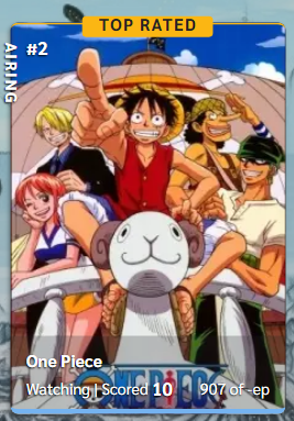 Thanks in advance :D |
May 8, 2021 3:16 PM
#283
| Hey again :v I have another request Is it possible for "orders" to add the "latest" and "earliest" options ?? Great layout btw👍👍 |
May 9, 2021 7:49 PM
#284

Valerio_Lyndon said: ODeivyd said: Having tags in that visual style is completely possible. Tags will automatically start on a new line when inputting them using commas "," in between them. Then it is a simple matter of adding the dot before each item using CSS. Tanks man! I loved the theme! one question: Is possible put my tags in topics? EX : https://imgur.com/a/JhjdUzz 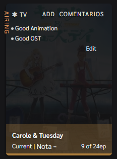 this is a spacing fix for the formatting, just ignore this this is a spacing fix for the formatting, just ignore thisAdd to the bottom of your code. .data.tags span a:before {
content: "";
display: inline-block;
width: 5px;
height: 5px;
background: hsl(var(--textIcon));
border-radius: 3px;
margin-right: 3px;
vertical-align: middle;
}I wasn't 100% sure what you meant when I read your comment so I made some assumptions. If you meant something else, I'd love to know: 1. The exact input you intend to place inside the tag editing box and 2. The visual result you want. Hi, I need your help! So I came here to ask you, how do I fix this? (https://i.imgur.com/xKGOUhT.png) If you want to see "in person" I will leave the tag as it is, just go to: Manga> Completed> Mouse over: "Hitozuma Life" I would like to leave with this design: https://image.myanimelist.net/ui/5LYzTBVoS196gvYvw3zjwOvdCd5iCZWgXn5ZWxiKU1g Here is the link to how your code is being used on my list: https://pastebin.com/LgGKJbdw Thanks in advance |
May 9, 2021 10:02 PM
#285
Coricot said: Hi, I'm really enjoying the theme but I've noticied something strange and I'm wordering if there's a fix around it. I renamed my top rated banners and I'm using custom glow for them, but either of them seem to be working when I sort my list by score. Instead I just see the regular ''Top Rated'' banner with no glow. https://i.imgur.com/nrCtzJM.png https://i.imgur.com/x5iE07w.png Thanks in advance :D I believe this is due to the mod you're using. It was made for an older version of the theme that didn't have score banners on the ordered list, and the code reflects this. To fix it, replace your current "Rename Top Rated Banners" code with this modified code. You can find it near the bottom of your CSS. Make sure to overwrite all of the code shown in the reference spoiler, but only that code and no more. /*------------------------------*\
|* Rename Top Rated Banners *|
\* - - - - - - - - - - - - - - -*/
/* Change labels here - do not remove the surrounding double quotes "" */
body:not([data-query*="order\":4"]) .data .score-10::after {
/* Rated 10 */
content: "MASTERPIECE";
}
body:not([data-query*="order\":4"]) .data .score-9::after {
/* Rated 9 */
content: "EXCELLENT";
}
/* some minor restyling */
body:not([data-query*="order\":4"]) .data .score-label::after {
left: 93px;
width: auto;
padding: 0 8px;
transform: translateX(-50%);
}/*------------------------------*\
|* Rename Top Rated Banners *|
\* - - - - - - - - - - - - - - -*/
/* Change labels here - do not remove the surrounding double quotes "" */
.data .score-10::after {
/* Rated 10 */
content: "MASTERPIECE";
}
.data .score-9::after {
/* Rated 9 */
content: "EXCELLENT";
}
/* some minor restyling */
.data .score-label::after {
left: 93px;
width: auto;
padding: 0 8px;
transform: translateX(-50%);
} |
May 9, 2021 10:07 PM
#286
iiwan said: Hey again :v I have another request Is it possible for "orders" to add the "latest" and "earliest" options ?? Great layout btw👍👍 Adding new functionality, such as sorting orders, is unfortunately out of CSS's capability. You would have to find a userscript¹ with that functionality, although I don't know of any to recommend you off the top of my head. ¹ Userscripts are JavaScript that can be run with a browser extension such as TamperMonkey |
May 9, 2021 10:29 PM
#287
Amethyst_Ero said: Hi, I need your help! So I came here to ask you, how do I fix this? (https://i.imgur.com/xKGOUhT.png) If you want to see "in person" I will leave the tag as it is, just go to: Manga> Completed> Mouse over: "Hitozuma Life" I would like to leave with this design: https://image.myanimelist.net/ui/5LYzTBVoS196gvYvw3zjwOvdCd5iCZWgXn5ZWxiKU1g Here is the link to how your code is being used on my list: https://pastebin.com/LgGKJbdw Thanks in advance I'd remove the code from the previous post, it was made specifically for that other person that already had done many changes to their list. .data.tags span a:before {
content: "";
display: inline-block;
width: 5px;
height: 5px;
background: hsl(var(--textIcon));
border-radius: 3px;
margin-right: 3px;
vertical-align: middle;
}Once that's done, you can try out this code for full-width tags. If I am following correctly, it should do what you're asking. 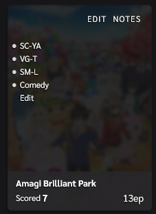 /*------------------------------*\
|* Full-Width Tags *|
\* - - - - - - - - - - - - - - -*/
.data.tags {
width: calc(100% - 12px);
text-align: left !important;
}
.data.tags span {
text-align: left;
}
.data.tags a {
padding-right: 0;
padding-left: 12px;
}
.data.tags a::after {
right: auto;
left: 0;
}
.data.tags span a::after {
content: "•";
font-size: 20px;
line-height: 12px;
}
.list-table .list-table-data .tags .edit {
float: none;
display: inline-block;
}
.data.tags .edit::after {
content: none;
}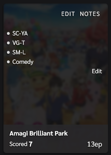 /*------------------------------*\
|* Full-Width Tags *|
\* - - - - - - - - - - - - - - -*/
.data.tags {
width: calc(100% - 12px);
text-align: left !important;
}
.data.tags span {
text-align: left;
}
.data.tags a {
padding-right: 0;
padding-left: 12px;
}
.data.tags a::after {
right: auto;
left: 0;
}
.data.tags span a::after {
content: "•";
font-size: 20px;
line-height: 12px;
}
.data.tags .edit::after {
content: none;
}Thanks for the thoroughly worded question. |
May 10, 2021 8:41 AM
#288
Valerio_Lyndon said: Amethyst_Ero said: Hi, I need your help! So I came here to ask you, how do I fix this? (https://i.imgur.com/xKGOUhT.png) If you want to see "in person" I will leave the tag as it is, just go to: Manga> Completed> Mouse over: "Hitozuma Life" I would like to leave with this design: https://image.myanimelist.net/ui/5LYzTBVoS196gvYvw3zjwOvdCd5iCZWgXn5ZWxiKU1g Here is the link to how your code is being used on my list: https://pastebin.com/LgGKJbdw Thanks in advance I'd remove the code from the previous post, it was made specifically for that other person that already had done many changes to their list. .data.tags span a:before {
content: "";
display: inline-block;
width: 5px;
height: 5px;
background: hsl(var(--textIcon));
border-radius: 3px;
margin-right: 3px;
vertical-align: middle;
}Once that's done, you can try out this code for full-width tags. If I am following correctly, it should do what you're asking. /*------------------------------*\
|* Full-Width Tags *|
\* - - - - - - - - - - - - - - -*/
.data.tags {
width: calc(100% - 12px);
text-align: left !important;
}
.data.tags span {
text-align: left;
}
.data.tags a {
padding-right: 0;
padding-left: 12px;
}
.data.tags a::after {
right: auto;
left: 0;
}
.data.tags span a::after {
content: "•";
font-size: 20px;
line-height: 12px;
}
.list-table .list-table-data .tags .edit {
float: none;
display: inline-block;
}
.data.tags .edit::after {
content: none;
}/*------------------------------*\
|* Full-Width Tags *|
\* - - - - - - - - - - - - - - -*/
.data.tags {
width: calc(100% - 12px);
text-align: left !important;
}
.data.tags span {
text-align: left;
}
.data.tags a {
padding-right: 0;
padding-left: 12px;
}
.data.tags a::after {
right: auto;
left: 0;
}
.data.tags span a::after {
content: "•";
font-size: 20px;
line-height: 12px;
}
.data.tags .edit::after {
content: none;
}Thanks for the thoroughly worded question. THANK YOOOOOOOOOOOU SO MUCH <3 |
May 12, 2021 5:13 AM
#289
| Hi! I have two question: 1) is there a way to show the title name only after hovering / show only the cover until the cursor is hovered over ? 2) is it possible to display the score in the upper right corner ? |
Shroud007May 12, 2021 5:46 AM
May 15, 2021 11:29 PM
#290
| this customization is good! lit af... but how do you change the background color into just like in the sample? |
May 17, 2021 8:57 PM
#291
Shroud007 said: Hi! I have two question: 1) is there a way to show the title name only after hovering / show only the cover until the cursor is hovered over ? 2) is it possible to display the score in the upper right corner ? 1) To accomplish this, we can set the opacity to 0 while the item isn't hovered. Add one or all of these codes to the bottom of the CSS. .list-item:not(:hover) .data.title {
opacity: 0;
}.list-item:not(:hover) .data.progress,
.list-item:not(:hover) .data.chapter,
.list-item:not(:hover) .data.volume {
opacity: 0;
}.list-item:not(:hover) .data.score {
opacity: 0;
}2) This is possible, but I'm not 100% sure if it will interfere with the "Completed"/"Current"/Etcetera text. Will have to try it out to be sure. I'm also not quite sure about the design you intend. Usually the edit/notes buttons are top right, so the score would have to either overlap them a bit, overlap the tags a bit, or go slightly out of the item's boundaries. If you could expand a bit on what you mean by this, I might be able to get some code written. |
May 17, 2021 9:02 PM
#292
Kuriru-kun said: this customization is good! lit af... but how do you change the background color into just like in the sample? The background colour controls (and other colours) can be found near the top of the code. The colours are HSL colour values, but without their surrounding parentheses. To get the correct values, simply strip away the surrounding parentheses and blurb. For instance, "hsl(244, 42%, 82%)" would simply become "244, 42%, 82%". For help picking an HSL colour you can use a website such as: https://www.w3schools.com/colors/colors_hsl.asp Or you can manually play with the numbers.  If you wanted a specific colour, could you point to which one you meant? If you meant something else entirely, I'll need some more details. |
May 17, 2021 10:14 PM
#293
Valerio_Lyndon said: Shroud007 said: Hi! I have two question: 1) is there a way to show the title name only after hovering / show only the cover until the cursor is hovered over ? 2) is it possible to display the score in the upper right corner ? 1) To accomplish this, we can set the opacity to 0 while the item isn't hovered. Add one or all of these codes to the bottom of the CSS. .list-item:not(:hover) .data.title {
opacity: 0;
}.list-item:not(:hover) .data.progress,
.list-item:not(:hover) .data.chapter,
.list-item:not(:hover) .data.volume {
opacity: 0;
}.list-item:not(:hover) .data.score {
opacity: 0;
}2) This is possible, but I'm not 100% sure if it will interfere with the "Completed"/"Current"/Etcetera text. Will have to try it out to be sure. I'm also not quite sure about the design you intend. Usually the edit/notes buttons are top right, so the score would have to either overlap them a bit, overlap the tags a bit, or go slightly out of the item's boundaries. If you could expand a bit on what you mean by this, I might be able to get some code written. Thanks a lot ! 2) Okay, by that I mean, is it possible that the score to be displayed only as a number in the lower right corner with no status (current, completed, etc) when mouse isn't hovered |
Shroud007May 17, 2021 10:19 PM
May 17, 2021 10:48 PM
#294
Shroud007 said: Valerio_Lyndon said: Shroud007 said: Hi! I have two question: 1) is there a way to show the title name only after hovering / show only the cover until the cursor is hovered over ? 2) is it possible to display the score in the upper right corner ? 1) To accomplish this, we can set the opacity to 0 while the item isn't hovered. Add one or all of these codes to the bottom of the CSS. .list-item:not(:hover) .data.title {
opacity: 0;
}.list-item:not(:hover) .data.progress,
.list-item:not(:hover) .data.chapter,
.list-item:not(:hover) .data.volume {
opacity: 0;
}.list-item:not(:hover) .data.score {
opacity: 0;
}2) This is possible, but I'm not 100% sure if it will interfere with the "Completed"/"Current"/Etcetera text. Will have to try it out to be sure. I'm also not quite sure about the design you intend. Usually the edit/notes buttons are top right, so the score would have to either overlap them a bit, overlap the tags a bit, or go slightly out of the item's boundaries. If you could expand a bit on what you mean by this, I might be able to get some code written. Thanks a lot ! 2) Okay, by that I mean, is it possible that the score to be displayed only as a number in the lower right corner with no status (current, completed, etc) when mouse isn't hovered Something like this?  /*------------------------------*\
|* Repositioned Scores *|
\* - - - - - - - - - - - - - - -*/
.data.score a {
transition:
text-indent var(--timeItem) var(--bezierFast),
color var(--timeText) var(--bezierFast);
}
.list-item:not(:hover) .data.score a {
text-indent: 90px;
}
.score-label::after {
text-indent: 0;
}
.data.score::before,
.data.score a::before {
transition: font-size var(--timeItem) var(--bezierFast);
}
.list-item:not(:hover) .data.score::before,
.list-item:not(:hover) .data.score a::before {
font-size: 0;
}/*------------------------------*\
|* Repositioned Scores *|
\* - - - - - - - - - - - - - - -*/
.data.score a {
transition:
font-size var(--timeItem) var(--bezierFast),
text-indent var(--timeItem) var(--bezierFast),
color var(--timeText) var(--bezierFast);
}
.list-item:not(:hover) .data.score a {
text-indent: 85px;
font-size: 18px !important;
}
.score-label::after {
text-indent: 0;
}
.data.score::before,
.data.score a::before {
transition: font-size var(--timeItem) var(--bezierFast);
}
.list-item:not(:hover) .data.score::before,
.list-item:not(:hover) .data.score a::before {
font-size: 0;
} |
May 20, 2021 6:52 AM
#295
| thanks for the help in my background color the other day... Can I ask another thing? Its about my selection of animes its slightly darker tho... How can I change its brightness? |
May 20, 2021 5:03 PM
#296
Kuriru-kun said: thanks for the help in my background color the other day... Can I ask another thing? Its about my selection of animes its slightly darker tho... How can I change its brightness? Changing the "imageBrightness" variable near the top of the CSS should do what you want. For full brightness, set it to 100%. |
Jun 2, 2021 6:58 PM
#297
| I love the layout, had clarity before this, but wanted one with big covers and i find out you made this. Never used any other layouts. I modiefied it quite a bit, but don't have much CSS knowledge so I'm unsure how it all works together so I have one question, is it possible to create Top Rated banners but they only show up when a specific tag is added? It probably is but i can't figure it out. If you can help that would be lovely |
Jun 2, 2021 7:25 PM
#298
| Hi, it's me again. So I would like to know. How to change this: https://i.imgur.com/8lRT2Mf.png To this: https://i.imgur.com/NmSnZpS.png Because it bothers my eyes and it gets blurry to see properly. |
Jun 2, 2021 10:24 PM
#299

Amethyst_Ero said: Hi, it's me again. So I would like to know. How to change this: https://i.imgur.com/8lRT2Mf.png To this: https://i.imgur.com/NmSnZpS.png Because it bothers my eyes and it gets blurry to see properly. add this code to to the bottom of your list:
/*Quick search dark mode fix*/
body[data-owner="1"] #fancybox-frame { filter: none; }
|
   StoryGraph x Spotify x Instagram “Whether we die or not isn't really that big a deal." — Suzuya Juuzou |
Jun 6, 2021 12:18 AM
#300
ChipChippy said: I love the layout, had clarity before this, but wanted one with big covers and i find out you made this. Never used any other layouts. I modiefied it quite a bit, but don't have much CSS knowledge so I'm unsure how it all works together so I have one question, is it possible to create Top Rated banners but they only show up when a specific tag is added? It probably is but i can't figure it out. If you can help that would be lovely Did you mean something like this?  It is possibe, but does require some modifications of how the tags work. This means that the scrollbar on tags no longer works, so some vertical overflow may occur when you are using a lot of tags. It also removes the little tag icon next to the tag. This first code affects only the B-Tier tag. It can easily be applied to other tags by changing the selectors if you know how to do that. The second spoiler shows an example of that. Use only one of these. /*------------------------------*\
|* Banner Tag *|
\* - - - - - - - - - - - - - - -*/
/* Modify how Tags Work */
.data.tags {
overflow: initial;
opacity: 1;
z-index: 10;
}
.data.tags span {
min-height: initial;
margin-bottom: 0;
}
.data.tags a {
min-height: 15px;
margin-bottom: 4px;
opacity: 0;
transition:
color var(--timeText) var(--bezierFast),
opacity calc(var(--timeItem) * 1.5) var(--bezierFast);
} .list-item:hover .data.tags a {
opacity: 1;
}
/* Tag-Specific Changes */
.data.tags a[href$="=B-Tier"] {
position: static;
opacity: 1;
}
.data.tags a[href$="=B-Tier"]::before {
content: "";
position: absolute;
right: -12px;
top: -52px;
z-index: -1;
width: 210px;
height: 6px;
border-top: 2px solid hsl(var(--text));
border-radius: 6px 6px 0 0;
pointer-events: none;
}
.data.tags a[href$="=B-Tier"]::after {
content: "B-Tier";
position: absolute;
right: 93px;
top: -60px;
z-index: -1;
min-width: 100px;
height: 21px;
padding: 3px 5px 0;
border-radius: 3px;
background: hsl(var(--text));
color: hsl(var(--bg));
font: bold 15px/15px var(--font);
text-align: center;
letter-spacing: 1px;
text-shadow: none;
transform: translateX(50%);
pointer-events: none;
}/*------------------------------*\
|* Banner Tag *|
\* - - - - - - - - - - - - - - -*/
/* Modify how Tags Work */
.data.tags {
overflow: initial;
opacity: 1;
z-index: 10;
}
.data.tags span {
min-height: initial;
margin-bottom: 0;
}
.data.tags a {
min-height: 15px;
margin-bottom: 4px;
opacity: 0;
transition:
color var(--timeText) var(--bezierFast),
opacity calc(var(--timeItem) * 1.5) var(--bezierFast);
} .list-item:hover .data.tags a {
opacity: 1;
}
/* Tag-Specific Changes */
.data.tags a[href$="=A-Tier"],
.data.tags a[href$="=B-Tier"] {
position: static;
opacity: 1;
}
.data.tags a[href$="=A-Tier"]::before,
.data.tags a[href$="=B-Tier"]::before {
content: "";
position: absolute;
right: -12px;
top: -52px;
z-index: -1;
width: 210px;
height: 6px;
border-top: 2px solid hsl(var(--text));
border-radius: 6px 6px 0 0;
pointer-events: none;
}
.data.tags a[href$="=B-Tier"]::before {
border-top-color: hsl(0, 0%, 50%);
}
.data.tags a[href$="=A-Tier"]::after,
.data.tags a[href$="=B-Tier"]::after {
content: "A-Tier";
position: absolute;
right: 93px;
top: -60px;
z-index: -1;
min-width: 100px;
height: 21px;
padding: 3px 5px 0;
border-radius: 3px;
background: hsl(var(--text));
color: hsl(var(--bg));
font: bold 15px/15px var(--font);
text-align: center;
letter-spacing: 1px;
text-shadow: none;
transform: translateX(50%);
pointer-events: none;
}
.data.tags a[href$="=B-Tier"]::after {
content: "B-Tier";
background: hsl(0, 0%, 50%);
} |
More topics from this board
» ❓ Ask for help here + See Frequently Asked Questions ( 1 2 3 4 5 ... Last Page )Shishio-kun - Apr 15, 2010 |
7921 |
by takkun_
»»
Yesterday, 9:54 PM |
|
» [CSS - MODERN] ⚡️ Fully-Customizable Layouts (2024 updates!) ( 1 2 3 4 5 ... Last Page )Shishio-kun - Jul 21, 2017 |
381 |
by KabukiChouNights
»»
Sep 13, 10:56 AM |
|
» theme helpthreat - Jul 5 |
5 |
by Zaryf
»»
Aug 21, 5:46 AM |
|
» [CSS - Modern] 🍰 Clarity by V.L ( 1 2 3 4 5 ... Last Page )Valerio_Lyndon - Apr 19, 2018 |
1261 |
by KiranaStarr
»»
Aug 16, 5:48 PM |
|
» [CSS] ⭐️ Customize your List Cursor + Cursor FixesShishio-kun - Mar 8, 2021 |
30 |
by Shishio-kun
»»
Jul 28, 3:17 AM |