New
Sep 10, 2019 11:07 PM
#351
Taduin said: for the horizontal edit button you don't understand it, i mean that the edit button that modifies the tags fits this code / * Horizontal Tags / Revision 0.2 * / in practice i ask that the tag edit button move to where the horizontal tags are  /* =================================== Edit Button Fix For Horizontal Tags */ .data.tags { max-width: 940px; } .data.tags a.edit { display: block; width: 40px !important; height: 17px !important; margin-bottom: 4px; flex: 0 0 auto; } .list-item:hover .data.tags a.edit:hover { width: 40px !important; } Taduin said: To change the heart, find this code on line 822:for the favorites how can i change heart color? i wanted to distinguish between tv, movie etc i tried to change the color of this code color: #1a75ff! important; but it makes the heart disappear to the tag i insert  Change the "#ff65ad" to any valid CSS colour. Example, "#fff" or "rgba(255,230,200)". The "!important" must be together. There cannot be a space between the exclamation point and the text. If you are colouring other tags by following the tutorial in the original post, you shouldn't need an "!important" statement. Taduin said: Like this?I remembered one thing, how can i add the - to the edit center and more? (as was practically the beginning) i want it to always change color based on the section  /* ============================
Add-Edit-More re-insert dash */
.list-table .list-table-data .data.title .add-edit-more {
color: var(--category-colour);
font-size: 10px;
}
.list-table .list-table-data .title .add-edit-more a {
margin-left: 0;
}Taduin said: It's changable based on the overall section, but not the individual anime's category. Example:you know that when you click on more below Discuss Anime is there an orange line? can you change the color according to the section and when you switch over to Discuss Anime change the text color according to the section?  /* ===============================
Category Coloured Discuss Anime */
.more-info .td1 > div > a {
border-color: var(--global-category-colour);
}Taduin said: can you make round corners for each anime line? where there are the title of the anime etc to make you understand  /* ================
Round List Items */
.list-item {
/* Change rounding amount here */
--rounding: 15px;
border-radius: var(--rounding);
}
.data.status {
width: 71px !important;
background: none !important;
border-left: 1px solid var(--bg) !important;
border-radius: var(--rounding);
} .data.status.watching,
.data.status.reading {
border-color: var(--watching) !important;
} .data.status.completed {
border-color: var(--completed) !important;
} .data.status.onhold {
border-color: var(--onhold) !important;
} .data.status.dropped {
border-color: var(--dropped) !important;
} .data.status.plantowatch,
.data.status.plantoread {
border-color: var(--plantowatch) !important;
} |
Sep 11, 2019 2:42 AM
#352
| @Valerio_Lyndon Then: The edit button for perfect horizontal tags The color of the heart probably did not translate the translator well, i would like to change the color of certain tags, such as the favorite color remains pink, but in the tag "hello" becomes blue for example The reintegration of the - okay but thinking about it better you can not put that changes color(as long as it changes color based on the section) only with the hover? I managed to do it but if i go over the edit button or more it changes color too - as if i were going over there too For Discuss Anime it has no good translation, i know, i meant that line just below Discuss Anime and when you move the cursor over the Discuss Anime it changes color based on the section edit: i noticed that the text Why? also changes the color The Round List Items is fine but i would like something if you can do it, can you make the line extend to the underside of more if i click more? edit: can you move the studio name and unknown studio under the seasons button (example fall 2019)? maybe it expands when there is more than one studio (like when you add several long tags, it enlarges the height of the anime section) it increases the height of the anime section (i can't explain but i hope you understand what i mean, i will try to make you understand from a screenshot ) 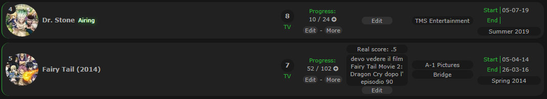 how can you see the fairy tail 2014 height of and the higher it being that the tag is bigger, can you do that if there are more studies it increases the like the tag? I tried to change color to the - i made you add again because i wanted it to change color with the hover and i managed to do it but i noticed one thing, if i go over more the hover also appears above the -, here are the codes /* ============================ Add-Edit-More re-insert dash */ .list-table .list-table-data .data.title .add-edit-more { color: #ababab; font-size: 11px; } .list-table .list-table-data .title .add-edit-more a { margin-left: 0; } /* ================================= Add-Edit-More category color dash */ .list-table .list-table-data .data.title .add-edit-more { transition: color 0.15s ease; } .list-table .list-table-data .data.title .add-edit-more:hover, .list-table .list-table-data .data.title .add-edit-more:hover { color: var(--category-colour) } Edit 2: I copied and modified the code on another position of the themes and i put the type, airing and edit and more buttons back to the original positions but i have a problem, do you know that i had the [ ] removed from airing? now i had to remove the code to get back to - and i would like you to get another code, could you remove the [ ] of airing and leave the - ? the - i would like the color i can manually put it myself and with the hover that changes according to the section.I made this change because i'm thinking of switching to these horizontal things to have as much space as possible.In case you didn't understand I want the color of the - after airing to be different from airing. You can also make a completely separate code that moves airing after the anime title? if i have enough space for long titles i would like to insert them there. PS: I know i'm asking too many things for once but i do it so that i change the codes all at once and i don't wait several days to get the code (i don't have it with you so it's clear why everyone has their own commitments ).If there are no contingencies, these are the last things to do. |
TaduinSep 14, 2019 12:07 PM
Sep 16, 2019 2:51 AM
#353
Taduin said: I've explained how to do this as best as I can on the main post. Find "Add your own coloured tags" within the "Further Modification" section. It's quite lengthy, and I am unsure how it will fair translation, but it is the most complete guide of how to accomplish this.The color of the heart probably did not translate the translator well, i would like to change the color of certain tags, such as the favorite color remains pink, but in the tag "hello" becomes blue for example Taduin said: Yes, that is what the code I provided will do. The limitation is that it cannot determine the colour per entry. Instead it will colour per page.For Discuss Anime it has no good translation, i know, i meant that line just below Discuss Anime and when you move the cursor over the Discuss Anime it changes color based on the section edit: i noticed that the text Why? also changes the color Taduin said: You can try this code:The Round List Items is fine but i would like something if you can do it, can you make the line extend to the underside of more if i click more? .list-table-data {
position: static;
}This will cause some other things to also reposition when "more" is clicked. For example, the favourite tag. It may also cause some unforeseen issue I haven't thought of, but I'm not entirely sure. Taduin said: Like this?can you move the studio name and unknown studio under the seasons button (example fall 2019)? maybe it expands when there is more than one studio (like when you add several long tags, it enlarges the height of the anime section) it increases the height of the anime section (i can't explain but i hope you understand what i mean, i will try to make you understand from a screenshot ) 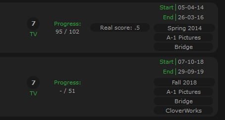 Something to keep in mind here, is there will be occasional wonky behaviour. Example when tags are longer than the studio: [Image] /* ==============================
Reposition Studio Below Season */
.data.airing-started,
.data.airing-finished,
.data.season {
align-self: flex-start;
} .data.airing-started {
top: 3px;
} .data.airing-finished {
top: 23px;
} .data.season {
top: 43px;
}
.list-table-data .data.season a {
width: 118px;
}
.data.studio {
align-self: flex-start;
margin-top: 58px;
margin-right: -120px;
}Taduin said: Good work changing it by yourself. :) Unfortunately though, that's another of those issues where there's no clean way around it. Same problem as the progress issue we had with the slash, if you remember that. The "add" and "more" buttons are part of the same element as the dash. So, when the buttons are hovered, the dash is effected too.The reintegration of the - okay but thinking about it better you can not put that changes color(as long as it changes color based on the section) only with the hover? I managed to do it but if i go over the edit button or more it changes color too - as if i were going over there too … I tried to change color to the - i made you add again because i wanted it to change color with the hover and i managed to do it but i noticed one thing, if i go over more the hover also appears above the -, here are the codes /* ============================ Add-Edit-More re-insert dash */ .list-table .list-table-data .data.title .add-edit-more { color: #ababab; font-size: 11px; } .list-table .list-table-data .title .add-edit-more a { margin-left: 0; } /* ================================= Add-Edit-More category color dash */ .list-table .list-table-data .data.title .add-edit-more { transition: color 0.15s ease; } .list-table .list-table-data .data.title .add-edit-more:hover, .list-table .list-table-data .data.title .add-edit-more:hover { color: var(--category-colour) } Taduin said: I'm not certain this will work without seeing your code, but give this a go.I copied and modified the code on another position of the themes and i put the type, airing and edit and more buttons back to the original positions but i have a problem, do you know that i had the [ ] removed from airing? now i had to remove the code to get back to - and i would like you to get another code, could you remove the [ ] of airing and leave the - ? the - i would like the color i can manually put it myself and with the hover that changes according to the section. I made this change because i'm thinking of switching to these horizontal things to have as much space as possible. In case you didn't understand I want the color of the - after airing to be different from airing. The hover effect will apply when hovering any part of the "airing" text. /* ==============================
Modify Content Status Brackets */
.content-status::before,
.rewatching::before,
.rereading::before {
content: none;
}
.content-status::after,
.rewatching::after,
.rereading::after {
content: " - ";
color: var(--text-dim); /* (your colour here) */
text-shadow: none;
}
.content-status:hover::after,
.rewatching:hover::after,
.rereading:hover::after {
content: " - ";
color: var(--category-colour);
text-shadow: none;
}/* ==============================
Modify Content Status Brackets */
.content-status::before,
.rewatching::before,
.rereading::before {
content: none;
}
.content-status::after,
.rewatching::after,
.rereading::after {
content: " - ";
color: var(--text-dim); /* (your colour here) */
text-shadow: none;
}Hopefully that works. If you want the dash on the other side (left instead of right), you just need to switch the "::before" and the "::after". As seen here: /* ==============================
Modify Content Status Brackets */
.content-status::before,
.rewatching::before,
.rereading::before {
content: " - ";
color: var(--text-dim); /* (your colour here) */
text-shadow: none;
}
.content-status:hover::before,
.rewatching:hover::before,
.rereading:hover::before {
content: " - ";
color: var(--category-colour);
text-shadow: none;
}
.content-status::after,
.rewatching::after,
.rereading::after {
content: none;
}Taduin said: Does this work?You can also make a completely separate code that moves airing after the anime title? if i have enough space for long titles i would like to insert them there. /* ======================
Reposition Content Status
Add Title Overflow */
.data.title {
padding: 3px 8px !important;
height: auto;
}
.data.title::after {
content: none;
}
.data.title > * {
margin-right: 3px;
}
.data.title .link.sort {
position: static;
display: inline;
padding-right: 0;
white-space: normal;
}
.list-table .list-table-data .data.title .add-edit-more {
display: block;
} |
Valerio_LyndonSep 16, 2019 3:07 AM
Sep 16, 2019 3:25 AM
#354
| @Valerio_Lyndon Then they are good but i have another problem now, the type of anime and above the title of the anime attacked not as before, can you solve?I noticed another thing, the tag edit button is much lower than before,apparently the problem comes from the code /* ====================== Reposition Content Status Add Title Overflow */ For the studio you can do that above the studio button there is written Studio: and above the summer 2019 (also the other seasons) button there is written Premiered: ? |
TaduinSep 16, 2019 4:45 AM
Sep 18, 2019 2:14 AM
#355
Taduin said: Ah, multi-line titles won't work with the "type" positioned above it. If the "type" is above the title, the title must be a single line. When the title overflows onto a second line, it gets repositioned, which I cannot make the "type" do. the type of anime and above the title of the anime attacked not as before, can you solve? Taduin said: The "content status" code should have no effect on the tag edit button. Are you sure something else isn't causing the issue? I tested your code on my own list and I didn't notice anything wrong.I noticed another thing, the tag edit button is much lower than before,apparently the problem comes from the code /* ====================== Reposition Content Status Add Title Overflow */ Taduin said: How's this?For the studio you can do that above the studio button there is written Studio: and above the summer 2019 (also the other seasons) button there is written Premiered: ? 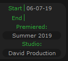 /* ===========================
Add Season and Studio Label */
.data.season::before,
.data.studio::before {
height: 15px;
font-size: 11px;
line-height: 1;
} .data.season::before {
content: "Premiered:";
width: 120px;
border: none;
text-align: center;
} .data.studio::before {
content: "Studio:";
display: block;
padding-top: 2px;
color: var(--category-colour);
}
.data.studio {
margin-top: 73px;
} |
Sep 18, 2019 4:58 AM
#356
| @Valerio_Lyndon Then: the text of premiered and studio is fine however you forgot to put studio: above unknow studio for the problem of the Reposition Content Status code Add Title Overflow will show you two screenshots that show the visual with and without code so as to make you understand, in case i give you all the css code to see better 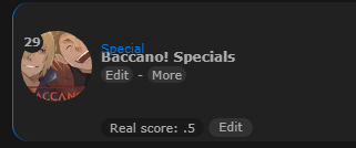  did these things being that the interface of the anime has grown as i can change the height and width of the interface where i insert the tags (i mean that when you click the tag edit button)? Without these last two things i have finished Here is the css code https://controlc.com/4b122b88 |
TaduinSep 18, 2019 5:17 AM
Sep 19, 2019 2:53 AM
#357
Taduin said: That's an unforeseen issue. To fix it, find this code:the text of premiered and studio is fine however you forgot to put studio: above unknow studio /* ==============================
Change Empty Studio Appearance */
.data.licensor:empty::before,
.data.magazine:empty::before,
.data.studio:empty::before {
display: block;
padding: 1px;
background: var(--btn-bg);
border-radius: 8.5px;
color: var(--text) !important;
font-size: 11px !important;
line-height: 15px;
transition: all 0.3s ease;
} .data.studio:empty:before {
content: "Unknown Studio";
} .data.licensor:empty:before {
content: "Unknown Licensor";
} .data.magazine:empty:before {
content: "Unknown Magazine";
}
.data.licensor:empty:hover::before,
.data.magazine:empty:hover::before,
.data.studio:empty:hover::before {
background: var(--btn-bg-h);
color: var(--btn-text-h) !important;
}Once you've found the section, replace it with this new one. /* =================================
Change Empty Studio Appearance v2 */
.data.licensor:empty::after,
.data.magazine:empty::after,
.data.studio:empty::after {
display: block;
padding: 1px;
background: var(--btn-bg);
border-radius: 8.5px;
color: var(--text) !important;
font-size: 11px !important;
line-height: 15px;
transition: all 0.3s ease;
} .data.studio:empty::after {
content: "Unknown Studio";
} .data.licensor:empty::after {
content: "Unknown Licensor";
} .data.magazine:empty::after {
content: "Unknown Magazine";
}
.data.licensor:empty:hover::after,
.data.magazine:empty:hover::after,
.data.studio:empty:hover::after {
background: var(--btn-bg-h);
color: var(--btn-text-h) !important;
}Next, do the same with this section. Replace this: /* ===========================
Add Season and Studio Label */
.data.season::before,
.data.studio::before {
height: 15px;
font-size: 11px;
line-height: 1;
} .data.season::before {
content: "Premiered:";
width: 120px;
border: none;
text-align: center;
} .data.studio::before {
content: "Studio:";
display: block;
padding-top: 2px;
color: var(--category-colour);
}
.data.studio {
margin-top: 73px;
}With this: /* ==============================
Add Season and Studio Label v2 */
.data.season::before,
.data.studio::before,
.data.studio:empty::before {
height: 15px;
font-size: 11px;
line-height: 1;
} .data.season::before {
content: "Premiered:";
width: 120px;
border: none;
text-align: center;
} .data.studio::before,
.data.studio:empty::before {
content: "Studio:";
display: block;
padding: 2px 0 0;
color: var(--category-colour);
}
.data.studio {
margin-top: 73px;
}Taduin said: Yes, I understand. It is possible to achieve this look:for the problem of the Reposition Content Status code Add Title Overflow will show you two screenshots that show the visual with and without code so as to make you understand, in case i give you all the css code to see better  But titles will be single line once again, which I was unsure if you wanted. Since, previously, you had requested multi-line titles. But this will fix the visual discrepancy with "type": /* ============================
Reposition Content Status v3 */
.data.title {
display: flex !important;
flex-flow: row nowrap;
padding: 19px 8px !important;
}
.data.title > * {
margin-right: 6px;
}
.data.title .link.sort {
position: static;
display: block;
padding: 0;
}
.list-table .list-table-data .data.title .add-edit-more {
position: absolute;
bottom: 1px;
left: 8px;
display: block;
}Taduin said: I'm not quite sure what you mean. Google Translate has garbled your message.did these things being that the interface of the anime has grown as i can change the height and width of the interface where i insert the tags (i mean that when you click the tag edit button)? |
Sep 19, 2019 4:10 AM
#358
| @Valerio_Lyndon Then all the codes are fine, now i send you a screen in the box you don't understand  in practice i want to increase the height. Having done this thing i finally finished |
Sep 20, 2019 2:54 AM
#359
Ah, I see. Thank you for the imagery. Here's the code:/* =======================
Tag Edit Box Height Fix */
.data.tags textarea {
top: 3px;
height: calc(100% - 6px) !important;
margin-top: 0;
}If you wish to change the width, just add a "width" property into the code. For example: /* =======================
Tag Edit Box Height Fix */
.data.tags textarea {
top: 3px;
width: 700px !important;
height: calc(100% - 6px) !important;
margin-top: 0;
} |
Sep 20, 2019 3:15 AM
#360
| @Valerio_Lyndon Perfect ! you have finished all the things i asked for, thank you for helping me all this time. If there is a type of system to vote for you who do the themes let me know because i will vote for you 100% |
Sep 21, 2019 3:17 AM
#361
Taduin said: Great. :) Hope you enjoy.@Valerio_Lyndon Perfect ! you have finished all the things i asked for, thank you for helping me all this time. Taduin said: No need, but thank you for the offer.If there is a type of system to vote for you who do the themes let me know because i will vote for you 100% |
Sep 21, 2019 2:34 PM
#362

Taduin said: If there is a type of system to vote for you who do the themes let me know because i will vote for you 100% Well Valerio will get Top Support of the year for the third year in a row for sure :D |
Sep 27, 2019 2:27 AM
#363

 Sorry if you've already answered this somewhere but is there any more personalization options for the banner text? I'd like to move it to the right instead of the left. Possible change the color and font too. |
 |
Sep 29, 2019 3:44 AM
#364
neil said: Try messing around with this code. Add it to the bottom of your CSS.Sorry if you've already answered this somewhere but is there any more personalization options for the banner text? I'd like to move it to the right instead of the left. Possible change the color and font too. #cover-image-container::after {
/*Positioning*/
left: 50%; /*set to "auto" if you give "right" a value*/
right: auto;
margin-left: -475px;
/*Color*/
color: #fff;
/*Shadow Color*/
text-shadow: 1px 4px 7px rgba(0,0,0,.45);
/*Font Family*/
font-family: Oswald;
}If you need help with any of the properties, I advise looking them up on W3Schools. I'll also link Shishio's font tutorial just in case you need help uploading custom ones or anything. You may also find Shishio's inspect element tutorial helpful for this or other modifications. I'll be around if you need any further help. |
Valerio_LyndonSep 29, 2019 12:58 PM
Sep 29, 2019 8:09 AM
#365
Valerio_Lyndon said: neil said: Try messing around with this code. Add it to the bottom of your CSS.Sorry if you've already answered this somewhere but is there any more personalization options for the banner text? I'd like to move it to the right instead of the left. Possible change the color and font too. #cover-image-container::after {
/*Positioning*/
left: 50%; /*set to "auto" if you give "right" a value*/
right: auto;
margin-left: -475px;
/*Color*/
color: #fff;
/*Shadow Color*/
text-shadow: 1px 4px 7px rgba(0,0,0,.45);
/*Font Family*/
font-family: Oswald;
}If you need help with any of the properties, I advise looking them up on W3Schools. I'll also link Shishio's font tutorial just in case you need help uploading custom ones or anything. You may also find Shishio's inspect element tutorial helpful for this or other modifications. I'll be around if you need any further help. I'll be around if you need any further help. Hi. Thanks for replying. I tried the things you mentioned. So everything is working except the fonts. Is this a problem on my end? When I type font names taken from Google Fonts into the css box, nothing pops up and the font remains unchanged. Only the 'cursive' works. Here's my code: 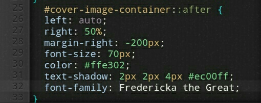 Here's how it looks: 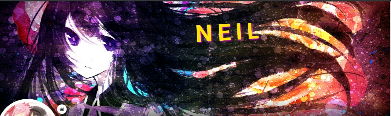 |
|
Sep 30, 2019 12:26 AM
#366
neil said: You need to "import" the font so that you (and others) can view it. Add this to the very top of your CSS:I tried the things you mentioned. So everything is working except the fonts. @\import "https://fonts.googleapis.com/css?family=Fredericka+the+Great"; This import can be found at the bottom right of Google Fonts: 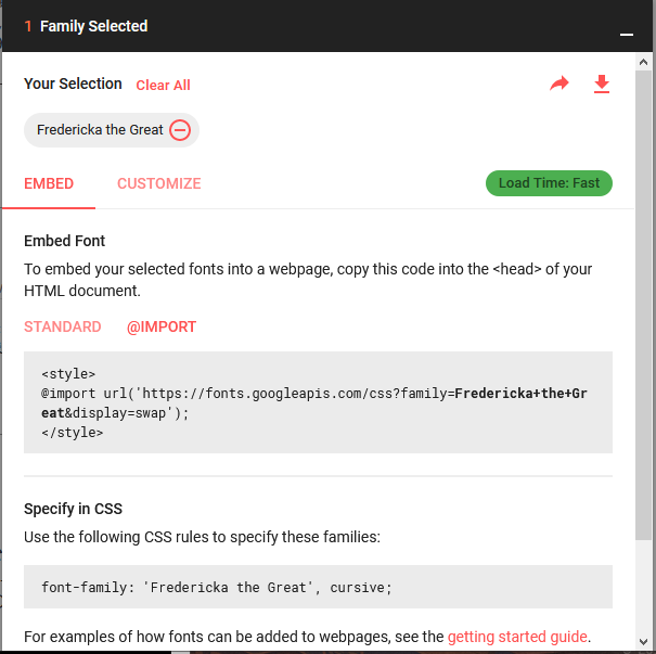 Then it just needs to be changed to the correct format as found under "Allow logged out users and other users to see custom layouts" in this thread: https://myanimelist.net/forum/?topicid=439897 Once it is imported, it can be used on elements throughout the list. |
Valerio_LyndonSep 30, 2019 12:35 AM
Sep 30, 2019 10:52 AM
#367
| Thanks a lot! It worked. And I copied your manga list's color and shadow combination cuz it looked pretty good :) |
neilSep 30, 2019 5:11 PM
|
Oct 1, 2019 6:42 AM
#368
| What's the optimal image resolution for choosing a background picture? I've tried various resolutions but the image gets cropped at the top anyway when I'm on 1080 res settings on my laptop. |
|
Oct 2, 2019 4:08 AM
#369
neil said: The height of the banner is 318 pixels, so for a 1080p display the optimal width would be 1920x318 pixels. It's not common to find images at this size, so you may find it easier to crop an image to it yourself (there are tools or websites that do this). You could also try increasing the height of the banner to something you prefer:What's the optimal image resolution for choosing a background picture? I've tried various resolutions but the image gets cropped at the top anyway when I'm on 1080 res settings on my laptop. Add to the bottom of your CSS, then change the top-most number to what you desire. /* ====================
Change Banner Height */
:root { --banner-height: 318px; }
.cover-block { height: var(--banner-height); }
.header { margin-top: calc(var(--banner-height) - 36px); }
.list-stats { top: calc(var(--banner-height) + 98px); }Add to the bottom of your CSS then change the "50%" to what you desire. /* =======================
Change Banner Crop Area */
.cover-block { background-position-y: 50%; } |
Oct 3, 2019 8:52 AM
#370
| Hiya, @Valerio_Lyndon First off I would like to say it is an amazing design, I am so far really enjoying my experience with it! I have couple of questions, if you font mind: 1)How do i add a border to the header but the color is the same as each category? 2)How can i do the same thing but for the shadow? 3) How do i make the text i hover on (on the bar which says all anime, currently watching, etc.) be the same colour as the underline? Mine: https://imgur.com/a/2GYXyGX What i want: https://imgur.com/pSAPjYv 4)How do i make it to where watching, completed, on hold, dropped and plan to watch (on the tab all anime) are the colour they are associated with (for example, watching would be green and completed would be blue) ? https://imgur.com/TOd0K2k Sorry for bad english. |
WhisperingAshesOct 3, 2019 4:41 PM
Oct 4, 2019 2:54 AM
#371
WhisperingAshes said: Add to the bottom of your CSS:1)How do i add a border to the header but the color is the same as each category? /* ===================
ADD BORDER TO HEADER */
[data-query*='status":7'] {
--header-border: var(--accent);
} [data-query*='status":1'] {
--header-border: var(--watching);
} [data-query*='status":2'] {
--header-border: var(--completed);
} [data-query*='status":3'] {
--header-border: var(--onhold);
} [data-query*='status":4'] {
--header-border: var(--dropped);
} [data-query*='status":6'] {
--header-border: var(--plantowatch);
}
.status-menu-container:before {
height: 56px;
border-width: 4px 0;
border-style: solid;
border-color: var(--header-border);
}
.status-menu:after {
left: -4px;
top: -47px;
border-width: 4px;
box-shadow: 0 0 0 4px var(--header-border);
} .fixed .status-menu:after {
top: 4px;
}WhisperingAshes said: The header shadow?2)How can i do the same thing but for the shadow?  Would that also include the button shadow?  WhisperingAshes said: Add to the bottom of your CSS:3) How do i make the text i hover on (on the bar which says all anime, currently watching, etc.) be the same colour as the underline? /* ====================
Add Colour To Header */
.status-menu .status-button {
transition: color 0.3s ease;
}
/* All Anime */
.status-menu .status-button:nth-of-type(1):hover,
.status-menu .status-button.on:nth-of-type(1) {
color: var(--accent) !important;
}
/* Watching */
.status-menu .status-button:nth-of-type(2):hover,
.status-menu .status-button.on:nth-of-type(2) {
color: var(--watching) !important;
}
/* Completed */
.status-menu .status-button:nth-of-type(3):hover,
.status-menu .status-button.on:nth-of-type(3) {
color: var(--completed) !important;
}
/* On Hold */
.status-menu .status-button:nth-of-type(4):hover,
.status-menu .status-button.on:nth-of-type(4) {
color: var(--onhold) !important;
}
/* Dropped */
.status-menu .status-button:nth-of-type(5):hover,
.status-menu .status-button.on:nth-of-type(5) {
color: var(--dropped) !important;
}
/* Planned */
.status-menu .status-button:nth-of-type(6):hover,
.status-menu .status-button.on:nth-of-type(6) {
color: var(--plantowatch) !important;
}WhisperingAshes said: Firstly, remove your current heading mod.4)How do i make it to where watching, completed, on hold, dropped and plan to watch (on the tab all anime) are the colour they are associated with (for example, watching would be green and completed would be blue) ? https://imgur.com/TOd0K2k Find and delete this line: @\import "https://malcat-gen.appspot.com/headers?template=[data-query*='\"status\":7'] .list-item:nth-child($index){margin-top:48px;}[data-query*='\"status\":7'] .list-item:nth-child($index):before{content:'$content'}";And this section: /* ===============
SECTION HEADERS */
[data-query*='"status":7'] .list-item:nth-child(2) { margin-top: 32px; }
[data-query*='"status":7'] .list-item:before {
position: absolute;
top: -40px;
left: 0;
display: block;
width: 100%;
height: 32px;
color: var(--text-head-h);
font: 20px/32px Oswald;
text-align: right;
letter-spacing: 1px;
text-transform: uppercase;
pointer-events: none;
}Nothing more, nothing less. Then, add this new version: Add to the top of your CSS: @\import "https://malcat-gen.appspot.com/headers?template=[data-query*='\"status\":7']:not([data-query*='order']):not([data-query*='tag\"']):not([data-query*='\"s\"']) .list-item:nth-child($index){margin-top:48px;}[data-query*='\"status\":7']:not([data-query*='order']):not([data-query*='tag\"']):not([data-query*='\"s\"']) .list-item:nth-child($index) .status:before{content:'$content'}";Add to the bottom of your CSS: /* =========================
CATEGORY HEADERS - CUSTOM */
[data-query*='"status":7']:not([data-query*='order']):not([data-query*='order']):not([data-query*='tag"']):not([data-query*='"s"']) .list-item:nth-child(2) { margin-top: 32px; }
[data-query*='"status":7'] .list-item .status::before {
position: absolute;
top: -40px;
left: 0;
display: block;
width: 1060px;
height: 32px;
background: none !important;
color: var(--text-head);
font: 20px/32px Oswald;
text-align: right;
letter-spacing: 1px;
text-transform: uppercase;
pointer-events: none;
} [data-query*='"status":7'] .list-item .watching::before,
[data-query*='"status":7'] .list-item .reading::before {
color: var(--watching);
} [data-query*='"status":7'] .list-item .completed::before {
color: var(--completed);
} [data-query*='"status":7'] .list-item .onhold::before {
color: var(--onhold);
} [data-query*='"status":7'] .list-item .dropped::before {
color: var(--dropped);
} [data-query*='"status":7'] .list-item .plantowatch::before,
[data-query*='"status":7'] .list-item .plantoread::before {
color: var(--plantowatch);
} |
Oct 4, 2019 9:09 AM
#372
Valerio_Lyndon said: WhisperingAshes said: Add to the bottom of your CSS:1)How do i add a border to the header but the color is the same as each category? /* ===================
ADD BORDER TO HEADER */
[data-query*='status":7'] {
--header-border: var(--accent);
} [data-query*='status":1'] {
--header-border: var(--watching);
} [data-query*='status":2'] {
--header-border: var(--completed);
} [data-query*='status":3'] {
--header-border: var(--onhold);
} [data-query*='status":4'] {
--header-border: var(--dropped);
} [data-query*='status":6'] {
--header-border: var(--plantowatch);
}
.status-menu-container:before {
height: 56px;
border-width: 4px 0;
border-style: solid;
border-color: var(--header-border);
}
.status-menu:after {
left: -4px;
top: -47px;
border-width: 4px;
box-shadow: 0 0 0 4px var(--header-border);
} .fixed .status-menu:after {
top: 4px;
}WhisperingAshes said: The header shadow?2)How can i do the same thing but for the shadow? Would that also include the button shadow? WhisperingAshes said: Add to the bottom of your CSS:3) How do i make the text i hover on (on the bar which says all anime, currently watching, etc.) be the same colour as the underline? /* ====================
Add Colour To Header */
.status-menu .status-button {
transition: color 0.3s ease;
}
/* All Anime */
.status-menu .status-button:nth-of-type(1):hover,
.status-menu .status-button.on:nth-of-type(1) {
color: var(--accent) !important;
}
/* Watching */
.status-menu .status-button:nth-of-type(2):hover,
.status-menu .status-button.on:nth-of-type(2) {
color: var(--watching) !important;
}
/* Completed */
.status-menu .status-button:nth-of-type(3):hover,
.status-menu .status-button.on:nth-of-type(3) {
color: var(--completed) !important;
}
/* On Hold */
.status-menu .status-button:nth-of-type(4):hover,
.status-menu .status-button.on:nth-of-type(4) {
color: var(--onhold) !important;
}
/* Dropped */
.status-menu .status-button:nth-of-type(5):hover,
.status-menu .status-button.on:nth-of-type(5) {
color: var(--dropped) !important;
}
/* Planned */
.status-menu .status-button:nth-of-type(6):hover,
.status-menu .status-button.on:nth-of-type(6) {
color: var(--plantowatch) !important;
}WhisperingAshes said: Firstly, remove your current heading mod.4)How do i make it to where watching, completed, on hold, dropped and plan to watch (on the tab all anime) are the colour they are associated with (for example, watching would be green and completed would be blue) ? https://imgur.com/TOd0K2k Find and delete this line: @import "https://malcat-gen.appspot.com/headers?template=[data-query*='"status":7'] .list-item:nth-child($index){margin-top:48px;}[data-query*='"status":7'] .list-item:nth-child($index):before{content:'$content'}";And this section: /* ===============
SECTION HEADERS */
[data-query*='"status":7'] .list-item:nth-child(2) { margin-top: 32px; }
[data-query*='"status":7'] .list-item:before {
position: absolute;
top: -40px;
left: 0;
display: block;
width: 100%;
height: 32px;
color: var(--text-head-h);
font: 20px/32px Oswald;
text-align: right;
letter-spacing: 1px;
text-transform: uppercase;
pointer-events: none;
}Nothing more, nothing less. Then, add this new version: Add to the top of your CSS: @import "https://malcat-gen.appspot.com/headers?template=[data-query*='"status":7']:not([data-query*='order']):not([data-query*='tag"']):not([data-query*='"s"']) .list-item:nth-child($index){margin-top:48px;}[data-query*='"status":7']:not([data-query*='order']):not([data-query*='tag"']):not([data-query*='"s"']) .list-item:nth-child($index) .status:before{content:'$content'}";Add to the bottom of your CSS: /* =========================
CATEGORY HEADERS - CUSTOM */
[data-query*='"status":7']:not([data-query*='order']):not([data-query*='order']):not([data-query*='tag"']):not([data-query*='"s"']) .list-item:nth-child(2) { margin-top: 32px; }
[data-query*='"status":7'] .list-item .status::before {
position: absolute;
top: -40px;
left: 0;
display: block;
width: 1060px;
height: 32px;
background: none !important;
color: var(--text-head);
font: 20px/32px Oswald;
text-align: right;
letter-spacing: 1px;
text-transform: uppercase;
pointer-events: none;
} [data-query*='"status":7'] .list-item .watching::before,
[data-query*='"status":7'] .list-item .reading::before {
color: var(--watching);
} [data-query*='"status":7'] .list-item .completed::before {
color: var(--completed);
} [data-query*='"status":7'] .list-item .onhold::before {
color: var(--onhold);
} [data-query*='"status":7'] .list-item .dropped::before {
color: var(--dropped);
} [data-query*='"status":7'] .list-item .plantowatch::before,
[data-query*='"status":7'] .list-item .plantoread::before {
color: var(--plantowatch);
}Thank you so much it worked like a charm! :D For number two i meant, how do i make the shadow of this the colour of each category: (Im really for not explaining it properly)  Im sorry i have some more questions ;w; For some odd reason when i select a category (for example Completed, all anime will be the same colour as completed:  Is there a way to make (tv, ova, movie etc) like a bold text? and how do i make airing glow (for each category)?  |
WhisperingAshesOct 4, 2019 9:16 AM
Oct 6, 2019 5:50 AM
#373
Before anything else, add this to the bottom of your CSS:/* ================
All Anime Colour */
:root { --all-anime: #1dc48f; }
/* =========================
Category Colour Variables */
[data-query*='"status":7'] {
--category-colour: var(--all-anime);
} [data-query*='"status":1'] {
--category-colour: var(--watching);
} [data-query*='"status":2'] {
--category-colour: var(--completed);
} [data-query*='"status":3'] {
--category-colour: var(--onhold);
} [data-query*='"status":4'] {
--category-colour: var(--dropped);
} [data-query*='"status":6'] {
--category-colour: var(--plantowatch);
}
.status.watching, .status.reading {
--item-category-colour: var(--watching);
} .status.completed {
--item-category-colour: var(--completed);
} .status.onhold {
--item-category-colour: var(--onhold);
} .status.dropped {
--item-category-colour: var(--dropped);
} .status.plantowatch, .status.plantoread {
--item-category-colour: var(--plantowatch);
}WhisperingAshes said: Try this.For number two i meant, how do i make the shadow of this the colour of each category: https://imgur.com/1SAMGFQ.png /* =============================
Category-Coloured Name Shadow */
#cover-image-container:after {
color: #fff;
text-shadow: 2px 2px 8px var(--category-colour);
}WhisperingAshes said: Hmm, odd. This should fix it:For some odd reason when i select a category (for example Completed, all anime will be the same colour as completed: https://imgur.com/dYaXClC.gif /* ===============================
Fix for All Anime Button Colour */
.status-menu .status-button:nth-of-type(1):hover,
.status-menu .status-button.on:nth-of-type(1) {
color: var(--all-anime) !important;
}
.status-button.all_anime::after {
background: var(--all-anime) !important;
}WhisperingAshes said: Here you go. Hopefully the glow looks alright.Is there a way to make (tv, ova, movie etc) like a bold text? and how do i make airing glow (for each category)? https://imgur.com/9gQBofD.png /* ===========
Bold "Type" */
.data.type {
font-weight: bold;
}
/* ======================
Glowing Content Status */
.content-status, .rewatching, .rereading {
color: #e8e8e8 !important;
text-shadow:
var(--category-colour) 1px 1px 7px,
var(--category-colour) 0px 0px 2px,
var(--category-colour) 0px 0px 1px
!important;
}For simple tweaks such as bolding the "type", you may wish to look into Inspect Element. It may take some learning, but allows for quickly changing simple aspects. Shishio has a video, which may or may not be helpful to you: [Link]  Thanks for using images, it's quite helpful. |
Oct 6, 2019 2:29 PM
#374
Valerio_Lyndon said: Before anything else, add this to the bottom of your CSS: /* ================
All Anime Colour */
:root { --all-anime: #1dc48f; }
/* =========================
Category Colour Variables */
[data-query*='"status":7'] {
--category-colour: var(--all-anime);
} [data-query*='"status":1'] {
--category-colour: var(--watching);
} [data-query*='"status":2'] {
--category-colour: var(--completed);
} [data-query*='"status":3'] {
--category-colour: var(--onhold);
} [data-query*='"status":4'] {
--category-colour: var(--dropped);
} [data-query*='"status":6'] {
--category-colour: var(--plantowatch);
}
.status.watching, .status.reading {
--item-category-colour: var(--watching);
} .status.completed {
--item-category-colour: var(--completed);
} .status.onhold {
--item-category-colour: var(--onhold);
} .status.dropped {
--item-category-colour: var(--dropped);
} .status.plantowatch, .status.plantoread {
--item-category-colour: var(--plantowatch);
}WhisperingAshes said: Try this.For number two i meant, how do i make the shadow of this the colour of each category: https://imgur.com/1SAMGFQ.png /* =============================
Category-Coloured Name Shadow */
#cover-image-container:after {
color: #fff;
text-shadow: 2px 2px 8px var(--category-colour);
}WhisperingAshes said: Hmm, odd. This should fix it:For some odd reason when i select a category (for example Completed, all anime will be the same colour as completed: https://imgur.com/dYaXClC.gif /* ===============================
Fix for All Anime Button Colour */
.status-menu .status-button:nth-of-type(1):hover,
.status-menu .status-button.on:nth-of-type(1) {
color: var(--all-anime) !important;
}
.status-button.all_anime::after {
background: var(--all-anime) !important;
}WhisperingAshes said: Here you go. Hopefully the glow looks alright.Is there a way to make (tv, ova, movie etc) like a bold text? and how do i make airing glow (for each category)? https://imgur.com/9gQBofD.png /* ===========
Bold "Type" */
.data.type {
font-weight: bold;
}
/* ======================
Glowing Content Status */
.content-status, .rewatching, .rereading {
color: #e8e8e8 !important;
text-shadow:
var(--category-colour) 1px 1px 7px,
var(--category-colour) 0px 0px 2px,
var(--category-colour) 0px 0px 1px
!important;
}For simple tweaks such as bolding the "type", you may wish to look into Inspect Element. It may take some learning, but allows for quickly changing simple aspects. Shishio has a video, which may or may not be helpful to you: [Link] Thanks for using images, it's quite helpful. Everything works thank you so much! Im sorry about the pictures i couldnt figure out how to use it earlier on. I just have one issue with the glow of the airing, how do i make it to where the "-" doesnt glow. If i cant is there a way to remove that "-"? 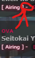 |
Oct 7, 2019 2:21 AM
#375
WhisperingAshes said: Don't be sorry. :) It's nice to have but not a requirement.Everything works thank you so much! Im sorry about the pictures i couldnt figure out how to use it earlier on. WhisperingAshes said: Ah, good question. You can remove the dash from airing with this:I just have one issue with the glow of the airing, how do i make it to where the "-" doesnt glow. If i cant is there a way to remove that "-"? https://imgur.com/FJTryeC.png /* ===============================
Remove Dash from Content Status */
.content-status::after, .rereading::after, .rewatching::after {
content: "] ";
}/* =========================
Add Dash to Add-Edit-More */
.add-edit-more::before {
content: "-";
}
[style*="none"] + [style*="none"] + .add-edit-more::before {
content: none;
} |
Oct 7, 2019 1:56 PM
#376
Valerio_Lyndon said: WhisperingAshes said: Don't be sorry. :) It's nice to have but not a requirement.Everything works thank you so much! Im sorry about the pictures i couldnt figure out how to use it earlier on. WhisperingAshes said: Ah, good question. You can remove the dash from airing with this:I just have one issue with the glow of the airing, how do i make it to where the "-" doesnt glow. If i cant is there a way to remove that "-"? https://imgur.com/FJTryeC.png /* ===============================
Remove Dash from Content Status */
.content-status::after, .rereading::after, .rewatching::after {
content: "] ";
}/* =========================
Add Dash to Add-Edit-More */
.add-edit-more::before {
content: "-";
}
[style*="none"] + [style*="none"] + .add-edit-more::before {
content: none;
}Hehe, ok i will make sure to keep that in mind. Thank you once again it works like a charm! You have been really great help thank you very much i coudln't of done it without you! :D |
Oct 7, 2019 7:18 PM
#377
Oct 14, 2019 6:46 AM
#378

| @Valerio_Lyndon Thank you for making this clean and beautiful list design!! I have problem with large cover, it doesn't load. I have tried your solution in FAQs to no avail. Could you help me spot the problem? I'd also like to know the CSS selector for large cover so i can try to fix it myself. My anime list Minified css: @\import "https://malscraper.azurewebsites.net/covers/auto/presets/dataimagelinkbefore";@\import "https://fonts.googleapis.com/css?family=Oswald";:root{--name:none;--avatar:url(https://cdn.myanimelist.net/images/userimages/3091981.jpg);--banner:url(https://i.imgur.com/3uDqTw4.jpg);--pbg:#f2f2f2;--bg:#fff;--bg-dark:#ddd;--text:#323232;--text-h:#787878;--text-dim:#bababa;--text-dim-h:#646464;--text-dark:#111;--icon:#323232;--accent:pink;--accent-h:#ef8295;--btn-bg:#ebebeb;--btn-bg-h:pink;--btn-head-bg-h:pink;--btn-text-h:#fff;--text-head:#9b9b9b;--text-head-h:#787878;--watching:pink;--completed:pink;--onhold:pink;--dropped:pink;--plantowatch:pink;--cover-bg:#323232;--edit-btn:#d9d9d9;--checkmark:pink;--border-rd:10px}#advanced-options .advanced-options-button a,#fancybox-close,#search-box,#search-box input,#search-box:after,.data.chapter,.data.image .link:after,.data.licensor a,.data.priority,.data.progress,.data.tags a,.data.tags a.edit:after,.data.volume,.fixed .status-menu:after,.header .header-title:after,.icon-menu svg,.icon-menu.setting,.icon-menu.setting .text,.icon-menu.setting .text a,.icon-menu:after,.icon-menu:before,.list-table .list-table-header .header-title .link.sort,.list-table-header .header-title,.status-button:after,.status-menu-container.fixed .status-menu,.status-menu-container:not(.fixed) .status-menu,.status-menu:after{transition:all .3s ease!important}#advanced-options .advanced-options-header .description,#advanced-options .advanced-options-header .description:before,#advanced-options [class*="-widget"] input,#advanced-options [class*="-widget"] label,#advanced-options [class*="-widget"] select,#search-button i,.header-info a,.list-table-data a,.more-info .td1>div>a{transition:all .15s ease!important}.header .header-title,.header-info,.icon-menu,.icon-menu.quick-add:before,.list-menu-float .icon-menu,.list-table>tbody:first-of-type:after,.stats a{display:inline-block;height:26px!important;width:26px!important;background:var(--bg)!important;border-radius:13px;color:var(--text)!important;font:normal 0/26px Arial,Verdana,sans-serif;text-indent:0;text-align:left;white-space:nowrap;vertical-align:top;overflow:hidden;box-shadow:0 1px 2px rgba(0,0,0,.2);transition:all .3s ease!important}.header .header-title:hover,.icon-menu:hover,.list-menu-float .icon-menu:hover,.stats a:hover{width:100px!important;background:var(--btn-head-bg-h)!important;color:var(--btn-text-h)!important}html{position:relative;min-height:100%}body{padding-bottom:64px;background:var(--pbg) no-repeat center/cover fixed!important}.list-container{position:static;width:100%;background:0 0!important;border:none}.list-block{width:1060px;min-height:initial;margin:64px auto 0}.status-menu-container.fixed+.list-block{margin-top:128px!important}.list-unit{width:100%!important;margin:0}.list-table{border:none!important}a,a:hover{color:var(--accent)}.initialize-tutorial{display:none!important}.cover-block{position:absolute;top:0;left:0;z-index:-5;width:100%;min-width:1060px;height:318px;background:var(--cover-bg) var(--banner) no-repeat center top/cover scroll}.cover-block:before{content:"";position:absolute;bottom:0;left:0;display:block;width:100%;height:50px;background:linear-gradient(to top,rgba(0,0,0,.5),rgba(0,0,0,0))}#cover-image,.btn-list-setting{display:none!important}#list-container #cover-image-container{display:block!important;width:1060px;height:100%;padding:0;background:var(--character) no-repeat right center/contain;margin:0 auto}#cover-image-container:after{content:var(--name);position:absolute;top:55px;left:50%;margin-left:-475px;color:#fff;font:bold 60px/60px Oswald;text-align:left;letter-spacing:15px;text-shadow:1px 4px 7px rgba(0,0,0,.45);text-transform:uppercase;white-space:pre;transform:scale(.9) perspective(350px) rotateY(8deg) rotateZ(-3deg);animation:name-slide 3s 1 .5s backwards}@keyframes name-slide{0%{top:12px;margin-left:-535px;opacity:0;letter-spacing:0;animation-timing-function:ease-out}90%{top:55px;margin-left:-475px}100%{letter-spacing:15px;opacity:1;animation-timing-function:cubic-bezier(0,0,.75,1)}}.header{display:flex;height:36px;margin-top:282px}.header .header-menu{position:static;display:flex;width:auto;height:26px;margin-left:6px;order:2}.btn-menu{height:0;font-size:0!important}.btn-menu #header-menu-button{display:none}.header .header-title{position:static;margin-left:155px;order:1;z-index:1}.header .header-title:before{content:"\f015";display:inline-block;width:26px;background:0 0!important;font-size:14px;font-family:FontAwesome;text-align:center!important}.header .header-title:hover:before{color:var(--btn-text-h)!important}.header .header-title:after{content:"Home";display:inline-block;height:26px!important;width:26px!important;font:14px/26px Arial,Verdana,sans-serif;color:var(--text)}.header .header-title:hover:after{color:var(--btn-text-h)}.header .header-menu .list-menu{position:static;order:1;display:inline-block;height:26px;border:none;background:0 0;box-shadow:none}.header .icon-menu.anime-list,.header .icon-menu.manga-list{position:static;padding:0;margin-right:6px;font-size:0!important;font-weight:400!important}.header .icon-menu.anime-list .text,.header .icon-menu.manga-list .text{position:static!important;font:14px/26px Arial,Verdana,sans-serif;vertical-align:top}.header .header-menu .list-menu .icon-menu svg.icon{position:static;max-width:14px;max-height:14px;padding:6px;fill:var(--text)}.header .header-menu .list-menu .icon-menu:hover svg.icon{fill:var(--btn-text-h)}.header-info{position:static;width:auto!important;padding:0 8px;margin:0!important;font-size:12px;order:2}.header-info a{color:var(--text)!important;text-decoration:none!important}.header-info a:hover{color:var(--text-h)!important}.btn-menu a.username{position:absolute;left:1px;top:-7px;display:block;width:150px;height:150px;background:0 0;border-radius:50%;font-size:0;z-index:36}.btn-menu span.username{display:none!important}.status-menu-container{position:relative;z-index:35!important;width:100%;min-width:1060px;height:64px;background:0 0;border:none!important}.status-menu-container.fixed{z-index:45!important}.status-menu-container:after,.status-menu-container:before{content:"";position:absolute;left:0;z-index:-1;display:block;width:100%}.status-menu-container:before{top:0;height:64px;background:var(--bg)}.status-menu-container:after{top:64px;height:2px;background:linear-gradient(to bottom,rgba(0,0,0,.2),rgba(0,0,0,0))}.status-menu{position:relative;display:block!important;width:1060px;padding:0 0 0 173px;margin:0 auto;box-sizing:border-box}.fixed .status-menu{padding:0 0 0 71px}.status-menu:after{content:"";position:absolute;top:-51px;left:-8px;width:150px;height:150px;background:var(--bg-dark) var(--avatar) no-repeat center top/cover;border:8px solid var(--bg);border-radius:50%;opacity:1;box-shadow:0 1px 2px rgba(0,0,0,.2)}.fixed .status-menu:after{top:0;width:48px;height:48px;box-shadow:none}.status-menu .status-button{display:inline-block!important;height:32px;padding:16px 0!important;margin:0 15px!important;color:var(--text-head)!important;font-size:17.6px!important;line-height:30px;white-space:nowrap;font-family:Oswald!important;text-transform:uppercase;letter-spacing:1px}.status-menu .status-button.on{color:var(--text-head-h)!important}.status-button.all_anime:after{background:var(--accent)!important}.status-button.reading:after,.status-button.watching:after{background:var(--watching)!important}.status-button.completed:after{background:var(--completed)!important}.status-button.onhold:after{background:var(--onhold)!important}.status-button.dropped:after{background:var(--dropped)!important}.status-button.plantoread:after,.status-button.plantowatch:after{background:var(--plantowatch)!important}.status-menu-container .search-container{top:19px;right:0}#search-box{padding-right:22px;border:2px solid transparent;border-radius:13px;margin-top:0!important}#search-box.open{width:150px!important;background:var(--btn-bg);border:2px solid var(--bg-dark)}#search-box input{background:0 0;border:none;border-radius:13px;outline:0;color:var(--text)}#search-box.open input{text-indent:7.5px;line-height:20px}.status-menu-container .search-container #search-button{position:absolute;right:0;top:0;width:26px;height:26px;border-radius:13px;margin-top:0;text-align:center}.open~#search-button{pointer-events:none}#search-button i{color:var(--text-head)!important;font-size:18px;line-height:26px}.open~#search-button i{font-size:14px;line-height:24px}#search-box:after{content:"";position:absolute;right:0;top:0;width:0;height:22px;padding-right:22px;background:linear-gradient(to right,var(--btn-bg) 2px,transparent 9.5px,transparent 142.5px,var(--btn-bg) 150px) content-box;border:2px solid transparent;border-radius:13px;pointer-events:none;opacity:0}#search-box.open:after{width:150px;opacity:1}.list-menu-float{position:relative;top:auto;display:block;width:904px;height:0;padding-left:155px;margin:0 auto;border:none;background:0 0;text-align:left;font-size:0;z-index:38}.icon-menu,.list-menu-float form{display:inline-block!important}.list-menu-float .icon-menu{top:74px;margin:0 6px 0 0}.list-menu-float .icon-menu .text{top:0!important;left:26px!important;display:inline-block;width:auto!important;height:26px;color:var(--text)!important;font-size:14px!important;opacity:1!important}.list-menu-float .icon-menu:hover .text{color:var(--btn-text-h)!important}.list-menu-float .icon-menu svg.icon{top:6px!important;left:6px!important;max-width:14px;max-height:14px;fill:var(--text)}.list-menu-float .icon-menu:hover svg.icon{fill:var(--btn-text-h)}[data-owner="1"] .list-menu-float .icon-menu.profile{position:absolute;left:1px;top:-43px;display:block!important;width:150px!important;height:150px!important;background:0 0!important;border-radius:50%;font-size:0;box-shadow:none}[data-owner=""] .icon-menu.profile{background-image:none!important}[data-owner=""] .icon-menu.profile:before{content:"\f007";position:absolute;top:0;left:0;display:block;width:26px;height:26px;font-size:14px;line-height:26px;text-align:center;color:var(--text);font-family:FontAwesome}[data-owner=""] .icon-menu.profile:hover:before{color:var(--btn-text-h)}[data-owner=""] .icon-menu.profile:after{content:"Profile";position:absolute;top:0;left:26px;display:inline-block;height:26px;font-size:14px;color:var(--text)}[data-owner=""] .icon-menu.profile:hover:after{color:var(--btn-text-h)}.icon-menu.quick-add svg{display:none}.icon-menu.quick-add:before{content:"\f067";background:0 0!important;font-size:14px;text-align:center;font-family:FontAwesome;box-shadow:none}.icon-menu.quick-add:hover:before{color:var(--btn-text-h)!important}.icon-menu.setting{overflow:visible}.icon-menu.setting:hover{width:26px!important}.icon-menu.setting .text{top:-2px!important;left:0!important;width:240px!important;height:26px!important;padding:2px 0;overflow:visible;font-size:0!important;opacity:1!important;pointer-events:none;z-index:-1}.icon-menu.setting:hover .text{pointer-events:auto}.icon-menu.setting .text a{position:absolute!important;top:2px!important;left:13px!important;width:0!important;height:26px!important;background:var(--btn-bg-h)!important;border:none!important;border-radius:0 13px 13px 0;overflow:hidden;color:var(--btn-text-h)!important;font:14px/26px Arial,Verdana,sans-serif!important;text-indent:9px;text-align:center;white-space:nowrap;opacity:0!important}.icon-menu.setting:hover .text a{width:120px!important;border-radius:0 13px 13px 0;opacity:1!important}.icon-menu.setting:hover .text a:hover{background:var(--accent-h)!important}.icon-menu.setting:hover .text .link-list-setting{left:120px!important}.icon-menu.setting .text a:hover{background:var(--btn-head-bg-h)!important}.list-status-title{width:1060px!important;height:64px!important;margin-top:-64px;background:0 0!important}.list-status-title .text{display:none!important}.list-status-title .stats{position:absolute;top:10px;right:32px!important;display:block;width:auto;height:26px!important;border-radius:0 0 26px 0;font-size:0;line-height:13px!important}.stats a{margin:0 0 0 6px!important;font:14px/26px Arial,Verdana,sans-serif}.stats a i{width:26px;text-align:center}.list-stats{position:absolute;top:416px;width:1060px!important;background:0 0!important;color:var(--btn-text-h)!important;font-weight:700}.list-table>tbody:first-of-type{position:relative;top:-26px;margin-top:-30px;left:1032px;display:block;width:30px;height:30px;background:0 0!important;z-index:39}.list-table>tbody:first-of-type:after{content:"\f0dc";position:absolute;top:0;right:0;margin:2px;font-size:14px;font-family:FontAwesome;text-align:center}.list-table>tbody:first-of-type:hover:after{background:var(--btn-head-bg-h)!important;color:var(--btn-text-h)!important}.list-table-header{position:absolute;top:0;right:15px;display:block;width:auto;height:26px;padding:2px 0;font-size:0;white-space:nowrap;pointer-events:none;z-index:-1}.list-table>tbody:first-of-type:hover .list-table-header{pointer-events:auto}.list-table .list-table-header .header-title{position:relative;display:inline-block;width:auto!important;height:auto;padding:0!important;border:none;background:0 0;font-weight:400}.list-table>tbody:first-of-type:hover .header-title{opacity:1}.list-table .list-table-header .header-title .link.sort{display:block;width:13px;height:26px;background:var(--btn-bg-h);border-radius:13px 0 0 13px;margin-left:-13px;overflow:hidden;box-sizing:border-box;color:var(--btn-text-h)!important;font:11px/26px Verdana,Arial,sans-serif;text-align:center;text-indent:-9px;white-space:normal;opacity:0}.list-table tbody:first-of-type:hover .list-table-header .header-title .link.sort{width:80px;opacity:1}.list-table-header .header-title a.hover_info{display:none!important}.list-table .list-table-header .header-title .link.sort:hover{background:var(--accent-h)}.list-table-header .header-title a .sort-icon{position:absolute;left:50%;width:10px;height:10px;margin-left:-5px;color:inherit!important;font-size:10px;line-height:10px}.sort-icon.fa-sort-asc{top:2px}.sort-icon.fa-sort-desc{bottom:2px}.anime tbody:first-of-type:hover .header-title.finished a,.anime tbody:first-of-type:hover .header-title.started a{padding:0 13px}.manga tbody:first-of-type:hover .header-title.finished a,.manga tbody:first-of-type:hover .header-title.started a{width:100px!important}.header-title.title a{font-size:0!important}.header-title.title a:after{content:"Title";font-size:11px}.list-table-header .header-title.tags{display:none!important}.list-item{position:relative;display:block;width:100%;background:var(--bg)!important;border:none;margin-bottom:8px}.list-table-data{position:relative;display:flex;max-width:1060px;min-height:64px;align-items:center;font-size:0}.data{display:block!important;padding:0!important;border:none!important;flex:0 0 auto;color:var(--text);font-size:11px}.list-table .list-table-data .data a{color:var(--text)!important;text-decoration:none!important}.list-table .list-table-data a:not(.edit-disabled):hover{color:var(--accent)!important}.list-unit .loading-space{margin:14px 0 22px}.list-unit .loading-space #loading-spinner{width:20px;height:20px;margin:0 auto;color:var(--text)}.list-table[data-items="[]"]:after{content:"No entries found. Try another category?";display:block;width:900px;background:var(--bg);border-radius:16px;margin:32px auto;color:var(--text);font:16px/32px Arial,Verdana,sans-serif;text-align:center}[data-owner="1"] .list-table[data-items="[]"]:after{content:"No entries found. Why not add some?"}[data-query*='"s":'] .list-table[data-items="[]"]:after{content:"No entries found. Perhaps your search terms are too restrictive?"}.data.status{position:absolute;top:0;left:0;width:3px!important;height:100%;padding:0!important}.list-table .list-table-data .data.status{width:100%!important;z-index:-1;border-radius:var(--border-rd);left:-3px}.status.reading,.status.watching{background:var(--watching)!important}.status.completed{background:var(--completed)!important}.status.onhold{background:var(--onhold)!important}.status.dropped{background:var(--dropped)!important}.status.plantoread,.status.plantowatch{background:var(--plantowatch)!important}.data.image{width:64px;height:64px;margin:4px 0 4px 8px;order:1}.data.image a{position:relative;display:block!important;border-radius:50%;overflow:hidden}.data.image img{width:64px!important;height:64px!important;border:none!important;object-fit:cover}.data.image a:after{content:"\f08e";position:absolute;top:0;left:0;display:block;width:100%;height:100%;background:rgba(0,0,0,.5);color:#fff;font:22px/64px FontAwesome;opacity:0}.data.image a:hover:after{opacity:1}.data.number{position:relative;top:-22px;width:20px;height:20px;background:var(--bg);border-radius:10px;margin:0 -28px 0 8px;order:1;line-height:20px;font-weight:700;z-index:1;display:none!important}.list-item:nth-child(n+101) .data.number{text-indent:-7px}.list-item:nth-child(n+1001) .data.number{width:27px;margin-right:-35px}.list-item:nth-child(n+10001) .data.number{width:34px;margin-right:-42px}.data.title{position:relative;width:142px;height:16px;padding:32px 0 0 8px!important;order:12;flex:1 0 auto;line-height:16px}.data.title .link.sort{position:absolute;top:16px;left:8px;display:inline-block;max-width:100%;padding-right:16px;overflow:hidden;box-sizing:border-box;line-height:16px;white-space:nowrap;text-overflow:ellipsis}.list-table .list-table-data .title .link:hover{color:var(--accent)!important}.content-status,.rereading,.rewatching{color:var(--text-dim)!important;font-size:10px!important}.content-status:before,.rereading:before,.rewatching:before{content:"["}.content-status:after,.rereading:after,.rewatching:after{content:"] - "}.add-edit-more{display:inline;float:none!important;color:var(--text-dim)}.list-table .list-table-data .title .add-edit-more a{color:var(--text-dim)!important}.list-table .list-table-data .title .add-edit-more a:hover{color:var(--text-dim-h)!important}.icon-watch{display:none!important}.data.type{position:relative;top:-16px;z-index:1;width:92px;height:16px;padding-left:8px!important;margin-right:-100px;order:11;text-align:left!important;color:var(--text-dim);line-height:16px;font-size:10px}.data.score{position:relative;order:13}.data.score a{display:block}@-moz-document url-prefix(){.data.score select{padding:0 16px 0 0;text-align:center}}.data.score select:focus{outline:0!important;box-shadow:0 2px 2px rgba(0,0,0,.3)}.data.chapter,.data.progress,.data.volume{width:92px;order:15}.data.chapter{margin-top:-34px}.data.volume{margin:34px 0 0 -92px},.data.chapter span,.data.progress span,.data.volume span{color:var(--text)}.data.progress:before{content:"Progress:";color:var(--text-dim)}.data.score:before{content:"Score:";color:var(--text-dim)}.completed .data.progress:before{content:"Episodes:";color:var(--text-dim)}.data.chapter:before{content:"Chapters:";color:var(--text-dim)}.data.volume:before{content:"Volumes:";color:var(--text-dim)}.data.chapter span:only-of-type:after,.data.volume span:only-of-type:after{content:" \f058";position:relative;top:1px;color:var(--checkmark);font-family:FontAwesome;font-size:13px}.data.score a:only-of-type:before{content:" \f006";position:relative;color:var(--checkmark);font-family:FontAwesome}.data.chapter input,.data.progress input,.data.volume input{height:15px;padding:0 1px;background:var(--btn-bg);border:1px solid var(--bg-dark);outline-color:var(--accent)!important;box-sizing:border-box;color:var(--text-dark);font:11px Verdana,Arial,sans-serif}.data.priority{position:relative;width:92px;height:74px;background:var(--bg);margin-right:-92px;order:14;color:var(--text);line-height:74px;opacity:1;pointer-events:none;z-index:1}.status:not(.plantowatch):not(.plantoread)~.data.priority{display:none!important}.list-item:hover .data.priority{opacity:0}.data.priority:before{content:"\f0a2";font-family:FontAwesome}.data.magazine,.data.rated,.data.retail,.data.season,.data.storage,.data.studio{margin-right:4px;order:20;flex-shrink:1}.data.rated{width:40px}.data.magazine{width:90px}.data.retail,.data.storage{width:72px}.data.season{width:92px;order:19}.data.studio{width:140px;order:19}.data.magazine:before,.data.rated:before,.data.retail:before,.data.season:before,.data.storage:before,.data.studio:before{display:block;color:var(--text-dim)}.data.rated:before{content:"Rated:"}.data.magazine:before{content:"Magazine:"}.data.retail:before,.data.storage:before{content:"Storage:"}.data.season:before{content:"Premiered:"}.data.studio:before{content:"Studio:"}.data.season:empty:after{content:"Unknown";display:block;color:var(--text-dim)}.data.licensor,.data.tags{width:120px;padding:3px 0!important;margin-right:8px;order:21;flex-shrink:1}.data.licensor span,.data.tags span{display:block;padding:1px 0;font-size:0!important;line-height:0}.data.licensor a,.data.tags a:not(.edit){display:block;padding:1px;background:var(--btn-bg-h);border-radius:8.5px;color:var(--btn-text-h)!important;font-size:11px!important;line-height:15px}.list-table .list-table-data .licensor span a:hover,.list-table .list-table-data .tags span a:hover{background:var(--accent-h);color:var(--btn-text-h)!important}.data.licensor:empty:before,.data.magazine:empty:before,.data.studio:empty:before{display:block;padding:1px;color:var(--text-dim);font-size:10px;line-height:15px;white-space:pre}.data.studio:empty:before{content:"Unknown\aStudio"}.data.licensor:empty:before{content:"Unknown\aLicensor"}.data.magazine:empty:before{content:"Unknown\aMagazine"}.data.tags textarea{position:absolute;top:3px;right:4px;z-index:5;width:530px!important;height:calc(100% - 6px)!important;background:var(--btn-bg);border:1px solid var(--bg-dark);outline-color:var(--accent)!important;box-sizing:border-box;resize:none;color:var(--text)}.data.tags a.edit{position:absolute;top:0;right:0;width:5px!important;height:100%!important;background:var(--edit-btn);text-align:left!important;font-size:0!important;opacity:0;z-index:1;border-radius:0 var(--border-rd) var(--border-rd) 0}.list-item:hover .data.tags a.edit{opacity:.7}.list-item:hover .data.tags a.edit:hover{width:25px!important;opacity:1}.data.tags a.edit:after{content:"\f040";position:absolute;top:50%;right:0;width:100%;height:20px;margin-top:-10px;color:var(--text);font:0/20px FontAwesome;text-align:center;opacity:0}.data.tags a.edit:hover:after{font-size:14px;opacity:1}.data.airing-finished,.data.airing-started,.data.days,.data.finished,.data.started{position:relative;width:100px;height:14px;overflow:hidden;order:25;color:var(--text);font-size:9px;line-height:14px;text-align:left!important;text-overflow:ellipsis}.data.started{top:-20px}.data.finished{top:0;margin-left:-100px}.data.days{top:20px;margin-left:-100px}.data.airing-started{top:-10px}.data.airing-finished{top:10px;margin-left:-100px}.data.airing-finished:before,.data.airing-started:before,.data.days:before,.data.finished:before,.data.started:before{display:inline-block;width:29px;padding-right:4px;border-right:1px solid var(--text-dim);text-align:right;color:var(--text-dim)}.data.started:before{content:"Start"}.data.finished:before{content:"End"}.data.days:before{content:"Days"}.data.airing-started:before{content:"Aired"}.manga .data.airing-started:before{content:"Issued"}.data.airing-finished:before{content:"to"}.manga .data.airing-finished,.manga .data.airing-started{width:107px}.manga .data.airing-finished{margin-left:-107px}.manga .data.airing-finished:before,.manga .data.airing-started:before{width:36px}.more-info{border:none!important}.more-info .td1{position:relative;padding-top:23px;color:var(--text-dark)}.more-info .td1>div{margin:0}.more-info .td1>div>a{position:absolute;top:0;left:0;border-bottom:2px solid var(--accent)}.list-table .more-info .more-content a{color:var(--text-dark)!important}.list-table .more-info .more-content a:hover{color:var(--accent)!important}footer{position:absolute;bottom:0;left:0;width:100%}#footer-block{min-width:1060px;height:32px;padding:16px 0;background:var(--bg)}#footer-block:before{content:"";position:absolute;left:0;top:-2px;width:100%;min-width:1060px;height:2px;background:linear-gradient(to top,rgba(0,0,0,.1),rgba(0,0,0,0))}#copyright{padding:0;color:var(--text-head);line-height:16px}#copyright:after{content:"\aList design by Valerio Lyndon.";white-space:pre}#fancybox-overlay{background:#000!important;opacity:.2!important}#fancybox-outer [class^=fancy-]{display:none}#fancybox-outer{background:var(--bg)!important;box-shadow:0 0 32px rgba(0,0,0,.5)}#fancybox-outer #fancybox-close{top:-13px;right:-13px;width:16px;height:16px;padding:2px;background:var(--btn-bg);border:3px solid var(--btn-text-h);border-radius:13px;color:var(--text);text-align:center;box-shadow:0 1px 2px rgba(0,0,0,.2)}#fancybox-outer #fancybox-close:after{content:"\f00d";display:block;margin-top:-1px;font:16px/1 FontAwesome}#fancybox-outer #fancybox-close:hover{background:var(--text);color:var(--btn-text-h)}#advanced-options{top:64px;width:910px;padding:32px 0;background:var(--bg);border:none;box-shadow:0 0 32px rgba(0,0,0,.5);color:var(--text-dark)}#advanced-options .advanced-options-button,#advanced-options .advanced-options-header,#advanced-options [class*="-widget"]{width:100%;padding:0;border:none}#advanced-options .filter-widget:last-of-type,#advanced-options .sort-widget:last-of-type{padding-bottom:0}#advanced-options .filter,#advanced-options .sort{padding-bottom:32px}#advanced-options .advanced-options-header{font-size:0;line-height:26px;box-sizing:border-box}#advanced-options .advanced-options-header:before{display:inline-block;width:249px;height:100%;padding-bottom:7.5px;font-size:16px;line-height:26px;text-align:right}#advanced-options .filter .advanced-options-header:before{content:"Filter"}#advanced-options .sort .advanced-options-header:before{content:"Sort"}#advanced-options .advanced-options-header .description{display:inline-block;width:20px;margin:0;color:transparent;white-space:nowrap;vertical-align:top;transition:all .15s ease;pointer-events:none}#advanced-options .advanced-options-header .description:hover{color:inherit;pointer-events:auto}#advanced-options .advanced-options-header .description:before{content:"\f059";display:inline-block;width:20.5px;color:var(--icon);font:14px/26px FontAwesome;text-align:center;pointer-events:auto}#advanced-options .advanced-options-header .description:hover:before{color:var(--text-dim)}#advanced-options [class*="-widget"]{font-size:0;line-height:1;white-space:nowrap}#advanced-options [class*="-widget"]>*{font-size:12px;vertical-align:top}#advanced-options [class*="-widget"] .widget-header{width:250.5px;height:26px;padding:11px 7.5px 11px 0;border-right:2px solid var(--text-dim);margin-right:7.5px;line-height:26px;text-align:right}#advanced-options [class*="-widget"] span{line-height:26px}#advanced-options [class*="-widget"] input,#advanced-options [class*="-widget"] label,#advanced-options [class*="-widget"] select,#advanced-options [class*="-widget"] span:not(.widget-header){height:26px;margin:11px 0;border-color:var(--text-dim)!important;border-radius:13px;box-sizing:border-box;color:var(--text-dark);font-size:12px}#advanced-options [class*="-widget"] input,#advanced-options [class*="-widget"] select{padding:0 7.5px;background:0 0;outline:0}#advanced-options [class*="-widget"] select{padding-right:16px;background:transparent url(https://i.imgur.com/hFijppc.png) no-repeat right center/16px auto}#advanced-options [class*="-widget"] input:focus,#advanced-options [class*="-widget"] option,#advanced-options [class*="-widget"] select:focus{background-color:var(--btn-bg)!important}#advanced-options :disabled,#advanced-options input:disabled+label{opacity:.5;color:var(--text)!important}#advanced-options .title input{width:387.5px!important}#advanced-options .filter-widget[class*="-status"] select{width:197.5px!important}#advanced-options .magazine select,#advanced-options .producer select{width:387.5px!important}#advanced-options .filter-widget[class*="-date"] span:nth-of-type(n+2){display:inline-block;width:40px;padding:0 3px 0 7.5px;border:1px solid var(--text-dim);border-right:none;border-radius:13px 0 0 13px;margin-right:0!important;line-height:24px;font-style:italic}#advanced-options .filter-widget[class*="-date"] span:nth-of-type(3){margin-left:7.5px!important}#advanced-options .filter-widget[class*="-date"] .day,#advanced-options .filter-widget[class*="-date"] .month,#advanced-options .filter-widget[class*="-date"] .year{border-radius:0;padding:0 16px 0 7.5px;border-left-width:0}#advanced-options .filter-widget[class*="-date"] .month,#advanced-options .filter-widget[class*="-date"] .year{border-right:none}#advanced-options .filter-widget[class*="-date"] .day{border-radius:0 13px 13px 0}#advanced-options .filter-widget[class*="-date"] .year{width:60px!important}#advanced-options .filter-widget[class*="-date"] .day,#advanced-options .filter-widget[class*="-date"] .month{width:45px!important}#advanced-options .aired-season .year{width:60px!important}#advanced-options .aired-season .season{width:130px!important;margin-left:7.5px}#advanced-options .first select,#advanced-options .second select{width:190px!important}#advanced-options .sort-widget input[type=radio]+label{width:92.25px!important;border-radius:13px;margin-left:7.5px;background:0 0!important;color:var(--text-dark);line-height:14px;transition:all .15s ease}#advanced-options .sort-widget input[type=radio]:not(:disabled)+label:hover{background:var(--btn-bg)!important}#advanced-options .sort-widget input[type=radio]:not(:disabled):checked+label{background:var(--text-dim)!important;border:1px solid var(--text-dim);color:var(--bg)!important}#advanced-options .sort-widget input[type=radio]:not(:checked)+label i{color:var(--icon)}#advanced-options #fancybox-close,#advanced-options .advanced-options-button a{width:90px;height:26px;padding:0;background:var(--btn-bg);border-radius:13px;box-shadow:0 1px 2px rgba(0,0,0,.2);color:var(--text-dark);line-height:26px;text-align:center}#advanced-options #fancybox-close:hover,#advanced-options .advanced-options-button a:hover{background:var(--btn-bg-h);color:var(--btn-text-h)}#advanced-options .advanced-options-button .btn-apply{margin:0 0 0 -106px}#advanced-options .advanced-options-button .btn-clear{margin:0 0 0 8px}#advanced-options #fancybox-close{left:50%;top:auto;bottom:32px;border:none;margin-left:53px}#advanced-options .btn-apply:before{content:"\f00c ";font-family:FontAwesome}#advanced-options .btn-clear:before{content:"\f12d ";font-family:FontAwesome}#advanced-options #fancybox-close:after{content:"\f00d Close";font:12px/26px Arial,FontAwesome,sans-serif}.list-table-data{padding-bottom:11px}.data.tags{position:absolute;left:0;top:0;display:flex!important;width:0;height:100%;padding:0!important;align-items:flex-end}.data.tags div{max-width:980px;margin:0 0 4px 80px;font-size:0;white-space:nowrap}.data.tags span{display:inline-block;padding:0}.data.tags span a{padding:1px 8px!important;margin:0 4px 0 0;white-space:nowrap}.data.tags span a[href*="=Favo"]{padding:0!important}.data.tags a.edit{right:-1060px}.data.tags textarea{right:-1060px}.cover-block{z-index:25}.header{z-index:36}footer:after,footer:before{content:"";position:fixed;top:0;z-index:-1;width:calc(50% - 538px);min-width:262px;height:100%;background:transparent no-repeat center center/contain scroll}footer:after{left:calc(100% - (50% - 538px));background-image:url(https://i.imgur.com/Kmif3sI.png);background-position:right bottom}body{--background:url(https://i.imgur.com/TZcoMdM.png);background-image:linear-gradient(rgba(0,0,0,.5),rgba(0,0,0,.5)),var(--background)!important;background-repeat:no-repeat!important;background-position:0 64px!important}.data.number,.data.priority,.list-item{background:transparent no-repeat center/cover fixed!important;background-image:linear-gradient(rgba(255,255,255,.8),rgba(255,255,255,.8)),var(--background)!important;border-radius:var(--border-rd)!important}:root{--header-border:#9ca5fe}.status-menu-container:before{height:56px;border-width:4px 0;border-style:solid;border-color:var(--header-border)}.status-menu:after{left:-4px;top:-47px;border-width:4px;box-shadow:0 0 0 4px var(--header-border)}.fixed .status-menu:after{top:4px}.status-menu-container.fixed{--header-border:transparent}[data-query*='status":7']{--header-border:var(--accent)}[data-query*='status":1']{--header-border:var(--watching)}[data-query*='status":2']{--header-border:var(--completed)}[data-query*='status":3']{--header-border:var(--onhold)}[data-query*='status":4']{--header-border:var(--dropped)}[data-query*='status":6']{--header-border:var(--plantowatch)}.status-menu-container:before{height:56px;border-width:4px 0;border-style:solid;border-color:var(--header-border)}.status-menu:after{left:-4px;top:-47px;border-width:4px;box-shadow:0 0 0 4px var(--header-border)}.fixed .status-menu:after{top:4px}.status-menu .status-button{transition:color .3s ease}.status-menu .status-button.on:nth-of-type(1),.status-menu .status-button:nth-of-type(1):hover{color:var(--accent)!important}.status-menu .status-button.on:nth-of-type(2),.status-menu .status-button:nth-of-type(2):hover{color:var(--watching)!important}.status-menu .status-button.on:nth-of-type(3),.status-menu .status-button:nth-of-type(3):hover{color:var(--completed)!important}.status-menu .status-button.on:nth-of-type(4),.status-menu .status-button:nth-of-type(4):hover{color:var(--onhold)!important}.status-menu .status-button.on:nth-of-type(5),.status-menu .status-button:nth-of-type(5):hover{color:var(--dropped)!important}.status-menu .status-button.on:nth-of-type(6),.status-menu .status-button:nth-of-type(6):hover{color:var(--plantowatch)!important}.list-item:hover{box-shadow:0 0 10px 2px var(--accent)} |
iMigiOct 14, 2019 8:18 AM
Oct 14, 2019 11:41 PM
#379
iMigi said: It was a little hard to debug due to the code formatting, but it looks like you haven't added the second part of the cover mod. I only see the cover generator import, and not the code section that adds support for it. Copy everything from this link to the bottom of your CSS:I have problem with large cover, it doesn't load. I have tried your solution in FAQs to no avail. Could you help me spot the problem? I'd also like to know the CSS selector for large cover so i can try to fix it myself. [Code] The selector is defined by the cover generator. Using the code above, that is ".data.image a::before". |
Oct 15, 2019 6:09 AM
#380
| @Valerio_Lyndon Thank you so much that fixed the problem! I was sloppy I thought the second import was your main theme css import so I didn't put any additional CSS. I was following the 'alternative' methods you give for each part (manually copy paste the CSS) but the large cover section doesn't have 'alternative' method for the css part so I missed it. I think you could put 'alternative' version there instead of only importing from your github for folks who want to customize the theme. Anyway, thanks again for your help~ |
Oct 19, 2019 5:41 AM
#381
Hi valerio, after a long time unfortunately i found a small problem that i hope you can solve it. To make it short when you complete a revised anime the interface is small and the yes, i am done to rewatching and not finishing rewatching buttons do not appear as they are too many large for the size you put (in place of screenshots to make you understand), could you enlarge that interface and make the two buttons appear correctly?  or https://i.imgur.com/uIE38RD.png or https://i.imgur.com/uIE38RD.png or https://i.imgur.com/alZaP9q.png or https://i.imgur.com/alZaP9q.png |
Oct 20, 2019 1:23 AM
#382
@Taduin Hmm, I think it's a MAL issue, not a theme issue. There was a support thread for it not long ago. But, that's beside the point and doesn't really matter. I pushed an update to the theme that should already be applied to your list. All fixed now (I hope). It now looks like this: It was missing any custom styling prior to this so I styled it the same as the rest of the theme. |
Oct 20, 2019 1:29 AM
#383
| If it was a my anime list problem better so,as soon as i complete another anime (i think monday or tuesday) i'll let you know if i still have that problem. |
TaduinOct 20, 2019 3:11 AM
Oct 20, 2019 1:37 AM
#384
Taduin said: Sounds good, please do. :)If it was a mal problem better so,as soon as i complete another anime (i think monday or tuesday) i'll let you know if i still have that problem. |
Oct 22, 2019 2:16 PM
#385
| I have just finished seeing an anime and i confirm that it has been solved, thanks |
Oct 22, 2019 5:08 PM
#386
Oct 23, 2019 7:11 AM
#387

| Hi (again) @Valerio_Lyndon, After going tru your Brink theme, I came across something I want to import to this theme. As shared, you have a section that changes the text of the "status-button" text. I tried importing the following bit, but the text duplicates. Duplicates as in the text I want appears, but also does the original MAL text. Would appreciate a hint on what else to add. #status-menu .status-button.all_anime::before {
content: "ALL";
} #status-menu .status-button.watching::before,
#status-menu .status-button.reading::before {
content: "CURRENT";
} #status-menu .status-button.completed::before {
content: "COMPLETED";
} #status-menu .status-button.onhold::before {
content: "PAUSED";
} #status-menu .status-button.dropped::before {
content: "DROPPED";
} #status-menu .status-button.plantowatch::before,
#status-menu .status-button.plantoread::before {
content: "PLANNED";
}
#status-menu .status-button::after {
	content: none;
} |

Oct 24, 2019 12:46 AM
#388
SheyCroix said: Heyo. The bit you found adds the text, the only thing missing is some code to remove the previous text. The full code would look something like this:Hi (again) @Valerio_Lyndon, After going tru your Brink theme, I came across something I want to import to this theme. As shared, you have a section that changes the text of the "status-button" text. I tried importing the following bit, but the text duplicates. Duplicates as in the text I want appears, but also does the original MAL text. Would appreciate a hint on what else to add. #status-menu .status-button.all_anime::before {
content: "ALL";
} #status-menu .status-button.watching::before,
#status-menu .status-button.reading::before {
content: "CURRENT";
} #status-menu .status-button.completed::before {
content: "COMPLETED";
} #status-menu .status-button.onhold::before {
content: "PAUSED";
} #status-menu .status-button.dropped::before {
content: "DROPPED";
} #status-menu .status-button.plantowatch::before,
#status-menu .status-button.plantoread::before {
content: "PLANNED";
}
#status-menu .status-button::after {
	content: none;
}.status-menu-container .status-menu .status-button {
font-size: 0 !important;
letter-spacing: 0;
}
#status-menu .status-button::before {
font-size: 17.6px;
letter-spacing: 1px;
} #status-menu .status-button.all_anime::before {
content: "ALL";
} #status-menu .status-button.watching::before,
#status-menu .status-button.reading::before {
content: "CURRENT";
} #status-menu .status-button.completed::before {
content: "COMPLETED";
} #status-menu .status-button.onhold::before {
content: "PAUSED";
} #status-menu .status-button.dropped::before {
content: "DROPPED";
} #status-menu .status-button.plantowatch::before,
#status-menu .status-button.plantoread::before {
content: "PLANNED";
}This code, in order: - Sets the font size on the regular text to 0. - Sets the font size of new text to the correct size (so that it isn't also 0). - Implements the new text. |
Oct 24, 2019 7:52 AM
#389
Oct 24, 2019 7:11 PM
#390
SheyCroix said: Not for changing the text, no. That code hides the coloured bars below the texts. That was a desired effect on my other theme, but perhaps not this one.Alright, that makes sense. Thanks! Would the bit for (see below) be needed too? #status-menu .status-button::after {
content: none;
} > >  |
Oct 24, 2019 7:26 PM
#391
Nov 8, 2019 3:33 PM
#392
| Hi there! First of all thank you so much for this theme! It's absolutely beautiful and I don't see myself changing it at all anytime soon. I was wondering if you could help me with something though... very recently I've found that the enlarged cover images on hover don't show the images for me. The enlarged box appears but appears as a grey box instead of the cover image. I tested on Chrome and it's still working fine there so I'm assuming that this is a browser issue? I'm on macOS Catalina Version 10.15.1 - Safari 13.0.3 |
Nov 8, 2019 10:14 PM
#393
FlyYOUNG said: It seems Safari implemented some privacy feature that blocks referral information from being sent. In other words, the automatic cover generator import is unable to detect what page is requesting information, and therefore cannot generate the necessary data. Hi there! First of all thank you so much for this theme! It's absolutely beautiful and I don't see myself changing it at all anytime soon. I was wondering if you could help me with something though... very recently I've found that the enlarged cover images on hover don't show the images for me. The enlarged box appears but appears as a grey box instead of the cover image. I tested on Chrome and it's still working fine there so I'm assuming that this is a browser issue? I'm on macOS Catalina Version 10.15.1 - Safari 13.0.3 You have a few options: You can disable "Prevent cross-site tracking" within Safari. I would probably not recommend doing this however, as I am unsure exactly the extents of what it does or does not block. Unfortunately, I couldn't find a way to disable it only for MAL. It's browser-wide or nothing it seems. To do this, you would go to Safari > Preferences > Privacy and uncheck "Prevent cross-site tracking". You could modify the cover generator import a little so that it doesn't require referral information. Basically, we just plug your username in. This means there will be two imports though, one for your animelist and one for your mangalist (because the generator can't tell which it needs otherwise). To do this, find your current generator import near the top of your CSS: @\import "https://malscraper.azurewebsites.net/covers/auto/presets/dataimagelinkbefore"; Delete it and replace it with these two revised imports: @\import "https://malscraper.azurewebsites.net/covers/anime/FlyYOUNG/presets/dataimagelinkbefore"; @\import "https://malscraper.azurewebsites.net/covers/manga/FlyYOUNG/presets/dataimagelinkbefore"; If you wanted to slim down the data as much as possible, you could split your CSS across two different MAL styles, one with the anime import and one with the manga import. But it's up to you, not a huge deal either way. Or, if you only use the animelist, you could simply forgoe the manga one. You can tell which is which by whether it has anime or manga within the URL. You can also try the alternative cover generator imports listed in the FAQ under "Cover images aren't loading?". I would only recommend using this if the cover generator is completely broken or occasionally glitching, as it will add quite a bit more load time to the web page. Thank you for providing your system and browser, it was very helpful! I hope one of those solutions fixes your issue. |
Valerio_LyndonNov 8, 2019 10:17 PM
Nov 9, 2019 7:41 AM
#394
Valerio_Lyndon said: You could modify the cover generator import a little so that it doesn't require referral information. Basically, we just plug your username in. This means there will be two imports though, one for your animelist and one for your mangalist (because the generator can't tell which it needs otherwise). I skipped straight to this one since it seemed the easiest and was the least hassle and luckily it worked! Thank you so much! |
Nov 9, 2019 12:20 PM
#395
| Is there any way for me to change the color of This text? Its rather invisible because of my background image |
People with a private list are either trolls or cowards. |
Nov 10, 2019 2:00 AM
#396
PavelFalta said: Yep. You can change the colour with this code. This actually also adds a text shadow, although that could be disabled by removing the "text-shadow" line. For help with CSS colours, google "color picker" and you should find one that works. The "#ffffff" and "black" are the text colour and shadow colour, respectively.Is there any way for me to change the color of This text? Its rather invisible because of my background image /* Stats Colour */
.list-unit .list-stats {
color: #ffffff !important;
text-shadow: 0 1px 0.5px black;
}If you wanted, you could also try adding a solid background with some code such as this: /* Stats Background */
.list-unit .list-stats {
top: calc(416px + 8px);
left: 50%;
width: auto !important;
height: 18px;
padding: 0 8px;
background: var(--bg) !important;
border-radius: 13px;
line-height: 18px;
transform: translateX(-50%);
} |
Nov 23, 2019 9:36 PM
#397

| Hello VL. I loved your Clarity layout. It was exactly what I was looking for. Nice work. Here's how I ended up customizing it. https://imgur.com/EwO9K3N.png  There are some parts, however, where I tried everything under the sun, but I couldn't change their color. Specifically, I'm talking about the filter overlay and the "fancybox" to edit an anime status. I figured out how to change the background; as for the other elements, I tried many commands but none of them worked. Here are some pictures from what I'd want to change: https://imgur.com/MVxVz9E.png  https://i.imgur.com/umhfRy9.png  This is the current code, but it only changed the background: #fancybox-outer {
border: rgba(31,31,31,1);
background: rgba(215,207,195,.96)
!important;
}
#advanced-options {
background: rgba(215,207,195,.96) !important;
}
#advanced-options {
border-color: rgba(31,31,31,1) !important;
}Thank you so much for this theme. |
  Mi música chiptune (auténtica, no fakebit) / My chiptune music (real, no fakebit) Mi música chiptune (auténtica, no fakebit) / My chiptune music (real, no fakebit)YouTube Battle of the Bits SoundCloud |
Nov 23, 2019 11:53 PM
#398
@TitanOfPlasma The grey line is controlled by the "text-dim" variable. You could change the variable on the root container, but that would also change some text on the list. To change it for the filter menu only, we can give the filter menu container a custom value for the variable which won't affect anything else:/* Filter Menu Borders */
#advanced-options { --text-dim: black; } The fancybox is a tricky thing as it isn't customizable through MAL's editing tools. It's an entirely different webpage that is being loaded inside of the list. It uses its own CSS rules that are separated from everything else. You can find an example of the page here: Link. The only way to change this is by using a browser extension such as Stylus [C] [F]. This allows you to add custom CSS for any webpage, although it will only be visible for you. An example stylesheet which changes the borders for the edit page can be seen in the spoiler below. /* Main Border */
#dialog {
border-color: red;
}
#dialog td {
border: none;
}
/* Seperators */
.page-common .normal_header {
border-color: blue;
}
.ownlist_anime_update #advanced-button .separator,
.ownlist_manga_update #advanced-button .separator {
border-color: blue;
}
/* Button Background */
.page-common .inputButton {
background-color: green;
border-color: yellow;
}Regex for the page it applies to (see the other spoiler for how to use this): https://myanimelist.net/ownlist/anime/.*/edit\?hideLayout 1. Click manage on the user extension.  2. Create new style. Make sure "as UserCSS" is not checked.  3. Add whatever code to the main text area.  4. Set what it applies to. In this case, that would be this string: https://myanimelist.net/ownlist/anime/.*/edit\?hideLayout  5. Give the theme a name and save.  |
Nov 24, 2019 1:12 PM
#399
| Thanks a lot, VL. It looks beautiful with the darker borders. I guess that'd be enough for me, I can live with the blue buttons. Oh, yes, I also use Stylus to customize other parts from MAL; it's so cool. |
| Mi música chiptune (auténtica, no fakebit) / My chiptune music (real, no fakebit) YouTube Battle of the Bits SoundCloud |
Nov 27, 2019 8:17 PM
#400
| Hello, love and enjoy your theme. :) I've been following the modifications and everything has been going well, but I'm just encountering a problem with the transparent item list part. /*-S-T-A-R-T--------------------*\ | Transparent List Rows | \*------------------------------*/ .list-item, .data.priority, .data.number { background: transparent no-repeat center / cover fixed !important; background-image: linear-gradient(rgba(33,33,33,0.8),rgba(33,33,33,0.8)), var(--background) !important; } /*------------------------E-N-D-*/ When I add this code, it makes the entire list items transparent. However, when I try to change the rgba it still doesn't make any changes to it at all. I have no idea if I missed a step or did something wrong, but would definitely appreciate some help with this. Here's some screenshots for reference. Before I paste the code into the theme:  And here's what happen after I use the modification:  And no what changes I do to the rgba, it stays like that :( |
More topics from this board
» theme helpthreat - Jul 5 |
5 |
by Zaryf
»»
Aug 21, 5:46 AM |
|
» [CSS] ⭐️ Customize your List Cursor + Cursor FixesShishio-kun - Mar 8, 2021 |
30 |
by Shishio-kun
»»
Jul 28, 3:17 AM |
|
» How To Have Different Banner/Cover image & Background Image For Manga & Anime ListsYasminaRegina - Jul 25 |
2 |
by YasminaRegina
»»
Jul 26, 1:02 AM |
|
Sticky: » 💚 [REPAIR STICKY] Repair/speed up layouts + Request layout fixes ( 1 2 )Shishio-kun - Nov 17, 2023 |
52 |
by LucaBalsa
»»
Jul 6, 2:02 PM |
|
» [CSS/BBCODE] ⭐️ How to view anyone's CSS or BBcodes (for lists, profiles, or clubs)!Shishio-kun - Feb 6, 2012 |
37 |
by sunnysummerday
»»
Jun 11, 7:44 PM |