New
May 14, 2019 12:43 PM
#201
May 25, 2019 10:52 PM
#202
| @Valerio_Lyndon Hi :)! I must say that theme is awesome, beautiful and total custom to my own taste, so thanks for all. I was wondering if is possible changer color of anime title in the list? How? |
May 26, 2019 12:51 AM
#203
@FaustoW Add this code to the bottom of your CSS. You can then tweak the two colour values to anything you want./* Titles */
.list-table .list-table-data .title .link:hover {
color: #ffffff !important;
}
/* Titles on Hover */
.list-table .list-table-data .title .link:hover {
color: #aaaaff !important;
}For help with colours: [Colour Picker] For help with modifying code, check out Shishio's videos here in the club. |
May 27, 2019 12:29 AM
#204
| @Valerio_Lyndon Thanks, works perfectly :)! |
May 30, 2019 9:16 AM
#205
| @Valerio_Lyndon Hi there. I'm a bit captivated with this design and I'm interested in trying it out by direct installation. Would you mind sharing the source code via other methods? It's that the one linked in the first few steps it's a mess and kinda want to avoid having to edit it all by hand haha ^^; (for example, the one linked is all in the same line which is hard for doing personal tweaks). (Same for dark mode) Thanks for sharing that design. |
SheyCroixMay 30, 2019 9:32 AM
May 30, 2019 1:21 PM
#206
| @SheyCroix Glad you like it. :) You can find readable versions [here]. |
Jun 1, 2019 5:33 PM
#207
Jun 2, 2019 4:42 AM
#208
| Hello, I tried adding a custom banner to the design, but the one already in there overrides it, any help? ^^; :root { --banner: url(http://i.imgur.com/c1UTBP3.jpg); } |
Jun 2, 2019 3:29 PM
#209
| @Yuki-Chan276 I see you've fixed it by using the multi-banner code, that's good. It was code priority that was the issue. You have the dark mode CSS below all your other code, so it's overwrites will take precedence over everything else. You can find a guide to what order everything is intended to be placed in the Help section of the original post, under "The layout is broken". This could be fixed by placing the dark mode further up in the code (directly after the main theme code) or changing the priority of the code using various work-arounds (this would be easier for this one issue). For instance, if you were to change ":root" to "body", then your custom banner would have higher priority and therefore take precedence over the dark mode banner (this goes for all code that starts with ":root"). You could also use "html body" if that was still not enough. Another option would be to add an "important" statement directly before the semi-colon. Here's an example that uses both of those fixes (but you would probably only need one): html body { --banner: url(http://i.imgur.com/c1UTBP3.jpg) !important; } |
Valerio_LyndonJun 2, 2019 3:37 PM
Jun 2, 2019 3:34 PM
#210
| @SheyCroix Sorry for any confusion caused, I should have just linked directly to the theme. There are two versions for each piece of CSS in that version I linked, "compressed" and normal. So, "theme" is non-compressed, multi-line, where-as "compressed" is one line. Direct link to the non-compressed here: [Link] |
Jun 3, 2019 2:17 AM
#211
Valerio_Lyndon said: @Yuki-Chan276 I see you've fixed it by using the multi-banner code, that's good. It was code priority that was the issue. You have the dark mode CSS below all your other code, so it's overwrites will take precedence over everything else. You can find a guide to what order everything is intended to be placed in the Help section of the original post, under "The layout is broken". This could be fixed by placing the dark mode further up in the code (directly after the main theme code) or changing the priority of the code using various work-arounds (this would be easier for this one issue). For instance, if you were to change ":root" to "body", then your custom banner would have higher priority and therefore take precedence over the dark mode banner (this goes for all code that starts with ":root"). You could also use "html body" if that was still not enough. Another option would be to add an "important" statement directly before the semi-colon. Here's an example that uses both of those fixes (but you would probably only need one): html body { --banner: url(http://i.imgur.com/c1UTBP3.jpg) !important; } Ohh, thank you for explaining it. I'll let it be like this, but thanks for the great insight~ Edit: Is there a way to remove the blue checkmarks on the completed list? (or otherwise colour them grey?) So, I edited the code to the readable one, a few messages up in this thread, and now I can't get rid of the character render on the top... ^^; Added the character removal line, didn't work. Added !important to the line as well, still didn't work... |
Yuki-Jun 3, 2019 2:39 AM
Jun 3, 2019 5:25 AM
#212
Valerio_Lyndon said: @SheyCroix Sorry for any confusion caused, I should have just linked directly to the theme. There are two versions for each piece of CSS in that version I linked, "compressed" and normal. So, "theme" is non-compressed, multi-line, where-as "compressed" is one line. Direct link to the non-compressed here: [Link] Don't apologize. It was my fault for not checking the rest. BUT! many thanks for the explanation and linking to that one. Will use it to rewrite everything so it's more easy to read later on. Many thanks for it, the theme and the help! Really digging out this one haha. Keep up the good word out there! |
Jun 4, 2019 2:44 AM
#213
@Yuki-Chan276 The checkmark colour can be changed by modifying the "--checkmark" value. For example:body { --checkmark: #888; }Or it can be removed by using this code: .data.progress span:only-of-type:after, .data.chapter span:only-of-type:after, .data.volume span:only-of-type:after {
content: none;
}Hmm, it definitely should work, as long as it's placed below the primary code and dark mode. It definitely definitely should work with an !important mark. Could be that some CSS got broken somewhere, maybe a missing curly brace. Another possibility is you might have hit the character limit for custom CSS (it does exist, surprisingly), although I hope that isn't it. I'd have to see the code that was causing the issue to be sure. |
Jun 4, 2019 11:10 AM
#214
Valerio_Lyndon said: @Yuki-Chan276 The checkmark colour can be changed by modifying the "--checkmark" value. For example: body { --checkmark: #888; }Or it can be removed by using this code: .data.progress span:only-of-type:after, .data.chapter span:only-of-type:after, .data.volume span:only-of-type:after {
content: none;
}Hmm, it definitely should work, as long as it's placed below the primary code and dark mode. It definitely definitely should work with an !important mark. Could be that some CSS got broken somewhere, maybe a missing curly brace. Another possibility is you might have hit the character limit for custom CSS (it does exist, surprisingly), although I hope that isn't it. I'd have to see the code that was causing the issue to be sure. As evidenced by @SheyCroix I had lots of double code ^^; She went over it and it's fixed now. I'll try removing the checkmark. Thanks a lot. Edit: Didn't seem to work ^^; |
Yuki-Jun 4, 2019 11:16 AM
Jun 4, 2019 3:11 PM
#215
| hi, i love this style, i think i put all the css code well, but no one but me can see it. i mean, i click on my list and see this style with no problem but no one else can. Do you know what the problem is? |
 |
Jun 4, 2019 5:26 PM
#216
davidgvidal said: Oh! Sorry for the trouble there, looks like some formatting got buggered on the main forum post. It's a glitch with MAL, but one I'd managed to avoid up to this point. :/ hi, i love this style, i think i put all the css code well, but no one but me can see it. i mean, i click on my list and see this style with no problem but no one else can. Do you know what the problem is? Anyhow, replace your four "@import" lines with these corrected ones (the only difference is these have backslashes at the start): @\import "https://valeriolyndon.github.io/MAL-Public-List-Designs/Clarity%20Theme/Theme%20-%20Compressed.css"; @\import "https://valeriolyndon.github.io/MAL-Public-List-Designs/Clarity%20Theme/Mod%20-%20Dark%20Mode%20Compressed.css"; @\import "https://malscraper.azurewebsites.net/covers/auto/presets/dataimagelinkbefore"; @\import "https://valeriolyndon.github.io/MAL-Public-List-Designs/Clarity%20Theme/Mod%20-%20Hover%20Image%20Compressed.css"; |
Jun 4, 2019 5:36 PM
#217
Valerio_Lyndon said: davidgvidal said: Oh! Sorry for the trouble there, looks like some formatting got buggered on the main forum post. It's a glitch with MAL, but one I'd managed to avoid up to this point. :/ hi, i love this style, i think i put all the css code well, but no one but me can see it. i mean, i click on my list and see this style with no problem but no one else can. Do you know what the problem is? Anyhow, replace your four "@import" lines with these corrected ones (the only difference is these have backslashes at the start): @\import "https://valeriolyndon.github.io/MAL-Public-List-Designs/Clarity%20Theme/Theme%20-%20Compressed.css"; @\import "https://valeriolyndon.github.io/MAL-Public-List-Designs/Clarity%20Theme/Mod%20-%20Dark%20Mode%20Compressed.css"; @\import "https://malscraper.azurewebsites.net/covers/auto/presets/dataimagelinkbefore"; @\import "https://valeriolyndon.github.io/MAL-Public-List-Designs/Clarity%20Theme/Mod%20-%20Hover%20Image%20Compressed.css"; Thank you for the help, just checked and it worked fine! |
 |
Jun 5, 2019 1:09 AM
#218
Yuki-Chan276 said: I'd have to see the CSS to know what the issue is. :) Make sure to place any new code at the bottom, too.Edit: Didn't seem to work ^^; |
Jun 5, 2019 1:26 AM
#219
Valerio_Lyndon said: Yuki-Chan276 said: I'd have to see the CSS to know what the issue is. :) Make sure to place any new code at the bottom, too.Edit: Didn't seem to work ^^; Here it is /*======= imports */ @\import "https://valeriolyndon.github.io/MAL-Public-List-Designs/Clarity%20Theme/Theme%20-%20Compressed.css"; /* ================ CATEGORY round HEADERS */ @\import "https://malcat-gen.appspot.com/headers?template=[data-query*='\"status\":7'] .list-item:nth-child($index){margin-top:162px;}[data-query*='\"status\":7'] .list-item:nth-child($index) .status:before{content:'$content'}"; /* Profile Picture*/ :root { --avatar: url(https://cdn.myanimelist.net/images/userimages/3060215.jpg); } /* cover banner */ :root { --banner: url(http://i.imgur.com/c1UTBP3.jpg); } /* character image */ :root { --character: none; } /* background */ body { --background: url(http://i.imgur.com/H9UBClT.png); background-image: /* background will be half-tinted black */ linear-gradient(rgba(0,0,0,0.5), rgba(0,0,0,0.5)), var(--background) !important; /* image position */ background-attachment: fixed; background-position: center center; background-repeat: no-repeat; background-size: cover !important; } /* ====================== falling particles effect */ @keyframes falling { 0% { background-position: -485px 487px, 485px 487px;} 100% { background-position: 0 0, 0 0; } } @-webkit-keyframes falling { 0% { background-position: -485px 487px, 485px 487px; } 100% { background-position: 0 0, 0 0; } } .list-container:after { position: fixed; display: block; content: ''; left: 0; bottom: 0; margin-left: 0; width: 100%; height: 100%; background-image: url(http://i.imgur.com/Dn3CFL1.png), url(http://i.imgur.com/NPyQceb.png); animation: falling 15s linear infinite; -webkit-animation: falling 15s linear infinite; z-index: -3 !important; pointer-events:none !important; } /* Transparent List Items */ .list-item, .data.priority, .data.number, .status:before, .status:after { background: transparent no-repeat center / cover fixed !important; background-image: linear-gradient(rgba(33,33,33,0.8),rgba(33,33,33,0.8)), var(--background) !important; } /* ============= Black THEME COLOURS */ :root { /*====== Generic Colours */ /*Page background*/ --pbg: #161616; /*Content background (list entries, header, footer, header buttons, popups)*/ --bg: #212121; /*Mostly used for borders (search bar, user inputs)*/ --bg-dark: #444; /*Generic text colour, applies to almost all text on the list. */ --text: #ababab; /*Generic text on hover */ --text-h: #416abe; /*Lighter text (add/edit/more, type, column descriptors, start/end/days, etcetera). Also serves as border colour for filter menu */ --text-dim: #777; /*Lighter text on hover */ --text-dim-h: #999; /*Used for longer text chunks (filter menu, more info) */ --text-dark: #ababab; /*Used for larger features to blend with text (filter menu).*/ --icon: #959595; /*Used for occasional colour flares (header all anime button, entry names, discuss link).*/ --accent: #416abe; /*====== Button Colours */ /*Used for occasional colour flares (header all anime button, entry names, discuss link).*/ --btn-bg: #191919; /*Background for secondary content on hover. Also serves as a secondary colour for header buttons.*/ --btn-bg-h: #ababab; /*Background for header buttons on hover.*/ --btn-head-bg-h: #416abe; /*Text colour for secondary content and header buttons on hover*/ --btn-text-h: #212121; /*===== Header Colours */ /*Text colour for header category buttons and search icon. Also serves as footer text color*/ --text-head: #9b9b9b; /*Text color for active header category button*/ --text-head-h: #ababab; /*====== Status Colours */ --watching: #2db039; --completed: #26448f; --onhold: #f9d457; --dropped: #a12f31; --plantowatch: #c3c3c3; /*====== Single-Use Colours */ /*The colour that is seen if the cover banner lacks an image.*/ --cover-bg: #090909; /*Edit button for tags, seen on the right of each list entry */ --edit-btn: #323232; /*The checkmark on completed list entries */ --checkmark: #C82536; } /*=== rest of dark theme*/ .cover-block:before{background:linear-gradient(to top,rgba(0,0,0,.8),rgba(0,0,0,0))} #cover-image-container:after{ color:#f6f5ff; text-shadow:2px 2px 8px #e4bef4 } .status-menu-container:after{background:linear-gradient(to bottom,rgba(0,0,0,.6),rgba(0,0,0,0))} #footer-block:before{background:linear-gradient(to top,rgba(0,0,0,.3),rgba(0,0,0,0))} #advanced-options #fancybox-close, #advanced-options .advanced-options-button a, #fancybox-outer #fancybox-close, .header .header-title, .header-info, .icon-menu, .list-menu-float .icon-menu, .list-table>tbody:first-of-type:after, .stats a, .status-menu:after{ box-shadow:0 1px 2px rgba(0,0,0,.8) } .data.score select{ background-image:url(https://i.imgur.com/hFijppc.png) } #fancybox-overlay{opacity:.35!important} #advanced-options, #fancybox-outer{ box-shadow:0 0 32px rgba(0,0,0,.75) } #fancybox-frame{ -webkit-filter:invert(87.8%) hue-rotate(197deg); filter:invert(87.8%) hue-rotate(197deg) } #advanced-options[class*="-widget"] select{ background-image:url(https://i.imgur.com/KF8oOyC.png) } /*=============== Titles */ /* Titles on Hover */ .list-table .list-table-data .title .link:hover { color: #C82536 !important; } /* ===== item row title hover colour */ .list-table-data:hover .title .link { color: #C82536 !important; } /* List item title hover colour NOTE: above should be the same, but test it out IF YES DELETE THIS .data.title .link.sort:hover { color: #C82536 !important; } */ /* Horizontal Tags / Revision 0.2 */ .list-table-data { padding-bottom: 11px; } .data.tags { position: absolute; left: 0; top: 0; display: flex !important; width: 0; height: 100%; padding: 0 !important; align-items: flex-end; } .data.tags div { max-width: 980px; margin: 0 0 4px 80px; font-size: 0; white-space: nowrap; } .data.tags span { display: inline-block; padding: 0; } .data.tags span a { padding: 1px 8px !important; margin: 0 4px 0 0; white-space: nowrap; } .data.tags span a[href*="=Favo"] { padding: 0 !important; } .data.tags a.edit { right: -1060px; } .data.tags textarea { right: -1060px; } /* Tag Descriptions Basis - Horizontal / Revision 2.1 */ .data.tags span a { position: relative; } .data.tags span a:not([href*="=Favo"]):after, .data.tags span a:not([href*="=Favo"]):before { position: absolute; display: block; transition: all 0.15s ease; pointer-events: none; opacity: 0; z-index: 5; } .data.tags span a:not([href*="=Favo"]):after { top: 27px; left: calc(50% - 345px); width: auto; max-width: 340px; height: auto; padding: 4px 8px; background: var(--btn-bg); border: 1px solid var(--text-dim); border-radius: 4px; box-sizing: border-box; color: var(--text); font: 11px/15px Arial, Verdana; text-align: left; white-space: pre-wrap; transform: translateX(-50%) translateX(340px); } .data.tags span a:not([href*="=Favo"]):before { content: ""; top: 17px; left: 50%; border-width: 5px; border-style: solid; border-color: transparent transparent var(--text-dim) transparent; margin-left: -10px; } .data.tags span a:hover:after { left: calc(50% - 340px); opacity: 1; } .data.tags span a:not([href*="=Favo"]):hover:before { margin-left: -5px; opacity: 1; } .data.tags span:not([href*="=Favo"]) a:after { transform: translateX(-17%) translateX(340px); } .data.tags span:not([href*="=Favo"]):nth-child(n+3) a:after { transform: translateX(-33%) translateX(340px); } .data.tags span:not([href*="=Favo"]):nth-child(n+5) a:after { transform: translateX(-50%) translateX(340px); } .data.tags span:not([href*="=Favo"]):nth-child(n+7) a:after { transform: translateX(-67%) translateX(340px); } .data.tags span:not([href*="=Favo"]):nth-child(n+9) a:after { transform: translateX(-83%) translateX(340px); } /* ========== Colored tags /* Studios/Producers */ .data.studio a:link { background: #C82536; color: black !important } /* SPECIAL TAGS */ .data.tags span a[href*="\=HiScored"], .data.tags span a[href*="\=AWC%202019"], .data.tags span a[href*="\=MRC%202019"] { color: black !important; background: #C82536; } /**=================== tags descriptions **/ .data.tags a[href*="\=HiScored"]:after { content: "Highest Scored Anime Challenge @ AWC Club" } .data.tags a[href*="\=AWC%202019"]:after { content: "MAL yearly Anime Watching Challenge" } .data.tags a[href*="\=MRC%202019"]:after { content: "MAL yearly Manga Reading Challenge" } /* ======== CATEGORY HEADERS while viewing all anime */ [data-query*='"status":7'] .list-item:nth-child(2) { margin-top: 58px; } .list-item .status:before, .list-item .status:after { position: absolute; top: -40px; left: 0; display: block; width: 1059px; height: 31px; background: var(--bg); border-width: 1px 0 0 1px; border-style: solid; border-color: var(--text-head); border-radius: 16px 16px 0 0; color: var(--text-head); font: 20px/31px Oswald; letter-spacing: 3px; text-indent: -0.5px; text-transform: uppercase; pointer-events: none; } [data-query*='"status":7'] .list-item .status:after { content: ""; top: auto; bottom: -40px; height: 32px; border-width: 0 0 0 1px; border-radius: 0 0 16px 16px; } .list-item .watching:before, .list-item .reading:before, .list-item .watching:after, .list-item .reading:after { border-color: var(--watching);} .list-item .completed:before, .list-item .completed:after { border-color: var(--completed);} .list-item .onhold:before, .list-item .onhold:after { border-color: var(--onhold);} .list-item .dropped:before, .list-item .dropped:after { border-color: var(--dropped);} .list-item .plantowatch:before, .list-item .plantoread:before, .list-item .plantowatch:after, .list-item .plantoread:after { border-color: var(--plantowatch);} /*========== config for start/end dates */ .data.airing-finished, .data.airing-started, .data.days, .data.finished, .data.started { position:relative; width:100px; height:14px; overflow:hidden; /* order of dates */ order:18; color:var(--text); font-size:9px; line-height:14px; text-align:left !important; text-overflow:ellipsis } /* ==== position for dates */ .data.started {top:-20px} .data.finished{ top:0; margin-left:-100px } .data.days{ top:20px; margin-left:-100px } .data.airing-started {top:-10px} .data.airing-finished{ top:10px; margin-left:-100px } /* separator line for started/finished dates */ .data.airing-finished:before, .data.airing-started:before, .data.days:before, .data.finished:before, .data.started:before{ display:inline-block; width:30px; padding-right:10px; border-right:2px solid var(--text-dim); text-align:right; color:var(--text-dim) } /*=========== label text for starting-finished dates, total days, airing dates */ .data.started:before{content:"Started"} .data.finished:before{ content:"Finished"} .data.days:before{content:"Days"} .data.airing-started:before{ content:"Aired"} .manga .data.airing-started:before{ content:"Issued"} .data.airing-finished:before{ content:"to"} .manga .data.airing-finished, .manga .data.airing-started{ width:107px} .manga .data.airing-finished{ margin-left:-107px} .manga .data.airing-finished:before, .manga .data.airing-started:before{ width:36px } /*======== */ .data.season:empty:after{ content:"Not Listed";} .data.studio:empty:before{ content:"Studio\aNot Listed"} .data.licensor:empty:before{ content:"Licensor\aNot Listed"} /* ====== */ #copyright{ padding:0; color:var(--text-head); line-height:16px; font-size: 12px; } #copyright:after{ content:"\a List Design Created by Valerio Lyndon.; } :root .data.progress span:only-of-type:after, .data.chapter span:only-of-type:after, .data.volume span:only-of-type:after { content: none; !important } /* ============================= */ |
Jun 5, 2019 2:44 AM
#220
@Yuki-Chan276 Ah, alright, it was a missing closing mark in the code as I thought. But, a quote mark rather than a bracket. The offending area is at the bottom of the code, seen here:#copyright:after{
content:"\a List Design Created by Valerio Lyndon.; }
:root .data.progress span:only-of-type:after, .data.chapter span:only-of-type:after, .data.volume span:only-of-type:after {
content: none; !important
}#copyright:after{
content:"\a List Design Created by Valerio Lyndon.";}
:root .data.progress span:only-of-type:after, .data.chapter span:only-of-type:after, .data.volume span:only-of-type:after {
content: none !important;
} |
Jun 5, 2019 3:03 AM
#221
Valerio_Lyndon said: @Yuki-Chan276 Ah, alright, it was a missing closing mark in the code as I thought. But, a quote mark rather than a bracket. The offending area is at the bottom of the code, seen here: #copyright:after{
content:"\a List Design Created by Valerio Lyndon.; }
:root .data.progress span:only-of-type:after, .data.chapter span:only-of-type:after, .data.volume span:only-of-type:after {
content: none; !important
}#copyright:after{
content:"\a List Design Created by Valerio Lyndon.";}
:root .data.progress span:only-of-type:after, .data.chapter span:only-of-type:after, .data.volume span:only-of-type:after {
content: none !important;
}Thank you so much for everything~ This is everything that I wanted ^^ |
Jun 7, 2019 2:35 AM
#222
| Hey, I have problems with category headers. I want to use basic style but neither basic or rounded works. Not even after some time. Anyway, nice work! It's my new favorite list design ^^ Thank you so much for help! <3 |
LeeKaoriJun 8, 2019 1:57 AM
Jun 7, 2019 8:47 PM
#223
LeeKaori said: Oh, I'm sorry about that! Fixed up the issue, thanks for pointing it out. I see you're using the basic version; Delete the category header import line at the top of your code and replace it with this fixed version:Hey, I have problems with category headers. I want to use basic style but neither basic or rounded works. Not even after some time. Anyway, nice work! It's my new favorite list design ^^ @\import "https://malcat-gen.appspot.com/headers?template=[data-query*='status\":7'] .list-item:nth-child($index){margin-top:48px;}[data-query*='status\":7'] .list-item:nth-child($index):before{content:'$content'}"; |
Jun 9, 2019 6:55 PM
#224
| Hi, I was trying to make a background image depending on the active page, but it doesn't seem to fill the entire page with the image. Honestly, I didn't understand what OP meant with "You still need to install one of the code blocks from the "Adding a background image" section for this code to work." BTW: Those backgrounds are just for testing. Here is the code: @\import "https://valeriolyndon.github.io/MAL-Public-List-Designs/Clarity%20Theme/Theme%20-%20Compressed.css"; @\import "https://valeriolyndon.github.io/MAL-Public-List-Designs/Clarity%20Theme/Mod%20-%20Dark%20Mode%20Compressed.css"; @\import "https://malscraper.azurewebsites.net/covers/auto/presets/dataimagelinkbefore"; @\import "https://valeriolyndon.github.io/MAL-Public-List-Designs/Clarity%20Theme/Mod%20-%20Hover%20Image%20On%20Circle%20Compressed.css"; :root { --avatar: url(https://cdn.myanimelist.net/images/userimages/5553825.jpg); } :root { --character: none; } :root { --banner: url(https://i.imgur.com/H7iXkmB.jpg); } /* =============== CHARACTER IMAGE */ /* All Anime */ body[data-query*='status":7'] { --background: url(https://imgur.com/ZW7Ozsr.jpg); } /* Watching/Reading */ body[data-query*='status":1'] { --background: url(https://imgur.com/ZW7Ozsr.jpg); } /* Completed */ body[data-query*='status":2'] { --background: url(https://imgur.com/q2yI0VH.jpg); } /* Onhold */ body[data-query*='status":3'] { --background: url(https://imgur.com/q2yI0VH.jpg); } /* Dropped */ body[data-query*='status":4'] { --background: url(https://imgur.com/Xpg70lz.jpg); } /* Planned */ body[data-query*='status":6'] { --background: url(https://imgur.com/Xpg70lz.jpg); } /* Transparent List Items */ .list-item, .data.priority, .data.number, .status:before, .status:after { background: transparent no-repeat center / cover fixed !important; background-image: linear-gradient(rgba(33,33,33,0.5),rgba(33,33,33,0.8)), var(--background) !important; } /* Favourite Tags - Left / Revision 0.4 */ .data.tags span { padding: 0; } .data.tags span a { margin: 1px 0; } .data.tags span a[href*="=Favourite"], .data.tags span a[href*="=Favorite"] { position: absolute; left: -34px; top: calc(50% - 13px); width: 26px; height: 26px; padding: 0; background: var(--bg); border-radius: 50%; color: #ff65ad !important; font-size: 0 !important; line-height: 23px; overflow: hidden; box-shadow: 0 1px 2px rgba(0,0,0,0.2); } .data.tags span a[href*="=Favourite"]:before, .data.tags span a[href*="=Favorite"]:before { content: "♥"; font-size: 26px; } /* "Clarity" by Valerio Lyndon / Review Tags Modification / Revision 0.1 */ /* Raise or lower this number to change how wide the box is. Make sure not to remove the "px" at the end. */ .data.tags { width: 260px; } .data.tags div:not(:empty){padding:2px 8px;background:var(--btn-bg);border-radius:8.5px}.data.tags span{display:inline;font-size:11px!important;cursor:text}.data.tags a:not(.edit){display:inline;padding:0;background:0 0;pointer-events:none} |
DooMWhiteJun 9, 2019 7:19 PM
 In most cases, the MAL Average Scores don't mean anything, here is a question: were the works made before 2000 all shit? Why are they so damn scarce in the Top 50? Think about how MAL is quite literally a filtered amount of the Anime fanbase. Here's a timeline of the Top 15 in which you can check that, almost always, the scores are affected by the freshness, popularity and other factors that have nothing to do with quality. |
Jun 10, 2019 1:19 AM
#225
DooMWhite said: Sorry for the confusion, that part of the post is a tad confusing. I'm working on a slight rewrite of the forum post to hopefully address some problems such as this. You'll need to add a piece of code from the "Adding a background image" section. There are two code snippets there to choose from that I will also place here to save time. The raw image:Hi, I was trying to make a background image depending on the active page, but it doesn't seem to fill the entire page with the image. Honestly, I didn't understand what OP meant with "You still need to install one of the code blocks from the "Adding a background image" section for this code to work." body {
background-image: var(--background) !important;
}body {
background-image:
linear-gradient(rgba(0,0,0,0.5), rgba(0,0,0,0.5)),
var(--background) !important;
}You can pick either version and add it to the bottom of your CSS, it should enable the background image. On the tint, you can play around with the two "background: rgba(0,0,0,0.5);" for a different colour or transparency. The "0.5" at the end of each is the transparency, while the first 3 are generic RGB colour values. See any RGB colour picker for reference. Hopefully this helps. |
Jun 10, 2019 9:47 AM
#226
Valerio_Lyndon said: DooMWhite said: Sorry for the confusion, that part of the post is a tad confusing. I'm working on a slight rewrite of the forum post to hopefully address some problems such as this. You'll need to add a piece of code from the "Adding a background image" section. There are two code snippets there to choose from that I will also place here to save time. The raw image:Hi, I was trying to make a background image depending on the active page, but it doesn't seem to fill the entire page with the image. Honestly, I didn't understand what OP meant with "You still need to install one of the code blocks from the "Adding a background image" section for this code to work." body {
background-image: var(--background) !important;
}body {
background-image:
linear-gradient(rgba(0,0,0,0.5), rgba(0,0,0,0.5)),
var(--background) !important;
}You can pick either version and add it to the bottom of your CSS, it should enable the background image. On the tint, you can play around with the two "background: rgba(0,0,0,0.5);" for a different colour or transparency. The "0.5" at the end of each is the transparency, while the first 3 are generic RGB colour values. See any RGB colour picker for reference. Hopefully this helps. Thanks, mate. Yeah, but that part I almost had gotten it if I had removed the --background: url(URLHERE); honestly. BTW: Is there any way to change the font color or that kind of stuff? I can't read the letters when I use the search method. |
DooMWhiteJun 10, 2019 12:10 PM
 In most cases, the MAL Average Scores don't mean anything, here is a question: were the works made before 2000 all shit? Why are they so damn scarce in the Top 50? Think about how MAL is quite literally a filtered amount of the Anime fanbase. Here's a timeline of the Top 15 in which you can check that, almost always, the scores are affected by the freshness, popularity and other factors that have nothing to do with quality. |
Jun 11, 2019 1:19 AM
#227
DooMWhite said: Ah, that's a bug with the theme. Not sure how I missed that one! I just pushed an update to fix it, next time you go to your list it should be a readable colour. :)BTW: Is there any way to change the font color or that kind of stuff? I can't read the letters when I use the search method. |
Jun 11, 2019 1:56 PM
#228
Valerio_Lyndon said: DooMWhite said: Ah, that's a bug with the theme. Not sure how I missed that one! I just pushed an update to fix it, next time you go to your list it should be a readable colour. :)BTW: Is there any way to change the font color or that kind of stuff? I can't read the letters when I use the search method. Well, ty for your attention. |
 In most cases, the MAL Average Scores don't mean anything, here is a question: were the works made before 2000 all shit? Why are they so damn scarce in the Top 50? Think about how MAL is quite literally a filtered amount of the Anime fanbase. Here's a timeline of the Top 15 in which you can check that, almost always, the scores are affected by the freshness, popularity and other factors that have nothing to do with quality. |
Jun 12, 2019 1:26 PM
#229
| Thanks for such amazing layout! |
Jun 16, 2019 5:20 PM
#230
| Do you have any recommendation as to a specific site to find character images on without a backdrop?? |
Jun 16, 2019 5:43 PM
#231
Fr0stFlame said: I'd recommend searching up the "transparent_background" tag on Danbooru: [Link] (NSFM, includes a lot of lewd images). You can also combine this with a character or any of Danbooru's other tags, for instance "rem_(re:zero)", to fine-tune your results. To filter out some (but probably not all) of the lewder results, you can add "rating:safe" to your search. Keep in mind you can only search two tags at a time though. If you wanted to get around that limit you could try using a different "booru" website that does not have the two tag limitation, although these sites have a smaller database than Danbooru. For instance, Yande.re: [Link] (also NSFM). For help with searching on booru websites: [Link].Do you have any recommendation as to a specific site to find character images on without a backdrop?? You can also search "anime render" or something like "rem rezero render" on Google or DeviantArt, which will turn up some decent results too. Keep in mind, these results are more likely to have watermarks placed on them that will need removing using an image editing program. |
Jun 19, 2019 12:13 AM
#232
| The album in the OP is real good and has a lot of views. I was able to use the screenshots from it in a video to demonstrate design :D |
Jun 19, 2019 12:42 AM
#233
Shishio-kun said: Glad it was of help :D Didn't even realize I could see the views on the albums haha.The album in the OP is real good and has a lot of views. I was able to use the screenshots from it in a video to demonstrate design :D |
Jun 19, 2019 12:37 PM
#234
| Hiho, Great job @Valerio_Lyndon I have a question, if u could tell me how to move status bar with all the options further down? I just want to make more space for the banner image, so all the waifus can be seen clearly. :P  |
Raideroz-nimJun 19, 2019 7:17 PM
Jun 19, 2019 7:06 PM
#235
Raideroz said: Add this to the bottom of your CSS. Then just modify the top-most number as you wish. The default is 318px. Make sure not to delete the "px" at the end, it is required.Hiho, Great job @Valerio_Lyndon. I have a question, if u could tell me how to move status bar with all the options further down? I just want to make more space for the banner image, so all the waifus can be seen clearly. :P /* ====================
Change Banner Height */
:root { --banner-height: 318px; }
.cover-block { height: var(--banner-height); }
.header { margin-top: calc(var(--banner-height) - 36px); }
.list-stats { top: calc(var(--banner-height) + 98px); }I like the images you've chosen, by the way. :3 |
Jun 19, 2019 7:57 PM
#236
Valerio_Lyndon said: Raideroz said: Add this to the bottom of your CSS. Then just modify the top-most number as you wish. The default is 318px. Make sure not to delete the "px" at the end, it is required.Hiho, Great job @Valerio_Lyndon. I have a question, if u could tell me how to move status bar with all the options further down? I just want to make more space for the banner image, so all the waifus can be seen clearly. :P /* ====================
Change Banner Height */
:root { --banner-height: 318px; }
.cover-block { height: var(--banner-height); }
.header { margin-top: calc(var(--banner-height) - 36px); }
.list-stats { top: calc(var(--banner-height) + 98px); }I like the images you've chosen, by the way. :3 Thank u very much. I tried to choose the best I could, and it took me some time. :D Btw. Do u know how to change the size of the banner image? No matter what I load only resolution's changing and I think it would be even better if image would be just smaller. |
Jun 20, 2019 3:11 AM
#237
In what way are you looking to change it? You can change the method of sizing the banner with background-size. Seen here:.cover-block {
background-size: contain;
}Or here: .cover-block {
background-size: 80% auto;
}If you meant something else, I'll need a bit of help understanding. :) |
Jun 20, 2019 10:48 AM
#238
Valerio_Lyndon said: In what way are you looking to change it? You can change the method of sizing the banner with background-size. Seen here: .cover-block {
background-size: contain;
}Or here: .cover-block {
background-size: 80% auto;
}If you meant something else, I'll need a bit of help understanding. :) No, u actually understood me perfectly. M so grateful, thank u very much once again. I can't imagine how much hard work you had to put into it and u still answer every question. All the best for u, my friend. |
Jun 20, 2019 11:43 AM
#239
Jun 22, 2019 5:56 AM
#240
| henlo @Valerio_Lyndon may I ask how can I make character renders act as a 'back to top' button? currently heres my configuration: 
@import "https://valeriolyndon.github.io/MAL-Public-List-Designs/Clarity%20Theme/Theme%20-%20Compressed.css";
@import "https://valeriolyndon.github.io/MAL-Public-List-Designs/Clarity%20Theme/Mod%20-%20Dark%20Mode%20Compressed.css";
@import "https://malscraper.azurewebsites.net/covers/auto/presets/dataimagelinkbefore";
@import "https://valeriolyndon.github.io/MAL-Public-List-Designs/Clarity%20Theme/Mod%20-%20Hover%20Image%20Compressed.css";
:root { --avatar: url(https://cdn.discordapp.com/attachments/497488967474741258/569688163744743424/Icon_Animated.gif); }
:root { --name: "They live anda die by the meme, a an infection."; }
/* ===============
CHARACTER IMAGE */

/* All Anime */
[data-query*='status":7'] { --character: url(https://i.imgur.com/4xGHxYy.png); }
/* Watching/Reading */
[data-query*='status":1'] { --character: url(https://i.imgur.com/50dVeFU.png); }
/* Completed */
[data-query*='status":2'] { --character: url(https://i.imgur.com/5kSYt3o.png); }
/* Onhold */
[data-query*='status":3'] { --character: url(https://i.imgur.com/ADcCxo3.png); }
/* Dropped */
[data-query*='status":4'] { --character: url(https://i.imgur.com/pUUQoSt.png); }
/* Planned */
[data-query*='status":6'] { --character: url(https://i.imgur.com/uqiRHGO.png); }
:root { --banner: url(https://i.imgur.com/1hk4MeZ.png); }
body {
	--background: url(https://i.imgur.com/QGDuBhb.png);
	background-image:
		linear-gradient(rgba(0,0,0,0.5), rgba(0,0,0,0.5)),
		var(--background) !important;
}
/* =================
CHARACTER RENDERS
updated: 2019-04-02 */

.cover-block { z-index: 25; }
.header { z-index: 36; }

footer:before, footer:after {
	content: "";
	position: fixed;
	top: 0;
	z-index: -1;

	width: calc(50% - 538px);
	min-width: 262px;
	height: 100%;
	background: transparent no-repeat center bottom / contain scroll;
}

/* Left Render */
footer:before {
	right: calc(100% - (50% - 538px));

	background-image: url(URLHERE);
	background-position: left bottom;
}

/* Right Render */
footer:after {
	left: calc(100% - (60% - 538px));

	background-image: url(https://i.imgur.com/0DO5T3w.png);
	background-position: right bottom;
}

@import "https://valeriolyndon.github.io/MAL-Public-List-Designs/Clarity%20Theme/Theme%20-%20Compressed.css";
@import "https://valeriolyndon.github.io/MAL-Public-List-Designs/Clarity%20Theme/Mod%20-%20Dark%20Mode%20Compressed.css";
@import "https://malscraper.azurewebsites.net/covers/auto/presets/dataimagelinkbefore";
@import "https://valeriolyndon.github.io/MAL-Public-List-Designs/Clarity%20Theme/Mod%20-%20Hover%20Image%20Compressed.css";
:root { --avatar: url(https://cdn.discordapp.com/attachments/497488967474741258/569621545232629775/cusmirk.gif); }
:root { --name: "I ain't ugly!aI'm just waya below average!"; }
/* ===============
CHARACTER IMAGE */

/* All Anime */
[data-query*='status":7'] { --character: url(https://i.imgur.com/RlPdu4o.png); }
/* Watching/Reading */
[data-query*='status":1'] { --character: url(https://i.imgur.com/N9G6NmD.png); }
/* Completed */
[data-query*='status":2'] { --character: url(https://i.imgur.com/rsT8a7L.png); }
/* Onhold */
[data-query*='status":3'] { --character: url(https://i.imgur.com/eJcJKAN.png); }
/* Dropped */
[data-query*='status":4'] { --character: url(https://i.imgur.com/VWgCvtB.png); }
/* Planned */
[data-query*='status":6'] { --character: url(https://i.imgur.com/N1QAVm9.png); }
:root { --banner: url(https://i.imgur.com/OOYr5Cy.png); }
body {
	--background: url(https://i.imgur.com/nbsg18F.png);
	background-image:
		linear-gradient(rgba(0,0,0,0.5), rgba(0,0,0,0.5)),
		var(--background) !important;
}
/* =================
CHARACTER RENDERS
updated: 2019-04-02 */

.cover-block { z-index: 25; }
.header { z-index: 36; }

footer:before, footer:after {
	content: "";
	position: fixed;
	top: 0;
	z-index: -1;

	width: calc(50% - 538px);
	min-width: 262px;
	height: 100%;
	background: transparent no-repeat center bottom / contain scroll;
}

/* Left Render */
footer:before {
	right: calc(100% - (60% - 538px));

	background-image: url(https://i.imgur.com/Kawk4ln.png);
	background-position: left bottom;
}

/* Right Render */
footer:after {
	left: calc(100% - (60% - 538px));

	background-image: url(URLHERE);
	background-position: right bottom;
}
|
  |
Jun 23, 2019 5:48 PM
#241
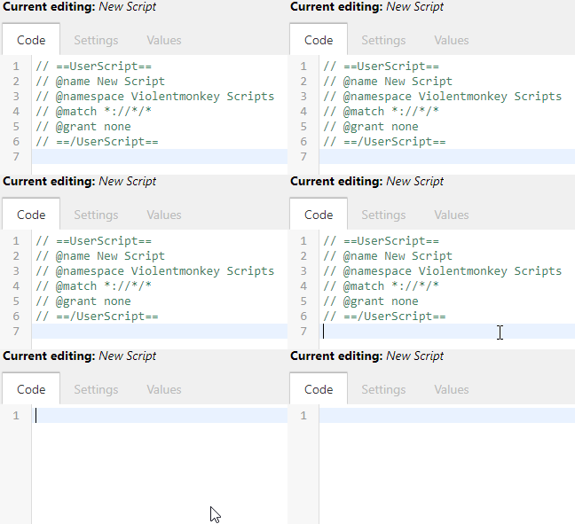
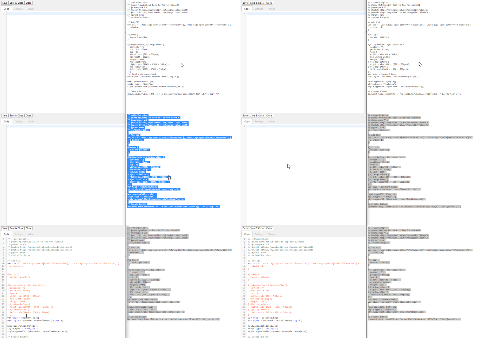
| @alaneCN CSS is limited to what the basic list layout can already do, so by normal methods this is impossible. However, if we are to use non-CSS methods, we can still achieve this. If you have a userscript extension such as Violentmonkey ([C] [F]), then this is possible to achieve client-side — in other words, for you only. No visitors would be able to see the effect. The "hitbox" does not perfectly trace the renders, instead it turns each side of the list into a button that, when clicked, will return you to the top of the page.
Tested on most recent versions of Chrome and Firefox. Seems to work fine, but let me know if it doesn't work since I'm a novice at Javascript and it's very possible my code is trash. |
Jun 23, 2019 6:31 PM
#242
| It works just as you described it, thanks~ and im not too worried over visitors and such in that regard, as long as I can get back to the top after reviewing my series for the umpteenth time im all set- I really love this format and what it can do, so this helps a lot! |
  |
Jun 23, 2019 6:46 PM
#243
Jun 30, 2019 3:34 PM
#244
Hi again @Valerio_Lyndon. I need some help in changing some colors. I might be overlooking something simple but Idk where to find it. It's about the edit box. Seems I changed a color I didn't have to and now that area looks weird. It would help if you could hint me as to what I have to fix to make it fit with the dark theme. Here's the code. Thanks in advance. |
SheyCroixJun 30, 2019 7:25 PM
Jun 30, 2019 4:45 PM
#245
SheyCroix said: Hmm, looks like the filter effect was changed or you're using a dark mode userstyle for MAL itself. Depending on which of those is the case, one of these code snippets may help. Try adding the first to the bottom of the code. If that doesn't help, try the second. First:Hi again @Valerio_Lyndon. I need some help in changing some colors. I might be overlooking something simple but Idk where to find it. It's about the edit box. Seems I changed a color I didn't have to and now that area looks weird. It would help if you could hint me as to what I have to fix to make it fit with the dark theme. Here's the code. Thanks in advance.  #fancybox-frame {
filter: invert(87.8%) hue-rotate(197deg);
}#fancybox-frame {
filter: none;
}If neither of these fix the issue, I'd have to take a look at your actual CSS. Knowing what browser you're using could also assist in debugging. |
Valerio_LyndonJun 30, 2019 11:52 PM
Jun 30, 2019 7:24 PM
#246
Valerio_Lyndon said: Hmm, looks like the filter effect was changed or you're using a dark mode userstyle for MAL itself. Depending on which of those is the case, one of these code snippets may help. Try adding the first to the bottom of the code. If that doesn't help, try the second. First: #fancybox-frame {
filter: invert(87.8%) hue-rotate(197deg);
}#fancybox-frame {
filter: none;
}If neither of these fix the issue, I'd have to take a look at your actual CSS. Knowing what browser you're using could also assist in debugging. I do employ the use of a dark theme user-style for MAL. The second one helped to solve the problem. The CSS code was shared there, with my previous post. (If you could remove it from your quote, I would appreciate it =D, tho feel free to look over it.) Once again, thanks for the help and for creating this theme. It's good, so I'm glad I discovered it via another friend who had posted on this thread. |
Jun 30, 2019 11:53 PM
#247
SheyCroix said: Oh, I am blind aren't I! Apologies, haha, glad the issue was solved. I've removed the code link from the quote. :)I do employ the use of a dark theme user-style for MAL. The second one helped to solve the problem. The CSS code was shared there, with my previous post. (If you could remove it from your quote, I would appreciate it =D, tho feel free to look over it.) Once again, thanks for the help and for creating this theme. It's good, so I'm glad I discovered it via another friend who had posted on this thread. |
Jul 2, 2019 10:15 AM
#248
| After setting this layout next anime I add are moving bottom one to Plan to watch even though they're completed. Have I done something wrong? EDIT// And btw. is there a way to make those tags look more bland? Like filter or something 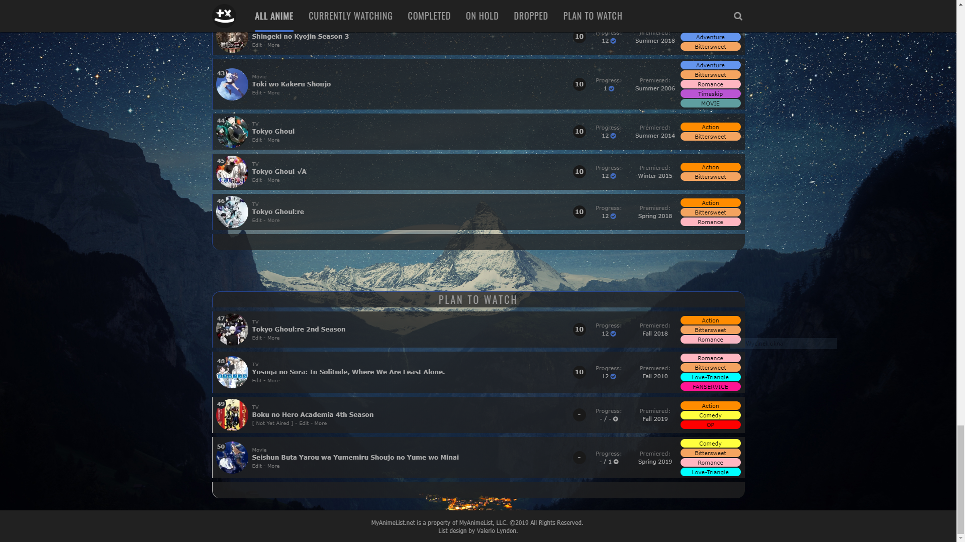 @import "https://valeriolyndon.github.io/MAL-Public-List-Designs/Clarity%20Theme/Theme%20-%20Compressed.css"; @import "https://valeriolyndon.github.io/MAL-Public-List-Designs/Clarity%20Theme/Mod%20-%20Dark%20Mode%20Compressed.css"; @import "https://malscraper.azurewebsites.net/covers/auto/presets/dataimagelinkbefore"; @import "https://valeriolyndon.github.io/MAL-Public-List-Designs/Clarity%20Theme/Mod%20-%20Hover%20Image%20Compressed.css"; @import "https://malcat-gen.appspot.com/headers?template=[data-query*='"status":7']:not([data-query*='order']) .list-item:nth-child($index){margin-top:162px;}[data-query*='"status":7']:not([data-query*='order']) .list-item:nth-child($index) .status:before{content:'$content'}"; :root { --avatar: url(https://i.imgur.com/7vQkrkX.jpg); } :root { --name: "sNw0wa Veni Vidi Vici"; } :root { --banner: url(https://i.imgur.com/3GR5BzF.jpg); } :root { --character: url(NONE); } body { --background: url(https://i.imgur.com/DV9HVpE.jpg); background-image: var(--background) !important; } /* Transparent List Items */ .list-item, .data.priority, .data.number, .status:before, .status:after { background: transparent no-repeat center / cover fixed !important; background-image: linear-gradient(rgba(33,33,33,0.77),rgba(33,33,33,0.77)), var(--background) !important; } /* ======================= CATEGORY HEADERS - ROUNDED updated 19-06-14 */ [data-query*='"status":7']:not([data-query*='order']) .list-item:nth-child(2) { margin-top: 58px; } .list-item .status:before, .list-item .status:after { position: absolute; top: -40px; left: 0; display: block; width: 1059px; height: 31px; background: var(--bg); border-width: 1px 0 0 1px; border-style: solid; border-color: var(--text-head); border-radius: 16px 16px 0 0; color: var(--text-head); font: 20px/31px Oswald; letter-spacing: 3px; text-indent: -0.5px; text-transform: uppercase; pointer-events: none; } [data-query*='"status":7']:not([data-query*='order']) .list-item .status:after { content: ""; top: auto; bottom: -40px; height: 32px; border-width: 0 0 0 1px; border-radius: 0 0 16px 16px; } .list-item .watching:before, .list-item .reading:before, .list-item .watching:after, .list-item .reading:after { border-color: var(--watching); } .list-item .completed:before, .list-item .completed:after { border-color: var(--completed); } .list-item .onhold:before, .list-item .onhold:after { border-color: var(--onhold); } .list-item .dropped:before, .list-item .dropped:after { border-color: var(--dropped); } .list-item .plantowatch:before, .list-item .plantoread:before, .list-item .plantowatch:after, .list-item .plantoread:after { border-color: var(--plantowatch); } /* Favourite Tags - Right / Revision 0.4*/ .data.tags span { padding: 0; } .data.tags span a { margin: 1px 0; } .data.tags span a[href*="=Favourite"], .data.tags span a[href*="=Favorite"] { position: absolute; left: 1068px; top: calc(50% - 13px); width: 26px; height: 26px; padding: 0; background: var(--bg); border-radius: 50%; color: #ff65ad !important; font-size: 0 !important; line-height: 23px; overflow: hidden; box-shadow: 0 1px 2px rgba(0,0,0,0.2); } .data.tags span a[href*="=Favourite"]:before, .data.tags span a[href*="=Favorite"]:before { content: "♥"; font-size: 26px; } /* Tag Colours */ .data.tags span a[href*="=Action"] { background: #FF8C00; color: #000000 !important } .data.tags span a[href*="=Comedy"] { background: #ffff3e; color: #000000 !important } .data.tags span a[href*="=Timeskip"] { background: #BA55D3; color: #000000 !important } .data.tags span a[href*="=Romance"] { background: #FFB6C1; color: #000000 !important } .data.tags span a[href*="=Bittersweet"] { background: #F4A460; color: #000000 !important } .data.tags span a[href*="=Love-Triangle"] { background: #00FFFF; color: #000000 !important } .data.tags span a[href*="=OP"] { background: #FF0000; color: #000000 !important } .data.tags span a[href*="=Shoujo"] { background: #C71585; color: #000000 !important } .data.tags span a[href*="=Adventure"] { background: #6495ED; color: #000000 !important } .data.tags span a[href*="=FANSERVICE"] { background: #FF1493; color: #000000 !important } .data.tags span a[href*="=Masterpiece"] { background: #FFD700; color: #000000 !important } .data.tags span a[href*="=MOVIE"] { background: #5F9EA0; color: #000000 !important } .data.tags span a[href*="=Monogatari%3A)"] { background: #FFF5EE; color: #000000 !important } |
sNw0wJul 2, 2019 11:08 AM
Jul 2, 2019 11:55 AM
#249
| The above appears properly to me, tho it's related to a problem I came to mention. Hi, yet again @Valerio_Lyndon ^^; It's regarding the headers for each section. As seen in that pic above, they are not displaying properly. On my side, tho, it's different. It's more related when doing searches or going with tag links. Adding pics below for example. |
SheyCroixJul 2, 2019 12:03 PM
Jul 2, 2019 4:05 PM
#250
| @sNw0w That is expected behaviour, and is mentioned in the spoiler where the install is found. The position of the headers is controlled by a third-party app which only refreshes every few hours or so. I see you've already switched to transparent tags with coloured text which looks quite nice. :) If you're still not happy with them, I would probably recommend using more pastel colours or experimenting with partial transparency on the background or the text (both support transparency) [Colour Picker]. You could also dim the entire tag (background and text) with an opacity change: .data.tags span a {
opacity: 0.5;
} |
Valerio_LyndonJul 2, 2019 4:12 PM
More topics from this board
» [BBCode] Font Awesome Guidehideso - Dec 25, 2023 |
6 |
by Shishio-kun
»»
Today, 12:26 AM |
|
Sticky: » 💚 [REPAIR STICKY] Repair/speed up a design + Request a layout fixShishio-kun - Nov 17, 2023 |
33 |
by Shishio-kun
»»
Yesterday, 11:42 PM |
|
» [CSS - Modern] 🛠️ Tweaks for lists -- Horizontal tags, descriptions, category-coloured text, accent colour, and more.Valerio_Lyndon - Oct 24, 2019 |
20 |
by IridescentJaune
»»
Nov 22, 10:58 PM |
|
» ✳️ Bunkasai 2024 List Design and Graphic Design contests are OPENShishio-kun - Nov 18 |
2 |
by Shishio-kun
»»
Nov 18, 5:01 AM |
|
Sticky: » [ SIGNATURES ~ PROFILES] All guides, generators, and templatesShishio-kun - Feb 16, 2023 |
29 |
by floral_sacrifice
»»
Nov 15, 10:24 AM |
