New
Jun 13, 2020 6:54 PM
#6251
Mila91 said: Hello I have a question about how to align the "about me" section picture, with the profile picture, example profile. … Is there some trick to this or does this occur only on my profile? When using align=left/right on an [img] tag, the images gain 4 pixels of padding on the top and 8 pixels of padding on either side. There are two solutions to this. One way is to use an image tag with no "align=direction", but that isn't very viable here. Alternatively, and the best solution in this case, is to edit your profile picture so that it has 4 transparent pixels at the top and save it as a PNG file. Or if you can't do transparent, then 4 pixels of pure white will work too. The actual image will be 350px tall, but its effective height will be 346px. |
Jun 13, 2020 7:26 PM
#6252

Valerio_Lyndon said: Mila91 said: Hello I have a question about how to align the "about me" section picture, with the profile picture, example profile. … Is there some trick to this or does this occur only on my profile? When using align=left/right on an [img] tag, the images gain 4 pixels of padding on the top and 8 pixels of padding on either side. There are two solutions to this. One way is to use an image tag with no "align=direction", but that isn't very viable here. Alternatively, and the best solution in this case, is to edit your profile picture so that it has 4 transparent pixels at the top and save it as a PNG file. Or if you can't do transparent, then 4 pixels of pure white will work too. The actual image will be 350px tall, but its effective height will be 346px. WOW I had no idea, good to know. It totally makes sense now :D |
Jun 14, 2020 3:18 AM
#6253
| @Valerio_Lyndon I tried ading the transparent pixel but the picture was too big to upload on MAL, so I tried croping the profile picture minus 4 pixels, thank you very much for this tip it will help me and others in the future. |
Jun 14, 2020 3:46 AM
#6254

Jun 14, 2020 4:57 AM
#6255

Nachorizo said: Hello. I'd like to ask how can you put moving particle effects like that on @Skittles lists (his has falling snow in the background). Also saw a saber themed one with a golden particle effect that I couldn't find anymore. Thanks For the snow effect, I borrowed it from one of Hahaido's donated layouts. You can find it here. |
 |
Jun 14, 2020 11:29 AM
#6257
RiuZakeh said: How can i put image inside the spoiler buttob? Use this code. Get img codes by uploading pics to imgur [spoiler][img]https://i.imgur.com/Gf13A51.gif[/img][/spoiler] |
Jun 15, 2020 11:06 PM
#6258

| Hello once more, I was wondering if the sticky element is achievable in MAL because I have tried it and I have miserably failed. The items usually either appear on the left of the screen and they don't stick to the top when I scroll down or they get fixed to a random point in the screen. Thanks! |


Jun 16, 2020 4:32 PM
#6259
Skittles said: Nachorizo said: Hello. I'd like to ask how can you put moving particle effects like that on @Skittles lists (his has falling snow in the background). Also saw a saber themed one with a golden particle effect that I couldn't find anymore. Thanks For the snow effect, I borrowed it from one of Hahaido's donated layouts. You can find it here. Hello again. Can I ask how did you make your snow effect fall "behind" in the background? Sorry but I don't know the proper term for it so its hard for me to explain but mine falls "on top" of the cover cards and obstructs them like this  |
Jun 17, 2020 1:40 AM
#6260
Nachorizo said: Skittles said: Nachorizo said: Hello. I'd like to ask how can you put moving particle effects like that on @Skittles lists (his has falling snow in the background). Also saw a saber themed one with a golden particle effect that I couldn't find anymore. Thanks For the snow effect, I borrowed it from one of Hahaido's donated layouts. You can find it here. Hello again. Can I ask how did you make your snow effect fall "behind" in the background? Sorry but I don't know the proper term for it so its hard for me to explain but mine falls "on top" of the cover cards and obstructs them like this Seems like a simple enough layering issue. Lowering the z-index should fix it. Go to line 1442 and add this code to the ".cover-block" section: position: relative; z-index: -1; 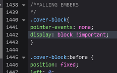 |
Jun 17, 2020 12:49 PM
#6261
Spedwagodownonme said: Hello once more, I was wondering if the sticky element is achievable in MAL because I have tried it and I have miserably failed. The items usually either appear on the left of the screen and they don't stick to the top when I scroll down or they get fixed to a random point in the screen. Thanks! What are you trying to sticky exactly? |
Shishio-kunJun 17, 2020 12:52 PM
Jun 17, 2020 4:38 PM
#6262
| Hi again, I was wondering if its possible to decrease the font size in the actual spoiler text? The text that you put "in between here" in the spoiler code. |
Jun 17, 2020 9:09 PM
#6263
Mila91 said: Hi again, I was wondering if its possible to decrease the font size in the actual spoiler text? The text that you put "in between here" in the spoiler code. This? [spoiler][size=50]text text text[/size][/spoiler] If you're talking about the spoiler button I don't think you can change that text size |
Jun 17, 2020 9:51 PM
#6264
Shishio-kun said: Spedwagodownonme said: Hello once more, I was wondering if the sticky element is achievable in MAL because I have tried it and I have miserably failed. The items usually either appear on the left of the screen and they don't stick to the top when I scroll down or they get fixed to a random point in the screen. Thanks! What are you trying to sticky exactly? Either the profile menu in which you can choose to go to your profile, to your anime list, and so on (the floating menu) or the sort menu (the list-table-header) but as it seems their code is intertwined with other ones which makes it tricky to get sticky *ba dum tss*. It's ok tho I've done basically what I wanted without the sticky element so np. Thanks for your reply! |
Jun 18, 2020 8:31 AM
#6265
Shishio-kun said: Mila91 said: Hi again, I was wondering if its possible to decrease the font size in the actual spoiler text? The text that you put "in between here" in the spoiler code. This? [spoiler][size=50]text text text[/size][/spoiler] If you're talking about the spoiler button I don't think you can change that text size Yeah the spoiler button, I didnt think so, but thanks anyways. |
Jun 18, 2020 10:28 PM
#6266

| I'm having an issue with the signature. I'm trying to get the "My Anime List" text to be on the left side and the "My Manga List" text to be on the right side and I'm trying to put the "My anime list" text in the middle between the left side of an image, which is in the center, and the left side of the quote. While the "My manga list" text in between the right side of the image and the right side of the quote. I'm trying to put both of the texts inside a quotation. And I'm trying to put an image in the middle of the two texts in a way that the top and bottom of the image are out of the quotation to get a sort of 3d effect. Also the "anime list" and "manga list" text link to my anime list and manga list respectively. This is a photoshop of what I'm basically trying to get it to look like: 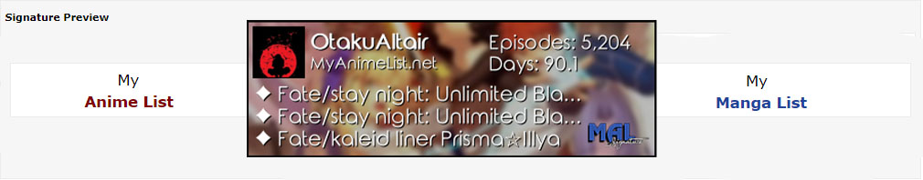 It seems to look different on forums so here's a picture of what I managed to do in the signature preview: 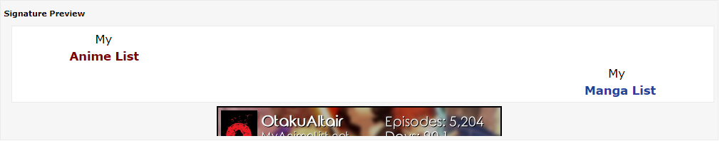 [quote][color=transparent]* * * * ** * * * * *[/color][size=150]My [color=transparent]* * * * *[/color][url=https://myanimelist.net/animelist/OtakuAltair][color=maroon][b]Anime List[/b][/color][/url][right]My[color=transparent]* * ** * * * *[/color] [url=https://myanimelist.net/animelist/OtakuAltair][color=sky][b]Manga List[/b][/color][/url][color=transparent]* * * * *[/color][/right][/size][/quote][center][URL="https://malsignature.com"][IMG]https://malsignature.com/?/view?username=OtakuAltair&style=normal[/IMG][/URL][/center] And posting it in the forum for good measure: * * * * ** * * * * *My * * * * *Anime List  So how do I do this? |
Jun 19, 2020 2:40 AM
#6267
| Hello guys, I need help with my anime list custom css. I found a custom layout a few days ago and copied just a few parts of the code and tried to edit it by myself. As you can see in my profile the result is ok, but there are a few minor things that I couldn't figure out how to fix. I'd like to remove the status text (all anime/currently watching...). Right now it's white text on white background so you can't really see it unless you select it, but if I could set the font to 0px that would look better and maybe remove this big white gap. There's also a problem with the text that pops out of the floating menu (if that's how it's called). This is the css I am using: @import "https://fonts.googleapis.com/css?family=Source+Sans+Pro";
body {
background: url(https://i.postimg.cc/JzHSb7Kg/opacity.png), fixed center/cover url(https://i.postimg.cc/Ytj7rMNQ/background.jpg)!important;
font: 10px Source Sans Pro; letter-spacing: 1px; text-transform: uppercase;}
#footer-block {background: none; padding: 20px;}
#copyright {font: 0px Source Sans Pro; color: white; text-shadow: 1px 1px 2px #333; padding-top: 15px;}
.status-menu-container .search-container #search-box input {font: 11px Source Sans Pro;
color: #999; letter-spacing: 0px; padding: 1px; border-radius: 20px;
border: 1px solid #ccc;}
.list-unit .list-status-title {width: 100%; height: 0px; background:none;}
.list-unit .list-status-title .stats {height: auto; line-height: 0;}
.list-unit .list-status-title .stats a {color: #999; margin: 0;}
.list-table .list-table-header .header-title.status, .list-table .list-table-data .data.status {width: 1px; padding: 1;}
.list-table .list-table-data .data.title .link {font-size: 11px;}
.list-table .list-table-data .data.title .add-edit-more {float: none; display: inline-block;
height: 0; font-size: 0; white-space: nowrap; margin-left: 5px; opacity: 0;}
.header .header-menu .btn-menu {
display: block;
text-align: right;
font-size: 0px;
}Any suggestion is very welcomed, thank you! |
Jun 20, 2020 12:54 AM
#6268
Davidozzo said: Hello guys, I need help with my anime list custom css. I found a custom layout a few days ago and copied just a few parts of the code and tried to edit it by myself. As you can see in my profile the result is ok, but there are a few minor things that I couldn't figure out how to fix. Looks really good so far, very clean. Davidozzo said: I'd like to remove the status text (all anime/currently watching...). Right now it's white text on white background so you can't really see it unless you select it, but if I could set the font to 0px that would look better and maybe remove this big white gap. Add this code to the bottom of your CSS. It sets the font-size property to 0 and then sets the height a bit smaller. If you want a bit more/less spacing then just adjust the value after the "height" property. /* Shrink status title bar */
.list-unit .list-status-title .text {
font-size: 0;
height: 14px;
}If you want to reposition the stats/filters button to fit better (they may overlap the list header if you set the spacing too small), then you can do so with some code like this: /* Reposition stats/filters button */
.list-unit .list-status-title .stats {
top: -7px;
}Davidozzo said: There's also a problem with the text that pops out of the floating menu (if that's how it's called). I assume you want to fix the text overflow? Here's some code for that. Add to the bottom of your CSS. /* Fix list menu float text overflow */
.list-menu-float .icon-menu.setting:hover .text,
.list-menu-float .icon-menu.setting:hover .text .link-list-setting,
.list-menu-float .icon-menu.setting:hover .text .link-style-setting {
width: 146px;
} |
Jun 20, 2020 1:57 AM
#6269
| @OtakuAltair I don't think that's possible with BBCode. You can position one line approximately correct with the transparent text trick you're already using. But it doesn't work over multiple lines, as the image, no matter how tall, is considered as part of the first line and all subsequent lines are placed below. For example, if I place the image here it is now part of this line.Therefore, this line right below gets placed far far beneath the other text, because the image is counted as part of the line. The only way to bypass this is using align=left or align=right on the img tag. It's just unfortunate that there is no align=center or alignment for groupings of text. The [right] and [center] BBCode tags don't work the same way as the img "align=" statement. Your best bet would be to use three images in a row, and place the text in the images. |
Jun 20, 2020 2:12 AM
#6270
Valerio_Lyndon said: Thanks! I think I'll do thatYour best bet would be to use three images in a row, and place the text in the images. |
Jun 20, 2020 8:47 AM
#6271

| o/ i think the next thing i wanna fix is all the posters which fail to load and cause white space.  how much space do you think it'd take to have a complete poster db? hopefully my googledrive or mega or something can handle it. |
 |
Jun 20, 2020 5:09 PM
#6272
| @Valerio_Lyndon thank you very much, I appreciate how you even cared about the stats/filter detail. I think my list design is now complete. |
Jun 21, 2020 2:29 AM
#6273
mutsuto said: i think the next thing i wanna fix is all the posters which fail to load and cause white space. I don't think it's a DB or lack of data issue, but rather some bug happening along the way. I've seen the endpoint the generator is accessing, and it definitely has the images for all items. My theory would be either that the tool is getting timed out by MAL for trying to access information too fast on longer lists, or perhaps it simply has an error in the code that is causing it to hang somewhere. mutsuto said: how much space do you think it'd take to have a complete poster db? hopefully my googledrive or mega or something can handle it. If we're talking a complete database, as in the entirety of MAL, then I've already done this actually. It takes up about 7MB, give or take, for a valid CSS sheet of all anime/manga covers in the database. [Example] If you reduced that to a simple ID and image URL for storage, it could be smaller, but obviously would not be functional for list CSS usage. I have links to all of the different CSS presets on my blog post: [Here], underneath step 3 of "Fix for Any Issue". If you simply wanted a list of items on your own anime/mangalists, instead of an entire database, you could try Mal It, which was made recently so may still work. I was also working on a tool to do this, but it has barely any documentation and I am unsure it even works right now, so I hesitate to recommend that. It's publicly available on my GitHub though, same as the code I use for maintaining the full database. |
Valerio_LyndonJun 21, 2020 2:33 AM
Jun 23, 2020 2:12 AM
#6275
| is there another issue with the anime pictures again as they are blurry |
Jun 23, 2020 1:50 PM
#6276
Mattinator95 said: They're working fine for me when I view your list. Were they working before, and if so, did you recently install an extension or switch browser?is there another issue with the anime pictures again as they are blurry |
Jun 27, 2020 6:26 AM
#6277

| Although most of the people in this site (at least from who i met and become my friend), they made their layout by them selves, but i see there are some of these people are helped by other MAL users to make their custom list and bio introduction. My question is, can someone willing to help me to customize my own list and my introduction bio? I'm sorry that my question is selfish, but....... yeah it cannot be helped. |
 |
Jun 27, 2020 11:02 PM
#6278
ManOfBalance said: Although most of the people in this site (at least from who i met and become my friend), they made their layout by them selves, but i see there are some of these people are helped by other MAL users to make their custom list and bio introduction. My question is, can someone willing to help me to customize my own list and my introduction bio? I'm sorry that my question is selfish, but....... yeah it cannot be helped. Help as in show you how, or create them for you? I might be able to help you learn. Do you have any experience in image editing or CSS? If not, you may want to check out Shishio's videos to learn the basics of each, they're linked on the club homepage. What's next depends on what you want to create. Did you have any design ideas you were wanting to implement? |
Jun 28, 2020 9:52 AM
#6279
| Hey, I was editing my manga list and I wanted a way to change the blue color of MAL everywhere to a different color (#4f3228), however if i change it for each element it will be quite tedious since ill have to find each place where the colour is applied. is there a way to change that specific colour to a different colour? |
Jun 28, 2020 6:42 PM
#6280
sahil23 said: Hey, I was editing my manga list and I wanted a way to change the blue color of MAL everywhere to a different color (#4f3228), however if i change it for each element it will be quite tedious since ill have to find each place where the colour is applied. is there a way to change that specific colour to a different colour? I've previously written some CSS that will change all these pieces and has a relatively easy way to change the colours, you can find it in my default list tweaks thread. It's right at the top, under "Change the accent colour." Perhaps give that a go, adding it to the bottom of your current CSS, and see if it serves your needs. |
Jun 28, 2020 10:13 PM
#6281
| Thank you very much, that's ideal. |
Jul 3, 2020 7:23 AM
#6282

@Shishio-kun About the post you in the "Main page" yeah i do want to make these parts less transparent and I believe I forgot to save the changes that I made, but i made them again and have the problem of the text breaking like this (When hovered): The ones like the "Digimon Saikai" one don't bother me that much, but Kaguya-sama, Ano Hana and others that get the tittle cutted really get to my nerves, I tried changing the font size and gave a shot with the margin system, but tbh i don't really get it so maybe I done something wrong... Another thing that i wanted to make is a "button" like the tags one but for my reviews/comments on the show, i haven't searched for this one yet but I'm putting all in one post so it gets less "spammy", hope I did everything right, and sorry for the inconvenient... |
Baunilha_Jul 3, 2020 12:06 PM
 |
Jul 3, 2020 5:59 PM
#6283
Svetlo_Raryama said: @Shishio-kun About the post you in the "Main page" yeah i do want to make these parts less transparent and I believe I forgot to save the changes that I made, but i made them again and have the problem of the text breaking like this (When hovered): The ones like the "Digimon Saikai" one don't bother me that much, but Kaguya-sama, Ano Hana and others that get the tittle cutted really get to my nerves, I tried changing the font size and gave a shot with the margin system, but tbh i don't really get it so maybe I done something wrong... Another thing that i wanted to make is a "button" like the tags one but for my reviews/comments on the show, i haven't searched for this one yet but I'm putting all in one post so it gets less "spammy", hope I did everything right, and sorry for the inconvenient... for menu transparency (add to the bottom of the CSS). At .1 it's almost clear, but if you want more opacity you can raise it to like .3 0 is completely clear .status-menu-container { background-color: rgba(0,0,0,.1) !important; } .list-unit { background-color: rgba(0,0,0,.1) !important; } For title text being cut off you can raise the 110 to a larger amount if needed. .list-table .list-table-data .data.title .link {height: 110px !important;} Add this for the i button and it brings up the more section (comments) on the upper left. You can edit it further by changing the numbers after height, width, left and top near the bottom (play with these settings and see what they do). .list-table .list-table-data .data.title .more a { position: relative; opacity: 1 !important; display: block !important; WIDTH: 10PX; FONT-SIZE: 10 !important; left: 30px; top: -35px; } .list-table .more-info{ position: fixed; height: 300px; width: 300px; left: 0px; top: 0px; } |
Shishio-kunJul 3, 2020 6:05 PM
Jul 3, 2020 7:53 PM
#6284
| Thanks, I'm going to mess around with it a bit and if I need some more help I'll make another post. |
|
Jul 6, 2020 12:26 PM
#6285
| Hi, I am new to coding and while editing my list, I ran into some problems, so I am hoping you can help me! :D I found this really good layout but after I finished editing it all, I realised that it had title issues (any idea how I can fix these dots that come up when the name is too long ( https://imgur.com/TuI8QeS ) and the names don't have any transitions or any colour-coded features, is there any way I can add these manually? I can send the code if need be and my list should be public. Also, is there any way I can add my own boxes and stuff? Thanks in advance. |
dsffsfdfsfdsfeJul 6, 2020 12:39 PM
Jul 6, 2020 3:16 PM
#6286
ThatWeebMystic said: Hi, I am new to coding and while editing my list, I ran into some problems, so I am hoping you can help me! :D I found this really good layout but after I finished editing it all, I realised that it had title issues (any idea how I can fix these dots that come up when the name is too long ( https://imgur.com/TuI8QeS ) and the names don't have any transitions or any colour-coded features, is there any way I can add these manually? I can send the code if need be and my list should be public. Also, is there any way I can add my own boxes and stuff? Thanks in advance. .data.title .link { text-overflow: inherit !important; } Add that to the bottom of the CSS to get rid of the dots There's like a hundred types of transitions so you'd have to be more specific. Is there an example from another list? Color coding tricks you can try are here: https://myanimelist.net/forum/?topicid=1807962 This code works from that topic: /*==============================*\ | Category-Coloured Titles | \* --- - --- - ---- - --- - --- */ .data.title .link:hover { text-decoration: underline; } .list-item .data.watching ~ .title .link, .list-item .data.reading ~ .title .link { /* Watching */ color: #2db039 !important; } .list-item .data.completed ~ .title .link { /* Completed */ color: #26448f !important; } .list-item .data.onhold ~ .title .link { /* On Hold */ color: #f1c83e !important; } .list-item .data.dropped ~ .title .link { /* Dropped */ color: #a12f31 !important; } .list-item .data.plantowatch ~ .title .link, .list-item .data.plantoread ~ .title .link { /* Planned */ color: #c3c3c3 !important; } You can add boxes but you should be more specific what they're for and what's going to be in them. Is there an example from another list? You can add new sections with before and after codes tho: https://youtu.be/bI13AHX3jFw?t=599 |
Jul 6, 2020 9:09 PM
#6287
Shishio-kun said: ThatWeebMystic said: Hi, I am new to coding and while editing my list, I ran into some problems, so I am hoping you can help me! :D I found this really good layout but after I finished editing it all, I realised that it had title issues (any idea how I can fix these dots that come up when the name is too long ( https://imgur.com/TuI8QeS ) and the names don't have any transitions or any colour-coded features, is there any way I can add these manually? I can send the code if need be and my list should be public. Also, is there any way I can add my own boxes and stuff? Thanks in advance. .data.title .link { text-overflow: inherit !important; } Add that to the bottom of the CSS to get rid of the dots There's like a hundred types of transitions so you'd have to be more specific. Is there an example from another list? Color coding tricks you can try are here: https://myanimelist.net/forum/?topicid=1807962 This code works from that topic: /*==============================*\ | Category-Coloured Titles | \* --- - --- - ---- - --- - --- */ .data.title .link:hover { text-decoration: underline; } .list-item .data.watching ~ .title .link, .list-item .data.reading ~ .title .link { /* Watching */ color: #2db039 !important; } .list-item .data.completed ~ .title .link { /* Completed */ color: #26448f !important; } .list-item .data.onhold ~ .title .link { /* On Hold */ color: #f1c83e !important; } .list-item .data.dropped ~ .title .link { /* Dropped */ color: #a12f31 !important; } .list-item .data.plantowatch ~ .title .link, .list-item .data.plantoread ~ .title .link { /* Planned */ color: #c3c3c3 !important; } You can add boxes but you should be more specific what they're for and what's going to be in them. Is there an example from another list? You can add new sections with before and after codes tho: https://youtu.be/bI13AHX3jFw?t=599 Thank you so much. This will be a huge help! :D Also, by transition, I meant like, making a position and colour transition, is that possible? And is it possible to move/transition the titles of the animes when your mouse hovers over the anime image/cover and not the title itself as the other information such as type of Anime and Date Aired which were added in advance by the original script writer lower towards the bottom of the anime's image. And for the title, is there a way that when it overflows, I can make it skip a line instead of going off the edge? Thank you a lot either way though! |
dsffsfdfsfdsfeJul 6, 2020 9:16 PM
Jul 6, 2020 9:31 PM
#6288
ThatWeebMystic said: Also, by transition, I meant like, making a position and colour transition, is that possible? Yes but you need to be extremely specific. What part of the list/what text, what kinds of transitions, what color, etc ThatWeebMystic said: And is it possible to move/transition the titles of the animes when your mouse hovers over the anime image/cover and not the title itself as the other information such as type of Anime and Date Aired which were added in advance by the original script writer lower towards the bottom of the anime's image. I think you want to customize the title when you point to an anime, right? The first codes control the color and position of the title when you're not pointing to the anime. The second codes control the color and position of the title when you point to the anime. You can change the colors and adjust the numbers to reposition it. .list-container .list-unit .list-table .list-item .data.title .link { color: red !important; top: 0px; left: 0px; } .list-container .list-unit .list-table .list-item:hover .data.title .link { color: blue !important; top: 10px; left: 10px; } Or you can add opacity: 0; to make it disappear and opacity 1 to make it reappear. .list-container .list-unit .list-table .list-item .data.title .link { opacity: 0 !important;; } .list-container .list-unit .list-table .list-item:hover .data.title .link { top: 210px; opacity: 1 !important; } |
Shishio-kunJul 6, 2020 9:36 PM
Jul 7, 2020 12:26 AM
#6289
| Thanks a lot for the transition, it helped a lot, but suddenly, I am also having another issue for some reason, the score of the anime I have given is going below some other things, even if I add z-index (I think that is what it's called) and I still have made no progress with the title cutting off/overflowing. (Here are some examples that can hopefully specify what I am trying to explain; https://imgur.com/w9Y0lbl (How the score originally was) https://imgur.com/FUDxCS8 (How it is now) https://imgur.com/r3i4LId (The Text overflow) Really sorry for the inconvenience and that I may be asking too much. |
dsffsfdfsfdsfeJul 7, 2020 5:24 AM
Jul 7, 2020 3:04 PM
#6290
ThatWeebMystic said: Thanks a lot for the transition, it helped a lot, but suddenly, I am also having another issue for some reason, the score of the anime I have given is going below some other things, even if I add z-index (I think that is what it's called) and I still have made no progress with the title cutting off/overflowing. (Here are some examples that can hopefully specify what I am trying to explain; https://imgur.com/w9Y0lbl (How the score originally was) https://imgur.com/FUDxCS8 (How it is now) https://imgur.com/r3i4LId (The Text overflow) Really sorry for the inconvenience and that I may be asking too much. Add this to the bottom. it brings the score back. edit the left and top codes to move the shape and score digit where you want. You should always put all changes on the bottom, this way you can undo them later if there's errors and the layout will go back to normal. /* Data Score before Shishio*/ .list-container .list-unit .list-table .list-item .list-table-data .data.score { right: 13px; top: 13px; } .list-container .list-unit .list-table .list-item .list-table-data .data.score::after { display: inline-block; font: normal normal normal 28px / 1 FontAwesome; -webkit-font-smoothing: antialiased; -moz-osx-font-smoothing: grayscale; text-rendering: auto; position: absolute; color: var(--color); content: "⬤"; z-index: 50px; left: -26.5px; top: -2px; } .list-container .list-unit .list-table .list-item .list-table-data .data.score :before { display: inline-block; font: normal normal normal 46.5px / 1 FontAwesome; text-rendering: auto; position: absolute; color: var(--color); content: "⬤"; z-index: 10px; left: -7px; bottom: -16.25px; } .list-container .list-unit .list-table .list-item .list-table-data .data.score .link { font: normal normal normal 13px / 1 tahoma, verdana, arial, sans-serif; color: #fff; top: 5.5px; right: 0; width: 28px; position: absolute; } /* Data Score after Shishio*/ .list-container .list-unit .list-table .list-item .list-table-data .data.score { right: 50px; top: 10px; } /* PURPLE SHAPE*/ .list-container .list-unit .list-table .list-item .list-table-data .data.score::after { left: 20px; top: 0px; z-index: 1 !important;; } /* GREEN BLUE SHAPE*/ .list-container .list-unit .list-table .list-item .list-table-data .data.score :before { left: -50px; top: -15px; z-index: 0 !important; } /* SCORE DIGIT */ .list-container .list-unit .list-table .list-item .list-table-data .data.score .link { top: 8px !important; left: 28px; position: relative; z-index: 5 !important;; } if you have any more problems link me to the original layout first so we can reset changes back to the default (that would be easier). I don't know these modern layouts at all. Also I highly recommend you start over on the layout if you're going to keep editing it- leave the default layout code alone and add ALL your changes to the bottom of the CSS. This way we can undo any bad changes and it will go back to default. And we can also see and edit your changes easily. I also recommend checking out my videos on editing CSS on your own https://www.youtube.com/watch?v=cTGbVutdqfc https://www.youtube.com/watch?v=bI13AHX3jFw https://www.youtube.com/watch?v=8besPyPQlzQ |
Shishio-kunJul 7, 2020 3:21 PM
Jul 7, 2020 3:19 PM
#6291
@ThatWeebMystic Wait is what you're trying to do the title, is simply show the entire title like here?  Add this to the bottom for that .list-container .list-unit .list-table .list-item .list-table-data .data.title .link { position: absolute; left: 0; padding: 15px 10px 25px 10px; background-color: rgba(19, 19, 19, 1); font-size: 14px; margin-left: -5px; margin-top: -30px; width: 185px; opacity: 1; color: #fff; font: normal normal normal 13px / 1 tahoma, verdana, arial, sans-serif; text-decoration: none !important; /* font-weight: 100 !important; */ position: absolute; text-align: center; border-top: 1px solid #3e3d3d; border-bottom: 2px solid #3e3d3d; overflow: inherit !important; text-overflow: inherit !important; white-space: inherit !important; } |
Jul 7, 2020 9:41 PM
#6292
Shishio-kun said: if you have any more problems link me to the original layout first so we can reset changes back to the default (that would be easier). I don't know these modern layouts at all. Also I highly recommend you start over on the layout if you're going to keep editing it- leave the default layout code alone and add ALL your changes to the bottom of the CSS. This way we can undo any bad changes and it will go back to default. And we can also see and edit your changes easily. I also recommend checking out my videos on editing CSS on your own https://www.youtube.com/watch?v=cTGbVutdqfc https://www.youtube.com/watch?v=bI13AHX3jFw https://www.youtube.com/watch?v=8besPyPQlzQ Hi, I will try this as for some reason the code for the score didn't work. ( This is the original layout https://murakumo-jp.github.io/MyAnimeList-CSS/Eorzea_Collection/ and this is were the code was found https://github.com/Murakumo-JP/MyAnimeList-CSS/blob/master/Eorzea_Collection/Eorzea_Collection.css ) Shishio-kun said: Wait is what you're trying to do the title, is simply show the entire title like here? The part were the text got cut off looked really good but is there any way that it only goes on double lines if the name is too long? If there's no way to arrange this then don't worry about it. Thanks for everything |
Jul 7, 2020 9:42 PM
#6293
| very rough mockup I want to display all of my category totals at the top of my page using classic, but the only way that looked even close to doable by my single semester of intro to CSS experience was display:flex body...:flex *...:flex needed pastebin.com/XE0W1cXq Extras:
|
Jul 7, 2020 10:56 PM
#6294
ThatWeebMystic said: Shishio-kun said: if you have any more problems link me to the original layout first so we can reset changes back to the default (that would be easier). I don't know these modern layouts at all. Also I highly recommend you start over on the layout if you're going to keep editing it- leave the default layout code alone and add ALL your changes to the bottom of the CSS. This way we can undo any bad changes and it will go back to default. And we can also see and edit your changes easily. I also recommend checking out my videos on editing CSS on your own https://www.youtube.com/watch?v=cTGbVutdqfc https://www.youtube.com/watch?v=bI13AHX3jFw https://www.youtube.com/watch?v=8besPyPQlzQ Hi, I will try this as for some reason the code for the score didn't work. ( This is the original layout https://murakumo-jp.github.io/MyAnimeList-CSS/Eorzea_Collection/ and this is were the code was found https://github.com/Murakumo-JP/MyAnimeList-CSS/blob/master/Eorzea_Collection/Eorzea_Collection.css ) Shishio-kun said: Wait is what you're trying to do the title, is simply show the entire title like here? The part were the text got cut off looked really good but is there any way that it only goes on double lines if the name is too long? If there's no way to arrange this then don't worry about it. Thanks for everything Oh I think the score code didn't work because you see a different score than the person viewing your list so I'd have to change the code selectors. But I can see scores on your list now, so that isn't an issue anymore I'm sure its possible to do the second thing but the only way I can think of is going to take a long time for me to recode it all |
Jul 7, 2020 11:25 PM
#6295
achoo_nice said: very rough mockup I want to display all of my category totals at the top of my page using classic, but the only way that looked even close to doable by my single semester of intro to CSS experience was display:flex body...:flex *...:flex needed pastebin.com/XE0W1cXq Extras:
I can't think of a good way to achieve that using flexbox, since there's not really a way to distinguish the category_totals <table> element from all the other <table> elements. There's also no way to have them in both locations, unfortunately, since that would require duplicating the HTML element (something CSS is unable to do). We could do some tricky with text-shadow if it were fixed positions, but that isn't applicable here. How I would do it is probably with absolute positioning. Here's an example. /* ----------------------------------------------------------------------------
repositon category totals using absolute positioning
------------------------------------------------------------------------------*/
#list_surround {
position: relative; /* Provides an anchor point for future "position: absolute"'s */
}
#list_surround > table:first-of-type {
margin-bottom: 100px; /* Make room for category totals */
}
/* Styling for all category totals */
.category_totals {
position: absolute;
left: 0;
}
/* Category-specific styling/positioning */
.header_cw ~ table .category_totals {
top: 50px;
}
.header_cw ~ table .category_totals::before {
content: "Watching: ";
}
.header_completed ~ table .category_totals {
top: 70px;
}
.header_completed ~ table .category_totals::before {
content: "Completed: ";
}
.header_onhold ~ table .category_totals {
top: 90px;
}
.header_onhold ~ table .category_totals::before {
content: "On Hold: ";
}
.header_dropped ~ table .category_totals {
top: 110px;
}
.header_dropped ~ table .category_totals::before {
content: "Dropped: ";
}
.header_ptw ~ table .category_totals {
top: 130px;
}
.header_ptw ~ table .category_totals::before {
content: "Planned: ";
}The problem with this, is that it adds a fixed amount of spacing to the top of the list. This spacing will remain at its maximum size no matter how many category totals are actually there, so there is a lot more white space on the single category views. But, again, I don't know that there is a fix for this, due to the lack of available selectors classic lists have that CSS can hook onto. |
Valerio_LyndonJul 7, 2020 11:29 PM
Jul 7, 2020 11:33 PM
#6296
Shishio-kun said: I'm sure its possible to do the second thing but the only way I can think of is going to take a long time for me to recode it all No need to worry about it then, you've already helped me a lot so thanks for everything! :D |
Jul 8, 2020 12:04 AM
#6297
Shishio-kun said: I'm sure its possible to do the second thing but the only way I can think of is going to take a long time for me to recode it all ThatWeebMystic said: The part were the text got cut off looked really good but is there any way that it only goes on double lines if the name is too long? If there's no way to arrange this then don't worry about it. Thanks for everything I may be jumping in where I'm not needed, but if I'm not misunderstanding, this should do what you want. Try applying this to the bottom of your CSS. It should automatically resize based on the contents. Keeping in mind this was made to work with the CSS you have on your list at time of writing, if you apply any other changes before this one, it may need a bit of tweaking. .list-container .list-unit .list-table .list-item .list-table-data .data.title .link {
margin-top: 26px;
transform: translateY(-100%);
width: 185px;
height: auto;
padding: 5px 10px;
white-space: normal;
} |
Jul 8, 2020 12:10 AM
#6298
Valerio_Lyndon said: Shishio-kun said: I'm sure its possible to do the second thing but the only way I can think of is going to take a long time for me to recode it all ThatWeebMystic said: The part were the text got cut off looked really good but is there any way that it only goes on double lines if the name is too long? If there's no way to arrange this then don't worry about it. Thanks for everything I may be jumping in where I'm not needed, but if I'm not misunderstanding, this should do what you want. Try applying this to the bottom of your CSS. It should automatically resize based on the contents. Keeping in mind this was made to work with the CSS you have on your list at time of writing, if you apply any other changes before this one, it may need a bit of tweaking. .list-container .list-unit .list-table .list-item .list-table-data .data.title .link {
margin-top: 26px;
transform: translateY(-100%);
width: 185px;
height: auto;
padding: 5px 10px;
white-space: normal;
}Thank you that looks good |
Jul 8, 2020 12:54 AM
#6299
Valerio_Lyndon said: How I would do it is probably with absolute positioning. Here's an example. /* ----------------------------------------------------------------------------
repositon category totals using absolute positioning
------------------------------------------------------------------------------*/
#list_surround {
position: relative; /* Provides an anchor point for future "position: absolute"'s */
}
#list_surround > table:first-of-type {
margin-bottom: 100px; /* Make room for category totals */
}
/* Styling for all category totals */
.category_totals {
position: absolute;
left: 0;
}
/* Category-specific styling/positioning */
.header_cw ~ table .category_totals {
top: 50px;
}
.header_cw ~ table .category_totals::before {
content: "Watching: ";
}
.header_completed ~ table .category_totals {
top: 70px;
}
.header_completed ~ table .category_totals::before {
content: "Completed: ";
}
.header_onhold ~ table .category_totals {
top: 90px;
}
.header_onhold ~ table .category_totals::before {
content: "On Hold: ";
}
.header_dropped ~ table .category_totals {
top: 110px;
}
.header_dropped ~ table .category_totals::before {
content: "Dropped: ";
}
.header_ptw ~ table .category_totals {
top: 130px;
}
.header_ptw ~ table .category_totals::before {
content: "Planned: ";
}The problem with this, is that it adds a fixed amount of spacing to the top of the list. This spacing will remain at its maximum size no matter how many category totals are actually there, so there is a lot more white space on the single category views. But, again, I don't know that there is a fix for this, due to the lack of available selectors classic lists have that CSS can hook onto. That's exactly what I was looking for, thanks! I only really use my list in all view so the extra space on single category pages doesn't matter. I did make a small addition to start aligning things but I'm kind of stuck on the next step. Would it be possible to somehow add tabbed spaces after each comma using just CSS so all the counts would align, or is that not a thing? /* ----------------------------------------------------------------------------
reposition category totals using absolute positioning
------------------------------------------------------------------------------*/
#list_surround {
position: relative;
/* Provides an anchor point for future "position: absolute"'s */
}
#list_surround>table:first-of-type {
margin-bottom: 100px;
/* Make room for category totals */
}
/* Styling for all category totals */
.category_totals {
position: absolute;
left: 0;
height: 30px;
}
.category_totals::before {
display: inline-block;
width: 5em;
}
/* Category-specific styling/positioning */
.header_cw~table .category_totals {
top: 50px;
}
.header_cw~table .category_totals::before {
content: "Watching: ";
}
.header_completed~table .category_totals {
top: 70px;
}
.header_completed~table .category_totals::before {
content: "Completed: ";
}
.header_onhold~table .category_totals {
top: 90px;
}
.header_onhold~table .category_totals::before {
content: "On Hold: ";
}
.header_dropped~table .category_totals {
top: 110px;
}
.header_dropped~table .category_totals::before {
content: "Dropped: ";
}
.header_ptw~table .category_totals {
top: 130px;
}
.header_ptw~table .category_totals::before {
content: "Planned: ";
}
} |
achoo_niceJul 8, 2020 12:59 AM
Jul 8, 2020 1:15 AM
#6300
Valerio_Lyndon said: I may be jumping in where I'm not needed, but if I'm not misunderstanding, this should do what you want. Try applying this to the bottom of your CSS. It should automatically resize based on the contents. Keeping in mind this was made to work with the CSS you have on your list at time of writing, if you apply any other changes before this one, it may need a bit of tweaking. .list-container .list-unit .list-table .list-item .list-table-data .data.title .link {
margin-top: 26px;
transform: translateY(-100%);
width: 185px;
height: auto;
padding: 5px 10px;
white-space: normal;
}Thank you! It works. :D |
More topics from this board
» [CSS - MODERN] ⚡️ Fully-Customizable Layouts (2024 updates!) ( 1 2 3 4 5 ... Last Page )Shishio-kun - Jul 21, 2017 |
381 |
by KabukiChouNights
»»
Sep 13, 10:56 AM |
|
» theme helpthreat - Jul 5 |
5 |
by Zaryf
»»
Aug 21, 5:46 AM |
|
» [CSS - Modern] 🍰 Clarity by V.L ( 1 2 3 4 5 ... Last Page )Valerio_Lyndon - Apr 19, 2018 |
1261 |
by KiranaStarr
»»
Aug 16, 5:48 PM |
|
» [CSS] ⭐️ Customize your List Cursor + Cursor FixesShishio-kun - Mar 8, 2021 |
30 |
by Shishio-kun
»»
Jul 28, 3:17 AM |
|
» How To Have Different Banner/Cover image & Background Image For Manga & Anime ListsYasminaRegina - Jul 25 |
2 |
by YasminaRegina
»»
Jul 26, 1:02 AM |