New
May 23, 2012 4:14 PM
#1

This layout is custom CSS. If you don't know how to install it, use the easy Beginner's Tutorial in this section: http://myanimelist.net/forum/?topicid=419405 The design works on both anime and manga lists. For more layouts check the full list of Premade Layouts: http://myanimelist.net/forum/?topicid=318587 Something I've always thought the ultimate purpose of your list should be is to emphasize the score, cover pic, and a description or mini-review (written through the Tags option). This way, people who go to your list and have similar tastes can know what you like best right away, then look at your tag to know what to expect if they add that anime from your list to theirs. My newest list design captures that!  Settings needed: 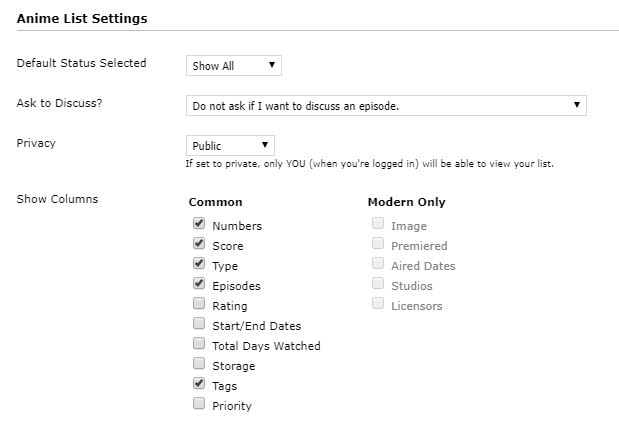 You can post any questions you have about this layout here in this topic! The code, copy everything in bold from the first @ to the last } @\import "https://malscraper.azurewebsites.net/covers/auto/presets/more"; /* HOW TO USE Use and COMPLETE this simple tutorial if you never installed CSS, it only takes a few minutes: http://myanimelist.net/forum/?topicid=200320 When you're done with the tutorial and can see the starter layout on your list, copy and paste this entire page of codes (including this part and the codes above and below) to your CSS edit box (the box titled Edit Advanced CSS File) replacing any other codes in the box. Save with the blue button at the bottom. It will put this premade layout on your list instead of the starter one from the tutorial! If the layout looks weird on your list after installing, you can try to alter your settings here. Common solutions are to set Default Status Settings to Watching or All Anime, check or uncheck tags (make sure you save afterwards): http://myanimelist.net/editprofile.php?go=listpreferences If your list still has problems you can ask us about it here, or other questions: http://myanimelist.net/forum/?topicid=200323 And you'll find further ways to customize your list here: http://myanimelist.net/forum/?topicid=419405 */ /* Text next to your rating. Says "My rating" by default. */ .td1[align="center"][width="45"]:before, .td2[align="center"][width="45"]:before { color: silver; content: "My rating: "; font-size: 17px; } body { background-color: black; background-image: url(https://image.myanimelist.net/ui/5LYzTBVoS196gvYvw3zjwDC-V6v0zIm4guohOfW12Gs); } * { } :hover { transition: all 0.5s ease 0s; } .header_title { background-color: transparent; background-position: center top; } .table_header { background-color: black; } .animetitle, .animetitle:visited { color: white; font-family: microsoft sans-serif; font-size: 22px; } .td1, .td2, a, a:visited, .category_totals, .table_header, #grand_totals, #copyright { color: beige; font-size: 17px; } .td1[align="center"][width="45"], .td2[align="center"][width="45"] { background: none repeat scroll 0 0 transparent; color: gold !important; font-size: 47px; margin-top: 33px; position: absolute; right: 245px; width: 73px; } .td1[align="center"][width="45"] a, .td2[align="center"][width="45"] a { color: gold; font-size: 47px; } td:nth-of-type(6) a { color: white; font-size: 15px; } #list_surround { width: 600px; } #list_surround { left: 5px !important; margin-top: -49px !important; position: absolute !important; } #list_surround { background-color: transparent; } .hide { background-position: left top; background-repeat: no-repeat; background-size: contain; display: inline-block !important; height: 300px; margin-bottom: 10px; margin-left: 0; margin-top: 5px; position: relative; width: 245px !important; } body { background-attachment: fixed; background-position: left top; background-size: cover; } .table_header:nth-of-type(3) { background: black; position: absolute; right: -0px; top: 70px; width: 140px; } .table_header:nth-of-type(3) { background: none repeat scroll 0 0 black; } .table_header:nth-of-type(3):before { color: white; content: " Sort by: "; font-size: 15px; font-weight: normal; } td:nth-of-type(6) { height: 124px !important; margin-left: -371px; margin-top: 115px; position: absolute; width: 361px; background: transparent !important; } body { background-color: black; background-repeat: no-repeat; } #list_surround { left: 0; margin: auto; position: absolute; right: 0; } a { text-decoration: none; } a:visited { text-decoration: none; } a:hover, a:visited:hover { color: white; text-decoration: underline; } border-width: 0; padding: 2px; } .td1[align="center"][width="45"]:hover, .td2[align="center"][width="45"]:hover { background: none repeat scroll 0 0 black; } .category_totals:hover, .td1:hover, .td2:hover, #grand_totals:hover, #copyright:hover { background-color: black !important; background-image: none !important; border-width: 0; } #copyright:after { content: "Custom CSS by Shishio-kun. Google Shishios Custom Lists for more layouts."; } .status_selected { color: white; padding: 2px; text-decoration: blink; } .status_not_selected { color: white; padding: 2px; } .status_selected a { color: blue; } .status_not_selected a { color: white; } .status_not_selected + .status_not_selected + .status_not_selected + .status_not_selected + .status_not_selected + .status_not_selected, .status_not_selected + .status_not_selected + .status_not_selected + .status_not_selected + .status_not_selected + .status_selected, .status_not_selected + .status_not_selected + .status_not_selected + .status_not_selected + .status_selected + .status_not_selected, .status_not_selected + .status_not_selected + .status_not_selected + .status_selected + .status_not_selected + .status_not_selected, .status_not_selected + .status_not_selected + .status_selected + .status_not_selected + .status_not_selected + .status_not_selected, .status_not_selected + .status_selected + .status_not_selected + .status_not_selected + .status_not_selected + .status_not_selected, .status_selected + .status_not_selected + .status_not_selected + .status_not_selected + .status_not_selected + .status_not_selected { background: none repeat scroll 0 0 black; display: none; height: 20px !important; margin-left: 0; margin-top: 0; padding-top: 0 !important; position: relative !important; width: 100px; } .thickbox { color: cyan; font-family: fantasy; font-size: 12px; } .header_title { height: 32px; padding: 2px; } .table_header { border-width: 0; font-weight: bold; padding: 2px; } .category_totals { color: white; font-size: 14px; height: 30px; } #copyright, #grand_totals { color: white; font-size: 12px; margin: 0 auto; text-align: center; } .table_header:nth-of-type(6) { display: none; } #inlineContent { background-image: url(https://image.myanimelist.net/ui/6YYcUzudlTgbmZrMT87ZN0y0ajg0LBr2sLkHD5GtCyLvvWSBASlqFDpt_Cp8l-Mi); background-position: center center; background-repeat: repeat-x; bottom: 0; display: block !important; height: 80px; left: 0; margin-bottom: 0; position: fixed; width: 100%; z-index: -1; } td:nth-of-type(6) small { margin-left: -357px; margin-top: 110px; position: absolute; } .status_selected a, .status_not_selected a { background: none repeat scroll 0 0 transparent !important; color: white !important; font-size: 121%; left: 2%; position: fixed; top: 7%; } .status_not_selected a { color: silver; } .status_selected + .status_not_selected a, .status_not_selected + .status_selected a, .status_not_selected + .status_not_selected a { background: none repeat scroll 0 0 transparent !important; left: 2%; position: fixed; top: 12%; } .status_selected + .status_not_selected a:hover, .status_not_selected + .status_selected a:hover, .status_not_selected + .status_not_selected a:hover { } .status_selected + .status_not_selected + .status_not_selected a, .status_not_selected + .status_selected + .status_not_selected a, .status_not_selected + .status_not_selected + .status_selected a, .status_not_selected + .status_not_selected + .status_not_selected a { background: none repeat scroll 0 0 transparent !important; left: 2%; position: fixed; top: 17%; } .status_selected + .status_not_selected + .status_not_selected a:hover, .status_not_selected + .status_selected + .status_not_selected a:hover, .status_not_selected + .status_not_selected + .status_selected a:hover, .status_not_selected + .status_not_selected + .status_not_selected a:hover { } .status_selected + .status_not_selected + .status_not_selected + .status_not_selected a, .status_not_selected + .status_selected + .status_not_selected + .status_not_selected a, .status_not_selected + .status_not_selected + .status_selected + .status_not_selected a, .status_not_selected + .status_not_selected + .status_not_selected + .status_selected a, .status_not_selected + .status_not_selected + .status_not_selected + .status_not_selected a { background: none repeat scroll 0 0 transparent !important; left: 2%; position: fixed; top: 22%; } .status_selected + .status_not_selected + .status_not_selected + .status_not_selected a:hover, .status_not_selected + .status_selected + .status_not_selected + .status_not_selected a:hover, .status_not_selected + .status_not_selected + .status_selected + .status_not_selected a:hover, .status_not_selected + .status_not_selected + .status_not_selected + .status_selected a:hover, .status_not_selected + .status_not_selected + .status_not_selected + .status_not_selected a:hover { } .status_selected + .status_not_selected + .status_not_selected + .status_not_selected + .status_not_selected a, .status_not_selected + .status_selected + .status_not_selected + .status_not_selected + .status_not_selected a, .status_not_selected + .status_not_selected + .status_selected + .status_not_selected + .status_not_selected a, .status_not_selected + .status_not_selected + .status_not_selected + .status_selected + .status_not_selected a, .status_not_selected + .status_not_selected + .status_not_selected + .status_not_selected + .status_selected a, .status_not_selected + .status_not_selected + .status_not_selected + .status_not_selected + .status_not_selected a { background: none repeat scroll 0 0 transparent !important; left: 2%; position: fixed; top: 27%; } .status_selected + .status_not_selected + .status_not_selected + .status_not_selected + .status_not_selected a:hover, .status_not_selected + .status_selected + .status_not_selected + .status_not_selected + .status_not_selected a:hover, .status_not_selected + .status_not_selected + .status_selected + .status_not_selected + .status_not_selected a:hover, .status_not_selected + .status_not_selected + .status_not_selected + .status_selected + .status_not_selected a:hover, .status_not_selected + .status_not_selected + .status_not_selected + .status_not_selected + .status_selected a:hover, .status_not_selected + .status_not_selected + .status_not_selected + .status_not_selected + .status_not_selected a:hover { } .status_not_selected + .status_not_selected + .status_not_selected + .status_not_selected + .status_not_selected + .status_not_selected a, .status_not_selected + .status_not_selected + .status_not_selected + .status_not_selected + .status_not_selected + .status_selected a, .status_not_selected + .status_not_selected + .status_not_selected + .status_not_selected + .status_selected + .status_not_selected a, .status_not_selected + .status_not_selected + .status_not_selected + .status_selected + .status_not_selected + .status_not_selected a, .status_not_selected + .status_not_selected + .status_selected + .status_not_selected + .status_not_selected + .status_not_selected a, .status_not_selected + .status_selected + .status_not_selected + .status_not_selected + .status_not_selected + .status_not_selected a, .status_selected + .status_not_selected + .status_not_selected + .status_not_selected + .status_not_selected + .status_not_selected a { display: none !important; } .status_selected, .status_not_selected, .status_selected:hover, .status_not_selected:hover { background: none repeat scroll 0 0 transparent; border: medium none; } .header_title { background-color: transparent !important; } .header_title { color: white; font-size: 28px; } a:hover, .a:hover { } .category_totals, .td1, .td2, #grand_totals, #copyright {background-color: rgba(0,0,0,.3) !important;} td:nth-of-type(2) small { position: absolute; margin-left: 10px; margin-top: 36px; background-color: rgba(0,0,0,.3) !important; } |
Shishio-kunApr 7, 2019 2:24 PM
Reply Disabled for Non-Club Members
May 23, 2012 4:59 PM
#2

The score doesn't appear at the right place when you are not viewing your own list or when you're not logged in: It's because you selected the score link and there is no link when you're not viewing your own list |
Shishio-kunJan 24, 2013 8:37 PM
May 23, 2012 7:51 PM
#3
| OK thanks for telling me I took care of it. You always get screwed making a new layout on the log-out lol. I fixed the logged-out issue and also made it more compatible with Chrome. |
Shishio-kunJan 24, 2013 8:37 PM
Jun 6, 2012 12:59 AM
#4
| I'm right now having Hahaido's transition effect in my list codes. When I mixed these codes in my list /* SCORE FONT AND POSITIONING Fonts for the score and the text before it. The first set of codes controls the score for anyone logged in. The second is for when someone is logged out. The third is for the text before the score regardless. You can move it a certain pixel amount by adjusting the numbers after margin-top and right codes. */ .td1[align="center"][width="45"], .td2[align="center"][width="45"]{ color: gold !important; font-size: 40px; margin-top: 44px; position: absolute; right: 209px; width: 70px; } .td1[align="center"][width="45"] a, .td2[align="center"][width="45"] a { color: gold; font-size: 40px; } .td1[align="center"][width="45"]:before, .td2[align="center"][width="45"]:before { color: white; content: " My rating: "; font-size: 15px; } /* ANIME TAG FONT This is the CSS to control the Tags font, which is underneath the score. Control the color and font size here. */ td:nth-of-type(6) a { font-size: 14px; color: white; } |
Jun 6, 2012 11:31 AM
#5
| Styles are never made to be mixed unless you're really good at editing. Generally you can add add-ons and stuff from tutorials as long as they're not contradictory or a different version of the same thing. Since I don't know what you're trying to do I can't tell you what adjustments to make. This layout uses #more CSS not anime title CSS btw. |
Jun 6, 2012 9:32 PM
#6
| I'm using those types of codes only which you have in your CSS right now. I guess I'll experiment more with the available codes here. However, do you anyone here who might be using this style. That would make things a lil' bit easier ^_^" |
Jun 6, 2012 11:12 PM
#7
Hinaya said: I'm using those types of codes only which you have in your CSS right now. I guess I'll experiment more with the available codes here. However, do you anyone here who might be using this style. That would make things a lil' bit easier ^_^" I don't. It'd be best to find the codes that control whichever parts of the tags and score like you want then you can add those your CSS. Not sure if that will work tho since this CSS is very particular and won't mix well. There's a tutorial here for finding any CSS code but the ones you want are in this already probably. |
Jun 17, 2012 1:58 PM
#8

| I cannot put my reviews, for some reason. I write them on the tag option, but they don't appear in the box. EDIT: I changed the background, since I preferred to have Monster's background, I hardly think so, but do you think it's related? |
CrashRHCPJun 17, 2012 2:02 PM
| Signature removed. Please follow the signature rules, as defined in the Site & Forum Guidelines. |
Jun 17, 2012 10:57 PM
#9
pmac said: I cannot put my reviews, for some reason. I write them on the tag option, but they don't appear in the box. EDIT: I changed the background, since I preferred to have Monster's background, I hardly think so, but do you think it's related? Thats really strange.. are you using the save button to finalize what you wrote? There's two things I can think of you can try first so we can hopefully narrow down the problem. First remove the CSS completely, and try to enter your reviews on the list without the CSS and see if they come up that way. Also, try to write a small review first. The space for reviews is limited to about 5 average sentences worth I think. But keep it small so it definitely goes up. I don't see how the background change can be related to it, so don't worry about that. |
Shishio-kunJun 17, 2012 11:01 PM
Jun 18, 2012 11:55 AM
#10
| The tags now appear, but on the title bar. Here, My manga list, I put the tag "Test" and comment "Test" too in the first manga of the list, Ah! My Goddess, so you don't have to go through everything: http://myanimelist.net/mangalist/pmac&status=1&order=0 EDIT: Figured out what's the problem, just not the solution. Anyways, it works fine in the anime list, but in manga list it puts on the big square the type (Manga, novel or One Shot) and puts on the title the tags. |
CrashRHCPJun 18, 2012 6:41 PM
| Signature removed. Please follow the signature rules, as defined in the Site & Forum Guidelines. |
Jun 18, 2012 7:04 PM
#11
pmac said: The tags now appear, but on the title bar. Here, My manga list, I put the tag "Test" and comment "Test" too in the first manga of the list, Ah! My Goddess, so you don't have to go through everything: http://myanimelist.net/mangalist/pmac&status=1&order=0 OK I see what you mean now. This layout is made for a similar set up to what you see in the example pic. So, if you can narrow down the table choices, first uncheck Type since you don't use that, it just says "manga". Save it and see if it works. Mess around with the choices till you get to a setup that works. Usuually, you wanna check three boxes other than numbers before you check tags. http://myanimelist.net/editprofile.php?go=listpreferences Wow that layout looks really good with that background, I might use that for a manga alternate version. |
Shishio-kunJun 18, 2012 7:23 PM
Jun 19, 2012 3:58 AM
#12
| Thanks, mate. I unchecked the Type and now it works fine! |
| Signature removed. Please follow the signature rules, as defined in the Site & Forum Guidelines. |
Jul 6, 2012 6:07 PM
#13

| Im not really a list wiz like you but i can tell there's something not right with mine because the tag isn't in the right place and it looks like a regular tag list on my profile do you know whats wrong with it? http://myanimelist.net/animelist/jesseman1993 |
 |
Jul 6, 2012 6:09 PM
#14
| let me see if that fixes it for me as well |
|
Jul 6, 2012 6:18 PM
#15
| i finally got it working right thanks for having this thread up :) |
|
Jul 27, 2012 10:51 PM
#16

| Just wanted to say thanks for this Shishio-kun :) |
Nov 9, 2012 8:21 AM
#17

| I'm currently using this style for my manga list. I mixed the button codes from Ayame's fate stay night list in this one and changed the position of the buttons from left to top. The last button (All Manga) always overlaps the headers. Anyway I can fix this ? For now I have kept the all manga button to "display: none". I added a list background, but it starts a few pixels above the header. I want it to start exactly from where the header is placed. Maybe I messed around too much with the codes.  |

Nov 9, 2012 9:23 AM
#18
Rinetto said: The last button (All Manga) always overlaps the headers. Anyway I can fix this ? For now I have kept the all manga button to "display: none". I added a list background, but it starts a few pixels above the header. I want it to start exactly from where the header is placed. Wow thats a really good design. Anyways you'd have to readjust the position of the part you added display: none too and the headers near the top. I did it for you in preview; save your current CSS then replace with this see if it works. Should have what you're asking for if not post back. If its only a little off from what you wanted then you have to make small adjustments to header codes near the top (margin-top codes) and the part you added display: none (top and left codes) too. Firebug makes minor adjustments way easier. @import "http://dl.dropbox.com/u/49469857/MAL/premade/manga.css"; @import "https://dl.dropbox.com/sh/56a9stdbm5hqyqo/aMQ6IuCeoe/manga_css.css"; @import "http://dl.dropbox.com/u/78340470/Icon%20Style%20Menu%20Bar/IconStyleCSS.css"; body { background-image: url("http://i1215.photobucket.com/albums/cc507/Rinetto/mainbg.jpg"); } .header_cw { background-image: url("http://i1215.photobucket.com/albums/cc507/Rinetto/r.png"); background-repeat: no-repeat; font-size: 0 !important; height: 225px; margin-top: -60px; } .header_completed { background-image: url("http://i1215.photobucket.com/albums/cc507/Rinetto/c-3.png"); background-repeat: no-repeat; font-size: 0 !important; height: 225px; margin-top: -60px; } .header_onhold { background-image: url("http://i1215.photobucket.com/albums/cc507/Rinetto/oh-2.png"); background-repeat: no-repeat; font-size: 0 !important; height: 225px; margin-top: -60px; } .header_dropped { background-image: url("http://i1215.photobucket.com/albums/cc507/Rinetto/dm.png"); background-repeat: no-repeat; font-size: 0 !important; height: 225px; margin-top: -60px; } .header_ptw { background-image: url("http://i1215.photobucket.com/albums/cc507/Rinetto/ptw-2.png"); background-repeat: no-repeat; font-size: 0 !important; height: 225px; margin-top: -60px; } .table_header { background-color: black; } .td1[align="center"][width="45"], .td2[align="center"][width="45"] { color: gold !important; font-size: 40px; margin-top: 44px; position: absolute; right: 209px; width: 70px; } .td1[align="center"][width="45"] a, .td2[align="center"][width="45"] a { color: gold; font-size: 40px; } .td1[align="center"][width="45"]:before, .td2[align="center"][width="45"]:before { color: white; content: " My rating: "; font-size: 15px; } .hide { background-position: left top; background-repeat: no-repeat; background-size: auto auto; display: inline-block !important; height: 310px; margin-bottom: 10px; margin-left: 0; margin-top: 5px; position: relative; width: 245px !important; } td:nth-of-type(6) a { color: white; font-size: 14px; } td:nth-of-type(6) { background: none repeat scroll 0 0 transparent; height: 146px !important; margin-left: -350px; margin-top: 141px; position: absolute; width: 330px; } body { background-attachment: scroll; background-color: transparent; background-position: left top; background-repeat: repeat; background-size: auto auto; color: transparent; position: absolute; } #list_surround { background-image: url("http://i1215.photobucket.com/albums/cc507/Rinetto/stars-night-dark-sparkle.gif"); left: 100px; position: absolute; right: auto; top: 200px !important; width: 598px !important; } a { text-decoration: none; } a:visited { text-decoration: none; } a:hover, a:visited:hover { color: white; text-decoration: underline; } .category_totals, .td1, .td2, #grand_totals, #copyright { background-image: url("http://img15.imageshack.us/img15/228/frame6518.png"); border-width: 0; color: white; padding: 2px; } .td1[align="center"][width="45"]:hover, .td2[align="center"][width="45"]:hover { background: url("http://img15.imageshack.us/img15/228/frame6518.png") repeat scroll 0 0 transparent; } .category_totals:hover, .td1:hover, .td2:hover, #grand_totals:hover, #copyright:hover { background-color: black; border-width: 0; padding: 2px; } #copyright:after { content: " Custom CSS by Shishio-kun. #more import by u531355. Google \'Shishio\'s Custom Lists\' for more designs and info."; } .status_selected a { color: #184900; display: block; font-size: 1px; height: 2px; padding: 128px 0 0 243px; width: 30px; } .status_not_selected a { color: #184900; display: block; font-size: 1px; height: 2px; padding: 128px 0 0 243px; width: 30px; } .status_not_selected a { opacity: 0; } .status_selected a { opacity: 0; } #list_surround .status_selected { background: url("http://i1215.photobucket.com/albums/cc507/Rinetto/br.png") no-repeat scroll 0 0 transparent; display: block; height: 111px; left: 0; padding: 0; position: absolute; top: -120px; width: 89px; } #list_surround .status_selected a { color: #FFEBCD; display: block; font-size: 1px; height: 2px; padding: 100px 0 0 243px; width: 30px; } #list_surround .status_not_selected { background: url("http://i1215.photobucket.com/albums/cc507/Rinetto/br.png") no-repeat scroll 0 0 transparent; display: block; height: 111px; left: 0; padding: 0; position: absolute; top: -120px; width: 89px; } #list_surround .status_not_selected a { color: #FFEBCD; display: block; font-size: 1px; height: 2px; padding: 100px 0 0 243px; width: 30px; } #list_surround .status_selected + .status_not_selected, #list_surround .status_not_selected + .status_selected, #list_surround .status_not_selected + .status_not_selected { background: url("http://i1215.photobucket.com/albums/cc507/Rinetto/bc.png") no-repeat scroll 0 0 transparent; height: 109px; left: 103px; width: 88px; } #list_surround .status_selected + .status_not_selected + .status_not_selected, #list_surround .status_not_selected + .status_selected + .status_not_selected, #list_surround .status_not_selected + .status_not_selected + .status_selected, #list_surround .status_not_selected + .status_not_selected + .status_not_selected { background: url("http://i1215.photobucket.com/albums/cc507/Rinetto/boh.png") repeat scroll 0 0 transparent; height: 109px; left: 205px; width: 86px; } #list_surround .status_selected + .status_not_selected + .status_not_selected + .status_not_selected, #list_surround .status_not_selected + .status_selected + .status_not_selected + .status_not_selected, #list_surround .status_not_selected + .status_not_selected + .status_selected + .status_not_selected, #list_surround .status_not_selected + .status_not_selected + .status_not_selected + .status_selected, #list_surround .status_not_selected + .status_not_selected + .status_not_selected + .status_not_selected { background: url("http://i1215.photobucket.com/albums/cc507/Rinetto/bth_bd.png") no-repeat scroll 0 0 transparent; display: inline; height: 108px; left: 305px; width: 108px; } #list_surround .status_selected + .status_not_selected + .status_not_selected + .status_not_selected + .status_not_selected, #list_surround .status_not_selected + .status_selected + .status_not_selected + .status_not_selected + .status_not_selected, #list_surround .status_not_selected + .status_not_selected + .status_selected + .status_not_selected + .status_not_selected, #list_surround .status_not_selected + .status_not_selected + .status_not_selected + .status_selected + .status_not_selected, #list_surround .status_not_selected + .status_not_selected + .status_not_selected + .status_not_selected + .status_selected, #list_surround .status_not_selected + .status_not_selected + .status_not_selected + .status_not_selected + .status_not_selected { background: url("http://i1215.photobucket.com/albums/cc507/Rinetto/bptr.png") no-repeat scroll 0 0 transparent; display: inline; height: 107px; left: 407px; width: 87px; } #list_surround .status_selected + .status_not_selected + .status_not_selected + .status_not_selected + .status_not_selected + .status_not_selected, #list_surround .status_not_selected + .status_selected + .status_not_selected + .status_not_selected + .status_not_selected + .status_not_selected, #list_surround .status_not_selected + .status_not_selected + .status_selected + .status_not_selected + .status_not_selected + .status_not_selected, #list_surround .status_not_selected + .status_not_selected + .status_not_selected + .status_selected + .status_not_selected + .status_not_selected, #list_surround .status_not_selected + .status_not_selected + .status_not_selected + .status_not_selected + .status_selected + .status_not_selected, #list_surround .status_not_selected + .status_not_selected + .status_not_selected + .status_not_selected + .status_not_selected + .status_selected, #list_surround .status_not_selected + .status_not_selected + .status_not_selected + .status_not_selected + .status_not_selected + .status_not_selected { background: url("http://i1215.photobucket.com/albums/cc507/Rinetto/bam.png") no-repeat scroll 0 0 transparent; height: 112px; left: 857px; padding-right: 0; position: absolute !important; width: 90px; top: -263px; } .thickbox { color: cyan; display: none; font-family: fantasy; font-size: 12px; } .header_title { height: 32px; padding: 2px; } .table_header { border-width: 0; font-weight: bold; padding: 2px; } .category_totals { height: 30px; } #copyright, #grand_totals { margin: 0 auto; text-align: center; } .table_header:nth-of-type(6) { display: none; } #inlineContent { background-attachment: fixed; background-clip: border-box; background-color: transparent; background-image: url("http://i1215.photobucket.com/albums/cc507/Rinetto/UTF-8B5pyJ5YipLnBuZw.png"); background-origin: padding-box; background-position: 0 0; background-repeat: no-repeat; background-size: contain; bottom: 0; display: inline !important; height: 100%; left: 698px; margin-bottom: 0; position: fixed; width: 100%; z-index: -2 !important; } |
Shishio-kunNov 9, 2012 9:28 AM
Nov 9, 2012 10:24 PM
#19
| Thanks a lot Shishio-kun ^-^ Its perfect now! |
Mar 20, 2013 11:05 PM
#20

| How would I adjust the position of the mini review box to be to the left of the picture and for the score to be right under the number of episodes watched? here is an idea http://i.imgur.com/zNB86SX.jpg http://myanimelist.net/animelist/xXTensaZenXx EDIT: NM I figured it out |
xXTensaZenXxMar 21, 2013 12:13 AM
Jul 11, 2014 7:13 AM
#21
| Fixed this up for a couple bad codes and the covers link is one thats updated more often than the old one. |
May 28, 2015 10:59 AM
#22

| I really like the ReviewerX fantasy theme that is based on this one. too bad its not available :O |
 |
Jun 29, 2015 1:08 AM
#23
| Thanks a lot, as you said this is the ultimate for me, but its possible to take out that dark line in the bottom? |
Dec 26, 2016 10:17 AM
#24
xXTensaZenXx said: How would I adjust the position of the mini review box to be to the left of the picture and for the score to be right under the number of episodes watched? here is an idea http://i.imgur.com/zNB86SX.jpg http://myanimelist.net/animelist/xXTensaZenXx EDIT: NM I figured it out How did you manage to adjust in the end? Having a similar issue, not only I want to move the review box, I want to increase the width of it as well. |
Nov 1, 2018 12:36 AM
#25
| My baby! One of the first and simplest cover layouts. It's been updated and fixed up. |
Dec 21, 2018 5:34 PM
#26

I really liked this one :D Just cosmetic changes to hit my taste.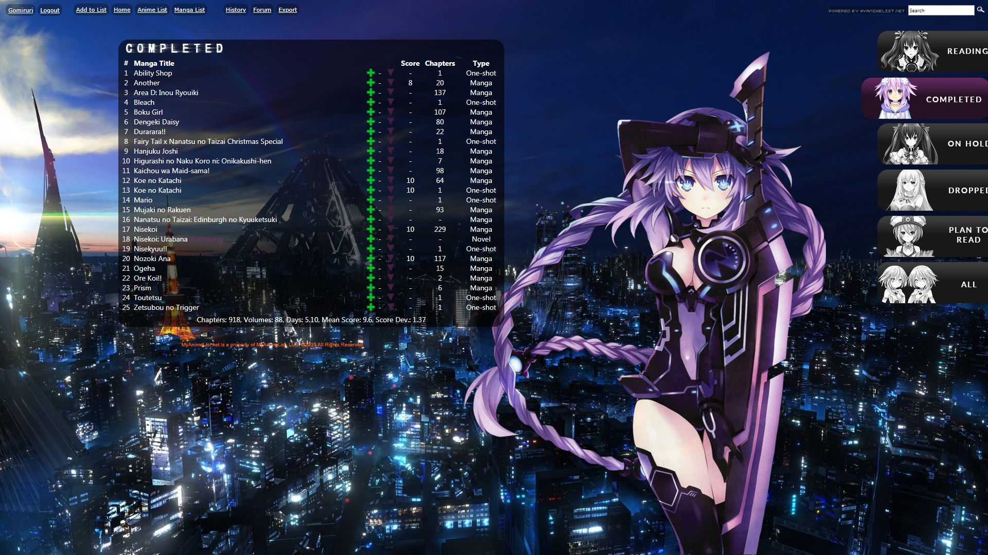 Thank you Shishio-kun. |
 |
Dec 22, 2018 4:32 PM
#27
Gomiruri said: I really liked this one :D Just cosmetic changes to hit my taste. Thank you Shishio-kun. So lovely, good job! :D |
Apr 6, 2019 4:57 PM
#28
| Where i can find code to this layout? Layout of the bottom of your post is diffrent. |
Apr 6, 2019 5:28 PM
#29
Damn, looks like I saved over this on accident somehow last year! I don't understand how that even could have happened :/ unfortunately I don't have this version saved in my documents, and wayback machine doesn't bring it up However I have an updated version that I made for my list, so I can try to convert that into one anyone can use (I'll try to get on that this weekend after some other projects). |
Apr 7, 2019 3:13 AM
#31
Smokk said: Thank you for reply. OK I restored the layout back (as far as I can see) to how it was in 2012, and I made a couple improvements. * the category links are fixed on the left side now so no more needing to scroll to the top to click them * the add and more links were getting messy in the same space with anime that had very long names, so I moved them to the right of the score where they should be convenient to use and won't get in the way of long name anime anymore. Might make some more adjustments tomorrow, since I think rating/score was a little more to the left. Also maybe it should be a tad bigger. The CSS code is in the opening post under the spoiler. I'm glad someone brought this to my attn so I could fix it up, thanks! :D  |
Shishio-kunApr 7, 2019 3:17 AM
Jan 16, 2021 7:52 PM
#32
Shishio-kun said: This layout is custom CSS. If you don't know how to install it, use the easy Beginner's Tutorial in this section: http://myanimelist.net/forum/?topicid=419405 The design works on both anime and manga lists. For more layouts check the full list of Premade Layouts: http://myanimelist.net/forum/?topicid=318587 Something I've always thought the ultimate purpose of your list should be is to emphasize the score, cover pic, and a description or mini-review (written through the Tags option). This way, people who go to your list and have similar tastes can know what you like best right away, then look at your tag to know what to expect if they add that anime from your list to theirs. My newest list design captures that! Settings needed: You can post any questions you have about this layout here in this topic! The code, copy everything in bold from the first @ to the last } @\import "https://malscraper.azurewebsites.net/covers/auto/presets/more"; /* HOW TO USE Use and COMPLETE this simple tutorial if you never installed CSS, it only takes a few minutes: http://myanimelist.net/forum/?topicid=200320 When you're done with the tutorial and can see the starter layout on your list, copy and paste this entire page of codes (including this part and the codes above and below) to your CSS edit box (the box titled Edit Advanced CSS File) replacing any other codes in the box. Save with the blue button at the bottom. It will put this premade layout on your list instead of the starter one from the tutorial! If the layout looks weird on your list after installing, you can try to alter your settings here. Common solutions are to set Default Status Settings to Watching or All Anime, check or uncheck tags (make sure you save afterwards): http://myanimelist.net/editprofile.php?go=listpreferences If your list still has problems you can ask us about it here, or other questions: http://myanimelist.net/forum/?topicid=200323 And you'll find further ways to customize your list here: http://myanimelist.net/forum/?topicid=419405 */ /* Text next to your rating. Says "My rating" by default. */ .td1[align="center"][width="45"]:before, .td2[align="center"][width="45"]:before { color: silver; content: "My rating: "; font-size: 17px; } body { background-color: black; background-image: url(https://image.myanimelist.net/ui/5LYzTBVoS196gvYvw3zjwDC-V6v0zIm4guohOfW12Gs); } * { } :hover { transition: all 0.5s ease 0s; } .header_title { background-color: transparent; background-position: center top; } .table_header { background-color: black; } .animetitle, .animetitle:visited { color: white; font-family: microsoft sans-serif; font-size: 22px; } .td1, .td2, a, a:visited, .category_totals, .table_header, #grand_totals, #copyright { color: beige; font-size: 17px; } .td1[align="center"][width="45"], .td2[align="center"][width="45"] { background: none repeat scroll 0 0 transparent; color: gold !important; font-size: 47px; margin-top: 33px; position: absolute; right: 245px; width: 73px; } .td1[align="center"][width="45"] a, .td2[align="center"][width="45"] a { color: gold; font-size: 47px; } td:nth-of-type(6) a { color: white; font-size: 15px; } #list_surround { width: 600px; } #list_surround { left: 5px !important; margin-top: -49px !important; position: absolute !important; } #list_surround { background-color: transparent; } .hide { background-position: left top; background-repeat: no-repeat; background-size: contain; display: inline-block !important; height: 300px; margin-bottom: 10px; margin-left: 0; margin-top: 5px; position: relative; width: 245px !important; } body { background-attachment: fixed; background-position: left top; background-size: cover; } .table_header:nth-of-type(3) { background: black; position: absolute; right: -0px; top: 70px; width: 140px; } .table_header:nth-of-type(3) { background: none repeat scroll 0 0 black; } .table_header:nth-of-type(3):before { color: white; content: " Sort by: "; font-size: 15px; font-weight: normal; } td:nth-of-type(6) { height: 124px !important; margin-left: -371px; margin-top: 115px; position: absolute; width: 361px; background: transparent !important; } body { background-color: black; background-repeat: no-repeat; } #list_surround { left: 0; margin: auto; position: absolute; right: 0; } a { text-decoration: none; } a:visited { text-decoration: none; } a:hover, a:visited:hover { color: white; text-decoration: underline; } border-width: 0; padding: 2px; } .td1[align="center"][width="45"]:hover, .td2[align="center"][width="45"]:hover { background: none repeat scroll 0 0 black; } .category_totals:hover, .td1:hover, .td2:hover, #grand_totals:hover, #copyright:hover { background-color: black !important; background-image: none !important; border-width: 0; } #copyright:after { content: "Custom CSS by Shishio-kun. Google Shishios Custom Lists for more layouts."; } .status_selected { color: white; padding: 2px; text-decoration: blink; } .status_not_selected { color: white; padding: 2px; } .status_selected a { color: blue; } .status_not_selected a { color: white; } .status_not_selected + .status_not_selected + .status_not_selected + .status_not_selected + .status_not_selected + .status_not_selected, .status_not_selected + .status_not_selected + .status_not_selected + .status_not_selected + .status_not_selected + .status_selected, .status_not_selected + .status_not_selected + .status_not_selected + .status_not_selected + .status_selected + .status_not_selected, .status_not_selected + .status_not_selected + .status_not_selected + .status_selected + .status_not_selected + .status_not_selected, .status_not_selected + .status_not_selected + .status_selected + .status_not_selected + .status_not_selected + .status_not_selected, .status_not_selected + .status_selected + .status_not_selected + .status_not_selected + .status_not_selected + .status_not_selected, .status_selected + .status_not_selected + .status_not_selected + .status_not_selected + .status_not_selected + .status_not_selected { background: none repeat scroll 0 0 black; display: none; height: 20px !important; margin-left: 0; margin-top: 0; padding-top: 0 !important; position: relative !important; width: 100px; } .thickbox { color: cyan; font-family: fantasy; font-size: 12px; } .header_title { height: 32px; padding: 2px; } .table_header { border-width: 0; font-weight: bold; padding: 2px; } .category_totals { color: white; font-size: 14px; height: 30px; } #copyright, #grand_totals { color: white; font-size: 12px; margin: 0 auto; text-align: center; } .table_header:nth-of-type(6) { display: none; } #inlineContent { background-image: url(https://image.myanimelist.net/ui/6YYcUzudlTgbmZrMT87ZN0y0ajg0LBr2sLkHD5GtCyLvvWSBASlqFDpt_Cp8l-Mi); background-position: center center; background-repeat: repeat-x; bottom: 0; display: block !important; height: 80px; left: 0; margin-bottom: 0; position: fixed; width: 100%; z-index: -1; } td:nth-of-type(6) small { margin-left: -357px; margin-top: 110px; position: absolute; } .status_selected a, .status_not_selected a { background: none repeat scroll 0 0 transparent !important; color: white !important; font-size: 121%; left: 2%; position: fixed; top: 7%; } .status_not_selected a { color: silver; } .status_selected + .status_not_selected a, .status_not_selected + .status_selected a, .status_not_selected + .status_not_selected a { background: none repeat scroll 0 0 transparent !important; left: 2%; position: fixed; top: 12%; } .status_selected + .status_not_selected a:hover, .status_not_selected + .status_selected a:hover, .status_not_selected + .status_not_selected a:hover { } .status_selected + .status_not_selected + .status_not_selected a, .status_not_selected + .status_selected + .status_not_selected a, .status_not_selected + .status_not_selected + .status_selected a, .status_not_selected + .status_not_selected + .status_not_selected a { background: none repeat scroll 0 0 transparent !important; left: 2%; position: fixed; top: 17%; } .status_selected + .status_not_selected + .status_not_selected a:hover, .status_not_selected + .status_selected + .status_not_selected a:hover, .status_not_selected + .status_not_selected + .status_selected a:hover, .status_not_selected + .status_not_selected + .status_not_selected a:hover { } .status_selected + .status_not_selected + .status_not_selected + .status_not_selected a, .status_not_selected + .status_selected + .status_not_selected + .status_not_selected a, .status_not_selected + .status_not_selected + .status_selected + .status_not_selected a, .status_not_selected + .status_not_selected + .status_not_selected + .status_selected a, .status_not_selected + .status_not_selected + .status_not_selected + .status_not_selected a { background: none repeat scroll 0 0 transparent !important; left: 2%; position: fixed; top: 22%; } .status_selected + .status_not_selected + .status_not_selected + .status_not_selected a:hover, .status_not_selected + .status_selected + .status_not_selected + .status_not_selected a:hover, .status_not_selected + .status_not_selected + .status_selected + .status_not_selected a:hover, .status_not_selected + .status_not_selected + .status_not_selected + .status_selected a:hover, .status_not_selected + .status_not_selected + .status_not_selected + .status_not_selected a:hover { } .status_selected + .status_not_selected + .status_not_selected + .status_not_selected + .status_not_selected a, .status_not_selected + .status_selected + .status_not_selected + .status_not_selected + .status_not_selected a, .status_not_selected + .status_not_selected + .status_selected + .status_not_selected + .status_not_selected a, .status_not_selected + .status_not_selected + .status_not_selected + .status_selected + .status_not_selected a, .status_not_selected + .status_not_selected + .status_not_selected + .status_not_selected + .status_selected a, .status_not_selected + .status_not_selected + .status_not_selected + .status_not_selected + .status_not_selected a { background: none repeat scroll 0 0 transparent !important; left: 2%; position: fixed; top: 27%; } .status_selected + .status_not_selected + .status_not_selected + .status_not_selected + .status_not_selected a:hover, .status_not_selected + .status_selected + .status_not_selected + .status_not_selected + .status_not_selected a:hover, .status_not_selected + .status_not_selected + .status_selected + .status_not_selected + .status_not_selected a:hover, .status_not_selected + .status_not_selected + .status_not_selected + .status_selected + .status_not_selected a:hover, .status_not_selected + .status_not_selected + .status_not_selected + .status_not_selected + .status_selected a:hover, .status_not_selected + .status_not_selected + .status_not_selected + .status_not_selected + .status_not_selected a:hover { } .status_not_selected + .status_not_selected + .status_not_selected + .status_not_selected + .status_not_selected + .status_not_selected a, .status_not_selected + .status_not_selected + .status_not_selected + .status_not_selected + .status_not_selected + .status_selected a, .status_not_selected + .status_not_selected + .status_not_selected + .status_not_selected + .status_selected + .status_not_selected a, .status_not_selected + .status_not_selected + .status_not_selected + .status_selected + .status_not_selected + .status_not_selected a, .status_not_selected + .status_not_selected + .status_selected + .status_not_selected + .status_not_selected + .status_not_selected a, .status_not_selected + .status_selected + .status_not_selected + .status_not_selected + .status_not_selected + .status_not_selected a, .status_selected + .status_not_selected + .status_not_selected + .status_not_selected + .status_not_selected + .status_not_selected a { display: none !important; } .status_selected, .status_not_selected, .status_selected:hover, .status_not_selected:hover { background: none repeat scroll 0 0 transparent; border: medium none; } .header_title { background-color: transparent !important; } .header_title { color: white; font-size: 28px; } a:hover, .a:hover { } .category_totals, .td1, .td2, #grand_totals, #copyright {background-color: rgba(0,0,0,.3) !important;} td:nth-of-type(2) small { position: absolute; margin-left: 10px; margin-top: 36px; background-color: rgba(0,0,0,.3) !important; } Hi~ Can I ask is it available for Manga settings as well or only for AnimeList? > . < |
Reply Disabled for Non-Club Members
More topics from this board
» theme helpthreat - Jul 5 |
5 |
by Zaryf
»»
Aug 21, 5:46 AM |
|
» [CSS - Modern] 🍰 Clarity by V.L ( 1 2 3 4 5 ... Last Page )Valerio_Lyndon - Apr 19, 2018 |
1261 |
by KiranaStarr
»»
Aug 16, 5:48 PM |
|
» [CSS] ⭐️ Customize your List Cursor + Cursor FixesShishio-kun - Mar 8, 2021 |
30 |
by Shishio-kun
»»
Jul 28, 3:17 AM |
|
» How To Have Different Banner/Cover image & Background Image For Manga & Anime ListsYasminaRegina - Jul 25 |
2 |
by YasminaRegina
»»
Jul 26, 1:02 AM |
|
Sticky: » 💚 [REPAIR STICKY] Repair/speed up layouts + Request layout fixes ( 1 2 )Shishio-kun - Nov 17, 2023 |
52 |
by LucaBalsa
»»
Jul 6, 2:02 PM |