Jul 24, 2014
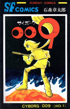
Cyborg 009 is incredible. The concept of a group of people, all given superpowers against their will and dealing with the horrible repercussions of such was a revolutionary concept back in its inception, aside from x-men which came out only a few months prior. The characters were interesting, and though it was rushed in the beginning, they soon all got a respectable amount of character development. The overarching plot was great too, with interesting story arcs portraying their conflict. There was also a very prominent Anti-War theme, thought that isnt a bad thing and worked very well in the story. The ending (and by ending,
...
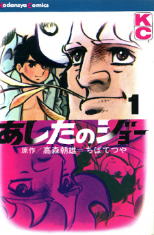
I mean what was originally supposed to be the ending) was pulled off very well. But there is a major problem in this series. the art is horrible. It looks like an even worse version of the Jetsons. I was never a big fan of 60s artwork which looks the same most of the time, like in Ashita no Joe, but Cyborg 009 has possibly the worst art i've ever seen. With the dark story, the cartoonish drawings could still fit, as is the case in Devilman, Billy Bat, and so on, but here it doesnt. In my opinion, a good manga should have good Art, Plot, and Characters. Cyborg 009 is missing the art. Art is very important in a manga, it helps portray the story by giving you a perfect visual of the impact of the plot and the characters. Cyborg 009's artwork cant do that, and thats why the series didnt reach anywhere near its full potential. If one can look past the artwork, though, they will be rewarded with an otherwise great series.
Reviewer’s Rating: 7
What did you think of this review?
Nice
 0
0
Love it
 0
0
Funny
 0
0
Confusing
 0
0
Well-written
 0
0
Creative
 0
0Show all


.png)