/* LINK COLOR ON HOVER*/
a:hover,
.list-table .list-table-data .data a:hover{
color: cyan !important;
}
/*BACKGROUND AND BORDER COLOR OF CATEGORY LINKS
The first number in the parenthesis is the amount of red (0-255).
The second number in the parenthesis is the amount of green (0-255).
The third number in the parenthesis is the amount of blue (0-255).
The fourth number in the parenthesis is the amount of opacity (.0 to 1).
*/
.status-menu-container{
background-color: rgba(0,50,150,.8) !important;
border: 1px white solid !important;
}
/* BACKGROUND AND BORDER COLOR OF LIST
See BACKGROUND AND BORDER COLOR OF CATEGORY LINKS above for guide on using RGBA colors.
*/
.list-block{
background-color: rgba(0,50,150,.6) !important;
border: 1px white solid !important;
}
/*BACKGROUND COLOR OF ROWS ON HOVER
See BACKGROUND AND BORDER COLOR OF CATEGORY LINKS above for guide on using RGBA colors.
*/
tbody[class*="list-item"]:hover,
.list-table tbody:nth-of-type(2n+1):hover {background-color:rgba(0,0,0,.5) !important;}
/* COVER AREA
The area taken up by covers.
*/
.list-block {
/* variables used in calc (explicit names) */
--height-img: 350px !important;
--width-img: 225px !important;
}
/* HOW MUCH THE COVER AREA OR TEXT DISAPEARS ON HOVER
First is the opacity for preview pics on hover. Next is opacity for text. Last is opacity for text on hover.
*/
.list-item:hover .image {
opacity: .3;
}
/* HD COVER SIZE
The size of covers seen.
*/
.data.image a:before{
background-size: cover !important;
height: 350px !important;
width: 225px !important;
background-position: center center !important;
}
/* LOW RES COVER SIZE
You only see this if the import for high res covers goes down.
*/
a img{
background-size: cover !important;
height: 350px !important;
width: 225px !important;
margin-left: 0px !important;
}
/* LINK COLOR ON HOVER*/
a:hover,
.list-table .list-table-data .data a:hover{
color: cyan !important;
}
/*BACKGROUND AND BORDER COLOR OF CATEGORY LINKS
The first number in the parenthesis is the amount of red (0-255).
The second number in the parenthesis is the amount of green (0-255).
The third number in the parenthesis is the amount of blue (0-255).
The fourth number in the parenthesis is the amount of opacity (.0 to 1).
*/
.status-menu-container{
background-color: rgba(0,50,150,.8) !important;
border: 1px white solid !important;
}
/* BACKGROUND AND BORDER COLOR OF LIST
See BACKGROUND AND BORDER COLOR OF CATEGORY LINKS above for guide on using RGBA colors.
*/
.list-block{
background-color: rgba(0,50,150,.6) !important;
border: 1px white solid !important;
}
/*BACKGROUND COLOR OF ROWS ON HOVER
See BACKGROUND AND BORDER COLOR OF CATEGORY LINKS above for guide on using RGBA colors.
*/
tbody[class*="list-item"]:hover,
.list-table tbody:nth-of-type(2n+1):hover {background-color:transparent !important;}
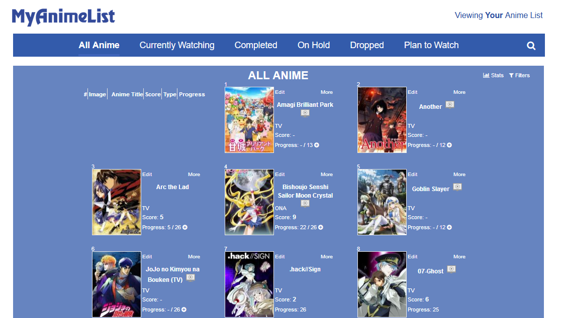
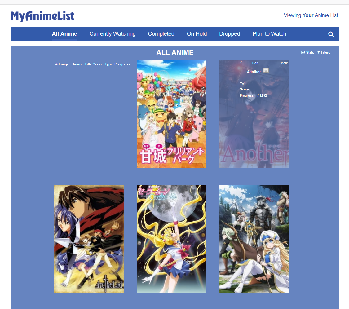
Added a simple grid with big preview pics; both of these should be good to start with if you want to make a grid style layout of your own with Inspect Element.