New
Aug 25, 2023 2:53 PM
#51
karmashizzle said: how can i add color transition on hover for the list data? have it fade in like so: (slow speed for demonstration purposes only) https://i.imgur.com/XeoVa9U.gif simply adding transition to the code only does it for the box shadow: https://i.imgur.com/u7MWpJh.gif /*
list color on hover
*/
.list-table-data:hover{
box-shadow: 1px 1px 45px 4px #211E21 inset;
background: linear-gradient(90deg, rgba(32, 70, 247, 0.2) 20%, rgba(46, 154, 255, 0.4) 100%) !important;
border-radius: 6px !important;
position: relative;
}CSS gradients such as "linear-gradient" are background-image's and thus, just like regular images, don't play nicely with transitions. My workaround is always to use a pseudo element with an opacity value and transition the opacity. This works for a lot of values that are hard to otherwise transition. Here's an example to replace your current "list color on hover" section (will look weird if you keep the background on .list-table-data itself): /*
list color on hover
*/
.list-table-data {
position: relative; /* so that the pseudo element will position in relation to this */
z-index: 0; /* prevent the -1 z-index on the pseudo element from going below the .list-item */
}
.list-table-data::before {
content: "";
position: absolute;
z-index: -1; /* position below the parent element (.list-table-data) */
inset: 0;
background-image: linear-gradient(90deg, rgba(32, 70, 247, 0.2) 20%, rgba(46, 154, 255, 0.4) 100%);
box-shadow: 1px 1px 45px 4px #211E21 inset;
border-radius: 6px;
opacity: 0;
transition: opacity .2s ease;
}
.list-table-data:hover::before {
opacity: 1;
} |
Valerio_LyndonAug 25, 2023 2:56 PM
Sep 30, 2023 8:59 PM
#52
| Updated to support the new list columns! :) Open to feedback if anyone wants these displayed a different way. With score enabled: 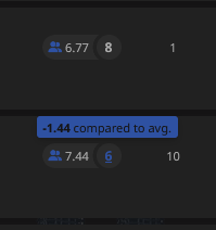 On PTW items:  With score disabled: 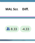 |
Valerio_LyndonSep 30, 2023 9:02 PM
Oct 1, 2023 5:16 PM
#53
past_me said: need help changing the border for the search box like in Brink theme (change color and add transition (not the top right corner thingy)). cant seem to find it in the old spaghetti code  ➔ ➔   finally the white outline on every input box is gone. who knew the solution is that simple! (not me clearly) --- i supposed i wont be needing the list tools anymore cuz mal score is officially added. o7 ---  so uh i have these "season" text underlying the hourglasses for some reason. how 2 fix? |
Oct 1, 2023 7:29 PM
#54
Reply to karmashizzle
past_me said:
need help changing the border for the search box like in Brink theme (change color and add transition (not the top right corner thingy)). cant seem to find it in the old spaghetti code
 ➔
➔ 
need help changing the border for the search box like in Brink theme (change color and add transition (not the top right corner thingy)). cant seem to find it in the old spaghetti code
 ➔
➔ 

finally the white outline on every input box is gone. who knew the solution is that simple! (not me clearly)
---
i supposed i wont be needing the list tools anymore cuz mal score is officially added. o7
---

so uh i have these "season" text underlying the hourglasses for some reason. how 2 fix?
| @karmashizzle The "Season" texts are a hack to make the primary Season text work. With solid colour backgrounds it works fine, but with transparent colours this occurs. It should have been visible on the previous versions as well but I never thought to look. To fix it I'd add this code to the bottom somewhere, it will hide the text and extra background colour. Just keep in mind this fix will break if you disable the "Dates" column. /* Hide erroneous "Season" header text. This fix should only be applied when:
• both the Dates and the Season columns are enabled
• a transparent colour is applied to the list/header background */
.header-title.started::before {
content: none;
}
.header-title.started + .started::before {
content: "Season";
}
.header-title:is(.started, .finished) {
background: none !important;
}Shout-out to the comment I wrote a year ago lamenting the hacky solution.  |
Oct 3, 2023 6:01 PM
#55
Oct 3, 2023 9:35 PM
#56
Reply to karmashizzle
Henlo! shouldnt this html thingymabob be in css form? it simply disappears from the code when saving.
under Forms

under Forms

@karmashizzle Hm, good catch! I don't remember the editor deleting that, might be a change to their CSS sanitisation. It's just an SVG (a type of vector-based image) but I guess it should probably be a PNG to get around MAL's bothersome edits. Changed in 2.3.2. For anyone using older versions, you can place this patch at the bottom of the CSS:/* Patch for parity with v2.3.2 */
select,
#advanced-options select,
#advanced-options select:disabled {
background-image: url(https://i.imgur.com/WUoqKmx.png);
background-position: calc(100% - 6px) 50%;
} |
Oct 4, 2023 8:24 PM
#57
Oct 6, 2023 8:57 PM
#58
| I have a request... Would it be possible to make the anime/manga avatar pictures bigger, and with a hover effect that displays a bigger picture of the show on the left side when user put their mouse over the whole banner of the anime/manga? |
Oct 6, 2023 9:38 PM
#59
Reply to aronaoi
I have a request...
Would it be possible to make the anime/manga avatar pictures bigger, and with a hover effect that displays a bigger picture of the show on the left side when user put their mouse over the whole banner of the anime/manga?
Would it be possible to make the anime/manga avatar pictures bigger, and with a hover effect that displays a bigger picture of the show on the left side when user put their mouse over the whole banner of the anime/manga?
| @aronaoi interesting cover choice 👀 anyways check here: https://myanimelist.net/forum/?topicid=1751661 |
Oct 7, 2023 9:49 AM
#60
Reply to karmashizzle
@aronaoi
interesting cover choice 👀
anyways check here: https://myanimelist.net/forum/?topicid=1751661
interesting cover choice 👀
anyways check here: https://myanimelist.net/forum/?topicid=1751661
| @karmashizzle Thank you so much! May I inquire for one more thing... it's about swapping the Anime Title column with the Scr. (Score) column. I want the score to be in between the Image and Anime Title. THANK UUU |
Oct 7, 2023 1:21 PM
#61
Reply to aronaoi
@karmashizzle Thank you so much! May I inquire for one more thing... it's about swapping the Anime Title column with the Scr. (Score) column. I want the score to be in between the Image and Anime Title. THANK UUU
@aronaoi This is possible, but not as easy as I'd like due to some unfortunate coding I did previously. Either way, try out this code./* Move Score left of Title */
.header-title.score {
order: 3;
}
.data.score {
grid-area: 1/4/2/5;
margin-left: 3px;
}
.data.title {
margin-left: 26px;
}
.data.image + .title {
margin-left: 83px;
}If I can figure out a better way to code the base theme I will update it, which may break this tweak if you ever update the theme. |
Oct 8, 2023 8:31 PM
#62
Reply to Valerio_Lyndon
@aronaoi This is possible, but not as easy as I'd like due to some unfortunate coding I did previously. Either way, try out this code.
If I can figure out a better way to code the base theme I will update it, which may break this tweak if you ever update the theme.
/* Move Score left of Title */

.header-title.score {
	order: 3;
}
.data.score {
	grid-area: 1/4/2/5;
	margin-left: 3px;
}

.data.title {
	margin-left: 26px;
}
.data.image + .title {
	margin-left: 83px;
}
If I can figure out a better way to code the base theme I will update it, which may break this tweak if you ever update the theme.
| @Valerio_Lyndon Thank you, this turned out not as good as I wanted, but thank you for this code anyways! |
Oct 10, 2023 2:41 AM
#63
| @Valerio_Lyndon 1 - did you missed this comment? jw 2 - apparently, adding more to the column (tags, notes, etc) breaks the 'season' fix lol  its fine ig. i've removed the transparency 3 - im trying to add a title color change when hovering the list table that varies based on the categories like this: 
[data-query*='"status":7']
	.list-table .list-table-data .title .link {
		color: var(--content-text) !important; }
	.list-table  .list-table-data:hover .title .link {
		color: hsl(188, 50%, 70%) !important; }
	.title .link:hover {
		color: var(--page-category) !important; }

[data-query*='"status":1']
	.list-table .list-table-data .title .link {
		color: var(--content-text) !important; }
	.list-table  .list-table-data:hover .title .link {
		color: hsl(210, 50%, 70%) !important; }
	.title .link:hover {
		color: var(--page-category) !important; }

[data-query*='"status":2']
	.list-table .list-table-data .title .link {
		color: var(--content-text) !important; }
	.list-table  .list-table-data:hover .title .link {
		color: hsl(260, 50%, 70%) !important; }
	.title .link:hover {
		color: var(--page-category) !important; }

[data-query*='"status":3']
	.list-table .list-table-data .title .link {
		color: var(--content-text) !important; }
	.list-table  .list-table-data:hover .title .link {
		color: hsl(280, 50%, 70%) !important; }
	.title .link:hover {
		color: var(--page-category) !important; }

[data-query*='"status":4']
	.list-table .list-table-data .title .link {
		color: var(--content-text) !important; }
	.list-table  .list-table-data:hover .title .link {
		color: hsl(320, 50%, 70%) !important; }
	.title .link:hover {
		color: var(--page-category) !important; }

[data-query*='"status":6']
	.list-table .list-table-data .title .link {
		color: var(--content-text) !important; }
	.list-table  .list-table-data:hover .title .link {
		color: hsl(340, 50%, 70%) !important; }
	.title .link:hover {
		color: var(--page-category) !important; }
HOWEVER!!! the last color "hsl(340, 50%, 70%)" for PTW is affecting all categories.  por qué¿ |
Oct 10, 2023 11:10 PM
#64
Reply to karmashizzle
@Valerio_Lyndon
1 - did you missed this comment? jw
2 - apparently, adding more to the column (tags, notes, etc) breaks the 'season' fix lol

its fine ig. i've removed the transparency
3 - im trying to add a title color change when hovering the list table that varies based on the categories like this:

HOWEVER!!! the last color "hsl(340, 50%, 70%)" for PTW is affecting all categories.

por qué¿
1 - did you missed this comment? jw
2 - apparently, adding more to the column (tags, notes, etc) breaks the 'season' fix lol

its fine ig. i've removed the transparency
3 - im trying to add a title color change when hovering the list table that varies based on the categories like this:

[data-query*='"status":7']
	.list-table .list-table-data .title .link {
		color: var(--content-text) !important; }
	.list-table  .list-table-data:hover .title .link {
		color: hsl(188, 50%, 70%) !important; }
	.title .link:hover {
		color: var(--page-category) !important; }

[data-query*='"status":1']
	.list-table .list-table-data .title .link {
		color: var(--content-text) !important; }
	.list-table  .list-table-data:hover .title .link {
		color: hsl(210, 50%, 70%) !important; }
	.title .link:hover {
		color: var(--page-category) !important; }

[data-query*='"status":2']
	.list-table .list-table-data .title .link {
		color: var(--content-text) !important; }
	.list-table  .list-table-data:hover .title .link {
		color: hsl(260, 50%, 70%) !important; }
	.title .link:hover {
		color: var(--page-category) !important; }

[data-query*='"status":3']
	.list-table .list-table-data .title .link {
		color: var(--content-text) !important; }
	.list-table  .list-table-data:hover .title .link {
		color: hsl(280, 50%, 70%) !important; }
	.title .link:hover {
		color: var(--page-category) !important; }

[data-query*='"status":4']
	.list-table .list-table-data .title .link {
		color: var(--content-text) !important; }
	.list-table  .list-table-data:hover .title .link {
		color: hsl(320, 50%, 70%) !important; }
	.title .link:hover {
		color: var(--page-category) !important; }

[data-query*='"status":6']
	.list-table .list-table-data .title .link {
		color: var(--content-text) !important; }
	.list-table  .list-table-data:hover .title .link {
		color: hsl(340, 50%, 70%) !important; }
	.title .link:hover {
		color: var(--page-category) !important; }
HOWEVER!!! the last color "hsl(340, 50%, 70%)" for PTW is affecting all categories.

por qué¿
| @karmashizzle RE: 1 - did you missed this comment? jw Oops! I read it, then completely forgot to respond. I believe the Catbox issues are actually due to the DDOS attacks they've been getting recently, it's made Catbox exceedingly unreliable. It's unfortunate as I quite liked such a barebones host that accepted every file I threw at it. I have been putting off switching my shit over because I kept hoping it would blow over but it still seems to be an issue and the issues began almost a month ago, so I may switch these images to a different host soon. RE: 2 - apparently, adding more to the column (tags, notes, etc) breaks the 'season' fix lol I'm currently investigating this. I recently discovered they changed the order of the columns from how they used to be, which may have broken this. Or it was always a bug with certain columns, but they definitely changed the order as well. It's definitely easily fixable in Chrome with some newly added CSS tricks, just not sure about Firefox yet as it will take more effort. RE: 3 - im trying to add a title color change when hovering the list table that varies based on the categories The [data-query] sections are only being applied to the first selector in each of those groupings and the indentation is being ignored by the CSS processor. This causes the last one to take precedence over all the others. Looks like you're only doing category-specific things to the middle selector, so you can either optimise it down to this: /** TITLE COLOR ON TABLE HOVER PER CATEGORY **/
.list-table .list-table-data .title .link {
color: var(--content-text) !important; }
.title .link:hover {
color: var(--page-category) !important; }
[data-query*='"status":7'] .list-table .list-table-data:hover .title .link {
color: hsl(188, 50%, 70%) !important; }
[data-query*='"status":1'] .list-table .list-table-data:hover .title .link {
color: hsl(210, 50%, 70%) !important; }
[data-query*='"status":2'] .list-table .list-table-data:hover .title .link {
color: hsl(260, 50%, 70%) !important; }
[data-query*='"status":3'] .list-table .list-table-data:hover .title .link {
color: hsl(280, 50%, 70%) !important; }
[data-query*='"status":4'] .list-table .list-table-data:hover .title .link {
color: hsl(320, 50%, 70%) !important; }
[data-query*='"status":6'] .list-table .list-table-data:hover .title .link {
color: hsl(340, 50%, 70%) !important; }Or, if you plan on changing those two extra codes later, you can have fun with a recent CSS addition: nesting! /** TITLE COLOR ON TABLE HOVER PER CATEGORY **/
[data-query*='"status":7'] {
& .list-table .list-table-data .title .link {
color: var(--content-text) !important; }
& .list-table .list-table-data:hover .title .link {
color: hsl(188, 50%, 70%) !important; }
& .title .link:hover {
color: var(--page-category) !important; }
}
[data-query*='"status":1'] {
& .list-table .list-table-data .title .link {
color: var(--content-text) !important; }
& .list-table .list-table-data:hover .title .link {
color: hsl(210, 50%, 70%) !important; }
& .title .link:hover {
color: var(--page-category) !important; }
}
[data-query*='"status":2'] {
& .list-table .list-table-data .title .link {
color: var(--content-text) !important; }
& .list-table .list-table-data:hover .title .link {
color: hsl(260, 50%, 70%) !important; }
& .title .link:hover {
color: var(--page-category) !important; }
}
[data-query*='"status":3'] {
& .list-table .list-table-data .title .link {
color: var(--content-text) !important; }
& .list-table .list-table-data:hover .title .link {
color: hsl(280, 50%, 70%) !important; }
& .title .link:hover {
color: var(--page-category) !important; }
}
[data-query*='"status":4'] {
& .list-table .list-table-data .title .link {
color: var(--content-text) !important; }
& .list-table .list-table-data:hover .title .link {
color: hsl(320, 50%, 70%) !important; }
& .title .link:hover {
color: var(--page-category) !important; }
}
[data-query*='"status":6'] {
& .list-table .list-table-data .title .link {
color: var(--content-text) !important; }
& .list-table .list-table-data:hover .title .link {
color: hsl(340, 50%, 70%) !important; }
& .title .link:hover {
color: var(--page-category) !important; }
}Or I guess you could just add the [data-query] to the start of every selector like we always have, but that's not as interesting as the new nesting structure lol. /** TITLE COLOR ON TABLE HOVER PER CATEGORY **/
[data-query*='"status":7'] .list-table .list-table-data .title .link {
color: var(--content-text) !important; }
[data-query*='"status":7'] .list-table .list-table-data:hover .title .link {
color: hsl(188, 50%, 70%) !important; }
[data-query*='"status":7'] .title .link:hover {
color: var(--page-category) !important; }
[data-query*='"status":1'] .list-table .list-table-data .title .link {
color: var(--content-text) !important; }
[data-query*='"status":1'] .list-table .list-table-data:hover .title .link {
color: hsl(210, 50%, 70%) !important; }
[data-query*='"status":1'] .title .link:hover {
color: var(--page-category) !important; }
[data-query*='"status":2'] .list-table .list-table-data .title .link {
color: var(--content-text) !important; }
[data-query*='"status":2'] .list-table .list-table-data:hover .title .link {
color: hsl(260, 50%, 70%) !important; }
[data-query*='"status":2'] .title .link:hover {
color: var(--page-category) !important; }
[data-query*='"status":3'] .list-table .list-table-data .title .link {
color: var(--content-text) !important; }
[data-query*='"status":3'] .list-table .list-table-data:hover .title .link {
color: hsl(280, 50%, 70%) !important; }
[data-query*='"status":3'] .title .link:hover {
color: var(--page-category) !important; }
[data-query*='"status":4'] .list-table .list-table-data .title .link {
color: var(--content-text) !important; }
[data-query*='"status":4'] .list-table .list-table-data:hover .title .link {
color: hsl(320, 50%, 70%) !important; }
[data-query*='"status":4'] .title .link:hover {
color: var(--page-category) !important; }
[data-query*='"status":6'] .list-table .list-table-data .title .link {
color: var(--content-text) !important; }
[data-query*='"status":6'] .list-table .list-table-data:hover .title .link {
color: hsl(340, 50%, 70%) !important; }
[data-query*='"status":6'] .title .link:hover {
color: var(--page-category) !important; }Any of those should work, assuming I didn't miss something. |
Valerio_LyndonOct 10, 2023 11:14 PM
Oct 11, 2023 1:13 AM
#65
Reply to Valerio_Lyndon
@karmashizzle RE: 1 - did you missed this comment? jw
Oops! I read it, then completely forgot to respond. I believe the Catbox issues are actually due to the DDOS attacks they've been getting recently, it's made Catbox exceedingly unreliable. It's unfortunate as I quite liked such a barebones host that accepted every file I threw at it. I have been putting off switching my shit over because I kept hoping it would blow over but it still seems to be an issue and the issues began almost a month ago, so I may switch these images to a different host soon.
RE: 2 - apparently, adding more to the column (tags, notes, etc) breaks the 'season' fix lol
I'm currently investigating this. I recently discovered they changed the order of the columns from how they used to be, which may have broken this. Or it was always a bug with certain columns, but they definitely changed the order as well. It's definitely easily fixable in Chrome with some newly added CSS tricks, just not sure about Firefox yet as it will take more effort.
RE: 3 - im trying to add a title color change when hovering the list table that varies based on the categories
The [data-query] sections are only being applied to the first selector in each of those groupings and the indentation is being ignored by the CSS processor. This causes the last one to take precedence over all the others.
Looks like you're only doing category-specific things to the middle selector, so you can either optimise it down to this:
Or, if you plan on changing those two extra codes later, you can have fun with a recent CSS addition: nesting!
Or I guess you could just add the [data-query] to the start of every selector like we always have, but that's not as interesting as the new nesting structure lol.
Any of those should work, assuming I didn't miss something.
Oops! I read it, then completely forgot to respond. I believe the Catbox issues are actually due to the DDOS attacks they've been getting recently, it's made Catbox exceedingly unreliable. It's unfortunate as I quite liked such a barebones host that accepted every file I threw at it. I have been putting off switching my shit over because I kept hoping it would blow over but it still seems to be an issue and the issues began almost a month ago, so I may switch these images to a different host soon.
RE: 2 - apparently, adding more to the column (tags, notes, etc) breaks the 'season' fix lol
I'm currently investigating this. I recently discovered they changed the order of the columns from how they used to be, which may have broken this. Or it was always a bug with certain columns, but they definitely changed the order as well. It's definitely easily fixable in Chrome with some newly added CSS tricks, just not sure about Firefox yet as it will take more effort.
RE: 3 - im trying to add a title color change when hovering the list table that varies based on the categories
The [data-query] sections are only being applied to the first selector in each of those groupings and the indentation is being ignored by the CSS processor. This causes the last one to take precedence over all the others.
Looks like you're only doing category-specific things to the middle selector, so you can either optimise it down to this:
/** TITLE COLOR ON TABLE HOVER PER CATEGORY **/

.list-table .list-table-data .title .link {
	color: var(--content-text) !important; }
.title .link:hover {
	color: var(--page-category) !important; }

[data-query*='"status":7'] .list-table  .list-table-data:hover .title .link {
	color: hsl(188, 50%, 70%) !important; }

[data-query*='"status":1']  .list-table  .list-table-data:hover .title .link {
	color: hsl(210, 50%, 70%) !important; }

[data-query*='"status":2'] .list-table  .list-table-data:hover .title .link {
	color: hsl(260, 50%, 70%) !important; }

[data-query*='"status":3'] .list-table  .list-table-data:hover .title .link {
	color: hsl(280, 50%, 70%) !important; }

[data-query*='"status":4'] .list-table  .list-table-data:hover .title .link {
	color: hsl(320, 50%, 70%) !important; }

[data-query*='"status":6'] .list-table  .list-table-data:hover .title .link {
	color: hsl(340, 50%, 70%) !important; }
Or, if you plan on changing those two extra codes later, you can have fun with a recent CSS addition: nesting!
/** TITLE COLOR ON TABLE HOVER PER CATEGORY **/

[data-query*='"status":7'] {
  & .list-table .list-table-data .title .link {
	color: var(--content-text) !important; }
  & .list-table .list-table-data:hover .title .link {
	color: hsl(188, 50%, 70%) !important; }
	& .title .link:hover {
	color: var(--page-category) !important; }
}

[data-query*='"status":1'] {
  & .list-table .list-table-data .title .link {
	color: var(--content-text) !important; }
  & .list-table .list-table-data:hover .title .link {
	color: hsl(210, 50%, 70%) !important; }
	& .title .link:hover {
	color: var(--page-category) !important; }
}

[data-query*='"status":2'] {
  & .list-table .list-table-data .title .link {
	color: var(--content-text) !important; }
  & .list-table .list-table-data:hover .title .link {
	color: hsl(260, 50%, 70%) !important; }
	& .title .link:hover {
	color: var(--page-category) !important; }
}

[data-query*='"status":3'] {
  & .list-table .list-table-data .title .link {
	color: var(--content-text) !important; }
  & .list-table .list-table-data:hover .title .link {
	color: hsl(280, 50%, 70%) !important; }
	& .title .link:hover {
	color: var(--page-category) !important; }
}

[data-query*='"status":4'] {
  & .list-table .list-table-data .title .link {
	color: var(--content-text) !important; }
  & .list-table .list-table-data:hover .title .link {
	color: hsl(320, 50%, 70%) !important; }
    & .title .link:hover {
	color: var(--page-category) !important; }
}

[data-query*='"status":6'] {
  & .list-table .list-table-data .title .link {
	color: var(--content-text) !important; }
  & .list-table .list-table-data:hover .title .link {
	color: hsl(340, 50%, 70%) !important; }
    & .title .link:hover {
	color: var(--page-category) !important; }
}
Or I guess you could just add the [data-query] to the start of every selector like we always have, but that's not as interesting as the new nesting structure lol.
/** TITLE COLOR ON TABLE HOVER PER CATEGORY **/


[data-query*='"status":7'] .list-table .list-table-data .title .link {
	color: var(--content-text) !important; }
[data-query*='"status":7'] .list-table .list-table-data:hover .title .link {
	color: hsl(188, 50%, 70%) !important; }
  [data-query*='"status":7'] .title .link:hover {
	color: var(--page-category) !important; }


[data-query*='"status":1'] .list-table .list-table-data .title .link {
	color: var(--content-text) !important; }
[data-query*='"status":1'] .list-table .list-table-data:hover .title .link {
	color: hsl(210, 50%, 70%) !important; }
  [data-query*='"status":1'] .title .link:hover {
	color: var(--page-category) !important; }


[data-query*='"status":2'] .list-table .list-table-data .title .link {
	color: var(--content-text) !important; }
[data-query*='"status":2'] .list-table .list-table-data:hover .title .link {
	color: hsl(260, 50%, 70%) !important; }
 [data-query*='"status":2'] .title .link:hover {
	color: var(--page-category) !important; }


[data-query*='"status":3'] .list-table .list-table-data .title .link {
	color: var(--content-text) !important; }
[data-query*='"status":3'] .list-table .list-table-data:hover .title .link {
	color: hsl(280, 50%, 70%) !important; }
  [data-query*='"status":3'] .title .link:hover {
	color: var(--page-category) !important; }

[data-query*='"status":4'] .list-table .list-table-data .title .link {
	color: var(--content-text) !important; }
[data-query*='"status":4'] .list-table .list-table-data:hover .title .link {
	color: hsl(320, 50%, 70%) !important; }
  [data-query*='"status":4'] .title .link:hover {
	color: var(--page-category) !important; }


[data-query*='"status":6'] .list-table .list-table-data .title .link {
	color: var(--content-text) !important; }
[data-query*='"status":6'] .list-table .list-table-data:hover .title .link {
	color: hsl(340, 50%, 70%) !important; }
  [data-query*='"status":6'] .title .link:hover {
	color: var(--page-category) !important; }
Any of those should work, assuming I didn't miss something.
| @Valerio_Lyndon RE:RE:1 - i see RE:RE:3 - we got a problem.. all 3 aint working properly(at least for me). here's a chart:  im confuzzled |
karmashizzleOct 11, 2023 2:05 AM
Oct 11, 2023 7:39 PM
#66
Reply to karmashizzle
@Valerio_Lyndon
RE:RE:1 - i see
RE:RE:3 - we got a problem.. all 3 aint working properly(at least for me). here's a chart:

im confuzzled
RE:RE:1 - i see
RE:RE:3 - we got a problem.. all 3 aint working properly(at least for me). here's a chart:

im confuzzled
| @karmashizzle Hm, yeah this is probably due to selector priority rules. Some of the defaults are taking precedence due to more specific selectors. I didn't even think to take a look at that, I just moved the [data-query] part around and I think my colourblind ass just didn't notice the page-category not taking effect lol (your categories are a beautiful gradient, but very similar to my eyes). Although I don't know why the 2nd and 3rd examples didn't work identically, maybe I typo'd something, but since you used the simple one we'll carry on with that. If we change the low-priority "link hover" selector to be a higher priority then it fixed it on my end. (".title .link:hover" > ".list-table .list-table-data:hover .data.title .link:hover") /** TITLE COLOR ON TABLE HOVER PER CATEGORY **/
.list-table .list-table-data .title .link {
color: var(--content-text) !important; }
.list-table .list-table-data:hover .data.title .link:hover {
color: var(--page-category) !important; }
[data-query*='"status":7'] .list-table .list-table-data:hover .title .link {
color: hsl(188, 50%, 70%) !important; }
[data-query*='"status":1'] .list-table .list-table-data:hover .title .link {
color: hsl(210, 50%, 70%) !important; }
[data-query*='"status":2'] .list-table .list-table-data:hover .title .link {
color: hsl(260, 50%, 70%) !important; }
[data-query*='"status":3'] .list-table .list-table-data:hover .title .link {
color: hsl(280, 50%, 70%) !important; }
[data-query*='"status":4'] .list-table .list-table-data:hover .title .link {
color: hsl(320, 50%, 70%) !important; }
[data-query*='"status":6'] .list-table .list-table-data:hover .title .link {
color: hsl(340, 50%, 70%) !important; } |
Oct 11, 2023 9:37 PM
#67
Reply to Valerio_Lyndon
@karmashizzle Hm, yeah this is probably due to selector priority rules. Some of the defaults are taking precedence due to more specific selectors. I didn't even think to take a look at that, I just moved the [data-query] part around and I think my colourblind ass just didn't notice the page-category not taking effect lol (your categories are a beautiful gradient, but very similar to my eyes).
Although I don't know why the 2nd and 3rd examples didn't work identically, maybe I typo'd something, but since you used the simple one we'll carry on with that. If we change the low-priority "link hover" selector to be a higher priority then it fixed it on my end. (".title .link:hover" > ".list-table .list-table-data:hover .data.title .link:hover")
Although I don't know why the 2nd and 3rd examples didn't work identically, maybe I typo'd something, but since you used the simple one we'll carry on with that. If we change the low-priority "link hover" selector to be a higher priority then it fixed it on my end. (".title .link:hover" > ".list-table .list-table-data:hover .data.title .link:hover")
/** TITLE COLOR ON TABLE HOVER PER CATEGORY **/

.list-table .list-table-data .title .link {
	color: var(--content-text) !important; }
.list-table .list-table-data:hover .data.title .link:hover {
	color: var(--page-category) !important; }

[data-query*='"status":7'] .list-table  .list-table-data:hover .title .link {
	color: hsl(188, 50%, 70%) !important; }

[data-query*='"status":1']  .list-table  .list-table-data:hover .title .link {
	color: hsl(210, 50%, 70%) !important; }

[data-query*='"status":2'] .list-table  .list-table-data:hover .title .link {
	color: hsl(260, 50%, 70%) !important; }

[data-query*='"status":3'] .list-table  .list-table-data:hover .title .link {
	color: hsl(280, 50%, 70%) !important; }

[data-query*='"status":4'] .list-table  .list-table-data:hover .title .link {
	color: hsl(320, 50%, 70%) !important; }

[data-query*='"status":6'] .list-table  .list-table-data:hover .title .link {
color: hsl(340, 50%, 70%) !important; }| @Valerio_Lyndon yea i was going for a lighter version of the category colors. thats why its samey. i don't mind any of the three, but the cleaner the code, the better. it works neow! TY for elp as always (• ω •) |
Oct 28, 2023 12:24 AM
#68
I have a Q: why does the aux bg goes down when i zoomed out? even tho its property is set to cover. the 'test' bg is unaffected. body::after {
background: var(--auxiliary-background) center/cover no-repeat;i could fix this by combining both images like so html:root {
--auxiliary-background: ;
--auxiliary-background-image-opacity: 0.8;
--background-image-opacity: 1;
--background: linear-gradient(var(--tint),var(--tint)), url(https://i.imgur.com/arIF8FT.png) center/cover no-repeat fixed, url(https://i.imgur.com/e9PG87w.gif); |
Nov 14, 2023 6:12 PM
#69
Reply to karmashizzle
I have a Q:

why does the aux bg goes down when i zoomed out? even tho its property is set to cover. the 'test' bg is unaffected.
i could fix this by combining both images like so

why does the aux bg goes down when i zoomed out? even tho its property is set to cover. the 'test' bg is unaffected.
body::after {
	background: var(--auxiliary-background) center/cover no-repeat;
i could fix this by combining both images like so
html:root {
	--auxiliary-background: ;
	--auxiliary-background-image-opacity: 0.8;
	--background-image-opacity: 1;
--background: linear-gradient(var(--tint),var(--tint)), url(https://i.imgur.com/arIF8FT.png) center/cover no-repeat fixed, url(https://i.imgur.com/e9PG87w.gif);| @karmashizzle That is due to a hard-coded height of 1080 pixels. Now, why I ever wrote 1080px there instead of the dynamic "100%" I could not tell you... fixed in the next update. Thanks for pointing it out! |
Jan 7, 2:13 PM
#70
Jan 7, 3:22 PM
#71
Reply to SheyCroix
Hey @Valerio_Lyndon, the "Switch Tags & Genres" mod stopped working after the last update.
What should I change to have it working again?
What should I change to have it working again?
| Sorry about that! I pushed an update which should fix it, it's a simple selector priority issue. [New Code] I never learn to not commit an update right before bed, especially knowing I have more work to do on it the next day. |
Jan 7, 4:05 PM
#72
No worries and thanks for that fast update! It's working again ♥ |
Jan 9, 6:22 PM
#73
| thanks for the update! /* Header VL rant officially removed as of v2.3.5 */  need help implementing the "top rated" Brink feature on top of the cover preview like so: 
/* Top Rated Banners */

.data .score-8 {
	--rated: var(--eight);
	--toggle: var(--toggleeight);
} .data .score-9 {
	--rated: var(--nine);
	--toggle: var(--togglenine);
} .data .score-10 {
	--rated: var(--ten);
	--toggle: var(--toggleten);
}

.data .score-8::before,
.data .score-9::before,
.data .score-10::before {
	content: "";
	position: absolute;
	left: -2px;
	bottom: 282px;
	z-index: -1;

	width: 190px;
	height: 6px;
	border-top: 2px solid hsla(var(--rated), 0.8);
	border-radius: 6px 6px 0 0;

	pointer-events: none;
	box-shadow:
		0 -4px 3px -3px hsl(var(--rated)),
		inset 0 6px 3px -6px hsl(var(--rated));
	visibility: var(--toggle);
}

.data .score-8::after,
.data .score-9::after,
.data .score-10::after {
	content: "TOP RATED";
	position: absolute;
	left: 93px;
	bottom: 278px;
	z-index: -1;

	min-width: 100px;
	height: 16px;
	padding: 0 10px;
	border-radius: 3px;
	background: hsla(var(--rated), 0.9);
	box-shadow:
		-4px 1px 5px -4px hsla(var(--rated), 0.9),
		4px 1px 5px -4px hsla(var(--rated), 0.9),
		0 3px 5px -3px hsla(var(--rated), 0.3),
		0 5px 15px -6px hsl(var(--rated));

	color: var(--content-highlight);
	font: bold 14px/15px "Pixelify Sans";
	text-align: center;
	letter-spacing: 1px;
	text-shadow: none;

	transform: translateX(-50%);
	pointer-events: none;
	visibility: var(--toggle);
}

/* Prevent "change score box" layout flicker (a bug that is present on default list CSS) */

.data.score a:not([style="display: none;"]) + select {
	display: none;
}
the root stuff is already in i tried using combinators but failed --- 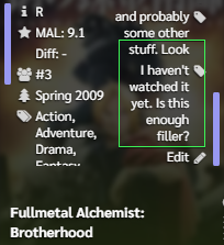 i love stumbling onto these ( ꈍᴗꈍ) |
karmashizzleJan 9, 9:18 PM
Jan 9, 10:49 PM
#74
Reply to karmashizzle
thanks for the update!
/* Header
VL rant officially removed as of v2.3.5 */

need help implementing the "top rated" Brink feature on top of the cover preview like so:

the root stuff is already in
i tried using combinators but failed
---

i love stumbling onto these ( ꈍᴗꈍ)
/* Header
VL rant officially removed as of v2.3.5 */

need help implementing the "top rated" Brink feature on top of the cover preview like so:

/* Top Rated Banners */

.data .score-8 {
	--rated: var(--eight);
	--toggle: var(--toggleeight);
} .data .score-9 {
	--rated: var(--nine);
	--toggle: var(--togglenine);
} .data .score-10 {
	--rated: var(--ten);
	--toggle: var(--toggleten);
}

.data .score-8::before,
.data .score-9::before,
.data .score-10::before {
	content: "";
	position: absolute;
	left: -2px;
	bottom: 282px;
	z-index: -1;

	width: 190px;
	height: 6px;
	border-top: 2px solid hsla(var(--rated), 0.8);
	border-radius: 6px 6px 0 0;

	pointer-events: none;
	box-shadow:
		0 -4px 3px -3px hsl(var(--rated)),
		inset 0 6px 3px -6px hsl(var(--rated));
	visibility: var(--toggle);
}

.data .score-8::after,
.data .score-9::after,
.data .score-10::after {
	content: "TOP RATED";
	position: absolute;
	left: 93px;
	bottom: 278px;
	z-index: -1;

	min-width: 100px;
	height: 16px;
	padding: 0 10px;
	border-radius: 3px;
	background: hsla(var(--rated), 0.9);
	box-shadow:
		-4px 1px 5px -4px hsla(var(--rated), 0.9),
		4px 1px 5px -4px hsla(var(--rated), 0.9),
		0 3px 5px -3px hsla(var(--rated), 0.3),
		0 5px 15px -6px hsl(var(--rated));

	color: var(--content-highlight);
	font: bold 14px/15px "Pixelify Sans";
	text-align: center;
	letter-spacing: 1px;
	text-shadow: none;

	transform: translateX(-50%);
	pointer-events: none;
	visibility: var(--toggle);
}

/* Prevent "change score box" layout flicker (a bug that is present on default list CSS) */

.data.score a:not([style="display: none;"]) + select {
	display: none;
}
the root stuff is already in
i tried using combinators but failed
---

i love stumbling onto these ( ꈍᴗꈍ)
@karmashizzle That's a tricky one since you basically have to code it from scratch since all the width/height values are different, there's an open/close transition, etc... we basically just got lucky that the list positions and layering didn't prevent this from happening, but one way to do it is like this./* Top Rated Banners */
.data.score-label {
--top-text: none;
--rated: transparent;
--toggle: hidden;
}
.data .score-8 {
--top-text: "TOP RATED";
--rated: var(--eight);
}
.data .score-9 {
--top-text: "TOP RATED";
--rated: var(--nine);
}
.data .score-10 {
--top-text: "TOP RATED";
--rated: var(--ten);
}
.data .score-label::before,
.data .score-label::after {
content: var(--top-text);
position: absolute;
z-index: 50;
opacity: 0;
transition: all .3s ease;
}
.data.image:hover ~ .score .score-label::before,
.data.image:hover ~ .score .score-label::after {
margin-top: -130px;
opacity: 1;
}
.data .score-label::before {
left: -205px;
top: calc(50% - 4px);
width: 190px;
height: 20px;
border-top: 3px solid hsla(var(--rated), 0.8);
border-radius: 10px 10px 0 0;
font-size: 0;
pointer-events: none;
box-shadow:
0 -4px 3px -3px hsl(var(--rated)),
inset 0 6px 3px -6px hsl(var(--rated));
}
.data .score-label::after {
left: calc(-205px + 190px/2);
top: calc(50% - 12px);
min-width: 100px;
height: 16px;
padding: 0 10px;
border-radius: 3px;
background: hsla(var(--rated), 0.9);
box-shadow:
-4px 1px 5px -4px hsla(var(--rated), 0.9),
4px 1px 5px -4px hsla(var(--rated), 0.9),
0 3px 5px -3px hsla(var(--rated), 0.3),
0 5px 15px -6px hsl(var(--rated));
color: var(--content-highlight);
font: bold 14px/15px "Pixelify Sans";
letter-spacing: 1px;
transform: translateX(-50%);
pointer-events: none;
}
.data.score {
position: static;
}I make no claims about the graphical performance of this. It works fine for me (in Firefox (on a gaming PC)) but the Clarity image hover that you're using used to lag Chrome on its own, so we'll see how it handles this. |
Jan 10, 12:18 AM
#75
@Valerio_Lyndon danke  i thought it would've been a somewhat easy task to add it. Valerio_Lyndon said: I make no claims about the graphical performance of this. It works fine for me (in Firefox (on a gaming PC)) but the Clarity image hover that you're using used to lag Chrome on its own, so we'll see how it handles this. my brain is confused as to what you're referring to. the top rated mod or the cover preview?. assuming you're referring to the "Clarity image hover" mod that i've been using for a long time(~april 2023?), there hasn't been any issues/impact on performance for me. even with the newly added top rated banner code. all gucci 👌 --- now to figure out the right colors for the ratings.. |
Jan 10, 4:02 PM
#76
Reply to karmashizzle
@Valerio_Lyndon danke 
i thought it would've been a somewhat easy task to add it.
my brain is confused as to what you're referring to. the top rated mod or the cover preview?.
assuming you're referring to the "Clarity image hover" mod that i've been using for a long time(~april 2023?), there hasn't been any issues/impact on performance for me.
even with the newly added top rated banner code. all gucci 👌
---
now to figure out the right colors for the ratings..

i thought it would've been a somewhat easy task to add it.
Valerio_Lyndon said:
I make no claims about the graphical performance of this. It works fine for me (in Firefox (on a gaming PC)) but the Clarity image hover that you're using used to lag Chrome on its own, so we'll see how it handles this.
I make no claims about the graphical performance of this. It works fine for me (in Firefox (on a gaming PC)) but the Clarity image hover that you're using used to lag Chrome on its own, so we'll see how it handles this.
my brain is confused as to what you're referring to. the top rated mod or the cover preview?.
assuming you're referring to the "Clarity image hover" mod that i've been using for a long time(~april 2023?), there hasn't been any issues/impact on performance for me.
even with the newly added top rated banner code. all gucci 👌
---
now to figure out the right colors for the ratings..
| @karmashizzle Sorry about that, I wanted to disclaim because if I don't then I often get responses from people asking why X thing happens. I'm glad the mods are working for you. When I swapped from Chrome to Firefox several years ago Chrome struggled to hold 60fps on even the most basic of pages and that image hover mod was especially bad. The last time I wrote an extension for it the lag just about doubled. Plus their renderer didn't calculate values correctly so the animation jittered up and down (no such problems in Firefox). It seems they've finally improved it though as I tested this mod out in Chrome and it seems a lot smoother than it used to be. |
Jan 13, 7:08 PM
#77
| The tag/genre hider is pretty neat!. i dislike the rows being fat so this mod makes genre/tag useable now. Bug Reports -- [1] slight incompatibility with some mods  [2] tag hider does not hide none for anime without any genre  Q -- i noticed this long ago but never bothered asking about it. why does the list settings and style settings appear slightly later than the rest? its unnoticeable when there's no lag. not a big deal, just wondering.  EDIT - actually, ignore the tag hider + review tag + switch t&g. thats just cuz of thinner list width |
karmashizzleJan 13, 8:43 PM
Jan 15, 12:23 AM
#78
Reply to karmashizzle
The tag/genre hider is pretty neat!. i dislike the rows being fat so this mod makes genre/tag useable now.
Bug Reports --
[1] slight incompatibility with some mods

[2] tag hider does not hide none for anime without any genre

Q --
i noticed this long ago but never bothered asking about it. why does the list settings and style settings appear slightly later than the rest? its unnoticeable when there's no lag. not a big deal, just wondering.

EDIT - actually, ignore the tag hider + review tag + switch t&g. thats just cuz of thinner list width
Bug Reports --
[1] slight incompatibility with some mods

[2] tag hider does not hide none for anime without any genre

Q --
i noticed this long ago but never bothered asking about it. why does the list settings and style settings appear slightly later than the rest? its unnoticeable when there's no lag. not a big deal, just wondering.

EDIT - actually, ignore the tag hider + review tag + switch t&g. thats just cuz of thinner list width
| @karmashizzle Thanks for the reports. The tag hider can definitely use some more work (hence the 0 version), so knowing these issues are there is handy. I'm not sure what other mods it can be compatible with but I'll take a look. :) That user menu bug is interesting! I remember applying a fix for the inverse, where they would stay visible after the menu closed. Seems like this is another bug with using "visibility" for some reason. I hadn't noticed because it's about 1 frame infrequently, but I can see how it'd worsen with more lag. If you add this code, does it fix it? If so, I'll just apply this patch to the main theme for v2.3.8. .list-menu-float {
background: none;
box-shadow: none;
visibility: visible;
pointer-events: none;
}
.list-menu-float:hover,
.list-menu-float::before {
pointer-events: auto;
}
.list-menu-float:hover::after {
content: "";
position: absolute;
z-index: -1;
inset: 0;
background: var(--content-background);
border-radius: 6px;
box-shadow: var(--medium-shadow);
}I seem to remember choosing "visibility" as I thought it would be more stable, having been around since the web's inception, but... clearly not. |
Valerio_LyndonJan 15, 10:31 AM
Jan 15, 2:02 AM
#79
Reply to Valerio_Lyndon
@karmashizzle Thanks for the reports. The tag hider can definitely use some more work (hence the 0 version), so knowing these issues are there is handy. I'm not sure what other mods it can be compatible with but I'll take a look. :)
That user menu bug is interesting! I remember applying a fix for the inverse, where they would stay visible after the menu closed. Seems like this is another bug with using "visibility" for some reason. I hadn't noticed because it's about 1 frame infrequently, but I can see how it'd worsen with more lag. If you add this code, does it fix it? If so, I'll just apply this patch to the main theme for v2.3.8.
I seem to remember choosing "visibility" as I thought it would be more stable, having been around since the web's inception, but... clearly not.
That user menu bug is interesting! I remember applying a fix for the inverse, where they would stay visible after the menu closed. Seems like this is another bug with using "visibility" for some reason. I hadn't noticed because it's about 1 frame infrequently, but I can see how it'd worsen with more lag. If you add this code, does it fix it? If so, I'll just apply this patch to the main theme for v2.3.8.
.list-menu-float {
	background: none;
	box-shadow: none;
	visibility: visible;
	pointer-events: none;
}
.list-menu-float:hover,
.list-menu-float::before {
	pointer-events: auto;
}

.list-menu-float:hover::after {
	content: "";
	position: absolute;
	z-index: -1;
	inset: 0;
	background: var(--content-background);
	border-radius: 6px;
	box-shadow: var(--medium-shadow);
}
I seem to remember choosing "visibility" as I thought it would be more stable, having been around since the web's inception, but... clearly not.
@Valerio_Lyndon yes and no. as the dropdown is only invisible, hovering anywhere on it will trigger it to appear.  EDIT - Fixed! 👍 |
karmashizzleJan 15, 2:12 PM
Jan 15, 10:39 AM
#80
Reply to karmashizzle
@Valerio_Lyndon yes and no. as the dropdown is only invisible, hovering anywhere on it will trigger it to appear.

EDIT - Fixed! 👍

EDIT - Fixed! 👍
| @karmashizzle What 0 testing does to ya. lol. I updated the earlier post with a fix for that if you wish to patch v2.3.7 and also released v2.3.8 which has this fix included. |
Jan 17, 1:04 AM
#81
Jan 17, 8:29 PM
#82
Reply to myuniquename
I really like the list, so thank you! :D
Now, the problem I have is that I don't get changes to the colors when I add the Category-coloured Header Buttons mod.
Now, the problem I have is that I don't get changes to the colors when I add the Category-coloured Header Buttons mod.
| @myuniquename looking at your list's css i dont see the mod's code. Did you remove it cuz it wasnt working or you thought you had it installed but didnt? it works fine when i add it to your list using firefox style editor. try adding it: /* Category Header Colours */
#status-menu .status-button:hover,
#status-menu .status-button::before {
color: var(--category);
}
#status-menu .status-button::after {
background: var(--category);
}
#status-menu .status-button.on::after {
opacity: 1;
}
.status-button:nth-of-type(1) {
--category: var(--all-items);
}
.status-button:nth-of-type(2) {
--category: var(--current);
}
.status-button:nth-of-type(3) {
--category: var(--completed);
}
.status-button:nth-of-type(4) {
--category: var(--onhold);
}
.status-button:nth-of-type(5) {
--category: var(--dropped);
}
.status-button:nth-of-type(6) {
--category: var(--planned);
}
/* END of Category Header Colours */ |
Jan 17, 8:40 PM
#83
Reply to karmashizzle
@myuniquename looking at your list's css i dont see the mod's code. Did you remove it cuz it wasnt working or you thought you had it installed but didnt? it works fine when i add it to your list using firefox style editor.
try adding it:
try adding it:
/* Category Header Colours */

#status-menu .status-button:hover,
#status-menu .status-button::before {
	color: var(--category);
}

#status-menu .status-button::after {
	background: var(--category);
}

#status-menu .status-button.on::after {
	opacity: 1;
}
.status-button:nth-of-type(1) {
	--category: var(--all-items);
}
.status-button:nth-of-type(2) {
	--category: var(--current);
}
.status-button:nth-of-type(3) {
	--category: var(--completed);
}
.status-button:nth-of-type(4) {
	--category: var(--onhold);
}
.status-button:nth-of-type(5) {
	--category: var(--dropped);
}
.status-button:nth-of-type(6) {
	--category: var(--planned);
}

/* END of Category Header Colours */| @karmashizzle Huh. Weird. I guess I must have had an issue somewhere along the line because you're correct, it does work. Thank you! :D |
Jan 17, 9:07 PM
#84
Reply to karmashizzle
@myuniquename looking at your list's css i dont see the mod's code. Did you remove it cuz it wasnt working or you thought you had it installed but didnt? it works fine when i add it to your list using firefox style editor.
try adding it:
try adding it:
/* Category Header Colours */

#status-menu .status-button:hover,
#status-menu .status-button::before {
	color: var(--category);
}

#status-menu .status-button::after {
	background: var(--category);
}

#status-menu .status-button.on::after {
	opacity: 1;
}
.status-button:nth-of-type(1) {
	--category: var(--all-items);
}
.status-button:nth-of-type(2) {
	--category: var(--current);
}
.status-button:nth-of-type(3) {
	--category: var(--completed);
}
.status-button:nth-of-type(4) {
	--category: var(--onhold);
}
.status-button:nth-of-type(5) {
	--category: var(--dropped);
}
.status-button:nth-of-type(6) {
	--category: var(--planned);
}

/* END of Category Header Colours */
@karmashizzle Thanks so much for helping them Karma! |
Feb 11, 7:00 PM
#85
| Henlo, i am back with more Q and shtuff 1. is the [add notes] text hard coded or smth? i cant seem to change it 2. is it possible to add days next to airing status on the same plane/grid using tags so it wont be affected by overflowed title, notes and T/G Hider?  ## ## 3. currently i have it on the side:  |
Feb 12, 9:50 PM
#86
Reply to karmashizzle
Henlo, i am back with more Q and shtuff
1. is the [add notes] text hard coded or smth? i cant seem to change it
2. is it possible to add days next to airing status on the same plane/grid using tags so it wont be affected by overflowed title, notes and T/G Hider?
 ##
##
3. currently i have it on the side:
 does it look fine on your end?
1. is the [add notes] text hard coded or smth? i cant seem to change it
2. is it possible to add days next to airing status on the same plane/grid using tags so it wont be affected by overflowed title, notes and T/G Hider?
 ##
##
3. currently i have it on the side:

| @karmashizzle I just used the default list's "Add notes" button, so the text isn't anywhere in my CSS. I only used CSS to add a new "Edit notes" button because it drove me kinda mad how the default functionality works... Anyway, you can change the text by using the ol' trick of 0 font-size on the button with an added ::after selector. /* Change note text */
.notes .edit {
font-size: 0 !important;
letter-spacing: 0; /* resetting letter-spacing in this way fixes a .3px gap */
}
.notes .edit::after {
content: "Kachow";
font-size: 11px;
letter-spacing: 0.3px;
} The tag position isn't quite possible I don't think. If it was just the tag hider then it would be no problem, and the airing status would be possible in a limited and janky manner, but overflowing titles is always a pain point because CSS has no way of selecting elements by how many lines they have. That and the tags are positioned in a completely separate area of the code and therefore can't be affected by regular size changes of the title, which cuts out the possibility of other workarounds. If you limited titles to one line, maybe? But then you would still have to deal with the janky airing issues, specifically positioning the tag to allow for irregular text such as "Not Yet Aired" airing boxes. It wouldn't be elegant. Leaving this here since I already wrote it before the aformentioned conclusion. The vertical positioning tag hider issues are happening because it's positioned relative to the row height, which is changing upon the genre expansion. There are two ways to fix this. Your first option and what's possibly the best way to fix this is to reposition the tags upon expansion of the genre area. The only difficult part of this is matching the transition timings/easings. I've found this can result in a jitter upon hover though, depending on the browser, but it means any row that is heigher than usual will display correctly. .data.tags span a[href$="=mon"],
.data.tags span a[href$="=tue"],
.data.tags span a[href$="=wed"],
.data.tags span a[href$="=thu"],
.data.tags span a[href$="=fri"],
.data.tags span a[href$="=sat"],
.data.tags span a[href$="=sun"] {
transition: top .18s ease;
}
.list-table-data:hover .tags span a[href$="=mon"],
.list-table-data:hover .tags span a[href$="=tue"],
.list-table-data:hover .tags span a[href$="=wed"],
.list-table-data:hover .tags span a[href$="=thu"],
.list-table-data:hover .tags span a[href$="=fri"],
.list-table-data:hover .tags span a[href$="=sat"],
.list-table-data:hover .tags span a[href$="=sun"] {
top: calc(50% - 28px) !important; /* 11px higher than the regular value */
transition-delay: .4s;
}The second, alternative option would be to simply set a fixed height from the top instead of using the calc(50% - 17px) which it currently uses. This will be the best-looking and least "buggy" solution provided that your rows are always the same height. It would position incorrectly on any row that's taller than usual though. .data.tags span a[href$="=mon"],
.data.tags span a[href$="=tue"],
.data.tags span a[href$="=wed"],
.data.tags span a[href$="=thu"],
.data.tags span a[href$="=fri"],
.data.tags span a[href$="=sat"],
.data.tags span a[href$="=sun"] {
top: 16.5px !important;
}(sorry for double ping on this) |
Valerio_LyndonFeb 12, 9:53 PM
Feb 13, 3:59 PM
#87
@Valerio_Lyndon TY for the splanations and solutions.  ima go with the 2nd one. i was gonna say something about this: Valerio_Lyndon said: But then you would still have to deal with the janky airing issues, specifically positioning the tag to allow for irregular text such as "Not Yet Aired" airing boxes. It wouldn't be elegant. but.. i couldnt lay out my thoughts well enough to form proper sentences xD ima just keep it to myself so i dont sound stupid :) --- Valerio_Lyndon said: (sorry for double ping on this)  i didnt get to read it  |
Feb 16, 1:33 AM
#88
Nov 7, 8:41 AM
#89
| Thanks for the design @Valerio_Lyndon, super cool!! I can't seem to figure out how to make the content link the same color as the status I'm in (current, completed, etc...). I know a little of programming, but never touched CSS, so I'm not even sure if the var(status) is somewhat what I'm looking for or not. 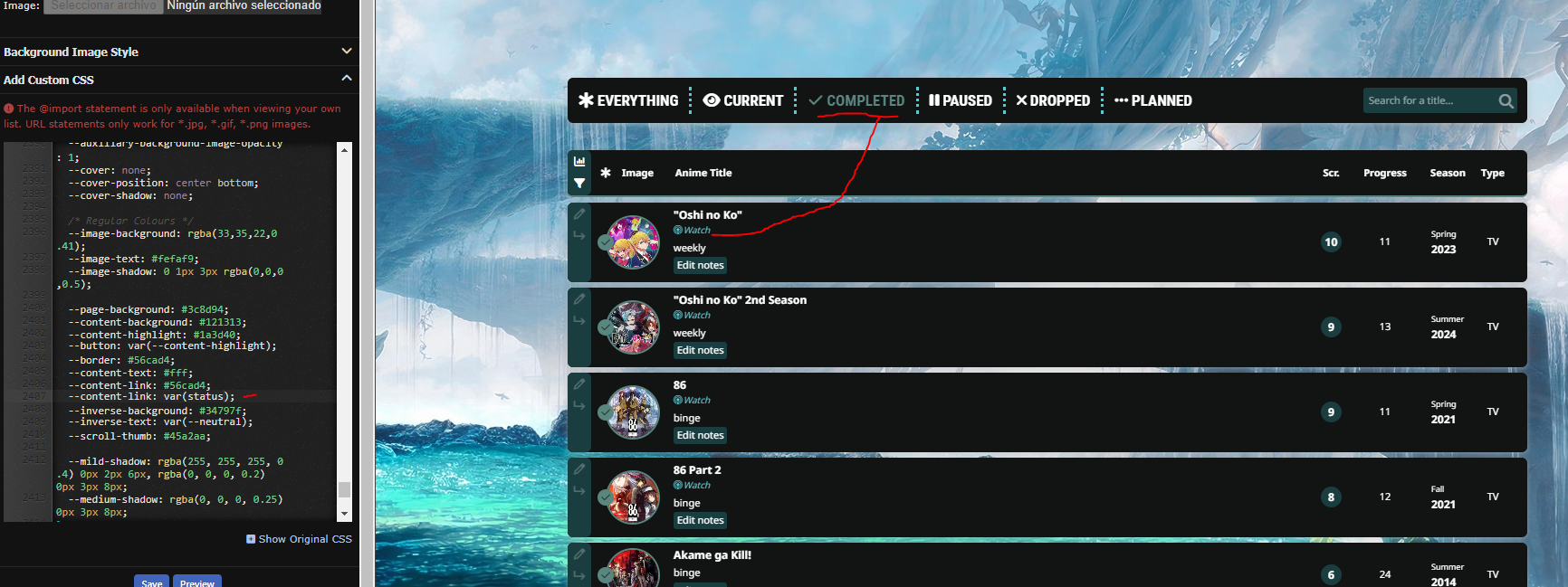 Furthermore, when I change the score header title from "scr." to "Score" it offsets the centering, and if I try to fix it changing the width on the class line, instead of moving only the title, it moves both the title and the score in opposite directions. Also, if I don't put in the progress column it breaks the distance between score and the other columns and moves them very close.  Finally, are the studio images able to be modded in? Such an amazing feature. Thanks again! |
Nov 7, 10:21 AM
#90
| @ddaruu VL is MIA so i'll help. first of, delete the two "content-link" under :root then, under "variables" add --content-link: var(--page-category);. it'll look like this: /*=========
!VARIABLES
=========*/
body[data-query*='"status":7'] {
--content-link: var(--page-category);
--page-category: var(--all-items);
}
body[data-query*='"status":1'] {
--content-link: var(--page-category);
--page-category: var(--current);
}
body[data-query*='"status":2'] {
--content-link: var(--page-category);
--page-category: var(--completed);
}
body[data-query*='"status":3'] {
--content-link: var(--page-category);
--page-category: var(--onhold);
}
body[data-query*='"status":4'] {
--content-link: var(--page-category);
--page-category: var(--dropped);
}
body[data-query*='"status":6'] {
--content-link: var(--page-category);
--page-category: var(--planned);
}for the score thing: .header-title.score a::before {
content: "Score";
margin-left: -5px !important;
} |
karmashizzleNov 7, 1:13 PM
Nov 7, 12:28 PM
#91
Reply to karmashizzle
@ddaruu VL is MIA so i'll help.
first of, delete the two "content-link" under :root
then, under "variables" add --content-link: var(--page-category);. it'll look like this:
for the score thing:
first of, delete the two "content-link" under :root
then, under "variables" add --content-link: var(--page-category);. it'll look like this:
/*=========
  !VARIABLES
  =========*/

body[data-query*='"status":7'] {
  --content-link: var(--page-category);
  --page-category: var(--all-items);
}
body[data-query*='"status":1'] {
  --content-link: var(--page-category);
  --page-category: var(--current);
}
body[data-query*='"status":2'] {
  --content-link: var(--page-category);
  --page-category: var(--completed);
}
body[data-query*='"status":3'] {
  --content-link: var(--page-category);
  --page-category: var(--onhold);
}
body[data-query*='"status":4'] {
  --content-link: var(--page-category);
  --page-category: var(--dropped);
}
body[data-query*='"status":6'] {
  --content-link: var(--page-category);
  --page-category: var(--planned);
}
for the score thing:
.header-title.score a::before {
	content: "Score";
	margin-left: -5px !important;
}| @karmashizzle thanks a lot, super clear! Ended up using -4px for that pixel perfect symmetry I guess the studio images then are a no-go? |
Nov 7, 12:45 PM
#92
Reply to ddaruu
@karmashizzle thanks a lot, super clear! Ended up using -4px for that pixel perfect symmetry
I guess the studio images then are a no-go?
I guess the studio images then are a no-go?
| @ddaruu i dont think he ever finished the studio images mod. so no. |
Nov 7, 12:55 PM
#93
Reply to karmashizzle
@ddaruu i dont think he ever finished the studio images mod. so no.
| @karmashizzle Pity, thanks again. |
Nov 12, 9:15 AM
#94
| Hello again, Having some trouble with character animation. As you can see if you enter either of my lists, Frieren has a dead frame in between, can't really figure out why. /* Add character */
#status-menu::after {
--h: 400px;
content: "";
position: absolute;
z-index: 2;
pointer-events: none;
bottom: 2px;
left: 0;
width: 100%;
height: var(--h);
background: url(https://imgur.com/rNIlLGa.png) calc(50% + 370px) 0vh / auto calc(var(--h) * 10) no-repeat;
animation: step-10 0.80s steps(1, jump-start) infinite;
/* original speed is 2560ms */
clip-path: inset(0 0 13px 0);
}
@keyframes step-10 {
0%, 100% {
background-position-y: 0px;
}
10% {
background-position-y: calc(var(--h) * -1);
}
20% {
background-position-y: calc(var(--h) * -2);
}
30% {
background-position-y: calc(var(--h) * -3);
}
40% {
background-position-y: calc(var(--h) * -4);
}
50% {
background-position-y: calc(var(--h) * -5);
}
60% {
background-position-y: calc(var(--h) * -6);
}
70% {
background-position-y: calc(var(--h) * -7);
}
80% {
background-position-y: calc(var(--h) * -8);
}
90% {
background-position-y: calc(var(--h) * -9);
}
100% {
background-position-y: calc(var(--h) * -10);
}
}I copied Breezy Theme's code, and modified it so it has 10 frames instead of 20. Image link. Tried deleting the 100% { background-position ... it gets rid of the dead frame but it messes up the flow of the animation (since, I guess I deleted a frame). Tbh idk If i'm missing a transition frame for it to flow properly, apart for the dead frame. |
Nov 13, 9:18 AM
#95
| ^Managed to resolve it. It was in the end that the frames were not looped correctly. If anyone ends up with the same problem as me, whatever frames you got just put them between 10% and 90%. If you put the 100% you end up with a dead frame. If you need more %, just put x5%, or if the total of frames is not even, put a x5% between something. I ended up with 11 frames after redoing the whole thing, and put a 85% between 80 and 90. Couldn't explain theoretically since I did this on trial and error and with a friend of mine who is very good at python and c++. Be careful to also change the multiplier value to the background position calculations depending on the number of frames you got. |
More topics from this board
» [CSS - Modern] 🛠️ Tweaks for lists -- Horizontal tags, descriptions, category-coloured text, accent colour, and more.Valerio_Lyndon - Oct 24, 2019 |
21 |
by Shishio-kun
»»
Yesterday, 9:05 AM |
|
» [BBCode] Font Awesome Guidehideso - Dec 25, 2023 |
8 |
by Shishio-kun
»»
Yesterday, 8:34 AM |
|
Sticky: » 💚 [REPAIR STICKY] Repair/speed up a design + Request a layout fixShishio-kun - Nov 17, 2023 |
33 |
by Shishio-kun
»»
Nov 25, 11:42 PM |
|
» ✳️ Bunkasai 2024 List Design and Graphic Design contests are OPENShishio-kun - Nov 18 |
2 |
by Shishio-kun
»»
Nov 18, 5:01 AM |
|
Sticky: » [ SIGNATURES ~ PROFILES] All guides, generators, and templatesShishio-kun - Feb 16, 2023 |
29 |
by floral_sacrifice
»»
Nov 15, 10:24 AM |


