New
May 22, 2020 8:50 PM
#151

nattadasu said: Hmmmmmmmmm... I think, it's based on your desktop resolution. So if you want the background looks "amazing," you can search for 1080p image or up. Thx, I'll give it a try and see how it goes. nattadasu said: Yep, you can btw. Search for --toggleStats: hidden; /*==============================*\ !VARIABLES @User \*------------------------------*/ Change hidden to visible so you can found the stats on footer of your list. I see, but is there any way to move it to the top or make it like a bar? |

   "𝓢𝓱𝓮 𝓯𝓸𝓻𝓰𝓸𝓻." 🪶 𝐹𝑜𝓇𝓊𝓂 𝒮𝑒𝓉 𝒷𝓎 𝒯𝑜𝓃𝒸𝑒𝓆 🪶 |
May 23, 2020 2:15 AM
#152
_Nazuru_ said: what would probably be the best size for the background image? I just can't seem to find the perfect image size for the background : ( And I was wondering if it's possible to add the stats bar from the default theme? https://i.imgur.com/91EAzWA.jpg To enable the stats bar, change the "toggleStats" option to "visible" in the theme's variables section. It's at the top of your CSS. 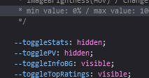 You can then find it displayed at the bottom of the page, by the footer:  As to the banner, Valerio_Lyndon said: You can use a website such as ezgif to crop the image if you want a specific part to be displayed.I recommend a ratio of 10:3 (i.e. 1920x576) for the banner image, but any size will work. |
May 23, 2020 4:13 AM
#153
Valerio_Lyndon said: _Nazuru_ said: what would probably be the best size for the background image? I just can't seem to find the perfect image size for the background : ( And I was wondering if it's possible to add the stats bar from the default theme? https://i.imgur.com/91EAzWA.jpg To enable the stats bar, change the "toggleStats" option to "visible" in the theme's variables section. It's at the top of your CSS. You can then find it displayed at the bottom of the page, by the footer: I see, but is it possible to move the stats bar somewhere else? Or make a dedicated button or something to display the stats? |
"𝓢𝓱𝓮 𝓯𝓸𝓻𝓰𝓸𝓻." 🪶 𝐹𝑜𝓇𝓊𝓂 𝒮𝑒𝓉 𝒷𝓎 𝒯𝑜𝓃𝒸𝑒𝓆 🪶 |
May 23, 2020 2:48 PM
#154
_Nazuru_ said: Valerio_Lyndon said: To enable the stats bar, change the "toggleStats" option … find it displayed at the bottom of the page, by the footer I see, but is it possible to move the stats bar somewhere else? Or make a dedicated button or something to display the stats? It's possible, to a point. Were you looking for functionality more similar to the default list with the stats at the top and a stats button next to the filter button? |
May 24, 2020 12:14 AM
#155
Valerio_Lyndon said: _Nazuru_ said: Valerio_Lyndon said: To enable the stats bar, change the "toggleStats" option … find it displayed at the bottom of the page, by the footer I see, but is it possible to move the stats bar somewhere else? Or make a dedicated button or something to display the stats? It's possible, to a point. Were you looking for functionality more similar to the default list with the stats at the top and a stats button next to the filter button? Yes, exactly. Doesn't have to be exactly the same as the default list but quite like it. But is it going to be hard to do it because I'm not really that good with css codes. |
"𝓢𝓱𝓮 𝓯𝓸𝓻𝓰𝓸𝓻." 🪶 𝐹𝑜𝓇𝓊𝓂 𝒮𝑒𝓉 𝒷𝓎 𝒯𝑜𝓃𝒸𝑒𝓆 🪶 |
May 24, 2020 2:17 AM
#156
@_Nazuru_ It is a bit complex, yes, but mostly due to the various breakpoints I added into the default code. Here's a mod that will revert the position like so: /*------------------------------*\
|* Restore Stats Position *|
\* - - - - - - - - - - - - - - -*/
#status-menu {
padding-left: calc(287px + 0.105 * (100vw - 980px));
}
.list-unit .list-status-title {
width: calc(169px + 0.07 * (100vw - 980px));
}
.list-unit .list-status-title .stats {
display: block;
}
.list-unit .list-status-title .stats a:first-child {
display: inline-block;
float: right;
}
.list-unit .list-stats {
position: static;
} .list-unit .list-stats:not([style="display: block;"]) {
display: none !important;
}
.list-table > tbody:first-of-type {
left: calc(198px + 0.07 * (100vw - 980px));
}
@media (max-width: 980px) {
#status-menu:not(.fixed) .search-container {
left: calc(50% + 15.5px);
}
.list-unit .list-status-title {
left: calc(50% - 263.5px);
width: 177px;
}
.list-table > tbody:first-of-type {
left: calc(50% - 77.5px);
}
}
@media (min-width: 1804px) {
.list-unit .list-status-title {
left: calc(8px + (50% - 1804px * .5));
width: calc(169px + 1804px * 0.035);
}
.list-table > tbody:first-of-type {
left: calc(186px + (1804px * 0.035) + (50% - 1804px * .5));
}
}Edit: this code does not work with theme versions above v1.6.0. For a more up to date version of this code, see my other reply: [Here]. |
Valerio_LyndonApr 5, 2021 8:59 PM
May 24, 2020 3:55 AM
#157
Valerio_Lyndon said: @_Nazuru_ It is a bit complex, yes, but mostly due to the various breakpoints I added into the default code. Here's a mod that will revert the position like so: /*------------------------------*\
|* Restore Stats Position *|
\* - - - - - - - - - - - - - - -*/
#status-menu {
padding-left: calc(287px + 0.105 * (100vw - 980px));
}
.list-unit .list-status-title {
width: calc(169px + 0.07 * (100vw - 980px));
}
.list-unit .list-status-title .stats {
display: block;
}
.list-unit .list-status-title .stats a:first-child {
display: inline-block;
float: right;
}
.list-unit .list-stats {
position: static;
} .list-unit .list-stats:not([style="display: block;"]) {
display: none !important;
}
.list-table > tbody:first-of-type {
left: calc(198px + 0.07 * (100vw - 980px));
}
@media (max-width: 980px) {
#status-menu:not(.fixed) .search-container {
left: calc(50% + 15.5px);
}
.list-unit .list-status-title {
left: calc(50% - 263.5px);
width: 177px;
}
.list-table > tbody:first-of-type {
left: calc(50% - 77.5px);
}
}
@media (min-width: 1804px) {
.list-unit .list-status-title {
left: calc(8px + (50% - 1804px * .5));
width: calc(169px + 1804px * 0.035);
}
.list-table > tbody:first-of-type {
left: calc(186px + (1804px * 0.035) + (50% - 1804px * .5));
}
}I've applied it to my list and it works just like i wanted! Thx for the mod : ) Last question, is there a way to add background image using css instead of using mal's setting? Since mal only allows maximum image size of 1mb (if i'm not mistaken), it's kinda troubling that i can't put the picture I want to. |
_NazumiMay 24, 2020 4:05 AM
"𝓢𝓱𝓮 𝓯𝓸𝓻𝓰𝓸𝓻." 🪶 𝐹𝑜𝓇𝓊𝓂 𝒮𝑒𝓉 𝒷𝓎 𝒯𝑜𝓃𝒸𝑒𝓆 🪶 |
May 24, 2020 4:48 AM
#158
_Nazuru_ said: is there a way to add background image using css instead of using mal's setting? Since mal only allows maximum image size of 1mb (if i'm not mistaken), it's kinda troubling that i can't put the picture I want to. Sure, that's possible. You can find some CSS below. Uploaded pictures still have a limit since they still get uploaded to MAL, but it's definitely higher; I think it's somewhere in between 5 and 10 MB (it keeps changing). /*------------------------------*\
|* URL-Based Cover Image *|
\* - - - - - - - - - - - - - - -*/
:root {
/* Change Image Here */
--cover-image: url(https://i.imgur.com/e07NexS.jpg);
}
#cover-image-container {
display: block !important;
}
#cover-image-container::before {
content: "";
display: block;
width: 100%;
max-width: initial;
height: 30vw;
min-height: calc(700px * 0.3);
max-height: calc(1920px * 0.3);
background: var(--cover-image) center / cover;
}
#cover-image {
display: none;
} |
May 24, 2020 8:48 PM
#159
Valerio_Lyndon said: _Nazuru_ said: is there a way to add background image using css instead of using mal's setting? Since mal only allows maximum image size of 1mb (if i'm not mistaken), it's kinda troubling that i can't put the picture I want to. Sure, that's possible. You can find some CSS below. Uploaded pictures still have a limit since they still get uploaded to MAL, but it's definitely higher; I think it's somewhere in between 5 and 10 MB (it keeps changing). /*------------------------------*\
|* URL-Based Cover Image *|
\* - - - - - - - - - - - - - - -*/
:root {
/* Change Image Here */
--cover-image: url(https://i.imgur.com/e07NexS.jpg);
}
#cover-image-container {
display: block !important;
}
#cover-image-container::before {
content: "";
display: block;
width: 100%;
max-width: initial;
height: 30vw;
min-height: calc(700px * 0.3);
max-height: calc(1920px * 0.3);
background: var(--cover-image) center / cover;
}
#cover-image {
display: none;
}Alright, that's all I needed for now. A really huge thanks for your help! ^_^ |
"𝓢𝓱𝓮 𝓯𝓸𝓻𝓰𝓸𝓻." 🪶 𝐹𝑜𝓇𝓊𝓂 𝒮𝑒𝓉 𝒷𝓎 𝒯𝑜𝓃𝒸𝑒𝓆 🪶 |
May 28, 2020 11:39 AM
#160

| Awesome template, I tried the mod from a bit higher up which adds a glow around top-rated things, but it only adds a glow around the top bar instead of around the score as well like shown in the screen shot. (https://image.myanimelist.net/ui/5LYzTBVoS196gvYvw3zjwBFlxSYJtTpPnQHSdAz9dTY) Can this be fixed? Also, is it possible to brighten and or change the opacity of the episode count? |
| Part 7 never |
May 29, 2020 9:45 PM
#161
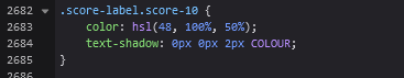
Deelaan said: I tried the mod from a bit higher up which adds a glow around top-rated things, but it only adds a glow around the top bar instead of around the score as well like shown in the screen shot. (https://image.myanimelist.net/ui/5LYzTBVoS196gvYvw3zjwBFlxSYJtTpPnQHSdAz9dTY) Can this be fixed? That's working as intended, since that's what the other user asked for. They did the score glow by themselves, hence it being in the screenshot. To replicate the effect, you could add a "text-shadow" property to the appropriate scores in the "Colour Score Text" mod. For the same effect that Arvidex had, you could use a value of "0px 0px 2px COLOUR". That's a lot of words, but in practice it means this:
Deelaan said: Also, is it possible to brighten and or change the opacity of the episode count? As in, the opacity when the item is not hovered? That's possible, yep. Find the "opacity" property on line 1664: 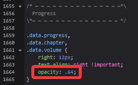 Change the ".64" to "1".  |

Valerio_LyndonMay 29, 2020 9:49 PM
May 30, 2020 7:20 AM
#162
Valerio_Lyndon said: Deelaan said: I tried the mod from a bit higher up which adds a glow around top-rated things, but it only adds a glow around the top bar instead of around the score as well like shown in the screen shot. (https://image.myanimelist.net/ui/5LYzTBVoS196gvYvw3zjwBFlxSYJtTpPnQHSdAz9dTY) Can this be fixed? That's working as intended, since that's what the other user asked for. They did the score glow by themselves, hence it being in the screenshot. To replicate the effect, you could add a "text-shadow" property to the appropriate scores in the "Colour Score Text" mod. For the same effect that Arvidex had, you could use a value of "0px 0px 2px COLOUR". That's a lot of words, but in practice it means this:
Deelaan said: Also, is it possible to brighten and or change the opacity of the episode count? As in, the opacity when the item is not hovered? That's possible, yep. Find the "opacity" property on line 1664: Change the ".64" to "1". Great, all working as intended! Thank you for still helping even though you weren't the original person who made the glow text lmao |
| Part 7 never |
May 31, 2020 8:09 PM
#163

nattadasu said: See on variable section, and find this line: --toggleTopRatings: visible; Thanks a lot for that info!!! @Valerio_Lyndon Man, I don't know how I didn't notice this layout last year but its AWESOME!!! I modified the 'PAUSED' for 'ON-HOLD' and 'CURRENT' for 'WATCHING'. I wanted to change the 'Not Scored' for "Not Scored Yet" but didn't find how (I'm not an expert on CSS). Anyway, thanks a lot for sharing your layout. |
   |
May 31, 2020 8:27 PM
#164
CamiloJTM said: Man, I don't know how I didn't notice this layout last year but its AWESOME!!! I wanted to change the 'Not Scored' for "Not Scored Yet" but didn't find how (I'm not an expert on CSS). Glad you're enjoying it. As to the score, I believe adding this code to the bottom of your CSS should work. Although, the longer this text is the more likely it is to overlap with the progress (mostly a problem on the "All Anime/Manga" page). /*------------------------------*\
|* - Rename Unscored Items - *|
\* - - - - - - - - - - - - - - -*/
.data.score a {
height: 15px;
flex-wrap: wrap;
overflow: hidden;
}
.data .score-na {
display: block;
width: 100%;
flex: 0 0 auto;
}
.data .score-na::before {
content: "Not Scored Yet";
} |
May 31, 2020 8:59 PM
#165
Valerio_Lyndon said: Although, the longer this text is the more likely it is to overlap with the progress (mostly a problem on the "All Anime/Manga" page). I see what you mean:  But for me, in most cases, will look like:  So it's a very good solution, worked perfectly. Thanks a lot for your help. |
KuroijiMay 31, 2020 9:03 PM
| |
Jun 24, 2020 5:12 AM
#166
| Hey! Thank you for the theme! There seems to be this little issue where the last line of anime entries become placed over the footnotes. Also is it possible to have custom image ratios for cover images? |
Jun 24, 2020 9:13 PM
#167
Isuraku said: There seems to be this little issue where the last line of anime entries become placed over the footnotes. I don't see that issue. Could you share the browser you're running and a screenshot of the problem? Isuraku said: Also is it possible to have custom image ratios for cover images? It's possible, just not easily changable by default. Here's a simple addition that enables you to easily change the sizing. You can add it at the bottom, below the "Mods" header. /*------------------------------*\
|* Adjust Cover Image Sizing *|
\* - - - - - - - - - - - - - - -*/
:root {
/* Default is 210px x 300px, a 7:10 ratio
I don't advise going smaller than 200 width.
For help with calculating aspect ratios, see:
https://andrew.hedges.name/experiments/aspect_ratio/ */
--cover-width: 210px;
--cover-height: 300px;
}
.list-item {
width: var(--cover-width);
height: var(--cover-height);
margin: calc((var(--coverwidth-) * -0.025) + 12px) calc((var(--cover-height) * -0.025) + 12px);
}
.add-edit-more {
bottom: calc(var(--cover-height) - 33px);
}
.data.tags {
height: calc(var(--cover-height) - 152px);
}
body:not([data-query*='order":4']) .data .score-9::before,
body:not([data-query*='order":4']) .data .score-10::before {
bottom: calc(var(--cover-height) - 18px);
width: var(--cover-width);
}
body:not([data-query*='order":4']) .data .score-9::after,
body:not([data-query*='order":4']) .data .score-10::after {
left: calc(-12px + (var(--cover-width) * 0.5) - 50px);
bottom: calc(var(--cover-height) - 23px);
} |
Jun 28, 2020 2:01 PM
#168
| my cover images are too dark how can i change it? |
Jun 28, 2020 6:37 PM
#169
kazurengan said: my cover images are too dark how can i change it? See the top of the code. Look for "imageBrightness". Raise the percentage. Save your changes after.  |
Jun 29, 2020 2:31 AM
#170

| This layout is great, but I want to add some personalizations to it. How do I change the font? |
 |
Jun 29, 2020 11:17 PM
#171
Lawl1et said: You can find the font at the very beginning of the main theme's CSS. Then, just change "Sarabun" to your desired font.This layout is great, but I want to add some personalizations to it. How do I change the font? 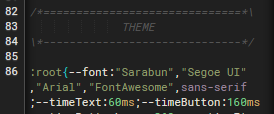 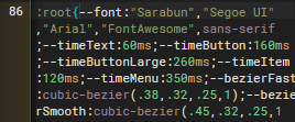 Be aware though, whatever font you choose will not be visible to other people unless they have it installed on their own PC, or you @import the font onto your list. You can use this guide from Shishio if you need help with importing it: [Link] at 0:10 for Google Fonts or 7:27 for downloaded fonts. If you want to change font sizes, that will take a bit more effort. You could either search the CSS for any instance of "font-size" or "font:" (any text editor should have a "find" feature for this), or I could make up something for easily changing it. |
Jun 30, 2020 12:05 PM
#172

| Thanks for the beautiful layout. Is there a way to increase the height of the banner image? I don't like my favorite images to be cut in half. |
 |
Jun 30, 2020 1:31 PM
#173
Blaze07 said: Thanks for the beautiful layout. Is there a way to increase the height of the banner image? I don't like my favorite images to be cut in half. Add this to the bottom, in the modifications section. To increase the height, change the "0.3" number at the top. /*------------------------------*\
|* Change Banner Height *|
\* - - - - - - - - - - - - - - -*/
:root {
/* Height is based on the screen's width.
* This maintains a set width:height ratio across screen sizes.
* Set --banner-height as a multiplier of screen width.
* Default is 0.3, AKA 30% of the page width.
*/
--banner-height: 0.3;
}
.list-block {
min-height: calc(100vh - (184px + (100vw * var(--banner-height))));
}
#cover-image {
height: calc(100vw * var(--banner-height));
min-height: calc(700px * var(--banner-height));
max-height: calc(1920px * var(--banner-height));
}
@media (max-width: 700px) {
.list-block {
min-height: calc(100vh - (184px + (700px * var(--banner-height))));
}
}
@media (min-width: 1920px) {
.list-block {
min-height: calc(100vh - (184px + (1920px * var(--banner-height))));
}
} |
Jul 7, 2020 1:39 PM
#174
| Hey, really nice job on this list layout! Pretty and not too flashy :) I have just a question, is it possible for this theme to have a function that blurs/replaces hentai covers (using the tag system) ? I saw other similar lists have that but haven't seen it mentioned in this one, unless i missed it. |
Jul 7, 2020 10:15 PM
#175
blessed_111 said: is it possible for this theme to have a function that blurs/replaces hentai covers (using the tag system) ? Yeah, it's possible. I made up some code for it a while back, it was in response to someone but no idea where I posted it though. 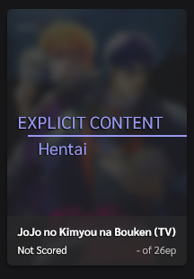 /*------------------------------*\
|* Hide Hentai Covers *|
\* - - - - - - - - - - - - - - -*/
.data.tags {
overflow: initial;
opacity: 1;
}
.data.tags span {
min-height: initial;
margin-bottom: 0;
}
.data.tags a {
min-height: 15px;
margin-bottom: 4px;
opacity: 0;
transition:
color var(--timeText) var(--bezierFast),
opacity calc(var(--timeItem) * 1.5) var(--bezierFast);
} .list-item:hover .data.tags a {
opacity: 1;
}
.data.tags a[href$="tag=Hentai"] {
position: absolute;
z-index: 5;
top: -51px;
right: -12px;
width: 210px;
height: 300px;
padding: 120px 0 0 36px;
background: hsla(var(--bgAlt), 70%);
border-radius: 6px;
color: hsl(var(--accent)) !important;
font: 20px/24px var(--font) !important;
text-align: left;
opacity: 1;
-webkit-backdrop-filter: blur(4px);
-moz-backdrop-filter: blur(4px);
backdrop-filter: blur(4px);
transition: opacity calc(var(--timeItem) * 1.5) var(--bezierFast);
pointer-events: none;
} .list-item:hover .data.tags a[href$="tag=Hentai"] {
opacity: 0;
}
@supports not (backdrop-filter: blur(4px)) {
.data.tags a[href$="tag=Hentai"] {
background: hsla(var(--bgAlt), 95%);
}
}
.data.tags a[href$="tag=Hentai"]::before {
content: "EXPLICIT CONTENT";
display: block;
border-bottom: 2px solid hsl(var(--accent));
padding-bottom: 4px;
margin-left: -12px;
text-indent: -12px;
}
.data.tags a[href$="tag=Hentai"]::after {
content: none;
} /*------------------------------*\
|* Hide Hentai Covers *|
\* - - - - - - - - - - - - - - -*/
.data.tags {
overflow: initial;
opacity: 1;
}
.data.tags span {
min-height: initial;
margin-bottom: 0;
}
.data.tags a {
min-height: 15px;
margin-bottom: 4px;
opacity: 0;
transition:
color var(--timeText) var(--bezierFast),
opacity calc(var(--timeItem) * 1.5) var(--bezierFast);
} .list-item:hover .data.tags a {
opacity: 1;
}
.data.tags a[href$="tag=Hentai"] {
position: absolute;
z-index: 5;
top: -51px;
right: -12px;
width: 210px;
height: 300px;
padding: 105px 0 0;
background: hsla(var(--bgAlt), 70%);
border-radius: 6px;
color: hsl(var(--accent)) !important;
font: 18px/22px var(--font) !important;
text-align: center;
text-transform: uppercase;
opacity: 1;
-webkit-backdrop-filter: blur(4px);
-moz-backdrop-filter: blur(4px);
backdrop-filter: blur(4px);
transition: opacity calc(var(--timeItem) * 1.5) var(--bezierFast);
pointer-events: none;
} .list-item:hover .data.tags a[href$="tag=Hentai"] {
opacity: 0;
}
@supports not (backdrop-filter: blur(4px)) {
.data.tags a[href$="tag=Hentai"] {
background: hsla(var(--bgAlt), 95%);
}
}
.data.tags a[href$="tag=Hentai"]::before {
content: "Explicit Content";
display: block;
border-bottom: 2px solid hsl(var(--accent));
padding-bottom: 4px;
}
.data.tags a[href$="tag=Hentai"]::after {
content: none;
}The styling could be changed if desired, but for now there's an option at least. All you need to do to blur a cover is add the tag "Hentai". |
Jul 8, 2020 1:51 AM
#176
| Thanks mate! Working perfectly ;) |
Jul 8, 2020 9:09 PM
#177

Valerio_Lyndon said: Hey, this is helps me a lot bruh! Btw, is there any way to add more tags instead Hentai (like yaoi or yuri)? Is it need to add something to a[href$="tag=Hentai"]? 🤔blessed_111 said: is it possible for this theme to have a function that blurs/replaces hentai covers (using the tag system) ? Yeah, it's possible. I made up some code for it a while back, it was in response to someone but no idea where I posted it though. /*------------------------------*\
|* Hide Hentai Covers *|
\* - - - - - - - - - - - - - - -*/
.data.tags {
overflow: initial;
opacity: 1;
}
.data.tags span {
min-height: initial;
margin-bottom: 0;
}
.data.tags a {
min-height: 15px;
margin-bottom: 4px;
opacity: 0;
transition:
color var(--timeText) var(--bezierFast),
opacity calc(var(--timeItem) * 1.5) var(--bezierFast);
} .list-item:hover .data.tags a {
opacity: 1;
}
.data.tags a[href$="tag=Hentai"] {
position: absolute;
z-index: 5;
top: -51px;
right: -12px;
width: 210px;
height: 300px;
padding: 120px 0 0 36px;
background: hsla(var(--bgAlt), 70%);
border-radius: 6px;
color: hsl(var(--accent)) !important;
font: 20px/24px var(--font) !important;
text-align: left;
opacity: 1;
-webkit-backdrop-filter: blur(4px);
-moz-backdrop-filter: blur(4px);
backdrop-filter: blur(4px);
transition: opacity calc(var(--timeItem) * 1.5) var(--bezierFast);
pointer-events: none;
} .list-item:hover .data.tags a[href$="tag=Hentai"] {
opacity: 0;
}
@supports not (backdrop-filter: blur(4px)) {
.data.tags a[href$="tag=Hentai"] {
background: hsla(var(--bgAlt), 95%);
}
}
.data.tags a[href$="tag=Hentai"]::before {
content: "EXPLICIT CONTENT";
display: block;
border-bottom: 2px solid hsl(var(--accent));
padding-bottom: 4px;
margin-left: -12px;
text-indent: -12px;
}
.data.tags a[href$="tag=Hentai"]::after {
content: none;
}/*------------------------------*\
|* Hide Hentai Covers *|
\* - - - - - - - - - - - - - - -*/
.data.tags {
overflow: initial;
opacity: 1;
}
.data.tags span {
min-height: initial;
margin-bottom: 0;
}
.data.tags a {
min-height: 15px;
margin-bottom: 4px;
opacity: 0;
transition:
color var(--timeText) var(--bezierFast),
opacity calc(var(--timeItem) * 1.5) var(--bezierFast);
} .list-item:hover .data.tags a {
opacity: 1;
}
.data.tags a[href$="tag=Hentai"] {
position: absolute;
z-index: 5;
top: -51px;
right: -12px;
width: 210px;
height: 300px;
padding: 105px 0 0;
background: hsla(var(--bgAlt), 70%);
border-radius: 6px;
color: hsl(var(--accent)) !important;
font: 18px/22px var(--font) !important;
text-align: center;
text-transform: uppercase;
opacity: 1;
-webkit-backdrop-filter: blur(4px);
-moz-backdrop-filter: blur(4px);
backdrop-filter: blur(4px);
transition: opacity calc(var(--timeItem) * 1.5) var(--bezierFast);
pointer-events: none;
} .list-item:hover .data.tags a[href$="tag=Hentai"] {
opacity: 0;
}
@supports not (backdrop-filter: blur(4px)) {
.data.tags a[href$="tag=Hentai"] {
background: hsla(var(--bgAlt), 95%);
}
}
.data.tags a[href$="tag=Hentai"]::before {
content: "Explicit Content";
display: block;
border-bottom: 2px solid hsl(var(--accent));
padding-bottom: 4px;
}
.data.tags a[href$="tag=Hentai"]::after {
content: none;
}The styling could be changed if desired, but for now there's an option at least. All you need to do to blur a cover is add the tag "Hentai". |
  Signature layout designed by myself, using Microsoft Office PowerPoint and Paint.NET |
Jul 8, 2020 9:56 PM
#178
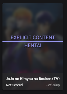
nattadasu said: Valerio_Lyndon said: blessed_111 said: is it possible for this theme to have a function that blurs/replaces hentai covers (using the tag system) ? Yeah, it's possible. I made up some code for it a while back Hey, this is helps me a lot bruh! Btw, is there any way to add more tags instead Hentai (like yaoi or yuri)? Is it need to add something to a[href$="tag=Hentai"]? 🤔 Sure. You would need to duplicate each selector that contains a reference to the "Hentai" tag, and then add a comma in between. For instance, this: .data.tags a[href$="tag=Hentai"] {
…
}.data.tags a[href$="tag=Hentai"],
.data.tags a[href$="tag=Yaoi"] {
…
}Here's a working example of the entire mod: /*------------------------------*\
|* Hide Hentai Covers *|
\* - - - - - - - - - - - - - - -*/
.data.tags {
overflow: initial;
opacity: 1;
}
.data.tags span {
min-height: initial;
margin-bottom: 0;
}
.data.tags a {
min-height: 15px;
margin-bottom: 4px;
opacity: 0;
transition:
color var(--timeText) var(--bezierFast),
opacity calc(var(--timeItem) * 1.5) var(--bezierFast);
} .list-item:hover .data.tags a {
opacity: 1;
}
.data.tags a[href$="tag=Hentai"],
.data.tags a[href$="tag=Yaoi"] {
position: absolute;
z-index: 5;
top: -51px;
right: -12px;
width: 210px;
height: 300px;
padding: 120px 0 0 36px;
background: hsla(var(--bgAlt), 70%);
border-radius: 6px;
color: hsl(var(--accent)) !important;
font: 20px/24px var(--font) !important;
text-align: left;
opacity: 1;
-webkit-backdrop-filter: blur(4px);
-moz-backdrop-filter: blur(4px);
backdrop-filter: blur(4px);
transition: opacity calc(var(--timeItem) * 1.5) var(--bezierFast);
pointer-events: none;
} .list-item:hover .data.tags a[href$="tag=Hentai"],
.list-item:hover .data.tags a[href$="tag=Yaoi"] {
opacity: 0;
}
@supports not (backdrop-filter: blur(4px)) {
.data.tags a[href$="tag=Hentai"],
.data.tags a[href$="tag=Yaoi"] {
background: hsla(var(--bgAlt), 95%);
}
}
.data.tags a[href$="tag=Hentai"]::before,
.data.tags a[href$="tag=Yaoi"]::before {
display: block;
border-bottom: 2px solid hsl(var(--accent));
padding-bottom: 4px;
margin-left: -12px;
text-indent: -12px;
} .data.tags a[href$="tag=Hentai"]::before {
content: "EXPLICIT CONTENT";
} .data.tags a[href$="tag=Yaoi"]::before {
content: "CONTENT WARNING";
}
.data.tags a[href$="tag=Hentai"]::after,
.data.tags a[href$="tag=Yaoi"]::after {
content: none;
} |
Jul 12, 2020 8:42 AM
#179
| Ah, ok... Thanks for the tips! XD |
Signature layout designed by myself, using Microsoft Office PowerPoint and Paint.NET |
Jul 20, 2020 4:33 PM
#180
| hi, I currently changed it so that the title does not appear on the cover but I want to change it again, but the text on some covers is not readable because I changed the opacity of the cover too I think. Is it possible to change the shadow of the text or something that solves the problem to be more readable? |
 |
Jul 21, 2020 12:43 AM
#181
ranyone said: hi, I currently changed it so that the title does not appear on the cover but I want to change it again, but the text on some covers is not readable because I changed the opacity of the cover too I think. Is it possible to change the shadow of the text or something that solves the problem to be more readable? I'd recommend turning the InfoBG to "visible". Found on line 96 in your current CSS: 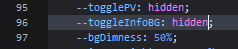  Or, you could try making the shadow harsher, but personally I've always found it hard to make look good, and doesn't increase readability that much. This is the current code, for reference: .data.title .link {
text-shadow:
-0.6px 0.84px 1.68px #000;
}To increase the intensity of the shadow, you would have to add more shadows, which will layer on top of each other. The shadows are laid out as such: <horizontal distance> <vertical distance> <spread AKA blur> <colour>. Just make sure there's a comma in between each shadow. For instance: .data.title .link {
text-shadow:
0.5px 2px 1px #000,
0.5px -1px 1px #000,
-1px -1px 1px #000,
-1px 2px 1px #000;
} |
Aug 2, 2020 6:00 AM
#182
| Hi! Thanks for the theme. I'm pretty sure that this is a matter of background images but I just want to confirm. On some of the anime covers the coloured text-shadow is darker. I'm guessing there's no way to change it for each anime. https://imgur.com/a/yFU3svJ Is there also a way to change the button borders? It's a light grey and there doesn't seem to be a code near the other colour codes in the CSS. https://imgur.com/a/ZtIkOHT And for last is there a way to change the MAL button colour? |
Aug 3, 2020 1:18 AM
#183
Xagok said: Hi! Thanks for the theme. I'm pretty sure that this is a matter of background images but I just want to confirm. On some of the anime covers the coloured text-shadow is darker. I'm guessing there's no way to change it for each anime. https://imgur.com/a/yFU3svJ Is there also a way to change the button borders? It's a light grey and there doesn't seem to be a code near the other colour codes in the CSS. https://imgur.com/a/ZtIkOHT And for last is there a way to change the MAL button colour? Yep, the only way to make it look 100% consistent across backgrounds would be to make the info backgrounds 100% opaque. The button borders are controlled by the --btnAccent variable, as described in the main forum post. The only other thing it changes is the little bar to the left of the dropdown items. So, you can modify the --btnAccent colour to change the button borders. --btnAccent controls:
  /* ==============================================
Change colour of sort-by dropdown item borders */
.list-table .list-table-header .header-title .link.sort:hover {
border-left-color: hsl(0, 0%, 100%);
}Changing the colour of the MAL button can be a bit tricky. You pretty much have two options: You can find the PSD and PNG files of the image: [here], [and here]. You could change the image with an image editor, and then upload it to an image host such as Imgur. If you don't know how to do that, but you have a specific colour in mind (as in, you have a CSS colour code picked out), I could modify the image for you. Once the image is modified, add this CSS and replace the "URLHERE" with your new image URL. /* =====================
Change MAL logo image */
body.ownlist .header .header-title {
background-image: url(URLHERE);
background-position: left 4px;
background-size: auto 20px;
}The alternative to switching images, is using some trickery with CSS filters. Here's some code which changes the colour to a dark blue: /* ======================
Change MAL logo colour */
body.ownlist .header .header-title {
filter: invert(0.65) sepia(1500%) saturate(1500%) hue-rotate(210deg);
}What we're doing here is applying some filters on top of the image. Since it's a pure white image, we invert the colours a bit to make it darker (more inversion = darker), add some sepia (only way of adding colour using the filter function), saturate it to increase the colouration, and then rotate the colours on an imaginary hue wheel (360 degrees would be one rotation) until we have the colour we want. It's rather convoluted, and I am actually not sure if it works the same on every browser. But it does do the job. |
Aug 3, 2020 4:31 AM
#184
| For the button accent. It only changes when hovering right. the actual border doesn't change. Same with the search bar, it only colours when it's being used. https://imgur.com/a/yMmhAFD And for the MAL logo I do have the coloured logo, but when I paste the link and preview the logo turns the same colour as the background. And if I paste the direct link the square turns white. Maybe i'm just doing something wrong. The logo: https://imgur.com/g1uBY87 |
Aug 3, 2020 5:01 PM
#185
 Love this. Thank you. |
Aug 3, 2020 11:47 PM
#186
Xagok said: For the button accent. It only changes when hovering right. the actual border doesn't change. Same with the search bar, it only colours when it's being used. https://imgur.com/a/yMmhAFD Ah, I see. I understand you now. To change the non-hovered border, you can add this CSS: /* ================================
Change non-hovered button border */
#header-menu-dropdown .icon-menu,
.list-unit .list-status-title .stats a,
.list-table > tbody:first-of-type::after,
body #fancybox-close,
#advanced-options .advanced-options-button a,
#status-menu .search-container #search-box,
div[style^="width: 300px;"] input {
border-color: hsl(0, 0%, 100%);
}Hopefully that does what you were wishing for. If not, please let me know. :) Xagok said: And for the MAL logo I do have the coloured logo, but when I paste the link and preview the logo turns the same colour as the background. And if I paste the direct link the square turns white. Maybe i'm just doing something wrong. The logo: https://imgur.com/g1uBY87 Were you using the direct link to the image? As in this: https://i.imgur.com/g1uBY87.png rather than the social link you have there. Using this, this code works for me: /* =====================
Change MAL logo image */
body.ownlist .header .header-title {
background-image: url(https://i.imgur.com/g1uBY87.png);
background-position: left 4px;
background-size: auto 20px;
}If that isn't the problem, then I'd have to see what code you are using that is going wrong to try and figure it out. So if you could save it and leave it public on your list, or upload it to Pastebin.com and share that, I could take a look. |
Aug 3, 2020 11:48 PM
#187
| @Esquilovysk Glad you're enjoying the theme. :) |
Aug 4, 2020 12:21 AM
#188
Valerio_Lyndon said: Xagok said: For the button accent. It only changes when hovering right. the actual border doesn't change. Same with the search bar, it only colours when it's being used. https://imgur.com/a/yMmhAFD Ah, I see. I understand you now. To change the non-hovered border, you can add this CSS: /* ================================
Change non-hovered button border */
#header-menu-dropdown .icon-menu,
.list-unit .list-status-title .stats a,
.list-table > tbody:first-of-type::after,
body #fancybox-close,
#advanced-options .advanced-options-button a,
#status-menu .search-container #search-box,
div[style^="width: 300px;"] input {
border-color: hsl(0, 0%, 100%);
}Yeah, that worked thank you Were you using the direct link to the image? As in this: https://i.imgur.com/g1uBY87.png rather than the social link you have there. Using this, this code works for me: /* =====================
Change MAL logo image */
body.ownlist .header .header-title {
background-image: url(https://i.imgur.com/g1uBY87.png);
background-position: left 4px;
background-size: auto 20px;
}It does reload the picture but it stays white. Here's the Pastebin link: https://pastebin.com/raw/cS1Hdap9 |
10969ToniAug 4, 2020 12:25 AM
Aug 4, 2020 11:31 PM
#189
Xagok said: It does reload the picture but it stays white. Here's the Pastebin link: https://pastebin.com/raw/cS1Hdap9 I'm a bit stumped, honestly. I can't find anything wrong with the CSS, and the logo displays as the new colour when I use your code on my own list and when I view your list right now. If it still isn't working for you right now, perhaps try refreshing the page with CTRL+F5 or clearing your browser's cache. |
Aug 5, 2020 3:20 AM
#190
Valerio_Lyndon said: Xagok said: It does reload the picture but it stays white. Here's the Pastebin link: https://pastebin.com/raw/cS1Hdap9 I'm a bit stumped, honestly. I can't find anything wrong with the CSS, and the logo displays as the new colour when I use your code on my own list and when I view your list right now. If it still isn't working for you right now, perhaps try refreshing the page with CTRL+F5 or clearing your browser's cache. After refreshing and clearing the cache it still doesn't work. I'll try to figure out why it isn't working. Regardless thanks for all of the help and I'm very sorry to have troubled you over such small modifications. This is exactly why I'm going to a computer school xD |
Aug 11, 2020 11:15 AM
#191

| What is the best resolution for the cover image? My smaller resolution images look decent on preview but then sadly get blurry when I save them. I don't have a big problem with higher resolution images. |
Aug 12, 2020 1:00 AM
#192
iStranger99 said: What is the best resolution for the cover image? My smaller resolution images look decent on preview but then sadly get blurry when I save them. I don't have a big problem with higher resolution images. The best image size will be an image as wide as your monitor, however wide that is. A safe bet is 1920 pixels wide, that will look good on most people's monitors. If you need help upscaling an image or getting it within the 1MB limit, I'd check out this write-up on the topic: Link. |
Aug 12, 2020 6:31 AM
#193
Valerio_Lyndon said: iStranger99 said: What is the best resolution for the cover image? My smaller resolution images look decent on preview but then sadly get blurry when I save them. I don't have a big problem with higher resolution images. The best image size will be an image as wide as your monitor, however wide that is. A safe bet is 1920 pixels wide, that will look good on most people's monitors. If you need help upscaling an image or getting it within the 1MB limit, I'd check out this write-up on the topic: Link. Used the upscaling tool and it worked! Picture looks great now, thank you! :) |
Aug 12, 2020 10:40 AM
#194
| I really like this layout. I like the Top Rated decoration addition to higher scored anime. I am not familiar with CSS so I am not sure if it is already something that can be changed with the script you have written, but it would be cool if we could change the text for the silver and gold ratings separately. So essential the gold goldRating could display "Top Rated" and the silverRating could display a different text such as "Recommended". I tried messing around with that a little bit already to change the score threshold for the "Top Rated" decoration, and to change the text itself, but I don't know how to add a feature which would allow someone to change only the text for the silverRating. A feature like that would be awesome |
Aug 12, 2020 11:50 PM
#195
AntonRuscov said: I really like this layout. I like the Top Rated decoration addition to higher scored anime. I am not familiar with CSS so I am not sure if it is already something that can be changed with the script you have written, but it would be cool if we could change the text for the silver and gold ratings separately. So essential the gold goldRating could display "Top Rated" and the silverRating could display a different text such as "Recommended". I tried messing around with that a little bit already to change the score threshold for the "Top Rated" decoration, and to change the text itself, but I don't know how to add a feature which would allow someone to change only the text for the silverRating. A feature like that would be awesome This is definitely possible, yep. Here's some code that can be added to the bottom of your current code (or integrated into the current CSS if desired). /* ==============================
Custom "Top Rated" Banner Text */
/* Patch for width of text box to better fit custom words */
body:not([data-query*='order":4']) .data .score-10::after,
body:not([data-query*='order":4']) .data .score-9::after {
left: 93px;
width: auto;
min-width: 100px;
padding: 0 5px;
transform: translateX(-50%);
}
/* Custom phrases / words */
body:not([data-query*='order":4']) .data .score-10::after {
/* Rated 10 */
content: "TOP RATED";
}
body:not([data-query*='order":4']) .data .score-9::after {
/* Rated 9 */
content: "RECOMMENDED";
} |
Aug 18, 2020 3:38 PM
#196
| THANK YOU!!!! |
Aug 18, 2020 3:39 PM
#197
Valerio_Lyndon said: This is definitely possible, yep. Here's some code that can be added to the bottom of your current code (or integrated into the current CSS if desired). THANK YOU!!! |
Aug 26, 2020 9:02 PM
#198

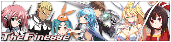
| Thanks for the awesome List Layout! Did a little bit of tweaking with some of the additional codes you shared in this forum and added my own banner's.  Link to my list if you want to check it out. https://myanimelist.net/animelist/TheFinesse |
 |
Aug 26, 2020 10:47 PM
#199
Aug 26, 2020 11:57 PM
#200

| hi 1. how to keep this always visible?  2. category wise title color  |
All those memories will be lost in time, like tears in rain..  |
More topics from this board
Sticky: » [ SIGNATURES ~ PROFILES] All guides, generators, and templatesShishio-kun - Feb 16, 2023 |
30 |
by Lia-chi
»»
2 hours ago |
|
Sticky: » [ BBCODE ] All 2023 BBcodes, Guides, and Templates ( 1 2 )Shishio-kun - Feb 16, 2023 |
56 |
by Pafon
»»
Sep 20, 7:33 PM |
|
» ❓ Ask for help here + See Frequently Asked Questions ( 1 2 3 4 5 ... Last Page )Shishio-kun - Apr 15, 2010 |
7921 |
by takkun_
»»
Sep 19, 9:54 PM |
|
» [CSS - MODERN] ⚡️ Fully-Customizable Layouts (2024 updates!) ( 1 2 3 4 5 ... Last Page )Shishio-kun - Jul 21, 2017 |
381 |
by KabukiChouNights
»»
Sep 13, 10:56 AM |
|
» theme helpthreat - Jul 5 |
5 |
by Zaryf
»»
Aug 21, 5:46 AM |