New
Jun 5, 2021 4:21 PM
#1
This is a custom layout for modern template lists. If you don't know how to install the codes, click here to view the Beginner's Tutorial. If there are problems: install the latest version, or check the Repair Sticky for patches and updates (found here). All premade modern layouts can be found in the gallery by clicking here. These beautiful designs are fully working, restored, and tested, and moved here for your convenience! There are some notes in the code to help with customization and some changeable parts are at the bottom of the CSS now. If you are using the Violet Evergarden layout, I've made some recording and tutorials just for changing some of this design: https://myanimelist.net/forum/?topicid=1928424#msg69120312 These recordings may also help with changing other layouts since it's all similar concepts. Otherwise, see the CSS tutorials for customizing help: https://myanimelist.net/forum/?topicid=2077862 Nier Layout with animated background  code: https://pastebin.com/raw/7ypdieRQ This layout also has a cover image you should apply: http://i.imgur.com/c1UTBP3.jpg Use the Cover Image settings above the Custom CSS edit box After you paste the code to your CSS edit box, you should change "SpaceCowboy" and "DateYukata" in the first two imports to your username. This provides personalized HD preview pics which are more reliable than the defaults. Your list(s) will also load significantly faster this way. However, lists set to private and friends-only can't use personalized preview pics and shouldn't edit them. Settings required: 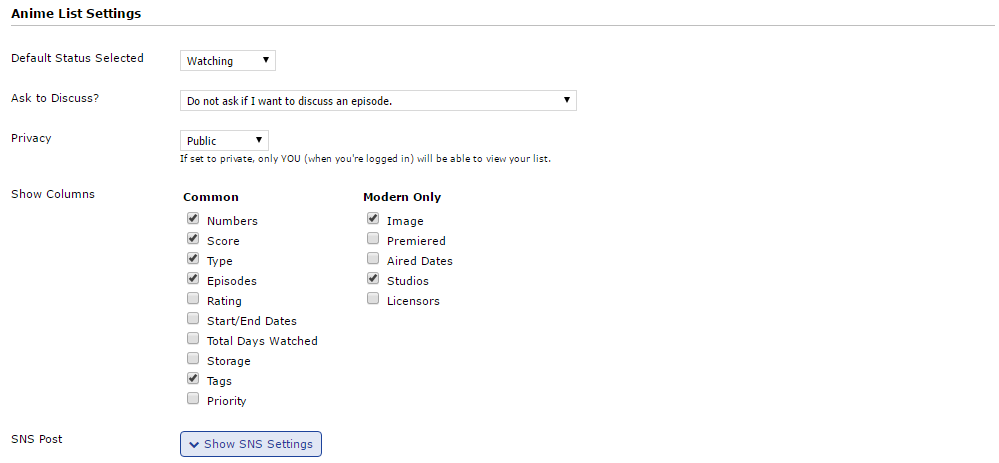 You can make the layout private or friend-only if you don't change the imports, but then your list might not load as fast. Madoka Grid-Style Layout  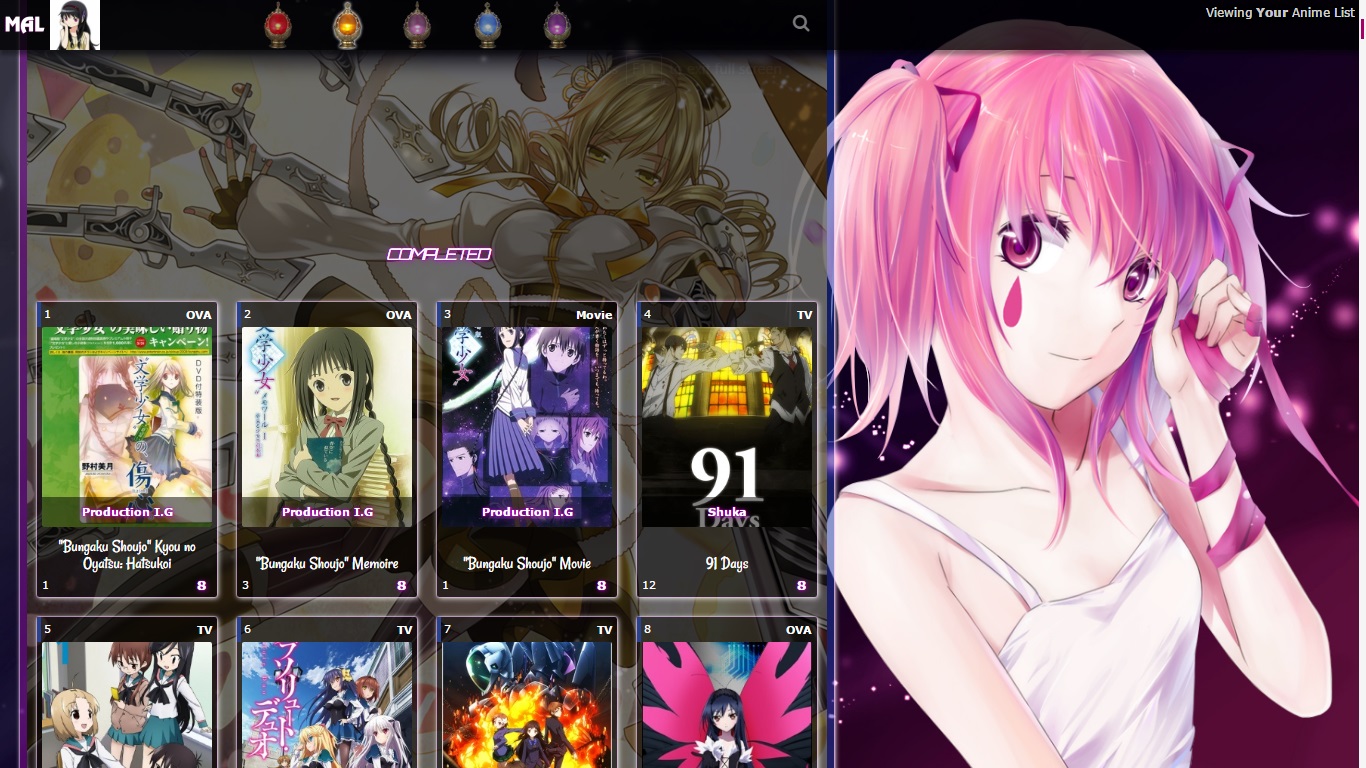 code: https://pastebin.com/raw/vS3ggdGc After pasting, change USERNAME to your username, see the line 19 of the CSS code. This layout also has a cover image you should apply: https://i.imgur.com/RYNhDg5.png Use the Cover Image settings above the Custom CSS edit box After you paste the code to your CSS edit box, you should change "SpaceCowboy" and "DateYukata" in the first two imports to your username. This provides personalized HD preview pics which are more reliable than the defaults. Your list(s) will also load significantly faster this way. However, lists set to private and friends-only can't use personalized preview pics and shouldn't edit them. Settings required: 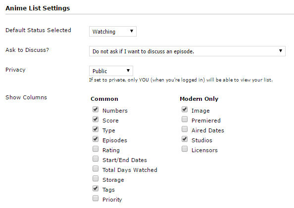 You can make the layout private or friend-only if you don't change the imports, but then your list might not load as fast. How to mark your favorite anime: 1/ Click on the tag icon  2/ A text box will come up, simply entering ,* at the end of your text For example: I love this anime ,*  this is what it will display 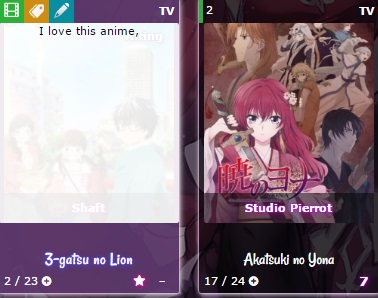 Madoka Line-style Layout 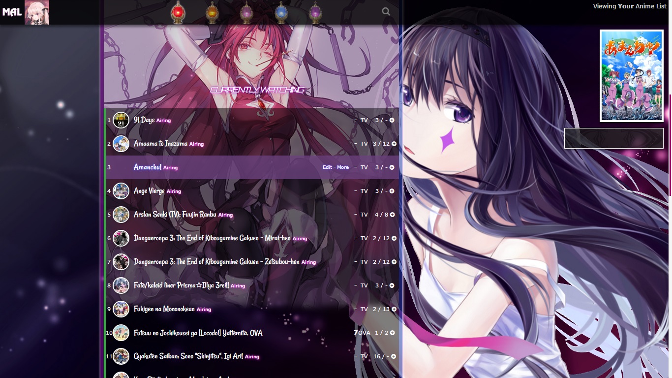 code: https://pastebin.com/raw/seR6RAxz After pasting, change USERNAME to your username, see the line 19 of the CSS code. This layout also has a cover image you should apply: https://i.imgur.com/RYNhDg5.png Use the Cover Image settings above the Custom CSS edit box After you paste the code to your CSS edit box, you should change "SpaceCowboy" and "DateYukata" in the first two imports to your username. This provides personalized HD preview pics which are more reliable than the defaults. Your list(s) will also load significantly faster this way. However, lists set to private and friends-only can't use personalized preview pics and shouldn't edit them. Settings required: 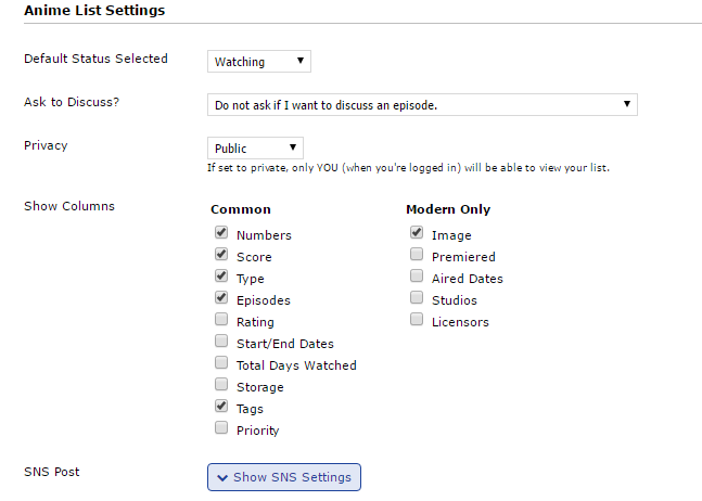 You can make the layout private or friend-only if you don't change the imports, but then your list might not load as fast. GochiUsa Layout 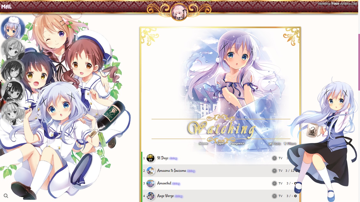 code: https://pastebin.com/raw/3KhR1bVE After you paste the code to your CSS edit box, you should change "SpaceCowboy" and "DateYukata" in the first two imports to your username. This provides personalized HD preview pics which are more reliable than the defaults. Your list(s) will also load significantly faster this way. However, lists set to private and friends-only can't use personalized preview pics and shouldn't edit them. Settings required:  You can make the layout private or friend-only if you don't change the imports, but then your list might not load as fast. Koe no Katachi Layout 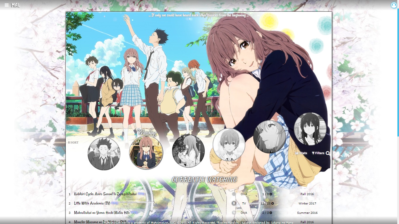 code: https://pastebin.com/raw/UJvBCuuS This layout also has a cover image you should apply: https://i.imgur.com/7Apn3HJ.png Use the Cover Image settings above the Custom CSS edit box After you paste the code to your CSS edit box, you should change "SpaceCowboy" and "DateYukata" in the first two imports to your username. This provides personalized HD preview pics which are more reliable than the defaults. Your list(s) will also load significantly faster this way. However, lists set to private and friends-only can't use personalized preview pics and shouldn't edit them. Settings required:  You can make the layout private or friend-only if you don't change the imports, but then your list might not load as fast. Shelter Layout 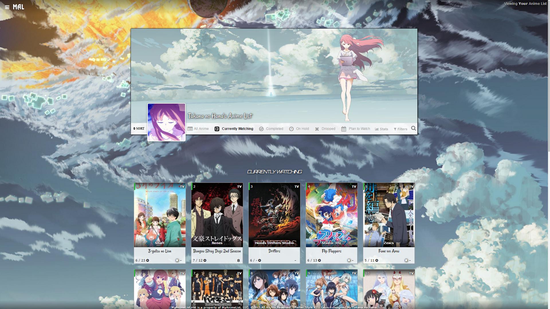 code: https://pastebin.com/raw/pPxWARV0 After you paste the code to your CSS edit box, you should change "SpaceCowboy" and "DateYukata" in the first two imports to your username. This provides personalized HD preview pics which are more reliable than the defaults. Your list(s) will also load significantly faster this way. However, lists set to private and friends-only can't use personalized preview pics and shouldn't edit them. Settings required:  You can make the layout private or friend-only if you don't change the imports, but then your list might not load as fast. Violet Evergarden Grid-style Layout 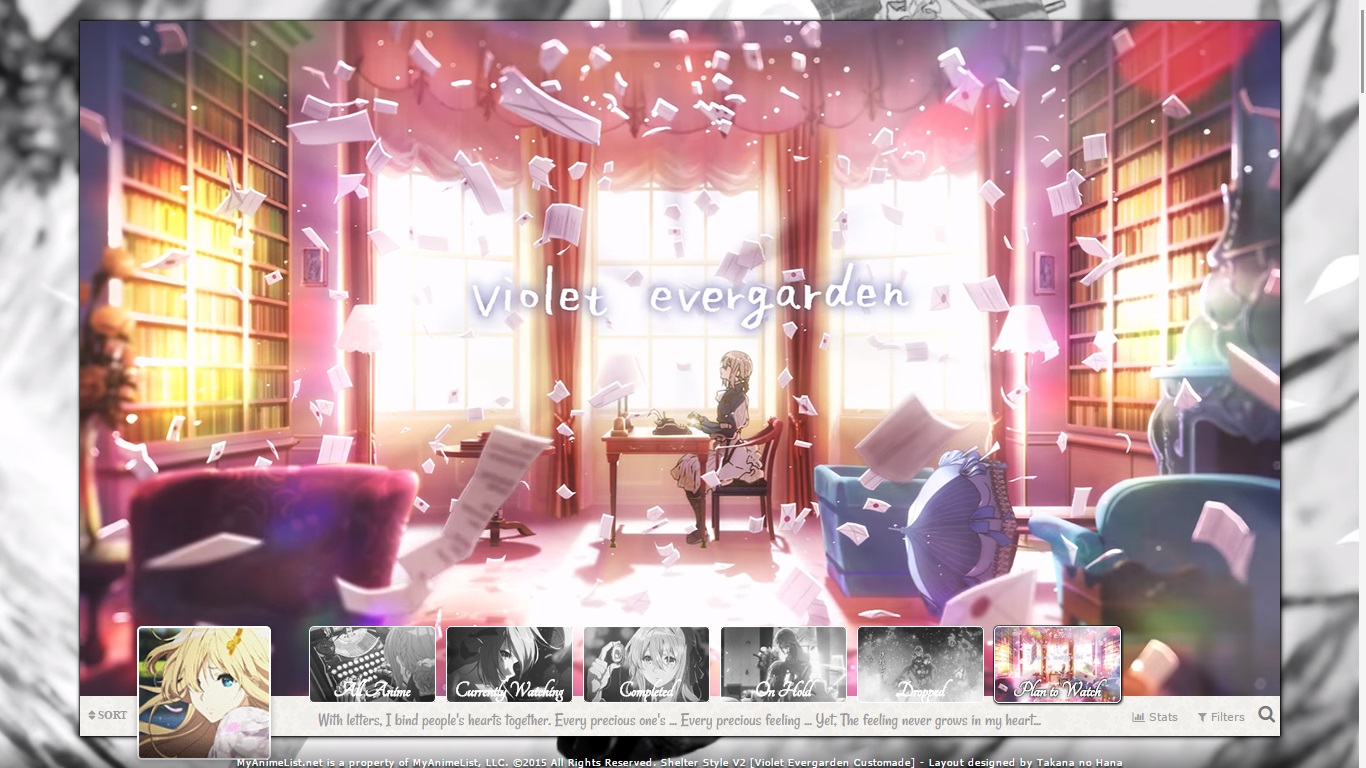 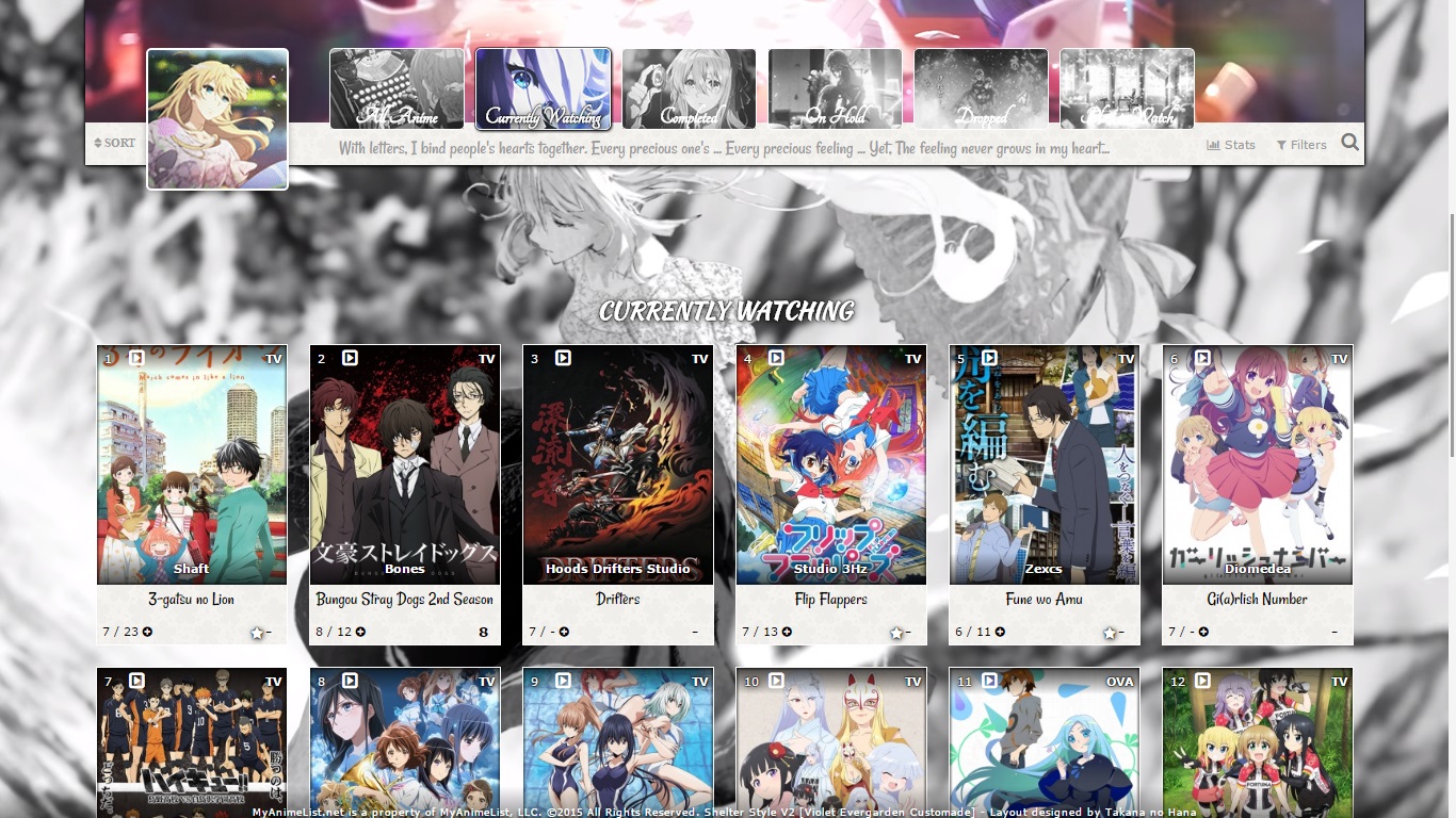 code: https://pastebin.com/raw/FPDYhacr This layout also has a cover image you should apply: http://i.imgur.com/GNbtQjA.jpg Use the Cover Image settings above the Custom CSS edit box After you paste the code to your CSS edit box, you should change "SpaceCowboy" and "DateYukata" in the first two imports to your username. This provides personalized HD preview pics which are more reliable than the defaults. Your list(s) will also load significantly faster this way. However, lists set to private and friends-only can't use personalized preview pics and shouldn't edit them. Settings required:  You can make the layout private or friend-only if you don't change the imports, but then your list might not load as fast. Violet Evergarden Line-style Layout 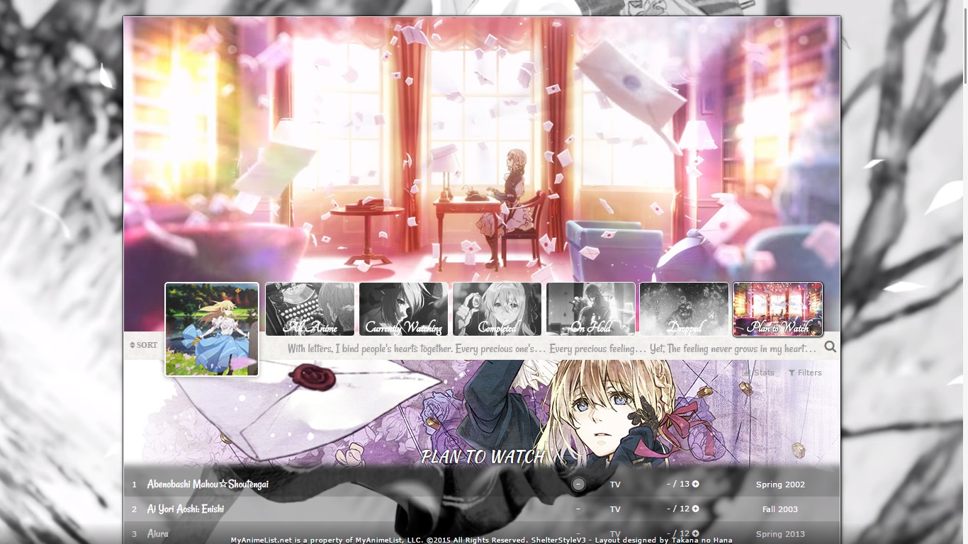 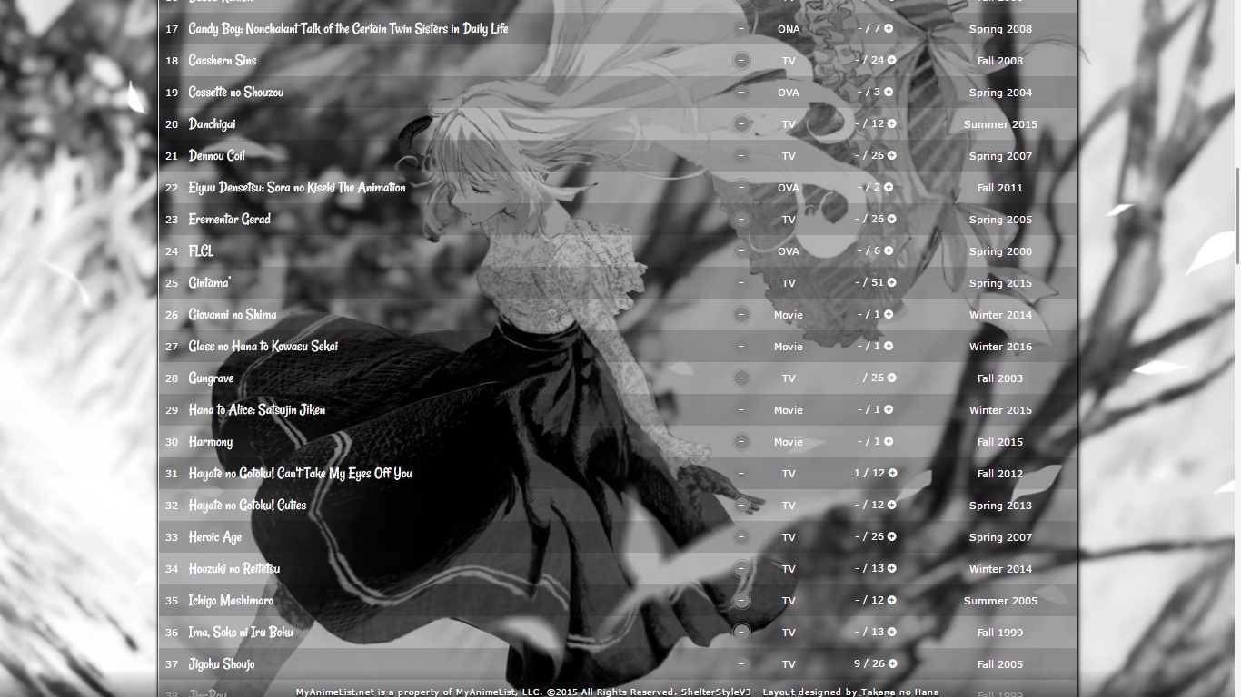 code: https://pastebin.com/raw/X7JzhtmM This layout also has a cover image you should apply: http://imgur.com/OW7SuKI Use the Cover Image settings above the Custom CSS edit box After you paste the code to your CSS edit box, you should change "SpaceCowboy" and "DateYukata" in the first two imports to your username. This provides personalized HD preview pics which are more reliable than the defaults. Your list(s) will also load significantly faster this way. However, lists set to private and friends-only can't use personalized preview pics and shouldn't edit them. Settings required:  You can make the layout private or friend-only if you don't change the imports, but then your list might not load as fast. Aria Layout 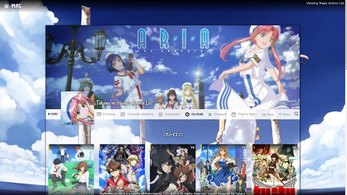 code: https://pastebin.com/raw/zPjaC3XT This layout also has a cover image you should apply: http://i.imgur.com/cExBZLn.jpg Use the Cover Image settings above the Custom CSS edit box After you paste the code to your CSS edit box, you should change "SpaceCowboy" and "DateYukata" in the first two imports to your username. This provides personalized HD preview pics which are more reliable than the defaults. Your list(s) will also load significantly faster this way. However, lists set to private and friends-only can't use personalized preview pics and shouldn't edit them. Settings required:  You can make the layout private or friend-only if you don't change the imports, but then your list might not load as fast. TTGL Layout 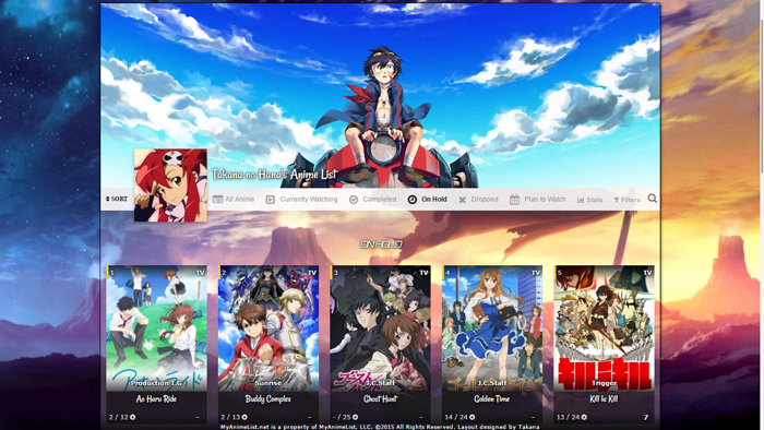 code: https://pastebin.com/raw/ucTxKJUn This layout also has a cover image you should apply: http://i.imgur.com/s8lSr2c.jpg Use the Cover Image settings above the Custom CSS edit box After you paste the code to your CSS edit box, you should change "SpaceCowboy" and "DateYukata" in the first two imports to your username. This provides personalized HD preview pics which are more reliable than the defaults. Your list(s) will also load significantly faster this way. However, lists set to private and friends-only can't use personalized preview pics and shouldn't edit them. Settings required:  You can make the layout private or friend-only if you don't change the imports, but then your list might not load as fast. Bungaku Layout 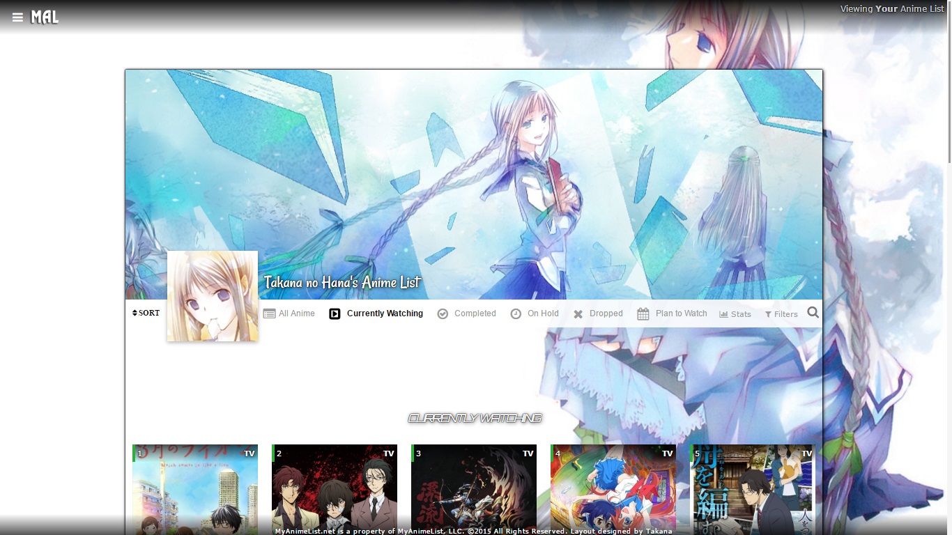 code: https://pastebin.com/raw/Sabcsbc9 This layout also has covers image you can apply: http://i.imgur.com/M5MOkc1.jpg http://i.imgur.com/SZbGfzZ.jpg https://imgur.com/a/aZGQU Use the Cover Image settings above the Custom CSS edit box After you paste the code to your CSS edit box, you should change "SpaceCowboy" and "DateYukata" in the first two imports to your username. This provides personalized HD preview pics which are more reliable than the defaults. Your list(s) will also load significantly faster this way. However, lists set to private and friends-only can't use personalized preview pics and shouldn't edit them. Settings required:  You can make the layout private or friend-only if you don't change the imports, but then your list might not load as fast. Love Live Layout 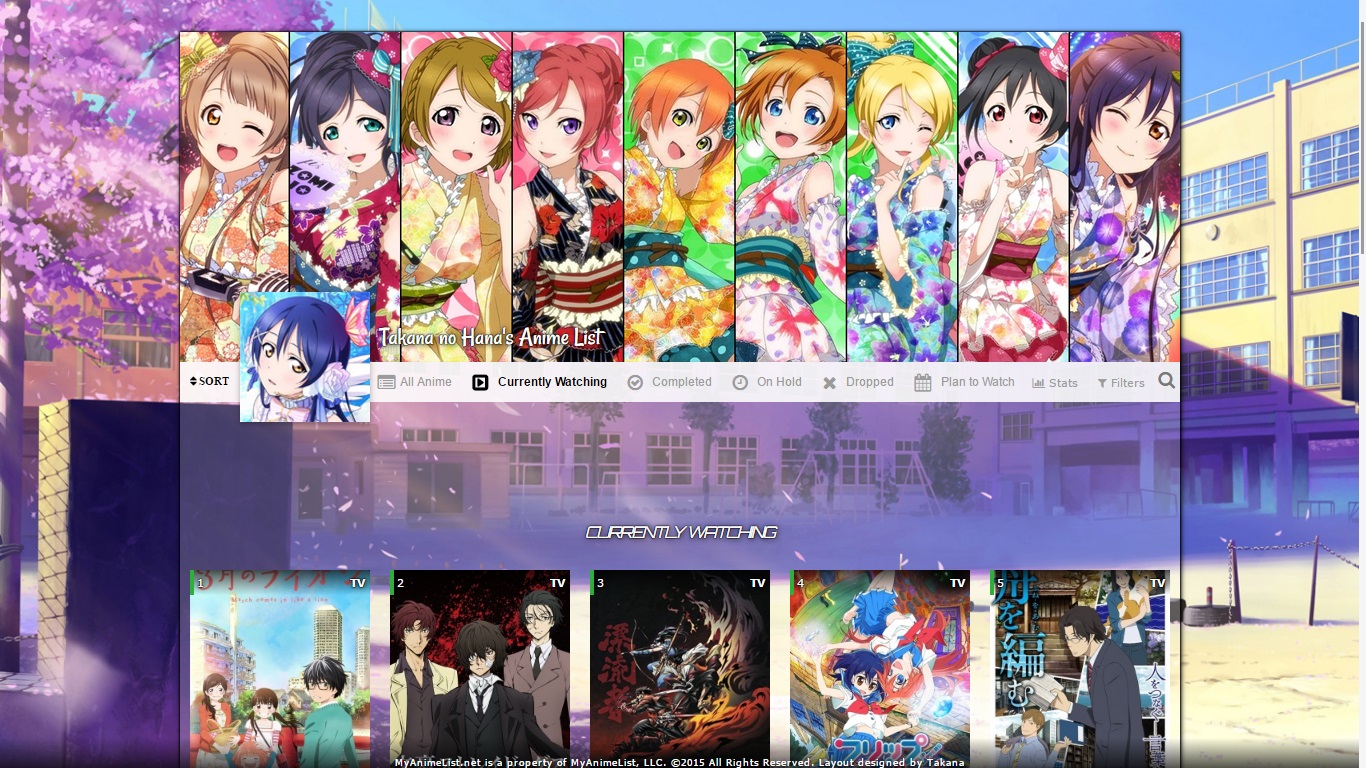 code: https://pastebin.com/raw/L6bqChYn This layout also has covers image you can apply: http://i.imgur.com/oyZHcxs.png http://i.imgur.com/83GwdBj.jpg http://i.imgur.com/iQXWkO0.jpg Use the Cover Image settings above the Custom CSS edit box After you paste the code to your CSS edit box, you should change "SpaceCowboy" and "DateYukata" in the first two imports to your username. This provides personalized HD preview pics which are more reliable than the defaults. Your list(s) will also load significantly faster this way. However, lists set to private and friends-only can't use personalized preview pics and shouldn't edit them. Settings required:  You can make the layout private or friend-only if you don't change the imports, but then your list might not load as fast. Gungrave Layout 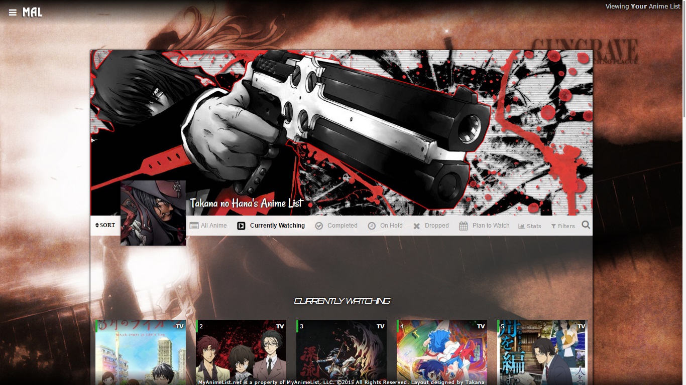 code: https://pastebin.com/raw/516BcCKK This layout also has covers image you can apply: http://i.imgur.com/cL9fKRV.jpg Use the Cover Image settings above the Custom CSS edit box After you paste the code to your CSS edit box, you should change "SpaceCowboy" and "DateYukata" in the first two imports to your username. This provides personalized HD preview pics which are more reliable than the defaults. Your list(s) will also load significantly faster this way. However, lists set to private and friends-only can't use personalized preview pics and shouldn't edit them. Settings required:  You can make the layout private or friend-only if you don't change the imports, but then your list might not load as fast. |
Shishio-kunApr 29, 2023 3:04 PM
Reply Disabled for Non-Club Members
Apr 1, 2023 12:39 PM
#2
| Great to see Takana's layouts being preserved! Quick warning though, the GochiUsa code has the same flaw from the original thread which can cause insane lag on some people's machines. The problem is the character image gets applied to an element on all list rows (.data.status). This means that instead of a single image being displayed, there are hundreds being layered on top of each other, which will slow down some people's PCs on large lists. I previously fixed this in the old thread after a user had troubles with it: https://myanimelist.net/forum/?topicid=1524727&show=50#msg57358196 [Refreshed Code] [Full list of Fixes & Changes] To quickly see the optimised version in action, view it: [Here] If you don't want to use the optimised code to keep all the original intent intact, the fix is simply to change the .data.status selector to one that only applies once on each page. You can see how I did that in this diffchecker here: https://www.diffchecker.com/jhzKzlRM/ |
Valerio_LyndonApr 1, 2023 12:42 PM
Apr 1, 2023 1:23 PM
#3
Valerio_Lyndon said: Great to see Takana's layouts being preserved! Quick warning though, the GochiUsa code has the same flaw from the original thread which can cause insane lag on some people's machines. The problem is the character image gets applied to an element on all list rows (.data.status). This means that instead of a single image being displayed, there are hundreds being layered on top of each other, which will slow down some people's PCs on large lists. I previously fixed this in the old thread after a user had troubles with it: https://myanimelist.net/forum/?topicid=1524727&show=50#msg57358196 [Refreshed Code] [Full list of Fixes & Changes] To quickly see the optimised version in action, view it: [Here] If you don't want to use the optimised code to keep all the original intent intact, the fix is simply to change the .data.status selector to one that only applies once on each page. You can see how I did that in this diffchecker here: https://www.diffchecker.com/jhzKzlRM/ Thanks I've switched it to your refreshed code. Although now looking at things I think these should all have the imports changed to Spacecowboy-type imports so everyone can simply put in their username and reduce the cover-loading lag which can be brutal |
Apr 29, 2023 2:12 PM
#4
| Tutorials/recordings on changing some features in the popular Violet Evergarden layout Change the quote Video of it for this layout: https://youtu.be/DJ5L--xF1T0 To change the quotes scroll down to the bottom of the code in your CSS edit box and there's the quote there in quotations (it's found under /* Your name that displays next to the avatar). You can replace the text there in quotations, like I did in the video with some random text, then you save. Don't delete the quotations on accident and make sure you always save when done. Changing Wallpaper Video of it: https://youtu.be/oZs7Xuv1dZ0 This seems complicated but easier with practice or seeing it done. So also at the bottom of the code, scroll up above the quote codes, and find: /*Change your backgrounds here*/
body[data-query*='"status":1'],
body[data-query*='"status":2'],
body[data-query*='"status":3'],
body[data-query*='"status":4'],
body[data-query*='"status":6'],
body[data-query*='"status":7'] {in the parenthesis after background-image under those codes you can delete the old image link in parenthesis and replace it with a new one that will be the new wallpaper. You can upload the wallpaper you want to Imgur (make an account there and log in first and wait for it to say "upload complete"). https://imgur.com/upload When you upload your desired wallpaper there, you get a new image link when you click Copy Link like I used in the video. Go to the code, delete the old image link in parenthesis and paste in the new one you got from Imgur. Add .jpg to the end of the image link and save. Be careful not to delete either of the parenthesis on accident, this happens a lot to everyone. I really recommend logging into Imgur too before uploading, so that the images don't get deleted later. If Imgur doesn't work for you or you don't want to log in for some reason, use this site https://postimages.org You can paste the direct link they give you into parenthesis in your layout the same way I pasted in the imgur code, and with postimage you don't need to add .jpg like with Imgur, postimage adds it for you. This is also how you can change the avatar, which is the furthest left video/GIF at the top, the background code for that is under /* **Your desired avatar **Note that the best resolution is 120px * 120px */ .cover-block::after which is a few lines above where you changed the quote. Changing List cover and videos on top Video of it all: https://youtu.be/WWiWRxeMeo0 First I recommend pasting this entire code to the very bottom of the CSS (make sure its pasted after everything else in your code and that you paste the full code) so that when you customize the images, it follows the same style as the original and fits/colors the videos you add correctly. Otherwise when you replace the videos they might have gaps or won't have the greyscale effect. Also this moves all the codes you need to change near the bottom to find them easily. When you paste in these codes, make sure you are at the very bottom of the custom CSS and copied the entire thing perfectly as seen in the recording. You can change the background image links the same as the wallpaper above - I'll show you what codes control the cover and the videos (they're actually gifs) . You should be able to use almost any animated GIF you want for the buttons at the top this way, and they should fit properly! :D This is the full code to paste to the bottom:
/* all_anime */
.status-menu-container .status-menu .status-button.all_anime {
background-image:url(http://i.imgur.com/J948M7X.png);
left:75px;
filter: grayscale(1);
background-size: cover;
}

.status-menu-container .status-menu .status-button.all_anime:hover {
background-image:url(http://i.imgur.com/EtJcBLp.gif);
filter: grayscale(0);
background-size: cover;
}

.status-menu-container .status-menu .status-button.all_anime.on {
background-image:url(http://i.imgur.com/EtJcBLp.gif);
filter: grayscale(0);
background-size: cover;
}

/* watching */

.status-menu-container .status-menu .status-button.watching {
background-image:url(http://i.imgur.com/4lIjnfH.png);
left:80px !important;
filter: grayscale(1);
background-size: cover;
}

.status-menu-container .status-menu .status-button.watching:hover {
background-image:url(http://i.imgur.com/FxP6Shw.gif);
filter: grayscale(0);
background-size: cover;
}

.status-menu-container .status-menu .status-button.watching.on {
background-image:url(http://i.imgur.com/FxP6Shw.gif);
filter: grayscale(0);
background-size: cover;
}

/* completed */

.status-menu-container .status-menu .status-button.completed {
background-image:url(http://i.imgur.com/ig9avfe.png);
left:85px !important;
filter: grayscale(1);
background-size: cover;
}

.status-menu-container .status-menu .status-button.completed:hover {
background-image:url(http://i.imgur.com/lsSov86.gif);
filter: grayscale(0);
background-size: cover;
}

.status-menu-container .status-menu .status-button.completed.on {
background-image:url(http://i.imgur.com/lsSov86.gif);
filter: grayscale(0);
background-size: cover;
}

/* on-hold */

.status-menu-container .status-menu .status-button.onhold {
background-image:url(http://i.imgur.com/8UTci5J.png);
left:90px !important;
filter: grayscale(1);
background-size: cover;
}

.status-menu-container .status-menu .status-button.onhold:hover {
background-image:url(http://i.imgur.com/IP3n4Ab.gif);
filter: grayscale(0);
background-size: cover;
}

.status-menu-container .status-menu .status-button.onhold.on {
background-image:url(http://i.imgur.com/IP3n4Ab.gif);
filter: grayscale(0);
background-size: cover;
}

/*dropped */

.status-menu-container .status-menu .status-button.dropped {
background-image:url(http://i.imgur.com/VNXW5lR.png);
left:95px !important;
filter: grayscale(1);
background-size: cover;
}

.status-menu-container .status-menu .status-button.dropped:hover {
background-image:url(http://i.imgur.com/7uWoqYr.gif);
filter: grayscale(0);
background-size: cover;
}

.status-menu-container .status-menu .status-button.dropped.on {
background-image:url(http://i.imgur.com/7uWoqYr.gif);
filter: grayscale(0);
background-size: cover;
}

/* plan to watch */

.status-menu-container .status-menu .status-button.plantowatch {
background-image:url(http://i.imgur.com/fYvwBVQ.png);
left:100px !important;
filter: grayscale(1);
background-size: cover;
}

.status-menu-container .status-menu .status-button.plantowatch:hover {
background-image:url(http://i.imgur.com/cqaTtlb.gif);
filter: grayscale(0);
background-size: cover;
}

.status-menu-container .status-menu .status-button.plantowatch.on {
background-image:url(http://i.imgur.com/cqaTtlb.gif);
filter: grayscale(0);
background-size: cover;
}


/**
 * List Container - List Status Title (with Stats)
 */
.list-unit .list-status-title {
    position: relative;
    display: table-cell;
    background-color: transparent;
    width: 1010px;
   height:0;
   /*background-color:rgba(127,127,127,1);*/
   background-color:rgba(0,0,0,.4);
   background-image:url(http://i.imgur.com/GThwznW.png);
   background-size:cover;
}
For the cover There's two covers/banners, for the top one you can upload an image directly to MAL through the Cover Image at the top of the list styling page you're using. Just turn on the cover image setting. Big wallpapers or HD images won't usually work for this one part. For the bottom one, under /** * List Container - List Status Title (with Stats) at the bottom, see the background image in parenthesis to change the list cover/banner picture etc. It's changed the same way as the wallpaper above. You can also add a px amount after height, a few lines above the background image code's line, change the height to something like 300px, it is set to zero for now, and this will make the banner bigger. Not needed but it's your choice. If you increase the height to 300px, as I did in the video, you can add .list-table .list-table-header:before {
margin-top: -140px !important;}
.list-unit .list-status-title .stats {
margin-top: -330px;
}
.list-unit .list-status-title .text {
margin-top: 260px !important;
}
to the bottom of the CSS to raise the sort menu, stats/filter etc back up. This is also done in the video. For the videos/GIFs Also found in the codes you just pasted to the bottom, see under /* all_anime */ these are the background image codes for the All Anime video GIFs, there's three background image links in parenthesis to replace for all three different states the All Anime button has, but you can replace them all with the same GIF, it's all pretty much the same, and the code I provided fixes some things. When you upload and paste the image link into the parenthesis, if you are using Imgur, you can add .gif to the end, as in the video. You don't need to add .gif if you are using postimage to upload GIFs. And if you want the black and white images on the top to be still, you can upload the GIF you want to use to EZ GIF https://ezgif.com/optimize and then go to Frames and cut out all but the first frame with the Skip buttons. Make the GIF and upload that frame to imgur (in the video I just copied the image and pasted it to Imgur as an upload shortcut) then you can replace only the first image link in parenthesis under /* all_anime */ with the one frame you just uploaded to Imgur and add .jpg to the end. This is all done in the video- I know this is a lot of info lol. Under /* watching */ are the three image links for the watching video/gif button which you can replace, under /* completed */ are the three image links for the Completed button, and so forth. Changing colors Add these codes to the bottom of your code (or find them in the code somewhere in the middle).
/* columns background color*/

.list-table > tbody:nth-of-type(2n+1) {
     background-color: rgba(0,0,0,.3) !important;
}

.list-table > tbody:nth-of-type(2n) {
background-color: rgba(0,0,0,.4) !important;
}
The zeros control the color. First zero is the amount of red, second is green, third is blue. You can raise them to up to 255 and save for color changes. So if you edited them to this and saved:
/* columns background color*/

.list-table > tbody:nth-of-type(2n+1) {
     background-color: rgba(130,0,110,.3) !important;
}

.list-table > tbody:nth-of-type(2n) {
background-color: rgba(130,0,120,.4) !important;
}
You'd get a dark purple table (it'd be 130 red and 120 blue). You can experiment with this RGBA thing here to see other color combos https://rgbacolorpicker.com/ |
Shishio-kunApr 29, 2023 4:03 PM
Apr 9, 6:38 PM
#5
| i chose the gungrave layout, but I want to change the background and the pfp icon, can i do that? |
Apr 9, 7:14 PM
#6
Reply to NemuSanjou
i chose the gungrave layout, but I want to change the background and the pfp icon, can i do that?
@NemuSanjou yes. look at the code and change these links |
Apr 9, 7:21 PM
#7
Reply to karmashizzle
| @karmashizzle grateful :) |
Reply Disabled for Non-Club Members
More topics from this board
» [BBCode] Font Awesome Guidehideso - Dec 25, 2023 |
6 |
by Shishio-kun
»»
Today, 12:26 AM |
|
Sticky: » 💚 [REPAIR STICKY] Repair/speed up a design + Request a layout fixShishio-kun - Nov 17, 2023 |
33 |
by Shishio-kun
»»
Yesterday, 11:42 PM |
|
» [CSS - Modern] 🛠️ Tweaks for lists -- Horizontal tags, descriptions, category-coloured text, accent colour, and more.Valerio_Lyndon - Oct 24, 2019 |
20 |
by IridescentJaune
»»
Nov 22, 10:58 PM |
|
» ✳️ Bunkasai 2024 List Design and Graphic Design contests are OPENShishio-kun - Nov 18 |
2 |
by Shishio-kun
»»
Nov 18, 5:01 AM |
|
Sticky: » [ SIGNATURES ~ PROFILES] All guides, generators, and templatesShishio-kun - Feb 16, 2023 |
29 |
by floral_sacrifice
»»
Nov 15, 10:24 AM |


