New
Oct 14, 2020 2:18 AM
#551

Valerio_Lyndon said: Uji_Gintoki_Bowl said: How do I make it so that instead of long titles getting a "...", it breaks a line and takes up 2 lines? https://i.imgur.com/mvATtFK.png It's possible to enable the title overflow, but there have to be some changes made to the "type" positioning. This is because it's not possible for it to vertically reposition depending on the title height. So, here's a couple of options. If any of them seem alright, then pick one and add it to the bottom of your CSS.  /*-S-T-A-R-T--------------------*\
| Multi Line Titles |
\*------------------------------*/
.data.type {
top: -24px;
left: -19px;
padding: 0 !important;
order: 12;
text-align: center !important;
pointer-events: none;
}
.data.title {
padding: 16px 8px !important;
height: auto;
}
.data.title::after {
content: none;
}
.data.title .link.sort {
position: static;
display: block;
padding-right: 0;
margin-right: 3px;
white-space: normal;
}
/*------------------------E-N-D-*/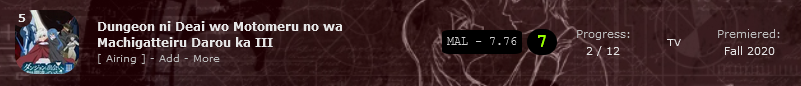 /*-S-T-A-R-T--------------------*\
| Multi Line Titles |
\*------------------------------*/
.data.type {
position: static;
width: 50px;
padding: 0 !important;
margin-right: 4px;
order: 16;
text-align: center !important;
}
.data.title {
padding: 8px !important;
height: auto;
}
.data.title::after {
content: none;
}
.data.title .link.sort {
position: static;
display: block;
padding-right: 0;
margin-right: 3px;
white-space: normal;
}
/*------------------------E-N-D-*/ /*-S-T-A-R-T--------------------*\
| Multi Line Titles |
\*------------------------------*/
.data.type {
top: 0px;
align-self: flex-start;
}
.data.title {
padding: 16px 8px !important;
height: auto;
}
.data.title::after {
content: none;
}
.data.title .link.sort {
position: static;
display: block;
padding-right: 0;
margin-right: 3px;
white-space: normal;
}
/*------------------------E-N-D-*/Alright, bet just did it. Thank you again! |
Please sign up for MangAlert! It's a little project I made that I'd really like to see the light of day and some users. MangAlert! (please sign up!) GitHub Repo (please star!) |
Oct 18, 2020 1:52 PM
#552
| Congrats your list design got used by the CEO lol |
Oct 19, 2020 3:51 AM
#553

| Is it possible to add text to the background on both the left and right columns? I personally want to add text regarding the details of the rating system I'm using. Also, how about shifting the character image to the right by a bit or changing the font/colour of the name that pops up? Thanks. |
YoshePlaysOct 19, 2020 10:35 AM
| Cosplayer, Photographer, & Journalist. ========= Discord► Yoshe#7068 Instagram► yoshe_plays Other Social Media Links► YoshePlays  |
Oct 21, 2020 10:20 PM
#554
YoshePlays said: Is it possible to add text to the background on both the left and right columns? I want to add text regarding the details of the rating system I'm using. You can add text via CSS, but it can be a little limiting. If you want a bit more styling control, you can create an image and add that image via CSS instead. Here's both methods so you can pick and choose. All new code should be placed at the bottom of your CSS.  The benefits of this are that it's simple and easy to change, but the downsides are that you can't stylize (bold, italic) bits of the text separately from each other, and it's pretty much just plaintext that you can add in this way. Details on changing the text are in the code below. /*-S-T-A-R-T--------------------*\
| Rating Description / Side Text |
\*------------------------------*/
:root {
/* Change descriptions here
* Do not insert any line breaks. All line breaks should be replaced by "\a ".
* Example: "This is the end of a paragraph.\a \a And the beginning of a new one."
* Additionally, the text must always be enclosed with double quotes "".
* Any double quotes inside must be preceeded with a backslash \.
* Example: "I \"enjoyed\" this anime a lot."
*/
--left-text: none ;
--right-text: "RATING INFO\a \a 10 - Flawless\a 9 - Almost perfect\a Etcetera" ;
}
.list-unit::before,
.list-unit::after {
position: absolute;
top: 390px;
min-width: 90px;
max-width: 200px;
padding: 8px;
background: rgba(0,0,0,0.7);
border-radius: 3px;
white-space: pre-wrap;
pointer-events: none;
}
.fixed + .list-block .list-unit::before,
.fixed + .list-block .list-unit::after {
position: fixed;
top: 72px;
}
.list-unit::before {
content: var(--left-text);
right: calc(50% + 538px);
}
.list-unit::after {
content: var(--right-text);
left: calc(50% + 538px);
}
/*------------------------E-N-D-*/ With an image-based approach, you have as much creative freedom as you want, but it does require using an image editor and re-uploading your image every time you want to change something about it. Details on how to change the image are in the code below. /*-S-T-A-R-T--------------------*\
| Rating Description / Side Img |
\*------------------------------*/
:root {
/* Change images here
* Upload an image and place the direct link inside of the url() parentheses.
* Then, ideally make sure the width and height numbers match the images' width and height.
* Append the width and height numbers with "px" if not already.
* If your image URL is directly from your PC, for e.x C:\Users\Name\Desktop\image.png
* then it won't work. It must be uploaded to an image host such as Imgur
*/
--left-image: url() ;
--left-image-width: 0px ;
--left-image-height: 0px ;
--right-image: url(https://i.imgur.com/vv851sf.png) ;
--right-image-width: 200px ;
--right-image-height: 130px ;
}
.list-unit {
position: relative;
}
.list-unit::before,
.list-unit::after {
content: "";
position: absolute;
top: 8px;
background-size: contain;
background-position: center;
pointer-events: none;
}
.fixed + .list-block .list-unit::before,
.fixed + .list-block .list-unit::after {
position: fixed;
top: 72px;
}
.list-unit::before {
right: calc(50% + 538px);
width: var(--left-image-width);
height: var(--left-image-height);
background-image: var(--left-image);
}
.list-unit::after {
left: calc(50% + 538px);
width: var(--right-image-width);
height: var(--right-image-height);
background-image: var(--right-image);
}
/*------------------------E-N-D-*/YoshePlays said: Also, how about shifting the character image to the right by a bit? You can use either a percentage amount or a "px" amount to change the positioning. /* Banner Character Position */
#list-container #cover-image-container {
width: 100%;
min-width: 1060px;
/* Change position here \/ */
background-position: 66% center;
}px numbers will often appear very different depending on the browser window size, so I recommend using percentage where possible. Or, you can also get fancy and use a calc (calculate) function to mix percentage and px values, which will make it easier to keep things looking the same across more visitors' screens while maintaining a bit more control. For example: background-position: calc(50% - 300px) center; YoshePlays said: changing the font/colour of the name that pops up? Add to the bottom of your CSS. The colours are the hashtags proceeded with 6 characters. To change the colour, copy and paste any colour from a CSS colour picker. /* ===================
Banner Text Colours */
body {
--banner-text: #f6f5ff ;
--banner-text-shadow: #e4bef4 ;
} |
Valerio_LyndonOct 21, 2020 10:24 PM
Oct 22, 2020 3:40 AM
#555
| Thanks! Sorry for bothering you again, but 1. How do I make it such that it enlarges when your cursor hovers over it like this?  2. and for the hover image arrow, how do you leave a space between the arrow and the status bar?   3. is it possible to add an extra character image to the left?  4. Valerio_Lyndon said: px numbers will often appear very different depending on the browser window size, so I recommend using percentage where possible. Or, you can also get fancy and use a calc (calculate) function to mix percentage and px values, which will make it easier to keep things looking the same across more visitors' screens while maintaining a bit more control. Exactly because of this, how do I ensure that the name/text on the cover image does not obscure the background image?   5. is it possible to list the total rewatch amount in the row as well, like this? 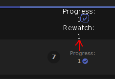 6. Thanks for dedicating your time to the community! c: |
YoshePlaysOct 22, 2020 3:47 AM
| Cosplayer, Photographer, & Journalist. ========= Discord► Yoshe#7068 Instagram► yoshe_plays Other Social Media Links► YoshePlays |
Oct 25, 2020 9:44 PM
#556
YoshePlays said: 1. How do I make it such that it enlarges when your cursor hovers over it like this? /* =======================
List Rows Hover Enlarge */
.list-item:hover {
z-index: 1;
transform: scale(1.025);
}YoshePlays said: 2. and for the hover image arrow, how do you leave a space between the arrow and the status bar? This will work. If you want a bit more space then you can adjust the two numbers up and down by the same amount. In other words, if you raise one by 3px, add 3px to the other number too. /* ==============================
Hover Image Reposition & Arrow */
/* change both of these numbers by the same amount to keep the image and arrow in sync with each other */
.data.image::before { left: -16px; }
.data.image a::before { left: -172px; }YoshePlays said: 3. is it possible to add an extra character image to the left? 4. Valerio_Lyndon said: px numbers will often appear very different depending on the browser window size, so I recommend using percentage where possible. Or, you can also get fancy and use a calc (calculate) function to mix percentage and px values, which will make it easier to keep things looking the same across more visitors' screens while maintaining a bit more control. Exactly because of this, how do I ensure that the name/text on the cover image does not obscure the background image? Since we already added some code about the character position and banner text, we'll overwrite that. You can find it at approximately line 343. You can delete what is shown here and replace it with the new code. 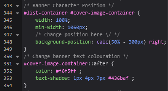 For 3, here's some CSS that can display multiple images. It will overwrite the default character image. For each image you can add a new url() to the background-image and a new X/Y pair to the background-position. Just make sure there is a comma between each one. In the code below I have 3 potential images, but that can be changed at any point by adding or removing one of the lines. Just make sure you have a comma after every line that isn't the last one (same as regular comma-separated lists, you don't end with a trailing comma). /* New Banner Characters & Positions */
#list-container #cover-image-container {
width: 100%;
min-width: 1060px;
/* Change images here */
background-image:
url(https://i.imgur.com/gmFUuZu.png),
url(image2),
url(image3)
;
/*
Change position here - each line correlates to the Nth image we've added above (2nd line positions the 2nd image)
Each position is a pair of X and Y positions (horizontal & vertical, in that order). For e.x: left center, 450px bottom
*/
background-position:
calc(50% + 300px) bottom,
calc(50% - 300px) bottom,
50% bottom
;
}And for the banner text, here's the new code. It's pretty much the same, but with added "left", and "top" properties for you to change. /* Banner text properties */
#cover-image-container::after {
/* positioning */
top: 55px;
left: calc(50% - 475px);
/* colouring */
color: #f6f5ff ;
text-shadow: 1px 4px 7px #436baf ;
/* don't change this */
margin-left: 0;
}Not that I know of. It would require a JavaScript tool, but I don't think anyone has made one with that function yet. The closest thing I know of is this: https://myanimelist.net/forum/?topicid=1855693 But I haven't tested it myself. |
Oct 26, 2020 11:01 PM
#557

| Hi V.L., I have been using your layout for sometime and even added some mods from the thread. There is just one thing, if you could check out my LIST HERE I want to be able to click on the tags that slide out from under the preview image. As of now its just a hover mechanic, as soon as I move my cursor to the preview image, it goes away. |
 I was rushing desperately, trying to reach the light. When I thought I did, I reached a dead end instead. Then I decided I wanted to enter that light. And at the edge of it, I found you. |
Oct 27, 2020 12:54 AM
#558
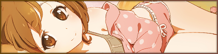
| Really like the theme, but what if I don't want Yui(?) on my banner? How do I change it? Furthermore, do you have a version of the cityscape image from dark mode without her in it? |
Oct 27, 2020 2:07 AM
#559
ColonelGarbage said: Really like the theme, but what if I don't want Yui(?) on my banner? How do I change it? Furthermore, do you have a version of the cityscape image from dark mode without her in it? This process is described in the main forum post under "Changing theme images." Specifically, you can add this to the bottom of your CSS: body { --character: none; } |
Oct 27, 2020 2:16 AM
#560
KrisMak1207 said: Hi V.L., I have been using your layout for sometime and even added some mods from the thread. There is just one thing, if you could check out my LIST HERE I want to be able to click on the tags that slide out from under the preview image. As of now its just a hover mechanic, as soon as I move my cursor to the preview image, it goes away. Give this a whirl, should do what you want. Add to the bottom of your CSS. /*-S-T-A-R-T--------------------*\
| Interactable Tags |
\*------------------------------*/
.list-item:hover::after {
content: "";
position: fixed;
right: calc(50% + 530px);
top: 0;
width: 158px;
height: 100%;
}
.data.tags {
z-index: 1;
}
.list-item:hover .data.tags div {
pointer-events: auto;
}
/*------------------------E-N-D-*/ |
Oct 27, 2020 2:16 AM
#561
| Ah, my apologies, then, I must've missed it. |
Oct 27, 2020 2:43 AM
#562
Valerio_Lyndon said: KrisMak1207 said: Hi V.L., I have been using your layout for sometime and even added some mods from the thread. There is just one thing, if you could check out my LIST HERE I want to be able to click on the tags that slide out from under the preview image. As of now its just a hover mechanic, as soon as I move my cursor to the preview image, it goes away. Give this a whirl, should do what you want. Add to the bottom of your CSS. /*-S-T-A-R-T--------------------*\
| Interactable Tags |
\*------------------------------*/
.list-item:hover::after {
content: "";
position: fixed;
right: calc(50% + 530px);
top: 0;
width: 158px;
height: 100%;
}
.data.tags {
z-index: 1;
}
.list-item:hover .data.tags div {
pointer-events: auto;
}
/*------------------------E-N-D-*/Thanks a lot, it works! |
I was rushing desperately, trying to reach the light. When I thought I did, I reached a dead end instead. Then I decided I wanted to enter that light. And at the edge of it, I found you. |
Oct 27, 2020 2:52 AM
#563
| Hope I'm not being a bother, but I have more than a few more questions. However, I'll start by saying I realize you have other things to do and answering questions that, let's be honest, you've probably answered at least once before, can't be that fun, so don't worry about getting back to me quickly. I understand it's a pain. Anyway, regarding the image hover, all I get is a grey rectangle. Could you point to what's missing in my CSS? Also, KrisMak, the one you replied to earlier, has genre tags on hover as well. How'd he do that? I saw you told him how to make them clickable but I'm don't know how he got them there in the first place and when I tried to use that snippet of code you gave him it didn't really do anything. Besides that. I have a gap between premier dates and studio names which makes it look less clean that he doesn't. Any idea what's causing it? Some also have the overall MAL rating of a show (1-10, not the age rating, sorry if I was unclear), and the synopsis incorporated into their list. How would I replicate that? And what about a button that switches between anime and manga lists? Once again, sorry for the trouble. |
Oct 27, 2020 2:58 AM
#564
| Hello again! 1. I'm currently dedicating a column to MAL score and Synposis, but it appears that titles which are too long go under the buttons instead of cutting off. Is there a way to limit the width of the .data.title? 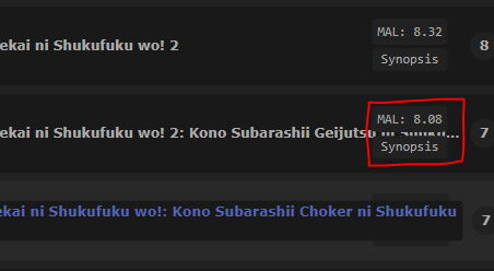 P.S. I have "Overflow Titles on Hover" added in my css /*-S-T-A-R-T--------------------*\
| Overflow Titles on Hover R2.0 |
\*------------------------------*/
.data.title .link.sort {
display: block;
height: 16px;
border-radius: 3px;
overflow: hidden;
transition: none !important;
} .data.title .link.sort:hover {
top: 24px;
z-index: 2;
height: auto;
padding: 2px 4px;
background: var(--btn-bg);
margin: 0 8px 0 -4px;
white-space: normal;
transform: translateY(-50%);
}
/*-------------------------------*/2a. I currently have added a red dot to display that the show is airing, which was done through disabling the .content-status #text, and placing the dot in .content-status:before and "[ Airing ]" in content-status:after  .content-status::before,
.content-status::after,
{
content: none;
}
.content-status {
color: #bababa!important;
font-size: 11px!important;
}
.content-status {
line-height: 10px;
}
.content-status {
color: #ff0000 !important;
font-size: 0px!important;
}
.content-status::before {
font-size: 12px !important;
font-family: 'Oswald';
content:"•";
padding-top: 2px;
text-shadow: 0 0 5px #ff0000, 0 0 1px #ff0000, 1px 1px 7px #ff0000, 0 0 0 #ff0000 !important;
color: #ff0000 !important;
padding: 0px 5px 0px 0px;
}
.content-status::after {
font-size: 10px !important;
font-family: 'Arial';
content:"[ Airing ]";
padding-top: 2px;
color: #777777 !important;
}I was planning to do the same thing for the [ Re-watching ] part, but adding a blue dot instead. However, the synopsis button happens to use .rewatch:before and .rewatch:after, which removed the original brackets for the theme, and prevented me from using the same method. Is there a way to directly edit the .rewatch #text, or use another way around this? and is it possible to reinsert the brackets? 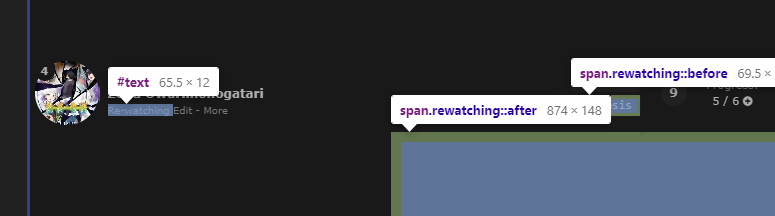 /*-S-T-A-R-T--------------------*\
|----------- MAL SCORE ----------|
\*------------------------------*/
.progress div {
position: relative;
}
.progress div:after {
position: absolute;
left: -81px;
top: calc(50% + -33.5px);
font: 12px 'Inconsolata', monospace;
color: #ababab;
transform: translateX(-50%);
background-color: #212121;
border-radius: 10%;
border: 5px solid #212121;
margin: 0 0 0 auto;
}
/*--------------------------------*/
/*-S-T-A-R-T--------------------*\
|---------- MAL SYNOPSIS ---------|
\*------------------------------*/
/* SYNOPSIS BASIS */
.rewatching, .rereading {
display: inline !important;
pointer-events: none;
}
.rewatching:before, .rewatching:after,
.rereading:before, .rereading:after {
content: none;
}
/* SYNOPSIS BUTTON */
.title a ~ [class^="re"]::before {
content: "Synopsis";
position: absolute;
right: 55px;
top: calc(50% + 12.5px);
z-index: auto;
width: 62px;
padding: 3.75px;
background-color: #212121;
border-radius: 10%;
font: 12px 'Inconsolata', monospace;
color: #ababab;
text-align: center;
transform: translate(50%, -50%);
pointer-events: auto;
}
/* SYNOPSES ON HOVER */
.title a ~ [class^="re"]::after {
position: absolute;
right: -608px;
top: calc(50% + 45px);
z-index: auto;
width: 854px;
padding: 10px;
--rounding: 8px;
border-radius: var(--rounding);
background-color: #212121;
font: 12px 'Inconsolata', monospace;
color: #ababab;
line-height: 1.35;
text-align: center;
white-space: pre-wrap;
opacity: 0;
transition: opacity 0.2s ease;
} .title a ~ [class^="re"]:hover::after {
opacity: 1;
}
/*-------------------------------*/2b. Is it possible to reposition the red dot (only) after the title? 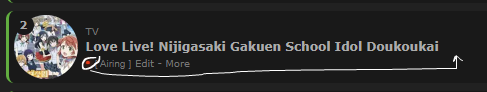 3. I wanted to try out the decimal rating css, it works, but it appears that the original score still appears. I tried messing around with the z-index, but it doesn't seem to have worked. 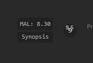 /*Decimal Ratings*/
.data.tags a[href*=".5"] {
position: absolute;
top: calc(50% - 20px);
left: 633px;
width: 26px;
height: 26px;
padding: 0 !important;
border-radius: 15px;
font: bold 14px/26px Arial;
pointer-events: none;
z-index: 3;
opacity: 1; }
.data.score:hover ~ .tags a[href*=".5"] {
opacity: 0; } |
YoshePlaysOct 27, 2020 3:58 AM
| Cosplayer, Photographer, & Journalist. ========= Discord► Yoshe#7068 Instagram► yoshe_plays Other Social Media Links► YoshePlays |
Oct 27, 2020 3:05 AM
#565
ColonelGarbage said: Hope I'm not being a bother, but I have more than a few more questions. However, I'll start by saying I realize you have other things to do and answering questions that, let's be honest, you've probably answered at least once before, can't be that fun, so don't worry about getting back to me quickly. I understand it's a pain. Anyway, regarding the image hover, all I get is a grey rectangle. Could you point to what's missing in my CSS? Also, KrisMak, the one you replied to earlier, has genre tags on hover as well. How'd he do that? I saw you told him how to make them clickable but I'm don't know how he got them there in the first place and when I tried to use that snippet of code you gave him it didn't really do anything. Besides that. I have a gap between premier dates and studio names which makes it look less clean that he doesn't. Any idea what's causing it? Some also have the overall MAL rating of a show (1-10, not the age rating, sorry if I was unclear), and the synopsis incorporated into their list. How would I replicate that? And what about a button that switches between anime and manga lists? Once again, sorry for the trouble. Hey man, I'm actually using this tool called MAL Tags Updater, allows you to add tags of any type to your entries. Also, try the code below after setting up the tags, all @import related stuff go at the very top of your code /* COVER PREVIEW */ @import "https://malscraper.azurewebsites.net/covers/auto/presets/dataimagelinkbefore"; @import "https://valeriolyndon.github.io/MAL-Public-List-Designs/Clarity%20Theme/Mod%20-%20Hover%20Image%20Compressed.css"; /* HORIZONTAL TAGS */ .list-table-data{padding-bottom:11px}.data.tags{position:absolute;left:0;top:0;display:flex!important;width:0;height:100%;padding:0!important;align-items:flex-end}.data.tags div{max-width:980px;margin:0 0 4px 80px;font-size:0;white-space:nowrap}.data.tags span{display:inline-block;padding:0}.data.tags span a{padding:1px 8px!important;margin:0 4px 0 0;white-space:nowrap}.data.tags span a[href*="=Favo"]{padding:0!important}.data.tags a.edit{right:-1060px}.data.tags textarea{right:-1060px} /* REPOSITIONED TAGS */ .data.tags { position: absolute; left: 0; top: 0; display: flex !important; width: 0; height: 100%; padding: 0 !important; align-items: flex-end; } .data.tags div { position: relative; top: calc(50% + 8px); left: -158px; background: var(--bg); width: 142px; min-height: 16px; padding: 4px 4px 0; border-radius: 8px; box-shadow: 0 0.5px 2px rgba(0,0,0,0.5); text-align: center; opacity: 0; transition: all 0.3s ease; pointer-events: none; } .list-item:hover .data.tags div { opacity: 1; transform: translateY(100px); } .data.tags span { display: inline-block; padding: 0 0 4px; vertical-align: top; } .data.tags span a { padding: 1px 8px !important; margin: 0 2px; word-wrap: anywhere; } .data.tags a.edit { right: -1060px; } .data.tags textarea { right: -1056px; } /* Fixes for Horizontal Tags */ .data.tags { display: block !important; } .data.tags div { margin: 0; white-space: normal; } .data.tags span a { white-space: normal; } .list-table-data { padding-bottom: 0; } /* Fixes for Favourite Tags */ .data.tags span a[href*="=Favourite"], .data.tags span a[href*="=Favorite"] { top: -42px; left: calc(50% - 13px); padding: 0 !important; opacity: 1; } .list-item:hover .data.tags span a[href*="=Favourite"], .list-item:hover .data.tags span a[href*="=Favorite"] { transform: translateY(-200px); } /* INTERACTABLE TAGS */ .list-item:hover::after { content: ""; position: fixed; right: calc(50% + 530px); top: 0; width: 158px; height: 100%; } .data.tags { z-index: 1; } .list-item:hover .data.tags div { pointer-events: auto; } /* END */ |
I was rushing desperately, trying to reach the light. When I thought I did, I reached a dead end instead. Then I decided I wanted to enter that light. And at the edge of it, I found you. |
Oct 27, 2020 3:10 AM
#566
| Hey V.L., when sorting through my list using tags, is it possible to get headers for the respective tags? Sort of similar to your code for the category headers.. |
I was rushing desperately, trying to reach the light. When I thought I did, I reached a dead end instead. Then I decided I wanted to enter that light. And at the edge of it, I found you. |
Oct 27, 2020 3:33 AM
#567
KrisMak1207 said: ColonelGarbage said: Hope I'm not being a bother, but I have more than a few more questions. However, I'll start by saying I realize you have other things to do and answering questions that, let's be honest, you've probably answered at least once before, can't be that fun, so don't worry about getting back to me quickly. I understand it's a pain. Anyway, regarding the image hover, all I get is a grey rectangle. Could you point to what's missing in my CSS? Also, KrisMak, the one you replied to earlier, has genre tags on hover as well. How'd he do that? I saw you told him how to make them clickable but I'm don't know how he got them there in the first place and when I tried to use that snippet of code you gave him it didn't really do anything. Besides that. I have a gap between premier dates and studio names which makes it look less clean that he doesn't. Any idea what's causing it? Some also have the overall MAL rating of a show (1-10, not the age rating, sorry if I was unclear), and the synopsis incorporated into their list. How would I replicate that? And what about a button that switches between anime and manga lists? Once again, sorry for the trouble. Hey man, I'm actually using this tool called MAL Tags Updater, allows you to add tags of any type to your entries. Also, try the code below after setting up the tags, all @import related stuff go at the very top of your code /* COVER PREVIEW */ @import "https://malscraper.azurewebsites.net/covers/auto/presets/dataimagelinkbefore"; @import "https://valeriolyndon.github.io/MAL-Public-List-Designs/Clarity%20Theme/Mod%20-%20Hover%20Image%20Compressed.css"; /* HORIZONTAL TAGS */ .list-table-data{padding-bottom:11px}.data.tags{position:absolute;left:0;top:0;display:flex!important;width:0;height:100%;padding:0!important;align-items:flex-end}.data.tags div{max-width:980px;margin:0 0 4px 80px;font-size:0;white-space:nowrap}.data.tags span{display:inline-block;padding:0}.data.tags span a{padding:1px 8px!important;margin:0 4px 0 0;white-space:nowrap}.data.tags span a[href*="=Favo"]{padding:0!important}.data.tags a.edit{right:-1060px}.data.tags textarea{right:-1060px} /* REPOSITIONED TAGS */ .data.tags { position: absolute; left: 0; top: 0; display: flex !important; width: 0; height: 100%; padding: 0 !important; align-items: flex-end; } .data.tags div { position: relative; top: calc(50% + 8px); left: -158px; background: var(--bg); width: 142px; min-height: 16px; padding: 4px 4px 0; border-radius: 8px; box-shadow: 0 0.5px 2px rgba(0,0,0,0.5); text-align: center; opacity: 0; transition: all 0.3s ease; pointer-events: none; } .list-item:hover .data.tags div { opacity: 1; transform: translateY(100px); } .data.tags span { display: inline-block; padding: 0 0 4px; vertical-align: top; } .data.tags span a { padding: 1px 8px !important; margin: 0 2px; word-wrap: anywhere; } .data.tags a.edit { right: -1060px; } .data.tags textarea { right: -1056px; } /* Fixes for Horizontal Tags */ .data.tags { display: block !important; } .data.tags div { margin: 0; white-space: normal; } .data.tags span a { white-space: normal; } .list-table-data { padding-bottom: 0; } /* Fixes for Favourite Tags */ .data.tags span a[href*="=Favourite"], .data.tags span a[href*="=Favorite"] { top: -42px; left: calc(50% - 13px); padding: 0 !important; opacity: 1; } .list-item:hover .data.tags span a[href*="=Favourite"], .list-item:hover .data.tags span a[href*="=Favorite"] { transform: translateY(-200px); } /* INTERACTABLE TAGS */ .list-item:hover::after { content: ""; position: fixed; right: calc(50% + 530px); top: 0; width: 158px; height: 100%; } .data.tags { z-index: 1; } .list-item:hover .data.tags div { pointer-events: auto; } /* END */ Getting a syntax error when attempting to install the js. Unfortunate, but thank you anyway! |
Oct 28, 2020 11:07 PM
#568
KrisMak1207 said: Hey V.L., when sorting through my list using tags, is it possible to get headers for the respective tags? Sort of similar to your code for the category headers.. There's no way to do that at the moment, no. A janky version could be possible with some custom JavaScript and some dedication, but no one has made that as of yet. Thanks for replying to Colonel! |
Valerio_LyndonOct 28, 2020 11:20 PM
Oct 29, 2020 12:04 AM
#569
ColonelGarbage said: regarding the image hover, all I get is a grey rectangle. Could you point to what's missing in my CSS? At the moment I see you don't have it installed, but when you do it should generally work as long as you have the two lines pasted near the top, as directed in the installation. If it doesn't work though, it's probably due to your browser (Safari & Brave are known for this) or a privacy extension (adblocker/content blocker) that has restrictions. For a fix, find this line from the default installation: @\import "https://malscraper.azurewebsites.net/covers/auto/presets/dataimagelinkbefore"; Delete it, and instead try this: @\import "https://malscraper.azurewebsites.net/covers/anime/ColonelGarbage/presets/dataimagelinkbefore"; @\import "https://malscraper.azurewebsites.net/covers/manga/ColonelGarbage/presets/dataimagelinkbefore"; And if that doesn't work, delete the two you just inserted and try this (note that these will increase page loading times). @\import "https://dl.dropboxusercontent.com/s/71mrsl1iz0z11p2/animelist_dataimagelinkbefore.css"; @\import "https://dl.dropboxusercontent.com/s/dpqglnr3slmgp7t/mangalist_dataimagelinkbefore.css"; ColonelGarbage said: KrisMak, the one you replied to earlier, has genre tags on hover as well. How'd he do that? The genres were added via the tool Kris linked above. If it's not working, you could try using a different extension to install it such as Tampermonkey, Violentmonkey, or Greasemonkey. There also exists a bookmarklet tool that has similar functionality, but I'd have to make a couple of repairs if you're interested as it's semi-broken right now. It would require manually updating it every once in a while too. That's about all I know of for automatic tagging options. As for the visual placement below the cover image, it's some code I wrote on request ages ago, further back in this thread. See here: Valerio_Lyndon said:  @Gomiruri Yes, that code would have some issues since it was tailored for Goko's modified list. This redone version of the code should work with just about any mod as of writing this post (hopefully). I tried to cover all the bases, but I may have missed some issues. @Gomiruri Yes, that code would have some issues since it was tailored for Goko's modified list. This redone version of the code should work with just about any mod as of writing this post (hopefully). I tried to cover all the bases, but I may have missed some issues.Standard disclaimers: • Incompatible with review-style tags. • Incompatible with tag descriptions. • Favourite tags will not appear until the item is hovered over. This could be changed but would require a removal of the tag box background and may be slightly more resource intensive. Add to the bottom of your code, below all other mods (this contains overrides for several other modifications so needs to be below them). /*-S-T-A-R-T--------------------*\
| Tags Below Hover Image R0.0 |
\*------------------------------*/
.data.tags {
position: absolute;
left: 0;
top: 0;
display: flex !important;
width: 0;
height: 100%;
padding: 0 !important;
align-items: flex-end;
}
.data.tags div {
position: relative;
top: calc(50% + 8px);
left: -158px;
background: var(--bg);
width: 142px;
min-height: 16px;
padding: 4px 4px 0;
border-radius: 8px;
box-shadow: 0 0.5px 2px rgba(0,0,0,0.5);
text-align: center;
opacity: 0;
transition: all 0.3s ease;
pointer-events: none;
} .list-item:hover .data.tags div {
opacity: 1;
transform: translateY(100px);
}
.data.tags span {
display: inline-block;
padding: 0 0 4px;
vertical-align: top;
}
.data.tags span a {
padding: 1px 8px !important;
margin: 0 2px;
word-wrap: anywhere;
}
.data.tags a.edit { right: -1060px; }
.data.tags textarea { right: -1056px; }
/* Fixes for Horizontal Tags */
.data.tags {
display: block !important;
}
.data.tags div {
margin: 0;
white-space: normal;
}
.data.tags span a {
white-space: normal;
}
.list-table-data {
padding-bottom: 0;
}
/* Fixes for Favourite Tags */
.data.tags span a[href*="\=Favourite"],
.data.tags span a[href*="\=Favorite"] {
top: -42px;
left: calc(50% - 13px);
padding: 0 !important;
opacity: 1;
} .list-item:hover .data.tags span a[href*="\=Favourite"],
.list-item:hover .data.tags span a[href*="\=Favorite"] {
transform: translateY(-200px);
}
/*------------------------E-N-D-*/ColonelGarbage said: I have a gap between premier dates and studio names which makes it look less clean that he doesn't. Any idea what's causing it? If an item has tags, that's where they go. It's empty right now since you haven't given any entries tags. But if you used the code from the previous reply, then the gap should be gone as the tags will have been repositioned. If you didn't use the code from the last reply, then you can always remove or fill in the gap by disabling the Tags column in your list settings or giving some items tags. ColonelGarbage said: Some also have the overall MAL rating of a show (1-10, not the age rating, sorry if I was unclear), and the synopsis incorporated into their list. How would I replicate that? I described the process with Gintoki Bowl in the Help Thread. Here's some links: - Adding the MAL score. - Followup about adding the synpopsis. If you do use any of this code, it may not work perfectly on your list, I haven't tested yet. But we can fix any issues you have if/when that is an issue. ColonelGarbage said: And what about a button that switches between anime and manga lists? There's these two links here. Did you have something else in mind?  |
Valerio_LyndonOct 29, 2020 12:11 AM
Oct 29, 2020 1:11 AM
#570
YoshePlays said: 1. I'm currently dedicating a column to MAL score and Synposis, but it appears that titles which are too long go under the buttons instead of cutting off. Is there a way to limit the width of the .data.title? Yep. Add this and adjust the "100px" if needed. /* Title Max Width */
.data.title .link.sort {
max-width: calc(100% - 100px);
}YoshePlays said: 2a. I currently have added a red dot to display that the show is airing, which was done through disabling the .content-status #text, and placing the dot in .content-status:before and "[ Airing ]" in content-status:after I was planning to do the same thing for the [ Re-watching ] part, but adding a blue dot instead. However, the synopsis button happens to use .rewatch:before and .rewatch:after, which removed the original brackets for the theme, and prevented me from using the same method. Is there a way to directly edit the .rewatch #text, or use another way around this? Not that you mention it, I think it is possible to use a different selector. This kind of solution is working within so many constraints, I figured I had the best selector on the rewatch. But if you enable the "Storage" list column in your settings, then we can use that as a burner column for the synopsis. You won't be able to see the storage column, the code will hide it. New synopsis code: /*-S-T-A-R-T--------------------*\
|---------- MAL SYNOPSIS ---------|
\*------------------------------*/
/* SYNOPSIS BASIS */
.data.storage {
width: 0;
font-size: 0;
margin: 0;
pointer-events: none;
}
/* SYNOPSIS BUTTON */
.data.storage::before {
content: "Synopsis";
position: absolute;
right: 480px;
top: calc(50% + 12.5px);
z-index: auto;
width: 62px;
padding: 3.75px;
background-color: #212121;
border-radius: 10%;
font: 12px 'Inconsolata', monospace;
color: #ababab;
text-align: center;
transform: translate(50%, -50%);
pointer-events: auto;
}
/* SYNOPSES ON HOVER */
.data.storage::after {
position: absolute;
right: 50px;
top: calc(50% + 45px);
z-index: auto;
width: 854px;
padding: 10px;
--rounding: 8px;
border-radius: var(--rounding);
background-color: #212121;
font: 12px 'Inconsolata', monospace;
color: #ababab;
line-height: 1.35;
text-align: center;
white-space: pre-wrap;
opacity: 0;
transition: opacity 0.2s ease;
} .data.storage:hover::after {
opacity: 1;
}You'll also have to change the preset you're using on the generator tool to this: /* [TITLE] *[DEL]/ .progress-[ID]:after {content: "MAL - [SCORE]";} #tags-[ID] ~ .storage:after {content: "SYNOPSIS\a\a[DESC]";}If you wish, you can change the CSS you've already generated with some find and replace tools found online or in any advanced text editor. The dot & the "Airing" text could be moved to the end of the title together, but not separately. The synopsis button would have to be repositioned after adding this. Instead of "right: 55px" it would probably have to use "left: #px" instead. /* =====================
Reposition Airing Dot */
.list-table .list-table-data .data.title {
padding-top: 16px !important;
height: 32px;
}
.data.title {
white-space: nowrap;
}
.data.title .link.sort {
position: static;
display: inline-block;
padding-right: 2px;
} .data.title .link.sort:hover {
position: absolute;
}
.content-status {
vertical-align: top;
line-height: 16px;
}
.rewatching,
.rereading,
.add-edit-more {
position: absolute;
bottom: 0;
left: 8px;
}
.rewatching:not([style]) ~ .add-edit-more,
.rereading:not([style]) ~ .add-edit-more {
left: 85px;
}YoshePlays said: 3. I wanted to try out the decimal rating css, it works, but it appears that the original score still appears. I tried messing around with the z-index, but it doesn't seem to have worked. Just needs a "background" property so that it covers what's behind it. Probably needs a bit of repositioning too. /* Decimal Ratings */ .data.tags a[href*=".5"] { position: absolute; top: calc(50% - 14px); left: 634px; width: 26px; height: 26px; padding: 0 !important; background: #212121; border-radius: 15px; font: bold 14px/26px Arial; pointer-events: none; z-index: 3; opacity: 1; } .data.score:hover ~ .tags a[href*=".5"] { opacity: 0; } |
Oct 29, 2020 3:59 AM
#571
| Thanks a lot! That sums up all the problems I have so far (hopefully). EDIT: I lied, I found a problem :c. The score appears as this when other tags are present.   P.S. Problem 2: I'm pretty sure this is just a browser/device problem, but for some reason when the hover/enlarge animation is activated, the whole row, including cover and text get blurred more progressively the more you scroll down the page. Is there a way to resolve this? I had this problem on my PC with opera, but this doesn't seem to be a thing on my mac which is using chrome. Anyways, another thing I wanted to point out about this template used here is that the first character of the [DESC] will be superscripted / appear as a special character without spacing between the "\a" if the first characters of the synopsis are "a-e". For future reference, if anyone were to use the code or ask about the synopsis function, it should be changed to {content: "SYNOPSIS\a \a [DESC]";} |
YoshePlaysOct 29, 2020 4:03 AM
| Cosplayer, Photographer, & Journalist. ========= Discord► Yoshe#7068 Instagram► yoshe_plays Other Social Media Links► YoshePlays |
Oct 29, 2020 10:19 PM
#572
YoshePlays said: Thanks a lot! That sums up all the problems I have so far (hopefully). EDIT: I lied, I found a problem :c. The score appears as this when other tags are present. Ah, the comma can be removed with this: /* Decimal rating comma fix */
.data.tags a[href$=".5"]::before {
content: none;
}YoshePlays said: P.S. Problem 2: I'm pretty sure this is just a browser/device problem, but for some reason when the hover/enlarge animation is activated, the whole row, including cover and text get blurred more progressively the more you scroll down the page. Is there a way to resolve this? I had this problem on my PC with opera, but this doesn't seem to be a thing on my mac which is using chrome. Hm, I don't see this happening on my versions of Firefox or Chrome. Might just be an Opera bug. Transforms can be weird sometimes, I guess that browser may have some badly implemented optimizations or something. YoshePlays said: For future reference, if anyone were to use the code or ask about the synopsis function, it should be changed to {content: "SYNOPSIS\a \a [DESC]";}Thanks for pointing this out! |
Oct 30, 2020 8:38 AM
#573
| Hey V.L. could I get this REPOSITIONED TAGS code for image hover preview instead of row hover preview?? Also, would the INTERACTABLE TAGS code work with the changed code?? As of now, when using the image hover preview mod, the tags appear on row hover and then the cover image appears on hovering over the image /* REPOSITIONED TAGS */
.data.tags {
position: absolute;
left: 0;
top: 0;
display: flex !important;
width: 0;
height: 100%;
padding: 0 !important;
align-items: flex-end;
}
.data.tags div {
position: relative;
top: calc(50% + 8px);
left: -158px;
background: var(--bg);
width: 142px;
min-height: 16px;
padding: 4px 4px 0;
border-radius: 8px;
box-shadow: 0 0.5px 2px rgba(0,0,0,0.5);
text-align: center;
opacity: 0;
transition: all 0.3s ease;
pointer-events: none;
} .list-item:hover .data.tags div {
opacity: 1;
transform: translateY(100px);
}
.data.tags span {
display: inline-block;
padding: 0 0 4px;
vertical-align: top;
}
.data.tags span a {
padding: 1px 8px !important;
margin: 0 2px;
word-wrap: anywhere;
}
.data.tags a.edit { right: -1060px; }
.data.tags textarea { right: -1056px; }
/* Fixes for Horizontal Tags */
.data.tags {
display: block !important;
}
.data.tags div {
margin: 0;
white-space: normal;
}
.data.tags span a {
white-space: normal;
}
.list-table-data {
padding-bottom: 0;
}
/* Fixes for Favourite Tags */
.data.tags span a[href*="=Favourite"],
.data.tags span a[href*="=Favorite"] {
top: -42px;
left: calc(50% - 13px);
padding: 0 !important;
opacity: 1;
} .list-item:hover .data.tags span a[href*="=Favourite"],
.list-item:hover .data.tags span a[href*="=Favorite"] {
transform: translateY(-200px);
} |
KrisMak1207Oct 30, 2020 8:47 AM
I was rushing desperately, trying to reach the light. When I thought I did, I reached a dead end instead. Then I decided I wanted to enter that light. And at the edge of it, I found you. |
Nov 1, 2020 1:31 AM
#574
KrisMak1207 said: Hey V.L. could I get this REPOSITIONED TAGS code for image hover preview instead of row hover preview?? Also, would the INTERACTABLE TAGS code work with the changed code?? As of now, when using the image hover preview mod, the tags appear on row hover and then the cover image appears on hovering over the image /* REPOSITIONED TAGS */
.data.tags {
position: absolute;
left: 0;
top: 0;
display: flex !important;
width: 0;
height: 100%;
padding: 0 !important;
align-items: flex-end;
}
.data.tags div {
position: relative;
top: calc(50% + 8px);
left: -158px;
background: var(--bg);
width: 142px;
min-height: 16px;
padding: 4px 4px 0;
border-radius: 8px;
box-shadow: 0 0.5px 2px rgba(0,0,0,0.5);
text-align: center;
opacity: 0;
transition: all 0.3s ease;
pointer-events: none;
} .list-item:hover .data.tags div {
opacity: 1;
transform: translateY(100px);
}
.data.tags span {
display: inline-block;
padding: 0 0 4px;
vertical-align: top;
}
.data.tags span a {
padding: 1px 8px !important;
margin: 0 2px;
word-wrap: anywhere;
}
.data.tags a.edit { right: -1060px; }
.data.tags textarea { right: -1056px; }
/* Fixes for Horizontal Tags */
.data.tags {
display: block !important;
}
.data.tags div {
margin: 0;
white-space: normal;
}
.data.tags span a {
white-space: normal;
}
.list-table-data {
padding-bottom: 0;
}
/* Fixes for Favourite Tags */
.data.tags span a[href*="=Favourite"],
.data.tags span a[href*="=Favorite"] {
top: -42px;
left: calc(50% - 13px);
padding: 0 !important;
opacity: 1;
} .list-item:hover .data.tags span a[href*="=Favourite"],
.list-item:hover .data.tags span a[href*="=Favorite"] {
transform: translateY(-200px);
}The repositioned tags code can be made to activate on image hover, but it's a little janky. Primarily, the large image will collapse as soon as you mouse over the tags, leaving only the tags floating. You can give it a go if you wish, here's the CSS: /*-S-T-A-R-T--------------------*\
| Tags Below Hover Image Row R0.0|
\*------------------------------*/
.data.image {
border-radius: 50%;
}
.data.tags {
position: absolute;
left: 0;
top: 0;
display: flex !important;
width: 0;
height: 100%;
padding: 0 !important;
align-items: flex-end;
}
.data.tags div {
position: relative;
top: calc(50% + 8px);
left: -158px;
background: var(--bg);
width: 142px;
min-height: 16px;
padding: 4px 4px 0;
border-radius: 8px;
box-shadow: 0 0.5px 2px rgba(0,0,0,0.5);
text-align: center;
opacity: 0;
transition: all 0.3s ease;
pointer-events: none;
} .data.image:hover ~ .data.tags div,
.data.tags:hover div {
opacity: 1;
transform: translateY(100px);
}
.data.tags span {
display: inline-block;
padding: 0 0 4px;
vertical-align: top;
}
.data.tags span a {
padding: 1px 8px !important;
margin: 0 2px;
word-wrap: anywhere;
}
.data.tags a.edit { right: -1060px; }
.data.tags textarea { right: -1056px; }
/* Fixes for Horizontal Tags */
.data.tags {
display: block !important;
}
.data.tags div {
margin: 0;
white-space: normal;
}
.data.tags span a {
white-space: normal;
}
.list-table-data {
padding-bottom: 0;
}
/* Fixes for Favourite Tags */
.data.tags span a[href*="\=Favourite"],
.data.tags span a[href*="\=Favorite"] {
top: -42px;
left: calc(50% - 13px);
padding: 0 !important;
opacity: 1;
} .data.image:hover ~ .data.tags span a[href*="\=Favourite"],
.data.image:hover ~ .data.tags span a[href*="\=Favorite"] {
transform: translateY(-200px);
}
/* Make the tags interactable */
.list-item .data.image:hover a:before {
top:calc(50% - 100px);
height:200px;
opacity:1
}
.data.image:hover::after {
content: "";
position: fixed;
right: calc(50% + 506px);
top: 0;
width: 182px;
height: 100%;
}
.data.tags {
z-index: 1;
}
.list-item:hover .data.tags div {
pointer-events: auto;
}
/*------------------------E-N-D-*/ |
Nov 4, 2020 1:52 PM
#575

| Hi, I'm not very good with coding (the only experience I have is VBA in excel, so CSS scrambles my brain most of the time. I have no experience creating code but I can do very basic things like moving an image left or right, or changing a text font color. For the most part, I try to keep things clean and simple, but do enjoy to have some characterization to my list. I tried reading other people's questions to see if I could find an answer and either it wasn't asked or I missed it. This has two parts: 1. I was wondering if I could have some help with adding a third character on the list. This one would be attached to the footer and would move with it as I scrolled. 2. How do I increase the space between the last item on the list and the top of the footer. (this is just to make room for the character.) 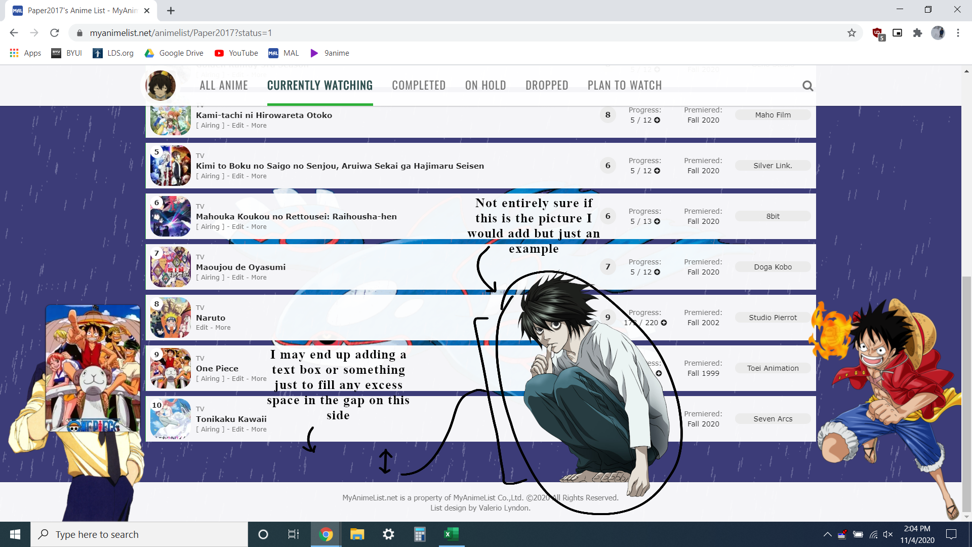 @\import "https://fonts.googleapis.com/css?family=Oswald"; @\import "https://malscraper.azurewebsites.net/covers/auto/presets/dataimagelinkbefore"; /* BANNER BACKGROUND To change background images: Delete what's in the parenthesis. Upload the new background to Imgur or a similar site, then copy the direct link (or Original GIF link if it's animated) and paste it into the parenthesis. Save. */ :root { --banner: url(https://imgur.com/kfeRsl4.png) !important;} /* BANNER TEXT*/ :root { --name: url(https://imgur.com/hsfQZdO.png) !Important; --namestart:70px; --nameend:125px; --namescale:.75; } /* BANNER AVATAR (BOTTOM LEFT PIC) */ :root { --avatar: url(https://cdn.myanimelist.net/images/userimages/7930522.jpg?t=1603492200) !important;} /* BANNER CHARACTER (PIC On BANNER)*/ :root { --character: url(https://imgur.com/8U0yIcX.png) !important; } /* WALLPAPER stuff. Based on Layers*/ :root { --wallpaper: var(--wallpaper1) ,var(--wallpaper2),var(--wallpaper3),var(--wallpaper-color) !important; /*Wallpaper Layers. 1 is first layer, 2 is second layer etc.*/ --wallpaper1: url(https://imgur.com/Vd23sGI.gif)fixed right; --wallpaper2:url()fixed no-repeat center top 25px ; --wallpaper3:url()fixed no-repeat center top; --wallpaper-color:rgb(30,30,100,1); } /* LEFT CHARACTER BY LIST */ footer:before { background-image: url(https://imgur.com/U8JmZsp.png) !important; } /* RIGHT CHARACTER BY LIST */ footer:after { background-image: url(https://imgur.com/Tj6GI43.png) !important; } /*Third Character(fixed to footer) and adjustments*/ :root { --thirdcharacter: url(https://imgur.com/TVuyQZV.png) !Important; --footer-gap: -200px; --thirdcharacter-spacing:345px; --thirdcharacter-position:250px; --thirdcharacter-zindex:-1; --thirdcharacter-scalesize:.25; } /*Fourth Character(Top of List) and adjustments*/ :root { --fourthcharacter: url(https://imgur.com/f2VV5nM.png) !Important; --header-gap: 128px; --button-fix:90px;/*Roughly 38 LOWER than header gap*/ --fourthcharacter-spacing:-25px; --fourthcharacter-position:155px; /*z-index won't work for this*/ --fourthcharacter-scalesize:.17; --stats-padding-height:3px; --stats-padding-width:25px; --stats-spacing:33px; --stats-opacity:.6; } /* TABLE COLORS and EDITS*/ :root { --bg: rgba(255,255,255,1); --list-items-radius: 5px; } /* OTHER CODES*/ body:before { width: 100%; height: 100%; display: block; position: fixed; left: 0; top:0; content: ""; } #search-box:after,.open~#search-button{pointer-events:none}:root{--name:none;--avatar:none;--banner:url(https://i.imgur.com/VoPJz2S.jpg);--character:url(https://i.imgur.com/6IPyngH.png);--pbg:var(--wallpaper);var(--bg);--text:#1C1C1C ;--text-h:#787878;--text-dim:#737373;--text-dim-h:#646464;--text-dark:#111;--icon:#1C1C1C ;--accent:#4065ba;--btn-bg:#DDDDDD;--btn-bg-h:#1C1C1C ;--btn-head-bg-h:#1d439b;--btn-text-h:#fff;--bg-dark:#ddd;--text-head:#737373;--text-head-h:#2F4F4F;--watching:#2db039;--completed:#26448f;--onhold:#f9d457;--dropped:#a12f31;--plantowatch:#c3c3c3;--cover-bg:#323232;--edit-btn:#d9d9d9;--checkmark:#9696eb}#advanced-options .advanced-options-button a,#fancybox-close,#search-box,#search-box input,#search-box:after,.data.chapter,.data.image .link:after,.data.licensor a,.data.priority,.data.progress,.data.score a,.data.studio a,.data.tags a,.data.tags a.edit:after,.data.volume,.fixed .status-menu:after,.header .header-title:after,.icon-menu svg,.icon-menu.setting,.icon-menu.setting .text,.icon-menu.setting .text a,.icon-menu:after,.icon-menu:before,.list-table .list-table-header .header-title .link.sort,.list-table-header .header-title,.status-button:after,.status-menu-container.fixed .status-menu,.status-menu-container:not(.fixed) .status-menu,.status-menu:after{transition:all .3s ease!important}#advanced-options .advanced-options-header .description,#advanced-options .advanced-options-header .description:before,#advanced-options [class*="-widget"] input,#advanced-options [class*="-widget"] label,#advanced-options [class*="-widget"] select,#search-button i,.header-info a,.list-table-data a,.more-info .td1>div>a{transition:all .15s ease!important}.header .header-title,.header-info,.icon-menu,.icon-menu.quick-add:before,.list-menu-float .icon-menu,.list-table>tbody:first-of-type:after,.stats a{display:inline-block;height:26px!important;width:26px!important;background:var(--bg)!important;border-radius:8px;color:var(--text)!important;font:400 0/26px Arial,Verdana,sans-serif;text-indent:0;text-align:left;white-space:nowrap;vertical-align:top;overflow:hidden;box-shadow:0 1px 2px rgba(0,0,0,.2);transition:all .3s ease!important}.header .header-title:hover,.icon-menu:hover,.list-menu-float .icon-menu:hover,.stats a:hover{width:100px!important;background:var(--btn-head-bg-h)!important;color:var(--btn-text-h)!important}html{position:relative;min-height:100%}body{padding-bottom:64px;background:var(--pbg) no-repeat center / cover fixed!important}.list-container{position:static;width:100%;background:0 0!important;border:none}.list-block{width:1060px;min-height:initial;margin:64px auto 0}.status-menu-container.fixed+.list-block{margin-top:128px!important}.list-unit{width:100%!important;margin:0}.cover-block,.cover-block:before{left:0;width:100%;position:absolute}.list-table{border:none!important}a,a:hover{color:var(--accent)}.initialize-tutorial{display:none!important}.cover-block{top:0;z-index:-5;min-width:1060px;height:318px;background:center center/cover no-repeat var(--cover-bg);background-image:var(--banner)}.cover-block:before{content:var(--fourthcharacter);transform:scale(var(--fourthcharacter-scalesize),var(--fourthcharacter-scalesize));bottom:var(--fourthcharacter-spacing);left:var(--fourthcharacter-position);display:block;height:50px;background:linear-gradient(to top,rgba(0,0,0,0),rgba(0,0,0,0))}#cover-image,.btn-list-setting{display:none!important}.cover-block .image-container{display:block!important;width:1060px;height:100%;padding:0;background:right center/contain no-repeat var(--character);margin:0px -725px auto}#cover-image-container:after{content:var(--name);transform:scale(var(--namescale),var(--namescale));position:absolute;bottom:55px;left:50%;margin-left:var(--nameend);color:#fff;font:700 60px/60px Oswald;text-align:left;letter-spacing:15px;text-shadow:1px 4px 7px rgba(0,0,0,.45);text-transform:uppercase;white-space:pre;transform:scale(.6) perspective(350px) rotateY() rotateZ();animation:name-slide 2s 1 .5s backwards}@keyframes name-slide{0%{bottom:25px;margin-left:var(--namestart);opacity:0;letter-spacing:0;animation-timing-function:ease-out}90%{bottom:55px;margin-left:var(--nameend)}100%{letter-spacing:15px;opacity:1;animation-timing-function:cubic-bezier(0,0,.75,1)}}.header{display:flex;height:36px;margin-top:282px}.header .header-menu{position:static;display:flex;width:auto;height:26px;margin-left:6px;order:2}.btn-menu{height:0;font-size:0!important}.btn-menu #header-menu-button{display:none}.header .header-title{position:static;margin-left:155px;order:1;z-index:1}.header .header-title:before{content:"\f015";display:inline-block;width:26px;background:0 0!important;font-size:14px;font-family:FontAwesome;text-align:center!important}.header .header-title:hover:before{color:var(--btn-text-h)!important}.header .header-title:after{content:"Home";display:inline-block;height:26px!important;width:26px!important;font:14px/26px Arial,Verdana,sans-serif;color:var(--text)}#search-box:after,.status-menu:after{content:""}.header .header-title:hover:after{color:var(--btn-text-h)}.header .header-menu .list-menu{position:static;order:1;display:inline-block;height:26px;border:none;background:0 0;box-shadow:none}.header .icon-menu.anime-list,.header .icon-menu.manga-list{position:static;padding:0;margin-right:6px;font-size:0!important;font-weight:400!important}.header .icon-menu.anime-list .text,.header .icon-menu.manga-list .text{position:static!important;font:14px/26px Arial,Verdana,sans-serif;vertical-align:top}.header .header-menu .list-menu .icon-menu svg.icon{position:static;max-width:14px;max-height:14px;padding:6px;fill:var(--text)}.header .header-menu .list-menu .icon-menu:hover svg.icon{fill:var(--btn-text-h)}.header-info{position:static;width:auto!important;padding:0 8px;margin:0!important;font-size:12px;order:2}.header-info a{color:var(--text)!important;text-decoration:none!important}.header-info a:hover{color:var(--text-h)!important}.btn-menu a.username{position:absolute;left:1px;top:-7px;display:block;width:150px;height:150px;background:0 0;border-radius:50%;font-size:0;z-index:36}.btn-menu span.username{display:none!important}.status-menu-container{position:relative;z-index:35!important;width:100%;min-width:1060px;height:64px;background:0 0;border:none!important}.status-menu-container.fixed{z-index:4500!important}.status-menu-container:after,.status-menu-container:before{content:"";position:absolute;left:0;z-index:-1;display:block;width:100%}.status-menu-container:before{top:0;height:64px;background:var(--bg)}.status-menu-container:after{top:64px;height:2px;background:linear-gradient(to bottom,rgba(0,0,0,.2),rgba(0,0,0,0))}.status-menu{position:relative;display:block!important;width:1060px;padding:0 0 0 173px;margin:0 auto;box-sizing:border-box}.fixed .status-menu{padding:0 0 0 71px}.status-menu:after{position:absolute;top:-51px;left:-8px;width:150px;height:150px;background:center top/cover no-repeat var(--bg-dark);background-image:var(--avatar);border:8px solid var(--bg);border-radius:50%;opacity:1;box-shadow:0 1px 2px rgba(0,0,0,.2)}.fixed .status-menu:after{top:0;width:48px;height:48px;box-shadow:none}.status-menu .status-button{display:inline-block!important;height:32px;padding:16px 0!important;margin:0 15px!important;color:var(--text-head)!important;font-size:17.6px!important;line-height:30px;white-space:nowrap;font-family:Oswald!important;text-transform:uppercase;letter-spacing:1px}.status-menu .status-button.on{color:var(--text-head-h)!important}.status-button.all_anime:after{background:var(--accent)!important}.status-button.reading:after,.status-button.watching:after{background:var(--watching)!important}.status-button.completed:after{background:var(--completed)!important}.status-button.onhold:after{background:var(--onhold)!important}.status-button.dropped:after{background:var(--dropped)!important}.status-button.plantoread:after,.status-button.plantowatch:after{background:var(--plantowatch)!important}.status-menu-container .search-container{top:19px;right:0}#search-box{padding-right:22px;border:2px solid transparent;border-radius:13px;margin-top:0!important}#search-box.open{width:150px!important;background:var(--btn-bg);border:2px solid var(--bg-dark)}#search-box input{background:0 0;border:none;border-radius:13px;outline:0}#search-box.open input{text-indent:7.5px;line-height:20px}.status-menu-container .search-container #search-button{position:absolute;right:0;top:0;width:26px;height:26px;border-radius:13px;margin-top:0;text-align:center}#search-button i{color:var(--text-head)!important;font-size:18px;line-height:26px}.open~#search-button i{font-size:14px;line-height:24px}#search-box:after{position:absolute;right:0;top:0;width:0;height:22px;padding-right:22px;background:linear-gradient(to right,var(--btn-bg) 2px,transparent 9.5px,transparent 142.5px,var(--btn-bg) 150px) content-box;border:2px solid transparent;border-radius:13px;opacity:0}#search-box.open:after{width:150px;opacity:1}.list-menu-float{position:relative;top:auto;display:block;width:904px;height:0;padding-left:155px;margin:0 auto;border:none;background:0 0;text-align:left;font-size:0;z-index:38}.icon-menu,.list-menu-float form{display:inline-block!important}.list-menu-float .icon-menu{top:74px;margin:0 6px 0 0}.list-menu-float .icon-menu .text{top:0!important;left:26px!important;display:inline-block;width:auto!important;height:26px;color:var(--text)!important;font-size:14px!important;opacity:1!important}.list-menu-float .icon-menu:hover .text{color:var(--btn-text-h)!important}.list-menu-float .icon-menu svg.icon{top:6px!important;left:6px!important;max-width:14px;max-height:14px;fill:var(--text)}.list-menu-float .icon-menu:hover svg.icon{fill:var(--btn-text-h)}[data-owner="1"] .list-menu-float .icon-menu.profile{position:absolute;left:1px;top:-43px;display:block!important;width:150px!important;height:150px!important;background:0 0!important;border-radius:50%;font-size:0;box-shadow:none}[data-owner=""] .icon-menu.profile{background-image:none!important}[data-owner=""] .icon-menu.profile:before{content:"\f007";position:absolute;top:0;left:0;display:block;width:26px;height:26px;font-size:14px;line-height:26px;text-align:center;color:var(--text);font-family:FontAwesome}[data-owner=""] .icon-menu.profile:hover:before{color:var(--btn-text-h)}[data-owner=""] .icon-menu.profile:after{content:"Profile";position:absolute;top:0;left:26px;display:inline-block;height:26px;font-size:14px;color:var(--text)}[data-owner=""] .icon-menu.profile:hover:after{color:var(--btn-text-h)}.icon-menu.quick-add:hover:before,.icon-menu.setting .text a{color:var(--btn-text-h)!important}.icon-menu.quick-add svg{display:none}.icon-menu.quick-add:before{content:"\f067";background:0 0!important;font-size:14px;text-align:center;font-family:FontAwesome;box-shadow:none}.icon-menu.setting{overflow:visible}.icon-menu.setting:hover{width:26px!important}.icon-menu.setting .text{top:-2px!important;left:0!important;width:240px!important;height:26px!important;padding:2px 0;overflow:visible;font-size:0!important;opacity:1!important;pointer-events:none;z-index:-1}.icon-menu.setting:hover .text{pointer-events:auto}.icon-menu.setting .text a{position:absolute!important;top:2px!important;left:13px!important;width:0!important;height:26px!important;background:var(--btn-bg-h)!important;border:none!important;border-radius:0 13px 13px 0;overflow:hidden;font:14px/26px Arial,Verdana,sans-serif!important;text-indent:7.5px;text-align:center;white-space:nowrap;opacity:0!important}.icon-menu.setting:hover .text a{width:120px!important;border-radius:0 13px 13px 0;opacity:1!important}.icon-menu.setting:hover .text .link-list-setting{left:120px!important}.icon-menu.setting .text a:hover{background:var(--btn-head-bg-h)!important}.list-status-title{width:1060px!important;height:var(--header-gap)!important;margin-top:-64px;background:0 0!important}.list-status-title .text{display:none!important}.list-status-title .stats{position:absolute;top:10px;right:32px!important;z-index:1000;display:block;width:auto;height:26px!important;border-radius:0 0 26px;font-size:0;line-height:13px!important}.stats a{margin:0 0 0 6px!important;font:14px/26px Arial,Verdana,sans-serif}.stats a i{width:26px;text-align:center}.list-stats{position:absolute;top:30px;margin-top:var(--stats-spacing);padding:var(--stats-padding-height);padding-left:var(--stats-padding-width);padding-right:var(--stats-padding-width);width:auto!important;z-index:1000;background:rgba(0,0,0,var(--stats-opacity))!important;color:#FFFFFF;border-radius:15px;!important;font-weight:700}.list-table>tbody:first-of-type{position:relative;top:calc(-1*var(--button-fix));margin-top:-30px;left:1032px;display:block;width:30px;height:30px;background:0 0!important;z-index:1139}.list-table>tbody:first-of-type:after{content:"\f0dc";position:absolute;top:0px;right:0;margin:2px;font-size:14px;font-family:FontAwesome;text-align:center}.list-table>tbody:first-of-type:hover:after{background:var(--btn-head-bg-h)!important;color:var(--btn-text-h)!important}.list-table-header{position:absolute;top:0;right:15px;display:block;width:auto;height:26px;padding:2px 0;font-size:0;white-space:nowrap;pointer-events:none;z-index:-1}.list-table>tbody:first-of-type:hover .list-table-header{pointer-events:auto}.list-table-header .header-title{position:relative;display:inline-block!important;width:auto!important;height:auto!important;padding:0!important;border:none!important;background:0 0!important;font-weight:400!important}.list-table>tbody:first-of-type:hover .header-title{opacity:1}.list-table-header .header-title a{display:block!important;width:13px!important;height:26px!important;background:var(--btn-bg-h)!important;border-radius:13px 0 0 13px;margin-left:-13px;overflow:hidden;box-sizing:border-box;color:var(--btn-text-h)!important;font:12px/26px Verdana,Arial,sans-serif!important;text-align:center!important;text-indent:-7.5px;white-space:normal!important;opacity:0}.list-table-header .header-title a.hover_info,.list-table-header .header-title.tags{display:none!important}tbody:first-of-type:hover .list-table-header .header-title.finished a,tbody:first-of-type:hover .list-table-header .header-title.started a{padding:0 13px}.data,.data.status{padding:0!important}.list-table-header .header-title a:hover{background:var(--btn-head-bg-h)!important}tbody:first-of-type:hover .list-table-header .header-title a{width:80px!important;opacity:1}.list-table-header .header-title a .sort-icon{position:absolute;left:50%;width:10px;height:10px;margin-left:-5px;color:inherit!important;font-size:10px;line-height:10px}.sort-icon.fa-sort-asc{top:2px}.sort-icon.fa-sort-desc{bottom:2px}.header-title.title a{font-size:0!important}.header-title.title a:after{content:"Title";font-size:12px!important}.list-item{position:relative;display:block;width:100%;border-radius:var(--list-items-radius);background:var(--bg)!important;border:none;margin-bottom:8px}.list-table-data{position:relative;display:flex;max-width:1060px;min-height:64px;align-items:center;font-size:0}.data{display:block!important;border:none!important;flex:0 0 auto;color:var(--text);font-size:11px}.list-table .list-table-data .data a{color:var(--text)!important;text-decoration:none!important}.list-table .list-table-data a:not(.edit-disabled):hover{color:var(--text-h)!important}.list-unit .loading-space{margin:14px 0 22px}.list-unit .loading-space #loading-spinner{width:20px;height:20px;margin:0 auto;color:var(--text)}.list-table[data-items="[]"]:after{content:"No entries found. Perhaps your search terms are too restrictive?";display:block;width:900px;background:var(--bg);border-radius:16px;margin:32px auto;color:var(--text);font:16px/32px Arial,Verdana,sans-serif;text-align:center}.data.status{position:absolute;top:3.5px;left:4px;width:72px!important;height:87px}.data.image{width:64px;height:64px;border-radius:50%;margin:4px 0 4px 8px;overflow:hidden;order:1}.data.image a{position:relative;top:-.5px;display:block!important}.data.image img{width:63.5px!important;height:79px!important;border:none!important;object-fit:cover}.data.image a:after{content:"\f14c";position:absolute;top:0px;left:0;display:block;width:100%;height:100%;background:rgba(0,0,0,.5);font-family:FontAwesome;color:#fff;font-size:30px;line-height:64px;opacity:0}.data.image a:hover:after{opacity:1}.data.number{position:relative;top:-22px;width:20px;height:20px;background:var(--bg);border-radius:10px;margin:0 -28px 0 8px;order:1;line-height:20px;font-weight:700;z-index:1}.data.title,.data.type{height:16px;line-height:16px}.list-item:nth-child(n+101) .data.number{text-indent:-7px}.list-item:nth-child(n+1001) .data.number{width:27px;margin-right:-35px}.list-item:nth-child(n+10001) .data.number{width:34px;margin-right:-42px}.data.title{position:relative;width:142px;padding:32px 0 0 8px!important;order:12;flex:1 0 auto}.data.title .link.sort{position:absolute;top:16px;left:8px;display:inline-block;max-width:100%;padding-right:16px;overflow:hidden;box-sizing:border-box;line-height:16px;white-space:nowrap;text-overflow:ellipsis}.list-table .list-table-data .title .link:hover{color:var(--accent)!important}.content-status,.rereading,.rewatching{color:var(--text-dim)!important;font-size:10px!important}.content-status:before,.rereading:before,.rewatching:before{content:"["}.content-status:after,.rereading:after,.rewatching:after{content:"] - "}.add-edit-more{display:inline;float:none!important;color:var(--text-dim)}.list-table .list-table-data .title .add-edit-more a{color:var(--text-dim)!important}.list-table .list-table-data .title .add-edit-more a:hover{color:var(--text-dim-h)!important}.icon-watch{display:none!important}.data.type{position:relative;top:-16px;width:92px;padding-left:8px!important;margin-right:-100px;order:11;text-align:left!important;color:var(--text-dim);font-size:10px}.data.score a,.data.score select{display:block;height:40px;border-radius:23px;line-height:40px}.data.score{position:relative;width:50px;height:30px;order:13}.data.score a{width:40px;background:var(--btn-bg);margin:0 0 0 auto}.list-table .list-table-data .score a:not(.edit-disabled):hover{background:var(--btn-bg-h);color:var(--btn-text-h)!important}.data.score select{position:absolute;top:0;right:0;width:40px;background:var(--btn-bg-h);color:var(--btn-text-h);box-shadow:none!important}.data.score select:focus{outline:0!important;box-shadow:0 2px 2px rgba(0,0,0,.3)}.data.chapter input,.data.progress input,.data.tags textarea,.data.volume input{border:1px solid var(--bg-dark);outline-color:var(--accent)!important;box-sizing:border-box}.data.chapter,.data.progress,.data.volume{width:92px;order:15}.data.chapter{margin-top:-40px}.data.volume{margin:18px 0 0 -92px}.data.chapter span,.data.progress span,.data.volume span{color:var(--text)}.data.progress:before{content:"Progress:";color:var(--text-dim)}.data.chapter:before{content:"Chapters:";color:var(--text-dim)}.data.volume:before{content:"Volumes:";color:var(--text-dim)}.data.chapter span:only-of-type:after,.data.progress span:only-of-type:after,.data.volume span:only-of-type:after{content:" \f058";position:relative;top:1px;color:var(--checkmark);font-family:FontAwesome;font-size:13px}.data.chapter input,.data.progress input,.data.volume input{height:15px;padding:0 1px;background:var(--btn-bg);color:var(--text-dark);font:11px Verdana,Arial,sans-serif}.data.priority{position:relative;width:92px;height:74px;background:var(--bg);margin-right:-92px;order:14;color:var(--text);line-height:74px;opacity:1;pointer-events:none;z-index:1}.status:not(.plantowatch):not(.plantoread)~.data.priority{display:none!important}.list-item:hover .data.priority{opacity:0}.data.priority:before{content:"\f0a2";font-family:FontAwesome}.data.magazine,.data.rated,.data.retail,.data.season,.data.storage{margin-right:4px;order:19;flex-shrink:1}.data.rated{width:40px}.data.magazine{width:90px}.data.retail,.data.storage{width:72px}.data.season{width:92px;order:20}.data.magazine:before,.data.rated:before,.data.retail:before,.data.season:before,.data.storage:before{display:block;color:var(--text-dim)}.data.rated:before{content:"Rated:"}.data.magazine:before{content:"Magazine:"}.data.retail:before,.data.storage:before{content:"Storage:"}.data.season:before{content:"Premiered:"}.data.season:empty:after{content:"Unknown";display:block;color:var(--text-dim)}.data.licensor,.data.studio,.data.tags{width:120px;padding:3px 0!important;margin-right:8px;order:21;flex-shrink:1}.data.licensor span,.data.studio span,.data.tags span{display:block;padding:1px 0;font-size:0!important;line-height:0}.data.licensor a,.data.studio a,.data.tags a:not(.edit){display:block;padding:1px;background:var(--btn-bg);border-radius:8.5px;color:var(--text)!important;font-size:11px!important;line-height:15px}.list-table .list-table-data .licensor span a:hover,.list-table .list-table-data .studio span a:hover,.list-table .list-table-data .tags span a:hover{background:var(--btn-bg-h);color:var(--btn-text-h)!important}.data.licensor:empty:before,.data.studio:empty:before{display:block;padding:1px;color:var(--text-dim);font-size:10px;line-height:15px;white-space:pre}.data.studio:empty:before{content:"Unknown\aStudio"}.data.licensor:empty:before{content:"Unknown\aLicensor"}.data.tags textarea{position:absolute;top:50%;right:4px;z-index:5;width:530px!important;height:64px!important;background:var(--btn-bg);margin-top:-32px;resize:none;color:var(--text)}.data.tags a.edit{display: none,position:absolute;top:0;right:0;width:5px!important;height:100%!important;background:var(--edit-btn);text-align:left!important;font-size:0!important;opacity:0;z-index:1}.list-item:hover .data.tags a.edit{opacity:.7}.list-item:hover .data.tags a.edit:hover{width:25px!important;opacity:1}.data.tags a.edit:after{content:"\f040";position:absolute;top:50%;right:0;width:100%;height:20px;margin-top:-10px;color:var(--text);font:0/20px FontAwesome;text-align:center;opacity:0}.data.tags a.edit:hover:after{font-size:14px;opacity:1}.data.airing-finished,.data.airing-started,.data.days,.data.finished,.data.started{position:relative;width:100px;height:14px;overflow:hidden;order:25;color:var(--text);font-size:9px;line-height:14px;text-align:left!important;text-overflow:ellipsis}.data.started{top:-20px}.data.finished{top:0;margin-left:-100px}.data.days{top:20px;margin-left:-100px}.data.airing-started{top:-10px}.data.airing-finished{top:10px;margin-left:-100px}.data.airing-finished:before,.data.airing-started:before,.data.days:before,.data.finished:before,.data.started:before{display:inline-block;width:29px;padding-right:4px;border-right:1px solid var(--text-dim);text-align:right;color:var(--text-dim)}.data.started:before{content:"Start"}.data.finished:before{content:"End"}.data.days:before{content:"Days"}.anime .data.airing-started:before{content:"Aired"}.manga .data.airing-started:before{content:"Issued"}.data.airing-finished:before{content:"to"}.more-info{border:none!important}.more-info .td1{position:relative;padding-top:23px;color:var(--text-dark)}#footer-block:before,.more-info .td1>div>a,footer{position:absolute;left:0}.more-info .td1>div{margin:0}.more-info .td1>div>a{top:0;border-bottom:2px solid var(--accent)}.list-table .more-info .more-content a{color:var(--text-dark)!important}.list-table .more-info .more-content a:hover{color:var(--accent)!important}footer{bottom:var(--footer-gap);width:100%}#footer-block{min-width:1060px;height:32px;padding:16px 0;background:var(--bg)}#footer-block:before{content:var(--thirdcharacter);transform:scale(var(--thirdcharacter-scalesize),var(--thirdcharacter-scalesize));bottom:var(--thirdcharacter-spacing);left:var(--thirdcharacter-position);width:1060px;z-index:var(--thirdcharacter-zindex);min-width:1060px;height:0px;background:linear-gradient(to top,rgba(0,0,0,.1),rgba(0,0,0,0))}#copyright{padding:0px;color:var(--text-head);line-height:16px}#copyright:after{content:"\aList design by Valerio Lyndon. Customized by Paper2017.";white-space:pre}#fancybox-overlay{background:#000!important;opacity:.2!important}#fancybox-outer [class^=fancy-]{display:none}#fancybox-outer{background:var(--bg)!important;box-shadow:0 0 32px rgba(0,0,0,.5)}#fancybox-outer #fancybox-close{top:-13px;right:-13px;width:16px;height:16px;padding:2px;background:var(--btn-bg);border:3px solid var(--btn-text-h);border-radius:13px;color:var(--text);text-align:center;box-shadow:0 1px 2px rgba(0,0,0,.2)}#fancybox-outer #fancybox-close:after{content:"\f00d";display:block;margin-top:-1px;font:16px/1 FontAwesome}#fancybox-outer #fancybox-close:hover{background:var(--text);color:var(--btn-text-h)}#advanced-options{top:64px;width:910px;padding:32px 0;background:var(--bg);border:none;box-shadow:0 0 32px rgba(0,0,0,.5);color:var(--text-dark)}#advanced-options .advanced-options-button,#advanced-options .advanced-options-header,#advanced-options [class*="-widget"]{width:100%;padding:0;border:none}#advanced-options .filter-widget:last-of-type,#advanced-options .sort-widget:last-of-type{padding-bottom:0}#advanced-options .filter,#advanced-options .sort{padding-bottom:32px}#advanced-options .advanced-options-header{font-size:0;line-height:26px;box-sizing:border-box}#advanced-options .advanced-options-header:before{display:inline-block;width:249px;height:100%;padding-bottom:7.5px;font-size:16px;line-height:26px;text-align:right}#advanced-options .filter .advanced-options-header:before{content:"Filter"}#advanced-options .sort .advanced-options-header:before{content:"Sort"}#advanced-options .advanced-options-header .description{display:inline-block;width:20px;margin:0;color:transparent;white-space:nowrap;vertical-align:top;transition:all .15s ease;pointer-events:none}#advanced-options .advanced-options-header .description:hover{color:inherit;pointer-events:auto}#advanced-options .advanced-options-header .description:before{content:"\f059";display:inline-block;width:20.5px;color:var(--icon);font:14px/1 FontAwesome;text-align:center;pointer-events:auto}#advanced-options .advanced-options-header .description:hover:before{color:var(--text-dim)}#advanced-options [class*="-widget"]{font-size:0;line-height:1;white-space:nowrap}#advanced-options [class*="-widget"]>*{font-size:12px;vertical-align:top}#advanced-options [class*="-widget"] .widget-header{width:250.5px;height:26px;padding:11px 7.5px 11px 0;border-right:2px solid var(--text-dim);margin-right:7.5px;line-height:26px;text-align:right}#advanced-options [class*="-widget"] span{line-height:26px}#advanced-options [class*="-widget"] input,#advanced-options [class*="-widget"] label,#advanced-options [class*="-widget"] select,#advanced-options [class*="-widget"] span:not(.widget-header){height:26px;margin:11px 0;border-color:var(--text-dim)!important;border-radius:13px;box-sizing:border-box;color:var(--text-dark);font-size:12px}#advanced-options [class*="-widget"] input,#advanced-options [class*="-widget"] select{padding:0 7.5px;background:0 0;outline:0}#advanced-options [class*="-widget"] select{padding-right:16px;background:url(https://i.imgur.com/hFijppc.png) center right/16px auto no-repeat}#advanced-options [class*="-widget"] input:focus,#advanced-options [class*="-widget"] option,#advanced-options [class*="-widget"] select:focus{background-color:var(--btn-bg)!important}#advanced-options :disabled,#advanced-options input:disabled+label{opacity:.5;color:var(--text)!important}#advanced-options .title input{width:387.5px!important}#advanced-options .filter-widget[class*="-status"] select{width:197.5px!important}#advanced-options .magazine select,#advanced-options .producer select{width:387.5px!important}#advanced-options .filter-widget[class*="-date"] span:nth-of-type(n+2){display:inline-block;width:40px;padding:0 3px 0 7.5px;border:1px solid var(--text-dim);border-right:none;border-radius:13px 0 0 13px;margin-right:0!important;line-height:24px;font-style:italic}#advanced-options .filter-widget[class*="-date"] span:nth-of-type(3){margin-left:7.5px!important}#advanced-options .filter-widget[class*="-date"] .day,#advanced-options .filter-widget[class*="-date"] .month,#advanced-options .filter-widget[class*="-date"] .year{border-radius:0;padding:0 16px 0 7.5px;border-left-width:0}#advanced-options .filter-widget[class*="-date"] .month,#advanced-options .filter-widget[class*="-date"] .year{border-right:none}#advanced-options .filter-widget[class*="-date"] .day{border-radius:0 13px 13px 0}#advanced-options .filter-widget[class*="-date"] .year{width:60px!important}#advanced-options .filter-widget[class*="-date"] .day,#advanced-options .filter-widget[class*="-date"] .month{width:45px!important}#advanced-options .aired-season .year{width:60px!important}#advanced-options .aired-season .season{width:130px!important;margin-left:7.5px}#advanced-options .first select,#advanced-options .second select{width:190px!important}#advanced-options .sort-widget input[type=radio]+label{width:92.25px!important;border-radius:13px;margin-left:7.5px;background:0 0!important;color:var(--text-dark);line-height:14px;transition:all .15s ease}#advanced-options .sort-widget input[type=radio]:not(:disabled)+label:hover{background:var(--btn-bg)!important}#advanced-options .sort-widget input[type=radio]:not(:disabled):checked+label{background:var(--text-dim)!important;border:1px solid var(--text-dim);color:var(--bg)!important}#advanced-options .sort-widget input[type=radio]:not(:checked)+label i{color:var(--icon)}#advanced-options #fancybox-close,#advanced-options .advanced-options-button a{width:90px;height:26px;padding:0;background:var(--btn-bg);border-radius:13px;box-shadow:0 1px 2px rgba(0,0,0,.2);color:var(--text-dark);line-height:26px;text-align:center}#advanced-options #fancybox-close:hover,#advanced-options .advanced-options-button a:hover{background:var(--btn-bg-h);color:var(--btn-text-h)}#advanced-options .advanced-options-button .btn-apply{margin:0 0 0 -106px}#advanced-options .advanced-options-button .btn-clear{margin:0 0 0 8px}#advanced-options #fancybox-close{left:50%;top:auto;bottom:32px;border:none;margin-left:53px}#advanced-options .btn-apply:before{content:"\f00c ";font-family:FontAwesome}#advanced-options .btn-clear:before{content:"\f12d ";font-family:FontAwesome}#advanced-options #fancybox-close:after{content:"\f00d Close";font:12px/26px Arial,FontAwesome,sans-serif} /* "Clarity" Modification by Valerio Lyndon / Hover Image / Revision 0.2 */ .data.image{overflow:visible}.data.image a:before{content:"";position:absolute;top:50%;left:-166px;width:150px;height:0;margin-top:0;background-repeat:no-repeat;background-position:center;background-size:cover;border-radius:8px;box-shadow:0 0 2px #000;opacity:0;pointer-events:none;-webkit-transition:all .3s ease;transition:all .3s ease;z-index:50}.data.image a:after,.data.image img{border-radius:50%}.data.image a:hover:before{height:200px;margin-top:-100px;opacity:1}.data.image a:after,.data.image img{border-radius:50%} /*horizontal tags*/ .list-table-data { padding-bottom: 17px; padding-top:4px; } .data.tags { position: absolute; left: -55px; top: 12px; display: -webkit-flex !important; display: -moz-flex !important; display: flex !important; width: 0; height: 100%; padding: 0 !important; -webkit-align-items: flex-end; -moz-align-items: flex-end; align-items: flex-end; } .data.tags div { max-width: 980px; margin: 0 0 20px 136px; font-size: 0; white-space: nowrap; } .data.tags span { display: inline-block; padding: 0; } .data.tags span a { padding: 1px 8px !important; margin-right: 4px; white-space: nowrap; } .data.tags span a[href*="\=Fav"] { padding: 0 !important; } .data.tags a.edit { right: -1060px; } .data.tags textarea { right: -1060px; } /*Custom Tag Colors*/ .data.tags a[href$="Horror"], .data.tags a[href*="Sports"], .data.tags a[href*="Demons"], .data.tags a[href*="Supernatural"], .data.tags a[href*="Action"], .data.tags a[href*="Samurai"] { color:#000000 !important; --btn-bg: #FF0101 !important; } .data.tags a[href$="Police"], .data.tags a[href*="Music"], .data.tags a[href*="Shounen"], .data.tags a[href*="Shounen&20Ai"], .data.tags a[href*="Adventure"] { color:#000000 !important; --btn-bg: #4682B4 !important; } .data.tags a[href*="Romance"], .data.tags a[href*="Harem"], .data.tags a[href*="Shoujo"], .data.tags a[href$="Ecchi"], .data.tags a[href*="Shoujo&20Ai"] { color:#000000 !important; --btn-bg: #F453FF !important; } .data.tags a[href*="Hentai"], .data.tags a[href*="Yuri"], .data.tags a[href*="Yaoi"] { color:#000000 !important; --btn-bg: #F453FF !important; cursor: url(https://imgur.com/lZFGZ1D.png) 25 25, auto; } .data.tags a[href$="Dementia"], .data.tags a[href*="Military"], .data.tags a[href*="Mystery"], .data.tags a[href*="Thriller"] { color:#000000 !important; --btn-bg: #646464 !important; } .data.tags a[href$="Psychological"], .data.tags a[href*="Vampire"], .data.tags a[href*="Sci-Fi"], .data.tags a[href$="Space"] { color:#000000 !important; --btn-bg: #909090 !important; } .data.tags a[href$="Slice%20of%20Life"], .data.tags a[href*="Parody"], .data.tags a[href*="School"], .data.tags a[href*="Kids"], .data.tags a[href$="Comedy"] { color:#000000 !important; --btn-bg: #D5D500 !important; } .data.tags a[href$="Josei"], .data.tags a[href*="Drama"], .data.tags a[href*="Doujinshi"] { color:#000000 !important; --btn-bg: #B301FF !important; } .data.tags a[href$="Magic"], .data.tags a[href*="Fantasy"], .data.tags a[href*="Mecha"] { color:#000000 !important; --btn-bg: #6BE103 !important; } .data.tags a[href$="Game"], .data.tags a[href*="Cars"], .data.tags a[href*="Super%20Power"], .data.tags a[href*="Gender&20Bender"] { color:#000000 !important; --btn-bg: #FF8001 !important; } .data.tags a[href$="Historical"], .data.tags a[href*="Martial%20Arts"], .data.tags a[href*="Seinen"] { color:#000000 !important; --btn-bg: #D2691E !important; } .cover-block { z-index: 25; } .header { z-index: 30; } /*data number stuff / picture radius*/ .data.image a, .data.image img, .data.image, .data.status, .data.image a:hover:after { border-radius: 8px; } .data.number { border-radius: 0 0 0px 1; background: rgba(255,255,255,1) !important; } /*Character Stuff*/ footer:before { content: ""; position: fixed; top: 0px; z-index: 1; width: calc(50% - 538px); min-width: 262px; height: 100%; transform:scale(1,1); background: transparent no-repeat center bottom / contain scroll; } footer:after { content: ""; position: fixed; top: 0px; z-index: 1; width: calc(50% - 538px); min-width: 262px; height: 100%; transform:scale(1,1); background: transparent no-repeat center bottom / contain scroll; } /* Left Render */ footer:before { right: calc(100% - (50% - 515px)); background-position: left bottom; } /* Right Render */ footer:after { left: calc(100% - (50% - 515px)); background-position: right bottom; } /*Change Banner Height here*/ :root { --banner-height: 290px; } .cover-block { height: var(--banner-height); } .header { margin-top: calc(var(--banner-height) - 36px); } .list-stats { top: calc(var(--banner-height) + 98px); } I don't need a response right away. I'm perfectly happy with how my list is right now. I just like to fiddle around with it and try to improve it here and there. -P.S. I really love the clarity layout. I'm suprised more people don't use it. Half the time I look at other people's lists they are either the generic, original format or extremely customized (sometimes taking a few seconds longer than I would like to load). --UPDATE-- I figured out how to tweek the spacing between the bottom of the list and the footer. I'm still struggling with adding a third character that would be stuck to the footer. --UPDATE AGAIN-- I figured out how to add an image attached to the footer. It isn't elegant but I made it work. I saw a part of the code that said: #footer-block:before{content:"" I changed it to: #footer-block:before{content:url(https://imgur.com/hnIOGtP.png) then all I had to do was remove a shadow and move the photo up a bit. |
Paper2017Nov 17, 2020 12:22 PM
Nov 28, 2020 1:18 AM
#576
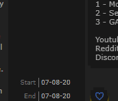 It appears that the hover animation causes the heart tag display to overlap the side texts. Any fix would be appreciated, thanks again! |
| Cosplayer, Photographer, & Journalist. ========= Discord► Yoshe#7068 Instagram► yoshe_plays Other Social Media Links► YoshePlays |
Nov 29, 2020 3:00 PM
#577
YoshePlays said: It appears that the hover animation causes the heart tag display to overlap the side texts. Any fix would be appreciated, thanks again! Add to the bottom .list-block .list-unit::before,
.list-block .list-unit::after {
z-index: 5;
} |
Dec 9, 2020 2:44 AM
#578

Hi, i am trying to make a ice image stay on top of the status menu and follow it when i scroll down like this: But this is the closest i have got to it so far: Before scrolling:  After scrolling it disappears:  This is what i have written in the css for now, but it doesn't scroll with the page this way. I thought the "position: sticky;" would do the trick but it doesn't work for some reason ... :/
#cover-image-container{
    position: absolute;
    background-image: url(https://i.imgur.com/8qH8L0d.png);
    width:100%;
    height:135%;
    z-index:0;
  }
I have also tried to add the ice to a ".status-menu-container.fixed:before" but it doesn't work as i want it to work :/ Edit: I managed to make it work, for anyone interested i had to put this after the already existing ".status-menu-container:after" if i put before it won't work
.status-menu-container:after{
    top:-25px;
    height: 64px;
    background: url(https://i.imgur.com/rcDaW21.png);
    background-size: cover;
  }
|
RafaelehDec 9, 2020 4:07 AM
Dec 17, 2020 4:29 AM
#579

| Hey, need a bit of help. How can I change the rows with an image, preferably individually changing the list rows if possible, and I want to also be able to change the transparency too. Thanks in advance! |
GilgameshuuDec 17, 2020 4:33 AM
* |
Dec 17, 2020 8:49 AM
#580

| Hi there! Added larger covers for my list which overwrote my change in the border radius of the cover but then I used the manual install and changed both "border-radius" commands in your compressed code to my values and it seems to work (dont know if it was the best way to do it though). Anyway most importantly I finally could change tags to be in one paragraph thanks to you but I've still got a few questions: as you can see here: https://i.imgur.com/HANLawS.png the commas in tags are white despite the rest of the text being black. Is there a way to change that? Also, is there a way to make tags while editing them more readable in dark mode? As you can see here: https://i.imgur.com/HWUg3c5.png its quite difficult to read while editing. Im fine with darkening the background of the tags bubble but I dont know the exact value I need to change for changing the tags color. My code is: @\import "https://fonts.googleapis.com/css?family=Oswald"; @\import "https://malscraper.azurewebsites.net/covers/auto/presets/dataimagelinkbefore"; @\import "https://valeriolyndon.github.io/MAL-Public-List-Designs/Clarity%20Theme/Theme%20-%20Compressed.css"; @\import "https://valeriolyndon.github.io/MAL-Public-List-Designs/Clarity%20Theme/Mod%20-%20Dark%20Mode%20Compressed.css"; @\import "https://malscraper.azurewebsites.net/covers/auto/presets/dataimagelinkbefore"; /* BANNER BACKGROUND To change background images: Delete what's in the parenthesis. Upload the new background to Imgur or a similar site, then copy the direct link (or Original GIF link if it's animated) and paste it into the parenthesis. Save. */ :root { --banner: url(https://image.myanimelist.net/ui/5LYzTBVoS196gvYvw3zjwHrDvBaZK9r7vt_HMGWQ0es) !important;} /* BANNER TEXT*/ :root { --name: "alex-vrtrx\a Anime-List" !Important; } /* BANNER AVATAR (BOTTOM LEFT PIC) */ :root { --avatar: url(https://image.myanimelist.net/ui/5LYzTBVoS196gvYvw3zjwJYIvCk6Nprp3DoXeIUBlpA) !important;} /* BANNER CHARACTER (RIGHT PIC)*/ :root { --character: url(https://image.myanimelist.net/ui/5LYzTBVoS196gvYvw3zjwEYuuHLbqXYv7RGvb2rYxuA) !important; } /* WALLPAPER */ body:before{ background-image: url(https://image.myanimelist.net/ui/BwOBRshyN1ZxRM2hlXvVKQ); } /* LEFT CHARACTER BY LIST */ footer:before { background-image: url(https://image.myanimelist.net/ui/BwOBRshyN1ZxRM2hlXvVKQ) !important; } /* RIGHT CHARACTER BY LIST */ footer:after { background-image: url(https://image.myanimelist.net/ui/BwOBRshyN1ZxRM2hlXvVKQ) !important; } /* TABLE COLORS*/ :root { /* Generic Colours */ --bg-dark: #ddd; --text: #ffffff; --text-h: #787878; --text-dim: #bababa; --text-dim-h: #646464; --text-dark: #111; --icon: #323232; --accent: #4065ba; /* Button Colours */ --btn-bg: #ebebeb; --btn-bg-h: #323232; --btn-head-bg-h: #1d439b; --btn-text-h: #fff; /* Header Colours */ --text-head: #9b9b9b; --text-head-h: #787878; /* Status Colours */ --watching: #2db039; --completed: #26448f; --onhold: #f9d457; --dropped: #a12f31; --plantowatch: #c3c3c3; /* Single-Use Colours */ --cover-bg: #323232; --edit-btn: #d9d9d9; --checkmark: #9696eb; } /* OTHER CODES*/ body:before { width: 100%; height: 100%; display: block; position: fixed; left: 0; top:0; content: ""; } .cover-block { z-index: 25; } .header { z-index: 30; } footer:before, footer:after { content: ""; position: fixed; top: 0; z-index: -1; width: calc(50% - 538px); min-width: 262px; height: 100%; background: transparent no-repeat center bottom / contain scroll;} .list-table .list-table-data .data.tags a { color: black !important; } .list-table .list-table-data .data.score a { color: black !important; } .list-table .list-table-data .data.status{ width: 5px !important; } .list-table .list-table-data .data.tags { width: 300px !important; } .list-table-data { min-height: 80px !important; } .data.image a { border-radius: 10% !important; width: 100% !important; height: 125% !important; } .data.image img { width: 64px !important; height: 80px !important; } .data.image { height: 100% !important; } .list-item { margin-bottom: 5px !important; } .data.number { top: -33px !important; margin: 0 -25px 0 8px !important; height: 20px !important; } .list-item:nth-child(n+101) .data.number { text-indent: -4px !important; } .list-table .list-table-data .data.status { width: 4px !important; } /*-S-T-A-R-T--------------------*\ | Review Tags R0.1 | \*------------------------------*/ /* Raise or lower this number to change how wide the box is. Make sure not to remove the "px" at the end. */ .data.tags { width: 300px; } .data.tags div:not(:empty){padding:2px 8px;background:var(--btn-bg);border-radius:8.5px}.data.tags span{display:inline;font-size:11px!important;cursor:text}.data.tags a:not(.edit){display:inline;padding:0;background:0 0;pointer-events:none} /*------------------------E-N-D-*/ /*-S-T-A-R-T--------------------*\ | Hover Image R0.3 | \*------------------------------*/ .data.image a{overflow:visible}.data.image a:before{content:"";position:absolute;top:50%;left:-166px;z-index:50;width:150px;height:0;background:var(--bg-dark) no-repeat center/cover;border-radius:10%;box-shadow:0 0 2px #000;opacity:0;pointer-events:none;transition:all .3s ease}.list-item:hover .data.image a:before{top:calc(50% - 100px);height:200px;opacity:1}.data.image a:after,.data.image img{border-radius:10%} /*------------------------E-N-D-*/ /*-S-T-A-R-T--------------------*\ | CatCol Header Text R0.0 | \*------------------------------*/ .status-menu .status-button{transition:color .3s ease}.status-menu .status-button.on:nth-of-type(1),.status-menu .status-button:nth-of-type(1):hover{color:var(--accent)!important}.status-menu .status-button.on:nth-of-type(2),.status-menu .status-button:nth-of-type(2):hover{color:var(--watching)!important}.status-menu .status-button.on:nth-of-type(3),.status-menu .status-button:nth-of-type(3):hover{color:var(--completed)!important}.status-menu .status-button.on:nth-of-type(4),.status-menu .status-button:nth-of-type(4):hover{color:var(--onhold)!important}.status-menu .status-button.on:nth-of-type(5),.status-menu .status-button:nth-of-type(5):hover{color:var(--dropped)!important}.status-menu .status-button.on:nth-of-type(6),.status-menu .status-button:nth-of-type(6):hover{color:var(--plantowatch)!important} /*------------------------E-N-D-*/ I think its quite messy but atleast my changes work so far. The only thing left right now would be to make the tags more readable while editing them (which may work by changin the background for tags but Im not sure how) I hope Im not a bother. Edit: I was able to change the color of it ( changed "btn-bg" to #90b3bb). If theres a better way to fix it please let me know! Oh and it isnt really necessary but is it possible to change how much the tags box expands once you click on edit? |
alex-vrtrxDec 17, 2020 1:55 PM
  |
Dec 17, 2020 7:23 PM
#581

How can I display the headings exactly how the profile name is done without it repeating on all pages.#cover-image-container:after {
content: "Currently Watching";}If I was unclear Im talking about this⬆⬆☝ but for each status |
      |
Dec 17, 2020 11:01 PM
#582
Gilgameshuu said: Individually as in specific anime/manga? That can be a little tricky, but give this a go (add it to the bottom of your CSS). Should do what you want, and hopefully doesn't have (m)any issues.Hey, need a bit of help. How can I change the rows with an image, preferably individually changing the list rows if possible, and I want to also be able to change the transparency too. Thanks in advance! /* =================================
Custom Backgrounds for Specific Rows
================================= */
/* row background internal code (what makes it tick) */
.list-item {
z-index: 0;
background: none !important;
}
.data.title {
position: static;
}
.title .link::before {
content: "";
position: absolute;
top: 0;
left: 0;
z-index: -1;
width: 100%;
height: 100%;
background: linear-gradient(var(--row-tint),var(--row-tint)), var(--background) no-repeat center / cover fixed;
pointer-events: none;
}
/* --- --- ---
Template:
.title a[href^="/animeORmanga/ID"]::before {
	background: linear-gradient(var(--row-tint),var(--row-tint)), url(IMAGE) no-repeat center / cover scroll;
}
--- --- --- */
/* add row backgrounds codes here */To add a new image background for a specific anime or manga, copy-paste this template .title a[href^="/animeORmanga/ID"]::before {
background: linear-gradient(var(--row-tint),var(--row-tint)), url(IMAGE) no-repeat center / cover scroll;
}Then, fill out the "/animeORmanga/ID" with the relevant info. The anime or manga is simply which type it is between the two. The ID is the anime or manga ID, found when mousing over the link in your list or in the URL bar when visiting the anime/manga page:  Then, fill out the "IMAGE" with a URL to whatever image you wish to use. Here's an example row with everything filled out .title a[href^="/anime/36022"]::before { background: linear-gradient(var(--row-tint),var(--row-tint)), url(https://i.imgur.com/Xh9tnsU.jpg) no-repeat center / cover scroll; } |
Dec 17, 2020 11:16 PM
#583
alex-vrtrx said: I finally could change tags to be in one paragraph thanks to you but I've still got a few questions: as you can see here: https://i.imgur.com/HANLawS.png the commas in tags are white despite the rest of the text being black. Is there a way to change that? With your current code, the easier way would be to add this to the bottom of your CSS: .list-table .list-table-data .data.tags span {
color: black !important;
}alex-vrtrx said: Also, is there a way to make tags while editing them more readable in dark mode? As you can see here: https://i.imgur.com/HWUg3c5.png its quite difficult to read while editing. … Oh and it isnt really necessary but is it possible to change how much the tags box expands once you click on edit? Use this. .data.tags textarea {
width: 524px !important;
color: black;
}The width won't change immediately, as I left it as it is now for your reference. To change the size, increase or decrease the "524px" (but keep the 'px' at the end of the number). |
Dec 17, 2020 11:31 PM
#584
Leospars said: How can I display the headings exactly how the profile name is done without it repeating on all pages. #cover-image-container:after {
content: "Currently Watching";}If I was unclear Im talking about this⬆⬆☝ but for each status Try adding this to the bottom of your CSS, should work. /*-S-T-A-R-T--------------------*\
| Categories for Banner Text |
\*------------------------------*/
/* Remove default text */
#cover-image-container::after { content: none; }
/* Add new text */
.list-unit::before {
content: "test";
position: absolute;
top: 55px;
left: calc(50% - 475px);
z-index: 25;
color: var(--banner-text);
font: bold 60px/60px Oswald;
text-align: left;
letter-spacing: 15px;
text-shadow: 1px 4px 7px var(--banner-text-shadow);
text-transform: uppercase;
white-space: pre;
transform: scale(0.9) perspective(350px) rotateY(8deg) rotateZ(-3deg);
animation: name-slide 3s 1 0.5s backwards;
}
.list-unit.all_anime::before {
/* All Anime */
content: "All Anime";
} .manga .list-unit.all_anime::before {
/* All Manga */
content: "All Manga";
}.list-unit.watching::before {
/* Currently Watching */
content: "Currently Watching";
} .list-unit.reading::before {
/* Currently Reading */
content: "Currently Reading";
} .list-unit.completed::before {
/* Completed Anime */
content: "Completed";
} .manga .list-unit.completed::before {
/* Completed Manga */
content: "Completed";
} .list-unit.onhold::before {
/* Anime On Hold */
content: "On Hold";
} .manga .list-unit.onhold::before {
/* Manga On Hold */
content: "On Hold";
} .list-unit.dropped::before {
/* Dropped Anime */
content: "Dropped";
} .manga .list-unit.dropped::before {
/* Dropped Manga */
content: "Dropped";
} .list-unit.plantowatch::before {
/* Plan to Watch */
content: "Plan to Watch";
} .list-unit.plantoread::before {
/* Plan to Read */
content: "Plan to Read";
} |
Dec 17, 2020 11:49 PM
#585
| @Valerio_Lyndon Thanks, it worked. Is it also possible to change the transparency of the image? Also another question, how can I make short reviews? It seems possible by just using tag desc, but it would take far too much time to make a different tag for every show in my list. Another question, can I use tagdesc on the favorite tag? I'm sorry for bombarding you with requests and questions. |
* |
Dec 18, 2020 5:38 AM
#586
The width won't change immediately, as I left it as it is now for your reference. To change the size, increase or decrease the "524px" (but keep the 'px' at the end of the number). Thanks for your help! Everything works now! |
|
Dec 18, 2020 9:17 PM
#587
Gilgameshuu said: Thanks, it worked. Is it also possible to change the transparency of the image? Ah yes, I forgot you asked about the transparency. To change transparency on any of the images, add an "opacity" property during the usage of the template. Set the property to a decimal value between 0 and 1. For instance, half transparency: .title a[href^="/anime/36022"]::before {
background: linear-gradient(var(--row-tint),var(--row-tint)), url(https://i.imgur.com/Xh9tnsU.jpg) no-repeat center / cover scroll;
opacity: 0.5;
}Gilgameshuu said: Also another question, how can I make short reviews? It seems possible by just using tag desc, but it would take far too much time to make a different tag for every show in my list. Will try and whip something up tomorrow. Where were you thinking of positioning these reviews if they're added? On the right of each row, or in a pop-out similar to tag descriptions? Gilgameshuu said: Another question, can I use tagdesc on the favorite tag? Do you want it to work with the Favourite Tag modification or just tags labelled favourite? To make it work with generic tags labelled favourite, you can replace your current version of the Tag Desc Basis with this new one: /*-S-T-A-R-T--------------------*\
| Tag Desc Basis Vertical R1.2 |
| Customized for use with fav tag|
\*------------------------------*/
.data.tags span a{position:relative}.data.tags span a:after,.data.tags span a:before{position:absolute;z-index:5;display:block;transition:all .15s ease;pointer-events:none;opacity:0}.data.tags span a:after{top:50%;left:-215px;width:200px;height:auto;padding:4px 8px;background:var(--btn-bg);border:1px solid var(--text-dim);border-radius:4px;box-sizing:border-box;color:var(--text);font:11px/15px Arial,Verdana;text-align:left;white-space:pre-wrap;transform:translateY(-50%)}.data.tags span a:before{content:"";top:calc(50% - 5px);left:-15px;border-width:5px;border-style:solid;border-color:transparent transparent transparent var(--text-dim)}.data.tags span a:hover::after{left:-210px;opacity:1}.data.tags span a:hover:before{left:-10px;opacity:1}
/*------------------------E-N-D-*/I haven't tested with the favourite tag modification, but I believe there would need to be some further changes made if that's what you're intending. |
Dec 18, 2020 9:37 PM
#588
Valerio_Lyndon said: Leospars said: How can I display the headings exactly how the profile name is done without it repeating on all pages. #cover-image-container:after {
content: "Currently Watching";}If I was unclear Im talking about this⬆⬆☝ but for each status Try adding this to the bottom of your CSS, should work. /*-S-T-A-R-T--------------------*\
| Categories for Banner Text |
\*------------------------------*/
/* Remove default text */
#cover-image-container::after { content: none; }
/* Add new text */
.list-unit::before {
content: "test";
position: absolute;
top: 55px;
left: calc(50% - 475px);
z-index: 25;
color: var(--banner-text);
font: bold 60px/60px Oswald;
text-align: left;
letter-spacing: 15px;
text-shadow: 1px 4px 7px var(--banner-text-shadow);
text-transform: uppercase;
white-space: pre;
transform: scale(0.9) perspective(350px) rotateY(8deg) rotateZ(-3deg);
animation: name-slide 3s 1 0.5s backwards;
}
.list-unit.all_anime::before {
/* All Anime */
content: "All Anime";
} .manga .list-unit.all_anime::before {
/* All Manga */
content: "All Manga";
}.list-unit.watching::before {
/* Currently Watching */
content: "Currently Watching";
} .list-unit.reading::before {
/* Currently Reading */
content: "Currently Reading";
} .list-unit.completed::before {
/* Completed Anime */
content: "Completed";
} .manga .list-unit.completed::before {
/* Completed Manga */
content: "Completed";
} .list-unit.onhold::before {
/* Anime On Hold */
content: "On Hold";
} .manga .list-unit.onhold::before {
/* Manga On Hold */
content: "On Hold";
} .list-unit.dropped::before {
/* Dropped Anime */
content: "Dropped";
} .manga .list-unit.dropped::before {
/* Dropped Manga */
content: "Dropped";
} .list-unit.plantowatch::before {
/* Plan to Watch */
content: "Plan to Watch";
} .list-unit.plantoread::before {
/* Plan to Read */
content: "Plan to Read";
}Valerio_Lyndon said: Leospars said: How can I display the headings exactly how the profile name is done without it repeating on all pages. #cover-image-container:after {
content: "Currently Watching";}If I was unclear Im talking about this⬆⬆☝ but for each status Try adding this to the bottom of your CSS, should work. /*-S-T-A-R-T--------------------*\
| Categories for Banner Text |
\*------------------------------*/
/* Remove default text */
#cover-image-container::after { content: none; }
/* Add new text */
.list-unit::before {
content: "test";
position: absolute;
top: 55px;
left: calc(50% - 475px);
z-index: 25;
color: var(--banner-text);
font: bold 60px/60px Oswald;
text-align: left;
letter-spacing: 15px;
text-shadow: 1px 4px 7px var(--banner-text-shadow);
text-transform: uppercase;
white-space: pre;
transform: scale(0.9) perspective(350px) rotateY(8deg) rotateZ(-3deg);
animation: name-slide 3s 1 0.5s backwards;
}
.list-unit.all_anime::before {
/* All Anime */
content: "All Anime";
} .manga .list-unit.all_anime::before {
/* All Manga */
content: "All Manga";
}.list-unit.watching::before {
/* Currently Watching */
content: "Currently Watching";
} .list-unit.reading::before {
/* Currently Reading */
content: "Currently Reading";
} .list-unit.completed::before {
/* Completed Anime */
content: "Completed";
} .manga .list-unit.completed::before {
/* Completed Manga */
content: "Completed";
} .list-unit.onhold::before {
/* Anime On Hold */
content: "On Hold";
} .manga .list-unit.onhold::before {
/* Manga On Hold */
content: "On Hold";
} .list-unit.dropped::before {
/* Dropped Anime */
content: "Dropped";
} .manga .list-unit.dropped::before {
/* Dropped Manga */
content: "Dropped";
} .list-unit.plantowatch::before {
/* Plan to Watch */
content: "Plan to Watch";
} .list-unit.plantoread::before {
/* Plan to Read */
content: "Plan to Read";
}Thanks it worked though I'm noticing a problem with the easing It moves slowly then rushes to a place in the header something similar is happening for the others as well.  |
LeosparsDec 19, 2020 2:20 AM
|
Dec 18, 2020 9:55 PM
#589
| @Valerio_Lyndon This is what I'm thinking off  Something like this, instead of the heart icon with favorite, It'll be something like a review tag with a paper icon, and when, I hover over it, it shows the text/review. I also want them to share the same tag but different descriptions, if possible I would also like to add the descriptions directly in the edit tag section, I don't know if I'm overcomplicating things so if there's an easier method to this please tell me. |
* |
Dec 19, 2020 2:23 AM
#590
| Also how can I get the list background to be set from the top of the image and it crops out the bottom only. In other words Instead of the image being center, centered,(I think) removing any extra top and bottom of the image outside the background/banner width, can I have it fixed to the top instead removing the bottom |
|
Dec 19, 2020 5:51 PM
#591
Leospars said: I'm noticing a problem with the easing It moves slowly then rushes to a place in the header something similar is happening for the others as well. https://i.imgur.com/nYyQahA.gif My mistake, this new version should fix that. Overwrite what you pasted in last time with the new version: /*-S-T-A-R-T--------------------*\
| Categories for Banner Text |
\*------------------------------*/
/* Remove default text */
#cover-image-container::after { content: none; }
/* Add new text */
.list-unit::before {
content: "";
position: absolute;
top: 55px;
left: 50%;
z-index: 25;
margin-left: -475px;
color: var(--banner-text);
font: bold 60px/60px Oswald;
text-align: left;
letter-spacing: 15px;
text-shadow: 1px 4px 7px var(--banner-text-shadow);
text-transform: uppercase;
white-space: pre;
transform: scale(0.9) perspective(350px) rotateY(8deg) rotateZ(-3deg);
animation: name-slide 3s 1 0.5s backwards;
} .list-unit.all_anime::before {
/* All Anime */
content: "Leospars";
} .manga .list-unit.all_anime::before {
/* All Manga */
content: "All Manga";
}.list-unit.watching::before {
/* Currently Watching */
content: "Currently Watching";
} .list-unit.reading::before {
/* Currently Reading */
content: "Currently Reading";
} .list-unit.completed::before {
/* Completed Anime */
content: "Completed";
} .manga .list-unit.completed::before {
/* Completed Manga */
content: "Completed";
} .list-unit.onhold::before {
/* Anime On Hold */
content: "On Hold";
} .manga .list-unit.onhold::before {
/* Manga On Hold */
content: "On Hold";
} .list-unit.dropped::before {
/* Dropped Anime */
content: "Dropped";
} .manga .list-unit.dropped::before {
/* Dropped Manga */
content: "Dropped";
} .list-unit.plantowatch::before {
/* Plan to Watch */
content: "Plan to Watch";
} .list-unit.plantoread::before {
/* Plan to Read */
content: "Plan to Read";
}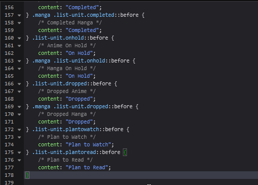 Leospars said: Also how can I get the list background to be set from the top of the image and it crops out the bottom only. In other words Instead of the image being center, centered,(I think) removing any extra top and bottom of the image outside the background/banner width, can I have it fixed to the top instead removing the bottom Sure! I believe this is what you intended here, try it out. /* Reposition body background */
body, .list-item, .data.priority, .data.number, .data.status:before, .data.status:after {
background-position: center top !important;
} |
Dec 19, 2020 9:01 PM
#592
Valerio_Lyndon said: Leospars said: I'm noticing a problem with the easing It moves slowly then rushes to a place in the header something similar is happening for the others as well. https://i.imgur.com/nYyQahA.gif My mistake, this new version should fix that. Overwrite what you pasted in last time with the new version: /*-S-T-A-R-T--------------------*
| Categories for Banner Text |
*------------------------------*/
/* Remove default text */
#cover-image-container::after { content: none; }
/* Add new text */
.list-unit::before {
content: "";
position: absolute;
top: 55px;
left: 50%;
z-index: 25;
margin-left: -475px;
color: var(--banner-text);
font: bold 60px/60px Oswald;
text-align: left;
letter-spacing: 15px;
text-shadow: 1px 4px 7px var(--banner-text-shadow);
text-transform: uppercase;
white-space: pre;
transform: scale(0.9) perspective(350px) rotateY(8deg) rotateZ(-3deg);
animation: name-slide 3s 1 0.5s backwards;
} .list-unit.all_anime::before {
/* All Anime */
content: "Leospars";
} .manga .list-unit.all_anime::before {
/* All Manga */
content: "All Manga";
}.list-unit.watching::before {
/* Currently Watching */
content: "Currently Watching";
} .list-unit.reading::before {
/* Currently Reading */
content: "Currently Reading";
} .list-unit.completed::before {
/* Completed Anime */
content: "Completed";
} .manga .list-unit.completed::before {
/* Completed Manga */
content: "Completed";
} .list-unit.onhold::before {
/* Anime On Hold */
content: "On Hold";
} .manga .list-unit.onhold::before {
/* Manga On Hold */
content: "On Hold";
} .list-unit.dropped::before {
/* Dropped Anime */
content: "Dropped";
} .manga .list-unit.dropped::before {
/* Dropped Manga */
content: "Dropped";
} .list-unit.plantowatch::before {
/* Plan to Watch */
content: "Plan to Watch";
} .list-unit.plantoread::before {
/* Plan to Read */
content: "Plan to Read";
}Leospars said: Also how can I get the list background to be set from the top of the image and it crops out the bottom only. In other words Instead of the image being center, centered,(I think) removing any extra top and bottom of the image outside the background/banner width, can I have it fixed to the top instead removing the bottom Sure! I believe this is what you intended here, try it out. /* Reposition body background */
body, .list-item, .data.priority, .data.number, .data.status:before, .data.status:after {
background-position: center top !important;
}SO MANY THANKS Cropping the pictures took time and thanks for the transition fix too ><  |
LeosparsDec 19, 2020 9:06 PM
|
Dec 19, 2020 9:54 PM
#593
Gilgameshuu said: https://i.imgur.com/xe1FEcA.png Something like this. Instead of the heart icon with favorite, it'll be something like a review tag with a paper icon, and when I hover over it, it shows the text/review. Try this out, should hopefully do what you want. First, I'll need you to go into your list settings and enable the "Storage" column on your animelist and/or "Retail" on your mangalist. The new code we enter will remove this column visually, so it won't change how anything looks. It just gives the code something to hook onto and use for the new reviews. Next, add this to the bottom of your code /*-S-T-A-R-T--------------------*\
| Reviews on Hover |
\*------------------------------*/
/*- Basis ----------------------*/
.data.storage, .data.retail {
width: 0;
font-size: 0;
pointer-events: none;
}
.data.storage::before, .data.retail::before {
content: "\f15c";
position: absolute;
left: -32px;
top: calc(50% - 16px);
z-index: 1;
display: none;
width: 26px;
height: 26px;
background: var(--btn-bg);
border-radius: 50%;
color: var(--text);
font: 14px/26px FontAwesome;
pointer-events: auto;
}
.data.storage::after, .data.retail::after {
position: absolute;
left: -48px;
top: 50%;
z-index: 1;
width: auto;
min-width: 64px;
max-width: 340px;
height: auto;
padding: 4px 8px;
background: var(--btn-bg);
border: 1px solid var(--text-dim);
border-radius: 4px;
box-sizing: border-box;
color: var(--text);
font: 11px/16px Arial, Verdana;
text-align: left;
white-space: pre-wrap;
overflow-wrap: break-word;
opacity: 0;
transform: translateY(-50%);
} .data.storage:hover::after, .data.retail:hover::after {
opacity: 1;
pointer-events: auto;
}
/* Use this template for anime, replacing out the "ID" and "REVIEW" parts:
#tags-ID ~ .storage::before {
	display: block;
} #tags-ID ~ .storage::after {
	content: "REVIEW";
}
** And this template for manga, replacing out the "ID" and "REVIEW" parts:
#tags-ID ~ .retail::before {
	display: block;
} #tags-ID ~ .retail::after {
	content: "REVIEW";
}
*/
/*- Reviews here ---------------*/
/*------------------------E-N-D-*/Then, you'll need to add and modify a template code for each review, similar to the background images. For anime, use this template: #tags-ID ~ .storage::before {
display: block;
} #tags-ID ~ .storage::after {
content: "REVIEW";
}For manga, use this template: #tags-ID ~ .retail::before {
display: block;
} #tags-ID ~ .retail::after {
content: "REVIEW";
}You'll need to replace the "ID" and "REVIEW" texts with the relevant info (anime/manga ID, your review). Here's an example of the template after it's filled out: #tags-41930 ~ .storage::before {
display: block;
} #tags-41930 ~ .storage::after {
content: "An enjoyable anime! Really like that one part and also the other part. Definitely earns its 7.";
}While using the template, you should know:
Gilgameshuu said: I also want them to share the same tag but different descriptions Not quite sure I follow you here. You want a single tag to have two descriptions? This might be possible depending on what your goal here is, and there are also potentially some ways to fake having the same tag by making it appear to be the same tag. What is your intention behind this change? Are you wishing to have two anime both say, for example, "Adventure", but have different descriptions? Or have two of the same tag on the same anime? The CSS solution would really depend on how you are using the tags. Gilgameshuu said: if possible I would also like to add the descriptions directly in the edit tag section, Unfortunately not possible without using the tags themselves as mini reviews. To add full-size CSS reviews, it has to be modified in the CSS. |
Valerio_LyndonDec 19, 2020 9:59 PM
Dec 19, 2020 10:10 PM
#594
| @Valerio_Lyndon Thank you very much for your help! You can disregard what I said about same tags different descriptions thing. |
* |
Dec 21, 2020 4:33 PM
#595

| Hello! I was looking into older posts from this thread and tried using the decimal rating CSS. But I can't seem to not make a comma appear in my tags. Am I putting the comma in the wrong place? I tried doing "TEXT, X.5" and "X.5, TEXT", I know nothing of CSS, so I might've misunderstand the entire thing lol. Also, if it only has a comma and nothing else, the comma disappears like it should... This is how my CSS is looking like in case I messed up something. /* Decimal Ratings */ .data.tags a[href*=".5"] { position: absolute; top: calc(50% - 13px); left: 694px; width: 26px; height: 26px; padding: 0 !important; background: #191919; border-radius: 15px; font: bold 14px/26px Arial; pointer-events: none; z-index: 3; opacity: 1; } .data.score:hover ~ .tags a[href*=".5"] { opacity: 1; } /* Decimal rating comma fix */ .data.tags a[href$=".5"]::before { content: none; } |
Dec 21, 2020 5:32 PM
#596
PunchStuff said: Hello! I was looking into older posts from this thread and tried using the decimal rating CSS. But I can't seem to not make a comma appear in my tags. Am I putting the comma in the wrong place? I tried doing "TEXT, X.5" and "X.5, TEXT", I know nothing of CSS, so I might've misunderstand the entire thing lol. Also, if it only has a comma and nothing else, the comma disappears like it should... This is how my CSS is looking like in case I messed up something. /* Decimal Ratings */ .data.tags a[href*=".5"] { position: absolute; top: calc(50% - 13px); left: 694px; width: 26px; height: 26px; padding: 0 !important; background: #191919; border-radius: 15px; font: bold 14px/26px Arial; pointer-events: none; z-index: 3; opacity: 1; } .data.score:hover ~ .tags a[href*=".5"] { opacity: 1; } /* Decimal rating comma fix */ .data.tags a[href$=".5"]::before { content: none; } The original decimal rating code was probably made for someone using another modification that changed some of the functionality. To fix it, try adding this below your other code. /* Decimal Ratings Comma Fix 2 */
.data.tags span {
font-size: 0 !important;
}
.data.tags span + span a::before {
content: ", ";
white-space: pre-wrap;
}Then, place all your decimal scores as the last tag in their tag section (after all other commas). |
Dec 21, 2020 6:23 PM
#597
Valerio_Lyndon said: PunchStuff said: Hello! I was looking into older posts from this thread and tried using the decimal rating CSS. But I can't seem to not make a comma appear in my tags. Am I putting the comma in the wrong place? I tried doing "TEXT, X.5" and "X.5, TEXT", I know nothing of CSS, so I might've misunderstand the entire thing lol. Also, if it only has a comma and nothing else, the comma disappears like it should... This is how my CSS is looking like in case I messed up something. /* Decimal Ratings */ .data.tags a[href*=".5"] { position: absolute; top: calc(50% - 13px); left: 694px; width: 26px; height: 26px; padding: 0 !important; background: #191919; border-radius: 15px; font: bold 14px/26px Arial; pointer-events: none; z-index: 3; opacity: 1; } .data.score:hover ~ .tags a[href*=".5"] { opacity: 1; } /* Decimal rating comma fix */ .data.tags a[href$=".5"]::before { content: none; } The original decimal rating code was probably made for someone using another modification that changed some of the functionality. To fix it, try adding this below your other code. /* Decimal Ratings Comma Fix 2 */
.data.tags span {
font-size: 0 !important;
}
.data.tags span + span a::before {
content: ", ";
white-space: pre-wrap;
}Then, place all your decimal scores as the last tag in their tag section (after all other commas). Now I get a comma before the score (just like the other guy post), my extended tags also stop working (from this topic last reply https://myanimelist.net/forum/?topicid=1862826 ) |
Dec 22, 2020 4:04 PM
#598
PunchStuff said: Valerio_Lyndon said: PunchStuff said: Hello! I was looking into older posts from this thread and tried using the decimal rating CSS. But I can't seem to not make a comma appear in my tags. Am I putting the comma in the wrong place? I tried doing "TEXT, X.5" and "X.5, TEXT", I know nothing of CSS, so I might've misunderstand the entire thing lol. Also, if it only has a comma and nothing else, the comma disappears like it should... This is how my CSS is looking like in case I messed up something. /* Decimal Ratings */ .data.tags a[href*=".5"] { position: absolute; top: calc(50% - 13px); left: 694px; width: 26px; height: 26px; padding: 0 !important; background: #191919; border-radius: 15px; font: bold 14px/26px Arial; pointer-events: none; z-index: 3; opacity: 1; } .data.score:hover ~ .tags a[href*=".5"] { opacity: 1; } /* Decimal rating comma fix */ .data.tags a[href$=".5"]::before { content: none; } The original decimal rating code was probably made for someone using another modification that changed some of the functionality. To fix it, try adding this below your other code. /* Decimal Ratings Comma Fix 2 */
.data.tags span {
font-size: 0 !important;
}
.data.tags span + span a::before {
content: ", ";
white-space: pre-wrap;
}Then, place all your decimal scores as the last tag in their tag section (after all other commas). Now I get a comma before the score (just like the other guy post), my extended tags also stop working (from this topic last reply https://myanimelist.net/forum/?topicid=1862826 ) Hm, I see. I didn't realize you were using code to extend tags. Also didn't account for the .8 etc codes that don't have their respective fixes applied from the original post. This new version should leave the reviews intact and apply the proper comma fix. Hopefully. /* Decimal Ratings Comma Fix 2 */
.data.tags span {
font-size: 0 !important;
}
.data.tags span + span a::before {
content: ", ";
white-space: pre-wrap;
}
.data.tags span::after {
font-size: 11px;
}
.data.tags a[href$=".0"]::before,
.data.tags a[href$=".1"]::before,
.data.tags a[href$=".2"]::before,
.data.tags a[href$=".3"]::before,
.data.tags a[href$=".4"]::before,
.data.tags a[href$=".5"]::before,
.data.tags a[href$=".6"]::before,
.data.tags a[href$=".7"]::before,
.data.tags a[href$=".8"]::before,
.data.tags a[href$=".9"]::before {
content: none;
} |
Dec 22, 2020 5:16 PM
#599
| Now it's working perfectly, thanks! Your work is amazing 👍 ( Just had to change the $ to a *, not sure why, but as long as it works lol) |
Dec 23, 2020 2:50 AM
#600

| Hello, I have a problem with my list, large covers won't load when I switch from my manga list to my anime list or vice versa. If I enter from my profile they load both, but if I do it from the buttons on the list they only work in the first one that I have entered. I don't know if I have explained myself very well. |
More topics from this board
» theme helpthreat - Jul 5 |
5 |
by Zaryf
»»
Aug 21, 5:46 AM |
|
» [CSS] ⭐️ Customize your List Cursor + Cursor FixesShishio-kun - Mar 8, 2021 |
30 |
by Shishio-kun
»»
Jul 28, 3:17 AM |
|
» How To Have Different Banner/Cover image & Background Image For Manga & Anime ListsYasminaRegina - Jul 25 |
2 |
by YasminaRegina
»»
Jul 26, 1:02 AM |
|
Sticky: » 💚 [REPAIR STICKY] Repair/speed up layouts + Request layout fixes ( 1 2 )Shishio-kun - Nov 17, 2023 |
52 |
by LucaBalsa
»»
Jul 6, 2:02 PM |
|
» [CSS/BBCODE] ⭐️ How to view anyone's CSS or BBcodes (for lists, profiles, or clubs)!Shishio-kun - Feb 6, 2012 |
37 |
by sunnysummerday
»»
Jun 11, 7:44 PM |