New
Aug 11, 2009 11:25 AM
#3251
| I never found the grand totals useful so I thought might as well do something with it. Nope, I just noticed it too. thanks will have to fix that too. |
Aug 11, 2009 11:42 AM
#3252
| That's a really cool list, Devil. I also updated my anime list because I was bored: http://myanimelist.net/animelist/Yves |
Aug 11, 2009 5:27 PM
#3253
| @Alexstratz- Not bad for your first list design. I like the idea and approach. The only thing is your photoshopped renders need some details touched up. There are a bunch of white spots which bring the quality down alot. If you make the renders better than It will look a whole lot better. Also your top header render would look really great if you used a shadow blending like you did for the background render. @Devil- Great List. The foreground image is nice touch. @Yves- Nice list as well. I like the two renders you chose. |
spineslayerAug 11, 2009 5:55 PM

Aug 12, 2009 7:22 AM
#3254

| My first try - made it a long time ago but forgot to ask... I think i'll make some changes soon.Anyway, can someone tell me how to erase the underline under every text? It's rather annoying. ^^" http://myanimelist.net/animelist/DarkSoul95&status=1&order=0 Thanks in advance~ |
MegaphyAug 12, 2009 8:03 AM
Aug 12, 2009 9:39 AM
#3255
spineslayer said: Okay, thanks for the advices. :D@Alexstratz- Not bad for your first list design. I like the idea and approach. The only thing is your photoshopped renders need some details touched up. There are a bunch of white spots which bring the quality down alot. If you make the renders better than It will look a whole lot better. Also your top header render would look really great if you used a shadow blending like you did for the background render. DarkSoul95 said: The problem comes from this part:Anyway, can someone tell me how to erase the underline under every text? It's rather annoying. ^^" http://myanimelist.net/animelist/DarkSoul95&status=1&order=0 Thanks in advance~ a You forgot the "-" in "text-decoration". ^^{ color: #415fa0; text decoration: none; [...] } |
AlexstratzAug 12, 2009 9:43 AM
Aug 13, 2009 9:10 AM
#3257

| I made some changes to my list >_< I think it came out better this time ^_^ I decided to do my own background coz the last one didn`t fit somehow with the design >_< but still I don`t know why the banner for the COPYRIGHTS is looking so pale O_O Like it has something white over it, it should be blue as the reast of the banners >_< Anyway Clicky ^^" |
Aug 13, 2009 6:47 PM
#3258
| @ BoomStick : Freakin pwnage list ^___^ Love it <3 |
Aug 13, 2009 7:06 PM
#3259
| @BoomStick yea, that is a sweet list, great job, the color is great, and the pictures fabulous. |
 |
Aug 14, 2009 11:35 AM
#3260

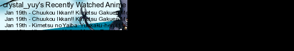
| Ok.. re-posting this, in the good thread this time :p Finally decide to made a mal list design... But being new on CSS, I'm now stuck on something... Help please!!! http://myanimelist.net/mangalist/crystal_yuy (manga is my testing list XD) Not complete but mostly.... I want to put the status bar (the "Currently Reading Completed On Hold Dropped Plan to Read Show All") between the header and the Reading banner And not on the bottom of the header, like it is now... Help please? |
     |
Aug 14, 2009 12:03 PM
#3261
So, after hearing the Bakemonogatari ED, I had an irresistable urge to create this: Tested with Opera, Firefox and IE. Optimized mainly for 1920x1200, but anything reasonably smaller will do as usual. My only concern is that if it turned out to be too flashy after all, but I'm happy with the result overall. crystal_yuy said: I want to put the status bar (the "Currently Reading Completed On Hold Dropped Plan to Read Show All") between the header and the Reading banner And not on the bottom of the header, like it is now... Help please? Like this or this? (images removed since problem was solved) If it's the first one, make this change: #list_surround { [...] padding-top: 386px; [...] } Edit: Second case solution: Do the above change and add "margin-top: -27px;" to each of the headers, .header_cw, .header_onhold etc. |
SpawwvyAug 17, 2009 2:27 AM
Aug 14, 2009 12:52 PM
#3262

| @crystal_yuy: Looks really good. I guess Spawwvy might already has some answer for you. @Spawwvy: wow, I couldn't believed I actually was reading all of those quotes. That is like you don't really need an eye-catching picture to make your design looks interesting. The background is really blend well with the design. Everything is just lovely to look at. Good job, Spawwvy. |
 "A Legend is but a tale of a beautiful lie." |
Aug 14, 2009 1:04 PM
#3263
| @ Spawwvy: the first one, thanks ^^ |
|
Aug 15, 2009 1:44 AM
#3264

| Awesome list, Spawwvy. |
 staff.applications ▼ guidelines.faq ▼ report.abuse ▼ thx.skittles ▼ thx.kina ▼ [H+] ³ ▼ |
Aug 15, 2009 7:00 AM
#3265

| I updated mine, but I have few problems.. T_T Could you please help me.. :D Link: http://myanimelist.net/animelist/SabakuNoGaara First, the "Property of Crave.." part.. This is the picture: http://i842.photobucket.com/albums/zz347/Alan92_04/AnimeList/Property1-2.png And this is how CSS looks like: */ #copyright { padding-top: 40px; text-align: center; margin: 0 auto; font-size: 9.00px; color: #D2691E; width: 490px; height: 70px; background-image: url(http://i842.photobucket.com/albums/zz347/Alan92_04/AnimeList/Property1-2.png); background-position:center; cursor: url(http://i842.photobucket.com/albums/zz347/Alan92_04/AnimeList/KUF.gif) 0 0, url(http://i842.photobucket.com/albums/zz347/Alan92_04/AnimeList/KUF.gif) 0 0, auto; } Why is it repeating the Picture? I set padding, so the text would fit on the center, but it started repeating the picture.. T_T What's wrong? And also.. My "Currently watching", "Plan to Watch" etc. banners.. Why aren't they fitting nicely, but they're more to the right.. T_T This is how the code for Currently watching looks like: .header_cw { width: 630px; height: 157px; background-image: url(http://i842.photobucket.com/albums/zz347/Alan92_04/AnimeList/Watching.png); background-repeat: no-repeat; background-position: center; cursor: url(http://i842.photobucket.com/albums/zz347/Alan92_04/AnimeList/KUF.gif) 0 0, url(http://i842.photobucket.com/albums/zz347/Alan92_04/AnimeList/KUF.gif) 0 0, auto;} Is there problem in code, or is it My Banner that won't fit? Thanks in advance.. :D |
 |
Aug 15, 2009 8:01 AM
#3266

| simplest option would be adding background-repeat:no-repeat; to the copyright. about the headers, it seems like they have a different width then the bottom things and that makes them look like they are too wide on the right.. maybe. |
 Donate to my awesomeness! | "Insanity: doing the same thing over and over again and expecting different results." - Albert Einstein |
Aug 15, 2009 8:06 AM
#3267
| Thank you.. :D EDIT: I fixed Copyright part with the text you provided me.. :D I will check once again the Headers, their dimensions and all.. Thanks. :D |
|
Aug 15, 2009 8:45 AM
#3268
| Thanks to Talon, everything is fine now.. :D So I would like to hear what do you think.. :D http://myanimelist.net/animelist/SabakuNoGaara |
|
Aug 15, 2009 11:52 AM
#3269
Update complete... This is my first try with CSS, what do you think? |
|
Aug 15, 2009 12:05 PM
#3270
| crystal_yuy, the background isn't that great, but the banners are awesome. |
Aug 15, 2009 3:06 PM
#3271

| @crystal_yuy: Gotta agree, u should change, or do sth with the bg :/ It kinda don't fit in there. Other than that, it's really great :) |
Aug 15, 2009 4:34 PM
#3272
Does this look better? Btw, what code did you guys enter to make that black bar at the very top of the list change color and transparent? |
crystal_yuyAug 15, 2009 4:56 PM
|
Aug 15, 2009 5:25 PM
#3273
| Better. =) edit: It should be this. #mal_control_strip{ background: url() right center ; filter:alpha(opacity=); -moz-opacity: ; opacity: ; } |
YvesAug 15, 2009 5:29 PM
Aug 15, 2009 6:51 PM
#3274
| @ Yves: I see Thanks ^^ |
|
Aug 16, 2009 11:36 AM
#3275
| Personaly I think that the pale orange one (the one you were with at first) was the best ^^ It was clear and simple~ but that`s my oppinion though~ This ones is goot too, but I liked the simple one better ^_^ |
ShinshokuAug 16, 2009 11:48 AM
Aug 16, 2009 11:45 AM
#3276

ScrumYummy said: cyruz said: Anyway, Eazy just updated his list with me and it turned out really nice. So check it out if you like. That looks SO SPIFFY. O___O unfortunately I haven't gotten off of my lazy butt and worked on my list design yet XD I will eventually. :3 You have the best list I've ever seen. |
| I'm back. |
Aug 16, 2009 5:41 PM
#3277
| Just changed my anime list :3 Dogs: Bullets & Carnage theme Doesn't really look that good. >_< And the banner doesn't really fit huh? And I'm sorta confused when it comes to wallpaper size. So what's the recommended size you guys think I should use. The one right now is 1920 x 1024 Any advice would be appreciated. |
Aug 16, 2009 6:11 PM
#3278

CharisMagic said: Just changed my anime list :3 Dogs: Bullets & Carnage theme Doesn't really look that good. >_< And the banner doesn't really fit huh? And I'm sorta confused when it comes to wallpaper size. So what's the recommended size you guys think I should use. The one right now is 1920 x 1024 Any advice would be appreciated. The whole list is messed up for me. O.o Even though I love dogs but I think your old theme is better. XD |
 |
Aug 16, 2009 7:39 PM
#3279
CharisMagic said: Just changed my anime list :3 Dogs: Bullets & Carnage theme Doesn't really look that good. >_< And the banner doesn't really fit huh? And I'm sorta confused when it comes to wallpaper size. So what's the recommended size you guys think I should use. The one right now is 1920 x 1024 Any advice would be appreciated. that is nice ,But I think the head banner doesn't match with the style . and about the size I usually use 1280 x 560 wallpaper. maybe its wrong but its work good with me :) |
Akita_Nov 22, 2010 9:41 AM
Aug 17, 2009 3:17 AM
#3280
| @Siva, cyruz: Thank you very much, I'm glad you like it. CharisMagic said: Just changed my anime list :3 Dogs: Bullets & Carnage theme Doesn't really look that good. >_< And the banner doesn't really fit huh? And I'm sorta confused when it comes to wallpaper size. So what's the recommended size you guys think I should use. The one right now is 1920 x 1024 Any advice would be appreciated. If you are using a wallpaper that can't be blended into a single-color background, the wallpaper should usually be as big as your screen resolution is. That's because you will most likely be the one who visits the list the most. My screen resolution is 1920x1200, so I'm using wallpapers of that size and try to position them so that they'd look as good as possible with smaller resolutions. In addition positioning is very important if you are using small wallpapers. I agree with what has been said about the head banner. You should try giving it a bluish or purplish tint or change it entirely. The images you are using for table row backgrounds aren't tall enough if the anime title is split into two rows. Also, the category totals either need some padding or centering. See this image for the two issues: http://i608.photobucket.com/albums/tt169/Spawwvy/example.jpg Oh, and your Plan to Watch header has the wrong image. Currently it uses the Dropped header. Otae_chan said: I updated my anime list , Is there anything I can do for improvement ? I think its just normal and nothing amazing x_x It's a decent start. I just have a deep grudge against Comic Sans MS (the font you're using), because it's used wrongly in too many places. Google "ban comic sans" if you want to know the reasoning behind this. The wallpaper is kinda small, but it actually blends pretty well into the black background. If it fits your screen, it's okay. Your choice of colors for the list is otherwise pretty good and very readable, but those headers somehow scream "dull" to me with that color, even though I like the font. |
Aug 17, 2009 8:32 AM
#3281
Spawwvy said: It's a decent start. I just have a deep grudge against Comic Sans MS (the font you're using), because it's used wrongly in too many places. Google "ban comic sans" if you want to know the reasoning behind this. The wallpaper is kinda small, but it actually blends pretty well into the black background. If it fits your screen, it's okay. Your choice of colors for the list is otherwise pretty good and very readable, but those headers somehow scream "dull" to me with that color, even though I like the font. oh, I guess I understand now about the font x_x I started to hate it too. Ok I will try again to change font and headers , thank you very much Spawwvy ^_^ and your list is amazing :) |
Aug 17, 2009 10:57 AM
#3282
Otae_chan said: that is nice ,But I think the head banner doesn't match with the style . and about the size I usually use 1280 x 560 wallpaper. maybe its wrong but its work good with me :) I updated my anime list , Is there anything I can do for improvement ? I think its just normal and nothing amazing x_x Yeah I figured it didn't match xD So I just made a new one. As for your list, it's pretty good. But yeah, I don't think Comic Sans MS is the way to go. I mean, I like the font, but not on lists for some reason >_< And maybe do something more to make the headers stand out? But good list overall =3 Spawwvy said: If you are using a wallpaper that can't be blended into a single-color background, the wallpaper should usually be as big as your screen resolution is. That's because you will most likely be the one who visits the list the most. My screen resolution is 1920x1200, so I'm using wallpapers of that size and try to position them so that they'd look as good as possible with smaller resolutions. In addition positioning is very important if you are using small wallpapers. I agree with what has been said about the head banner. You should try giving it a bluish or purplish tint or change it entirely. The images you are using for table row backgrounds aren't tall enough if the anime title is split into two rows. Also, the category totals either need some padding or centering. See this image for the two issues: http://i608.photobucket.com/albums/tt169/Spawwvy/example.jpg Oh, and your Plan to Watch header has the wrong image. Currently it uses the Dropped header. Wow thanks for all the help ^__^ I fixed the problems/issues you pointed out (or at least, tried to). I changed the wallpaper to the size of my screen resolution (1024x768). It looks ok on mine, but i don't think it looks that good on other resolutions xD I changed the banner also. Hopes this one looks better O_O And I made the td1 and td2 bigger, making enough room for titles that need 2 lines. I centered the category totals. Lmao, I didn't even notice the plan to watch was incorrect :3 Thanks for pointing that out. |
Aug 17, 2009 4:28 PM
#3283
| First try...Just wondering, what's the code to change the black upper menu bar? Just do it ~ |
Aug 17, 2009 4:48 PM
#3284

Spawwvy said: I just wanted to chime in that I am very fond of this design. As someone who has practiced visual astronomy most of my life, to see this done in such a nice and detailed way is extremely gratifying.So, after hearing the Bakemonogatari ED, I had an irresistable urge to create this |
  |
Aug 18, 2009 7:46 AM
#3285
CharisMagic said: Yeah I figured it didn't match xD So I just made a new one. As for your list, it's pretty good. But yeah, I don't think Comic Sans MS is the way to go. I mean, I like the font, but not on lists for some reason >_< And maybe do something more to make the headers stand out? But good list overall =3 Now it is much better , really nice :) and I will change the headers soon .. thank you very much for your advice ^_^ |
Aug 18, 2009 3:08 PM
#3286
I updated my anime list, Dogs theme ^^ I'm having a problem with the cursor though... The dogs head, from the complete banner till the end of the list, won't show when I have my mouse on the beige background, it only show when I'm in the list part. But on the top of the list (header & current) it's show fine... I'm not sure what I'm doing wrong... |
|
Aug 18, 2009 7:37 PM
#3287

| Updated my anime list. :) @ crystal_yuy: First, delete every single cursor: url(http://i83.photobucket.com/albums/j304/crystal_yuy/MAL/ListDesign/Dogs.png) 0 0, auto; #list_surround Then, put this code: html {cursor: url(http://i83.photobucket.com/albums/j304/crystal_yuy/MAL/ListDesign/Dogs.png) 1 2, auto;}Edit: For the cursor code the "html" part should have a backslash between the "h" and "t" (the backslash won't show up if I type it for some reason...) |
JangmiAug 18, 2009 9:55 PM
Aug 18, 2009 10:23 PM
#3288
| @ Jangmi: I made the change but now it seems the dogs only show when it's over a click-able link? What I wanted was for the mouse to stay a dog whenever the mouse was on the list or background area ^^;; |
|
Aug 18, 2009 10:41 PM
#3289
Replace the "/" in the "html" with the backslash. :) |
Aug 19, 2009 5:22 AM
#3290
| ^Lol, nice picture @Jangmi Your list is nicely done, very cute Chibi Nagisa pic. Is there a wider size wallpaper of the one your currently using? Great and all, but don't like the fact that it covers Nagisa with the list. Be better if she was more to the right side, and make your list set to the left, Just an opinion, heh Anywhoo, great list none the less, havn't seen a Clannad one in awhile. @crystal_yuy Great list you have there too, Best thing I like about it, is your banners. Just sticks out so much, great job making those. @Toushi Haven't seen the anime, but from your list, it looks awesome. Your top banner looks awesome, the other ones are great too, but you used all the same pictures, Be better if you used different ones for each, think it would stick out more. And the words, "Currently watching, Completed etc" I'd say give it more color, then just plain white. Great overall @CharisMagic Another cool list design for Dogs. With a small monitor, can't really appreciate your wallpaper, but looks awesome from what I can see, haha. Love the splatters on your banners. Have you tried using a different font then just a simple one? |
|
Aug 19, 2009 7:44 AM
#3291
DarkDemonz said: @Jangmi Your list is nicely done, very cute Chibi Nagisa pic. Is there a wider size wallpaper of the one your currently using? Great and all, but don't like the fact that it covers Nagisa with the list. Be better if she was more to the right side, and make your list set to the left, Just an opinion, heh Anywhoo, great list none the less, havn't seen a Clannad one in awhile. I was afraid that would happen for some people. :( The list looked like this on my laptop:  Uploaded a bigger BG (1600x1000) and repositioned the list set so hopefully it looks better. ^^ (Edit: Went back to the BG I have now, but repositioned it also.) |
JangmiAug 19, 2009 7:58 AM
Aug 19, 2009 11:20 AM
#3292
| Yay! it's working, Thank you very much Jangmi ^^ @ DarkDemonz: Thanks ^^ EDIT: I notice another problem.. the selected & not selected status of my anime list doesn't work from the start... unlike the manga list, where when you first load the page you see that the select status is the Currently Reading one but the selected status background won't change until you click on a status in the anime list... I've copy/paste the code from my manga list so shouldn't it works the same way? |
crystal_yuyAug 19, 2009 12:24 PM
|
Aug 20, 2009 4:56 AM
#3293
| @Jangmi Ahh, I see, you should of kept it the way it was then, since the majority of people does have widescreen monitors. Should of used my laptop to look at your list first, heh. |
|
Aug 20, 2009 8:34 AM
#3294
crystal_yuy said: Yay! it's working, Thank you very much Jangmi ^^ EDIT: I notice another problem.. the selected & not selected status of my anime list doesn't work from the start... unlike the manga list, where when you first load the page you see that the select status is the Currently Reading one but the selected status background won't change until you click on a status in the anime list... I've copy/paste the code from my manga list so shouldn't it works the same way? Your welcome. :D About the selected status...I think it just does that. I don't know how to fix it either. :( DarkDemonz said: @Jangmi Ahh, I see, you should of kept it the way it was then, since the majority of people does have widescreen monitors. Should of used my laptop to look at your list first, heh. Changed it back. Thanks for your feedback. ^^ |
Aug 20, 2009 8:47 AM
#3295
| Well, the status bar thingy doesn't matter that much but if someone find what's wrong, do tell me :) |
|
Aug 20, 2009 11:34 PM
#3296
| @crystal_yuy- I like your list. The banners are awesomely done. Though you should save your work as .png files so the best quality is shown. ;) One thing I think that can greatly improved is the background, its just way to plain for your list. @Jangmi- I like the flow of your list. Choosing chalk text was a great idea. The one thing that I would do is re-arrange the top header's text and notes so they all fit on the chalkboard in the background. It will give it that special touch which will blend in the top header into the background image. **To the both of you, Great lists!** |
Aug 21, 2009 3:27 AM
#3297

| Hey .. I'm a beginner with the CSS stuff but I tried to make something for the anime & manga List .. Anime : http://myanimelist.net/animelist/LoveSong&status=7&order=0 Manga : http://myanimelist.net/mangalist/LoveSong&status=7&order= any suggestions .. ?! |
Aug 21, 2009 4:49 AM
#3298
| @LoveSong That's a very cute list you have, simple but yet, looks great. The banners especially. The only thing I don't like about your animelist is the total, at the end of completed...etc. To me, it just doesn't feel right. Doesn't match the other pictures and such. Both list are great ! |
|
Aug 21, 2009 8:35 AM
#3299
| @ spineslayer: Great suggestion, thanks! I'll find some time today to do that. :D @ LoveStory: I agree with DarkDemonz on your animelist's category totals. I think it should be the same color as your rows (and maybe remove the Amu/Ikuto picture?) so that it blends in. Other than that, both lists are very nice! |
Aug 21, 2009 11:05 AM
#3300
| @ spineslayer: Thanks, I'll find sometime to re-save them in png. And yeah, background plain, but I just didn't know what to do with it.. XD @ LoveStory: Both list are cute ^^ Though I agreed with the 2 above concerning the category totals on your animelist, something doesn't feel right with it.. |
|
More topics from this board
» 【 ART THREAD 】Let's share our art! ❤︎ ( 1 2 3 4 )mewmewforever - Aug 30, 2024 |
179 |
by Absurdo_N
»»
3 hours ago |
|
» Shamelessly shilling my art accounts!AzafuseKingTora - Yesterday |
0 |
by AzafuseKingTora
»»
Yesterday, 9:33 PM |
|
» how to fully hide or ignore users in the forumsdeg - Aug 16 |
8 |
by SushiRoe
»»
Yesterday, 5:34 PM |
|
» This is Lena, my new OC!DiscloSalilokui - Yesterday |
0 |
by DiscloSalilokui
»»
Yesterday, 10:26 AM |
|
» Writing Contest - Getting Views AdviceThruddingsfly - Sep 5 |
0 |
by Thruddingsfly
»»
Sep 5, 4:27 PM |