New
Feb 7, 2013 3:56 AM
#1

| I think the club should have its own banner; is any of our illustrious illustrators willing to take up the job? metamorphius' edit: FREE TO USE CLUB BANNERS 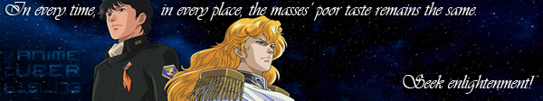  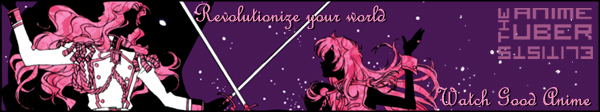   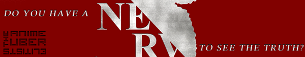     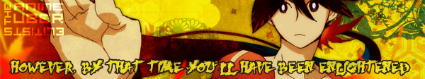 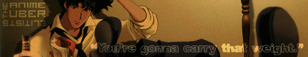 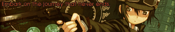 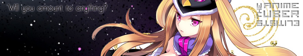 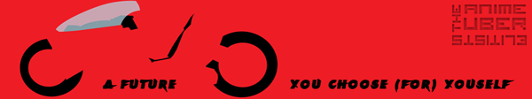 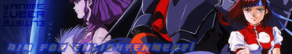 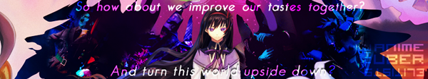 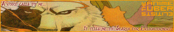     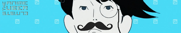   ADDENDUM Should anyone wish to use more than one banner in their sig, but is not fond of gifs, I suggest a simple, automated image rotator that requires very little of the end user. UNIVERSAL SIG ROTATOR Simply register there and insert links of as many banners as you'd like to have rotated in your signature. Ducat's edit: Regrettably, some of the old banners are no longer available. The current set that we have are the ones we've managed to salvage. Feel free to create your own banners and post them here. Just remember, it must be from our E-List and it must have our logo. Enjoy! |
Ducat_RevelJul 27, 2020 8:04 AM
| My favorite genres: good Quality, better Quality, best Quality, Über-Quality. Scoring criteria: Existence does not precede Essence. Current status: OFFLINE. Even if not really. I have no Facebook, no Tweeter and no latest fashionable social network. Mail me only if you absolutely must, and I still won't promise to answer: the postman might have been shot by an automated sentry, blown up by a mine, eaten by a shark, or something. |
Feb 7, 2013 4:38 AM
#2
| I could do it if no one else applies. Just tell me the dimensions and if you have any specific idea for the theme. |
 |
Feb 7, 2013 4:56 AM
#3
| My original idea was to make a few 350x19 user bars, but some might want a larger banner. In the end, I believe it's better not to limit creativity and leave it up to whomever wishes to give it a try. BTW, I'm working on a 350x19 based on this. |
| My favorite genres: good Quality, better Quality, best Quality, Über-Quality. Scoring criteria: Existence does not precede Essence. Current status: OFFLINE. Even if not really. I have no Facebook, no Tweeter and no latest fashionable social network. Mail me only if you absolutely must, and I still won't promise to answer: the postman might have been shot by an automated sentry, blown up by a mine, eaten by a shark, or something. |
Feb 7, 2013 5:05 AM
#4
| Ugh, I didn't need to see that xD OK, userbars should be quick to make. I already have templates from some earlier projects so I just need to change the picture and the text. As for a larger banner, I could go along the lines of BakaBTs banners or sth like that. Anyway, I'll try something tomorrow. |
|
Feb 7, 2013 6:39 AM
#5
Here it is. I know it's amateurish, but I have neither artistic talent or the skills to use Gimp... Anyone who wishes may improve on this. PLEASE! Copyleft must be the same as the original Wiki image. |
MaegilFeb 11, 2013 6:21 PM
| My favorite genres: good Quality, better Quality, best Quality, Über-Quality. Scoring criteria: Existence does not precede Essence. Current status: OFFLINE. Even if not really. I have no Facebook, no Tweeter and no latest fashionable social network. Mail me only if you absolutely must, and I still won't promise to answer: the postman might have been shot by an automated sentry, blown up by a mine, eaten by a shark, or something. |
Feb 7, 2013 11:14 PM
#6
| Hahah, that's a nice one. OK, here are my banners and userbars. I did a pretty lazy job with userbars, because I lacked inspiration and because Maegil already made one. I thought about making an animated one, but again, laziness kicked in :/ Userbars Striped   Non-striped   Banners 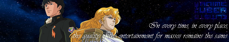  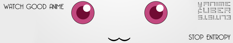  |
metamorphiusFeb 7, 2013 11:22 PM
|
Feb 8, 2013 1:29 AM
#7
| Well done! I have a little problem with the first banner, though - to someone who doesn't know Sturgeon's law, it passes the idea that you're saying that the quality is good... I particularly liked Kyuubey's banner - minimalistic, but very direct. |
MaegilFeb 8, 2013 1:53 AM
| My favorite genres: good Quality, better Quality, best Quality, Über-Quality. Scoring criteria: Existence does not precede Essence. Current status: OFFLINE. Even if not really. I have no Facebook, no Tweeter and no latest fashionable social network. Mail me only if you absolutely must, and I still won't promise to answer: the postman might have been shot by an automated sentry, blown up by a mine, eaten by a shark, or something. |


Feb 8, 2013 3:43 AM
#10

metamorphius said: Hahah, that's a nice one. OK, here are my banners and userbars. I did a pretty lazy job with userbars, because I lacked inspiration and because Maegil already made one. I thought about making an animated one, but again, laziness kicked in :/ Userbars Striped Non-striped Banners Outstanding. I love the banner with Watashi (just because The Tatami Galaxy is one of my favorite anime.) |

Feb 8, 2013 4:33 AM
#11
| Aww, thanks everyone, I'm really glad you liked them. Btw, nice sigs, Nid and Ducat. Maegil said: I have a little problem with the first banner, though - to someone who doesn't know Sturgeon's law, it passes the idea that you're saying that the quality is good... I put "for masses" hoping that would prevent confusion, but if you have a suggestion to improve the text (without altering the original quote I paraphrased too much), I'm listening. Or should I remove it altogether? Although I think that would leave the banner somewhat empty and...lacking impact. |
|
Feb 8, 2013 5:15 AM
#12
| The problem is that the image shows an ideal, but the message points out mankind's negative attitudes; this causes a bit of a paradox. To solve this, we'd need a motivational punch line, for example: "In every time, in every place, the masses' vulgar taste remains the same." , followed by "Watch good anime!", "Improve Your Standards!" or "Seek Enlightenment!". I'd also recommend avoiding to overlap the white font on Reinhart's white cape. |
MaegilFeb 8, 2013 5:46 AM
| My favorite genres: good Quality, better Quality, best Quality, Über-Quality. Scoring criteria: Existence does not precede Essence. Current status: OFFLINE. Even if not really. I have no Facebook, no Tweeter and no latest fashionable social network. Mail me only if you absolutely must, and I still won't promise to answer: the postman might have been shot by an automated sentry, blown up by a mine, eaten by a shark, or something. |
Feb 9, 2013 5:28 AM
#13
OK, here's the improved version.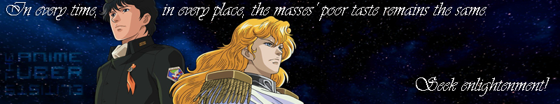 Btw, since this topic will eventually get burried, maybe all these banners and userbars could be put in the club's description (under a spoiler) so those who might be interested in using them can find them easily. Also, what is the max length for signature on MAL? Perhaps I should provide resized versions of the banners as well in case someone decides to use them here. |
|
Feb 9, 2013 5:57 AM
#14
| Max characters is 650, but there's also a physical size limit beyond which the sig gets truncated. Just look at my sig... |
MaegilFeb 9, 2013 6:19 AM
| My favorite genres: good Quality, better Quality, best Quality, Über-Quality. Scoring criteria: Existence does not precede Essence. Current status: OFFLINE. Even if not really. I have no Facebook, no Tweeter and no latest fashionable social network. Mail me only if you absolutely must, and I still won't promise to answer: the postman might have been shot by an automated sentry, blown up by a mine, eaten by a shark, or something. |
Feb 9, 2013 6:32 AM
#15
| I just searched the forums and saw in the guidelines thread the max width is 600px. I like the original size of the banners better, they kinda fit the width of the site, but since there is a possibility the mods may remove sigs which exceed the max dimensions allowed, here are the resized banners.     |
|
Feb 9, 2013 7:36 AM
#16
| Good work! As a bonus, the fonts also improved... |
| My favorite genres: good Quality, better Quality, best Quality, Über-Quality. Scoring criteria: Existence does not precede Essence. Current status: OFFLINE. Even if not really. I have no Facebook, no Tweeter and no latest fashionable social network. Mail me only if you absolutely must, and I still won't promise to answer: the postman might have been shot by an automated sentry, blown up by a mine, eaten by a shark, or something. |
Feb 9, 2013 7:42 AM
#17
| Just changed my signature. These things are really nice. I need to stick to one. Hopefully this is it. |
Feb 9, 2013 7:51 AM
#18
| Maybe what you really want is a .GIF with them all... |
| My favorite genres: good Quality, better Quality, best Quality, Über-Quality. Scoring criteria: Existence does not precede Essence. Current status: OFFLINE. Even if not really. I have no Facebook, no Tweeter and no latest fashionable social network. Mail me only if you absolutely must, and I still won't promise to answer: the postman might have been shot by an automated sentry, blown up by a mine, eaten by a shark, or something. |
Feb 9, 2013 7:54 AM
#19
| . . . The thought has now been implanted in my head. It will haunt me until it happens (which no one is really obligated to do. Please, everyone, don't volunteer all at once). |
Feb 9, 2013 8:30 AM
#20
Here you go!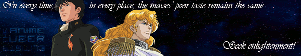 |
MaegilFeb 9, 2013 8:38 AM
| My favorite genres: good Quality, better Quality, best Quality, Über-Quality. Scoring criteria: Existence does not precede Essence. Current status: OFFLINE. Even if not really. I have no Facebook, no Tweeter and no latest fashionable social network. Mail me only if you absolutely must, and I still won't promise to answer: the postman might have been shot by an automated sentry, blown up by a mine, eaten by a shark, or something. |
Feb 9, 2013 8:41 AM
#21
Maegil said: Here you go! Maegil, you handsome devil you! I have now been saved~! |
Feb 9, 2013 8:44 AM
#22
| Kudos to metamorphius, please; I just patched them together. |
| My favorite genres: good Quality, better Quality, best Quality, Über-Quality. Scoring criteria: Existence does not precede Essence. Current status: OFFLINE. Even if not really. I have no Facebook, no Tweeter and no latest fashionable social network. Mail me only if you absolutely must, and I still won't promise to answer: the postman might have been shot by an automated sentry, blown up by a mine, eaten by a shark, or something. |
Feb 9, 2013 8:57 AM
#23
| Serious props to metamorphius. Even though I already complemented him for his stellar work, a second shout out wouldn't hurt. |
Feb 9, 2013 9:21 PM
#24
| No need to thank me too much, it wasn't that much of a work. Maegil said: As a bonus, the fonts also improved... Yeah, that's because previously I had forgotten to apply anti-aliasing so I fixed that when I resized the banner. As for changing/rotating banners, thanks, Maegil for making the gif. Downside to gifs is the image quality so, I'll mention that in addition to this method, it is possible to use a PHP image rotator which will show different image every time the page is reloaded. You can find a simple image rotator here http://www.marcofolio.net/webdesign/php_random_image_rotation.html Or just copy the code from here http://d.alistapart.com/randomizer/rotate.txt Of course, this means you need to host this as a php file as well as the images somewhere. I understand that is probably too much of a hassle for most people, so you can use the rotator I set up on one of my domains I don't use. Just copy this in your sig (without spaces in the tags, ofc) [ img ]http://malosevjezbam.netne.net/imagerotate.php[ /img ] Just a test to see if this thing works: P.S. Maybe I'll make a couple of more banners for variety's sake when I have time and inspiration, i.e. God knows when. |
metamorphiusFeb 9, 2013 9:30 PM
|

Feb 16, 2013 8:47 AM
#26
| I was thinking of doing a draft letter to be posted in the club's images and be sent to whomever anyone believed to be in need of Enlightenment - something in this spirit: http://www.namsense.com/images/Draft%20Notice.jpg For it, we'd need a nice, official-looking coat-of-arms. Is anyone up to the job? |
| My favorite genres: good Quality, better Quality, best Quality, Über-Quality. Scoring criteria: Existence does not precede Essence. Current status: OFFLINE. Even if not really. I have no Facebook, no Tweeter and no latest fashionable social network. Mail me only if you absolutely must, and I still won't promise to answer: the postman might have been shot by an automated sentry, blown up by a mine, eaten by a shark, or something. |
Feb 16, 2013 3:38 PM
#27

Maegil said: I was thinking of doing a draft letter to be posted in the club's images and be sent to whomever anyone believed to be in need of Enlightenment - something in this spirit: http://www.namsense.com/images/Draft%20Notice.jpg For it, we'd need a nice, official-looking coat-of-arms. Is anyone up to the job? I really hope someone takes up your idea. That's genius. |
Mar 10, 2013 5:44 AM
#28
 >Ducat_Revel | 3 hours ago >Goes to show. In anime, there's a ton of crap in between good shows. >Maegil | 14 seconds ago >That's one take on the pic. To someone new, however, it's meaning would more likely be that the anime in the middle are great... I think this would work better if there were no top image, and the LotGH banner were transferred to the bottom. |
| My favorite genres: good Quality, better Quality, best Quality, Über-Quality. Scoring criteria: Existence does not precede Essence. Current status: OFFLINE. Even if not really. I have no Facebook, no Tweeter and no latest fashionable social network. Mail me only if you absolutely must, and I still won't promise to answer: the postman might have been shot by an automated sentry, blown up by a mine, eaten by a shark, or something. |
Mar 10, 2013 6:03 AM
#29
Maegil said: I was thinking of doing a draft letter to be posted in the club's images and be sent to whomever anyone believed to be in need of Enlightenment - something in this spirit: http://www.namsense.com/images/Draft%20Notice.jpg For it, we'd need a nice, official-looking coat-of-arms. Is anyone up to the job? I can't believe I missed this. I may be able to make something. Not today, but in a few days. Do you have any requirements how it should look like? |
|
Mar 10, 2013 6:41 AM
#30
| I was thinking on something including a pyramid - we are "elitists" and aim to "enlighten", so a Illuminati pun seems in order... In any case, you can take inspiration from real world sources. |
| My favorite genres: good Quality, better Quality, best Quality, Über-Quality. Scoring criteria: Existence does not precede Essence. Current status: OFFLINE. Even if not really. I have no Facebook, no Tweeter and no latest fashionable social network. Mail me only if you absolutely must, and I still won't promise to answer: the postman might have been shot by an automated sentry, blown up by a mine, eaten by a shark, or something. |
Mar 10, 2013 3:27 PM
#31
Here's the coat of arms. I'm not sure how "official-looking" it is or how well I incorporated the pyramid theme, but this is how it turned out.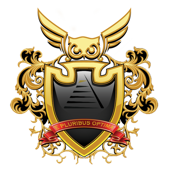 I went for a relatively simple look because I'm lazy, i.e. I didn't want to embellish it too much or add tons of heraldic animals. To shortly explain what some elements mean... The pyramid in the center of the shiled is, as Maegil suggested, partly an Illuminati joke and therefore also a symbol of enlightenment. In addition to that, the top of the pyramid (the gold coloured part) represents the best of the anime/manga (i.e. our Enlightenment lists) which may quantitatively be small but stand at the top and "shine" unlike those below. At the topmost part of the coat of arms is an angry-looking owl (it is stylized, but I hope it is recognizable enough). The owl is at the top as the symbol of wisdom one attains when one reaches enlightenment. It is also a guardian of the top part of the pyramid (the Enlightenment anime/manga). The motto is a pun - it is a reference to the famous "e pluribus unum" and can be translated as "of many, the best" (refers, ofc, to the very best the anime/manga medium has to offer). OK, that's enough pretentious nonsense for now. If you want me to change something, do say so. If not, I hope the coat of arms is good, or at least, decent enough. Btw, there's something I said a while ago metamorphius said: I'll make a couple of more banners for variety's sake when I have time and inspiration. So, there's a couple of new banners. 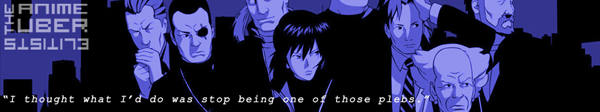  With these two the number of banners is 6 IIRC and I think that's enough variety from me. |
metamorphiusMar 10, 2013 3:34 PM
|
Mar 10, 2013 5:49 PM
#32
| Awesome. We should make that as our new club picture, though I'm not sure if something should be added more to it. Either way, I love it. |
 |
Mar 10, 2013 5:55 PM
#33
| Thanks, that was fast! Since I'm allowed to suggest modifications, I'll take the liberty: I understand that the whole coat-of-arms is highly modern-stylized, but the pyramid ends up looking too much like a corporate logo. The color scheme is also too dark and lacks contrast- I'd recommend using the blazon rules of tincture making it, for instance, blue azure, a pyramid proper, bordure or. The motto banner should be larger, so it can be read when shrunk. I'd suggest making it twice as broad, and as wide as the limits of the mantling, and moving it to below the escutcheon, covering at most only the tip of the base (from which, appending an order such as a book would reinforce the association with culture). Displacing the motto would free up space inside the escutcheon, allowing to enlarge and center the pyramid vertically. The top of the escutcheon's shape doesn't transmit the idea of a tower - you'd do better to cut it off, surmount it with a tower, and place the owl as crest (but take care not to make it a mural crown - or maybe not). Finally, the owl is too big, and overlaps the mantling. Sorry for all the assertiveness... |
| My favorite genres: good Quality, better Quality, best Quality, Über-Quality. Scoring criteria: Existence does not precede Essence. Current status: OFFLINE. Even if not really. I have no Facebook, no Tweeter and no latest fashionable social network. Mail me only if you absolutely must, and I still won't promise to answer: the postman might have been shot by an automated sentry, blown up by a mine, eaten by a shark, or something. |
Mar 10, 2013 6:20 PM
#34

| Those new banners are great as well! I'm gonna have to steal borrow the GitS one :D Though I should get to meddling with my own since I finally got my hands on Photoshop again |
 |
Mar 11, 2013 3:11 AM
#35
| Thanks, people. @Meagil Don't worry about assertiveness. That's not the problem. The problem is I don't have Illustrator and this is all made in PS, so I cannot freely resize (actually, upsize) everything without fucking up the resolution (for example, enlarging the banner). Also, I am a fool who merged some layers without thinking x.x But I'll see what can be done, though, since it's Monday today I can't promise when - it could be tomorrow, it could be for the weekend. Maegil said: The top of the escutcheon's shape doesn't transmit the idea of a tower Well, that's understandable because the shape of the shield was not meant to transmit that idea. It's not like I sat and carefully pondered every detail. But, I'm not sure how well the tower with the owl atop would look like. Or that may be my taste speaking, because I've never fancied towers on coats of arms. Maegil said: Finally, the owl is too big, and overlaps the mantling. That's done on purpose. I'll move it, but I think I'll leave the size same or make it just slightly smaller. |
metamorphiusMar 11, 2013 3:15 AM
|
Mar 13, 2013 9:07 AM
#36
moeslasher said: LOOK I've made another awesome one 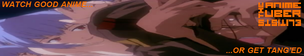 I do not understand it. Could you please explain? |
Mar 13, 2013 9:42 AM
#37
| I like the idea (and the choice of colour), but not really the choice of the picture. At least, the aspect ratio seems off. AlabastreAizo said: I do not understand it. Could you please explain? Here's how I understood it. You know how in Evangelion, there's a liquid called LCL (I'm not getting into explaining what the liquid exactly is as that would be spoilerific for those who haven't seen the anime) in which the pilots are submerged and how it allows for the pilots to sync with Evas? Now, LCL is orange-ish which lead the fans to often refer to it as "tang" (Tang is a type of orange drink), so I guess the expression "get tanged" comes from that as well. |
metamorphiusMar 13, 2013 9:51 AM
|
Mar 13, 2013 11:21 AM
#38
moeslasher said: LOOK I've made another awesome one I'd argue about having an Evangelion banner. Our current six Mawaru, Tatami, Madoka, LOGH, Berserk, and GITS: SAC are rather well done shows, and while Eva is intelligent, symbolic, and to an extent brilliant, it's quality is highly debated. It's verdict among anime critics is split 50/50. A show with a wobbly status like Evangelion shouldn't represent our illustrious band of the hawk elitists. |
Mar 13, 2013 12:06 PM
#39

Ducat_Revel said: moeslasher said: LOOK I've made another awesome one I'd argue about having an Evangelion banner. Our current six Mawaru, Tatami, Madoka, LOGH, Berserk, and GITS: SAC are rather well done shows, and while Eva is intelligent, symbolic, and to an extent brilliant, it's quality is highly debated. It's verdict among anime critics is split 50/50. A show with a wobbly status like Evangelion shouldn't represent our illustrious band of the hawk elitists.  try to face up the reviews "...I'm not going to try to convince anybody who already isn't an Eva fan that this film will change your mind about the series, because it won't. But the truth of the matter is that this film is a masterpiece in not only anime, but in animation and filmmaking in general. It is not afraid to ask some of the most philisophical questions we can ask ourselves as people and is not afraid to have us, the viewer, realize the answers even as the characters on screen attempt to do the same. If you are going to see this movie, watch the 26 episode show first, or you'll have no idea what is going on. End of Evangelion is one of the most artistic and beautiful movies I have ever seen, animated or not, and is a mandatory movie to watch I believe for anybody who considers themselves a fan of anime or film in general...." Review from BatOtaku13 Neon Genesis Evangelion: The End of Evangelion |
moeslasherMar 13, 2013 12:09 PM
Mar 13, 2013 12:10 PM
#40

Ducat_Revel said: moeslasher said: LOOK I've made another awesome one I'd argue about having an Evangelion banner. Our current six Mawaru, Tatami, Madoka, LOGH, Berserk, and GITS: SAC are rather well done shows, and while Eva is intelligent, symbolic, and to an extent brilliant, it's quality is highly debated. It's verdict among anime critics is split 50/50. A show with a wobbly status like Evangelion shouldn't represent our illustrious band of the hawk elitists. This. I'd also like to point out that the picture looks stretched and is hard to discern. In addition, the font color you chose it absolutely hideous. You might want to look into color theory. The actual font is problematic too as is the typesetting. You should play around with design more and maybe look up some tutorials. |
Mar 13, 2013 2:15 PM
#41
Ducat_Revel said: moeslasher said: LOOK I've made another awesome one I'd argue about having an Evangelion banner. Our current six Mawaru, Tatami, Madoka, LOGH, Berserk, and GITS: SAC are rather well done shows, and while Eva is intelligent, symbolic, and to an extent brilliant, it's quality is highly debated. It's verdict among anime critics is split 50/50. A show with a wobbly status like Evangelion shouldn't represent our illustrious band of the hawk elitists. This would be more why I don't understand the banner. Also "tang'ed". |
Mar 13, 2013 4:16 PM
#42
| Oh, that was Evangelion?! I couldn't tell for all the distortion... Tang'ed: I guess this is what people are complaining about when they speak of "too much localization". Having the pun explained, I can now understand why you chose an orange font; regrettably, it still clashes. |
| My favorite genres: good Quality, better Quality, best Quality, Über-Quality. Scoring criteria: Existence does not precede Essence. Current status: OFFLINE. Even if not really. I have no Facebook, no Tweeter and no latest fashionable social network. Mail me only if you absolutely must, and I still won't promise to answer: the postman might have been shot by an automated sentry, blown up by a mine, eaten by a shark, or something. |
Mar 13, 2013 4:28 PM
#43
Maegil said: Oh, that was Evangelion?! I couldn't tell for all the distortion... Tang'ed: I guess this is what people are complaining about when they speak of "too much localization". Having the pun explained, I can now understand why you chose an orange font; regrettably, it still clashes. Yeah after the explanation it makes more sense, but it still looks bad. I think maybe if there was an outline around the font or if he chose another font it would look better. With that said, I'm going to whip up a banner myself, mostly because I want one from one particular series and I have a very graphic-designy picture from the series that I think would make a lovely banner. Probably not as awesome as Meta's stuff, but oh well. =) Edit: By the way- What font is everyone using for "The Anime Uber elitists" part? |
AmberlehMar 13, 2013 4:33 PM
Mar 13, 2013 5:47 PM
#44
Amberleh said: Edit: By the way- What font is everyone using for "The Anime Uber elitists" part? I already replied to Amber, but if anyone else wants to know the font is Visitor TT2 BRK which can be downloaded here: http://www.fontstock.net/5972/visitor-tt2--brk-.html |
|
Mar 13, 2013 6:02 PM
#45
| Thanks Meta!! Okay so which do you guys prefer- White or faded pink?   By the way, I totally don't expect anyone else to use this banner. I know it's totally full of pink. You can use it if you want, of course. I just wanted an Utena one for myself. <3 |
AmberlehMar 13, 2013 6:14 PM
Mar 13, 2013 6:17 PM
#46
| NP, you're very much welcome. Hah, I just knew you'd make an Utena banner! I really like it and for once, I don't mind that it's pink in the least. Besides, the combination of pink and black always works well. Amberleh said: Okay so which do you guys prefer- White or faded pink? Faded, definitely. It's perfectly noticeable, yet it doesn't dominate the picture but instead complements it. |
metamorphiusMar 13, 2013 6:20 PM
|
Mar 13, 2013 7:31 PM
#47
| Great. Another banner. I'm going to slowly turn into a banner whore because of this. Amber: I don't mind if it's pink. I'd still eat it up. Still trying to understand meta's image rotation thingy so I can include all 7 banners, including Utena. But when I do, it'll be amazing! |
Mar 13, 2013 7:48 PM
#48
Ducat_Revel said: Great. Another banner. I'm going to slowly turn into a banner whore because of this. As if that's a bad thing. I can even make you a personalized banner if you have a request since I've got some free time. Which I should probably use to work on the coat of arms but eh, I think I'll procrastinate with that. Ducat_Revel said: Still trying to understand meta's image rotation thingy so I can include all 7 banners, including Utena. But when I do, it'll be amazing! You can just use the link I posted in this topic earlier - it should be working. I also just uploaded the other three banners there too (yes, Utena as well). I think the (limited) bandwidth on the domain I set the rotator at had been used up last month, so the rotator probably didn't work, but it is working now. And if only you use the rotator as a sig, the limit shouldn't be breached again. |
metamorphiusMar 13, 2013 8:07 PM
|
Mar 13, 2013 8:11 PM
#49
metamorphius said: I can even make you a personalized banner if you have a request since I've got some free time. Which I should probably use to work on the coat of arms but eh, I think I'll procrastinate with that. Well isn't this just the frosting on the cake. I may have to take you up on that. Currently, I'm conflicted between Cowboy Bebop, Mushishi, or Monster. Probably Mushishi though. I just can't deny Ginko. metamorphius said: You can just use the link I posted in this topic earlier - it should be working. I also just uploaded the other three banners there too (yes, Utena as well). Done and done! |
Ducat_RevelMar 13, 2013 11:32 PM
Mar 13, 2013 9:43 PM
#50
| Awesome! Glad you guys like it! Meta- I guess I'm predictable, eh? Haha. To be fair, Utena has such GREAT imagery, especially with the new-ish box set art that was released (One of these pieces is what I used) so it really lends itself to graphic designy stuff like this. By the way, for anyone interested, a great place to get fonts is www.dafont.com I get like all my fonts there and I could spend forever just looking through them all. |
More topics from this board
Sticky: » The New Manga Enlightenment Camp - All plebes and Untermenschen MUST attendExinqt - Aug 21, 2015 |
31 |
by Ducat_Revel
»»
Apr 2, 6:33 PM |
|
» 10 Steps to Becoming an Anime ElitistDeago - Jun 2, 2023 |
2 |
by AaronRRedfield
»»
Jan 11, 3:52 PM |
|
» Winter 2024 OverviewDeago - Dec 20, 2023 |
0 |
by Deago
»»
Dec 20, 2023 8:24 AM |
|
» Anime/Manga Recommendation Thread Based on Your List ( 1 2 3 4 5 ... Last Page )TrishaCat - Jan 25, 2013 |
1161 |
by GanXWeed69o7
»»
Aug 19, 2023 12:15 PM |
|
» Summer 2023 OverviewDeago - Jun 14, 2023 |
0 |
by Deago
»»
Jun 14, 2023 7:48 PM |