New
Sep 11, 2014 9:13 PM
#4501

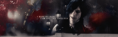
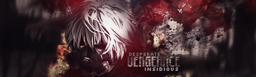
| Hey guys, it's been over a year and a half, so I updated my avatar, sig, display pic, and profile design. I decided to go with a fiery theme because I'm all about motivation, drive, determination, burning passion, flaming spirit. As the slogan text on my profile design says, "Light a fire in your soul." Anyway, I spent the last few days on my design with almost no sleep. I had not intended to spend nearly as long as I did, but that's life. Sometimes you just need to let go and go for the goal. I ran into a lot of setbacks while designing this, including the limitations within Photoshop and gifs. As you will most likely notice, the "favorite characters" section is very low quality. I did my best to blend it in anyway. I was quite irritated since it took me hours to do that part (partly because my computer becomes slow as... a duck, when I'm dealing with many frames or large files). I should've been expecting it though... Looking back, I probably shouldn't have had the short little character bios appear, then I could've split the image into smaller dimensions and it wouldn't have reduced quality. I might be updating my list design in the coming days, but I might just leave it. I don't really have the passion for it right now, and I spent over 100 hours on the current design when I made it, don't really have that much time to waste right now. You'll need to give it a minute to load, especially if your not isn't too good. Let me know what you think. Thanks.                                          Previous "About Me" Design [spoiler]                                        |
dperolioSep 14, 2014 4:42 PM
Sep 11, 2014 9:49 PM
#4502

| Man this is a big piece of work. I really like it overall, nice consistency throughout the whole piece. But yeah, this is too big/long to load (well, it only takes me 10-20 secs, but that is enough to say that it is a bit too much. But my obvious conclusion would still be, good work. Hopefully when I will stop being lazy I will finish my own layout. |
 |
Sep 12, 2014 6:43 AM
#4503

| I'm not surprised. It looks great. Though, I don't know why you make a seperate thread just for that occasion, if there are two wonderful threads where you can let the world know you updated your profile and signature.. Ya know, like everyone else. |
 |
Sep 12, 2014 7:11 AM
#4504
| Thanks both of you. :) @ar4can7he Yup, it's a large file size. With something like this though, I don't even worry about that. We all have decent internet nowadays, and even if you don't it will only load slow the first time, then it'll be cached. If I was designing a website I would care about speed/efficiency, but for an art piece like this, the sky's the limit to me. I dunno, I guess I made a thread because most people don't spend 60 hours on something like this. xd Also changed my ava, sig, and dp. Don't see the harm though, it's been almost 2 years since I made my last thread here and will probably be 2 more until I make another profile design. It's not like I'm spamming threads. :c |
Sep 12, 2014 7:19 AM
#4505

| Damn that's great, literally the best one I've seen so far. Not a fan of the colors, but amazing effort nonetheless. |
 |
Sep 12, 2014 10:10 AM
#4506
dperolio said: I dunno, I guess I made a thread because most people don't spend 60 hours on something like this. xd Also changed my ava, sig, and dp. Don't see the harm though, it's been almost 2 years since I made my last thread here and will probably be 2 more until I make another profile design. It's not like I'm spamming threads. :c No, probably just 80% of all designers here. I don't count the hours I take for my layouts though... I just know it takes hours.. and hours.. xx No offense, but you're nothing special or anything. At least that's the impression I get from your posts and I suspect that to be the reason behind this thread as well. Don't get me wrong, dude. Your works are stunning, very cool and you've got much more experience and skill than most of us here. I have no problem to say that, because it's what I honestly think, but like I said, I get that certain impression from your posts and it somewhat annoys me a bit. |
|
Sep 12, 2014 10:26 AM
#4507
| Ah, well sorry you feel that way. Not trying to offend anyone or say "I'm special." I would be lying if I said I didn't want attention/recognition for my work though, what artist doesn't? I saw someone else post 2 threads about their new profile design the other day here, no one cared then. I certainly wouldn't be complaining if others spent as much time and effort as I did on a design and they decided to make a thread about it. In fact, I would welcome it. I love gaining motivation and inspiration. No offense, but you're coming off really rude to me. :/ I don't know why you're making assumptions about me without even getting to know me, but feel free to add me on Skype and we can talk further: dustin.perolio There is no "secret reasoning" behind this thread. I've worked long and hard on a design and want to receive opinions about it. Yeah I could've made multiple posts, but instead I made a single thread since I'm showing off more than one thing. Does it really matter? |
dperolioSep 12, 2014 10:30 AM
Sep 12, 2014 10:29 AM
#4508

| My god ... this is ... AMAZING ! How long did it even take you? I'd be very proud having this as my profile design ^^ |
 |
Sep 12, 2014 10:33 AM
#4509
| There's no need for them to make a thread about it, because there are specific threads for that. True, I want attention too (concerning my works, that is), but it's not like you wouldn't get that in these threads. I don't know why what I'm saying would come off as rude. I was just wondering why anyone would need to make a special thread for themselves if there are already threads for that purpose. I'm not saying: WOOOH go get your fucking thread deleted right now and post your updates in the right threads!... or am I? Just wanted to "suggest" there is a better way. |
|
Sep 12, 2014 10:34 AM
#4510
PrOxAnto said: My god ... this is ... AMAZING ! How long did it even take you? I'd be very proud having this as my profile design ^^ Thanks. ^^ I honestly don't even know... The last 3-4 days have been a blur. I've basically only been working on this, eating (very little), sleeping (very little-none). Yesterday I literally spent like 20 hours with the animations alone (part my fault, part my computer's fault). Overall, I would say 40-60+ hours. Zzz. That's how I tend to get when I'm working on something, it's really not a good thing for my health. Isa__ said: There's no need for them to make a thread about it, because there are specific threads for that. True, I want attention too (concerning my works, that is), but it's not like you wouldn't get that in these threads. I don't know why what I'm saying would come off as rude. I was just wondering why anyone would need to make a special thread for themselves if there are already threads for that purpose. I'm not saying: WOOOH go get your fucking thread deleted right now and post your updates in the right threads!... or am I? Just wanted to "suggest" there is a better way. Alright, well thank you, and sorry. Guess you're right. Just trying to get a little more exposure to my work. Figured this would be more useful/entertaining than some of the threads I see posted in Casual Discussion. :p |
dperolioSep 12, 2014 10:40 AM
Sep 12, 2014 11:03 AM
#4511

| The profile is not bad, but the quality of some parts is too low and it has too much gifs so the loading time gets kinda high even with good connections. I would get rid of some gifs and for example place some good pictures there. Gifs in general are nice to have, but only when the quality is good too - your favorite characters gif has such low quality that it gets this "pixel problem" in its colours, especially black. But thats only my opinion. |
Sep 12, 2014 11:29 AM
#4512
Sylinchen said: The profile is not bad, but the quality of some parts is too low and it has too much gifs so the loading time gets kinda high even with good connections. I would get rid of some gifs and for example place some good pictures there. Gifs in general are nice to have, but only when the quality is good too - your favorite characters gif has such low quality that it gets this "pixel problem" in its colours, especially black. But thats only my opinion. Yeah, indeed that's a problem I had. Of course I didn't realize it until after I'd spent hours on the animation, or I wouldn't have done it that way. >< Load times I'm not worried about, anyone that wants to see it will. Admittedly, I didn't intend for this to be quite so large. That gif's the only one that had large quality loss though. I still liked the animation, even though it pained me that I had to live with low quality, so I kept it. I still think it blends in pretty well. I agree I probably went a bit overboard with the animations. xd Thanks for the feedback. |
dperolioSep 12, 2014 12:04 PM


Sep 12, 2014 5:45 PM
#4514

Hederick said: Thread merged. Good thing you merged it. |
 |
Sep 12, 2014 6:05 PM
#4515
| Thanks Hederick, sorry for causing problems. ;_; |
dperolioSep 12, 2014 6:45 PM
Sep 14, 2014 3:26 PM
#4516
| Updated my profile for real now. Everything's done, everything's linked. Let me know what'cha think. |
|
Sep 14, 2014 4:20 PM
#4517

Isa__ said: Updated my profile for real now. Everything's done, everything's linked. Let me know what'cha think. ^Almost rhymed LOVE LOVE LOVE LOVE ITTT no complaints, none. My favorite layout ever. The lighting is done beautifully and as always from Isa... amazing text! |

Sep 14, 2014 5:10 PM
#4518
Isa__ said: Updated my profile for real now. Everything's done, everything's linked. Let me know what'cha think. You know what I think about that orange and white small gradient text. ._. With the contrast of the design, they hurt my eyes. And it looks like you lowered the opacity on the text under the "Choose" side text a little too much. Oh and the "See you again!" text at the bottom looks like it got moved under a layer by accident or something. Those are my only complaints. The design looks great and definitely looks complete with the additions you made. Well done. :) |
dperolioSep 14, 2014 6:19 PM
Sep 14, 2014 5:57 PM
#4519

Isa__ said: Updated my profile for real now. Everything's done, everything's linked. Let me know what'cha think. Aww, i like it, but I really loved it before OTL   The Bravely Default text and the bottom part of the layout I think some of the text is a bit more orange-ish than other parts D: |
 |
Sep 14, 2014 11:46 PM
#4520

| Haven't been on.. but i made sure to update mine. well it's not a full layout tho D: |
| invisible signature \m/ |
Sep 15, 2014 12:06 AM
#4521

Isa__ said: Updated my profile for real now. Everything's done, everything's linked. Let me know what'cha think. What can I say? It's magnificent, girl. <3 Izachin said: Haven't been on.. but i made sure to update mine. well it's not a full layout tho D: It's nice, simple and clean. Not really a fan of the typo on the "Louis Asahina" part, though. Also, I just updated mine. Had a great time playing through Tomb Raider and decided to make a layout based on it. |
 |
Sep 15, 2014 2:39 AM
#4522
Insidious said: Izachin said: Haven't been on.. but i made sure to update mine. well it's not a full layout tho D: It's nice, simple and clean. Not really a fan of the typo on the "Louis Asahina" part, though. I agree lol i suddenly thought that font on the louis asahina didn't suit louis himself lol x.x |
| invisible signature \m/ |
Oct 2, 2014 7:04 PM
#4523

Oct 3, 2014 9:13 AM
#4524
| BigJk said: I also updated my design. My idea was to keep it as simple, clean and flat as possible. It looks good. I like this style. |
Oct 3, 2014 11:22 AM
#4525
Exo_x said: It looks good. I like this style. Thanks. :) |
 |
Oct 5, 2014 4:37 AM
#4526

| it is nothing special but i updated my profile today, was in the mood to doodle something :3 |
Oct 22, 2014 12:51 AM
#4528
| It's been a year or so since I made anything for my profile. And, I feel it's lacking something. Any suggestions? = v = Oh wow, I feel a little embarrassed now.. Seeing there's plenty of good looking profiles which are Fate/UBW related. |
Oct 22, 2014 1:01 AM
#4529
Kalafina said: It looks really great! :3It's been a year or so since I made anything for my profile. And, I feel it's lacking something. Any suggestions? = v = Oh wow, I feel a little embarrassed now.. Seeing there's plenty of good looking profiles which are Fate/UBW related. I'm having a bit difficulty reading some of the text, but that's prob cuz it's 4 am here... |
|
Oct 22, 2014 1:14 AM
#4530
| Ah, Thanks for the quick feedback. I'll see what I can do with those text when I get back home. I haven't checked whether or not they're readable with a smaller screen too, That or I probably over sharpened them again.. Hah. Thanks again~! |
Oct 22, 2014 5:02 PM
#4531
Oct 22, 2014 9:09 PM
#4532
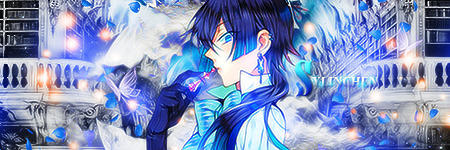
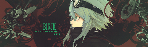
BigJk said: Really like the design :D may I ask where you get your resources from? like the chains or the flames? ^^ Oh, Thank you! The flame looking textures are from DA, just search "Dust Textures". I did the chains with the emboss settings. |
Nov 3, 2014 6:00 PM
#4533

| So after being a member for about a year, i finally made a profile design with links. Tell me what you guys think! |
 |
Nov 3, 2014 6:35 PM
#4534

Neni07 said: So after being a member for about a year, i finally made a profile design with links. Tell me what you guys think! Left you a comment on your profile. :> |
"Be the change you wish to see in the world." ⛩️  |
Nov 4, 2014 9:38 AM
#4535
| Profile updated! Thanks for the advise, it looks much better now! :) |
|
Nov 11, 2014 8:54 AM
#4537
shuryukan said: finished new one :x Well, I like it. The colors are light and playful, which helps to set the tone for the rest of the layout. There's a couple spots here and there that are hard to read, but overall I think it's a very solid profile! Good job. c: |
|
Nov 11, 2014 11:12 AM
#4538
Insidious said: Thanks, which parts in particular are hard to read?shuryukan said: finished new one :x Well, I like it. The colors are light and playful, which helps to set the tone for the rest of the layout. There's a couple spots here and there that are hard to read, but overall I think it's a very solid profile! Good job. c: I always have my pc at lowest brightness, which I've found results in everything I do being brighter than usual :x |
|
Nov 11, 2014 2:45 PM
#4539
shuryukan said: Thanks, which parts in particular are hard to read? I always have my pc at lowest brightness, which I've found results in everything I do being brighter than usual :x The "music playlist" part is a little difficult on the eyes, as well as the actual song playing. Maybe it's just me, but the script font is pretty difficult to read. Like, it's not hard to see, but hard to read. It's probably because I never write/read in script and am not used to it. |
|
Nov 19, 2014 12:43 PM
#4540


Nov 19, 2014 12:48 PM
#4541
-Akie said: looks really nice :3I've just recently finished my 3rd profile! Any thoughts? :) and egoist ♥♥ |
|
Nov 19, 2014 1:05 PM
#4542
shuryukan said: Insidious said: Thanks, which parts in particular are hard to read?shuryukan said: finished new one :x Well, I like it. The colors are light and playful, which helps to set the tone for the rest of the layout. There's a couple spots here and there that are hard to read, but overall I think it's a very solid profile! Good job. c: I always have my pc at lowest brightness, which I've found results in everything I do being brighter than usual :x Text seems okay to me. really lovely DP, so colorful and harmonious. -Akie said: I've just recently finished my 3rd profile! Any thoughts? :) Looks really good. Trouble reading the bottom part, but otherwise it looks great. Wish my poor brain could actually come up with a DP like this. Still trying though, I am not going to abandon that fast but meh. |
|
Nov 19, 2014 10:33 PM
#4543


Nov 19, 2014 11:43 PM
#4544

Nov 20, 2014 9:40 AM
#4545
Nov 20, 2014 11:03 AM
#4546
VanityStar said: I've recently finished my 4th layout. Can I have a bit of a feedback on it?~ Hey great layout. I love it! Even the part about wanting a pony. I'd say the only thing that is worth fixing is to center the navigation options for gallery, cards, and collabs. The navigation links for animelist and mangalist look centered even though it's just because of the length of the words so it just looks weird if the rest are put to the right. |
"Be the change you wish to see in the world." ⛩️ |
Nov 20, 2014 12:18 PM
#4547
shuryukan said: looks really nice :3 and egoist ♥♥ ar4can7he said: Looks really good. Trouble reading the bottom part, but otherwise it looks great. Wish my poor brain could actually come up with a DP like this. Still trying though, I am not going to abandon that fast but meh. Wow, thank you! I'm glad you like it ^^ |
Nov 20, 2014 5:47 PM
#4548
VanityStar said: xKirin said: I guess something is wrong with your coding, I can't seems to view a complete profile but just some random slices.. @______@ Really? It looks like a full layout on my side:o Perhaps it is just me then..? This is how your profile looks from my side:  |
 Forum set is a gift from Bunnyama❀ |
Nov 20, 2014 5:49 PM
#4549
xKirin said: which stylish are u using, if you're using any (?)VanityStar said: xKirin said: I guess something is wrong with your coding, I can't seems to view a complete profile but just some random slices.. @______@ Really? It looks like a full layout on my side:o Perhaps it is just me then..? This is how your profile looks from my side: if the max side dimensions < 690px, that happens from my experience 3: |
|
Nov 20, 2014 6:38 PM
#4550
shuryukan said: which stylish are u using, if you're using any (?) if the max side dimensions < 690px, that happens from my experience 3: I have already disabled all the stylish I am using, not sure if it is still effective though.. |
Forum set is a gift from Bunnyama❀ |
More topics from this board
» Anime Recommendations - MALhacker09 - May 16, 2022 |
23 |
by CLModerno
»»
Yesterday, 4:31 PM |
|
» Painting Kimi no Na Wa (Your Name) Music Albummufarari - Jan 13 |
9 |
by DesuMaiden
»»
Yesterday, 12:42 PM |
|
» Oil Painting of Boa Hancock from One Piece Stampedemufarari - May 19 |
4 |
by DesuMaiden
»»
Yesterday, 12:41 PM |
|
» How to Export/Backup Your Anime List Automatically! (TamperMonkey Script)hacker09 - May 18, 2020 |
13 |
by hacker09
»»
Yesterday, 9:30 AM |
|
» Where to make graphics with gifs?StrawberryBlxxd - Yesterday |
1 |
by Daviljoe193
»»
Yesterday, 8:41 AM |