New
Jan 21, 2019 11:49 PM
#101
Shishio-kun said: Oh, yeah, if that's code for default lists I highly doubt it'd work right on my list considering just about every element is different from the default here. As I said previously though, there are a couple of quirks that had to be accepted when I decided to customize certain things more than they were originally intended. :)http://pasted.co/2b6f5447 so would my transparency codes I give out not work for yours? I'll check it out for sure later, maybe I can update mine at this link so they will work for yours too :D (tho mine were intended for the basic layout originally) |

Jan 21, 2019 11:53 PM
#102
Shishio-kun said: Valerio_Lyndon said: There's a few ways to do it, although none as straight-forward as I would like due to a couple of concessions I had to get the design prettier. The simplest patch would be to add this code to the bottom of your CSS. You can change the opacity by raising or lowering the "0.5" on the second line there to any decimal between 0 and 1. .list-item {
background: rgba(33, 33, 33, 0.5) !important;
}
.data.priority { background: none; }
.data.progress { opacity: 0; transition: opacity 0.3s ease; }
.list-item:hover .data.progress { opacity: 1; }http://pasted.co/2b6f5447 so would my transparency codes I give out not work for yours? I'll check it out for sure later, maybe I can update mine at this link so they will work for yours too :D (tho mine were intended for the basic layout originally) i honestly didn't see yours, if you're talking to me |
Jan 22, 2019 1:10 AM
#103

OhTaKuSo said: Shishio-kun said: Valerio_Lyndon said: There's a few ways to do it, although none as straight-forward as I would like due to a couple of concessions I had to get the design prettier. The simplest patch would be to add this code to the bottom of your CSS. You can change the opacity by raising or lowering the "0.5" on the second line there to any decimal between 0 and 1. .list-item {
background: rgba(33, 33, 33, 0.5) !important;
}
.data.priority { background: none; }
.data.progress { opacity: 0; transition: opacity 0.3s ease; }
.list-item:hover .data.progress { opacity: 1; }http://pasted.co/2b6f5447 so would my transparency codes I give out not work for yours? I'll check it out for sure later, maybe I can update mine at this link so they will work for yours too :D (tho mine were intended for the basic layout originally) i honestly didn't see yours, if you're talking to me Oh, no, I was talking to Valerio about making my widespread transparency codes more effective in case someone tries them :D |
Jan 22, 2019 1:24 AM
#104
Shishio-kun said: OhTaKuSo said: Shishio-kun said: Valerio_Lyndon said: There's a few ways to do it, although none as straight-forward as I would like due to a couple of concessions I had to get the design prettier. The simplest patch would be to add this code to the bottom of your CSS. You can change the opacity by raising or lowering the "0.5" on the second line there to any decimal between 0 and 1. .list-item {
background: rgba(33, 33, 33, 0.5) !important;
}
.data.priority { background: none; }
.data.progress { opacity: 0; transition: opacity 0.3s ease; }
.list-item:hover .data.progress { opacity: 1; }http://pasted.co/2b6f5447 so would my transparency codes I give out not work for yours? I'll check it out for sure later, maybe I can update mine at this link so they will work for yours too :D (tho mine were intended for the basic layout originally) i honestly didn't see yours, if you're talking to me Oh, no, I was talking to Valerio about making my widespread transparency codes more effective in case someone tries them :D derp. well that one of the issues with the way that the forums are set up |
Jan 22, 2019 2:39 PM
#105

@Valerio_Lyndon how can I move the horizontal tags so they're a bit lower?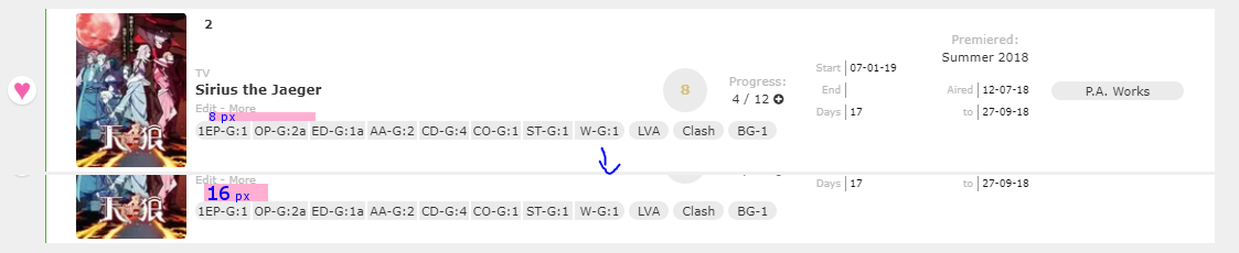 Changing "top"s didn't seem to have any effect. I didn't mess up with anything else since I don't want to break everything (again). Also, is the "object-fit" in ".data.image img" the only thing that controls how cover images look like inside the box? I changed it from "cover" to "fill" but couldn't achieve what I wanted. After comparing SS it looks like vertically the covers fit better (since some additional pixels at the top and bottom became visible) but horizontally nothing changed. Is there something I missed? how it looks like rn vs how I wished it looked like 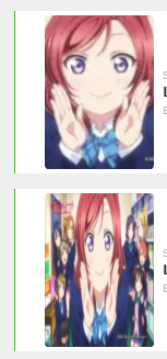 |
HakaminahJan 22, 2019 3:05 PM
 I'm watching anime since 2012. I also play games, sometimes. Don't bother me if you want to 'become friends' or things like that. It's tiresome. I know you just want to collect some meaningless numbers. Thought: How many people sparked H. Charlotta just for blue pot? |
Jan 22, 2019 5:00 PM
#106
Hakaminah said: How far it's raised from the bottom is controlled with the margin on ".data.tags div". Looks like you've already modified it a bit so all you'll need to do is tweak it a little further. Here's the current code from your CSS for reference.how can I move the horizontal tags so they're a bit lower? https://i.imgur.com/a4l14Rt.png Changing "top"s didn't seem to have any effect. I didn't mess up with anything else since I don't want to break everything (again). … .data.tags div {
max-width: 980px;
margin: 0 0 29px 136px;
font-size: 0;
white-space: nowrap;
}If you aren't familiar with shorthand, then each number represents a side of the objects margin. In order: top, right, bottom, left. Hakaminah said: Yeah, that's the property that controls the image stretching. Removing the object-fit line entirely or setting it to fill should reset the image to default behaviour. But I am not sure if it will achieve what you want for the Love Live cover, since the original Love Live cover doesn't have the extra stuff on the sides, that I can find anyhow. However, any cover that does have extra content that was previously out of bounds will now display how you want it.… is the "object-fit" in ".data.image img" the only thing that controls how cover images look like inside the box? … how it looks like rn vs how I wished it looked like https://i.imgur.com/EXhpbmg.png |
Jan 22, 2019 5:14 PM
#107
Valerio_Lyndon said: Yeah, that's the property that controls the image stretching. Removing the object-fit line entirely or setting it to fill should reset the image to default behaviour. But I am not sure if it will achieve what you want for the Love Live cover, since the original Love Live cover doesn't have the extra stuff on the sides, that I can find anyhow. However, any cover that does have extra content that was previously out of bounds will now display how you want it. It's not just Love Live ad. A lot of commercials or other ONAs have wide covers. Here's some Re:Zero stuff too.  Only their hands are visible and it just looks weird. Squished covers aren't perfect but they're still a lot better than this. Either way, removing the line didn't help. In the previous layout I was using I could change the covers so they fit in there the way I want but it wasn't using content fill (iirc it was using #cover-image, which your list is not using apparently, and background-size for controlling covers) so I'm at loss. |
I'm watching anime since 2012. I also play games, sometimes. Don't bother me if you want to 'become friends' or things like that. It's tiresome. I know you just want to collect some meaningless numbers. Thought: How many people sparked H. Charlotta just for blue pot? |
Jan 22, 2019 5:48 PM
#108
Hakaminah said: Hm, I see. It looks like when MAL generates the small preview pictures for the list it also crops them to fit. As seen here, the source image found on the list is vertically cropped even though the image on the database entry is wide.Valerio_Lyndon said: Yeah, that's the property that controls the image stretching. Removing the object-fit line entirely or setting it to fill should reset the image to default behaviour. But I am not sure if it will achieve what you want for the Love Live cover, since the original Love Live cover doesn't have the extra stuff on the sides, that I can find anyhow. However, any cover that does have extra content that was previously out of bounds will now display how you want it. It's not just Love Live ad. A lot of commercials or other ONAs have wide covers. Here's some Re:Zero stuff too. Only their hands are visible and it just looks weird. Squished covers aren't perfect but they're still a lot better than this. Either way, removing the line didn't help. In the previous layout I was using I could change the covers so they fit in there the way I want but it wasn't using content fill (iirc it was using #cover-image, which your list is not using apparently, and background-size for controlling covers) so I'm at loss. 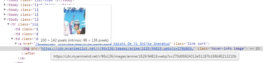 The list you were using before was clearly using a third-party cover generator, which grabs a high-rez version of covers from their original MAL pages. Hence the lack of cropping like MAL has done here. The reason I did not use this on the basic version of this theme is because the images are so small there was no benefit to adding an image generator. I do, however, use one for the image hover mod, since it benefits me there to do so. It would also benefit you in this situation, so I'll go over how to add one. First things first, you need to add the generator. AzureWebsites is the best right now, so we'll use that. Add this to the very top of your code (above anything that isn't another @import). @\import "https://malscraper.azurewebsites.net/covers/auto/presets/dataimagelinkbefore"; Then, add this code to the bottom of your list: .data.image .link:before {
content: "";
position: absolute;
top: 0;
left: 0;
z-index: 1;
width: 100%;
height: 100%;
background-size: 100% 100%;
}
.data.image .image { z-index: -1; }It should now (hopefully) look how you want it and have the added benefit of being higher resolution. You should also be able to change background properties this way. 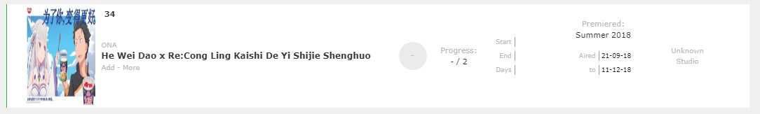 |
Jan 22, 2019 6:57 PM
#109
Valerio_Lyndon said: It should now (hopefully) look how you want it and have the added benefit of being higher resolution. You should also be able to change background properties this way. It worked \o/ I had some problems with "link icon on hover" thing since it stopped showing up. I replaced ".data.image a:after" to ".data.image a:hover:before" to match the new cover code (and removed .data.image a:hover:after, not sure what it was doing anyway) but it was showing the cropped covers under the icon / tint. I had to remove background-related tint codes from it and replace them with inset shadow to get effects similar to what I had. Stuff's complicated. >.> Thanks for helping me to deal with it tho. |
HakaminahJan 22, 2019 7:05 PM
I'm watching anime since 2012. I also play games, sometimes. Don't bother me if you want to 'become friends' or things like that. It's tiresome. I know you just want to collect some meaningless numbers. Thought: How many people sparked H. Charlotta just for blue pot? |
Jan 22, 2019 7:10 PM
#110
| @Hakaminah Oh yeah, I forgot about the darkening effect, woops. The :hover:after was a remnant from the unmodified theme. Glad it's working now. |
Jan 24, 2019 1:09 AM
#111
| Hey, I'm myanimeusername. How is your design for the whole site going? I can't wait to see it :D |
Jan 24, 2019 3:19 AM
#112
Kweebecs said: Slowly. :P It's not top priority right now, and I've been getting sidetracked with other projects and work. I've completed the majority of about half the pages so I still have a good many days of grinding out code for it to be ready, no idea on an estimate.Hey, I'm myanimeusername. How is your design for the whole site going? I can't wait to see it :D |
Valerio_LyndonOct 28, 2020 11:49 PM
Jan 24, 2019 3:30 AM
#113
Valerio_Lyndon said: Kweebecs said: Slowly. :P It's not top priority right now, and I've been getting sidetracked with other projects and work. I've completed the majority of about half the pages so I still have a good many days of grinding out code for it to be ready, no idea on an estimate.Hey, I'm myanimeusername. How is your design for the whole site going? I can't wait to see it :D Since you are interested in the project I feel it's worth showing you what the concept that I'm building on looks like so you know whether or not it fits your style. Keeping in mind that this is all subject to change.  At first glance, it didn't stand out as much as I thought it was considering your list design but as at it a bit more closely, all the details and small changes you've done all add up to a really helpful and nice page design :D I can't wait to try this, although I would like it if we ourselves could change the background and add a picture :3 Oh and, I didn't realise you were born in 7777, lucky you! :p |
Jan 24, 2019 3:46 AM
#114
Kweebecs said: Yeah, it's not as flashy as it perhaps could be and it may not be for everyone. It started 100% as a project to increase my own enjoyment of the website and has continued as such. It's not where I want it and still has suathes of content unmodified, so I do hope to make it better before sharing it fully with everyone. Who knows, I might redo half of it if I feel it's needed. It's a lot of work just managing the code for this compared to a list design though, it wasn't made for customizing and has a lot of weird quirks so it takes much longer to edit, which doesn't help the flashiness factor since a seemingly small change can be a victory for me, but may seem insignificant to anyone else. Anyhow, just wanted to give you an idea of the direction it's currently going in so you know what to expect. Nice to know there is interest. :)At first glance, it didn't stand out as much as I thought it was considering your list design but as at it a bit more closely, all the details and small changes you've done all add up to a really helpful and nice page design :D I can't wait to try this, although I would like it if we ourselves could change the background and add a picture :3 Oh and, I didn't realise you were born in 7777, lucky you! :p Haha yeah, that was a little test I was doing with faking inputs to get a normally invalid date of birth. Someone asked about it on the help thread a while back. |
Jan 24, 2019 4:22 PM
#115

| Dude, thanks for your theme, it's awesome! I changed a lot of it for my best girl but there's only one thing I want to play with: the colors inside the title box (TV, airing, edit, more, progress, etc). Currently it's some kind of weak grey. Where's the line in your code to change it? https://myanimelist.net/animelist/Ausemere |
 |
Jan 24, 2019 4:58 PM
#116
Ausemere said: Glad you've got it working how you want it for the most part. :DDude, thanks for your theme, it's awesome! I changed a lot of it for my best girl but there's only one thing I want to play with: the colors inside the title box (TV, airing, edit, more, progress, etc). Currently it's some kind of weak grey. Where's the line in your code to change it? https://myanimelist.net/animelist/Ausemere That colour is controlled by the --text-dim and --text-dim-h variables near the top of the code. If you want to avoid directly tweaking the theme, here's them seperated out for easier reading. You could add this below the main theme's code and customize from there. :root {
--text-dim: #bababa;
--text-dim-h: #646464;
} You can see a full list of colours used by the theme on the first post, under "Further Instructions" > "Change theme colours", although I have not properly documented what colour changes what yet. :< I'll have to get on that soon. It's documented now! If you wanted only certain colours changed instead of every instance of said colour, we could go more in-depth with targeting specific selectors. :) |
Valerio_LyndonJan 24, 2019 5:38 PM
Jan 24, 2019 5:29 PM
#117
| Wow, thanks! I actually found it before you reply, sorry for being unattentive. I also got the transparency modifier. And I found out how to make the vertical status color thicker, so I'll leave it there for other people reading the topic: .data.status{position:absolute;top:0;left:0;width:4px!important;height:100%} |
| |
Jan 24, 2019 6:07 PM
#119
| @Kweebecs I read your response when the notification first came up but couldn't respond at the time. I know you've deleted it now so sorry if this seems a bit weird lol but I wanted to address your feedback since it's helpful as always. Hopefully that's alright. --- It seems I didn't do as much testing as I should have with the extra mods, darn. It seems to work fine on the dark version, but the light ver has more colours changed so it looks a little off. Seems it works best placed after the winter theme since then the tags don't get the individual background issue. And then to correct the main colour you could add this to the review tag mod: .data.tags div:not(:empty) { background: rgba(255, 255, 255, 0.93); }It's not ideal, but until I can look into it further and see if I can improve the code it's workable. I think it might be fixable by pushing an update to the winter theme, I'll have to check it out more later and see if I can fix it but no promises. ;) I'll have to add a note to the main post about it until then in-case anyone else has the same problem. --- It's unlikely I'll make custom themes like that, although not totally out of the question. The main issue being all the incompatibilites that can spring up when creating highly customized themes (as seen with the winter theme). It takes some work to mantain, and I think I only want one of those running at once. :) On the other hand, if I were to make a simpler theme that only changed colours and images then personally it feels a little meaningless since I have all the tutorials for how to do so on the main theme already. But, that said, I can understand it's easier to use a premade theme instead of starting from scratch so there is an argument to be made. I may look into themes more in the future, be it simple image/colour sets to get someone up and running quickly or more overdone seasonal themes where I turn up the dials and have fun making something I normally wouldn't (maybe a summer or fall one). :D |
Valerio_LyndonJan 24, 2019 6:14 PM
Jan 24, 2019 7:57 PM
#120
Valerio_Lyndon said: Kweebecs said: Slowly. :P It's not top priority right now, and I've been getting sidetracked with other projects and work. I've completed the majority of about half the pages so I still have a good many days of grinding out code for it to be ready, no idea on an estimate.Hey, I'm myanimeusername. How is your design for the whole site going? I can't wait to see it :D Since you are interested in the project I feel it's worth showing you what the concept that I'm building on looks like so you know whether or not it fits your style. Keeping in mind that this is all subject to change. i'm willing to help test the layout |
Jan 24, 2019 8:11 PM
#121
OhTaKuSo said: It's not quite ready for sharing yet, too many pages yet to style or just broken. When I have a beta version ready I'll make a post in the club here for people to use and give feedback on. :)Valerio_Lyndon said: Kweebecs said: Hey, I'm myanimeusername. How is your design for the whole site going? I can't wait to see it :D Since you are interested in the project I feel it's worth showing you what the concept that I'm building on looks like so you know whether or not it fits your style. Keeping in mind that this is all subject to change. i'm willing to help test the layout Did you see my edit from the earlier post in which I @'d you? I noticed I had given imperfect code and wanted to correct the mistake. |
Jan 24, 2019 8:15 PM
#122
Valerio_Lyndon said: OhTaKuSo said: It's not quite ready for sharing yet, too many pages yet to style or just broken. When I have a beta version ready I'll make a post in the club here for people to use and give feedback on. :)Valerio_Lyndon said: Kweebecs said: Slowly. :P It's not top priority right now, and I've been getting sidetracked with other projects and work. I've completed the majority of about half the pages so I still have a good many days of grinding out code for it to be ready, no idea on an estimate.Hey, I'm myanimeusername. How is your design for the whole site going? I can't wait to see it :D Since you are interested in the project I feel it's worth showing you what the concept that I'm building on looks like so you know whether or not it fits your style. Keeping in mind that this is all subject to change. i'm willing to help test the layout Did you see my edit from the earlier post in which I @'d you? I noticed I had given imperfect code and wanted to correct the mistake. yeah I did, |
Jan 24, 2019 8:26 PM
#123
Jan 25, 2019 3:03 AM
#124
Valerio_Lyndon said: @Kweebecs I read your response when the notification first came up but couldn't respond at the time. I know you've deleted it now so sorry if this seems a bit weird lol but I wanted to address your feedback since it's helpful as always. Hopefully that's alright. --- It seems I didn't do as much testing as I should have with the extra mods, darn. It seems to work fine on the dark version, but the light ver has more colours changed so it looks a little off. Seems it works best placed after the winter theme since then the tags don't get the individual background issue. And then to correct the main colour you could add this to the review tag mod: .data.tags div:not(:empty) { background: rgba(255, 255, 255, 0.93); }It's not ideal, but until I can look into it further and see if I can improve the code it's workable. I think it might be fixable by pushing an update to the winter theme, I'll have to check it out more later and see if I can fix it but no promises. ;) I'll have to add a note to the main post about it until then in-case anyone else has the same problem. --- It's unlikely I'll make custom themes like that, although not totally out of the question. The main issue being all the incompatibilites that can spring up when creating highly customized themes (as seen with the winter theme). It takes some work to mantain, and I think I only want one of those running at once. :) On the other hand, if I were to make a simpler theme that only changed colours and images then personally it feels a little meaningless since I have all the tutorials for how to do so on the main theme already. But, that said, I can understand it's easier to use a premade theme instead of starting from scratch so there is an argument to be made. I may look into themes more in the future, be it simple image/colour sets to get someone up and running quickly or more overdone seasonal themes where I turn up the dials and have fun making something I normally wouldn't (maybe a summer or fall one). :D Okay, thanks for telling me :D |
Jan 25, 2019 3:11 AM
#125
| Hey, I'd like to use your favourite heart display add-on with the bigger sized images of an anime. Could you send me a code where either the hearts are displayed on the other side or the images are displayed on the other side? That way I can have both and they wont overlap each other :D Thanks a lot for answering all my questions :p Also, I'd love to talk to you some more if you have Discord, mine is Kweebecs#2136 :D Oh, and how did you do colors for horizontal tags? |
KweebecsJan 25, 2019 10:50 AM
Jan 25, 2019 7:07 PM
#126
Kweebecs said: Here's the code for favourite tags on the right side of the list:Hey, I'd like to use your favourite heart display add-on with the bigger sized images of an anime. Could you send me a code where either the hearts are displayed on the other side or the images are displayed on the other side? That way I can have both and they wont overlap each other :D Thanks a lot for answering all my questions :p Also, I'd love to talk to you some more if you have Discord, mine is Kweebecs#2136 :D Oh, and how did you do colors for horizontal tags? /* Favourite Tags / Revision 0.2 */
.data.tags span a[href*="\=Favourite"], .data.tags span a[href*="\=Favorite"] {
position: absolute;
right: -34px;
top: 50%;
margin-top: -13px;
width: 26px;
height: 26px;
padding: 0;
background: var(--bg);
border-radius: 50%;
color: #ff65ad !important;
font-size: 0 !important;
line-height: 23px;
overflow: hidden;
box-shadow: 0 1px 2px rgba(0,0,0,0.2);
} .data.tags span a[href*="\=Favourite"]:before, .data.tags span a[href*="\=Favorite"]:before { content: "♥"; font-size: 26px; }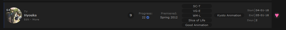 I did the colours as explained in the coloured tags spoiler in the main post. :) I just removed the "background" part of it, so it was only colour. Example: .data.tags span a[href*="\=TAGNAME"] { color: COLOUR }I'm afraid I don't really use Discord, my main social networks are MyAnimeList and AniList since everyone I know is on there haha. |
Jan 26, 2019 1:15 AM
#127
| Thank you, could I add you as a friend on here then? :3 I tried sending you a friend request but I can't :( |
Jan 26, 2019 3:26 AM
#128
Kweebecs said: Sure, why not. :P I sent you a request. I disabled incoming requests a while back since I don't accept randoms and it's easier to just disable. :)Thank you, could I add you as a friend on here then? :3 I tried sending you a friend request but I can't :( |
Jan 27, 2019 8:20 PM
#129

| Hello! someone can help me ? I started with the guide and I have a problem, anime/manga cover preview doesn't work... I see the image in gray like not loading, I don't know how to fix that, I tried to fix but nothing works :( This is my ''CSS code'' : @\import "https://valeriolyndon.github.io/MAL-Public-List-Designs/Clarity%20Theme/Theme%20-%20Compressed.css"; :root { --avatar: url(https://i.imgur.com/BKgS5rt.jpg); } :root { --name: "S10K"; } :root { --banner: url(https://i.imgur.com/RMIpVZI.jpg); } :root { --character: url(NONE); } body { background-image: linear-gradient(rgba(0,0,0,0.0), rgba(0,0,0,0.0)), url(https://i.imgur.com/2JhH955.jpg) !important; } .list-item, .data.priority, .data.number { background: transparent no-repeat center / cover fixed !important; background-image: linear-gradient(rgba(0,0,80,0.1),rgba(0,0,80,0.1)), url(https://i.imgur.com/2JhH955.jpg) !important; } |
Jan 27, 2019 9:16 PM
#130
S10K said: The small images look correct to me. I assume you are trying to add the large covers? If so, try replacing your code with this. It's your current code with the large cover imports added, working when I try it.Hello! someone can help me ? I started with the guide and I have a problem, anime/manga cover preview doesn't work... I see the image in gray like not loading, I don't know how to fix that, I tried to fix but nothing works :( This is my ''CSS code'' : @\import "https://valeriolyndon.github.io/MAL-Public-List-Designs/Clarity%20Theme/Theme%20-%20Compressed.css"; :root { --avatar: url(https://i.imgur.com/BKgS5rt.jpg); } :root { --name: "S10K"; } :root { --banner: url(https://i.imgur.com/RMIpVZI.jpg); } :root { --character: url(NONE); } body { background-image: linear-gradient(rgba(0,0,0,0.0), rgba(0,0,0,0.0)), url(https://i.imgur.com/2JhH955.jpg) !important; } .list-item, .data.priority, .data.number { background: transparent no-repeat center / cover fixed !important; background-image: linear-gradient(rgba(0,0,80,0.1),rgba(0,0,80,0.1)), url(https://i.imgur.com/2JhH955.jpg) !important; } @\import "https://valeriolyndon.github.io/MAL-Public-List-Designs/Clarity%20Theme/Theme%20-%20Compressed.css";
@\import "https://malscraper.azurewebsites.net/covers/auto/presets/dataimagelinkbefore";
@\import "https://valeriolyndon.github.io/MAL-Public-List-Designs/Clarity%20Theme/Mod%20-%20Hover%20Image%20Compressed.css";
:root { --avatar: url(https://i.imgur.com/BKgS5rt.jpg); }
:root { --name: "S10K"; }
:root { --banner: url(https://i.imgur.com/RMIpVZI.jpg); }
:root { --character: url(NONE); }
body {
background-image:
linear-gradient(rgba(0,0,0,0.0), rgba(0,0,0,0.0)),
url(https://i.imgur.com/2JhH955.jpg)
!important;
}
.list-item, .data.priority, .data.number {
background: transparent no-repeat center / cover fixed !important;
background-image:
linear-gradient(rgba(0,0,80,0.1),rgba(0,0,80,0.1)),
url(https://i.imgur.com/2JhH955.jpg)
!important;
} |
Jan 28, 2019 4:36 AM
#131
| @Valerio_Lyndon wow it's working, so much thanks, btw the reason why the css code was without large covers is because I made a copy before I got to that point and I tried different ways to fix it but I did not get it. I really like the design/aesthetics and how useful it is, thanks again <3 |
Feb 1, 2019 1:58 PM
#133
| @Valerio_Lyndon Can you tell me how can I move text on my status buttons (all anime, watching, completed etc) a bit down? I can move the buttons around but not the text itself. I also have a question: Some covers like that of Alice to Zouroku aren't fitting perfectly (?) before. That anime's cover as white as it gets on borders but there was this weird 1px wide line there, on the right side. How it looks like:  How I think it should look like:  I ignored it since the difference was barely noticeable and there aren't many anime where it's even visible. Now I tried to add some overlays here and there, starting with covers and there's something weird happening with their right side. The overlay image is of the same dimensions as the covers themselves should be so it's supposed to fit perfectly like this:  But for some reason the right side is a bit blurry and I don't understand why.  Do you happen to know if these things are connected and why it's like that? It seems like it depends on my screen since when I close up - it's gone, when I close up 2 times more - it shows up again. I don't really need it to be fixed but was just curious. |
HakaminahFeb 1, 2019 2:07 PM
I'm watching anime since 2012. I also play games, sometimes. Don't bother me if you want to 'become friends' or things like that. It's tiresome. I know you just want to collect some meaningless numbers. Thought: How many people sparked H. Charlotta just for blue pot? |
Feb 1, 2019 9:27 PM
#134
| @Hakaminah You've got a lot of hard questions haha. Moving the text isn't too difficult. :) There's a couple of ways to go about it. One way would be to change the "line-height" to move the text up and down. The text would appear approximately in the middle of whatever value you choose (so 100px line height would have the text centered around the 50px mark). For basic height correction this will do pretty well. Code example: .status-menu .status-button {
line-height: 180px;
}The anime cover edge seems to be caused by some silly quirk of Chrome. In one of my replies, I gave you some code for higher rez images that aren't cropped. I placed these over top of the low-rez images (so that if the high-rez fail to load, there's still images). They should be displaying the same width as each other, one covering up the other. And they do... in Firefox. But in Chrome they're displaying wrong for some reason, probably an image aliasing difference/issue. You've got a couple of options here (don't use both): One option I can think of is reducing the size of the low-rez covers. This will prevent them from peeking out from the high-rez ones and isn't a major difference in how they display. Plus, with the overlay image you have covering the edges it hides any width/height differences between the images. It's not ideal, but it fixes the visual oddity. .data.image a {
z-index: 1;
}
.data.image img {
position: absolute;
left: 1px;
top: 1px;
width: 98px !important;
height: 138px !important;
}Another option: completely remove the low-rez covers. Since they aren't visible most of the time, this is a potential solution. But if the cover generator ever fails then your images will be completely blank. .data.image img { display: none; }The blurry edge on the overlay also appears to be a Chrome-specific bug. Probably a symptom of the same issue where-in the image is not displaying at the correct width and is being smoothed wrong. Although, I have no clue why this applies here since your image is the exact same size as the element. It, again, should be working fine, which is the most frustrating part. I tried using some tricks to improve the issue, but nothing actually fixed the image displaying incorrectly. That isn't to say there isn't a fix, but I couldn't find one. I'll update if I do. Anyhow, I did manage to get a sharp, unblurred result by recreating your image using CSS (the box-shadow property specifically). This is obviously not a perfect issue as it does not allow using complex imagery, but it does fix this specific problem. .data.image .link:after {
top: 1px;
left: 1px;
width: 98px !important;
height: 138px !important;
background: none;
box-shadow:
0 0 0 1px #ff0000,
inset 0 0 0 1px #0000ff,
inset 0 0 0 2px #00ff00;
} Also, you didn't ask about this but I felt I should bring it to your attention. The image generator doesn't work very well when embedded inside another @import since it needs to know what page it is being directed from to work. Chrome seems to solve this currently but it did not in the past, meaning it may not in the future either if they decide to revert to old behaviour. It also does not work on Firefox. Solutions: The easiest and most elegant solution is to move the import from your code file into the MAL CSS box. The generator doesn't need to be told what to generate if you've already pointed it to the correct place. The issue with this is you have to specify if you want it to generate anime or mangalist covers. This would either add bloat on each list since you're now loading manga covers on the animelist (and vice-versa), or require you to host two separate CSS files: one for your animelist, one for your mangalist. But, if you were to change from your current import, seen here for reference: @\import "https://malscraper.azurewebsites.net/covers/auto/presets/dataimagelinkbefore"; To these two, it should work no matter where you place it. @\import "https://malscraper.azurewebsites.net/covers/anime/Hakaminah/presets/dataimagelinkbefore"; @\import "https://malscraper.azurewebsites.net/covers/manga/Hakaminah/presets/dataimagelinkbefore"; The difference is that in the second version we are telling it where to go (your page) where-as the first is automatically detecting where based on where the request comes from. The third solution is to not bother, since it does still work in Chrome and if it ain't broke, you know. It's up to you. :) |
Feb 3, 2019 10:23 AM
#135
@Valerio_Lyndon I added some renders and this happened with my list. I removed them one by one to see which one did it and it seems like it's flowers' fault. /* flowers below banner */
.list-container:before {
position: absolute;
display: block;
content: '';
left: 0;
bottom: 0;
top: 382px !important;
width: 100%;
height: 100%;
background:transparent url(https://dl.dropboxusercontent.com/s/z1wi6n8t0k3cbea/banner%20unter.png?dl=0) repeat-x top center;
z-index: -1 !important;
}They don't show if I remove position and if I change it to fixed, it scrolls with page. Is it possible to change it so it stays like it is without breaking stuff? |
I'm watching anime since 2012. I also play games, sometimes. Don't bother me if you want to 'become friends' or things like that. It's tiresome. I know you just want to collect some meaningless numbers. Thought: How many people sparked H. Charlotta just for blue pot? |
Feb 3, 2019 3:08 PM
#136
@Hakaminah Changing the height to "calc(100% - 382px)" should fix the overflow issue./* flowers below banner */
.list-container:before {
position: absolute;
display: block;
content: '';
left: 0;
bottom: 0;
top: 382px !important;
width: 100%;
height: calc(100% - 382px);
background:transparent url(https://dl.dropboxusercontent.com/s/z1wi6n8t0k3cbea/banner%20unter.png?dl=0) repeat-x top center;
z-index: -1 !important;
} |
Valerio_LyndonFeb 3, 2019 3:11 PM
Feb 3, 2019 3:10 PM
#137
Valerio_Lyndon said: @Hakaminah Changing the height to "calc(100% - 382px)" should fix the overflow issue. Wow, it did. Thanks~ |
I'm watching anime since 2012. I also play games, sometimes. Don't bother me if you want to 'become friends' or things like that. It's tiresome. I know you just want to collect some meaningless numbers. Thought: How many people sparked H. Charlotta just for blue pot? |
Feb 4, 2019 11:32 AM
#138

| Hello there, nice theme. I was wondering how to use the code to change a studio's color just like the tags. I can't figure out what do i need to replace with the "TAGNAME" from .data.studio span a[href*="\=TAGNAME"] { background: COLOUR } What do i have to do? Thanks. |

Feb 4, 2019 8:13 PM
#139
TsioAtti said: Oh, my apologies! I must have forgotten to rewrite that part :( The template should be:Hello there, nice theme. I was wondering how to use the code to change a studio's color just like the tags. I can't figure out what do i need to replace with the "TAGNAME" from .data.studio span a[href$="\=TAGNAME"] { background: COLOUR } What do i have to do? Thanks. .data.studio span a[href$="/STUDIONUM"] { background: COLOUR }You can find the studio number to replace the "STUDIONUM" by hovering over the studio and checking the URL at the bottom left of your screen, similar to the tags. You can also click on the link to the studio and check the URL there too. You need the number at the end, as seen here:  So a complete example would look like below. This turns Kyoto Animation to green and Fanworks to black. /* Kyoto Animation */
.data.studio span a[href$="/2"] { background: #196619 }
/* Fanworks */
.data.studio span a[href$="/866"] { background: black }Same deal with licensors, use the template and replace the number by checking the end of the URL. .data.licensor span a[href$="/LICENSORNUM"] { background: COLOUR }Thanks for pointing out the oversight, I'll fix up the main post very soon. :) |
Valerio_LyndonFeb 6, 2019 11:11 PM
Feb 5, 2019 8:04 AM
#140
| Hi, I'm impressed with your work Valerio. Just a quick question. Whenever I want to put my own image, it just went blank. I did double checked that the file ends with jpg. . But the problem didn't occurred when I just copy link address at images online. Thank you |
Feb 5, 2019 3:48 PM
#141
Hamiuwl said: Hm, what's the image you were trying to use? Some image hosts can be a nuisance when it comes to linking directly to their images.Hi, I'm impressed with your work Valerio. Just a quick question. Whenever I want to put my own image, it just went blank. I did double checked that the file ends with jpg. . But the problem didn't occurred when I just copy link address at images online. Thank you |
Feb 6, 2019 8:32 AM
#142
Valerio_Lyndon said: Hamiuwl said: Hm, what's the image you were trying to use? Some image hosts can be a nuisance when it comes to linking directly to their images.Hi, I'm impressed with your work Valerio. Just a quick question. Whenever I want to put my own image, it just went blank. I did double checked that the file ends with jpg. . But the problem didn't occurred when I just copy link address at images online. Thank you It's actually an image I edited myself from Adobe Photoshop. I did converted the file to jpg. but it still doesn't work either |
Feb 6, 2019 11:40 AM
#143
Hamiuwl said: Ah, what exact image host were you using and what URL? It might give me an idea what's going wrong if I can see myself. Posting the CSS after you input the URL may also assist.Valerio_Lyndon said: Hamiuwl said: Hi, I'm impressed with your work Valerio. Just a quick question. Whenever I want to put my own image, it just went blank. I did double checked that the file ends with jpg. . But the problem didn't occurred when I just copy link address at images online. Thank you It's actually an image I edited myself from Adobe Photoshop. I did converted the file to jpg. but it still doesn't work either |
Valerio_LyndonFeb 6, 2019 6:04 PM
Feb 7, 2019 5:42 AM
#144
Valerio_Lyndon said: Hamiuwl said: Ah, what exact image host were you using and what URL? It might give me an idea what's going wrong if I can see myself. Posting the CSS after you input the URL may also assist.Valerio_Lyndon said: Hamiuwl said: Hm, what's the image you were trying to use? Some image hosts can be a nuisance when it comes to linking directly to their images.Hi, I'm impressed with your work Valerio. Just a quick question. Whenever I want to put my own image, it just went blank. I did double checked that the file ends with jpg. . But the problem didn't occurred when I just copy link address at images online. Thank you It's actually an image I edited myself from Adobe Photoshop. I did converted the file to jpg. but it still doesn't work either "C:\Users\HP\Downloads\Compressed\anime-street-scenic-buildings-bicycle-24005.jpg" |
Feb 7, 2019 6:37 AM
#145
Hamiuwl said: Valerio_Lyndon said: Hamiuwl said: Valerio_Lyndon said: Hamiuwl said: Hm, what's the image you were trying to use? Some image hosts can be a nuisance when it comes to linking directly to their images.Hi, I'm impressed with your work Valerio. Just a quick question. Whenever I want to put my own image, it just went blank. I did double checked that the file ends with jpg. . But the problem didn't occurred when I just copy link address at images online. Thank you It's actually an image I edited myself from Adobe Photoshop. I did converted the file to jpg. but it still doesn't work either "C:\Users\HP\Downloads\Compressed\anime-street-scenic-buildings-bicycle-24005.jpg" It's not possible to simply link files that are on your pc for them to work on MAL. If you want to use that image, you need to go to any file hosting site like imgur, upload your file there, and then use the direct link you'll get. |
I'm watching anime since 2012. I also play games, sometimes. Don't bother me if you want to 'become friends' or things like that. It's tiresome. I know you just want to collect some meaningless numbers. Thought: How many people sparked H. Charlotta just for blue pot? |
Feb 14, 2019 3:00 PM
#146

 uuh, so hi! i finally made the switch to modern lists and used yours as a base. it was the only one available here that i liked (and it looks like anilist/twitter).. ..soo ..thanks for making it! :)   |
 |
Feb 14, 2019 4:23 PM
#147
| @sunnysummerday :o Thanks for sharing! Love a lot of the tweaks you did, always great to see other's takes on things. I wish I had thought of a lot of them. ;) Anyhow, I'm happy the design was useful! |
Feb 17, 2019 4:10 PM
#148
| Hey there! :3 I recently installed this theme, and I love it so much. I was wondering though if there was any way to add space between different categories (ie watching, completed, dropped etc). Here's a visual example of what I mean because I explained it terribly lol.  As you can see in the image I added text, but I'll probably be able to figure out once each section's seperated. Thanks in advance :D |
Feb 17, 2019 6:09 PM
#149
maya_amano said: I was about to tell you no, but actually it is possible! I thought MAL had broken it when they disabled the API, but using Doomcat's header tool with a custom template I managed to get it working. Hey there! :3 I recently installed this theme, and I love it so much. I was wondering though if there was any way to add space between different categories (ie watching, completed, dropped etc). Here's a visual example of what I mean because I explained it terribly lol. As you can see in the image I added text, but I'll probably be able to figure out once each section's seperated. Thanks in advance :D This is the result:  And here's the code, I hope it works for you as well! Add this to the top of your CSS: @\import "https://malcat-gen.appspot.com/headers?template=[data-query*='\"status\":7'] .list-item:nth-child($index){margin-top:48px;}[data-query*='\"status\":7'] .list-item:nth-child($index):before{content:'$content'}";Then add this anywhere below the @import's (bottom of the code is always safe): [data-query*='"status":7'] .list-item:nth-child(2) { margin-top: 32px; }
[data-query*='"status":7'] .list-item:before {
position: absolute;
top: -40px;
left: 0;
display: block;
width: 100%;
height: 32px;
color: var(--text-head);
font: 20px/32px Oswald;
text-align: right;
letter-spacing: 1px;
text-transform: uppercase;
pointer-events: none;
}The code for all this is split between the custom template in the import and the second section here. You should be able to tweak it without much issue if you know some CSS, but if you're having trouble I'll be happy to try and assist. |
Feb 18, 2019 10:14 AM
#150

| Thank you ! It looks amazing,using it right now. Just have a small question. Is it possible to make the scores viewable at all times on light mode without having to hover the mouse over the score for each title? |


More topics from this board
» [CSS - MODERN] ⚡️ Fully-Customizable Layouts (2024 updates!) ( 1 2 3 4 5 ... Last Page )Shishio-kun - Jul 21, 2017 |
381 |
by KabukiChouNights
»»
Sep 13, 10:56 AM |
|
» theme helpthreat - Jul 5 |
5 |
by Zaryf
»»
Aug 21, 5:46 AM |
|
» [CSS] ⭐️ Customize your List Cursor + Cursor FixesShishio-kun - Mar 8, 2021 |
30 |
by Shishio-kun
»»
Jul 28, 3:17 AM |
|
» How To Have Different Banner/Cover image & Background Image For Manga & Anime ListsYasminaRegina - Jul 25 |
2 |
by YasminaRegina
»»
Jul 26, 1:02 AM |
|
Sticky: » 💚 [REPAIR STICKY] Repair/speed up layouts + Request layout fixes ( 1 2 )Shishio-kun - Nov 17, 2023 |
52 |
by LucaBalsa
»»
Jul 6, 2:02 PM |