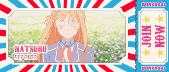
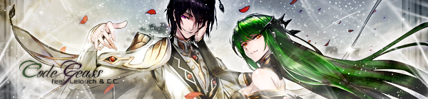
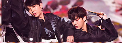
they're really awesome *.*
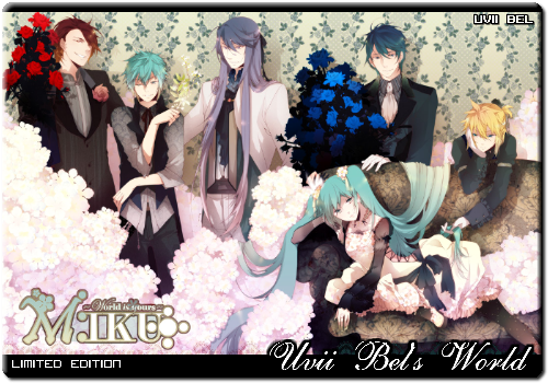
maybe they should be a little smaller but it's because I like smaller cards
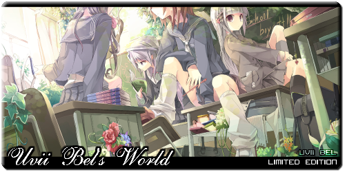
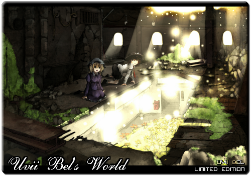
the first one is really beautiful and I like the light effect in the third^^
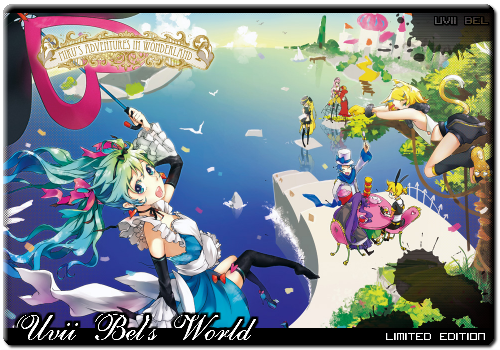
the last one is nice too^^
They're really good! I like the pictures you used. A little advice: Maybe making them all the same size is a good idea? And personally, I think they're a little too big ^^"
But it's up to you ;D
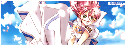
-The text is all distorted in "Uvii Bel's World", you might want to change the anti-aliasing settings (Use smooth).
-And it seems the font in "Uvii Bel's World" doesn't have an apostrophe character, you could add it or choose another similar font.
-I'm a fan of consistent card sizes, so that's another thing to change if you want.
-The drop shadow is too dark, try lowering the opacity, it's blending too much with the card.
Nice cards, but just that the "Uvii Bel's World" cannot be seen clearly, you can use either "sharp" or "smooth" to make it more visible. And I think the cards are quite big, maybe you can resize it a little. Other than that, there's not much problem. Nice pictures used (:


